OC-9 Ballet White from Benjamin Moore is a versatile paint color that strikes a perfect balance between warmth and elegance. This soft white hue has a subtle hint of beige, making it a cozy choice for any room. Unlike stark whites, Ballet White brings a soothing warmth to spaces, making it ideal for creating a tranquil and welcoming atmosphere. Its unique blend allows it to adapt to a variety of lighting conditions, looking graceful and inviting at any time of the day.
This color can be the go-to option for those looking to refresh their home without the starkness associated with pure white. It’s especially popular among homeowners and interior designers who want a neutral backdrop that is easy to pair with other colors and decor styles.
Whether you are updating a living room, bedroom, or kitchen, Ballet White offers a timeless aesthetic that enhances natural light and adds a sense of spaciousness.
Thanks to its versatility, Ballet White works wonderfully with a wide range of decorating styles, from modern to rustic. It also pairs beautifully with wood tones, metallic finishes, and vibrant colors, offering endless possibilities for personalizing your space. If you’re after a color that combines beauty with flexibility, OC-9 Ballet White by Benjamin Moore could be the perfect choice for your next home project.
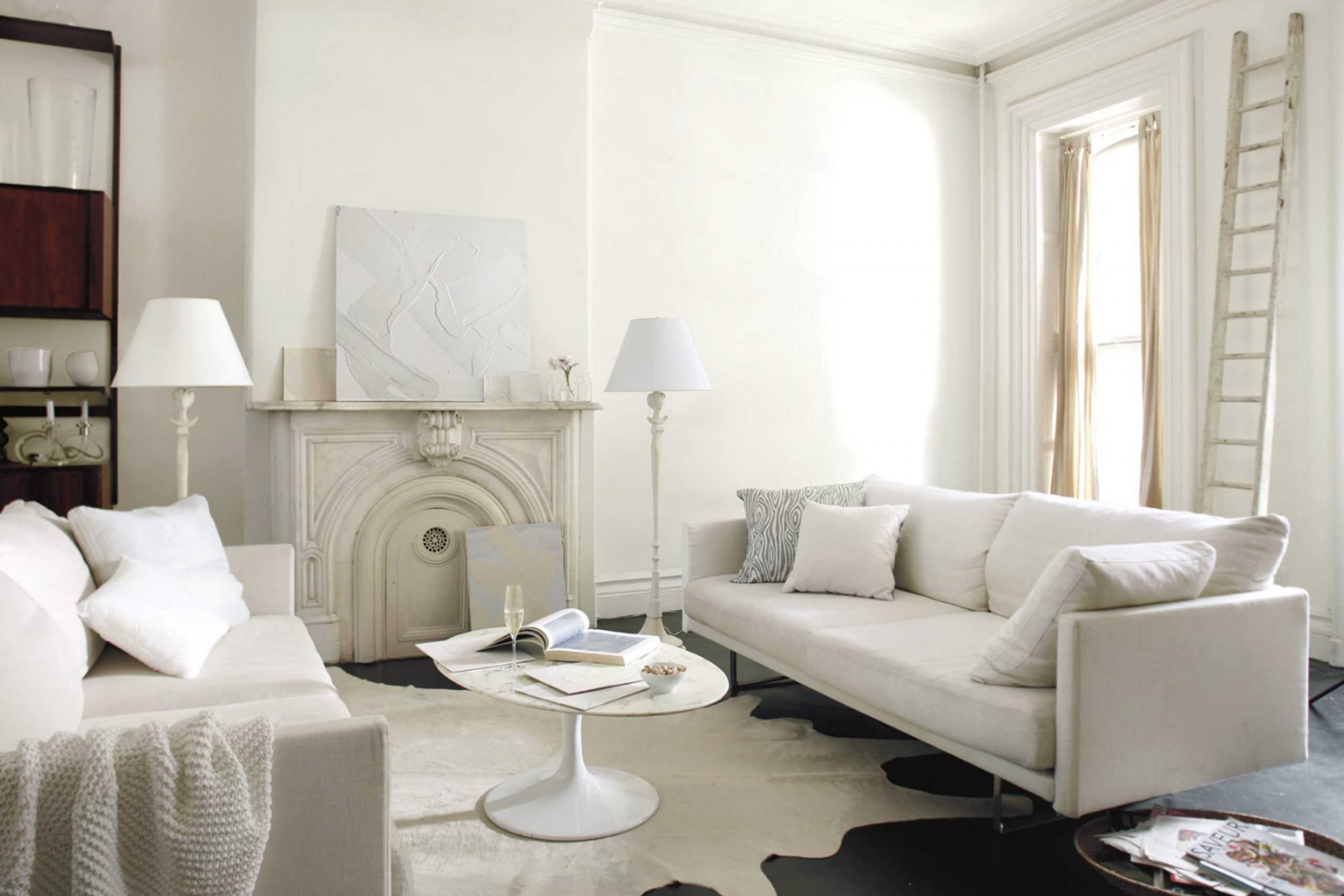
What Color Is Ballet White OC-9 by Benjamin Moore?
Ballet White by Benjamin Moore is a soft, warm hue that radiates a sense of calmness and sophistication. This versatile color is perfect for creating a cozy and inviting space. Its subtle undertones make it a great choice for pairing with a variety of interior styles, from modern minimalism to classic traditional. Ballet White works wonders in spaces that aim to be both serene and stylish, offering just the right amount of warmth without overwhelming the senses.
In terms of interior styles, this color shines in settings that favor simplicity and elegance. It’s a fantastic choice for Scandinavian-inspired interiors, where the focus is on light and space. Its warm undertones also make it suitable for rustic themes, complementing natural materials like wood and stone beautifully. Ballet White can bring a soft, refined backdrop to farmhouse-style decors as well, blending seamlessly with natural textiles and distressed finishes.
When it comes to materials and textures, Ballet White pairs exceptionally well with light woods, creating a harmonious and earthy vibe. It also looks stunning against brushed metals for a more contemporary feel. In rooms with plenty of natural light, silk or linen fabrics in Ballet White will add a layer of texture and depth, enhancing the room’s overall aesthetic without overwhelming it with color.
This color is all about balance, making it a smart choice for those looking to introduce warmth and subtlety into their living spaces.
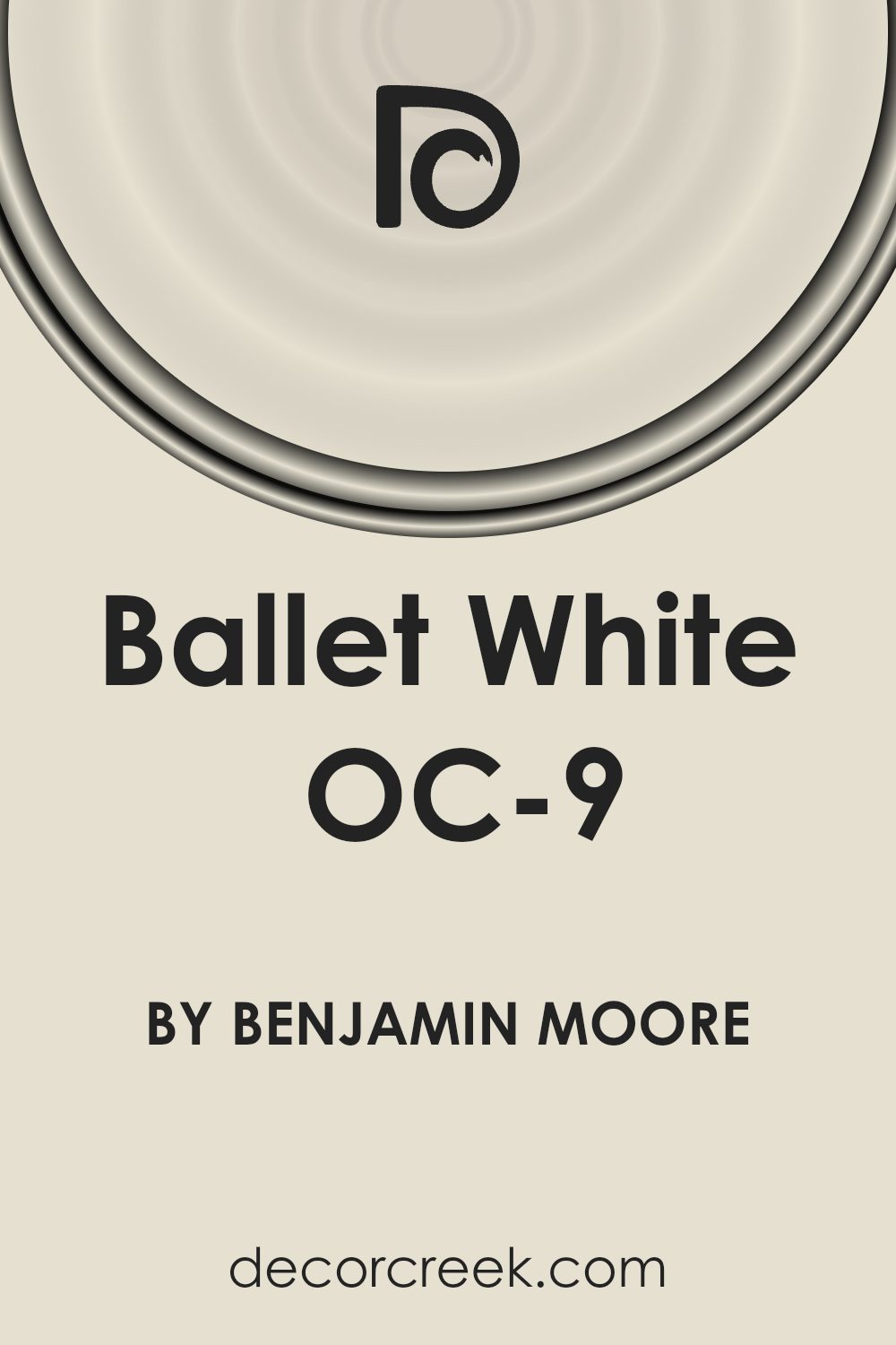
Is Ballet White OC-9 by Benjamin Moore Warm or Cool color?
Ballet White OC-9 by Benjamin Moore is a beautifully versatile paint color that can transform any room in your home into a welcoming and serene space. This subtle off-white hue has a warm undertone, making it perfect for creating a cozy atmosphere without the starkness often associated with pure white. Its adaptability means it works well in any light, gracefully shifting in tone from morning to evening, enhancing the natural beauty of your space.
Applying Ballet White OC-9 in your home brings a gentle elegance to walls, making rooms appear larger and more open while offering a soft backdrop that complements a wide range of decor styles and colors. It’s particularly effective in living areas, bedrooms, and kitchens, where its soothing presence creates a peaceful retreat from the outside world.
Homeowners love Ballet White OC-9 because it’s easy to live with and maintain. It hides imperfections well and is a practical choice for busy households, blending seamlessly with different textures and materials, from wood to metal and beyond. This color encourages creativity, allowing personal tastes to shine through in the furnishings and accessories, making any home feel uniquely inviting and personal.
Undertones of Ballet White OC-9 by Benjamin Moore
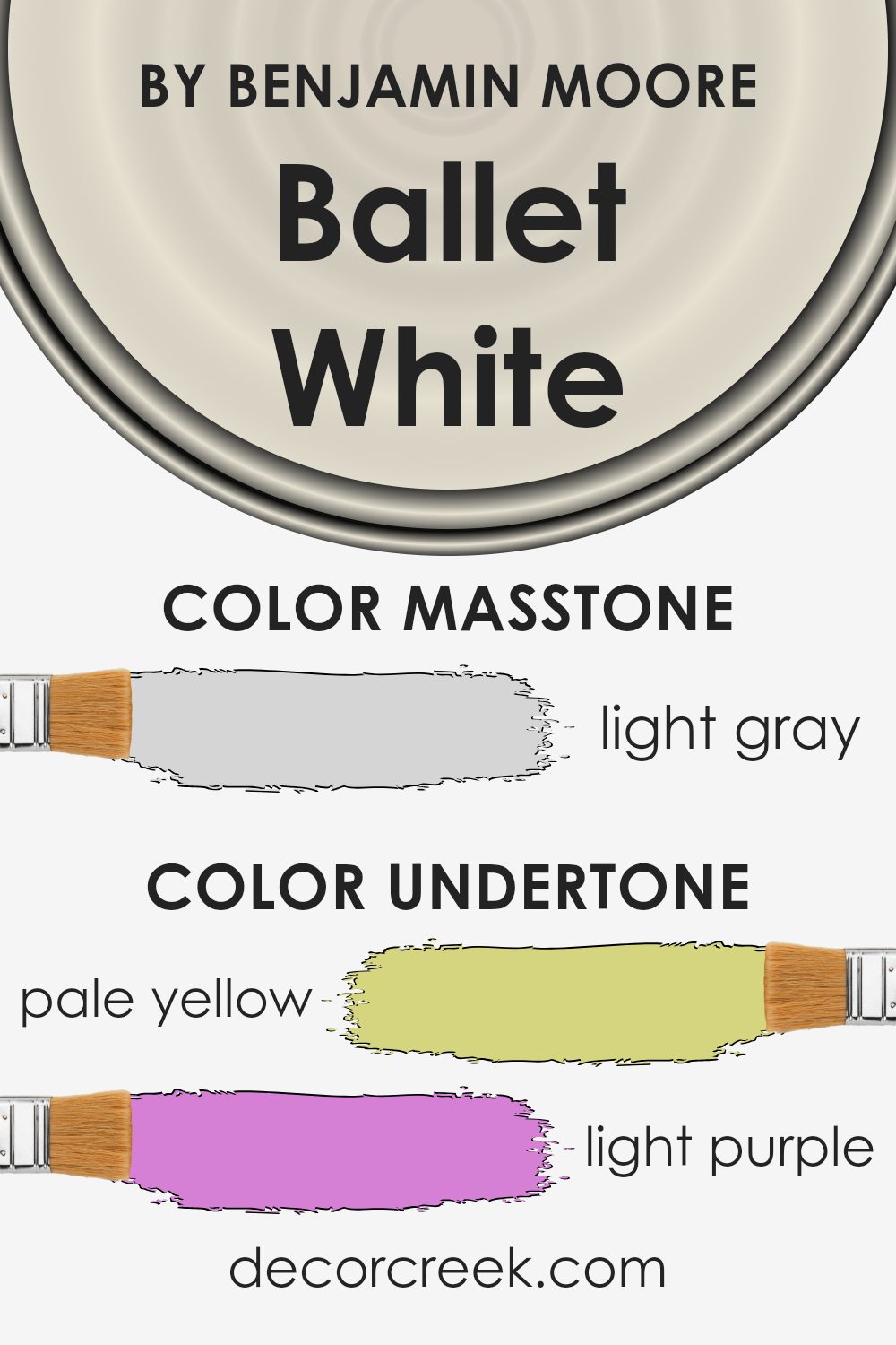
Ballet White by Benjamin Moore is a unique paint color that has a complex mix of undertones, including pale yellow, light purple, light blue, pale pink, mint, lilac, and grey. These undertones play a big part in how we see the color, making it more than just a simple shade of white. Depending on the lighting and surrounding colors, one undertone might stand out more than another, changing the paint’s overall look and feel.
For example, in a room with lots of natural light, the pale yellow and light blue undertones might make the space feel brighter and more airy. If the room has more artificial light, the light purple or lilac undertones could give the walls a slightly cooler touch. The grey undertone keeps the color from feeling too warm, balancing it out nicely.
When applied to interior walls, the undertones of Ballet White can significantly affect the room’s ambiance. The subtle hints of color can make the walls feel warm and inviting without overpowering the space with strong hues. This makes it an excellent choice for anyone looking to create a cozy yet versatile aesthetic in their home. The mix of undertones also means Ballet White can complement a wide range of decor styles and colors, adding depth and interest to the walls without demanding attention.
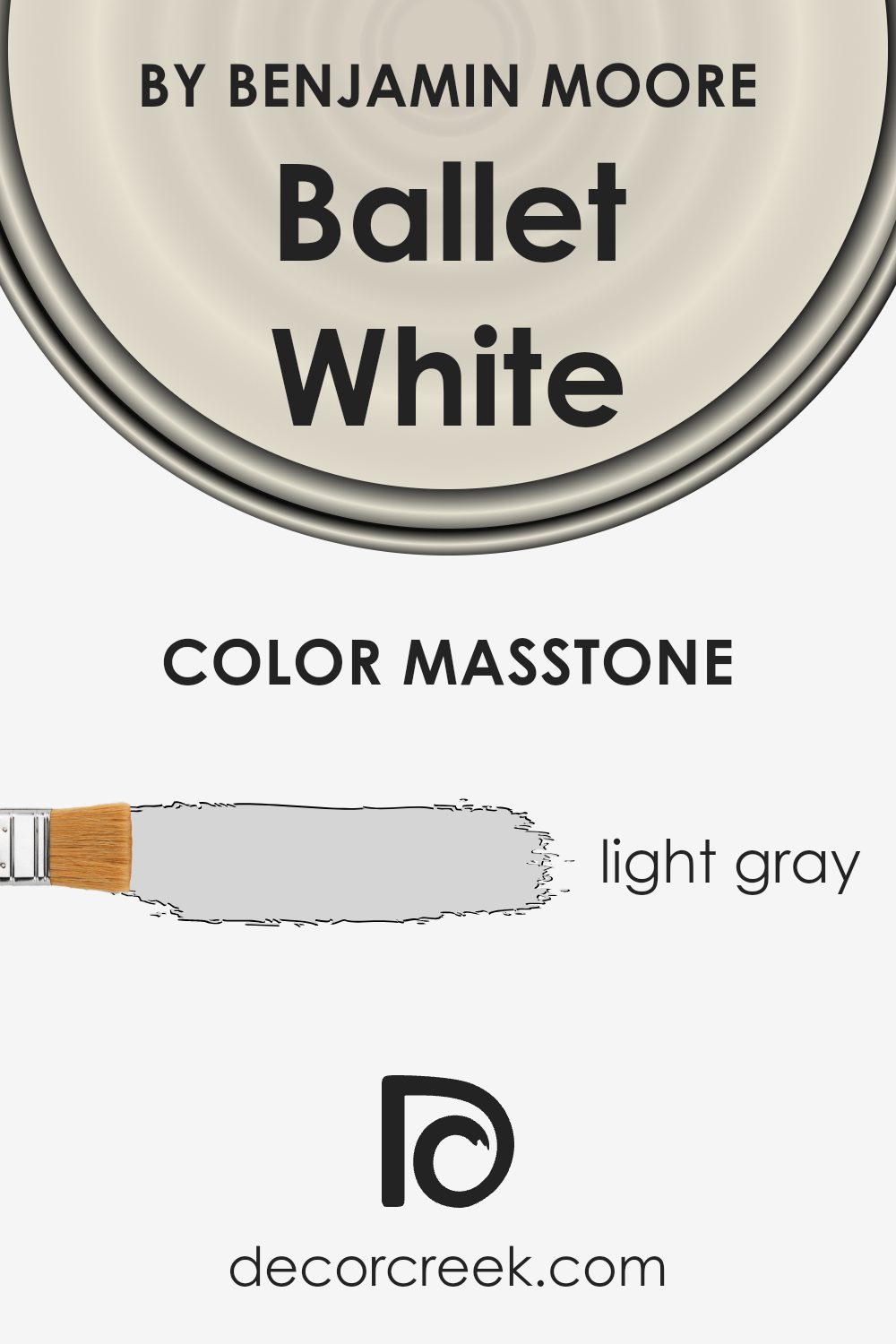
What is the Masstone of the Ballet White OC-9 by Benjamin Moore?
Ballet White OC-9 by Benjamin Moore has a masstone of light gray, a color code of #D5D5D5. This subtle, warm light gray offers a classical, understated elegance to any room. Its versatility means it can effortlessly fit into a wide range of home styles and aesthetics. Being a neutral shade, it pairs well with both bold and soft colors, allowing you to mix and match décor elements with ease.
In spaces where natural light is abundant, Ballet White OC-9 reflects beautifully, creating a serene and expansive feel. In rooms with less natural light, it helps keep the space feeling bright and airy without the starkness sometimes associated with pure white. This color works particularly well in living areas, bedrooms, and kitchens, offering a timeless backdrop that can evolve with changing trends and personal tastes.
Its calming effect makes it a popular choice for creating a relaxing and soothing environment at home.
How Does Lighting Affect Ballet White OC-9 by Benjamin Moore?
Lighting plays a vital role in how we perceive colors, significantly impacting their appearance and the mood of a room. Different light sources can change the way a color looks. For instance, a paint color like Ballet White by Benjamin Moore can appear differently under various lighting conditions.
In artificial light, Ballet White might look warmer or more inviting, depending on the type of bulb used. LED or fluorescent lighting can influence its tone, making it seem crispier or slightly cooler, respectively. This subtle shift can affect the atmosphere of a space, creating a cozy or more formal setting.
- Natural light brings its own dynamics to colors. Ballet White’s true character shines in natural light, revealing its complex undertones. The quality of natural light, however, changes throughout the day and depends on the room’s orientation.
- North-faced rooms receive less direct sunlight, which can make Ballet White appear more muted and cooler, enhancing its subtle gray undertones. This makes the room feel serene and calm, perfect for spaces designed for relaxation.
- South-faced rooms bathe in abundant sunlight, making Ballet White look warmer and brighter. This exposure brings out the color’s creamy warmth, creating an inviting and cheerful atmosphere that’s ideal for living spaces and kitchens.
- East-faced rooms enjoy the morning sunlight, which can make Ballet White feel soft and warm in the morning. As the light shifts away, the color can appear more neutral and balanced in the afternoon, offering a natural transition from a vibrant morning to a peaceful evening.
- West-faced rooms get the evening light, which can cast a golden glow on Ballet White, highlighting its warm undertones. As the sun sets, the color can transition to a calmer, cooler tone, perfect for unwinding at the end of the day.
In summary, Ballet White’s appearance can shift dramatically depending on the light exposure it receives, reflecting different moods and atmospheres throughout the day and in various settings.
What is the LRV of Ballet White OC-9 by Benjamin Moore?
LRV stands for Light Reflectance Value. It’s a measure of how much light a paint color reflects compared to how much it absorbs. On a scale from 0 to 100, a score close to 0 means the color is very dark and absorbs most of the light, while a score close to 100 means it’s very light and reflects most of the light back into the room.
LRV is important because it helps us understand how light or dark a paint color will look on our walls and how it will affect the overall mood and brightness of a room. The amount of natural and artificial light a room gets can change the appearance of the paint color on the walls, making it crucial to consider LRV when choosing paint colors.
With an LRV of 71.97, Ballet White OC-9 is on the lighter end of the scale, indicating it reflects a lot of light. This means that when used on walls, Ballet White has the potential to make a space feel more open, airy, and brighter. This particular shade will be pretty light, helping to illuminate the room by bouncing natural light around. This is especially beneficial in spaces that receive less natural light or are smaller, as it can help make the room feel more expansive and welcoming.
The high LRV of Ballet White makes it a versatile color that can work well in many different spaces, enhancing the overall feel of the room without overwhelming it with color.
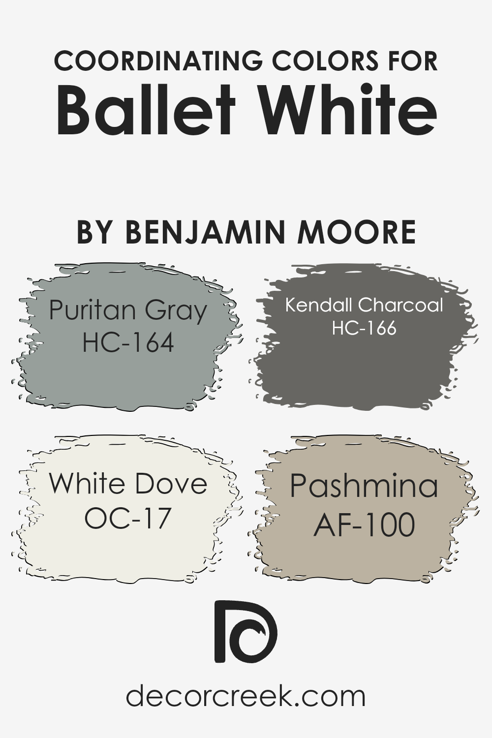
Coordinating Colors of Ballet White OC-9 by Benjamin Moore
Coordinating colors are hues that pair well with a primary color to create visually appealing schemes. These color combinations can enhance the aesthetics of a space, making it more inviting and coherent. When we use Benjamin Moore’s Ballet White as our primary shade, a soft, nuanced off-white that offers a tranquil and gentle backdrop, selecting the right coordinating colors is essential for achieving a harmonious look. The aim is to choose colors that complement rather than compete with Ballet White, ensuring a seamless transition between hues.
Puritan Gray, with its hints of blue and green, adds a soothing and elegant touch that works beautifully with the subdued warmth of Ballet White. It’s perfect for creating a serene and sophisticated space. White Dove stands out as an exceptionally versatile color, offering a slightly warmer tone that promises to lift and lighten any room while maintaining a subtle connection to Ballet White’s softness.
Kendall Charcoal offers a striking contrast with its deep, rich gray tones, bringing a bold yet balanced dynamic to rooms looking for depth and drama without overwhelming. Lastly, Pashmina, with its enveloping warmth, bridges the gap between the tranquil softness of Ballet White and deeper tones, providing a comforting and cohesive look that is both grounding and uplifting. These coordinating colors ensure a well-rounded palette that complements the primary color, creating spaces that are visually interesting and harmonious.
You can see recommended paint colors below:
- HC-164 Puritan Gray (CHECK A SAMPLE)
- OC-17 White Dove (CHECK A SAMPLE)
- HC-166 Kendall Charcoal (CHECK A SAMPLE)
- AF-100 Pashmina (CHECK A SAMPLE)
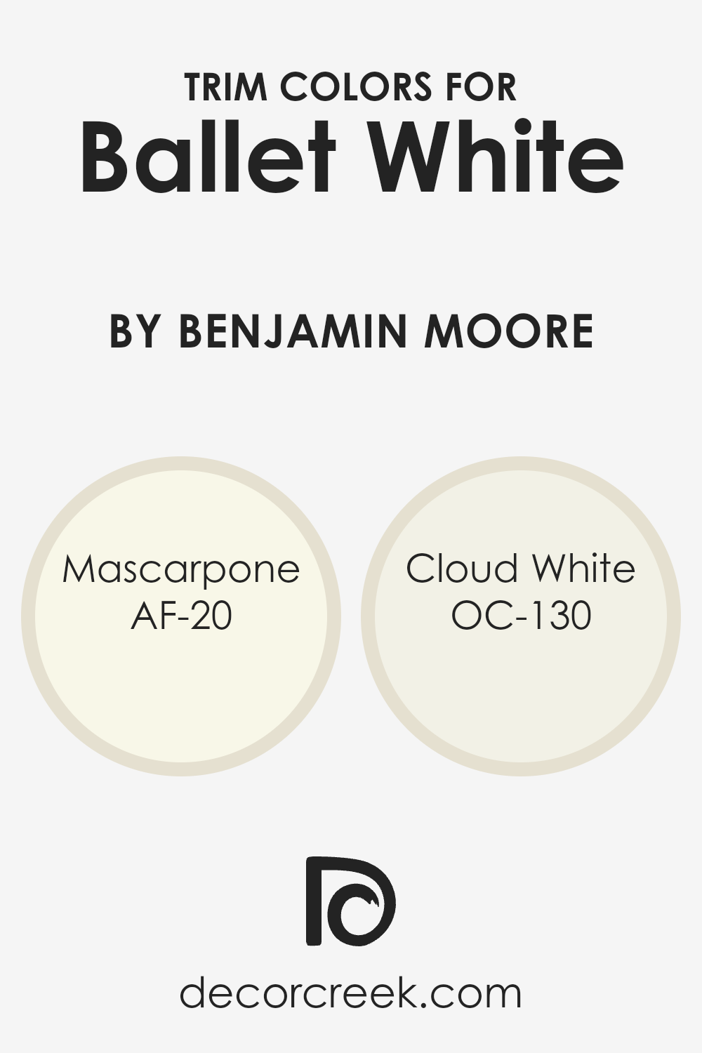
What are the Trim colors of Ballet White OC-9 by Benjamin Moore?
Trim colors are essentially the hues used for the decorative elements that outline or frame the walls, like door frames, window sills, moldings, and skirting boards. These colors play a key role in highlighting the architectural details of a room, creating contrasts that can either subtly complement or boldly stand out against the wall color.
When it comes to using Ballet White OC-9 by Benjamin Moore, selecting the right trim colors is crucial because it helps in defining the space and emphasizing the soft, warm, and welcoming nature of Ballet White. The chosen trim colors can enhance the room’s brightness, making it feel more open and airy, or add a touch of elegance and sophistication, depending on the desired outcome.
AF-20 – Mascarpone and OC-130 – Cloud White are two trim colors that work beautifully with Ballet White. Mascarpone offers a rich, creamy white that brings warmth and depth to the edges and corners of a room. It’s a lush shade that pairs wonderfully with the gentle and serene Ballet White, adding a layer of coziness and comfort to the space. On the other hand, Cloud White has a lighter, airier feel that can make the transition between the wall and the trim almost seamless yet noticeable. Its subtle tone provides a clean and crisp edge, enhancing the softness of Ballet White without creating a stark contrast. Both colors contribute to creating a harmonious and inviting atmosphere, making them excellent choices for trim work.
You can see recommended paint colors below:
- AF-20 Mascarpone (CHECK A SAMPLE)
- OC-130 Cloud White
Colors Similar to Ballet White OC-9 by Benjamin Moore
Similar colors play a significant role in design and decoration because they create a harmonious and soothing ambiance, weaving a subtle continuity into spaces that can enhance the overall aesthetic appeal without overwhelming the senses.
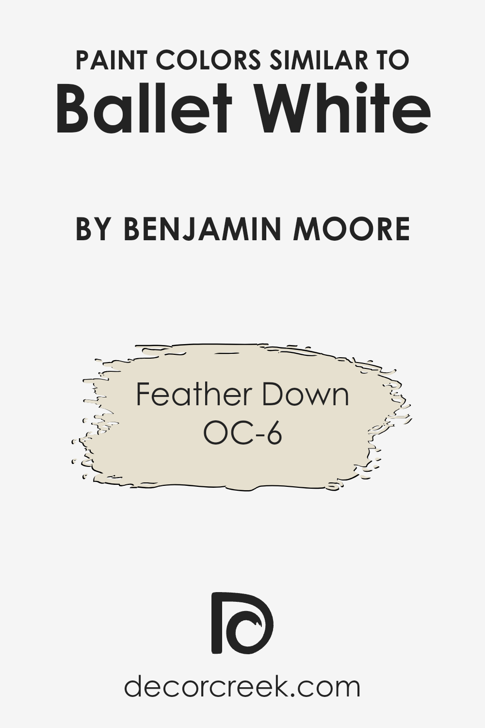
When we consider a color like Ballet White OC-9 by Benjamin Moore, its soft, warm tone acts as a versatile backdrop, enabling a seamless integration of decor elements. The subtlety of Ballet White paves the way for similar colors, like Feather Down OC-6, to amplify the room’s warmth and coziness, ensuring that all elements in the space interact cohesively.
These similar shades are crucial in achieving a nuanced yet unified look, allowing for a gentle variation that adds depth and character to interiors without creating a stark contrast.
Feather Down OC-6, sharing a kinship with Ballet White, is a warm, inviting hue that brings a soft, gentle touch to any space, encapsulating the essence of tranquility and comfort. Its understated elegance makes it a perfect companion to Ballet White, enriching the atmosphere without disturbing the visual flow.
The beauty of utilizing similar colors like these lies in their ability to craft spaces that feel thoughtfully curated and peacefully cohesive, making rooms feel more welcoming and lived-in. Through the subtle use of similar shades, one can achieve a sophisticated balance, effortlessly blending backgrounds with decorative accents for a holistic and inviting environment.
You can see recommended paint color below:
- OC-6 Feather Down
Complimentary Colors for Ballet White OC-9 Paint Color by Benjamin Moore
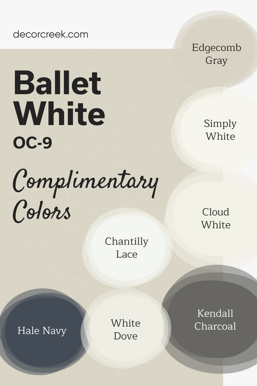
Ballet White by Benjamin Moore is a warm, understated off-white that brings elegance and comfort to any room. Its soft tone makes it an excellent choice for walls in both traditional and modern spaces, offering a welcoming feel without being too bold. Ballet White serves as a versatile backdrop that allows other design elements to shine.
For complementary colors, pair Ballet White with Chantilly Lace or Simply White for a crisp, clean contrast.
Hale Navy adds a striking touch of boldness, while Edgecomb Gray and Revere Pewter bring a more subtle, earthy depth. White Dove and Cloud White are ideal for trim and ceilings, ensuring a cohesive, bright finish throughout the space.
How to Use Ballet White OC-9 by Benjamin Moore In Your Home?
Ballet White OC-9 by Benjamin Moore is a paint color that many people love for its versatility and subtle beauty. This color is a soft, warm white with a hint of beige, making it perfect for creating cozy and welcoming spaces in your home. Unlike stark whites, Ballet White brings a soft warmth to rooms, making them feel more inviting without the stark contrast that pure white sometimes offers.
This color is great for pretty much any room in your home, whether it’s a living room, bedroom, or even a kitchen. It works well as a main wall color, providing a neutral backdrop that allows your furniture and decor to stand out. It’s also excellent for trim, doors, and ceilings, offering a slight contrast to other wall colors without overwhelming the space.
People often use Ballet White in spaces where they want to enhance natural light. It reflects light beautifully, creating a bright and airy feel. For those wanting to update their home’s look without going too bold, Ballet White is a perfect choice. It meshes well with a wide range of color palettes, from earthy and rustic to modern and minimalist.
Ballet White OC-9 by Benjamin Moore vs Feather Down OC-6 by Benjamin Moore
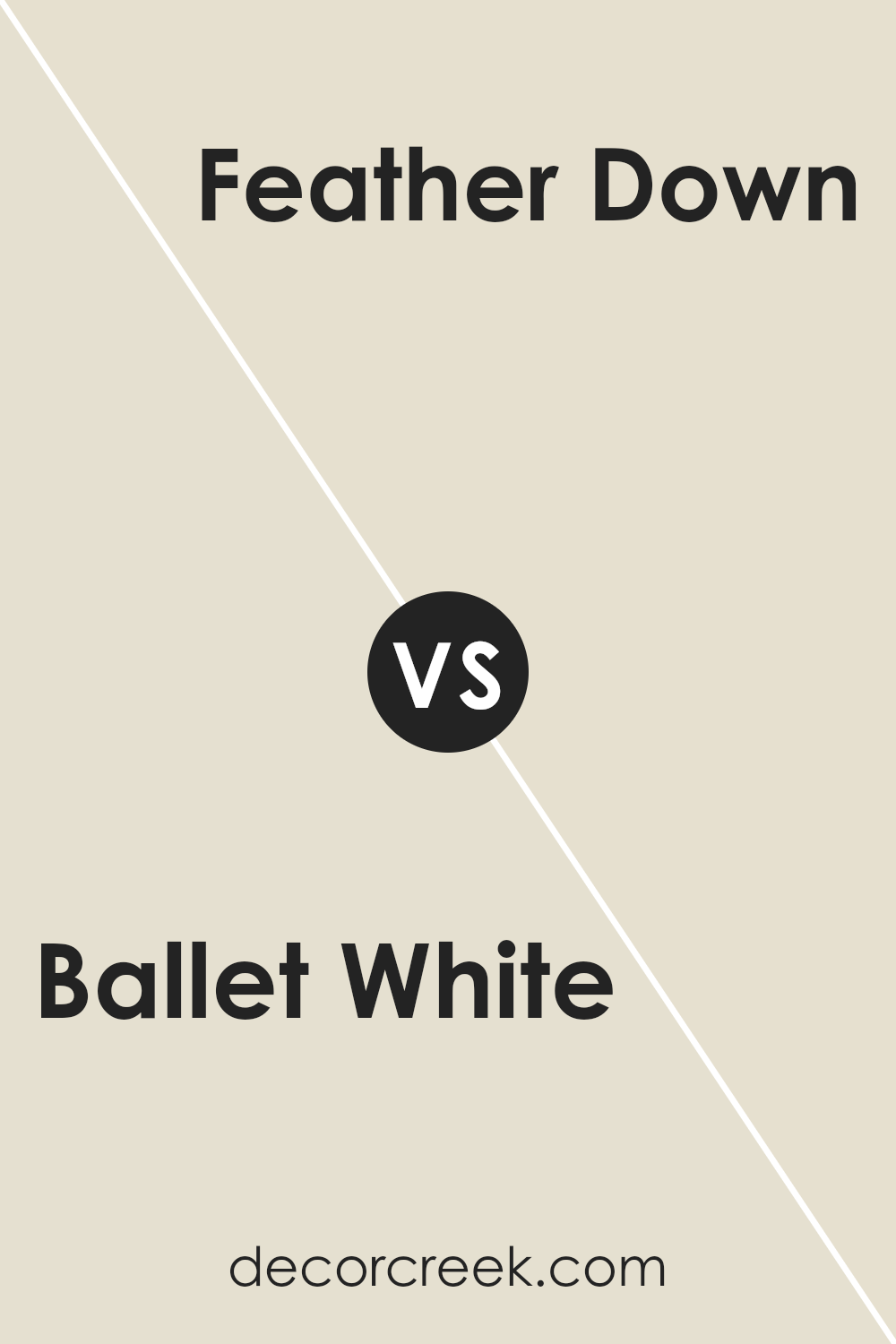
Ballet White and Feather Down, both from Benjamin Moore, share a neutral, soft vibe but have their unique characteristics. Ballet White is like a warm hug from a cozy, well-lit room; it’s inviting and has a creamy touch that makes spaces feel open and airy. It’s not your stark white but has a depth that works wonders in bringing a calming presence to any room.
On the other hand, Feather Down leans more towards a classic, off-white with a hint of soft beige. It adds a subtle warmth to the room, creating a comfortable and cozy atmosphere that’s perfect for creating a relaxed space. It’s like the glow of morning light, gentle and soothing, enhancing the room’s overall feeling without overwhelming it.
When comparing the two, think of Ballet White as the brighter, lighter sister with a bit of a sunny disposition, while Feather Down is the quieter, cozier one, offering a pinch more warmth with its beige undertones. Both colors work beautifully to create serene and welcoming spaces, but your choice would depend on the kind of warmth and lightness you’re aiming to infuse into your space.
You can see recommended paint color below:
- OC-6 Feather Down
Conclusion
In conclusion, Ballet White OC-9 by Benjamin Moore stands out as a versatile and timeless choice for anyone looking to refresh their space with a subtle, warm hue. Its ability to blend well with various decor styles and settings, from modern to traditional, makes it a go-to option for designers and homeowners alike. The color exudes a sense of comfort and elegance, creating a welcoming atmosphere in any room.
Moreover, the adaptability of Ballet White proves its worth across different lighting conditions, showcasing a range of nuances from soft beige to a light, creamy tone. This characteristic ensures that regardless of the room it’s applied in, it maintains its beauty and charm, making it a practical choice for those looking to achieve a serene and sophisticated ambiance in their home.
Ever wished paint sampling was as easy as sticking a sticker? Guess what? Now it is! Discover Samplize's unique Peel & Stick samples.
Get paint samples


How does Ballet White compare to SW Aesthetic White?
Hi there! 😊
Ballet White (BM) and SW Aesthetic White are both soft, warm neutrals, but they have slightly different personalities. Ballet White leans a bit creamier with a subtle beige undertone, making it feel cozy and traditional.
Aesthetic White is a touch lighter and has a bit of gray in it, giving it a more modern, understated vibe.
If you’re torn, think about your lighting—Aesthetic White stays more neutral in bright light, while Ballet White can show off a little more warmth.
Both are gorgeous; it just depends on the mood you want! ✨