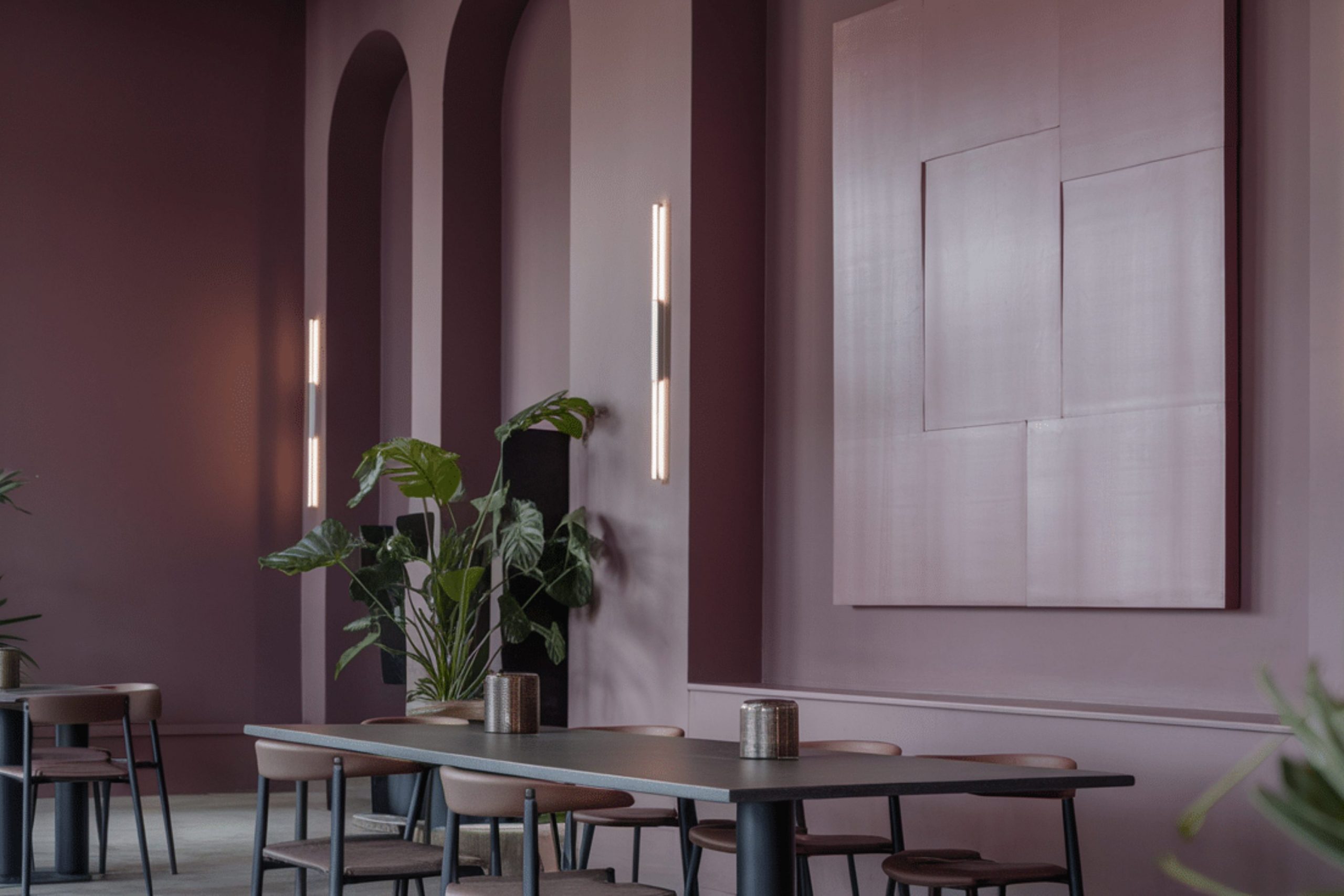
When you think of colors that truly make a statement, Benjamin Moore’s 1265 Deep Mauve should be at the top of your list. Its rich, deep hue carries a sense of refinement and boldness that can improve any room.
Whether you are looking to redo a room in your home or simply add a pop of color, this shade has the flexibility to fit in with various decor styles. It’s a color that reflects confidence and gives any area a luxurious feel without feeling too intense.
If you are considering a paint that embodies both warmth and depth, Deep Mauve provides a perfect balance. It works wonderfully in living areas, bedrooms, or even as an accent wall that draws attention.
I’ve found that it pairs well with soft neutrals and metallic finishes, offering many possibilities for creating a room that feels both cozy and refined.
What Color Is Deep Mauve 1265 by Benjamin Moore?
Deep Mauve by Benjamin Moore is a rich, warm purple with a subtle hint of gray, making it both inviting and flexible. This unique shade balances between bold and understated, allowing for a perfect backdrop in a range of decorating styles. Deep Mauve works exceptionally well in contemporary areas due to its modern feel, yet it also has a classic quality that suits traditional settings.
For interior styles, Deep Mauve shines in minimalist designs where its depth can stand out against simple, clean lines. It also pairs beautifully in bohemian settings, complemented by eclectic accessories. When used in a rustic style, it brings a touch of unexpected color that still feels earthy and grounded.
When considering materials, Deep Mauve pairs well with natural wood tones from light oak to rich walnut, improving the warmth of the wood. It also looks stunning when matched with metallic accents like brass or copper, adding a touch of luxury.
Textures such as velvet or silk in home furnishings improve the cozy feel of the color, while rougher textures like burlap or linen provide a lovely contrast that highlights its plush depth. In terms of textiles, a chunky knit throw or wool rugs can add comfort and style, making Deep Mauve a standout choice for both style and comfort.
Is Deep Mauve 1265 by Benjamin Moore Warm or Cool color?
Deep Mauve 1265 by Benjamin Moore is a rich, warm purple shade that brings a cozy and inviting atmosphere to any room. This color works well in homes because it’s deep enough to add character, yet subtle enough not to overpower the room.
It pairs nicely with neutral tones like whites, creams, and grays, which help balance its intensity. Because Deep Mauve has a comforting feel, it’s excellent for living areas or bedrooms where you want to create a relaxing vibe. It also reflects light differently depending on the time of day, adding a dynamic element to the room.
This flexibility makes it a practical choice for anyone looking to add a touch of warmth to their home without committing to a loud or bold color. Deep Mauve can also make small areas appear richer and more welcoming, making it a great option for adding depth and interest in various home settings.
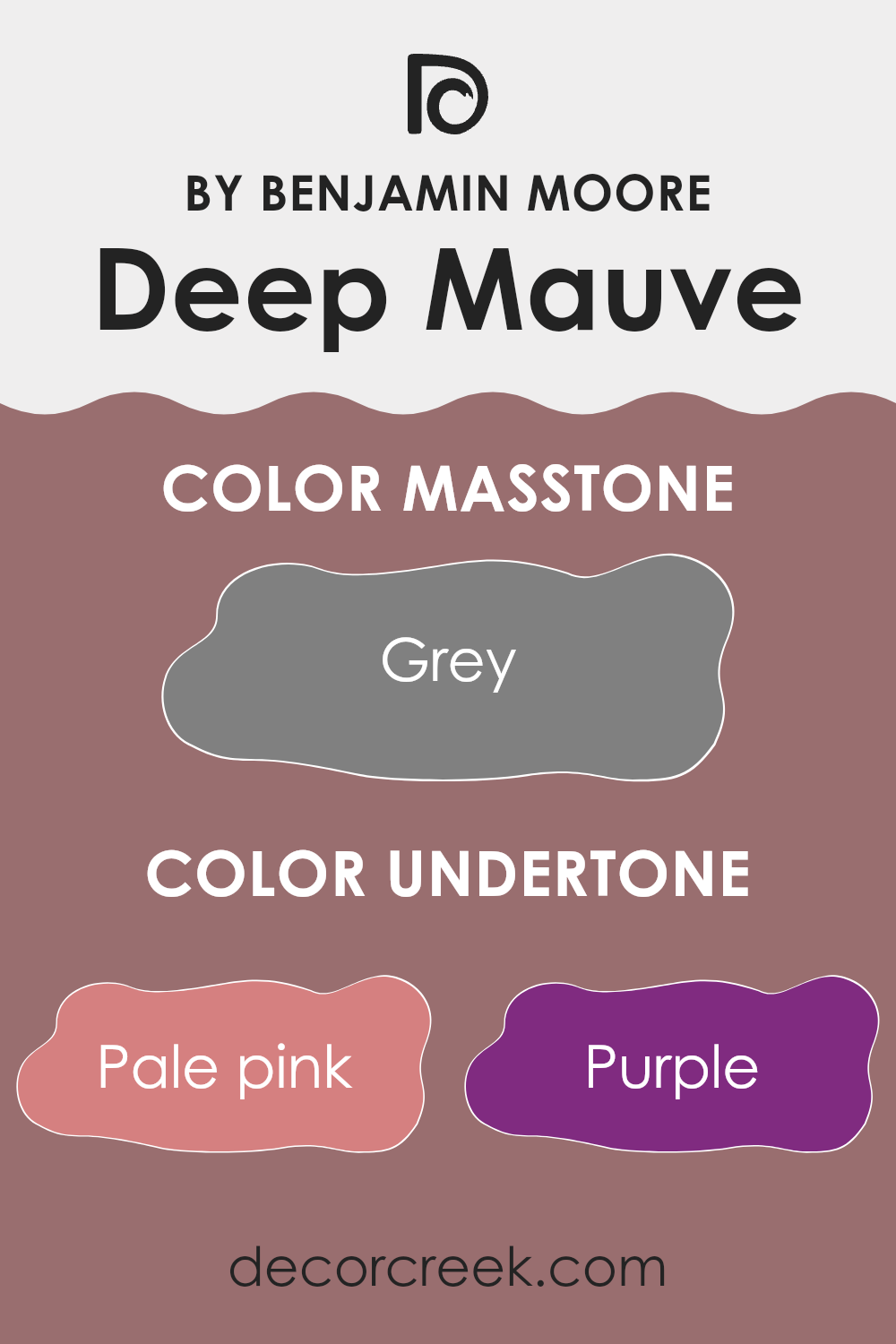
Undertones of Deep Mauve 1265 by Benjamin Moore
Deep Mauve by Benjamin Moore is a complex and flexible paint color. Its variety of undertones allows it to adapt to different lighting conditions and color schemes, making it a popular choice for interior walls. Undertones are subtle colors that influence the main hue. For Deep Mauve, these undertones include shades like pale pink, purple, olive, and many others. Each undertone can bring out different aspects of Deep Mauve, affecting how the color looks in various environments.
When you paint a wall with Deep Mauve, the lighting and surrounding colors can highlight these undertones. In a room with natural light, you might notice the lighter undertones, such as pale pink or light purple, giving the room a softer feel. In artificial light, darker undertones like dark green or navy might become more prominent, adding a certain richness to the room.
The presence of multiple undertones makes Deep Mauve a flexible choice, allowing it to fit in with many decor styles and preferences. It can look refined and reserved or vibrant and lively, depending on what it is paired with and where it is used. The flexibility of Deep Mauve is part of what makes it a useful color for interior design, as it can smoothly connect various elements in a room. If you’re considering using Deep Mauve for your walls, it is helpful to consider both your lighting and decor to fully use the potential of its undertones.
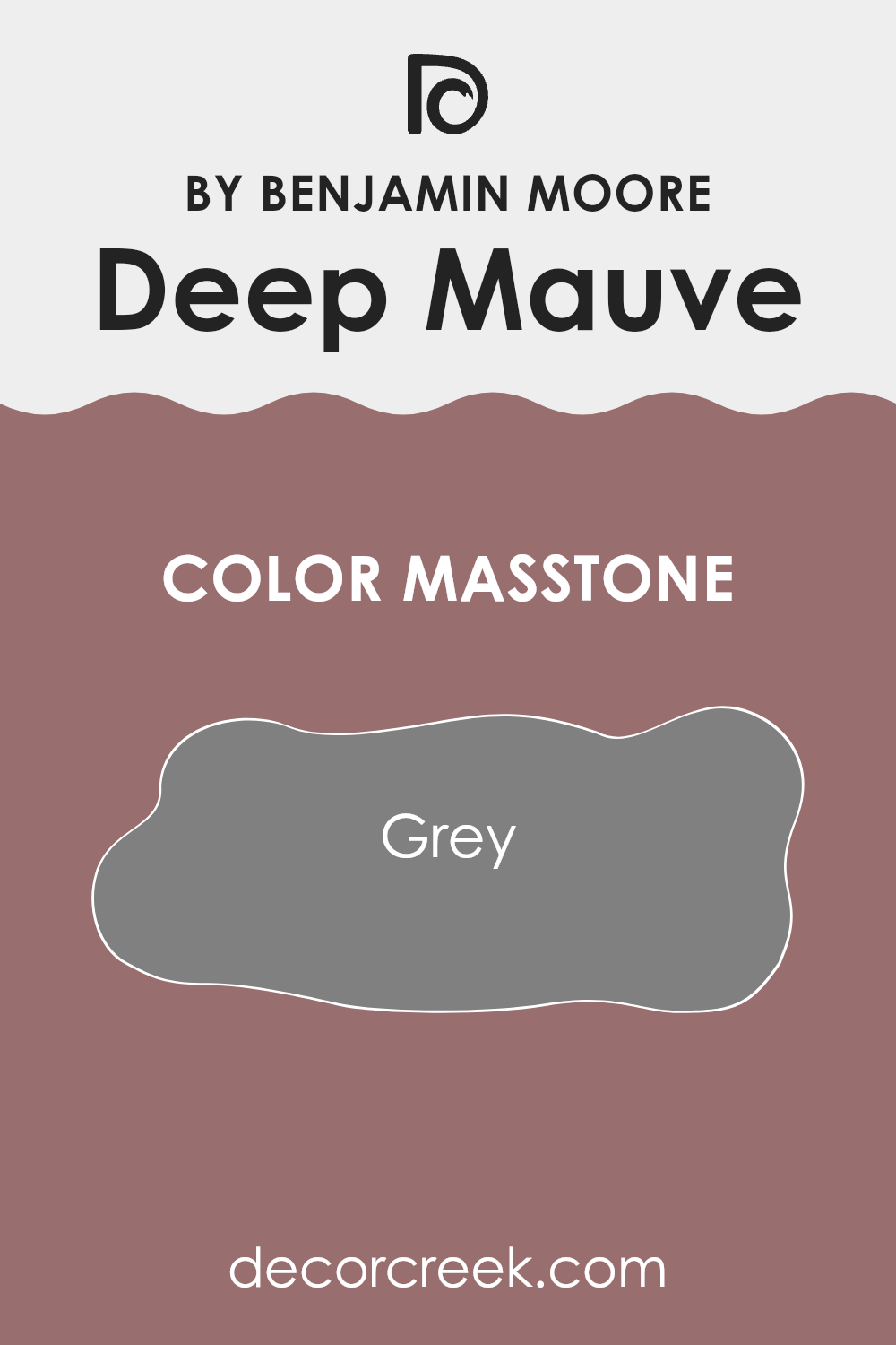
What is the Masstone of the Deep Mauve 1265 by Benjamin Moore?
Deep Mauve (1265) by Benjamin Moore, when seen in its masstone, displays a solid gray color, similar to the gray (#808080) found in standard palettes. This neutral gray tone makes it a flexible choice for home interiors.
Because of its neutral base, it blends easily with various decor styles and color schemes without overpowering the room. This characteristic allows homeowners to use it in numerous parts of their home, such as living rooms, bedrooms, and even kitchens, with ease.
Gray has a calming effect, and when used on walls, it provides a subtle backdrop that can make furniture and art pieces stand out. Moreover, this color is practical because it can easily hide minor marks or dirt, reducing the appearance of wear and making it ideal for high-traffic areas. Its adaptability and practicality make it a reliable choice for a wide range of decorating needs.
How Does Lighting Affect Deep Mauve 1265 by Benjamin Moore?
Lighting plays a crucial role in how colors appear in a room, impacting both their intensity and tone. When considering a specific paint color like Deep Mauve by Benjamin Moore, it’s essential to think about how different lighting conditions will affect its appearance.
In artificial light, the effect on Deep Mauve can vary depending on the type of bulbs used. Incandescent bulbs tend to warm up colors, making Deep Mauve appear richer and more intense. Meanwhile, fluorescent lighting could bring out cooler tones in the color, possibly highlighting more of its underlying blue tones.
Natural light brings out the truest color, but the direction of the light and time of day can change how Deep Mauve looks. In north-facing rooms, which receive less direct sunlight, Deep Mauve might look more muted and shadowed, giving it a somewhat subdued appearance. The limited light can cool down the color, so it might seem slightly bluer or more reserved.
South-facing rooms, filled with abundant sunlight for most of the day, will show Deep Mauve in its full effect. The ample natural light tends to improve the color’s warmth, making it vibrant and lively, which is perfect for creating a welcoming atmosphere.
In east-facing rooms, morning light will make Deep Mauve look soft and warm, ideal for bedrooms or breakfast nooks where a calm, gentle environment is desired. As the day progresses and the direct sunlight moves away, the color may lose some of its vitality and appear more muted.
Conversely, in west-facing rooms, the color will have a more neutral appearance during the morning and become increasingly vibrant towards the evening as it catches the warm afternoon and setting sun. This can add a dynamic quality to the room, with the color changing mood as the day progresses.
Overall, Deep Mauve’s perception in a room can significantly differ based on the lighting, impacting the mood and feel of the room.
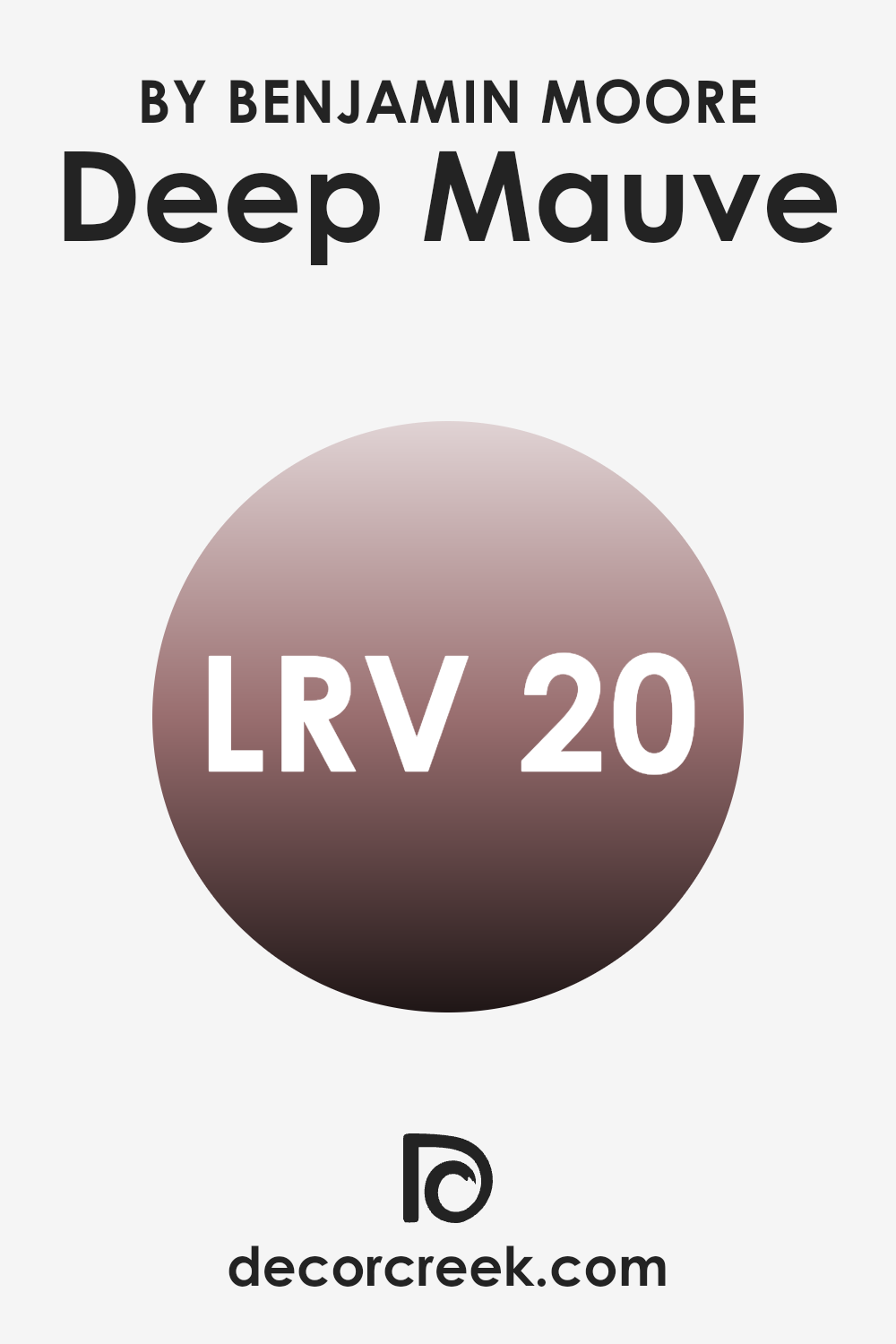
What is the LRV of Deep Mauve 1265 by Benjamin Moore?
LRV stands for Light Reflectance Value, which essentially measures the percentage of light a paint color reflects from or absorbs into a surface when lit. The scale ranges from 0, indicating a color that absorbs most light and appears very dark, to 100, which is the brightest and reflects most of the light back.
This measurement helps in knowing how light or dark a color will look on your walls. Choosing the right LRV can make a room feel more spacious and well-lit or cozy and intimate, depending on the effect you want.
Deep Mauve by Benjamin Moore has an LRV of 19.88, which means it is on the darker side, absorbing more light than it reflects. This color will create a more contained and cozy feeling in a room, perfect for creating a warm, inviting atmosphere. However, if used in a room with limited natural light, it may make the room appear smaller or dim. To balance that, effective lighting and lighter accents or furniture can be used to improve the room’s overall brightness and prevent it from feeling too confined.
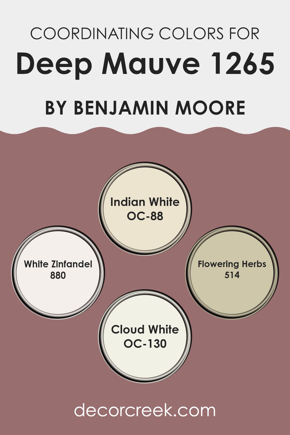
Coordinating Colors of Deep Mauve 1265 by Benjamin Moore
Coordinating colors are selected shades that harmonize and complement the main color used in a room, like Deep Mauve. By choosing the right coordinating colors, one can create a cohesive interior design that improves the aesthetic and emotional feel of a room. These colors can include variations on the primary color or completely different hues that share a compatible undertone, ensuring that all elements of the decor blend smoothly.
Indian White, OC-88, is a subtle and warm neutral with a hint of yellow, making it an excellent background color that doesn’t clash with stronger hues like Deep Mauve. It provides a soft contrast and helps to make the primary color stand out. White Zinfandel, 880, has a soft, muted pink tone, offering a gentle accent that pairs wonderfully with the intensity of Deep Mauve, lending a light, refreshing touch to the color scheme.
Flowering Herbs, 514, is a fresh green color that brings a sense of nature and freshness to a room, effectively balancing the richness of Deep Mauve with its earthy feel. Lastly, Cloud White, OC-130, is a clean and crisp white that acts as a perfect counterbalance, brightening areas dominated by darker or richer colors, and improving the overall lightness of the environment. Together, these coordinating colors work smoothly to support and improve the primary color choice in a harmonious and visually appealing way.
You can see recommended paint colors below:
- OC-88 Indian White
- 880 White Zinfandel
- 514 Flowering Herbs
- OC-130 Cloud White
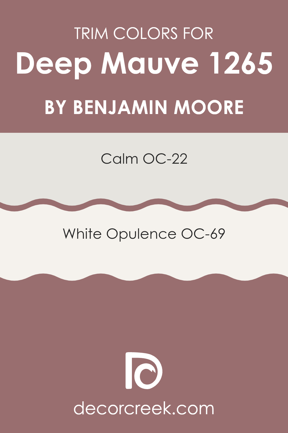
What are the Trim colors of Deep Mauve 1265 by Benjamin Moore?
Trim colors play a key role in improving the overall appearance of a room by defining its architectural details and framing the walls. Choosing the right trim color can help highlight the unique shade of the main wall color, in this case, Deep Mauve by Benjamin Moore.
OC-22 Calm and OC-69 White Opulence are excellent options for trim colors with this vibrant wall color, as they both offer a subtle contrast while maintaining a harmonious look throughout the room. Using these lighter shades on trims can effectively outline doors, windows, and other elements, bringing a fresh and polished look to the interior.
OC-22 Calm by Benjamin Moore is a muted, soft gray that has an understated grace, making it an excellent choice for a trim that complements a range of colors without drawing attention away. It acts almost like a soft shadow, refining the edges where it is applied without creating a harsh contrast. On the other hand, OC-69 White Opulence is a crisp, bright white that provides a clean, clear outline against richer, deeper hues. This shade adds a burst of brightness around edges, giving them a neat appearance that improves the structure and dimensions of the room.
You can see recommended paint colors below:
- OC-22 Calm
- OC-69 White Opulence
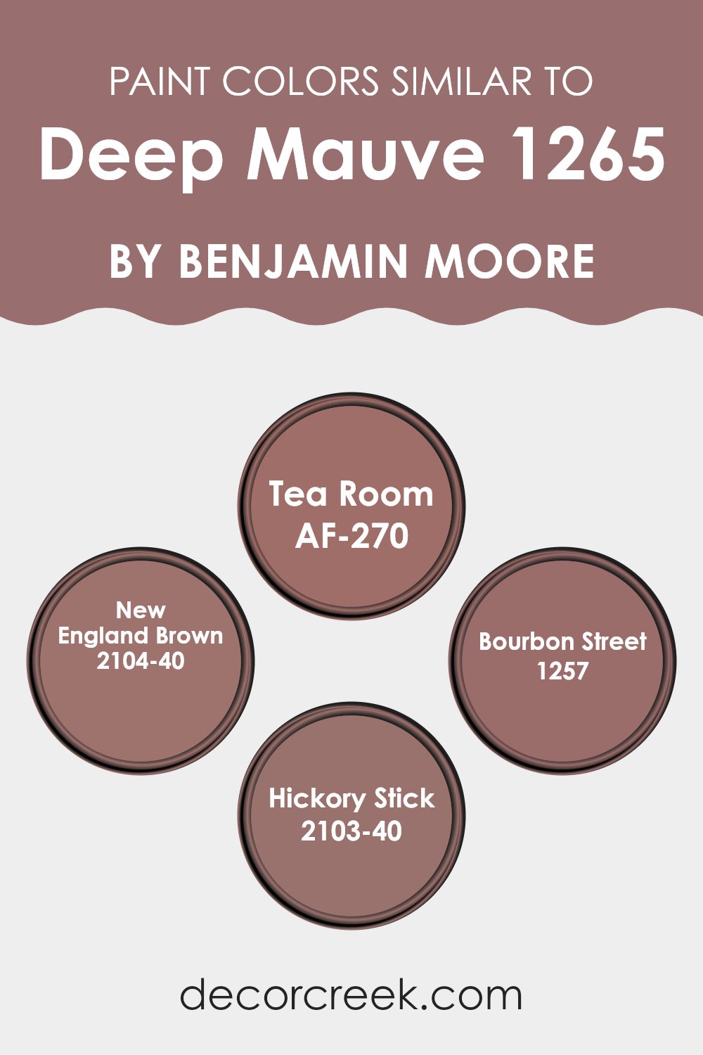
Colors Similar to Deep Mauve 1265 by Benjamin Moore
Choosing similar colors in design provides a harmonious and cohesive look to a room. Utilizing shades that possess shared undertones or sit adjacent to each other on the color spectrum aids in creating a smooth transition from one area to another.
For example, AF-270 Tea Room and 2104-40 New England Brown are both warm, earthy hues that impart a welcoming and comforting vibe, setting a tone of subtle refinement without feeling too intense. When colors like these are used together, they help in crafting an environment that feels both connected and balanced.
Another good pairing with hues like Deep Mauve includes 1257 Bourbon Street and 2103-40 Hickory Stick. Bourbon Street offers a richer, more intense feel whereas Hickory Stick leans towards a deep, robust tone, grounding the lighter shades in the palette.
When used in a room, these colors can add depth and interest, making each room tell a story through its hues. Implementing hues that complement each other well ensures that the surroundings are pleasing to the eye, making the area look well-thought-out and neatly designed. By choosing such coordinated colors, one can easily achieve a cohesive atmosphere throughout their home or any interior.
You can see recommended paint colors below:
- AF-270 Tea Room
- 2104-40 New England Brown
- 1257 Bourbon Street
- 2103-40 Hickory Stick
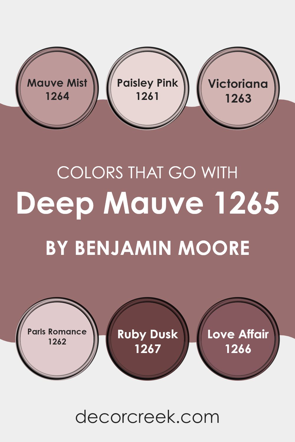
Colors that Go With Deep Mauve 1265 by Benjamin Moore
Choosing complementary colors to go with Deep Mauve 1265 by Benjamin Moore is crucial as they help in achieving a harmonious and visually appealing room. The colors paired with Deep Mauve, like Mauve Mist, Paisley Pink, Victoriana, Paris Romance, Ruby Dusk, and Love Affair, each contribute their unique vibes and work together to create a cohesive look. These colors create a balanced environment that improves the aesthetics of any room, making it feel welcoming and lively.
Mauve Mist is a lighter, softer shade of mauve that adds a gentle contrast to the deeper tones of Deep Mauve, providing a calming feel to any room. Paisley Pink introduces a delicate touch of pink, offering a fresh and youthful appeal that lightens the overall mood.
Victoriana, on the other hand, is a dusty rose color that blends beautifully with Deep Mauve, adding a hint of vintage charm to the palette.
Paris Romance is a subtle pink that brings a romantic ambiance, perfect for creating a cozy and inviting room.
Ruby Dusk is a deeper, rich red that combines well with Deep Mauve for a bold and dramatic effect, suitable for accent features. Lastly, Love Affair is a vibrant pink that adds energy and passion, making it ideal for focal points or decorative accents. Together, these colors work smoothly with Deep Mauve to craft rooms that are both appealing and full of life.
You can see recommended paint colors below:
- 1264 Mauve Mist
- 1261 Paisley Pink
- 1263 Victoriana
- 1262 Paris Romance
- 1267 Ruby Dusk
- 1266 Love Affair
How to Use Deep Mauve 1265 by Benjamin Moore In Your Home?
Deep Mauve 1265 by Benjamin Moore is a rich, deep purple color that can add a warm and cozy feel to any room in your home. It’s perfect for creating a striking accent wall in your living room or bedroom. This bold hue pairs well with light neutrals, like creams and soft grays, which can help balance out its intensity.
If you’re not ready to commit to painting a whole room, consider using Deep Mauve for smaller projects, like a piece of furniture or interior doors, for a pop of color. It also works beautifully in a bathroom, providing a luxurious touch when combined with white tiles or fixtures.
For those who enjoy a bit of creativity, you can use this color in your decorative accents, such as throw pillows, curtains, or an area rug, to bring warmth and depth to your living areas without feeling too intense. Deep Mauve 1265 offers a unique option for those looking to add a personal touch to their home décor.
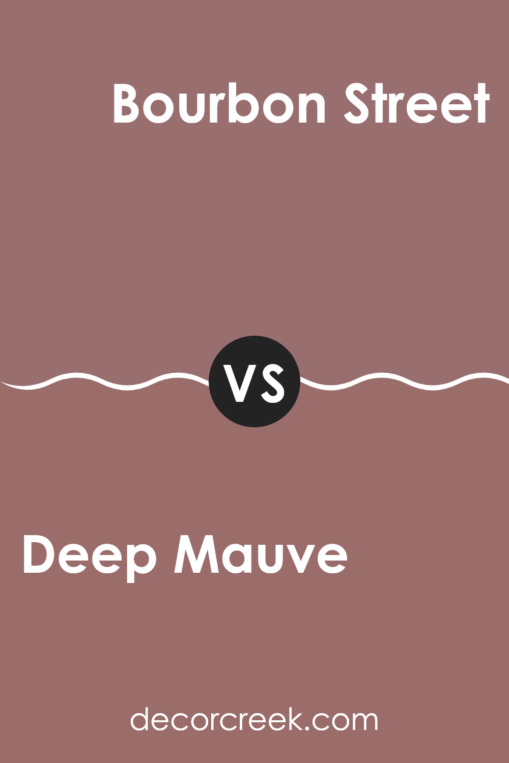
Deep Mauve 1265 by Benjamin Moore vs Bourbon Street 1257 by Benjamin Moore
Deep Mauve is a rich, muted pink shade with a touch of gray. It’s a calm, understated color that works well in areas meant for relaxation like living rooms or bedrooms. On the other hand, Bourbon Street is darker and closer to a warm brown with a subtle red undertone.
This color provides a cozy and inviting feel, making it excellent for areas where you entertain guests or unwind. While Deep Mauve has a cooler, more neutral appearance, Bourbon Street offers warmth, making it more vibrant.
Although both colors bring a softer, gentler feel to a room, their distinct tones affect the mood differently, with Deep Mauve leaning towards a gentle calmness and Bourbon Street towards a warm welcome.
You can see recommended paint color below:
- 1257 Bourbon Street
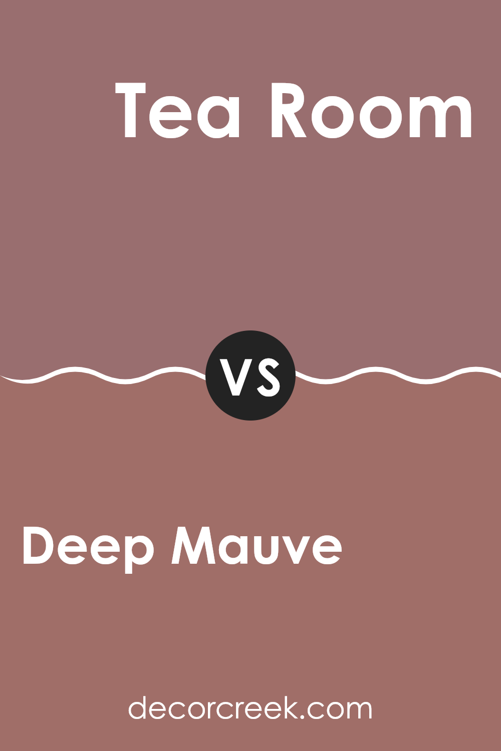
Deep Mauve 1265 by Benjamin Moore vs Tea Room AF-270 by Benjamin Moore
Deep Mauve by Benjamin Moore is a rich, vibrant color that leans more towards a purple-pink shade. It’s quite striking and adds a bold, lively feel to any room. On the other hand, Tea Room by Benjamin Moore takes a softer approach with its muted beige tone, which gives a room a quiet and cozy atmosphere.
While Deep Mauve stands out and can make a statement in a room, Tea Room is more understated, providing a subtle background that mixes well with many styles and colors. If you’re looking for something that pops and feels a bit modern, go with Deep Mauve.
If you prefer a gentle, warm background that is easy to match, Tea Room is a great choice. Both colors offer distinct moods and can significantly influence the look and feel of a room based on what you’re aiming for.
You can see recommended paint color below:
- AF-270 Tea Room
Deep Mauve 1265 by Benjamin Moore vs New England Brown 2104-40 by Benjamin Moore
Deep Mauve and New England Brown by Benjamin Moore are distinct in their vibes and color shades. Deep Mauve has a rich, muted tone of purple with a hint of gray, giving it a more subdued feel. It’s a color that adds depth to areas without being overly bold, making it a great choice for a cozy, calming room.
On the other hand, New England Brown is a warm, medium-dark brown that brings a rustic, earthy quality to any room. This color is flexible, fitting well with a range of décor styles from traditional to more modern aesthetics.
It can make a room feel grounded and welcoming. While Deep Mauve leans towards a cooler, softer appearance, New England Brown offers a heartier, warmer ambiance. Both colors work well for creating inviting interiors, yet they serve different moods and themes within a home.
You can see recommended paint color below:
- 2104-40 New England Brown
Deep Mauve 1265 by Benjamin Moore vs Hickory Stick 2103-40 by Benjamin Moore
Deep Mauve by Benjamin Moore is a soft, subtle shade that tends to give off a gentle, calming effect. This color is lighter and has a bluish-pink tinge, making it great for creating a peaceful and cozy atmosphere in rooms like bedrooms or living areas.
In contrast, Hickory Stick by Benjamin Moore is notably darker and richer. This color has a strong brown base with gray undertones, providing a more robust and grounded feeling. It’s well suited for areas that aim for a more grounded or dramatic look, such as studies or dining rooms.
Both colors offer unique vibes and can be used effectively depending on the mood you’re aiming to set in your room. Deep Mauve works well when you want a lighter, more airy feel, while Hickory Stick is ideal for a more substantial, rooted aesthetic. Each brings its own unique character to the table, making them flexible choices for home decor.
You can see recommended paint color below:
- 2103-40 Hickory Stick
After reading about 1265 Deep Mauve by Benjamin Moore, I’m really impressed with this color. It’s not just a regular pink or purple. It’s a special mixture that makes rooms feel warm and welcoming. If somebody wants to make their bedroom or living room look different and more inviting, this color could be a great choice.
I learned that 1265 Deep Mauve works well with many other colors. That means you don’t have to worry about it clashing with your furniture or decorations, which is pretty handy! Whether you have a lot of light in your room or just a little, this color adjusts nicely, keeping the room looking great all the time.
Lastly, painting with 1265 Deep Mauve is simple and fun. You can easily do it yourself or with a little help. It won’t just change the color of the walls; it kind of changes the whole feeling of the room. So whether you’re a kid like me or a grown-up, this color makes a room feel cozy and cheerful.
I’m thinking it might be a nice color for my room too, to give it a fresh and lively vibe.
Ever wished paint sampling was as easy as sticking a sticker? Guess what? Now it is! Discover Samplize's unique Peel & Stick samples.
Get paint samples

