When it comes to refreshing your home with a touch of simplicity and elegance, choosing the right paint color becomes pivotal. One top choice for many homeowners and decorators is OC-88 Indian White from Benjamin Moore.
This particular shade is a testament to how neutral colors can bring a serene and welcoming vibe to any space. Indian White stands out for its subtle warmth, making it a versatile option that pairs beautifully with a wide range of decor styles—from traditional to contemporary.
It’s a color that reflects the brand’s commitment to providing high-quality paints that cater to different tastes and design needs.
Whether you’re planning to revamp your living area, bedroom, or kitchen, OC-88 Indian White offers a clean and refined backdrop that enhances other design elements in your room.
In this exploration of OC-88 Indian White, we’ll uncover the charm and potential it holds for transforming spaces with its understated beauty.

What Color Is Indian White OC-88 by Benjamin Moore?
Indian White OC-88 by Benjamin Moore is a subtle and versatile color that adds a touch of warmth to any space.
This shade belongs to the off-white spectrum, making it an excellent choice for those looking for a color that is not stark white but still maintains a clean and airy feel.
It has a soft, creamy undertone that brings a cozy atmosphere to the room, making it perfect for creating a welcoming environment.
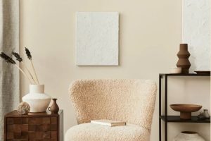
When it comes to interior styles, Indian White OC-88 shines in a variety of settings. It is particularly well-suited for modern and minimalist designs, where its simplicity can be a backdrop that allows furniture and art to stand out.
Additionally, it works incredibly well in rustic, farmhouse, and shabby chic decors, where its warmth complements natural wood finishes, vintage pieces, and textured fabrics.
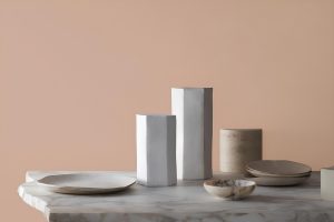
Pairing it with materials and textures, Indian White OC-88 goes hand in hand with natural wood, whether it’s sleek and polished or rugged and distressed.
Metals like brushed nickel and brass offer a lovely contrast, adding a touch of sophistication. For textiles, consider soft cotton, linen, or even rich velvet to enhance the comforting vibe of this color.
It plays well with other neutrals for a subtle palette or can serve as a calm backdrop for pops of bolder colors in accessories and artwork.
Ever wished paint sampling was as easy as sticking a sticker? Guess what? Now it is! Discover Samplize's unique Peel & Stick samples.
Get paint samples

Is Indian White OC-88 by Benjamin Moore Warm or Cool color?
Indian White OC-88 by Benjamin Moore is a unique paint color that has the power to transform any space into a serene and inviting area. Its subtle warmth makes it versatile, perfectly fitting into various interior designs, from modern to traditional.
This color has a soft, creamy hue that reflects light beautifully, making rooms appear brighter and more spacious. It’s an excellent choice for walls in living areas, bedrooms, and even kitchens, where its comforting presence can create a cozy atmosphere.
The beauty of Indian White OC-88 lies in its ability to complement different textures and materials.
Whether you have wooden furniture, metallic accents, or colorful fabrics, this shade acts as a harmonious backdrop, enhancing the overall aesthetic without overwhelming the senses.
It offers a calm and peaceful vibe, which is crucial for homes where relaxation and tranquility are priorities. By choosing Indian White OC-88, homeowners can achieve a balanced and elegant look that feels both sophisticated and welcoming.
Undertones of Indian White OC-88 by Benjamin Moore
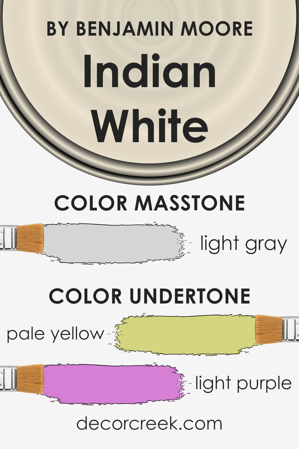
The color Indian White OC-88 by Benjamin Moore is not just a simple paint color; it comes alive with its subtle undertones of pale yellow and light purple.
These undertones play a crucial role in how we perceive the color and can significantly influence the atmosphere of a room. Generally, undertones can make a color appear cooler or warmer, impacting the mood and feeling of a space.
For Indian White OC-88, the pale yellow undertone adds a hint of warmth and brightness, giving rooms a sunny and uplifting vibe.
On the other hand, the light purple undertone introduces a touch of elegance and tranquility, balancing out the warmth with a cool, serene feeling.
When applied to interior walls, these undertones work together to create a dynamic and inviting space. In sunlight, the pale yellow undertone can become more pronounced, making the room feel cozy and cheerful.
In artificial light, the light purple might become more noticeable, lending a sophisticated and calm feel to the environment. This versatility makes it an excellent choice for various rooms, from living spaces to bedrooms, as it adapts to different lighting conditions and decorating styles.
Understanding these undertones can help you appreciate the complexity and beauty of Indian White OC-88 and how it can enhance your home.
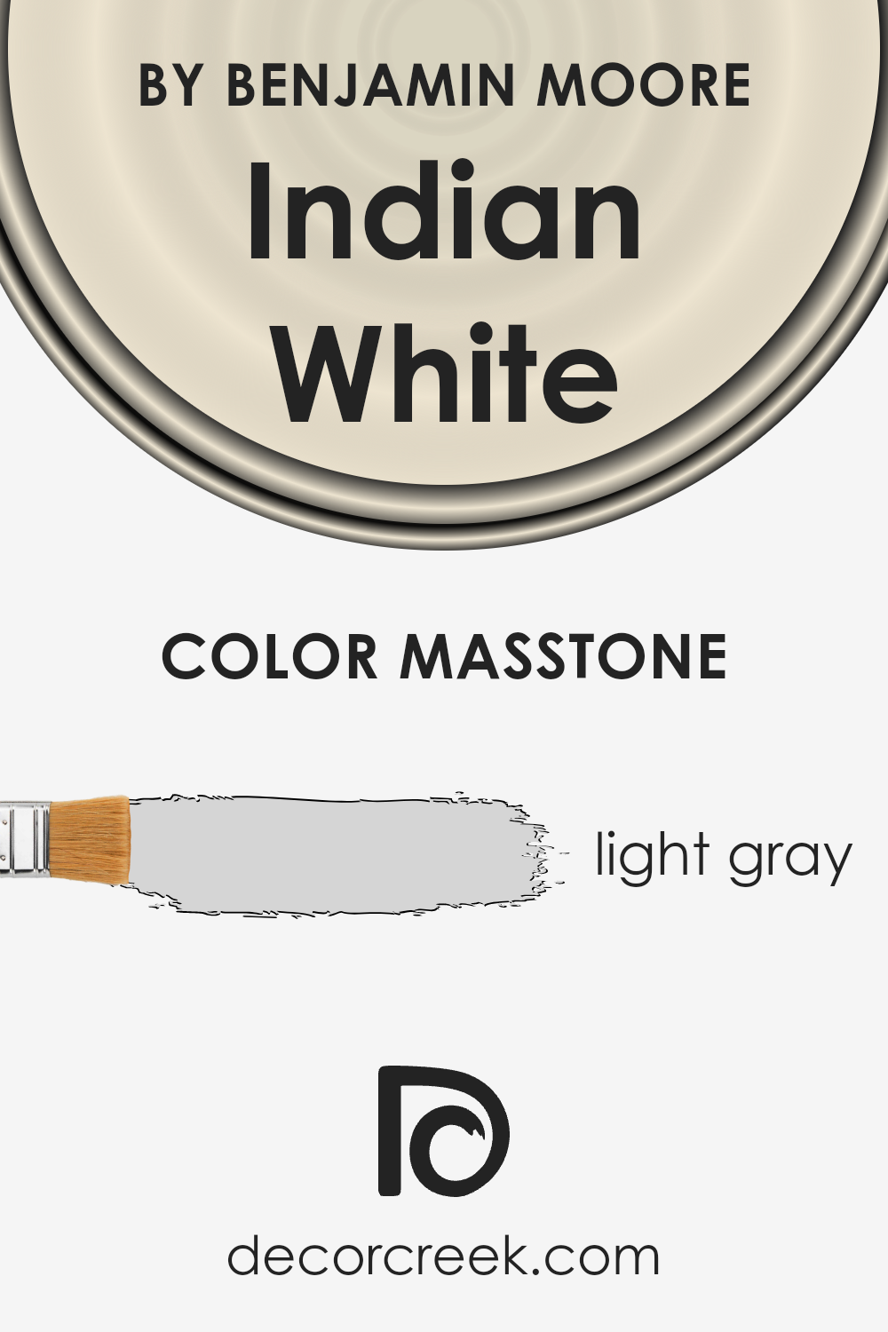
What is the Masstone of the Indian White OC-88 by Benjamin Moore?
Indian White OC-88 by Benjamin Moore has a masstone that appears as a light gray, closely matching the color code #D5D5D5. This subtle hue has a unique quality of blending seamlessly into various home environments.
Its light gray tone makes it incredibly versatile, allowing it to work well in spaces seeking a soft, neutral background. Such a color doesn’t overpower a room but instead adds a layer of quiet sophistication.
Whether in a living room, bedroom, or kitchen, this shade can enhance the sense of space, reflecting light gently and making rooms appear brighter and more open.
The light gray nature of Indian White OC-88 means it pairs beautifully with a wide range of colors, from bold and vibrant hues to more subdued tones.
It’s especially effective in creating a serene and calming atmosphere, suitable for areas in the home where relaxation is key.
For homeowners looking to add a modern touch without the starkness that comes with pure white, this color offers a soft alternative, providing warmth and a cozy feel to living spaces.
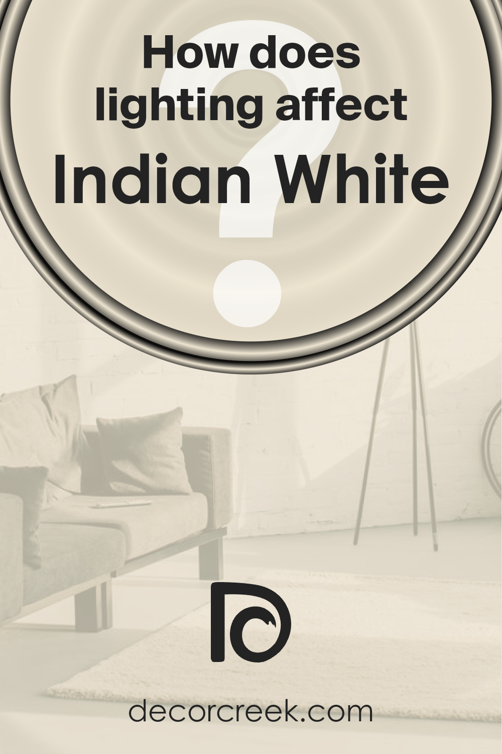
How Does Lighting Affect Indian White OC-88 by Benjamin Moore?
Lighting has a significant impact on the perception of colors. Essentially, the type of light and its direction can alter how we see color in our homes.
When we look at a specific color, like the serene shade often referred to as Indian White (OC-88) from Benjamin Moore, its appearance can change dramatically under different lighting conditions, whether it’s bathed in natural or artificial light.
Under artificial light, colors can either warm up or cool down depending on the bulbs’ temperature. Artificial lights, such as LED or fluorescent bulbs, tend to either cast a cool glow or a warm one, affecting how colors like this subtle shade appear.
For this light and warm tone, artificial lighting can enhance its cozy warmth, making it more inviting in the evening or in rooms with limited natural light.
In natural light, however, the color’s true beauty shines distinctly. As the day progresses, natural light changes color, influencing how Indian White looks on your walls.
Morning light in an east-facing room is cooler, so this particular color may appear slightly more muted or cooler early in the day. In contrast, evening light brings out the warmth in the color, especially in west-facing rooms, adding a soft glow as the sun sets.
North-facing rooms receive less direct sunlight, so they tend to have cooler, more consistent light throughout the day. Here, Indian White might seem a bit more reserved, maintaining a more consistent appearance but with a slightly cool undertone.
On the other hand, south-facing rooms are drenched in warm sunlight for most of the day, which will accentuate the warmth and richness of the color, making it feel brighter and more vibrant.
Each direction the room faces brings out a unique aspect of this color, impacting the atmosphere and mood of the space.
By understanding how light interacts with colors like Indian White, you can make informed choices on where to use them in your home to achieve the desired effect.
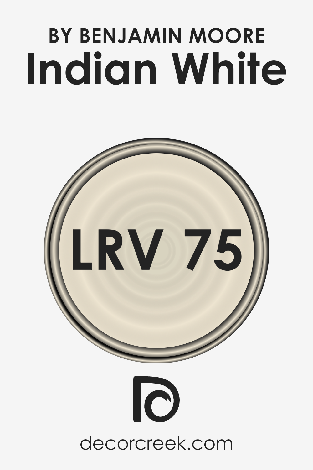
What is the LRV of Indian White OC-88 by Benjamin Moore?
LRV stands for Light Reflectance Value, which is a number ranging from 0 to 100, indicating how much light a color reflects or absorbs. Colors with a higher LRV, closer to 100, reflect more light, making them appear brighter and more open.
These are often used in smaller or darker rooms to make the space feel larger and more inviting. On the other hand, colors with a lower LRV, closer to 0, absorb more light, creating a cozier and more intimate atmosphere.
This value helps in deciding which color to choose based on how bright or subdued you want your room to look.
The LRV of 75.44 for Indian White means it is on the brighter side, reflecting a good amount of light. This quality makes it an excellent choice for making a room feel airy and spacious.
Since it reflects much of the light that hits it, Indian White can help in enhancing the natural light in a room, making the space look more lively during the day.
In smaller or poorly lit rooms, using a color with a high LRV like this can really help in making the room appear larger and more welcoming without overwhelming the space with too much brightness.
LRV – what does it mean? Read This Before Finding Your Perfect Paint Color
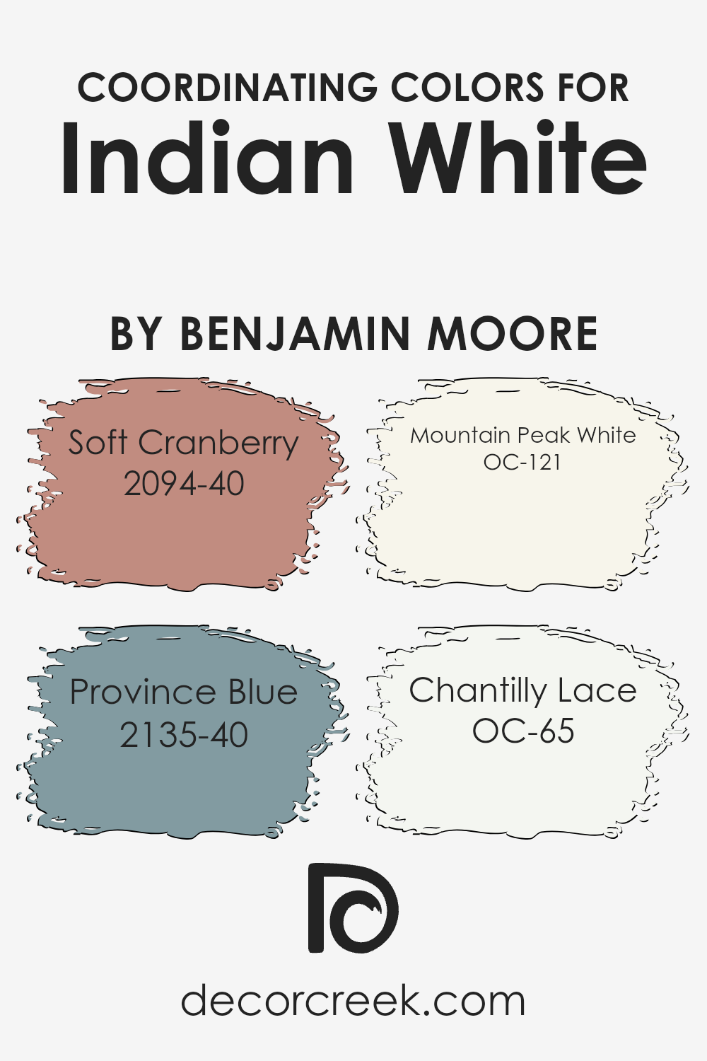
Coordinating Colors of Indian White OC-88 by Benjamin Moore
Coordinating colors are those that complement each other well when used together in a space. The idea behind them is to create a visually appealing and balanced look.
Such colors can either be contrasting, to add a vibrant feel, or similar in tone for a more cohesive and subtle appearance.
When working with a base color like a soft, serene shade akin to Indian White by Benjamin Moore, selecting the right coordinating colors can truly make a design stand out.
By choosing hues that match well, it’s possible to enhance the ambiance of a room, making it feel more put together and intentional.
Among the colors that pair nicely with this base are Soft Cranberry, a rich, welcoming shade of red which adds warmth and depth, and Province Blue, a calm and refined blue that brings a soothing and classic touch.
Mountain Peak White, another coordinating color, offers a crisp and clean look that complements the warmer tones, ensuring the space feels airy and light.
Meanwhile, Chantilly Lace, with its delicate and soft presence, acts as a neutral backdrop that allows other colors to shine without overwhelming the senses.
Each of these colors works together to create a harmonious palette that can be adapted to fit any style or preference, providing a versatile range of options for enhancing home decor.
You can see recommended paint colors below:
- 2094-40 Soft Cranberry
- 2135-40 Province Blue
- OC-121 Mountain Peak White
- OC-65 Chantilly Lace
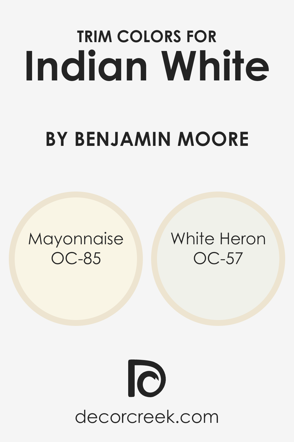
What are the Trim colors of Indian White OC-88 by Benjamin Moore?
Trim colors are essentially the paint used for the accents in a room or on the exterior of a home, which include baseboards, moldings, door frames, and window frames.
They play a crucial role in defining and emphasizing the architectural details of a space, creating contrast, and enhancing the overall aesthetic appeal.
When paired with a main color like Indian White OC-88 by Benjamin Moore, selecting the appropriate trim colors is vital to achieve a cohesive and appealing look.
OC-85 Mayonnaise and OC-57 White Heron are excellent choices for trim colors as they offer subtle variations that harmonize beautifully with the warmth and neutrality of Indian White, ensuring that the space feels inviting and balanced.
OC-85 Mayonnaise is a soft, warm white that adds a hint of coziness to the trim, complementing Indian White OC-88 without overpowering it.
It’s like the gentle glow of morning light, providing a serene backdrop that enhances the room’s natural brightness.
On the other hand, OC-57 White Heron stands out as a crisp and clean white with a subtle brightness, reminiscent of the purity and calmness of a white heron standing in still waters.
This color is perfect for bringing a fresh and airy feel to the trim, offering a slight contrast to the warmth of Indian White OC-88 that is both refreshing and sophisticated.
Together, these trim colors add depth and dimension to the space, making it look more refined and elegantly put together.
You can see recommended paint colors below:
- OC-85 Mayonnaise
- OC-57 White Heron
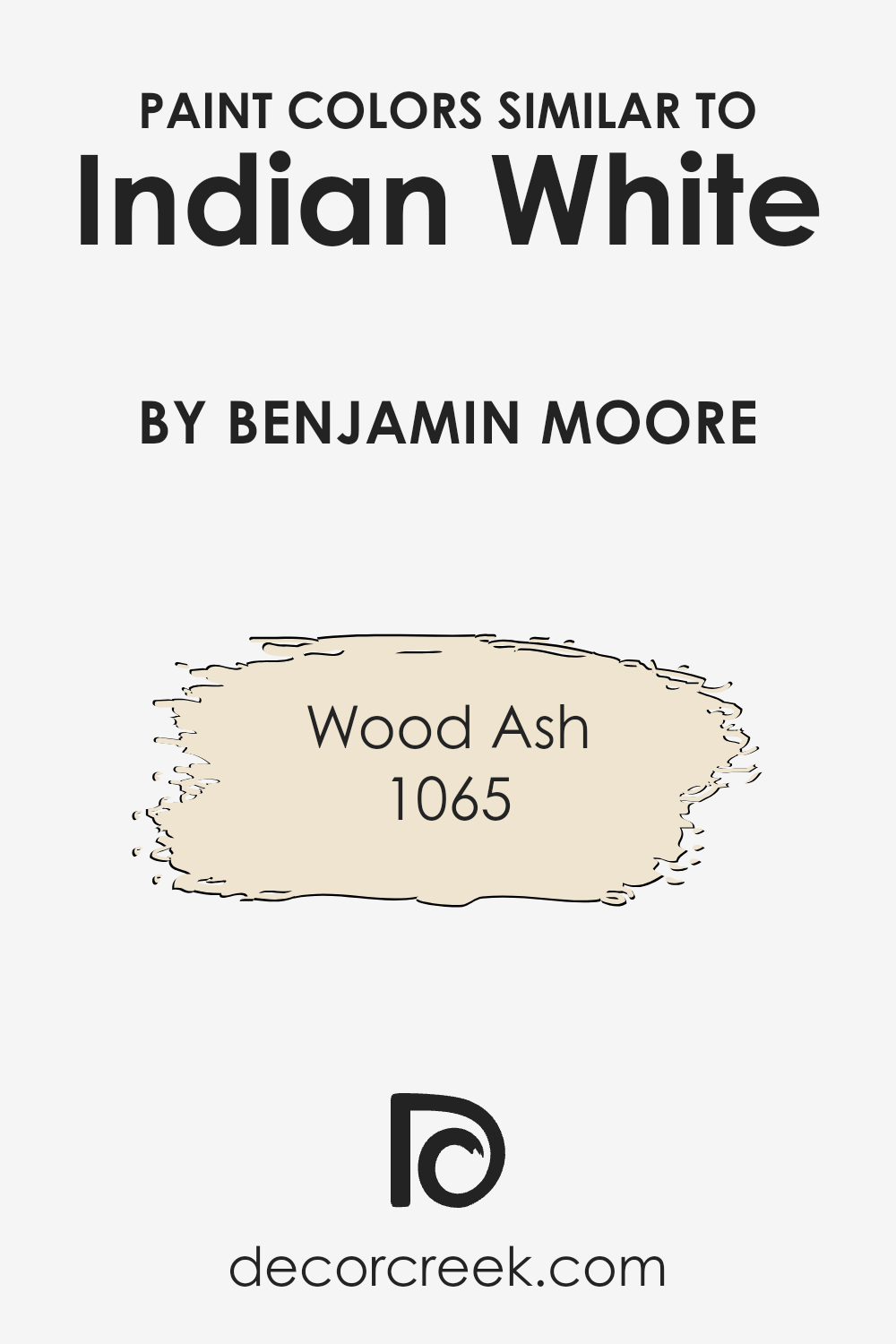
Colors Similar to Indian White OC-88 by Benjamin Moore
Similar colors play a crucial role in creating a unified and harmonious look in any space, acting like a thread that ties the visual elements together seamlessly.
When colors share a close relationship on the color wheel, they have a natural compatibility, making it easier to blend and layer them within a design.
This compatibility ensures that no element stands out jarringly, but rather complements the overall theme. For instance, consider how shades similar to Indian White OC-88 by Benjamin Moore might be utilized.
These tones can create a soothing backdrop, setting a tranquil mood conducive to relaxation and reflection.
One such color is 1065 – Wood Ash. It’s a soft, muted shade that whispers elegance rather than shouting it, offering a subtle depth to spaces without overwhelming them.
This quality makes it an ideal companion for areas seeking a touch of serenity with a modern twist. Then, imagine a color slightly cooler or warmer yet still carrying that understated sophistication.
These shades are fundamental in achieving a cohesive look. They work by subtly differing from each other, allowing for a gentle contrast that adds visual interest without disrupting the tranquil feel initiated by a color like Indian White OC-88.
Using similar colors helps achieve balance, making them essential for anyone looking to create a space that feels purposefully designed and aesthetically pleasing.
You can see recommended paint color below:
- 1065 Wood Ash
How to Use Indian White OC-88 by Benjamin Moore In Your Home?
Indian White OC-88 by Benjamin Moore is a popular paint choice for those looking to add a touch of calm and elegance to their homes. This color is a soft, warm white that has a subtle, inviting feel.
It’s not stark or cold, making it a great option for creating a cozy atmosphere in any room. People often use it in living rooms and bedrooms to create a serene backdrop that pairs well with various decor styles, from modern to traditional.
Because of its versatility, Indian White can also be applied in kitchens and bathrooms for a clean, refreshed look. It can make small spaces appear larger and more open, thanks to its bright, yet warm tone.
For those who enjoy adding pops of color, this shade serves as a beautiful canvas, allowing furniture and artwork to stand out. It’s also a practical choice for hallways and entryways, welcoming guests with a light and airy ambiance.
Overall, using Indian White OC-88 by Benjamin Moore offers a simple yet effective way to enhance the beauty of your home, providing a soothing environment that’s both inviting and stylish.
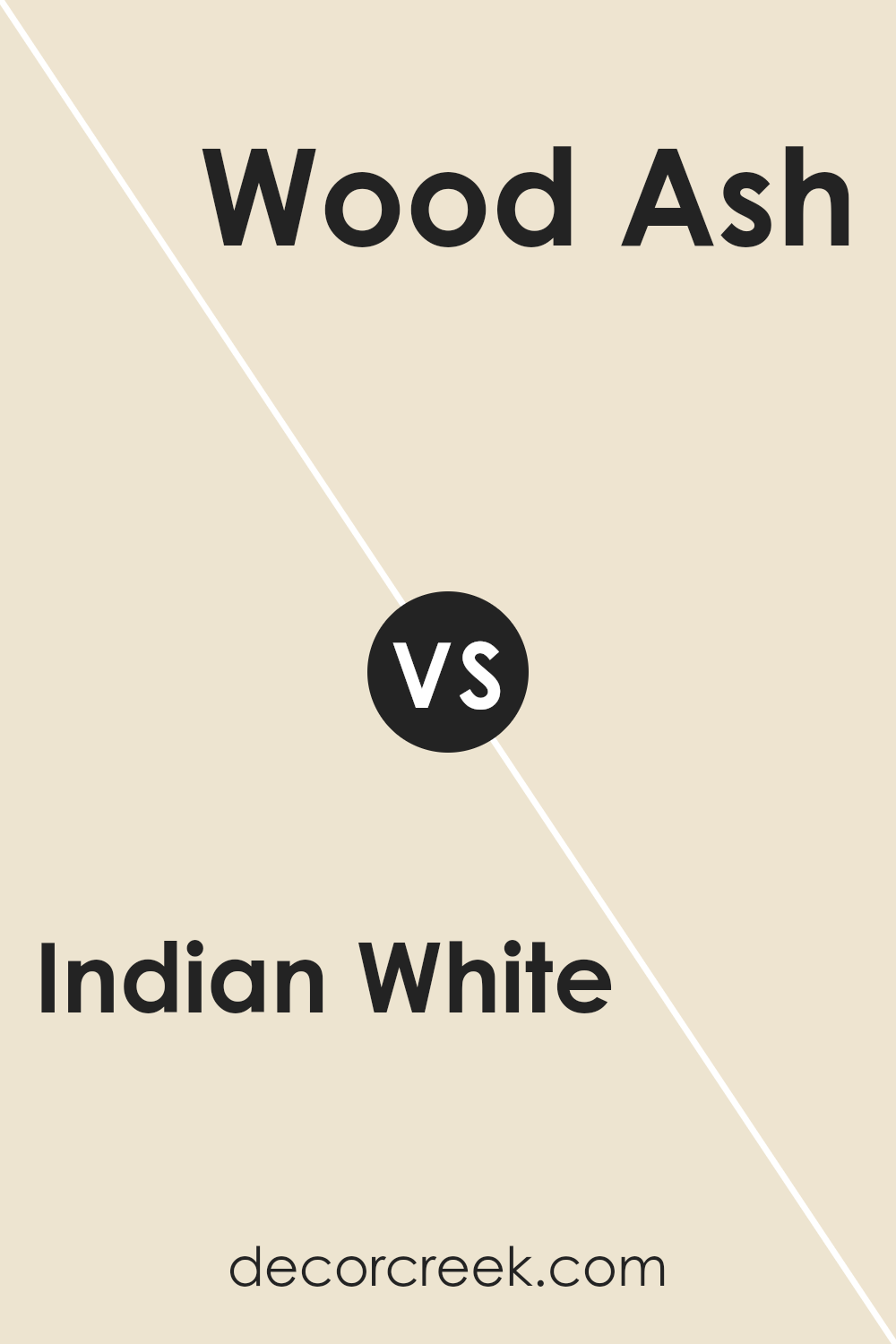
Indian White OC-88 by Benjamin Moore vs Wood Ash 1065 by Benjamin Moore
Indian White OC-88 by Benjamin Moore is a soft, warm off-white color. It has a subtle creaminess to it, making it a great choice for creating a cozy and inviting atmosphere without looking too yellow.
Its gentle tone works well in various lighting situations, adapting beautifully to different styles and spaces. On the other hand, Wood Ash 1065 by Benjamin Moore is a light, neutral beige with a hint of gray.
This color leans more towards a natural, earthy feel, providing a tranquil and serene vibe. It’s versatile, blending nicely with different colors and materials, and it’s perfect for those looking to add a touch of sophistication to their space.
While Indian White adds warmth to a room, Wood Ash offers a sleek, modern look. Both colors are fantastic options for those wanting to keep their walls light and airy, but the choice between a warmer hue and a more muted, neutral tone depends on personal preference and the desired mood of the space.
You can see recommended paint color below:
- 1065 Wood Ash
Conclusion
In summary, Indian White OC-88 by Benjamin Moore is a versatile and appealing color option that can breathe new life into any space. Its subtle warmth and gentle brightness make it a perfect choice for creating cozy and inviting interiors.
Whether you’re looking to refresh your living room, bedroom, or any other area of your home, this shade offers a balanced blend of elegance and comfort.
It pairs beautifully with a variety of decor styles and other colors, making it a practical choice for those seeking to enhance their space without overwhelming it with bold colors.
Moreover, Indian White OC-88’s adaptability extends beyond residential spaces, proving to be equally effective in commercial settings where a sense of openness and light is desired.
Its ability to reflect light enriches the ambiance, making rooms appear more spacious and welcoming. This color stands out as a reliable choice for anyone looking to update their space with a timeless and versatile hue.
Its universal appeal ensures that it can seamlessly integrate into any design scheme, providing a fresh and modern look that remains stylish over time.
Ever wished paint sampling was as easy as sticking a sticker? Guess what? Now it is! Discover Samplize's unique Peel & Stick samples.
Get paint samples