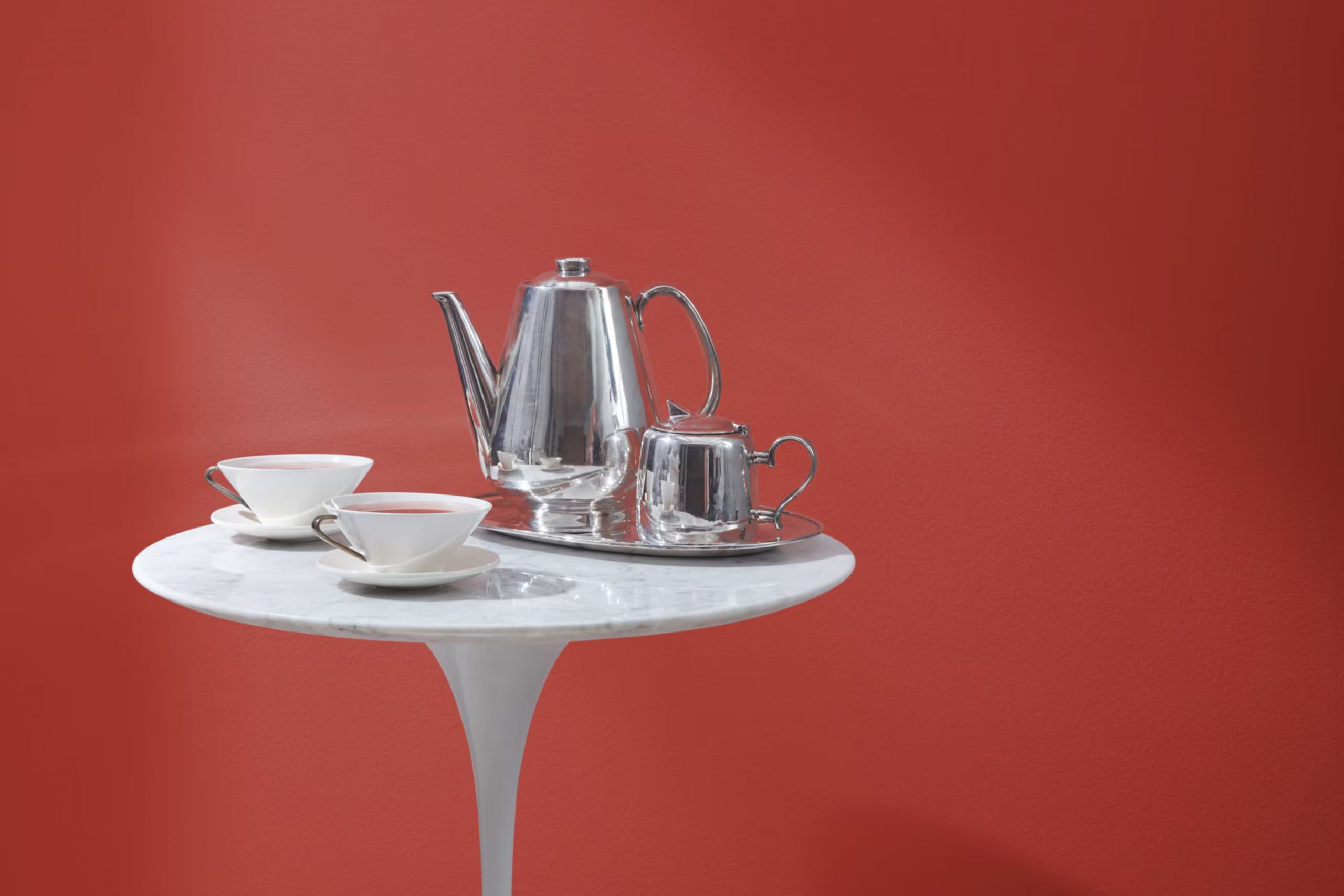
I recently came across a rich, refined shade by Benjamin Moore called 2004-10 Deep Rose. As I looked more into it, I found that it’s not just any ordinary hue. Deep Rose has a unique quality that adds warmth and a subtle hint of drama to any room. Its deep pink tones are both inviting and modern, making it a perfect choice for someone wanting to add a splash of personality to their interior.
Whether you’re thinking about refreshing a living area or just sprucing up a small nook, Deep Rose offers flexibility. It works wonderfully with light accents that highlight its depth without feeling overpowering.
If you’re like me, cautious yet curious about introducing vibrant colors into your home, Deep Rose might just be the hue to help you make that gentle yet impactful change.
It’s easy to see why choosing the right color can really make a place feel like yours, and Deep Rose does just that with its cozy yet bold charm.
What Color Is Deep Rose 2004-10 by Benjamin Moore?
Deep Rose by Benjamin Moore is a vibrant and warm pink color that brings a fresh, inviting feel to any room. Its rich tone works beautifully in interior styles that celebrate color and warmth, such as Bohemian, eclectic, or modern decor. This hue can create a memorable impression in a living room, a cozy vibe in a bedroom, or add a playful splash to a kitchen.
When it comes to pairing materials and textures with Deep Rose, natural wood stands out. The earthy, calming quality of wood balances the boldness of the pink, bringing a grounded feel to the interior. Linen or cotton fabrics in neutral shades also complement this color well, adding a soft and airy touch that keeps the room light and engaging.
Additionally, metallic finishes like brass or gold can enhance the richness of Deep Rose. These combinations lend a touch of elegance and warmth, creating an appealing contrast. Incorporating such metal accents in fixtures or decor items can really make the color pop and give your interior a lively yet cozy ambiance. Overall, Deep Rose is perfect for anyone looking to add a dynamic and heartening flourish to their home with a colour that’s both playful and comforting.
decorcreek.com
Is Deep Rose 2004-10 by Benjamin Moore Warm or Cool color?
Deep Rose 2004-10 by Benjamin Moore is a vibrant and rich shade of pink with a hint of red. This color brings a warm and lively feel to any room. In homes, using Deep Rose on walls can make a room more inviting and cheerful.
It’s especially good for areas where energy and warmth are desired, like living rooms or dining areas. This color pairs well with neutral shades such as whites, grays, and beiges, which help to balance out its intensity.
Accessories or furniture in contrasting colors like teal or green can also look stunning with Deep Rose. In smaller areas, like a bathroom or an accent wall, it can add a lovely pop of color without feeling overpowering. Overall, this shade works well for those looking to add a bit of warmth and personality to their home.
Undertones of Deep Rose 2004-10 by Benjamin Moore
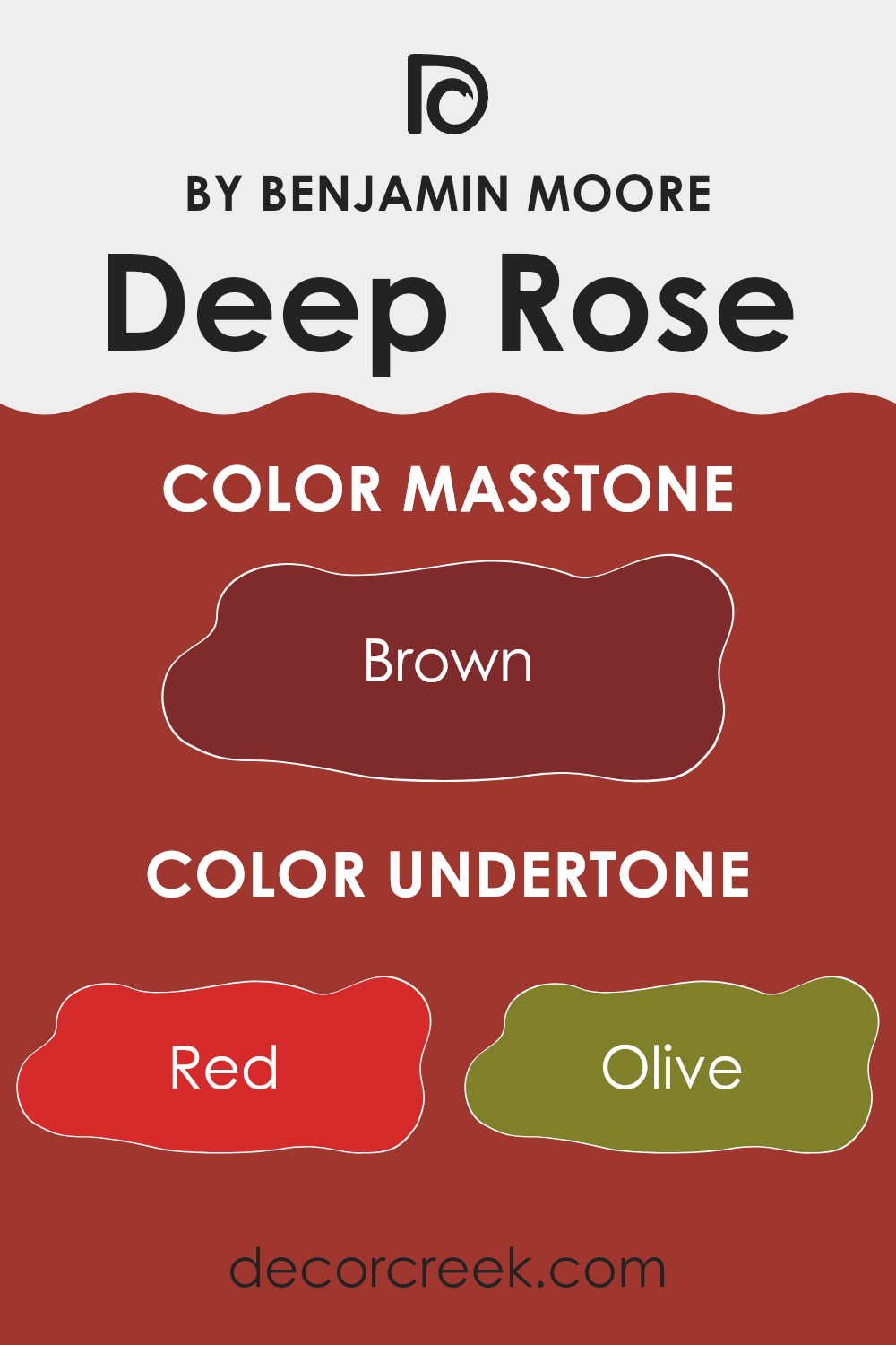
The color Deep Rose holds a complex charm due to its mixture of undertones. Undertones are subtle colors that lie beneath the surface color and they greatly influence how we perceive the main color in different lighting conditions. For Deep Rose, these undertones include shades like red, olive, purple, orange, and pink, among others.
Each undertone brings its own effect. For example, red adds warmth and vibrancy, making the color feel more alive. Olive might mute the color slightly, giving it a more subdued look under certain lights. Purple can add a hint of mystery and depth, while orange increases the warmth. Pink softens the red, making it less intense and more gentle.
When applied on interior walls, these undertones interact with both natural and artificial light, affecting the overall ambiance of a room. During the day, natural light might enhance the red and orange undertones, making the wall appear bright and warm. In the evening, artificial lighting could highlight the purple or pink undertones, creating a cozy and inviting interior. The more neutral undertones like grey and dark grey can help balance the vibrancy, ensuring the color doesn’t feel overpowering.
The diverse undertones of Deep Rose also provide flexibility in matching with different decor styles and color schemes. They can harmonize with both bold and subtle hues, accommodating personal tastes and existing home furnishings. This makes Deep Rose a flexible choice for many homes, adding depth and interest to interior areas.
decorcreek.com
What is the Masstone of the Deep Rose 2004-10 by Benjamin Moore?
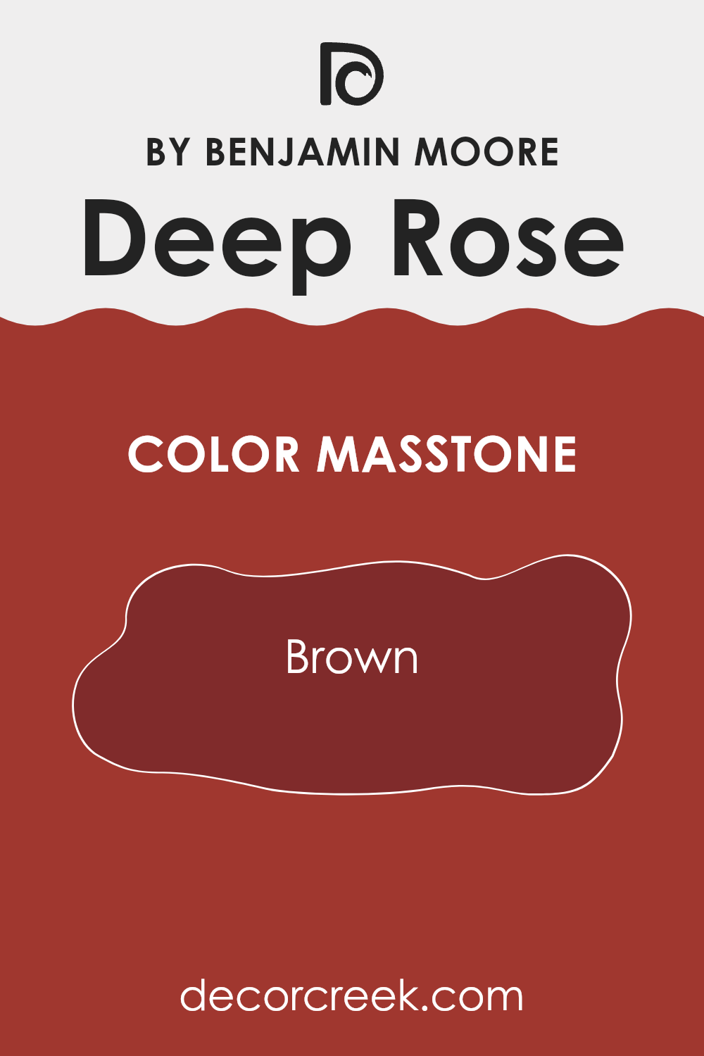
Deep Rose 2004-10 by Benjamin Moore, when observed in its masstone, shows a solid brown hue (#802B2B). This warm and deep color can significantly impact how a room feels and looks. In home settings, this shade of brown offers a comforting and cozy vibe, making interiors feel more inviting. It’s great for living rooms or bedrooms where you want a touch of warmth without the intensity of a brighter red or a stark neutral.
Using Deep Rose in its masstone provides an excellent backdrop for furniture and decor, blending well with both light and dark pieces. It helps in creating a cohesive look without feeling overpowering among the room’s other design elements.
For instance, pairing it with lighter beige or cream colors can make the room look elegant yet relaxed. Because it’s on the darker side, it can also hide marks or stains, which is practical for busy households. Overall, this color is flexible and can be used to add depth and comfort to any home interior.
decorcreek.com
How Does Lighting Affect Deep Rose 2004-10 by Benjamin Moore?
Lighting has a significant impact on how colors are perceived, which means that the same paint can look different depending on the lighting conditions. For the color Deep Rose by Benjamin Moore, it’s important to understand how it reacts under various light sources.
Artificial Light: In rooms lit with artificial lights, such as LED or incandescent bulbs, Deep Rose typically appears richer and more vibrant. The warmth or coolness of the bulb can shift the shade slightly. Warmer bulbs bring out the cozy, inviting aspects of Deep Rose, making it seem more intense and lively. Cooler bulbs might make it look a bit more subdued, highlighting its muted undertones.
Natural Light: Natural light varies throughout the day and affects how Deep Rose looks in a room. In sunlight, this shade can look bright and vivid, with its true color showing more clearly. As the daylight fades, the color might seem deeper and richer.
North-Faced Rooms: North-facing rooms get less direct sunlight, which can make colors appear slightly cooler and bluer. Here, Deep Rose may look more like a soft burgundy, losing some of its brightness but still providing a warm tone to the interior.
South-Faced Rooms: These rooms receive plenty of sunlight throughout the day, which means Deep Rose will often look very bright and dynamic here. The ample light can enhance the paint’s warm tones, making the room feel inviting and cheerful.
East-Faced Rooms: Morning light in east-facing rooms is warm and bright but becomes cooler as the day progresses. In the morning, Deep Rose will appear warmer and more welcoming, transitioning to a slightly cooler tone by the afternoon.
West-Faced Rooms: As the sun sets, west-facing rooms are bathed in warm, golden light. This enhances the red and pink tones in Deep Rose, making it look especially vibrant and rich during the late afternoon and early evening.
Overall, Deep Rose’s appearance can shift dramatically depending on the light it’s under, ranging from a subtle burgundy to a lively, dynamic pink.
decorcreek.com
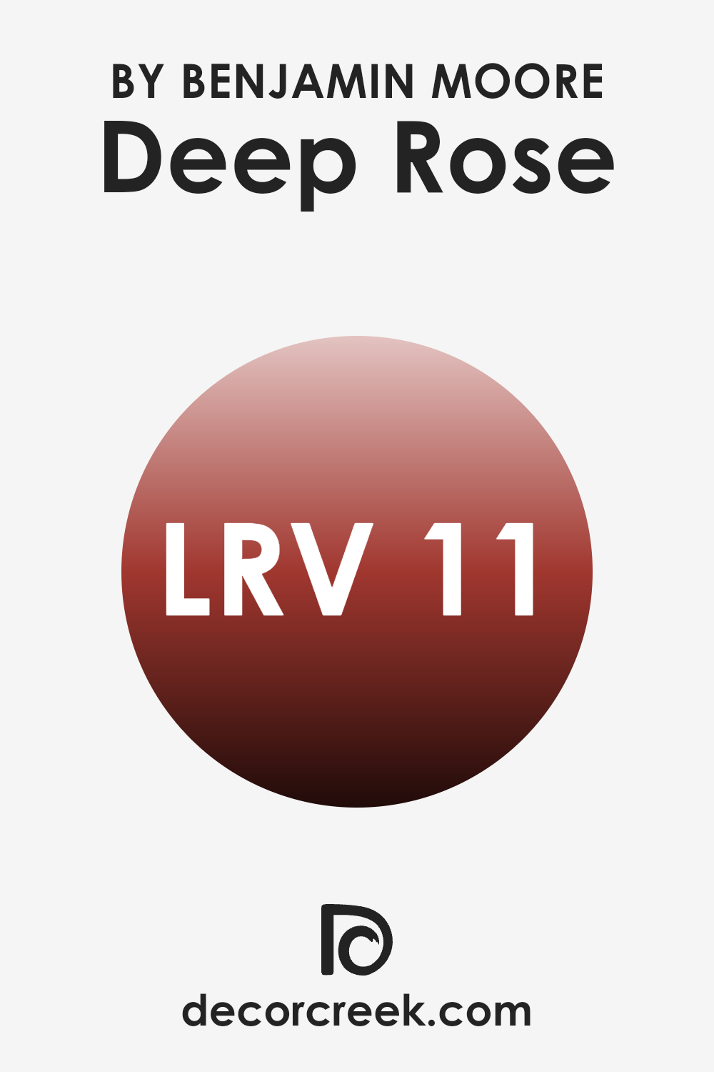
What is the LRV of Deep Rose 2004-10 by Benjamin Moore?
LRV stands for Light Reflectance Value, which is a measure of the amount of visible light a paint color reflects when it’s on your walls. Basically, it tells you how bright or dark a color will look once you apply it to a surface.
High LRV values mean the color reflects more light, making it appear lighter and can make a room feel more open and airy. Conversely, lower LRV values mean the color absorbs more light, which can make it appear darker and can create a more enclosed and cozy atmosphere.
The color Deep Rose has an LRV of 11.35, which is relatively low. This means it’s on the darker side and will absorb a lot of light rather than reflecting it. In a room, this could make the interior feel smaller or more intimate, depending on the size of the area and the amount of natural light available. When using a darker color like this, it’s good practice to consider the lighting in the room or think about using the color on an accent wall instead of all four walls to prevent the room from feeling too enclosed.
decorcreek.com
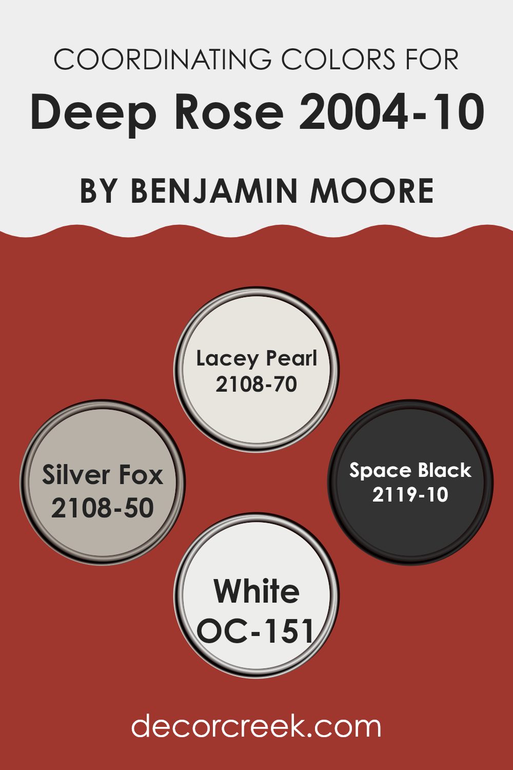
Coordinating Colors of Deep Rose 2004-10 by Benjamin Moore
Coordinating colors are hues that complement each other and work harmoniously when used together in an interior. These colors are chosen to highlight or balance the features of a primary color, like the vibrant Deep Rose by Benjamin Moore, enhancing the overall look of a room. By selecting shades that coordinate, you can create a cohesive and pleasing atmosphere, whether you’re aiming for contrast or subtlety.
Lacey Pearl is a soft, elegant off-white color that acts as a delicate backdrop, making it ideal for highlighting bolder shades like Deep Rose. Silver Fox, on the other hand, is a muted gray that carries just enough depth to stand alongside stronger colors without feeling overpowering, providing a chic, grounded look.
RoomBlack is a deep, intense black which offers a dramatic contrast to the rosiness of Deep Rose, perfect for adding a touch of elegance and boldness. Lastly, White OC-151 is a pure, clean white that brings crispness and brightness, helping to lift and illuminate any palette it accompanies. Together, these coordinating colors present a well-rounded selection that complements and enhances the beautiful qualities of Deep Rose.
You can see recommended paint colors below:
- 2108-70 Lacey Pearl
- 2108-50 Silver Fox
- 2119-10 Space Black
- OC-151 White
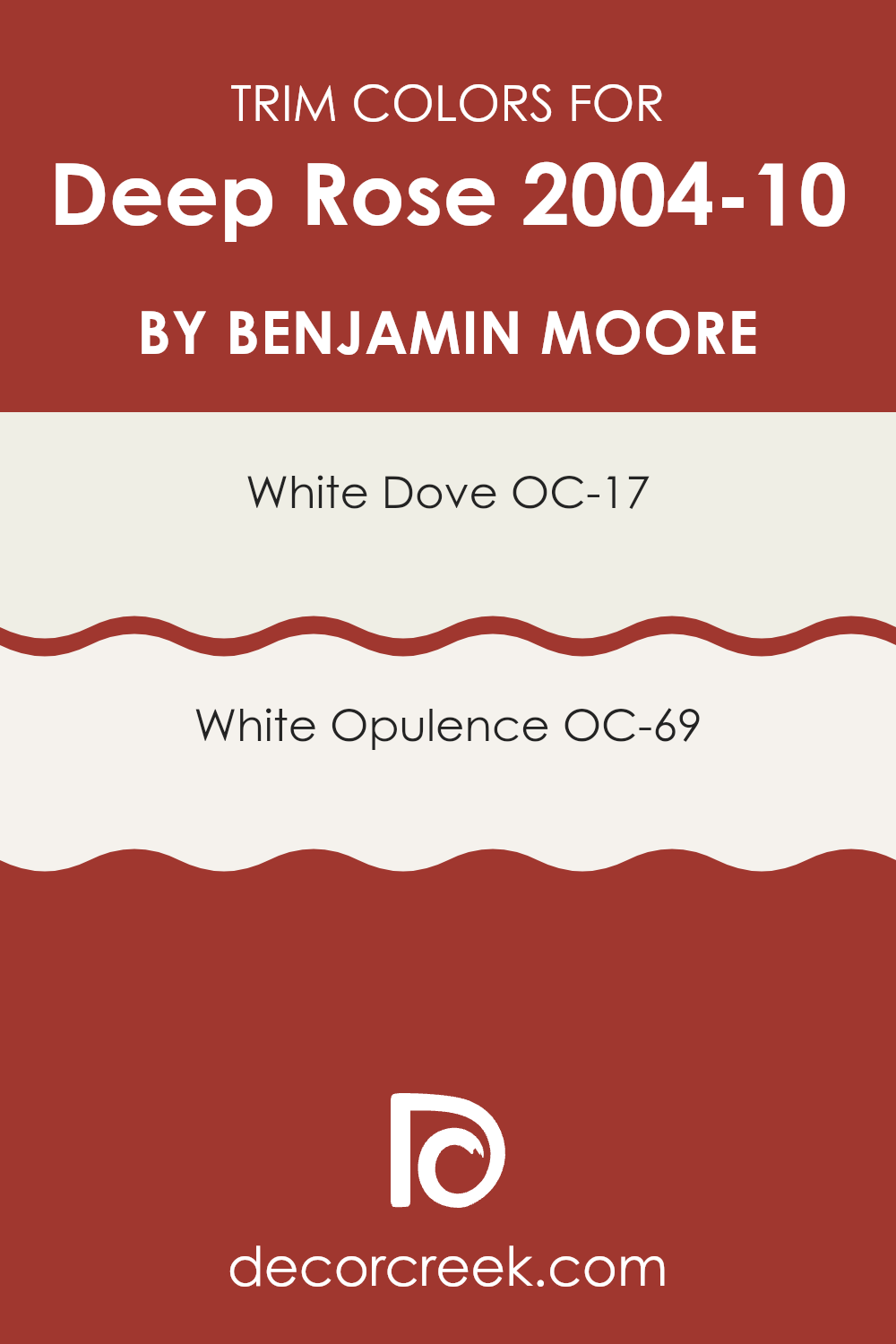
What are the Trim colors of Deep Rose 2004-10 by Benjamin Moore?
Trim colors are chosen specifically to complement the main color on walls, enhance architectural details, and frame the sections of an interior effectively, creating a more finished look. For instance, when using a vibrant and rich hue like Benjamin Moore’s Deep Rose, it’s crucial to select trim colors that will balance this intensity and highlight the crisp lines and details of the interior.
The recommended trim colors for Deep Rose are OC-17 – White Dove and OC-69 – White Opulence. These colors are particularly effective in making sure that the deep, energetic tone of Deep Rose doesn’t feel overpowering in a room, allowing for a harmonious balance that enhances both the main wall color and the overall look.
White Dove (OC-17) by Benjamin Moore is a soft, warm white with a gentle cream undertone, which gives it a very relaxed and inviting feel. It pairs beautifully with richer and deeper colors, providing a subtle contrast that allows architectural features to stand out without creating too stark of a division.
On the other hand, White Opulence (OC-69) is a cleaner, brighter white with a hint of a cool undertone, offering a fresh and airy feel that can make any interior seem more open and light. Both trim colors work wonderfully with Deep Rose, ensuring the room maintains a pleasant and harmonious look while accentuating the architectural elegance of the interior.
You can see recommended paint colors below:
- OC-17 White Dove
- OC-69 White Opulence
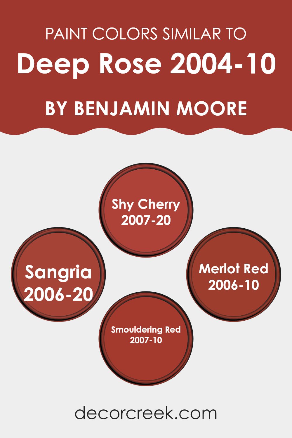
Colors Similar to Deep Rose 2004-10 by Benjamin Moore
When choosing paint colors for a room, using similar colors can create a harmonious and cohesive atmosphere. Deep Rose and its similar shades like Shy Cherry, Sangria, Merlot Red, and Smouldering Red play off each other beautifully, enhancing the visual continuity and balance in the interior.
These shades are all from Benjamin Moore and are part of the same color family, which means they share undertones that help tie them together seamlessly. Using colors with similar undertones makes it easier to achieve a designer look, as they naturally complement each other and offer a subtle yet effective variation.
For instance, Shy Cherry is a muted cherry pink that provides a gentle warmth, making it ideal for living areas that seek a touch of coziness without feeling overpowering. Sangria, with its deeper, berry-inspired hue, adds a rich, inviting quality to any room, perfect for areas meant for relaxation or entertaining.
Merlot Red, which is a robust, wine-like color, works well in dining rooms or studies, where its depth can create a refined feel. Lastly, Smouldering Red, the deepest of these similar shades, offers a bold and powerful presence, excellent for accent walls or decorations where a strong visual impact is desired. Each of these colors, while unique, supports and enhances its peers, making them excellent choices for creating layered and attractive color schemes.
You can see recommended paint colors below:
- 2007-20 Shy Cherry
- 2006-20 Sangria
- 2006-10 Merlot Red
- 2007-10 Smouldering Red
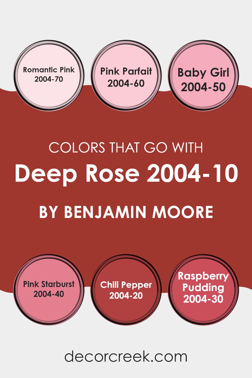
Colors that Go With Deep Rose 2004-10 by Benjamin Moore
Choosing complementary colors for Deep Rose 2004-10 by Benjamin Moore is essential in creating a harmonious and visually pleasing environment. When colors work well together, they can enhance the mood of a room, make small areas appear larger, and add depth and character to a decor theme.
For instance, Romantic Pink 2004-70 is a softer sister shade to Deep Rose, offering a gentle contrast that creates a cozy, inviting atmosphere perfect for places meant for relaxation. Pink Parfait 2004-60 is slightly lighter, bringing in a soft lightness that can brighten darker corners and combine smoothly with the bolder Deep Rose.
Going a bit richer, Baby Girl 2004-50 presents a subtle yet effective mix into the palette, where its youthful and gentle hue quietly balances the intensity of Deep Rose. Pink Starburst 2004-40 introduces a vivid splash, lending a playful and energetic vibe to the mix, ideal for interiors designed for fun or creative activities.
Colors like Chili Pepper 2004-20 provide a striking contrast with a deep red that pairs dramatically with Deep Rose, perfect for areas where a strong visual impact is desired. Lastly, Raspberry Pudding 2004-30 echoes a kindred spirit to Deep Rose but with a slightly muted richness, making it ideal for adding warmth and depth to the overall look. Together, these colors create a diverse and appealing palette that works together to bring any room to life.
You can see recommended paint colors below:
- 2004-70 Romantic Pink
- 2004-60 Pink Parfait
- 2004-50 Baby Girl
- 2004-40 Pink Starburst
- 2004-20 Chili Pepper
- 2004-30 Raspberry Pudding
How to Use Deep Rose 2004-10 by Benjamin Moore In Your Home?
Deep Rose 2004-10 by Benjamin Moore is a rich, vivid shade of pink with a slightly red undertone. It’s a great choice for adding a bright pop of color to any room, making it feel warm and inviting. You can use it in various ways around your home.
For example, painting one accent wall with Deep Rose can create a striking focal point in a living room or bedroom without feeling overpowering. It’s also perfect for a powder room or a dining area, where it adds a touch of drama and warmth.
Combining Deep Rose with neutral tones like whites, grays, or soft beiges can balance its intensity, making the interior feel cozy yet lively. If you’re into a bolder look, pairing it with navy or dark green can provide a beautiful contrast. Consider it for accessories too, like throw pillows or curtains, if you’re not ready to commit to paint. Whether for big projects or small touches, this color can make your home feel more personalized and lively.
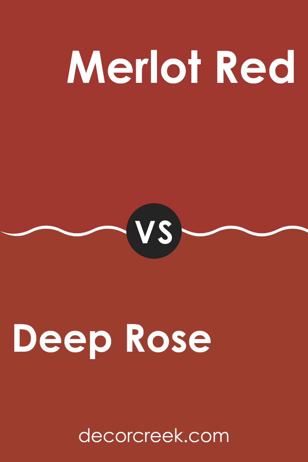
Deep Rose 2004-10 by Benjamin Moore vs Merlot Red 2006-10 by Benjamin Moore
Both Deep Rose and Merlot Red by Benjamin Moore are rich and vibrant colors, but they each bring a different vibe to an interior. Deep Rose is a bright, punchy shade, ideal for creating a cheerful and lively atmosphere.
Its bold pink undertones can make any room feel welcoming and full of life. In contrast, Merlot Red has a darker, more intense feel. It leans more towards a classic red with a hint of burgundy, making it great for adding a touch of elegance and warmth to an area.
While both colors are strong and can stand out in a room, Merlot Red is generally better for those looking to create a more cozy and inviting environment, whereas Deep Rose is perfect for a more upbeat and dynamic setting.
You can see recommended paint color below:
- 2006-10 Merlot Red
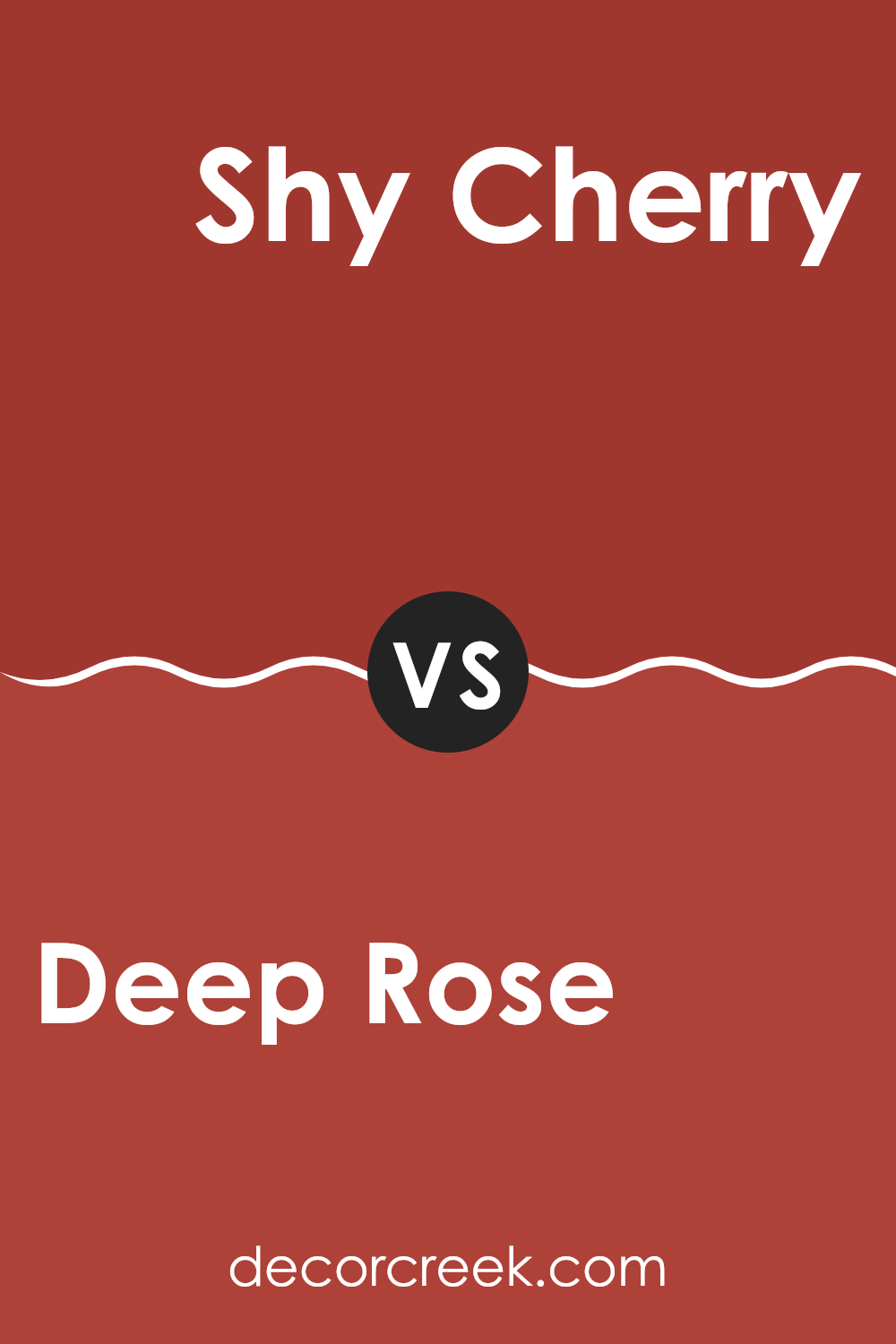
Deep Rose 2004-10 by Benjamin Moore vs Shy Cherry 2007-20 by Benjamin Moore
Deep Rose and Shy Cherry are both vibrant colors from Benjamin Moore. Deep Rose has a bold, pinkish-red tone that stands out and adds a lot of character to an interior.
It’s the kind of color that can make a statement in a room, either on an accent wall or through decorative touches. In contrast, Shy Cherry leans more towards a classic cherry red. It’s a bit deeper and darker than Deep Rose, giving it a richer feel.
Shy Cherry can give a room a cozy, warm atmosphere, making it ideal for areas where you want to relax or have people gather. Both colors bring energy and warmth, but Deep Rose has a lighter, more playful look while Shy Cherry offers depth and a traditional vibe, suitable for a variety of decorating styles.
You can see recommended paint color below:
Deep Rose 2004-10 by Benjamin Moore vs Sangria 2006-20 by Benjamin Moore
The main color Deep Rose by Benjamin Moore is a vibrant and rich shade that carries a feeling of warmth and energy. It has a strong presence due to its depth, which makes it perfect for creating focal points in a room or adding a dynamic burst of color.
On the other hand, Sangria by Benjamin Moore is a more intense and slightly darker hue. It closely resembles the color of red wine, providing a bold and dramatic look. Both colors share a red base, but Sangria leans towards a more dramatic and bold palette, while Deep Rose offers a lively yet less overpowering look.
While both can be used for accents and statement walls, Deep Rose might be preferred in areas where a softer, yet still vibrant, atmosphere is desired. Sangria, with its depth and drama, works well when a more striking, attention-grabbing effect is sought.
You can see recommended paint color below:
- 2006-20 Sangria
Deep Rose 2004-10 by Benjamin Moore vs Smouldering Red 2007-10 by Benjamin Moore
Deep Rose and Smouldering Red, both by Benjamin Moore, are rich, vivid colors that create a strong impression. Deep Rose has a vibrant pink tone that feels energetic and warm.
It’s a color that can make a room feel lively and cheerful. On the other hand, Smouldering Red offers a darker, more intense appearance. This shade is closer to a burgundy and can give a room a more cozy and inviting atmosphere.
While both colors add personality and flair to an interior, Deep Rose has a lighter, more playful vibe, whereas Smouldering Red brings depth and a hint of mystery. Each color could work well in a different kind of interior depending on the mood you’re aiming for.
You can see recommended paint color below:
- 2007-10 Smouldering Red
After reading about the 2004-10 Deep Rose paint from Benjamin Moore, I’ve learned quite a bit about how a color can make a room feel different. Deep Rose is a bright, happy red that can add a lot of energy to a room. It’s perfect for places where you want to feel cheerful and active, like a playroom or a kitchen. The paint is also very good at covering walls smoothly, so you don’t see any old paint or marks underneath.
This color isn’t just for walls. It can also look great on a piece of furniture or a door, adding a fun pop of color to any corner of your home. Even though it’s bold, it goes well with many other colors, like soft whites or even darker blues, which can help balance out its intensity.
In summary, the Deep Rose paint by Benjamin Moore is a wonderful choice if you want to make an interior lively and full of fun. It covers walls well, works with many colors, and can be used in different ways throughout the home.
It’s definitely a color that can make you feel happy just by looking at it.
decorcreek.com
Ever wished paint sampling was as easy as sticking a sticker? Guess what? Now it is! Discover Samplize's unique Peel & Stick samples.
Get paint samples

