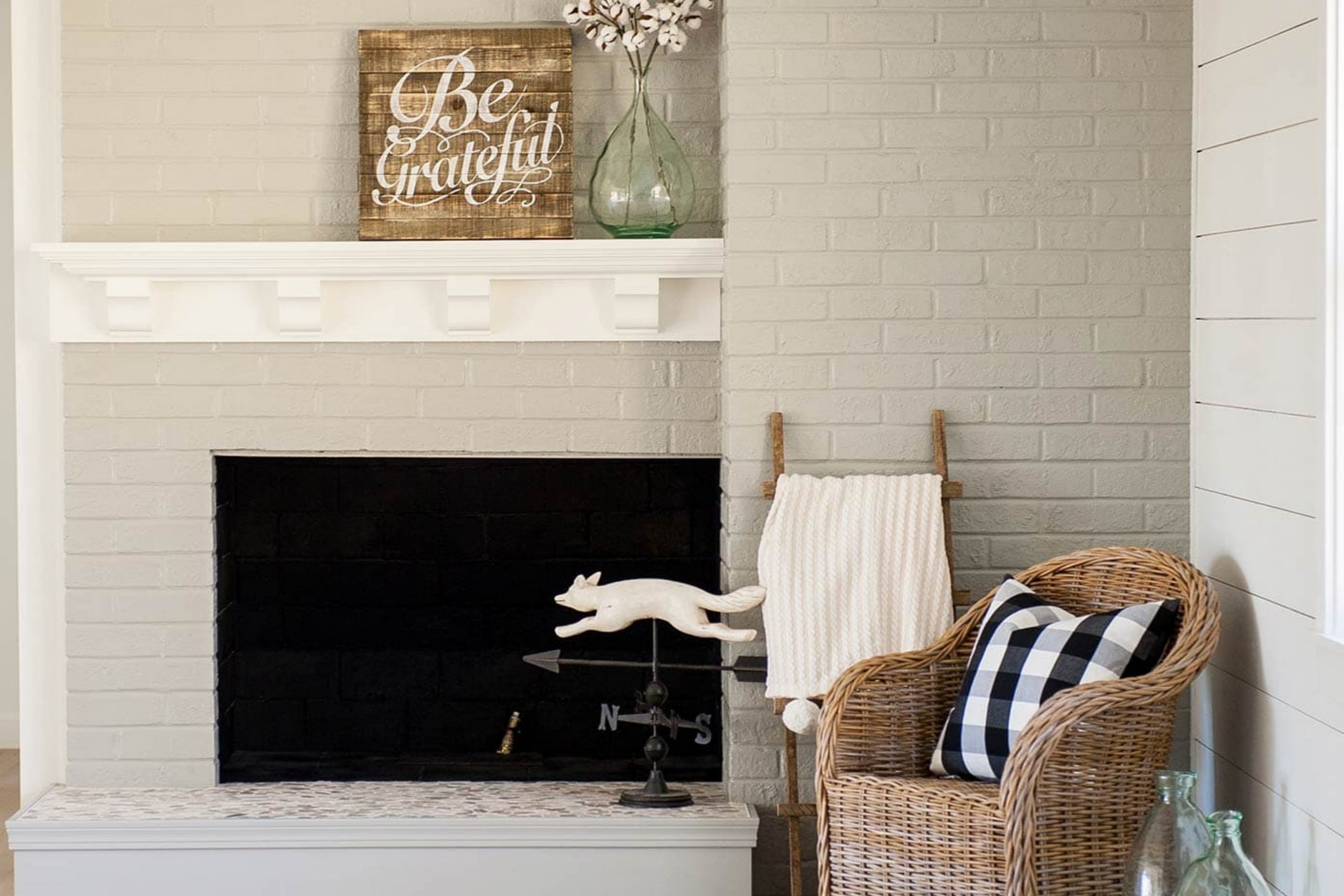
Benjamin Moore’s OC-17, also known as White Dove, is a popular paint color that homeowners and interior designers love for its versatility and timeless elegance. This shade is a go-to for anyone looking to refresh their space with a clean, bright feel without the harshness that some pure whites can project.
White Dove has a touch of warmth to it, making it inviting and comforting, which is perfect for creating a cozy atmosphere in any room. Whether you’re updating your living room, kitchen, or even the exterior of your house, White Dove can adapt to a variety of lighting conditions and design styles, from modern to traditional.
It pairs beautifully with a wide range of colors, allowing for flexibility in your decor choices. If you’re thinking about giving your space a makeover or just a simple touch-up, consider Benjamin Moore’s White Dove for a classic look that will stay in style for years to come.
What Color Is White Dove OC-17 by Benjamin Moore?
White Dove by Benjamin Moore is a soft and warm shade of white that brings a gentle, welcoming atmosphere to any room. It stands out for its versatility and ability to pair beautifully with a wide range of colors, materials, and textures. This particular shade of white has just the right balance – not too cool and not too warm, making it an ideal choice for creating a serene and inviting space.
This color works exceptionally well in a variety of interior styles, including modern minimalist, traditional, coastal, and even rustic farmhouses. Its subtle warmth adds a cozy feel to spaces, while its brightness helps small rooms appear larger and more open. White Dove is a go-to for walls, trim, and ceilings, offering a cohesive and polished look throughout the home.
As for pairing with materials and textures, it complements natural wood beautifully, from light oaks to rich walnuts, highlighting their natural grain. It also pairs well with soft textiles like linen or wool in neutral tones, adding texture and depth to the room. For a more modern and sleek look, combining it with metallic finishes like brass or chrome can add a touch of elegance. Overall, White Dove provides a timeless backdrop, allowing for flexibility and creativity in your decorating scheme.
Is White Dove OC-17 by Benjamin Moore Warm or Cool color?
White Dove by Benjamin Moore is a popular paint color known for its versatility and timeless appeal. It’s a soft, warm white that doesn’t lean too cool or too warm, making it just right for any room in your house. This color stands out because it creates a peaceful and inviting atmosphere, acting almost like a backdrop that allows other design elements to shine.
Whether you’re pairing it with bold colors or sticking to a neutral palette, White Dove has the ability to tie everything together harmoniously. Its subtlety is one of its main strengths, offering a clean look without becoming stark or sterile, which is a common issue with some white paints. This color can make small spaces appear larger and brighter, while also adding a sense of calm to busy areas.
Overall, White Dove is a great choice for anyone looking to refresh their home with a classic and airy feel.
Undertones of White Dove OC-17 by Benjamin Moore
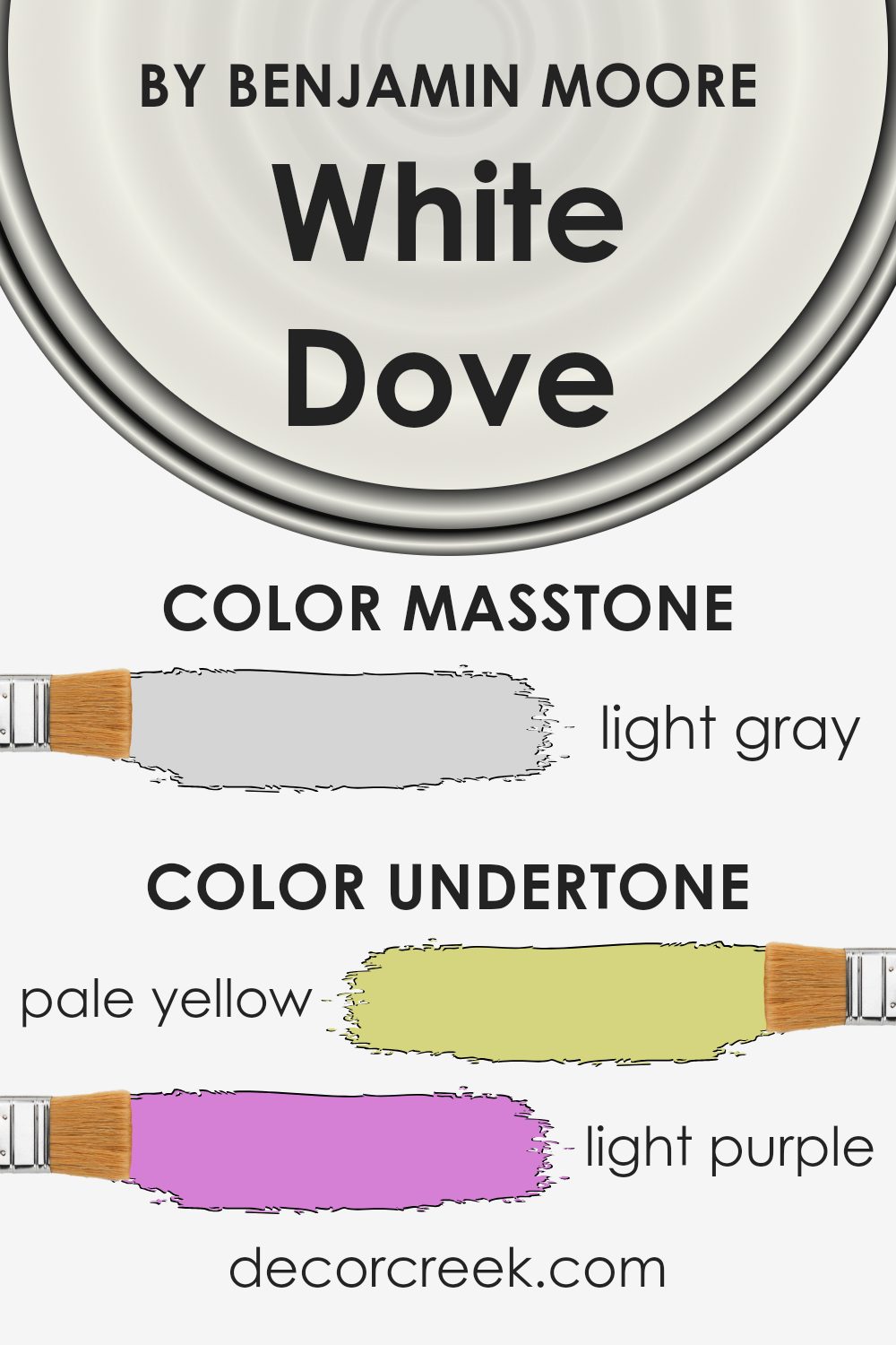
White Dove by Benjamin Moore is a popular color choice for interior walls due to its soft, warm tones. This color isn’t just a simple white; it has complex undertones that give it a rich, nuanced look. Understanding these undertones can significantly affect how we see the color in a room. The subtle shades present in White Dove include pale yellow, light purple, light blue, pale pink, mint, lilac, and grey.
When it comes to interior decoration, these undertones play a crucial role. They can make the color appear differently based on the lighting and the surrounding colors. For instance, in a room with a lot of natural light, the pale yellow and light blue undertones can make the walls look brighter and more inviting. Under softer lighting, the grey or pale pink might become more pronounced, giving the room a cozier feel.
The presence of these undertones adds depth to what might otherwise be a flat white. It’s this complexity that makes White Dove such a versatile choice. It can complement a wide range of décor styles and color schemes, from bold and contemporary to soft and vintage. Whether you want to create a crisp, clean look or a warm, inviting space, the subtle undertones in White Dove can help achieve that effect.
In conclusion, the undertones of White Dove add a layer of richness, making it not just a paint color, but a design element.
What is the Masstone of the White Dove OC-17 by Benjamin Moore?
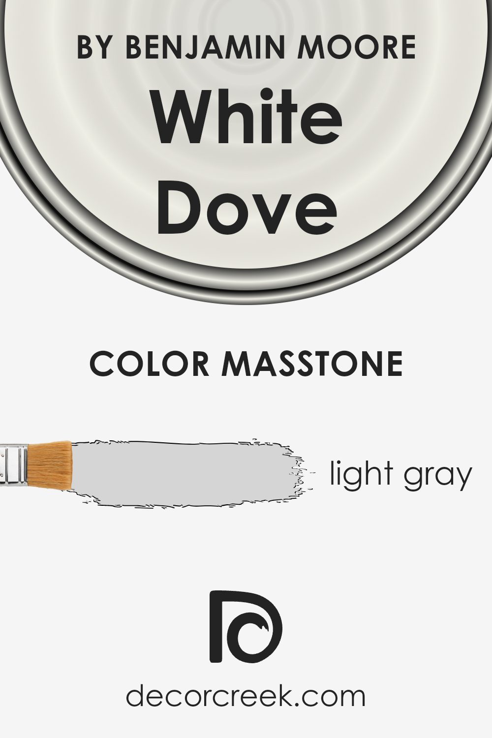
White Dove OC-17 by Benjamin Moore has a masstone that looks like light gray (#D5D5D5). This color is known for its ability to bring a soft, soothing vibe into any room. It’s quite versatile and can easily fit into various design schemes, from modern to traditional. Because its base tone is close to light gray, it acts as a neutral backdrop.
This means it seamlessly complements a wide range of colors, from bold hues to more muted tones, making it a perfect choice for those wanting to add a touch of elegance without overwhelming a space.
In homes, this color works wonders by creating an airy and open feel. It reflects natural light beautifully, making spaces appear brighter and more inviting. Whether it’s used on walls, trim, or cabinets, it adds a subtle, clean touch that enhances the overall aesthetic without dominating the décor. This makes it an ideal choice for homeowners looking to create a peaceful and welcoming environment.
How Does Lighting Affect White Dove OC-17 by Benjamin Moore?
Lighting plays a crucial role in how we perceive colors. It can transform a hue from warm and inviting to cold and distant. When it comes to the color White Dove by Benjamin Moore, a popular shade for interiors, its appearance can significantly shift depending on the light source. Let’s explore how this shade behaves under different lighting conditions and in rooms with various orientations.
In artificial light, White Dove tends to reflect the tone of the bulb used. Warm-toned bulbs bring out its creamy, warm characteristics, making the space feel cozy. In contrast, cool-toned LED lights can give it a crisper, brighter appearance, often preferred in modern settings. This duality makes White Dove versatile in homes where the mood might need to change from morning to night.
Natural light, however, introduces a whole new dynamic. In north-faced rooms, which receive cooler, more consistent light throughout the day, White Dove can appear slightly more muted, with a subtle grayish undertone. This doesn’t detract from its beauty, though; instead, it gives a serene, calm vibe perfect for bedrooms or study areas.
In south-faced rooms, where sunlight is warmer and more abundant, White Dove shines in its full glory. The natural brightness enhances its warm undertones, making spaces feel airy and inviting. It’s an excellent choice for living rooms or kitchens, where a welcoming atmosphere is key.
East-faced rooms see a lot of light in the morning, which means White Dove will appear warmer and brighter in the first half of the day before transitioning to a cooler, more balanced white as the sun moves. This natural progression suits spaces used predominantly in the morning, like breakfast nooks.
West-faced rooms, however, get the evening sun. Here, White Dove can take on a soft, warm glow by late afternoon, perfect for dining rooms or spaces where you wind down in the evening.
In conclusion, White Dove’s ability to adapt its character depending on the lighting makes it a highly versatile choice for any room direction. Whether under artificial light or influenced by the time of the day, it maintains a delicate balance between warmth and brightness, adapting to its surroundings to create the desired mood.
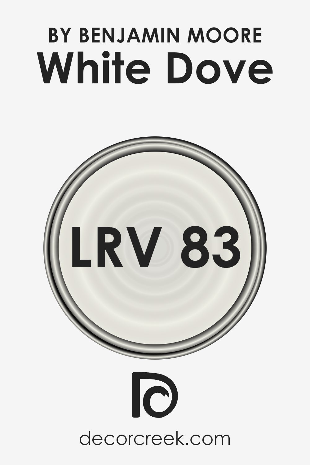
What is the LRV of White Dove OC-17 by Benjamin Moore?
LRV stands for Light Reflectance Value, a measure that helps in figuring out how light or dark a paint color will look once it’s applied to the walls. This value is given on a scale from 0 to 100, where 0 means the color absorbs all light (think of a pitch-black room) and 100 reflects all light, much like a bright, shiny mirror.
This measure is super helpful when deciding how a color might change the mood or feel of a room. For instance, colors with a higher LRV can make spaces appear larger and more open because they reflect more light around the room.
With an LRV of 83.16, the color we’re talking about is on the lighter side, meaning it’s pretty good at reflecting light. This quality can make a room feel more airy and spacious, an excellent choice if you’re hoping to brighten up a dim space without needing to add more lights. Since it does reflect quite a bit of light, the color itself might appear slightly different throughout the day depending on how much natural light the room gets.
In the morning, it might look one way, and by evening, as the quality of light changes, it could take on a different tone. This ability to subtly change with the lighting can add a dynamic quality to your space without overwhelming it with color.
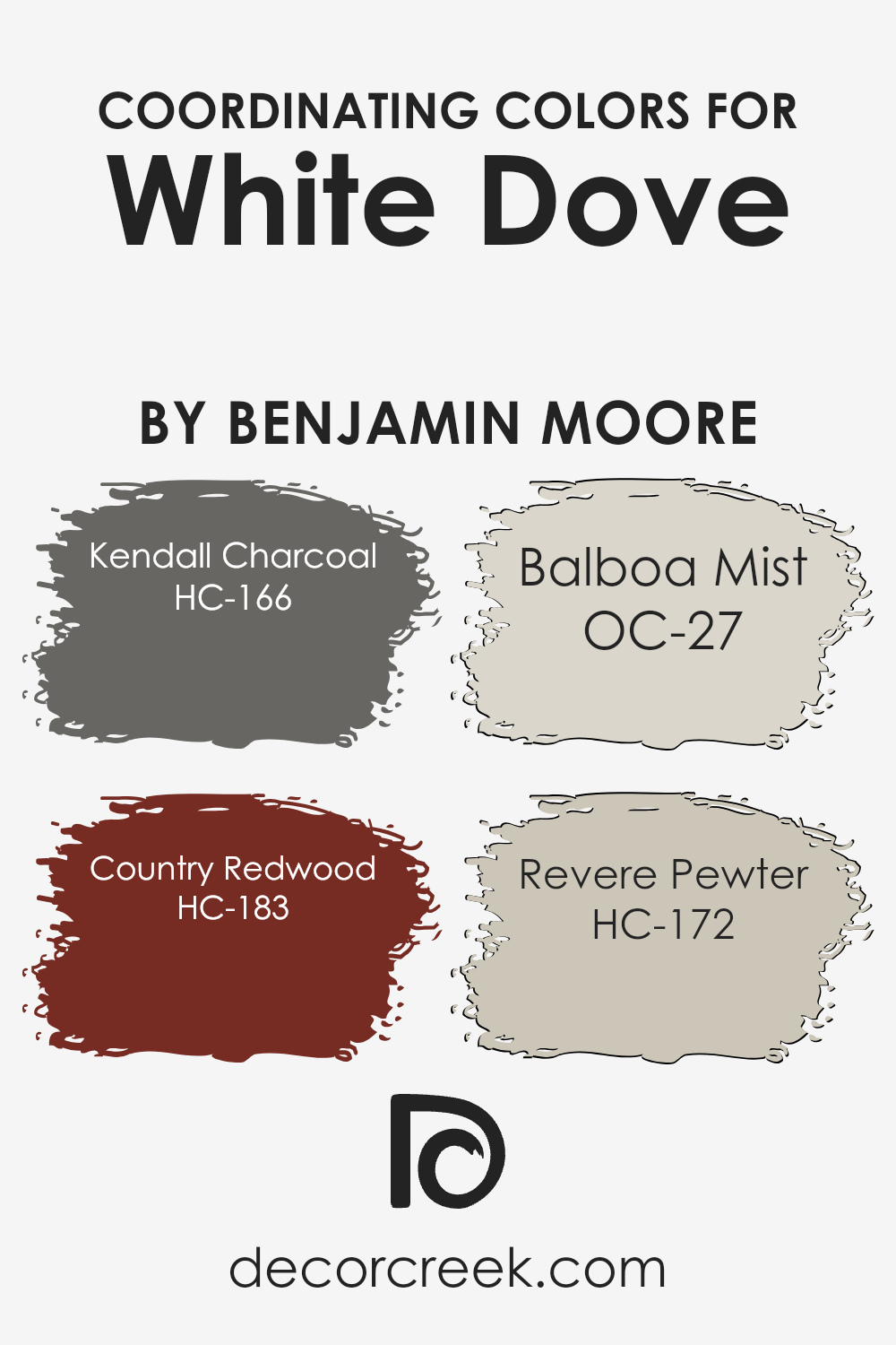
Coordinating Colors of White Dove OC-17 by Benjamin Moore
Coordinating colors are a palette of colors that work harmoniously together to enhance the atmosphere and aesthetic of a space. They are selected based on their compatibility and how each color compliments the others, creating a cohesive look. When used correctly, coordinating colors can add depth, contrast, and visual interest to a room.
For example, if we take White Dove by Benjamin Moore as a base color, known for its soft and warm hue, it opens up a wide range of possibilities for color coordination that can transform any room into a beautifully balanced space.
One of the coordinating colors, Kendall Charcoal (HC-166), is a deep, rich gray that offers a striking contrast to the lightness of White Dove, making it ideal for accent walls or furniture to add sophistication. Meanwhile, Country Redwood (HC-183) brings a robust, earthy red into the mix, introducing warmth and vitality, perfect for accessories or statement pieces.
Balboa Mist (OC-27) is another coordinating color, a light and airy gray that enhances the softness of White Dove, providing a subtle layer of complexity and elegance.
Lastly, Revere Pewter (HC-172) is a light gray with warm undertones, striking the right balance between contrasting and complementing White Dove, thus ensuring the space feels coordinated and thoughtfully put together. Each of these colors, when paired with White Dove, contributes to a harmonious and inviting space that feels intentional and expertly designed.
You can see recommended paint colors below:
- HC-166 Kendall Charcoal
- HC-183 Country Redwood
- OC-27 Balboa Mist
- HC-172 Revere Pewter
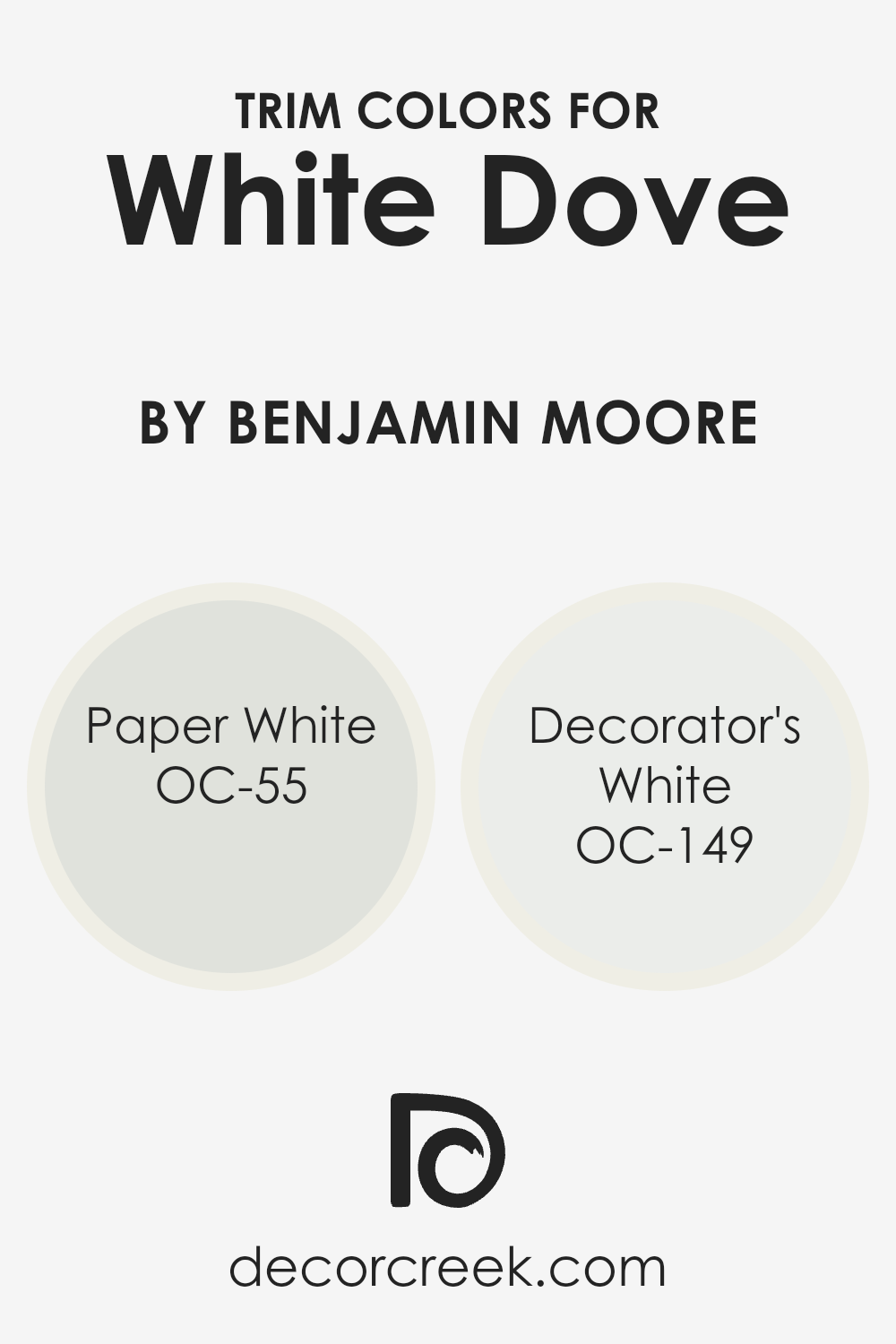
What are the Trim colors of White Dove OC-17 by Benjamin Moore?
Trim colors are essentially the accents you choose for the edges or outlines in your room—like window frames, doors, and the skirting around the baseboard. These colors play a vital role because they outline and define the space, bringing contrast or harmony to the overall color scheme.
When you have walls painted in White Dove by Benjamin Moore, a warm and welcoming off-white, selecting the right trim color can elevate the look of your entire room. White Dove itself is a versatile backdrop, offering a canvas that pairs beautifully with a range of trim colors to either subtly blend or strikingly contrast, depending on the desired effect.
OC-55 Paper White is a soft, crisp white with a hint of gray. This color is perfect for trim with White Dove as it provides a subtle contrast, bringing out the warmth in White Dove without overwhelming it, perfect for a modern yet timeless look. On the other hand, OC-149 Decorator’s White is a brighter, cleaner white with a slightly cool undertone. Using it as a trim color alongside White Dove walls creates a sharper contrast, making the architectural details pop more distinctly, resulting in a fresh and refined appearance. Each of these trim colors can enhance the beauty of White Dove, defining spaces with elegance and style.
You can see recommended paint colors below:
- OC-55 Paper White
- OC-149 Decorator’s White
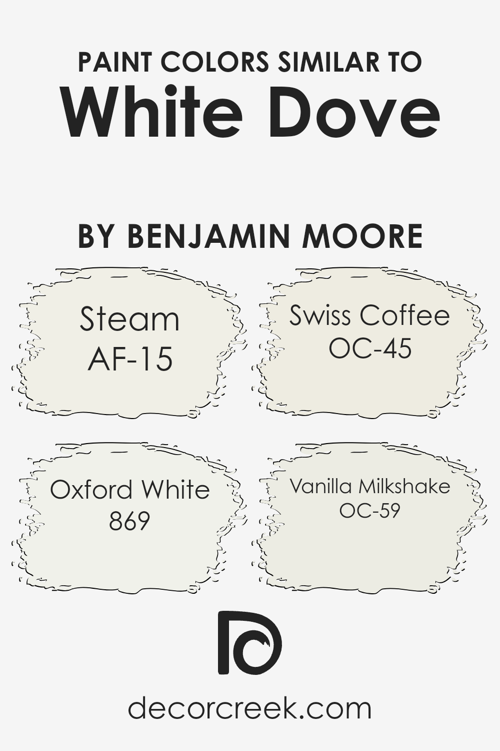
Colors Similar to White Dove OC-17 by Benjamin Moore
Similar colors play a crucial role in achieving a harmonious and balanced aesthetic in any space. When it comes to hues like those similar to White Dove by Benjamin Moore, such as AF-15 – Steam, 869 – Oxford White, OC-45 – Swiss Coffee, and OC-59 – Vanilla Milkshake, the importance of these subtle variations becomes clear.
These colors share a base that is soothing and versatile, yet each brings its own unique undertone, allowing for layers of texture and depth without overwhelming the senses. Incorporating these similar shades can create an inviting and cohesive look, making a room appear larger, brighter, and more elegant.
Steam is a clean, crisp color that offers a breath of fresh air to any room, with a minimalistic charm that’s neither too warm nor too cool. Oxford White, on the other hand, provides a slightly sharper contrast, ideal for trim and ceilings, offering a pristine backdrop that highlights the architecture of a space. Swiss Coffee introduces a warmer, creamier tone, perfect for creating a cozy atmosphere without sacrificing brightness. Lastly, Vanilla Milkshake has a soft, welcoming feel, with just a hint of sweetness, making it ideal for spaces meant for relaxation and comfort.
Together, these colors support a seamless aesthetic flow, enhancing the overall feel without demanding center stage, proving that beauty often lies in the subtlest of details.
You can see recommended paint colors below:
- AF-15 Steam
- 869 Oxford White
- OC-45 Swiss Coffee
- OC-59 Vanilla Milkshake
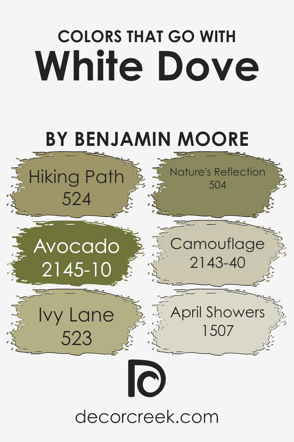
Colors that Go With White Dove OC-17 by Benjamin Moore
Choosing the right colors to complement White Dove OC-17 by Benjamin Moore is crucial in design because it enhances the overall aesthetic, mood, and spatial perception of any room. White Dove is a versatile, soft white paint that serves as a perfect backdrop for a wide array of colors, allowing for flexibility in design choices and themes. When selecting companion colors, it’s essential to consider how they will interact with White Dove and with each other to create a cohesive look.
Colors such as 524 – Hiking Path, a muted earthy tan, bring warmth and grounding to spaces, offering a soothing and inviting atmosphere. Contrastingly, 2145-10 – Avocado, is a deep, rich green that adds a bold, nature-inspired touch, infusing vitality and depth into interiors.
The slightly softer 523 – Ivy Lane provides a gentle hint of green that harmonizes with White Dove, promoting a serene and balanced feel. 504 – Nature’s Reflection, a calm mid-tone blue, mirrors the tranquility of the natural world, creating a peaceful and relaxing environment.
Similarly, 2143-40 – Camouflage is another nature-inspired hue, but with a more muted, olive tone, it crafts an earthy, understated elegance that complements White Dove’s purity. Lastly, 1507 – April Showers, a light, airy blue, offers a fresh and clean look, reminiscent of a clear sky after the rain, adding a subtle splash of color that elevates the room without overwhelming it.
Together, these colors work in harmony with White Dove OC-17 by Benjamin Moore to create spaces that are both inviting and stylistically coherent.
You can see recommended paint colors below:
- 524 Hiking Path
- 2145-10 Avocado
- 523 Ivy Lane
- 504 Nature’s Reflection
- 2143-40 Camouflage
- 1507 April Showers
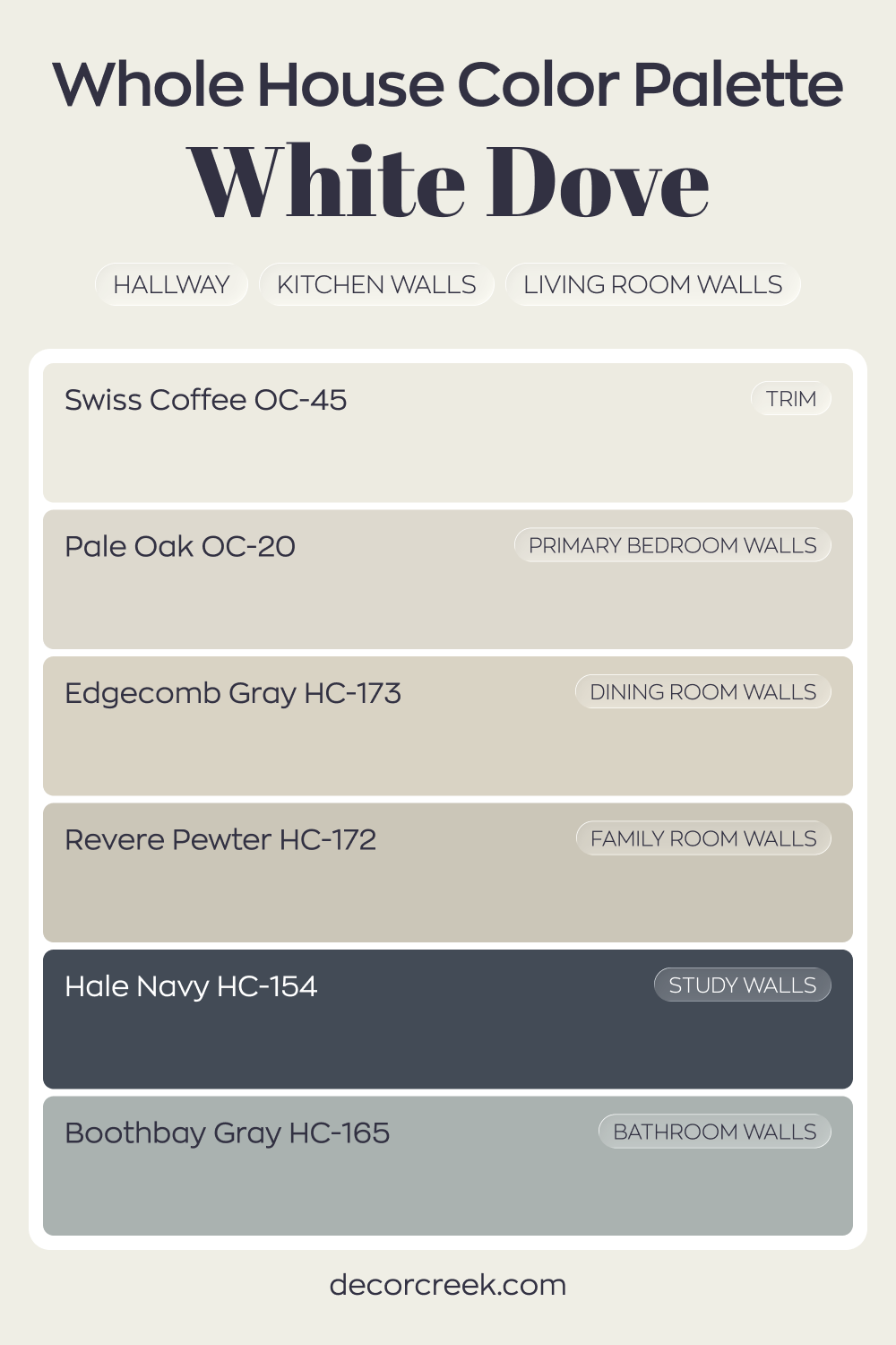
Whole House Paint Color Palette Centered On White Dove OC-17
White Dove OC-17 carries a clean, creamy white through the hallway, kitchen, and living room walls. Swiss Coffee on trim creates a soft contrast that feels intentional and refined. The combination offers brightness with warmth.
Pale Oak in the primary bedroom and Edgecomb Gray in the dining room extend the gentle neutral flow.
Revere Pewter in the family room deepens the palette slightly, adding grounded warmth. Boothbay Gray in the bathroom introduces a cool accent that balances the warmer tones.
Hale Navy in the study provides a bold focal point. The deep blue pairs beautifully with the surrounding whites and greiges, creating a cohesive whole-house look.
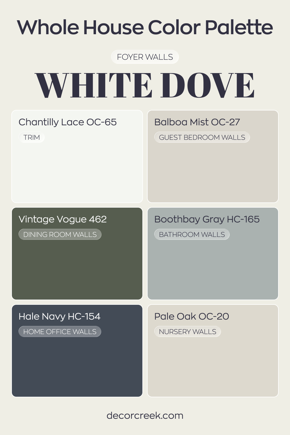
White Dove OC-17 brightens the foyer with a soft, creamy white glow. Chantilly Lace on trim sharpens the architectural lines and keeps the look crisp. The combination offers freshness with gentle warmth.
Balboa Mist in the guest bedroom and Pale Oak in the nursery continue the light neutral story.
Vintage Vogue in the dining room adds rich green depth, while Boothbay Gray in the bathroom introduces a cool blue-gray layer. These tones create variety while staying harmonious.
Hale Navy in the house office provides bold contrast and focus. The darker accent strengthens the palette, balancing the lighter whites and soft neutrals throughout the home.
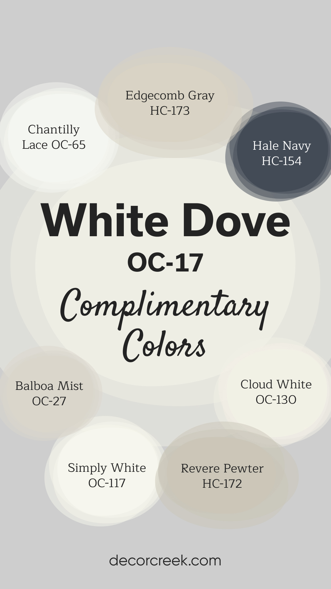
Complimentary Colors for White Dove OC-17 Paint Color by Benjamin Moore
White Dove by Benjamin Moore is a soft, warm white that works beautifully in any space. Its versatility allows it to pair well with both dark and light colors. For a bold contrast, Kendall Charcoal or Hale Navy are excellent choices, adding depth to the room while keeping things elegant.
If you’re looking for a more neutral, calming palette, Revere Pewter and Edgecomb Gray work wonderfully to create a balanced and sophisticated feel.
For a touch of boldness, Vintage Vogue brings in an earthy, deep green that pairs beautifully with the soft warmth of White Dove. Simply White enhances the fresh, clean aesthetic of the room, while Boothbay Gray offers a cool, subtle contrast. White Dove’s flexibility makes it an ideal choice for both modern and classic interiors, bringing a touch of brightness to any space.
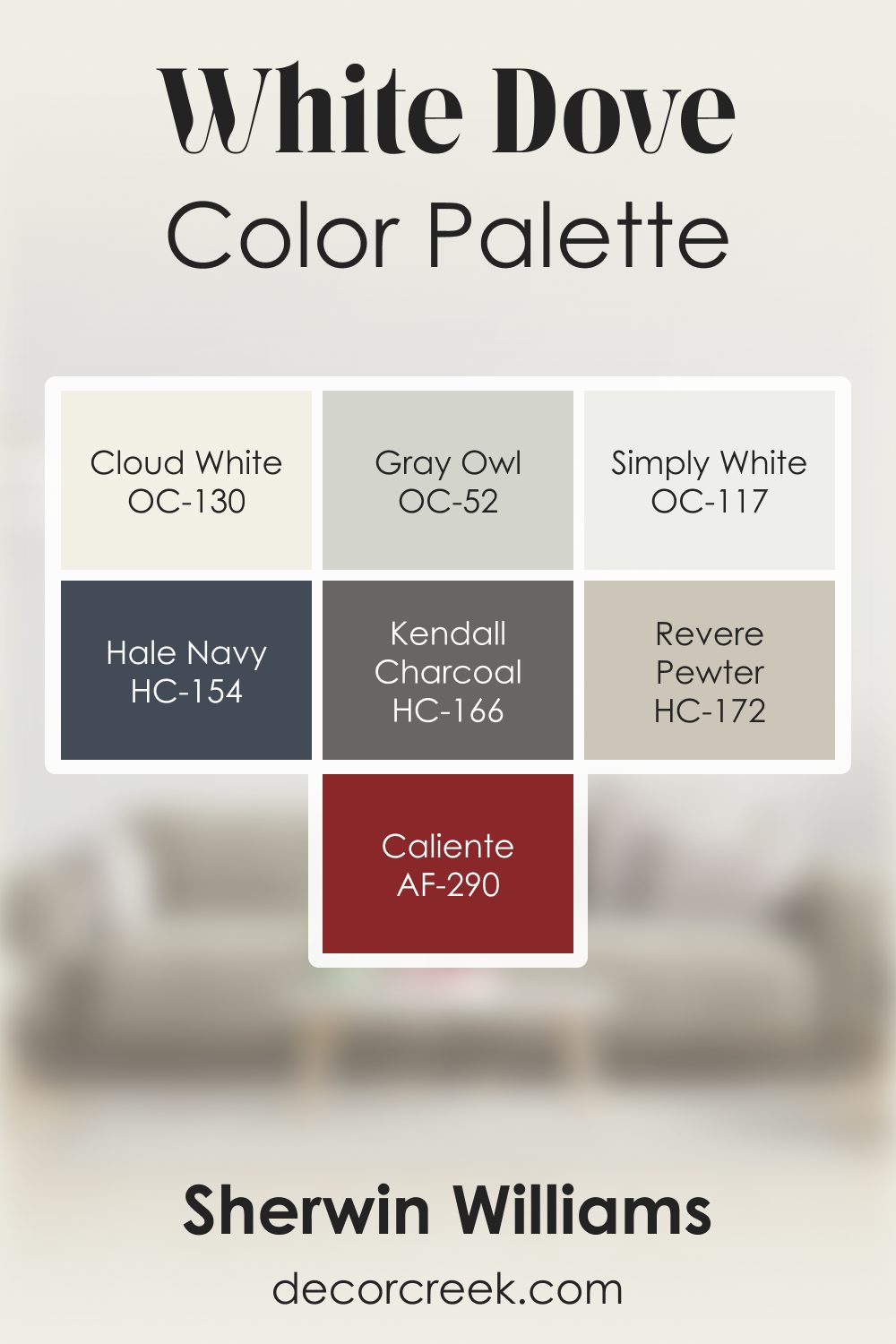
White Dove OC-17 by Benjamin Moore Color Palette
White Dove is soft, clean, and warm, offering a gentle brightness that works beautifully as a foundation for many palettes. Here, it is paired with warm neutrals, grounding accents, and versatile supporting tones that highlight its friendly character.
Cloud White enhances the palette with additional warmth, helping White Dove feel even softer and more welcoming.
Simply White adds crisp clarity that keeps the palette bright and balanced. Gray Owl introduces a cool, airy touch that adds subtle depth without breaking the palette’s warmth. Revere Pewter brings a warm, grounded layer that strengthens transitions and adds natural depth.
Hale Navy provides a deep, steady accent that brings structure and contrast, pairing perfectly with the soft brightness of White Dove. Kendall Charcoal adds confident grounding, giving the palette a strong and stable edge.
Caliente finishes the palette with a warm burst of personality, adding a lively spark that blends smoothly with the warm whites and neutrals.
Together, these colors create a palette that feels warm, calm, and inviting—perfect for living rooms, bedrooms, kitchens, and entryways where soft light and quiet comfort feel right at home.
How to Use White Dove OC-17 by Benjamin Moore In Your Home?
White Dove OC-17 by Benjamin Moore is a popular paint color choice for homeowners looking to add a touch of elegance and warmth to their spaces. With its soft and creamy appearance, White Dove offers a versatile backdrop that can bring rooms to life. It’s particularly effective in areas where natural light is abundant, as the color vibrates with brightness and a sense of openness. One of the best ways to use White Dove in your home is by applying it to walls in living rooms, bedrooms, or kitchens, where its neutral tone provides a calming effect and pairs well with various decors, from modern to traditional.
Additionally, White Dove works great on trim, doors, and cabinetry, offering a subtle contrast against other colors or contributing to a monochromatic and seamless look when used alongside similar shades. Its virtually endless compatibility with other colors means you can use it as a starting point to refresh your home and give it a clean, inviting feel.
Whether you’re aiming for a complete makeover or a simple update, White Dove can help achieve a timeless aesthetic that enhances the beauty of your living space.
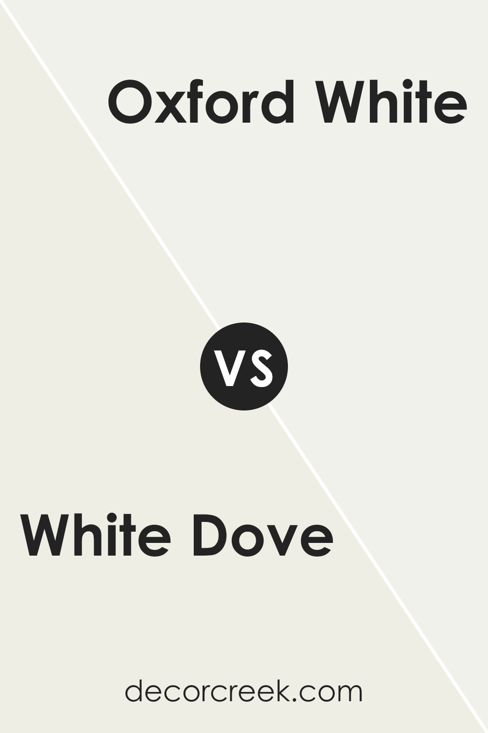
White Dove OC-17 by Benjamin Moore vs Oxford White 869 by Benjamin Moore
White Dove and Oxford White are two popular shades from Benjamin Moore, each with its unique vibe. White Dove is a soft, warm white with a hint of creaminess, making it very inviting and comfy. It’s perfect for spaces where you want a cosy, welcoming feel without going too stark. On the other hand, Oxford White is a crisp, clean white.
It leans more towards a pure white with a slight cool undertone. This makes it great for creating a sharp, modern look that still feels approachable. If you’re deciding between the two, think about the mood you want to set. Want something soft and gentle? Go for White Dove. If you prefer your space to feel more sleek and contemporary, Oxford White is your go-to. Both are versatile, but the choice depends on the atmosphere you aim to create.
You can see recommended paint color below:
- 869 Oxford White
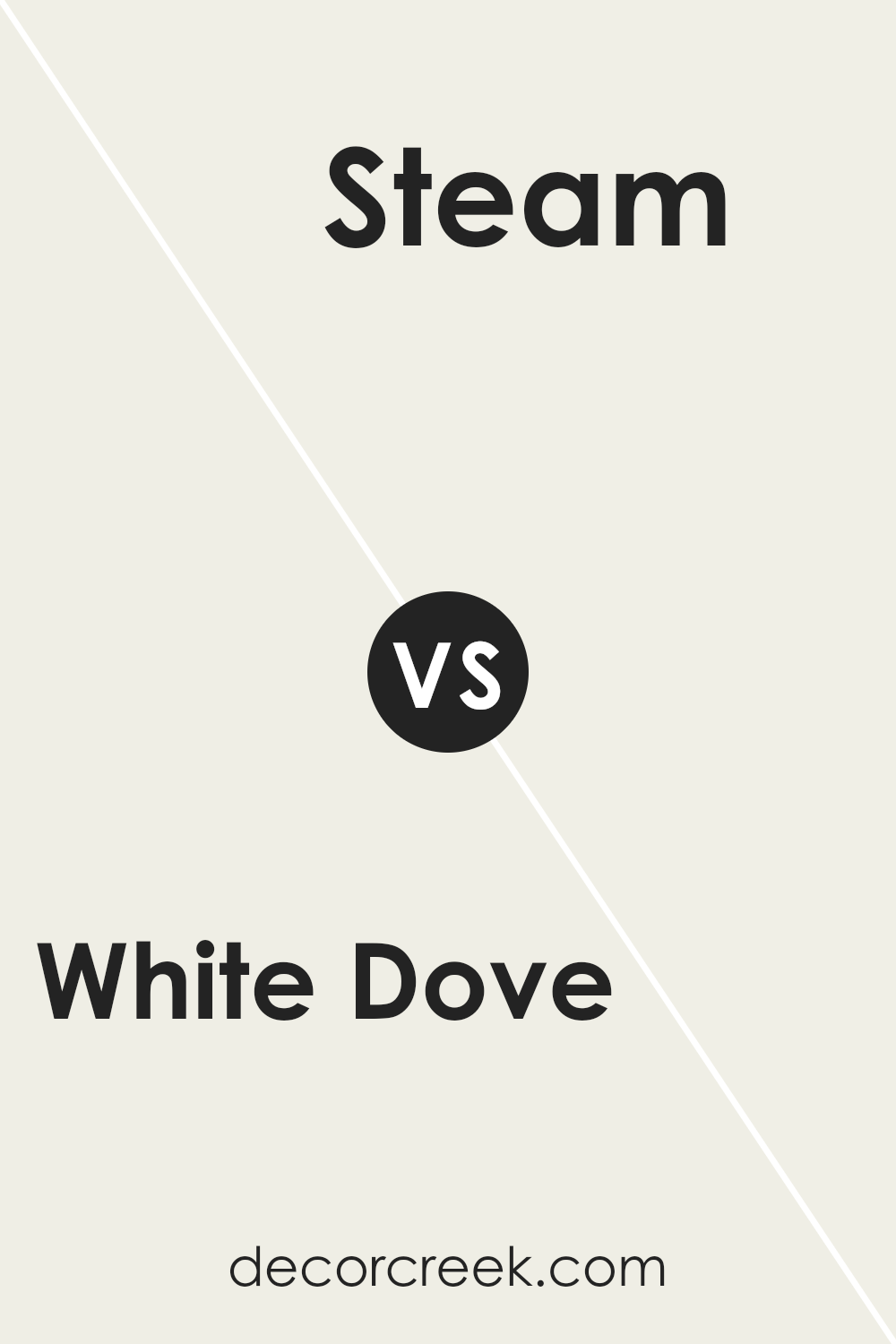
White Dove OC-17 by Benjamin Moore vs Steam AF-15 by Benjamin Moore
White Dove and Steam are two popular paint choices from Benjamin Moore. Both colors are often picked for their neutral and versatile nature, but they have distinct tones that set them apart. White Dove is a warm white with a soft touch, offering a cozy and inviting feel. It’s perfect for creating a relaxed and comfortable atmosphere in any room, making spaces feel welcoming and bright.
On the other hand, Steam leans more towards the cooler side of the color spectrum. Although it’s also a white, it has a crisper and cleaner appearance. This makes it ideal for modern spaces or areas where a fresh, uncluttered vibe is desired. Steam is especially great for achieving a minimalist aesthetic without feeling too sterile. When deciding between the two, consider the mood you want to set in your space.
White Dove brings warmth and softness, whereas Steam adds a sleek and contemporary touch.
You can see recommended paint color below:
- AF-15 Steam
White Dove OC-17 by Benjamin Moore vs Swiss Coffee OC-45 by Benjamin Moore
White Dove and Swiss Coffee, both by Benjamin Moore, are popular choices for those looking for versatile paint colors. While they may seem similar at first glance, some distinct differences set them apart. White Dove is widely loved for its softness and warmth while maintaining a clean appearance. It strikes a perfect balance without being too stark or too creamy, making it a great choice for a cozy yet bright feel in a room.
On the other hand, Swiss Coffee brings a slightly warmer tone, offering a touch of creaminess that adds cozy depth to spaces without overwhelming them. It is especially favored for creating an inviting atmosphere, particularly in well-lit areas where its richness can be appreciated without appearing too yellow.
In essence, when choosing between White Dove and Swiss Coffee, consider the amount of warmth and softness you want to introduce to your space. White Dove is ideal for those who prefer a clean, bright backdrop, while Swiss Coffee suits those looking for a warmer, comforting feel with a bit more depth.
You can see recommended paint color below:
White Dove OC-17 by Benjamin Moore vs Vanilla Milkshake OC-59 by Benjamin Moore
White Dove and Vanilla Milkshake, both by Benjamin Moore, are popular choices for those seeking a soft, neutral backdrop in their home. White Dove is a warm white that brings a sense of calm and simplicity to any space. It’s known for its versatility, easily pairing with a wide range of colors and decor styles.
On the other hand, Vanilla Milkshake is slightly warmer and richer than White Dove. It has a creamy quality that makes spaces feel cozy and welcoming. While both colors share a similar base, Vanilla Milkshake’s added warmth gives it a more inviting feel, making it a great choice for living areas and bedrooms where comfort is key.
In contrast, White Dove’s neutral tone works well in spaces that aim for a crisp, clean look, such as kitchens and bathrooms. Ultimately, the choice between these two depends on the mood you want to create in your space.
You can see recommended paint color below:
- OC-59 Vanilla Milkshake
Conclusion
White Dove by Benjamin Moore has been celebrated as a versatile and beloved paint color that has the unique ability to add a touch of elegance and warmth to any space. Its soft, neutral hue offers a perfect backdrop for a wide range of decor styles, making it a top choice for both homeowners and interior designers alike. Its adaptability means it can create a serene and inviting atmosphere in any room, whether it be a bright and airy living area or a cozy, peaceful bedroom.
What sets White Dove apart is its subtle warmth, which ensures spaces feel inviting rather than stark or clinical, which can sometimes be the case with pure whites. This makes it an ideal choice for those looking to achieve a soft, yet sophisticated, aesthetic in their homes.
Moreover, its ability to pair beautifully with a variety of colors and materials, from bold and vibrant hues to subtle earth tones and natural wood finishes, ensures that White Dove remains a timeless and popular choice for creating beautiful and harmonious spaces.

Ever wished paint sampling was as easy as sticking a sticker? Guess what? Now it is! Discover Samplize's unique Peel & Stick samples.
Get paint samples

