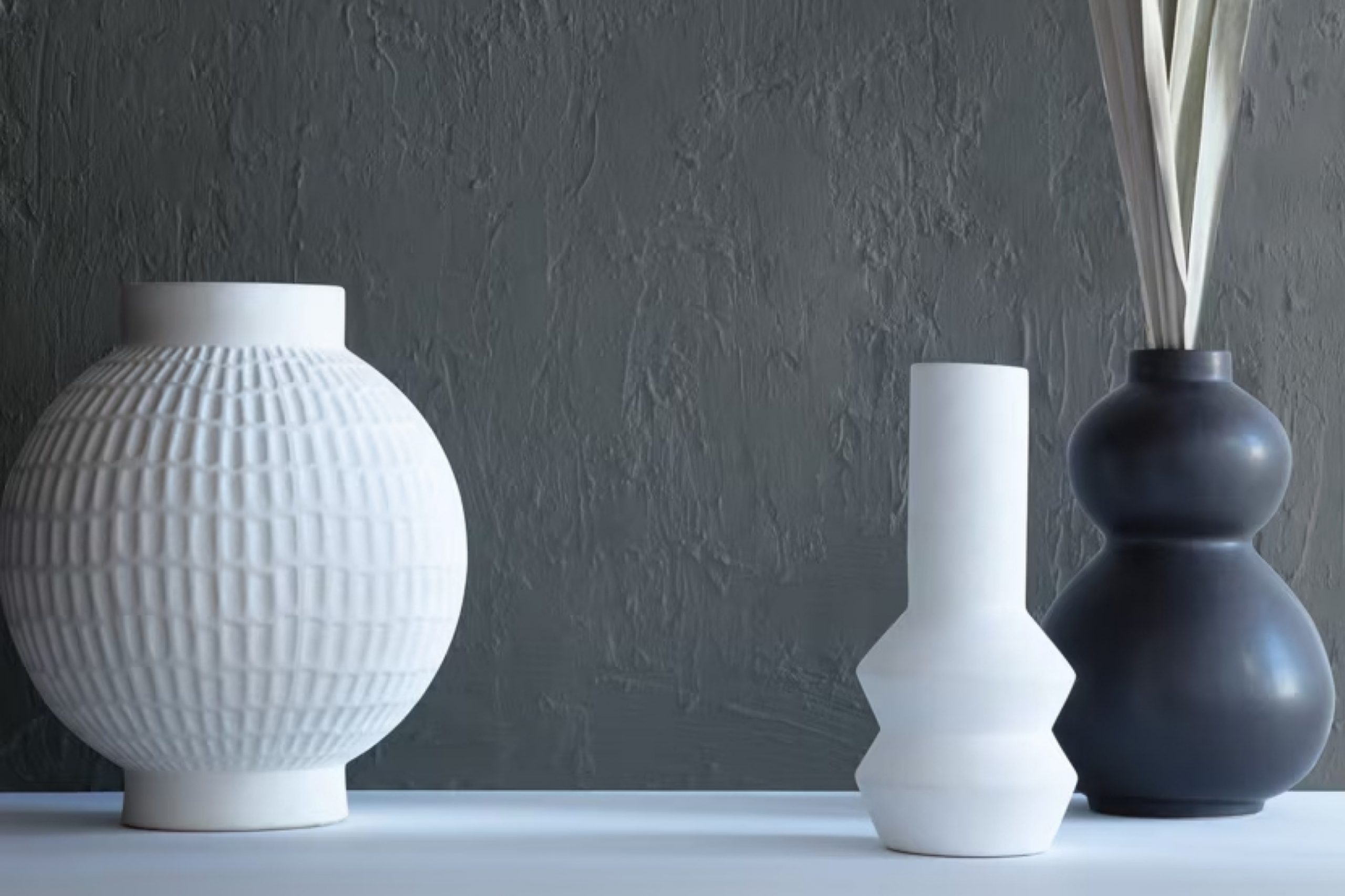
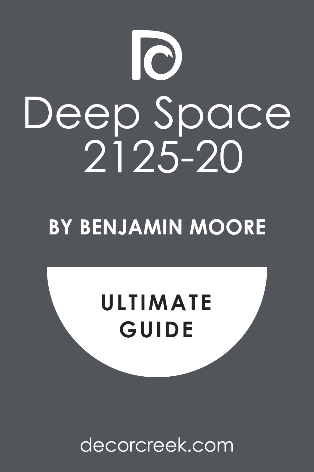
As you might be considering a fresh look for your space, you should check out a unique shade named 2125-20 Deep Space by Benjamin Moore. This color is a profound, rich charcoal that can give your room a modern and sophisticated air.
Whether you’re thinking about painting a bedroom, a living area, or even an accent wall, Deep Space offers a versatile backdrop that complements various decor styles and color schemes.
It’s dark enough to make a statement yet neutral to pair easily with brighter colors or softer hues, creating a balanced look. If you’re planning to update your interiors, think about how this shade could enhance your furnishings and reflect your personal style.
Reimagining your space with 2125-20 Deep Space might be just what you need to give it a fresh, contemporary vibe.
What Color Is Deep Space 2125-20 by Benjamin Moore?
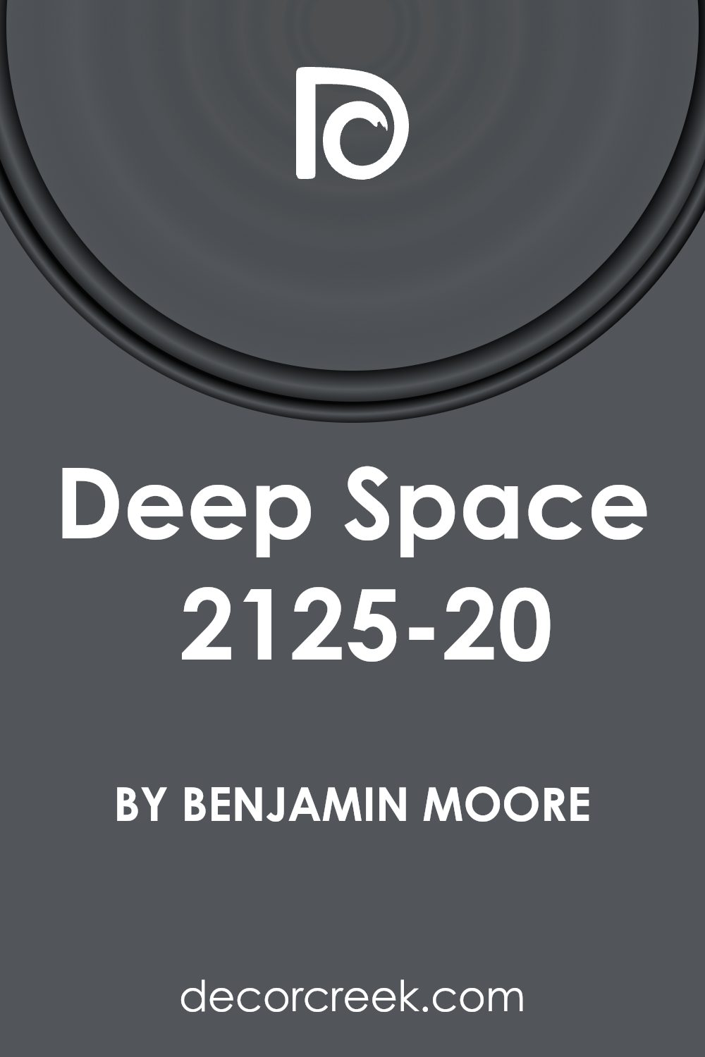
Deep Space by Benjamin Moore is a rich, dark color with hints of navy and charcoal. It’s a versatile shade that suits various interior design styles, especially modern, industrial, and minimalist decors. When used in a room, this color provides a strong, grounding effect that makes it ideal for accent walls or even on all four walls for a dramatic look.
This deep hue pairs excellently with a range of materials and textures. In a modern setting, combining it with polished metals, like stainless steel or chrome, adds a crisp, clean feel to the space. For an industrial vibe, consider matching it with rough textures like exposed brick or weathered wood, which complement its depth and intensity.
Soft furnishings like velvet or silk in lighter colors such as soft grays or creamy whites can also balance the darkness of Deep Space, adding a touch of luxury and comfort.
In terms of lighting, Deep Space benefits from ample natural light or well-placed artificial lighting to prevent it from overpowering a room. This color also works well with large windows that draw in natural light, highlighting its richness and depth without making the space feel too closed in.
Overall, Deep Space offers a bold and grounding presence in any interior where strong visual impact is desired.
Is Deep Space 2125-20 by Benjamin Moore Warm or Cool color?
Deep Space 2125-20 by Benjamin Moore is a rich, dark gray hue that infuses homes with a modern and stylish look. This color is exceptional for creating striking contrasts, especially when paired with light-colored furnishings or trim. Its ability to absorb light makes it a popular choice for accent walls, providing a dramatic backdrop that makes artwork and decorative pieces stand out.
Deep Space is versatile enough to be used in various rooms, from living areas to bedrooms, adding depth and focus. In smaller spaces, using this color can create a cozy, intimate feel, while in larger areas, it brings a sense of grounding.
This shade also pairs beautifully with metallic fixtures and finishes, such as brushed nickel or chrome, enhancing the overall contemporary vibe of a room. Additionally, its timeless nature means it won’t quickly go out of style, making it a solid choice for anyone looking to refresh their home’s appearance.
Undertones of Deep Space 2125-20 by Benjamin Moore
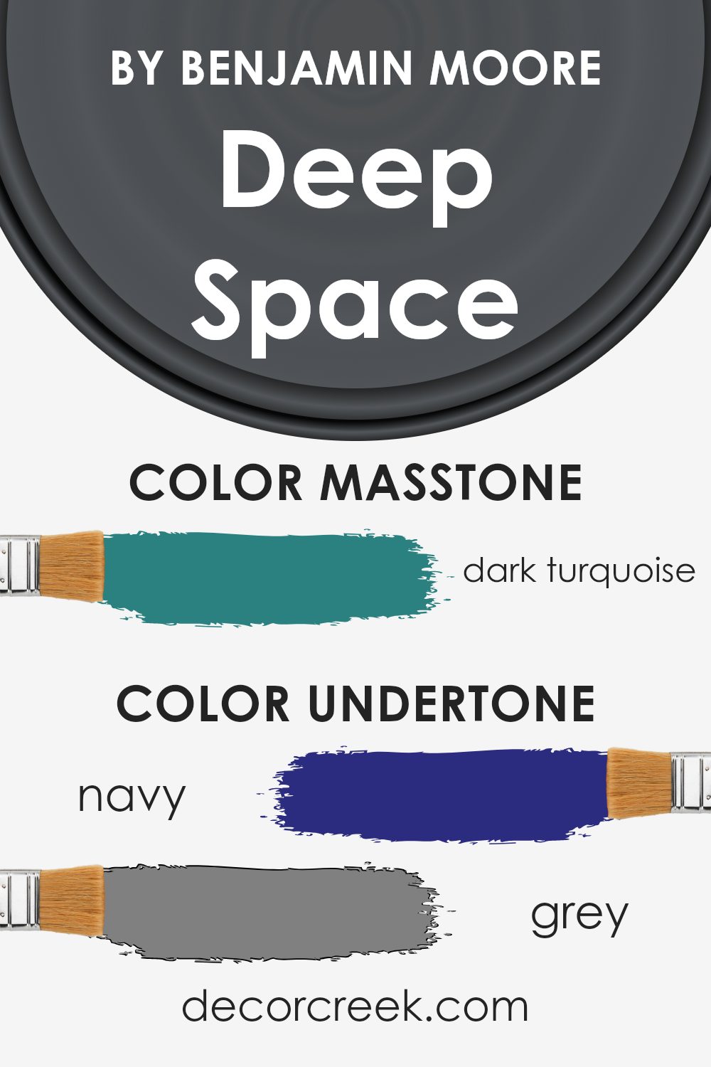
Deep Space 2125-20 by Benjamin Moore is a complex color with a variety of undertones that add depth and richness. Undertones are subtle hues that can influence the overall look of a paint color. They can make a color appear cooler or warmer, depending on the lighting and surrounding elements.
The undertones in Deep Space 2125-20 include shades of navy, grey, purple, dark green, dark grey, olive, brown, blue, dark blue, lilac, light turquoise, violet, mint, green, light green, turquoise, and light blue. These undertones contribute to how the color is perceived in different environments.
For instance, in a room with plenty of natural light, the blue and green undertones might become more prominent, giving the walls a cooler feel. In contrast, in a space with warmer lighting, the brown and olive undertones might stand out, adding a cozy warmth to the room.
When used on interior walls, Deep Space 2125-20 can create varying effects based on its undertones. This versatility makes it an excellent choice for spaces where you want depth and interest without overwhelming the senses.
The blend of undertones can help tie together different decor elements, making the space feel cohesive.
Whether creating a dramatic accent wall or enveloping a room in color, the undertones in this paint can significantly impact the mood and style of a space.
What is the Masstone of the Deep Space 2125-20 by Benjamin Moore?
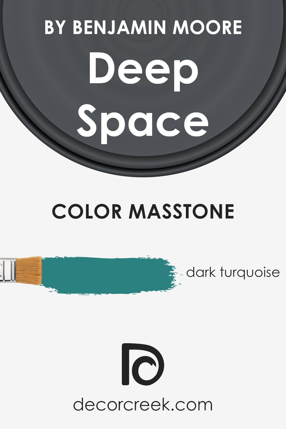
Deep Space 2125-20 by Benjamin Moore is a dark turquoise color with a masstone that gives off a calm and cozy vibe. This color works beautifully in homes where homeowners want to create a moody yet inviting atmosphere. Since it’s a darker shade, it tends to absorb light, making it perfect for larger spaces or rooms with plenty of natural light.
In smaller or dimly-lit rooms, using this color on a feature wall can help prevent the space from feeling too closed in. The dark turquoise hue pairs well with warm woods and metallic accents, enhancing a room’s aesthetic without feeling overly loud or busy.
It’s also versatile, complementing both modern and traditional decor seamlessly. When used in a home, Deep Space 2125-20 impacts positively by adding depth and interest while maintaining a relaxed and comfortable environment.
How Does Lighting Affect Deep Space 2125-20 by Benjamin Moore?
Lighting plays a crucial role in how colors are perceived in any space. The same color can look quite different under various types of lighting because light can affect the intensity and hue. When it comes to the color Deep Space 2125-20 by Benjamin Moore, its presentation can vary significantly depending on the light it’s exposed to. This deep, rich shade can have nuanced appearances under different lighting conditions.
In artificial light, Deep Space tends to appear denser and more saturated. If the artificial lighting is warm, it might draw out a subtle, cozy vibe from the color, making it ideal for living areas where you want to create a relaxed atmosphere. In cooler artificial light, this color might lean slightly towards a starker appearance, which can be striking for modern settings.
Natural light, on the other hand, reveals the true character of Deep Space. In a room with lots of natural sunlight, like a south-facing room, the color can look vibrant and dynamic. The intense sunlight will highlight the depth of the color, making the walls look robust and lively.
Rooms that face north receive less direct sunlight, which can make Deep Space appear more shadowy and dramatic. This can be perfect for creating a moody or intimate feeling in spaces like bedrooms or studies.
In east-facing rooms, the morning light can make Deep Space look softer and slightly bluish, offering a calm and peaceful start to the day. This softer version of the color works well in rooms used predominantly in the morning, such as breakfast nooks.
Conversely, in west-facing rooms, the evening light brings warmth that can make Deep Space glow subtly, perfect for living spaces used mainly in the afternoons and evenings.
Understanding these nuances can help you decide where to paint this color in your home to make the most of its dynamic potential under different light exposures.

What is the LRV of Deep Space 2125-20 by Benjamin Moore?
LRV stands for Light Reflectance Value, which is a measure of how much light a color reflects or absorbs when painted on a surface. It is expressed as a percentage and helps in determining how light or dark a color will appear once applied.
A higher LRV indicates a lighter color that reflects more light, while a lower LRV denotes a darker color that absorbs more light. This measurement is crucial when choosing paint colors for a room, as it can massively impact the perception of space and light in the environment.
In the case of Deep Space (LRV 10.8) by Benjamin Moore, the low LRV suggests that it is a very dark color that absorbs most of the light. When used on walls, this paint color will create a bold and dramatic effect, making it ideal for creating a striking accent wall or adding depth to an interior space. However, because it reflects very little light, using it in a small or poorly-lit room might make the space appear smaller and darker.
It’s perfect for larger areas or rooms with plenty of natural or artificial lighting where it won’t overly diminish the perceived size of the space.

Coordinating Colors of Deep Space 2125-20 by Benjamin Moore
Coordinating colors are those that complement each other when used together in decor or design, enhancing the overall aesthetic without overpowering each other. When decorating with a strong, bold color like a deep navy, choosing the right coordinating colors is crucial for achieving a balanced and harmonious look.
For a color like Deep Space 2125-20 by Benjamin Moore, which is a rich, dark hue, lighter and softer shades can create a striking contrast while maintaining a cohesive design.
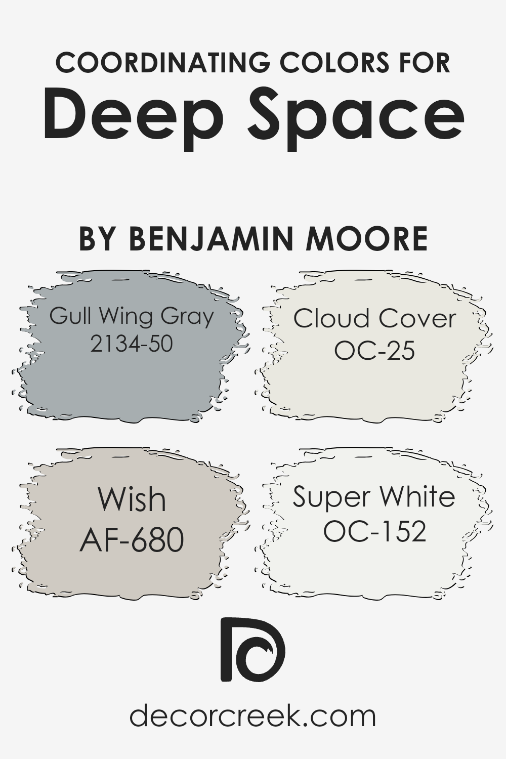
Gull Wing Gray 2134-50 is a mid-tone gray that maintains a subtle warmth, making it easy to pair with deeper shades for a grounded yet airy feel. Wish AF-680 is a gentle taupe that offers a muted backdrop, ideal for spaces that aim for a subtle touch of sophistication without using overpowering hues.
Cloud Cover OC-25 is a soft off-white with a touch of grey; it’s perfect for bringing light into a room and enhancing the space without creating stark contrasts. Lastly, Super White OC-152 is a clean and crisp white that provides a fresh and clear aspect, working as a perfect canvas to bring any color palette together.
These shades support and enhance the depth of Deep Space 2125-20, working together to create an inviting space.
You can see recommended paint colors below:
- 2134-50 Gull Wing Gray (CHECK A SAMPLE)
- AF-680 Wish (CHECK A SAMPLE)
- OC-25 Cloud Cover
- OC-152 Super White (CHECK A SAMPLE)
What are the Trim colors of Deep Space 2125-20 by Benjamin Moore?
Trim colors are specific shades used to paint the architectural details of a room such as door frames, window frames, skirting boards, and moldings. They are crucial in interior design as they define and accentuate the boundaries within a space, providing clean lines that visually separate different architectural elements.
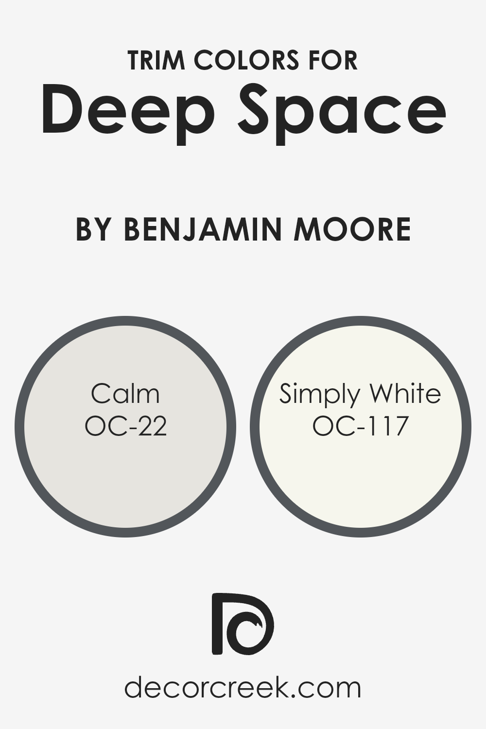
For example, when Deep Space, a rich and deep blue hue, is used as the main wall color, it sets a bold and dramatic tone. Choosing a fitting trim color such as OC-22 – Calm or OC-117 – Simply White can enhance this look by adding a neat, contrasting frame to the walls.
OC-22 – Calm is a soft gray that, true to its name, imparts a peaceful and grounded feel to a space. It works wonderfully as a trim color because it can subtly outline details without overwhelming the primary color, Deep Space. Similarly, OC-117 – Simply White is a clean and bright white that offers a sharp contrast to deeper hues, making architectural details pop dramatically.
This color is ideal for those who want their trims to stand out, bringing a fresh and airy quality to the overall design. Using either Calm or Simply White as trim colors with Deep Space ensures that the darker shade does not overpower the room but instead is elegantly balanced by these lighter tones.
You can see recommended paint colors below:
- OC-22 Calm
- OC-117 Simply White
Colors Similar to Deep Space 2125-20 by Benjamin Moore
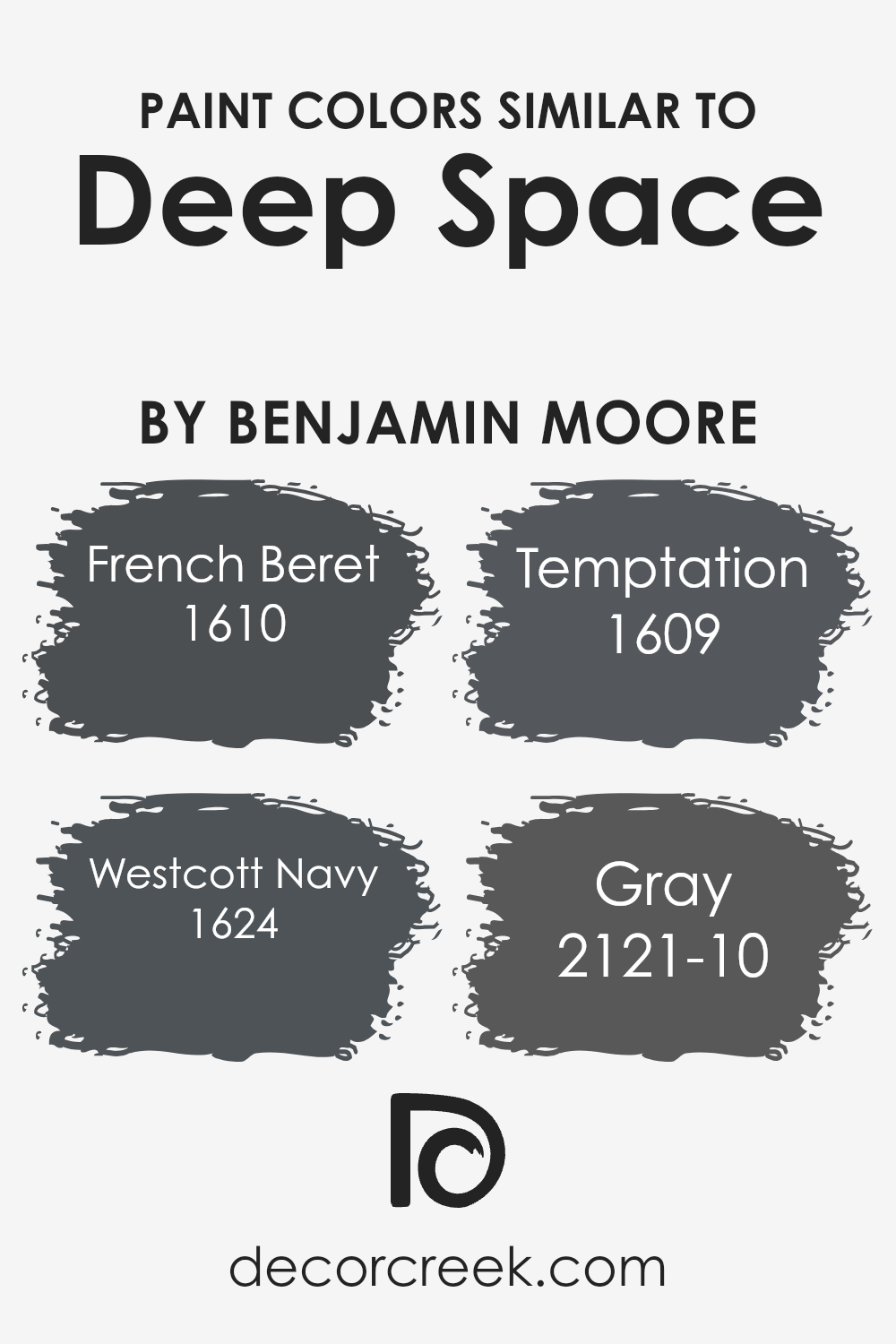
Choosing similar colors in design can be crucial for creating a harmonious and visually appealing space. Colors like French Beret, Westcott Navy, Temptation, and Gray are excellent complements to Deep Space 2125-20 by Benjamin Moore.
These colors work well together because they share similar hues and intensities, making them easy to blend within a space without overpowering each other. Using similar colors can also create a subtle yet impactful visual flow, leading the eye smoothly from one area to another which enhances the overall aesthetic appeal of the room.
French Beret 1610 is a deep, smoky blue that mirrors the depth of the night sky, bringing a sense of calmness to any space it adorns. Westcott Navy 1624, a slightly lighter shade of navy, adds a classic touch with its rich blue tones that recall the feeling of an elegant navy uniform.
Temptation 1609, on the other hand, introduces a hint of gray to its blue, providing a modern twist that is both refreshing and stylish. Lastly, Gray 2121-10 serves as a neutral backbone, offering a stable foundation that supports and enhances its more vivid blue counterparts.
Together, these colors create a cohesive palette that complements the deep tones of Deep Space, ensuring a stylish and well-balanced look.
You can see recommended paint colors below:
- 1610 French Beret (CHECK A SAMPLE)
- 1624 Westcott Navy (CHECK A SAMPLE)
- 1609 Temptation (CHECK A SAMPLE)
- 2121-10 Gray (CHECK A SAMPLE)
Colors that Go With Deep Space 2125-20 by Benjamin Moore
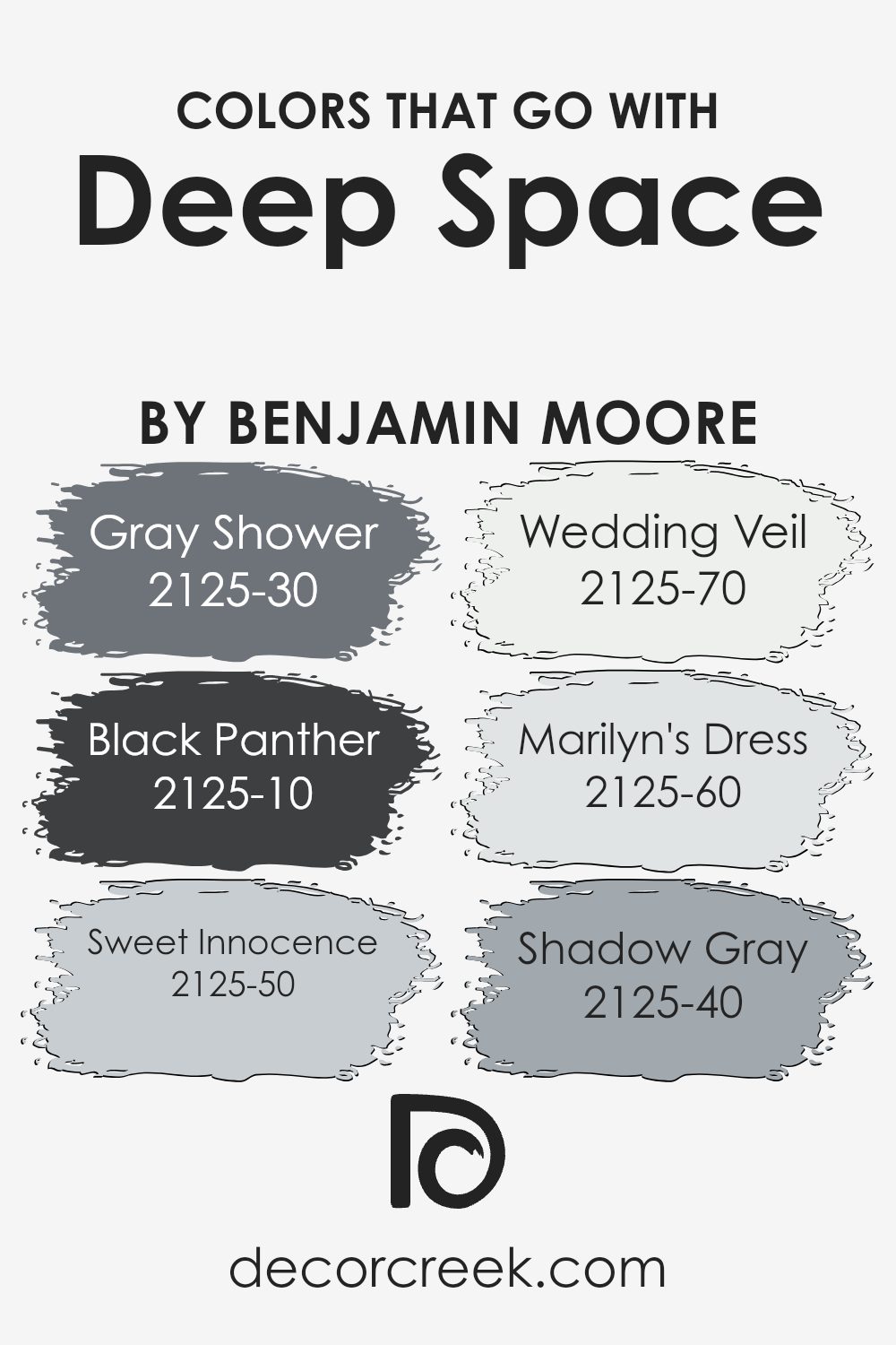
When selecting complementary colors for the rich hue of Deep Space 2125-20 by Benjamin Moore, it’s crucial to establish a harmonious palette. Colors like Gray Shower, Black Panther, Sweet Innocence, Wedding Veil, Marilyn’s Dress, and Shadow Gray work seamlessly with Deep Space, providing balance and enhancing the depth of any space.
These colors have unique characteristics making them versatile for creating a thoughtful blend of brightness and shadow in interior spaces.
Gray Shower and Black Panther offer a beautiful contrast to Deep Space. Gray Shower is a light, almost silvery gray that brings a softness to balances darker tones. Meanwhile, Black Panther is a dense, potent black that adds a striking boldness and definition when paired with deeper shades like Deep Space.
On the lighter side, Sweet Innocence and Wedding Veil are subtle and fresh colors. Sweet Innocence is a gentle, muted lavender that adds a touch of soft color, perfect for relaxing spaces. Wedding Veil is an ultra-light gray with a hint of warmth, ideal for adding a slight contrast without overwhelming the presence of Deep Space.
Lastly, Marilyn’s Dress and Shadow Gray offer medium tones. Marilyn’s Dress is a delicate blue-gray that resonates calmness and is effective in spaces aiming for a fresh, airy feel. Shadow Gray, a deeper tone of gray, works well to bridge the gap between light and dark, ensuring the overall look is cohesive yet distinctively layered.
These colors collectively enhance the aesthetic appeal while maintaining the visual interest of the surroundings when combined with Deep Space.
You can see recommended paint colors below:
- 2125-30 Gray Shower (CHECK A SAMPLE)
- 2125-10 Black Panther (CHECK A SAMPLE)
- 2125-50 Sweet Innocence (CHECK A SAMPLE)
- 2125-70 Wedding Veil (CHECK A SAMPLE)
- 2125-60 Marilyn’s Dress (CHECK A SAMPLE)
- 2125-40 Shadow Gray (CHECK A SAMPLE)
How to Use Deep Space 2125-20 by Benjamin Moore In Your Home?
Deep Space 2125-20 by Benjamin Moore is a rich, deep blue paint that brings a unique touch to any room. This color is fantastic for creating a bold statement wall in living spaces or bedrooms. It pairs beautifully with light neutral furnishings or wood accents to provide a balanced look.
If you’re aiming for a cozy, intimate vibe, using this shade in a small room like a bathroom or reading nook can enhance the feeling of seclusion and comfort.
For those who enjoy a modern aesthetic, combining Deep Space 2125-20 with metallic finishes such as silver or chrome can create a trendy, stylish contrast. It’s also an excellent choice for the exterior of a home, such as on doors or shutters, giving a striking curb appeal that stands out in a neighborhood.
Overall, this color is versatile and can be used to create a variety of vibes depending on what it’s paired with, making it a great choice for anyone looking to refresh their space.
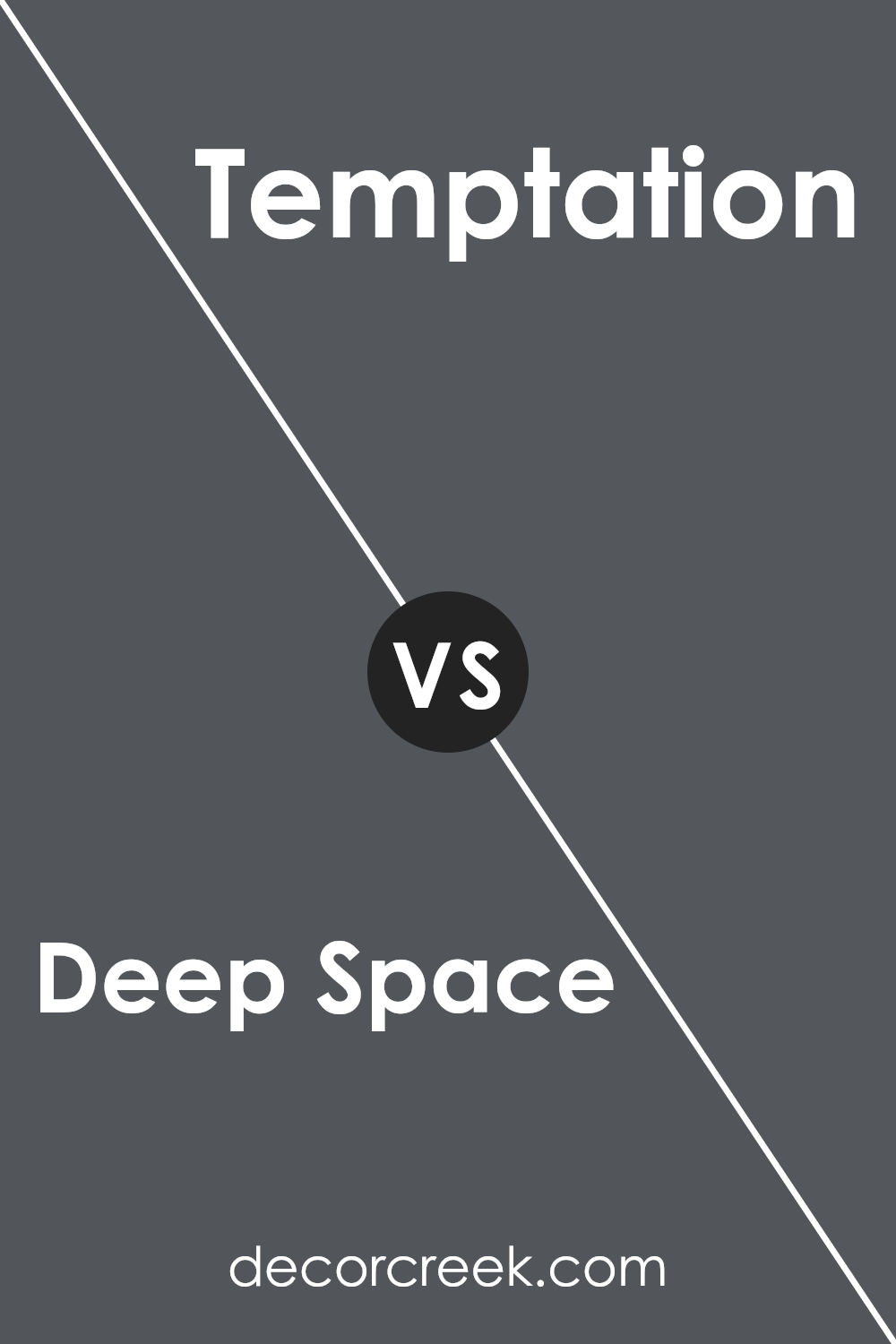
Deep Space 2125-20 by Benjamin Moore vs Temptation 1609 by Benjamin Moore
Deep Space 2125-20 by Benjamin Moore is a strong and rich navy blue that has an almost velvet-like texture in appearance, giving any space a bold and cozy feel. It’s perfect for making a statement in a room, whether on an accent wall or throughout a larger area.
On the other hand, Temptation 1609 is a lighter shade of gray with subtle blue undertones. This color is versatile and offers a more laid-back vibe, making it suitable for various living spaces, promoting a relaxed and calming atmosphere.
While Deep Space gives a room a more dramatic and cozy effect, Temptation tends to open up spaces and gives them a fresh, airy feel. Both colors do a great job in their respective roles, whether you’re looking to create a striking feature or a gentle backdrop.
You can see recommended paint color below:
- 1609 Temptation (CHECK A SAMPLE)
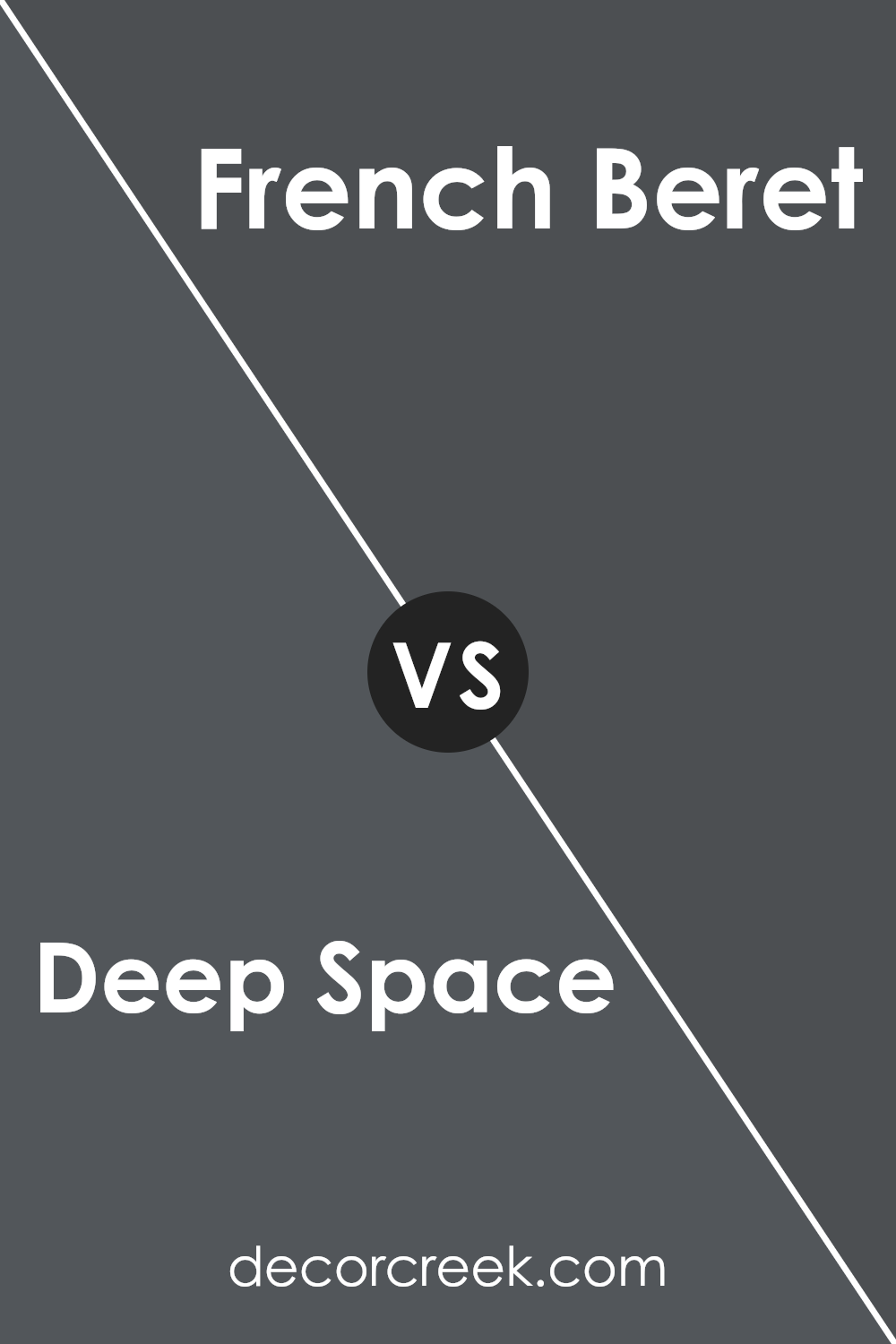
Deep Space 2125-20 by Benjamin Moore vs French Beret 1610 by Benjamin Moore
Deep Space and French Beret, both by Benjamin Moore, are classy, dark shades, perfect for creating a strong presence in any room. Deep Space is a richer, more intense color resembling a very dark blue or black. It’s suitable for making a bold statement and can make large rooms feel cozier.
On the other hand, French Beret is a softer, charcoal gray color with hints of blue. It’s less intense than Deep Space, providing a more subtle and lighter feel, though it is still decidedly dark. This color works well in smaller spaces or as an accent wall, as it won’t overwhelm the room.
While both colors are on the darker end of the spectrum, Deep Space leans towards a true dark shade, whereas French Beret offers a hint of gentleness due to its grayish undertone. Together, they provide versatile options for interior design, whether for a striking, bold look or a gentle, understated elegance.
You can see recommended paint color below:
- 1610 French Beret (CHECK A SAMPLE)
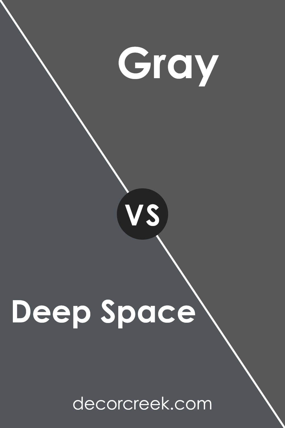
Deep Space 2125-20 by Benjamin Moore vs Gray 2121-10 by Benjamin Moore
The main color, Deep Space, is a very dark shade that could be seen as a strong and bold part of the color spectrum. It leans towards a black but has subtle hints of navy, making it a solid choice for an accent wall or for furniture if you want something that really stands out. This color is ideal if you’re looking to create a strong statement in a room, whether for a cozy reading nook or a dramatic living room setup.
On the other hand, the second color, Gray, while still dark, is lighter compared to Deep Space. It’s a deep charcoal color that offers a less intense feel but still provides a significant presence in a space. This shade is versatile, working well in various settings, from modern kitchens to minimalist bedrooms, offering a touch of depth without overpowering the space.
Both colors are great for adding character to a room, but your choice will depend on how bold or subtle you want the room’s atmosphere to be.
You can see recommended paint color below:
- 2121-10 Gray (CHECK A SAMPLE)
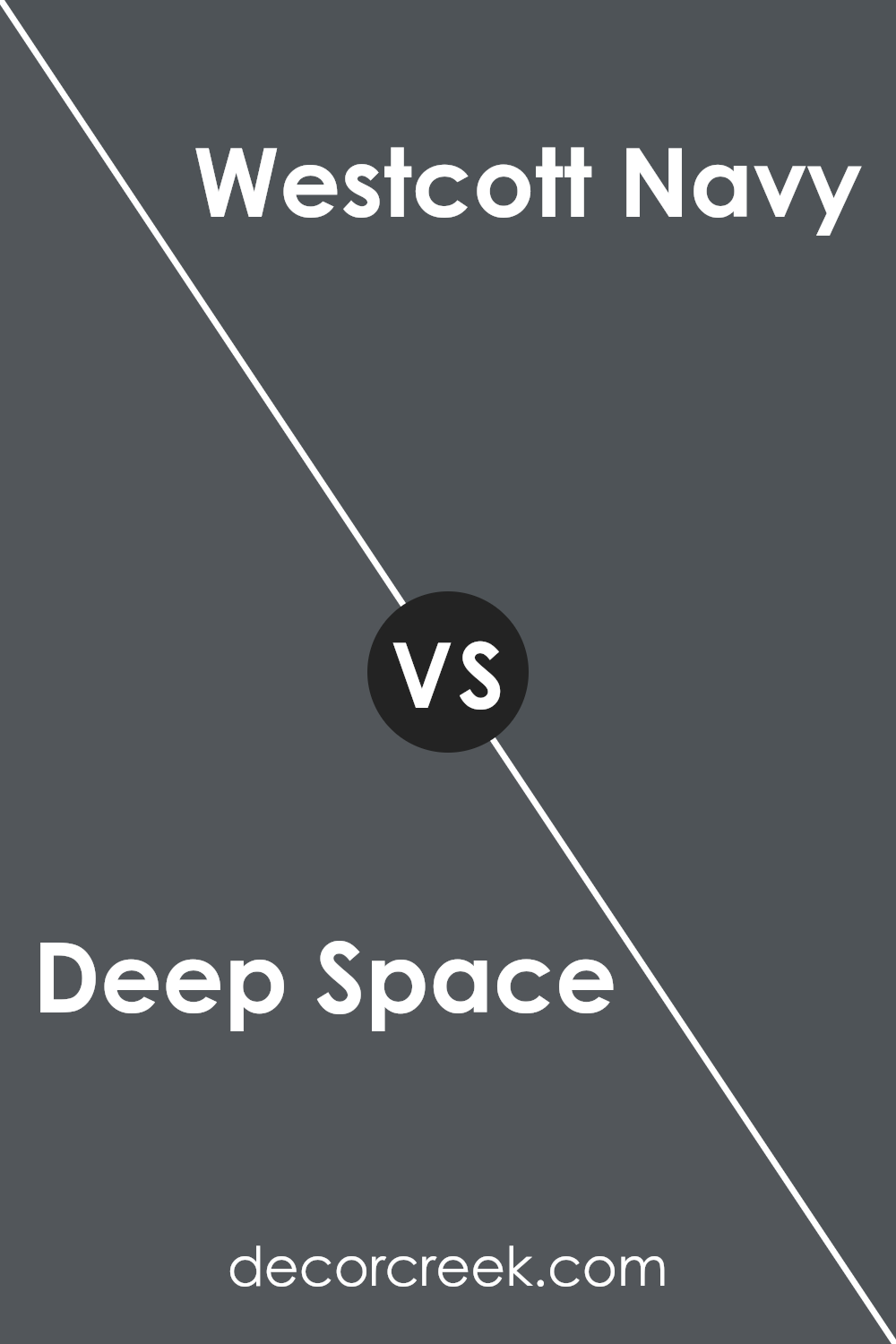
Deep Space 2125-20 by Benjamin Moore vs Westcott Navy 1624 by Benjamin Moore
Deep Space 2125-20 by Benjamin Moore is a very dark, almost black hue that can give a strong, bold look to any room. It’s great for creating a feeling of depth and drama when used on walls or accents. On the other hand, Westcott Navy 1624 is also a dark color but with a distinct blue tone, which gives it a slightly lighter and more traditional navy feel compared to Deep Space.
Westcott Navy can be more flexible in combining with various decor styles, offering a classic, timeless appeal. Both colors are excellent choices for adding a powerful impact in any space, but the selection depends on whether you prefer a hint of blue or a deeper, near-black coloration.
These shades can also affect the room’s perceived size and lighting, with Deep Space potentially making rooms feel smaller and cozier, while Westcott Navy might maintain a bit more spaciousness.
You can see recommended paint color below:
- 1624 Westcott Navy (CHECK A SAMPLE)
Conclusion
Deep Space is a dark, almost black color that has a hint of blue in it. Think of it like the night sky just before it turns completely black. This color is great for making any space in a house look more sophisticated and cozy, like a little reading nook or a bedroom where you can relax.
I found out that this paint works well in rooms where you want to show off other decorations because it’s a great background color. It doesn’t take the attention away from the other colors or furniture in the room. When used right, Deep Space can make a room feel warmer and more inviting because it adds a lot of character without being too bold.
Choosing the right color for a room can make a big difference, and it seems like Deep Space is a good option for those who want something deep and thoughtful but still very stylish.
So, whether someone is redoing their living room, bedroom, or just a small corner of their home, Deep Space might be the perfect pick to create a cozy, stylish look.
Ever wished paint sampling was as easy as sticking a sticker? Guess what? Now it is! Discover Samplize's unique Peel & Stick samples.
Get paint samples


