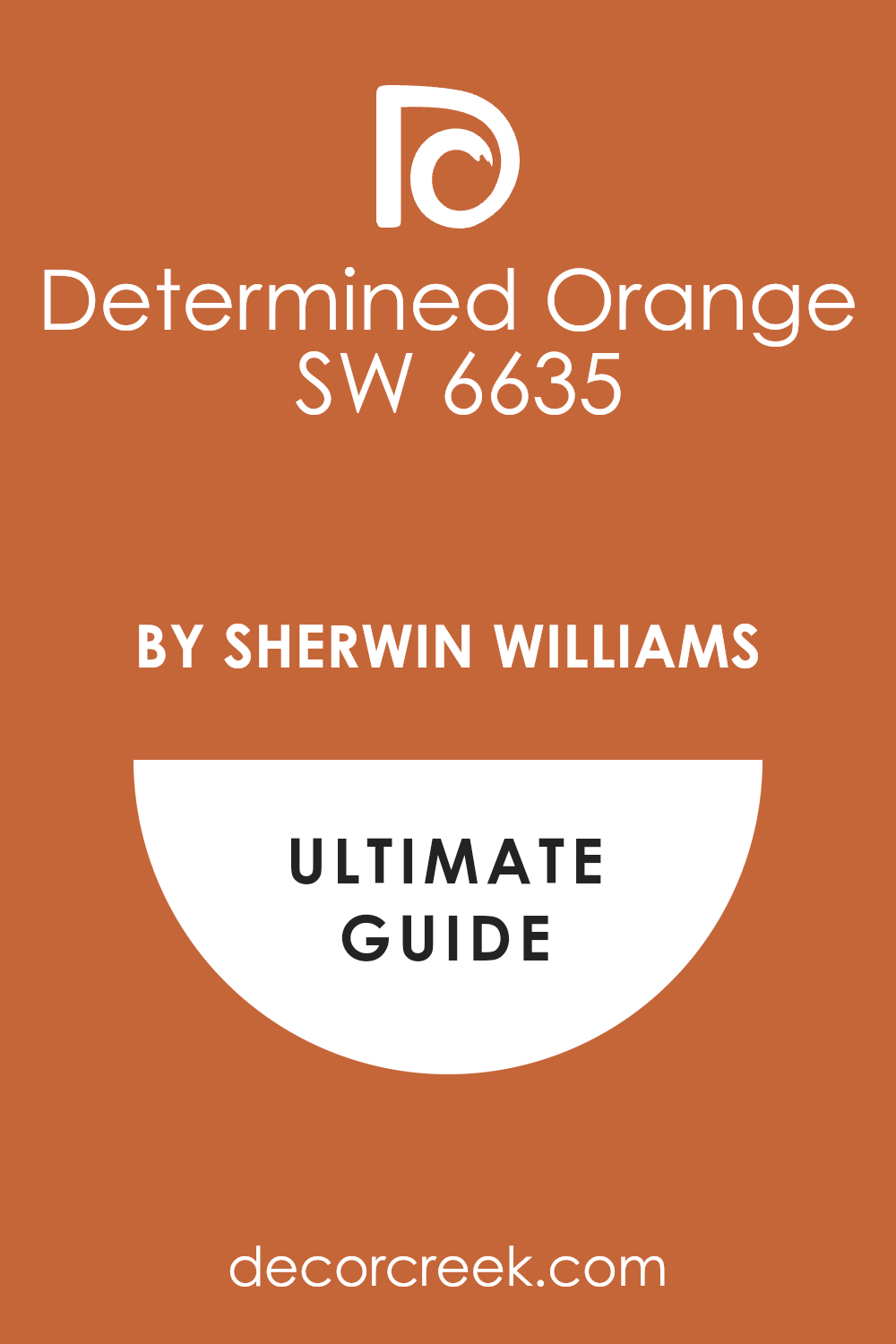
If you’re thinking about revitalizing your space with a fresh, vibrant color, you might want to consider SW 6635 Determined Orange by Sherwin Williams. This shade of orange is bold and full of life, perfect for adding a splash of energy to any room. Whether you plan to paint an accent wall, a full room, or even just add some colorful touches through decor, Determined Orange could be the ideal choice.
As a color, orange is known for its ability to stimulate excitement and enthusiasm. It’s not just any orange, though; Determined Orange has a particular depth that works beautifully to create a warm, welcoming atmosphere. It pairs wonderfully with neutral shades, making it quite versatile for various design styles.
Whether you lean towards modern minimalism or a more eclectic aesthetic, the adaptability of Determined Orange makes it a great candidate for your next interior project.
Using this color, you can transform a dull room into a cheerful sanctuary, perfect for both lively social gatherings and cozy family dinners.
So, if you’re looking for a way to add some personality to your living space, Determined Orange might just be the color you need to make your home feel both energized and inviting.
What Color Is Determined Orange SW 6635 by Sherwin Williams?
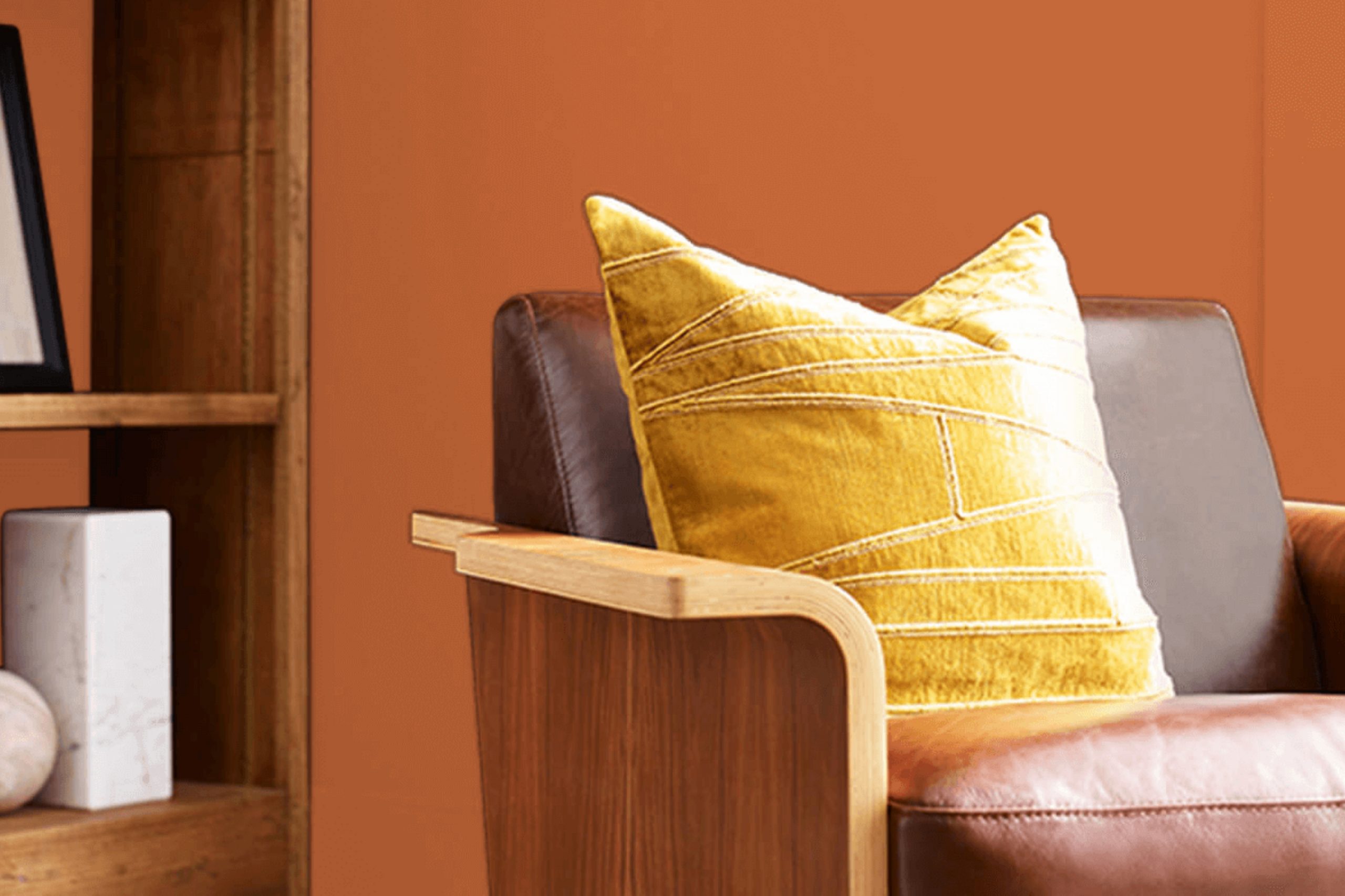
Determined Orange by Sherwin Williams is a vibrant and energetic shade that brings a lively burst of warmth to any space. This color possesses a deep, rich quality, not unlike a glowing sunset or the changing leaves of autumn. It has a certain zest that can invigorate a room’s atmosphere and mood.
This shade works particularly well in interior styles that lean towards the eclectic or bohemian, as it pairs beautifully with various textures and materials. In a modern setting, Determined Orange can serve as a striking focal point, especially when used on an accent wall or in decorative accessories.
It also fits nicely within rustic themes where wood elements typically dominate. The warmth of the orange tone contrasts splendidly with natural wood grains, metals, and leather, creating a cozy yet lively environment.
For textiles and furniture, Determined Orange pairs well with plush fabrics like velvet or simpler cotton materials, adding both comfort and a touch of playfulness. When combined with metallic finishes like bronze or copper, this color enhances the overall warmth of the interior, creating a welcoming and stylish space.
This versatile orange hue is perfect for those looking to add a splash of color and energy to their home.
Is Determined Orange SW 6635 by Sherwin Williams Warm or Cool color?
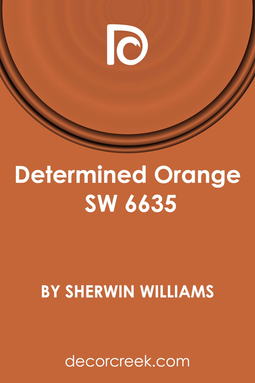
Determined Orange SW 6635 by Sherwin Williams is a vibrant and energetic shade of orange. Its rich and warm tone makes it a great choice for adding a pop of color to any room. This color works well in a variety of spaces, especially in places where a lot of activity happens, like the kitchen or a playroom. It can create a lively and inviting atmosphere, encouraging creativity and lively conversation.
When used in the living room or dining area, Determined Orange can make the space feel more welcoming and cheerful. It’s important to balance this strong color with neutral tones or soft furnishings to ensure it doesn’t overwhelm the space.
In smaller doses, like on an accent wall or in decor items, it can add just the right amount of zest without overpowering the room.
Overall, Determined Orange is a great choice for those looking to bring warmth and energy into their home décor. Its ability to liven up a space makes it a popular pick for those wanting to add a touch of fun and positivity to their living environment.
Undertones of Determined Orange SW 6635 by Sherwin Williams
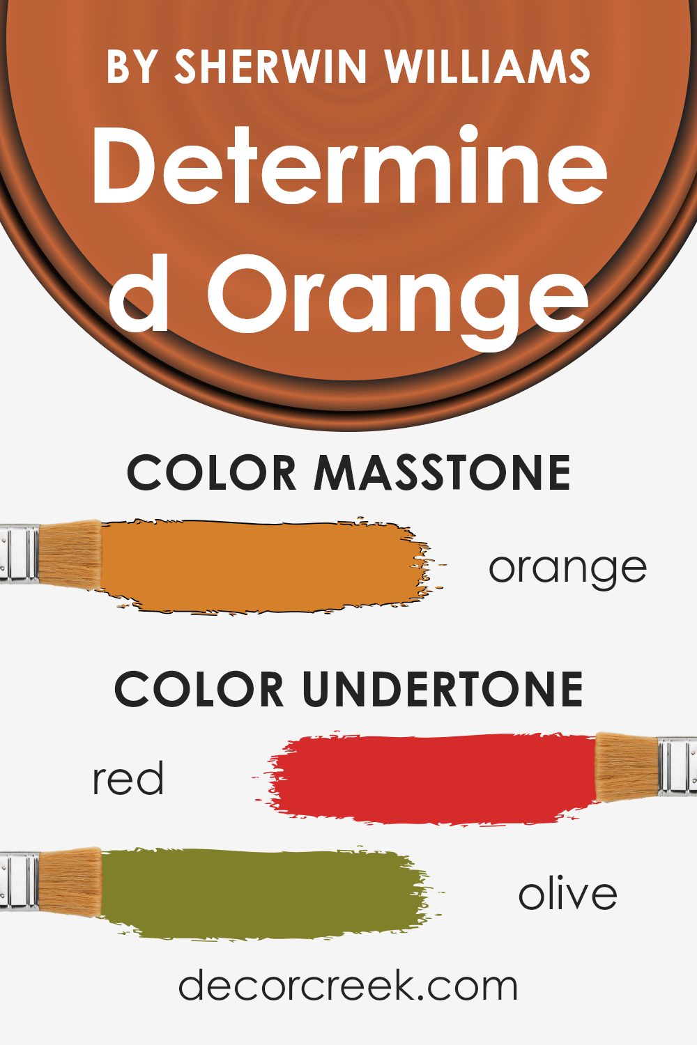
Determined Orange by Sherwin Williams is a vibrant, striking shade that can energize any space. However, how it appears can vary greatly due to its complex undertones. Undertones are subtle colors that influence the main hue and can affect how we perceive the color under different lighting conditions.
This particular orange has an array of undertones including red, olive, pale pink, brown, pink, grey, yellow, purple, light green, pale yellow, and mint. These undertones can pull the color in different directions, leaning it towards a warmer or cooler side depending on the lighting and surrounding colors.
For example, under natural light, the red and yellow undertones might make the orange appear brighter and more vivid. In artificial lighting, the grey or olive might become more noticeable, giving the color a more muted and grounded feel. This makes Determined Orange quite versatile, adapting slightly with the environment.
When used on interior walls, these undertones can significantly enhance the mood and aesthetics of a room. In a well-lit space with ample sunlight, the orange will feel warm and inviting due to its yellow and red undertones.
In a room with less natural light, the cooler undertones like grey and olive can make the space feel more refined and subdued.
Thus, when choosing this paint for walls, consider how these undertones might interact with furnishings and other elements in the room, as well as how changing light conditions throughout the day might alter its appearance.
This consideration helps in achieving the desired atmosphere and complementing existing decor seamlessly.
What is the Masstone of the Determined Orange SW 6635 by Sherwin Williams?
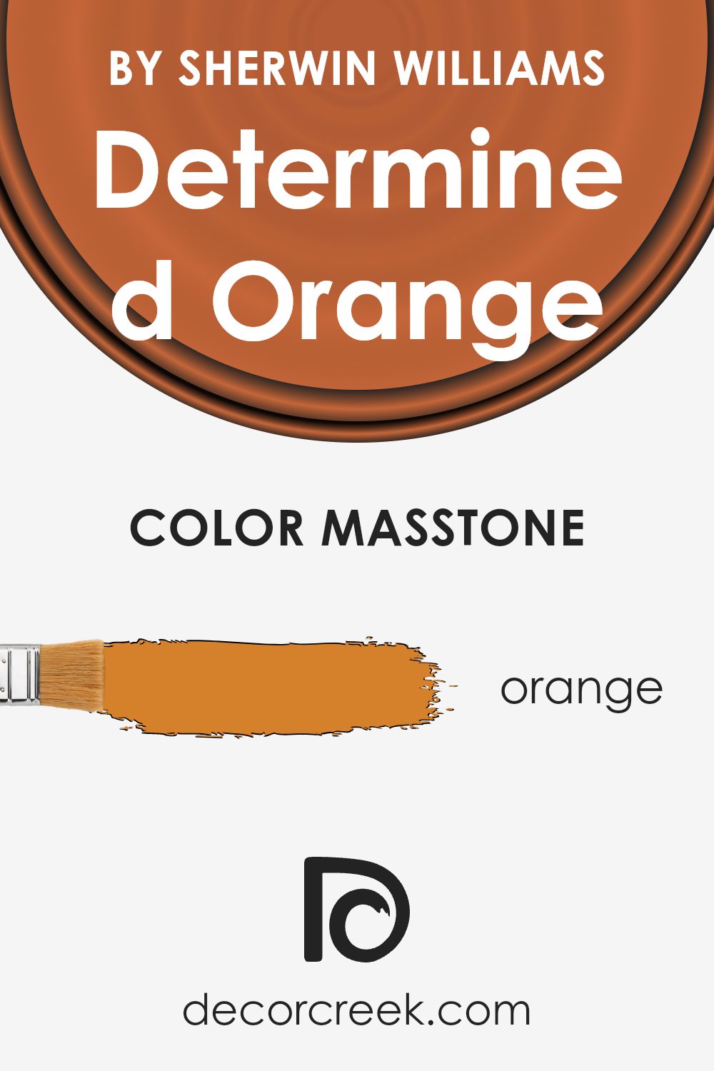
Determined Orange, with its masstone #D5802B, is a lively and warm shade that brings a cozy, cheerful vibe to any room. This particular orange has a deep, rich base that makes it less overwhelming and more comforting. In a home setting, it works best when used in spaces where you want to add energy and warmth without overpowering the area.
It’s great for a feature wall in a living room or dining area, adding a touch of playfulness and inviting conversation. In smaller doses, such as on throw pillows or in art pieces, it introduces a splash of color that breaks up neutral tones and adds visual interest.
This color pairs well with soft creams, dark browns, or even a muted green, creating a balanced and inviting atmosphere. Its versatility makes it suitable for various home styles, whether you’re looking to add a pop of color to a modern space or warm up a rustic interior.
How Does Lighting Affect Determined Orange SW 6635 by Sherwin Williams?
Lighting plays a crucial role in how we perceive colors. The way a room is lit can significantly affect the appearance of paint colors on the walls. Different types of lighting can make a color look vibrant or dull, warm or cool.
Determined Orange SW 6635 by Sherwin Williams is a lively, vibrant shade that can change mood depending on the lighting. Under artificial light, such as LED or fluorescent bulbs, Determined Orange can appear more intense and vivid. This makes it a great choice for spaces that want to promote energy and warmth, like a living room or kitchen.
In natural light, the true beauty of Determined Orange shines through. Sunlight can bring out the depth and richness of the color, depending on the time of day. Morning light tends to be softer, making the color appear more muted, while afternoon light can enhance its vibrancy.
Room orientation also affects how Determined Orange behaves:
– North-faced rooms: These rooms get less direct sunlight, which can make colors appear cooler. Determined Orange might look more subdued in a north-facing room, giving a soft but cheerful glow.
– South-faced rooms: With more direct sunlight, south-facing rooms enhance the warmth and brightness of Determined Orange, making it appear more vivid and lively throughout the day.
– Fast-faced rooms: Morning light in east-facing rooms can make Determined Orange look very bright and fresh in the morning, but it might lose some intensity as the day progresses.
– West-faced rooms: Evening light in west-facing rooms brings out the warm tones in Determined Orange, making the space feel cozy and inviting, especially in the late afternoon and evening.
Understanding how lighting affects colors can help you choose the right paint for your space and achieve the ambiance you desire. Whether under artificial or natural light, and regardless of room orientation, Determined Orange can create a dynamic and welcoming atmosphere.

What is the LRV of Determined Orange SW 6635 by Sherwin Williams?
LRV stands for Light Reflectance Value, and it is a measure used to reflect how much light a color will reflect when it is applied to a surface. This scale runs from a low value, which means it reflects little light, to a high value, meaning it reflects a lot of light.
Colors with a higher LRV make rooms feel brighter because they reflect more light back into the room. On the other hand, colors with lower LRV values absorb more light and can make a space feel cozier but smaller and darker.
The LRV of Determined Orange, which is 21.64, suggests that it is a darker shade that absorbs more light than it reflects. This characteristic makes it more suitable for spaces that need a warm, intimate atmosphere. However, using it in a small room or a room with limited natural light might not be ideal, as it could make the space feel even smaller and darker.
In larger rooms or rooms with plenty of natural or artificial lighting, its rich, warm tone can add a nice touch without overpowering the space.

Coordinating Colors of Determined Orange SW 6635 by Sherwin Williams
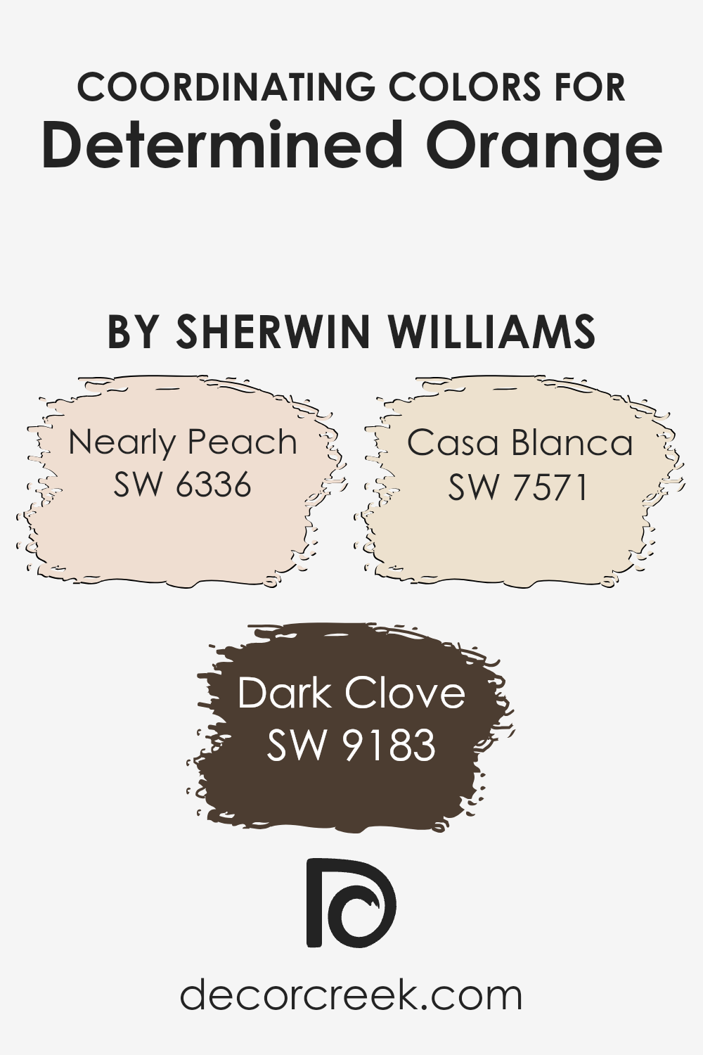
Coordinating colors are those that harmonize well with a main hue, balancing the overall look of a space while enhancing its aesthetic appeal. In the case of Determined Orange, a vibrant and energetic shade by Sherwin Williams, there are specific coordinating colors selected to complement and accentuate its warmth and brightness without overwhelming it.
These coordinating colors, chosen for their ability to create a cohesive and appealing palette, include Nearly Peach, Dark Clove, and Casa Blanca.
Nearly Peach is a soft, subtle shade with a slightly pink tint that offers a gentle contrast to the boldness of Determined Orange, providing a soothing visual relief and a light, airy feel. Dark Clove, on the other hand, is a deep, rich brown that adds a sense of grounding and depth to the space, working as a perfect counterbalance to the intensity of Determined Orange.
Lastly, Casa Blanca is a creamy, off-white color that acts as a neutral backdrop, allowing the more vivid colors to stand out and giving the space a clean and refined look. Together, these colors create a harmonious blend that makes any room feel welcoming and well-coordinated.
You can see recommended paint colors below:
- SW 6336 Nearly Peach (CHECK A SAMPLE)
- SW 9183 Dark Clove
- SW 7571 Casa Blanca (CHECK A SAMPLE)
What are the Trim colors of Determined Orange SW 6635 by Sherwin Williams?
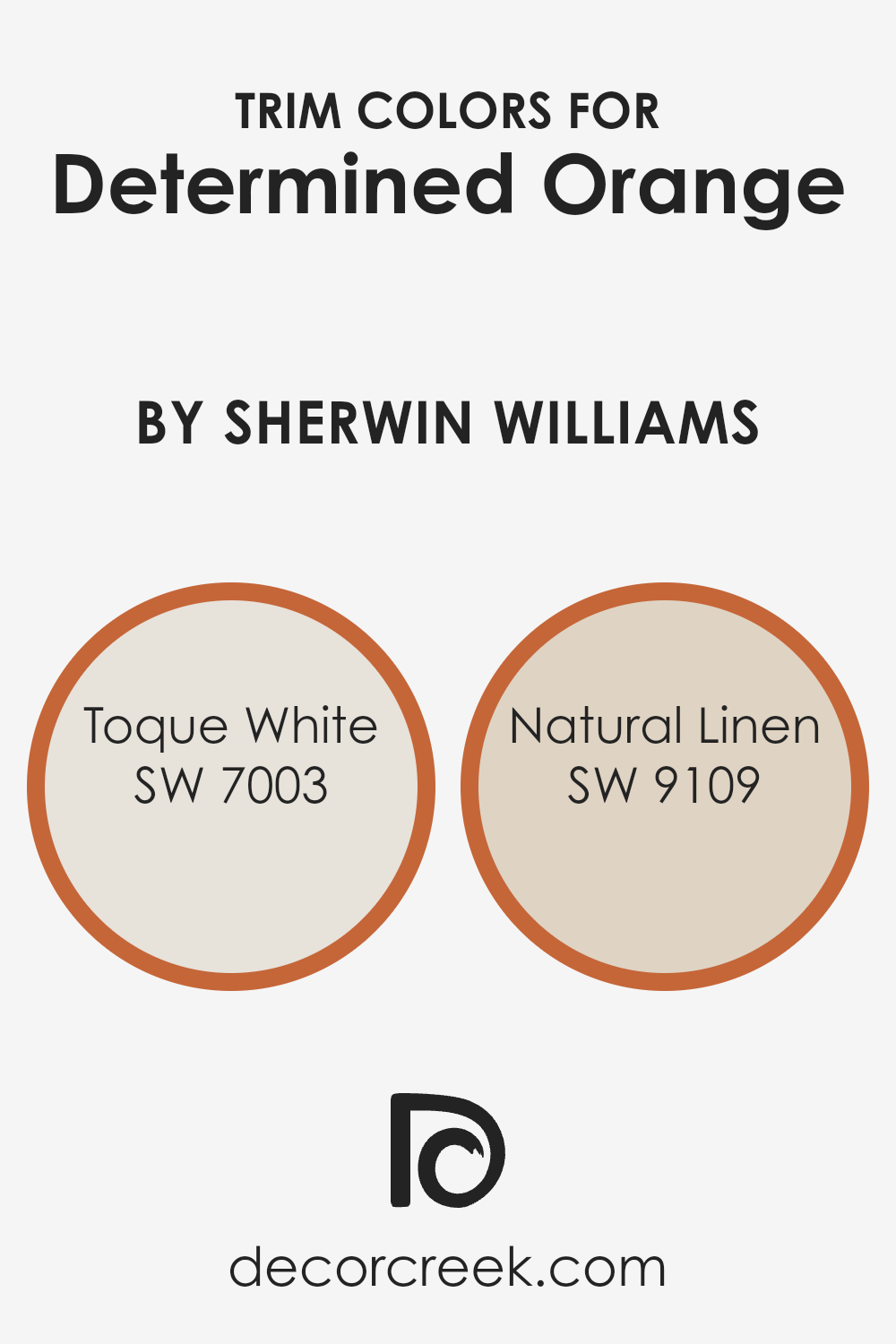
Trim colors play a crucial role in enhancing the visual appeal and character of a room, especially when paired with bold or vivid wall colors like Determined Orange by Sherwin Williams. By using trim colors such as Toque White SW 7003 or Natural Linen SW 9109, you can create a pleasing contrast that neatly defines the space while also softening the intensity of the primary color.
These trim colors provide a subtle buffer that draws attention to the architecture of the space, making features like moldings, doors, and windows stand out.
Toque White SW 7003 is a clean and crisp white tone that can instantly give any room a fresh and orderly look, making it a perfect complement to the warm and vibrant hues of Determined Orange. On the other hand, Natural Linen SW 9109 offers a warmer, gentler off-white tone that adds a touch of coziness and warmth to the overall decor.
Both these shades work beautifully as trim colors, providing balance and a finishing touch that enhances the overall look without competing with the primary color.
You can see recommended paint colors below:
Colors Similar to Determined Orange SW 6635 by Sherwin Williams
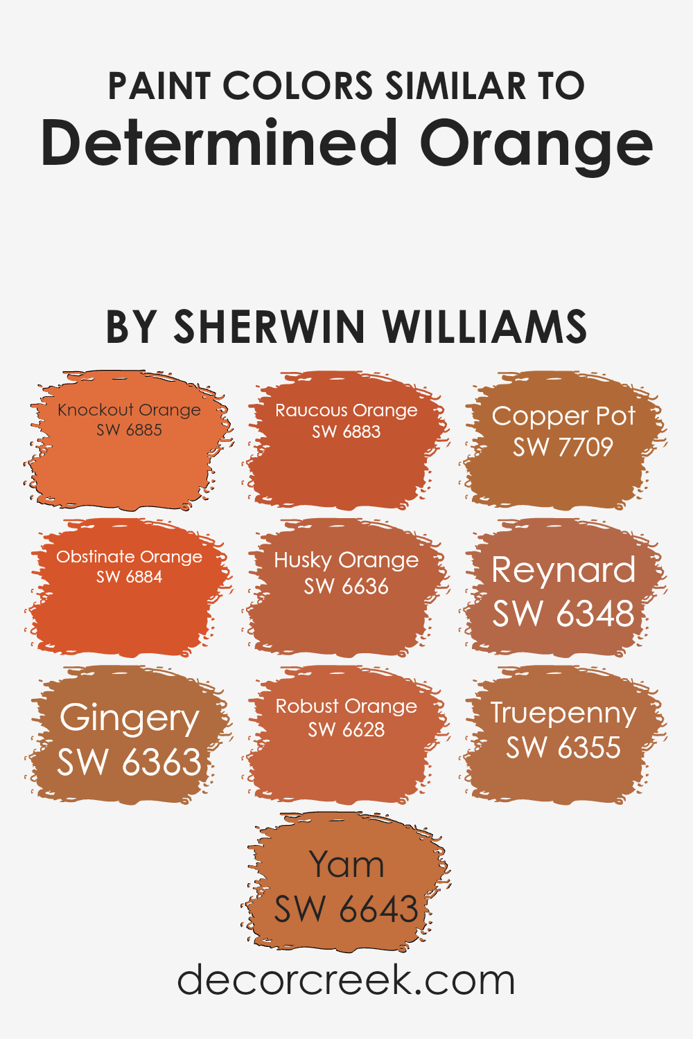
Similar colors are essential in design because they can create harmony and cohesion. By choosing shades near Determined Orange by Sherwin Williams, designers can achieve a balanced and unified look while still introducing variety.
Colors like Knockout Orange and Obstinate Orange are close relatives that provide a vibrant yet consistent vibe. These slight variations in hue allow for a visually interesting environment without overwhelming the senses. Similarly, colors like Gingery, Yam, and Raucous Orange offer a slight diversion in warmth or depth, enabling layering that’s both subtle and impactful.
When working on projects that demand a cohesive but rich palette, colors like Husky Orange and Robust Orange check those boxes by staying true to the orange family while offering different intensities and undertones. This technique is especially helpful in areas where you want to maintain a thematic color story without monotony.
Colors like Copper Pot, Reynard, and Truepenny lend themselves well to spaces that need a touch of earthiness, keeping the overall ambiance warm and welcoming. These tools in a designer’s palette ensure that every space feels intentionally styled and pleasing to the eye.
You can see recommended paint colors below:
- SW 6885 Knockout Orange (CHECK A SAMPLE)
- SW 6884 Obstinate Orange (CHECK A SAMPLE)
- SW 6363 Gingery (CHECK A SAMPLE)
- SW 6643 Yam (CHECK A SAMPLE)
- SW 6883 Raucous Orange (CHECK A SAMPLE)
- SW 6636 Husky Orange (CHECK A SAMPLE)
- SW 6628 Robust Orange (CHECK A SAMPLE)
- SW 7709 Copper Pot (CHECK A SAMPLE)
- SW 6348 Reynard (CHECK A SAMPLE)
- SW 6355 Truepenny (CHECK A SAMPLE)
Colors that Go With Determined Orange SW 6635 by Sherwin Williams
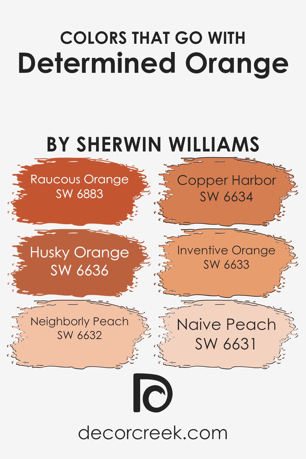
Selecting complementary colors for Determined Orange SW 6635 by Sherwin Williams is essential for creating a harmonious and visually appealing space. The chosen colors work together to enhance the warm, vibrant tones of Determined Orange, making it more versatile and suitable for various design schemes. When paired thoughtfully, these colors can create a lively yet balanced atmosphere in any room.
Raucous Orange SW 6883 is a daring, energetic shade that pairs well with the boldness of Determined Orange, adding a punch of intensity to the décor. Husky Orange SW 6636, with a deeper and slightly muted hue, offers a grounded contrast that is both welcoming and warm, making spaces feel cozy and inviting.
Neighborly Peach SW 6632 brings a soft and friendly peach tone that lightens the environment, providing a gentle complement to the more intense orange shades.
Copper Harbor SW 6634 leans towards a rich, earthy copper color that adds depth and a touch of luxury when combined with Determined Orange. Inventive Orange SW 6633 features a playful and creative feel that sparks fun and imagination, perfect for energizing a room.
Finally, Naive Peach SW 6631 offers a delicate, almost pastel-like peach that adds a subtle touch of sweetness, enhancing the overall aesthetic without overpowering it. Together, these colors enrich the robustness of Determined Orange, allowing for a variety of decorating styles and personal tastes.
You can see recommended paint colors below:
- SW 6883 Raucous Orange (CHECK A SAMPLE)
- SW 6636 Husky Orange (CHECK A SAMPLE)
- SW 6632 Neighborly Peach (CHECK A SAMPLE)
- SW 6634 Copper Harbor (CHECK A SAMPLE)
- SW 6633 Inventive Orange (CHECK A SAMPLE)
- SW 6631 Naive Peach (CHECK A SAMPLE)
How to Use Determined Orange SW 6635 by Sherwin Williams In Your Home?
Determined Orange by Sherwin Williams is a vibrant and inviting color that infuses any space with energy and warmth. This shade of orange is ideal for creating a cozy atmosphere, making it perfect for living rooms, kitchens, or dining areas where families gather and spend a lot of time.
You can use this paint to create a striking accent wall, or perhaps paint a piece of furniture like a bookshelf or a set of dining chairs for a playful splash of color. Complement it with neutral shades like white, beige, or soft gray to balance the intensity of the orange and keep your space feeling open and airy.
Accessories in teal or deep blue can also pair nicely with Determined Orange, offering a beautiful contrast and making the room’s decor pop. Whether you’re looking to rejuvenate a dull room or add a personal touch, Determined Orange can help you achieve it in a fun way.
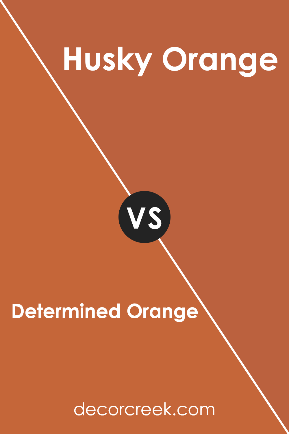
Determined Orange SW 6635 by Sherwin Williams vs Husky Orange SW 6636 by Sherwin Williams
Determined Orange and Husky Orange are two distinct shades offered by Sherwin Williams. Determined Orange is a vibrant, energetic orange that adds a bold splash of color to any space. It’s bright and lively, making it perfect for areas where you want to add a sense of excitement or enthusiasm.
On the other hand, Husky Orange has a slightly muted tone compared to Determined Orange. This color is still clearly orange but with a duskier, more subdued quality.
It’s great for creating a warm, inviting atmosphere without overwhelming a room with too much brightness. Both colors can add charm and warmth to a space, but your choice between them would depend on how bold or subtle you want the orange hue in your setting.
You can see recommended paint color below:
- SW 6636 Husky Orange (CHECK A SAMPLE)
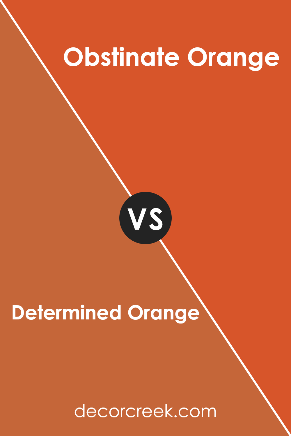
Determined Orange SW 6635 by Sherwin Williams vs Obstinate Orange SW 6884 by Sherwin Williams
Determined Orange and Obstinate Orange are both vibrant colors by Sherwin Williams, but they have distinct tones that set them apart. Determined Orange is a softer, more muted shade. It gives off a warm and welcoming vibe, making it a great choice for living spaces or areas where you want a cozy, inviting atmosphere.
On the other hand, Obstinate Orange is a lot bolder and brighter. This punchy shade has a more energetic feel, which can liven up a space significantly.
It suits energetic areas like playrooms or creative spaces where you want to spark excitement and creativity. While both colors share the warmth of orange, Determined Orange leans towards a subtler expression, whereas Obstinate Orange goes full force with vibrancy and zest.
You can see recommended paint color below:
- SW 6884 Obstinate Orange (CHECK A SAMPLE)
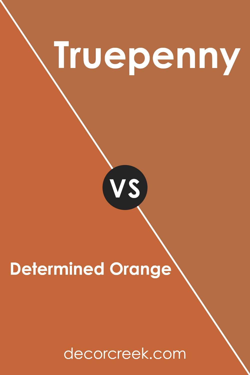
Determined Orange SW 6635 by Sherwin Williams vs Truepenny SW 6355 by Sherwin Williams
Determined Orange and Truepenny, both from Sherwin Williams, offer unique shades that could dramatically change any space’s look. Determined Orange has a vibrant, fiery feel to it, immediately catching the eye and bringing warmth to environments. It’s ideal for spaces that need a strong, cheerful burst of color.
On the other hand, Truepenny has a softer approach. This color is a warm brown with a subtle orange undertone. It gives off a cozy and inviting vibe, perfect for creating a welcoming atmosphere in areas like living rooms or entryways.
While both colors share warm undertones that add a comforting feel, Determined Orange is more intense and outgoing, whereas Truepenny offers a more subdued and gentle presence. The choice between them depends on whether you want your space to have a bold statement or a gentle warmth.
You can see recommended paint color below:
- SW 6355 Truepenny (CHECK A SAMPLE)
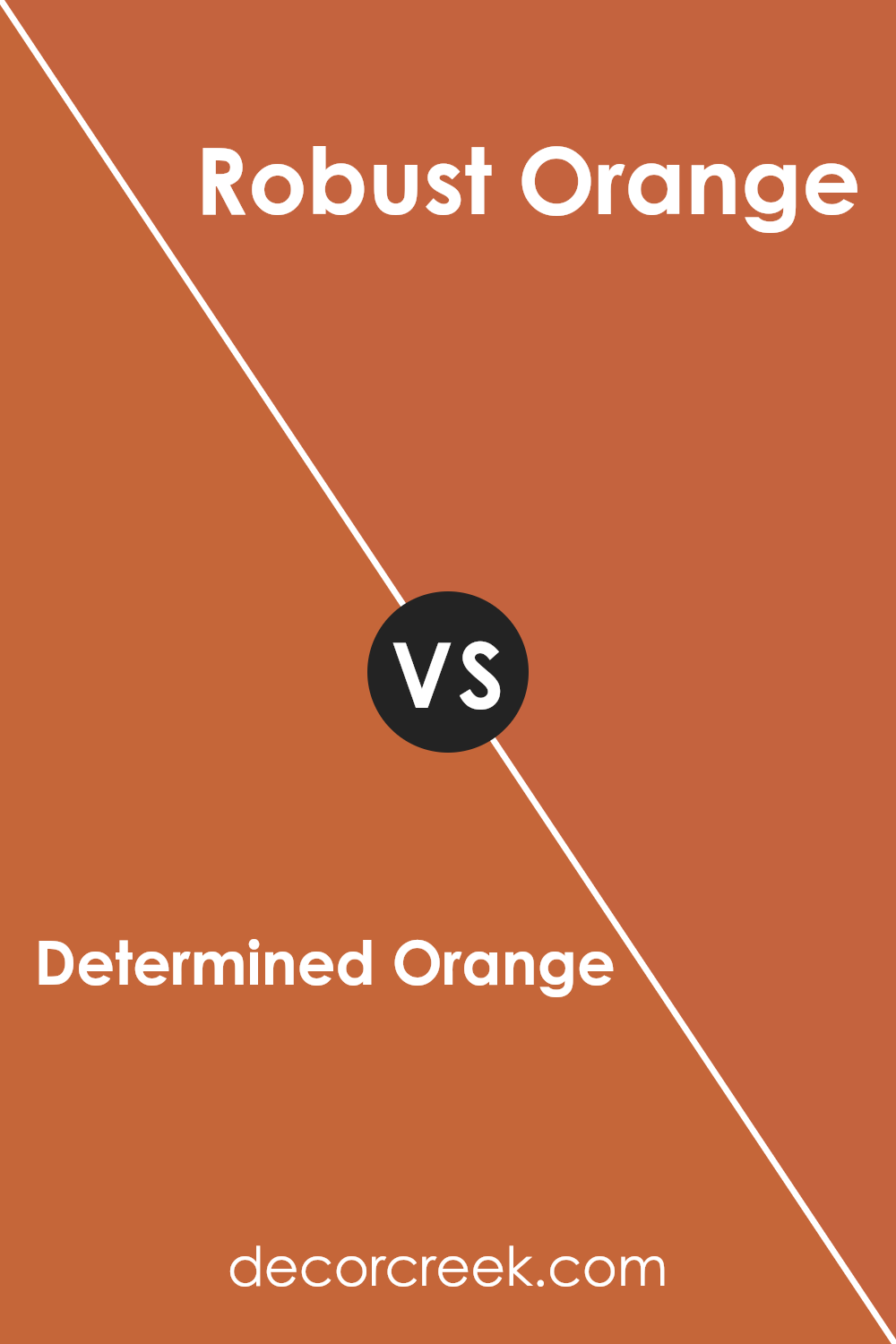
Determined Orange SW 6635 by Sherwin Williams vs Robust Orange SW 6628 by Sherwin Williams
Determined Orange and Robust Orange are both vibrant shades offered by Sherwin Williams. Determined Orange is a bold color that gives a strong and cheerful vibe to any space. It’s perfect for making a statement in a room, brightening up areas that need a lively touch.
On the other hand, Robust Orange is slightly deeper and richer, providing a warm and cozy feeling. This color works well in spaces where you want to create a welcoming and comfortable atmosphere, like living rooms or dining areas.
While both colors share the same orange base, Determined Orange is more vivid and bright, whereas Robust Orange leans towards a more muted, earthy tone. Both colors are great choices for adding energy and warmth to a space, but your choice depends on the specific mood or style you want to achieve in your room.
You can see recommended paint color below:
- SW 6628 Robust Orange (CHECK A SAMPLE)
Determined Orange SW 6635 by Sherwin Williams vs Knockout Orange SW 6885 by Sherwin Williams
Determined Orange and Knockout Orange are two vibrant shades from Sherwin Williams. Determined Orange has a softer, more muted tone, making it great for creating a cozy and welcoming atmosphere in spaces like living rooms or bedrooms. Its understated quality allows it to blend nicely with furniture and decorations without overpowering them.
In contrast, Knockout Orange is much more vivid and bolder. This color is perfect if you want to make a strong statement in a space, such as in a game room or a creative studio where energy and inspiration are key. It has a way of drawing attention and can really liven up an area.
Both colors could work beautifully depending on your needs and the vibe you’re aiming for in a room. Determined Orange offers a gentle warmth, while Knockout Orange bursts with energy and excitement.
You can see recommended paint color below:
- SW 6885 Knockout Orange (CHECK A SAMPLE)
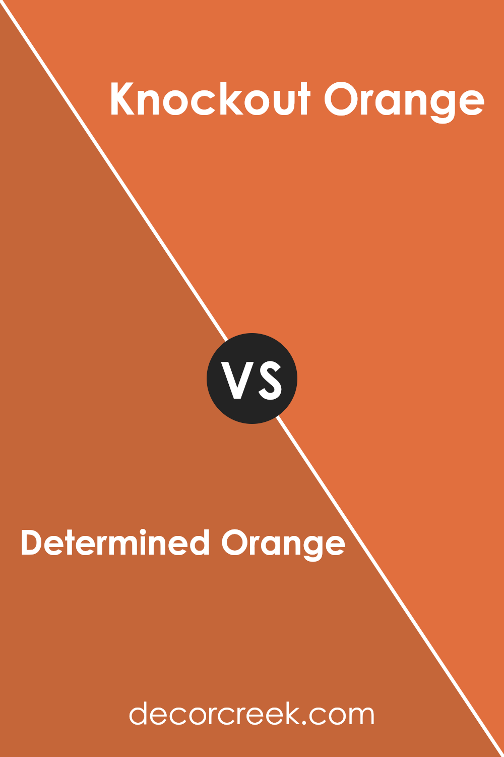
Determined Orange SW 6635 by Sherwin Williams vs Reynard SW 6348 by Sherwin Williams
Determined Orange by Sherwin Williams is a vibrant, energetic color. It’s bright and cheerful, perfect for spaces where you want to add a lively, welcoming vibe. This shade of orange is strong but not overwhelming, making it a great choice to boost the mood in a kitchen or a creative space.
In contrast, Reynard by Sherwin Williams is a deeper, muted reddish-brown. It offers a warm, cozy feeling, ideal for creating a comfortable and inviting atmosphere. This color works well in areas like living rooms or studies, where you want a sense of calm and comfort.
In summary, while Determined Orange is bright and uplifting, Reynard is more understated and warm. Each color suits different spaces and moods, depending on what feeling you want to achieve in a room.
You can see recommended paint color below:
- SW 6348 Reynard (CHECK A SAMPLE)
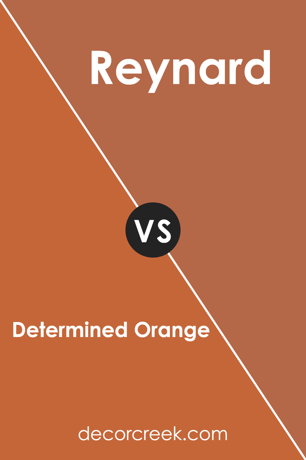
Determined Orange SW 6635 by Sherwin Williams vs Copper Pot SW 7709 by Sherwin Williams
Determined Orange and Copper Pot are both warm, inviting shades from Sherwin Williams, but they bring different vibes to a space. Determined Orange is a bright, bold orange with a vibrant energy that can cheer up any room. It’s the kind of color that stands out and makes a statement, perfect for a fun accent wall or to liven up a creative space.
On the other hand, Copper Pot is a deeper, more muted shade that leans towards a burnt orange or terracotta. It offers a cozy, earthy feel that is more subdued compared to Determined Orange. Copper Pot works well in spaces where you want a touch of warmth without overwhelming brightness, like living rooms or bedrooms.
Both colors are great for adding warmth and personality, but Determined Orange commands more attention, while Copper Pot provides a grounded, soothing look.
You can see recommended paint color below:
- SW 7709 Copper Pot (CHECK A SAMPLE)
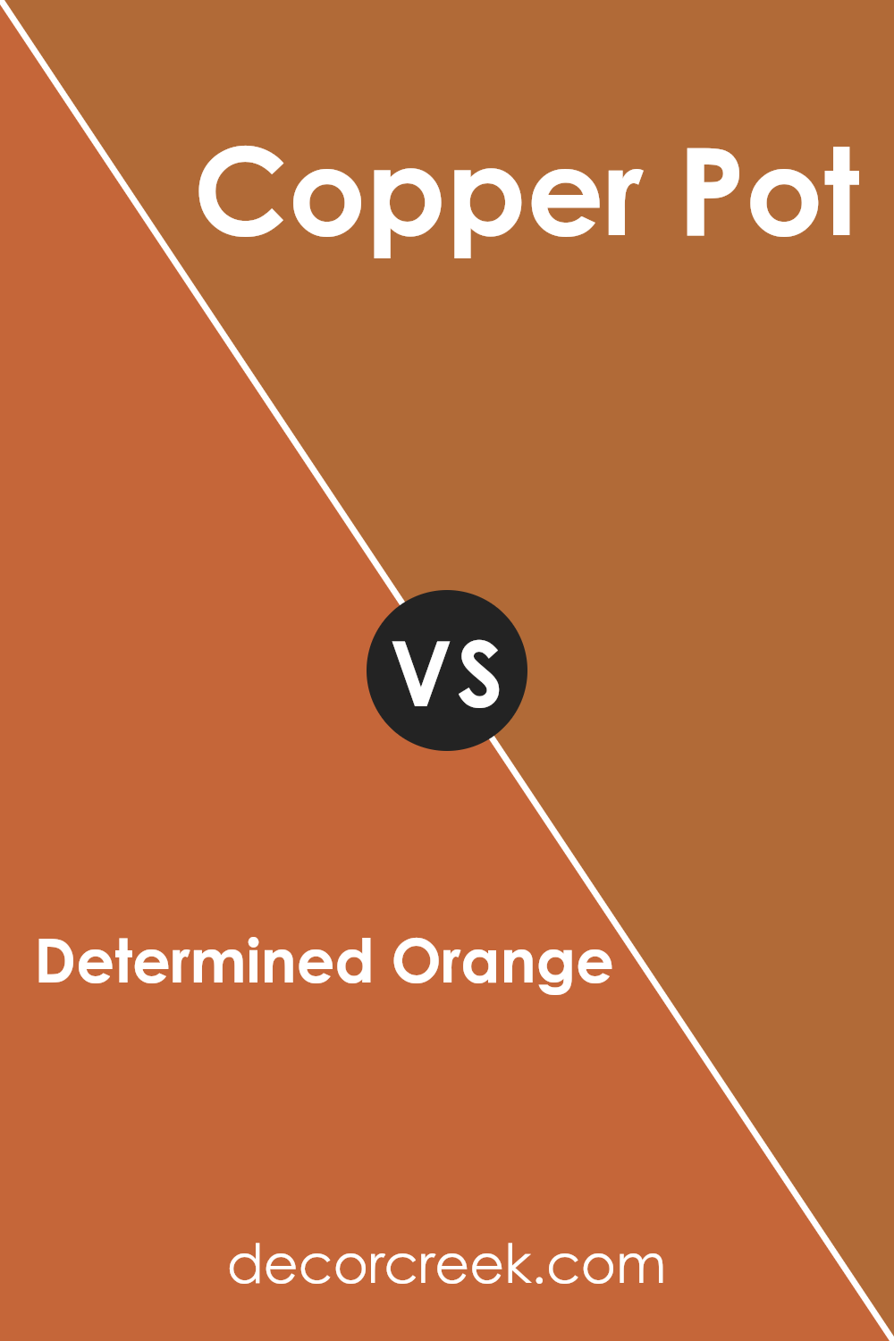
Determined Orange SW 6635 by Sherwin Williams vs Yam SW 6643 by Sherwin Williams
Determined Orange and Yam are two vibrant colors from Sherwin Williams that each create their unique ambiance. Determined Orange is a lively, bright orange that sparks energy and enthusiasm in any space. It’s the kind of color that can make a room feel instantly cheerful and active, perfect for a playful living area or a creative space.
On the other hand, Yam is a deeper, more muted orange with a hint of earthiness, offering a cozy and warm feel. This color is great for creating a comforting and welcoming environment, suitable for places like the dining room or a snug reading nook.
While both shades belong to the orange family, Determined Orange is punchier and more striking, standing out boldly against other colors. Yam, being subtler, blends more smoothly into its surroundings, providing a soothing warmth rather than a burst of energy. Depending on the mood you want to set, either color can brighten up a room in its own unique way.
You can see recommended paint color below:
- SW 6643 Yam (CHECK A SAMPLE)
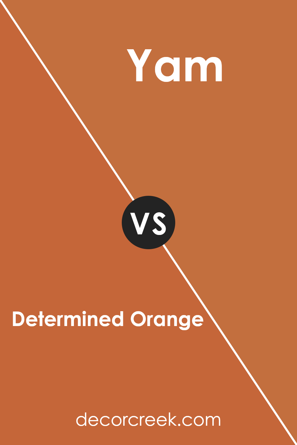
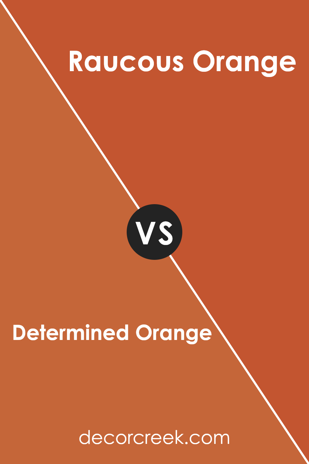
Determined Orange SW 6635 by Sherwin Williams vs Raucous Orange SW 6883 by Sherwin Williams
The main color, Determined Orange, is a warm, vibrant shade that has a grounding yet energetic feel. It’s a more subdued orange, which makes it versatile and easy to pair with other colors. This shade works well in spaces where you want to add a touch of warmth without overwhelming the environment.
On the other hand, Raucous Orange is a louder, brighter orange. It’s bolder and more vivid, making it a great choice for areas where you want to make a strong visual statement or energize the space. This shade stands out more and can bring life and excitement to a room.
In summary, while both colors are within the orange family, Determined Orange offers a softer, more muted approach, ideal for creating a cozy atmosphere. Raucous Orange, with its intense brightness, is perfect for injecting vibrancy and fun into a space.
You can see recommended paint color below:
- SW 6883 Raucous Orange (CHECK A SAMPLE)
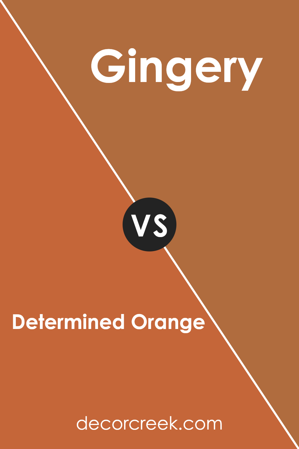
Determined Orange SW 6635 by Sherwin Williams vs Gingery SW 6363 by Sherwin Williams
Determined Orange and Gingery by Sherwin Williams are two eye-catching shades, each with their unique charm. Determined Orange is a bold and vibrant color, more intense and vivid. It stands out in a room, bringing a sense of energy and cheerfulness. This makes it a great choice for places where you want to add some liveliness, like a kitchen or a playroom.
On the other hand, Gingery is a muted orange shade with a touch of brown, giving it a warmer and more grounded feel. It’s less loud compared to Determined Orange, offering a cozy and welcoming vibe. This makes Gingery suitable for spaces where you want a subtle yet warm atmosphere, like a living room or a dining area.
Both colors can add personality and mood to your spaces, but the choice between them depends on the kind of impact you want to create. Determined Orange jumps out, while Gingery blends in softly, enveloping the room in warmth.
You can see recommended paint color below:
- SW 6363 Gingery (CHECK A SAMPLE)
Conclusion
As I finish talking about SW 6635 Determined Orange by Sherwin Williams, I really like how this bright orange paint adds a fun and energetic touch to any room. It’s like when you feel a bit down and then you see something really bright and happy — that’s what this color does.
It’s perfect if you want to make a place like your bedroom or your living room look lively and cheerful.
If you’re thinking about changing up your space, and you want something that feels warm and inviting, this shade of orange could be just what you need. It’s a color that gets noticed and makes you feel welcome. It can make the usual, boring spots in your house pop with energy and warmth. Whether you splash it on all walls or just use it for one accent wall, it’ll definitely make a difference.
Overall, I think SW 6635 Determined Orange is a great choice if you want to brighten up your home and add some cheer. So next time you’re deciding on a new paint color, you might want to consider this vibrant orange to spruce up your space!
Ever wished paint sampling was as easy as sticking a sticker? Guess what? Now it is! Discover Samplize's unique Peel & Stick samples.
Get paint samples


