When you’re trying to decide on the perfect paint color for your space, it’s crucial to consider how it affects the mood and style of your rooms. SW 7003 Toque White by Sherwin Williams is a versatile option that I find works beautifully in various settings.
This shade of white has a warm undertone that makes it welcoming yet very subtle, which means it won’t overpower your decor but will complement various furniture styles and finishes.
Using Toque White can help you achieve a clean and cohesive look throughout your home. Whether you’re painting a sunny kitchen or a cozy bedroom, this color adds a gentle touch of warmth that enhances the room’s overall feel without being too stark or clinical.
It’s particularly useful if you like changing your decor frequently, as its neutral tone provides a fantastic backdrop for any color scheme or decorative style.
So, if you’re looking for a dependable paint color that can keep your space looking fresh and inviting, SW 7003 Toque White is definitely worth considering. It’s like a quiet anchor, holding the space together while allowing your personal style to shine through.

What Color Is Toque White SW 7003 by Sherwin Williams?
Toque White by Sherwin Williams is a gentle and cozy off-white shade that brings a soft and inviting atmosphere to any room. It’s a versatile hue that acts as a warm backdrop, making it an ideal choice for various interior styles. This subtle shade can enhance the laid-back vibe of contemporary, minimalist spaces, or add a fresh breath to traditional and rustic designs.
With its creamy undertone, Toque White offers more warmth than stark whites, which helps in creating a welcoming environment. It pairs beautifully with natural materials like wood, enhancing the grains and texture of wooden furniture or flooring.
This color also works well with stone elements, such as marble or granite, bringing out their natural patterns without overpowering them.
Fabrics and textures such as linen, wool, and cotton look stunning against this mellow white, as it complements their intrinsic simplicity. Toque White also forms a delightful contrast with metal finishes like brushed nickel or aged brass, providing a balanced backdrop that lets these materials shine.
Whether it’s a cozy living room, a crisp and clear kitchen, or a calm and collected bedroom, Toque White is suitable for creating a light and airy feel without feeling too cold or impersonal, making spaces feel more open and refreshed.
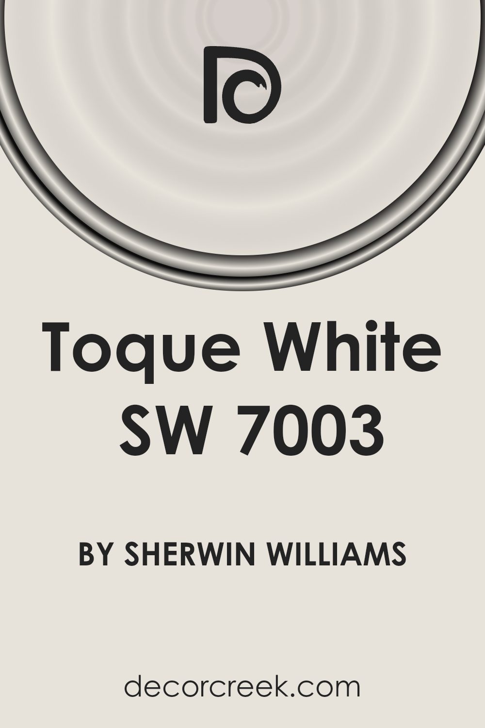
Is Toque White SW 7003 by Sherwin Williams Warm or Cool color?
Toque White SW 7003 by Sherwin Williams is a popular paint color with a warm, inviting feel thanks to its soft white tone. This specific shade is well-suited for almost any room in the house, making spaces look bright and open. Because it’s a neutral color, Toque White pairs easily with a variety of other colors, from bold and vibrant hues to softer, more muted tones. This versatility makes it a great choice for living rooms, bedrooms, and kitchens, as it can adapt to different styles and moods, whether you’re looking for a cozy, relaxed vibe or a more clean and minimalist look.
Using Toque White in smaller spaces can help give the illusion of a larger area, as the light color reflects more light than darker shades. This can open up rooms that might otherwise feel cramped. Overall, Toque White is a practical, flexible option that brings a fresh, clean look to any home.
Undertones of Toque White SW 7003 by Sherwin Williams
Toque White is a subtle and versatile paint color with a complexity that comes from its unique blend of undertones. These undertones include pale yellow, light purple, light blue, pale pink, mint, lilac, and grey.
Undertones are subtle colors that influence the main hue and can affect how paint looks under different lighting conditions or when combined with various décor elements. The presence of multiple undertones in Toque White means that it can appear differently based on the room’s lighting and surrounding colors.
For instance, under bright sunlight, the pale yellow might make the color seem warmer, while in a dimly lit room, the grey undertone might dominate, giving it a cooler feel.
When used on interior walls, Toque White offers a gentle backdrop that is never stark or cold. Its mix of undertones allows it to adapt seamlessly to a variety of spaces and styles. This adaptability makes Toque White a good choice for almost any room, enhancing the space without overpowering it.
Whether setting a calm mood in a bedroom or offering a clean look in a living area, its subtlety and depth help bring a balanced and harmonious feel to the space.
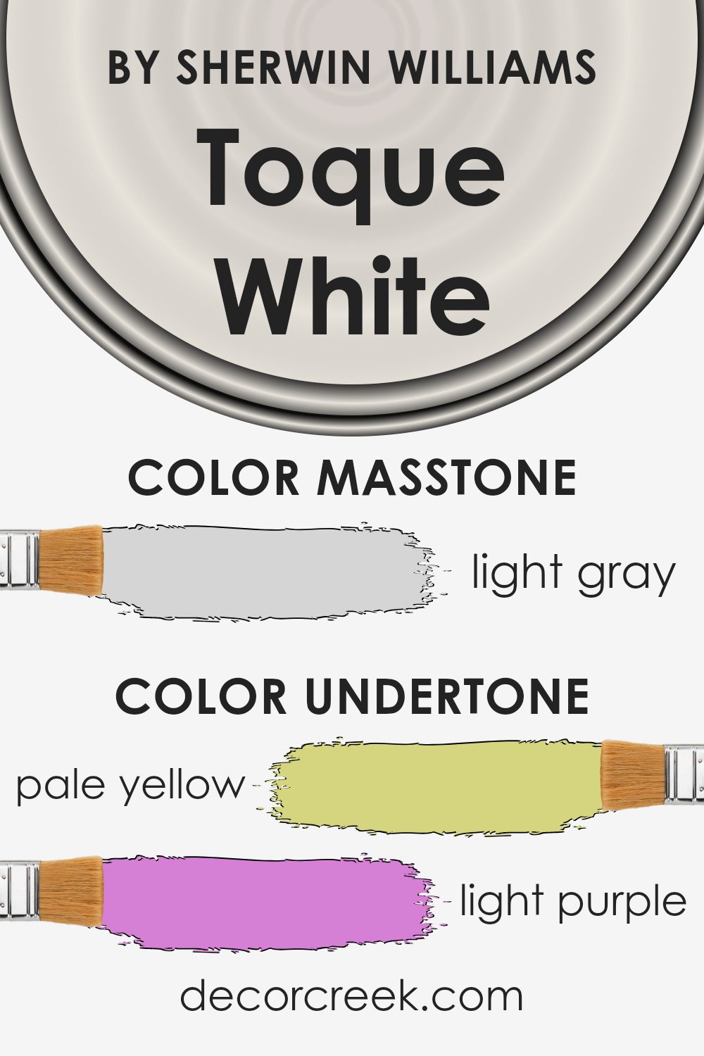
What is the Masstone of the Toque White SW 7003 by Sherwin Williams?
Toque White SW 7003 by Sherwin Williams has a masstone of light gray, coded as #D5D5D5. This subtle and neutral shade is incredibly versatile, making it a great choice for various spaces in a home. Its light gray tone offers a fresh, clean look that can make small rooms appear larger and more open.
In larger spaces, it serves as a smooth background, allowing furniture and art to stand out. This color is effective in areas with limited natural light, as it reflects light well, brightening the space. It is an excellent choice for living rooms, bedrooms, and kitchens where a calm and uncomplicated atmosphere is desirable.
Additionally, its neutrality means it pairs easily with other colors, from bright hues to darker shades, providing flexibility in decor styles from modern to traditional. This makes Toque White a practical and popular choice for creating a comfortable, stylish home environment.
How Does Lighting Affect Toque White SW 7003 by Sherwin Williams?
Lighting plays a crucial role in how we perceive colors. Different light sources can significantly affect the appearance of a color on walls or objects. Natural sunlight offers the truest representation of colors, while artificial light can alter how a color is viewed.
Toque White is a neutral shade with a warm undertone that can appear differently based on the lighting conditions. In artificial light, such as LED or fluorescent bulbs, this color might lean slightly more towards a creamy or warm hue, depending on the type of bulb.
Warm-toned lights will enhance the coziness of Toque White, making it feel more inviting, while cooler-toned lights might make it appear brighter and slightly less warm.
In natural light, the time of day and the direction the room faces significantly affect Toque White’s appearance. In north-facing rooms, which receive less direct sunlight and often emit a cooler light, Toque White retains most of its neutrality but might look slightly shadowed.
This can make the room feel calm and peaceful but can sometimes seem a bit chilly without additional warm lighting or decor.
South-facing rooms bathe in abundant natural light for most of the day, making Toque White look brighter and more vibrant. It tends to bring out the color’s subtle warm undertones, making the space feel sunny and welcoming.
In east-facing rooms, morning light can make Toque White look very soft and warm, creating an inviting atmosphere. As the day progresses, the intensity of the natural light decreases, which can make the walls look more neutral and subdued by the afternoon.
Conversely, west-facing rooms will have a more neutral tone during the morning and become warmer in the evening. This change can make Toque White transition from a subtle neutral at dawn to a softer, cozy hue by sunset, perfectly adapting to the varying intensities and angles of light throughout the day.
Overall, Toque White adapts well to different lighting situations, making it a versatile choice for various settings.

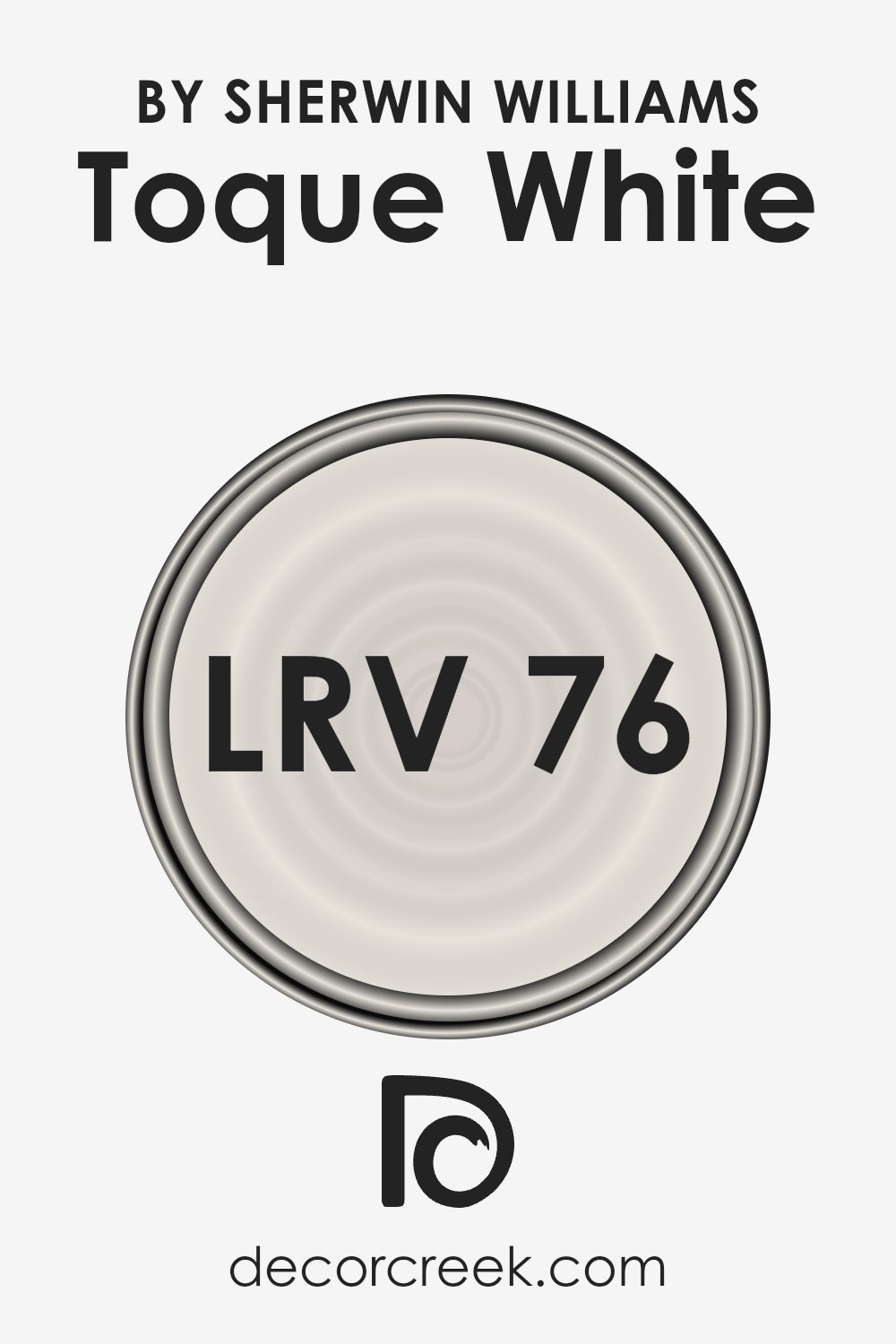
What is the LRV of Toque White SW 7003 by Sherwin Williams?
LRV stands for Light Reflectance Value, which is a measurement used to determine how much light a paint color reflects or absorbs when applied to a wall. This value is expressed as a number on a scale where a higher number means the paint color reflects more light, while a lower number indicates it absorbs more light.
Understanding LRV can help you make better choices about which paint colors will work best for your space, particularly in terms of making rooms feel brighter or more cozy.
For Toque White with an LRV of 76.093, it means this color is quite reflective. This helps to make spaces appear larger and more open because it bounces a lot of light around the room. This paint is great for darker rooms or areas where you want to enhance natural light, as it won’t absorb much light and instead reflects it, brightening the space effectively.
Thus, using this LRV level can be particularly beneficial in smaller or darker spaces to give an airy and more expansive feel.
Coordinating Colors of Toque White SW 7003 by Sherwin Williams
Coordinating colors work by complementing each other to create harmonious and visually appealing color schemes in design. Essentially, these colors are selected based on how well they go together, taking into account their undertones and intensities.
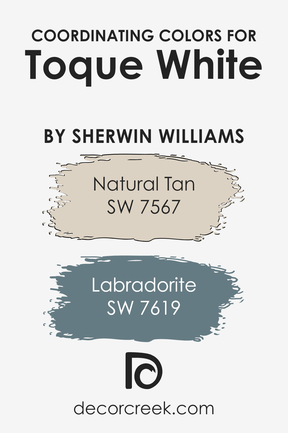
When using Toque White, a neutral and versatile shade by Sherwin Williams, it becomes essential to pair it with colors that enhance its subtlety without overwhelming it. Colors like Natural Tan and Labradorite serve this purpose perfectly, providing balance and a smooth visual flow.
Natural Tan is a warm, inviting color that adds a sense of coziness to any space. It pairs beautifully with the light and airy feel of Toque White, making a room feel more grounded and welcoming. On the other hand, Labradorite is a deeper, more striking color with hints of blue and gray.
It offers a striking contrast to the lighter Toque White, adding depth and interest to the design. Together, these colors create a cohesive look that can make any room feel stylish and put-together.
You can see recommended paint colors below:
- SW 7567 Natural Tan (CHECK A SAMPLE)
- SW 7619 Labradorite (CHECK A SAMPLE)
What are the Trim colors of Toque White SW 7003 by Sherwin Williams?
Trim colors are the hues selected for the detailing elements of room décor, such as baseboards, moldings, window frames, and door frames. They play a crucial role in defining and accentuating the aesthetic boundaries within a space, guiding the eye and finishing the overall appearance of a room.
For a base color like Toque White by Sherwin Williams, choosing the right trim color can significantly impact the room’s overall expression by either subtly complementing the walls or creating a striking contrast.
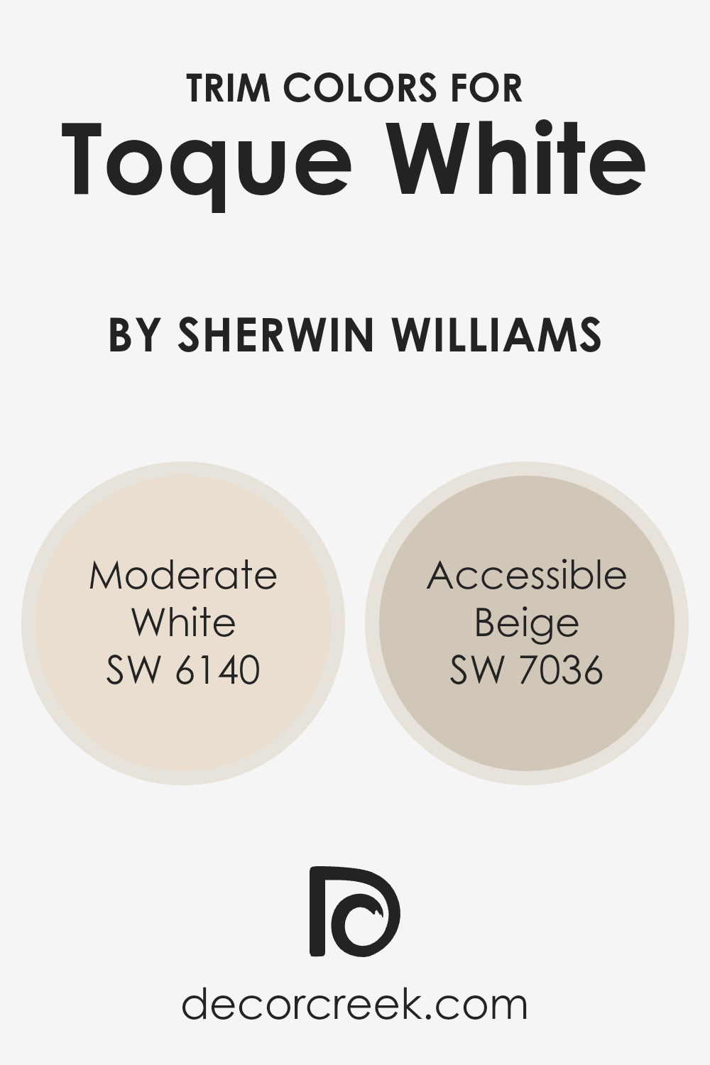
Moderate White SW 6140 offers a slightly warmer tone that gently complements Toque White, lending a soft, cohesive look to the space without creating too harsh of a contrast. It’s a versatile shade that works well in a variety of spaces, easily blending with different decor styles.
On the other hand, Accessible Beige SW 7036 provides a deeper, richer hue that helps to outline and define room features more prominently when used as a trim color, offering a more pronounced frame against the lighter Toque White.
This color can add depth and interest, enhancing the overall environment without overwhelming the subtlety of the main wall color.
You can see recommended paint colors below:
- SW 6140 Moderate White (CHECK A SAMPLE)
- SW 7036 Accessible Beige (CHECK A SAMPLE)
Colors Similar to Toque White SW 7003 by Sherwin Williams
When decorating a home, choosing the right shades that complement each other is crucial for creating a harmonious space. Similar colors, like those related to Toque White by Sherwin Williams, play an important role because they help to create a cohesive look without sharp contrasts that could clash.
These shades share a base hue, which makes them blend beautifully while each maintains a unique character.
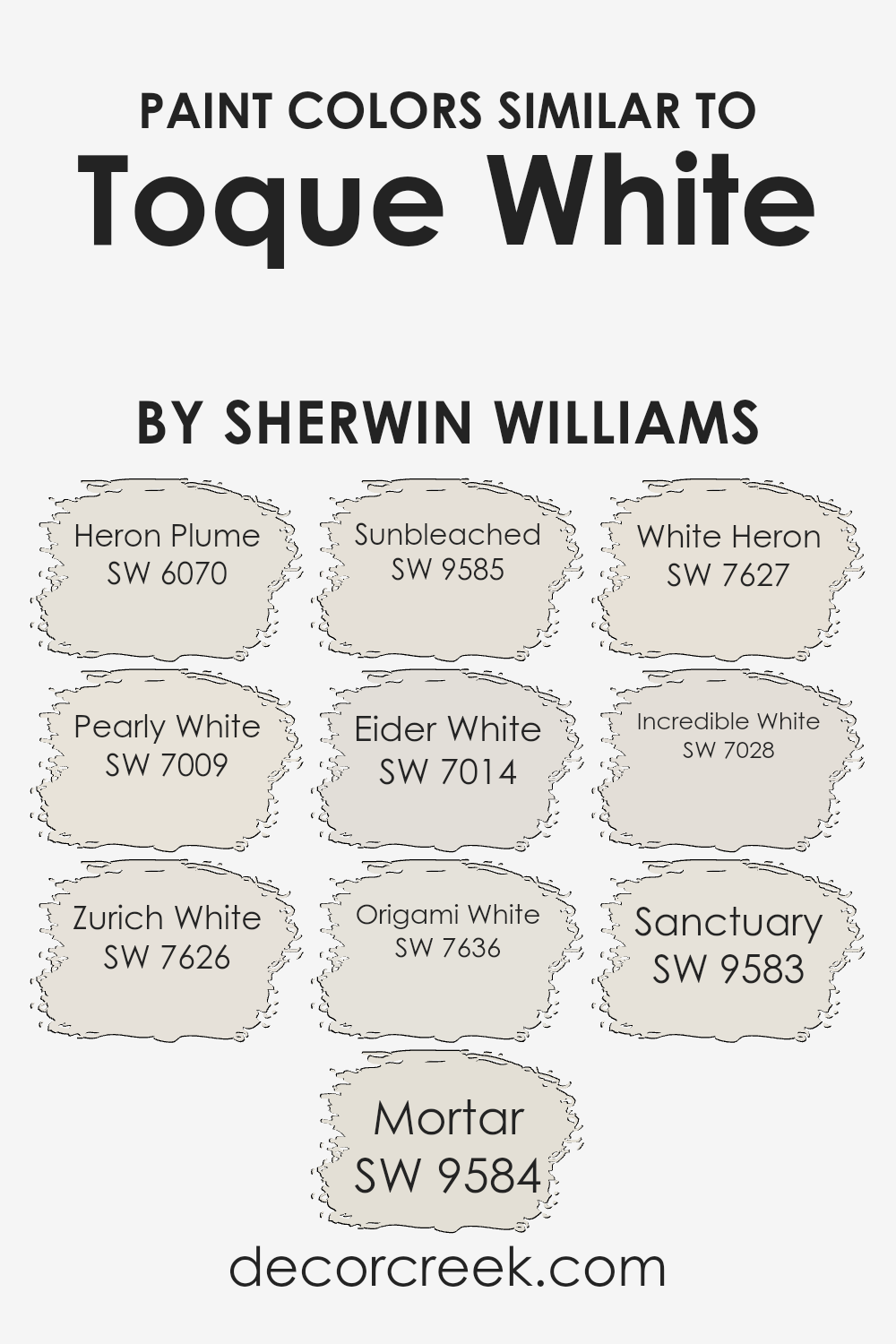
For instance, Heron Plume has a subtle warmth that keeps spaces feeling inviting and gentle, making it a great choice for living areas. Pearly White offers a hint of sheen that can brighten rooms subtly without overwhelming with brightness, perfect for smaller spaces needing an illusion of more space.
Zurich White leans slightly towards a cooler tone, providing a crisp backdrop that highlights modern decor effectively. Mortar and Sunbleached are deeper, setting a more defined mood; Mortar brings a sturdy, grounding effect, while Sunbleached adds a gentle timeworn softness to the space.
Eider White is noted for its slight gray undertone, offering a soft, neutral canvas that works well in varied lighting. Origami White adds a touch of sophistication without complexity, keeping spaces looking fresh and clean. White Heron and Incredible White are both very light and airy, with White Heron being almost ethereal, and Incredible White providing a stable yet light presence. Sanctuary, finally, offers a touch of warmth, perfect for creating a cozy, welcoming atmosphere. Each of these shades, while similar, offers its distinct vibe, making them versatile for different design needs.
You can see recommended paint colors below:
- SW 6070 Heron Plume (CHECK A SAMPLE)
- SW 7009 Pearly White (CHECK A SAMPLE)
- SW 7626 Zurich White (CHECK A SAMPLE)
- SW 9584 Mortar (CHECK A SAMPLE)
- SW 9585 Sunbleached (CHECK A SAMPLE)
- SW 7014 Eider White (CHECK A SAMPLE)
- SW 7636 Origami White (CHECK A SAMPLE)
- SW 7627 White Heron (CHECK A SAMPLE)
- SW 7028 Incredible White (CHECK A SAMPLE)
- SW 9583 Sanctuary (CHECK A SAMPLE)
Colors that Go With Toque White SW 7003 by Sherwin Williams
Choosing the right colors to pair with Toque White SW 7003 by Sherwin Williams is crucial because it ensures that the space feels cohesive and aesthetically pleasing. Toque White itself is a soft, gentle white that serves as a fantastic backdrop for other hues, providing a subtle warmth that makes it versatile for various settings.
When selecting colors like First Star SW 7646, Big Chill SW 7648, Eider White SW 7014, Snowbound SW 7004, and Incredible White SW 7028, it’s about creating a harmonious space that feels both welcoming and stylish.
First Star SW 7646 is a light gray that brings a fresh and airy feel to any room, making it an excellent companion for the warmer undertones of Toque White. Big Chill SW 7648 is another gray but with slightly cooler undertones, offering a crisp contrast that enhances spaces with a modern edge.
Eider White SW 7014 has a touch of pink, softening the environment and adding a hint of color without overwhelming the senses.
Snowbound SW 7004 is a bright, clean white that adds a vivid lift, perfect for trim or ceilings to provide a crisp boundary. Incredible White SW 7028 treads a fine line between gray and beige, providing a neutral palette that adapts easily to different decor styles. When these colors are used together with Toque White, they produce a seamless flow that ties the various elements of a room together beautifully.
You can see recommended paint colors below:
- SW 7646 First Star (CHECK A SAMPLE)
- SW 7648 Big Chill (CHECK A SAMPLE)
- SW 7014 Eider White (CHECK A SAMPLE)
- SW 7004 Snowbound (CHECK A SAMPLE)
- SW 7028 Incredible White (CHECK A SAMPLE)

How to Use Toque White SW 7003 by Sherwin Williams In Your Home?
Toque White SW 7003 by Sherwin Williams is a versatile paint color that can greatly enhance the look of your home. Its neutral white shade works beautifully in any room, whether you want a fresh, clean look or a warm, inviting space. It pairs well with other colors, allowing you to add personal touches through decor and furniture.
If you’re planning to freshen up your living room, Toque White can make the space feel more open and airy. It reflects natural light well, brightening up areas that might otherwise seem dark. This color is also a great choice for kitchens and bathrooms, where cleanliness is key, as the crispness of the white can give the impression of hygiene and order.
For bedrooms, the softness of Toque White offers a calm backdrop, ideal for relaxing. It works well with different textures and fabrics, helping you create a cozy, comfortable retreat. Overall, Toque White is a practical color that can easily fit into your decorating plans, giving your home a modern, fresh look.
Toque White SW 7003 by Sherwin Williams vs Sunbleached SW 9585 by Sherwin Williams
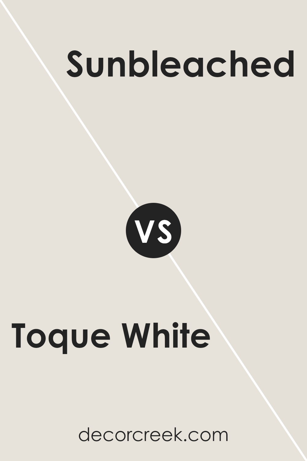
Toque White and Sunbleached are both neutral paint colors by Sherwin Williams, but they offer different vibes for interior spaces. Toque White is a soft, warm grey with a comforting and clean look. It is versatile enough to be used in many areas of a home, serving as a gentle backdrop that complements various decor styles and colors.
On the other hand, Sunbleached has a lighter, more beige tone, bringing a sunnier and slightly more rustic feel to rooms. This color can make spaces feel airier and is particularly effective in casual, relaxed environments like sun rooms or cozy corners with a lot of natural light.
Both colors are neutral, but Toque White leans more towards a muted grey, while Sunbleached offers a hint of warmth with its beige undertones. Depending on the atmosphere you want to create, either color could enhance your space, with Toque White providing a subtle sophistication and Sunbleached adding a cheerful, open feel.
You can see recommended paint color below:
- SW 9585 Sunbleached (CHECK A SAMPLE)
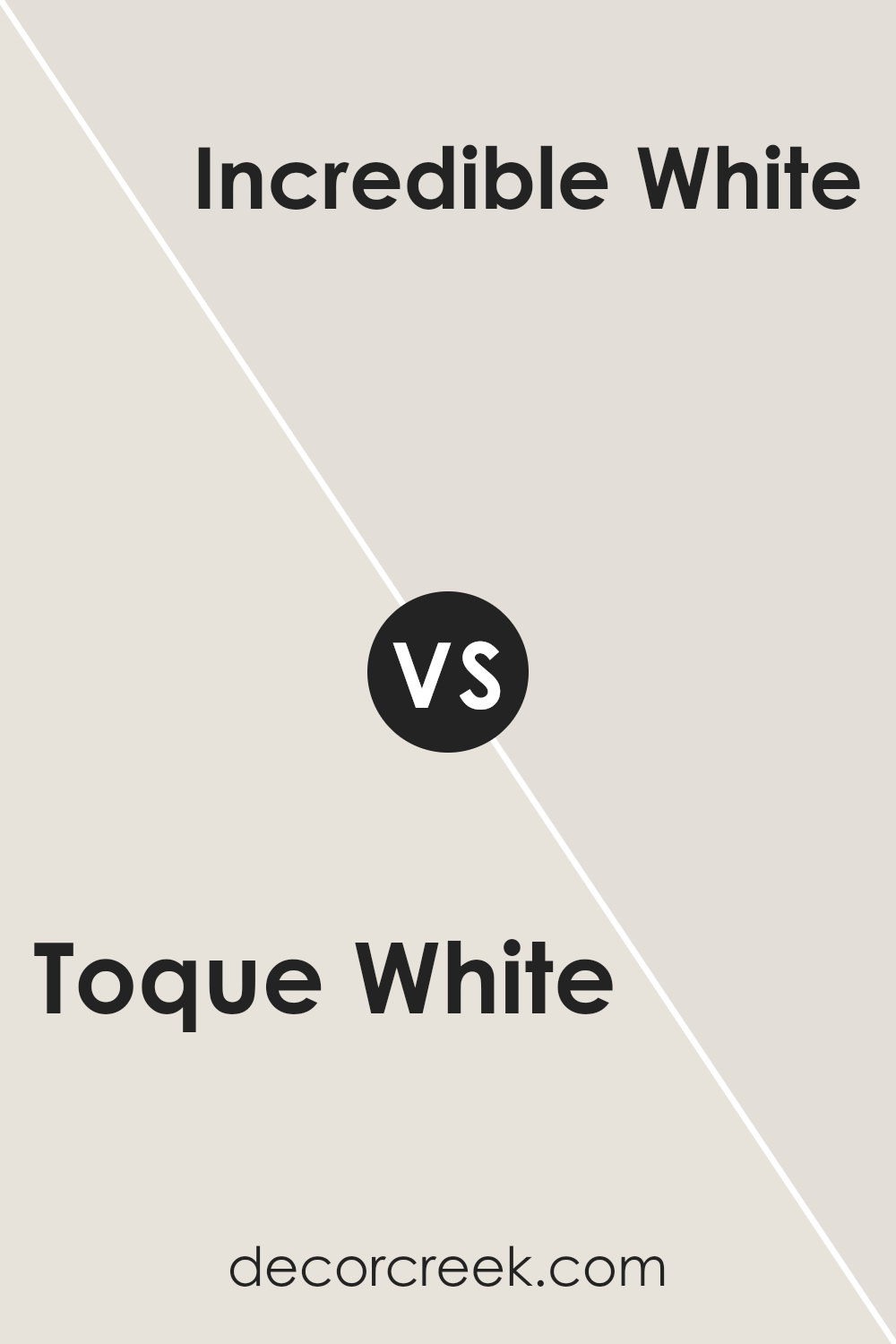
Toque White SW 7003 by Sherwin Williams vs Incredible White SW 7028 by Sherwin Williams
Toque White and Incredible White by Sherwin Williams are both neutral paint colors, but they have subtle differences. Toque White has a slightly cooler tone, giving it a crisper look. It might remind you of a bright, clear day with its fresh vibe.
On the other hand, Incredible White leans a bit warmer. This warm touch makes it feel more inviting and cozy, ideal for spaces where you want to relax and feel at home. If you’re deciding between the two for a room, think about the atmosphere you want to create.
Toque White is great for areas that need a bright, open feel, while Incredible White works well in spaces where a soft, welcoming mood is desired. Both colors are versatile and can work beautifully in various settings, depending on your preference for cooler or warmer tones.
You can see recommended paint color below:
Toque White SW 7003 by Sherwin Williams vs Zurich White SW 7626 by Sherwin Williams
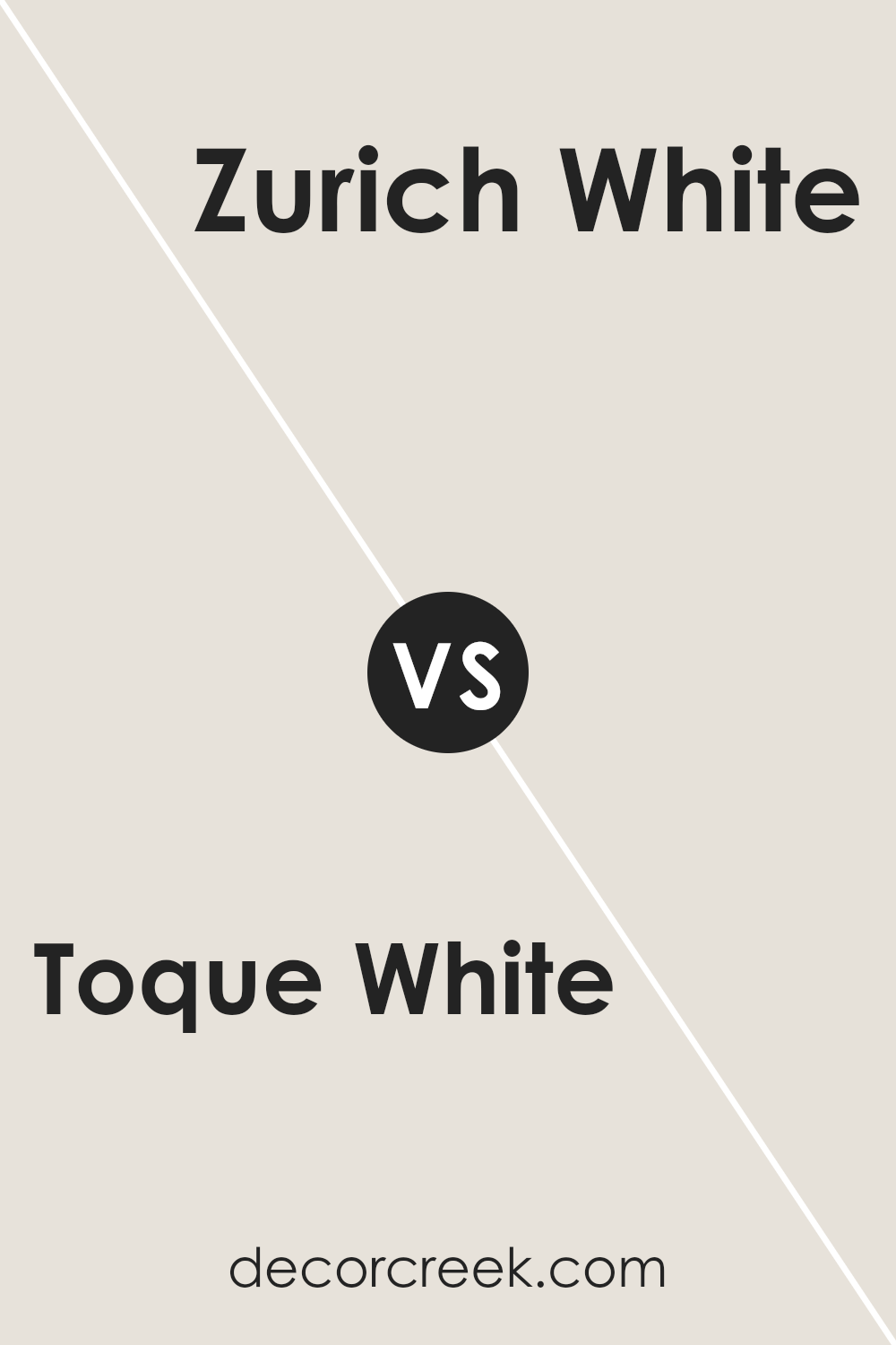
Toque White and Zurich White are both popular paint colors by Sherwin Williams, but they have subtle differences that might influence your choice depending on what you’re looking for in a space. Toque White is a very light gray shade that brings a fresh and clean look to any room. It’s a great choice if you want a near-white color that still offers a hint of warmth to keep the room from feeling too stark.
On the other hand, Zurich White leans slightly towards a soft beige tone. This color can make a room feel more inviting and cozy compared to Toque White. It’s perfect if you prefer your whites with a touch more depth and warmth, without veering too far into actual color.
Both shades are quite neutral and flexible, working well in a variety of settings such as living rooms, bedrooms, and kitchens. Choosing between them depends on whether you prefer a cooler (Toque White) or warmer (Zurich White) undertone in your decor.
You can see recommended paint color below:
Toque White SW 7003 by Sherwin Williams vs Heron Plume SW 6070 by Sherwin Williams
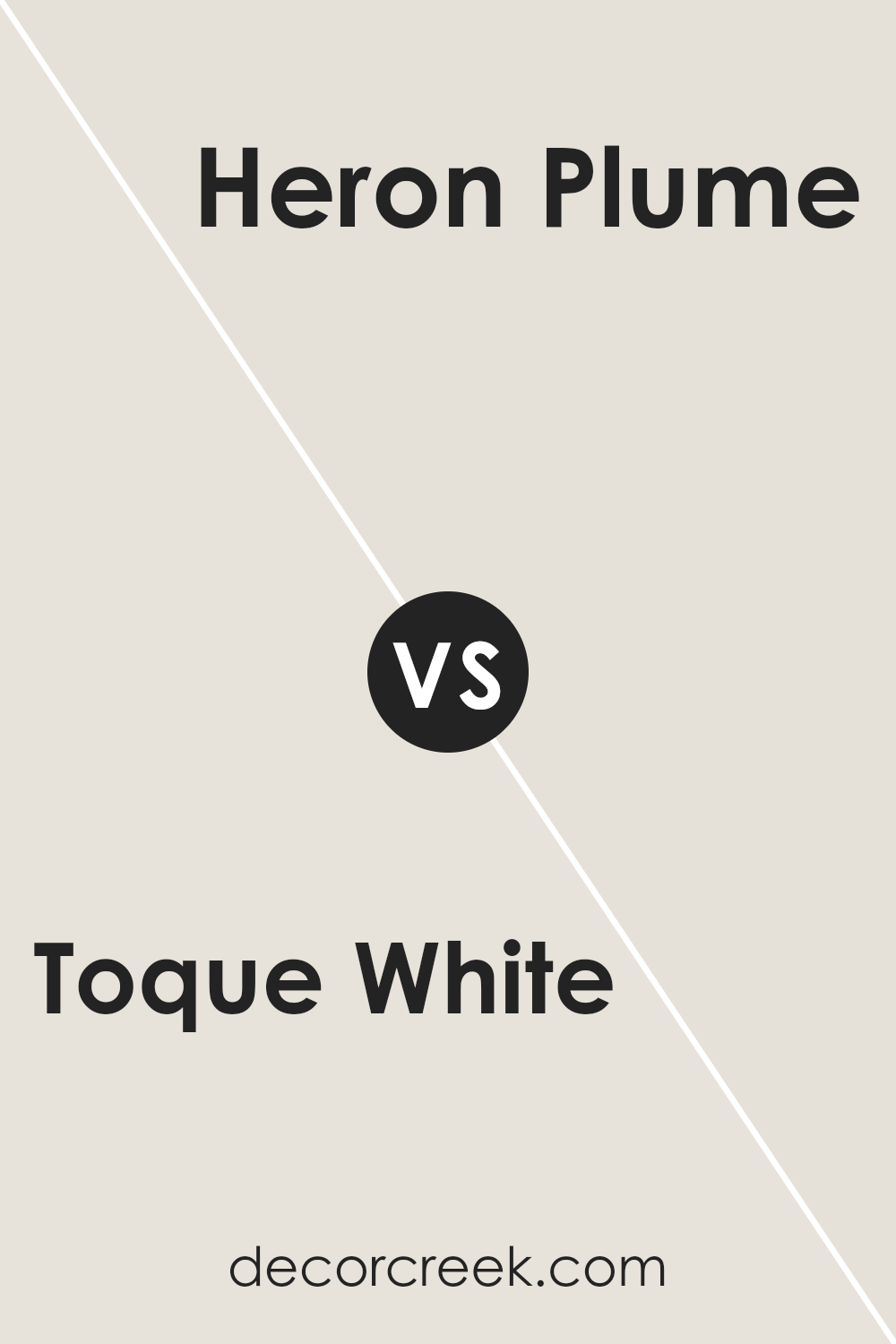
Toque White and Heron Plume are two paint colors from Sherwin Williams that offer subtle differences, making each unique in its right. Toque White is a soft, warm white with a hint of gray. It serves as a versatile backdrop and can brighten up any space without feeling too stark.
On the other hand, Heron Plume is slightly darker and brings in a touch more gray. This gives it a calming, neutral appearance that still maintains warmth, but with a slightly more pronounced presence compared to Toque White.
Heron Plume can be ideal for creating a cozy atmosphere in rooms that get a lot of light, where it won’t feel overwhelming. Both colors work well in various settings, from modern to traditional, and can be paired with other colors easily.
You can see recommended paint color below:
Toque White SW 7003 by Sherwin Williams vs Pearly White SW 7009 by Sherwin Williams
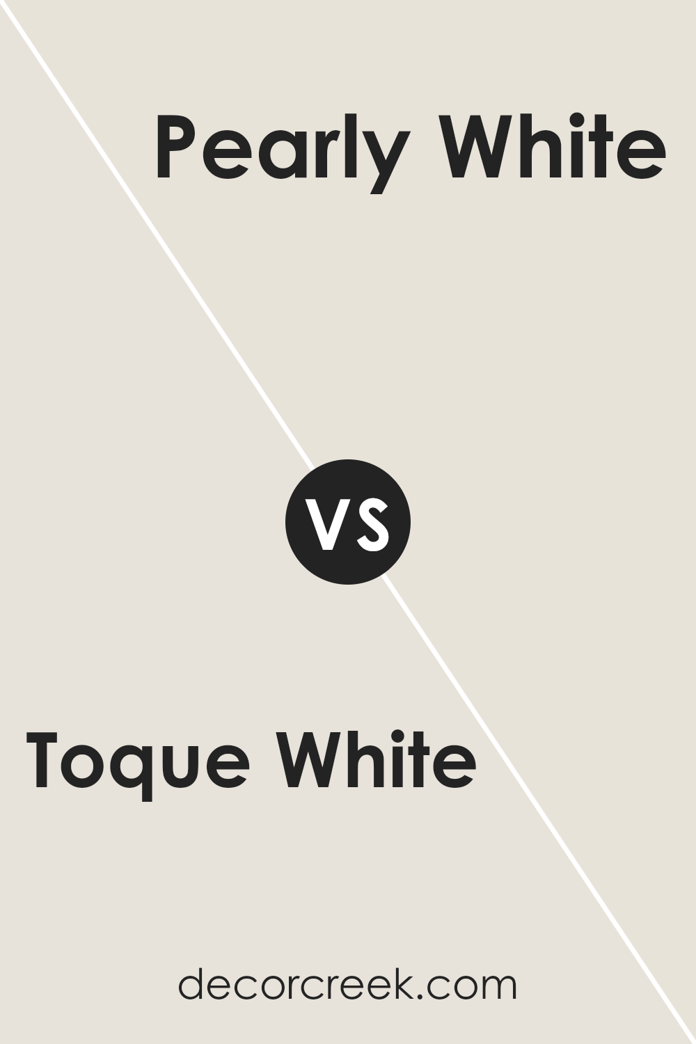
Toque White and Pearly White are both popular colors by Sherwin Williams. Toque White has a clean, neutral tone that makes it incredibly versatile for use throughout the home. It’s a soft white that doesn’t come off as too stark, making it a good choice for creating a calm and welcoming atmosphere.
On the other hand, Pearly White has a slightly warmer undertone, giving it a cozy and gentle vibe. This makes it ideal for spaces where you want a touch of warmth without overpowering with color. Pearly White has a bit of a creamy feel, and it reflects light beautifully, enhancing the space with a subtle glow.
Both colors pair well with other shades and can be used in any room, but the choice depends on the warmth and mood you want to achieve in your space.
You can see recommended paint color below:
Toque White SW 7003 by Sherwin Williams vs Sanctuary SW 9583 by Sherwin Williams
Toque White and Sanctuary by Sherwin Williams are two distinct shades that can set very different moods in a space. Toque White is a soft, clean white with a subtle warm undertone, making it perfect for creating a bright and airy feel. It reflects light well, which can make small rooms appear larger and more open.
This color works well in any area of the home, providing a neutral backdrop for any décor style.
On the other hand, Sanctuary is a deeper, muted shade that leans towards a sophisticated gray with hints of green. This color offers a more cozy, calming feel and is ideal for spaces where a more enclosed, intimate atmosphere is desired. It’s excellent for bedrooms or reading nooks where relaxation is key. Unlike Toque White, Sanctuary can add depth and interest to a room, serving as a focal point or an accent wall.
Both colors offer unique possibilities and can effectively complement each other within a home, depending on the desired effect and room function.
You can see recommended paint color below:
- SW 9583 Sanctuary (CHECK A SAMPLE)
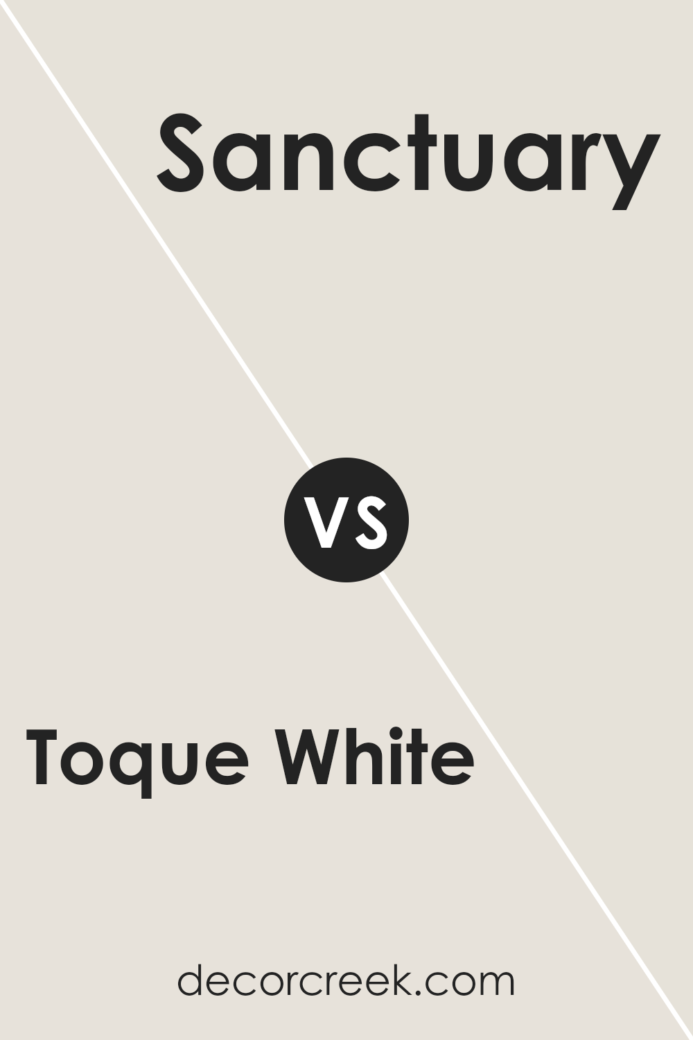
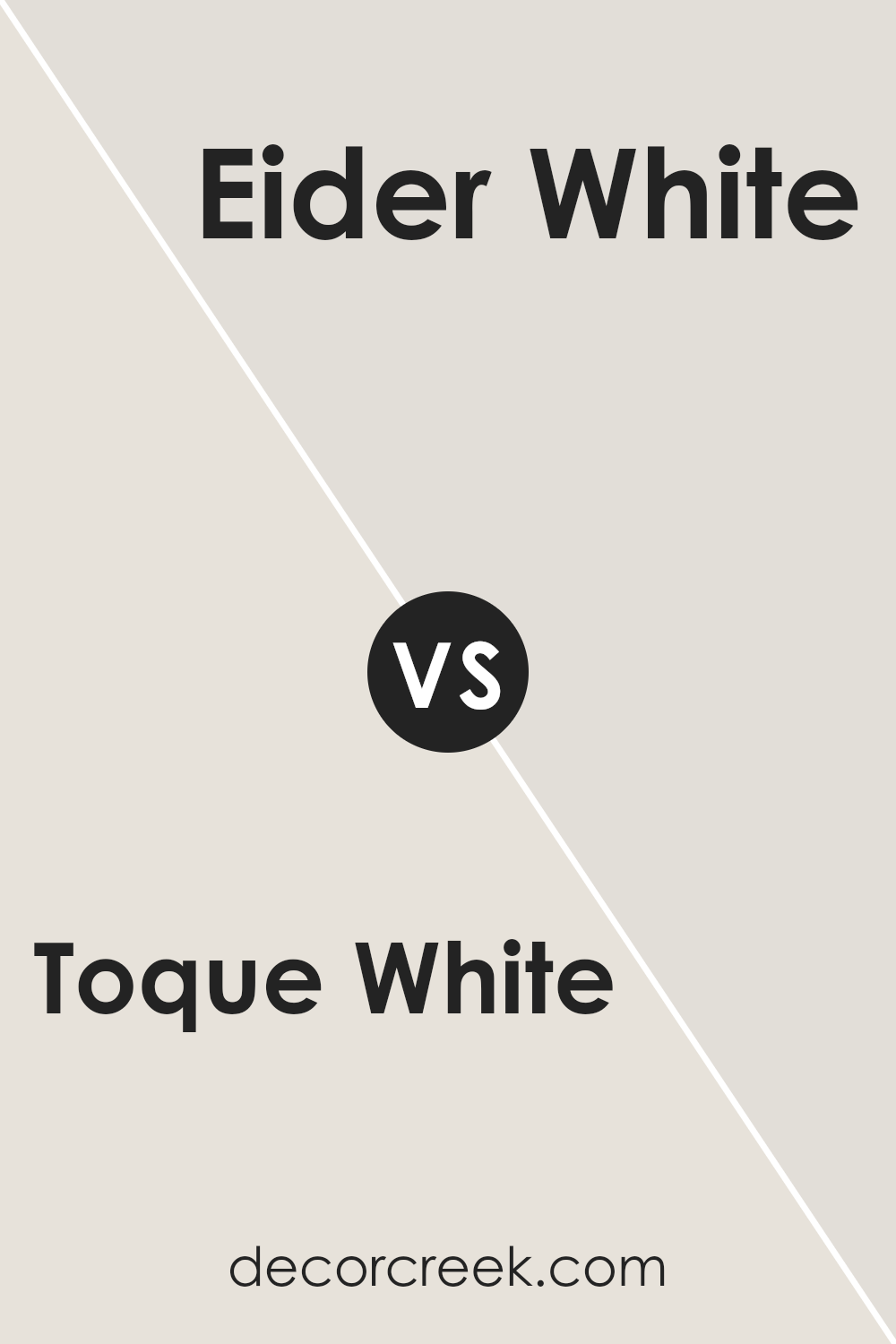
Toque White SW 7003 by Sherwin Williams vs Eider White SW 7014 by Sherwin Williams
Toque White and Eider White by Sherwin Williams are two popular shades of white paint, each offering a unique tone for home interiors. Toque White is a clean and warm white that provides a subtle hint of gray. It’s a great choice for creating a cozy and welcoming atmosphere without being too stark or bright.
On the other hand, Eider White has a slightly more complex tone, featuring a touch of gray as well, but it also incorporates a faint hint of pinkish-purple that gives it a cooler appearance. This subtle nuance can add a gentle contrast when used on walls, especially in spaces that get plenty of natural light.
Comparing the two, Toque White works well in spaces where you want to add warmth, while Eider White is better suited for a modern, slightly more muted look. Both shades are versatile and can be used in various settings, from bedrooms to living rooms, providing a clean backdrop that complements different decor styles.
You can see recommended paint color below:
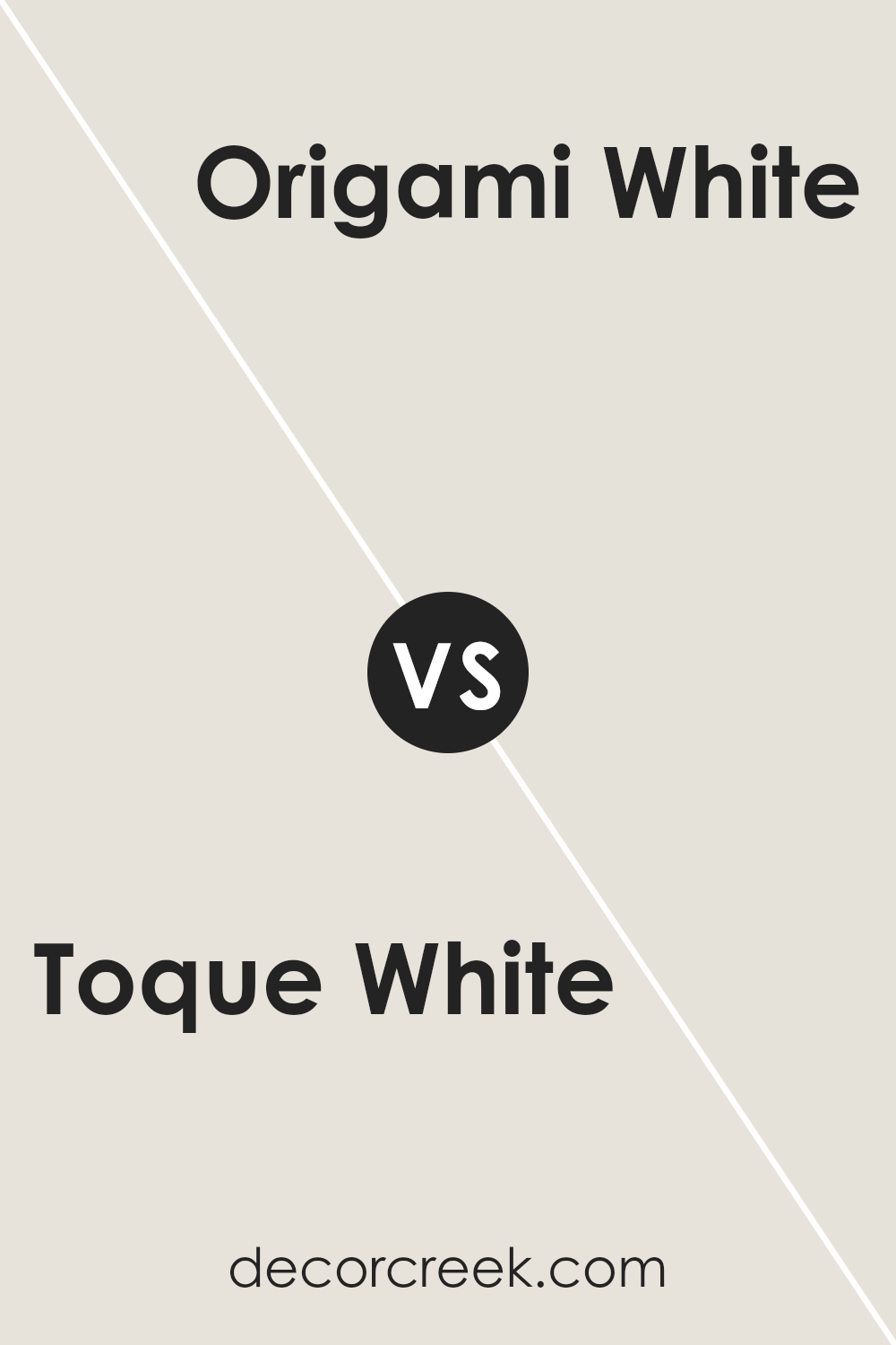
Toque White SW 7003 by Sherwin Williams vs Origami White SW 7636 by Sherwin Williams
Toque White and Origami White are both neutral paint colors by Sherwin Williams, but they have different undertones and visual impacts. Toque White is a soft, warm white with a slight grayish tone that gives it a calm appearance.
This makes it an excellent choice for creating a cozy and welcoming atmosphere in rooms like living areas and bedrooms. It tends to blend well with various decor styles and brings a touch of warmth to spaces without overwhelming them.
Origami White, on the other hand, has a cooler undertone, leaning slightly towards beige and gray. This color is perfect for spaces that get a lot of natural light, as the light highlights its subtle, neutral qualities without making the room feel cold. Origami White works well in modern and minimalist spaces, as it provides a clean, crisp backdrop that complements contemporary furnishings and finishes.
In conclusion, while both colors are great for creating neutral spaces, Toque White offers warmth and coziness, whereas Origami White offers a cleaner, more neutral canvas suitable for modern aesthetics.
You can see recommended paint color below:
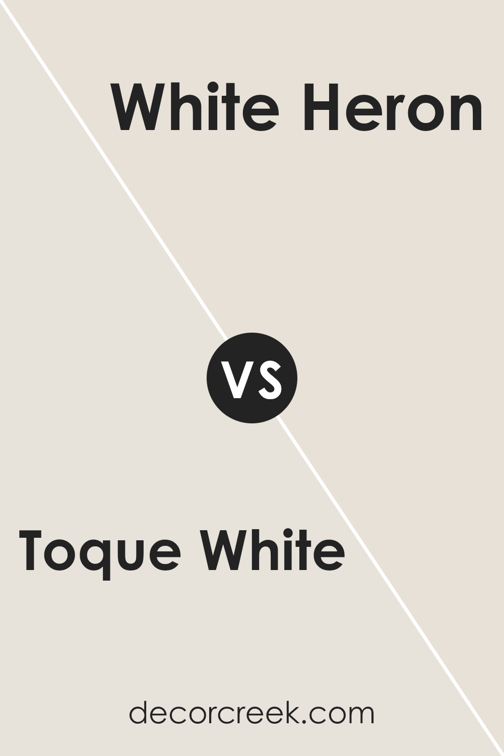
Toque White SW 7003 by Sherwin Williams vs White Heron SW 7627 by Sherwin Williams
Toque White and White Heron are both popular Sherwin Williams colors, but they offer distinct tones that could affect the feel of a room. Toque White has a slightly warm undertone, which gives a cozy and inviting feel to spaces. This warmth makes it suitable for living areas or bedrooms where you want a soft, welcoming ambiance.
On the other hand, White Heron has cooler undertones that lend it a crisper, cleaner look. This cooler vibe is great for creating a more refreshing and open feel, which can be perfect for bathrooms, kitchens, or smaller spaces that you want to feel larger.
When choosing between these two, consider the amount of natural light your room gets and the mood you’re aiming for. Toque White works well in rooms with less natural light or where you want warmth, while White Heron is ideal if you prefer a sharper, brighter space. Both colors are versatile, but their subtle differences will impact the overall atmosphere of your room.
You can see recommended paint color below:
- SW 7627 White Heron (CHECK A SAMPLE)
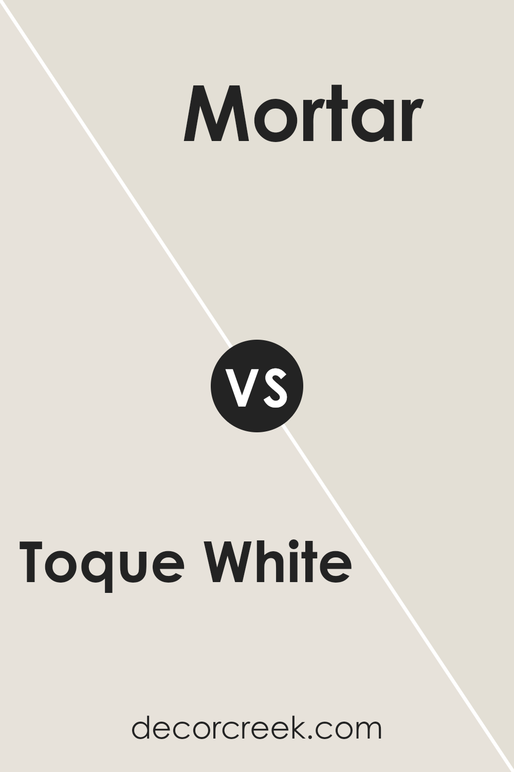
Toque White SW 7003 by Sherwin Williams vs Mortar SW 9584 by Sherwin Williams
Toque White and Mortar are both colors by Sherwin Williams, but they bring different vibes to a space. Toque White is a soft, neutral white with a warm undertone, making it perfect for creating a light and airy feel in any room. It’s versatile and can act as a background for bolder colors or as a standalone for a clean, simple look.
On the other hand, Mortar is a much darker shade, leaning towards a deep taupe or a soft, earthy gray. This color is great for adding depth and warmth to a space. It works well in areas where you might want a more cozy or enveloping atmosphere, like in a snug living room or a bedroom.
When used together, these two colors can complement each other well. Toque White can lighten up a room, while Mortar can be used for accent walls or furniture, providing a striking contrast that adds interest and variety to the decor.
You can see recommended paint color below:
- SW 9584 Mortar (CHECK A SAMPLE)
Conclusion
I’m thrilled to have shared all about SW 7003 Toque White by Sherwin Williams with you. This color is a wonderful choice if you’re thinking of giving your room a fresh, clean look. Toque White is soft and cozy, making any space feel welcoming and warm. Whether you want to paint a bedroom, a living room, or even the kitchen, this color suits almost every area of your home.
It’s also fabulous because it works well with other colors. If you have furniture or decorations in bright or dark colors, Toque White on the walls will make those colors pop without clashing. It’s like the perfect backdrop for all your favorite things!
As someone who adores simple and elegant styles, I find Toque White incredibly easy to use. It helps lighten up a room without being too flashy, and it’s great for making small spaces appear bigger. If you find yourself unsure about what paint to choose, consider Toque White.
It’s a decision that’s hard to go wrong with, and it might just be the perfect color to make your home look its best. Remember, a can of paint can really change how a room feels, and Toque White is definitely a winner in my book!

Ever wished paint sampling was as easy as sticking a sticker? Guess what? Now it is! Discover Samplize's unique Peel & Stick samples.
Get paint samples


