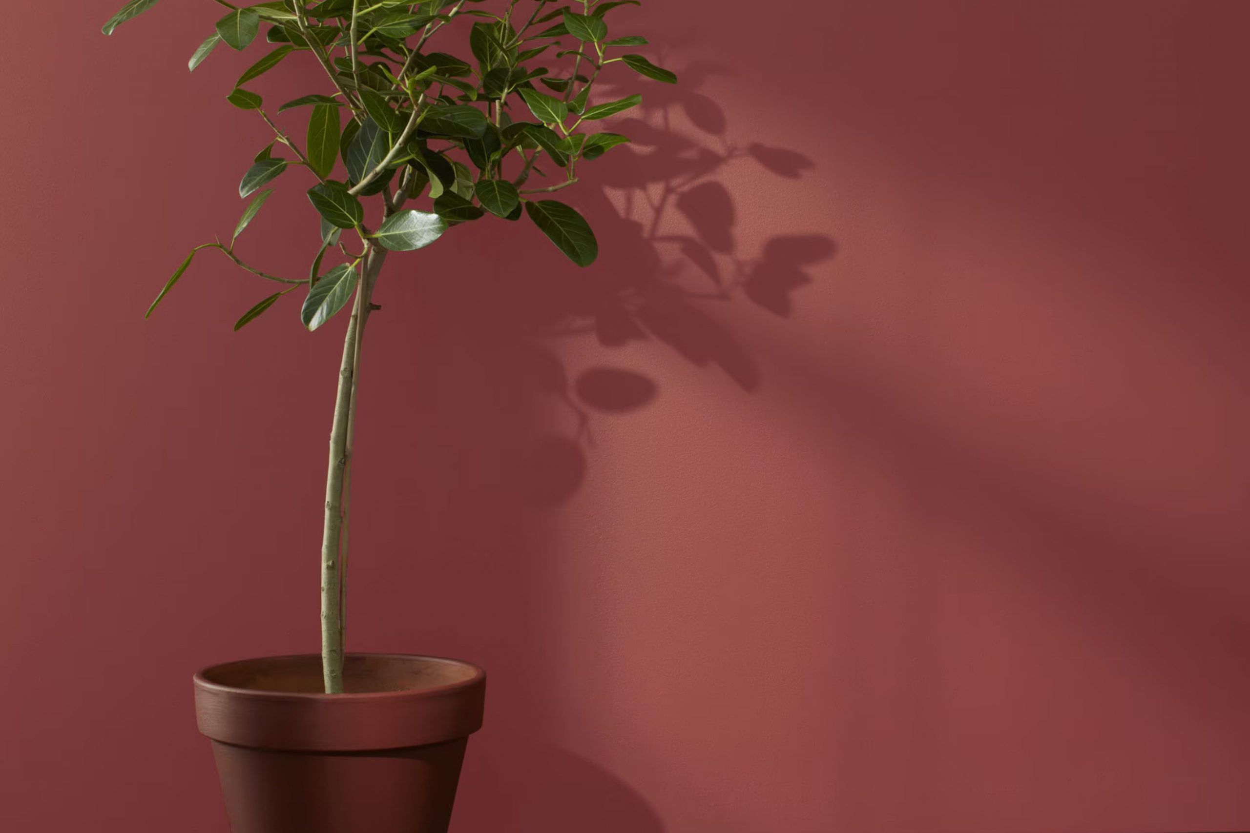
As you plan your next dinner party, imagine introducing a touch of grace and warmth with Benjamin Moore’s AF-300 Dinner Party. This rich, refined color can deeply change the mood of any dining room, making your guests feel both welcome and cherished.
AF-300 Dinner Party is not just a paint color; it’s a backdrop for memories, laughter, and delightful evenings. I’ve seen how this color can draw people together, encouraging long conversations and a cozy, communal feeling. It perfectly complements wood furniture and works brilliantly with both natural and artificial light, making it suitable for many dinner settings.
Adding this color to your walls would not just be a change; it will be an improvement that enhances every meal hosted in its presence.
So, as you look to make your dining area more inviting, consider how AF-300 could be your ally in creating an atmosphere where every gathering feels special.
What Color Is Dinner Party AF-300 by Benjamin Moore?
Dinner Party AF-300 by Benjamin Moore is a deep, rich red that brings warmth and a touch of drama to any room. This bold color can create a feeling of coziness and comfort, making it perfect for dining rooms where it can stimulate conversation and appetite. Additionally, the depth of this red can also enhance the ambiance in a living room or bedroom by adding a sense of warmth and intimacy.
Dinner Party pairs well with natural materials like wood, enhancing its warm undertones. Dark woods like mahogany or walnut can accentuate the richness of the red, while lighter woods like oak bring a pleasant contrast. This color also works well with leather textures, adding an element of luxury and comfort, particularly in furniture like sofas or armchairs. For fabrics, velvet is an excellent choice as it reflects light beautifully, creating a lush, inviting environment.
This color fits effortlessly into interior styles such as traditional, where its classic overtones blend harmoniously with elegant woodwork and detailed trim. It’s also at home in eclectic and contemporary styles where bold color choices can define the room. Dinner Party provides a stunning backdrop for metallic accents like brass or gold, which highlight its depth and warmth.
For those looking to create a cozy yet dynamic interior, Dinner Party is an excellent choice.
Is Dinner Party AF-300 by Benjamin Moore Warm or Cool color?
Benjamin Moore’s Dinner Party AF-300 is a rich, deep red that brings a warm and inviting atmosphere to any room. Perfect for creating a cozy dining area, this color makes it feel like the walls themselves are welcoming you and your guests to sit down and enjoy a meal together. It’s not too bright but has enough intensity to make a statement and add personality to a room.
When used in homes, this shade can make large rooms feel more intimate while giving smaller areas a touch of elegance. It works well in areas with lots of natural light as well as rooms that rely more on artificial lighting, reflecting the light beautifully to enhance the room’s overall mood.
Pairing it with neutral furniture and decor can balance out its boldness, or it can be matched with other strong, warm tones for a more cohesive look. Dinner Party AF-300 is flexible, making it ideal not just for dining rooms, but also living rooms, kitchens, and even bedrooms where you want to add depth and warmth.
Undertones of Dinner Party AF-300 by Benjamin Moore
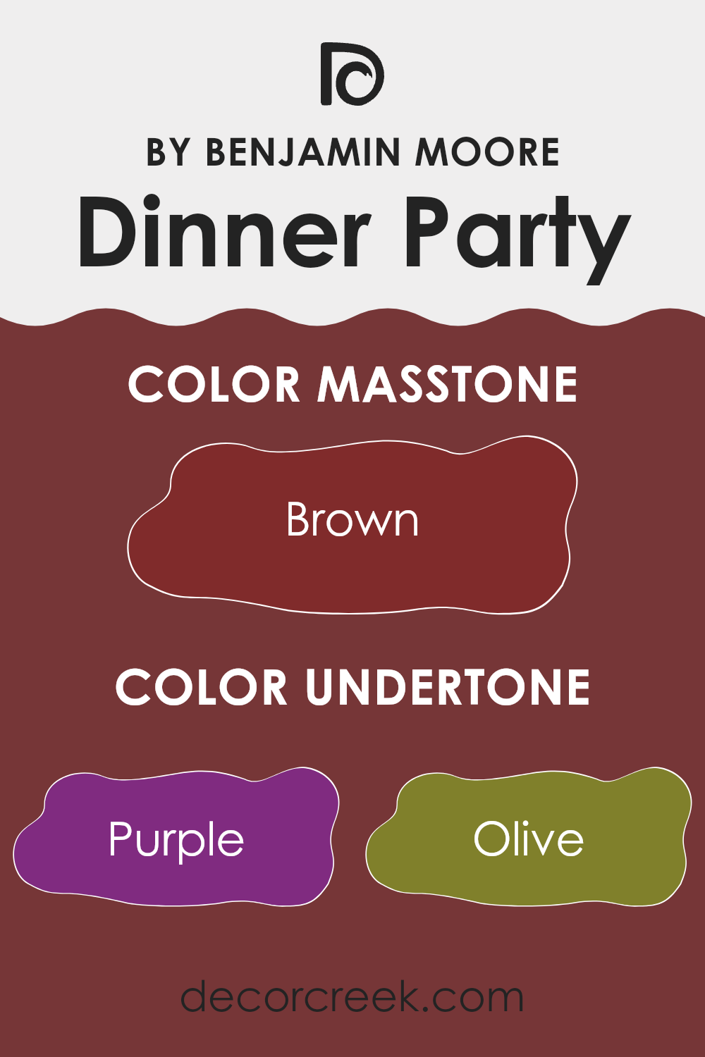
Dinner Party by Benjamin Moore is a complex paint color that comes alive with a fascinating blend of undertones. When choosing paint colors, it’s important to consider these subtle hues, as they influence the overall feel and appearance of a room. Undertones are the faint colors that lie beneath the primary color you see. These shaded elements can make a color look different under various lighting conditions or when placed next to other colors.
Dinner Party has a rich palette of undertones including purple, olive, dark gray, red, gray, navy, dark green, pink, orange, dark turquoise, and pale pink. This variety allows the color to shift in appearance subtly, depending on the lighting and surrounding elements. For instance, in a room with abundant natural light, the purple or pink undertones might become more noticeable, giving the walls a warm and inviting glow. In artificial lighting, darker undertones like navy or dark gray might stand out, adding depth and intrigue to the room.
In an interior setting, using Dinner Party on walls can create a dynamic backdrop. It can harmonize with a range of decor styles and color schemes due to its flexible undertones. If paired with furnishings that highlight its olive or dark green undertones, the room can feel grounded and connected to nature. Alternatively, accenting with elements that draw out its pink or red undertones can add a touch of warmth and vibrancy.
Overall, the effect of undertones is a subtle yet powerful aspect of selecting paint colors. They can enhance the mood and style of a room, making a color like Dinner Party a flexible choice for creating refined interior rooms without feeling too strong.
What is the Masstone of the Dinner Party AF-300 by Benjamin Moore?
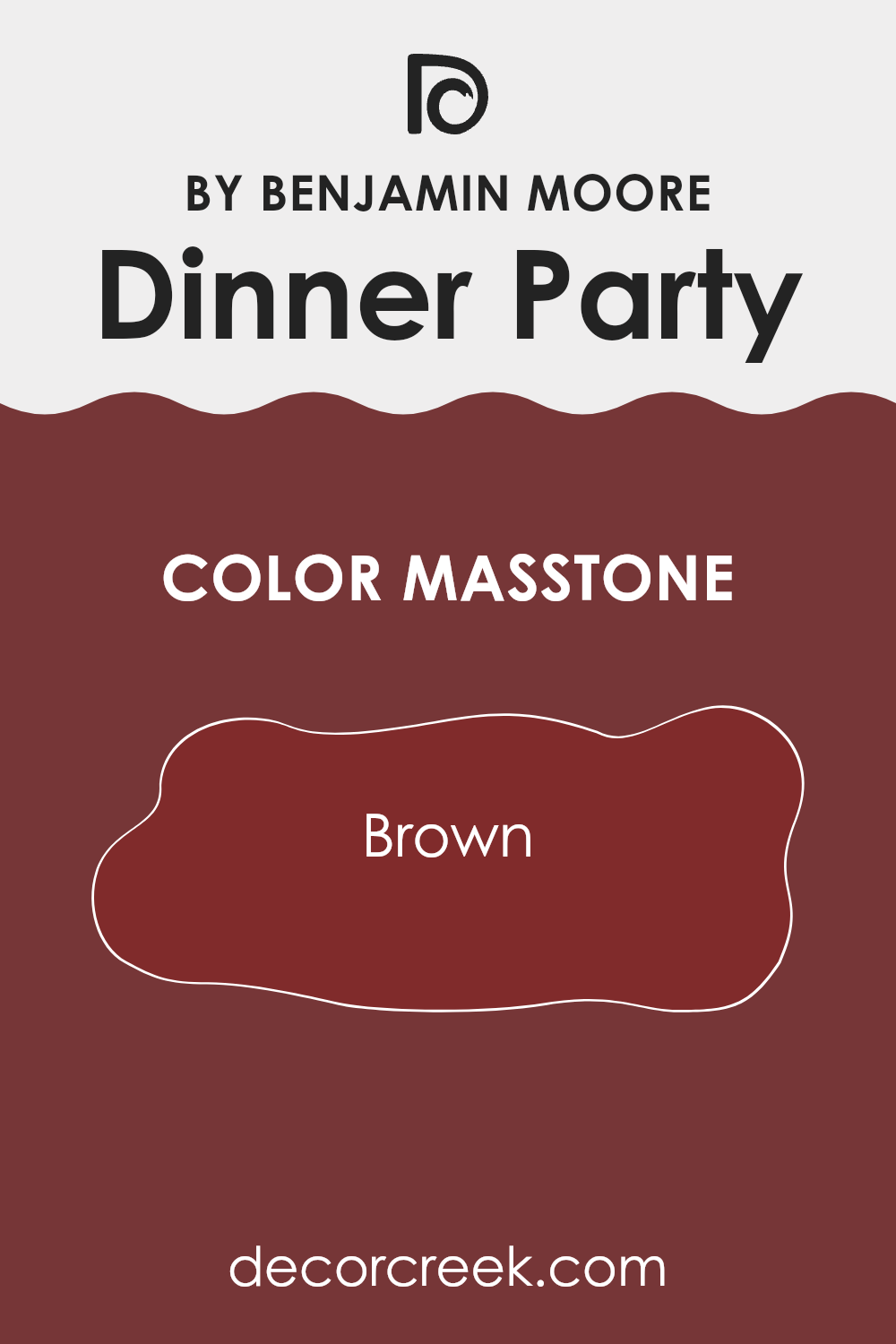
Dinner Party AF-300 by Benjamin Moore is a rich brown color with a deep, warm undertone. In homes, this color creates a cozy and inviting atmosphere, making it perfect for social areas like the living room or dining area.
The brown tone offers a sense of stability and comfort, which is ideal for places where families gather or host guests. Its warm hue pairs well with various textures and materials, enhancing wood finishes, leather furniture, and soft fabrics.
This makes it flexible for both traditional and modern decor. In brighter rooms, it brings a grounding effect, and in dimly lit areas, it adds depth and warmth. Overall, this warm brown color is excellent for creating a friendly and welcoming environment without feeling too dark or too strong.
How Does Lighting Affect Dinner Party AF-300 by Benjamin Moore?
Lighting dramatically affects how colors appear in different settings, influencing both the mood and functionality of a room. The color you see in a paint chip might not look the same on your walls due to varied lighting conditions.
For instance, consider the color Dinner Party AF-300 by Benjamin Moore—a rich, deep hue. Under artificial light, such as LED or incandescent bulbs, this color can appear slightly warmer, bringing out reddish undertones that add coziness to the environment. It’s ideal for rooms where you want warmth and an inviting atmosphere, like living rooms or dining areas.
In natural light, however, the influence is different. Sunlight can reveal the true depth and complexity of Dinner Party AF-300, highlighting its vibrant yet dark nature. This may vary through the day: morning light is often cooler, which could make the color appear more muted, while the golden tones of afternoon sunlight will bring out its warmer undertones.
- Room orientation further plays a crucial role in how Dinner Party AF-300 is perceived:
- North-facing rooms receive less sunlight, which makes colors appear shadowy or cooler. Dinner Party AF-300 might look more somber and less vibrant in a north-facing room.
- South-facing rooms receive ample sunlight, brightening and warming up the color. Here, Dinner Party AF-300 will look richer and more dynamic throughout the day.
- East-facing rooms receive bright, cool morning light, making Dinner Party AF-300 look bold early in the day but deeper and darker as sunlight fades.
- West-facing rooms receive warm evening light. In these rooms, the color may feel softer in the morning but glow warmly later in the day.
Understanding these differences can help in deciding where to paint a particular color based on how it interacts with light and the mood you want to create in each room.
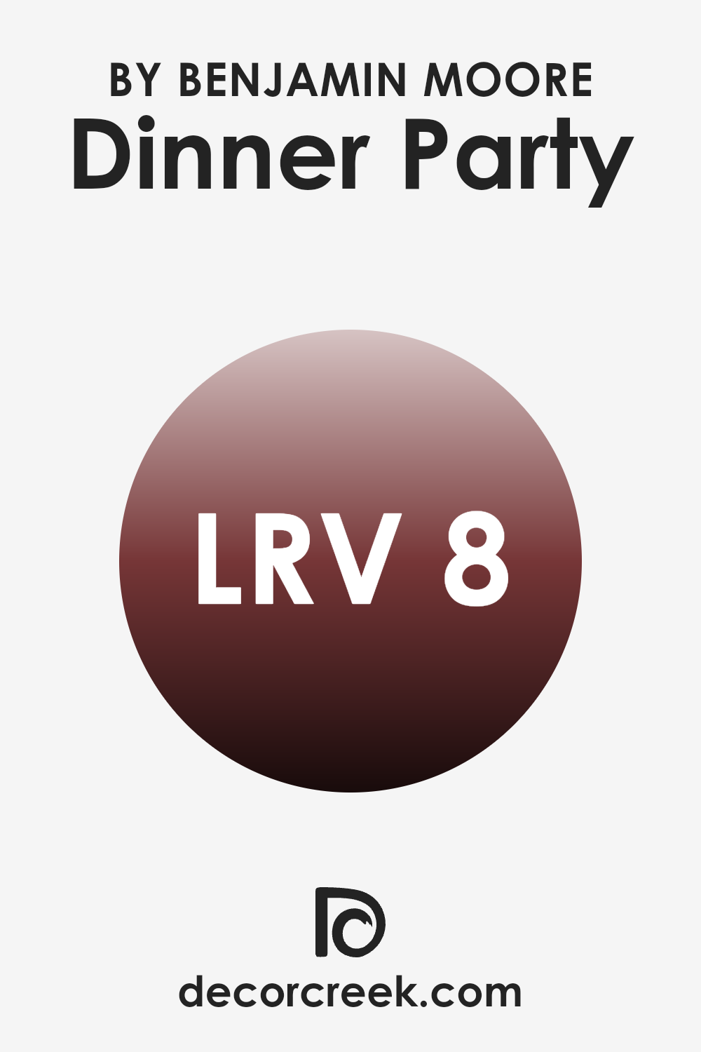
What is the LRV of Dinner Party AF-300 by Benjamin Moore?
LRV stands for Light Reflectance Value, which is a measure used to describe the percentage of light a paint color can reflect back into a room. It’s essentially a scale that helps to determine how light or dark a color might look once applied to walls.
The higher the LRV, the lighter the paint will appear, and conversely, the lower the LRV, the darker the paint will seem. This value is important when choosing paint colors because it affects how bright or dim a room will feel, and it can also influence how big or small the room appears.
With an LRV of 8.43, Dinner Party by Benjamin Moore is quite dark, meaning it reflects only a small amount of light. In practical terms, this low LRV suggests that the color will absorb more light than it reflects, creating a moody and intense look in a room. This quality can be desirable in large, well-lit areas where a darker color can add depth and character.
However, in a smaller or less naturally lit room, using a low-LRV color like Dinner Party might make the room appear smaller and darker, which is something to consider when deciding where to use this particular shade.
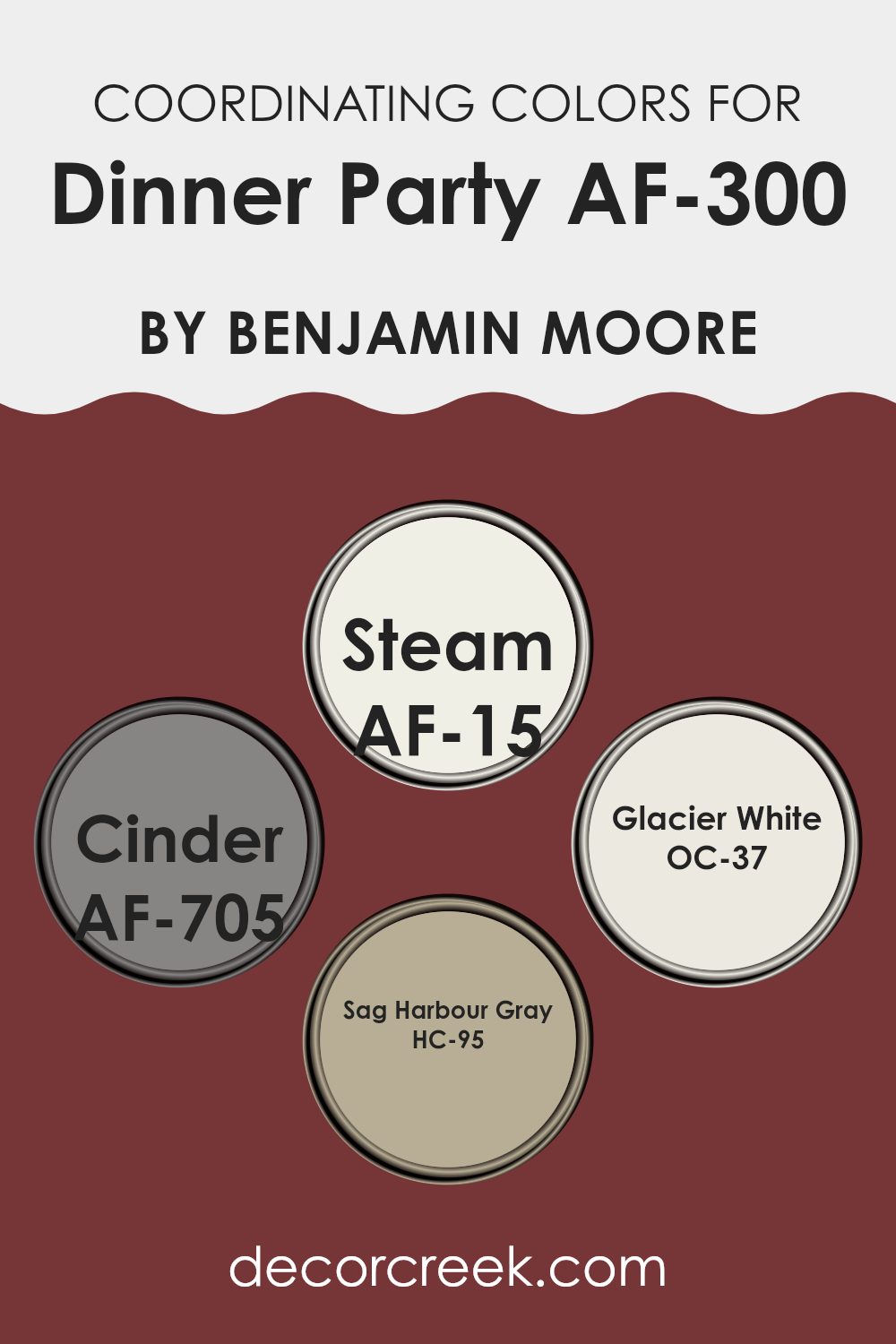
Coordinating Colors of Dinner Party AF-300 by Benjamin Moore
Coordinating colors are selected hues that complement each other, either by being on similar color spectrum levels or by providing a striking contrast that balances a color scheme. When you choose coordinating colors like those compatible with AF-300, you make sure that each color harmonizes and enriches the look of your room. Using these coordinating colors effectively can help you achieve a seamless and visually pleasing decor.
AF-15 – Steam is a crisp white with barely-there gray undertones that makes it a flexible and clean addition. It pairs beautifully with deeper tones, giving any room a fresh, orderly feel. AF-705 – Cinder is a deep charcoal with a hint of warmth. This color provides a strong anchor for lighter shades, offering a grounding effect that feels reassuring and secure.
OC-37 – Glacier White offers a pure, snow-like appearance that brightens and opens up any room, making it feel more airy and open. Lastly, HC-95 – Sag Harbour Gray, a soft gray with warm undertones, offers a gentle contrast when used with darker or more vibrant hues, rounding out the color story with its subtle charm. By mixing these shades, you can create a room that feels balanced and visually engaging without feeling too strong.
You can see recommended paint colors below:
- AF-15 Steam
- AF-705 Cinder
- OC-37 Glacier White
- HC-95 Sag Harbour Gray
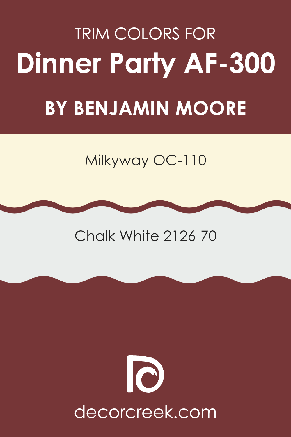
What are the Trim colors of Dinner Party AF-300 by Benjamin Moore?
Trim colors are specialized shades used to accentuate and contrast the main hues on a wall, usually applied to moldings, door frames, windows, and skirting. Trim colors play a crucial role in defining visual boundaries and enhancing architectural details, helping to create a cohesive look in a room.
Specifically, when using a rich and deep color like Dinner Party AF-300 by Benjamin Moore, it’s important to select trim colors that will complement and offset this bold shade, ensuring that the room feels balanced rather than too intense.
For the color OC-110 – Milkyway, this is a soft, gentle white with subtle creamy undertones, making it an excellent choice for trims when paired with deeper, dramatic wall colors. It brings a light, fresh contrast that can help highlight the richness of Dinner Party AF-300. On the other hand, 2126-70 – Chalk White is a pure, clean white, offering a crisp, clear contrast that can effectively outline and bring into focus the refined depth of darker tones. Using this color for trims can create a striking outline around architectural features, adding definition and neatness to the room.
You can see recommended paint colors below:
- OC-110 Milkyway
- 2126-70 Chalk White
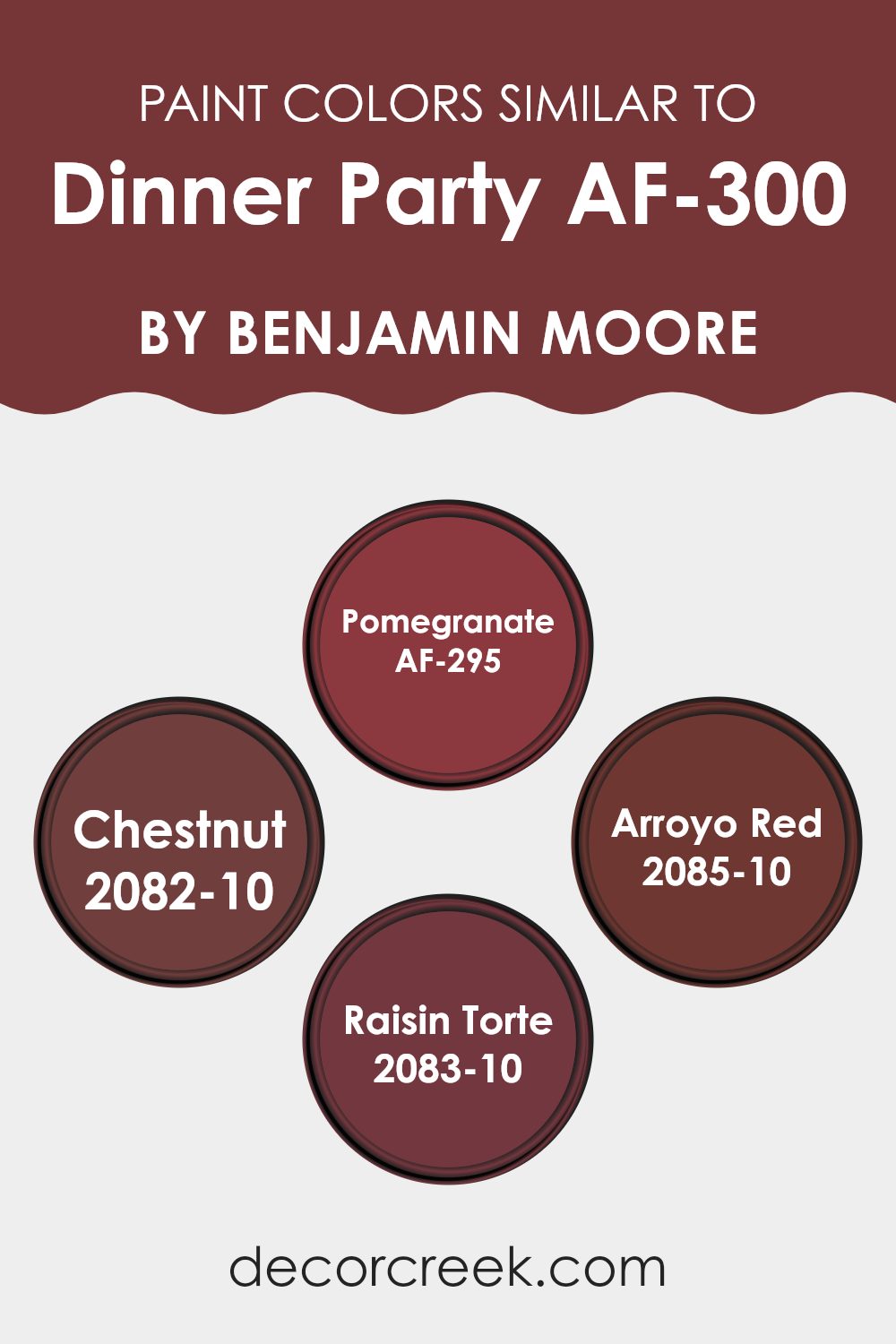
Colors Similar to Dinner Party AF-300 by Benjamin Moore
Choosing similar colors can be significant in creating a cohesive and harmonious look. Colors that share similar tones or hues naturally pair well and create a seamless visual flow, helping to achieve a balanced and unified aesthetic in a room. Using shades like Pomegranate, Chestnut, Arroyo Red, and Raisin Torte, which bridge the gap between boldness and warmth, can enhance the atmosphere in any setting.
These colors, which revolve around the central theme set by Dinner Party, play off each other to foster a rich, inviting mood. They are particularly effective in areas where a sense of continuity is desirable, such as open-plan homes or across a series of connected rooms.
Pomegranate is a deep, vibrant tone that adds a touch of vitality without feeling too strong. Its rich quality makes it perfect for accent walls or furniture pieces that you want to stand out. Then there’s Chestnut, a warmer and more earthy hue that brings to mind the comforting and cozy feeling of autumn.
Moving on to Arroyo Red, this color has a rustic yet lively character, offering a great backdrop for art or drawing attention to a well-curated bookshelf. Lastly, Raisin Torte delivers a darker, more muted shade, ideal for adding depth and refinement in quieter corners of a room. These colors, when used thoughtfully, can bring life to any room with their shared warmth and richness.
You can see recommended paint colors below:
- AF-295 Pomegranate
- 2082-10 Chestnut
- 2085-10 Arroyo Red
- 2083-10 Raisin Torte
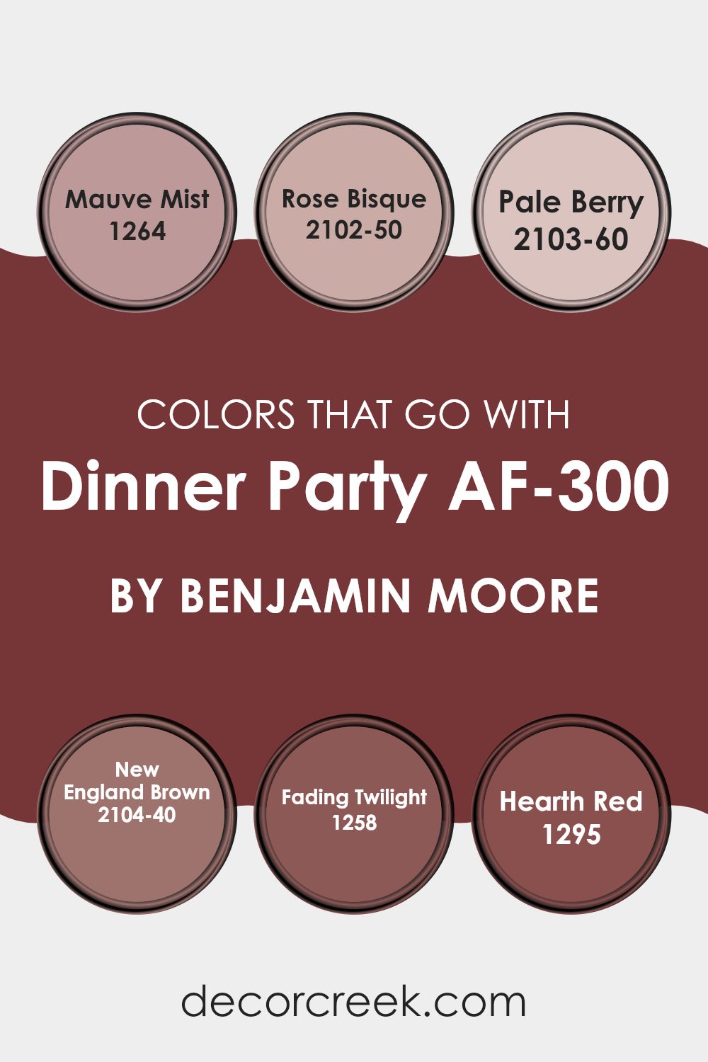
Colors that Go With Dinner Party AF-300 by Benjamin Moore
Choosing the right colors to match with Dinner Party AF-300 by Benjamin Moore is essential in creating a harmonious and inviting atmosphere. Dinner Party AF-300, a rich and deep red hue with warm undertones, sets a cozy and welcoming mood.
When paired with complementary colors such as Mauve Mist and Rose Bisque, it enables the room to have a subtle contrast without feeling too strong or heavy. Mauve Mist is a gentle lilac color that adds a touch of calmness, while Rose Bisque is a soft pink that brings a light and airy feel to the room. These lighter shades help balance the bold nature of Dinner Party AF-300.
Further enhancing the overall aesthetic, colors like Pale Berry, New England Brown, Fading Twilight, and Hearth Red offer additional layers and depth to the design scheme. Pale Berry is a muted pink that offers a soft contrast, and New England Brown is a rich chocolate shade that provides a grounding effect, complementing the primary red beautifully.
On the other hand, Fading Twilight is a subtle grey with hints of blue, perfect for creating a soothing backdrop that allows the richer tones to stand out. Lastly, Hearth Red is a vibrant, deep red that echoes the warmth and depth of Dinner Party AF-300, reinforcing the inviting quality of the environment. Together, these colors create a balanced and harmonious look that enhances the beauty and appeal of any room.
You can see recommended paint colors below:
- 1264 Mauve Mist
- 2102-50 Rose Bisque
- 2103-60 Pale Berry
- 2104-40 New England Brown
- 1258 Fading Twilight
- 1295 Hearth Red
How to Use Dinner Party AF-300 by Benjamin Moore In Your Home?
Dinner Party AF-300 by Benjamin Moore is a rich, deep burgundy paint that can add warmth and grace to any room. This color is perfect for creating a cozy, inviting mood, making it an excellent choice for dining rooms where families gather to share meals.
It can also bring a sense of luxury and comfort to living rooms or bedrooms. When paired with soft lighting, the depth of this hue helps create a relaxing environment, ideal for winding down after a busy day.
To use Dinner Party AF-300 in your home, consider painting one accent wall to add a splash of color, while keeping the other walls in a neutral tone to maintain balance. It can also look stunning on kitchen cabinets for those willing to make a bold statement. Complement it with light-colored furnishings or decorations to make the room feel more open and airy despite the dark tone of the paint.
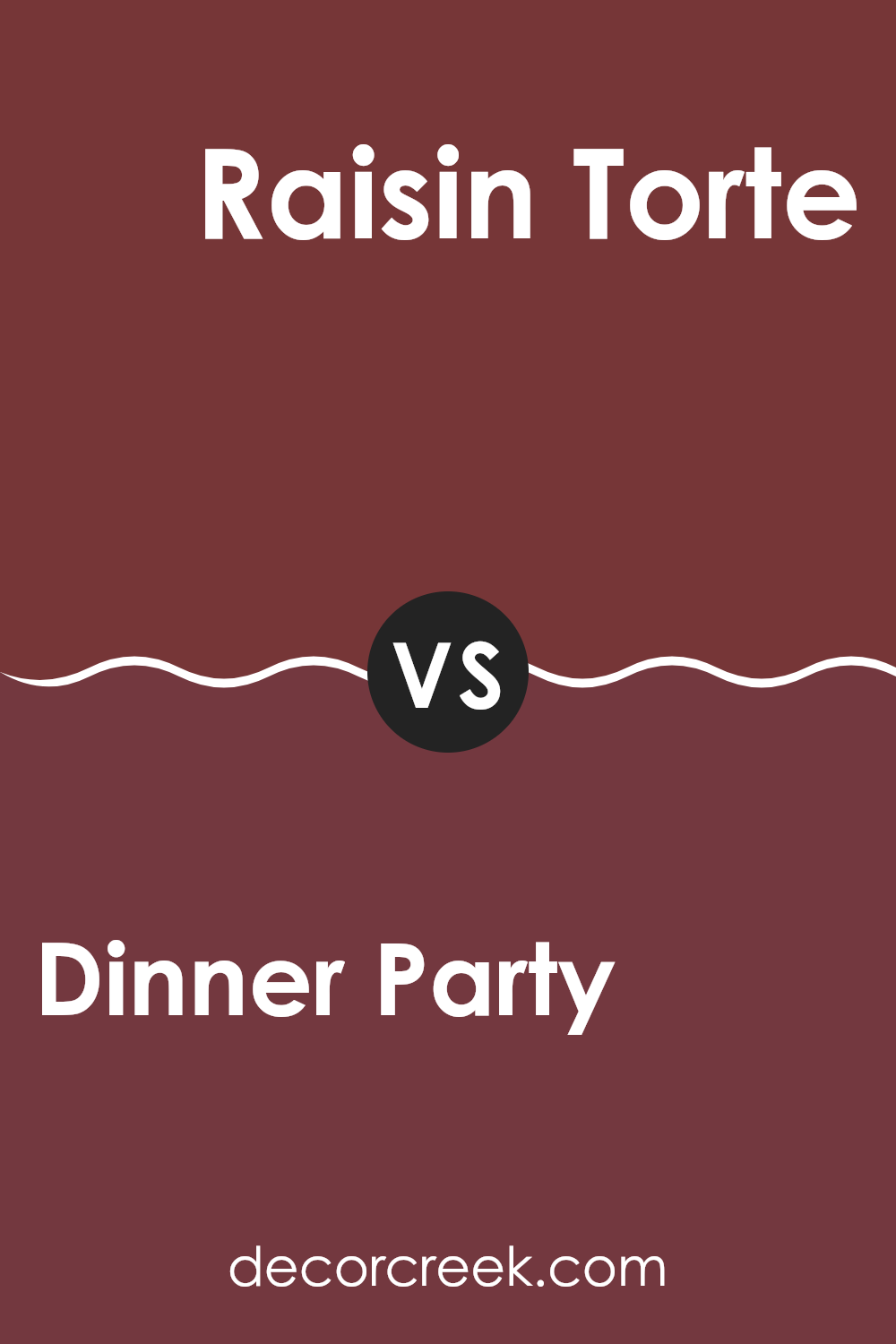
Dinner Party AF-300 by Benjamin Moore vs Raisin Torte 2083-10 by Benjamin Moore
Dinner Party by Benjamin Moore is a deep, rich red with a brown undertone that gives it a warm and inviting feel. It’s a color that makes a statement and creates a cozy atmosphere, perfect for social areas like dining rooms or living areas.
On the other hand, Raisin Torte by Benjamin Moore is also a deep shade but leans more toward a brownish-purple or burgundy. It’s darker than Dinner Party and offers a bold and elegant vibe, suitable for accent walls or to create a focal point in a room.
Both colors are quite intense and can be used effectively to add depth and warmth to an interior. While Dinner Party might seem a bit more vibrant due to its red undertone, Raisin Torte carries a subtle purple hue that can appear more reserved. Each color offers a unique character and can strongly influence the feel of a room depending on how it is used.
You can see recommended paint color below:
- 2083-10 Raisin Torte
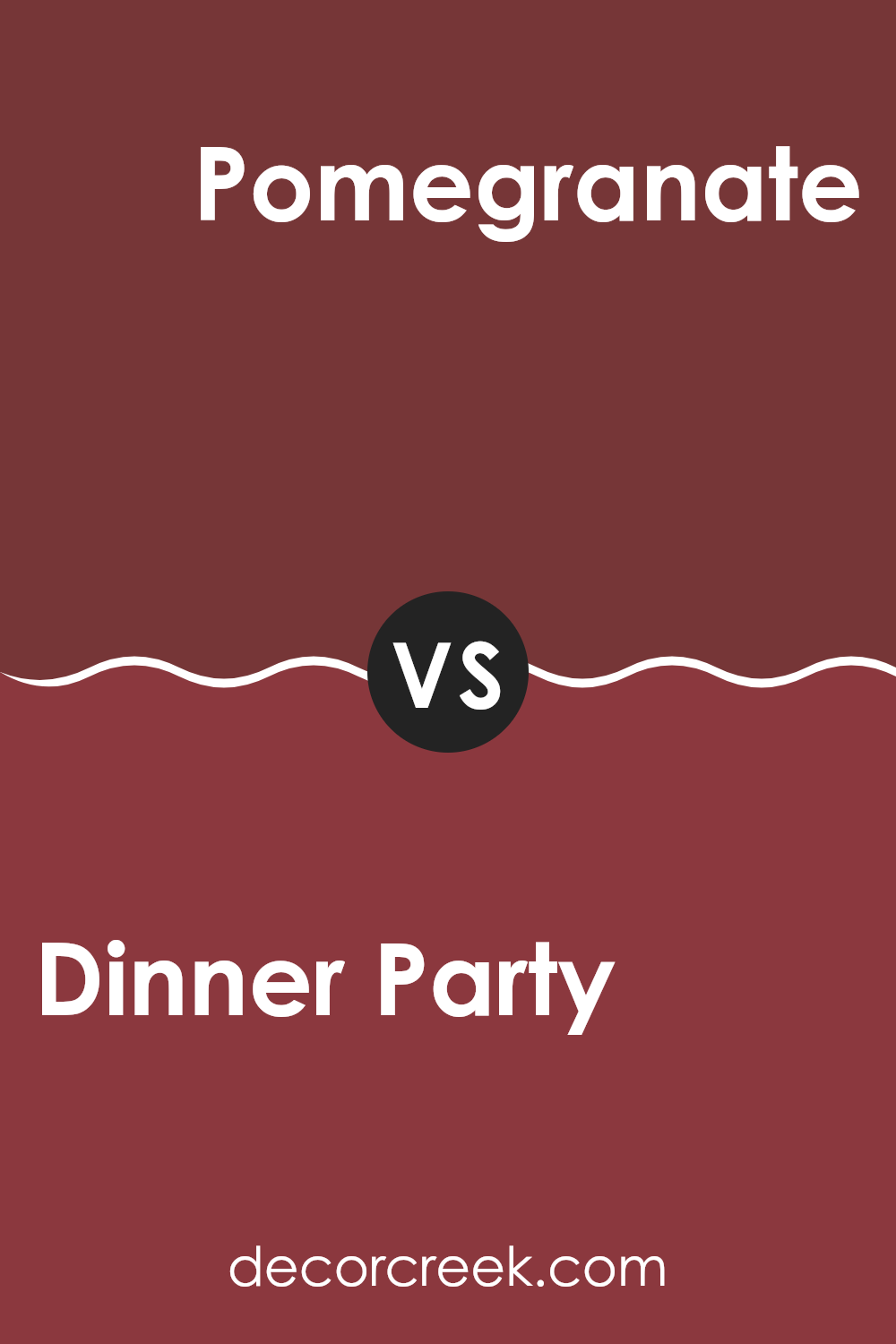
Dinner Party AF-300 by Benjamin Moore vs Pomegranate AF-295 by Benjamin Moore
The main color, Dinner Party, is a deep, rich red with a brown undertone that creates a warm and inviting atmosphere. It’s ideal for rooms where you want a cozy and slightly formal vibe, like dining rooms or libraries.
On the other hand, Pomegranate is a vibrant, slightly brighter red with a hint of orange. This color is energetic and would be great for areas that need a lively yet warm touch, such as a kitchen or a playful living area.
Both colors bring warmth but in different intensities and moods. Dinner Party leans toward a muted, more reserved red, while Pomegranate stands out with a zestier, more cheerful tone. Each would pair well with neutral furnishings to allow the red to really stand out and be the focal point of the room.
You can see recommended paint color below:
- AF-295 Pomegranate
Dinner Party AF-300 by Benjamin Moore vs Chestnut 2082-10 by Benjamin Moore
“Dinner Party” is a dark, rich red that has a warm, inviting feel. It’s the type of color that makes a bold statement in any room and can make rooms feel cozier. This color works well in dining rooms or living areas where you want a sense of warmth and comfort.
On the other hand, “Chestnut” is a deep brown that carries a strong presence and can act as a solid foundation in a room’s color scheme. It pairs beautifully with lighter colors and natural materials, bringing a grounded feeling to interiors.
While “Dinner Party” tends to make a room pop with its vibrant hue, “Chestnut” offers a more understated elegance, providing a steady, earthy base that complements a wide range of decorating styles. Both colors offer unique traits for creating inviting rooms, with “Dinner Party” leaning toward a dramatic flair and “Chestnut” offering a more subdued and flexible backdrop.
You can see recommended paint color below:
- 2082-10 Chestnut
Dinner Party AF-300 by Benjamin Moore vs Arroyo Red 2085-10 by Benjamin Moore
Dinner Party by Benjamin Moore is a rich, deep aubergine shade that offers a warm, cozy vibe to any room. It’s a color that pairs well with softer, lighter tones, helping to create a welcoming atmosphere in rooms like living areas or dining rooms. This shade can make large rooms feel more intimate and gives a luxurious touch to small rooms.
In contrast, Arroyo Red, also by Benjamin Moore, is a bold and vibrant brick red color. It stands out more than Dinner Party and is packed with energy, making it a great choice for rooms where you want to make a statement, like an accent wall or a front door. This color works well in areas that receive a lot of light and can be paired with neutral shades to balance its intensity.
Both colors are unique and can dramatically affect the mood and style of a room, depending on how they are used. Whether looking for warmth and depth or striking vibrancy, Dinner Party and Arroyo Red offer great options.
You can see recommended paint color below:
- 2085-10 Arroyo Red
As I finish writing about the color AF-300 Dinner Party by Benjamin Moore, I’ve learned a lot about how certain colors can make us feel and how they can make our homes look beautiful. Dinner Party is a special kind of red that’s rich and warm, kind of like the feeling you get when you’re wrapped in a cozy blanket or sitting by a fire. It’s a color that can make a room feel welcoming and friendly, perfect for a place where family and friends gather to eat and have fun together.
Using Dinner Party paint in a dining room or a living area can really make the place look pretty and feel comfortable. It’s not just any red; it has depth that adds character and warmth, making you want to stay in the room longer. Whether you put it on all the walls or just one as an accent, this color has a way of making the place lively and cozy at the same time.
After all my research and writing on AF-300 Dinner Party, I think it’s a great choice for someone who wants to make their home more inviting and cozy.
It stands out nicely but isn’t too bright or harsh, making it just right for a place where you’d gather around with loved ones for a meal and good conversation.
Ever wished paint sampling was as easy as sticking a sticker? Guess what? Now it is! Discover Samplize's unique Peel & Stick samples.
Get paint samples

