If you’re on the lookout for a paint color that brings a sense of calm and clarity to any space, Benjamin Moore’s AF-15 Steam might just be what you need. It’s a subtle color that doesn’t shout for attention, yet it holds a soft power that transforms a room into a serene hideaway. Imagine brushing this gentle hue onto your walls and watching how it delicately shifts the mood, making your home feel more open and airy.
As you go about deciding if Steam is the right choice, think about the rooms in your house that could use a light touch. Perhaps it’s your bustling kitchen that needs to feel a bit more welcoming, or your home office where clarity and focus are paramount. With Steam, the possibilities stretch as far as your imagination goes.
Its versatility in pairing with other colors and decor is also a huge plus, allowing you to maintain the existing style or create something entirely new.
Why not let this elegant shade work its quiet charm in your living space?
After all, transforming your home with a fresh coat of paint like AF-15 Steam can be a simple yet significant way to enhance your everyday environment.
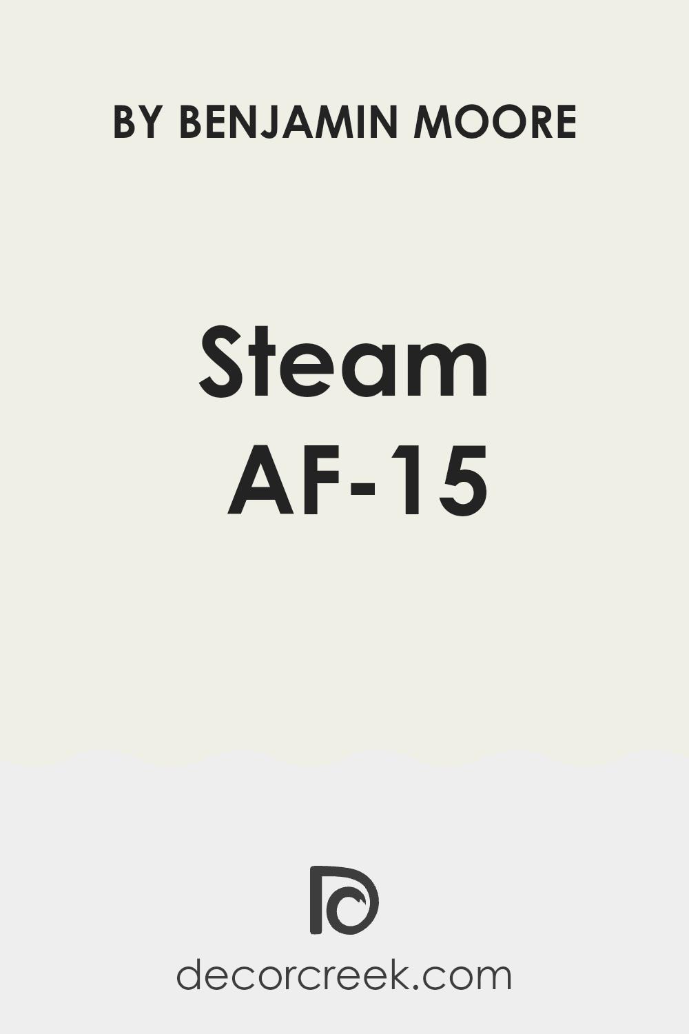
What Color Is Steam AF-15 by Benjamin Moore?
Steam AF-15 by Benjamin Moore is a versatile and soft gray color that has a subtle warmth to it, making it a perfect backdrop for various interior styles. This color is gentle and understated, offering a clean and modern look that can easily blend with other hues. Its neutrality means it can serve as a base to which bolder colors or accents can be added without overwhelming the space.
Steam AF-15 works exceptionally well in contemporary and minimalist designs due to its clean and crisp nature. It also fits beautifully into a Scandinavian style, where light, airy colors are preferred to enhance the feeling of space and natural light. This color can be used effectively in coastal themes to mimic the calmness of sandy shores and soft ocean breezes.
When it comes to pairing with materials and textures, Steam AF-15 coordinates beautifully with natural wood tones, from light pines to richer walnuts, adding warmth to the space. It also looks stunning with metallic finishes like brushed nickel or chrome, which complement its modern vibe.
For textiles, consider soft, plush fabrics or smooth linens in neutral or pastel tones to create a relaxed and inviting environment.
Whether used for walls, cabinets, or accent features, Steam AF-15 provides a subtle yet distinctive foundation that enhances and supports various decor elements.
Is Steam AF-15 by Benjamin Moore Warm or Cool color?
Steam AF-15 by Benjamin Moore is a unique shade that really changes the look and feel of any home. It’s a versatile gray that balances cool and warm tones, making it a perfect choice no matter the room or style of your house.
If your living space has a lot of natural light, Steam AF-15 looks almost soft and luminous, adding a light airiness that makes rooms seem more open and spacious. In areas with less light, it adds depth and warmth, creating a cozy, inviting atmosphere.
This color is also really practical. It hides small marks and smudges well, which is great for busy households. Plus, it pairs easily with a wide range of other colors and decorations. Whether you mix it with bold, bright colors or stick to a more neutral palette, it holds its own while allowing other elements to stand out.
This makes it incredibly useful for homeowners who enjoy changing their décor frequently without wanting to repaint every time.
Undertones of Steam AF-15 by Benjamin Moore
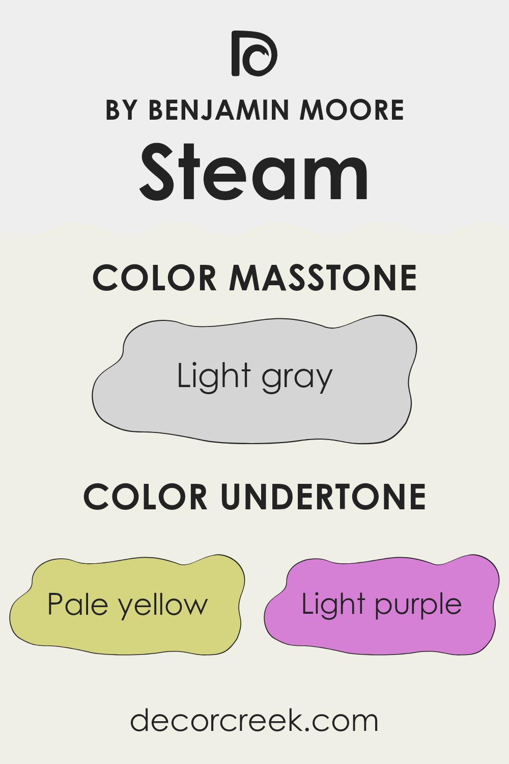
Steam AF-15 by Benjamin Moore is a unique paint color because it contains a mix of subtle undertones that can affect the perception of the space it’s used in. These undertones include pale yellow, light purple, light blue, pale pink, mint, lilac, and grey. Having these varied undertones means that Steam AF-15 doesn’t just look gray—it has depth and complexity, which can change depending on the lighting and surrounding colors.
The presence of pale yellow can make a room feel a bit warmer, while light blue can lend a cooler, more calming effect. Light purple and lilac add a touch of gentleness, giving walls a soft, almost whimsical charm. Pale pink can bring a flush of warmth, making spaces feel more welcoming. Mint offers a hint of freshness, enhancing spaces with a clean, crisp vibe.
The grey undertone helps balance all these hues, maintaining a neutral backdrop that’s flexible in different design settings. When applied to interior walls, the mix of these undertones in Steam AF-15 means it can complement a wide range of décor styles and color schemes.
In natural light, the color might lean towards a fresher, cooler hue, while under artificial lighting, it might appear warmer. This adaptability makes Steam AF-15 a versatile choice for any room, enhancing the space without overwhelming it with color. Whether you want a room that feels cozy, refreshing, or gently vibrant, this paint can help you achieve that atmosphere.
What is the Masstone of the Steam AF-15 by Benjamin Moore?
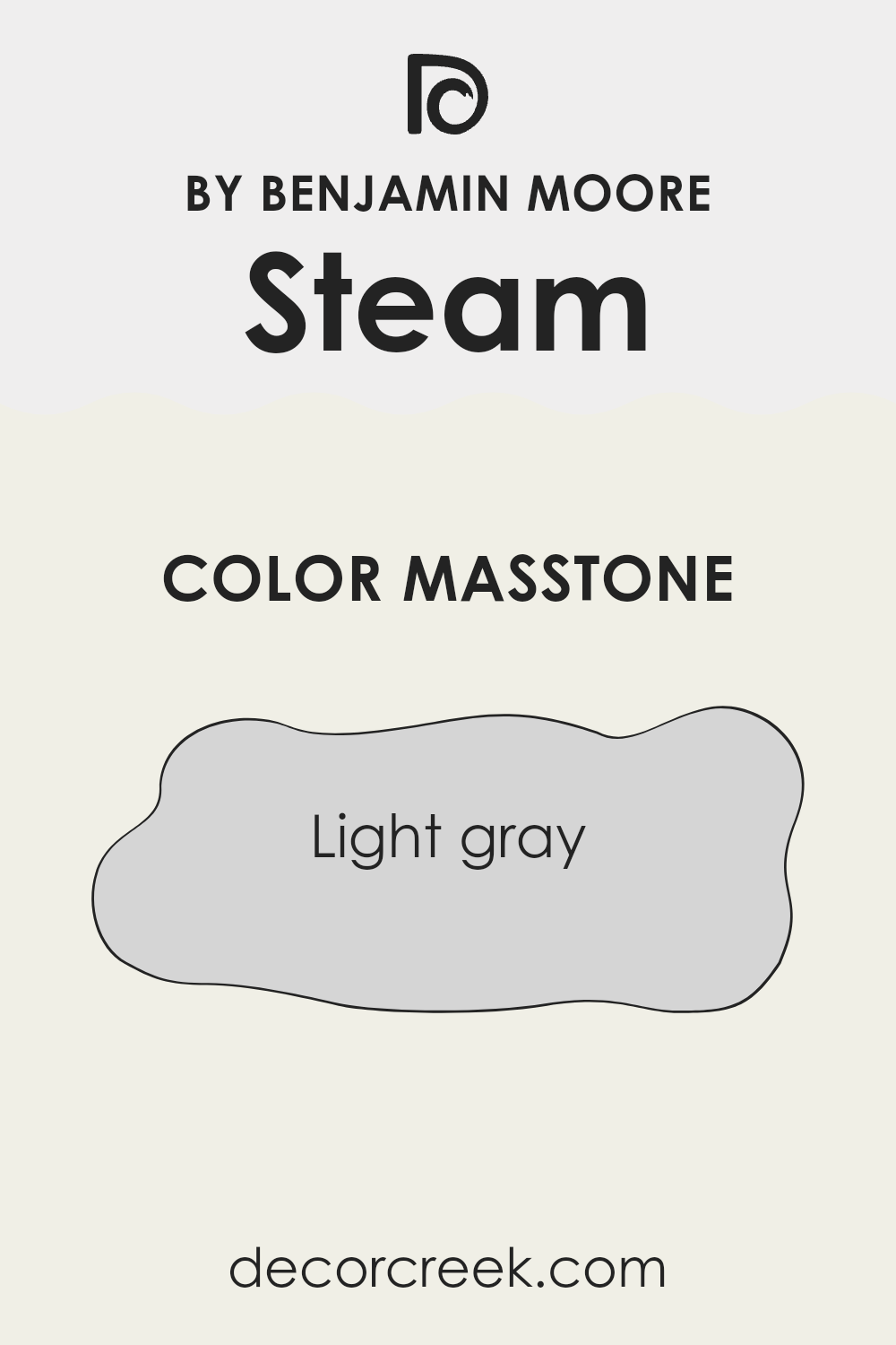
Steam AF-15 by Benjamin Moore, with its masstone of light gray (#D5D5D5), offers a versatile and gentle shade that works well in various home settings. This light gray has a clean and minimalistic feel, making it a great choice for those looking to create a calm and uncluttered space.
It pairs easily with different colors, whether you’re aiming for a modern look with bold contrasts or a soft, understated palette. As a neutral backdrop, it allows artwork and furniture to stand out, helping to highlight their colors and designs.
Light gray is also excellent at reflecting natural light, which helps make smaller rooms appear larger and more open. Overall, Steam AF-15 is a practical color choice that can adapt to multiple decorating styles, maintaining a fresh and inviting atmosphere in your home.
How Does Lighting Affect Steam AF-15 by Benjamin Moore?
Lighting has a significant impact on how colors appear in different environments. The color Steam AF-15 by Benjamin Moore can look quite different depending on the light it’s exposed to. This is because lighting can alter the color’s brightness, tone, and mood.
In artificial light, Steam AF-15 tends to look slightly warmer and cozier, especially under soft, warm bulbs. This makes it a great choice for living areas or any space where you want to create a welcoming atmosphere. The warm artificial lighting brings out subtle undertones in the paint, making the walls feel more inviting.
In natural light, the color can change dramatically depending on the time of day and the direction the room faces. Natural light generally reveals the truest color, but the intensity and angle of the light can make a big difference.
- North-faced rooms: These rooms get less direct sunlight, which can make Steam AF-15 appear cooler and more neutral. It’s perfect for creating a calm, consistent look since the light in these rooms tends to be more stable throughout the day.
- South-faced rooms: These rooms are flooded with light for most of the day, which can make the color warmer and brighter. Steam AF-15 will look lighter and more vibrant, making the space feel airy and lively.
- East-faced rooms: In these rooms, the color will look warm and bright in the morning as the sun rises, but may turn cooler as the day progresses. The morning light can make the room feel fresh and invigorating.
- West-faced rooms: Here, the evening light can make Steam AF-15 appear very warm and welcoming, especially towards sunset. During the morning, however, the color might appear more subdued.
By understanding these variations, you can decide where to use Steam AF-15 to enhance your living space, ensuring that the color complements the room’s lighting and usage.
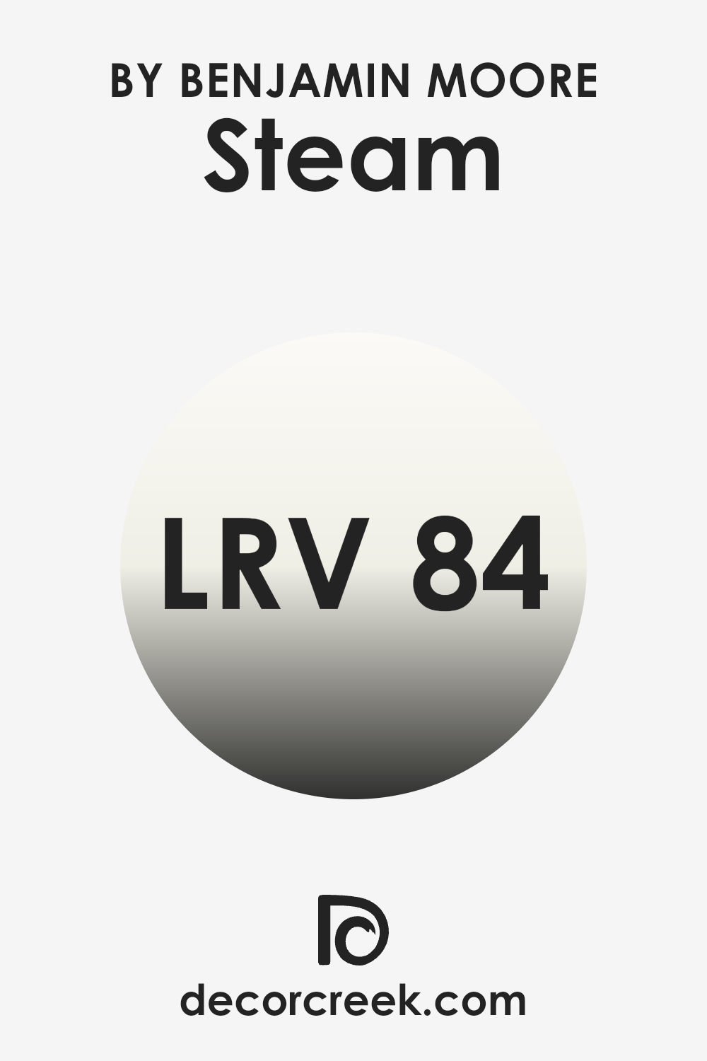
What is the LRV of Steam AF-15 by Benjamin Moore?
LRV stands for Light Reflectance Value, which is a measure of how much light a paint color reflects or absorbs. Essentially, it indicates how light or dark a color will appear once it’s on your walls. Colors with higher LRVs reflect more light, making them appear lighter, while those with lower LRVs absorb more light, appearing darker.
This value is particularly useful when deciding on a paint color for a room, as it helps predict how it will look in various lighting conditions. For instance, a room with a lot of natural light can handle a darker shade, whereas a room with less light might benefit from a lighter shade.
With an LRV of 84.2, the color in question reflects a significant amount of light, making it a good choice for making spaces appear brighter and more open. It’s especially useful in smaller or darker rooms where you want to create a sense of more space and light. The high LRV means it will help in reflecting both natural and artificial light, effectively using the available light to create a lighter feel in the room.
Therefore, this particular shade will not only lighten up a space but also help in creating an airy feel, enhancing the overall aesthetic without overwhelming the senses.
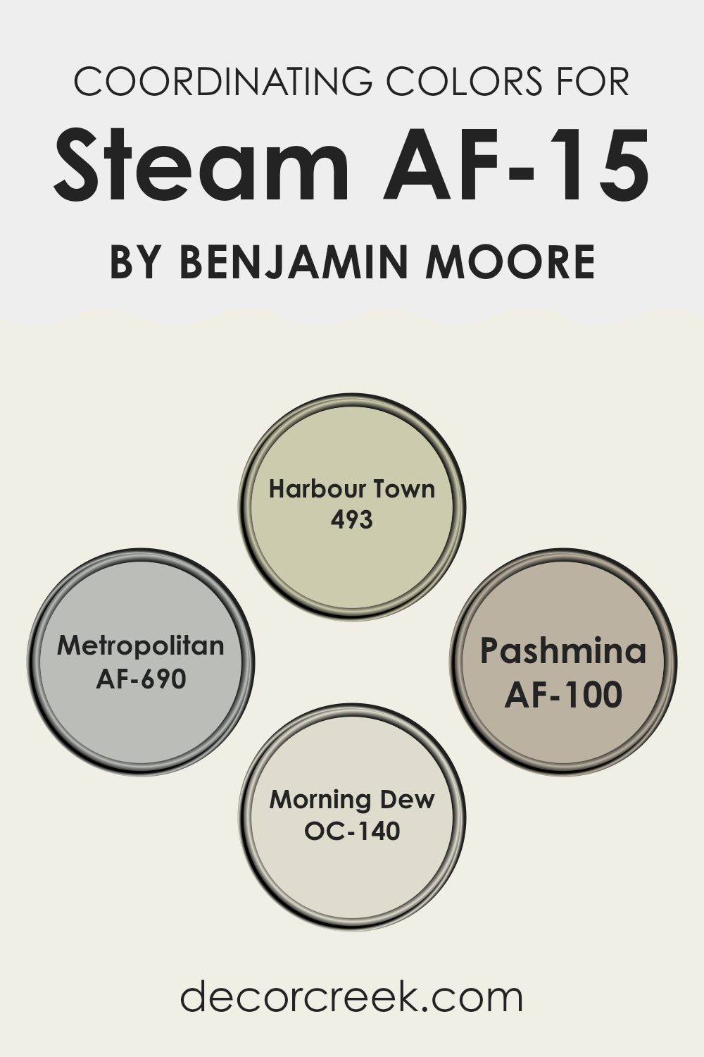
Coordinating Colors of Steam AF-15 by Benjamin Moore
Coordinating colors are shades that complement one another to create visually appealing combinations in interiors or designs. These colors can be utilized to achieve balance and harmony within a space. They often work well together as they share similar undertones or contrast in a way that makes the overall look cohesive. For instance, choosing colors that are either adjacent on the color wheel or opposite each other helps achieve that coordination effectively.
For example, ‘493 – Harbour Town’ is a deep greyish-blue that evokes the feeling of a quaint maritime village. It pairs beautifully with lighter shades, bringing depth to spaces that feature it. ‘AF-690 – Metropolitan’, on the other hand, is a soft grey that can act as a neutral backdrop, allowing more vibrant colors to stand out while maintaining a clean and calm environment.
Another excellent coordinating color, ‘AF-100 – Pashmina’, offers a warmer, beige tone reminiscent of the fine wool scarves from which it takes its name, lending an inviting warmth to any room.
Meanwhile, ‘OC-140 – Morning Dew’ is a very light, almost ethereal grey, that provides a refreshing touch to a space, making it perfect for creating a subtle distinction when paired with other neutrals.
Together, these colors represent versatile options that can harmonize in various combinations to enhance the aesthetic of a room.
You can see recommended paint colors below:
- 493 Harbour Town
- AF-690 Metropolitan
- AF-100 Pashmina
- OC-140 Morning Dew
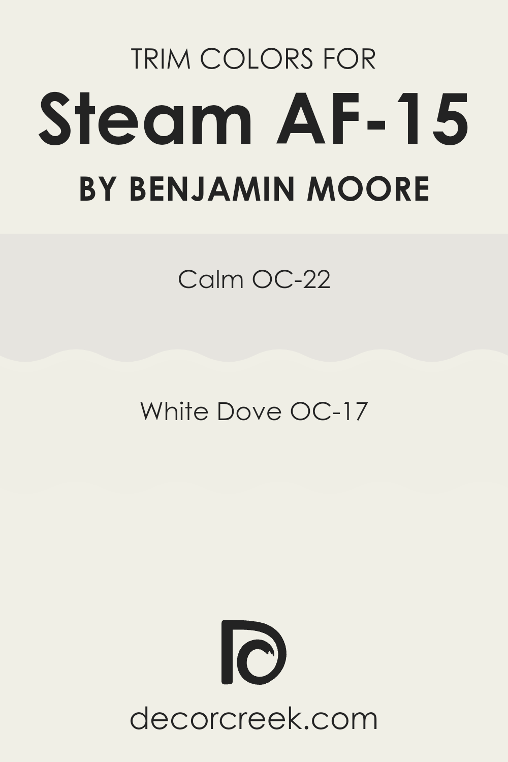
What are the Trim colors of Steam AF-15 by Benjamin Moore?
Trim colors refer to the paint used on the architectural elements like door frames, window frames, moldings, and baseboards that stand out against the main wall color. Choosing the right trim color can significantly enhance the overall look of a room by adding contrast and highlighting the features of the space.
Among the popular choices for trim colors are OC-22 Calm and OC-17 White Dove by Benjamin Moore, which both pair well with a variety of wall colors, increasing the aesthetic appeal and coherence of interior designs.
OC-22 Calm, as the name suggests, is a soft and unobtrusive color that offers a subtle distinction when used as a trim. It complements a broad range of wall colors without overpowering the space, making it ideal for creating a gentle, cohesive look. OC-17 White Dove is a timeless, clean white that provides a crisp contrast, particularly effective in bringing out the vibrancy in darker wall colors. Its versatility ensures it can be used in numerous spaces irrespective of their style or dominant color palette, making both options solid choices for trim colors.
You can see recommended paint colors below:
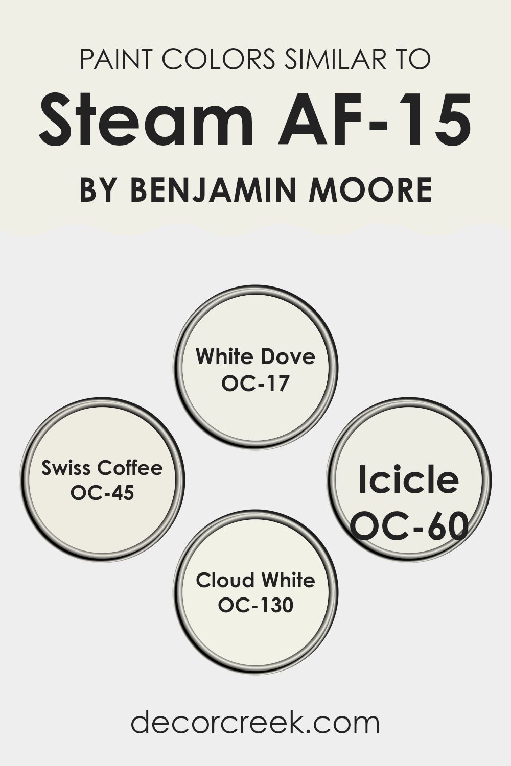
Colors Similar to Steam AF-15 by Benjamin Moore
Choosing similar colors for your home decor allows for a harmonious and cohesive aesthetic, creating a soothing and inviting environment. Such hues complement each other seamlessly, preventing harsh contrasts and giving the home a unified look. When you use colors close in shade and tone, like variations of the same color family, it enhances the flow from room to room, providing a subtle transition and making the spaces feel larger. These colors work together to support an overall theme without overpowering each other, making it easier to decorate and match with furniture and accessories.
Among similar colors inspired by AF-15, one can consider White Dove (OC-17), which offers a warm, soft white that brings a calm and gentle feeling to any space. Swiss Coffee (OC-45) provides a slightly creamier white that adds a richer layer of warmth, perfect for living areas and bedrooms alike.
Another close color, Icicle (OC-60), introduces a cooler undertone, giving a fresh, crisp look that works well in bathrooms and kitchens. Lastly, Cloud White (OC-130) strikes a balance with a neutral, adaptable backdrop that can brighten up darker rooms or create a subtle delineation in an open-concept area. These colors, while close to each other on the color palette, each have unique undertones that allow for flexibility and personalization in decor.
You can see recommended paint colors below:
- OC-17 White Dove
- OC-45 Swiss Coffee
- OC-60 Icicle
- OC-130 Cloud White
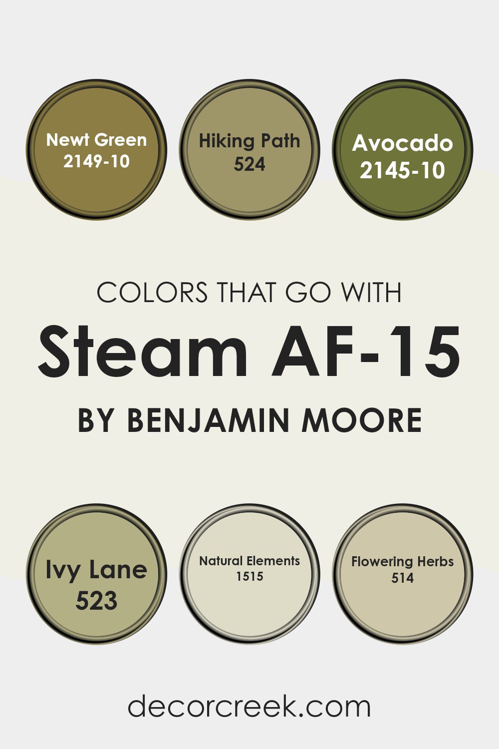
Colors that Go With Steam AF-15 by Benjamin Moore
Choosing colors that complement Steam AF-15 by Benjamin Moore is crucial because it ensures that the overall look feels harmonious and pleasing to the eye. When selecting accent colors like Newt Green, Hiking Path, Avocado, Ivy Lane, Natural Elements, and Flowering Herbs, it’s essential to consider how these hues will interact with Steam AF-15 to create a balanced and cohesive atmosphere in your space. These colors, when combined correctly, can enhance the main shade and bring a room together seamlessly.
Newt Green is a deep, lush green that adds a touch of nature’s vibrancy, making it perfect to pair with neutral tones. Similarly, Hiking Path is a warm earthy brown that can make a space feel grounded and cozy, offering a solid base for more adventurous colors.
Avocado is a richer, deeper green that provides a burst of freshness and can easily breathe life into softer surroundings. Ivy Lane is a slightly darker green that tends to add a bit of mystery and depth to the room, playing well with lighter colors like Steam AF-15. On to the lighter shades, Natural Elements is a soft beige that mirrors the calmness of nature, providing a subtle backdrop that allows other colors to shine.
Lastly, Flowering Herbs is a gentle gray-green, reminiscent of early spring, that brings in a touch of softness and a whisper of color, ideal for spaces aiming for a relaxed feel. These colors collectively create a versatile palette that can adapt to various decor styles while maintaining an attractive visual flow.
You can see recommended paint colors below:
- 2149-10 Newt Green
- 524 Hiking Path
- 2145-10 Avocado
- 523 Ivy Lane
- 1515 Natural Elements
- 514 Flowering Herbs
How to Use Steam AF-15 by Benjamin Moore In Your Home?
Steam AF-15 by Benjamin Moore is a light gray paint color that offers a fresh and clean look, making it ideal for various rooms in a home. This versatile shade can brighten up a small space or give a large room a coherent appearance.
It’s especially good for living rooms and bedrooms where you want a neutral backdrop that pairs well with any style or decor. You can also use Steam AF-15 in bathrooms and kitchens for a sleek, timeless finish.
The color works well with both modern and traditional furnishings, allowing you to mix and match different pieces without the color of the walls clashing. It complements bright colors and bold patterns, providing a calm background that doesn’t steal the spotlight. Furthermore, because it’s a neutral color, it’s simple to repaint over if you decide to update your color scheme in the future.
Steam AF-15 can help you achieve a clean, organized look in your home, enhancing both the appearance and the feel of your spaces.
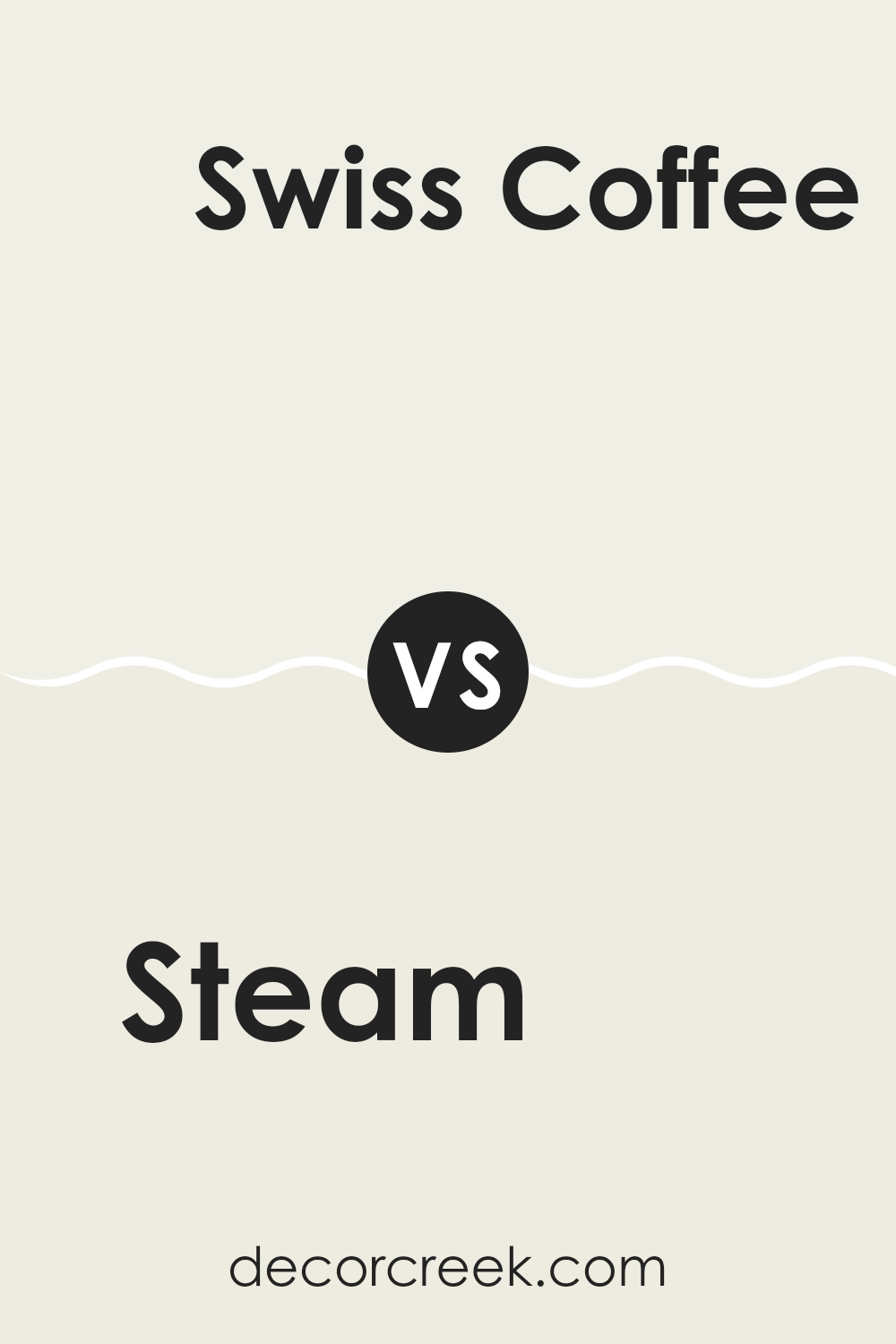
Steam AF-15 by Benjamin Moore vs Swiss Coffee OC-45 by Benjamin Moore
Steam AF-15 and Swiss Coffee OC-45 are both colors from Benjamin Moore that set a subtle, neutral backdrop for any room. Steam AF-15 is a soft grey with a hint of warmth, making it versatile and ideal for creating a calming, gentle atmosphere. It pairs well with a variety of decor styles and can make small spaces appear larger.
On the other hand, Swiss Coffee OC-45 is a creamy off-white that offers a cozy, welcoming vibe. It’s slightly warmer than Steam AF-15 and works exceptionally well in spaces that seek a touch of brightness without the starkness of pure white. This color can make rooms feel more open and airy.
Both colors are excellent choices for a clean, minimal look but cater to slightly different aesthetic tastes and functional needs. Whether choosing Steam AF-15 for its cool subtlety or Swiss Coffee OC-45 for its warm radiance, both bring their own unique flair to the space.
You can see recommended paint color below:
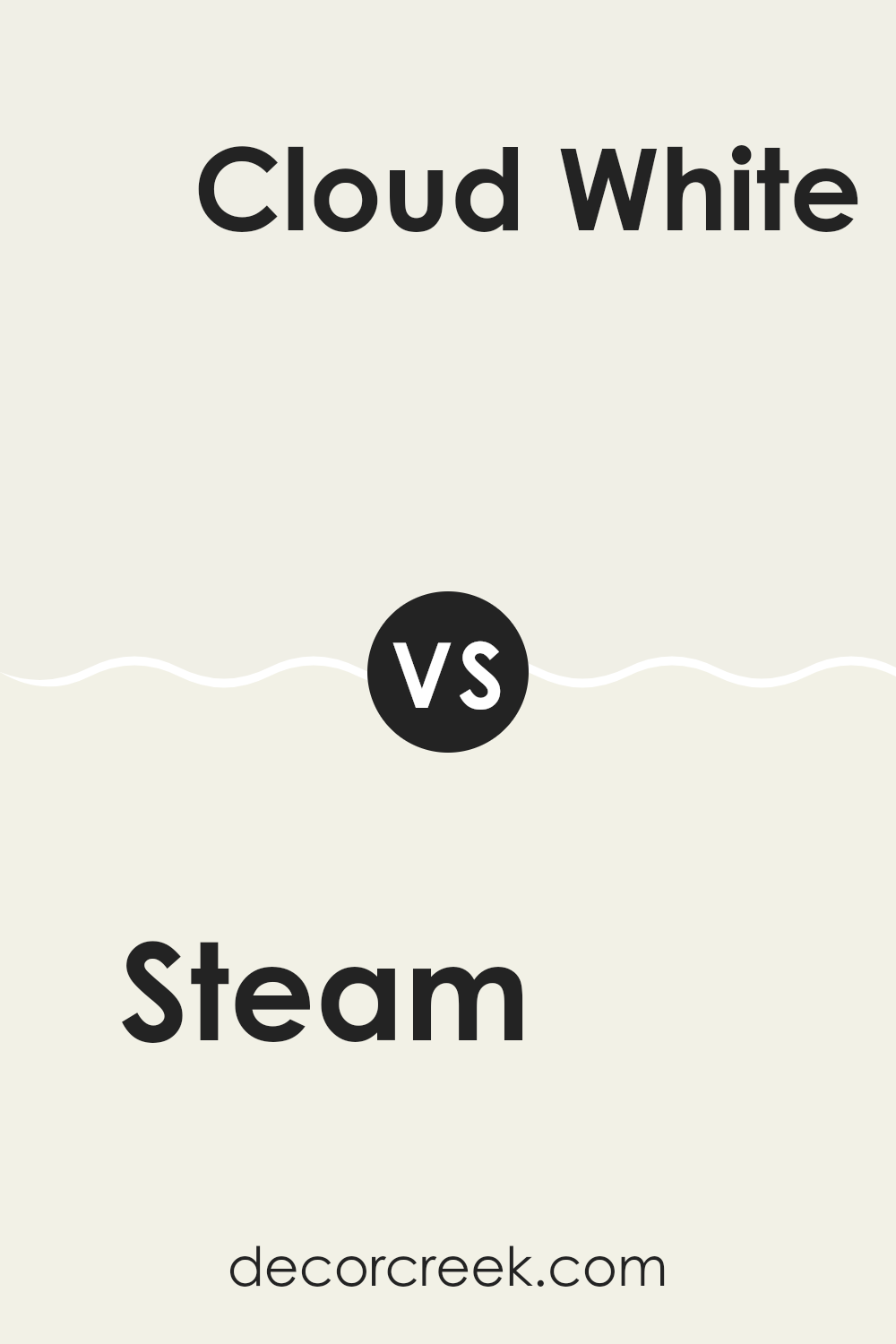
Steam AF-15 by Benjamin Moore vs Cloud White OC-130 by Benjamin Moore
Steam AF-15 and Cloud White OC-130, both from Benjamin Moore, have distinct traits that cater to different aesthetic preferences. Steam AF-15 is a muted gray with a hint of warmth, making it a versatile choice for any room that needs a subtle, soft touch of color. It pairs beautifully with various furnishings and styles, providing a calming background that doesn’t overpower.
On the other hand, Cloud White OC-130 is a classic, crisp white. It is brighter than Steam AF-15 and offers a clean, fresh look that can help make a space feel more open and airy. Cloud White is excellent for trim work or areas where you want to add brightness without the starkness often associated with pure white.
In summary, if you’re looking for a neutral with a bit of depth, Steam AF-15 is perfect. For a fresher, brighter feel, Cloud White OC-130 is ideal.
You can see recommended paint color below:
Steam AF-15 by Benjamin Moore vs Icicle OC-60 by Benjamin Moore
Steam AF-15 and Icicle OC-60 are both paint colors by Benjamin Moore, but they bring different vibes and visual impacts to a space. Steam AF-15 is a gentle, soft gray that offers a subtle, understated look. It’s perfect for creating a neutral backdrop that still has some warmth, making it versatile for any room.
On the other hand, Icicle OC-60 is a lighter, crisper gray with a cooler tone. It reflects more light, making it ideal for smaller spaces or rooms that you want to feel more open and airy. This color could give a room a cleaner, more refreshing look compared to the warmer hue of Steam AF-15.
Both colors are muted and can work well in various decorating styles, from modern to traditional. Your choice between them would depend on the kind of mood you want to set and how much natural light your room receives.
You can see recommended paint color below:
- OC-60 Icicle
Steam AF-15 by Benjamin Moore vs White Dove OC-17 by Benjamin Moore
Steam AF-15 and White Dove OC-17 are both popular paint colors by Benjamin Moore, but they have distinct vibes. Steam AF-15 is a soft gray that provides a subtle, neutral backdrop. It’s a great choice if you want a hint of color while keeping things calm and understated. This shade can blend seamlessly with various decor styles, adding a touch of modernity without overpowering your space.
On the other hand, White Dove OC-17 is a warm white that’s renowned for its versatility and creamy undertone. It brings a refreshing brightness to any room, making it feel airy and open. Despite its brightness, it’s not stark or cold, thanks to its softness, making it perfect for creating a welcoming atmosphere.
In summary, Steam AF-15 is ideal for a gentle, neutral look, while White Dove OC-17 is excellent for a cleaner, brighter feel. Each color has its unique ability to enhance a space depending on your style preference and desired mood.
You can see recommended paint color below:
Whether you want to paint your room, your entire house, or maybe just a chair or cabinet, this color is a nice choice because it works very well in a lot of different places and with many other colors.
AF-15 Steam isn’t too dark or too light, so it doesn’t take over a room but rather helps all the other colors in the room look good. It’s like the quiet friend who makes everyone else shine. I think that makes it a smart pick if you don’t want to keep changing colors; it will stay in style and keep looking fresh for a long time.
Overall, if someone asks me what I think about using AF-15 Steam, I would tell them it’s a great choice. It’s calm, it doesn’t shout for attention, and it makes everything around it look better and brighter.
Whether you’re just sprucing up a little space or giving a big area a new look, this color could be a real winner.

Ever wished paint sampling was as easy as sticking a sticker? Guess what? Now it is! Discover Samplize's unique Peel & Stick samples.
Get paint samples

