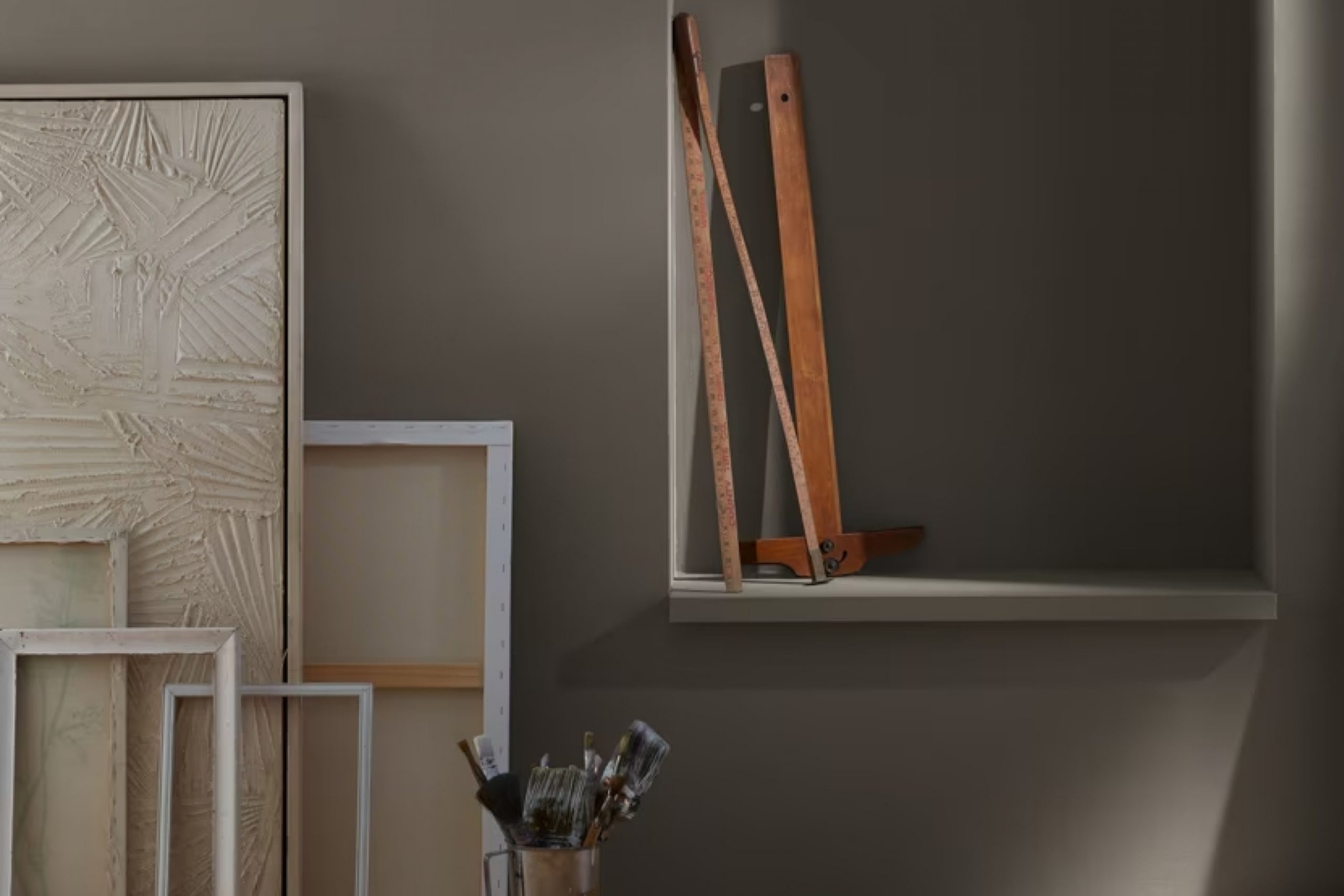
When I first saw Dragon’s Breath 1547 by Benjamin Moore, the name totally caught my attention 🔥 The color is deep and rich—kind of moody but still super inviting. What I love is how it shifts with the light—warm and earthy during the day, then cozy and bold at night. It really adds something special to a room without trying too hard.
Using Dragon’s Breath felt like adding a sophisticated touch to my interior design. It’s a bold choice, but surprisingly versatile.
I found it worked well as an accent wall, drawing attention without overwhelming the room. Paired with lighter, neutral shades, it added depth without making the space feel smaller.
As I experimented, I realized its potential went beyond the walls. Furniture pieces and decor elements in this shade added a cohesive, polished feel to my home.
The result was a balanced blend of drama and elegance, creating a refined yet welcoming environment.
Embracing such a powerful color may have seemed daunting at first, but the results were worth it.
Dragon’s Breath 1547 has transformed my living space into something uniquely mine, offering a perfect blend of style and warmth.
What Color Is Dragon’s Breath 1547 by Benjamin Moore?
Dragon’s Breath by Benjamin Moore is a deep, rich color that can be described as a dark gray with a hint of brown. This bold shade is part of the neutral family but has a unique depth that makes it stand out. Its deep tone makes it perfect for creating a cozy and intimate atmosphere in any room.
This color works wonderfully in traditional and modern interiors, adding warmth and a sense of grounding. In traditional settings, Dragon’s Breath can be paired with classic wooden furniture and luxurious fabrics like velvet or wool to create a warm and inviting space.
In modern interiors, it pairs well with clean lines and sleek materials, such as stainless steel or glass, providing a striking contrast.
Dragon’s Breath complements a variety of materials and textures. It looks stunning with natural materials like leather, adding to its warm and inviting appeal.
It also works well with metallic finishes, providing a rich backdrop that enhances the overall effect of brass or gold accents. Linen and cotton in lighter shades can balance the depth of Dragon’s Breath, softening the space and adding a touch of brightness.
Overall, Dragon’s Breath is a versatile color that can add depth and sophistication to a range of interior styles, from cozy and traditional to sleek and modern.
Is Dragon’s Breath 1547 by Benjamin Moore Warm or Cool color?
Dragon’s Breath by Benjamin Moore, known as color 1547, is a deep, rich brown that can add warmth and coziness to a home. It is a versatile color that works well in different parts of a house. In living rooms, it can make the space feel inviting and comfortable, offering a sense of security.
It pairs beautifully with off-white trim or lighter neutrals, creating a classic, timeless look. When used in a bedroom, Dragon’s Breath creates a snug and relaxing atmosphere, perfect for winding down after a long day.
In kitchens or dining areas, it can add a touch of elegance without feeling too formal. The color’s depth makes it an excellent backdrop for showcasing art or furniture. Dragon’s Breath can also work effectively in a study or home office, where its depth provides a conducive environment for focus and productivity. Its earthy tone complements natural materials like wood and stone, integrating seamlessly into various decor styles.
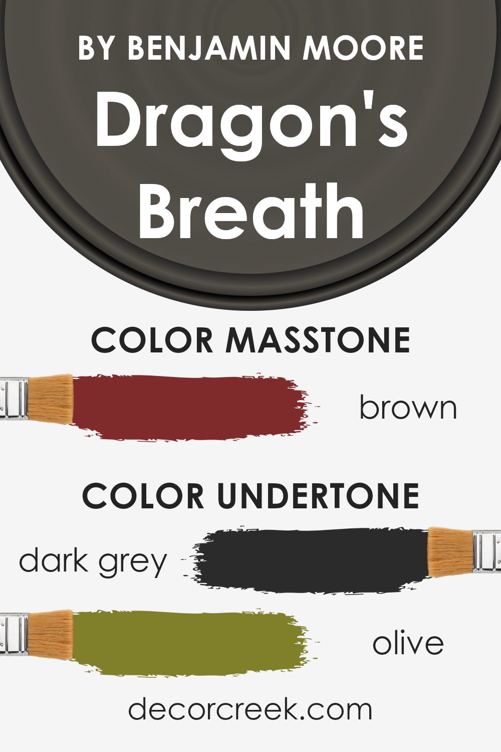
Undertones of Dragon’s Breath 1547 by Benjamin Moore
Dragon’s Breath by Benjamin Moore is a rich, complex color that combines several undertones to create its unique appearance. The presence of dark grey undertones provides a grounding effect, making the color appear solid and reliable. Olive and dark green undertones add a natural, earthy quality, which can make the color feel cozy and inviting.
The subtle hint of purple gives Dragon’s Breath a touch of elegance and depth, while navy and dark turquoise bring a subtle vibrancy that can make the paint feel more dynamic. Grey undertones help in balancing all these colors, ensuring that none of them becomes too overpowering.
The red, orange, pink, and pale pink undertones introduce warmth and a soft touch, giving the color a welcoming feel. These reddish undertones can help the color adapt to different kinds of light, adding warmth in low light and vibrancy in brighter conditions.
When Dragon’s Breath is used on interior walls, its varied undertones play with the light in a room, sometimes appearing cooler or warmer depending on the time of day and the light sources.
This versatility makes it an excellent choice for creating cozy, comfortable spaces while being visually interesting. The color can anchor a room, making it feel complete and harmonious.
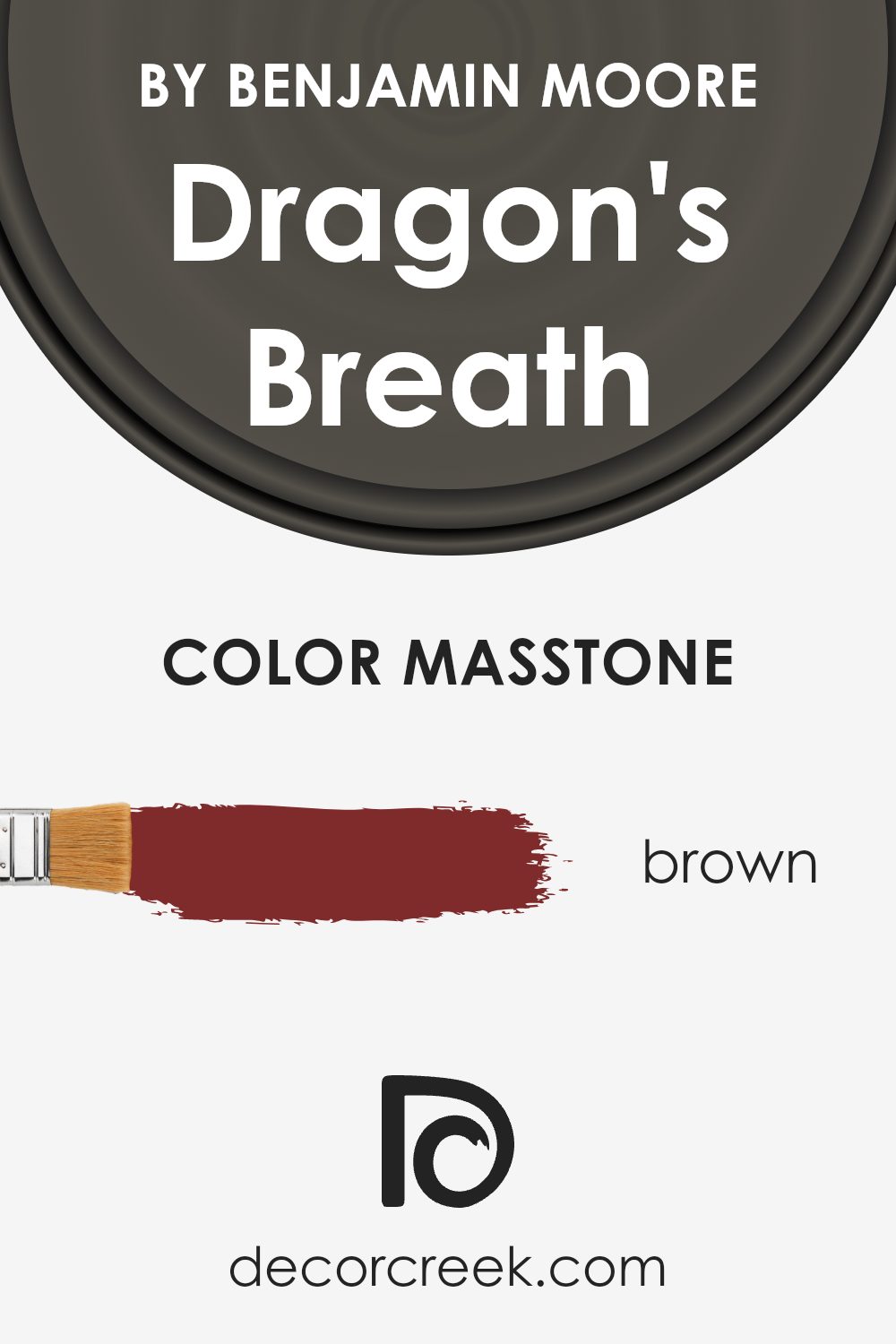
What is the Masstone of the Dragon’s Breath 1547 by Benjamin Moore?
Dragon’s Breath is a rich and warm brown color by Benjamin Moore. This shade brings a cozy and inviting feeling to any room. Its deep brown hue creates a sense of warmth, making it perfect for living rooms or bedrooms where you want to feel relaxed and comfortable.
Dragon’s Breath pairs well with neutral colors, providing a strong, earthy contrast to lighter shades like cream or beige. It also works nicely with greens and blues for a natural and balanced look.
In smaller spaces, such as an office or reading nook, this color gives a snug atmosphere. When used with the right lighting, Dragon’s Breath can add a feeling of depth and richness. It’s a versatile color choice that can make a house feel more like a home. Whether on accent walls or as part of the overall color scheme, it offers a timeless appeal that is both modern and classic.
How Does Lighting Affect Dragon’s Breath 1547 by Benjamin Moore?
Lighting plays a crucial role in how we perceive colors, as it can significantly alter their appearance. One such color, Dragon’s Breath by Benjamin Moore, is a deep, warm gray that can shift in tone depending on the light.
In natural light, Dragon’s Breath may appear lighter and more muted. The direction a room faces can also impact this color’s appearance. In north-facing rooms, which receive cooler and indirect light, Dragon’s Breath can seem even darker and more gray.
The color might come across as a sophisticated neutral in such spaces, providing a cozy feel.
In south-facing rooms, where the sunlight is warmer and more direct, Dragon’s Breath will likely reveal its warmer undertones. This might make the color appear a bit warmer, creating a welcoming and enveloping environment.
The increased natural light will highlight the color’s richness, making it an excellent choice for spaces where warmth is desired.
East-facing rooms get bright, direct sunlight in the morning and cooler, indirect light later in the day. In the morning, Dragon’s Breath might take on a slightly brighter and warmer tone, while in the afternoon, the color could appear more subdued and cool. This change can add visual interest throughout the day.
West-facing rooms receive warm, golden light in the late afternoon and evening, which can enhance the warmth of Dragon’s Breath.
During the morning, when the light is cooler, the color might seem more neutral, but as the day progresses, the warmth and richness of the color will be more pronounced.
In artificial light, the type of bulb used can either warm up or cool down the color. Incandescent or warm LED bulbs can enhance the cozy, inviting feel of Dragon’s Breath by bringing out its warmer undertones.
Conversely, cool or daylight LED bulbs might emphasize its gray aspects, making the space feel more modern and polished.

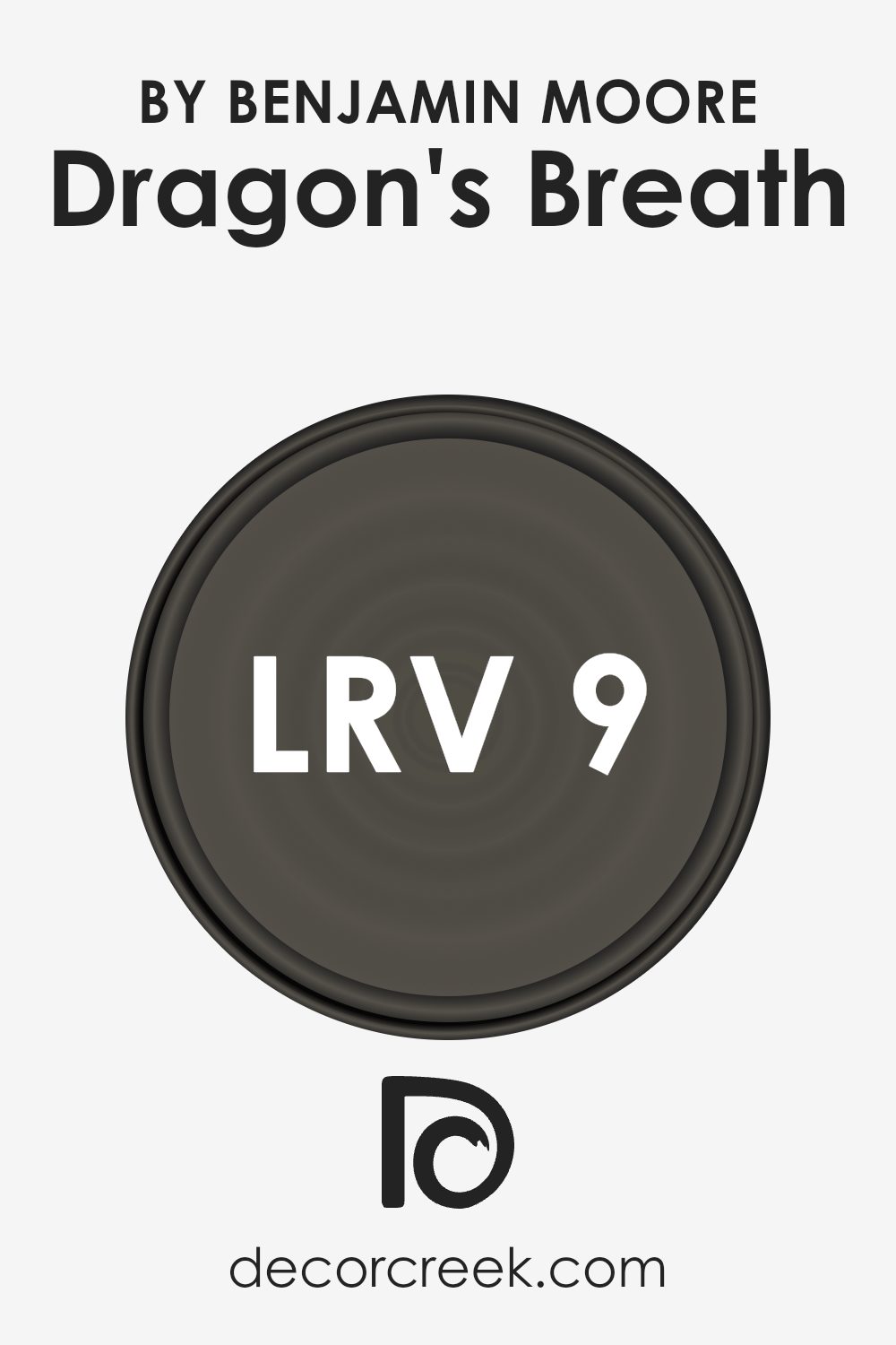
What is the LRV of Dragon’s Breath 1547 by Benjamin Moore?
Light Reflectance Value (LRV) is a measure that tells us how much light a color reflects. It’s a number from 0 to 100, where 0 is absolute black (not reflecting any light) and 100 is pure white (reflecting all light). LRV helps in understanding how bright or dark a color might appear in different lighting conditions.
Colors with high LRV values will make a room feel brighter and more open, while lower LRV values will result in a room feeling more intimate and cozy.
It’s an important factor to consider when choosing paint colors, as the reflected light will have an impact on how the color appears on your walls.
Dragon’s Breath, with an LRV of 9.18, is a very dark color, meaning it reflects only a small amount of light. This makes the color quite deep and rich, which can add a dramatic or cozy feeling to a space, depending on how it’s used.
In a well-lit room, Dragon’s Breath might give an elegant and sophisticated vibe, while in a dimmer space, it could make the area feel smaller and more intimate.
The low LRV means that it’s vital to consider the lighting in the room where this paint will be used. It’s perfect for creating an accent wall or adding warmth and depth to a room, but if the space is small or lacks natural light, it might make it feel even more enclosed.
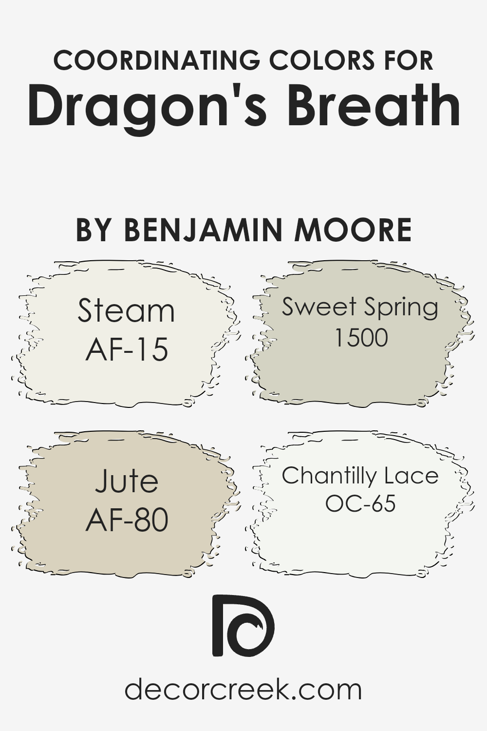
Coordinating Colors of Dragon’s Breath 1547 by Benjamin Moore
Coordinating colors are shades that work well together to create a harmonious look in a space. They complement each other, enhancing the mood and feel of a room without clashing. For the rich and dramatic color Dragon’s Breath, several coordinating colors can be used to bring balance and warmth to a space. One such color is Steam, a soft and light neutral that offers a calming presence. It pairs well, providing a gentle contrast while allowing the darker tones to stand out beautifully.
Jute is another coordinating color. This muted earthy tone brings a touch of natural warmth, complementing the richness with its subtle, soft look. Sweet Spring offers a refreshing, gentle green hue that can add a hint of nature’s calmness to the palette.
These colors create a peaceful base when placed alongside darker shades, adding life and light. Finally, Chantilly Lace, a crisp white, introduces a clean and brightening effect.
It works wonderfully with darker tones, providing a striking yet balanced contrast.
By using these colors together, you can build a room that feels cohesive and well-designed, where each shade plays its part in enhancing the overall atmosphere.
You can see recommended paint colors below:
- AF-15 Steam
- AF-80 Jute
- 1500 Sweet Spring
- OC-65 Chantilly Lace
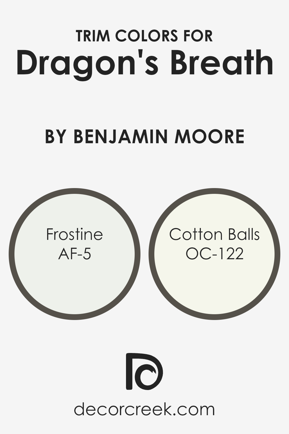
What are the Trim colors of Dragon’s Breath 1547 by Benjamin Moore?
Trim colors are the shades you use on the edges and borders of a room, like baseboards, window frames, and doors. They are important because they help set off the main wall color, making it stand out more and giving the room a finished look.
For the deep and rich hue of Dragon’s Breath by Benjamin Moore, choosing the right trim colors can make all the difference. When you pair it with the color Frostine (AF-5), its soft, almost icy undertone can give a clean and fresh look.
Frostine creates a gentle contrast that doesn’t overpower, allowing the deeper hue of Dragon’s Breath to stay prominent.
On the other hand, the color Cotton Balls (OC-122) is a warm, bright white that can add a cozy feel to a space. This classic shade brings in a bit of warmth without being too heavy, complementing the boldness of Dragon’s Breath nicely.
With these trim colors, you’re able to highlight the richness of the main shade while keeping things balanced and pleasing to the eye. Frostine and Cotton Balls serve their roles by enhancing the main wall color and completing the overall color scheme in a room.
You can see recommended paint colors below:
- AF-5 Frostine
- OC-122 Cotton Balls
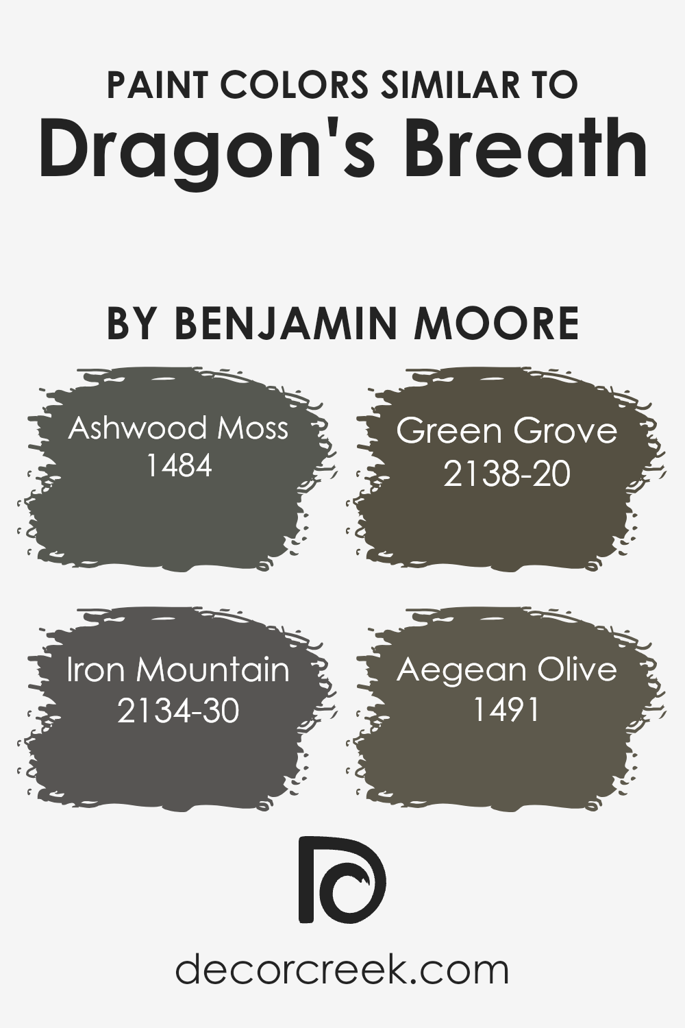
Colors Similar to Dragon’s Breath 1547 by Benjamin Moore
Colors that are similar to Dragon’s Breath by Benjamin Moore bring a cohesive and harmonious feel to a space. They work well together because they share similar undertones, creating a balanced look that is pleasing to the eye.
For example, Ashwood Moss, with its rich, earthy green tones, provides a grounded feel that complements the dark, moody nature of Dragon’s Breath.
Iron Mountain, a deep and almost charcoal-like hue, adds a sleek, modern touch while still maintaining warmth, due to its subtle hints of brown.
Green Grove offers a lively yet muted green that breathes life into any room without being overwhelming. Its gentle vibrance pairs well with the slightly darker shades, bringing in an element of nature and calm.
Aegean Olive, on the other hand, captures the softness of an olive tone, which ties in seamlessly with Dragon’s Breath, adding to the warmth and weight of the ensemble.
Together, these colors create a coherent palette that can be used throughout a space to develop a unified, cozy atmosphere without unity sacrificing depth or interest.
You can see recommended paint colors below:
- 1484 Ashwood Moss
- 2134-30 Iron Mountain
- 2138-20 Green Grove
- 1491 Aegean Olive
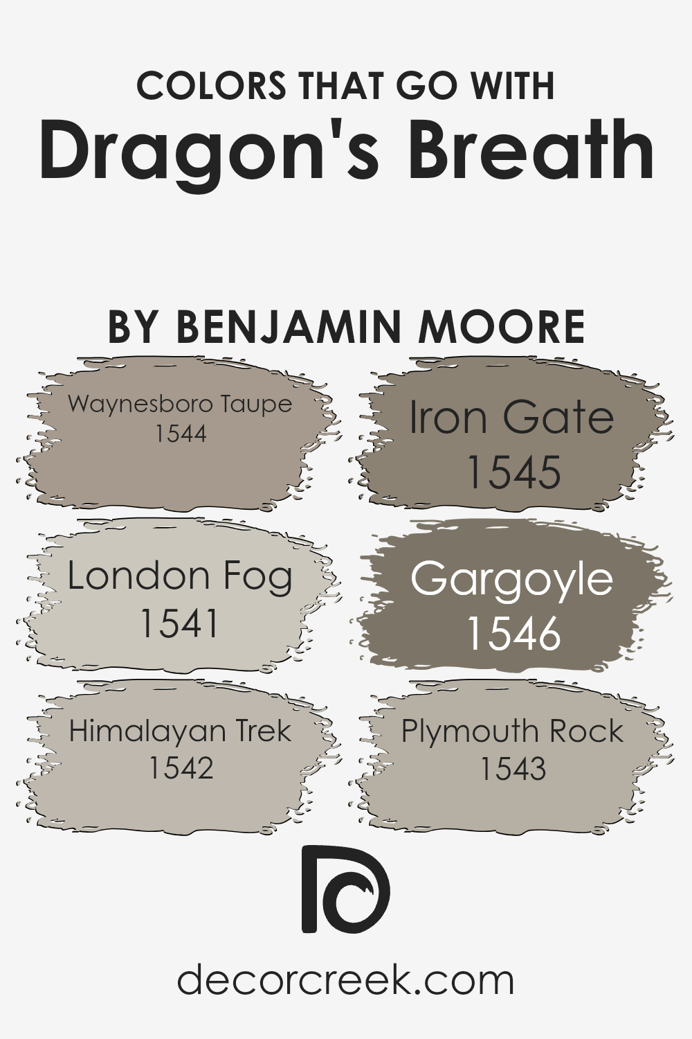
Colors that Go With Dragon’s Breath 1547 by Benjamin Moore
Dragon’s Breath 1547 by Benjamin Moore is a deep, almost charcoal brown that exudes warmth and depth. When paired with the right colors, it can create a balanced and inviting space. Waynesboro Taupe 1544 is a soft, muted taupe that complements the richness of Dragon’s Breath by adding a gentle contrast.
It’s a versatile color that grounds the palette without overwhelming the eyes. Similarly, London Fog 1541 offers a subtle, grayish tone that introduces a sophisticated calmness, providing a perfect backdrop for the intensity of Dragon’s Breath.
Continuing with harmonious pairings, Himalayan Trek 1542 introduces a earthy, warm beige that echoes natural tones, enhancing both warmth and comfort. Iron Gate 1545, a cooler, deeper shade, can add depth, making spaces feel cozier.
Gargoyle 1546, with its muted gray hue, pairs nicely by creating a neutral but striking balance with richer tones, drawing attention without being overpowering. Finally, Plymouth Rock 1543 offers a soft, light gray that lightens the surrounding color scheme, balancing the palette by adding a hint of brightness.
Together, these colors create a seamless transition from dark to light, providing a range of expression in any room while enhancing the rich character of Dragon’s Breath.
You can see recommended paint colors below:
- 1544 Waynesboro Taupe
- 1541 London Fog
- 1542 Himalayan Trek
- 1545 Iron Gate
- 1546 Gargoyle
- 1543 Plymouth Rock
How to Use Dragon’s Breath 1547 by Benjamin Moore In Your Home?
Dragon’s Breath 1547 by Benjamin Moore is a rich, dark gray paint color with warm undertones. It can be a versatile choice for home interiors, bringing a cozy and inviting feel to any room. In a living room, it works well as an accent wall, adding depth and making lighter-colored furniture stand out. For a bedroom, painting all four walls in Dragon’s Breath can create a cocoon-like atmosphere, perfect for relaxation.
In kitchens, this color pairs beautifully with white cabinets and countertops, offering a modern look that’s both bold and elegant. Accessories in metallic finishes like gold or silver can enhance the overall appearance, adding a touch of warmth and brightness.
Bathrooms benefit from Dragon’s Breath by giving a sense of luxury and sophistication. It can also be striking in a hallway or as an exterior door color, creating a welcoming entrance. With its adaptable nature, Dragon’s Breath is a great choice for many design styles.
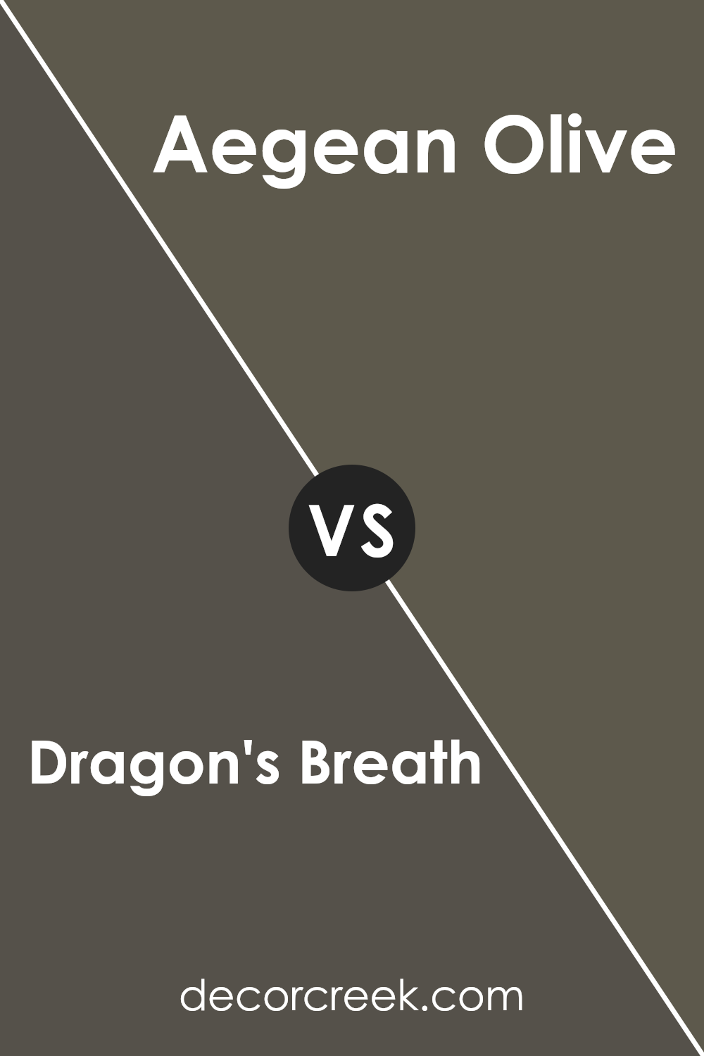
Dragon’s Breath 1547 by Benjamin Moore vs Aegean Olive 1491 by Benjamin Moore
Dragon’s Breath by Benjamin Moore is a rich, deep charcoal brown with warm undertones. It creates a cozy and inviting atmosphere, making it a great choice for living rooms or bedrooms where you want to feel cocooned. This color can act as a neutral, easily pairing with a variety of other shades.
On the other hand, Aegean Olive is a muted green with gray undertones. It feels earthy and calming, perfect for spaces where you want to connect with nature. This color works well in kitchens or dining rooms, where it can be paired with natural woods and plants for a relaxed feel.
When comparing the two, Dragon’s Breath is darker and more dramatic, ideal for making a bold statement, while Aegean Olive is softer and more subtle, giving a gentle, nature-inspired vibe. Both colors can bring warmth and character to your home, but the choice depends on whether you prefer bold drama or understated calm.
You can see recommended paint color below:
- 1491 Aegean Olive
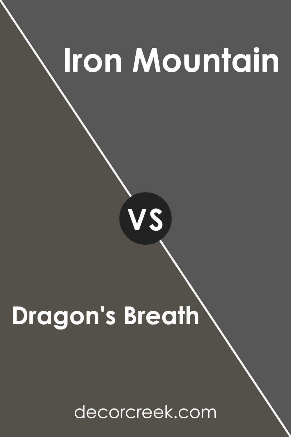
Dragon’s Breath 1547 by Benjamin Moore vs Iron Mountain 2134-30 by Benjamin Moore
Dragon’s Breath 1547 by Benjamin Moore is a warm, rich brown with hints of gray, creating a cozy and inviting atmosphere. It can make a space feel intimate and comfortable. This color works well as an accent or on larger walls, pairing nicely with neutral tones or lighter shades for contrast.
Iron Mountain 2134-30 by Benjamin Moore, on the other hand, is a dark gray with a strong presence. It has a cooler undertone compared to the warmth of Dragon’s Breath. Iron Mountain can give a room a modern, sleek feel and creates a strong backdrop for dynamic spaces.
In comparison, Dragon’s Breath adds warmth and earthiness, making rooms feel snug and welcoming, while Iron Mountain is bolder and provides a sophisticated yet cool ambiance. Both colors are versatile, but the choice between them depends on whether you’re aiming for warmth or a more contemporary, cool elegance.
You can see recommended paint color below:
- 2134-30 Iron Mountain
Dragon’s Breath 1547 by Benjamin Moore vs Green Grove 2138-20 by Benjamin Moore
Dragon’s Breath by Benjamin Moore is a deep, earthy brown that exudes warmth and richness. It feels cozy and grounded, making it a great choice for spaces where you want a strong, enveloping vibe. It works well in living rooms or dens, adding a touch of elegance and coziness.
Green Grove, on the other hand, is a deep green that brings a touch of nature indoors. It’s a more vibrant and refreshing color compared to Dragon’s Breath, offering a feeling of balance and calm.
This color is perfect for rooms where you want to feel connected to nature, such as a study or a bedroom.
While Dragon’s Breath provides warmth and depth, Green Grove offers a refreshing and lively feel. Both colors can be used to create distinctive atmospheres, either by emphasizing the warmth and comfort of brown or the invigorating presence of green.
Each color has its unique appeal and can set a different mood in any space.
You can see recommended paint color below:
- 2138-20 Green Grove

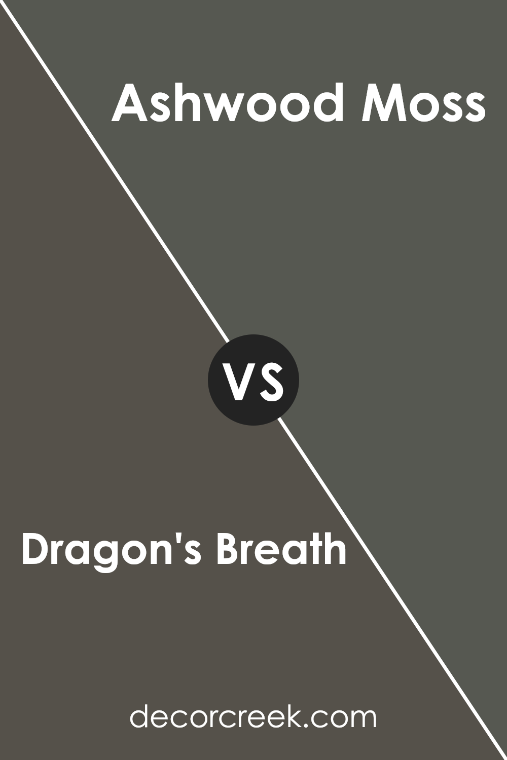
Dragon’s Breath 1547 by Benjamin Moore vs Ashwood Moss 1484 by Benjamin Moore
Dragon’s Breath and Ashwood Moss are two rich colors from Benjamin Moore that create distinct atmospheres. Dragon’s Breath is a deep, warm brown with charcoal undertones. It gives a sense of coziness and works well in living rooms or bedrooms, adding warmth and depth to a space.
Ashwood Moss, on the other hand, is a dark green with earthy brown undertones. It feels more grounded and natural, making it perfect for connecting indoor spaces with the outdoors. It pairs beautifully with wood tones and can create a calming effect.
While both colors are dark and strong, Dragon’s Breath leans towards a more neutral palette, providing a versatile backdrop, whereas Ashwood Moss brings a touch of nature indoors.
Choosing between them depends on whether you want a warm, neutral setting or a more nature-inspired, green space. Both offer depth and interest to a room, but with their own unique character.
You can see recommended paint color below:
Conclusion
As I wrap up my thoughts on Benjamin Moore’s 1547 Dragon’s Breath, I realize how much this paint color actually feels like a story. It’s this amazing dark gray with hints of brown, making it feel warm and cozy. Imagine a dragon taking a nap under a big old tree in a misty forest. That’s kind of what this color brings to my mind.
When you see it on a wall, it feels almost magical, like the inside of a cozy cave or an ancient castle. It can make a small room feel snug and inviting. It’s perfect if you want a place to feel safe, like a hug from a big soft blanket.
I also think it would look cool in a big room with lots of light. The mix of dark and warm makes it interesting in both sunny and dim light. It’s like how shadows play on the walls during sunset.
In the end, 1547 Dragon’s Breath is more than just a paint color. It’s a feeling. It can make any room feel special and comforting.
It’s not too bright or too dull, but just right like a balance between day and night. So, if you want something that brings stories to life in your home, this color might be a perfect choice.
Ever wished paint sampling was as easy as sticking a sticker? Guess what? Now it is! Discover Samplize's unique Peel & Stick samples.
Get paint samples

