When you’re on the lookout for the perfect white paint for your space, Benjamin Moore’s OC-65 Chantilly Lace deserves your attention. This particular shade stands out because of its pure and crisp quality, making it a top choice for those aiming to brighten their rooms or create a feeling of spaciousness. Unlike some whites that can feel too stark or cold, Chantilly Lace brings a warmth that makes spaces feel inviting.
Homeowners and designers often lean towards Chantilly Lace not just because of its beauty, but also due to its versatility. It pairs beautifully with a wide range of colors and materials, meaning it can fit seamlessly into various decor styles. Whether you’re redoing a cozy cottage, a modern loft, or a traditional family home, this paint can help enhance your design vision.
Moreover, its popularity is not just about the look. Benjamin Moore is known for producing high-quality paint that professionals and DIY enthusiasts trust. Their formula ensures that Chantilly Lace goes on smoothly and stands up well over time, resisting common problems like chipping and yellowing.
Choosing the right paint color can be a challenge, but if you’re looking for a white that is both beautiful and practical, OC-65 Chantilly Lace by Benjamin Moore could be exactly what you need. Its ability to transform a space with a fresh, clean look makes it a favorite for a good reason.
What Color Is Chantilly Lace OC-65 by Benjamin Moore?
Chantilly Lace by Benjamin Moore is a go-to color for anyone looking to freshen up their space with a pure, crisp white. This shade has a slight warmth to it, making it versatile and inviting, unlike some cooler whites that can come off as stark or clinical. It’s perfect for spaces where you want to boost natural light, as it reflects light beautifully, making rooms feel more open and airy.
This color shines in a variety of interior styles. It’s a classic pick for those leaning towards minimalist or Scandinavian designs, where the emphasis is on simplicity and brightness. Modern and contemporary spaces also benefit from its clean look, providing a smooth backdrop for bolder colors or patterns to stand out. Even in traditional settings, Chantilly Lace adds a fresh touch without detracting from the timeless elegance of classic furniture and decor.
Pairing Chantilly Lace with natural materials and textures works wonders. Think of light woods like oak or birch to enhance its warmth, or contrast it with dark woods for a striking visual. Metals, whether it’s polished chrome, brushed nickel, or warm brass, pop against this backdrop, while soft textures like linen or wool in home textiles soften spaces and add depth.
This color truly is a chameleon, adapting seamlessly to different materials, making it a fantastic choice for a cohesive look throughout your home.
Undertones of Chantilly Lace OC-65 by Benjamin Moore
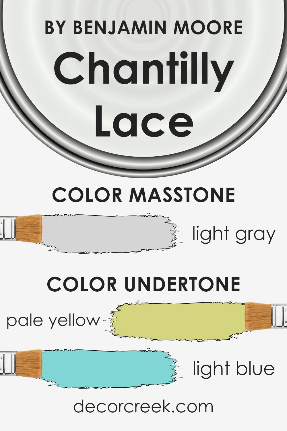
The color Chantilly Lace has a beautiful knack for changing its appearance based on the light and other colors around it. This versatility comes from its myriad of undertones, which include pale yellow, light blue, light purple, mint, pale pink, lilac, and gray.
Consider undertones as a color’s shadow, subtly influencing how we perceive the main hue. They play a background role but are key in determining the color’s true character. In different lights, one might catch a glimpse of pale yellow, making the space feel warmer, or notice a hint of light blue, giving off a cooler vibe.
When Chantilly Lace is used on interior walls, these undertones have a significant impact. In a room flooded with natural sunlight, the pale yellow or mint might become more pronounced, creating a light, airy feel. Conversely, in a space with less light or at a different time of day, the light purple or lilac undertones could emerge, adding a subtle depth.
The grey undertone helps in balancing the warmth and coolness, ensuring the color doesn’t lean too heavily in one direction, making it a great choice for various rooms and lighting conditions.
Understanding these undertones helps in picking complementary colors for decor and accents, ensuring the room feels cohesive. The presence of these subtle hues allows Chantilly Lace to adapt beautifully, making it incredibly versatile for interior design.
What is the Masstone of the Chantilly Lace OC-65 by Benjamin Moore?
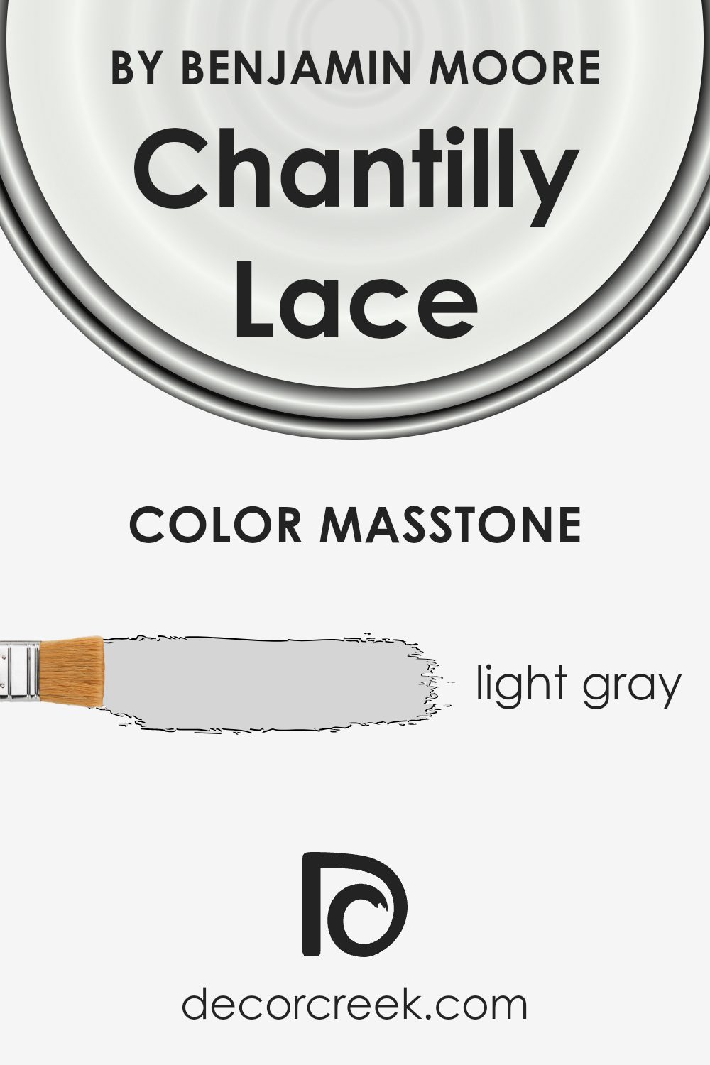
Chantilly Lace is a paint color from Benjamin Moore that appears as a light gray (#D5D5D5) at its core. This color’s masstone, which means the color seen when the paint is undiluted, significantly influences how it is used in homes. The light gray shade is neutral and versatile, making it an excellent choice for various spaces.
Whether you’re painting a sunny kitchen or a cozy bedroom, this color can create a bright and airy feel, reflecting natural light beautifully. This enhances the sense of space in smaller rooms and contributes to a clean, crisp atmosphere in larger areas. Additionally, its subtle gray tone serves as a perfect backdrop, allowing furniture and decor to stand out without overwhelming them.
As a result, Chantilly Lace is a fantastic option for those looking to achieve a fresh, modern look in their home, while maintaining a warm and inviting environment.
How Does Lighting Affect Chantilly Lace OC-65 by Benjamin Moore?
Lighting plays a crucial role in how we perceive colors, dramatically affecting their appearance and the ambiance of a space. Different light sources can change a color’s intensity and tone, making it appear cooler, warmer, lighter, or darker. This phenomenon is particularly important to consider when choosing paint colors for your home, such as the popular shade by Benjamin Moore known for its clean and crisp qualities.
In artificial light, the perception of colors can vary significantly based on the type of bulbs used. Incandescent lighting, which emits a warmer glow, can enhance warm tones in a color, making it feel cozier and more inviting. On the other hand, fluorescent lighting usually casts a cooler glow, potentially making colors appear sharper and bluer.
This specific white hue, being neutral and versatile, benefits from artificial light by maintaining its clarity and brightness, though it might lean slightly warmer or cooler depending on the bulb.
In natural light, this color reveals its true potential, embodying a fresh and airy quality. Rooms that face different directions receive varying amounts and qualities of sunlight, which affects how colors are perceived.
North-faced rooms receive less direct sunlight, casting a cooler, softer light, which can make colors appear slightly more shadowed and cooler in tone. This particular white maintains its brightness in these conditions but may show a subtle cool undertone.
South-faced rooms are bathed in warm, golden sunlight for most of the day, making colors appear brighter and warmer. This warm light enhances the luminous quality of the white, making it appear even crisper and more vibrant.
East-faced rooms get bright morning light, which is cooler and bluer, giving a serene and tranquil feeling. This gentle light can make the white seem very pure and fresh, perfect for starting the day.
West-faced rooms receive the warm, intense light of the afternoon and evening, which can cause colors to glow intensely. In these conditions, the color warms up, maintaining its brightness while offering a soft, welcoming ambiance as the day progresses.
Thus, lighting conditions significantly influence the perception of this particular white, showcasing its versatility and ability to adapt to different settings while preserving its inherent character.
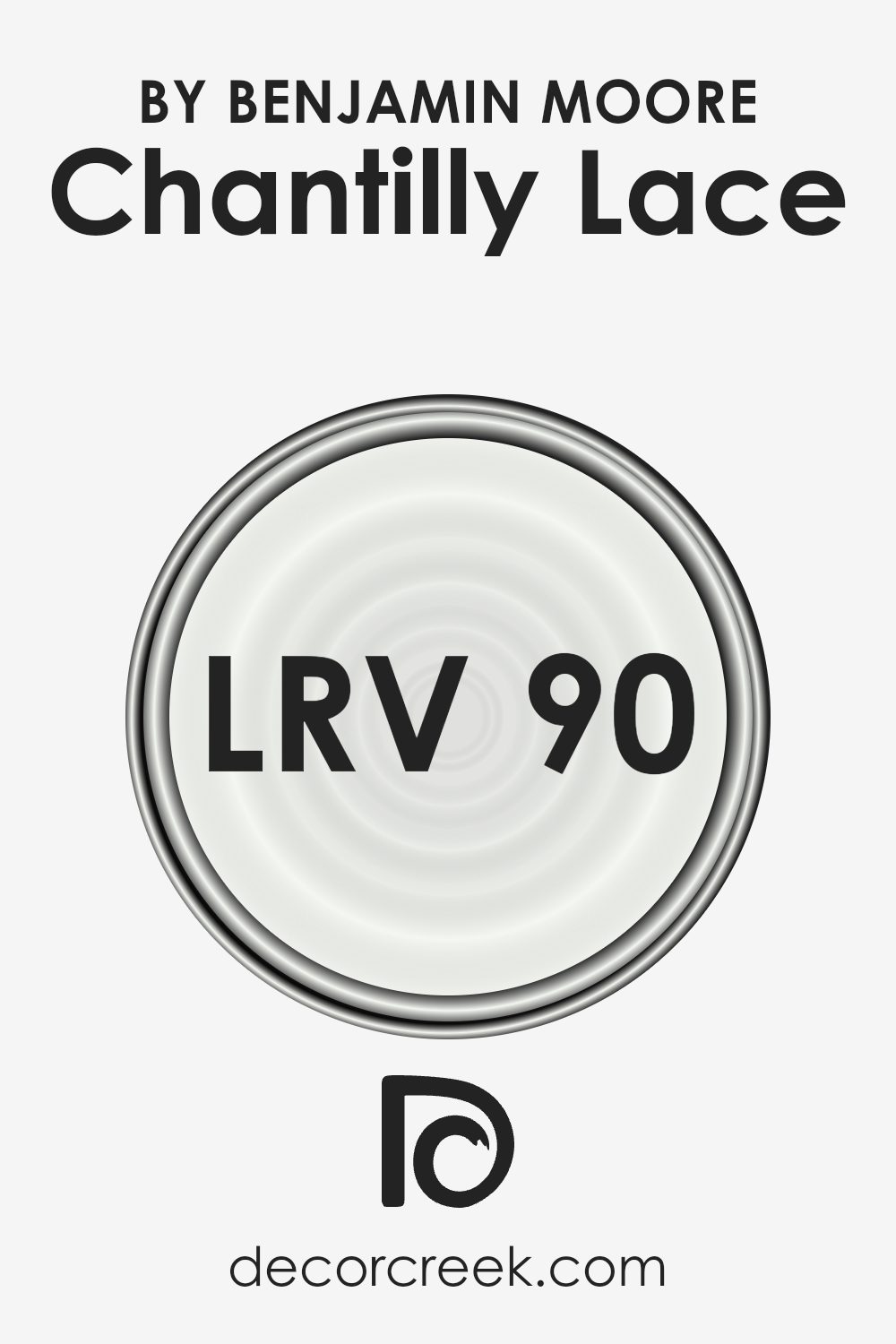
What is the LRV of Chantilly Lace OC-65 by Benjamin Moore?
LRV stands for Light Reflectance Value, which is a measurement used to describe the amount of visible and usable light that a paint color reflects or absorbs when it’s applied on the walls. This scale runs from 0 to 100, with 0 being completely black (absorbing all light) and 100 being pure white (reflecting all light).
The LRV helps you understand how light or dark a color will look in a space and can influence the mood and ambiance. A higher LRV means the color reflects more light, making spaces appear larger and more open, while a lower LRV means the color absorbs more light, creating a cozier or more intimate space.
For Chantilly Lace OC-65 by Benjamin Moore, with an LRV of 90.04, it falls into the category of colors that reflect a lot of light. This high LRV value means that it is very close to being pure white, making it an excellent choice for brightening up rooms and giving a clean, fresh look.
In spaces with a lot of natural light, this color can help to amplify the light, making the room appear more vibrant and airy. Conversely, in less naturally lit spaces, Chantilly Lace can help to maximize the available light, preventing the room from feeling dark or cramped.
Thus, its high LRV makes it a flexible and desirable choice for a variety of spaces, enhancing natural light and contributing to a feeling of openness.
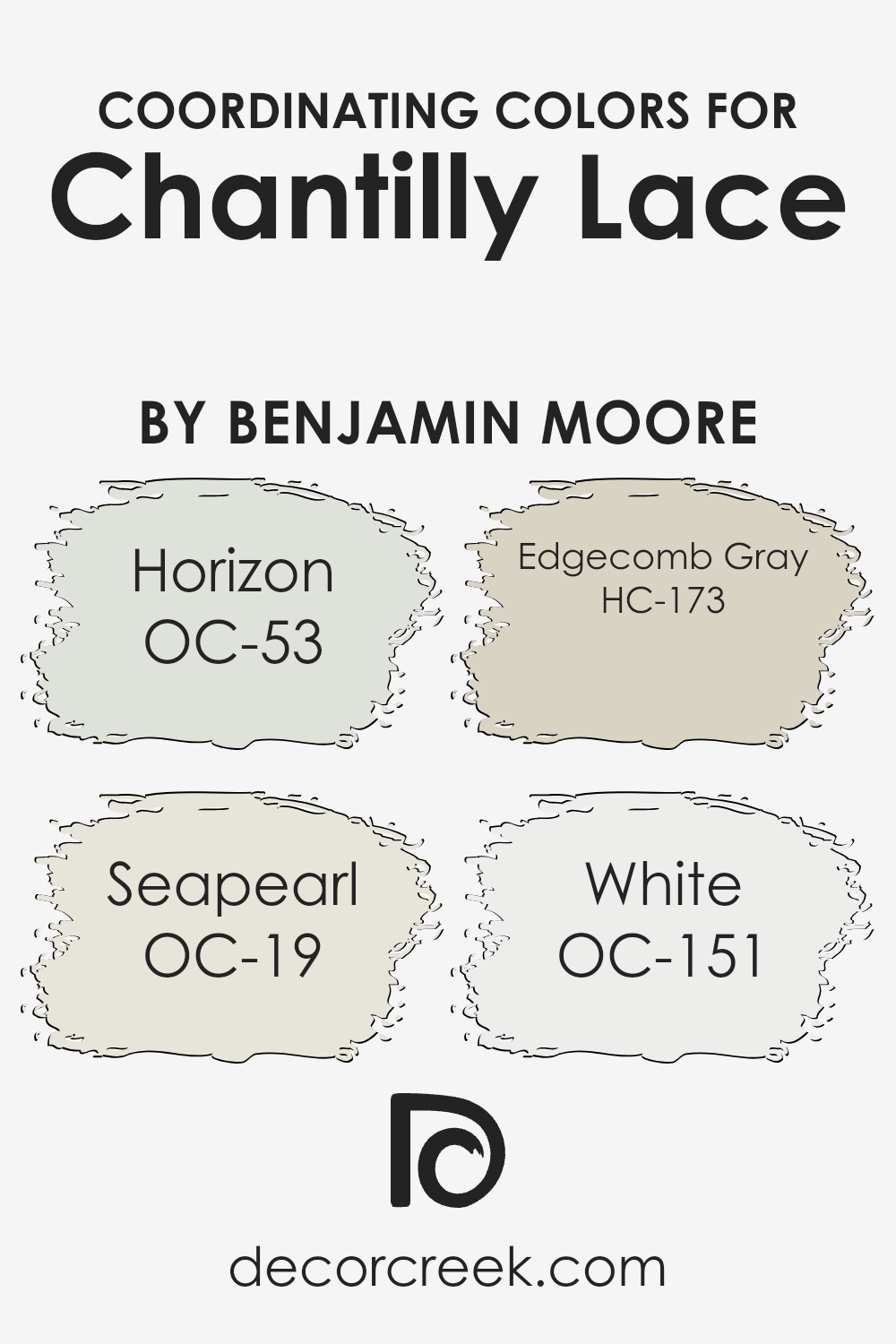
Coordinating Colors of Chantilly Lace OC-65 by Benjamin Moore
Coordinating colors are hues that complement each other when used together, creating a harmonious and visually appealing palette. This concept is crucial in interior design, fashion, and art, enabling the creation of spaces and compositions that are pleasing to the eye.
When it comes to Benjamin Moore’s Chantilly Lace OC-65, a selection of coordinating colors has been identified to enhance its beauty further and bring out the best in your decor. These colors work by balancing or accentuating Chantilly Lace’s clean and versatile nature, making them perfect partners for a variety of design styles.
Horizon OC-53 is a soft, airy gray that brings a sense of calm and serenity to any space, making it a perfect complement to the light and crisp Chantilly Lace. Seapearl OC-19, on the other hand, is a slightly warmer hue with a blend of gray and beige, offering a neutral backdrop that works beautifully with the purity of Chantilly Lace.
Edgecomb Gray HC-173 pushes the boundaries a little further into the realm of warm greige, providing a deeper contrast that still maintains a natural and understated elegance.
Lastly, White OC-151 is a pure, bright white that can refresh and illuminate a room, creating a crisp and clean look when used alongside Chantilly Lace. Together, these colors form a cohesive palette that enhances the beauty and versatility of Chantilly Lace, allowing for endless design possibilities.
You can see recommended paint colors below:
- OC-53 Horizon
- OC-19 Seapearl
- HC-173 Edgecomb Gray
- OC-151 White
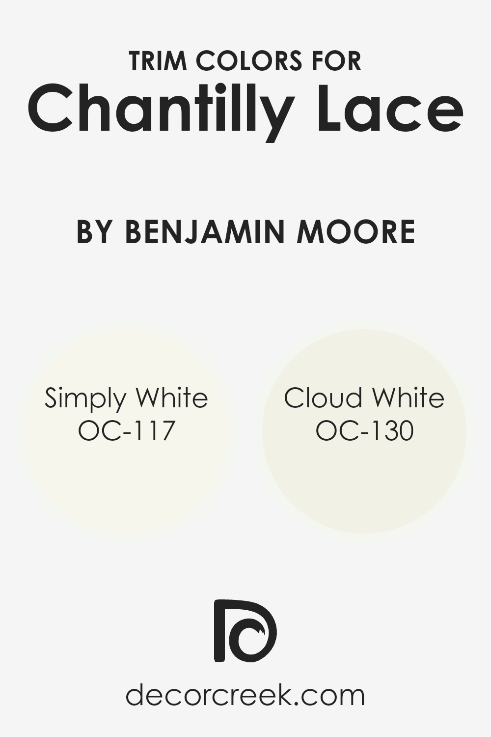
What are the Trim colors of Chantilly Lace OC-65 by Benjamin Moore?
Trim colors, like those that complement Chantilly Lace OC-65 by Benjamin Moore, play a significant role in defining the aesthetics of a space. They are essentially the accent colors applied to elements such as door frames, skirting boards, window frames, and crown moldings, functioning to highlight and frame the architectural features of a room.
Opting for the right trim color can enhance the overall ambiance of a space, creating a delightful contrast or seamless transition that elevates the main wall color. In the context of Chantilly Lace OC-65, a crisp and clean white, selecting a fitting trim color is crucial for achieving a cohesive and polished look.
Simply White OC-117 and Cloud White OC-130 are two excellent choices for trim colors when working with a base like Chantilly Lace. Simply White OC-117 offers a warm, soft hue, providing a subtle contrast that enriches the space without overwhelming it. This makes it an ideal choice for bringing a cozy yet elegant feel to the room.
On the other hand, Cloud White OC-130 presents a slightly cooler, neutral undertone, offering versatility that works harmoniously with Chantilly Lace to create a serene and inviting atmosphere. Both choices ensure that the trim helps to define the space in a way that complements the main color, enhancing the room’s aesthetic appeal and character.
You can see recommended paint colors below:
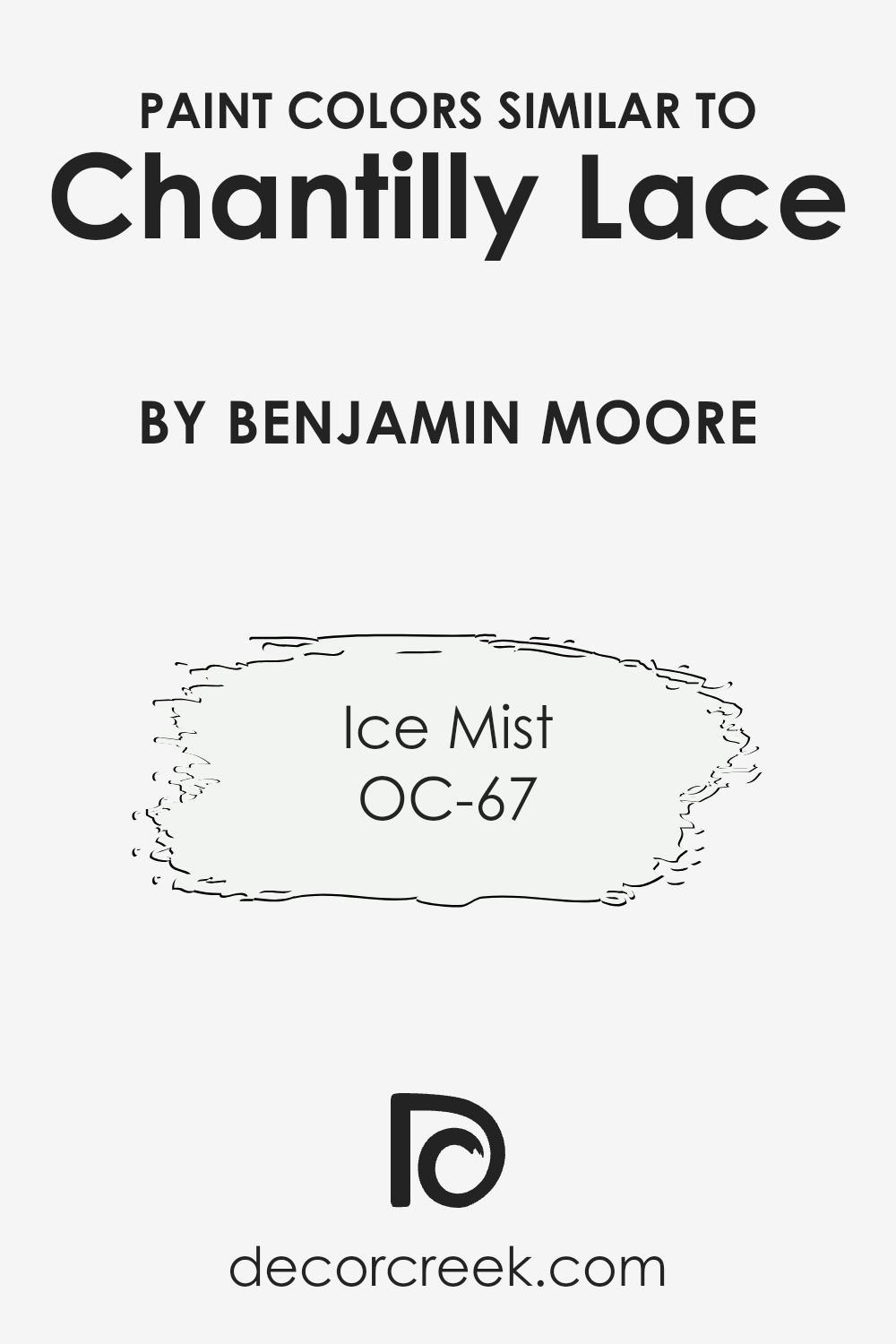
Colors Similar to Chantilly Lace OC-65 by Benjamin Moore
Similar colors play a crucial role in the world of interior design and decoration, acting as the building blocks for creating atmospheres that are cohesive, harmonious, and visually appealing. When colors closely resemble each other, like Chantilly Lace by Benjamin Moore and its similar color, Ice Mist (OC-67), they can be used together to enhance the sense of space, light, and unity within a room.
This is because similar colors share a common hue, making them blend seamlessly when placed side by side or used in different elements of a room’s decor. They work by subtly varying in shade or tone, thereby adding depth and complexity without causing a visual clash. This subtle variation can make a room feel thoughtfully designed and put together, offering a serene and refined backdrop to any living space.
Chantilly Lace is a bright, crisp white that radiates cleanliness and simplicity. It’s a color that reflects maximum light, making spaces appear larger and more open. Its ability to act as a versatile backdrop for both bold and soft color palettes makes it a popular choice. On the other hand, Ice Mist offers a hint of cool freshness, akin to the first light frost of winter.
It’s a shade that brings an airy lightness to spaces, making it ideal for creating a tranquil and soothing ambiance. Both colors, in their own unique way, contribute to crafting interiors that feel both welcoming and impeccably styled, highlighting the importance of selecting similar colors to achieve a desired effect in home decor.
You can see recommended paint color below:
- OC-67 Ice Mist
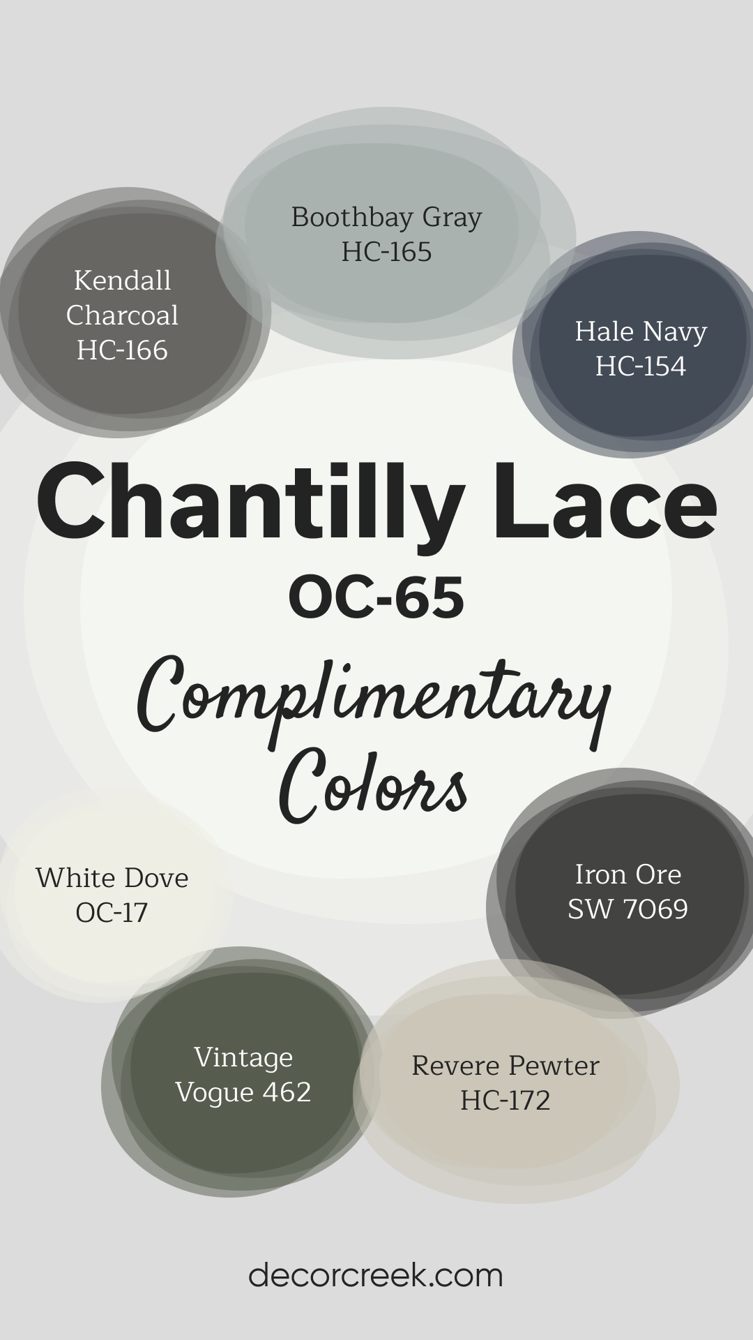
Complimentary Colors for Chantilly Lace OC-65 Paint Color by Benjamin Moore
Chantilly Lace by Benjamin Moore is a versatile, bright white that brings a fresh and elegant feel to any space. Its clean and crisp appearance makes it an excellent backdrop for a wide range of colors. Hale Navy offers a bold and dramatic contrast, perfect for accent walls or cabinetry.
Balboa Mist and White Dove are great choices for a light, airy finish that complements the simplicity of Chantilly Lace. Together, these colors provide endless design possibilities, perfect for creating timeless, stylish interiors.
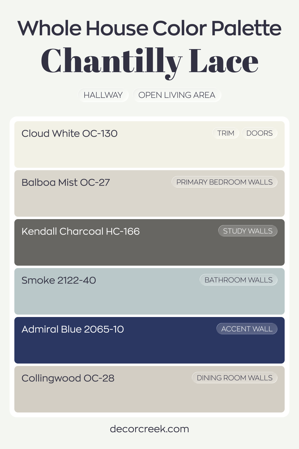
Whole House Paint Color Palette Designed Around Chantilly Lace OC-65
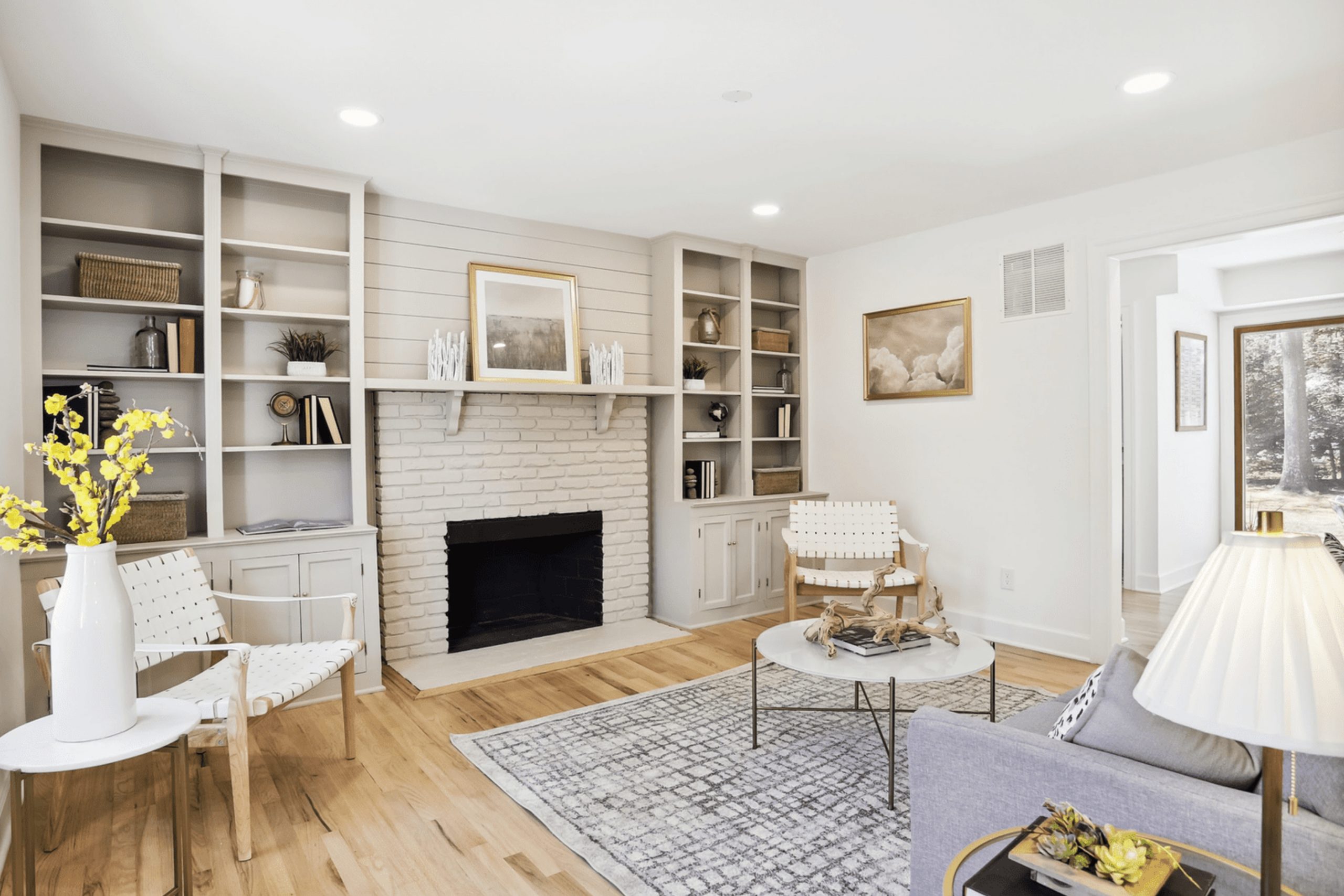
Chantilly Lace OC-65 brightens the hallway and open living area with a fresh, clean white. Cloud White on trim and doors keeps the lines soft yet defined. The pairing feels light and refined.
Balboa Mist in the primary bedroom and Collingwood in the dining room introduce warm gray balance. Smoke in the bathroom adds a misty blue tone that complements the neutrals.
These shades create gentle transitions from room to room.
Kendall Charcoal in the study and Admiral Blue on an accent wall bring bold depth. The darker colors provide contrast that sharpens the airy white foundation.
How to Use Chantilly Lace OC-65 by Benjamin Moore In Your Home?
Chantilly Lace OC-65 by Benjamin Moore is a popular paint color known for its pure, bright white appearance. It’s a go-to choice for homeowners looking to freshen up their space with a clean and airy feel. Due to its versatility, it works well in various rooms, whether you’re painting a sunny kitchen, a cozy bedroom, or a relaxing bathroom. Its ability to reflect light makes it perfect for spaces you want to appear larger and more open.
Using Chantilly Lace on walls can instantly make a room feel more polished and pulled together. It serves as an excellent backdrop for both bold and subtle color schemes, allowing furniture and decor to stand out. For a unified home aesthetic, consider using it on trim, doors, and ceiling for a crisp, cohesive look. Whether you prefer modern minimalism or classic elegance, Chantilly Lace can help you create a welcoming and sophisticated atmosphere in your home.
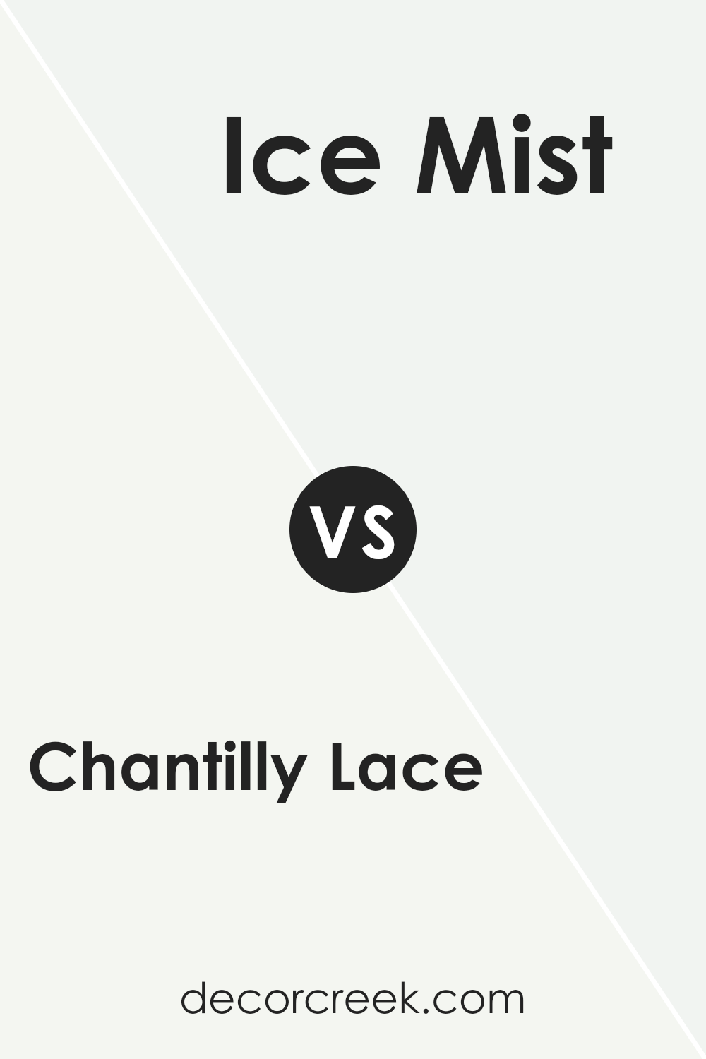
Chantilly Lace OC-65 by Benjamin Moore vs Ice Mist OC-67 by Benjamin Moore
Chantilly Lace and Ice Mist are two popular colors from Benjamin Moore, each bringing its unique mood to rooms. Chantilly Lace is a bright, crisp white. It acts like a canvas, making spaces feel open and airy. It reflects light beautifully, making it perfect for any room looking for a fresh, clean look. On the other hand, Ice Mist has a cooler tone, offering a subtle hint of blue.
This gives it an almost ethereal feel, creating a serene and calming atmosphere. It’s ideal for those wanting to add a touch of tranquility to their space. While both colors are great for making small rooms appear larger, Chantilly Lace offers a warm and inviting vibe, whereas Ice Mist leans towards a cooler, more reflective ambiance.
Choosing between them depends on the mood you’re aiming to create—warm and welcoming with Chantilly Lace or calm and soothing with Ice Mist.
You can see recommended paint color below:
- OC-67 Ice Mist
Conclusion
Chantilly Lace by Benjamin Moore is a popular paint color known for its pure and clean appearance. This shade stands out for its versatility and ability to enhance the brightness of any space. It’s a favorite among homeowners and designers alike for its ability to pair well with various decor styles and color palettes. The shade is particularly appreciated for bringing a fresh and airy feel to interiors, making rooms appear more spacious and inviting.
Choosing Chantilly Lace for your next home project means opting for a timeless and elegant backdrop that complements both modern and traditional settings. Its understated beauty provides a perfect canvas for adding personal touches through furniture and accessories.
Whether used in a bustling kitchen or a tranquil bedroom, Chantilly Lace offers a serene and sophisticated feel, proving why it remains a go-to choice for creating beautiful and harmonious living environments.

Ever wished paint sampling was as easy as sticking a sticker? Guess what? Now it is! Discover Samplize's unique Peel & Stick samples.
Get paint samples

