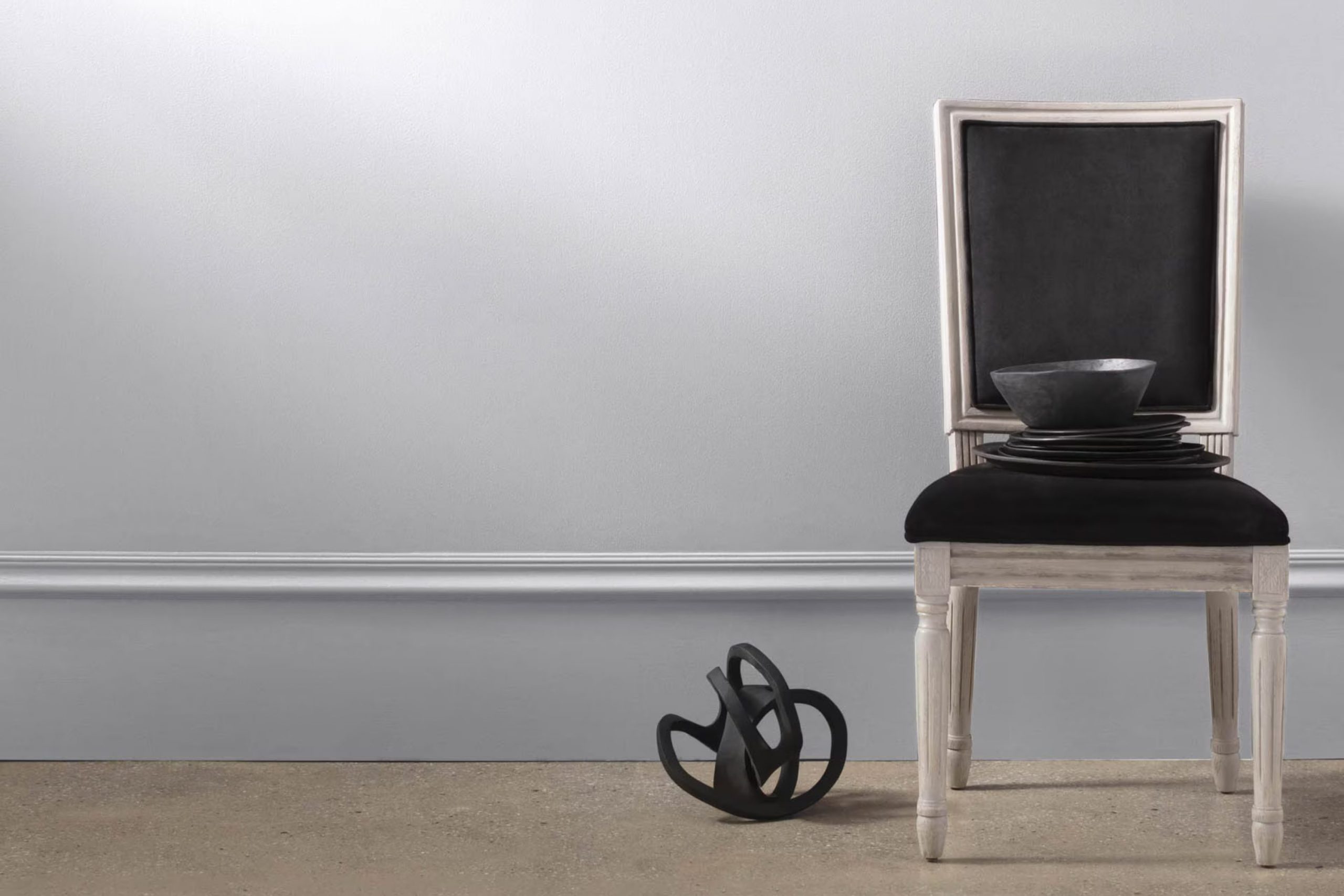
I recently came across Benjamin Moore’s 2117-70 Dreamy Cloud paint color, and I must say it’s quite a beautiful shade. When you’re thinking about updating a room’s vibe, the right color can really set the mood. Dreamy Cloud has this soft, airy feel to it that seems perfect for creating a calm and relaxing room.
It’s a adaptable hue—neither too harsh nor too muted, making it an excellent choice for almost any room. Whether you’re looking to freshen up your living room, bedroom, or even the bathroom, this color could work wonderfully. It reflects light in a way that makes rooms feel bigger and brighter without being overpowering.
For those looking to add a subtle splash of color that soothes the senses and brings a gentle warmth to interiors, Dreamy Cloud might be just what you need. As I played around with decor ideas, I found it pairs well with a wide range of accents and furniture styles, from modern to rustic.
Next, I will discuss how it complements different themes and textures, making it a truly adaptable choice for your decorating plans.
What Color Is Dreamy Cloud 2117-70 by Benjamin Moore?
Dreamy Cloud by Benjamin Moore is a soft, light gray color with a hint of blue. This subtle tint gives it a clean and fresh appearance, making it a flexible choice for a variety of decorating styles. Its lightness reflects natural light beautifully, enhancing small rooms and making them appear larger.
This color works exceptionally well in minimalist and contemporary interiors, adding a touch of elegance without overpowering the surroundings. It also fits seamlessly into a coastal or Scandinavian-style home, where light colors and simplicity are key elements of the design.
Dreamy Cloud pairs well with natural materials like light woods, which help to maintain a bright and airy feel in the room. Textures such as linen and cotton in whites or soft pastels complement this color perfectly, adding to the relaxed vibe of the room. For a more dynamic contrast, pairing it with darker hues like navy or charcoal can create a visually striking effect.
Overall, Dreamy Cloud is ideal for those looking to create a fresh, clean look in their home, providing a gentle background that works well with various materials and textures.
Is Dreamy Cloud 2117-70 by Benjamin Moore Warm or Cool color?
Dreamy Cloud by Benjamin Moore is a light and gentle gray color with hints of blue, making it ideal for creating a calm and welcoming atmosphere in any room.
This shade is adaptable enough to work in various rooms, from bedrooms and bathrooms to living areas and kitchens. Its subtle undertones help keep the room feeling fresh and open, which is great for smaller rooms that might otherwise feel cramped.
Dreamy Cloud reflects natural light beautifully, which can make a room feel brighter and more airy. This is particularly useful in areas that don’t receive a lot of sunlight. It pairs well with both modern and traditional decor, making it a convenient choice for those who like to mix styles or update their interiors without repainting everything. Furniture in natural wood tones or white works especially well with this color, adding to its clean and relaxed vibe. Overall, Dreamy Cloud is a practical and pretty color option that works well in any home.
Undertones of Dreamy Cloud 2117-70 by Benjamin Moore
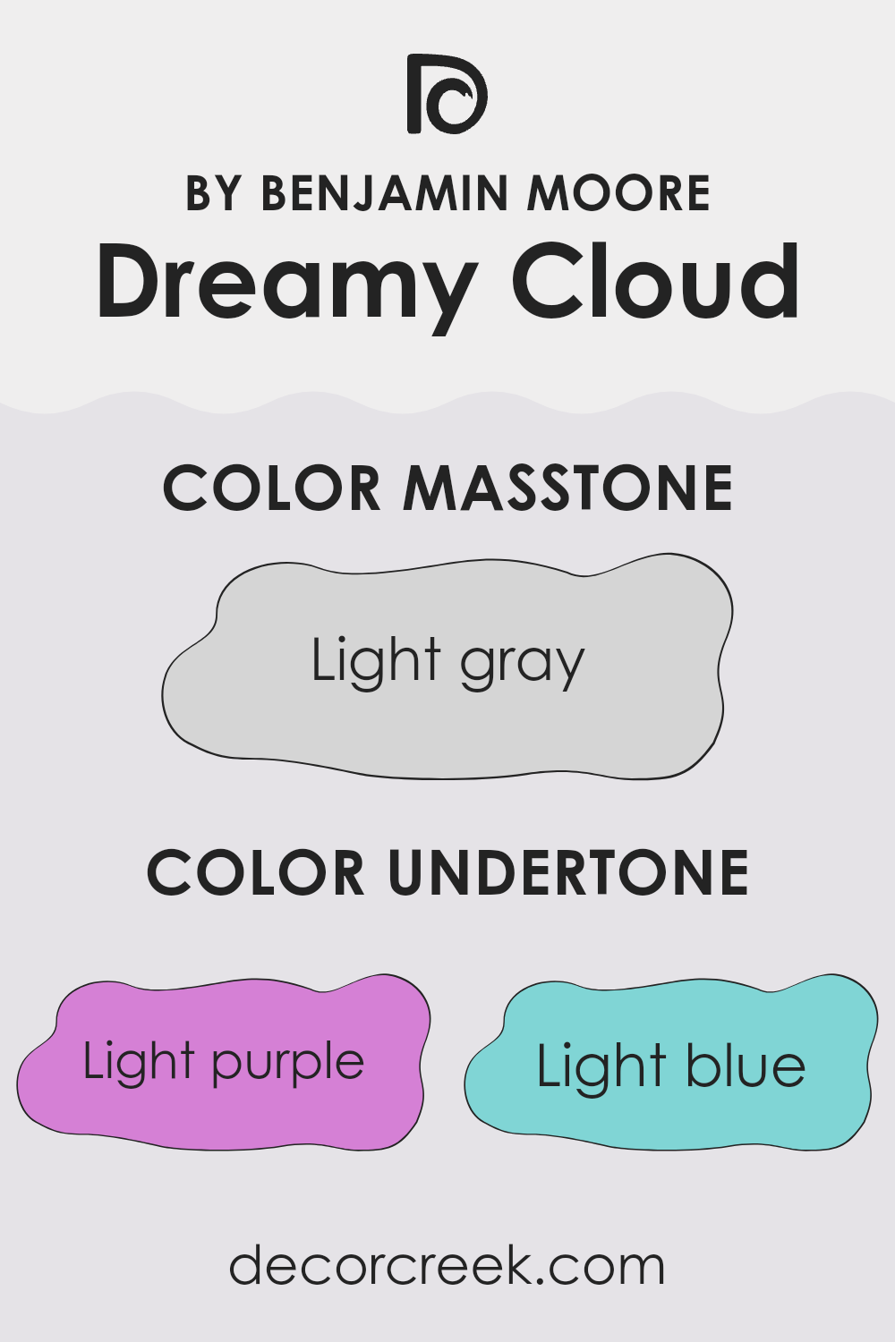
Dreamy Cloud2117-70 is a flexible paint color that combines hints of various subtle shades, influencing the overall ambiance of a room. This color has undertones of light purple, light blue, pale yellow, lilac, pale pink, mint, and grey. Undertones are the underlying qualities of a color that might not be immediately obvious but can significantly affect how the color appears in different lighting conditions.
The presence of light purple and lilac undertones adds a touch of softness, making the room feel welcoming. Light blue and mint bring a fresh and airy feel, good for creating a relaxed environment. Pale yellow undertones gently warm up the room, making it cozy and inviting. Pale pink adds a slight warmth, improving the nurturing feel of the room. Meanwhile, the grey undertone ensures that the color remains neutral and flexible, blending well with various decor styles and color schemes.
When applied on interior walls, Dreamy Cloud2117-70 is adaptable and can look slightly different depending on the lighting and surrounding colors. In natural light, the blue and mint may become more prominent, giving the room a fresher look. In artificial lighting, warmer tones like pale pink and yellow might stand out, creating a snug atmosphere.
This characteristic makes Dreamy Cloud2117-70 excellent for rooms where mood flexibility is desired, adjusting and subtly changing from morning light to evening calm.
What is the Masstone of the Dreamy Cloud 2117-70 by Benjamin Moore?
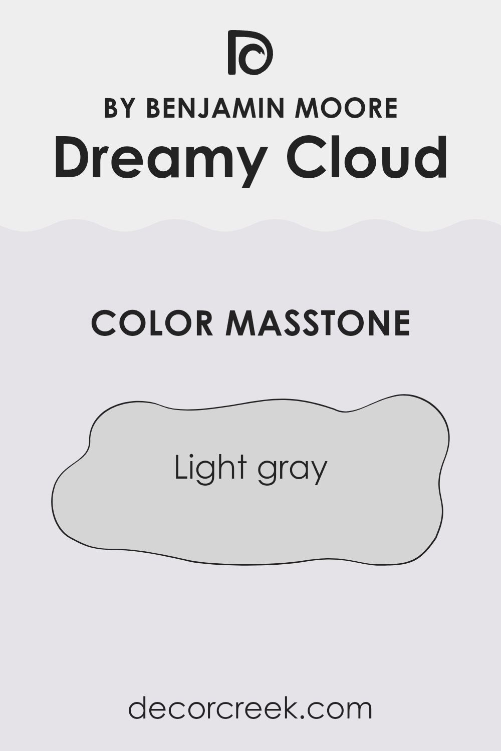
Dreamy Cloud 2117-70 by Benjamin Moore is a light gray shade. When used in homes, this color offers a clean and subtle backdrop. Since it’s not too dark or too bright, it fits well in any room without overpowering the room.
This shade is great for creating a peaceful atmosphere, as it pairs nicely with other colors, whether bright or muted. Homeowners often choose this light gray for bedrooms to promote a restful environment or in living areas where it provides a neutral canvas for furniture and art.
Its flexibility also makes it suitable for bathrooms and kitchens, where it can help the rooms appear larger and more open. Decorating with this color is straightforward because it harmonizes with different styles and materials, making it a practical choice for a modern, minimalist, or even a traditional home.
How Does Lighting Affect Dreamy Cloud 2117-70 by Benjamin Moore?
Lighting plays a crucial role in how we perceive colors. Different light sources can dramatically change the appearance of a paint color, affecting the mood and atmosphere of a room. Colors can look different under natural sunlight compared to artificial lights like LEDs or fluorescent lamps.
Take the light gray color “Dreamy Cloud” by Benjamin Moore, for instance. This shade can appear subtly different depending on the lighting in which it’s viewed. In natural light, which is the clearest, most neutral light, “Dreamy Cloud” tends to look truer to its swatch. This type of light brings out the clean, crisp quality of the color, making it appear light and airy.
In rooms with artificial lighting, the color can shift based on the type of bulbs used. LED lights, which often have a cooler tone, might make “Dreamy Cloud” appear slightly bluer or cooler than it does in natural light. Fluorescent lighting, on the other hand, could bring out greenish tones in the paint.
The direction a room faces affects the quality of natural light and therefore how “Dreamy Cloud” looks. In north-facing rooms, light is cooler and more consistent throughout the day. Here, “Dreamy Cloud” might appear slightly more shadowy and muted. South-facing rooms get the most sunlight, warming the color and making it look lighter and more vibrant.
East-facing rooms receive warm light in the morning, which makes “Dreamy Cloud” look softer and warmer in the morning, then returning to its truer color as the day goes on. West-facing rooms experience the opposite, with less intense light in the morning and a warmer, golden glow in the evening, enhancing the warmth of the color.
Understanding these nuances can help in choosing the right paint color for your room, ensuring that you get the mood and atmosphere you desire at different times of the day.
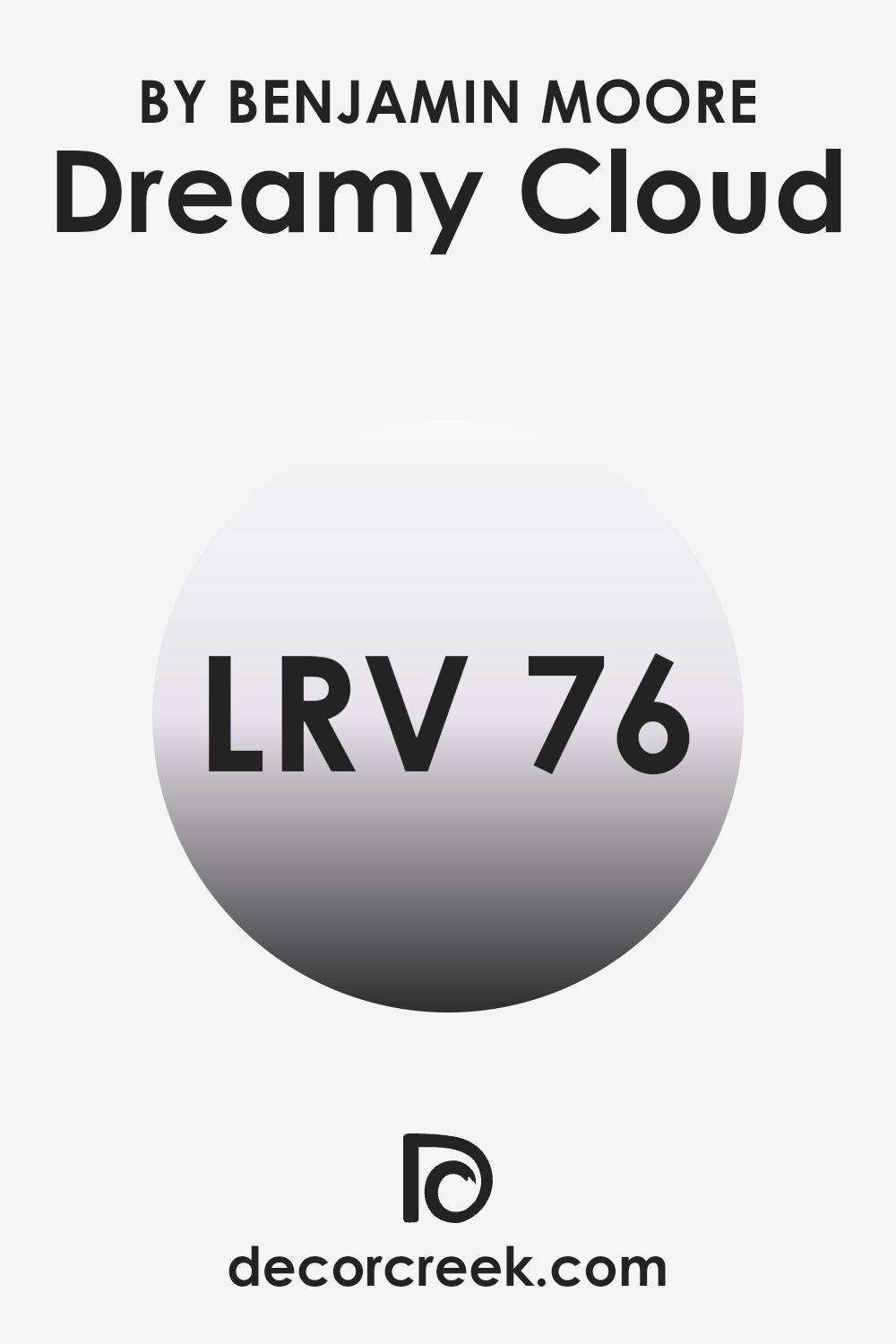
What is the LRV of Dreamy Cloud 2117-70 by Benjamin Moore?
LRV stands for Light Reflectance Value, which is a measurement of how much light a paint color reflects. Think about it as a scale where white reflects most light and black absorbs it.
LRV can range from a low of about 1, which is very dark and absorbs most light, to a high of 99, which is very light and reflects almost all the light. Colors with a higher LRV make a room feel brighter because they reflect more light around the room. This number helps people decide which paint to use based on how bright or dark they want the room to feel.
The LRV for the color Dreamy Cloud by Benjamin Moore is 76.41. This is quite a high value, meaning this color will reflect a lot of light and make a room look light-filled and airy. This makes it a great choice for darker rooms that need to be brightened up or smaller rooms that you want to appear larger.
Because this color reflects a lot of light, it stays true to its color under different lighting conditions and doesn’t shift much in appearance from day to night, offering a consistent look in a room through varying light levels.
decorcreek.com
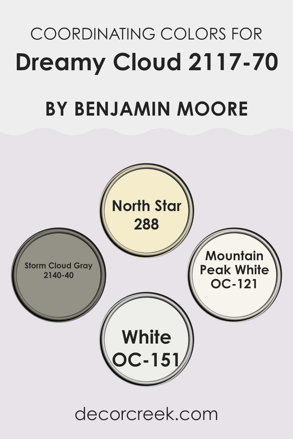
Coordinating Colors of Dreamy Cloud 2117-70 by Benjamin Moore
Coordinating colors are shades that complement or improve each other to create a visually satisfying decor or design palette. In the world of interior design, selecting coordinating colors involves choosing hues that balance one another, enabling each color to look its best.
Good coordination helps in achieving a harmonious atmosphere throughout a room, where no individual color overpowers another. This coordination can be achieved by selecting colors with similar tones, or ones that stand on opposite ends of the color spectrum, thereby complementing each other.
In the case of the color Dreamy Cloud by Benjamin Moore, several coordinating colors have been identified to work exceptionally well alongside this particular shade. North Star is a subtle, soft blue that offers a calm, refreshing contrast, providing a lightness that pairs well with the gentle tone of Dreamy Cloud.
Storm Cloud Gray is a deeper hue that brings depth and a robust character to rooms, making it great for adding a strong, grounding element in rooms that feature the lighter Dreamy Cloud. Mountain Peak White is a crisp, clean white that acts as a fresh, bright counterbalance, improving the airy quality of Dreamy Cloud.
Lastly, White is a basic, classic shade that smoothly integrates with virtually any color, ensuring that this particular hue supports the others without clashing or distracting from the main palette.
You can see recommended paint colors below:
- 288 North Star
- 2140-40 Storm Cloud Gray
- OC-121 Mountain Peak White
- OC-151 White
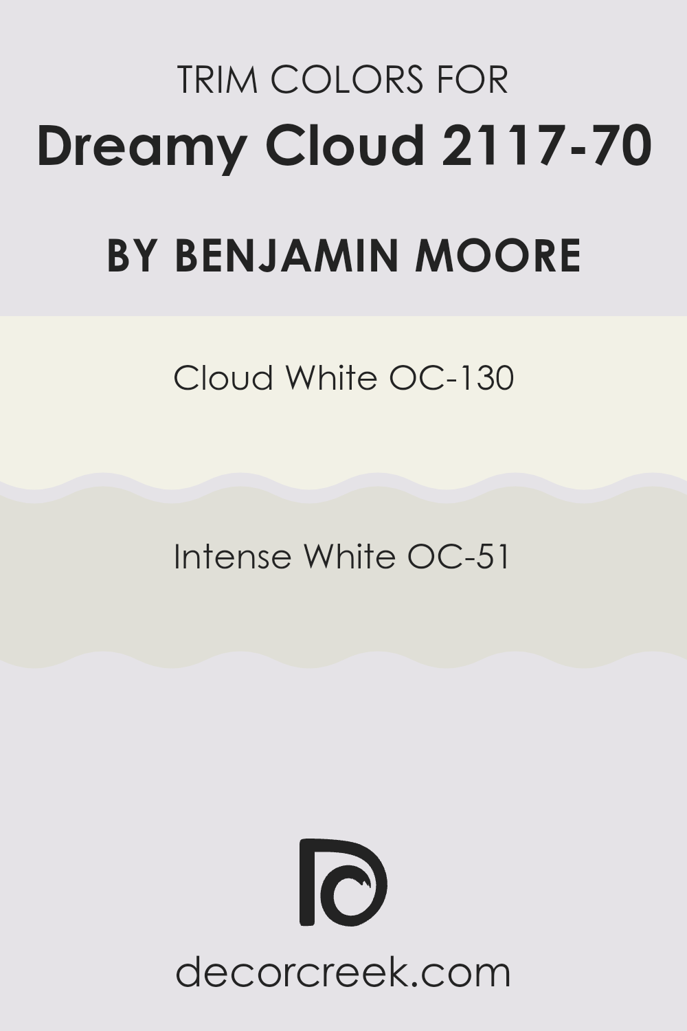
What are the Trim colors of Dreamy Cloud 2117-70 by Benjamin Moore?
Trim colors are shades that help to outline or highlight architectural details and edges of walls in a room, acting as an aesthetic boundary that defines the areas between different surfaces, such as walls and ceilings, door frames, and window sills.
Often, they are in a contrasting shade to the main wall color to draw attention and add a neat, finished look to the room. For Dreamy Cloud by Benjamin Moore, using trim colors like OC-130 Cloud White or OC-51 Intense White can really make the soft tones of the wall come alive by providing a clean, sharp boundary that improves the overall appeal of the room.
OC-130 Cloud White is a crisp, clean white that radiates a sense of freshness and simplicity. It’s perfect for creating a bright and airy feel when used as a trim, offering a subtle contrast that’s not too stark against lighter wall colors like Dreamy Cloud.
On the other hand, OC-51 Intense White has a slightly deeper, warmer tone compared to Cloud White, giving it a cozy and inviting presence. This color works beautifully as a trim color, adding just enough warmth to complement cooler tones without overpowering the senses. Both choices are excellent for achieving a polished look that defines and supports the visual flow of a room.
You can see recommended paint colors below:
- OC-130 Cloud White
- OC-51 Intense White
Colors Similar to Dreamy Cloud 2117-70 by Benjamin Moore
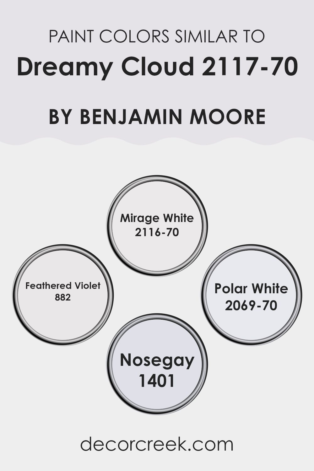
Choosing similar colors in interior design can improve the overall look, creating a cohesive and harmonious environment. Colors like Mirage White, Feathered Violet, Polar White, and Nosegay work well with Dreamy Cloud because they share subtle underlying tones that tie the room together without overpowering the senses. These similar colors can also make a room appear larger and more open, as they naturally blend with each other to expand the visual palette.
Mirage White is a soft, almost ethereal white with a hint of gray, making it an ideal choice for creating a calm and gentle backdrop in any room. Its lightness brings a fresh and airy feel that complements more vibrant or darker colors. Feathered Violet has a slight hint of lavender, offering a touch of warmth while keeping the atmosphere light and airy, perfect for adding a gentle pop of color.
Polar White stands out with its crisp and clear presence, providing a brilliant base that can brighten darker areas or accent stronger colors. Nosegay introduces a subtle pink tone, offering a warm and inviting feel to a room, which adds a soft glow to a room without being overpowering. Together, these colors maintain visual interest while keeping the environment peaceful and pleasing.
You can see recommended paint colors below:
- 2116-70 Mirage White
- 882 Feathered Violet
- 2069-70 Polar White
- 1401 Nosegay
Colors that Go With Dreamy Cloud 2117-70 by Benjamin Moore
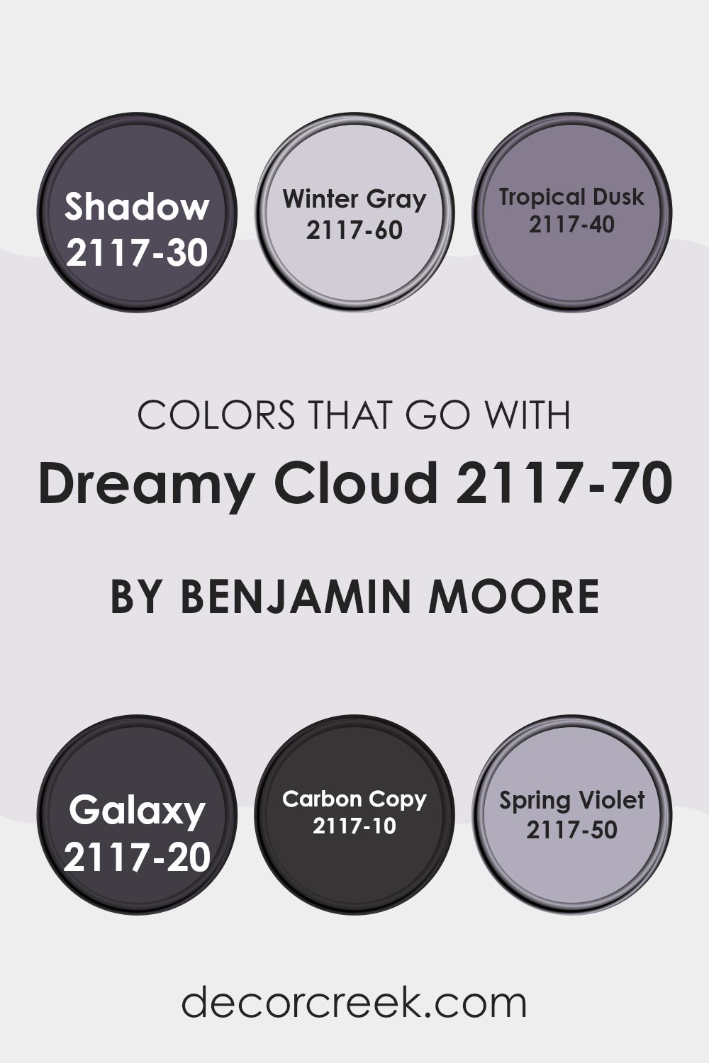
Choosing the right colors to complement Dreamy Cloud 2117-70 by Benjamin Moore can really improve the ambiance of a room. Dreamy Cloud is a flexible light gray hue that can serve as a neutral background, allowing accents to shine or offering a soothing base for deeper tones. Complementary colors range from soft grays to rich purples and deep blues, providing a variety of options for different tastes and design goals.
For instance, a hue like Winter Gray 2117-60 is a lighter, almost ethereal gray that pairs well with Dreamy Cloud for a subtle and clean look; it doesn’t overpower but supports a soft and airy atmosphere. Slightly more vibrant, Tropical Dusk 2117-40 introduces a gentle blush tone, offering a hint of warmth to rooms predominantly cooled by gray shades.
For more drama and depth, Galaxy 2117-20, a profound blue, creates a striking contrast against Dreamy Cloud, ideal for feature walls or textile highlights in a room. Shadow 2117-30 is another strong choice, offering a bold gray that commands attention without overpowering, perfect for creating a focal point.
For a touch of the unexpected, Spring Violet 2117-50 brings light purple into the mix, adding a cheerful pop of color that is still gentle enough to maintain the peaceful feel established by Dreamy Cloud. Lastly, Carbon Copy 2117-10 is almost black, very strong and grounding, excellent for giving weight and definition to a light-colored room. Each color option offers its own unique feel while still maintaining harmony with Dreamy Cloud, allowing you to personalize your room efficiently and stylishly.
You can see recommended paint colors below:
- 2117-30 Shadow
- 2117-60 Winter Gray
- 2117-40 Tropical Dusk
- 2117-20 Galaxy
- 2117-10 Carbon Copy
- 2117-50 Spring Violet
How to Use Dreamy Cloud 2117-70 by Benjamin Moore In Your Home?
Dreamy Cloud 2117-70 by Benjamin Moore is a flexible, light gray paint with soft blue undertones that offers a calm and gentle feel to any room. Its muted tone makes it perfect for those looking to create a peaceful, relaxing atmosphere in their home. This color is ideal for living rooms and bedrooms where a subtle, soothing ambiance is desired.
Using Dreamy Cloud in a small room, like a bathroom or a hallway, can make the area appear larger and more open. Because of its neutral quality, it pairs well with a wide range of decor styles and colors, from bright and bold to more muted and natural tones. For those looking to give their kitchen a fresh look, painting the cabinets or walls in Dreamy Cloud can brighten the room while maintaining a clean and inviting vibe.
Overall, Dreamy Cloud 2117-70 is a fantastic choice for anyone looking to give their home a light, airy feel without going too bold with color.
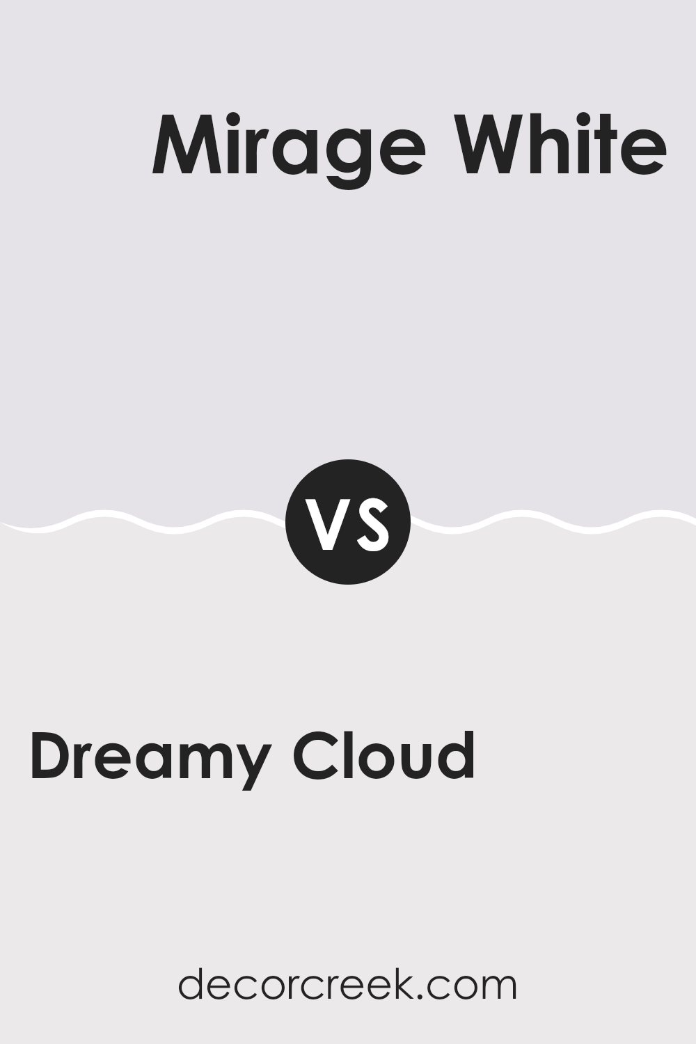
Dreamy Cloud 2117-70 by Benjamin Moore vs Mirage White 2116-70 by Benjamin Moore
Dreamy Cloud and Mirage White by Benjamin Moore are both light and airy paint colors, but they have some subtle differences. Dreamy Cloud has a touch of gray, giving it a cool, understated vibe. This makes it great for creating a calm and collected room in your home.
On the other hand, Mirage White leans slightly toward a warm tone due to a hint of beige. This warmth makes Mirage White ideal for rooms where you want a cozy and inviting atmosphere. Both colors are light enough to make small rooms feel bigger and brighter.
However, Dreamy Cloud’s cooler tone might be more suited for a modern look, while Mirage White’s warmth is perfect for a traditional or welcoming room. Each brings its unique feel, making them adaptable choices depending on the mood you want to set in your room.
You can see recommended paint color below:
- 2116-70 Mirage White
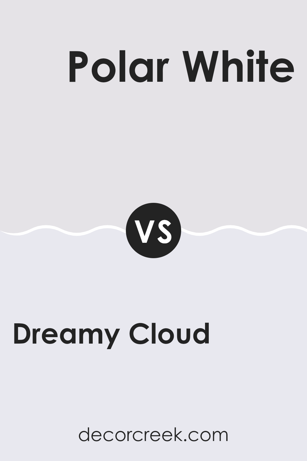
Dreamy Cloud 2117-70 by Benjamin Moore vs Polar White 2069-70 by Benjamin Moore
Dreamy Cloud and Polar White are both light, airy colors by Benjamin Moore, but they have subtle differences that can affect the feel of a room. Dreamy Cloud has a faint dash of lavender in its base, giving it a gentle, warm vibe.
This makes it great for rooms where you want a hint of coziness while still keeping the area bright and open. On the other hand, Polar White is a cleaner, more straightforward white. It’s very bright and pure, making it perfect for creating a crisp, clear look in a room.
Polar White tends to reflect more light, which can help make small rooms appear larger and more inviting. In summary, if you’re aiming for a room with a warm, slightly colored atmosphere, Dreamy Cloud is suitable, while Polar White is ideal for a sharp, clean look.
You can see recommended paint color below:
- 2069-70 Polar White
Dreamy Cloud 2117-70 by Benjamin Moore vs Nosegay 1401 by Benjamin Moore
Dreamy Cloud and Nosegay are two distinct paint colors from Benjamin Moore. Dreamy Cloud is a light, almost ethereal hue, bordering on white but with a hint of soft gray. It’s quite subtle and can make a room feel open and airy. This makes it a perfect choice for rooms where you want a calm, gentle backdrop that doesn’t overpower your décor.
On the other hand, Nosegay is more expressive. It’s a light pink color that adds a warm, inviting touch to any room. Unlike Dreamy Cloud, Nosegay has a definite color presence that brings rooms a soft, cheerful ambiance.
Both colors are gentle and can work beautifully in many interiors. Dreamy Cloud is better for those who prefer a minimalistic or very light palette, while Nosegay offers a touch of color, welcoming and cozy, ideal for creating a friendly atmosphere. Each color sets a different mood and can complement various design styles depending on what feel you’re aiming for in a room.
You can see recommended paint color below:
- 1401 Nosegay
Dreamy Cloud 2117-70 by Benjamin Moore vs Feathered Violet 882 by Benjamin Moore
Dreamy Cloud and Feathered Violet by Benjamin Moore are both unique, but they offer different vibes for decorating rooms. Dreamy Cloud is a soft, very light grey almost bordering on white, giving a fresh and airy feel to any room. It’s perfect for making smaller rooms appear larger and is adaptable enough to be paired with many other colors.
In contrast, Feathered Violet is a subtle lavender hue with more presence and color depth than Dreamy Cloud. It adds a gentle touch of color and is ideal for creating a cozy, inviting atmosphere. This color works well in bedrooms or other areas where a calming effect is desired.
While both colors share a softness in terms of saturation, Dreamy Cloud leans toward a neutral palette, improving light and room, whereas Feathered Violet brings a slight, warm color, lending personality and warmth to rooms. Whether used alone or together, both colors offer distinct possibilities for creating beautiful and homely environments.
You can see recommended paint color below:
- 882 Feathered Violet
In writing about 2117-70 Dreamy Cloud by Benjamin Moore, I found that it’s a lovely color to make any room look calm and light. This grayish white shade is perfect because it’s not too bright or dark, so it works really well for bedrooms, living rooms, or even the kitchen. It’s unique in the way it changes look depending on the light, looking warmer sometimes and cooler at other times.
One of the best things is that it goes well with a lot of other colors. Whether you want to pair it with soft blues or even bright oranges and greens, it doesn’t clash and keeps things looking nice and simple. It also makes the room look cleaner and more put together.
From all the details I gathered, Dreamy Cloud can help make small rooms seem bigger and more open. If you’re looking for a new color to try on your walls that is friendly and makes your room look bright and happy, 2117-70 Dreamy Cloud by Benjamin Moore might be the perfect pick.
It’s easy to use and sure to make any room nicer with its soft charm.
Ever wished paint sampling was as easy as sticking a sticker? Guess what? Now it is! Discover Samplize's unique Peel & Stick samples.
Get paint samples

