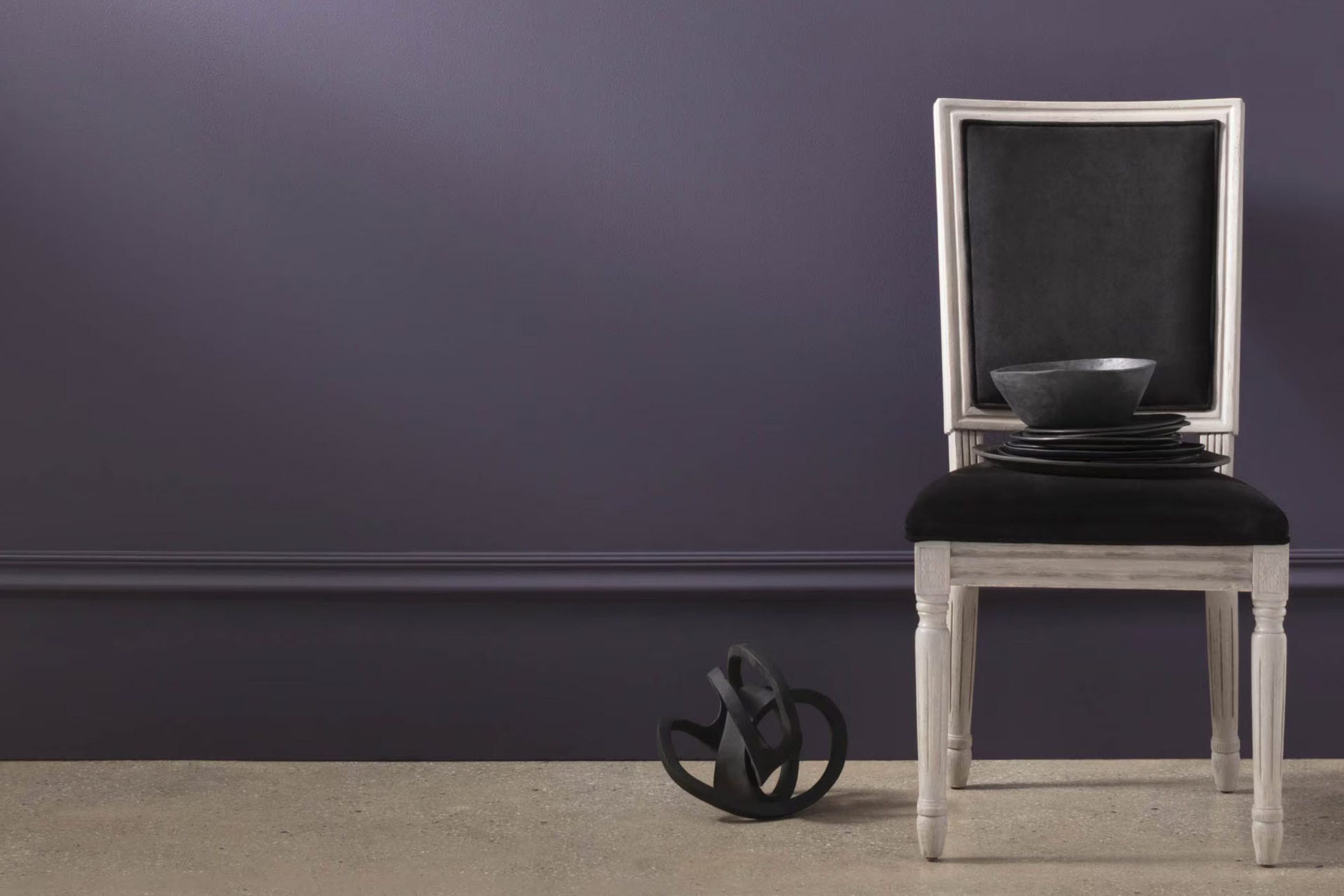
Let me tell you about an interesting shade of paint I came across: 2117-30 Shadow by Benjamin Moore. This deep, rich amethyst has a luxurious feel that immediately catches the eye. It’s the kind of color that adds a mysterious depth to any room, turning plain walls into showpieces.
When used in areas that receive a lot of natural light, Shadow evolves throughout the day, shifting from a contemplative dark hue to softer, lighter tones. I’m considering this color for a bedroom to create a cozy, enveloped feeling or perhaps to make a striking statement in a dining area.
It pairs beautifully with light grays, creams, and even bold hues, offering adaptability in design choices. If you’re looking to refresh your living area or are after a dramatic change, Shadow by Benjamin Moore might just be what you need.
I find it intriguing how a single shade can redefine an area and thought you might be interested in what makes this color unique.
What Color Is Shadow 2117-30 by Benjamin Moore?
Shadow 2117-30 by Benjamin Moore is a deep, rich amethyst that adds a bold and cozy touch to any area. This shade is perfect for creating a dramatic backdrop, making it ideal for those looking to introduce both warmth and character in their homes. It works especially well in living areas, bedrooms, and dining rooms, where its intensity helps to create a cozy, inviting atmosphere.
This luxurious purple hue complements a variety of interior styles. It pairs beautifully with modern and contemporary aesthetics because of its bold color, which makes a striking statement. Similarly, Shadow 2117-30 works wonderfully in artistic or bohemian-inspired areas, where its depth can be mixed with vibrant colors and eclectic decor for a lively environment.
When it comes to materials, Shadow 2117-30 goes well with rich, natural textures like wood and leather, enhancing their natural tones. Metals such as brass or gold add a touch of glamour to this dark hue, while pairing it with velvet or silk gives the room a soft yet dramatic feel. For those wanting to balance its depth, incorporating elements like light-colored linens or creamy ceramics can lighten areas while maintaining a stylish contrast.
Is Shadow 2117-30 by Benjamin Moore Warm or Cool color?
Shadow 2117-30 by Benjamin Moore is a deep, rich purple that can really make a statement in your home. This color is quite bold, so using it in the right area is key to getting the best effect.
It’s perfect for creating a cozy and inviting atmosphere in areas where you and your guests spend a lot of time, like living rooms or dining areas. Because Shadow 2117-30 is so intense, it works well as an accent wall rather than covering all four walls, which could make the room seem smaller or darker.
Pairing it with lighter colors such as creams or light grays can help balance out its depth. This shade also adds a touch of drama and luxury to an area when used in furniture pieces, curtains, or even lampshades. It’s a great way to add some personality to your decor without overpowering the area.
Undertones of Shadow 2117-30 by Benjamin Moore
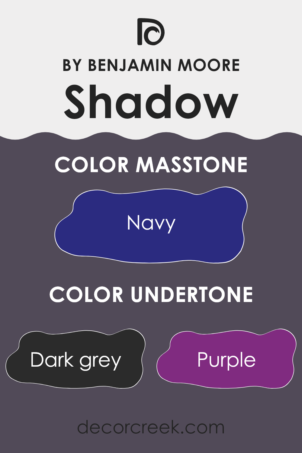
Shadow2117-30 by Benjamin Moore is a complex color that incorporates various undertones, adding depth and adaptability to its appearance. The undertones in any paint color can dramatically affect its perception under different lighting conditions and when paired with different decor elements. For example, dark gray undertones offer a solid, grounding effect, making a room feel more secure and enclosed.
Incorporating subtler hints of colors like purple and brown in Shadow2117-30 adds a layer of warmth, making the area more inviting. Purple can give a slight tinge of creativity and richness, whereas brown can enhance a feeling of earthiness and stability. Dark turquoise and dark green undertones introduce a touch of nature and vivacity, which might explain why a room painted in this color can feel lively yet still deeply comforting.
The additional layers of grey and olive point to a more subdued and neutral backdrop that works well in various settings, providing flexibility in decor choices. Dark blue, violet, and blue bring in a coolness, which balances the warmer tones, and lilac adds a touch of softness.
On interior walls, these characteristics of Shadow2117-30 mean that the color can appear differently based on the room’s lighting and the colors around it. Natural light can enhance its vibrant undertones, making the walls a dynamic part of the room’s overall mood. The adaptable nature due to its vast range of undertones ensures that it can suit many styles and tastes, aligning well with furniture and decor from bold and rich to soft and subtle.
What is the Masstone of the Shadow 2117-30 by Benjamin Moore?
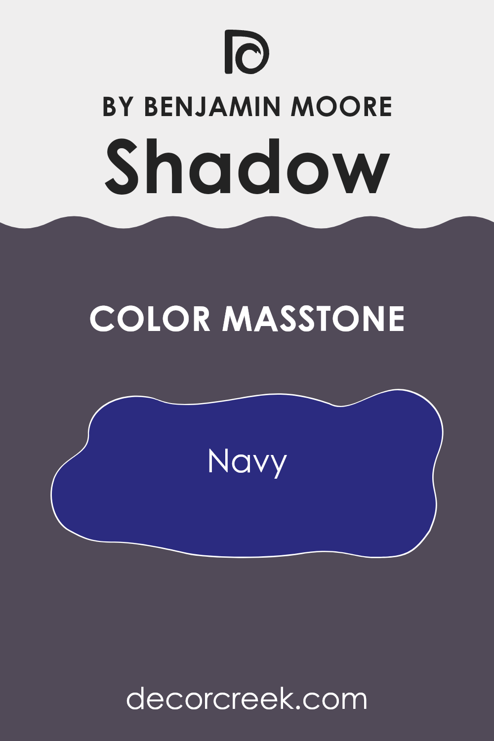
Shadow 2117-30 by Benjamin Moore is a rich, deep navy blue with a masstone of Navy (#2B2B80). This color is bold and stable, making it a popular choice for home interiors. When used on walls, it brings a sense of strength and depth to the area. This navy shade works exceptionally well in large rooms or areas with ample natural light, as its depth can make smaller rooms feel a bit tighter.
However, when paired with bright whites or light grays, it helps in creating a striking contrast that can make smaller areas appear more defined and interesting.
In addition to walls, Shadow 2117-30 is also great for accent features such as cabinets or furniture pieces, injecting a dash of drama and interest. This color not only adds visual weight but also has a comforting quality, making areas feel secure and grounded. Because of its boldness, it pairs beautifully with various color schemes, including neutrals, pastels, or vibrant hues, allowing for adaptable design options in a home setting.
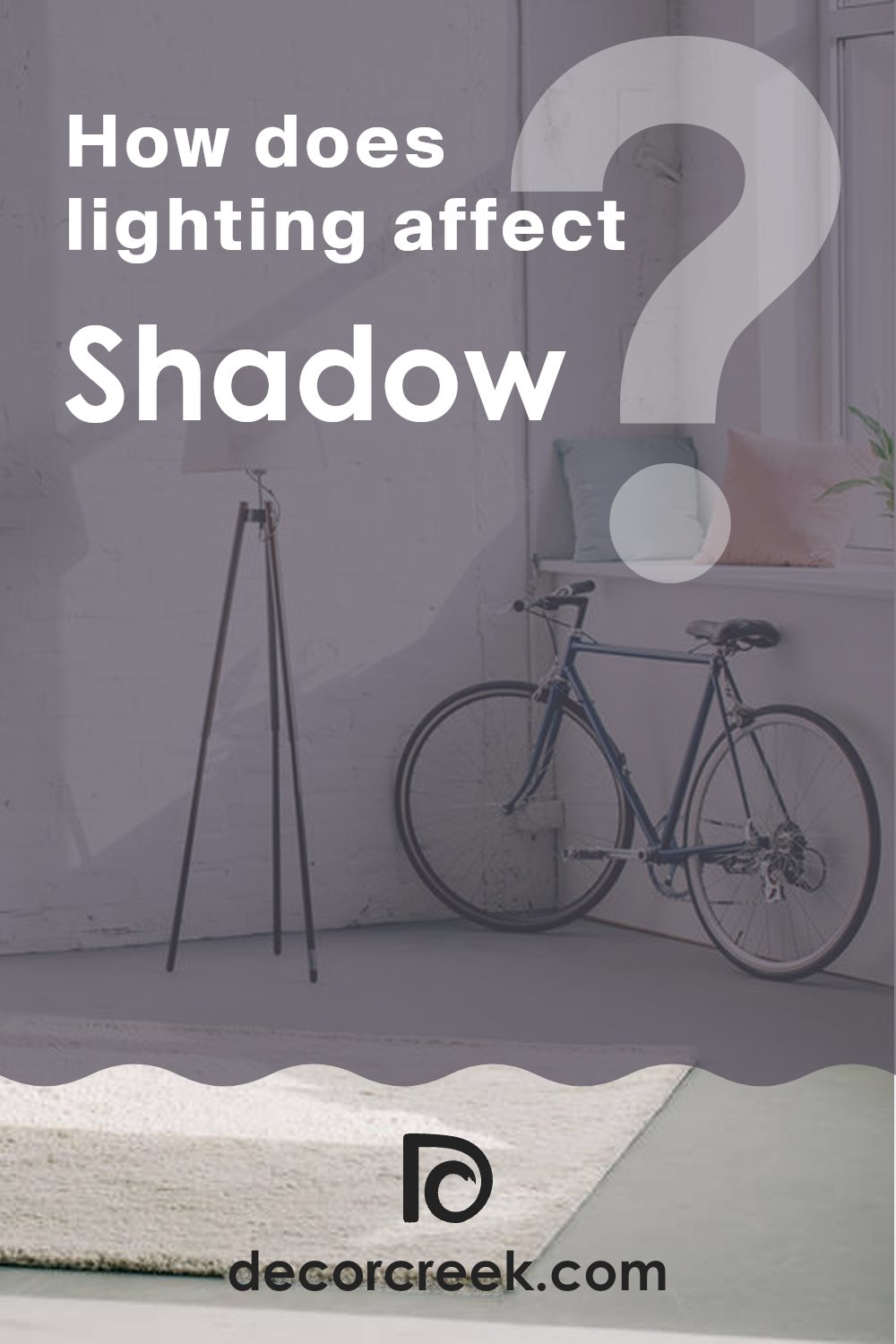
How Does Lighting Affect Shadow 2117-30 by Benjamin Moore?
Lighting can significantly impact how colors appear in a room. The way colors react under different light sources can affect the mood and style of an area. Whether it’s natural sunlight or various types of artificial lights, different lighting conditions can change how a color looks.
Taking the color Shadow2117-30 by Benjamin Moore as an example, let’s consider how it behaves in different lighting scenarios. This particular shade is a deep, rich gray that can appear almost charcoal or softly black depending on the light.
In artificial light, Shadow2117-30’s true depth comes out, especially under warm, incandescent bulbs. These lights tend to enhance the warmth in the color, making the room feel cozy and enclosed. Under cooler LED lights, however, the color can appear slightly lighter and more straightforward gray without as much warmth.
Natural light has a distinct effect on Shadow2117-30. In a room facing north, which generally receives cooler, more consistent light, this color can seem more uniform and subtly refined throughout the day. The cooler light emphasizes the gray aspects, making it a steady and stable backdrop for any room.
In south-facing rooms, where light is warmest and brightest throughout the day, Shadow2117-30 absorbs light and can look dramatically darker. This effect can make a room feel more intimate during the brightest hours.
East-facing rooms receive bright light in the morning, which can make this color look vibrant and lively when illuminated by sunrise. However, as the day progresses and the natural light fades, the color will return to its deeper, darker shade.
West-facing rooms experience the opposite effect. Shadow2117-30 may appear more muted during the morning and become richer and fuller under the intense evening light. This play of light can add a dynamic quality to the area as the color shifts throughout the day.
In conclusion, the appearance of the color Shadow2117-30 can vary significantly based on the direction of your room and the lighting conditions, altering the atmosphere and the feeling it brings to an area.
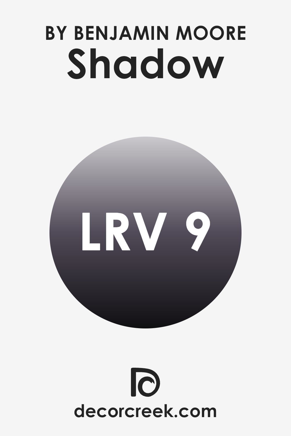
What is the LRV of Shadow 2117-30 by Benjamin Moore?
LRV stands for Light Reflectance Value, which is a scale indicating how much light a color reflects. This value can range anywhere from 1 to 99, where higher numbers mean the color reflects more light. Understanding the LRV of paint is crucial because it helps you decide how a color will look in a certain area.
A high LRV paint will make a room feel brighter since it reflects more light, while a lower LRV paint absorbs more light, making the area appear darker. With an LRV of 9.3, Shadow2117-30 by Benjamin Moore is a dark shade. This means that it will absorb more light than it reflects, creating a noticeably darker ambiance in any room it is used in.
If you are considering this color for an area, it’s ideal for areas where a darker, cozy appearance is desired. However, this low LRV means that you might need to use more lighting in the room to brighten it up if it feels too dark. This particular shade can make small rooms feel smaller or more intimate, which can be perfect for creating a cozy corner or accent walls that stand out.
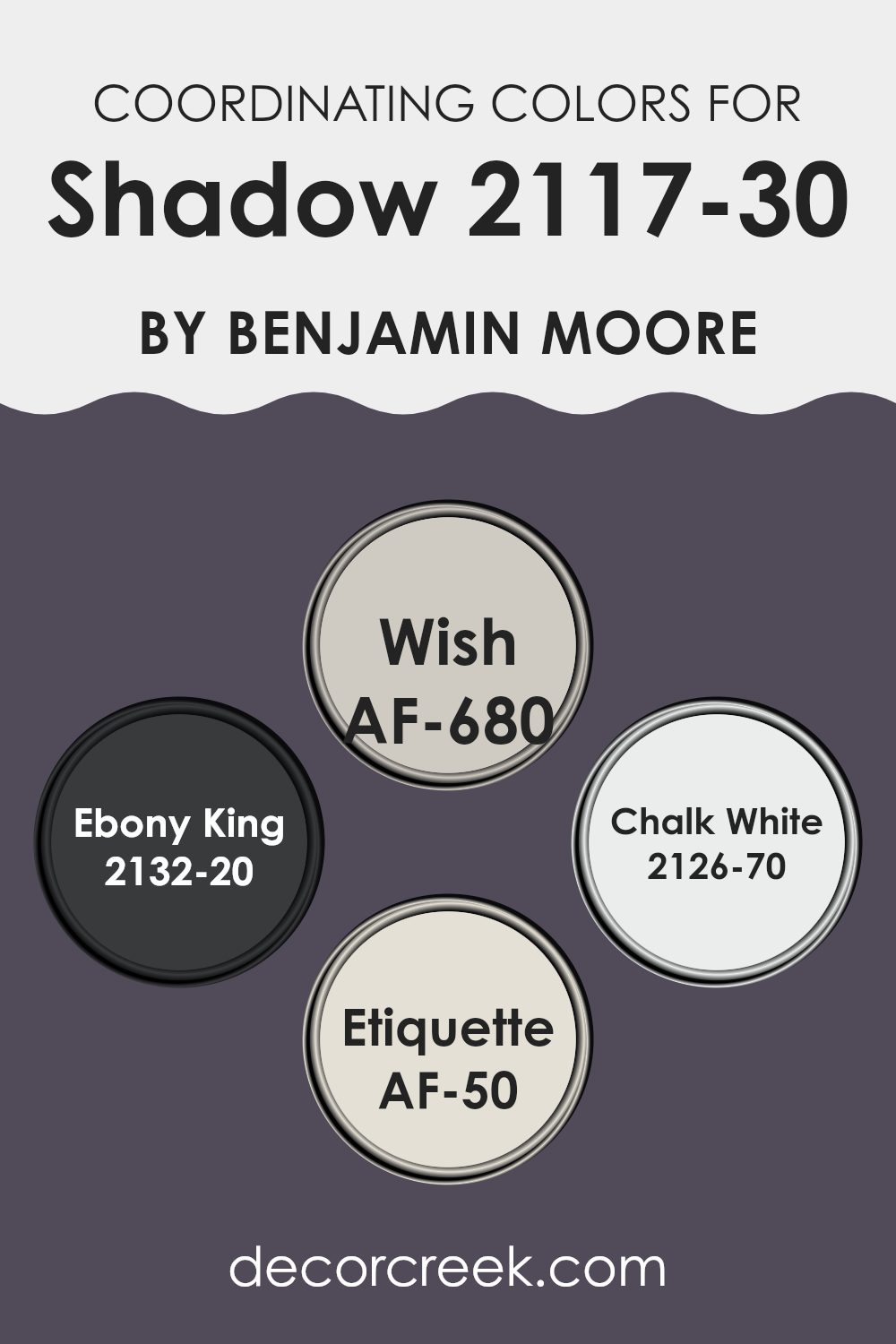
Coordinating Colors of Shadow 2117-30 by Benjamin Moore
Coordinating colors are selected to provide visual harmony in an area by complementing or contrasting in a way that is visually appealing. Shadow2117-30 by Benjamin Moore might have its distinct character, but when paired with colors like AF-680 – Wish, 2132-20 – Ebony King, 2126-70 – Chalk White, and AF-50 – Etiquette, it can produce a balanced and unified look. This practice helps to balance out a room’s aesthetics and mood by ensuring that colors support each other rather than clash.
AF-680 – Wish is a subtle and gentle gray that offers a light and airy feel, making it a fantastic neutral base that can pair well with deeper or vibrant tones. Then there’s 2132-20 – Ebony King, a deep, intense black that provides a strong statement and can be used effectively to add depth and focus in a room.
On the lighter side, 2126-70 – Chalk White is a crisp and clean white that acts as a refreshing contrast, brightening areas and giving a sense of freshness. Lastly, AF-50 – Etiquette, a soft, muted gray, acts as an adaptable backdrop that can easily blend with both neutral schemes and more dynamic decors. Combining these colors can create a cohesive palette that enhances the overall aesthetics of any area they inhabit.
You can see recommended paint colors below:
- AF-680 Wish
- 2132-20 Ebony King
- 2126-70 Chalk White
- AF-50 Etiquette
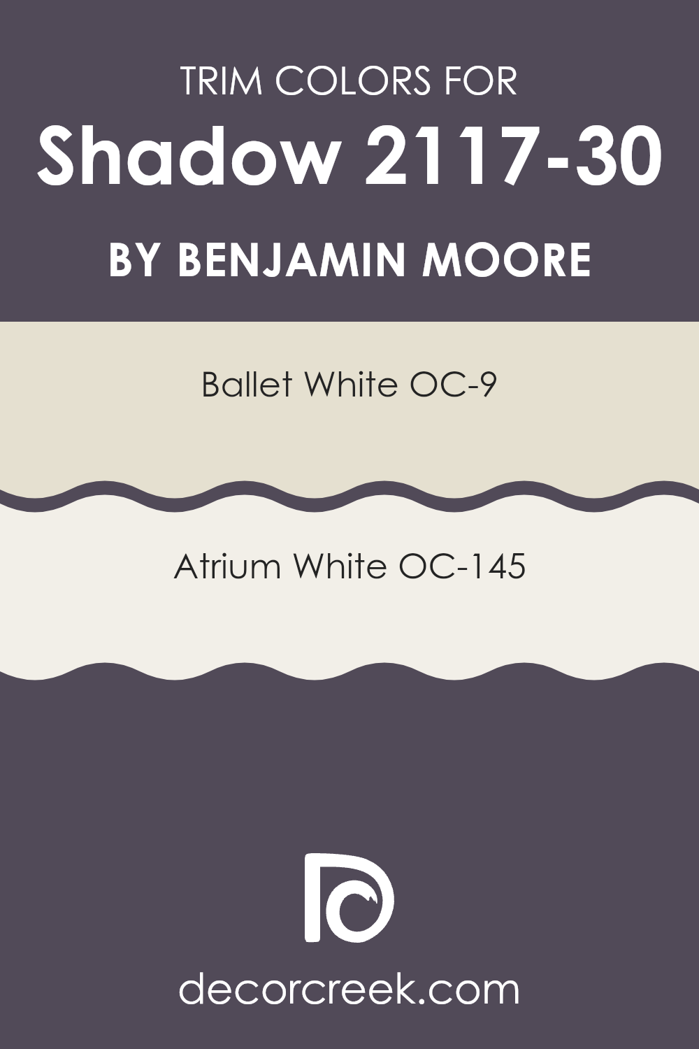
What are the Trim colors of Shadow 2117-30 by Benjamin Moore?
Trim colors are specific shades used on the architectural elements like door frames, moldings, and window trims to accentuate or complement the main colors of the walls. When using a distinct hue like Shadow 2117-30 by Benjamin Moore, the choice of trim colors can significantly influence the overall aesthetic and feel of the area.
OC-9 Ballet White and OC-145 Atrium White are excellent choices for trim, providing a clean and crisp boundary that enhances the depth and contrast against darker wall colors. OC-9 Ballet White is a soft, creamy white that offers a subtle warmth, making it an ideal contrast to the cooler, bold tone of Shadow 2117-30.
It softly highlights the trim details without competing with the primary color. On the other hand, OC-145 Atrium White has a brighter and more neutral undertone, which provides a sharper distinction against darker shades, ensuring that the architectural features stand out more prominently. Using either of these colors as trim can help define the area and polish the overall look of the room, maintaining harmony while providing an appealing contrast.
You can see recommended paint colors below:
Colors Similar to Shadow 2117-30 by Benjamin Moore
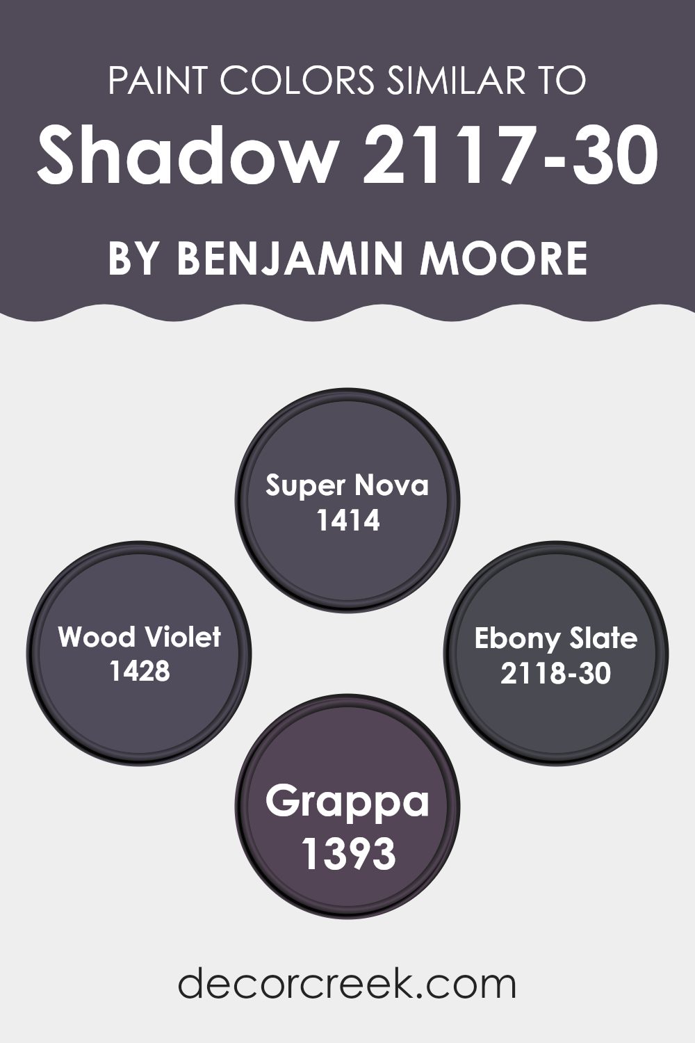
Similar colors are pivotal in creating a harmonious and aesthetic atmosphere in any area as they share common undertones that blend effortlessly with one another. Using similar colors, such as the rich and deep Benjamin Moore shades like Super Nova, Wood Violet, Ebony Slate, and Grappa, can lead to a visually cohesive environment that is pleasant and continuous.
By strategically incorporating colors that naturally pair well, homeowners can achieve a balanced look that is both comfortable and pleasing to the eye. Super Nova is a bright and bold color that adds a hint of liveliness to any room. On the other hand, Wood Violet offers a more muted, but still vibrant, purple hue that complements areas looking for a touch of playfulness without overpowering the senses.
Ebony Slate is a strong, almost black shade that provides a grounding effect, perfect for creating a dramatic statement. Meanwhile, Grappa presents a unique bluish-purple tone that looks subtle yet distinguished, making it ideal for adding depth to areas needing a touch of refinement. Together, these colors form a palette that allows for creative freedom while ensuring the decor looks unified and thoughtfully designed.
You can see recommended paint colors below:
- 1414 Super Nova
- 1428 Wood Violet
- 2118-30 Ebony Slate
- 1393 Grappa
Colors that Go With Shadow 2117-30 by Benjamin Moore
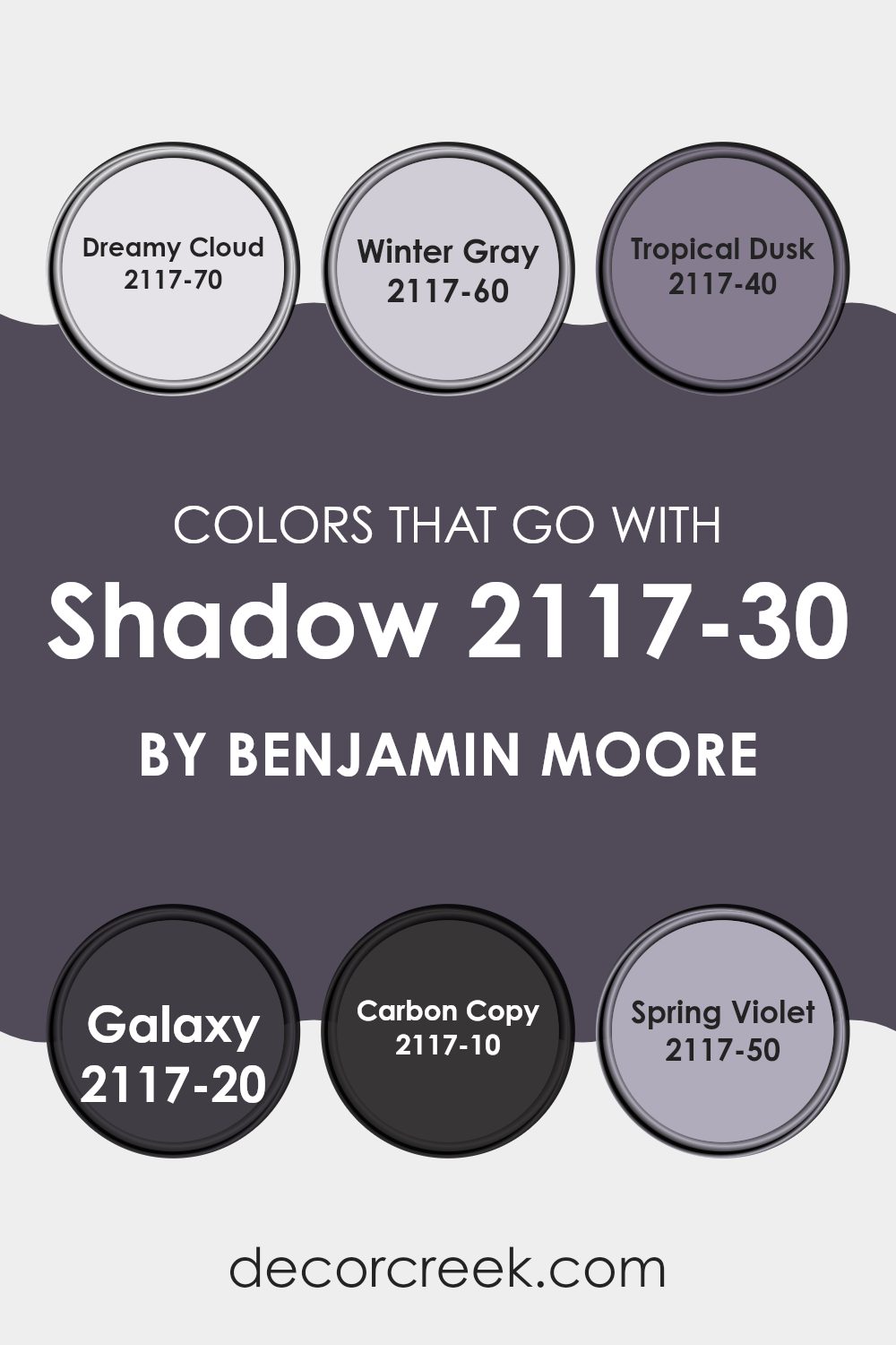
Choosing the right complementary colors to pair with Shadow 2117-30 by Benjamin Moore is crucial in achieving a harmonious and appealing look in your area. The shades that blend well with Shadow, such as Dreamy Cloud, Winter Gray, Tropical Dusk, Galaxy, Carbon Copy, and Spring Violet, each bring their unique tones that enhance the deep richness of Shadow. These coordinated colors make it easier to design a room with a balanced and cohesive aesthetic while allowing each color to stand out in its own right.
Dreamy Cloud is a gentle off-white that provides a soft contrast to the deeper Shadow, giving a light and airy feel to any room. It dresses up the walls in a subtle way without overpowering the main hue. Winter Gray is a calming, mid-tone gray that pairs smoothly with Shadow, supporting the primary color without competing for attention.
For a more vibrant option, Tropical Dusk offers a slight purple hue, adding a touch of unexpected color that’s both inviting and warm. Galaxy is a darker, more intense blue that aligns closely to Shadow for those who prefer depth and a bit of mystery in their palette. Carbon Copy is nearly as dark as Shadow but with a charcoal essence, perfect for creating a dramatic and cohesive area. Lastly, Spring Violet introduces a soft pastel purple that brightens areas innovatively and gently. Together, these colors work in concert to create a visually engaging environment that is delightful to live in.
You can see recommended paint colors below:
- 2117-70 Dreamy Cloud
- 2117-60 Winter Gray
- 2117-40 Tropical Dusk
- 2117-20 Galaxy
- 2117-10 Carbon Copy
- 2117-50 Spring Violet
How to Use Shadow 2117-30 by Benjamin Moore In Your Home?
Shadow 2117-30 by Benjamin Moore is a deep, rich purple that can add a unique touch to any room. Its intensity works well if you want to create a cozy, inviting atmosphere. For example, it’s perfect for a bedroom wall behind a bed to serve as a dramatic focal point, or you could paint a reading nook to make it feel more secluded and cozy.
You can also use this color in your living room on one wall to add depth and interest to the area. Shadow pairs beautifully with lighter shades like creams or soft grays, which can help balance its depth. Furnishings in natural wood or metallic tones also look great against this dark backdrop.
In smaller doses, such as on a front door or a piece of furniture, Shadow 2117-30 adds a splash of mystery and charm without overshadowing the area. It’s an adaptable paint color that can be used in many ways to make your home feel warm and welcoming.
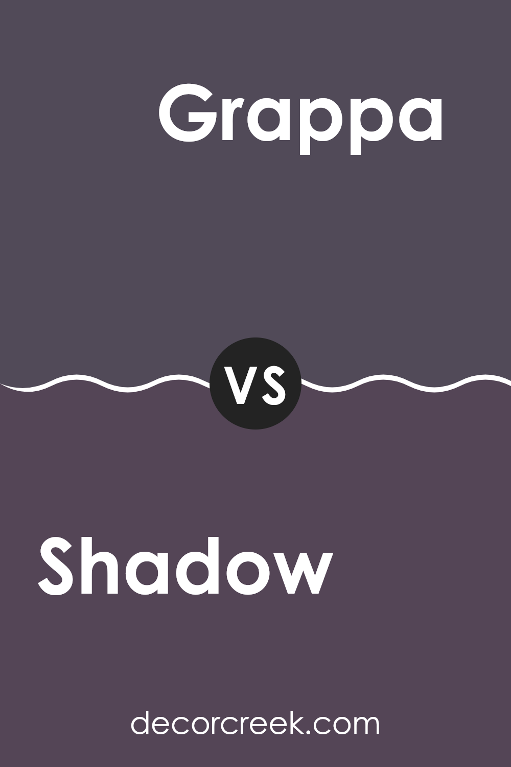
Shadow 2117-30 by Benjamin Moore vs Grappa 1393 by Benjamin Moore
Shadow 2117-30 by Benjamin Moore is a deep, rich purple with a dramatic flair. It creates a bold statement and works well in areas designed for creativity and impact. On the other hand, Grappa 1393 is a lighter, more subtle purple.
It leans towards a softer, more delicate vibe, which makes it great for achieving a gentle and inviting atmosphere in a room. While Shadow sets a powerful, intense mood, Grappa offers a softer, more relaxed feel.
Both colors belong to the purple family but serve different purposes in interior design due to their contrasting intensities and undertones. Shadow is the choice if you want depth and prominence, whereas Grappa is ideal for a softer, lighter touch.
You can see recommended paint color below:
- 1393 Grappa
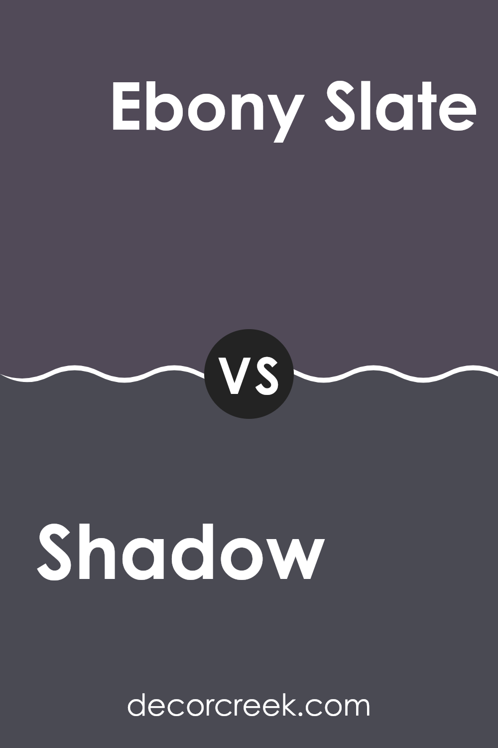
Shadow 2117-30 by Benjamin Moore vs Ebony Slate 2118-30 by Benjamin Moore
Shadow and Ebony Slate by Benjamin Moore are both dark hues, but they have distinct tones that set them apart. Shadow presents as a deep, rich purple with a noticeable warmth that gives it a cozy feel. It’s perfect for creating an intimate atmosphere in areas like dens or bedrooms.
On the other hand, Ebony Slate leans more towards a charcoal color with subtle blue undertones, making it cooler in appearance. This color is excellent for giving areas a modern and sharp look, suitable for areas such as home offices or contemporary living rooms.
Both these shades are great for making bold statements and can help to highlight other elements in the room, such as furniture or artwork, though Shadow might offer a slightly warmer, more welcoming vibe, while Ebony Slate provides a crisp, clean backdrop.
You can see recommended paint color below:
- 2118-30 Ebony Slate
Shadow 2117-30 by Benjamin Moore vs Wood Violet 1428 by Benjamin Moore
Shadow 2117-30 by Benjamin Moore stands out as a dramatic and deep shade of purple, providing a bold statement wherever it is used. It tends to absorb light, making it an excellent choice for creating a cozy and warm atmosphere in areas such as a bedroom or a snug area in a home. The depth of this color can make smaller rooms feel smaller, yet enrich larger areas with a sense of profound luxury.
On the other hand, Wood Violet 1428, also by Benjamin Moore, is a lighter, softer purple. This color reflects more light, making it a great option for brightening up an area while still adding a touch of color. It works well in various settings, bringing a pleasant and airy feel without overpowering the senses.
When comparing the two, Shadow is much more intense and can dramatically change an area, whereas Wood Violet is gentler and adaptable for different locations, making areas feel open and light.
You can see recommended paint color below:
- 1428 Wood Violet
Shadow 2117-30 by Benjamin Moore vs Super Nova 1414 by Benjamin Moore
Shadow is a deep, rich charcoal hue that feels bold and dramatic. This color works well in areas where you want to make a statement, such as living rooms or dining areas. It pairs nicely with bright whites or metallic finishes, which can add a sharp contrast and enhance the boldness of the shade.
Super Nova, on the other hand, is a light, soft gray that gives off a more subtle and calming effect. It’s an adaptable color that fits well in many parts of a home, including bedrooms, kitchens, and bathrooms. This color works great with softer hues, providing a clean and airy feel to any area.
Comparing these two, Shadow offers a more striking and assertive vibe, while Super Nova brings a lightness and gentleness, making it easier to use across larger areas or in areas aiming for a relaxed atmosphere. Both colors support various decor styles, but their impact is distinctly different – Shadow is eye-catching, while Super Nova maintains a low profile.
You can see recommended paint color below:
In wrapping up my thoughts on the “2117-30 Shadow by Benjamin Moore” paint, I’ve found that it’s really an interesting color. It’s kind of like a deep purple that can look almost black sometimes. This color is unique and can make any area look more stylish and well thought-out. It’s perfect for someone wanting to add a bit of mystery or drama to their area without making it too dark.
I learned that depending on where you put it and the kind of lighting you have, Shadow can change how it looks. In some lights, it might look more purple, and in others, it could lean towards black. That makes it really fun because it’s like having two colors in one depending on the time of day!
Overall, using “2117-30 Shadow” can be a great choice if you want to make an area feel special and interesting. It works well in places like a cozy reading nook or even a bold living room. I would suggest anyone looking for something a little different to give this color a try, seeing how it can really make an area come alive in its own unique way.
decorcreek.com
Ever wished paint sampling was as easy as sticking a sticker? Guess what? Now it is! Discover Samplize's unique Peel & Stick samples.
Get paint samples

