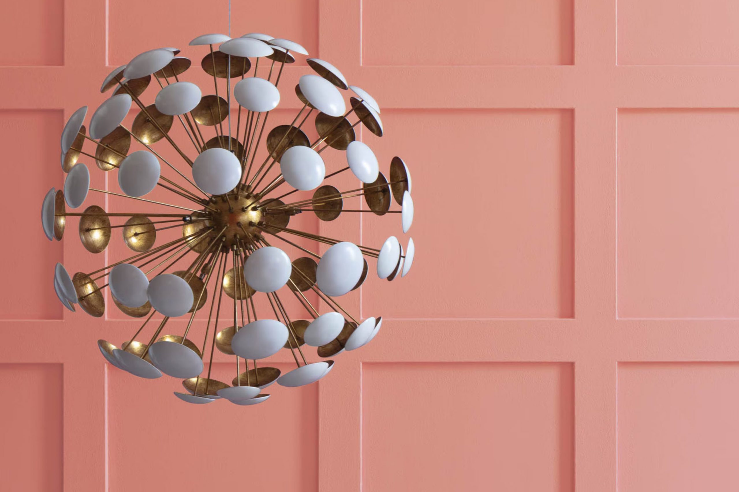
Have you ever stumbled upon a color that subtly whispers elegance? That’s what happened to me with Benjamin Moore’s 2174-40 Dusty Mauve. This paint offers a unique blend of warmth and refinement that can gently uplift any room without feeling too intense.
The soft pinkish-purple hue has a graceful presence, making it a perfect choice if you’re looking to add a hint of color to your room without making too bold a statement. When I first used Dusty Mauve, I was looking for something that would complement natural light well, fitting seamlessly with both modern and traditional decor.
This color did not disappoint. It works wonderfully as a main wall color, and it’s just as effective when used for accent walls or furniture pieces. If you want a color that balances well with a variety of textures and furnishings, you might find Dusty Mauve to be a delightful option.
It’s amazing how it brings a fresh yet subtle vibe to the room.
What Color Is Dusty Mauve 2174-40 by Benjamin Moore?
The color Dusty Mauve by Benjamin Moore is a cozy, inviting shade that mixes hints of purple and gray. This muted hue has a soft and subtle quality that makes it very adaptable for decorating a home. Due to its quiet elegance, it fits particularly well in bedrooms and living rooms where a calming atmosphere is desired.
Dusty Mauve works beautifully in a variety of interior design styles including modern farmhouse, shabby chic, and traditional decor. This color pairs exceptionally well with natural materials such as light wooden furniture, wicker accents, and linen fabrics, which help create a relaxed, airy feel. In rooms with more metal or glass, it can add a touch of warmth, providing balance and softness to modern materials.
For those who favor a coordinated look, this color goes well with creamy whites or deep charcoals. It can also be paired with soft pastels like baby blue or mint green for a gentle contrast. In terms of texture, Dusty Mauve complements rich velvets and fluffy cottons, enhancing the cozy feel of a room. When used on a feature wall, paired with accessories in similar or contrasting shades, this color can really make a room feel welcoming and warm.
Is Dusty Mauve 2174-40 by Benjamin Moore Warm or Cool color?
Dusty Mauve by Benjamin Moore is a soft, gentle color that adds a cozy and warm feel to any room. It’s a type of pink with hints of purple that isn’t too bright, making it a great choice for those who want a stylish yet subtle look.
This color works well in rooms where you want to relax, such as bedrooms and living rooms. It pairs nicely with neutral tones like whites and greys, which helps create a balanced and inviting atmosphere.
In a home setting, Dusty Mauve can also be used in smaller areas like bathrooms or as an accent wall to give a touch of warmth without feeling too intense. It’s particularly useful in rooms with less natural light, as it can help make the room feel more lively and cozy. Overall, Dusty Mauve is adaptable and can fit well with many decor styles, whether you’re aiming for a modern look or something more traditional.
Undertones of Dusty Mauve 2174-40 by Benjamin Moore
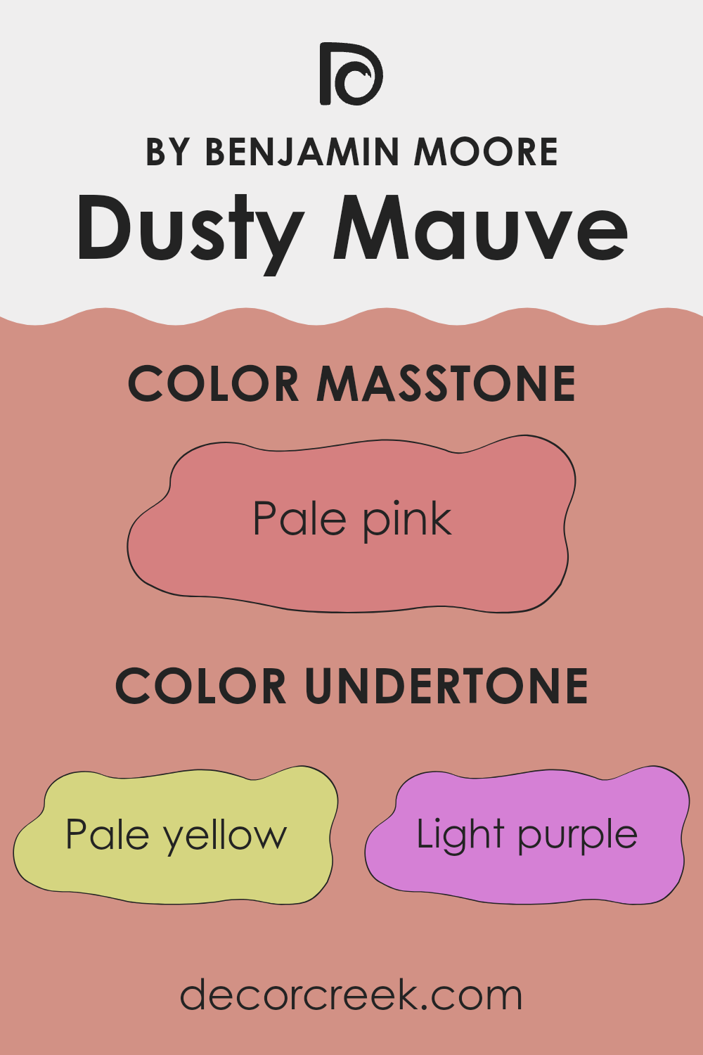
Dusty Mauve is a nuanced paint color that carries a blend of subtle tones which influence its overall appearance in different lighting conditions. By understanding its undertones, we can better predict how the color will behave on the walls of a home.
This particular shade has a variety of undertones, including pale yellow, light purple, grey, and more. Each undertone plays a critical role in the color’s perception. For instance, the pale yellow and light purple undertones add a soft warmth and gentle depth, respectively. This makes the color adaptable in its use, suitable for rooms meant for relaxation or gentle activity.
In an interior setting, these undertones interact with both natural and artificial light, potentially shifting the appearance of Dusty Mauve through different times of the day. The grey and light gray contribute to its stability, ensuring that the color doesn’t lean too heavily toward a bright or overpowering tone. This helps maintain a calming backdrop that doesn’t clash with other elements in the room.
Additionally, the inclusion of more vibrant undertones like orange, pink, and fuchsia provides a hidden richness that can be quite striking when highlighted by certain lighting, adding an unexpected flair to a room without feeling too loud.
When applied to walls, Dusty Mauve creates a dynamic yet harmonious look. It can complement various decor styles and works particularly well in rooms like living rooms or bedrooms where a calm and welcoming atmosphere is desirable. Its complex undertone mixture ensures that it offers something unique, subtly enhancing the room and interacting in an interesting way with different furnishings and interior details.
decorcreek.com
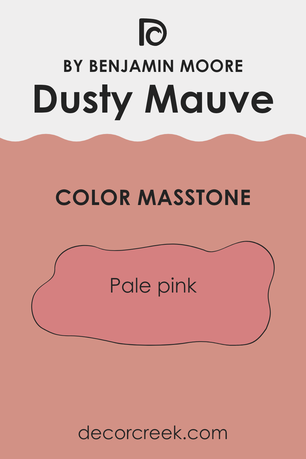
What is the Masstone of the Dusty Mauve 2174-40 by Benjamin Moore?
Dusty Mauve (2174-40) by Benjamin Moore has a masstone of pale pink, identified by the color code #D58080. This shade is light and subtly vibrant, making it a great choice for adding a soft, warm touch to any room without feeling too intense.
This particular tone of pink is gentle and calming, making rooms feel welcoming and cozy. It’s especially effective in bedrooms and living areas where you want to create a calm and inviting atmosphere. Additionally, this color pairs well with neutral tones like whites or grays, as well as richer hues such as deep greens or blues, offering flexible design possibilities.
Its quiet presence means it works well in different lighting conditions, maintaining its beauty whether bathed in natural sunlight or under artificial lights. This makes it adaptable and appealing for many homes, enhancing rooms with its subtle charm and warmth.
How Does Lighting Affect Dusty Mauve 2174-40 by Benjamin Moore?
Lighting plays a significant role in how colors appear in a room. Different types of light can enhance or alter the perception of color, influencing mood and aesthetics. The color dusty mauve by Benjamin Moore is a perfect example to discuss how light affects color perception.
In artificial light, dusty mauve may appear warmer and richer. Artificial lights, especially those with a yellow or warm tone, can add a cozy and welcoming feel to this shade. This slightly pinkish-purple hue can turn more into a muted rose under warm indoor lighting, making rooms feel intimate and comfortable.
In natural light, the true colors come alive, and dusty mauve displays its full charm. Under bright, clear daylight, this color can look more vibrant and lively, with its subtle gray undertones balancing its warmth. The quality of natural light, however, changes with the direction of the room and the time of day.
In north-facing rooms, light is cooler and more consistent throughout the day. Here, dusty mauve may appear more muted and subtle, with its gray tones becoming prominent, giving a calm and soft appearance.
South-facing rooms enjoy abundant light for most of the day, which can make dusty mauve look brighter and more lively. Its warmer undertones are enhanced in this lighting, making the room feel lighter and more energetic.
East-facing rooms get most of their light in the morning when the light is golden and warm. In the morning, dusty mauve will look soft and warm, potentially shifting toward a cooler, more neutral tone as the day progresses into the evening and the natural light diminishes.
West-facing rooms receive intense evening light, which can make dusty mauve glow warmly in the late afternoon and evening, enhancing the richness of the color, while appearing more subdued in the morning light.
Each direction and type of light can give dusty mauve a different character, making it an adaptable choice that can adjust to various lighting conditions in home decor.
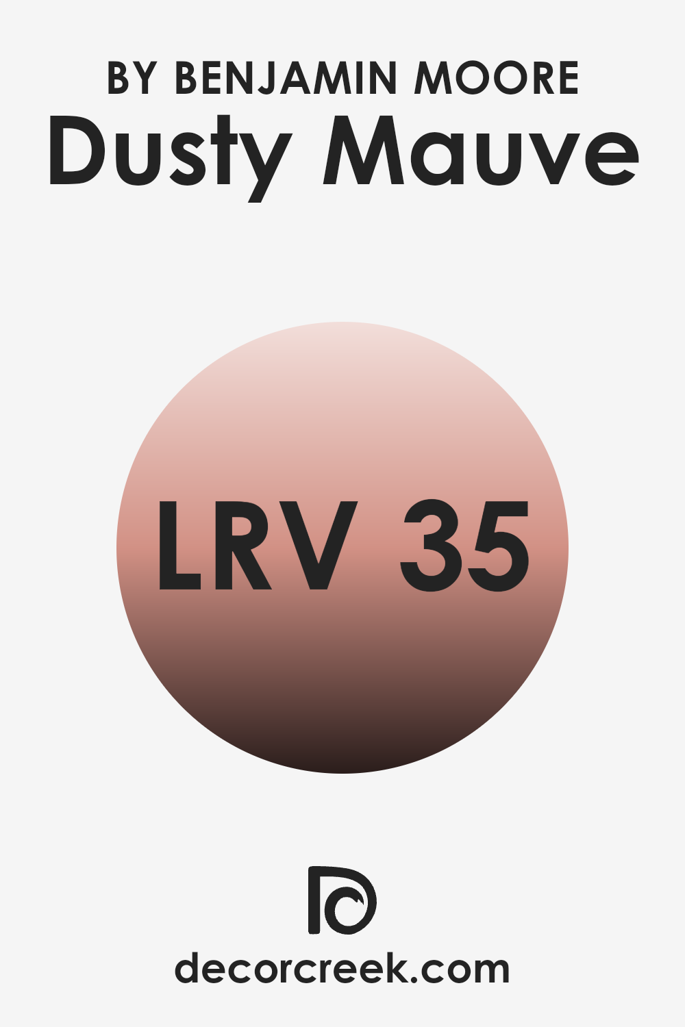
What is the LRV of Dusty Mauve 2174-40 by Benjamin Moore?
Light Reflectance Value (LRV) is a measure used to express how much light a paint color reflects or absorbs. A higher LRV means the color reflects more light, making it appear brighter and opening up a room, while a lower LRV means the color absorbs more light, which can make a room feel cozier but smaller.
This value is particularly helpful when choosing paint colors for your home, as it can help you understand how the color will influence the feeling and the lighting in a room.
The LRV of Dusty Mauve is 35.07, which places it closer to the middle but leaning toward the darker end of the scale. With this LRV, Dusty Mauve is moderately reflective and won’t make a room feel overly bright or expansive. However, it also means that the color can add depth and warmth to a room, making it feel intimate and comfortable. In rooms with limited natural light, this color might appear slightly darker, whereas in well-lit rooms, its true color will be more evident.
This balance allows it to work well in different lighting conditions without feeling too intense.
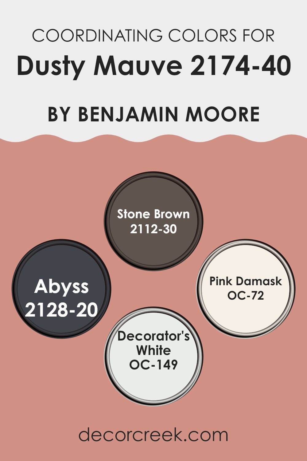
Coordinating Colors of Dusty Mauve 2174-40 by Benjamin Moore
Coordinating colors are those that harmonize well together in design, helping to create a cohesive look in any room. When using a specific color like Dusty Mauve by Benjamin Moore, coordinating colors are chosen to complement its tone and enhance the overall aesthetic of a room. These complementary colors can be used for accents, trims, or even as dominant secondary colors within a palette, allowing for a balanced and pleasing visual experience.
Among the coordinating colors for Dusty Mauve, Stone Brown presents a rich, deep brown hue that grounds the softer mauve with a sense of robustness. This color is great for furniture or accent walls, providing a strong contrast. Abyss is a dark, almost black shade that adds drama and depth, perfect for highlighting key features or for dramatic furnishings.
On the lighter side, Pink Damask offers a soft, pale pink that echoes the subtlety of Dusty Mauve, ideal for creating a gentle, cohesive flow in rooms seeking a touch of softness. Lastly, Decorator’s White is a clean, crisp white that offers a fresh contrast, making it excellent for trim or ceilings to give a sharp, clean finish to a room setup. Together, these colors work with Dusty Mauve to achieve a well-rounded and inviting room.
You can see recommended paint colors below:
- 2112-30 Stone Brown
- 2128-20 Abyss
- OC-72 Pink Damask
- OC-149 Decorator’s White
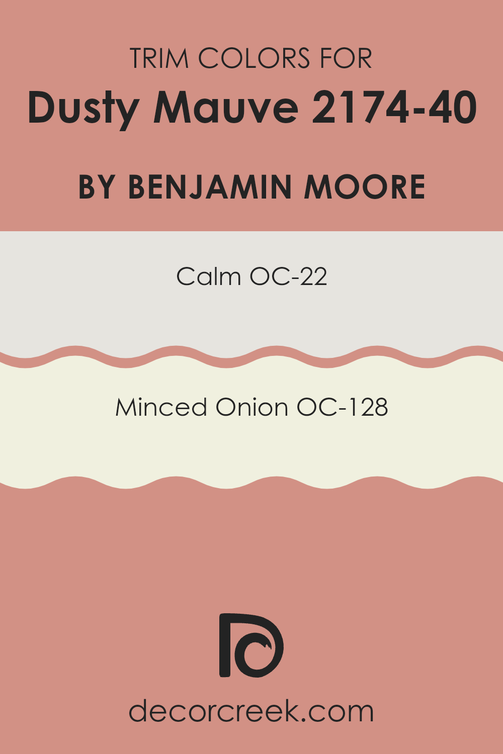
What are the Trim colors of Dusty Mauve 2174-40 by Benjamin Moore?
Trim colors are specific shades used to accentuate or complement the main color on walls, typically applied to window frames, doors, baseboards, and other moldings. Choosing the right trim color can greatly affect the overall aesthetic and mood of a room. For instance, the soft beauty of Dusty Mauve by Benjamin Moore can be enhanced by carefully selected trim colors that add contrast without feeling too intense.
Using OC-22 – Calm, a light and gentle gray, as a trim color provides a subtle contrast that highlights the warmer tones of Dusty Mauve without creating a stark difference. This pairing can make the room feel well-coordinated and attractive.
Alternatively, OC-128 – Minced Onion offers a slightly warmer and deeper gray tone that serves as a beautiful frame for Dusty Mauve, enriching its depth and adding to the visual interest of the room. Both colors support the main hue without competing for attention, ensuring a harmonious palette.
You can see recommended paint colors below:
- OC-22 Calm
- OC-128 Minced Onion
Colors Similar to Dusty Mauve 2174-40 by Benjamin Moore
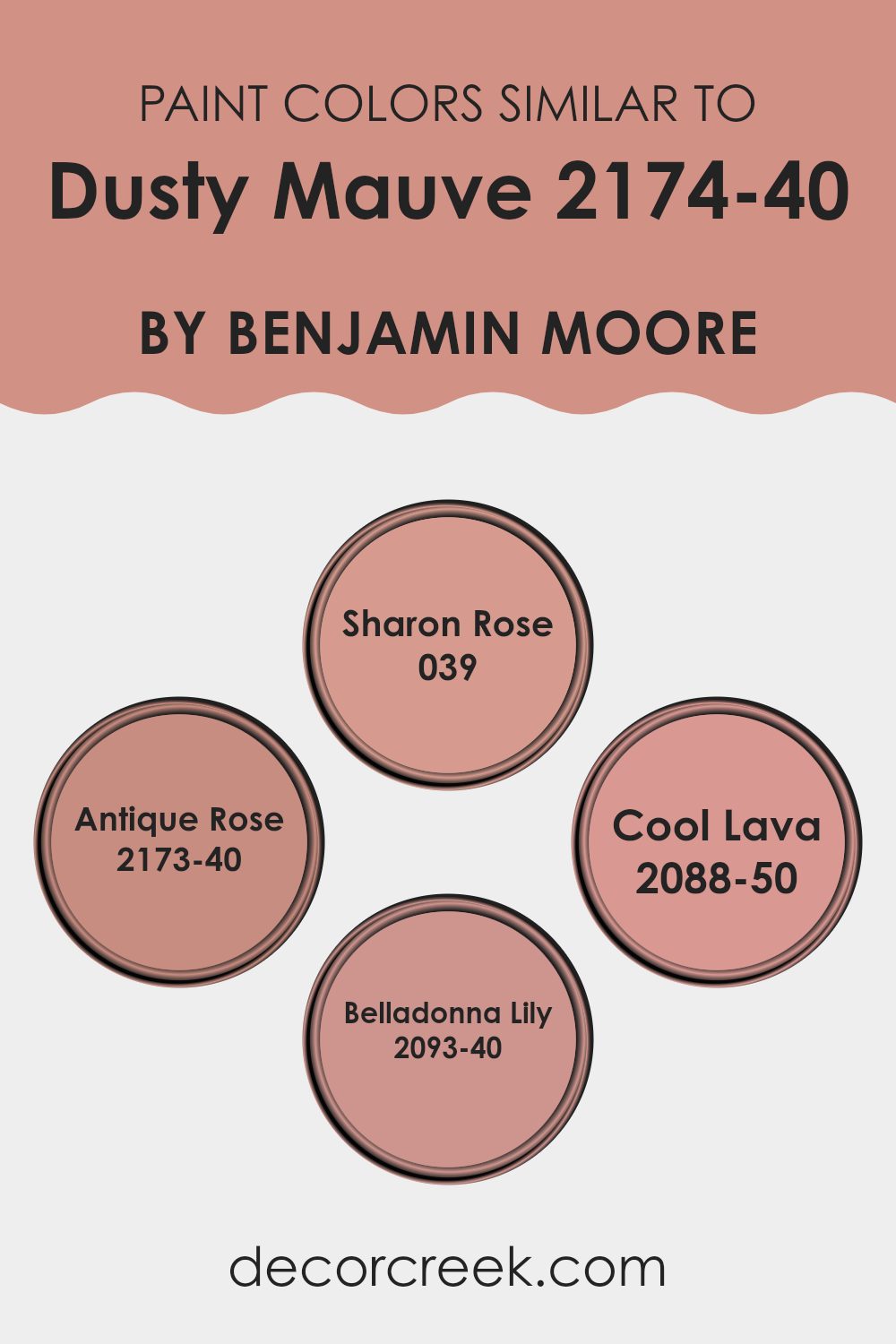
Choosing similar colors when designing a room is important because it can create a smooth and harmonious look. When colors like Dusty Mauve, Sharon Rose, Antique Rose, Cool Lava, and Belladonna Lily are used together, they create a soft transition from one shade to another, which can make a room feel cohesive and pleasing. Similar colors, like these, work together to provide a feeling of balance without sharp contrasts that might clash or feel visually jarring. This can be particularly effective in rooms where you want a calming atmosphere or a unified aesthetic.
Sharon Rose and Antique Rose are subtly different shades of pink that offer a gentle complement to the slightly deeper Dusty Mauve. While Sharon Rose has a soft, almost peachy blush tone, Antique Rose appears as a slightly deeper pink that leans toward a muted vintage feel.
Moving slightly away from pink shades, Cool Lava introduces a touch of gentle red with undertones reminiscent of a light raspberry, adding a mild yet enriching variation to the palette. Lastly, Belladonna Lily stands out with its slightly purplish pink hue that provides a unique twist, ensuring the color scheme has a touch of gentle whimsy without feeling too intense. Together, these colors provide a rich tapestry of hues that can create a lovely, nuanced environment.
You can see recommended paint colors below:
- 039 Sharon Rose
- 2173-40 Antique Rose
- 2088-50 Cool Lava
- 2093-40 Belladonna Lily
Colors that Go With Dusty Mauve 2174-40 by Benjamin Moore
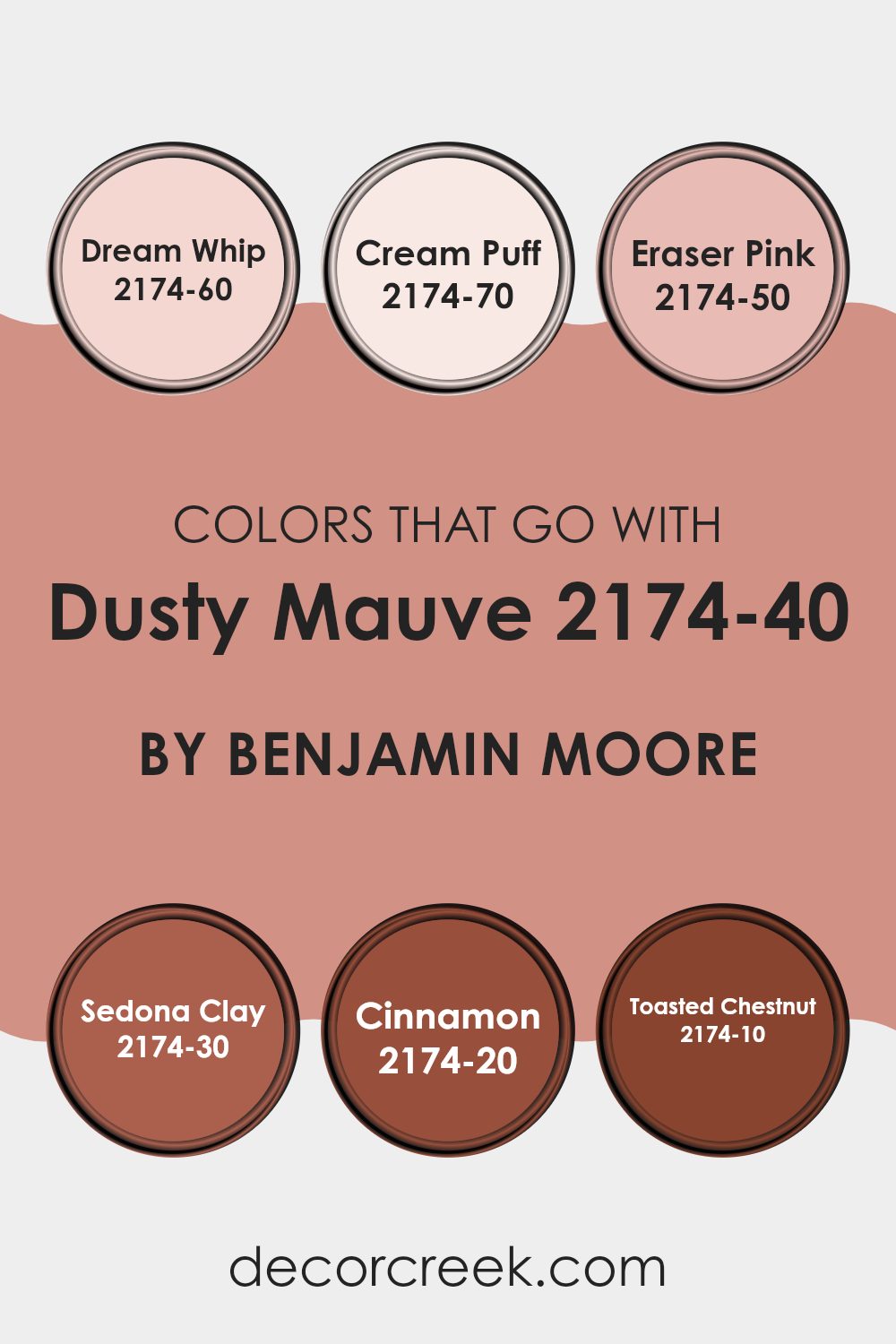
Dusty Mauve 2174-40 by Benjamin Moore is a unique shade that requires carefully chosen complementary colors to enhance its visual impact in any room. Selecting the right colors that harmonize with Dusty Mauve can create a cohesive look that feels balanced and pleasing to the eye. Colors like Dream Whip, Cream Puff, Eraser Pink, Sedona Clay, Cinnamon, and Toasted Chestnut are ideal as they each bring their own character while supporting the primary hue.
Dream Whip is a gentle off-white with a subtle hint of pink that softens the intensity of Dusty Mauve, making it perfect for creating a light and airy feel in a room. Cream Puff is even lighter, providing a creamy backdrop that allows the mauve to stand out without feeling too intense. Eraser Pink, a slightly brighter pink, injects a playful energy that refreshes the surroundings when paired with Dusty Mauve.
On the warmer side, Sedona Clay offers a rich, earthy contrast that grounds the mauve, ideal for a cozy, inviting atmosphere. Cinnamon is a deep, warm spice color that adds a sense of warmth and richness, pairing beautifully with the cooler tones of the mauve. Lastly, Toasted Chestnut is a robust, dark shade that draws out the depth of Dusty Mauve, perfect for creating a striking and appealing environment. Together, these colors work seamlessly to enhance the beauty of Dusty Mauve, making any room look well-thought-out and harmoniously designed.
You can see recommended paint colors below:
- 2174-60 Dream Whip
- 2174-70 Cream Puff
- 2174-50 Eraser Pink
- 2174-30 Sedona Clay
- 2174-20 Cinnamon
- 2174-10 Toasted Chestnut
How to Use Dusty Mauve 2174-40 by Benjamin Moore In Your Home?
Dusty Mauve 2174-40 by Benjamin Moore is a soft, muted pink shade that brings a cozy and warm feel to any room. This color is adaptable and works well in rooms like living rooms, bedrooms, or even bathrooms. It pairs beautifully with neutral colors like whites, greys, and beiges, creating a gentle, inviting atmosphere.
For those looking to refresh their home, Dusty Mauve is ideal for feature walls. It can provide a pop of gentle color without feeling too intense. When used in a bedroom, it offers a calming backdrop, perfect for relaxing after a long day. In living areas, pairing this paint with soft furnishings and natural materials, like wooden furniture or wicker baskets, can really tie the room together.
Moreover, Dusty Mauve can be a lovely choice for painting cabinets or shelves, giving your kitchen or study area a light, bright makeover. Because of its subtle nature, it’s a color you won’t quickly grow tired of, keeping your home looking fresh and cozy for a long time.
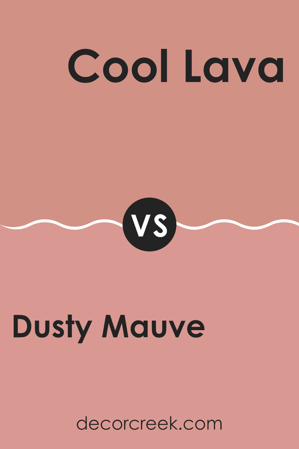
Dusty Mauve 2174-40 by Benjamin Moore vs Cool Lava 2088-50 by Benjamin Moore
Dusty Mauve and Cool Lava are two distinct colors by Benjamin Moore. Dusty Mauve is a soft, subtle shade that blends grey and pink tones, creating a warm and cozy feel in a room. This color gives off a gentle and welcoming vibe, making it ideal for living rooms aimed at relaxation.
On the other hand, Cool Lava is a vibrant, energetic red with a hint of pink that adds a lively and cheerful touch to any room. It’s much brighter than Dusty Mauve and can bring energy and excitement to an area.
While Dusty Mauve works well in rooms for unwinding, Cool Lava is perfect for areas where activity and enthusiasm are desired. Both colors have their unique appeal, but they cater to different moods and settings within home décor.
You can see recommended paint color below:
- 2088-50 Cool Lava
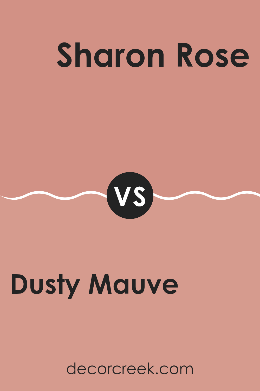
Dusty Mauve 2174-40 by Benjamin Moore vs Sharon Rose 039 by Benjamin Moore
Dusty Mauve by Benjamin Moore is a subtle, muted shade of pink with hints of gray, giving it a soft, understated appearance. This color has a warm and cozy vibe, making it perfect for creating a comforting atmosphere in rooms designed for relaxation, like bedrooms or living areas.
On the other hand, Sharon Rose is a livelier pink with a more pronounced rose tone. It’s brighter and has a youthful energy that makes it stand out more than Dusty Mauve. Sharon Rose works well in rooms where a cheerful, inviting ambiance is desired, such as a child’s room or a family kitchen.
Both colors offer distinct feelings: Dusty Mauve leans toward a gentle, calming presence, while Sharon Rose brings a fresher, more vibrant touch. Depending on the mood you want to set in your room, either shade could be a great choice. Sharon Rose might be more stimulating, while Dusty Mauve could be better for a relaxing retreat.
You can see recommended paint color below:
- 039 Sharon Rose
Dusty Mauve 2174-40 by Benjamin Moore vs Belladonna Lily 2093-40 by Benjamin Moore
Dusty Mauve and Belladonna Lily, both by Benjamin Moore, offer distinct vibes due to their unique color tones. Dusty Mauve presents a soft, muted shade of purple with a greyish tint that gives a subtle and calming effect, making it ideal for rooms where you want a gentle touch of color. It pairs well with natural hues and soft neutrals, providing a cozy, welcoming atmosphere.
In contrast, Belladonna Lily is a vibrant, more saturated shade that leans toward pink with a vivid undertone. This color is bolder and makes more of a statement. It’s perfect for areas where you want to add a splash of brightness and energy, and it stands out beautifully when used for accent walls or in decor accessories.
Overall, choosing between Dusty Mauve and Belladonna Lily hinges on the mood you’re aiming for: understated refinement with Dusty Mauve or dynamic vibrancy with Belladonna Lily. Both colors can beautifully enhance a room’s aesthetic but in remarkably different ways.
You can see recommended paint color below:
- 2093-40 Belladonna Lily

Dusty Mauve 2174-40 by Benjamin Moore vs Antique Rose 2173-40 by Benjamin Moore
Dusty Mauve and Antique Rose by Benjamin Moore are both warm, inviting colors, but they bring distinct vibes to a room due to their different tones. Dusty Mauve has a soft, subtle pink hue that feels cozy and calm.
It’s great for creating a gentle, soothing atmosphere in a room. On the other hand, Antique Rose has a deeper, richer tone, leaning more toward a classic rose color, which gives it a more traditional and slightly more vibrant appearance. This color can add a touch of refined beauty to any area without being too bold.
Both colors work well in a variety of settings, like living rooms or bedrooms, adding a soft, gentle touch to the interior design. When choosing between the two, consider the mood you want to set: Dusty Mauve for a lighter, breezier feel, or Antique Rose for a bit more warmth and traditional charm.
You can see recommended paint color below:
- 2173-40 Antique Rose
After reading a lot about 2174-40 Dusty Mauve by Benjamin Moore, I think it’s a great paint color choice for rooms. This color has a kind, soft feel that can make any room feel cozy and welcoming. It’s not too bright and not too dark, which makes it perfect if you want something that isn’t too bold. Dusty Mauve works well in bedrooms or living rooms because it brings a warm and calm feeling.
I also learned that this color matches well with a lot of different furniture and decorations. Whether you have light colored furniture or something darker, Dusty Mauve will fit right in without clashing. That makes it easy if you ever want to change how your room looks without having to repaint everything.
Overall, I’d say Dusty Mauve is a smart pick if you want a paint color that makes your room feel cozy and cute. It’s good for anyone who likes colors that aren’t too flashy but still add something special to your room. If you’re thinking about changing up your room a bit, it’s a color worth considering.
decorcreek.com
Ever wished paint sampling was as easy as sticking a sticker? Guess what? Now it is! Discover Samplize's unique Peel & Stick samples.
Get paint samples

