The art of interior design often draws heavily on the nuanced use of colors, both in creating focal points and harmonizing elements within a room. Abyss 2128-20 by Benjamin Moore is one such hue that is making waves in the realm of decor.
In this article, we’ll explore the depths of this captivating shade, delving into its undertones, warmth, and the wonders of its transformative powers in different lighting scenarios.

What Color Is Abyss 2128-20?
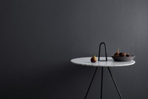
Abyss 2128-20 is a rich, deep shade that holds a blend of charcoal and midnight blue. It evokes the mysterious depth of oceanic trenches, wrapped in shadow and silence. This hue is versatile, fitting seamlessly into contemporary, minimalist, or industrial styles.
The intense depth of Abyss pairs beautifully with sleek metallics, soft velvets, and even rustic wood textures, making it a dynamic choice for those looking to make a bold statement.

Ever wished paint sampling was as easy as sticking a sticker? Guess what? Now it is! Discover Samplize's unique Peel & Stick samples.
Get paint samples

Is It a Warm Or Cool Color?
Despite its intense depth, Abyss 2128-20 leans towards the cool spectrum. Its subtle blue undertones lend it a chilly, calming demeanor. Cool colors, in general, recede in spaces, giving the illusion of expansiveness.
This characteristic of Abyss makes it a brilliant choice for homes seeking to create an illusion of space, depth, or just a tranquil retreat.
Undertones of Abyss 2128-20
Every color has undertones, which are subtle hues beneath the dominant color. Abyss 2128-20 exudes a quiet undertone of deep blue, which influences its overall feel and adaptability. Undertones can alter the perception of colors significantly. The blue undertone in Abyss gives it a serene depth, making it appear more dynamic than a standard charcoal.
On interior walls, this undertone can accentuate the atmospheric allure, especially in well-lit rooms.

Coordinating Colors of Abyss 2128-20
Coordinating colors enhance and complement primary shades, ensuring a balanced and harmonious decor. For Abyss 2128-20, the following are excellent coordinating shades:
- OC-57 White Heron : A clean white with no overwhelming undertones.
- AF-15 Steam : A warm, steamed milk hue.
- AF-675 Fusion : A soft lavender with muted undertones.
- BM 2139-50 Silver Marlin : A subdued aqua shade.
Adding to the palette, consider BM 2136-70 Whispering Spring , a light periwinkle; BM 2153-70 Morning Sky Blue , a refreshing pale blue; and BM 2056-70 Icy Moon Drops , a cold, almost translucent blue.

How Does Lighting Affect Abyss 2128-20?
Lighting is pivotal in defining how a color is perceived. With its low LRV of 7, Abyss tends to absorb light, appearing almost black in low-light conditions. In abundant natural light, the blue undertones shimmer through. North-facing rooms might render Abyss slightly cooler, while in south-faced rooms, it could seem somewhat warmer, though still predominantly cool.
East and west-facing rooms will showcase this color in varying degrees, based on the time of day.

LRV of Abyss 2128-20
Light Reflectance Value (LRV) measures the percentage of light a color reflects. With an LRV of 7, Abyss is on the lower end, absorbing much light and reflecting little. This means it creates a more intimate, cocooning effect in rooms, perfect for spaces where a sense of coziness or drama is desired.

LRV – what does it mean? Read This Before Finding Your Perfect Paint Color
Trim Colors of Abyss 2128-20
Trim colors highlight and frame wall shades. For Abyss, variations of white from Benjamin Moore, such as OC-17 White Dove , OC-65 Chantilly Lace , and OC-117 Simply White , provide a crisp contrast, making the deep blue undertones pop and the space more defined.

Colors Similar to Abyss 2128-20
Recognizing similar colors aids in creating a cohesive theme. Some colors akin to Senora Gray 1530 include:
- BM 2132-30 Black Horizon : A deep, dark gray, reminiscent of stormy skies.
- BM 2119-30 Baby Seal Black : A softer shade with a touch of blue.
- BM 2120-30 Witching Hour : A twilight blue-gray, mystifying and deep.
- BM 2127-30 Gravel Gray : A muted, earthy gray with neutral undertones.

Colors That Go With Abyss 2128-20
Harmonious color schemes are integral to a cohesive room ambiance. For Abyss 2128-20, shades such as Benjamin Moore’s Blue Danube 2062-30 , HC-166 Kendall Charcoal , HC-144 Palladian Blue , OC-24 Winds Breath , and OC-27 Balboa Mist integrate beautifully, each bringing its unique flair while complementing the deep, serene Abyss.

How to Use Abyss 2128-20 In Your Home?
Abyss 2128-20, with its intriguing blend of charcoal and blue, is versatile enough to grace any room in the home. Ideal for both expansive spaces and cozy nooks, it’s perfect for the bedroom, living area, or study. Its rich depth complements minimalist, industrial, contemporary, and even bohemian designs.
Incorporate Abyss in spaces you wish to imbue with a touch of drama or sophistication.
Abyss 2128-20 in the Bedroom
The serene undertones of Abyss 2128-20 make it a brilliant choice for bedrooms. Its calming effect is conducive to relaxation and rest. Paired with soft linens and warm woods, it creates a tranquil retreat. To counter its depth, use light-colored textiles and decor, ensuring the space remains inviting.

Abyss 2128-20 in the Bathroom
In bathrooms, Abyss 2128-20 provides a spa-like ambiance. Its cool undertones contrast beautifully with metallic fixtures, whether gold or chrome. To enhance the luxurious feel, pair it with marble countertops or white tiles. Greenery or light-colored accessories will add a touch of freshness.

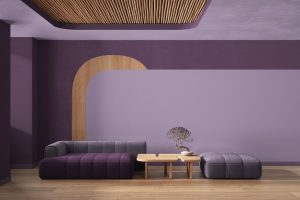
Abyss 2128-20 in the Living Room
For living rooms, Abyss 2128-20 sets a dramatic stage. It can be used on all walls or just a feature wall. Pair it with soft neutrals or pastels to balance its depth. Incorporate plush fabrics, like velvet or silk, and metallic accents to elevate the space’s sophistication.

Abyss 2128-20 for an Exterior
Abyss 2128-20, when used on exteriors, lends homes a stately, modern appearance. It pairs well with crisp white trims and wooden elements. Whether on a townhouse or a country home, this shade exudes elegance and can be complemented with landscaping in light, contrasting hues.

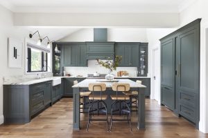
Abyss 2128-20 in the Kitchen
In kitchens, Abyss 2128-20 works wonders as a backdrop. Its deep tone contrasts beautifully with stainless steel appliances. Use light-colored countertops or open shelving with dishes in lighter hues to break the intensity, creating a space that’s both cozy and modern.

Abyss 2128-20 on the Kitchen Cabinets
For a bold kitchen statement, paint cabinets in Abyss 2128-20. This creates depth and drama, especially against lighter walls or backsplashes. Gold or brass hardware on the Abyss cabinets will pop, providing an opulent touch to the culinary space. Consider glass-front cabinets or open shelves to balance the intensity.

Comparing Abyss 2128-20 With Other Colors
Colors evoke emotions, influence moods, and even determine spatial perceptions. It’s crucial to compare shades like Abyss 2128-20 with others to understand their nuances, undertones, and overall feel, ensuring a cohesive and harmonious interior design.
Such comparisons not only aid in finding the right mood for a space but also assist in coordinating furniture, fabrics, and other design elements. To use BM Abyss correctly, let’s see how it works compared with other hues.
Abyss 2128-20 vs. BM 2127-20 Black Ink
Abyss 2128-20, a deep, intense hue, feels bottomless and expansive. When set against Black Ink , a dense and saturated shade, Abyss appears slightly more navy, highlighting its subtle blue undertones.
Both colors exude sophistication, but Abyss’s blue essence gives it a cooler vibe, whereas Black Ink feels more neutral.

Abyss 2128-20 vs. OC-121 Mountain Peak White
Against the pure and light Mountain Peak White , Abyss 2128-20 showcases its depth and intensity. This contrast is stark, emphasizing Abyss’s richness. Mountain Peak White acts as a canvas, making Abyss pop, perfect for creating a striking balance in any space.

Abyss 2128-20 vs. BM 2159-70 White Cloud
White Cloud , with its softness, brings out the profoundness in Abyss 2128-20. It’s a subtler contrast than with Mountain Peak White, hinting at a serene atmosphere when these colors coexist.
Abyss against this backdrop feels grounded, while White Cloud adds airiness.

Abyss 2128-20 vs. BM 2126-60 Gray Cloud
When juxtaposed with Gray Cloud , Abyss 2128-20 appears even more blue-toned. Gray Cloud, with its neutral, muted characteristics, underscores the vibrancy and depth of Abyss, making the duo perfect for a modern, chic aesthetic.

Abyss 2128-20 vs. BM 2149-60 White Marigold
White Marigold , a color with a slight yellow undertone, contrasts with Abyss 2128-20 in a way that emphasizes the cooler undertones of Abyss. This combination offers a play between warm and cool, creating a harmonious yet dynamic interaction.

Abyss 2128-20 vs. BM 1563 Quiet Moments
Quiet Moments , a tranquil and soft hue, alongside Abyss 2128-20, creates a peaceful palette. The deep intensity of Abyss is softened by the calming presence of Quiet Moments. The two together evoke feelings of a serene shoreline at dusk.

Conclusion
The depth and adaptability of Abyss 2128-20 make it a standout shade in Benjamin Moore’s palette. By comparing it with other colors, we get a clearer picture of its unique strengths and how it might interact with other hues in a design space. Choosing the right color combination is akin to creating a symphony, with each shade playing its part to bring about harmony, mood, and emotion.
The subtle differences in undertones, depth, and warmth can make all the difference in achieving the perfect ambiance.

Ever wished paint sampling was as easy as sticking a sticker? Guess what? Now it is! Discover Samplize's unique Peel & Stick samples.
Get paint samples