When you’re on the hunt for a paint color that is both sophisticated and soothing, 2062-20 Gentleman’s Gray by Benjamin Moore might just be what you need. Often mistaken for a standard gray, this hue actually leans towards a deep, blue-toned navy, giving it a unique twist that sets it apart from more traditional grays.
Choosing the right color can sometimes feel overwhelming, but Gentleman’s Gray makes it easy. It’s perfect for adding a touch of elegance to any space, whether you’re painting a cozy reading nook or giving your home office a chic upgrade. This color works beautifully in a variety of lighting situations, highlighting its versatility.
I’ve found that it pairs exceptionally well with crisp white trim, which really allows the depth of the blue to stand out. If you’re looking to create a space that feels both inviting and stylish, Gentleman’s Gray is a choice you might want to consider.
Its rich tone provides an ideal backdrop for both modern and traditional décor, ensuring that you create a space that feels both timeless and fresh.
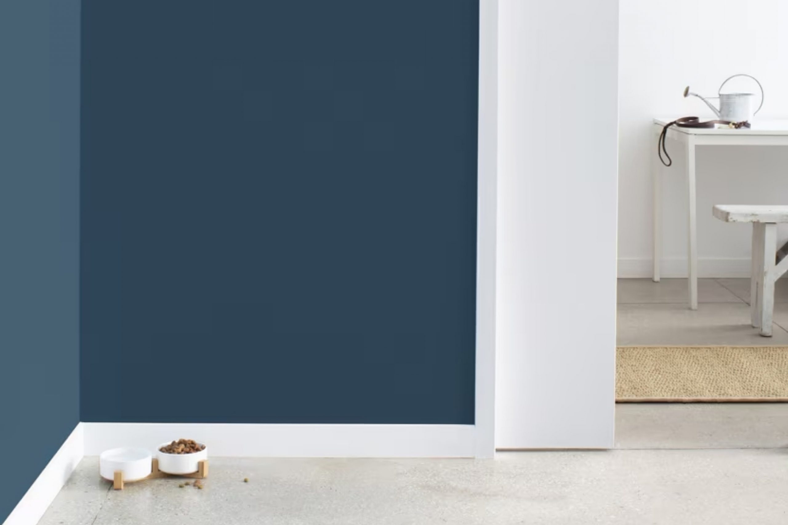
What Color Is Gentleman’s Gray 2062-20 by Benjamin Moore?
Gentleman’s Gray by Benjamin Moore is a rich, deep blue that borders on a navy shade with subtle green undertones, giving it a unique and striking appearance. This color has a commanding presence in any room, making it an excellent choice for spaces intended to make a statement without overwhelming the senses.
This versatile color works exceptionally well in various interior styles, particularly modern, contemporary, and traditional decors. It provides a strong foundation in rooms, offering a dramatic backdrop that can either stand alone or be accented with vibrant colors or metallic finishes for more dynamic interiors.
When it comes to pairing with materials and textures, Gentleman’s Gray is remarkably adaptable. It pairs beautifully with natural wood, enhancing the warmth of wooden furniture or flooring. Leather, particularly in rich browns or blacks, also complements this deep blue hue, adding a layer of luxury and comfort to the setting. For textiles, consider using velvet or silk to introduce a touch of luster and softness that contrasts nicely with the depth of Gentleman’s Gray.
With its deep and arresting color, this paint is ideal for creating a bold focal point in living rooms, dining rooms, or even bedrooms, where it can help to create a cozy, inviting atmosphere.

Is Gentleman’s Gray 2062-20 by Benjamin Moore Warm or Cool color?
Gentleman’s Gray by Benjamin Moore is a deep, rich blue shade that has a subtle hint of green. This unique mixture makes it versatile and perfect for adding a strong, yet warm touch to any room in a house. It is especially favored in living rooms and dining areas where the goal is to create a welcoming, yet impressive atmosphere.
The color works well with natural light, appearing vibrant during the day while taking on a cozier, more intimate vibe in the evening under soft lighting. It pairs beautifully with light woods, metallic finishes like gold or brass, and also looks stunning against white trim or moldings, which bring out its depth even more.
Moreover, Gentleman’s Gray can make small spaces appear larger because of its deep tone, while in larger areas, it brings a sense of warmth and closeness. Overall, it’s a great choice for anyone looking to add both style and comfort to their home.
Undertones of Gentleman’s Gray 2062-20 by Benjamin Moore
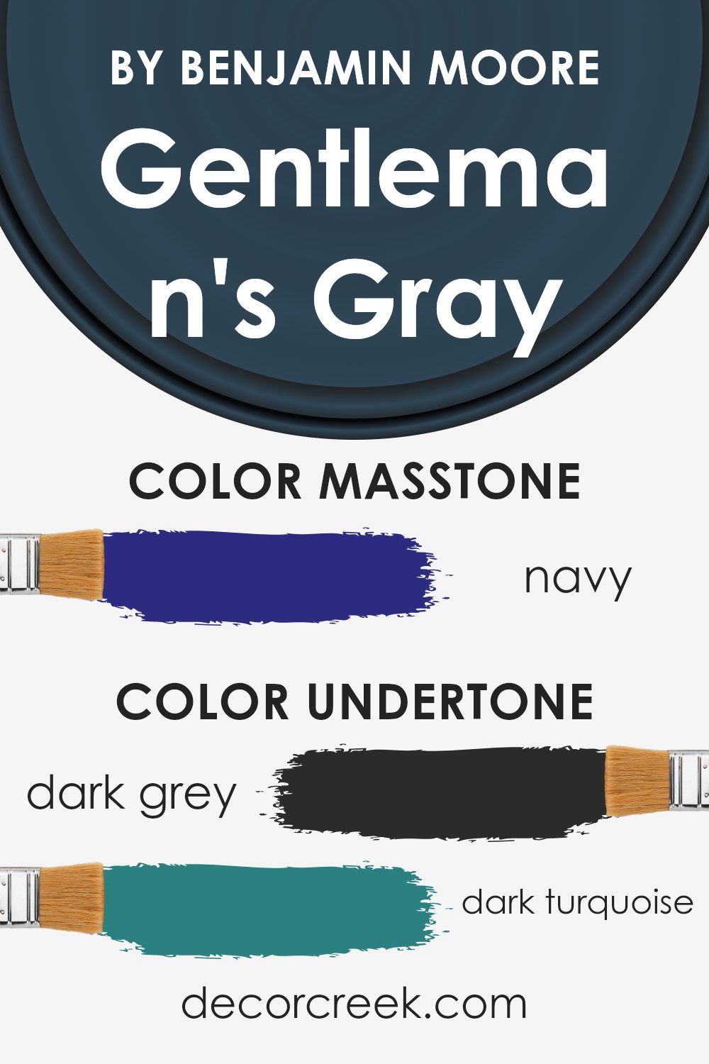
Gentleman’s Gray is a rich color that beautifully plays with undertones to create a dynamic presence in any room. An undertone is a subtle hue that underlies the main color you see and can influence how that color appears under different lighting conditions. The undertones make the main color look different from time to time or in various lights.
The primary color of Gentleman’s Gray seems to be a dark navy, but depending on lighting and surrounding colors, different undertones might peek through. For example, dark grey and dark blue undertones keep the color grounded and give it a steady, strong feel. This characteristic can make a space feel more secure and enclosed, perfect for creating a cozy library or a focused office space.
On the other hand, hints of dark turquoise or a touch of purple can bring a subtle vibrancy to the paint, adding a hint of depth that prevents the color from feeling flat or dull. These pops can give a lively contrast to predominantly warm furnishings, enhancing the overall aesthetics of the room.
When used on interior walls, Gentleman’s Gray with these mixed undertones can shift the mood of a room throughout the day. In bright daylight, the cooler undertones might become more pronounced, providing a refreshing vibe. In artificial or dim light, the warmer tones like brown or olive might stand out, making the room feel warmer and more inviting.
So, the impact of Gentleman’s Gray in a room depends heavily on its complex and fascinating undertones. The way they blend and contrast can significantly affect how the main color is perceived, ultimately influencing the atmosphere of any space.
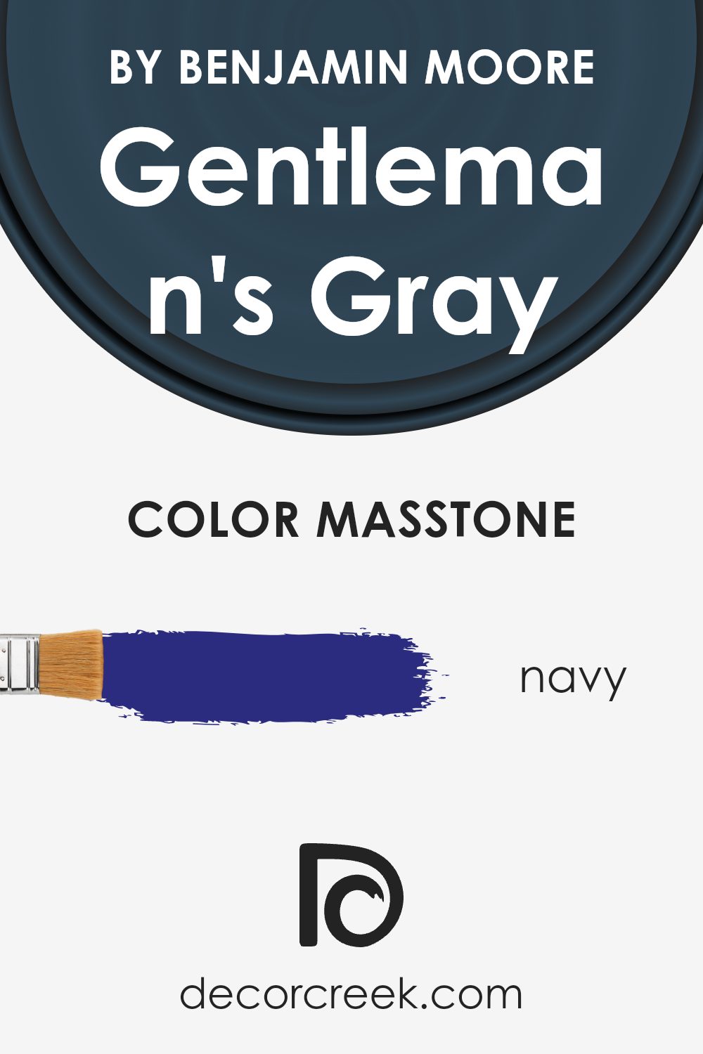
What is the Masstone of the Gentleman’s Gray 2062-20 by Benjamin Moore?
Gentleman’s Gray by Benjamin Moore is a rich shade of navy blue, given the hexadecimal code #2B2B80. This color is notably deep and intense, providing a strong presence in any room. Its navy masstone allows it to function beautifully as an accent or a primary wall color in homes.
One of the significant impacts of using a darker color like Gentleman’s Gray is its ability to create a cozy and inviting atmosphere. It pairs well with bright whites or lighter colors, which bring out its depth and prevent spaces from feeling too enclosed. This color works especially well in personal spaces like bedrooms and studies, where its calming effect can be fully appreciated.
Additionally, in living areas, it can help ground the decor and serve as an excellent backdrop for artworks and furniture, making them stand out. Gentleman’s Gray’s versatility makes it a popular choice among those looking to add a touch of elegance and depth to their home interiors.
How Does Lighting Affect Gentleman’s Gray 2062-20 by Benjamin Moore?
Lighting plays a crucial role in how colors appear in a room. Different light sources can dramatically change the way a color looks. For instance, Gentleman’s Gray by Benjamin Moore can look significantly different under various lighting conditions.
In artificial light, especially warm-toned lights like incandescent bulbs, Gentleman’s Gray will take on a warmer and more inviting tone. The gray will seem less stark, potentially pulling out more of the underlying blue tones, making the walls feel cozy especially in the evening.
In natural light, the appearance of Gentleman’s Gray can vary throughout the day. The color tends to look more vibrant and truer to its original shade in bright, natural light. It can show its full depth and richness when sunlight is abundant.
The orientation of the room also affects how Gentleman’s Gray is perceived:
- North-faced rooms: These rooms get less direct sunlight, making them naturally cooler in tone. Here, Gentleman’s Gray may appear more as a true deep gray, emphasizing its muted qualities without as much blue becoming dominant.
- South-faced rooms: These rooms receive a lot of sunlight throughout the day. The ample light can brighten Gentleman’s Gray, highlighting its subtle blue undertones and making the room feel more lively and inviting.
- East-faced rooms: Morning light is typically cooler and can make Gentleman’s Gray look sharper and more distinctly blue in the morning, transitioning to a truer gray as the day progresses.
- West-faced rooms: Evening light brings warmer tones that can soften Gentleman’s Gray, making it appear more muted and cozy as the day ends.
Understanding these effects can help in deciding which paint color to choose based on the room’s orientation and the type of lighting it most often receives. Choosing the right lighting conditions can make a big difference in achieving the desired ambiance with Gentleman’s Gray.
What is the LRV of Gentleman’s Gray 2062-20 by Benjamin Moore?
LRV stands for Light Reflectance Value. This is a measurement that shows how much light a paint color can reflect in a room. Simply put, colors with higher LRV values reflect more light. They can make a room feel brighter and more open. Colors with lower LRV values absorb more light, making spaces appear darker and cozier.
Understanding LRV can be very helpful when choosing the right paint color for your room, especially if you’re thinking about how it will feel during different times of the day or in varied lighting conditions.
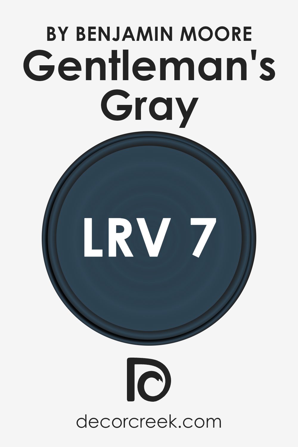
With an LRV of 7.26, Gentleman’s Gray is a dark shade. This means it doesn’t reflect much light. When painted on walls, it can give a room a more enclosed feel, which could be perfect for creating a more intimate space or making a large room feel less vast. However, because it absorbs light, using this color in a small or poorly lit room might make the space feel even smaller and darker.
To balance this, pairing it with lighter colored furniture or decor, or using good artificial lighting can help offset the dark tone of the walls.
Coordinating Colors of Gentleman’s Gray 2062-20 by Benjamin Moore
Coordinating colors are complementary shades that work together to enhance the overall aesthetic of a space, creating a harmonious and balanced look. When used alongside a primary color like Gentleman’s Gray by Benjamin Moore, coordinating colors can highlight its features, add depth, or soften its impact, depending on the chosen scheme.
These colors are selected based on their ability to complement each other while maintaining a pleasing contrast that brings out the best in each hue.
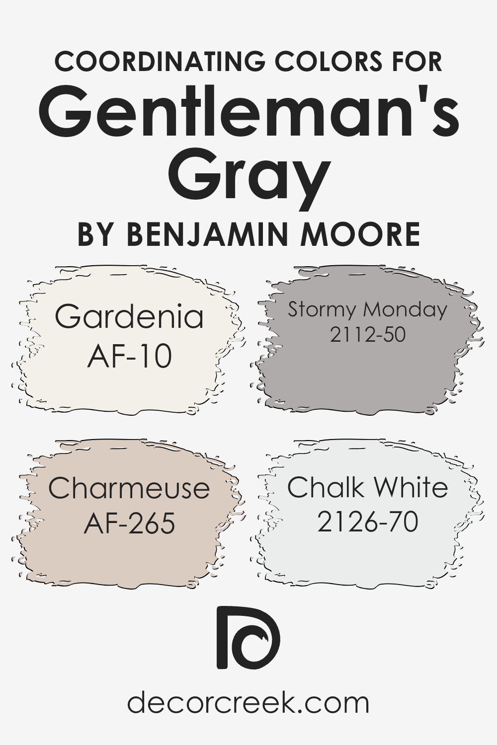
For Gentleman’s Gray, a deep, rich blue, the coordinating colors suggested are Gardenia, Charmeuse, Stormy Monday, and Chalk White. Gardenia is a warm, creamy white that offers a soft contrast to the boldness of Gentleman’s Gray, giving a calming effect to any space. Charmeuse is a subtle yellow with a hint of luxury, providing a light, uplifting feel that counteracts the cooler undertones of Gentleman’s Gray.
Stormy Monday brings a blend of gray with warm taupe undertones, adding complexity and a modern twist when paired with darker shades. Lastly, Chalk White is a crisp, clean white that acts as a refreshing palette cleanser, making it perfect for creating a striking, fresh look when used with darker, more dramatic colors like Gentleman’s Gray.
You can see recommended paint colors below:
- AF-10 Gardenia (CHECK A SAMPLE)
- AF-265 Charmeuse (CHECK A SAMPLE)
- 2112-50 Stormy Monday (CHECK A SAMPLE)
- 2126-70 Chalk White (CHECK A SAMPLE)
What are the Trim colors of Gentleman’s Gray 2062-20 by Benjamin Moore?
Trim colors are specific shades used to accentuate or complement the main colors of a wall, typically used for door frames, skirting boards, moldings, and window frames. Choosing the right trim color can highlight the architecture and design features of a room while also helping to define and separate different color zones.
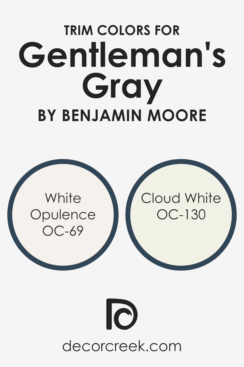
When using Gentleman’s Gray, a deep, rich blue from Benjamin Moore, pairing it with the appropriate trim colors such as OC-69 White Opulence and OC-130 Cloud White can create a clean, crisp border that defines the space. This contrast not only brings attention to the detailing of the trim but also softens the intensity of the darker wall color, making the room feel more balanced and inviting.
OC-69 White Opulence is a fresh and airy white that offers a subtle hint of warmth, making it an excellent choice for trimming against the deep tones of Gentleman’s Gray. This color can help to lightly brighten the room without overwhelming the boldness of the blue. On the other hand, OC-130 Cloud White carries a neutral tone, providing a softer transition from the vividness of the Gentlemen’s Gray, thus ensuring the area maintains a harmonious yet distinct look. Both these trim colors work beautifully to enhance the aesthetics of a room, giving it a neat, polished look while allowing the wall color to truly shine.
You can see recommended paint colors below:
- OC-69 White Opulence
- OC-130 Cloud White
Colors Similar to Gentleman’s Gray 2062-20 by Benjamin Moore
Choosing similar colors can greatly enhance the aesthetic of a space, creating a harmonious and pleasing atmosphere. When you use shades that are close to each other on the color wheel, like those similar to Gentleman’s Gray, they naturally complement each other, providing both variation and unity to the design.
Such color choices make a room feel cohesive without the stark contrasts that come with more divergent colors. This subtle blend can soften the transitions between different elements of decor, making the space visually relaxing and comfortable.
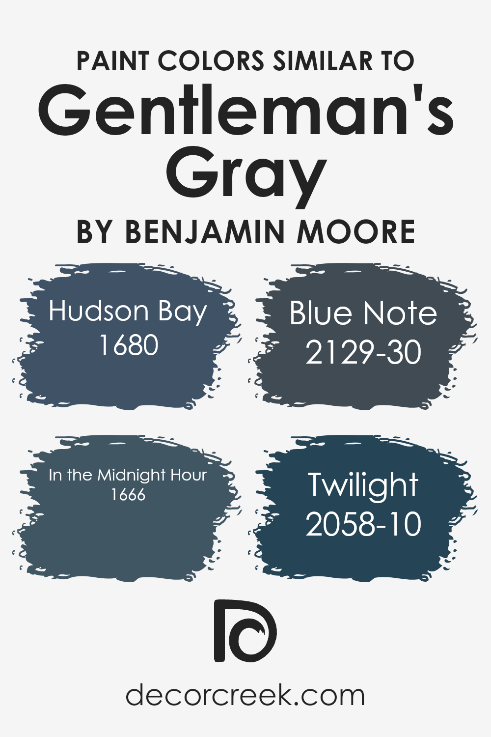
Among the colors similar to Gentleman’s Gray, Hudson Bay has a deep, refreshing blue tone that recalls the depths of the ocean, adding a sense of depth and richness to walls or accents. In the Midnight Hour leans towards a profound navy, offering a strong but not overwhelming presence, ideal for creating a focal point in a subdued setup.
Blue Note steps towards a slightly more intense and vivid hue of blue, bringing a distinct vibrancy that could energize a space without overpowering it. Lastly, Twilight presents a dusky blue that evokes the calming moments just after sunset, perfect for spaces intended for relaxation and reflection. Each of these colors can be effectively used to create a space that feels interconnected and thoughtfully put together.
You can see recommended paint colors below:
- 1680 Hudson Bay (CHECK A SAMPLE)
- 1666 In the Midnight Hour (CHECK A SAMPLE)
- 2129-30 Blue Note (CHECK A SAMPLE)
- 2058-10 Twilight (CHECK A SAMPLE)
Colors that Go With Gentleman’s Gray 2062-20 by Benjamin Moore
Understanding how different colors complement and enhance the aesthetic of Gentleman’s Gray 2062-20 by Benjamin Moore plays a crucial role in interior design. Choosing the right colors can create a harmonious environment that reflects a homeowner’s taste and style.
For instance, 2062-50 Blue Jean is a vibrant color that brings a lively energy into any space, making it excellent for areas where vitality and enthusiasm are desired. The deeper 2062-30 Blue Danube adds a touch of drama and depth, perfect for creating focal points in rooms.
Similarly, 2062-10 Polo Blue is a rich, deep blue which can lend an air of mystery and intrigue to spaces. This makes it ideal for a cozy reading nook or an elegant dining area. Meanwhile, 2062-40 Blue Daisy is lighter and has a playful tone to it, suitable for children’s rooms or casual living spaces.
Moving on to the softer tones, 2062-60 Blue Hydrangea has a subtle freshness, working well in bathrooms or kitchens where a clean, refreshing look is needed. Lastly, 2062-70 Harbour Fog offers a gentle, muted presence that can soften any room, making it ideal for creating a relaxing bedroom or a tranquil office space.
Together, these colors complement Gentleman’s Gray by providing balance, contrast, and a variety of moods that cater to different personal tastes and room functionalities.
You can see recommended paint colors below:
- 2062-50 Blue Jean (CHECK A SAMPLE)
- 2062-30 Blue Danube (CHECK A SAMPLE)
- 2062-10 Polo Blue (CHECK A SAMPLE)
- 2062-40 Blue Daisy (CHECK A SAMPLE)
- 2062-60 Blue Hydrangea (CHECK A SAMPLE)
- 2062-70 Harbour Fog (CHECK A SAMPLE)

How to Use Gentleman’s Gray 2062-20 by Benjamin Moore In Your Home?
Gentleman’s Gray by Benjamin Moore is a rich, navy blue color with hints of teal, creating a unique and stylish shade that stands out as more than just a simple blue. This paint color is perfect for those looking to add a touch of elegance and depth to any room in their home. It works exceptionally well in living areas and bedrooms, providing a grounded, calming atmosphere that pairs beautifully with bright whites or soft grays for a crisp contrast.
In a dining room, Gentleman’s Gray can create a regal background that makes gold accents or wood furniture pop, offering a stunning setting for meals. Alternatively, using this color in a bathroom can add a touch of luxury, especially when combined with metallic fixtures and natural light.
For those who love a dramatic look, painting cabinets or an accent wall with this color can bring a modern twist to the kitchen. Overall, Gentleman’s Gray offers both style and versatility, making it a solid choice for anyone looking to enhance their home décor.
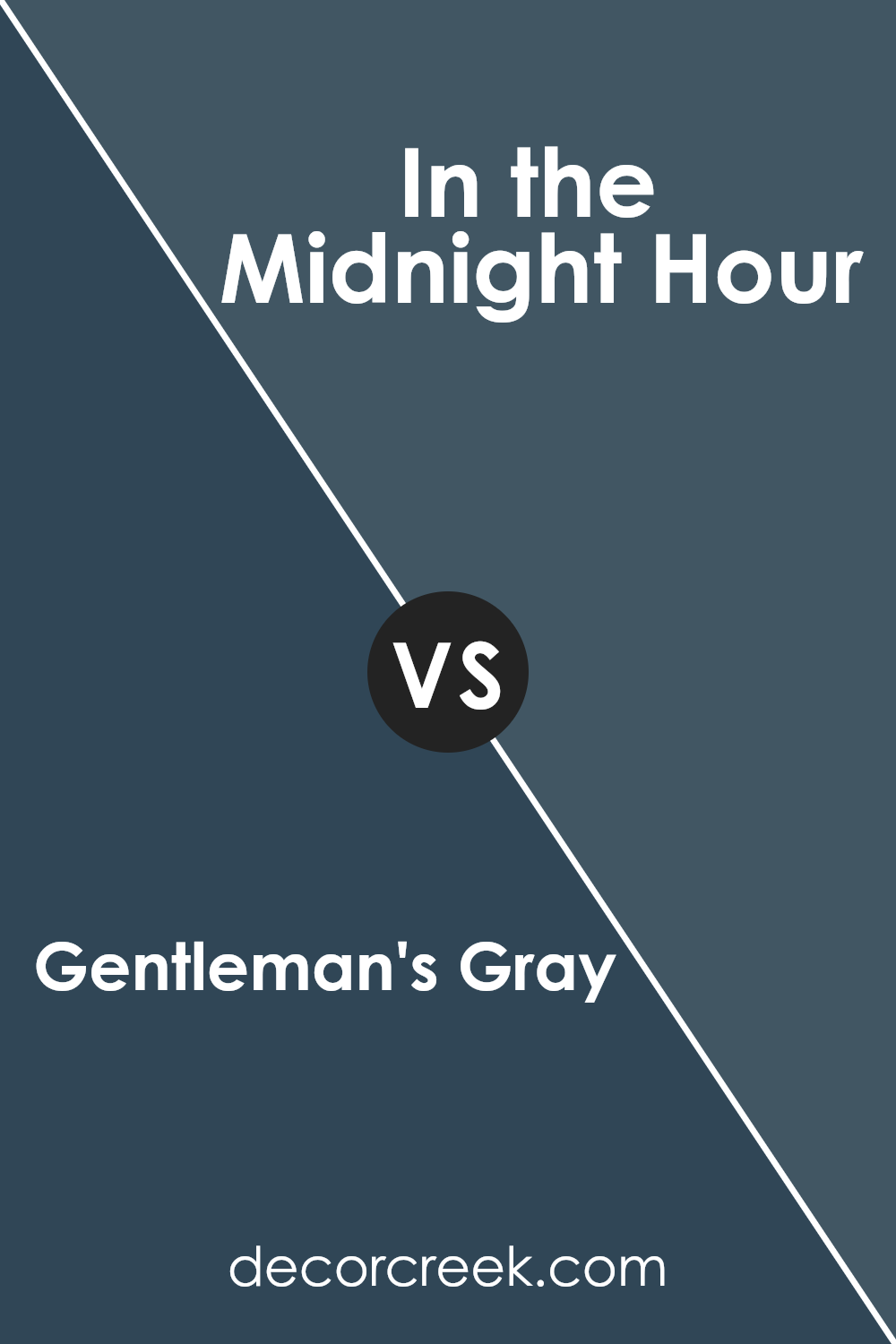
Gentleman’s Gray 2062-20 by Benjamin Moore vs In the Midnight Hour 1666 by Benjamin Moore
Gentleman’s Gray and In the Midnight Hour are both rich, deep colors by Benjamin Moore. Gentleman’s Gray is a dark blue shade, close to navy but with a hint of green that makes it appear somewhat teal in certain lighting. This color is bold and can make a strong statement in any space.
In contrast, In the Midnight Hour is a cooler and darker blue, almost resembling a very dark navy blue or close to black. This color can add drama and depth, making it great for creating a cozy, intimate atmosphere in a room.
Both colors are suitable for people looking to make a room feel more grounded and full. They can be used in various settings like bedrooms, offices, or living rooms and are particularly effective in adding character to walls or furniture pieces. Whether you’re going for something slightly more green-tinged with Gentleman’s Gray or a deeper, almost black blue with In the Midnight Hour, both colors offer a strong base for decor and style choices.
You can see recommended paint color below:
- 1666 In the Midnight Hour (CHECK A SAMPLE)
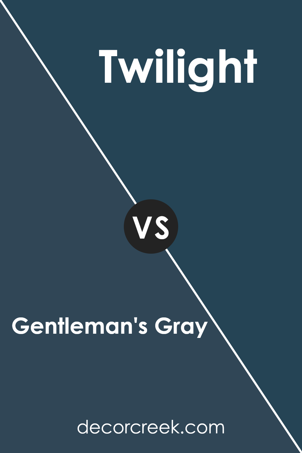
Gentleman’s Gray 2062-20 by Benjamin Moore vs Twilight 2058-10 by Benjamin Moore
Gentleman’s Gray is a deep, rich navy-blue shade that exudes a classic and timeless feel, perfect for creating a strong and inviting atmosphere in any room. This color leans towards a traditional navy with subtle hints of green under certain lighting, making it unique but still very approachable and easy to match with decor.
On the other hand, Twilight is a darker, moodier blue with significant black undertones, giving it a mysterious, almost charcoal-like appearance. This color is bolder and makes more of a statement, ideal for accent walls or areas where you want to draw attention.
Both colors are from Benjamin Moore and offer durability and depth, with Gentleman’s Gray providing a more maritime vibe, while Twilight offers a more shadowy, dramatic flair. Depending on your space and lighting, both can add a striking touch but in distinctly different ways. Choosing between them depends on the ambience you wish to achieve—cozy and steady with Gentleman’s Gray, or bold and dramatic with Twilight.
You can see recommended paint color below:
- 2058-10 Twilight (CHECK A SAMPLE)
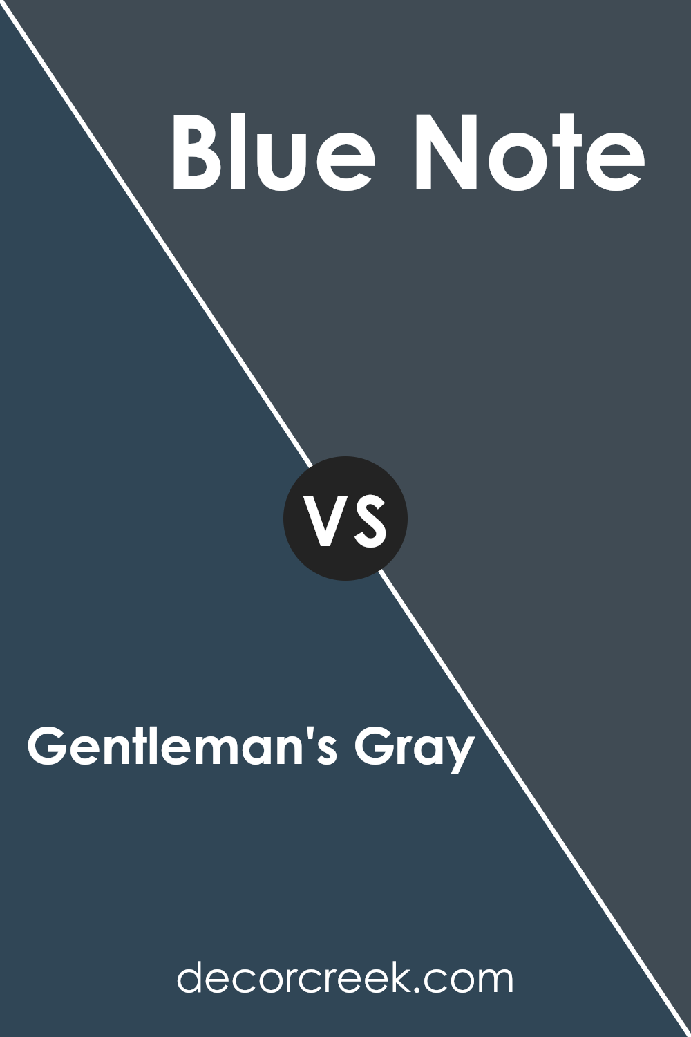
Gentleman’s Gray 2062-20 by Benjamin Moore vs Blue Note 2129-30 by Benjamin Moore
Gentleman’s Gray by Benjamin Moore is a deep, bold blue with hints of green, giving it a strong, classic feel. It’s perfect for creating a statement in spaces like offices or dining rooms where you want a touch of drama. On the other hand, Blue Note by Benjamin Moore is a darker shade that leans more towards a pure, deep navy.
It’s ideal for those who prefer colors that reflect a more traditional navy tone, making it great for accent walls or cabinetry for a timeless look.
Both colors share a richness that can anchor a room wonderfully, but Gentleman’s Gray offers a slightly teal undertone, while Blue Note sticks to a truer, darker blue. Depending on your decor, each color has the potential to add depth and interest to your space but in subtly different ways.
You can see recommended paint color below:
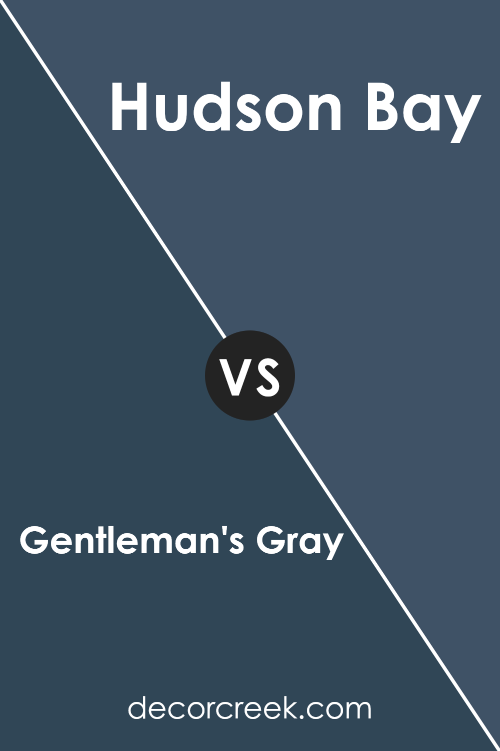
Gentleman’s Gray 2062-20 by Benjamin Moore vs Hudson Bay 1680 by Benjamin Moore
Gentleman’s Gray by Benjamin Moore is a deep, saturated blue that has a touch of green, giving it a rich, navy-like appearance. This color is bold and stands out well in spaces where a strong, impactful color is desired. It pairs well with brighter colors or various shades of gray for a more layered look.
On the other hand, Hudson Bay by Benjamin Moore is a softer, more muted blue with gray undertones. It conveys a calm and gentle vibe, making it suitable for creating a relaxed environment. This color works beautifully in well-lit spaces or areas where you want to promote a sense of calm without the starkness of true gray.
Although both colors are forms of blue, Gentleman’s Gray is darker and more intense, suitable for making a statement. Hudson Bay, being lighter and subtler, is excellent for a softer, more understated look. Their uses depend largely on the atmosphere you want to achieve in your space.
You can see recommended paint color below:
- 1680 Hudson Bay (CHECK A SAMPLE)
Conclusion
In wrapping up, I want to share how I feel about 2062-20 Gentleman’s Gray by Benjamin Moore. This paint color is not just gray; it’s like the deep blue of the ocean mixed in with a bit of stormy sky. It’s a classy color that makes any room look more mature and stylish, just like how a fancy suit makes someone look really polished and smart.
Using Gentleman’s Gray in a room is like giving it a new personality, one that is calm and serious, but also very welcoming. This color works really well in places where you want to feel relaxed, like a bedroom, or look smart, like in a living room or an office.
What I really like about this color is how it changes depending on the light. Sometimes it looks more blue, and other times, it leans towards gray. This keeps the room feeling fresh and interesting.
So, if you’re thinking about giving a room a new look, Gentleman’s Gray is a fantastic choice. It’s not just a simple paint; it’s a way to make your space feel more grown-up and put together, just like wearing a well-tailored suit. Whether you want a room to unwind or a formal space to impress, this color definitely does the trick.
Ever wished paint sampling was as easy as sticking a sticker? Guess what? Now it is! Discover Samplize's unique Peel & Stick samples.
Get paint samples


