If you’re planning to give your space a fresh, cheerful look, you might want to consider SW 6677 Goldenrod by Sherwin Williams. I find this paint color absolutely delightful because it has a vibrant, sunny hue that can brighten any room. When you use Goldenrod, it feels like you’re bringing a little bit of sunshine indoors, which is especially nice during the darker, colder months.
From my experience, this color works wonderfully in living areas, kitchens, and even bathrooms, where you want to add a burst of energy and positivity.
It pairs beautifully with a wide range of decor styles and complements both modern and traditional settings. Plus, it’s a great backdrop for artwork and other decorative items.
Whether you’re giving a single room a makeover or thinking about a more extensive renovation, Goldenrod could be the perfect choice to liven up your space.
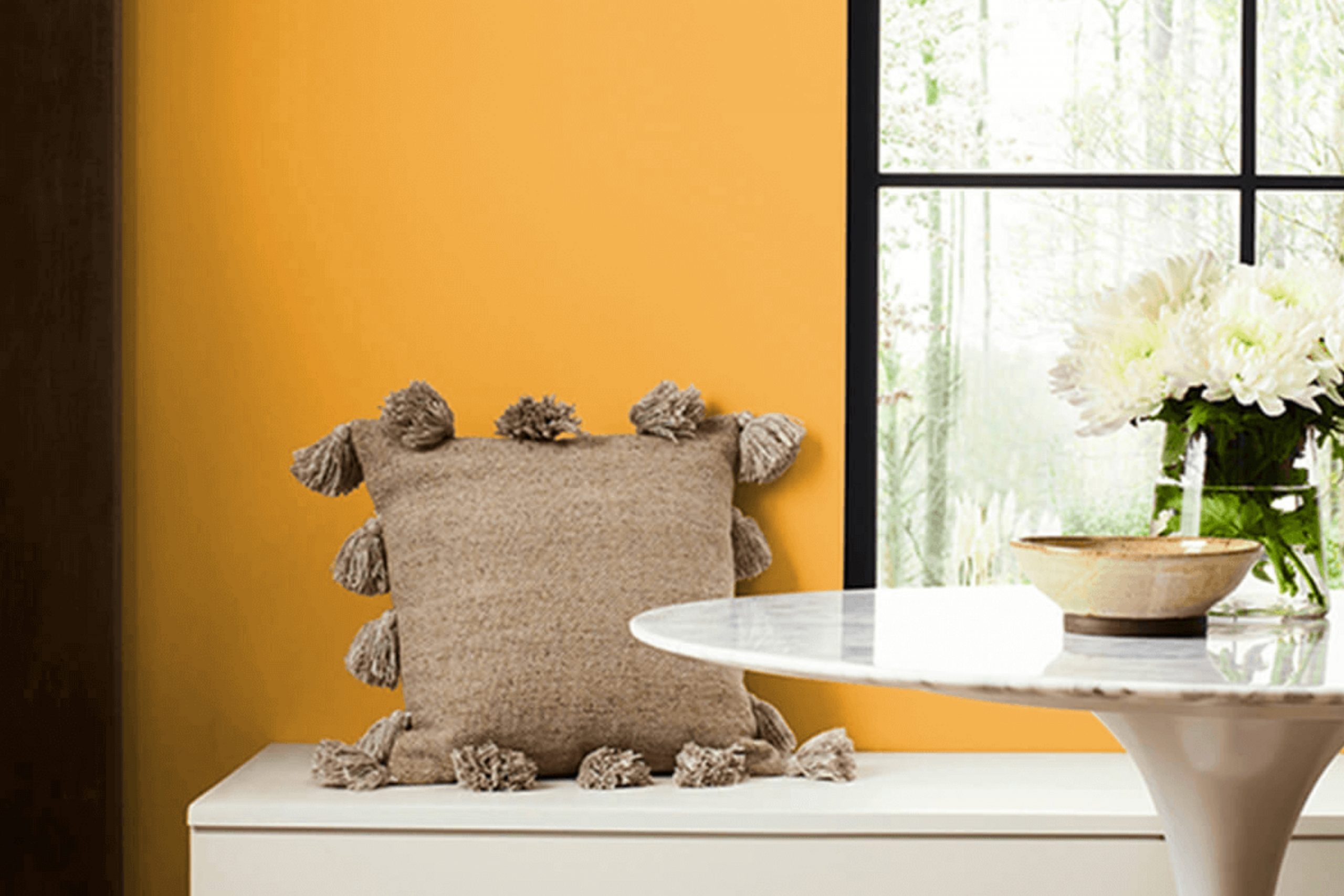
What Color Is Goldenrod SW 6677 by Sherwin Williams?
Goldenrod by Sherwin Williams is a warm, vibrant yellow color that brings a cozy yet cheerful ambiance to any space. This hue is reminiscent of golden autumn sunflowers and has the power to brighten up rooms while providing a welcoming atmosphere.
Ideal for adding a dash of sunshine, this color works particularly well in living rooms, kitchens, and dining areas where it encourages lively conversations and adds a touch of warmth.
When considering interior styles, Goldenrod excels in country, rustic, and traditional designs. Its earthy tones complement natural elements perfectly, making it easy to pair with wooden furniture and accessories. In a more modern setting, when used thoughtfully, it can give a fresh and lively touch to minimalist decor, breaking the monotony of neutral palettes.
For materials, Goldenrod pairs beautifully with natural wood, from darker walnut to lighter oak, enhancing the grain and texture of wooden surfaces. Fabrics that work well with this color include soft textures like cotton and linen in neutral shades or subtle patterns.
For a tactile contrast, you might consider incorporating materials like rough jute or soft wool, which help balance the brightness of the yellow with a touch of earthiness.
This color not only adds visual warmth but also pairs well with other earth tones, soft greens, or creamy whites, allowing for a versatile approach in creating diverse and appealing interior spaces.

Is Goldenrod SW 6677 by Sherwin Williams Warm or Cool color?
Goldenrod SW 6677 by Sherwin Williams is a vibrant, warm yellow hue that brings a cheerful and inviting atmosphere into any home. This shade of yellow can be used in various rooms to add a sense of brightness and energy. In living rooms or kitchens, Goldenrod can make the space feel more welcoming and lively, which is perfect for spaces where families gather or entertain guests.
In smaller or dimly lit areas, this color can help to make the space appear larger and more open by reflecting light. It’s a great choice for a study or home office as well, where the cheerful color can help stimulate mental activity and creativity.
However, since it is a bold color, it’s important to balance it with neutral tones like white, gray, or beige. This will prevent the color from overwhelming the space and will keep the overall aesthetic light and harmonious.
Accents like plants or soft textiles can also complement the brightness of Goldenrod, creating a comfortable and stylish environment.
Undertones of Goldenrod SW 6677 by Sherwin Williams
GoldenrodSW 6677 is a vibrant yellow paint color that infuses spaces with a cheerful glow. Understanding its undertones can help you use the color effectively in your home. Undertones are subtle hues that influence the main color, and in the case of GoldenrodSW 6677, they play a significant role in how the color is perceived and how well it blends with other décor elements.
This particular shade has various undertones, including orange, pale yellow, pale pink, light green, olive, mint, and grey. These undertones can shift the color’s appearance under different lighting conditions. For example, the orange undertone adds a warm, inviting feel, making the room feel cozy and comfortable.
The pale yellow undertone contributes to the overall brightness, enhancing natural light in a space.
When painted on interior walls, GoldenrodSW 6677, with its pale pink undertone, softens the vivid yellow, making it more adaptable and less overwhelming. The light green and mint undertones bring a touch of freshness, which can revitalize a room without overpowering it. Lastly, the olive and grey undertones ground the color, preventing it from being too flashy and helping it to blend nicely with natural materials and neutral colors.
Overall, these undertones affect how GoldenrodSW 6677 interacts with furnishings, flooring, and other architectural elements, enabling homeowners and designers to create harmonious and welcoming spaces.
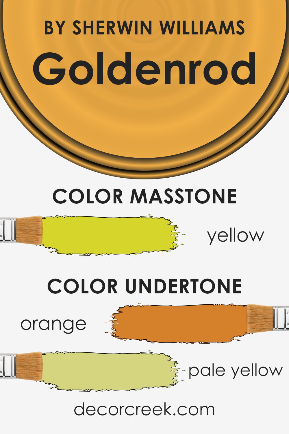
What is the Masstone of the Goldenrod SW 6677 by Sherwin Williams?
GoldenrodSW 6677 by Sherwin Williams is a vibrant and cheerful yellow color that can have a big impact on the mood in any home. The main color, or masstone, is Yellow(#D5D52B), which is a bright and lively shade, close to the color of blooming goldenrods.
This vivid hue can make spaces feel more welcoming and energetic. It’s great for areas like kitchens or living rooms where people gather and lots of activity happens.
In rooms with less natural light, using GoldenrodSW can add a splash of brightness, making the space feel lighter and fuller. However, because it’s such a strong color, it’s important to use it thoughtfully to avoid overwhelming a room. Pairing it with neutral colors like white or gray can balance its intensity.
The light-reflecting quality of this yellow can also help to make a small room seem bigger. Overall, it’s a fun color that can bring a sunny vibe to any home.
How Does Lighting Affect Goldenrod SW 6677 by Sherwin Williams?
Lighting plays a crucial role in how we perceive colors. Different types of light can change how a color looks in a space, affecting its intensity and hue. Natural light, for example, is considered the ideal light source because it displays colors most accurately. Artificial light, on the other hand, can vary widely and influence how a particular color is experienced.
Take the color Goldenrod SW 6677 by Sherwin Williams for instance. This vibrant yellow shade can look significantly different depending on the type of light it’s exposed to. Under artificial light, such as incandescent bulbs, it may appear warm and cozy because these lights have a yellowish tone that enhances the yellow in Goldenrod.
Fluorescent lighting, however, could make it appear sharper and more intense because of its bluish tone.
When it comes to natural light, the direction of the window also impacts how the color is displayed. In north-facing rooms, light is cooler and more consistent throughout the day, meaning Goldenrod might appear more muted and gentle here. South-facing rooms, with their stronger, direct sunlight, can make Goldenrod look more vibrant and lively.
In east-facing rooms, where sunlight is warm and bright in the morning and dimmer in the afternoon, Goldenrod will have a cheerful glow in the morning but a subtler presence later in the day. Conversely, in west-facing rooms, the color remains subtle in the morning light but gets a burst of brightness in the intense afternoon light.
Understanding these nuances can help you choose where and how to use this particular color in your home or space to achieve the desired effect.
Whether it’s creating a bright and energizing area or a calm and cozy nook, the impact of lighting on Goldenrod can help you achieve your design goals.
What is the LRV of Goldenrod SW 6677 by Sherwin Williams?
LRV stands for Light Reflectance Value, which is a measure of the amount of light a paint color reflects back into a room compared to the amount it absorbs. A higher LRV means the color is lighter and reflects more light, while a lower LRV indicates a darker shade that will absorb more light.
This measurement helps in deciding which paint color to choose based on how bright or dark you want the room to feel. It’s particularly useful for smaller spaces or areas with limited natural light, as a higher LRV can make a space appear larger and more open.
The LRV of Goldenrod, which is 50.107, positions it in the middle range. Colors with a mid-range LRV like this are versatile and provide a balance between reflecting and absorbing light. This makes Goldenrod a good choice for rooms where you need a moderate amount of reflectivity without making the space feel too bright.
It’s an optimal balance for areas that also benefit from a touch of warmth and coziness, as this particular color can add a sunny, welcoming vibe without overwhelming the senses.

Coordinating Colors of Goldenrod SW 6677 by Sherwin Williams
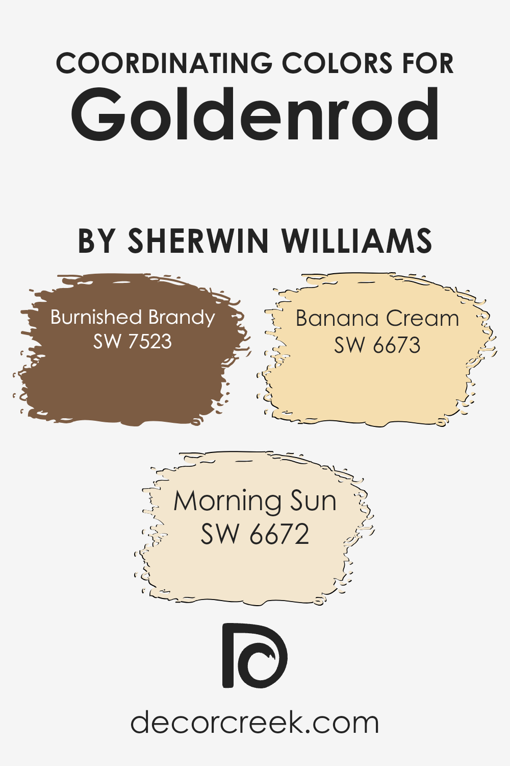
Coordinating colors are shades that complement each other when used together in design and decor. They elevate the aesthetics of a space by creating a harmonious and visually appealing environment. Essentially, these colors complement one another and help each room have its own distinctive feel while maintaining a cohesive look throughout the home.
For example, Burnished Brandy SW 7523 is a rich, deep hue that evokes the warmth of aged leather, adding an inviting and comforting atmosphere to any room. In contrast, Morning Sun SW 6672 offers a bright and cheerful yellow that suggests the freshness of early dawn, bringing a light and airy feel to the space.
Banana Cream SW 6673, meanwhile, provides a soft, creamy yellow that softens the overall appearance, adding a subtle touch of sweetness and calm. When used together, these colors provide a balanced and pleasing palette that enriches the visuals of any space, whether through paint, accent pieces, or fabrics.
Each shade stands on its own but also works in perfect concert with the others to create a harmonious setting.
You can see recommended paint colors below:
- SW 7523 Burnished Brandy (CHECK A SAMPLE)
- SW 6672 Morning Sun (CHECK A SAMPLE)
- SW 6673 Banana Cream (CHECK A SAMPLE)
What are the Trim colors of Goldenrod SW 6677 by Sherwin Williams?
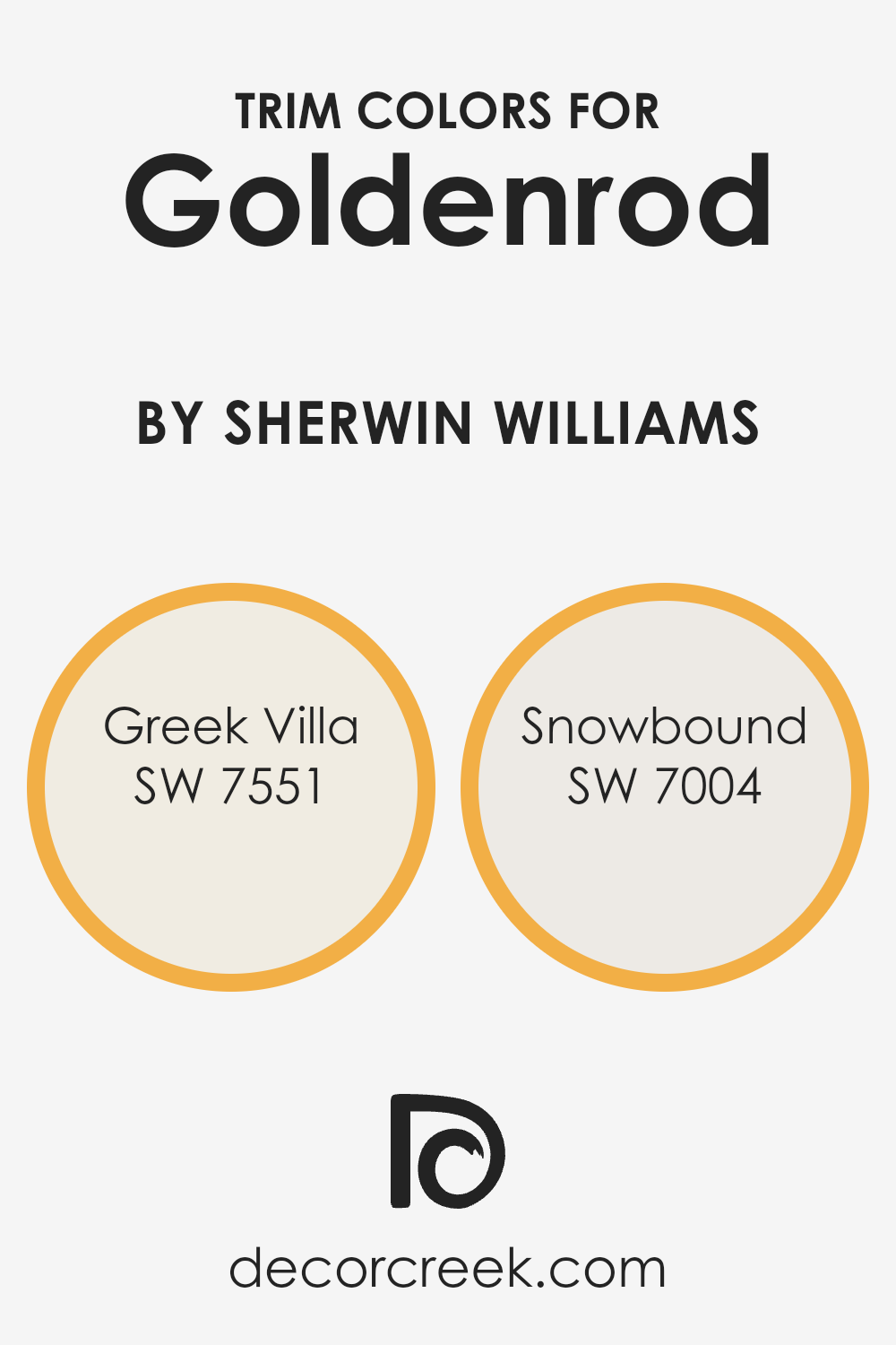
Trim colors are specifically chosen hues typically used to paint the architectural features such as door frames, window trims, and skirtings, creating accents that complement the main colors of walls or exteriors. In the context of using Goldenrod, a vibrant, sunny shade by Sherwin Williams, selecting the right trim color is crucial to enhance its beauty without overwhelming it.
Greek Villa SW 7551 and Snowbound SW 7004 are perfect examples of trim colors that can achieve this balance, bringing a fresh and crisp outline to the lively tone of Goldenrod.
Greek Villa SW 7551 is a soft, off-white color with subdued warmth that offers a gentle contrast, highlighting the rich intensity of a vibrant hue like Goldenrod without causing a harsh visual clash.
On the other hand, Snowbound SW 7004 is a neutral, bright white with slight greige undertones that provides a sharper definition against more saturated colors, ensuring that features like doorways and trims are cleanly distinguished, enhancing the overall visual appeal of the space.
Both colors help to ensure that the trim complements rather than competes with the main color, providing a harmonious and polished look.
You can see recommended paint colors below:
Colors Similar to Goldenrod SW 6677 by Sherwin Williams
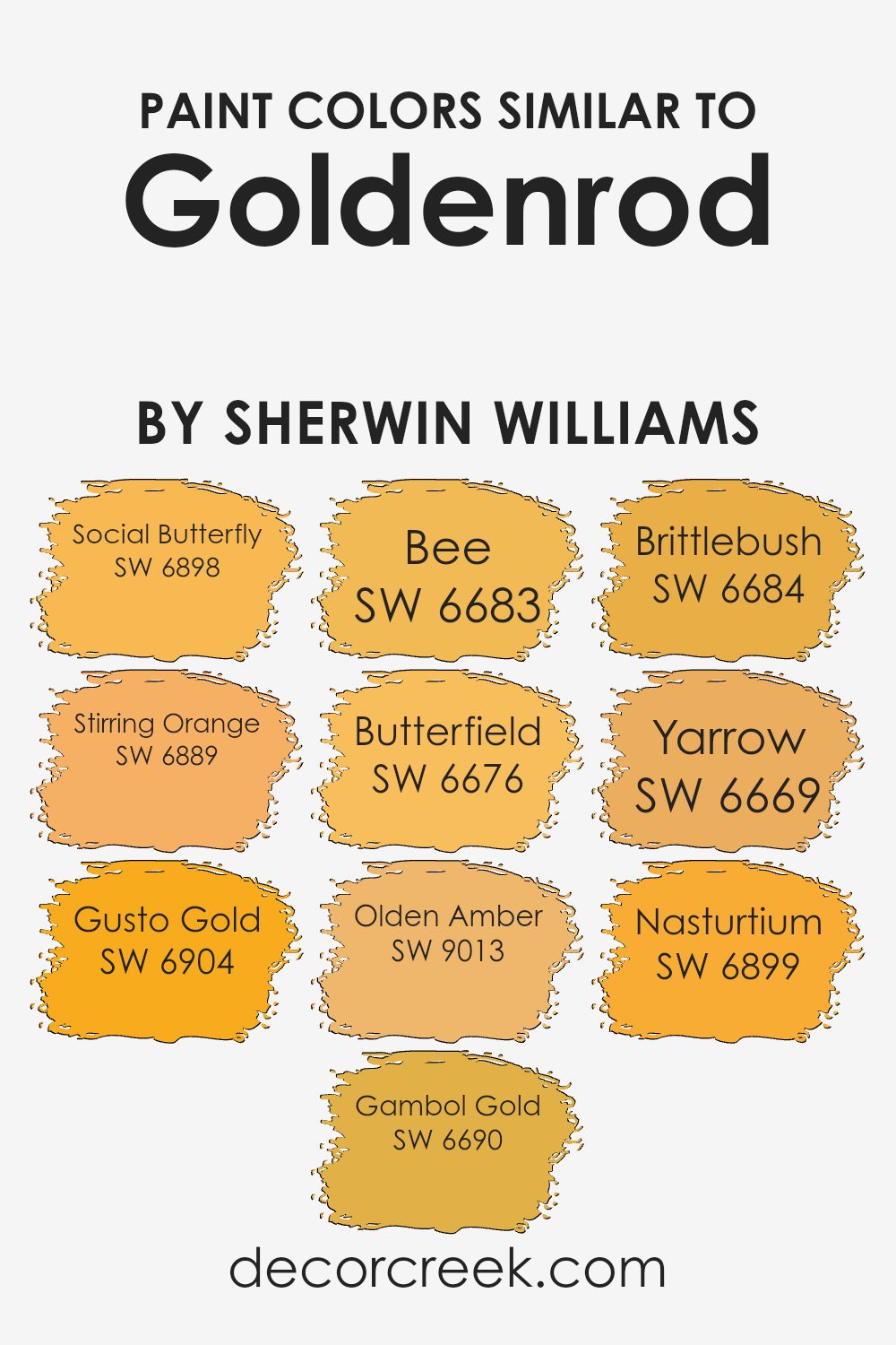
Similar colors are essential in design because they help create a cohesive and pleasing look. Colors that closely resemble each other can be used to create a subtle and harmonious flow within a space, avoiding harsh contrasts and making the environment feel more unified and inviting.
This is particularly true when using variations of a specific hue, such as the rich and warm colors related to Goldenrod by Sherwin Williams. These shades offer a spectrum of options that blend well together, allowing for design flexibility while maintaining a certain mood or theme.
For instance, Social Butterfly is a cheerful, vibrant orange that adds a sense of playfulness to any room. Stirring Orange has a bolder, deeper shade that provides a robust and energetic vibe, making it perfect for areas needing a pop of color. Gusto Gold exudes a bright, sunny feel that can instantly lighten up a space.
Gambol Gold, on the other hand, has a mellow, golden tone that evokes a sense of warmth and comfort. Bee is a lively color that seems to buzz with excitement, ideal for adding a bit of fun. Butterfield lends a softer, creamier version of yellow, perfect for more subdued or calming areas.
Olden Amber offers a rich, deep yellow that resembles the golden hues of autumn, bringing a sense of warmth to any environment. Brittlebush stands out with its slightly muted, yet distinctly sunny appearance. Yarrow has a boldness that can command attention, yet it fits beautifully within the range of similar colors.
Lastly, Nasturtium bursts with an intense orange that is both inviting and energizing, great for spaces intended to stimulate focus and creativity. Those colors mesh well, creating versatile combinations that can enhance various design schemes with their warmth and coherence.
You can see recommended paint colors below:
- SW 6898 Social Butterfly
- SW 6889 Stirring Orange
- SW 6904 Gusto Gold (CHECK A SAMPLE)
- SW 6690 Gambol Gold (CHECK A SAMPLE)
- SW 6683 Bee (CHECK A SAMPLE)
- SW 6676 Butterfield (CHECK A SAMPLE)
- SW 9013 Olden Amber (CHECK A SAMPLE)
- SW 6684 Brittlebush (CHECK A SAMPLE)
- SW 6669 Yarrow (CHECK A SAMPLE)
- SW 6899 Nasturtium
Colors that Go With Goldenrod SW 6677 by Sherwin Williams
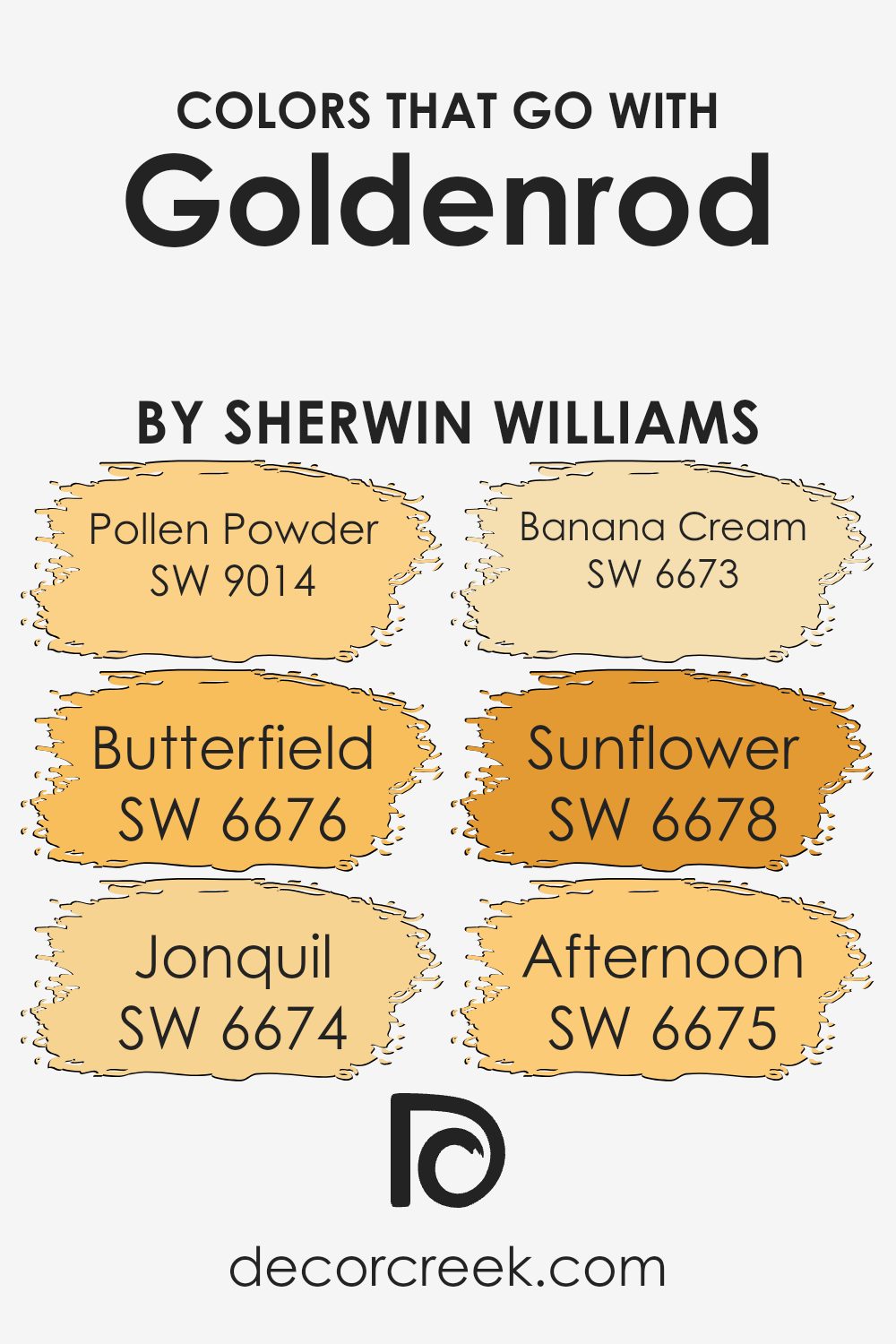
Colors that pair well with Goldenrod SW 6677 by Sherwin Williams play a crucial role in creating cohesive and appealing color schemes in interior design. Such coordination ensures that the chosen hues complement each other, enhancing the overall aesthetic of a space.
When paired correctly, these colors can bring out the boldness of Goldenrod, making it stand out as a vibrant and warm hue that can act as a focal point or an energetic background in any room.
For instance, Pollen Powder SW 9014 is a soft and subtle yellow that provides a gentle contrast to the more intense Goldenrod, making it ideal for creating a soothing yet cheerful ambiance. Meanwhile, Butterfield SW 6676 offers a deeper yellow tone that harmonizes with Goldenrod’s richness, perfect for adding a sense of continuity and flow in a color palette.
Jonquil SW 6674, with its vivid and lively yellow, injects an extra splash of brightness, enhancing the energetic feel of a room. Banana Cream SW 6673 is slightly lighter, providing a fresh and airy feel that can lighten up a space while still supporting the vibrant theme.
Sunflower SW 6678, with its deep, almost orangey hue, pairs wonderfully with Goldenrod for a more dramatic and bold effect, ideal for spaces intended to make a statement. Lastly, Afternoon SW 6675 is reminiscent of a sunny day and works beautifully alongside Goldenrod for a cheerful and inviting environment. These colors come together to offer versatility and charm, ensuring that Goldenrod can indeed shine in various settings.
You can see recommended paint colors below:
- SW 9014 Pollen Powder (CHECK A SAMPLE)
- SW 6676 Butterfield (CHECK A SAMPLE)
- SW 6674 Jonquil (CHECK A SAMPLE)
- SW 6673 Banana Cream (CHECK A SAMPLE)
- SW 6678 Sunflower (CHECK A SAMPLE)
- SW 6675 Afternoon (CHECK A SAMPLE)
How to Use Goldenrod SW 6677 by Sherwin Williams In Your Home?
Goldenrod SW 6677 by Sherwin Williams is a vibrant, cheerful yellow paint color that can brighten up any space in your home. Perfect for adding a splash of sunshine, it works well in kitchens and living rooms where you spend a lot of time during the day. This warm yellow shade is also a great choice for a child’s playroom or a creative space, as it brings a lively and energetic vibe.
Using Goldenrod in small doses, like on an accent wall or for furniture pieces, can inject personality into a room without overwhelming it. It pairs beautifully with neutral colors such as white, gray, or beige, which help balance its brightness. For a dramatic effect, you could combine it with dark blues or greens.
Additionally, because Goldenrod is a bold color, it can make narrow spaces like hallways feel more inviting and spacious. Whether you’re looking to create a cheerful nook or add a touch of warmth to your entire home, this shade can help you achieve the look you’re going for with its sunny disposition.
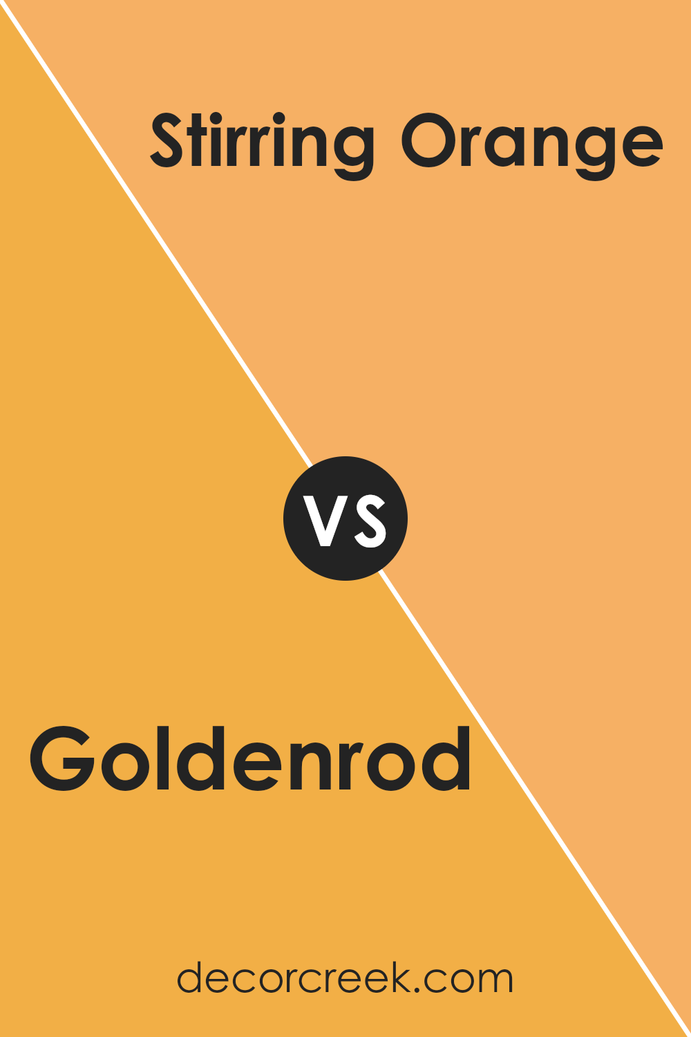
Goldenrod SW 6677 by Sherwin Williams vs Stirring Orange SW 6889 by Sherwin Williams
Goldenrod SW 6677 by Sherwin Williams is a warm, deep yellow with a subtle vibrancy that brings a cozy and uplifting feel to any space. It resembles the color of late summer sunflowers and harvest moons, making it ideal for creating a cheerful and inviting atmosphere in rooms like the kitchen or living room.
On the other hand, Stirring Orange SW 6889 is a bold and energetic orange that packs a punch. This shade is reminiscent of autumn leaves and festive pumpkins, providing a lively pop of color that is sure to brighten up any area. It works well in spaces that benefit from a sense of fun and creativity, such as a playroom or an eccentric home office.
Both colors offer a way to add warmth and brightness to your home, with Goldenrod lending a softer, sunlit quality and Stirring Orange offering a more intense, lively vibe. This makes each color suitable for different purposes and moods, depending on the effect you want to achieve in your space.
You can see recommended paint color below:
- SW 6889 Stirring Orange
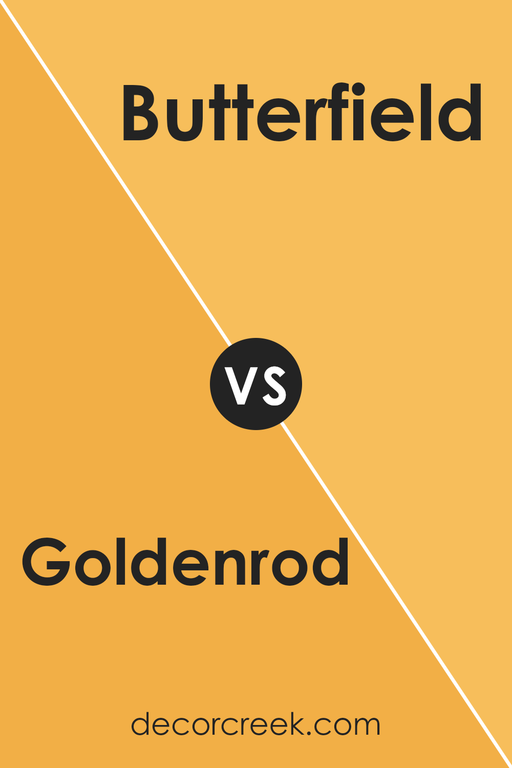
Goldenrod SW 6677 by Sherwin Williams vs Butterfield SW 6676 by Sherwin Williams
Goldenrod SW 6677 and Butterfield SW 6676, both by Sherwin Williams, are warm, welcoming shades that fall into the yellow family. Goldenrod is a bolder, more vivid shade, reminiscent of the flower it’s named after. It has a deep, sunlit tone that might remind you of a bright, sunny day.
On the other hand, Butterfield is a lighter, more subtle yellow. It resembles the creamy hue of butter and offers a gentler touch of color. Goldenrod works well in a space where you want to add a dash of cheerfulness and energy, while Butterfield is perfect for creating a soft, soothing atmosphere.
Both colors are great for adding warmth to a room, but your choice depends on how striking you want the color effect to be.
You can see recommended paint color below:
- SW 6676 Butterfield (CHECK A SAMPLE)
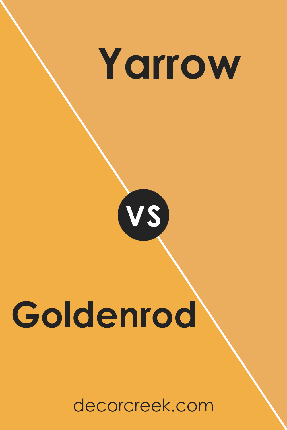
Goldenrod SW 6677 by Sherwin Williams vs Yarrow SW 6669 by Sherwin Williams
Goldenrod SW 6677 and Yarrow SW 6669 are two distinct shades offered by Sherwin Williams. The color Goldenrod is a warm, rich yellow with a sunny vibe. It’s deep enough to make a bold statement, yet it retains a certain softness that prevents it from overpowering a room.
On the other hand, Yarrow is an intense, vivid yellow with a hint of mustard. This color is bolder and can add a striking touch to any space. While Goldenrod might bring a cozy and welcoming feel, ideal for a living room or kitchen, Yarrow, with its stronger tone, could be great for an accent wall or decor items that you want to stand out.
Both colors bring warmth but in different intensities and shades, making them suitable for various decorating styles and preferences.
You can see recommended paint color below:
- SW 6669 Yarrow (CHECK A SAMPLE)
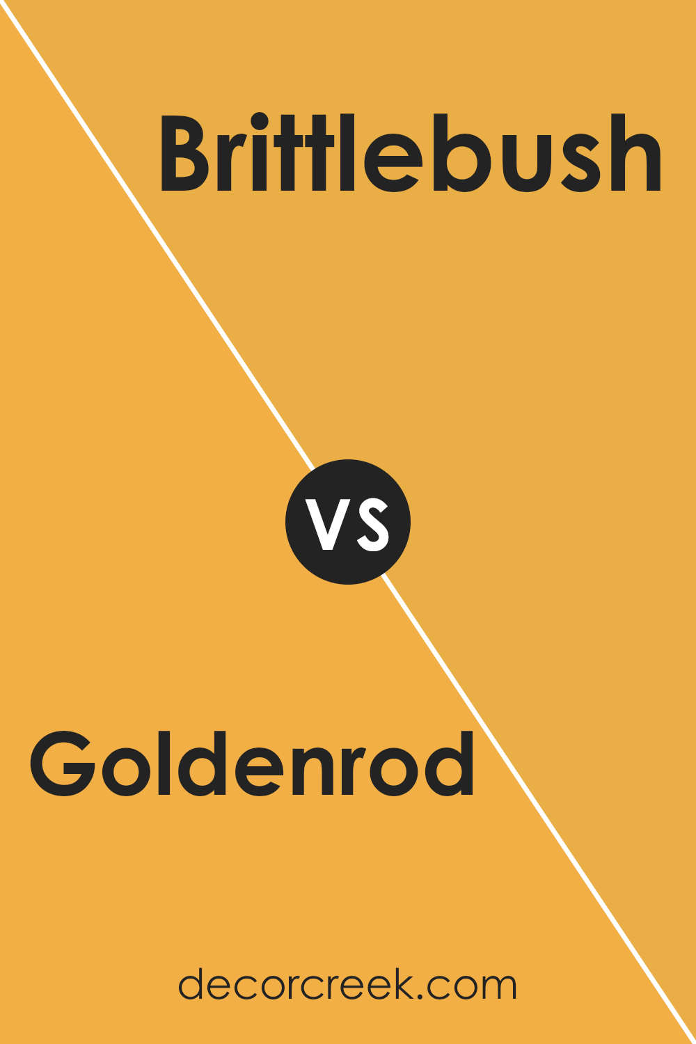
Goldenrod SW 6677 by Sherwin Williams vs Brittlebush SW 6684 by Sherwin Williams
Goldenrod SW 6677 by Sherwin Williams is a warm, vivid yellow with a subtle orange tone that makes it stand out. It’s bright and cheerful, perfect for creating a cozy and inviting atmosphere in any room. On the other hand, Brittlebush SW 6684 is a lighter, softer yellow. This color is more understated and has a gentle appeal that can make spaces feel airy and open.
While Goldenrod is bolder and can be a focal point in a design, Brittlebush offers a quieter backdrop, ideal for those who prefer a more subtle look. These two colors can work well together for anyone wanting to combine a striking feature with a calming balance.
Goldenrod can bring in energy and warmth, whereas Brittlebush can provide a soothing contrast, ideal for a balanced, cheerful ambiance.
You can see recommended paint color below:
- SW 6684 Brittlebush (CHECK A SAMPLE)
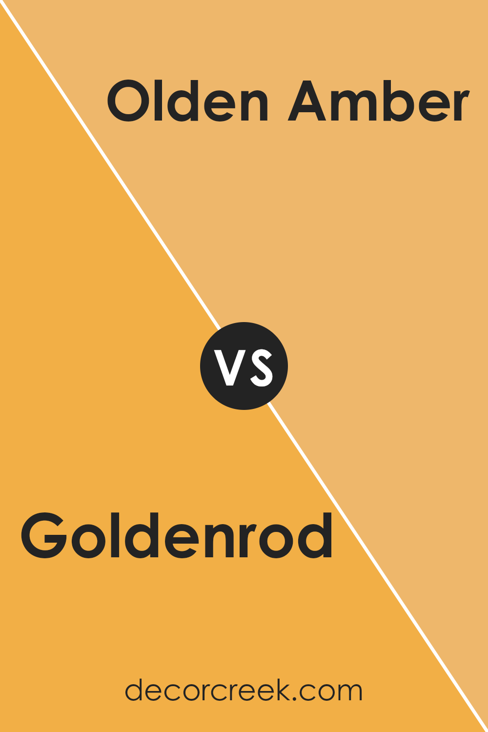
Goldenrod SW 6677 by Sherwin Williams vs Olden Amber SW 9013 by Sherwin Williams
Goldenrod (SW 6677) and Olden Amber (SW 9013) are two colors offered by Sherwin Williams, but they each bring their own unique vibe. Goldenrod is a bright, sunny yellow with a vibrant energy that can instantly make a room feel welcoming and cheerful.
It’s particularly great for spaces that you want to give a lively, uplifting feel. On the other hand, Olden Amber has a deeper, richer hue that resembles a warm honey or deep mustard. This color adds a cozy, more grounded ambiance to a room, making it perfect for creating a snug and inviting space.
Both colors are warm-toned, which can help make a space feel warm and cozy, but Goldenrod throws in more brightness, while Olden Amber offers depth and warmth.
You can see recommended paint color below:
- SW 9013 Olden Amber (CHECK A SAMPLE)
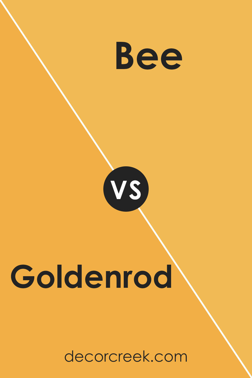
Goldenrod SW 6677 by Sherwin Williams vs Bee SW 6683 by Sherwin Williams
Goldenrod SW 6677 and Bee SW 6683 by Sherwin Williams are both warm, inviting shades but with distinct vibes. Goldenrod offers a deeper, mustard-like yellow that brings a cozy, autumn-inspired feel to spaces. It pairs well with rich, earthy tones like browns and greens, making it perfect for areas where you want a touch of warmth without overwhelming brightness.
On the other hand, Bee is a brighter, more vibrant yellow. It’s closer to a sunflower yellow and injects a cheerful, energetic pop of color wherever used. This shade works great in spaces designed for creativity and happiness, like kitchens and playrooms.
Both colors are great for adding a sunny disposition to your home but serve different moods and themes. Goldenrod leans towards a subtle, warm palette, while Bee offers a punchier tone that stands out more boldly.
You can see recommended paint color below:
- SW 6683 Bee (CHECK A SAMPLE)
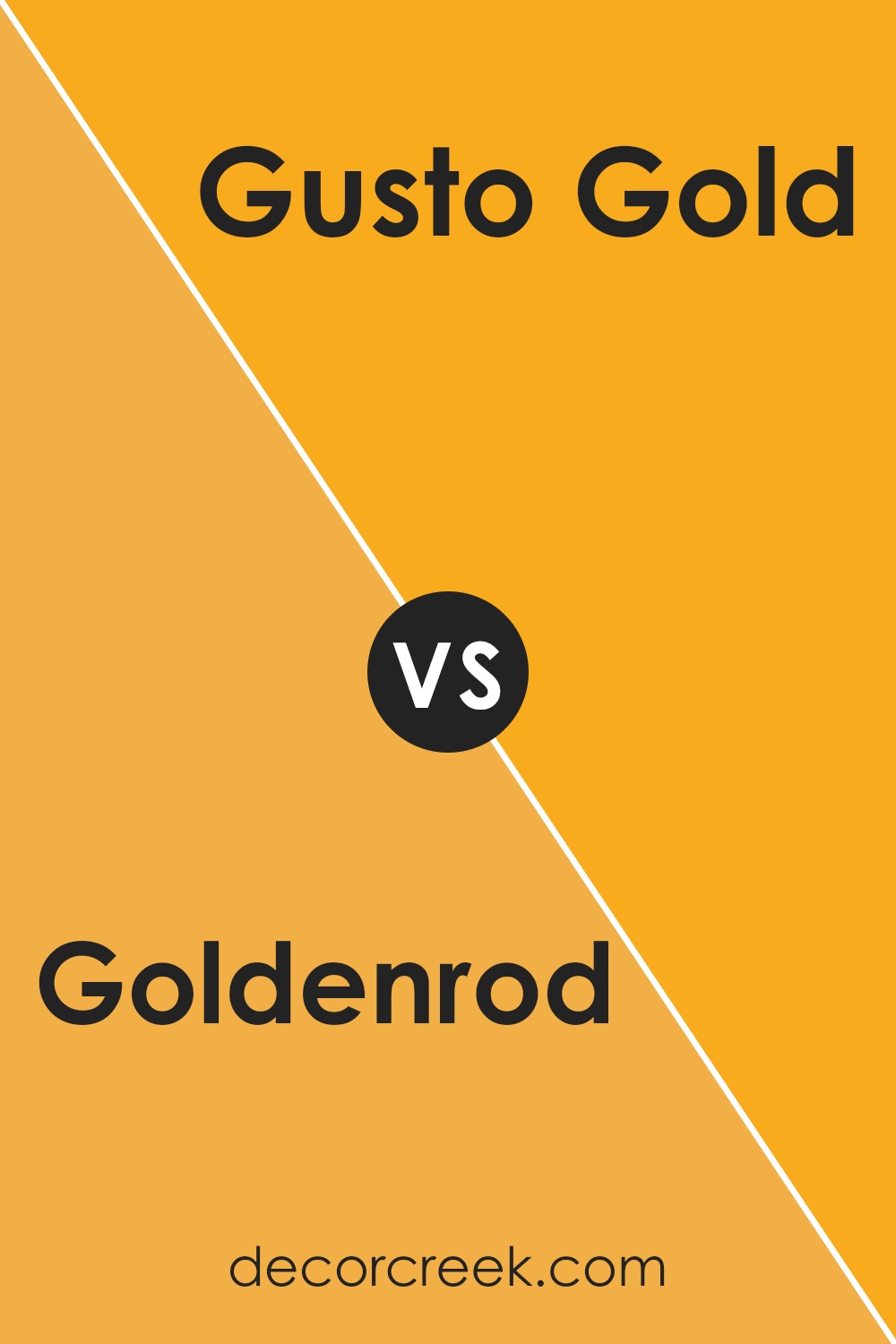
Goldenrod SW 6677 by Sherwin Williams vs Gusto Gold SW 6904 by Sherwin Williams
Goldenrod and Gusto Gold, both from Sherwin Williams, offer distinct shades of yellow, each with its unique appeal. Goldenrod is a subtle, muted yellow with a warm, welcoming vibe. It’s not too bright, making it a versatile choice that can easily blend with different decor styles, adding a soft, cheerful touch to any room.
On the other hand, Gusto Gold stands out with its bold and vibrant tone. This color is deeper and richer, resembling the bright hue of marigold flowers. Gusto Gold packs a punch and is perfect for making a strong statement in a space. It works well in areas that benefit from a splash of energy and personality.
In comparison, Goldenrod is more laid-back and suits a broad range of settings, while Gusto Gold is ideal for those who want to add a dynamic and lively feel to their environment. Both colors bring warmth to interiors but cater to different tastes and design needs.
You can see recommended paint color below:
- SW 6904 Gusto Gold (CHECK A SAMPLE)
Goldenrod SW 6677 by Sherwin Williams vs Social Butterfly SW 6898 by Sherwin Williams
Goldenrod SW 6677 by Sherwin Williams is a warm, rich yellow that brings brightness and cheer to any space. It has a sunny vibe that can make a room feel more inviting and cozy. This shade works well in spaces that need a pop of color or in areas that get plenty of light, enhancing the natural brightness.
On the other hand, Social Butterfly SW 6898 is a vivacious pink with a playful and energetic feel. It’s a bold choice that adds a sense of fun and personality to a room. This color is great for creating a focal point or for use in a child’s room or creative space where you want to inspire joy and creativity.
Both colors are quite distinct and can set very different moods in a space. Goldenrod leans towards a natural, relaxed feel, while Social Butterfly is more about zest and excitement. Depending on what atmosphere you want to create, each offers its unique charm and impact.
You can see recommended paint color below:
- SW 6898 Social Butterfly

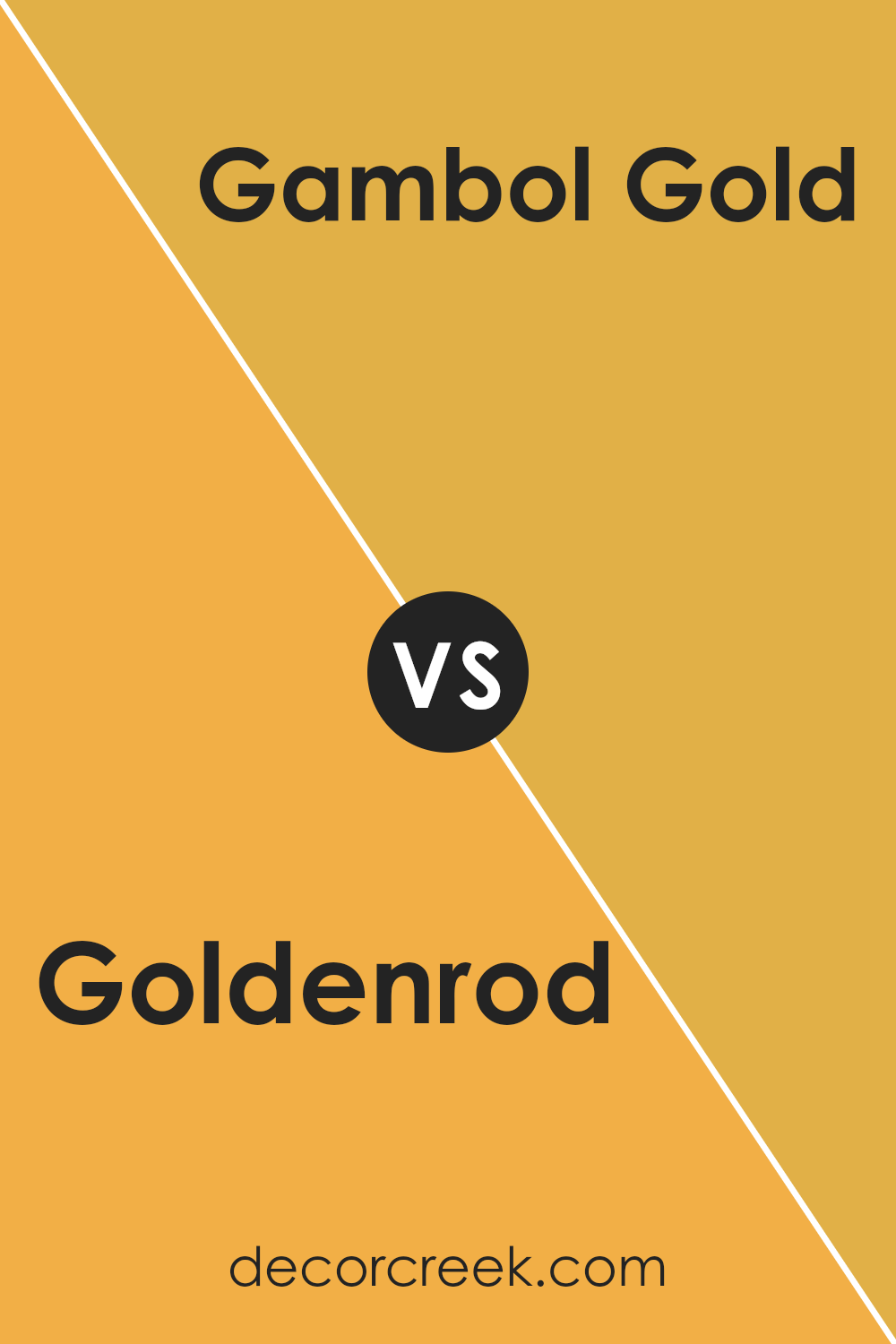
Goldenrod SW 6677 by Sherwin Williams vs Gambol Gold SW 6690 by Sherwin Williams
Goldenrod SW 6677 and Gambol Gold SW 6690 are both warm and inviting shades by Sherwin Williams, but they do have some distinct differences. Goldenrod is a subdued and earthy yellow with a slightly muted tone, making it perfect for creating a cozy and welcoming atmosphere. It works well in spaces where you want a touch of warmth without overwhelming brightness.
On the other hand, Gambol Gold is a brighter and more vibrant yellow. It’s a cheerful color that stands out more and can energize a room. This makes it ideal for areas where you want to add a lively and playful vibe.
While Goldenrod offers a more understated charm, Gambol Gold is bolder and can make a statement. Depending on the mood you want to set in your space, you might choose the soft and gentle feel of Goldenrod or the more dynamic and energetic presence of Gambol Gold. Both colors add warmth, but the impact varies between subtle and striking.
You can see recommended paint color below:
- SW 6690 Gambol Gold (CHECK A SAMPLE)
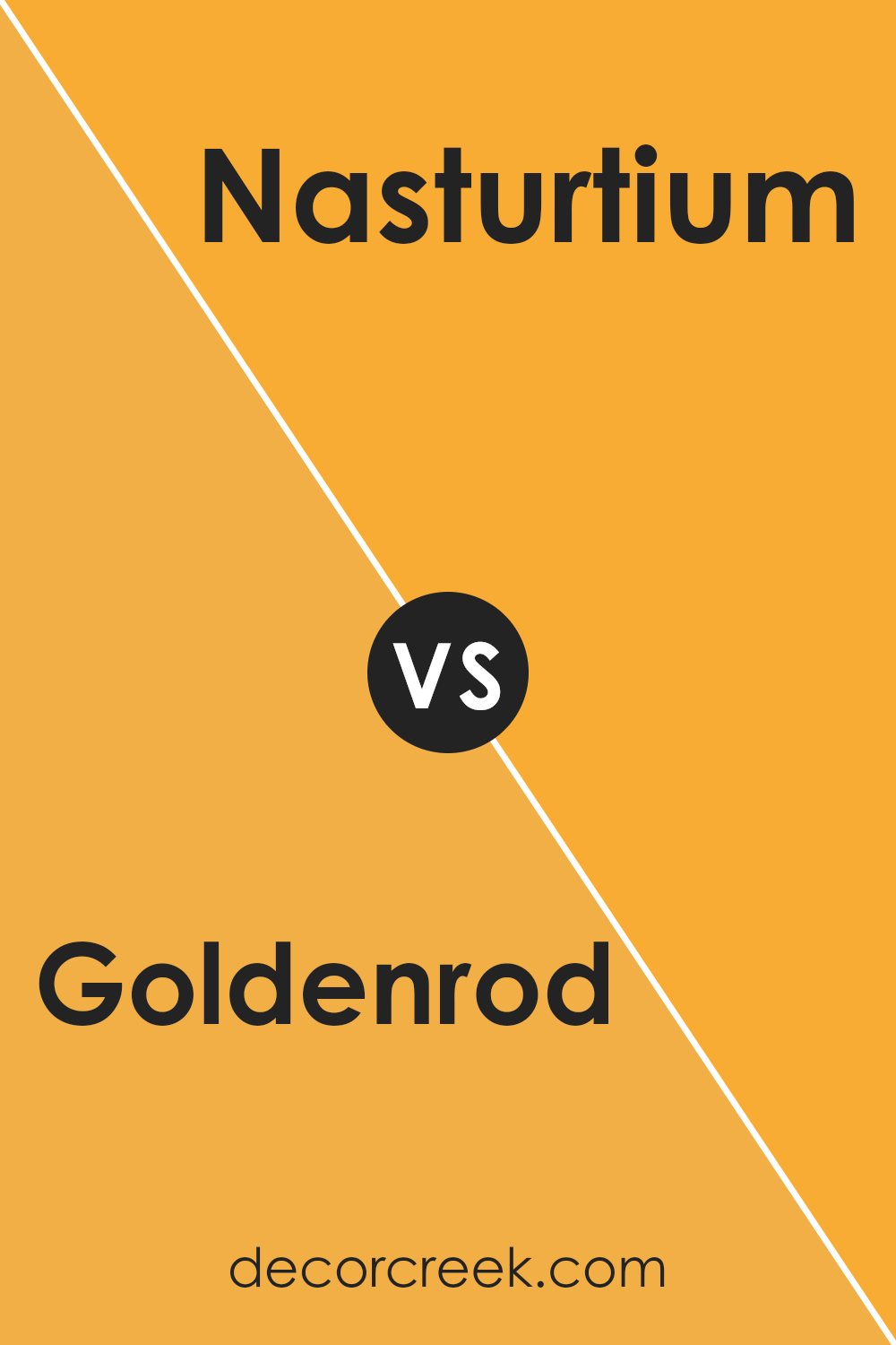
Goldenrod SW 6677 by Sherwin Williams vs Nasturtium SW 6899 by Sherwin Williams
Goldenrod SW 6677 and Nasturtium SW 6899 are two vibrant paint colors from Sherwin Williams, each with its own unique appeal. Goldenrod is a warm, deep yellow that brings a cozy, inviting vibe to any space. It’s a cheerful color that can brighten up rooms that need a touch of sunshine, making it perfect for living areas and kitchens.
On the other hand, Nasturtium is a bold, bright orange that stands out with its lively intensity. This color has a playful yet energetic feel, ideal for spaces where you want to add some fun and excitement. It can work beautifully as an accent wall or in areas where creative or dynamic energy is needed, like playrooms or creative studios.
Both colors are striking in their own ways and can be used to create distinct moods in a home. Goldenrod offers a sense of warmth and coziness, while Nasturtium provides a punch of enthusiasm and vibrancy. Choosing between them depends on what atmosphere you want to create in your space.
You can see recommended paint color below:
- SW 6899 Nasturtium
Conclusion
As I wrap up my thoughts on the SW 6677 Goldenrod paint by Sherwin Williams, I feel it’s an excellent choice for anyone looking to add a splash of sunshine to their space. This bright and cheerful yellow brings a warm and inviting vibe to any room, making it perfect for places where you want to feel happy and energetic, like a kitchen or a playroom.
Goldenrod works best when paired with contrasting colors that can balance its brightness. For instance, using it with shades of gray or navy blue can make the walls really pop and give the room a fresh, modern look. It’s also important to consider the lighting in your room because this yellow can change its mood depending on how much light it gets; it feels softer in natural light and bolder in artificial light.
Lastly, painting with Goldenrod is a smooth experience as Sherwin Williams paint is known for its quality and ease of application. It covers well and lasts a long time, ensuring that your vibrant walls keep their color without needing constant touch-ups.
So, if you’re thinking about giving your room a makeover, SW 6677 Goldenrod is undoubtedly worth considering. It’s a color that makes you smile every time you walk into the room!

Ever wished paint sampling was as easy as sticking a sticker? Guess what? Now it is! Discover Samplize's unique Peel & Stick samples.
Get paint samples


