In the vast world of paints and shades, Sherwin Williams has managed to carve out a special place with their unique range of paints. Snowbound SW 7004 is a color that stands out within this range due to its distinct quality and appeal. This article takes an in-depth look at this distinctive color, its undertones, how it works with other shades, and how it transforms under different lighting conditions.
We will also delve into its Light Reflectance Value (LRV), the importance of coordinating trim colors, and similar shades that offer alternative choices to consumers.

What Color Is Snowbound SW 7004?
Snowbound SW 7004 is a shade of white that exhibits a clean, bright, and fresh appeal. Unlike stark white, which can come off as sterile or stark, Snowbound manages to hold onto a sense of warmth. This color evokes images of freshly fallen, unblemished snow, with its inherent purity and serenity. It’s a shade that can lend a touch of grace and sophistication to any space.
While Snowbound can be described as white, it is far from a simple, basic white. Up close and personal, one can notice that this shade has more depth to it. There’s an inherent elegance to this color which can uplift and brighten any room, creating a perfect backdrop that allows other elements in the room to shine.
The subtlety of Snowbound SW 7004 lies in the slight undertones that lend it its unique character.

Ever wished paint sampling was as easy as sticking a sticker? Guess what? Now it is! Discover Samplize's unique Peel & Stick samples.
Get paint samples

Is It a Warm Or Cool Color?
Snowbound SW 7004 can be classified as a cool color due to its undertones. Cool colors are often described as calming and relaxing, and Snowbound is no different. It brings a serene, tranquil vibe to a room, making it an excellent choice for spaces where peace and calm are desired.
Undertones of Snowbound SW 7004
The undertones of color are the colors that appear beneath the surface, subtly influencing how we perceive the main hue. In the case of Snowbound, it carries a very slight and balanced violet-pink undertone. This undertone, while not easily discernible, provides a crisp freshness to the color, creating an inviting ambiance.
Undertones play a significant role in how we perceive color. They influence the visual temperature of the hue and can dramatically change the mood of the space. The violet-pink undertone of Snowbound makes it a cooler white, making it perfect for creating a calm, serene atmosphere.

Coordinating Colors of Snowbound SW 7004
Coordinating colors are the colors that harmonize well with a particular color. When it comes to Snowbound SW 7004, there are several colors that pair perfectly with it:
- SW 9138 Stardew : This subtle, silvery-blue color complements Snowbound by enhancing its cool undertones while providing a soft, serene atmosphere.
- SW 7064 Passive : A soft and light gray, Passive adds depth to a room when paired with SW Snowbound while keeping the space looking fresh and open.
- SW 9178 In the Navy : As a bold, rich navy color, In the Navy adds a striking contrast against Snowbound, bringing a sense of sophistication and drama to the space.
- SW 9167 Polished Concrete : This warm, medium-gray creates a grounding effect when used with Snowbound, adding a contemporary and stylish vibe to any room.
Three other colors that harmonize well with Snowbound are the following:
- SW 7611 Tranquil Aqua , a soft, pastel blue-green;
- SW 6100 Practical Beige , a warm, light beige;
- SW 7071 Gray Screen , a medium, true gray.

How Does Lighting Affect Snowbound SW 7004?
The lighting in a room can significantly alter the appearance of Snowbound SW 7004. Under warm, artificial light, the cool violet-pink undertones of Snowbound can become more noticeable, lending a subtle warmth to the color. Conversely, under cool, natural light, Snowbound may appear as a true, crisp white, highlighting its fresh and clean appeal.

LRV of Snowbound SW 7004
The LRV (or Light Reflectance Value) of color indicates how much light the color reflects. Snowbound SW 7004 has an LRV of 83, which places it in the higher range. This high LRV means that Snowbound reflects a significant amount of light, making it an excellent choice for dark spaces or rooms that need a brightening effect.
A high LRV color like Snowbound is also beneficial in small rooms, as it can make the space appear larger and more open. Plus, it also reduces eye strain, making the environment more comfortable to spend time in.

LRV – what does it mean? Read This Before Finding Your Perfect Paint Color
Trim Colors of Snowbound SW 7004
Trim colors are the colors used on the architectural trim and molding in a room. They are important because they create a finished look and can either subtly blend with the wall color or provide a stark contrast. For Snowbound SW 7004, the following shades of white make excellent trim choices:
- SW Alabaster (SW 7008) : This is a timeless, slightly warm white that provides a subtle contrast against Snowbound.
- SW Extra White (SW 7006) : This is a pure, brilliant white that creates a more distinct border against Snowbound, perfect for a crisp, modern aesthetic.
- SW Westhighland White (SW 7566) : A creamy, warm white, Westhighland White offers a softer, more harmonious transition from the cool Snowbound.

Colors Similar to Snowbound SW 7004
Recognizing similar colors is crucial as it offers alternatives and allows more flexibility in design. Two colors similar to Snowbound are:
- SW Pure White (SW 7005) : This is a versatile and neutral white that is warmer than Snowbound. It works beautifully in almost any space and lighting condition.
- SW Ibis White (SW 7000) : Ibis White is a slightly cooler white with a more noticeable gray undertone. It brings a modern and minimalistic feel to a room.
Understanding colors that are similar to your chosen shade gives you a broader palette to work with. It allows you to adjust your color scheme based on specific needs, such as room size, lighting conditions, or desired mood, ultimately resulting in a more personalized and comfortable space.

Colors That Go With Snowbound SW 7004
When you’re looking to create a beautiful, harmonious interior design, the color palette you choose is critically important. Snowbound SW 7004, with its clean, fresh appeal and cool undertones, pairs well with a variety of other colors, creating a balanced and inviting space. Here are a few excellent choices:
- SW 7622 Homburg Gray : This deep, cool gray adds depth and richness when paired with Snowbound, creating a striking balance between light and dark.
- SW 9170 Acier : A complex gray with neutral undertones, Acier offers a subtle contrast to Snowbound. It’s a versatile color that adds sophistication to any room.
- SW 7015 Repose Gray : Repose Gray is a light to medium gray with warm undertones. When paired with Snowbound, it offers a soft, harmonious contrast, making it perfect for a relaxing and welcoming space.
- SW 6218 Tradewind : Tradewind is a soft, cool blue that beautifully enhances the cool undertones of Snowbound. It creates a calm, serene atmosphere, perfect for bedrooms or bathrooms.
- SW 7016 Mindful Gray : Mindful Gray is a warm, medium gray that can bring a sense of comfort and coziness to a room. When paired with Snowbound, it provides a balanced and contemporary look.
- SW 9130 Evergreen Fog : Evergreen Fog is a muted green-gray that adds a touch of earthy warmth to the coolness of Snowbound. It’s an excellent choice for creating a soothing, nature-inspired palette.
Selecting colors that go well together is fundamental in interior design as it creates a sense of harmony and balance in the room. Colors that complement each other enhance the overall aesthetics and create a pleasing, cohesive look. They can influence mood, perception of space, and overall comfort.
Combining colors successfully, like Snowbound with the colors listed above, can highlight architectural details, create visual interest, and even affect the perceived temperature of the space. Ultimately, a well-curated color palette helps to create a room that is not just visually appealing but also resonates with the feelings and moods you want to evoke.
Whether you’re aiming for a calm and serene space or a vibrant and energetic one, the interplay of colors can help you achieve your desired effect.

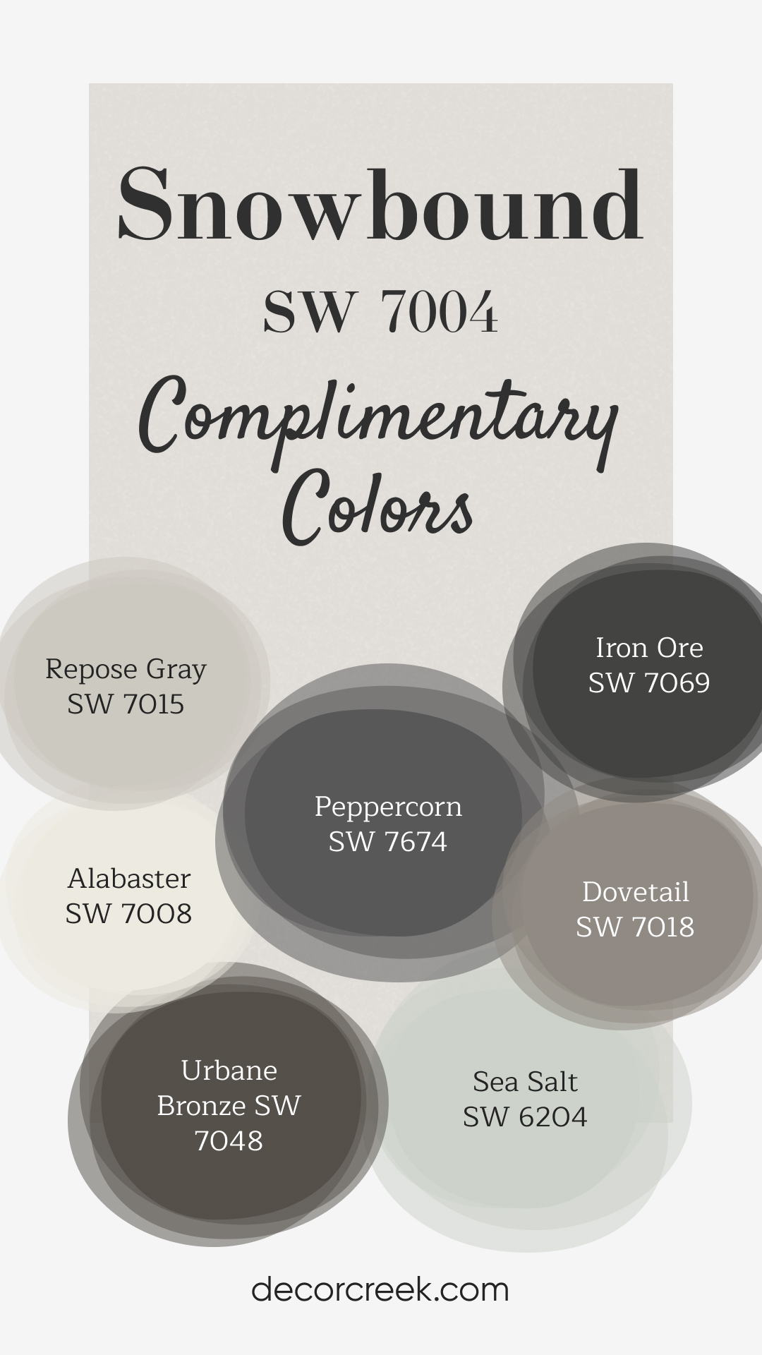
Complimentary Colors for Snowbound SW 7004 Paint Color by Sherwin-Williams
Snowbound by Sherwin Williams is a clean and crisp white that serves as an ideal backdrop for both bold and subtle shades. It pairs beautifully with deeper tones like Peppercorn and Iron Ore, offering striking contrast. Alabaster and Repose Gray add lighter, neutral tones that soften the palette, bringing a sense of balance.
Whether you’re looking for contrast or harmony, these colors work together to enhance the look of your home. Urbane Bronze and Dovetail provide depth and warmth, adding richness to the mix, while Sea Salt brings a refreshing hint of color with its light, greenish-blue hue. These versatile shades can easily be combined to create a sophisticated yet welcoming atmosphere.
Whether you’re updating your walls, accents, or trim, these colors are a great way to add dimension and character to your space.
How to Use Snowbound SW 7004 In Your Home?
Snowbound SW 7004, with its serene and fresh appeal, can be used in any room in your house. Its versatile nature and high LRV make it an excellent choice for spaces large and small, bright and dim. It also fits well with various interior design styles, from modern and contemporary to Scandinavian and minimalist. The balanced undertones and bright presence of Snowbound create a perfect canvas, allowing other design elements in the room to shine.
How to Use Snowbound SW 7004 in the Bedroom?
Snowbound shines in the bedroom, creating a calm, peaceful retreat. Its cool undertones and high light reflectance value can make the room feel larger, brighter, and more restful. Pair it with soft, neutral linens and curtains for a serene and airy feel.
Additionally, Snowbound works beautifully in a bedroom with rich-colored furniture. The color helps to balance out the darkness of the furniture, while the slight violet-pink undertones complement the warmth of wood tones. It also works well in a child’s bedroom, offering a neutral base that can grow with the child’s changing tastes.

How to Use Snowbound SW 7004 in the Bathroom?
In bathrooms, Snowbound adds freshness and brightness, making the space feel clean and spa-like. It’s especially effective in small or windowless bathrooms, as the high LRV can help to brighten up the space. Pair it with cool-toned fixtures and accessories for a crisp, modern look.
In a larger bathroom, Snowbound can be paired with darker shades like SW Homburg Gray or SW Acier for a sophisticated, high-contrast look. Use these darker colors for cabinetry or accents to create visual interest while allowing Snowbound to keep the overall feel of the room light and bright.

How to Use Snowbound SW 7004 in the Living Room?
In the living room, Snowbound can help to create a relaxing and welcoming environment. Use it on the walls to set a light and bright backdrop, and complement it with a mix of cool and warm-toned furniture and accessories to create a balanced, harmonious look.
Snowbound also pairs beautifully with a variety of textures. Use it alongside rich fabrics like velvet or leather to create a luxurious feel, or pair it with soft, cozy textiles for a comfortable, inviting space. Regardless of the living room’s style, Snowbound can enhance the aesthetics, making the room feel calm, sophisticated, and open.

How to Use Snowbound SW 7004 for an Exterior?
When used on home exteriors, Snowbound brings a timeless, elegant appeal. The color works well with various architectural styles, from modern and minimalist to classic and traditional. Its high LRV also helps to reflect sunlight, keeping the home cooler during the hot summer months.
For a classic look, pair Snowbound with contrasting trim colors like SW Homburg Gray or SW Acier. For a more modern look, try pairing it with darker, bold colors for the front door or shutters. Regardless of the design choice, Snowbound can lend a touch of sophistication and curb appeal to any home exterior.

How to Use Snowbound SW 7004 in the Kitchen
The kitchen, often referred to as the heart of the home, is another perfect space for Snowbound. The color’s brightness and freshness create an inviting and clean atmosphere. Paired with stainless steel appliances and open shelving, Snowbound can help achieve a modern, airy kitchen space.
For a touch of contrast, consider a kitchen island or lower cabinets in a darker shade like SW Homburg Gray or SW Acier. This contrast will add visual interest and depth to the kitchen, while the overall brightness of Snowbound keeps the space feeling open and light.

How to Use Snowbound SW 7004 for the Kitchen Cabinets
Kitchen cabinets painted in Snowbound can instantly brighten and modernize the space. This is especially effective in a kitchen with limited natural light or in smaller kitchens where the goal is to make the space feel larger.
On the other hand, if your kitchen is spacious with ample natural light, Snowbound cabinets can create a breezy, fresh environment. Pair them with a contrasting countertop in a darker hue or a backsplash in a bold color for a stylish and contemporary look.

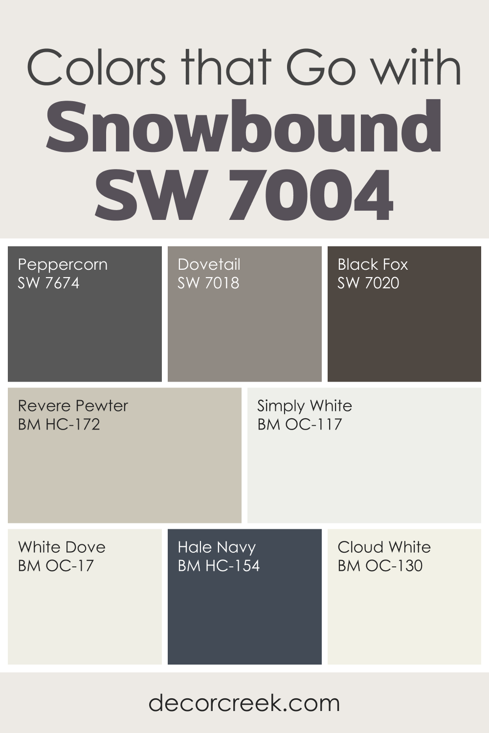
Colors That Go With Snowbound SW 7004 for a Clean and Modern Home
Snowbound SW 7004 is a crisp, bright white that brings a clean look without feeling cold. I often choose it for modern homes or rooms that need a sharp, fresh backdrop. When paired with deeper tones like Peppercorn, Dovetail, and Black Fox, Snowbound gains a bold contrast that makes the whole room feel more defined. These darker shades help balance Snowbound’s cool brightness.
If you prefer a softer look, colors like White Dove, Revere Pewter, Simply White, and Cloud White offer warm support and make Snowbound feel gentler. Adding a rich accent such as Hale Navy brings depth and makes the palette feel steady and stylish.
Snowbound works beautifully in kitchens, bathrooms, and modern living areas. It pairs well with metals, clean lines, natural stone, and simple décor.
With the right color partners, Snowbound creates a bright setting that feels fresh, clear, and easy to enjoy every day.
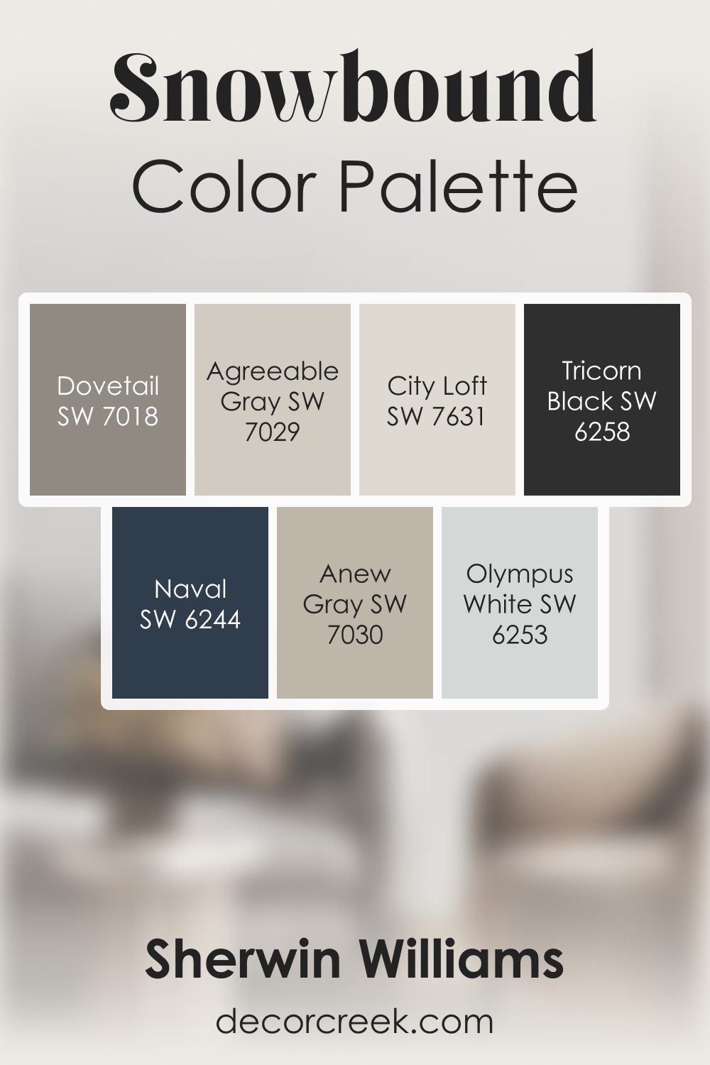
Snowbound SW 7004 by Sherwin Williams Color Palette
When I work with Snowbound, I always feel a soft, clean brightness settle into the room. There’s something calming about the way it sits on the wall—light, gentle, and quietly uplifting. I love pairing it with Agreeable Gray or City Loft when I want a smooth, easy flow that still feels warm. Dovetail brings a lovely mid-tone balance that helps the palette feel grounded without losing softness. Olympus White adds a breath of air, and Anew Gray brings a warm layer that feels steady and welcoming.
Whenever I want contrast that feels strong but not heavy, Naval becomes the perfect companion. It gives Snowbound a deep, confident edge that still feels refined. And Tricorn Black adds that bold touch that makes the whole palette feel crisp and intentional.
This palette works beautifully because each color supports Snowbound rather than competing with it. The result feels bright, calm, and gently structured—perfect for creating rooms that feel both fresh and cozy.
Comparing Snowbound SW 7004 With Other Colors
Comparing your selected color with other colors is important because it helps you understand the color’s undertones, brightness, and overall look more effectively. It allows you to make an informed decision about how the color would work in your space. Also, it provides a better understanding of the color’s versatility and how it pairs with other colors in different lighting conditions and spaces.
Snowbound SW 7004 vs. SW 7657 Tinsmith
Tinsmith is a soft, light gray color that is significantly cooler than Snowbound. While both colors have high LRVs, Tinsmith’s cooler tone may make a space feel more sterile compared to the slight warmth of Snowbound. However, Tinsmith’s cooler tones can work well in a modern or contemporary setting, while Snowbound’s balanced undertones lend it more versatility across various design styles.

Snowbound SW 7004 vs. SW 6100 Practical Beige
Practical Beige is a warm, light beige color, quite different from Snowbound’s cool, white tones. Practical Beige brings a cozy and inviting feeling to a space, while Snowbound lends a crisp, clean look. Both colors can work wonderfully in various settings, but the choice between the two would depend on the desired warmth and mood in the room.

Snowbound SW 7004 vs. SW 9135 Whirlpool
Whirlpool is a soft, muted blue color that offers a much different look than Snowbound. While Whirlpool can bring a calm, serene vibe to a space, Snowbound provides a brighter, more open feel. The two colors would pair well together, with Snowbound offering a bright backdrop to the soothing tones of Whirlpool.

Snowbound SW 7004 vs. SW 7012 Creamy
Creamy is a soft, warm white color, significantly warmer than Snowbound. The noticeable yellow undertones in Creamy lend a cozy, inviting feel to a space, while Snowbound’s slight violet-pink undertones provide a fresh, clean look. While both are beautiful choices, the decision between the two would rely heavily on the amount of warmth you want in your space.

Snowbound SW 7004 vs. SW 7028 Incredible White
Incredible White is a light gray color with a slight green undertone, contrasting with Snowbound’s violet-pink undertones. While Snowbound offers a clean, bright aesthetic, Incredible White has a more subdued, calming effect. Both are versatile colors, but the choice between the two would depend on your color scheme and the mood you want to evoke.

Snowbound SW 7004 vs. SW 6232 Misty
Misty is a soft, light gray-blue color , offering a distinctly cooler look compared to Snowbound. While Misty can bring a tranquil, soothing vibe to a space, Snowbound’s high LRV and neutral undertones provide an airy, open atmosphere. The two colors could pair well together, especially in spaces where you want to instill a calm, serene ambiance.

Conclusion
In the realm of paints, Snowbound SW 7004 is a standout choice. With its crisp, clean appeal, cool undertones, and high light reflectance value, it offers endless possibilities in the world of design. When paired with the right coordinating colors and used with the appropriate trim, this color can transform any space into a haven of tranquility and elegance.
Whether you’re creating a serene bedroom, a fresh living room, or a bright kitchen, Snowbound SW 7004 promises to deliver remarkable results.


