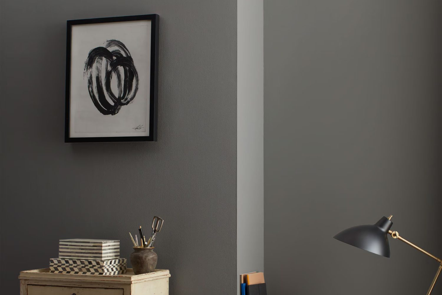
If you’re looking for a paint color that adds a touch of sophistication and style to any room, HC-166 Kendall Charcoal by Benjamin Moore might be just what you need. This shade stands out for its depth and versatility, making it a popular choice among homeowners and interior designers alike. Kendall Charcoal is a deep, warm gray that can create a cozy atmosphere in a space or serve as a bold backdrop for vibrant pops of color in your decor.
This color can transform different areas of your home, whether you’re painting an accent wall, cabinetry, or even the exterior. It works well in a variety of settings, from modern to traditional, because of its timeless elegance. Plus, Kendall Charcoal pairs beautifully with a wide range of colors, from soft whites to bright hues, allowing you to customize your space to fit your personal style.
Choosing the right paint color can sometimes be overwhelming, but Kendall Charcoal by Benjamin Moore offers a blend of warmth and sophistication that can elevate any room. Its versatility makes it a fantastic choice for anyone looking to refresh their space with a color that balances between making a statement and creating a warm, inviting environment. Whether you’re updating a single room or reimagining your entire home, Kendall Charcoal provides an elegant foundation that’s both stylish and practical.
What Color Is Kendall Charcoal HC-166 by Benjamin Moore?
Kendall Charcoal is a rich, deep gray color from Benjamin Moore that adds a touch of sophistication to any space. This color has a warm undertone, making it versatile and inviting, perfect for creating a cozy atmosphere in your home. Whether applied to walls, cabinets, or accents, Kendall Charcoal brings a sense of depth and elegance.
This color works beautifully in a variety of interior styles. In modern and contemporary settings, it provides a strong but neutral background that allows furniture and art to stand out. It’s equally at home in traditional spaces, where its depth can add character to decorative trim or built-in cabinetry. Industrial designs benefit from its gritty, raw edge, pairing well with exposed brick, metal fixtures, and reclaimed wood.
Kendall Charcoal pairs wonderfully with a range of materials and textures. It looks stunning against crisp white trim or soft, creamy fabrics, creating a balanced and visually appealing contrast. Natural wood tones, from light oaks to rich walnuts, complement its warmth, enhancing the cozy feel of a space. In terms of textures, think about incorporating plush velvets or smooth leathers to add luxury, or linens and woven textiles for a more relaxed vibe. This color is a fantastic choice for anyone looking to add depth and sophistication to their interior.
Is Kendall Charcoal HC-166 by Benjamin Moore Warm or Cool color?
Kendall Charcoal by Benjamin Moore is a deep, sophisticated gray that brings a touch of elegance to any home. This color has a unique ability to transform spaces, making them feel both cozy and stylish at the same time. Its versatility is one of its best features; it works beautifully in a variety of settings, from modern kitchens to traditional living rooms. The richness of this gray allows it to serve as a strong backdrop for both bold colors and softer, neutral palettes, making it a favorite choice among homeowners and designers alike.
When applied to walls, Kendall Charcoal adds depth and character, turning a simple room into a statement of style. It’s particularly effective in creating a focal point, whether on a feature wall or when used to highlight architectural details. In well-lit areas, it can appear slightly lighter, showcasing its complex undertones, while in darker rooms, it provides a snug, inviting atmosphere. This flexibility makes Kendall Charcoal a go-to color for those looking to add a touch of sophistication to their home without overwhelming it with darkness. Its balance of warmth and elegance ensures a timeless look that complements a wide range of decor styles.
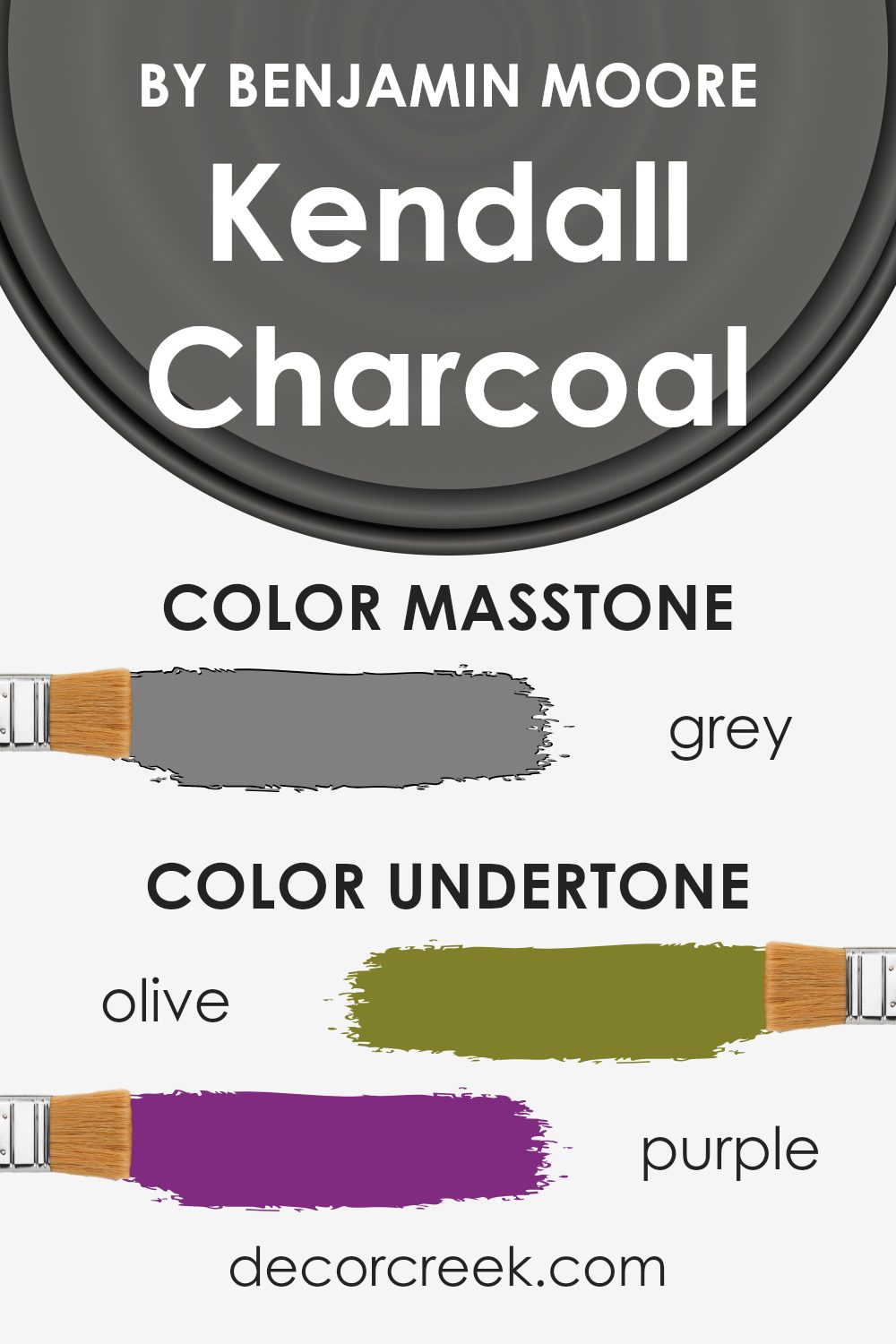
Undertones of Kendall Charcoal HC-166 by Benjamin Moore
Kendall Charcoal is a deep, rich gray that has a unique versatility thanks to its complex undertones. Imagine this color as a canvas that slightly changes its appearance depending on the lighting and surrounding colors. Each undertone adds a layer of depth and sophistication to the main hue.
Undertones like olive, purple, dark turquoise, and brown bring warmth to the gray, making it feel inviting and cozy in a room. This warmth is perfect for creating a comfortable living space or a welcoming kitchen. Dark green, navy, and dark grey add seriousness and elegance, making Kendall Charcoal a great choice for office spaces or formal dining rooms.
When used on interior walls, the color interacts with natural and artificial light, sometimes highlighting its cooler undertones like pale pink, mint, and lilac, giving a room a soft and serene atmosphere. On the other hand, undertones such as orange, light green, and pink can energize the space, making it feel lively and vibrant.
The beauty of Kendall Charcoal lies in its ability to adapt. In a room with lots of sunlight, you might notice its lighter undertones like pale yellow, light purple, and light blue, making the wall feel alive and dynamic. In contrast, in a room with less natural light, its darker undertones, like dark blue, green, and red, could provide a sense of solidity and grounding.
Understanding the undertones of Kendall Charcoal is key to using it effectively in your home. It’s not just a simple gray; it’s a sophisticated palette of colors that can transform a space in subtle but impactful ways. Whether you aim for a soft and airy feel or a dark and cozy vibe, Kendall Charcoal’s undertones have the power to achieve the desired ambiance, making it a truly versatile paint choice for any room.
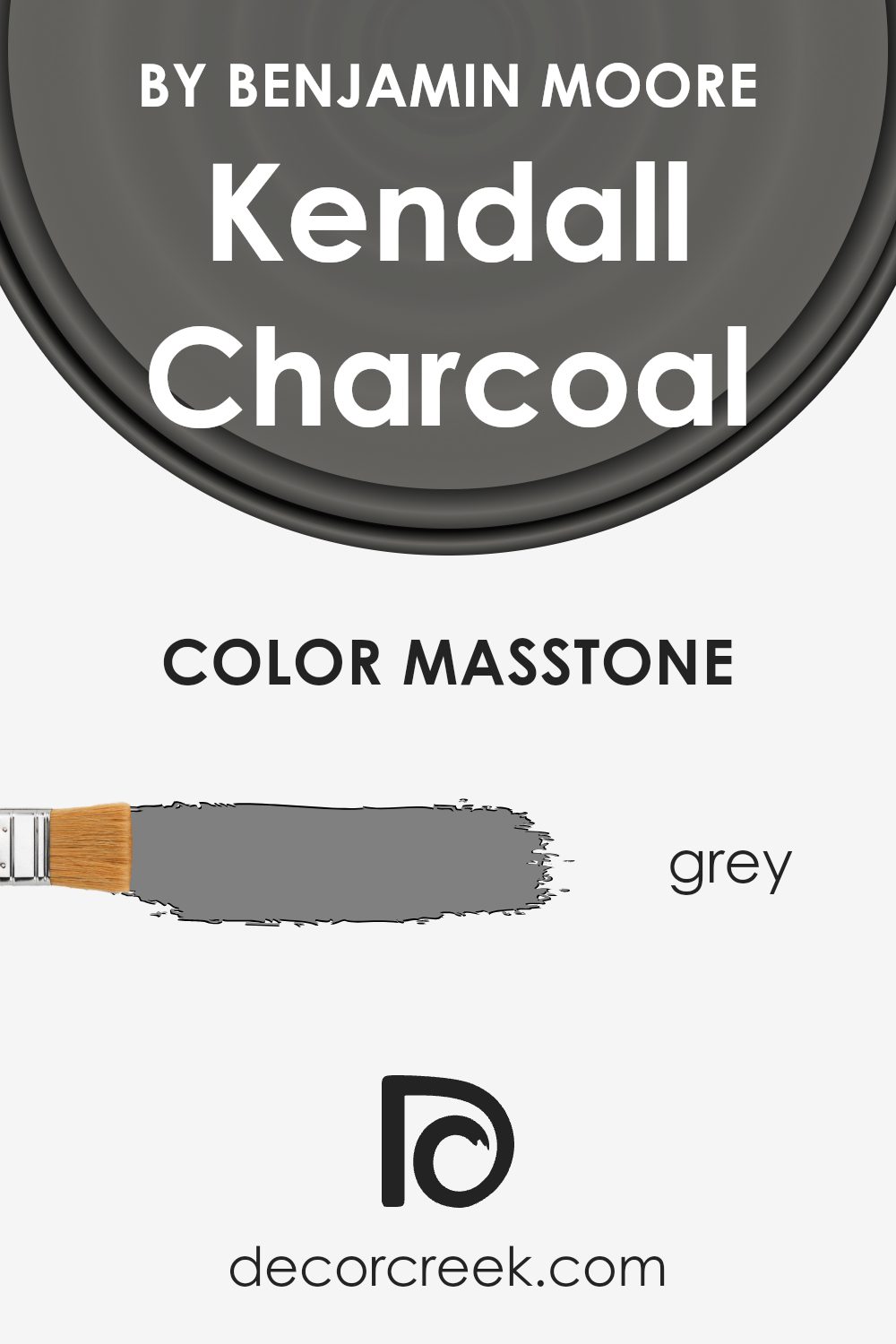
What is the Masstone of the Kendall Charcoal HC-166 by Benjamin Moore?
Kendall Charcoal HC-166 by Benjamin Moore has a masstone that matches the classic shade of grey you see with the code #808080. This particular grey brings a sophisticated and versatile look into homes. It’s a color that works well in various spaces, from living rooms to bedrooms, because of its neutral yet rich tone. The beauty of this shade lies in its ability to balance a room, providing a perfect backdrop for both bold and muted colors. It can make artwork pop, furniture stand out, or create a cozy, understated elegance in a space.
In homes, Kendall Charcoal can offer a sense of stability and calmness, making rooms feel more anchored and thoughtfully designed. It’s especially good for areas that you want to keep somewhat neutral but also give a touch of depth and character. Whether it’s applied on walls, cabinets, or accents, this grey has a soft warmth that avoids the coldness some greys can have, making spaces feel welcoming and lived-in. Its versatility makes it a favorite for homeowners looking to upgrade their space with a color that’s easy to work with.
How Does Lighting Affect Kendall Charcoal HC-166 by Benjamin Moore?
Lighting plays a crucial role in how we perceive colors, with different types of light having a big impact on the way a color looks in a space. This concept is particularly important when considering paint colors for your home or office. Take the color Kendall Charcoal by Benjamin Moore, for example. This is a deep, warm gray that can look dramatically different depending on the light it’s exposed to.
- In artificial light, such as LED or incandescent bulbs, Kendall Charcoal tends to look warmer and can bring out the cozy, inviting aspects of the color. This makes it a popular choice for living areas and bedrooms where artificial light is often used to create a welcoming atmosphere.
- In natural light, the appearance of this color can vary significantly. Natural light changes in color temperature throughout the day, which means Kendall Charcoal will also appear to change. In the bright, midday sun, it might look lighter and more true to its gray undertones. However, near sunrise or sunset, it can take on a warmer, richer hue.
- Rooms facing different directions also have a unique impact on this color. North-facing rooms usually get less direct sunlight, making them cooler in tone. Here, Kendall Charcoal can appear more as a true, deep gray, adding depth and sophistication to the space. In contrast, south-facing rooms receive a greater amount of direct sunlight, brightening the color and highlighting its warmer undertones, making the space feel cozy yet vibrant.
- East-facing rooms get morning light, which is cooler and bluer. This makes Kendall Charcoal appear slightly more muted and cooler in the morning, shifting towards a warmer tone in the afternoon as the quality of light changes. West-facing rooms experience the opposite; the color can look warmer and more dynamic in the evening when these rooms are bathed in the golden hues of the setting sun.
Understanding how lighting affects colors like Kendall Charcoal can help you choose the right paint for your space, ensuring that it always looks its best under any lighting conditions.
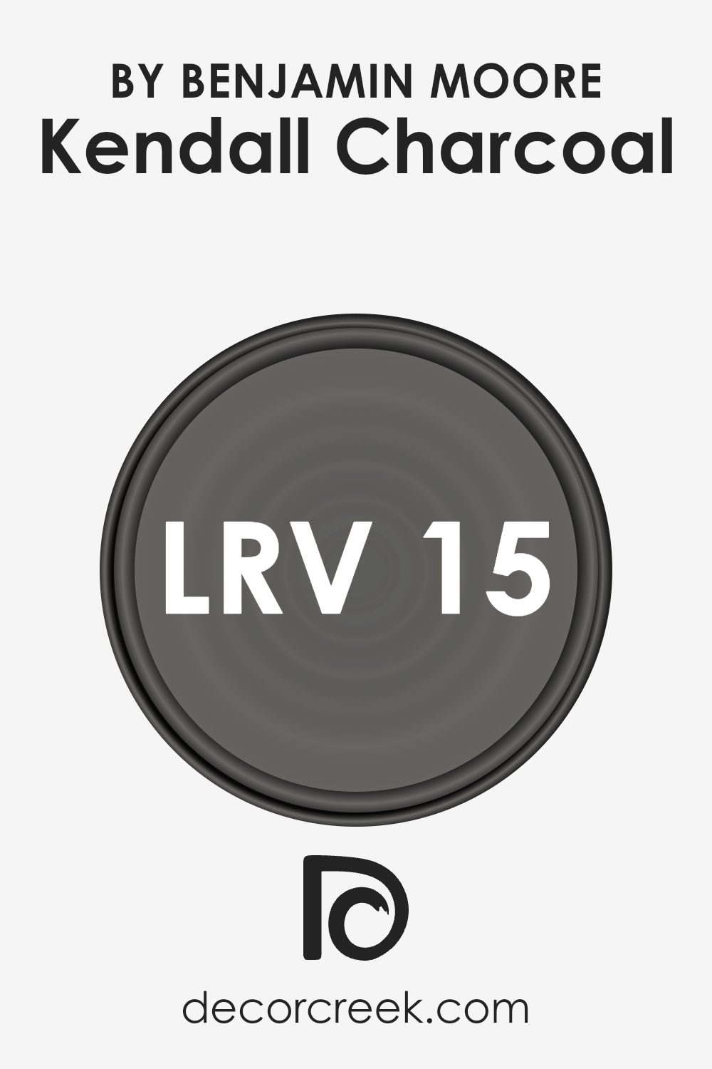
What is the LRV of Kendall Charcoal HC-166 by Benjamin Moore?
LRV stands for Light Reflectance Value, and it’s a measure that tells us how much light a paint color reflects back into a room, compared to how much it absorbs. An LRV can range from 0 to 100, with 0 being a true black that reflects no light and 100 being a pure white that reflects all light. Colors with high LRVs make a room feel brighter and more open because they reflect more light around the space. On the other hand, colors with low LRVs absorb more light, which can make a room feel cozier but also smaller and darker. The LRV is a crucial factor to consider when choosing paint because it affects the overall atmosphere and mood of a room.
The LRV of Kendall Charcoal is 14.61, which means it’s on the darker end of the spectrum. This low LRV indicates that Kendall Charcoal is a deep, rich color that absorbs a lot of light rather than reflecting it. In a room, this means Kendall Charcoal will create a sense of depth and drama. It’s a strong color choice that will notably influence the room’s ambiance, making it ideal for spaces where a cozy, intimate feel is desired. However, because of its low LRV, it’s important to consider the room’s natural light availability and the size of the space when using this color, as it might make a small or poorly lit room feel even smaller or dimmer.
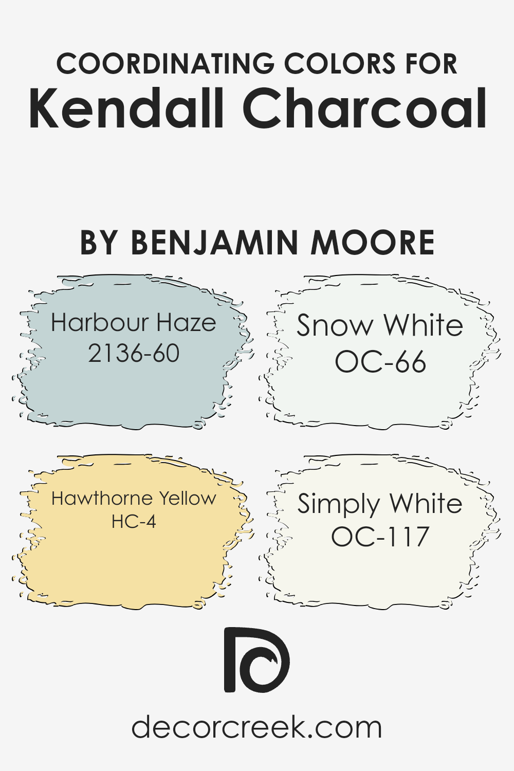
Coordinating Colors of Kendall Charcoal HC-166 by Benjamin Moore
Coordinating colors are shades that complement each other, enhancing the overall aesthetic of a space when used together. They work by balancing visual appeal, either by contrasting or harmonizing with the main color. For instance, when decorating with a sophisticated hue like a deep gray, finding the right coordinating colors ensures a cohesive and pleasing look. These colors are chosen to add vibrancy or calmness to the decor, depending on the ambiance you want to create.
Harbour Haze is a soft, airy blue that brings a sense of tranquility and openness to a room, making it feel more spacious and light. It contrasts gently with darker tones, providing a refreshing lift. Hawthorne Yellow, on the other hand, is a cheerful, sunny yellow that injects warmth and energy into spaces, brightening them up and making them feel more welcoming and lively. Snow White is a crisp, clean white that acts as a versatile backdrop, making other colors pop while bringing a sense of freshness and clarity.
Simply White offers a slightly warmer tone than Snow White, imparting a soft glow to the room, creating a cozy and inviting atmosphere. Together, these colors form a harmonious palette that complements the depth and richness of a darker shade like a deep gray, allowing for a wide range of design possibilities that can fit any mood or style you aim to achieve.
You can see recommended paint colors below:
- 2136-60 Harbour Haze
- HC-4 Hawthorne Yellow
- OC-66 Snow White
- OC-117 Simply White
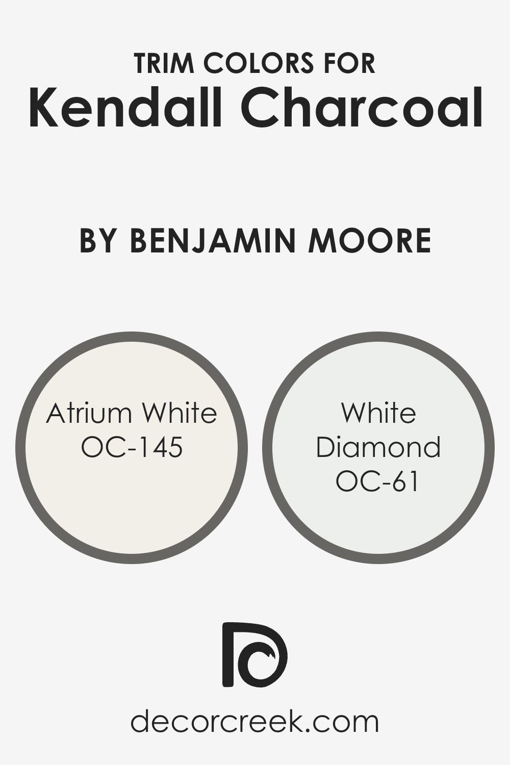
What are the Trim colors of Kendall Charcoal HC-166 by Benjamin Moore?
Trim colors are the hues used for painting the architectural details and accent areas of a room, such as door frames, window trims, skirting boards, and crown moldings. These colors are pivotal in defining and accentuating the overall aesthetic and character of a space, providing contrast or cohesion with the wall colors. Specifically, when dealing with a deep, sophisticated shade like Kendall Charcoal by Benjamin Moore, selecting the right trim color can significantly impact the room’s vibe, making it appear more refined and well-put-together. The use of lighter trim colors, such as OC-145 – Atrium White and OC-61 – White Diamond, can create a stunning contrast that highlights the architectural features of a room, ensuring that the rich depth of Kendall Charcoal doesn’t overwhelm the space.
OC-145 – Atrium White is a crisp, clean white with just a hint of warmth, making it an excellent choice for trims, especially when you want to soften the contrast with the dark, grey tones of Kendall Charcoal without losing the sharp, sophisticated edges. It adds a subtle glow to the room, ensuring the space feels open and airy. On the other hand, OC-61 – White Diamond offers a cooler tone, almost like fresh snow, which can bring a crisp, refreshing contrast to the warmer undertones of Kendall Charcoal. Its slightly icy hue makes it perfect for creating a sharp, modern edge around the room’s architectural features, enhancing the contemporary appeal of the space.
You can see recommended paint colors below:
- OC-145 Atrium White
- OC-61 White Diamond
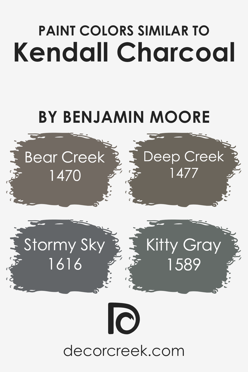
Colors Similar to Kendall Charcoal HC-166 by Benjamin Moore
Similar colors play a vital role in design and aesthetics because they create harmony and a sense of balance. When colors closely resemble one another, like those similar to Benjamin Moore’s Kendall Charcoal, they effortlessly blend with each other, creating a cohesive look. This can be particularly important in interior design, where creating a unified atmosphere is key to achieving a professional and polished outcome. The subtle differences between these similar hues allow for depth and complexity within a color scheme, avoiding monotony while maintaining a consistent theme. They work together by sharing a common base tone, in this case, a deep, sophisticated gray, yet each brings its own unique character to the table.
For example, Bear Creek has a solid, earthy foundation that evokes a sense of groundedness, ideal for spaces meant to feel cozy and inviting. Stormy Sky, as its name suggests, offers a slightly more dynamic feel with undertones that can remind one of an overcast sky, perfect for adding a touch of drama without overwhelming a space. Deep Creek leans towards a deeper, woodsy essence, providing warmth and richness, which can make large, open spaces feel more intimate. Lastly, Kitty Gray offers a lighter, softer gray that can illuminate and expand a space, giving an airy lift to darker themes. Together, these colors can cohesively adorn a room, flowing from one space to another, or stand alone, depending on the desired effect, making them versatile allies in design.
You can see recommended paint colors below:
- 1470 Bear Creek
- 1616 Stormy Sky
- 1477 Deep Creek
- 1589 Kitty Gray
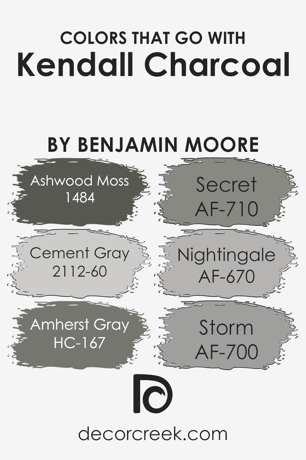
Colors that Go With Kendall Charcoal HC-166 by Benjamin Moore
Choosing the right colors to complement Kendall Charcoal HC-166 by Benjamin Moore is crucial in achieving a cohesive and appealing look in your space. Kendall Charcoal is a deep, sophisticated gray that sets a dramatic tone, perfect as a statement color for walls or accent pieces. To harmonize this striking shade, colors like Ashwood Moss, Cement Gray, Amherst Gray, Secret, Nightingale, and Storm are invaluable. Each of these colors shares an understated elegance that enhances the depth and richness of Kendall Charcoal, making them ideal companions.
- Ashwood Moss has a natural, earthy vibe, giving rooms a grounded feel, while Cement Gray offers a lighter, airy contrast that brings balance to the solidity of Kendall Charcoal.
- Amherst Gray pairs nicely, adding a slightly more intense version of a gray theme, heightening the dynamic between light and shadow in a room.
- Secret, on the other hand, tends toward a softer, more muted alternative that complements the boldness without overwhelming the senses.
- Nightingale is a unique blend that introduces a subtle hint of color, perfect for softening edges and adding complexity.
- Lastly, Storm brings a robust, full-bodied gray to the mix, enhancing the sophisticated palette and ensuring the space feels both cohesive and distinct.
Together, these colors work seamlessly to create depth, interest, and a sense of harmony in any space paired with Kendall Charcoal.
You can see recommended paint colors below:
- 1484 Ashwood Moss
- 2112-60 Cement Gray
- HC-167 Amherst Gray
- AF-710 Secret
- AF-670 Nightingale
- AF-700 Storm
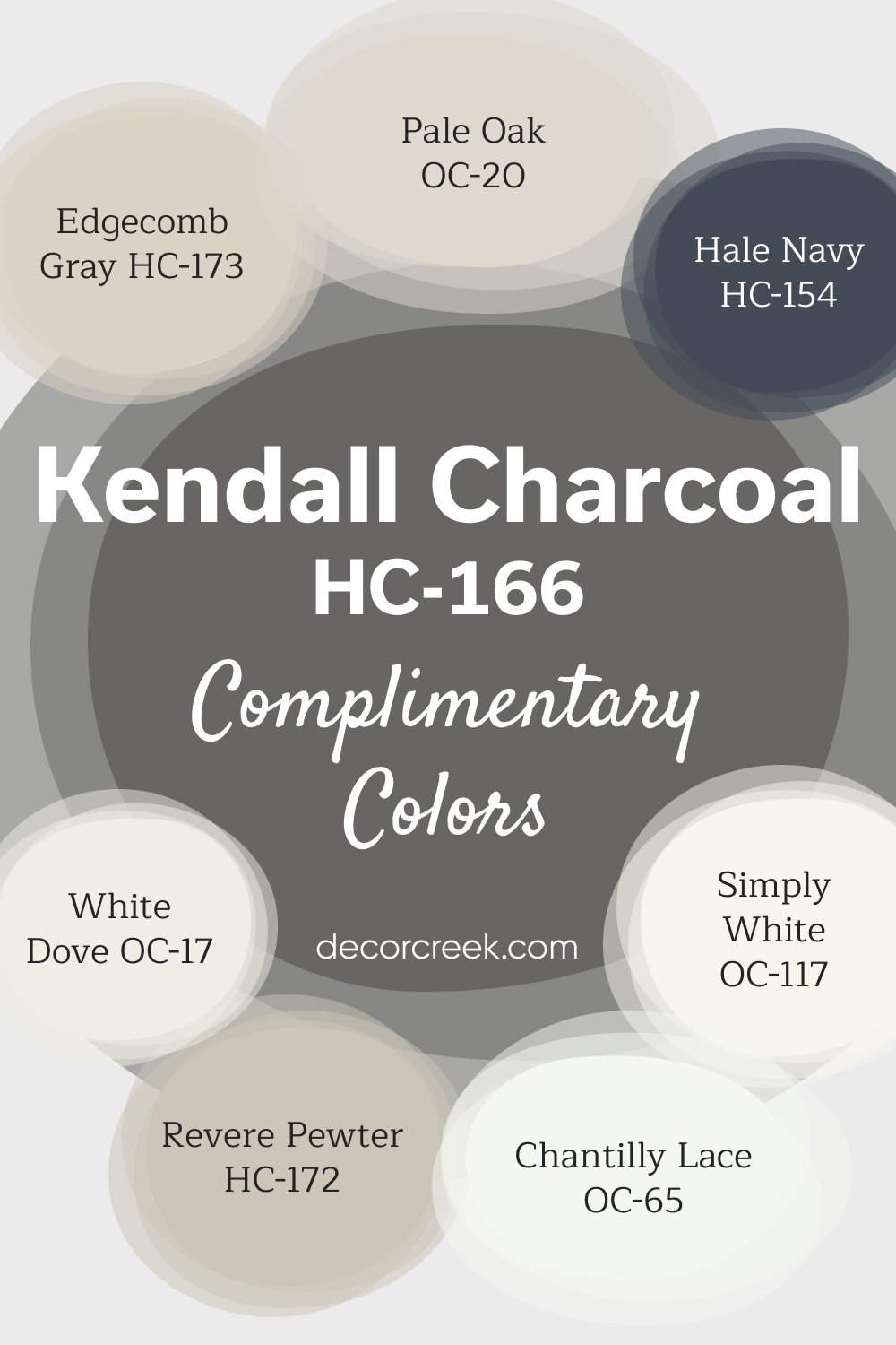
Complimentary Colors for Kendall Charcoal HC-166 Paint Color by Benjamin Moore
Kendall Charcoal by Benjamin Moore is a bold, elegant gray that adds depth and richness to any room. It pairs well with crisp, bright whites like White Dove and Simply White, which offer clean, contrasting accents.
Softer shades like Edgecomb Gray and Pale Oak create a balanced, neutral backdrop, making them ideal for larger areas or trim work. For a more striking look, Hale Navy brings a deep, bold contrast to the palette, while Chantilly Lace adds a fresh, clean touch.
Revere Pewter, with its warm, subtle gray tones, completes the combination, offering a versatile and timeless color scheme that works well in both modern and traditional spaces.
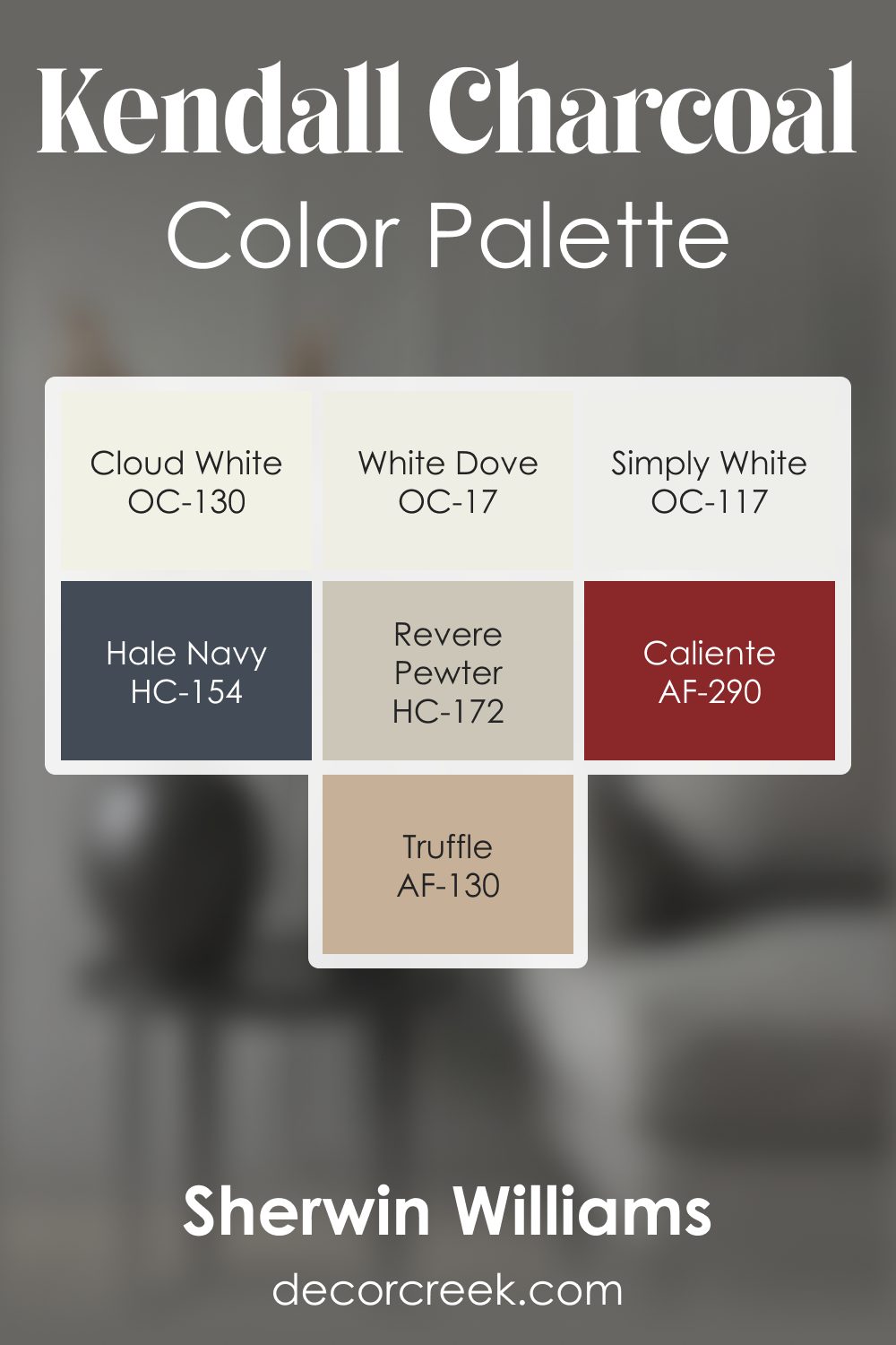
Kendall Charcoal HC-166 by Benjamin Moore Color Palette
Kendall Charcoal is rich, grounded, and confident, and this palette is built to highlight those strong qualities while adding warmth and comfort. Cloud White, White Dove, and Simply White brighten the palette with a clean glow that softens Kendall Charcoal’s depth and keeps the overall mood welcoming.
Revere Pewter supports the palette with a warm, calming note that bridges light and dark beautifully, offering a smooth transition that feels natural and easy.
Hale Navy introduces a cool, steady accent that blends seamlessly with the deep charcoal tone.
Caliente brings a lively spark of warmth that adds personality and keeps the palette from feeling too subdued.
Truffle adds earthy richness, grounding the palette and creating a fuller, warmer look. Together, these shades create a palette that feels structured and expressive, yet warm and approachable.
It works wonderfully in entryways, dining rooms, offices, and living spaces where depth and comfort are equally important.
The combination of warm whites, natural mid-tones, and strong accents makes Kendall Charcoal feel striking while still being friendly and inviting.
How to Use Kendall Charcoal HC-166 by Benjamin Moore In Your Home?
Kendall Charcoal HC-166 by Benjamin Moore is a versatile paint color that can add a touch of sophistication and depth to any space in your home. This deep, rich gray offers a perfect balance, not too dark and not too light, making it an excellent choice for various decorating styles. You can use it in your living room to create a cozy atmosphere that’s both elegant and inviting. Painting one wall with Kendall Charcoal can serve as a stunning accent, bringing attention to features like a fireplace or a beautiful piece of artwork.
In a bedroom, this color can help to create a peaceful and serene environment, perfect for relaxing after a long day. It pairs beautifully with white trim and bedding for a classic look, or you can mix it with brighter colors for a more modern vibe.
For those looking to update their kitchen or bathroom, Kendall Charcoal can add a touch of drama and luxury to cabinets or walls, complementing both traditional and contemporary styles. This color works well with natural elements like wood and stone, enhancing the beauty of your home.
Overall, Kendall Charcoal HC-166 is a fantastic choice for anyone looking to add depth and character to their home with paint.
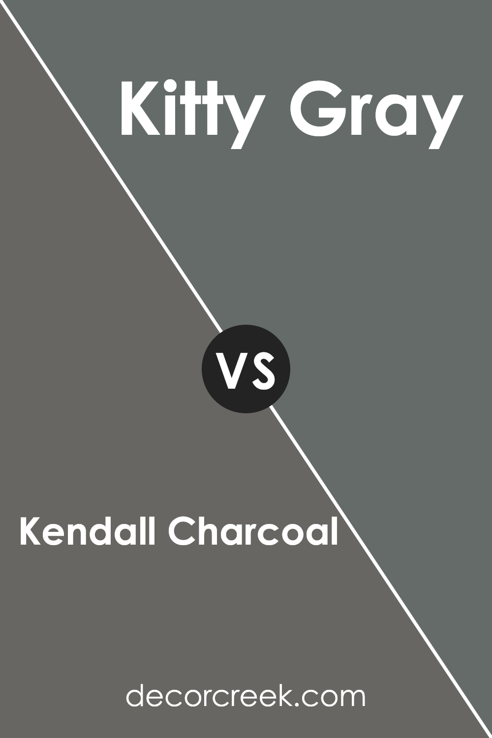
Kendall Charcoal HC-166 by Benjamin Moore vs Kitty Gray 1589 by Benjamin Moore
Kendall Charcoal and Kitty Gray, both by Benjamin Moore, offer unique vibes for any space. Kendall Charcoal is a deep, rich gray that brings a sense of sophistication and strength. It’s perfect for creating a bold statement or an elegant ambiance in a room. This color tends to draw in the eye, making it a great choice for accent walls or cabinets.
On the other hand, Kitty Gray is a lighter, softer gray that provides a tranquil and airy feel. It’s ideal for those wanting a serene and inviting space. Kitty Gray has a versatility that makes it suitable for any room, blending well with various decor styles.
When comparing these two, Kendall Charcoal is much darker and can make a room feel cozy and dramatic, while Kitty Gray offers a lighter touch, enhancing the sense of space and light in a room. Both colors are beautiful in their own right, but your choice between them would depend on the mood and aesthetic you wish to achieve in your space.
You can see recommended paint color below:
- 1589 Kitty Gray
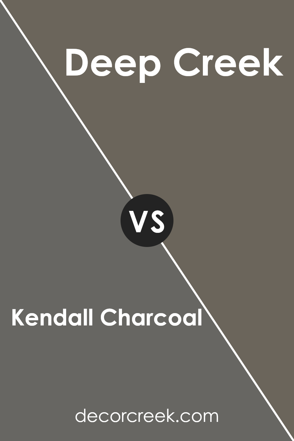
Kendall Charcoal HC-166 by Benjamin Moore vs Deep Creek 1477 by Benjamin Moore
Kendall Charcoal and Deep Creek are two popular colors from Benjamin Moore, each offering its unique charm for interior and exterior projects. Kendall Charcoal is a deep, warm gray that adds a sophisticated and rich touch to spaces. It’s ideal for creating a cozy, inviting atmosphere with its balanced blend of gray tones. On the other hand, Deep Creek is an earthy, dark brown hue with green undertones, offering a natural, grounding effect. It’s perfect for those looking to bring a bit of nature and tranquility into their home.
While both colors are on the darker side, Kendall Charcoal leans more towards a classic gray, making it versatile for various decor styles. In contrast, Deep Creek brings in a more specific aesthetic that complements wood elements and greenery, suiting spaces that aim for an organic, rustic vibe. Whether choosing between the cool depth of Kendall Charcoal or the earthy richness of Deep Creek, each color presents a unique opportunity to enhance your space with character and style.
You can see recommended paint color below:
- 1477 Deep Creek
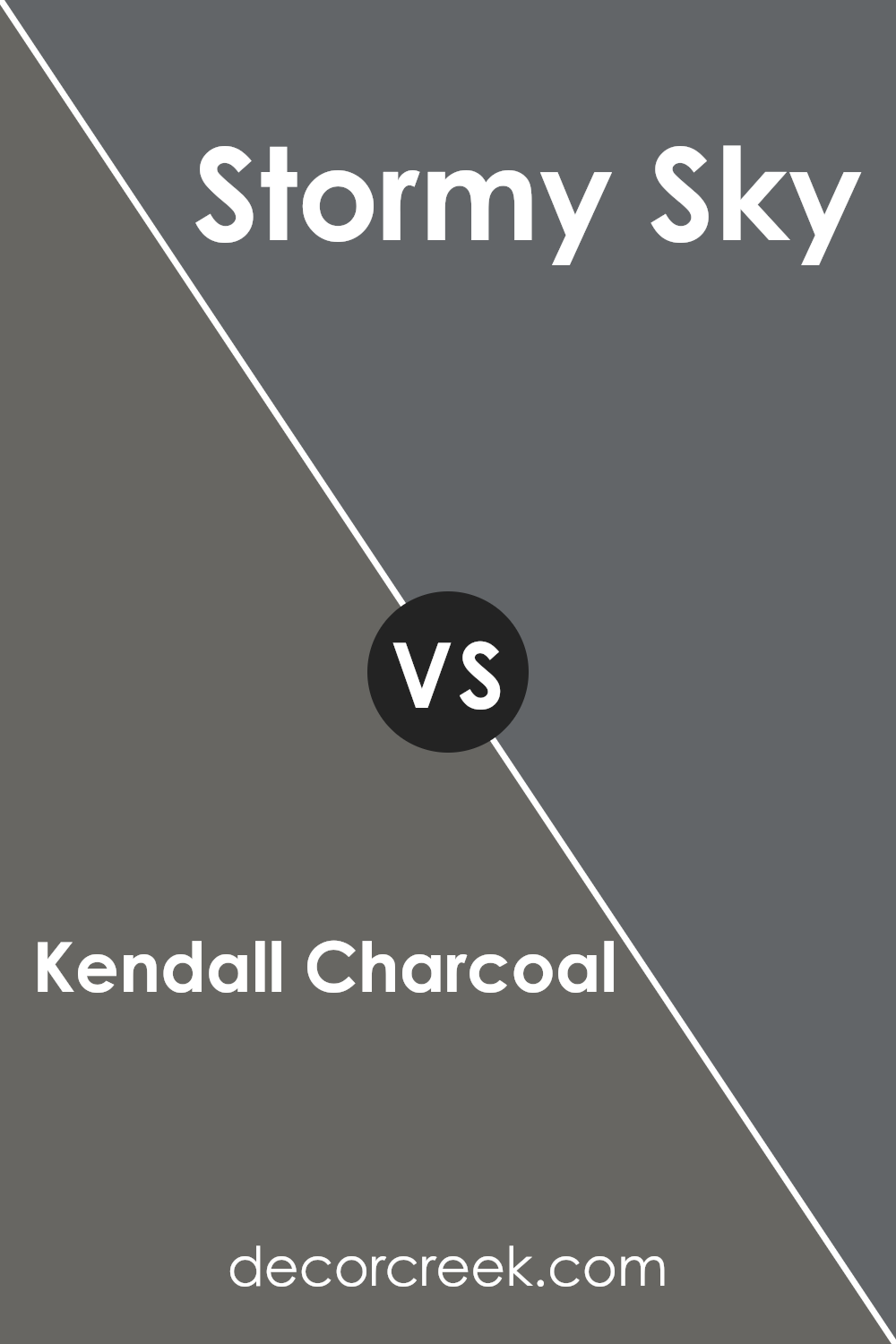
Kendall Charcoal HC-166 by Benjamin Moore vs Stormy Sky 1616 by Benjamin Moore
Kendall Charcoal is a deep, warm gray that brings a rich, cozy vibe to spaces. Its versatility allows it to pair well with bright colors, adding elegance without overwhelming with darkness. On the other hand, Stormy Sky has a cooler, moodier gray tone that mirrors the serene feel of an overcast sky. It’s lighter than Kendall Charcoal, providing a softer option for those who want a calm and soothing aesthetic without going too dark.
Kendall Charcoal, because of its depth, is perfect for accent walls or furniture, giving a strong contrast against lighter colors. It’s also great for exterior spaces, offering a stately, robust appearance. Stormy Sky, with its cooler hue, is ideal for creating a peaceful retreat, excellent for bedrooms or bathrooms. It goes well with pastels and whites, creating a fresh, airy feel.
In summary, Kendall Charcoal is your go-to for a bold, sophisticated look, while Stormy Sky offers a gentler, tranquil vibe. Both colors have their unique charm, enabling you to craft spaces that reflect different moods and styles.
You can see recommended paint color below:
- 1616 Stormy Sky
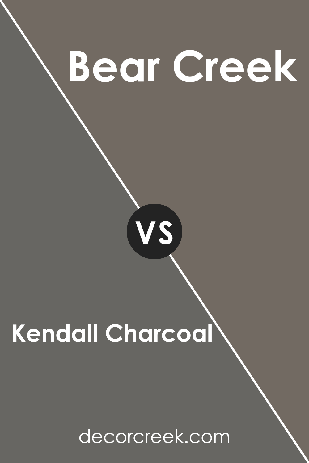
Kendall Charcoal HC-166 by Benjamin Moore vs Bear Creek 1470 by Benjamin Moore
The main color, Kendall Charcoal, is a deep, sophisticated grey that adds a strong, yet neutral presence to spaces. It’s like a shadowy backdrop, perfect for highlighting decor or for creating a dramatic ambiance in any room. On the other hand, Bear Creek is a darker, earthy grey with brown undertones, offering a warmer and cozier feel compared to the cooler, more neutral vibe of Kendall Charcoal.
Bear Creek, being reminiscent of a sturdy tree bark, exudes a natural, comforting essence that’s ideal for creating a welcoming atmosphere. Both colors are excellent choices from Benjamin Moore for different reasons: Kendall Charcoal works great for a modern, chic, or industrial look, while Bear Creek suits those aiming for a rustic, homey, or traditional style. Depending on the mood you want to set or the theme you’re going for in your space, these colors offer versatile options.
You can see recommended paint color below:
- 1470 Bear Creek
Conclusion
Kendall Charcoal HC-166 by Benjamin Moore is a sophisticated shade that offers versatility and depth to any space. Ideal for those wanting to add a touch of elegance and a modern twist to their interiors, this gray manages to balance richness with subtlety, making it perfect for both bold accent walls and entire rooms. It pairs beautifully with a wide range of colors, from soft pastels to vibrant hues, enabling creative color schemes that can refresh and elevate a space.
This color stands out for its ability to adapt to various lighting conditions, showcasing different facets of its gray scale from dawn to dusk. It’s particularly beloved by designers for its luxurious finish that complements wood, metal, and stone, making it a go-to choice for enhancing architectural details.
Whether used in a living room, bedroom, or an external facade, Kendall Charcoal HC-166 by Benjamin Moore is a timeless option that brings sophistication and a hint of drama to any design project.

Ever wished paint sampling was as easy as sticking a sticker? Guess what? Now it is! Discover Samplize's unique Peel & Stick samples.
Get paint samples

