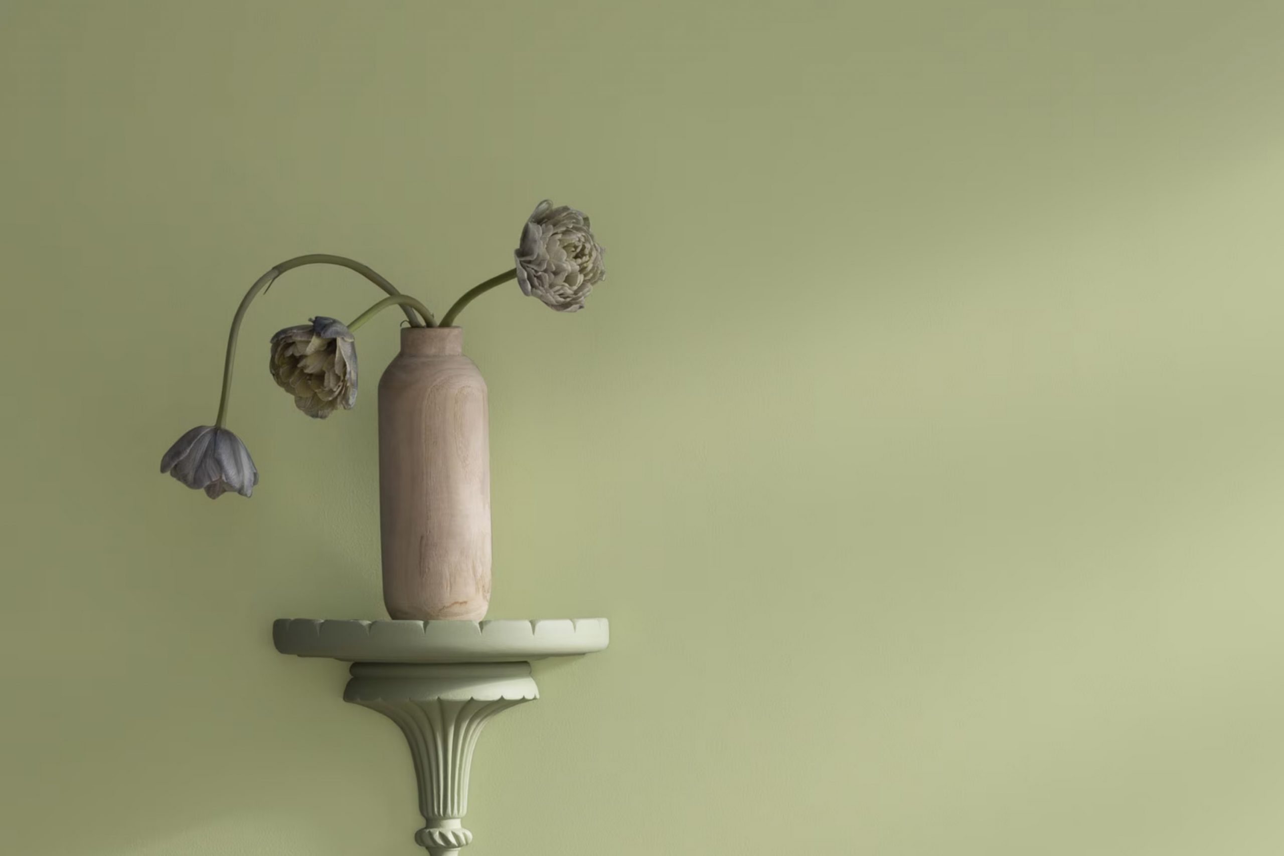
When you first glance at Benjamin Moore’s 502 Grasslands, it’s clear this color carries its own unique charm. It offers a soothing green hue that feels both fresh and peaceful, perfect for adding a touch of calm to any room. As an enthusiast trying out different shades for my living room makeover, I noticed how Grasslands stood out.
It’s not just a color; it’s a mood enhancer. Imagine sitting back, relaxing after a long day, and the walls around you contribute to a feeling of peace and recovery. In decorating my room, I aimed for a look that brings the beauty of the outdoors inside. Grasslands does just that.
It’s adaptable too, pairing beautifully with soft creams, bold charcoals, or even wooden textures, offering flexible options for furniture and decor. As you think about your next project, consider how this refreshing shade could breathe new life into your room.
Whether you’re updating a bedroom, a study, or even a kitchen, Grasslands could be the peaceful backdrop you’re looking for.
What Color Is Grasslands 502 by Benjamin Moore?
Grasslands by Benjamin Moore is a fresh and lively green shade that brings a touch of nature into your home. This medium-toned color is vibrant without being overpowering, making it perfect for creating cozy, inviting rooms. Grasslands works beautifully in various interior styles, particularly in country, rustic, and contemporary settings, where its natural vibe can truly shine.
In country-style homes, Grasslands complements exposed wooden beams and natural stone elements, enhancing the rustic charm of the room. In modern and contemporary interiors, this color provides a striking contrast when paired with sleek materials like glass and polished metal, adding a refreshing burst of color that lifts the overall aesthetic of the room.
For textures, Grasslands pairs well with smooth, clean-lined fabrics in furniture, as well as with more tactile materials like linen and wool in accents and decor. This color goes wonderfully with natural wood, helping to balance its vibrancy and allowing wooden furniture or flooring to stand out.
For a cohesive look, consider using this color with a range of green and earthy tones in cushions, throws, and area rugs, which will help create a harmonious room. Whether you’re looking to paint an accent wall or refresh your entire living room, Grasslands is a flexible choice that can brighten up your home.
Is Grasslands 502 by Benjamin Moore Warm or Cool color?
Grasslands 502 by Benjamin Moore is a fresh and lively green paint color that brings a touch of nature indoors. When used in homes, this shade creates a warm and welcoming atmosphere, making rooms feel more open and lively. It’s particularly effective in rooms that receive a lot of natural light, as the sunlight enhances the color’s natural tones.
This color works well in many different areas of the home. In living rooms or dining areas, Grasslands 502 can be paired with creams and light browns to foster a cozy, inviting environment. It’s also a popular choice for bedrooms, where the soft green promotes a calm and restful feeling.
Additionally, the flexibility of Grasslands 502 means it can be used as an accent wall or for painting entire rooms. It coordinates well with wooden furniture and natural elements, helping to tie the indoor room to the outdoors. Overall, using this color in home decor adds freshness and vitality to any room, enriching the living room with ease.
Undertones of Grasslands 502 by Benjamin Moore
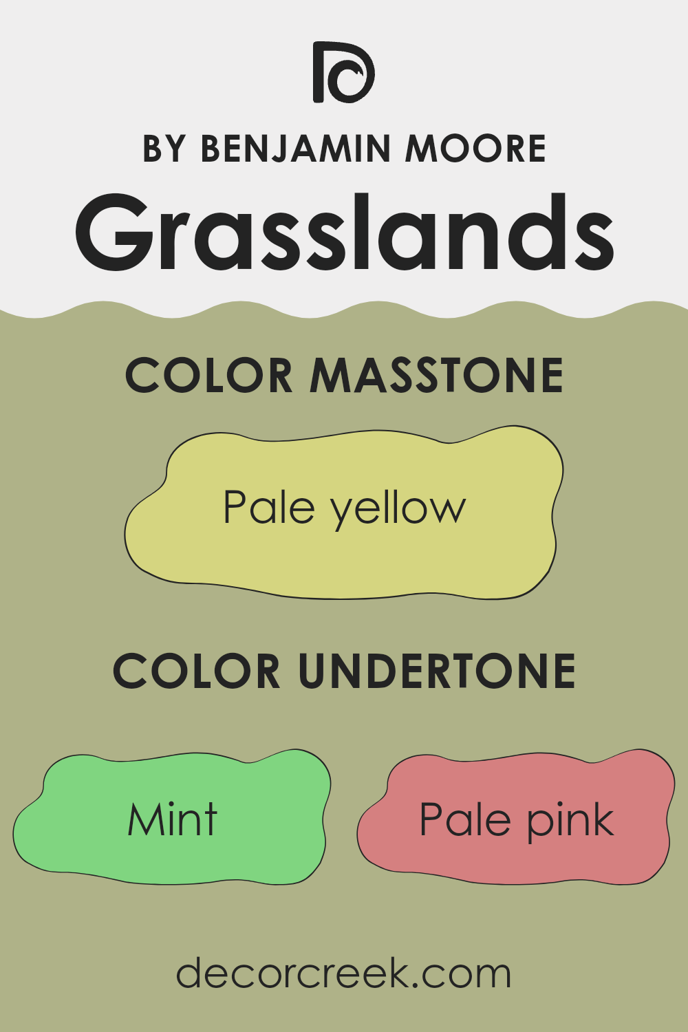
Grasslands 502 by Benjamin Moore is a complex color that carries a variety of undertones, making it flexible and dynamic in different settings. Undertones are subtle colors that lurk beneath the surface color and can significantly influence how a color appears in different lighting and adjacent to other colors.
For Grasslands 502, the undertones include mint, pale pink, grey, light gray, light blue, light purple, lilac, yellow, light green, orange, and olive. Each of these undertones contributes to how the main color is perceived. For example, mint and light green can make it feel fresher and more vibrant, especially in natural light, whereas grey and light gray can tone it down to create a more muted presence in dimmer, artificial lighting.
In interior settings, the impact of these undertones can be quite pronounced. In a room with ample sunlight, the greener and lighter undertones like mint and yellow can make the walls appear lively and airy. On the other hand, in a room with less natural light, the grayer undertones might dominate, giving the walls a more subdued appearance.
When using this paint color, it’s important to consider these undertones in relation to furniture and decor. For instance, placing a sofa in a pale pink or lilac next to a Grasslands 502 wall might bring out those respective undertones in the wall color, creating a subtle but pleasing coordination. Overall, the diverse undertones of Grasslands 502 allow for flexibility in design and an ability to adapt to various decors and moods within a room.
What is the Masstone of the Grasslands 502 by Benjamin Moore?
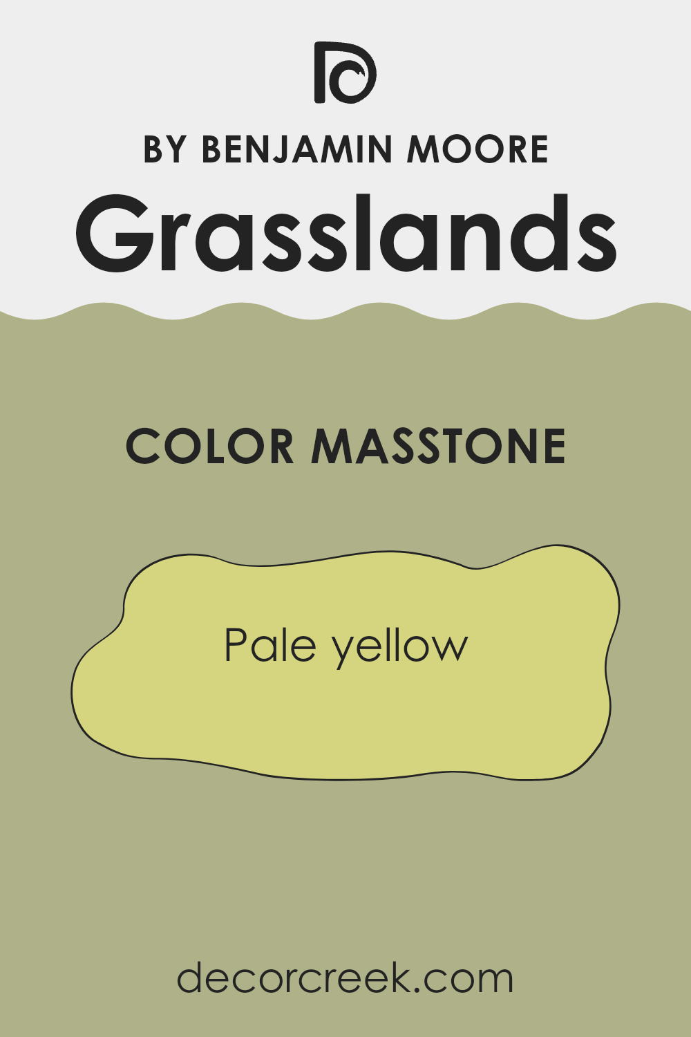
Grasslands 502 by Benjamin Moore has a masstone of Pale Yellow (#D5D580), which gives it a light and airy feel. This gentle color has a subtle vibrancy that can brighten up any room without overpowering it. When used in homes, its soft hue brings a sense of freshness and light, making rooms appear more open and welcoming.
This shade works wonderfully in living areas, kitchens, and bedrooms where a calm but cheerful atmosphere is desired. Its neutrality allows it to blend well with various decor styles and colors, making it a flexible choice for many homes.
Additionally, because it’s not too bold, this pale yellow can be a great background color, helping furniture and art to stand out. It’s particularly effective in rooms that receive a lot of natural light, as the color can enhance the light-filled quality of the room.
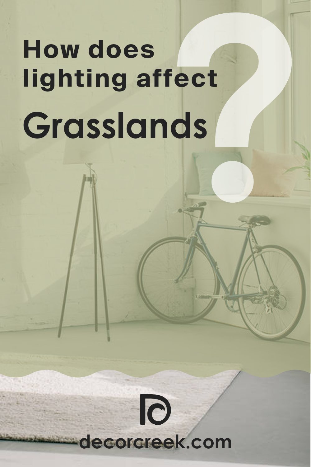
How Does Lighting Affect Grasslands 502 by Benjamin Moore?
Lighting plays a crucial role in how we perceive colors, significantly affecting how a color appears in different environments. Grasslands 502 by Benjamin Moore, for example, can look quite different under various lighting conditions due to its unique hue and saturation.
In artificial light, such as that emitted by LED bulbs or fluorescent lights, Grasslands 502 may appear slightly cooler than it does in natural light. Artificial light often has a blue or yellow cast, influencing the perceived warmth or coolness of a color. This means in a room lit with warm-toned bulbs, Grasslands 502 might look a bit more muted and earthy, emphasizing its green undertones.
Conversely, in natural light, which is generally fuller and more balanced, Grasslands 502 can showcase its true color better. Natural daylight enhances the vibrant, fresh qualities of the color, making the room feel lively and refreshing. The color’s depth and richness are more apparent, especially during the midday when sunlight is brightest.
The direction a room faces also impacts how Grasslands 502 is displayed:
- North-facing rooms: These rooms get less direct sunlight, which can make colors appear cooler and somewhat shadowy. Here, Grasslands 502 might look more subdued and less lively, taking on a softer, more conservative green shade.
- South-facing rooms: These get a lot of light throughout the day, and this abundance of natural light can make Grasslands 502 look vibrant and dynamic. Its green tones can become quite pronounced, lively, and bright, enhancing the room’s overall warmth.
- East-facing rooms: Morning light is warm and then turns cooler as the day progresses. Grasslands 502 in such rooms can appear freshly vibrant in the morning but might take on a more balanced green shade through the day.
- West-facing rooms: Afternoon and evening light can add a golden glow, warming up the Grasslands 502 color to appear more welcoming and slightly more intense toward the latter part of the day.
Understanding how lighting affects Grasslands 502 can help in deciding which room to paint this color, depending on the atmosphere and vibe you want to create. Such insights are also helpful when choosing lighting fixtures and bulb types to complement the room’s overall aesthetics.
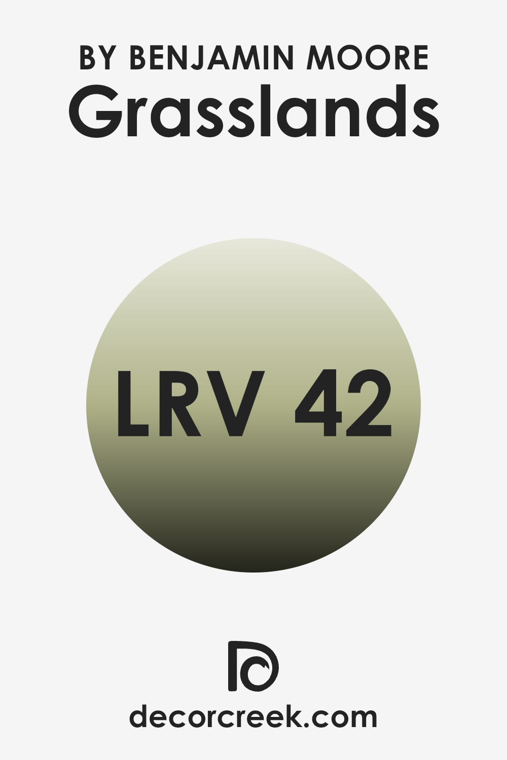
What is the LRV of Grasslands 502 by Benjamin Moore?
LRV stands for Light Reflectance Value, which is a measurement used to indicate how much light a color reflects and how much it absorbs. Measured on a scale from 0 to 100, a lower LRV means the color tends to be darker and absorb more light, while a higher LRV indicates a lighter color that reflects more light.
This value helps in choosing paint colors for rooms based on how bright or dark you want the room to feel. For instance, a room with lots of natural light might benefit from a color with a lower LRV to avoid feeling too bright, whereas a darker room might need a higher LRV to make it feel more open and lighter.
Regarding the color Grasslands with an LRV of 41.82, it stands on the darker side of the mid-range spectrum. This means it has a moderately high capacity to absorb light, rather than reflecting it, which can make the color appear more intense and pronounced when applied to walls.
In rooms with less natural light, this color might make the room feel somewhat darker and cozier. Conversely, in a well-lit room, Grasslands can offer a rich, lush look without overpowering the room with brightness. This LRV level provides flexibility, making it a suitable option for various lighting scenarios and design preferences.
decorcreek.com
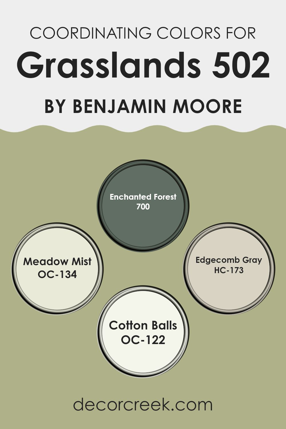
Coordinating Colors of Grasslands 502 by Benjamin Moore
Coordinating colors are shades that complement each other well when used together in decoration. They typically enhance each other without clashing, creating a harmonious color scheme in your room. For instance, if a room’s main color is a specific shade, such as Grasslands, other hues that balance or enhance this base color can be used for trim, accents, or even as secondary wall colors. These combinations can make a design feel cohesive and thoughtfully put together.
Considering Grasslands as a primary color, colors like 700 – Enchanted Forest, OC-134 – Meadow Mist, HC-173 – Edgecomb Gray, and OC-122 – Cotton Balls are ideal coordinating colors. Enchanted Forest is a deep, vibrant green shade, providing a rich contrast that can create a striking effect when paired with lighter shades.
Meadow Mist is a gentle, airy green that offers a subtle contrast, easing the transition between the boldness of Enchanted Forest and the calmness of a lighter primary color. Edgecomb Gray offers a warm, neutral gray that supports almost any color without overpowering it, making it a flexible choice for balancing stronger elements in a room. Lastly, Cotton Balls is a clean, crisp white, perfect for trim and ceilings to provide a fresh, polished finish. Together, these colors work to create a balanced and inviting atmosphere.
You can see recommended paint colors below:
- 700 Enchanted Forest
- OC-134 Meadow Mist
- HC-173 Edgecomb Gray
- OC-122 Cotton Balls
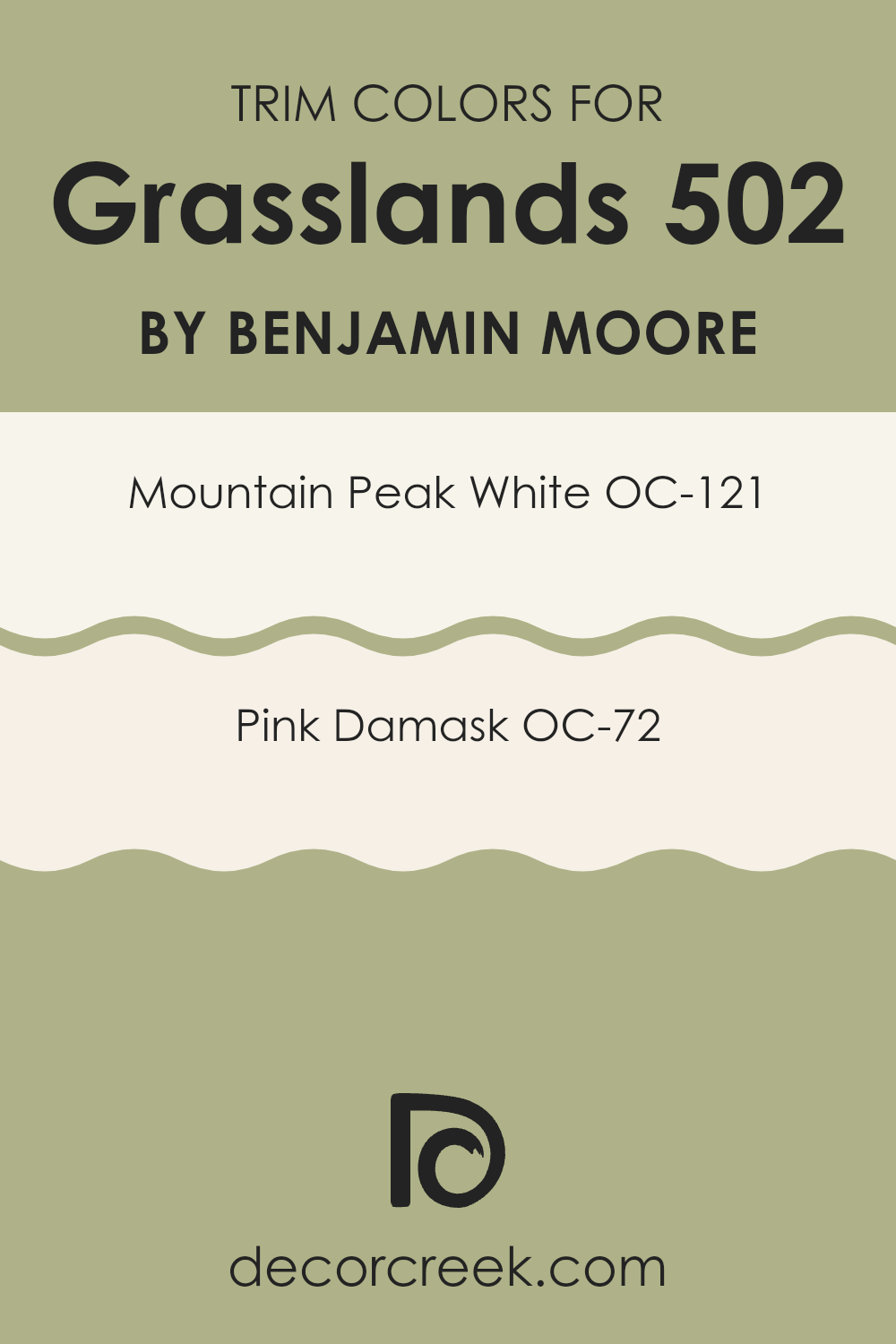
What are the Trim colors of Grasslands 502 by Benjamin Moore?
Trim colors are the contrasting or complementary paint shades used for the architectural details and accents such as door frames, window casings, baseboards, molding, and sometimes even ceiling borders. Choosing the right trim colors can highlight these features, creating a visual framework that enhances the overall aesthetic of a room.
These colors often differ from the wall colors to add depth and interest to the room, delineating various elements clearly. Trim colors can influence the perception of the room, making rooms seem larger, warmer, or more inviting depending on the chosen hues.
For example, OC-121 – Mountain Peak White, which is a bright, clean white, acts as a brilliant choice for trim. This color provides a crisp contrast to softer or darker wall colors, outlining the rooms and making architectural details pop visually. On the other hand, OC-72 – Pink Damask, a gentle and warm pink, offers a softer approach to trim, giving a subtle hint of color and warmth that can soften the overall feel of a room without overpowering it. This color works well in adding a touch of warmth to cooler tones or enhancing the romantic vibe of a room.
You can see recommended paint colors below:
- OC-121 Mountain Peak White
- OC-72 Pink Damask
Colors Similar to Grasslands 502 by Benjamin Moore
Similar colors are crucial in design because they provide a cohesive and harmonious look, ensuring that the environment feels balanced and pleasing to the eye. Colors that are similar tend to have either the same hues with different tints, tones, or shades, or closely related hues which create a subtle and gentle contrast.
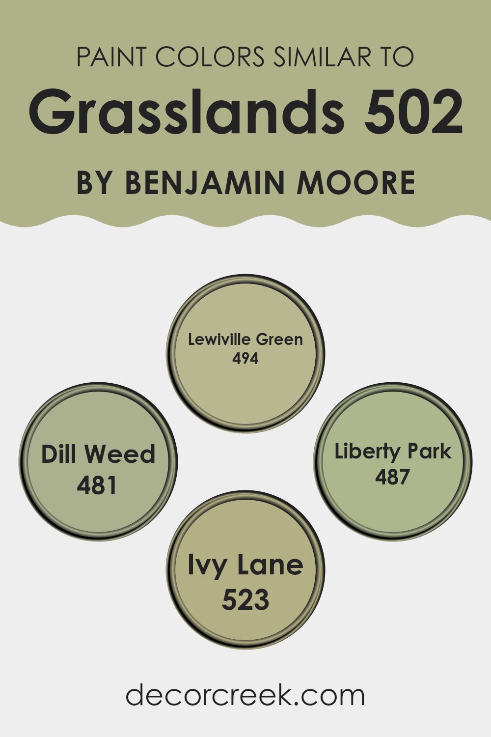
This can be particularly important in rooms where the goal is to produce a calming and unified atmosphere. Colors like Lewiville Green, Liberty Park, Ivy Lane, and Dill Weed are perfect examples of how employing hues from the same family can yield an aesthetically agreeable environment.
Lewiville Green is a fresh and lively color that brings a hint of nature’s vibrancy inside, while Dill Weed offers a slightly muted, yet earthy feel, perfect for rooms that aim for a natural touch without overpowering the senses. On the other hand, Liberty Park strikes a balance with its deeper, richer tone, offering a grounded and secure feeling, which makes it ideal for creating focal points or accentuating details in a room.
Lastly, Ivy Lane has a robust and verdant character that can invigorate any room, providing depth and interest. These colors work well together because they each maintain an essence of the natural world, varying slightly in depth and intensity to afford visual interest and continuity.
You can see recommended paint colors below:
- 494 Lewiville Green
- 481 Dill Weed
- 487 Liberty Park
- 523 Ivy Lane
Colors that Go With Grasslands 502 by Benjamin Moore
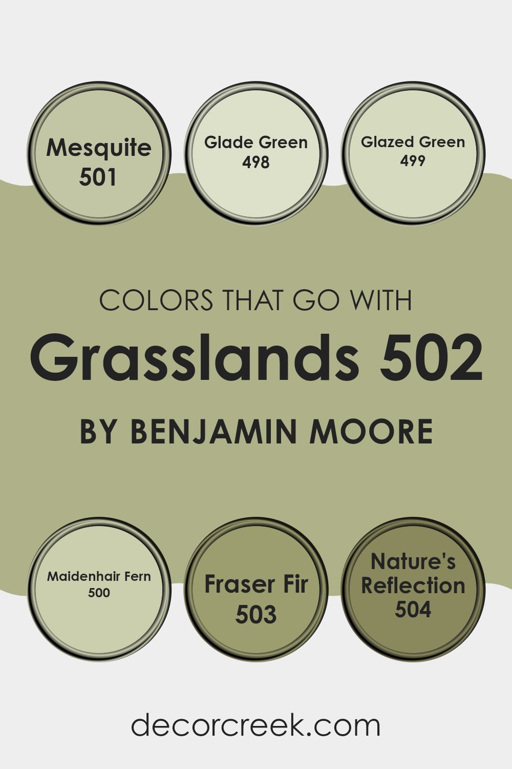
Choosing colors that complement Grasslands 502 by Benjamin Moore is essential for creating a harmonious and appealing room. The color Grasslands 502 itself is a neutral, flexible green that sets a calming tone, making it a fantastic base for various interior designs.
By pairing it with colors like Mesquite 501, Glade Green 498, and Glazed Green 499, one can achieve a seamless gradient of greens, adding depth and continuity to a room. These shades range from the subtle, lighter touch of Mesquite, providing a soft backdrop, to the more pronounced and lively tones of Glade Green and Glazed Green, which inject vitality and a touch of nature’s freshness into any room.
Furthermore, including colors like Maidenhair Fern 500, Fraser Fir 503, and Nature’s Reflection 504 with Grasslands 502 allows for richer layering and texture in decorating. Maidenhair Fern offers a hint of a brighter, more vibrant green which can liven up rooms when used on accent pieces or walls.
Meanwhile, the darker, moodier Fraser Fir and the mellow, earthy tone of Nature’s Reflection help in grounding the room, making it feel more cohesive and cozy. This thoughtful selection and combination of colors not only make the room more aesthetically pleasing but also ensures that the interiors feel connected and balanced.
You can see recommended paint colors below:
- 501 Mesquite
- 498 Glade Green
- 499 Glazed Green
- 500 Maidenhair Fern
- 503 Fraser Fir
- 504 Nature’s Reflection
How to Use Grasslands 502 by Benjamin Moore In Your Home?
Grasslands 502 by Benjamin Moore is a flexible paint color that can add a fresh, natural look to any room in your home. Its green hue mirrors the calming shades of outdoor landscapes, making it a perfect choice for creating a cozy and inviting atmosphere.
You can use Grasslands 502 in various ways. It works well in living rooms and bedrooms where a touch of nature’s calmness can be especially appreciated. This color pairs beautifully with light woods and soft neutrals, like creams and beiges, to keep the room light and airy.
It also looks striking against white trim, which can highlight its rich depth. In bathrooms or small rooms, applying it on an accent wall can add depth without overpowering the area. For those who like a bit of contrast, combining it with darker or contrasting colors can create an interesting and lively dynamic. In essence, Grasslands 502 is great for anyone looking to refresh their home with a natural, grounding color.
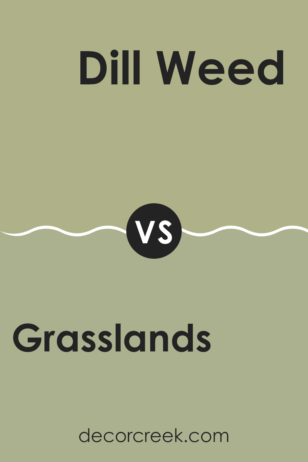
Grasslands 502 by Benjamin Moore vs Dill Weed 481 by Benjamin Moore
Grasslands 502 by Benjamin Moore is a warm, light green hue that mimics the fresh, vibrant feel of a meadow in spring. Its subtle earthy tones allow it to easily blend with natural elements and materials in a home.
On the other hand, Dill Weed 481 is a deeper green with a slightly more intense color, reminiscent of richer, dense foliage. Both colors bring a sense of freshness and nature into any room, but Grasslands 502 offers a softer approach which makes it great for creating a light, airy feel.
In contrast, Dill Weed 481, with its bolder tone, makes a statement and can add depth to a design, making it ideal for accent walls or areas where a more pronounced impact is desired. Both colors work well in various lighting situations, enhancing the room without overpowering it.
You can see recommended paint color below:
- 481 Dill Weed
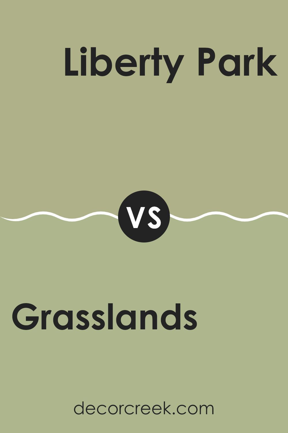
Grasslands 502 by Benjamin Moore vs Liberty Park 487 by Benjamin Moore
Grasslands 502 by Benjamin Moore is a soft green color that resembles the fresh hues seen in a meadow. It has a light, airy feel, making it a great choice for creating a calm and inviting atmosphere in any room. This color is flexible enough to work well in both bright and dim lighting conditions.
On the other hand, Liberty Park 487 by Benjamin Moore is a deeper shade of green. It draws inspiration from the rich, dark greens typically found in a dense forest. This color adds a bold touch to rooms, making it ideal for accent walls or areas where you want to make a statement.
Both colors bring the natural beauty of the outdoors inside but in different ways. Grasslands 502 offers a gentle, refreshing vibe, while Liberty Park 487 provides a more dramatic and intense look. Together, they can complement each other beautifully in a home, balancing light and depth in your decor.
You can see recommended paint color below:
- 487 Liberty Park
Grasslands 502 by Benjamin Moore vs Ivy Lane 523 by Benjamin Moore
Grasslands 502 and Ivy Lane 523 by Benjamin Moore are two distinct green hues, each offering a unique atmosphere. Grasslands 502 is a lighter, softer green that brings a fresh and breezy feel to a room. It’s much like the gentle color of early spring leaves, making it ideal for creating a calm, soothing environment. This color works well in areas where you want a touch of nature without overpowering the senses.
On the other hand, Ivy Lane 523 is a deeper, more intense green. It’s reminiscent of the dense foliage in a lush garden or forest. This darker shade can make a room feel more filled in and cozy, perfect for rooms intended to feel more grounded and rich. Ivy Lane 523 tends to stand out more and can serve as an excellent backdrop for decor that includes bright colors or wood elements.
Both colors bring their special touch to interior rooms but do so in quite different ways—Grasslands offering a light touch, and Ivy Lane a deeper immersion. Each can be used creatively depending on the effect you want to achieve in your room.
You can see recommended paint color below:
- 523 Ivy Lane
Grasslands 502 by Benjamin Moore vs Lewiville Green 494 by Benjamin Moore
When you look at the colors Grasslands 502 and Lewisville Green 494 by Benjamin Moore, you’ll notice some unique differences. Grasslands 502 gives off a gentle, light green hue that brings to mind the softness of early spring grass.
It’s quite muted, which makes it easy to fit into many rooms without overpowering them. On the other hand, Lewisville Green 494 sports a deeper, richer green, echoing the dense foliage of a forest. This color is bolder and can make a strong statement in a room.
Both these shades are green, but the way they set the mood differs due to their intensity and depth. Grasslands 502 is lighter, perfect for a calm, soothing feel, while Lewisville Green 494 offers a moodier and more striking appearance. Depending on what you’re looking for in a room, either could work well; Grasslands for a subtle touch and Lewisville for a dominant vibe.
You can see recommended paint color below:
- 494 Lewiville Green
After reading about 502 Grasslands by Benjamin Moore, I’ve learned quite a bit about this unique color. 502 Grasslands is more than just green; it’s a shade that brings the feeling of being outside right into your home. It reminds me of a field full of tall grass where you can run freely and feel the fresh air.
Benjamin Moore did a great job of making a paint color that isn’t just pretty to look at but also has a calming effect. It’s the kind of color you might want in a room where you read books, do your homework, or even relax and daydream. It’s not too bright and not too dark, making it just right for rooms where you spend a lot of time.
Using 502 Grasslands in different areas of your home can really shift how a room feels. Imagine your bedroom with this color; it could make you feel relaxed and cozy, helping you to sleep better. Or think about it in the living room, making it a welcoming room for everyone who comes over.
In conclusion, I’m really impressed with 502 Grasslands by Benjamin Moore. It’s a beautiful color that can make any room feel more comfortable and inviting. I can see why it would be a popular choice for anyone wanting to bring a bit of the outdoors into their home.
Ever wished paint sampling was as easy as sticking a sticker? Guess what? Now it is! Discover Samplize's unique Peel & Stick samples.
Get paint samples

