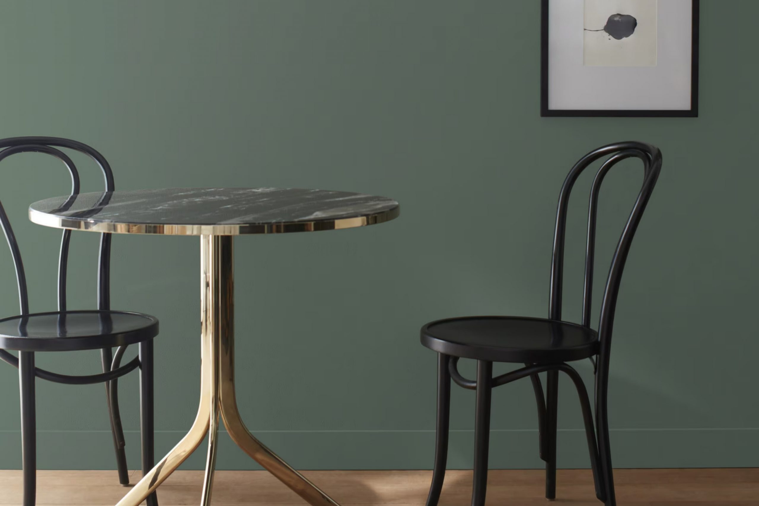
Imagine walking through a peaceful, dense forest where the sunlight gently filters through the leaves, casting a brilliant array of greens around you. This is the calm feeling evoked by Benjamin Moore’s color, 700 Enchanted Forest.
I chose this shade for my reading nook, hoping to bring some of nature’s calmness into my corner of the world. The color itself is a rich, deep green that seems to pull in the outdoors, creating a cozy shelter right in my own home.
Every time I settle into my nook, surrounded by the lushness of 700 Enchanted Forest, it feels like a small, personal retreat. Whether I’m lost in a book or just sipping my morning tea, the color complements the natural light beautifully, enhancing the sense of quiet and comfort.
It’s like having a little piece of the forest inside, peaceful and refreshing.
What Color Is Enchanted Forest 700 by Benjamin Moore?
Enchanted Forest by Benjamin Moore is a rich, deep green hue with hints of blue that bring to mind the lush shades of dense, leafy woodland areas. This vibrant color has a balance of warmth and coolness, making it adaptable and striking in various interior settings.
This color works exceptionally well in interior styles that lean towards nature-inspired themes, such as rustic or bohemian. It’s an excellent choice for creating a cozy, inviting atmosphere in living rooms or bedrooms. Enchanted Forest can also provide a striking background in modern and contemporary rooms, offering a bold splash of color that maintains an air of stylishness without being too strong.
When pairing materials and textures with this shade, natural elements like wood and stone complement its earthy vibe perfectly. Think wooden furniture with exposed grains, stone sculptures, or clay pots, which can help ground the room and tie it together. Textiles in natural fibers like linen or wool in neutral shades also work well, providing contrast and softness to the rich, deep green.
Metallic accents in gold or brass can give a room a touch of luxury, making the color pop even more. This flexible green is ideal for anyone looking to add a natural yet chic touch to their room.
Is Enchanted Forest 700 by Benjamin Moore Warm or Cool color?
Enchanted Forest is a deep, rich green paint by Benjamin Moore that brings a sense of nature into any home. This shade is especially good for creating a cozy, inviting environment and works well in rooms that benefit from a calm, grounded atmosphere like living rooms or bedrooms. The color pairs beautifully with natural materials like wood and stone, enhancing the organic feel of a room.
It’s also quite flexible, complementing both modern and traditional decor styles. When used on an accent wall, Enchanted Forest provides a stunning backdrop that makes furniture and artwork stand out.
Since it’s a darker color, it’s effective in large, well-lit rooms, adding depth and interest without making the room feel smaller. Overall, this bold green has a unique ability to add character and warmth to a home, making it a popular choice for those looking to add a touch of nature-inspired beauty to their rooms.
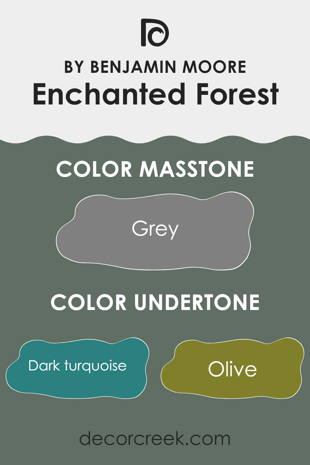
Undertones of Enchanted Forest 700 by Benjamin Moore
Enchanted Forest 700 by Benjamin Moore is a rich and complex paint color that adds depth and character to any room. This color, though primarily seeming like a lush, deep forest green, possesses a myriad of undertones which can subtly influence its appearance under different lighting conditions and when paired with various decor elements.
The undertones of a paint color are secondary shades that emerge depending on lighting or neighboring colors. In the case of Enchanted Forest 700, undertones like dark turquoise, olive, navy, and dark green help the primary color maintain a nature-inspired feel, making it a flexible choice for living rooms or studies. These cooler undertones can make the room feel calm and grounded.
Meanwhile, warmer undertones such as brown, red, and orange can make a room feel cozier and more inviting, making this shade suitable for rooms like dining areas or bedrooms. Purple and violet undertones add a touch of luxury and depth, enhancing the overall aesthetic appeal.
When applied to interior walls, Enchanted Forest 700’s diverse palette of undertones allows it to adapt to different styles and settings. In rooms with ample natural light, the lighter undertones like mint and light turquoise might become more pronounced, giving the room a vibrant yet still soothing atmosphere. In darker rooms, the deeper undertones like navy and dark grey can make the room feel more intimate and enclosed.
Overall, the undertones in Enchanted Forest 700 make it a dynamic choice capable of creating different moods and styles in a variety of settings, helping in achieving a desired atmosphere in one’s home.
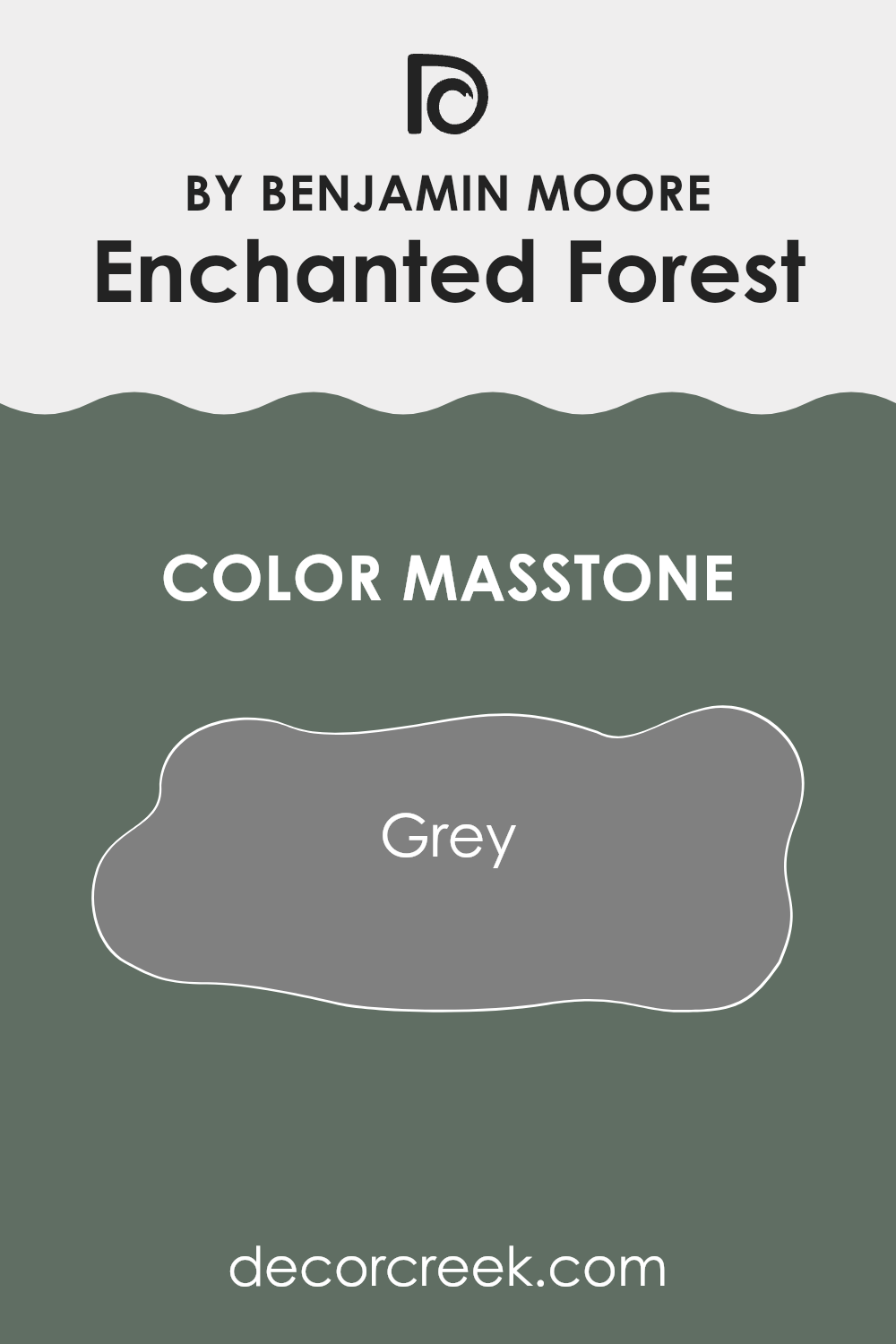
What is the Masstone of the Enchanted Forest 700 by Benjamin Moore?
Enchanted Forest 700 by Benjamin Moore, with its masstone of Grey (#808080), offers a flexible color choice for home interiors. This grey hue essentially acts as a neutral base, making it easy to match with a wide range of furniture and decor styles.
Whether your home features modern minimalism or cozy, classic designs, this shade of grey can fit seamlessly into the aesthetic without overpowering the room. Additionally, because grey is so adaptable, it helps in creating a seamless flow when transitioning from one room to another, maintaining a coherent look throughout the home.
Its neutrality is also beneficial for smaller rooms, as it can help make them appear more roomy and open. Moreover, the subtle quality of this grey allows for flexibility in accent colors, meaning you can add splashes of bolder colors through accessories or wall art to personalize each room to your liking.
How Does Lighting Affect Enchanted Forest 700 by Benjamin Moore?
Lighting plays a crucial role in how colors appear in any environment. Different light sources can dramatically change the perception of colors, affecting moods and aesthetics. Enchanted Forest 700 by Benjamin Moore is a beautifully deep shade that can vary in appearance depending on the lighting conditions it’s under.
In natural light, Enchanted Forest 700 reveals its true depth and richness. The natural sunlight brings out the vibrant undertones of the color, making it appear lively and dynamic. This makes it a great choice for rooms with a lot of windows, where the color can show its full potential during the day.
Artificial light, depending on its type, can affect how this color is perceived. Warm artificial lights, such as incandescent bulbs, tend to enhance the warmth and richness of the color, making it appear cozier and more inviting. Cooler lights, like some LEDs or fluorescent lights, might lean towards bringing out a slightly duller or less vibrant version of the color.
The direction a room faces also impacts how Enchanted Forest 700 appears:
- North-faced rooms: These rooms may get less direct sunlight, so the color might look darker and more shadowed. It generally has a cooler tone in these settings, which might not show the color’s full vibrancy.
- South-faced rooms: These rooms receive a good amount of sunlight throughout the day. Here, Enchanted Forest 700 will look bright and energetic, with its rich hues standing out vividly in the ample natural light.
- East-faced rooms: Morning light can make this color look soft and warmly inviting in the morning, but it can become darker and cooler as the day progresses and less direct sunlight enters the room.
- West-faced rooms: In these rooms, the afternoon and evening light can warm up the color, making it appear richer and more intense during those times.
Understanding how lighting affects this particular shade can help in deciding which rooms and settings are best to use it in, ensuring that the color always adds the desired atmosphere to a room.
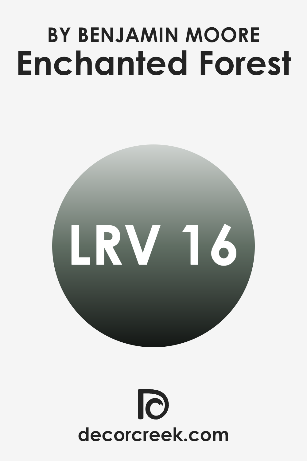
What is the LRV of Enchanted Forest 700 by Benjamin Moore?
LRV stands for Light Reflectance Value, which is a measurement used to determine how much light a paint color reflects or absorbs when applied to a surface. It’s a scale that goes from 1 to 99, where 1 means the paint absorbs almost all the light and 99 means it reflects almost all the light.
This metric is important because it can significantly impact the brightness of a room. A higher LRV paint will make a room feel lighter and brighter because it reflects more light around the room, whereas a lower LRV paint absorbs more light, making a room appear darker.
In the case of Enchanted Forest by Benjamin Moore, which has an LRV of 15.96, it is a darker shade. This means it absorbs more light than it reflects. In a practical sense, using this color in a small, poorly lit room might make the room feel even smaller and darker.
However, in a larger, well-lit area, the depth of this color can add a rich, cozy feeling to the environment. When considering such a shade, lighting and room size should be carefully considered to generate the desired effect and atmosphere in the room.
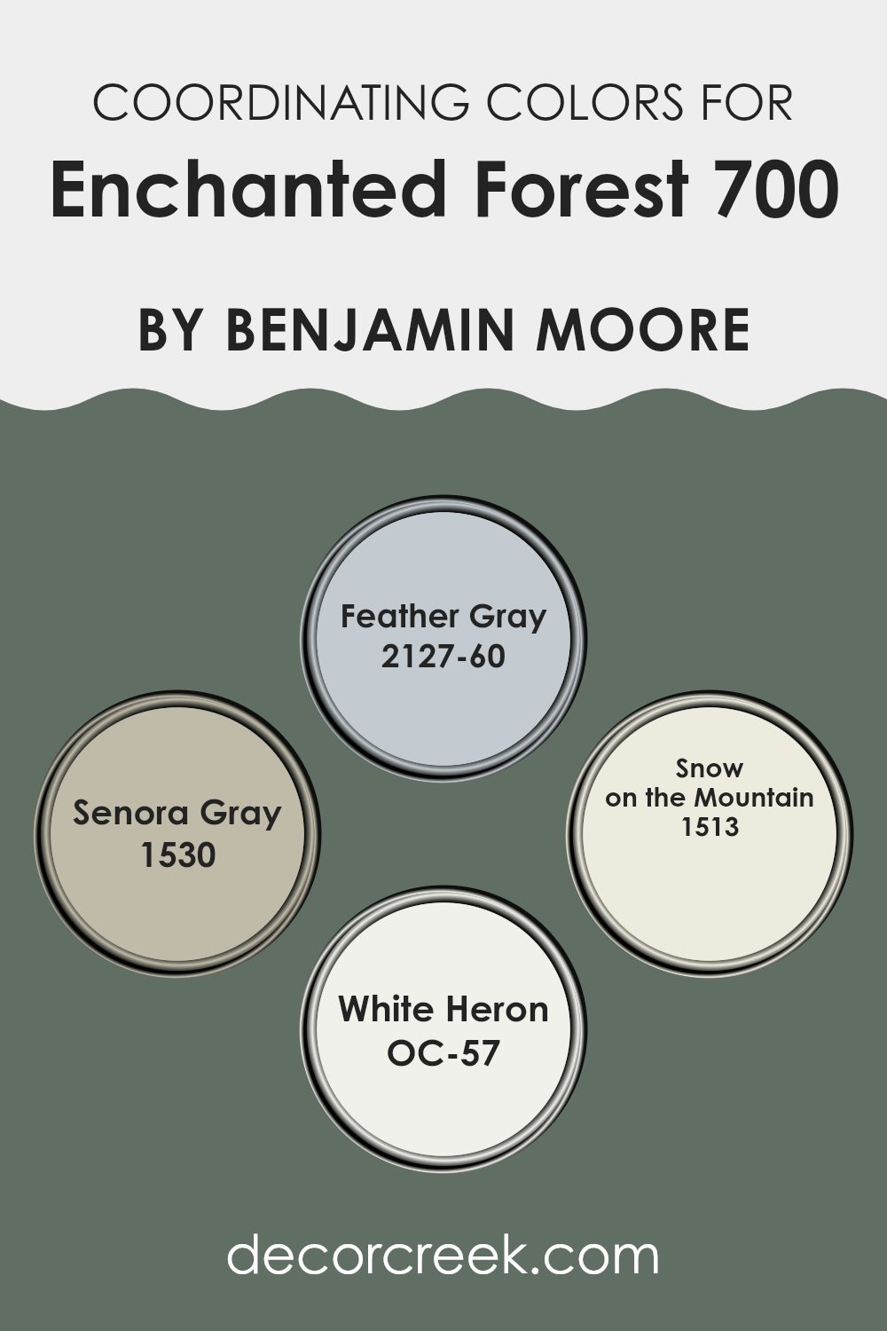
Coordinating Colors of Enchanted Forest 700 by Benjamin Moore
Coordinating colors are a set of hues that harmonize well with a primary color, enhancing the overall aesthetic of a room without overpowering the main tone. These colors can offset, complement, or subtly blend with the key shade to create a cohesive interior design.
For example, when using a deep green like Enchanted Forest from Benjamin Moore as the primary color, coordinating shades like Feather Gray and Senora Gray can add a balanced contrast, while lighter tones like Snow on the Mountain and White Heron can brighten and soften the overall look.
Feather Gray, with its soft, subtle gray tones, offers a soothing backdrop that pairs nicely with more intense colors, providing a gentle transition between the boldness of Enchanted Forest and a lighter palette.
Senora Gray, on the other hand, has a deeper, almost earthy gray tone that grounds the surroundings, bringing a sense of stability to vibrant or darker shades. Snow on the Mountain lives up to its name by introducing a refreshing hint of muted green mixed with gray, invoking the feel of a light, snowy landscape that complements natural, deeper greens.
Lastly, White Heron is a crisp, clean white that acts as a perfect canvas, highlighting and lifting the surrounding colors without clashing or causing visual disruption. Together, these coordinating colors work to create a pleasing and visually appealing environment when paired with a primary color like Enchanted Forest.
You can see recommended paint colors below:
- 2127-60 Feather Gray
- 1530 Senora Gray
- 1513 Snow on the Mountain
- OC-57 White Heron
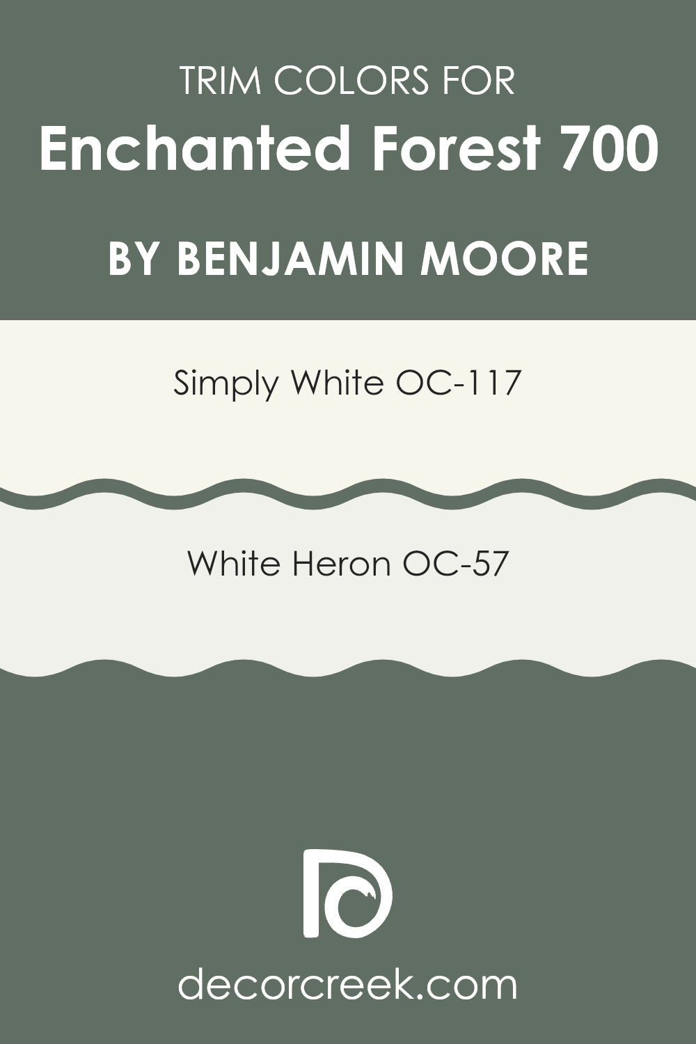
What are the Trim colors of Enchanted Forest 700 by Benjamin Moore?
Trim colors are specific shades used on the borders of walls, doorframes, window frames, and moldings to enhance the appearance of a room. Decorating with the right trim color adds contrast and depth, bringing out the main hues of the room.
When used with a richer, deeper wall shade like Enchanted Forest by Benjamin Moore, trim colors like Simply White and White Heron play a crucial role. They help define the rooms precisely, ensuring that the coloring doesn’t feel too strong and the unique features of a room stand out, giving the overall decor a clean and finished look.
Simply White (OC-117) is a fresh and bright white color that offers a crisp contrast. It works wonderfully to highlight the lush tones of Enchanted Forest, making the room feel airy and more open. On the other hand, White Heron (OC-57) has a subtle warmth and provides a soothing background that doesn’t clash with stronger colors. Both colors give a neat, polished edge to the walls, enhancing the overall aesthetic and making everything around look distinctly tidy and orderly.
You can see recommended paint colors below:
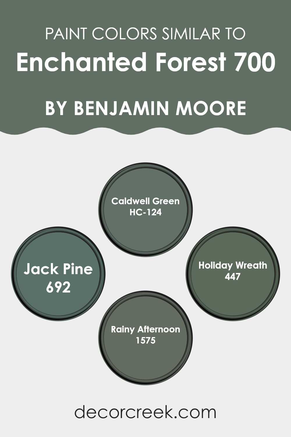
Colors Similar to Enchanted Forest 700 by Benjamin Moore
Similar colors play an essential role in creating a harmonious and unified look in interior design, ensuring a soothing visual flow from one room to another. When colors like HC-124 – Caldwell Green, 692 – Jack Pine, 447 – Holiday Wreath, and 1575 – Rainy Afternoon are used together, they present variations of a theme, enlivening the environment without creating too much contrast. Each shade, while distinct, shares a common undertone that ties the room together beautifully, enhancing the overall aesthetic without causing visual fragmentation.
HC-124 – Caldwell Green is a deep, earthy tone that adds a touch of warmth to rooms, perfect for creating cozy corners. On the other hand, 692 – Jack Pine is a darker, moodier green that brings depth to a room, ideal for accent walls or rich textile elements.
Then there’s 447 – Holiday Wreath, a vibrant, lively green that injects freshness and energy into any room, making rooms feel lively and inviting. Lastly, 1575 – Rainy Afternoon offers a softer, gentler green with a hint of gray, providing a subtle, calming backdrop in a more subdued palette. Using these similar colors helps to create a cohesive yet diverse room, allowing one to mix and match textures and accessories without the fear of color clashing.
You can see recommended paint colors below:
- HC-124 Caldwell Green
- 692 Jack Pine
- 447 Holiday Wreath
- 1575 Rainy Afternoon
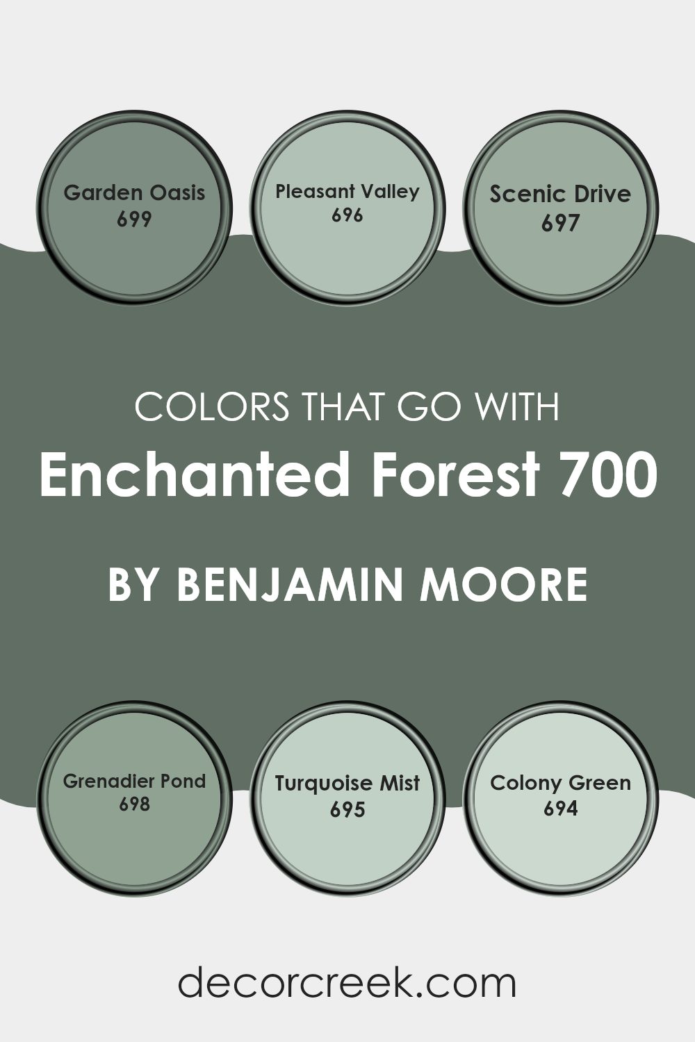
Colors that Go With Enchanted Forest 700 by Benjamin Moore
Choosing the right colors to complement Enchanted Forest 700 by Benjamin Moore is crucial for creating a harmonious and appealing room. These colors should blend well and enhance the deep, lush undertones of Enchanted Forest, as well as bring balance and contrast where necessary.
Garden Oasis 699, akin to the freshness of a well-kept garden, boasts a lively and verdant hue that breathes life into Enchanted Forest’s earthy character. Pleasant Valley 696 provides a gentle sky blue that reflects a clear day, offering a soft contrast that highlights deeper greens without overpowering them.
Nearby, Scenic Drive 697 carries a subtle gray infusion, providing a neutral backdrop that allows richer colors to stand out. Grenadier Pond 698 taps into a darker palette with its bluish-green tone, mirroring the shadowy depths of forest waters, which pairs beautifully with the mystical vibes of Enchanted Forest.
Turquoise Mist 695 plays on the lighter side, with a breezy and fresh tinge that injects vibrancy and light. Lastly, Colony Green 694, with its subdued green, leans towards a more muted expression, ensuring it supports rather than competes with more dominant shades. Through thoughtful use of these complementary colors, any living room can achieve a balanced and pleasing aesthetic that enhances the overall atmosphere.
You can see recommended paint colors below:
- 699 Garden Oasis
- 696 Pleasant Valley
- 697 Scenic Drive
- 698 Grenadier Pond
- 695 Turquoise Mist
- 694 Colony Green
How to Use Enchanted Forest 700 by Benjamin Moore In Your Home?
Enchanted Forest 700 by Benjamin Moore is a rich, deep green paint that brings a touch of nature’s beauty into your home. This color is perfect if you want to create a cozy, inviting atmosphere in any room. Its deep tones are great for making large rooms feel more intimate and smaller rooms look stylish.
You can use Enchanted Forest 700 in different ways. For instance, painting an accent wall with this color can make it the focal point of a room, especially when paired with lighter colors like soft whites or creams. This contrast not only adds interest but also defines the room beautifully.
Additionally, this shade works well in bedrooms or reading areas, where its calming effect can help you relax. You might also consider using it on kitchen cabinets or bathroom walls for a unique, refreshing look. Furniture pieces painted in Enchanted Forest 700 against a lighter background can really stand out, making a bold design statement. Overall, Enchanted Forest 700 is flexible. It adds warmth and character to rooms, making them feel welcoming and stylish.
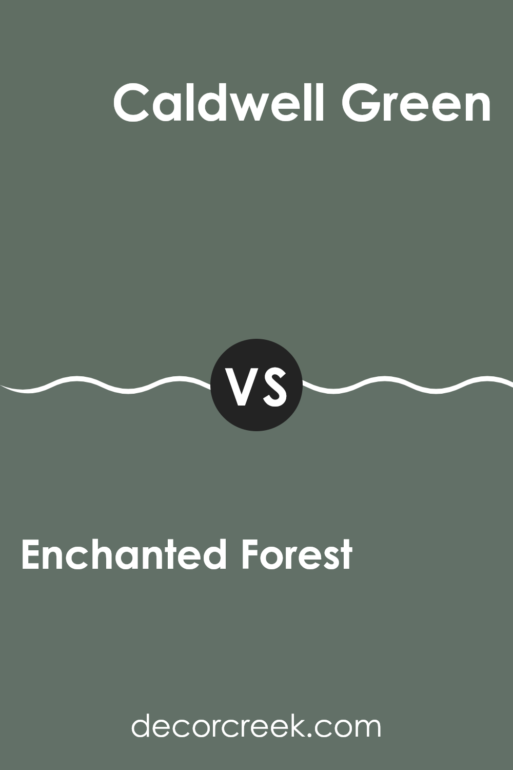
Enchanted Forest 700 by Benjamin Moore vs Caldwell Green HC-124 by Benjamin Moore
Enchanted Forest and Caldwell Green are both beautiful shades from Benjamin Moore. Enchanted Forest is a deep, rich green that has a vibrant, lively feel. It’s perfect for creating a statement in a room, perhaps on an accent wall or for cabinetry, giving any room a fresh and dynamic look.
On the other hand, Caldwell Green is a subtler, more muted green shade. It tends to have a more classic vibe, lending an enduring look to interiors. This color works well in rooms where you want a touch of color without making it too strong, making it great for bedrooms or offices.
Both colors reflect nature’s greens but in different intensities and tones, offering varied options for decorating depending on the mood and atmosphere you want to achieve in a room.
You can see recommended paint color below:
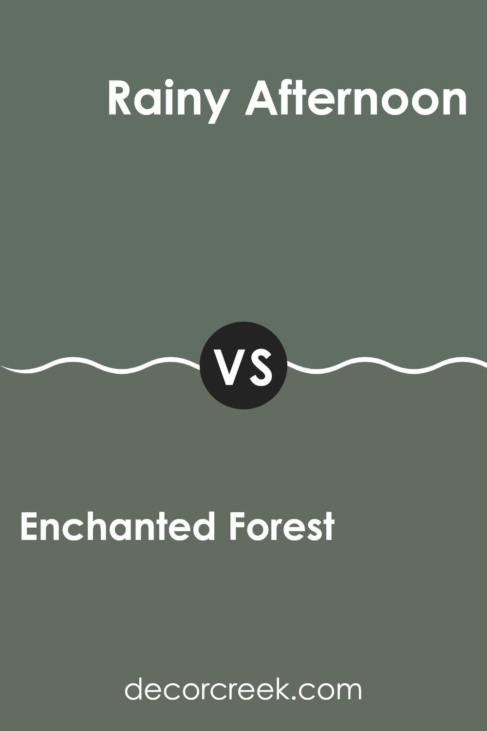
Enchanted Forest 700 by Benjamin Moore vs Rainy Afternoon 1575 by Benjamin Moore
Enchanted Forest is a deep, rich green that gives off a cozy and natural feel. It resembles the dense greenery of a thick, lush forest and tends to make a bold statement in a room. This color is perfect for creating a cozy, secluded atmosphere, ideal for rooms where you might want to feel surrounded by nature.
On the other hand, Rainy Afternoon is a lighter, more subdued gray-green, reminiscent of the sky during a gentle rainstorm. This color is softer and more neutral, making it flexible and easy to pair with various decor styles and colors. It works well in rooms where you want a touch of calmness without the heaviness of a darker shade.
Both colors have their unique appeal and can greatly influence the mood of a room, from the bold and earthy presence of Enchanted Forest to the quiet and soothing tone of Rainy Afternoon.
You can see recommended paint color below:
Enchanted Forest 700 by Benjamin Moore vs Jack Pine 692 by Benjamin Moore
The main color, Enchanted Forest, and the second color, Jack Pine, are both from Benjamin Moore and offer unique green shades great for creating warm, welcoming rooms. Enchanted Forest is a deeper, richer green that leans towards a jewel tone. It’s perfect for accent walls or for rooms where a touch of drama is desired. This color pairs well with light, earthy tones and darker woods, making it flexible for different design styles.
On the other hand, Jack Pine is a lighter, more subdued green. It has an almost muted quality, making it ideal for creating a calm and cozy atmosphere. This color works beautifully in smaller rooms or rooms that get plenty of natural light, as it won’t feel too strong.
Both colors offer distinct vibes – Enchanted Forest brings a bold and deep feel, whereas Jack Pine offers a softer, more relaxed environment. Choosing between them depends on the mood and style you want to achieve in your room.
You can see recommended paint color below:
- 692 Jack Pine
Enchanted Forest 700 by Benjamin Moore vs Holiday Wreath 447 by Benjamin Moore
Enchanted Forest 700 and Holiday Wreath 447 by Benjamin Moore are both beautiful, deep green hues, though they offer subtly different vibes for decorating rooms. Enchanted Forest is a darker green that tends to evoke a sense of mystery and richness. This color can make a room feel cozy and inviting, almost like being in a dense, lush forest. It works well in places where a touch of drama is desired, such as in a study or a dining room.
On the other hand, Holiday Wreath is a slightly lighter green with what seems like a hint of blue. It’s still in the dark range but has a fresher feel compared to Enchanted Forest. This color is perfect for creating a welcoming and refreshing atmosphere.
It might be more suited for casual rooms or rooms that get a lot of natural light, giving them a lively, cheerful ambiance without being too strong. Both colors are great choices for someone wanting to bring the elements of nature into their home, yet each one sets a very different mood.
You can see recommended paint color below:
- 447 Holiday Wreath
In wrapping up, I found that the paint color 700 Enchanted Forest by Benjamin Moore is quite special. This shade of green can really make any room look more lively and cozy at the same time. Whether it’s used in a big room like the living room or a small area like a bathroom, this color creates a fresh and inviting atmosphere. It’s like bringing a little bit of nature inside your home, which can make you feel relaxed and happy.
This color is not just pretty but also works well with other colors. You can pair it with light colors like white or cream for a soft look, or with dark colors like brown or black for a bit more drama. It’s perfect for those who want to add a splash of color to their room without making it look too bold.
Overall, the 700 Enchanted Forest paint is a great choice if you want to refresh your room with something that looks beautiful and feels comforting.
It’s a color that can make your room a nicer place to spend time in, whether you’re playing, studying, or just hanging out.
Ever wished paint sampling was as easy as sticking a sticker? Guess what? Now it is! Discover Samplize's unique Peel & Stick samples.
Get paint samples

