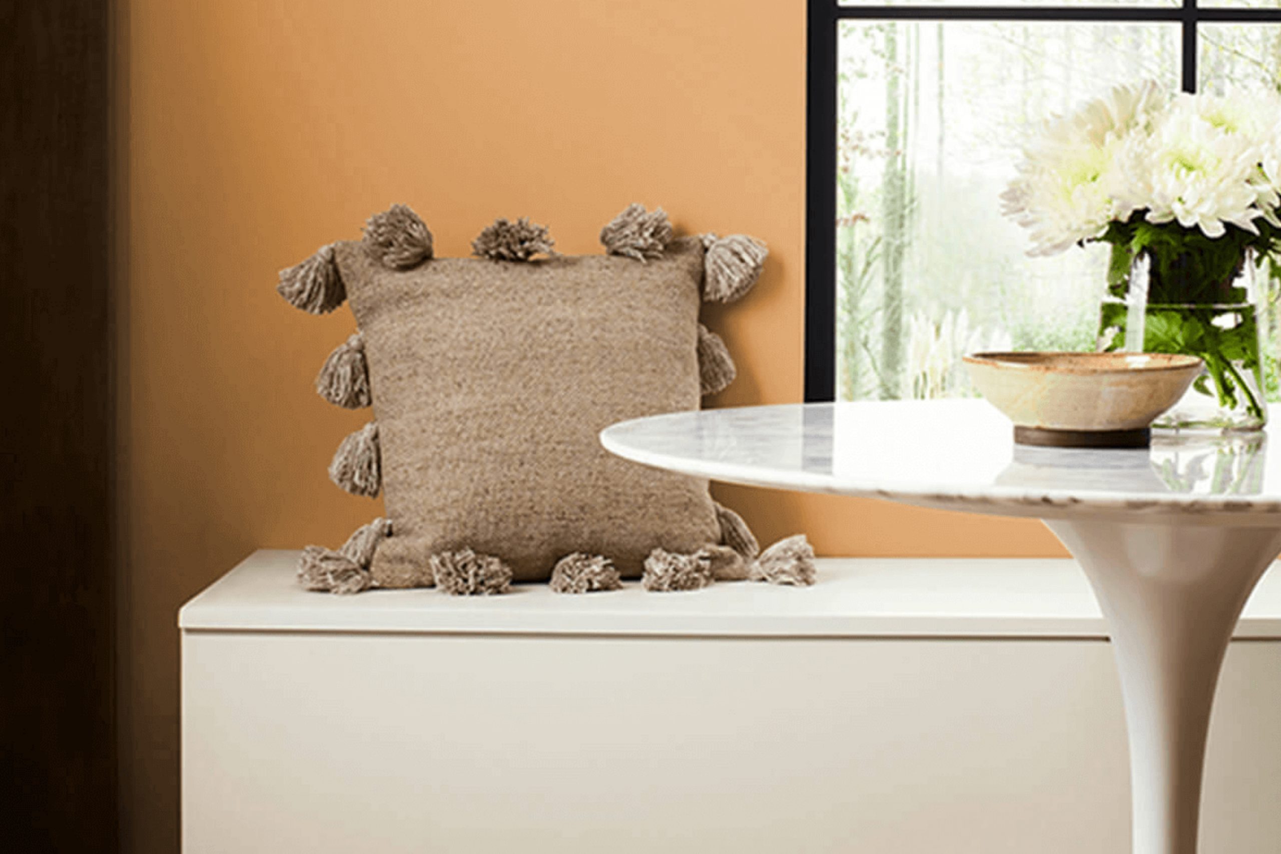
I recently stumbled upon SW 2858 Harvest Gold by Sherwin Williams, a rich and warm paint color that instantly grabs your attention. When you think of autumn, you imagine the golden leaves and the cozy vibe; this color embodies all of that warmth and comfort.
It’s perfect if you’re looking to add a sense of coziness and warmth to any room in your house. What’s fascinating about Harvest Gold is how it can make an area feel inviting and snug yet energizing. It pairs wonderfully with a range of colors, from soft whites to deep greens, ensuring adaptability regardless of your home’s existing palette.
If you’re considering refreshing a room or just want to bring a new energy to your area, Harvest Gold could be the way to go. It can bring life to a dull room or accent one that already has vibrant elements.
Let me share more about how this color behaves in different lights and areas, its compatibility with various décor styles, and some tips on the best places in your home to use it.
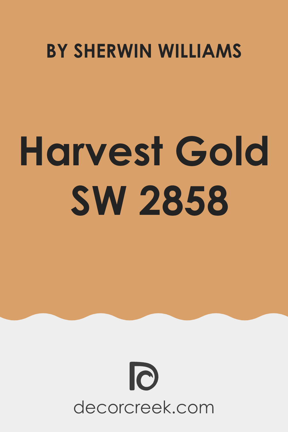
What Color Is Harvest Gold SW 2858 by Sherwin Williams?
Harvest Gold is a warm, welcoming shade that immediately gives a touch of coziness to any area. This color resembles the golden hue of autumn leaves, radiating a gentle and inviting ambiance. It works wonderfully in areas meant for relaxation and gathering like living rooms and dining rooms.
The warmth of Harvest Gold pairs well with natural materials such as wood, leather, and linen, enhancing the cozy feel of these textures. It can also harmonize beautifully with darker tones of green or blue, adding a balanced contrast that enriches the allure of a room. When matched with metallic accents such as brass or copper, Harvest Gold adds a hint of rustic charm without being too strong.
This color is quite adaptable in terms of interior design styles. It shines in rustic settings where it complements earthy, organic elements. In a more traditional setting, it works magically with rich, classic wood tones and detailed textures. For a modern twist, pairing it with crisp whites and clean lines can make the area feel warm yet fresh. Therefore, whether you are decorating a country cottage or a contemporary apartment, Harvest Gold can create a cozy, welcoming atmosphere that makes the house feel like a home.
Is Harvest Gold SW 2858 by Sherwin Williams Warm or Cool color?
Harvest Gold by Sherwin Williams is a warm, inviting paint color that adds a cheerful touch to any area. This particular shade of yellow has hints of orange, giving it a cozy, autumnal feel, reminiscent of golden leaves under the fall sun. When used in homes, Harvest Gold creates a welcoming environment, making rooms feel bright and airy.
It’s especially effective in areas that don’t receive a lot of natural sunlight, as its golden tones help light up a room. This color is adaptable, working well in kitchens and living rooms where families gather, as it stimulates feelings of happiness and energy.
Additionally, it pairs beautifully with various wood finishes, from light pine to dark walnut, enhancing the natural elements of the furniture and flooring. Nevertheless, it is important to balance Harvest Gold with neutral tones like white, gray, or soft beige. This prevents the area from becoming too intense and keeps the atmosphere light and pleasant.
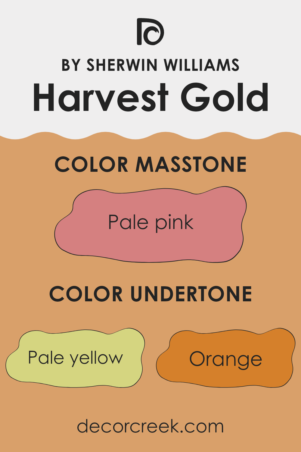
Undertones of Harvest Gold SW 2858 by Sherwin Williams
Harvest Gold is a vibrant and welcoming paint color that adds warmth to any room. The color has a base that might look simply yellow at a glance, but it includes a mix of subtle undertones that can influence the overall effect on your interior walls. These undertones include pale yellow, orange, gray, and more, each adding its unique flair to the color.
Pale yellow and orange undertones in Harvest Gold inject a cheerful brightness, perfect for living areas or kitchens where a sunny, energetic mood is desired. These warmer undertones make the walls feel cozy and inviting.
Gray and light gray undertones provide a muted effect, softening the intensity of the gold. This makes Harvest Gold more adaptable and easier to incorporate into various decor styles without being too strong in the area with too much vibrancy.
On interior walls, Harvest Gold gives a room a fresh, lively look, especially in natural light. However, the appearance of Harvest Gold can shift depending on the lighting. In bright daylight, the yellower undertones might stand out, making the wall look more vivid. In artificial or dim lighting, the grayer undertones might become more pronounced, giving the room a subtler, more subdued look.
In conclusion, the mixture of undertones in Harvest Gold means it can adjust to different settings and decorations, making it a flexible choice for your home. Whether you’re going for a bright and bold look or something more understated, this color can meet various aesthetic needs.
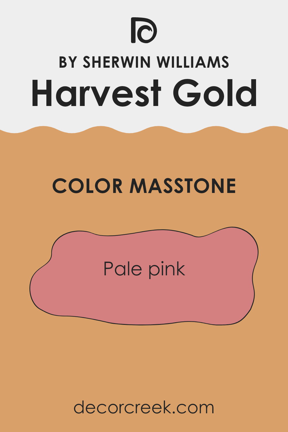
What is the Masstone of the Harvest Gold SW 2858 by Sherwin Williams?
Harvest Gold SW 2858 by Sherwin Williams has a masstone of pale pink, coded as #D58080. This gentle, soft pink shade brings a sense of warmth and approachability to any area. In homes, this color works beautifully because it offers a subtle hint of color without being too strong in a room.
It’s easy to match with various decor styles and furniture colors, making it a adaptable choice for living rooms, bedrooms, or even kitchens. The pale pink masstone helps in creating a cozy and welcoming atmosphere, ideal for areas where comfort is key.
It’s particularly effective in small rooms or areas with limited natural light, as it can make areas feel bigger and brighter. Overall, this color offers a fresh, pleasant aesthetic that can complement a wide range of interior designs, from modern to traditional.
How Does Lighting Affect Harvest Gold SW 2858 by Sherwin Williams?
Lighting has a profound impact on how we perceive colors, influencing their appearance and the mood they help create in an area. The type of light and the direction of light exposure can make the same color look different.
Taking the color Harvest Gold as an example, this warm, rich yellow can vary significantly under different lighting conditions. In natural light, this color appears bright and vibrant, bringing a sunny and cheerful vibe to a room.
Under artificial lighting, such as LED or incandescent bulbs, the yellow tones may deepen, creating a cozier and slightly more muted atmosphere. The type of bulb (cool vs. warm) also affects its appearance; warmer bulbs enhance the yellow, making it more pronounced, while cooler bulbs might make it appear softer.
In rooms with different facing directions, Harvest Gold will display varying characteristics:
- North-Faced Rooms: These rooms often receive less direct sunlight, which can make colors appear slightly darker and cooler. Harvest Gold in a north-facing room could look more subdued and less vibrant, possibly requiring additional lighting to brighten the area.
- South-Faced Rooms: With ample sunlight, south-facing rooms allow Harvest Gold to shine most naturally. The color will appear warmer and very true to its hue, making the room feel sunny and welcoming throughout the day.
- East-Faced Rooms: Morning light from an east-facing window can make Harvest Gold look very bright and dynamic in the morning, fading to a gentler glow as the day progresses. This can create a pleasant effect of a changing atmosphere as the day advances.
- West-Faced Rooms: Evening light from a west-facing window will warm up Harvest Gold towards the end of the day, making the room feel cozy and inviting. During the morning hours, the color might appear cooler, gradually warming up as the sunlight becomes more direct.
Understanding how different types of lighting and room orientations affect color can help in making informed decisions about paint and decor to achieve the desired effect in your area.

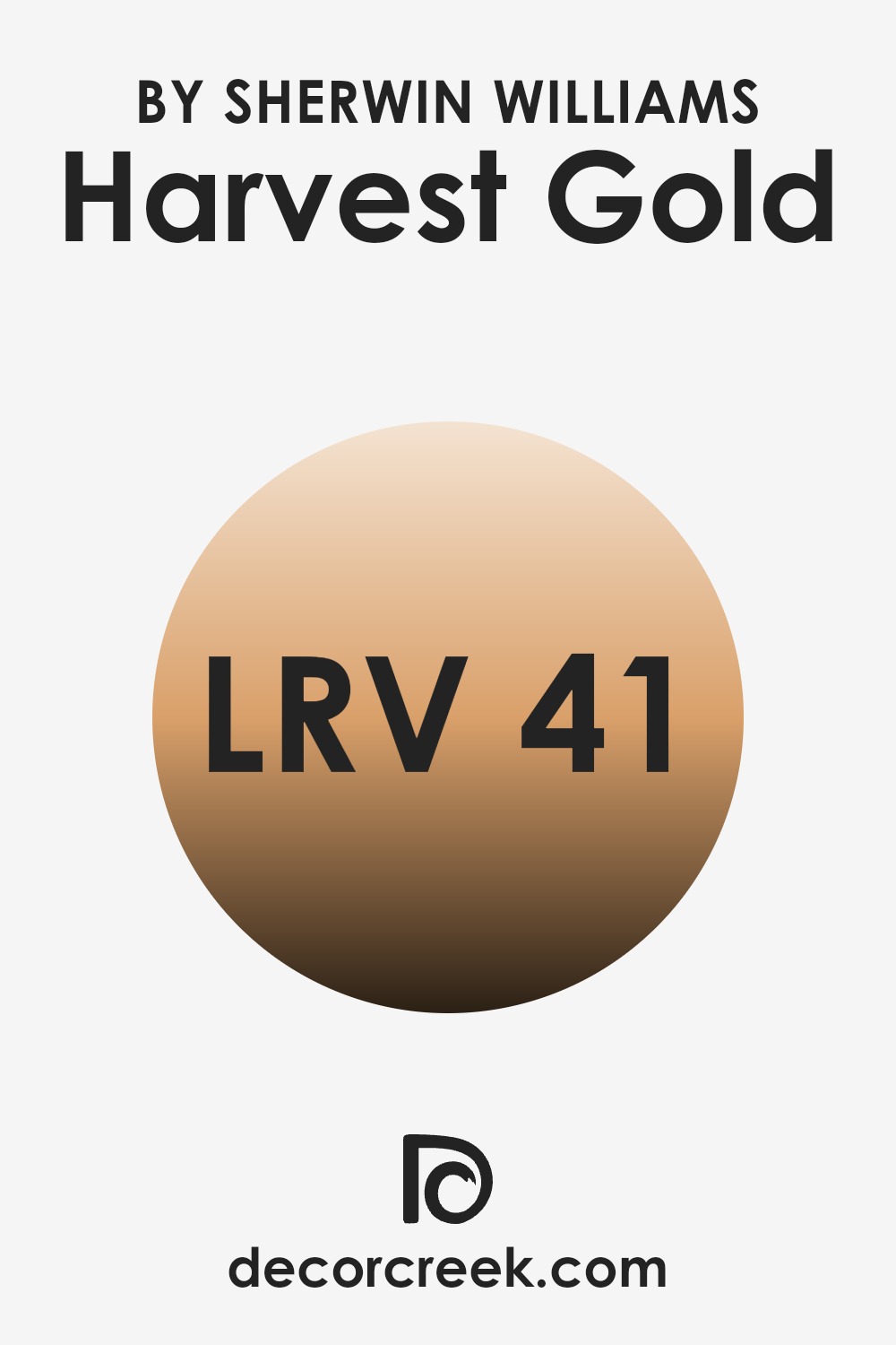
What is the LRV of Harvest Gold SW 2858 by Sherwin Williams?
LRV stands for Light Reflectance Value, which is a measurement used to determine how much light a paint color reflects back into a room compared to how much it absorbs. This scale was designed to help people figure out how light or dark a color might appear once it’s on the wall.
A higher LRV means the paint reflects more light, making the room appear brighter. Conversely, a lower LRV indicates that the paint absorbs more light, which can make an area look darker. This is especially important when choosing colors for small or poorly lit areas, as a higher LRV can make these areas feel more open and airy.
Regarding the specific LRV of 40.973 for the paint color mentioned, it stands somewhere in the middle of the scale. This means it isn’t particularly light or extremely dark, offering a balanced appearance that neither dominates the area with brightness nor makes it feel too enclosed.
This moderate LRV makes the color adaptable, suitable for rooms with varying amounts of natural or artificial light. It can help create a welcoming, warm effect in an area, making it cozy but still fairly reflective, which is useful for maintaining a sense of balance in the room’s aesthetics without leaning too heavily towards a lighter or darker scheme.
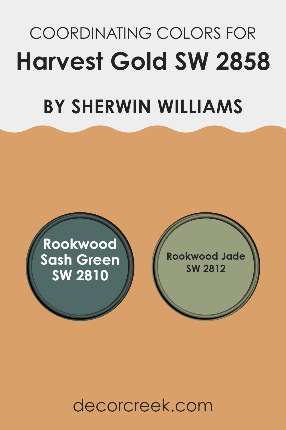
Coordinating Colors of Harvest Gold SW 2858 by Sherwin Williams
Coordinating colors are hues that complement each other when used together in design and decor, creating a balanced and harmonious look. When working with a specific base color like Harvest Gold, choosing the right coordinating colors can enhance the overall aesthetic of an area.
Coordinating colors ideally accentuate each other, bringing out the best features of the original shade without being too strong. The chosen coordinating colors can be used for various elements such as walls, trims, furniture, or accessories.
Rookwood Sash Green is a deep, earthy green that pairs well with the warm tones of Harvest Gold. This color is perfect for creating a grounded and inviting atmosphere in any room, particularly as an accent wall or as part of the room’s trim. On the other hand, Rookwood Jade offers a slightly lighter and more muted green shade.
This color works beautifully alongside Harvest Gold, particularly in areas that aim for a subtle yet inviting palette. It’s ideal for adding a gentle splash of color to areas like kitchens or bathrooms, helping to keep the area feeling fresh and clean. Together, these shades work seamlessly with Harvest Gold to create a pleasing and cozy environment.
You can see recommended paint colors below:
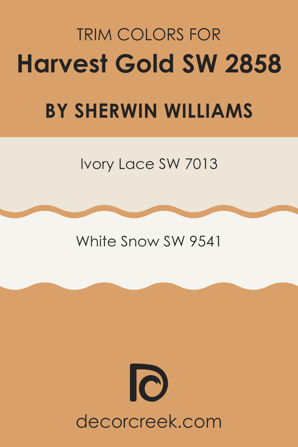
What are the Trim colors of Harvest Gold SW 2858 by Sherwin Williams?
Trim colors play a crucial role in enhancing and defining the visual appeal of a building’s exterior or an interior room’s aesthetic. When used effectively, they outline and accent architectural features, creating a contrasting frame that can make the main color pop or subtly blend to provide a seamless look.
For a warm, rich hue like Harvest Gold, trim colors such as SW 7013 – Ivory Lace and SW 9541 – White Snow are excellent choices. These colors are light and neutral, which helps in balancing the boldness of Harvest Gold by adding a crisp, clean border that highlights the building’s design features.
SW 7013 – Ivory Lace is a soft, creamy white with a touch of warmth, making it a perfect complement to Harvest Gold as it softens the overall appearance without being too strong on the golden tones. This creates a smooth transition between the vivid central color and the architectural details.
On the other hand, SW 9541 – White Snow is a brighter, purer white that offers a striking contrast to Harvest Gold. This sharper distinction brings out the best of the golden tones, making them stand out more prominently, which is ideal for features that deserve attention. Both trim colors enhance the beauty and character of Harvest Gold, making them practical choices for anyone looking to highlight their home’s best attributes.
You can see recommended paint colors below:
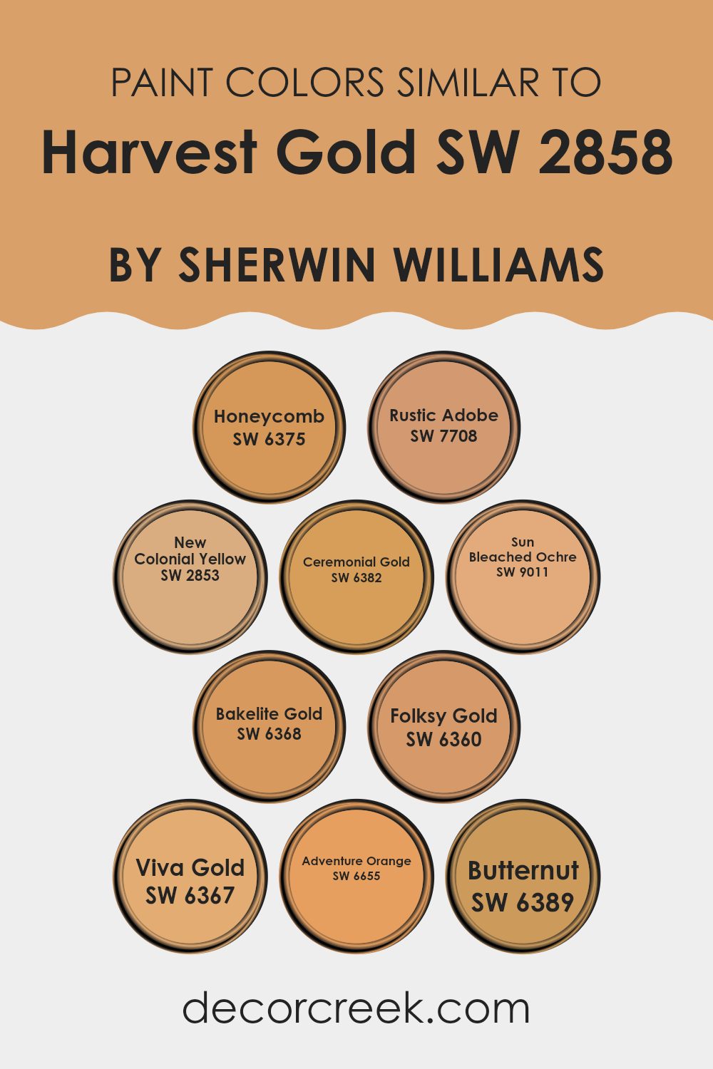
Colors Similar to Harvest Gold SW 2858 by Sherwin Williams
Similar colors play a crucial role in creating a harmonious and balanced visual experience, ensuring a seamless transition between hues that share a common base yet differentiate subtly in tones. These color gradients can be vital in design choices, helping to achieve a coherent look within an environment without stark contrasts that may disrupt the aesthetic flow. Taking examples from shades akin to Harvest Gold, colors like Honeycomb and Rustic Adobe beautifully illustrate this concept.
Honeycomb is a warm, muted yellow, evoking the peaceful feeling of a sunny afternoon, while Rustic Adobe offers a rich, earthy red reminiscent of traditional clay houses that radiates warmth. New Colonial Yellow brings to mind the soft, washed-out hues of historical architecture, gentle and inviting.
Ceremonial Gold has a deeper, more resonant yellow that suggests a sense of dignified richness. Sun Bleached Ochre has the faded look of a well-loved object left to bask under the sun, offering a quiet nostalgia. Bakelite Gold is reminiscent of vintage plasticware, possessing a quirky charm.
Folksy Gold hints at autumn’s welcome, with subdued gold tones that whisper rather than shout. Viva Gold boasts a more saturated, exuberant yellow that adds a punch of cheerfulness to any palette. Adventure Orange is bolder, infusing a lively energy with its bright and inviting presence.
Lastly, Butternut is a creamy, comforting shade of yellow, much like the squash it’s named for, providing a cozy, soft backdrop. These similar colors, each unique in their own right, contribute to creating visually appealing and cohesive areas that feel intentional and gracefully coordinated.
You can see recommended paint colors below:
- SW 6375 Honeycomb
- SW 7708 Rustic Adobe
- SW 2853 New Colonial Yellow
- SW 6382 Ceremonial Gold
- SW 9011 Sun Bleached Ochre
- SW 6368 Bakelite Gold
- SW 6360 Folksy Gold
- SW 6367 Viva Gold
- SW 6655 Adventure Orange
- SW 6389 Butternut
How to Use Harvest Gold SW 2858 by Sherwin Williams In Your Home?
Harvest Gold SW 2858 by Sherwin Williams is a warm and inviting paint color that is perfect for adding a cozy and cheerful touch to any room in your home. This shade of yellow brings a sunny and bright feel, making it ideal for areas where you spend a lot of time with family or friends.
You could use Harvest Gold in your kitchen to create a welcoming atmosphere for cooking and gathering. Painting your living room with this color can also make it feel more lively and comfortable. Additionally, this color works well in a home office or study area, as its cheerful hue can help boost your mood and energy levels, which might enhance productivity.
For a softer look, you can pair Harvest Gold with neutral tones like whites or grays. This combination can keep the area feeling light and airy while still injecting some warmth and personality. Consider using this adaptable color to refresh your walls or accent pieces and give your home a cozy update.
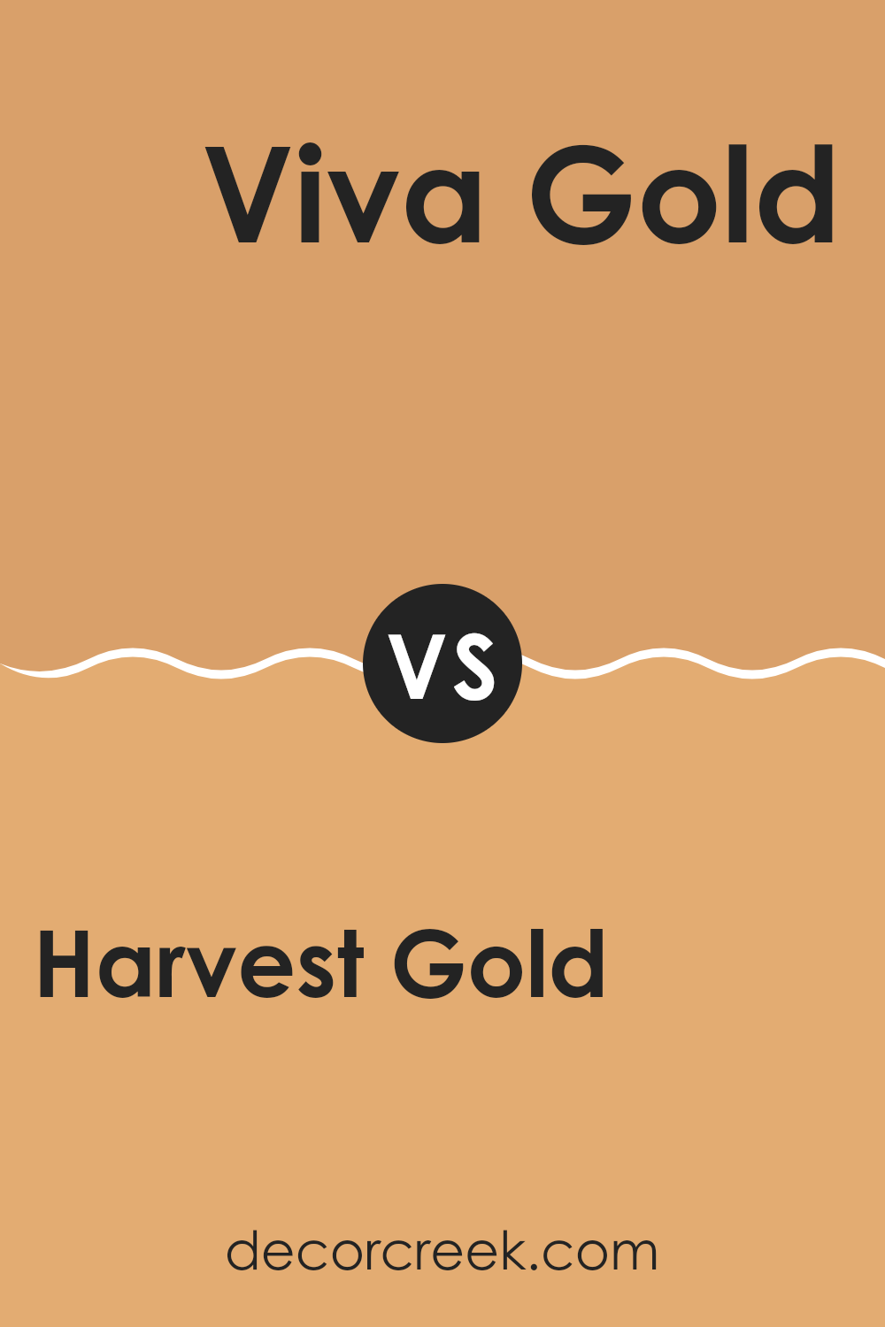
Harvest Gold SW 2858 by Sherwin Williams vs Viva Gold SW 6367 by Sherwin Williams
Harvest Gold and Viva Gold are two shades by Sherwin Williams that both bring warm, golden tones to an area but in slightly different ways. Harvest Gold is a muted, earthy yellow with a subdued, creamy feel.
It could give a room a cozy, welcoming atmosphere without being too bright or too strong. On the other hand, Viva Gold packs a bit more punch. It’s a richer, more vibrant gold that stands out more boldly. This color can add a cheerful and energetic vibe to any area, making it feel livelier.
While Harvest Gold might be better suited to a classic or traditional setting because of its softer appearance, Viva Gold would fit well in areas where you want to make a stronger, more dynamic statement.
You can see recommended paint color below:
- SW 6367 Viva Gold
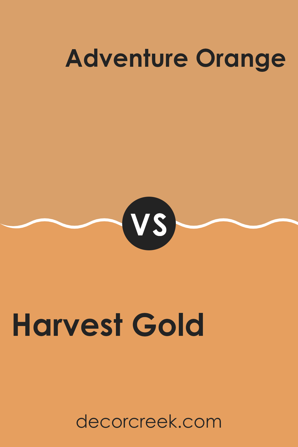
Harvest Gold SW 2858 by Sherwin Williams vs Adventure Orange SW 6655 by Sherwin Williams
Harvest Gold and Adventure Orange are two vibrant colors from Sherwin Williams that each bring their unique charm to any area. Harvest Gold is a warm, deep yellow that creates a cozy and inviting feel. It works well in rooms needing a touch of cheerfulness without being too bright.
On the other hand, Adventure Orange is a bold, energetic color that stands out and brings life to a room. This shade of orange is perfect for areas where you want to make a strong statement and add a sense of excitement.
These two colors are quite different in their emotional impact. While Harvest Gold brings a calm and comforting vibe, Adventure Orange adds zest and a dynamic energy. Depending on what atmosphere you’re aiming for, each color has the potential to refresh and liven up your area in its own unique way. They can also complement each other nicely in different rooms of a home to create diverse experiences.
You can see recommended paint color below:
- SW 6655 Adventure Orange
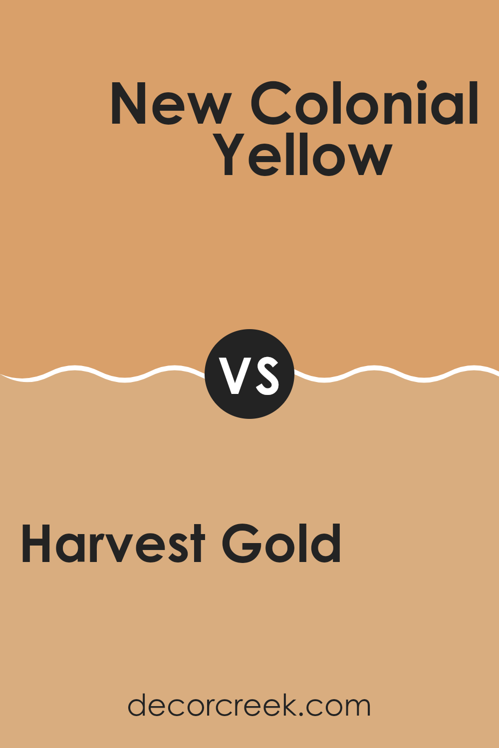
Harvest Gold SW 2858 by Sherwin Williams vs New Colonial Yellow SW 2853 by Sherwin Williams
Harvest Gold and New Colonial Yellow are both warm, inviting paint colors from Sherwin Williams, but they have subtle differences that set them apart. Harvest Gold is a deeper, richer shade that resembles the golden tones of autumn leaves.
This color is cozy and comforting, making it a great choice for areas where you want to create a snug and welcoming atmosphere. On the other hand, New Colonial Yellow is lighter and brighter. It has a sunnier feel, reminiscent of a cheerful, sunny day.
This makes it ideal for areas where you want to add a splash of brightness, energizing the room. Although both colors share a yellow base, Harvest Gold offers a more muted, golden hue, while New Colonial Yellow brings a crisp vibrancy, much like early morning sunshine. These qualities mean that while both can warm up a room, they do so in distinctly different ways.
You can see recommended paint color below:
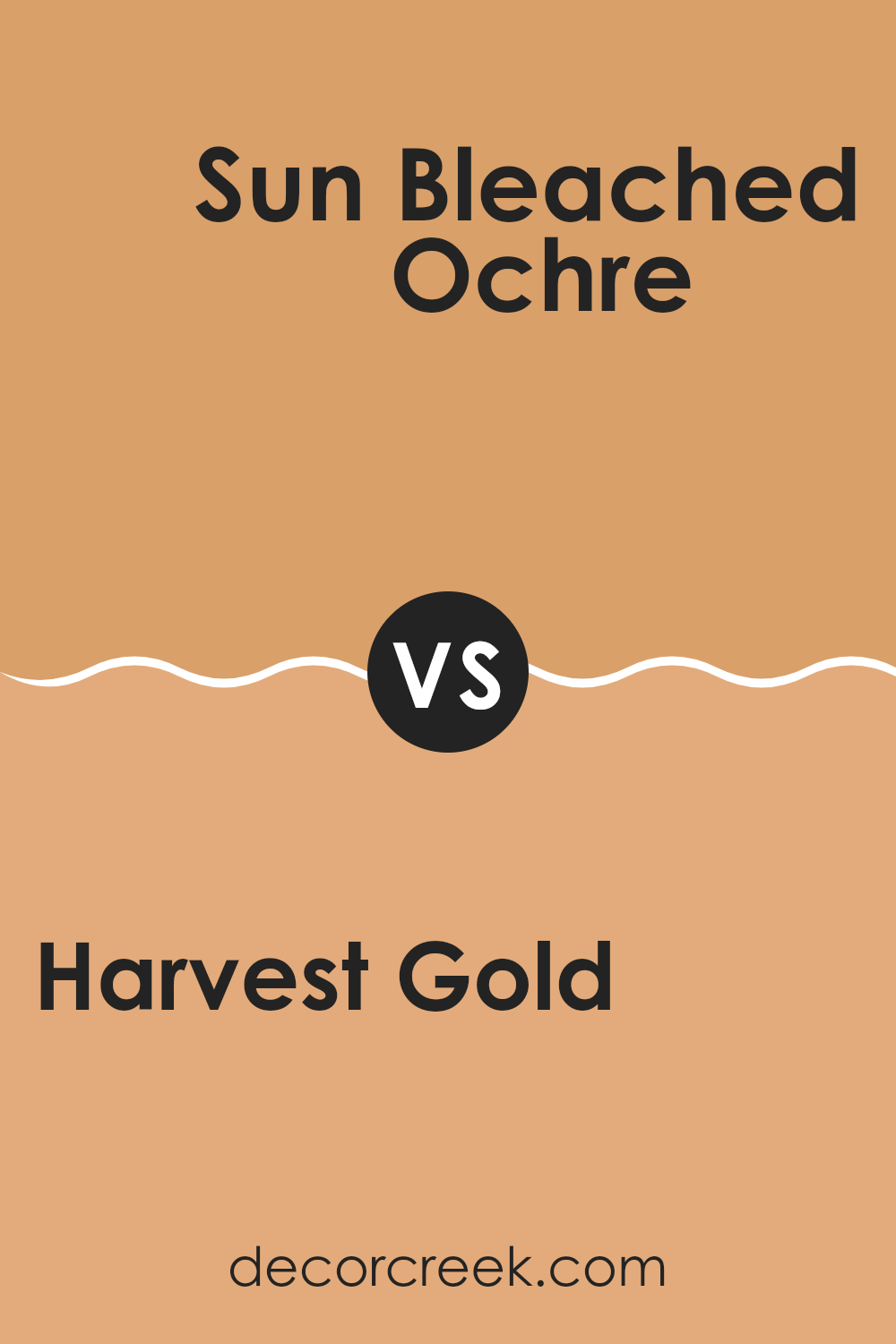
Harvest Gold SW 2858 by Sherwin Williams vs Sun Bleached Ochre SW 9011 by Sherwin Williams
Harvest Gold and Sun Bleached Ochre are two warm and inviting color options from Sherwin Williams. Harvest Gold is a rich, deep yellow with a golden hue reminiscent of autumn leaves. It creates a cozy and welcoming atmosphere, making it ideal for living rooms or dining areas where you want to add a touch of warmth.
On the other hand, Sun Bleached Ochre presents a lighter, more muted version of yellow. This color is softer and almost sandy, making it great for areas where you want a subtle yet warm presence. It’s excellent for bedrooms or bathrooms where a more relaxed feel is desired.
Both colors have their unique appeal. Harvest Gold stands out more and could easily be the focal point in a room, whereas Sun Bleached Ochre blends nicely into the background, providing a gentle backdrop for other decor elements. Depending on the mood you want to set, either color can enhance your home beautifully.
You can see recommended paint color below:
- SW 9011 Sun Bleached Ochre
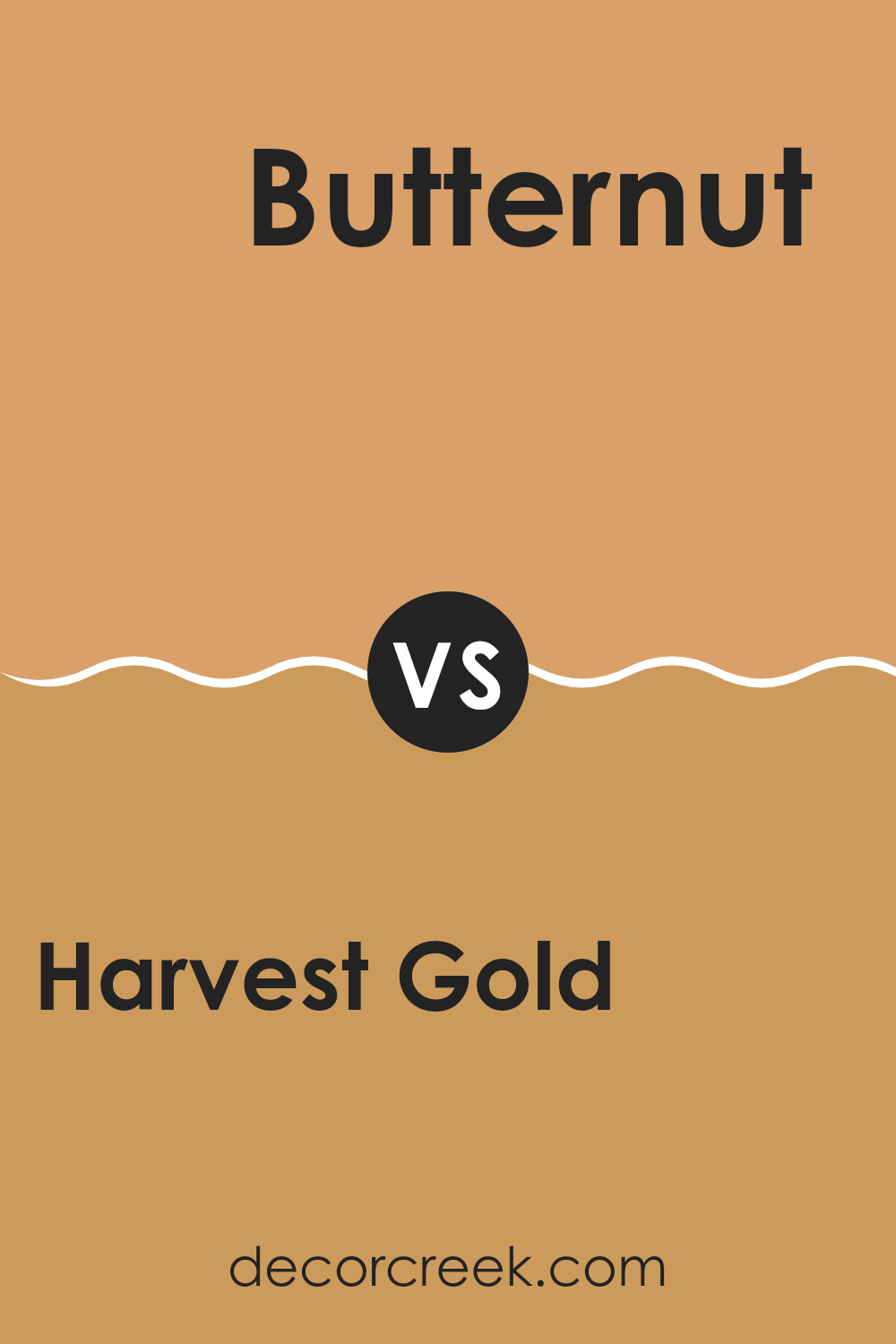
Harvest Gold SW 2858 by Sherwin Williams vs Butternut SW 6389 by Sherwin Williams
Harvest Gold and Butternut by Sherwin Williams are both warm, inviting colors, but they have distinct tones that set them apart. Harvest Gold is a rich, deep yellow with a slightly muted tone, making it a cozy choice for areas.
It works well in living areas and kitchens where you want a welcoming, yet confident atmosphere. On the other hand, Butternut is lighter and brighter, with a vivid, cheerful glow. This shade is perfect for adding a sense of freshness and energy to a room, especially in smaller areas or rooms that could use a lift.
While both colors share a yellow base, Harvest Gold presents a more grounded, amber feel compared to the sunnier, more playful tone of Butternut. Together, they could complement each other well in a color scheme, with Butternut brightening areas and Harvest Gold adding depth and warmth.
You can see recommended paint color below:
- SW 6389 Butternut
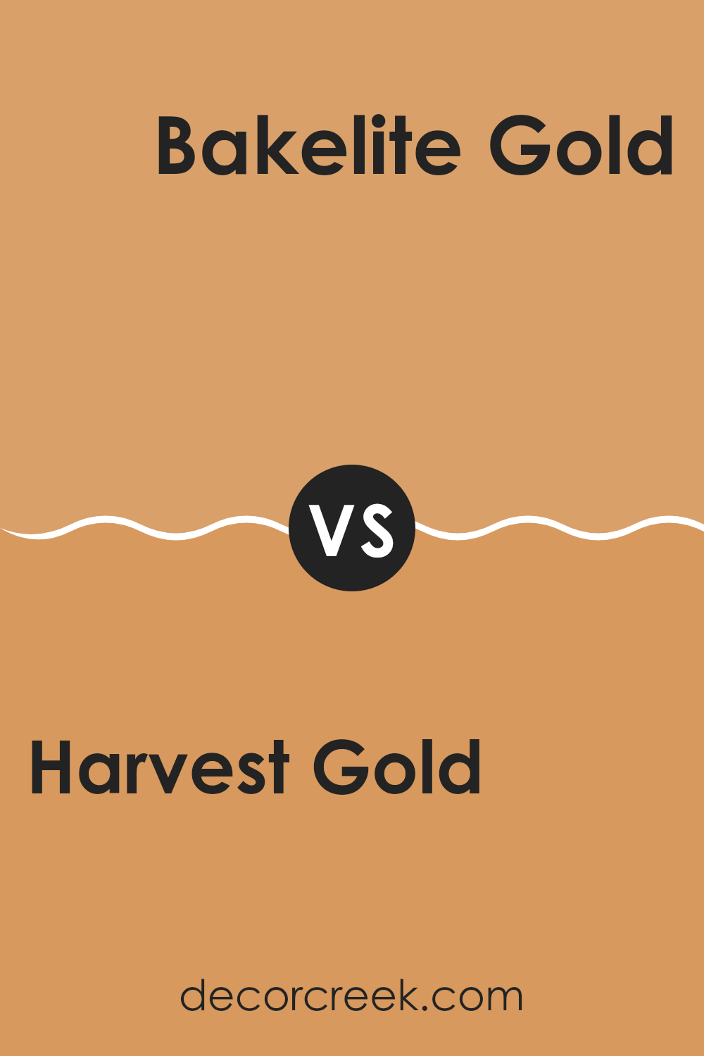
Harvest Gold SW 2858 by Sherwin Williams vs Bakelite Gold SW 6368 by Sherwin Williams
Harvest Gold and Bakelite Gold by Sherwin Williams are two warm, inviting colors, but they each have a distinct mood and tone. Harvest Gold is a muted, earthy yellow with a hint of brown, making it soft and subtle for areas where you want a calm, cozy feel without the brightness typical of yellows. It pairs well with natural materials like wood and stone.
On the other hand, Bakelite Gold is a deeper, richer yellow with an orange undertone. It’s bolder and brighter, standing out more in a room. This color would work well in areas that benefit from a vibrant, cheerful splash of color, like kitchens or dining rooms.
Both colors reflect warmth and can create a welcoming environment. Your choice between them would depend on the level of warmth and vibrancy you want to achieve in your area.
You can see recommended paint color below:
- SW 6368 Bakelite Gold
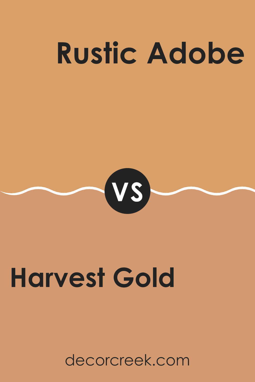
Harvest Gold SW 2858 by Sherwin Williams vs Rustic Adobe SW 7708 by Sherwin Williams
Harvest Gold and Rustic Adobe are both warm, welcoming colors by Sherwin Williams, each with its own unique charm. Harvest Gold has a bright, sunny quality that feels cheerful and lively. It is reminiscent of a golden autumn afternoon, creating a cozy and friendly atmosphere wherever it’s used.
On the other hand, Rustic Adobe carries a deeper, earthy red tone, much like the natural clay it’s named after. This color offers a strong sense of warmth and sturdiness, making it perfect for areas where you want to add a bit of rustic charm.
While Harvest Gold gives rooms an open, airy feel, Rustic Adobe tends to provide a more grounded, enveloping vibe. Both colors work well in areas where comfort is key, but your choice depends on the mood you’re aiming to set; brighter and lighter with Harvest Gold, or more intimate and earthbound with Rustic Adobe. Together, they could even complement each other in an area that celebrates both light and depth.
You can see recommended paint color below:
- SW 7708 Rustic Adobe
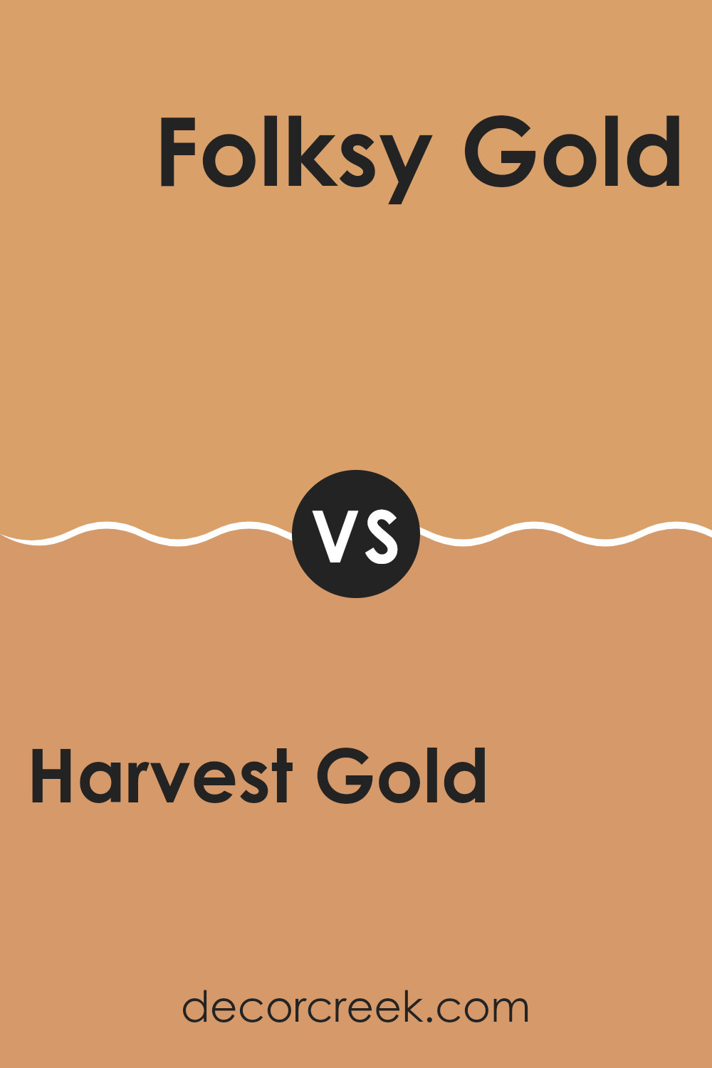
Harvest Gold SW 2858 by Sherwin Williams vs Folksy Gold SW 6360 by Sherwin Williams
Harvest Gold and Folksy Gold by Sherwin Williams are two distinct shades that can certainly enrich any living area, each in its own unique way. Harvest Gold is a deep, rich yellow with a subtle mustard undertone, which makes it a warm and cozy color, perfect for creating a welcoming and comfortable atmosphere. It aligns well with traditional decor and can also add a dash of nostalgic charm to modern areas.
On the other hand, Folksy Gold is a lighter and brighter shade, with a more pronounced golden hue that radiates cheerfulness. Its vibrancy makes it particularly suitable for areas where you want to add a lively touch without being too strong with color. Folksy Gold works well in kitchens, living rooms, or any area that benefits from a burst of sunny energy.
Both colors offer their own unique appeal, with Harvest Gold leaning towards a more muted, classic look and Folksy Gold providing a fresh and energetic vibe. Each can be used effectively to create the desired mood and style in a room.
You can see recommended paint color below:
- SW 6360 Folksy Gold
Harvest Gold SW 2858 by Sherwin Williams vs Ceremonial Gold SW 6382 by Sherwin Williams
Harvest Gold and Ceremonial Gold by Sherwin Williams are both warm and golden hues, but they present unique tones that set them apart. Harvest Gold offers a deep, muted shade, reminiscent of autumn leaves, making it a cozy choice for areas where you want a touch of understated warmth. This color works well in living rooms or dining areas where you aim for a welcoming atmosphere.
On the other hand, Ceremonial Gold is brighter and more vibrant. This color is bolder and stands out more, ideal for creating a cheerful and lively ambiance. It’s a great option for accent walls, hallways, or any area where you want to add a splash of energy.
While both colors share a gold base, Harvest Gold leans towards a softer, more muted golden brown, whereas Ceremonial Gold is distinctly brighter with a sunny, energetic quality. Depending on the mood you want to set in a room, either could be a perfect choice, with Harvest Gold providing subtlety and Ceremonial Gold offering a punch of vibrancy.
You can see recommended paint color below:
- SW 6382 Ceremonial Gold
Harvest Gold SW 2858 by Sherwin Williams vs Honeycomb SW 6375 by Sherwin Williams
Harvest Gold and Honeycomb are two warm shades offered by Sherwin Williams. Harvest Gold is a deeper, richer shade that evokes the feel of autumn with its golden brown tones. It gives a cozy and inviting atmosphere, making it perfect for areas where you want a comforting and strong presence.
In contrast, Honeycomb is lighter and brighter, resembling the natural color of honey. It brings a cheerful and sunny vibe to any area, making it ideal for rooms that you want to feel energetic and uplifting.
While both colors share a warmth that can enhance the mood of a room, Harvest Gold provides a more grounded and mature look, whereas Honeycomb offers a fresher and more vibrant appeal. They can be combined for a harmonious look or used separately to achieve different moods in your decor.
You can see recommended paint color below:
I just finished reading an article about a paint color called SW 2858 Harvest Gold by Sherwin Williams, and I think it’s really interesting! This color is a warm yellow that looks like the golden color you see on ripe wheat in a field. The article explained how this color makes rooms feel cozy and happy, which is great if you want your room to feel more inviting.
I learned that SW 2858 Harvest Gold goes well with lots of different colors. You can pair it with dark green or deep blue for a nice contrast, or keep things light and airy by using it with softer colors like light gray or cream. This makes it a very adaptable color if you like to change things up from time to time.
The author of the article also talked about how different lighting in your room can change how this color looks. It can look brighter and more vibrant in a lot of natural light, or a bit more subdued in rooms without much sunlight. This is good to know because if you’re planning to paint your room, you might want to think about how much light it gets during the day.
Overall, SW 2858 Harvest Gold sounds like a great color choice if you’re thinking about giving your room a new look. It’s not just pretty, but also flexible, which means it can work well in lots of different places and with many other colors, making it easy to use wherever you want to feel cozy and happy.

Ever wished paint sampling was as easy as sticking a sticker? Guess what? Now it is! Discover Samplize's unique Peel & Stick samples.
Get paint samples

