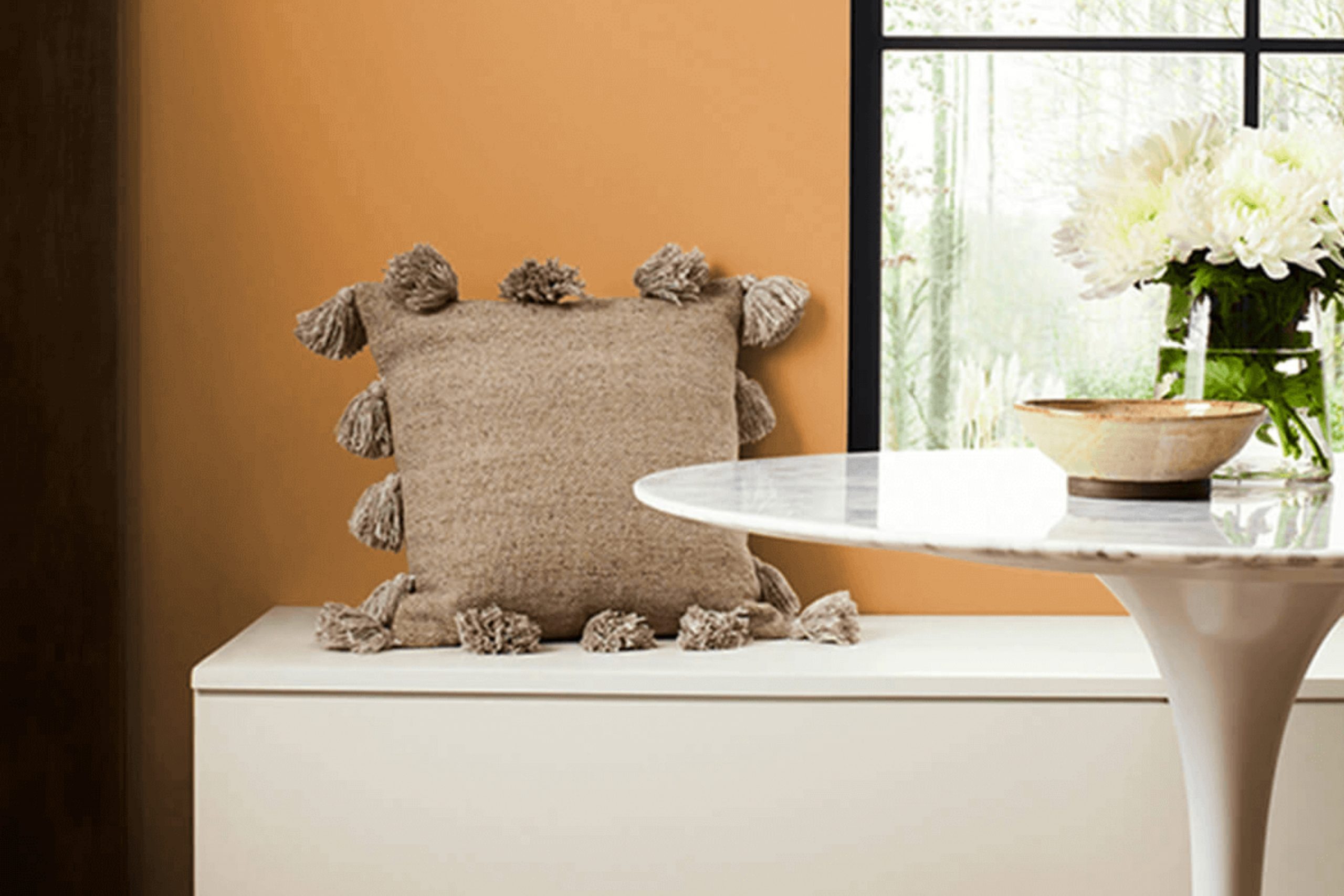
Honeycomb by Sherwin Williams is a color that exudes warmth and comfort. Whenever I think about it, I picture a room filled with the golden glow of autumn sunlight. It’s a shade that wraps around you like a soft, cozy blanket, inviting feelings of happiness and contentment.
The rich, honeyed tone adds depth to any room, making it feel both inviting and refined. Whether you’re planning to paint a cozy living room or a vibrant kitchen, Honeycomb effortlessly blends with both modern and traditional styles.
It’s a color that can change a neutral area into something special, adding just the right touch of energy without being overpowering. Imagine pairing Honeycomb with soft whites or deep blues for a balanced look.
On its own, it has the power to stand out, yet it harmonizes beautifully with a variety of other colors. In my experience, it’s a shade that makes you feel at home, encouraging relaxation while still being lively enough to keep things interesting. If you want a color that offers warmth and charm, Honeycomb might just be the perfect choice.
What Color Is Honeycomb SW 6375 by Sherwin Williams?
Honeycomb by Sherwin Williams is a warm, inviting shade of yellow that brings a cheerful glow to any room. This color is reminiscent of the golden hue of honey, making it perfect for creating a cozy yet vibrant environment. Its soft, sunny tone can brighten up a room without being overpowering.
This flexible shade works particularly well in interior styles like farmhouse, bohemian, and traditional settings. In a farmhouse style, Honeycomb can add warmth to whitewashed walls and natural wood finishes.
For a bohemian look, pair it with rich textiles, bold patterns, and eclectic accessories to enhance the colorful and laid-back vibe. In a traditional setting, Honeycomb can complement classic furniture and vintage decor, adding a touch of character and comfort.
When it comes to materials and textures, Honeycomb pairs beautifully with natural elements. Think of wooden furniture, rattan accents, and woven baskets. The color also blends nicely with soft, plush fabrics like linen or cotton, providing a cozy and welcoming atmosphere.
Accents in deep greens or soft blues can create a pleasing contrast, while metallics like gold or brass can add a touch of elegance. Overall, Honeycomb is a flexible and friendly color that can easily harmonize with various settings and materials.
Is Honeycomb SW 6375 by Sherwin Williams Warm or Cool color?
Honeycomb SW 6375 by Sherwin Williams is a warm, golden-yellow paint color that brings a cozy and inviting feeling to any room. This color works well in homes because it creates a cheerful and welcoming atmosphere.
When used in living rooms or kitchens, it can make the area feel more vibrant and lively. The yellow undertones add warmth, which can help make areas feel brighter, especially in rooms with limited natural light. Honeycomb is flexible and pairs nicely with neutrals like whites and grays, or even deeper colors such as navy blue or forest green.
It can be used to highlight certain areas or as an accent wall to add a pop of color. In rooms where people gather, like dining areas, this shade encourages a sense of warmth and friendliness. Overall, Honeycomb SW 6375 is a great choice for those looking to add a sunny touch to their home decor.
Undertones of Honeycomb SW 6375 by Sherwin Williams
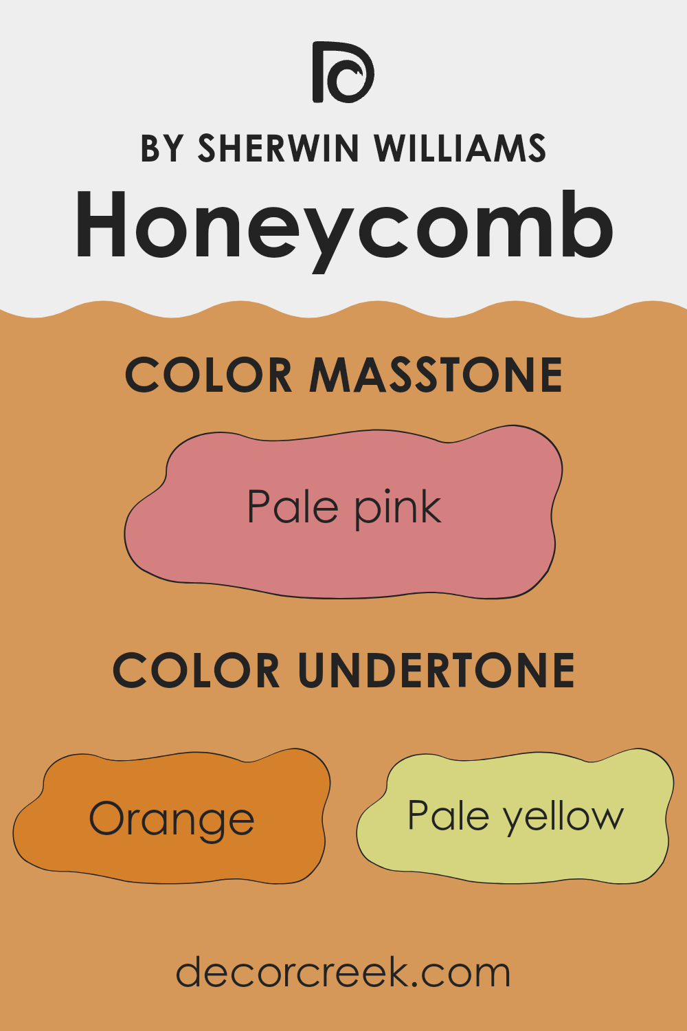
Honeycomb SW 6375, a warm and inviting color by Sherwin Williams, evokes a sense of comfort and cheerfulness in interior rooms. Its primary color may appear as a golden yellow, but the way we perceive it is influenced by its undertones. Understanding these undertones helps in determining how this paint might look in different lighting and with varying decor styles.
Orange undertones in the color make it appear warm and lively, adding a bit of vibrancy to the room. The presence of pale yellow and yellow gives the color a sunnier feel, making areas feel brighter and more inviting, especially in rooms with limited natural light.
Grey undertones soften the color slightly, providing balance and preventing it from feeling too intense. Olive, mint, and light green undertones introduce earthy elements, grounding the color and complementing natural materials like wood or plants.
Pink and red hints add a slight warm overtone without overpowering the primary hue, while light purple, light gray, and lilac introduce subtle depth and complexity. Violet and fuchsia contribute a gentle richness, creating interest without dominating the room. Honeycomb SW 6375, with all its undertones, brings a flexible and cozy feel to interiors, making it suitable for both modern and traditional settings.
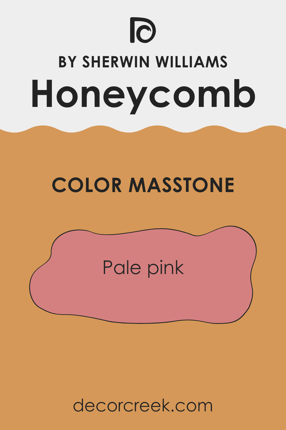
What is the Masstone of the Honeycomb SW 6375 by Sherwin Williams?
Honeycomb SW 6375 by Sherwin Williams is a pale pink color that brings a warm and welcoming feel to any room. As a masstone, the soft pink hue can subtly change the atmosphere, creating a cozy and inviting room.
In a home, this light pink color works well in bedrooms or living areas, adding a sense of comfort and relaxation. It pairs nicely with neutral tones like whites and grays, allowing it to stand out without being overpowering. Natural light enhances its warm undertones, making it an excellent choice for rooms with plenty of sunlight.
In small areas, the gentle color can create an illusion of warmth and openness, making the area feel more spacious and inviting. Overall, Honeycomb SW 6375’s pale pink masstone gently enhances the aesthetic of home interiors, making rooms feel more vibrant and lively while maintaining a soothing presence.
How Does Lighting Affect Honeycomb SW 6375 by Sherwin Williams?
Lighting plays a big role in how we perceive colors. Depending on the type and amount of light, a color can look very different. For instance, the color Honeycomb SW 6375 by Sherwin Williams can show various characteristics under different lighting conditions.
In natural light, colors often look bright and true to their appearance on a paint swatch. However, natural light changes throughout the day. In the northern hemisphere, north-facing rooms receive the most consistent but cooler and softer natural light. In these rooms, Honeycomb may appear a bit muted and less warm than it does in direct sunlight as the cool light might tone down its warm, golden hue.
South-facing rooms, on the other hand, get the most intense sunlight throughout the day. Honeycomb in these rooms will appear more vibrant and warm. The abundance of warm sunlight will enhance its natural golden quality, making the room feel cozy and inviting.
East-facing rooms receive direct sunlight in the morning. In these rooms, Honeycomb will look fresh and bright in the morning light but may appear more shadowed and subtler later in the day when the light shifts. West-facing rooms have the opposite effect. The afternoon and evening light, which is warmer, will enhance Honeycomb’s warm tones, making it appear richer and more golden as the day progresses.
Artificial lighting can also affect how Honeycomb looks. Warm light bulbs, like incandescent or warm LEDs, will complement the warm tones of Honeycomb, enhancing its golden appearance. Cooler bulbs, like some fluorescent lights, can make it appear slightly duller or muted since they emit a cooler light. Therefore, it’s essential to consider both natural and artificial lighting when choosing this color for a particular room to ensure it looks as desired throughout the day.
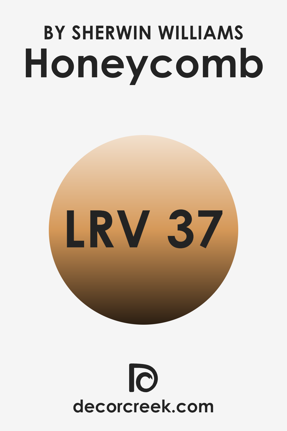
What is the LRV of Honeycomb SW 6375 by Sherwin Williams?
Light Reflectance Value, or LRV, measures how much light a paint color reflects. It is a scale that goes from 0 to 100, where 0 is absolute black, reflecting no light, and 100 is pure white, reflecting all the light. The LRV can help you understand how bright or dark a color will appear in a room. A lower LRV means the color absorbs more light, making a room feel cozier or more intimate. In contrast, a higher LRV means the color reflects more light, often making areas feel larger and more open.
With an LRV of 37.443, Honeycomb is a warm, mid-toned color. It is not too bright and not too dark; it sits comfortably in a middle range. It will reflect a moderate amount of light, making it a good choice for creating a warm and inviting atmosphere without overpowering a room with brightness.
This level allows the color to maintain its presence on the walls while still contributing to a cozy ambiance. In rooms where you want a sense of warmth and comfort but with enough light to prevent the room from feeling too tight or enclosed, Honeycomb with its LRV of 37.443 might be ideal.
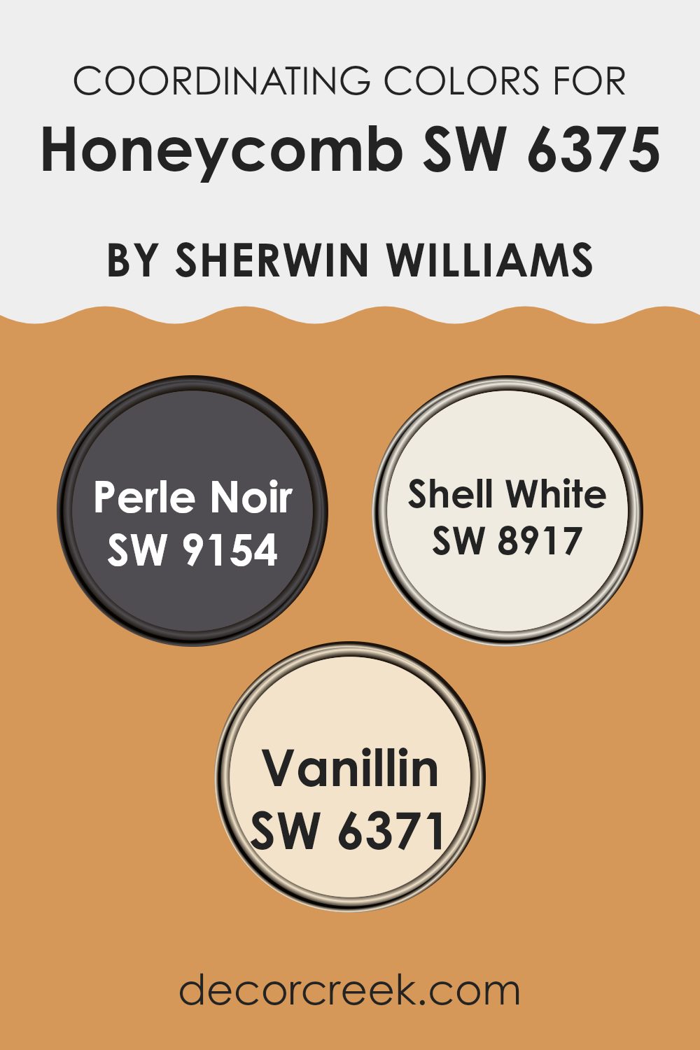
Coordinating Colors of Honeycomb SW 6375 by Sherwin Williams
Coordinating colors are hues that complement and enhance each other when used together in a room. When paired correctly, these colors can create a harmonious and visually pleasing environment. In interior design, choosing coordinating colors involves considering how different tones and shades interact to achieve a balanced look.
For instance, Honeycomb, a warm and inviting hue, pairs wonderfully with specific colors like Perle Noir, Shell White, and Vanillin. These choices can enhance the warmth and energy of Honeycomb, offering depth and contrast.
Perle Noir is a rich, deep black that adds a touch of luxury and grounding effect to any room. It contrasts beautifully with Honeycomb, creating a bold yet balanced look. Shell White provides a soft, creamy backdrop that subtly supports the warm undertones, making a room feel more open and airy.
Its lightness works well to frame Honeycomb’s warmth without overpowering it. Vanillin is a gentle, creamy yellow that complements Honeycomb’s vibrancy, bringing out its sunny disposition while adding an element of coziness. These harmonious colors work together to create an inviting, cohesive atmosphere in any room.
You can see recommended paint colors below:
- SW 9154 Perle Noir
- SW 8917 Shell White
- SW 6371 Vanillin
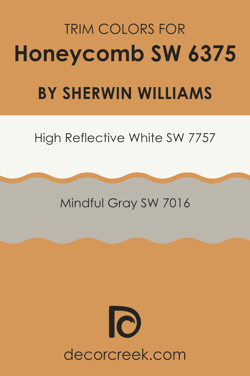
What are the Trim colors of Honeycomb SW 6375 by Sherwin Williams?
Trim colors play a crucial role in highlighting and defining different elements of a room or building exterior. They are the shades used on moldings, frames, doors, and windows, creating contrast and paying extra attention to architectural details. For Honeycomb SW 6375, choosing the right trim color can enhance its warm, golden-yellow tones, allowing the room to feel more welcoming and complete.
Using SW 7757 High Reflective White as a trim color can make the Honeycomb walls stand out while offering a clean and crisp border. High Reflective White is a pure, bright white that boosts the sense of light in any room, making it feel open and airy.
On the other hand, SW 7016 Mindful Gray can offer a subtle contrast while maintaining a calm, balanced look. This gray is soft with a hint of warmth, which pairs beautifully with the yellow undertones of Honeycomb. It adds depth without being too stark or overpowering. By incorporating these distinct trim colors, you enhance the beauty of Honeycomb, accentuating its characteristics and ensuring that the overall aesthetic remains visually appealing.
You can see recommended paint colors below:
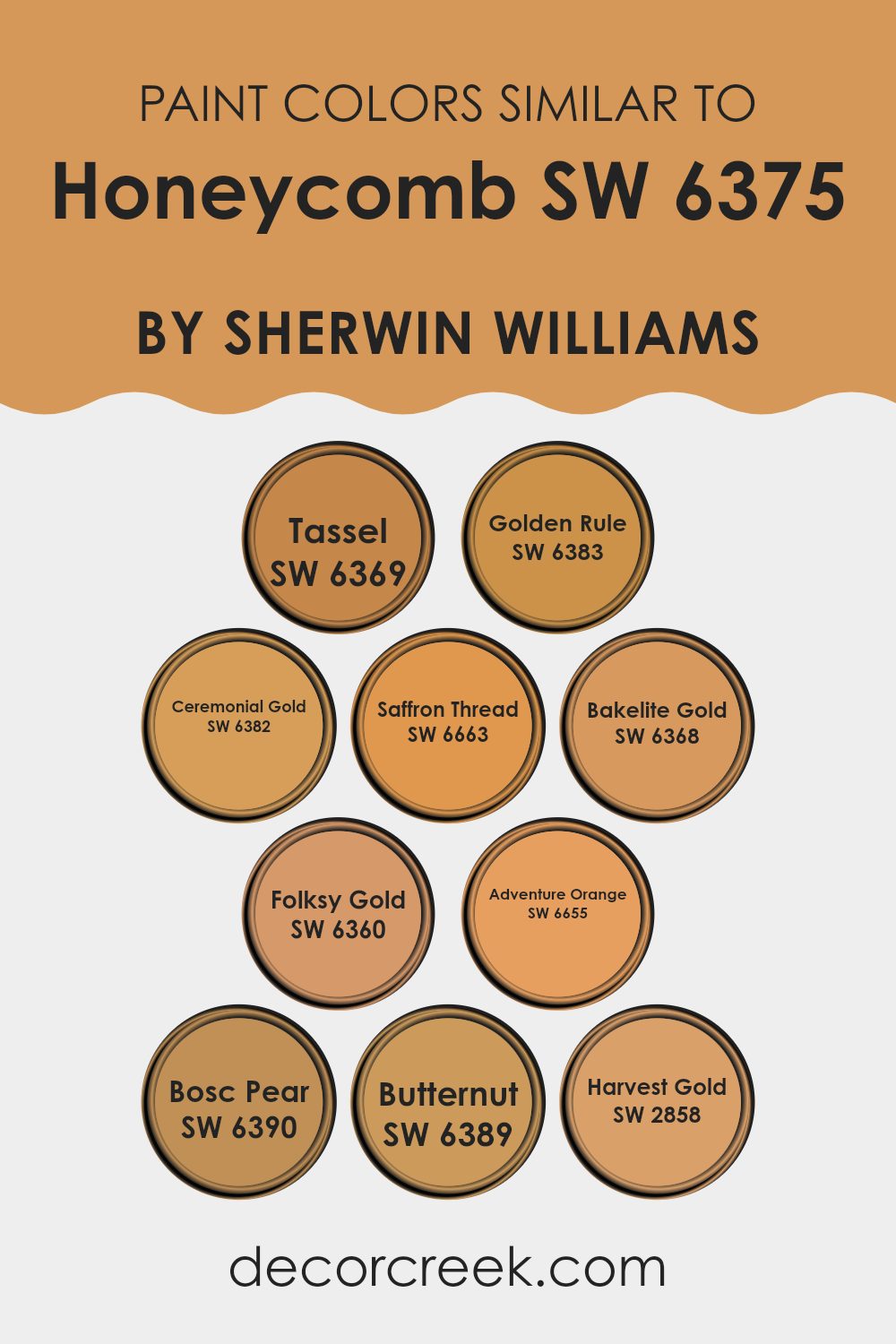
Colors Similar to Honeycomb SW 6375 by Sherwin Williams
Similar colors play a crucial role in design by creating a harmonious and cohesive look. When working with the warm, golden hue of Honeycomb, choosing colors like Tassel and Golden Rule can enhance the overall aesthetic. Tassel provides a muted golden undertone that offers a soft warmth, while Golden Rule brings a deeper, richer gold, adding depth and richness to the palette.
Ceremonial Gold adds a refined touch with its balanced gold hue, and Saffron Thread introduces a spicy, vibrant twist that enlivens any room. Bakelite Gold is similar, offering a bold yet inviting beacon of warmth that feels welcoming and energetic.
Meanwhile, Folksy Gold brings a more rustic and down-to-earth vibe, with a touch of heritage warmth. Adventure Orange offers a lively pop of color that complements the surrounding golden tones and adds a cheerful, energetic ambiance. Bosc Pear and Butternut introduce a subtle earthiness, with Bosc Pear providing a gentle yellowish-green hint and Butternut offering a smooth, buttery feel.
Finally, Harvest Gold rounds out the group with its classic, enduring warmth, reminiscent of autumn leaves. These colors, when used together, create a sense of unity and balance, enhancing any room’s overall aesthetic and making the room feel inviting and comfortable.
You can see recommended paint colors below:
- SW 6369 Tassel
- SW 6383 Golden Rule
- SW 6382 Ceremonial Gold
- SW 6663 Saffron Thread
- SW 6368 Bakelite Gold
- SW 6360 Folksy Gold
- SW 6655 Adventure Orange
- SW 6390 Bosc Pear
- SW 6389 Butternut
- SW 2858 Harvest Gold
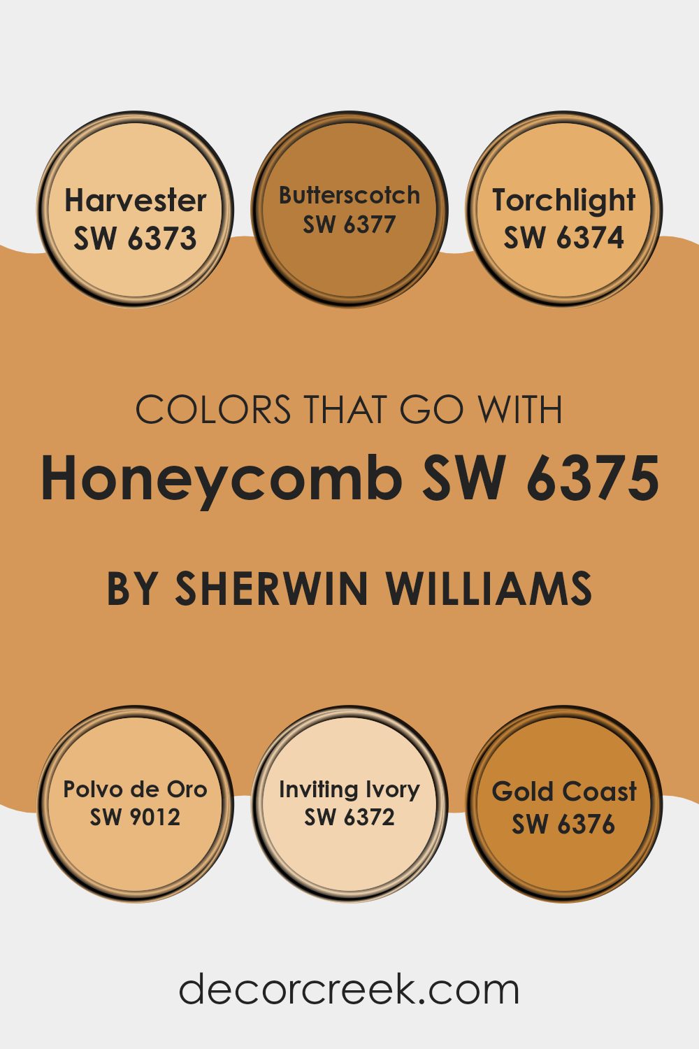
Colors that Go With Honeycomb SW 6375 by Sherwin Williams
Choosing colors that complement Honeycomb SW 6375 by Sherwin Williams is essential for creating a balanced and visually appealing room. Honeycomb is a warm, golden yellow hue that evokes a sense of warmth and comfort. Pairing it with colors like SW 6373 Harvester, a soft and welcoming golden yellow, can enhance the cozy ambiance of a room.
Harvester complements Honeycomb beautifully, reinforcing the warmth through its gentle, earthy tone. On the other hand, SW 6377 Butterscotch adds a slightly richer and more vibrant touch, infusing energy without overshadowing Honeycomb’s subtleness.
Adding SW 6374 Torchlight, a bright and cheerful orange-yellow, can bring more vibrancy to the mix, perfect for a lively and inviting atmosphere. Meanwhile, SW 9012 Polvo de Oro offers a muted golden hue that softens the palette, balancing brighter colors with subtlety.
SW 6372 Inviting Ivory provides a delicate creaminess, enhancing Honeycomb’s golden undertones while adding light and openness to the room. Finally, SW 6376 Gold Coast, a rich and bold golden shade, deepens the color scheme, adding depth and a sense of luxury to the room. Together, these colors harmonize with Honeycomb to create a cohesive, warm, and inviting environment.
You can see recommended paint colors below:
- SW 6373 Harvester
- SW 6377 Butterscotch
- SW 6374 Torchlight
- SW 9012 Polvo de Oro
- SW 6372 Inviting Ivory
- SW 6376 Gold Coast
How to Use Honeycomb SW 6375 by Sherwin Williams In Your Home?
Honeycomb SW 6375 by Sherwin Williams is a warm and inviting shade of yellow. This color can brighten up any room and add a cozy feel to your home. In living rooms or kitchens, Honeycomb offers a sunny and cheerful atmosphere, making these areas feel welcoming and lively.
This shade works well with natural wood tones, creating a harmonious and balanced look. You can pair it with white or cream accents for a fresh and clean appearance. In a bedroom, Honeycomb can help create a warm and comfortable environment, perfect for relaxation.
It’s also a great choice for an accent wall, providing a pop of color without feeling overpowering. This shade can be used in both traditional and modern decor settings, adapting easily to different styles. With its warm undertone, Honeycomb SW 6375 adds a gentle vibrancy to any room, making your home feel more inviting and comfortable.
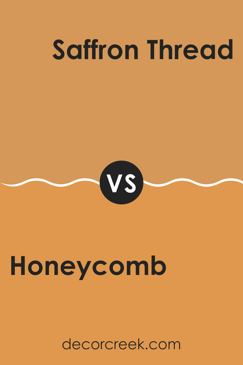
Honeycomb SW 6375 by Sherwin Williams vs Saffron Thread SW 6663 by Sherwin Williams
Honeycomb SW 6375 and Saffron Thread SW 6663 are two warm colors by Sherwin Williams that both exude warmth and energy. Honeycomb is a rich, golden yellow that can add a cozy and inviting feeling to any room. It’s a bit darker and more muted, which makes it flexible for creating a warm atmosphere without being too bold.
On the other hand, Saffron Thread is brighter and more vibrant. It’s a cheerful yellow with hints of orange, which can bring a lively and energetic vibe to areas. This makes it great for areas where you want to inspire creativity and positivity.
When comparing the two, Honeycomb offers a more grounded, comforting tone, while Saffron Thread is more vivid and bold. Both colors can be used to brighten up a room, but the choice between them depends on whether you prefer a warm, cozy feel or a bright, energetic ambiance.
You can see recommended paint color below:
- SW 6663 Saffron Thread
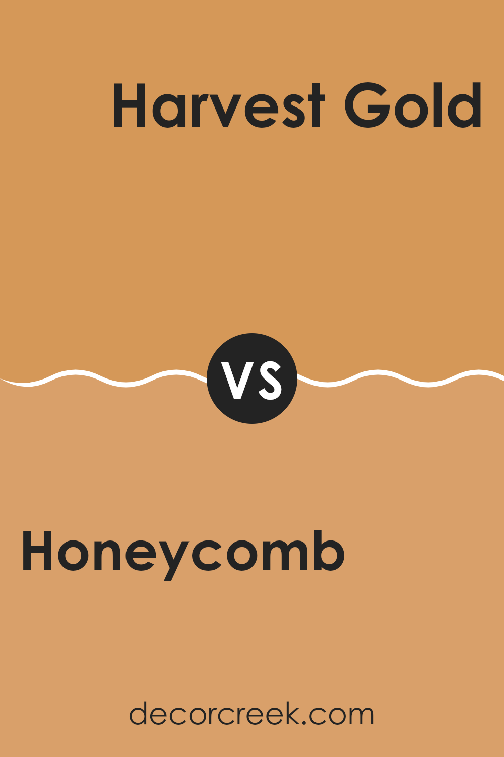
Honeycomb SW 6375 by Sherwin Williams vs Harvest Gold SW 2858 by Sherwin Williams
Honeycomb and Harvest Gold are two warm and inviting colors from Sherwin Williams. Honeycomb is a vibrant, golden yellow that brightens up any room with warmth and energy. It’s a bold choice that can make a room feel lively and cheerful. In contrast, Harvest Gold is a bit subtler. It has a softer, earthier tone that gives a nod to classic styles.
Harvest Gold feels cozy and can create a more relaxed atmosphere. While both colors bring warmth, Honeycomb stands out with its brighter, more striking shade, making it great for accent walls or lively areas.
Harvest Gold, on the other hand, is flexible and can blend seamlessly with traditional or rustic decor, making it ideal for living rooms or kitchens. Both add warmth, but Honeycomb pops with energy, while Harvest Gold provides a comforting, classic feel.
You can see recommended paint color below:
- SW 2858 Harvest Gold
Honeycomb SW 6375 by Sherwin Williams vs Butternut SW 6389 by Sherwin Williams
Honeycomb SW 6375 is a warm and inviting golden yellow with a touch of coziness, reminiscent of the rich hue found in a honeycomb. It’s a flexible color that can create a cheerful and welcoming atmosphere in any room. Butternut SW 6389, on the other hand, is a slightly deeper and richer yellow-orange. It has more earthy undertones compared to Honeycomb, giving it a grounded feel.
When comparing the two, Honeycomb is lighter and more vibrant, which can brighten up rooms and add a sense of warmth and openness. It works well in areas where you want to create an uplifting vibe. Butternut, being darker, offers a more subdued and cozy atmosphere.
It is ideal for areas where you want a bit more depth and a comforting feel. Both colors are lovely, but the choice depends on whether you prefer the brighter cheerfulness of Honeycomb or the deeper warmth of Butternut.
You can see recommended paint color below:
- SW 6389 Butternut
Honeycomb SW 6375 by Sherwin Williams vs Bosc Pear SW 6390 by Sherwin Williams
Honeycomb (SW 6375) by Sherwin Williams is a warm, golden yellow that brings a sense of warmth and cheerfulness to a room. It’s a bold color, reminiscent of sunlit honey, offering a cozy and energetic vibe. In contrast, Bosc Pear (SW 6390) is a softer, more muted yellow-green.
It feels more natural and earthy, with a hint of green that gives it a subtle, calming effect. While Honeycomb is vibrant and lively, perfect for a room that needs a touch of brightness, Bosc Pear is more subdued and gentle, ideal for creating a relaxed atmosphere.
The two colors can work together to provide balance in a design, with Honeycomb adding energy and Bosc Pear bringing in harmony. Whether used separately or together, each color has its unique charm and potential to influence the mood of a room.
You can see recommended paint color below:
- SW 6390 Bosc Pear
Honeycomb SW 6375 by Sherwin Williams vs Golden Rule SW 6383 by Sherwin Williams
Honeycomb (SW 6375) and Golden Rule (SW 6383) from Sherwin Williams are both warm, inviting yellows, but they differ in their tones and appeal. Honeycomb is a deeper, richer shade with an earthy undertone.
It feels cozy and comforting, often reminding people of warm honey or the golden hue of a late afternoon sun. In contrast, Golden Rule is a lighter, brighter yellow, leaning more towards a cheerful and sunny feel. It brings to mind a radiant summer day or the fresh zest of citrus.
While Honeycomb can create a snug, intimate atmosphere, Golden Rule tends to open up a room, making it feel airy and lively. Both colors can add warmth to a room, but the choice between them depends on whether you want a deeper, more grounded yellow or a light, energetic one. Each color sets a different mood in a room.
You can see recommended paint color below:
Honeycomb SW 6375 by Sherwin Williams vs Adventure Orange SW 6655 by Sherwin Williams
Honeycomb (SW 6375) by Sherwin Williams is a warm, golden yellow that brings a sunny, cozy feeling to a room. It’s like bringing a little bit of sunlight indoors, creating a bright and cheerful atmosphere.
In contrast, Adventure Orange (SW 6655) is a bold, vibrant hue that leans more toward a lively, spirited orange. It’s full of energy and can easily become the centerpiece in any room, demanding attention. Both colors have warm tones, but Honeycomb is softer and more inviting, making it suitable for areas where you want to promote relaxation and comfort.
On the other hand, Adventure Orange’s strong, energetic vibe works well if you want to add a playful or dramatic touch. Choosing between them can depend on the mood you wish to create: calm and welcoming with Honeycomb, or fun and dynamic with Adventure Orange.
You can see recommended paint color below:
- SW 6655 Adventure Orange
Honeycomb SW 6375 by Sherwin Williams vs Tassel SW 6369 by Sherwin Williams
Honeycomb and Tassel are both warm, inviting yellows by Sherwin Williams, but they have distinct personalities. Honeycomb is a rich, golden-yellow that feels cozy and welcoming. It’s a strong color that works well in areas where you want to create a sense of warmth and comfort.
Tassel, on the other hand, is a softer, lighter yellow. It has a softer touch, making it more subtle and gentle. This color feels airy and brightens up a room without being overpowering.
Both colors are cheerful and can bring positive energy to a room, but Honeycomb is more intense, while Tassel leans towards a more subdued, gentle appearance. If you’re looking to create a vibrant and bold atmosphere, Honeycomb might be your choice. For a lighter, more relaxed environment, Tassel is an excellent option. Both colors pair well with neutral tones for a balanced look.
You can see recommended paint color below:
- SW 6369 Tassel
Honeycomb SW 6375 by Sherwin Williams vs Ceremonial Gold SW 6382 by Sherwin Williams
Honeycomb (SW 6375) and Ceremonial Gold (SW 6382) are two warm, inviting shades from Sherwin Williams that are fairly similar but have distinct qualities. Honeycomb is a bright, golden yellow that can add a cheerful and lively atmosphere to a room. It’s ideal for a sunny, energetic feel, and works well in areas where you want to boost energy.
On the other hand, Ceremonial Gold is a deeper, richer shade of gold. It has more depth and can create a warm, welcoming environment. This color adds a sense of coziness and is well-suited for areas where comfort and warmth are desired, like living rooms or dining areas.
Both colors can complement a wide range of other shades, but Honeycomb might pair better with lighter, airy accent colors, while Ceremonial Gold can harmonize with deeper, earth-toned accents. Both colors are flexible and can enhance the overall look of any room.
You can see recommended paint color below:
- SW 6382 Ceremonial Gold
Honeycomb SW 6375 by Sherwin Williams vs Bakelite Gold SW 6368 by Sherwin Williams
Honeycomb SW 6375 by Sherwin Williams is a warm, golden-yellow hue that brings a sense of comfort and coziness to a room. It resembles the rich, sweet tones of honey, offering a welcoming atmosphere. This color works well in living rooms where you want to create a cheerful and inviting vibe.
On the other hand, Bakelite Gold SW 6368 is slightly more muted and leans towards a mustard shade. It carries a retro feel, reminiscent of vintage decor, making it a great choice for those looking to add a bit of nostalgia to their rooms.
Bakelite Gold is flexible and pairs nicely with both neutral and bold colors for a diverse range of style options. In summary, while both colors bring warmth, Honeycomb is bright and lively, perfect for energetic areas, whereas Bakelite Gold offers a subdued, classic feel, suitable for a cozier, more intimate setting.
You can see recommended paint color below:
- SW 6368 Bakelite Gold
Honeycomb SW 6375 by Sherwin Williams vs Folksy Gold SW 6360 by Sherwin Williams
Honeycomb SW 6375 and Folksy Gold SW 6360, both by Sherwin Williams, offer warm, inviting tones but differ in intensity and mood. Honeycomb features a rich, golden hue with a vibrant and lively character. It adds warmth and brightness to a room, making it feel cozy and welcoming. Perfect for areas where you seek energy and warmth, this color works well in living rooms and kitchens.
On the other hand, Folksy Gold has a more muted and subtler gold hue, offering a softer and more relaxed feel compared to Honeycomb. It brings a sense of calm without overpowering the room, making it suitable for bedrooms or areas where a gentle atmosphere is desired.
Both colors can harmonize well with neutral tones or be paired with bolder accents, yet Honeycomb stands out more with its striking vibrancy, while Folksy Gold plays a more understated, soothing role.
You can see recommended paint color below:
- SW 6360 Folksy Gold
As I come to the end of my thoughts about SW 6375 Honeycomb by Sherwin Williams, I feel like I have taken a colorful journey with you. Honeycomb is not just a color; it’s like a glowing, warm hug that you can paint on your walls. It makes rooms feel cozy and inviting, almost like the sunshine on a pleasant day.
This color is a mix of yellow and orange tones, not too bright but not too dull either. It reminds me of sweet honey and can bring a cheerful mood to any part of your home. Whether you’re painting a bedroom, a kitchen, or even a hallway, Honeycomb can make it feel happier and more alive. Even if the day outside is cloudy, the inside will still feel sunny!
I also think about how Honeycomb can work well with other colors. You can pair it with soft whites or gentle grays for a balanced look. Or, if you like something a bit more exciting, mix it with bolder colors for a fun and lively feel.
In simple words, SW 6375 Honeycomb is like having a piece of sunshine right inside your home. It’s perfect for bringing warmth and happiness wherever you put it. I hope this color can make you smile as much as it makes me.
Ever wished paint sampling was as easy as sticking a sticker? Guess what? Now it is! Discover Samplize's unique Peel & Stick samples.
Get paint samples

