This shade of green, with its vibrant energy and natural charm, feels like a breath of fresh air every time I see it. It’s the kind of color that brings a sense of renewal, almost like the first signs of spring after a long winter.
When painting a room with Hep Green, I noticed how it brought life and vitality to the space, creating an atmosphere that was both uplifting and soothing.
For someone like me who appreciates nature, Hep Green carries the essence of a lush garden or a peaceful forest. It manages to balance brightness with a subtlety that doesn’t feel overwhelming.
Whether used as an accent wall or throughout a room, this color has a way of making spaces feel more open and inviting. Pairing it with neutral tones or natural wood finishes further enhances its organic feel.
Hep Green’s versatility surprised me. It works well in living rooms, kitchens, or even cozy reading nooks, inviting you to feel more connected to the outdoors.
Overall, choosing this shade has transformed my living space, infusing it with an energy that feels both grounding and revitalizing.
What Color Is Hep Green SW 6704 by Sherwin Williams?
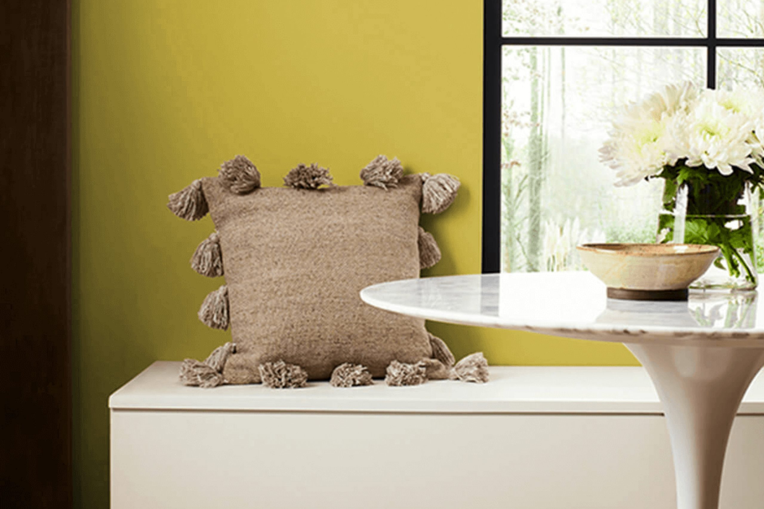
Hep Green from Sherwin Williams is a lively and refreshing shade of green. It’s a vibrant color, reminiscent of fresh spring leaves or a bright garden, bringing a sense of nature into any room. This hue is perfect for adding a splash of color and energy, making spaces feel lively and welcoming.
Hep Green fits well with several interior styles. In a modern or contemporary setting, it acts as a striking accent against neutral tones such as whites, grays, and blacks. When incorporated into a bohemian or eclectic style, it complements the mix of patterns, textures, and colors typical of such designs.
This green can also work in a farmhouse or rustic style, adding a pop of color to the otherwise earthy and muted palette.
For materials and textures, Hep Green pairs beautifully with natural elements. Think of warm wooden furniture, woven baskets, or jute rugs that enhance its natural feel. It also works well with metallic accents, such as brass or copper, providing a lively contrast.
Soft textiles like linen or cotton in neutral shades can balance the vibrancy of Hep Green, while plant life and greenery can further accentuate its natural vibe. Together, these elements create a space that feels vibrant yet grounded.
Is Hep Green SW 6704 by Sherwin Williams Warm or Cool color?
Hep Green SW 6704 by Sherwin Williams is a fresh and lively color that brings a vibrant, natural feel to any space. It has a cheerful tone that can brighten up a room, making it a great choice for areas where you want to create an inviting, energetic atmosphere.
This green hue pairs well with neutral colors like whites and grays, adding a pop of color without overwhelming the space.
In living rooms or kitchens, it can serve as an accent wall, providing a cool backdrop that encourages a feeling of freshness. In bedrooms, it offers a pleasant, soothing environment while still maintaining a hint of energy. Hep Green can also be used in home offices to help stimulate creativity and focus, thanks to its lively nature.
Overall, this color brings a bit of the outside world inside, promoting a sense of cheerfulness and vitality in a home.
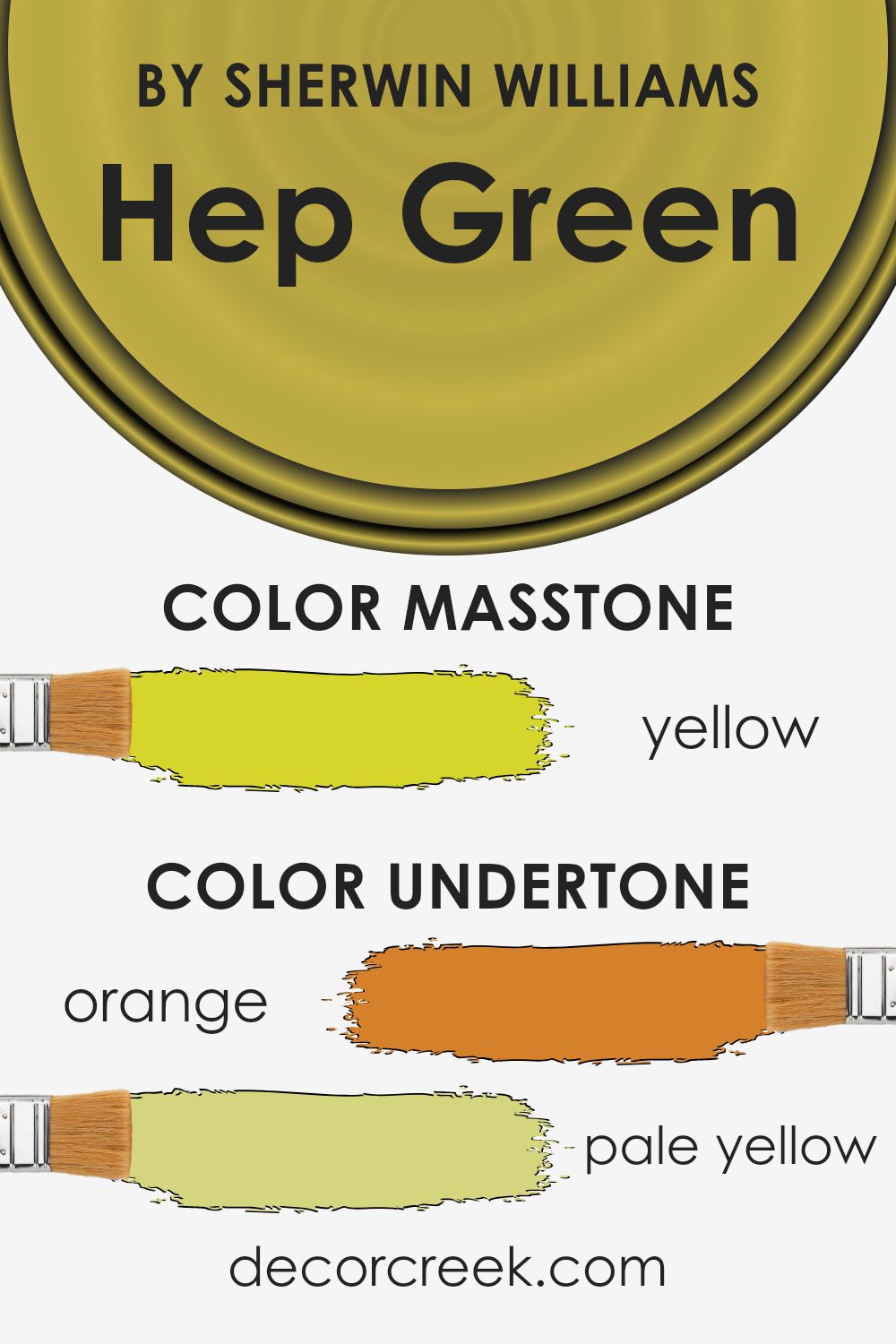
Undertones of Hep Green SW 6704 by Sherwin Williams
The color Hep Green by Sherwin Williams is a complex shade that carries several undertones. These include hints of orange, pale yellow, pale pink, light green, olive, mint, and grey. Undertones are subtle colors mixed into the primary color, and they can affect how a color looks depending on the lighting and the surrounding environment.
When used on interior walls, these undertones can change the perception of Hep Green. The orange undertone adds a bit of warmth, making the room feel cozy and inviting. The pale yellow can bring about a soft, sunny feel, adding brightness without overpowering.
Meanwhile, the pale pink undertone offers a gentle touch that can enhance the soothing atmosphere.
The light green and mint undertones contribute to a fresh, natural vibe, often creating a sense of calmness. Olive hints add depth, giving the room a more grounded feel. Finally, the grey undertone can help neutralize the color, making it versatile and adaptable to various design styles.
Overall, the undertones in Hep Green can subtly influence a room’s mood and ambiance. By understanding these undertones, you can decide how they’ll work with other colors and elements in your space to achieve the desired effect.
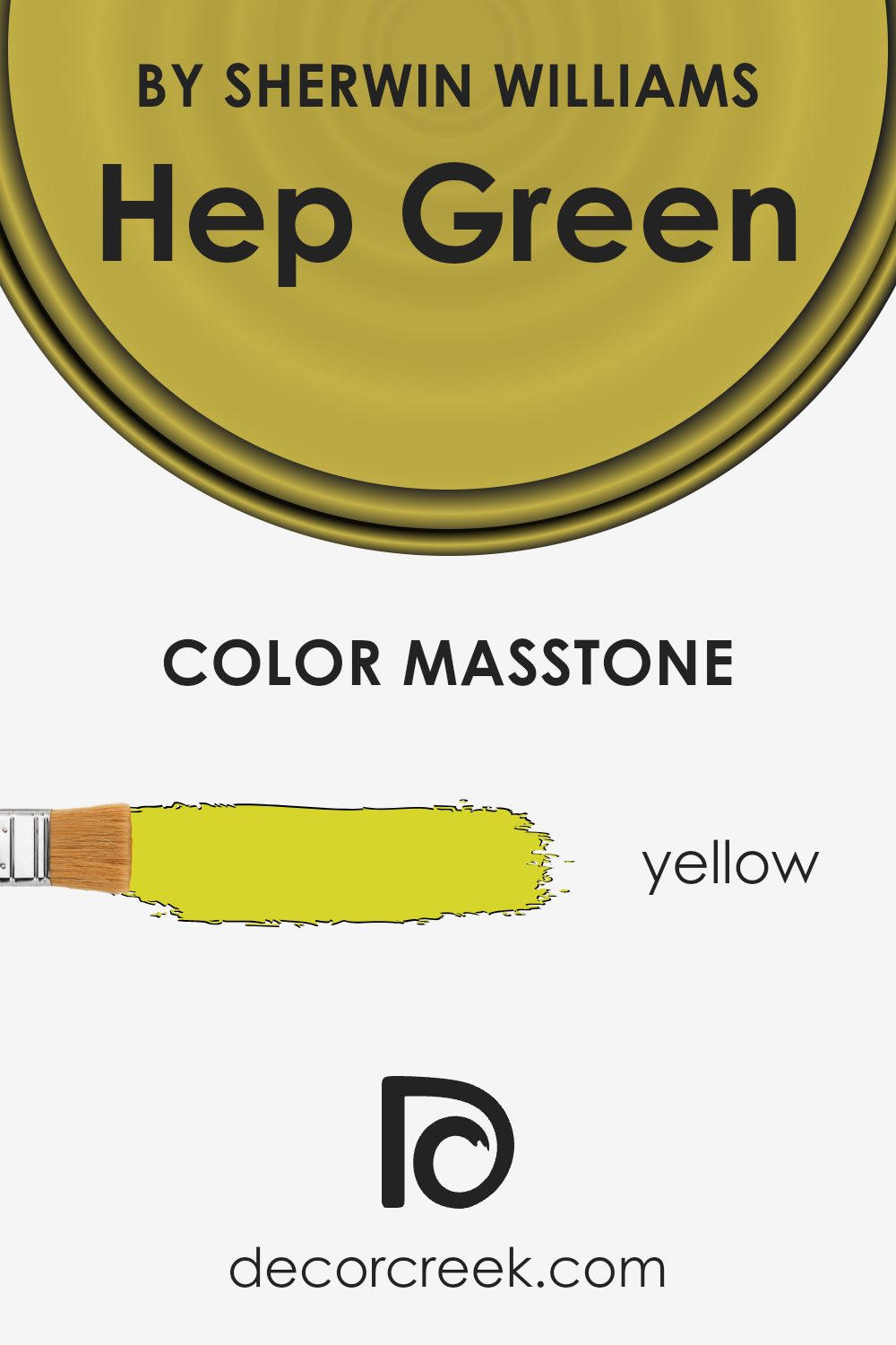
What is the Masstone of the Hep Green SW 6704 by Sherwin Williams?
Hep Green SW 6704 by Sherwin Williams is a lively and bright green hue with a strong yellow undertone, visible in its masstone (#D5D52B). The yellow base makes the green feel warm and energetic, ideal for spaces where you want to encourage conversation and activity, like kitchens or living rooms. This color’s warm nature can make a room feel fresh and inviting, adding a sense of cheerfulness.
In homes, Hep Green can brighten up darker spaces, too, due to its strong yellow influence. When used in a smaller room, it can make the area feel more open and airy, pushing the walls outward visually. It’s a great choice for accent walls or to bring furniture or accessories to life.
Pairing it with neutral tones like whites, grays, or beiges can help balance its vividness, ensuring it doesn’t overwhelm the space. This balance creates a harmonious environment that’s both vibrant and comfortable.
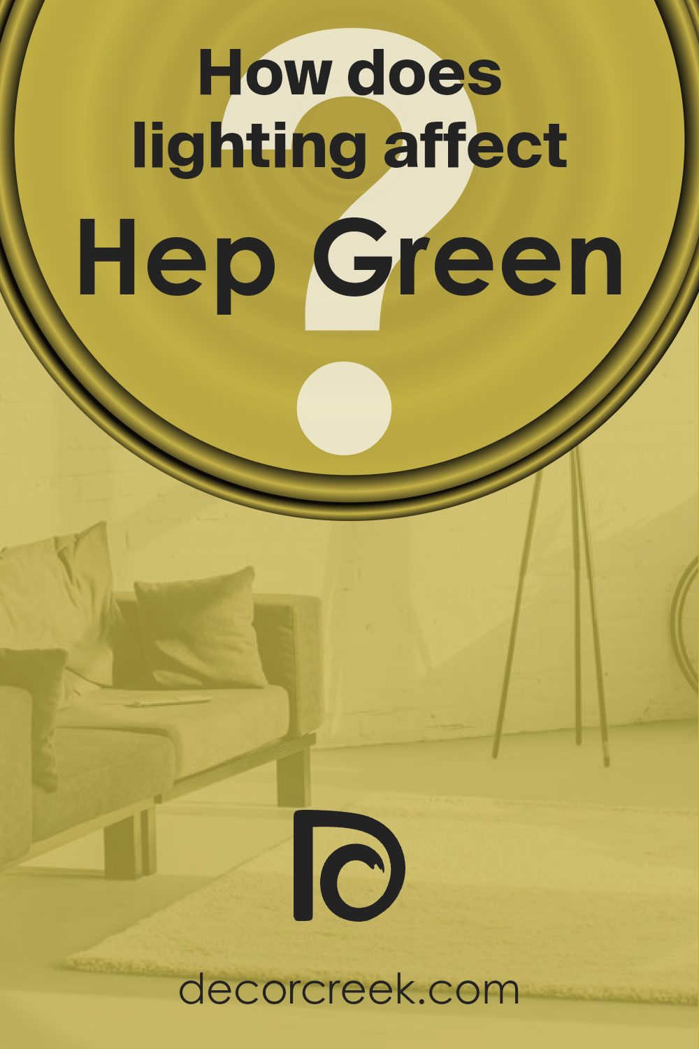
How Does Lighting Affect Hep Green SW 6704 by Sherwin Williams?
Lighting plays a crucial role in how colors appear in a space, as different lights can change the perception of a color. Natural and artificial lights have varying effects on colors. Natural light changes with the time of day, whereas artificial light sources, like incandescent, fluorescent, and LED lights, each project different undertones that can alter color perception.
Hep Green by Sherwin Williams is a lively and vibrant color. Under natural light, Hep Green may appear brighter and more refreshing. However, because natural light changes throughout the day, this color might look different depending on the room’s orientation.
In north-facing rooms, which receive cooler, more diffused light, Hep Green might appear slightly muted or grayer than its true color. This is because north light brings out cooler undertones in colors. As a result, Hep Green could lose some of its warmth in these spaces.
In south-facing rooms, Hep Green often appears more vivid and warm. South-facing rooms benefit from steady, warm sunlight throughout the day. This type of light enhances the warmth in colors, bringing out the richness of Hep Green.
East-facing rooms receive warm, yellow-toned light in the morning and cool, bluish light in the afternoon. In the morning, Hep Green may look particularly fresh and lively, while in the afternoon it may seem cooler and slightly less intense.
West-facing rooms have the opposite light pattern, with cooler, dimmer light in the morning and warm, bright light in the evening. Hep Green can look softer in the morning but will warm up and become more dynamic as the day moves into the afternoon and evening.
Under artificial lighting, the kind of bulbs used can also affect Hep Green. Incandescent bulbs often give a warm glow, enhancing yellows and greens, making Hep Green feel cozier.
Fluorescent lights might add a cooler tone, potentially dulling Hep Green. LED lights vary widely, so choosing a warm or cool LED can significantly impact how Hep Green looks at night.
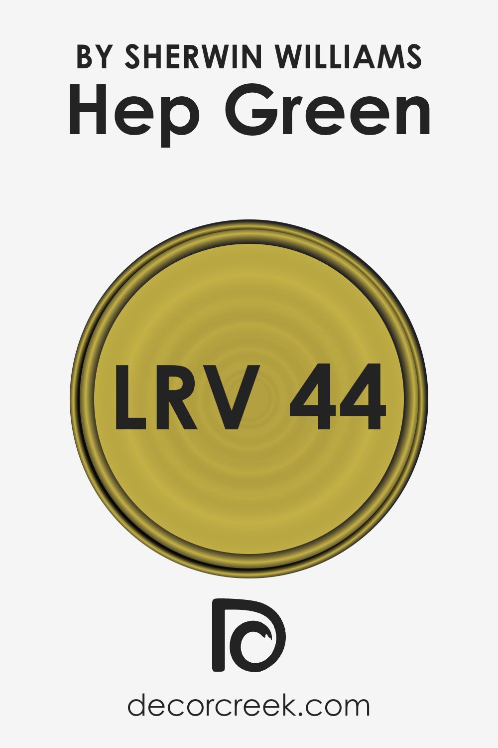
What is the LRV of Hep Green SW 6704 by Sherwin Williams?
Light Reflectance Value, or LRV, is a measurement used to determine how much light a color reflects or absorbs. It ranges from 0, which represents absolute black and absorbs all light, to 100, which represents pure white and reflects all light. LRV is important because it helps us understand how a color will behave in different lighting conditions.
When a color has a high LRV, it reflects more light and can make a space feel brighter and more open. Conversely, a color with a low LRV absorbs more light, which can make a room feel more cozy or intimate.
For the particular color Hep Green, which has an LRV of 43.642, it falls in the middle range on the LRV scale. This means it’s neither too light nor too dark. In practical terms, Hep Green will reflect a moderate amount of light, helping to balance natural light in a room without overwhelming it. It can be a good choice for spaces where you want a bit of warmth and color without making them feel too dark.
In rooms with enough natural light, this color can provide a refreshing yet comforting atmosphere, while in rooms with less light, it will maintain a more subdued presence, helping other elements of the room stand out.
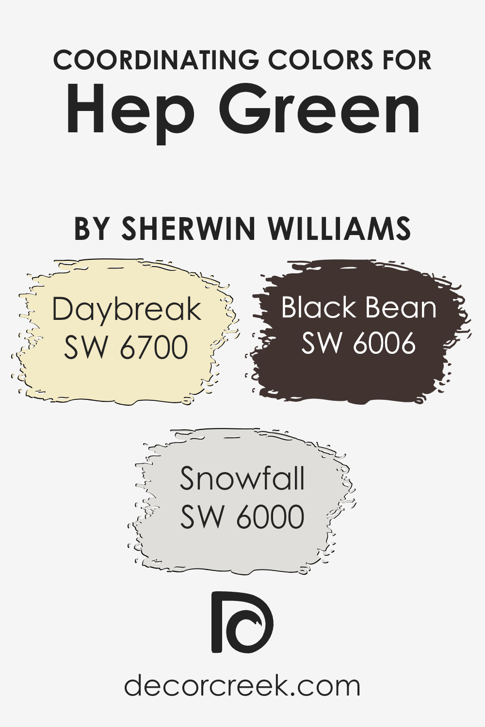
Coordinating Colors of Hep Green SW 6704 by Sherwin Williams
Coordinating colors are hues that work well together to create a balanced and pleasing look in a space. These colors typically share similar undertones or complementary contrasts that harmonize with the main color. When paired with SW 6704 Hep Green by Sherwin Williams, they create a palette that feels cohesive and inviting. Hep Green is a lively shade that brings a natural, vibrant feel to any room, and the right coordinating colors can enhance this effect.
SW 6700 Daybreak is a soft, warm yellow that complements Hep Green by adding a touch of cheerfulness and warmth.
Its subtle brightness can make walls feel sunny and open. SW 6000 Snowfall is a cool white with a slightly blue undertone, offering a crisp contrast to Hep Green, making the green pop while bringing in a fresh, clean vibe.
Meanwhile, SW 6006 Black Bean adds depth and sophistication with its rich, dark olive-brown tone, grounding the palette and providing a dramatic backdrop that highlights the green’s vibrancy.
Together, these colors create a balanced look that blends energetic and calming elements into a single harmonious setting.
You can see recommended paint colors below:
- SW 6700 Daybreak
- SW 6000 Snowfall
- SW 6006 Black Bean
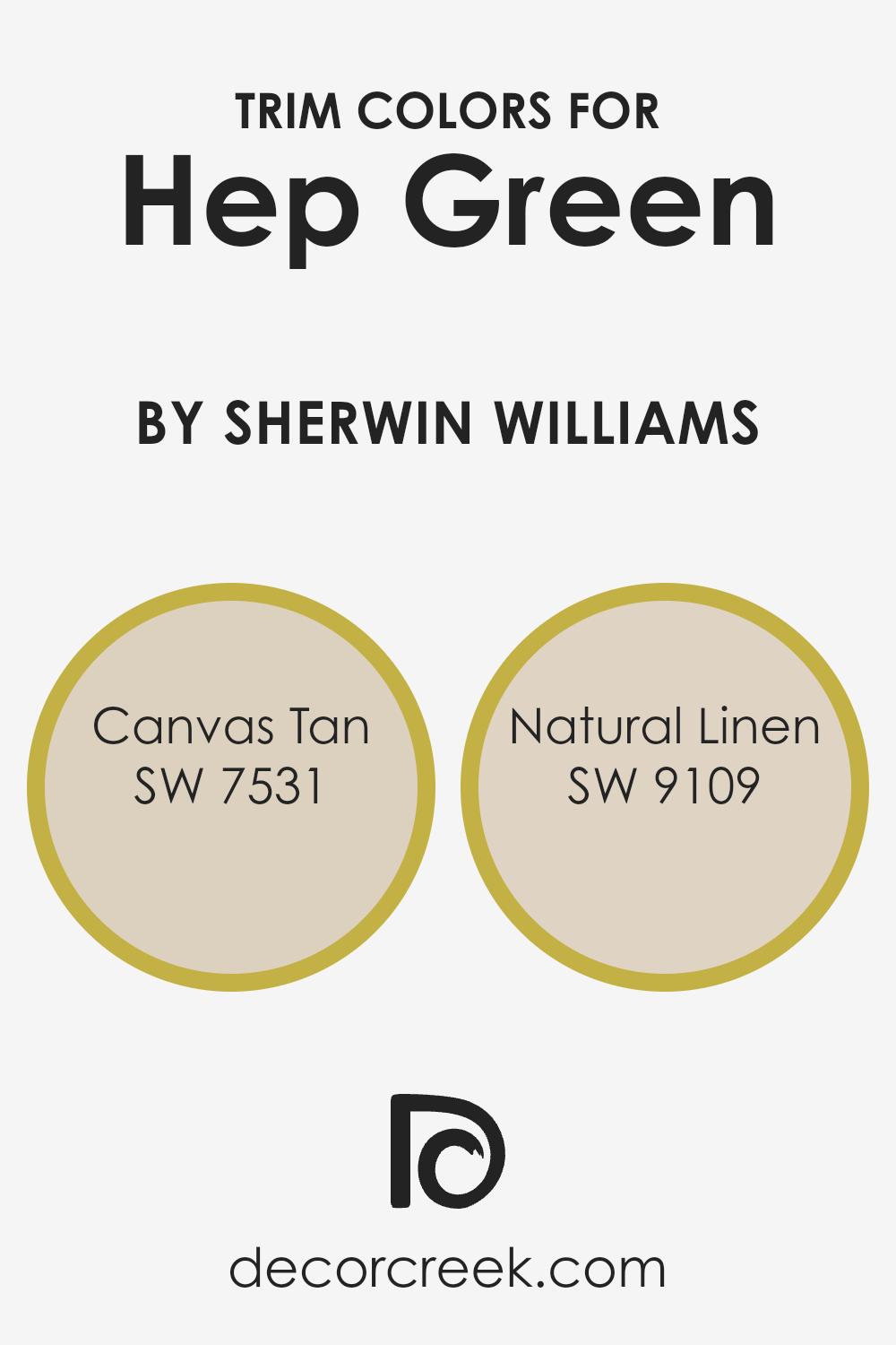
What are the Trim colors of Hep Green SW 6704 by Sherwin Williams?
Trim colors are the hues used on the edges or moldings of a room, providing a visual contrast that highlights architectural details or complements the primary wall color. In the context of Hep Green (SW 6704) by Sherwin Williams, choosing the right trim colors is crucial because they can either harmonize or create a striking contrast that enhances the overall look of a space.
Canvas Tan (SW 7531) is a warm, neutral color that brings a subtle, inviting feel. Its softness complements the freshness of Hep Green without overshadowing it, making it a great choice for a classic, balanced look.
Meanwhile, Natural Linen (SW 9109) offers a slightly deeper, earthy tone that can ground the bright and lively nature of Hep Green, adding depth and warmth to the space.
Using these trim colors effectively helps in defining the space and creating a cohesive design.
When paired with Hep Green, both Canvas Tan and Natural Linen can add dimension and interest, either by providing a seamless transition or a gentle contrast that highlights the green’s vibrancy.
Canvas Tan serves as a gentle whisper that underscores without competing, while Natural Linen lends an organic touch that wraps the room in comfort.
The selection of trim colors influences the mood and visual harmony of the room, accentuating Hep Green’s fresh feel while ensuring the space remains inviting and well-coordinated.
You can see recommended paint colors below:
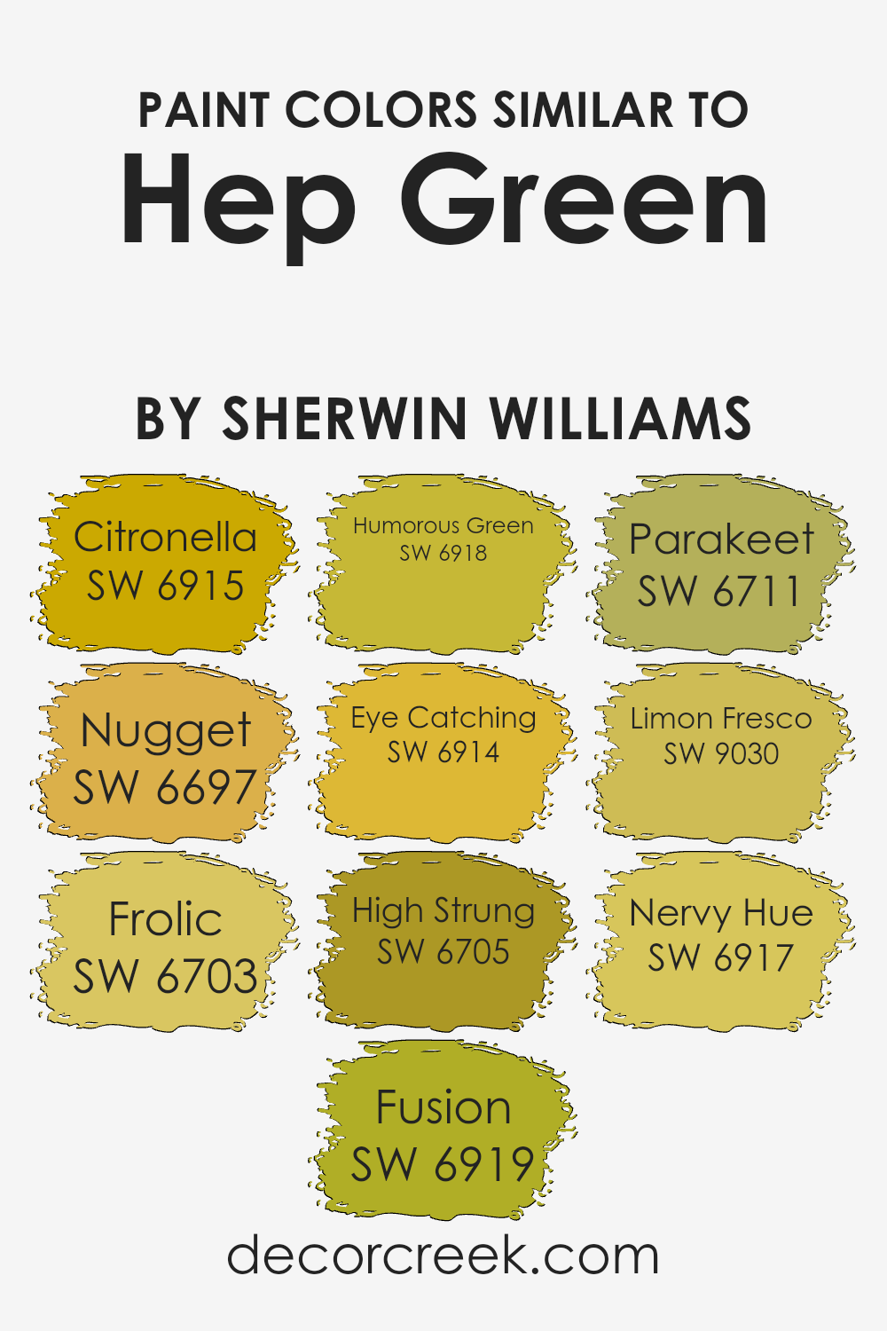
Colors Similar to Hep Green SW 6704 by Sherwin Williams
Similar colors play an important role in design and decoration, creating a cohesive and harmonious look. When working with Hep Green, choosing similar shades like Citronella, Nugget, Frolic, Fusion, Humorous Green, Eyecatching, High Strung, Parakeet, Limon Fresco, and Nervy Hue enhances the overall aesthetic.
These tones blend beautifully while offering subtle differences that keep spaces interesting. Citronella is a bright, sunny yellow-green that brings a sense of freshness and liveliness. Nugget takes on a more golden hue, offering warmth and richness to a color palette.
Frolic has a playful, cheerful green that lightens up a space with its bright vibe.
Fusion blends elements of green and yellow to create a balanced, energetic tone.
Humorous Green is a lively shade with a slight hint of whimsy, perfect for a fun and inviting atmosphere. Eyecatching lives up to its name, with its bold and vivid hue drawing attention effortlessly.
High Strung offers a crisp and sharp green that energizes any setting. Parakeet brings in a tropical, vibrant green that evokes a sense of nature and vitality. Limon Fresco provides a zesty, fresh lime color, while Nervy Hue presents an engaging, slightly daring green that adds character.
These tones work well together to create stunning designs that are vibrant and sleek.
You can see recommended paint colors below:
- SW 6915 Citronella
- SW 6697 Nugget
- SW 6703 Frolic
- SW 6919 Fusion
- SW 6918 Humorous Green
- SW 6914 Eye Catching
- SW 6705 High Strung
- SW 6711 Parakeet
- SW 9030 Limon Fresco
- SW 6917 Nervy Hue
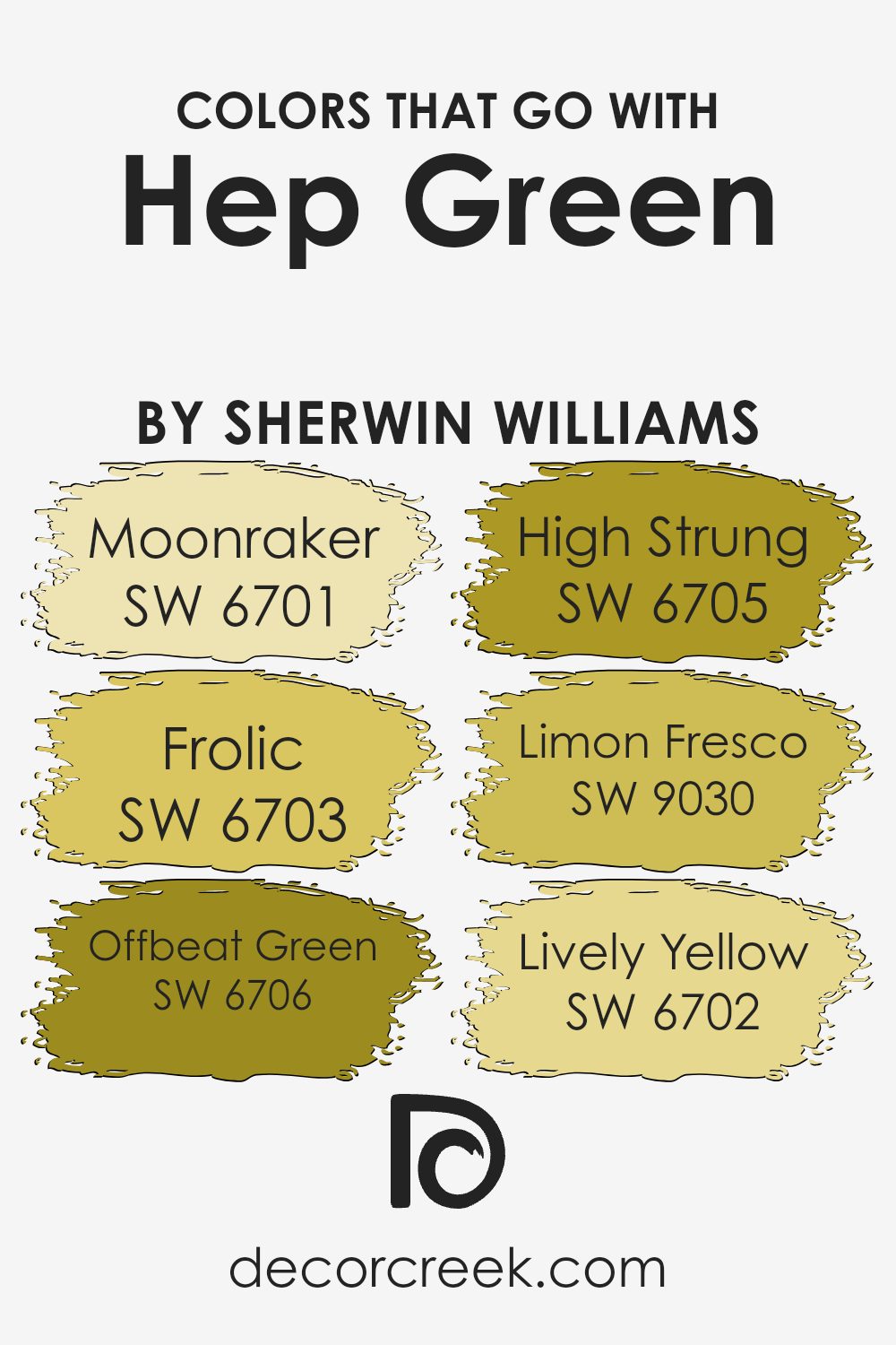
Colors that Go With Hep Green SW 6704 by Sherwin Williams
Choosing colors that go well with Hep Green SW 6704 by Sherwin Williams is essential in creating a balanced and harmonious space. The right color palette can enhance the overall aesthetic and mood of a room. Hep Green is a vibrant, lively hue that brings energy to any environment.
To complement it, you can consider using SW 6701 – Moonraker, which is a soft, creamy shade that adds warmth and brightness, subtly balancing Hep Green’s boldness.
Another good match is SW 6703 – Frolic, which has a cheerful, playful tone that pairs well with Hep Green’s fresh vibe, creating an uplifting atmosphere.
For those seeking a slightly cooler companion, SW 6706 – Offbeat Green fosters a unique charm by providing a sense of contrast while staying within the green family.
SW 6705 – High Strung is an invigorating color with a vibrant punch that can enhance the lively nature of Hep Green.
Meanwhile, SW 9030 – Limon Fresco offers a zesty twist with its lemony hue, adding a fresh, crisp feel.
Finally, SW 6702 – Lively Yellow brings in an element of sunshine, maintaining a cheerful and bright ambiance. These colors, when combined thoughtfully, can create a cohesive and lively interior space.
You can see recommended paint colors below:
- SW 6701 Moonraker
- SW 6703 Frolic
- SW 6706 Offbeat Green
- SW 6705 High Strung
- SW 9030 Limon Fresco
- SW 6702 Lively Yellow
How to Use Hep Green SW 6704 by Sherwin Williams In Your Home?
Hep Green SW 6704 by Sherwin Williams is a bright, fresh shade of green that can bring life to many areas of your home. This lively color works well for adding a pop of vibrancy to your kitchen cabinets or as an accent wall in a living room. If you want to create a cheerful and energetic atmosphere, this hue is a great choice.
Hep Green pairs nicely with neutral colors such as white or gray, allowing it to stand out without overwhelming a space.
In a bedroom, using Hep Green on one wall can create a refreshing feature that contrasts nicely with bedding in softer tones. In a child’s room, it can add a playful touch. For those who enjoy bold colors in their living spaces, this color can also be used outdoors on patio furniture or garden features to make your exterior feel more connected to nature.
Overall, Hep Green is a versatile shade that brings energy and freshness wherever it’s used.
Hep Green SW 6704 by Sherwin Williams vs Humorous Green SW 6918 by Sherwin Williams
Hep Green (SW 6704) and Humorous Green (SW 6918) are two distinct shades by Sherwin Williams that offer different vibes for any space. Hep Green is a softer, muted green that exudes calmness and harmony. Its subtle tone makes it versatile for various styles, creating a welcoming environment without being overpowering.
On the other hand, Humorous Green is a vibrant and lively shade. It has a brighter, more cheerful personality that brings energy and fun to a room. This color is perfect for making a statement or adding a pop of color to a neutral space.
While Hep Green is great for a soothing and balanced look, Humorous Green brings zest and playfulness. Choosing between the two depends on whether you want a calm retreat or a lively, spirited atmosphere. Both colors can beautifully enhance your living space but cater to different moods and preferences.
You can see recommended paint color below:
- SW 6918 Humorous Green
Hep Green SW 6704 by Sherwin Williams vs Nervy Hue SW 6917 by Sherwin Williams
Hep Green (SW 6704) and Nervy Hue (SW 6917) by Sherwin Williams are two interesting greens with distinct personalities. Hep Green is a warm, muted green with a gentle, earthy feel, making it versatile for various settings. It brings a touch of nature indoors, providing a calming but lively atmosphere.
On the other hand, Nervy Hue is a brighter, more electric green. It is youthful and vibrant, perfect for making a bold statement in a room.
Where Hep Green is subtle and soothing, Nervy Hue is striking and energizing. When choosing between them, consider the mood you want to create. Hep Green suits spaces where you want to relax and unwind, while Nervy Hue works well in areas needing energy and excitement. Both colors can pair nicely with neutrals or other brighter shades, depending on the look you want to achieve.
You can see recommended paint color below:
- SW 6917 Nervy Hue
Hep Green SW 6704 by Sherwin Williams vs Eye Catching SW 6914 by Sherwin Williams
Hep Green SW 6704 and Eye Catching SW 6914 are both vibrant colors from Sherwin Williams, but they bring very different feelings and energies to a space. Hep Green is a lively, fresh shade reminiscent of lush foliage. It has a natural and soothing vibe, perfect for creating a calm and pleasant atmosphere. It’s a great choice for spaces where you want to feel relaxed and connected to nature.
On the other hand, Eye Catching SW 6914 is a bold, energetic yellow. It grabs attention and adds a sunny, cheerful vibe to any room. This color is ideal for spaces where you want to feel energized and uplifted.
It reflects optimism and creativity, making it suitable for areas like kitchens or playrooms where a lively atmosphere is welcomed.
While Hep Green brings an earthy calm, Eye Catching offers a burst of joy and enthusiasm. Both colors can make a room feel warm and inviting, depending on the ambiance you want to create.
You can see recommended paint color below:
- SW 6914 Eye Catching
Hep Green SW 6704 by Sherwin Williams vs Citronella SW 6915 by Sherwin Williams
Hep Green (SW 6704) and Citronella (SW 6915) are two lively and vibrant colors by Sherwin Williams. Hep Green is a muted, earthy green with a hint of warmth, making it feel natural and calming. It brings a touch of nature indoors and is great for creating a relaxed atmosphere.
Citronella, on the other hand, is a bright, sunny yellow-green. It feels more energetic and playful, adding a cheerful vibe to a room.
While Hep Green is more subdued and blends well with other natural tones, Citronella stands out and adds a pop of color, making it perfect for accents or feature walls. Together, these colors can balance each other, with Hep Green providing a grounding effect and Citronella offering lively energy. Whether used separately or combined, they each bring their unique character to a space.
You can see recommended paint color below:
- SW 6915 Citronella
Hep Green SW 6704 by Sherwin Williams vs High Strung SW 6705 by Sherwin Williams
Hep Green and High Strung by Sherwin Williams are lively and fresh shades of green. Hep Green has a slightly muted tone with a subtle gray undertone. It’s a softer green, making it suitable for those who want a touch of nature without it being too bold.
On the other hand, High Strung is a brighter, more vivid green. It’s slightly more intense and energetic compared to Hep Green. This color brings more vibrancy and can be a fun choice for rooms where you want to add a lively touch.
Both colors are similar in their green base but differ fundamentally in intensity. Hep Green offers a calmer, more laid-back vibe, while High Strung brings a fuller punch of color and excitement. They can work together or separately, depending on how much energy you want to bring into a space. Their differences lie mainly in their brightness and how they transform the mood of the room.
You can see recommended paint color below:
- SW 6705 High Strung
Hep Green SW 6704 by Sherwin Williams vs Frolic SW 6703 by Sherwin Williams
Hep Green (SW 6704) and Frolic (SW 6703) by Sherwin Williams are two colors that sit closely on the green spectrum. Hep Green is a lively and vibrant shade of green. It has a classic and fresh feel, evoking the lushness of spring. Frolic, while similar, is a slightly lighter and softer green. It carries a cheerful and playful vibe, making it feel slightly less intense than Hep Green.
When comparing the two, Hep Green offers a bold pop of color, perfect for making a statement in any space. In contrast, Frolic has a gentler presence, ideal for spaces where a hint of color is desired without overwhelming a room.
Both colors bring a fresh, natural element to interior and exterior designs, but the choice between them depends on the desired energy and mood. If you want a more robust, spirited atmosphere, Hep Green is your go-to, while Frolic introduces a softer, more playful touch.
You can see recommended paint color below:
- SW 6703 Frolic
Hep Green SW 6704 by Sherwin Williams vs Limon Fresco SW 9030 by Sherwin Williams
Hep Green and Limon Fresco are two vibrant colors from Sherwin Williams. Both bring a fresh and lively feel but have different vibes. Hep Green is a crisp, bright green that can invigorate a space. It brings a sense of nature and energy, making it a great choice for areas where you want a lively atmosphere.
On the other hand, Limon Fresco is a softer, more muted yellow-green. It’s warmer and slightly more relaxed than Hep Green. This makes Limon Fresco a good choice if you want a more subdued, but still fresh and cheerful environment.
In summary, if you aim for a space full of energy and nature, go for Hep Green. If a softer, cheerful aura is desired, Limon Fresco might be the better option. Both colors bring their own unique feel to a room, making them versatile choices for different settings.
You can see recommended paint color below:
- SW 9030 Limon Fresco
Hep Green SW 6704 by Sherwin Williams vs Nugget SW 6697 by Sherwin Williams
Hep Green and Nugget are two distinct colors by Sherwin Williams, each with its own character. Hep Green is a lively, fresh shade of green that brings a sense of nature and energy into a space. It’s a vibrant color that feels welcoming and bright, perfect for making a room pop.
In contrast, Nugget is a warm, golden yellow. It has an earthy, sunflower-like quality that adds warmth and coziness to a space. While still cheerful, Nugget feels a bit more grounded and comforting compared to the bright energy of Hep Green.
When placed next to each other, Hep Green offers a burst of freshness, while Nugget provides a warm, inviting contrast. These colors can work well together when you want to create an energetic, vibrant atmosphere balanced with warmth and depth. Both colors have their own unique appeal, making them great choices depending on the mood you want to set in a room.
You can see recommended paint color below:
- SW 6697 Nugget
Hep Green SW 6704 by Sherwin Williams vs Parakeet SW 6711 by Sherwin Williams
Hep Green and Parakeet are both lively and bold greens from Sherwin Williams, each with their unique vibe. Hep Green is a softer, more muted shade that balances brightness with a touch of subtlety. It has an earthy feel that can bring a fresh, natural look to a room without being too overpowering.
Parakeet, on the other hand, is a much brighter and more vibrant green. It pops with energy and can instantly wake up a space. This color is more daring and can be used to make a statement or highlight specific features.
While Hep Green works well in spaces where you want a relaxed yet fresh atmosphere, Parakeet is perfect for areas where you want to inject energy and fun. Both colors are versatile, but your choice depends on whether you prefer a calmer vibe or a more lively, eye-catching look.
You can see recommended paint color below:
- SW 6711 Parakeet
Hep Green SW 6704 by Sherwin Williams vs Fusion SW 6919 by Sherwin Williams
Hep Green (SW 6704) and Fusion (SW 6919) by Sherwin Williams are two vibrant shades with distinct personalities. Hep Green is a lively, yellow-tinged green that brings a fresh and natural feel to any space. It’s like a burst of spring, adding energy and a sense of growth to a room.
On the other hand, Fusion is a sunlit, bright yellow that radiates warmth and cheerfulness. It’s much bolder than Hep Green and can instantly uplift a room’s mood with its lively brightness.
While Hep Green has a more balanced and earthy undertone, making it versatile for different settings, Fusion stands out with its bold and dazzling appearance. Choosing between them depends on whether you want the calming, nature-inspired vibe of Hep Green or the sunny, energetic impact of Fusion. Either way, both colors can add charm and vibrancy to your home.
You can see recommended paint color below:
- SW 6919 Fusion
Conclusion
SW 6704 Hep Green is a color that really stands out for me. It’s a bright, happy green that reminds me of fresh grass in spring or maybe the color of a juicy lime. I think it’s the kind of color that can make any room feel lively and cheerful. When I see it, I feel energized and ready to take on the day.
If I were to paint a room with Hep Green, I imagine it would be perfect for a playroom or a creative space where you want to feel inspired and awake.
Green is known for being the color of nature, and having it indoors can make you feel connected to the outside world, even if you’re inside.
I love how this color can work well with others too, like bright yellows or soft whites, making it easy to create a fun and inviting feel wherever you use it.
I would suggest it to anyone who wants to add a pop of color and joy to their home. It’s not only beautiful but also brings a sense of happiness and energy that brightens things up. The color feels fresh and new, inviting fun and creativity in, making you smile every time you see it.
Ever wished paint sampling was as easy as sticking a sticker? Guess what? Now it is! Discover Samplize's unique Peel & Stick samples.
Get paint samples

