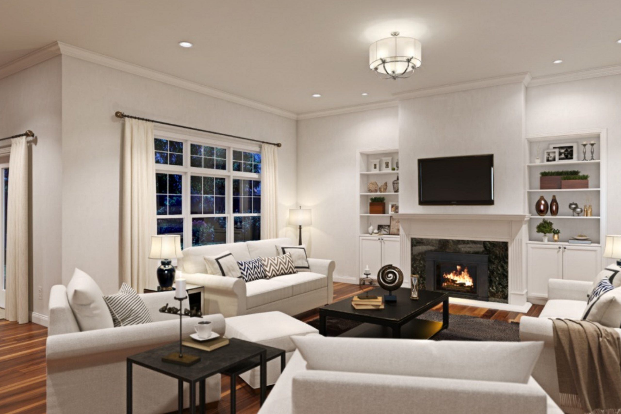
If you’re on the hunt for the perfect neutral paint color, you might want to check out SW 7531 Canvas Tan by Sherwin Williams. This paint color is a soft, warm tan that brings a cozy vibe to any room without overwhelming it with color. It’s like the comfortable pair of jeans you reach for when you want something that’s both stylish and feels like home. Canvas Tan is versatile enough to work in a variety of spaces—whether it’s brightening up a small room, adding warmth to a modern design, or serving as a backdrop for a more traditional décor.
One of the best things about Canvas Tan is how it pairs with other colors. It goes beautifully with whites, creating a subtle contrast that’s both inviting and soothing. If you love a natural look, you’ll find it complements wood tones and greenery wonderfully, making spaces feel grounded and alive. It’s also a great choice if you’re looking for a neutral that can support bolder colors and patterns without competing for attention.
Choosing the right paint can transform your space, and Canvas Tan by Sherwin Williams offers a golden opportunity to refresh your walls with a hue that’s both timeless and contemporary.
Whether you’re painting a living room, bedroom, or kitchen, this color can help create a welcoming atmosphere that feels just right.
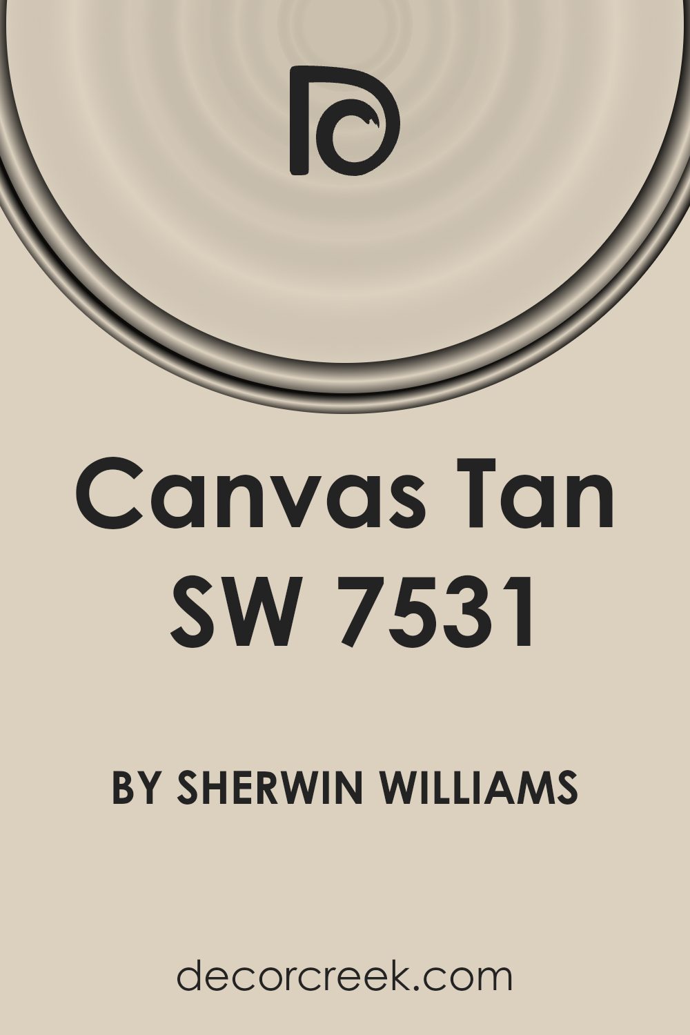
What Color Is Canvas Tan SW 7531 by Sherwin Williams?
Canvas Tan by Sherwin Williams is a warm and inviting neutral shade that brings a cozy feeling to any room. This color strikes a perfect balance between beige and light brown, offering a soft backdrop that complements a wide range of decor styles. It’s versatile, making it an excellent choice for living rooms, bedrooms, and kitchens, as it adds warmth without overpowering the space.
This shade works beautifully in interior styles that value comfort and simplicity, such as farmhouse, rustic, and Scandinavian. Its understated elegance also makes it suitable for more modern and minimalist spaces, where it can provide a subtle contrast to sharper lines and cooler tones.
Canvas Tan pairs well with natural materials and textures, enhancing the sense of comfort and warmth in a room. Think of pairing it with wooden furniture, whether it’s a sleek oak table in a modern dining room or rustic pine shelves in a cozy living room. Leather accents, like sofas and chairs, also complement its warmth, adding a touch of luxury and timelessness.
For textiles, consider soft, nubby fabrics in neutral colors for throw pillows or a chunky wool throw to add depth and interest. Together, these elements create a harmonious space that feels both welcoming and stylish.
Is Canvas Tan SW 7531 by Sherwin Williams Warm or Cool color?
Canvas Tan by Sherwin Williams is a versatile paint color that brings a natural and warm feel to any room in the house. Its gentle and welcoming tone resembles the softness of a well-loved canvas, providing a perfect backdrop that complements a wide range of decor styles and other colors. This color works well in sun-soaked spaces as well as in rooms with limited natural light, as it has a way of making spaces feel brighter and more airy without overwhelming the senses.
In living rooms, Canvas Tan creates a cozy atmosphere that encourages relaxation and conversation. In bedrooms, it offers a calm and soothing ambiance, making it easier to unwind and rest. When used in kitchens or dining areas, it adds warmth, inviting everyone to gather and spend time together.
Its adaptability makes it an excellent choice for those who like to change up their decor frequently, as it pairs well with both bold and subdued accents. Overall, Canvas Tan is a timeless choice that adds a touch of comfort and elegance to homes.
Undertones of Canvas Tan SW 7531 by Sherwin Williams
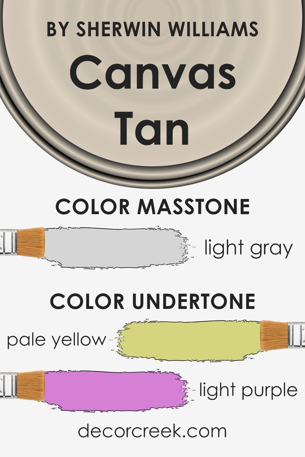
Canvas Tan is a color that might seem simple at first glance, but it’s actually quite complex due to its undertones. Undertones are subtle colors that lie beneath the surface of the main color, impacting how it looks under different lighting conditions and when paired with other colors. This paint has a variety of undertones including pale yellow, light purple, light blue, pale pink, mint, lilac, and grey. These undertones play a big role in how we perceive the color.
In general, undertones can make a color appear cooler or warmer, depending on which ones are dominant. For Canvas Tan, the mix of warm (pale yellow, pale pink, mint) and cool (light purple, light blue, lilac) undertones, along with neutral grey, give it a balanced versatility. This means it can look slightly different from one room to another, depending on lighting and surrounding elements.
When used on interior walls, the various undertones of this paint come into play in subtle ways. Natural light can bring out its warm tones, making a room feel cozy and welcoming. Meanwhile, artificial light might highlight its cooler or neutral undertones, giving the space a more serene or sophisticated vibe.
This versatility makes Canvas Tan a fantastic choice for any room, adapting to the style and the light it receives. Whether you’re aiming for a fresh, airy feel or a grounded, cozy ambiance, this color has the ability to shift mood with its underlying rainbow of undertones.
It’s like having multiple colors in one, all working together to enhance the space in a beautifully understated way.
What is the Masstone of the Canvas Tan SW 7531 by Sherwin Williams?
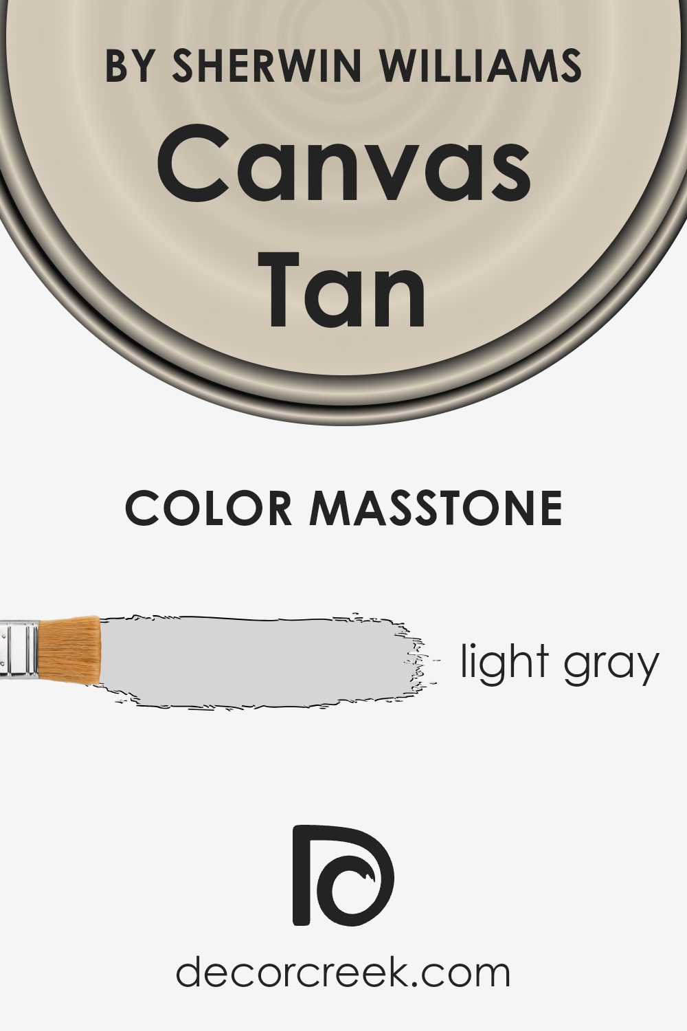
Canvas Tan SW 7531, by Sherwin Williams, sports a masstone that might surprise you – it’s a light gray, not tan as the name might suggest. This hue, specifically tagged with the color code #D5D5D5, carries a cool, neutral vibe that’s more versatile than you might first think. When it comes to using this color in homes, its light gray essence means it plays well in various spaces, both large and small.
This shade can open up smaller rooms, making them feel more spacious and airy, all thanks to its light-reflective quality. In larger areas, it serves as a calm and soothing backdrop that can complement a wide range of decor styles and color palettes.
The subtle neutrality of Canvas Tan’s light gray allows homeowners to mix and match their furnishings and accessories without worrying about clashing or overpowering their spaces. It’s a quiet, understated color that brings a sense of peace and serenity to any room, making it an excellent choice for creating a restful and inviting home environment.
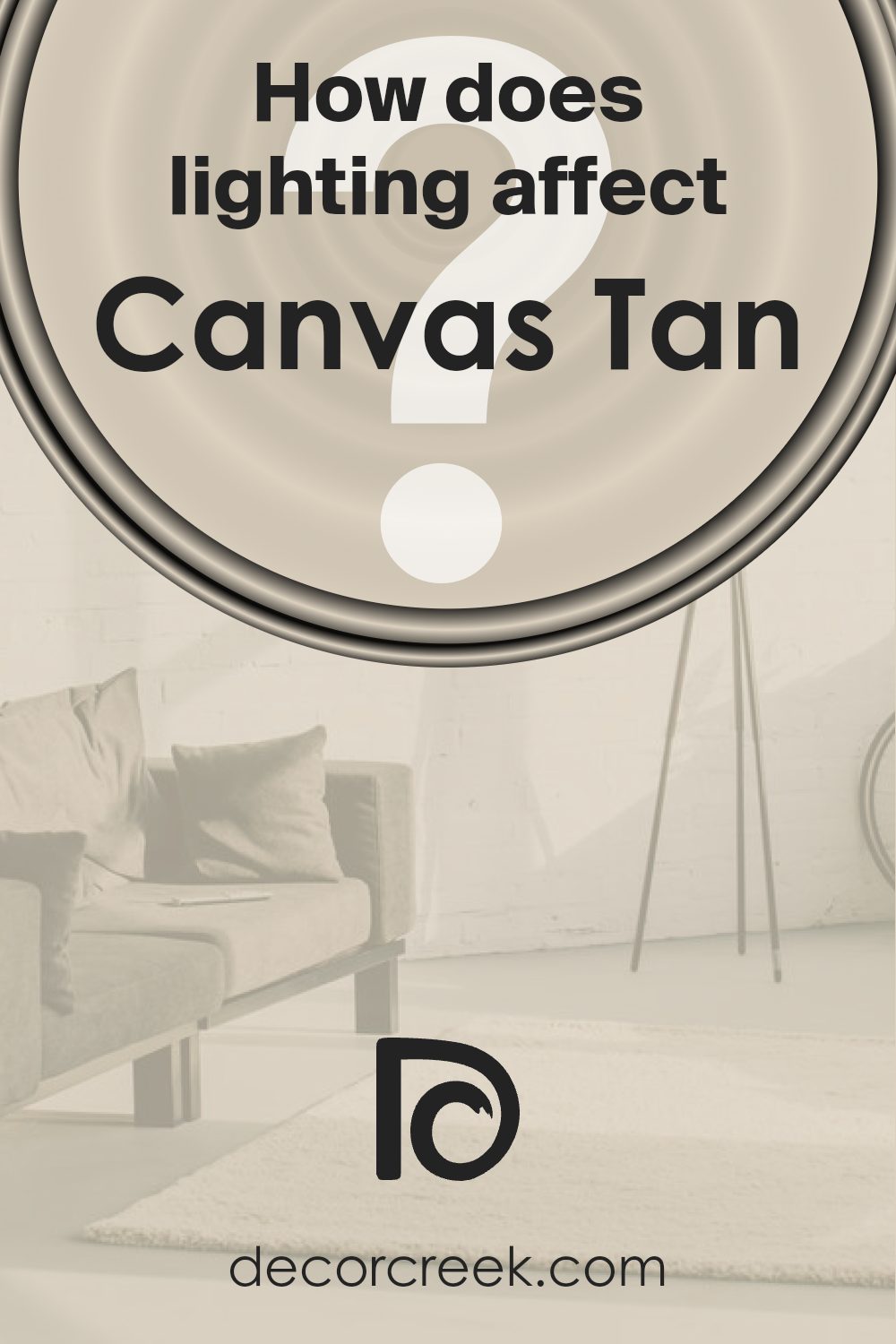
How Does Lighting Affect Canvas Tan SW 7531 by Sherwin Williams?
Lighting plays a crucial role in how we perceive colors, subtly changing their appearance and the mood they create in a space. The color in question, Canvas Tan, offers a versatile and warm neutral shade that can blend well in various settings. However, the type of lighting it’s under can significantly influence how it’s seen.
In artificial light, the impact on Canvas Tan depends on the type of bulbs used. Warm lighting can enhance its cozy, earthy tones, making spaces feel more inviting. On the other hand, cool artificial light might make it appear slightly more muted, drawing out its subtle gray undertones and creating a more neutral backdrop.
Natural light brings its dynamic characteristics, changing how Canvas Tan looks throughout the day. Its appearance can shift from warm and vibrant in the morning light to softer and more subdued by the evening. The direction of the room also plays a significant role in this transformation.
North-faced rooms receive less direct sunlight, which could make Canvas Tan look slightly cooler and more muted. This setting might not bring out the warmest tones of the color but can still provide a calm and serene ambiance.
South-faced rooms bathe in abundant sunlight, enhancing the warmth and depth of Canvas Tan, making the color feel brighter and more inviting. It’s in these settings that the color can truly show its cozy, welcoming nature.
East-faced rooms get the morning sunlight, which means Canvas Tan can appear warm and lively in the morning but might lose some of its vibrancy as the day progresses. It’s a dynamic scenario that evolves, offering different experiences based on the time.
West-faced rooms experience the opposite. They are cooler and less vibrant in the morning, but as the sun sets, they capture a warmer light, making Canvas Tan radiate warmth and coziness by afternoon and evening.
In summary, lighting, whether artificial or natural, along with the room’s orientation, largely impacts how Canvas Tan is perceived, affecting its warmth, depth, and overall vibe within the space.
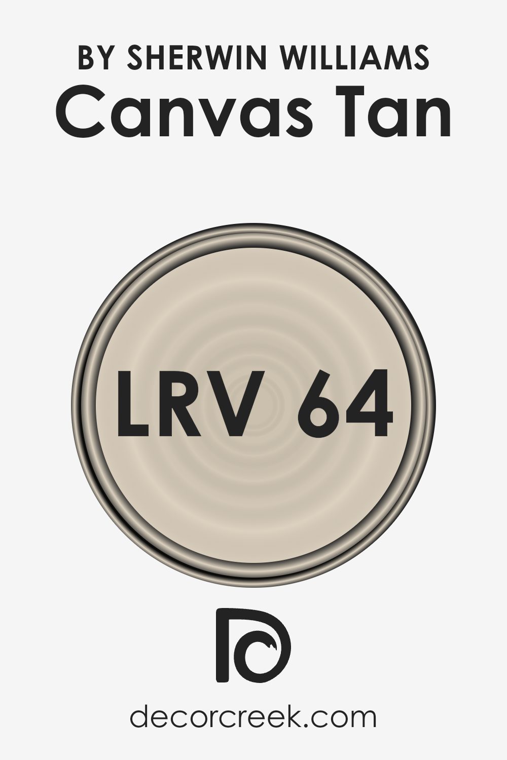
What is the LRV of Canvas Tan SW 7531 by Sherwin Williams?
LRV stands for Light Reflectance Value, and it’s a measure of how much light a paint color reflects back into a room. The scale runs from 0, which is pure black and absorbs most of the light, to 100, which is pure white and reflects most of the light back into the room. This number is crucial because it can significantly affect how light or dark a paint color appears once it’s on your walls.
The amount of natural and artificial light in a space will interact with the LRV of the paint color, either making it appear lighter or darker. So, understanding the LRV can help you choose the right paint color for your space, ensuring it complements the room’s lighting conditions and atmosphere you want to create.
With an LRV of 64.307, Canvas Tan falls into the lighter spectrum of colors, which means it has a good capability to reflect light, making spaces feel more open and airy. This particular value indicates that it’s a versatile color capable of brightening up rooms without being overwhelmingly bright or stark.
In spaces with less natural light, using a color like this can help make the area feel more vibrant and uplifted, as it will effectively bounce the available light around the room. On the other hand, in a very brightly lit space, this LRV will ensure that the color holds its warmth and depth without becoming washed out, making Canvas Tan a great choice for creating a cozy yet illuminated environment.
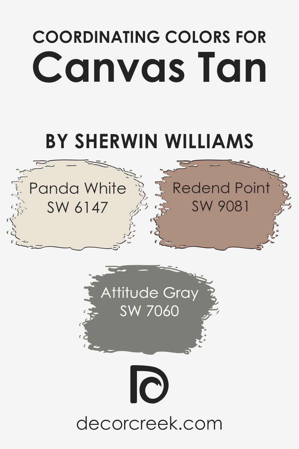
Coordinating Colors of Canvas Tan SW 7531 by Sherwin Williams
Coordinating colors are shades that complement each other aesthetically, creating a pleasing palette when used together in interior design or art. They are designed to enhance the main color, making spaces or designs feel aligned and thoughtfully arranged. For example, when working with a base color like Canvas Tan by Sherwin Williams, selecting coordinating colors can significantly impact the overall look and feel of a room, providing balance and character. These specific coordinating colors have been chosen to work harmoniously with Canvas Tan, each bringing its own unique vibe to the mix.
Panda White SW 6147 is a soft, airy white with a hint of warmth, making it a versatile companion to Canvas Tan. It offers a subtle contrast, brightening spaces without overwhelming, perfect for creating a serene and inviting atmosphere. Attitude Gray SW 7060, on the other hand, is a deeper, more expressive shade that adds depth and sophistication.
Its rich tone works well with Canvas Tan, offering a contemporary edge and highlighting the warmer tan’s natural appeal. Redend Point SW 9081 is a muted, rosy hue that introduces a gentle splash of color. This soft, earthy pink complements Canvas Tan in a way that’s both understated and playful, adding a hint of romance and whimsy to the palette.
Together, these colors form a cohesive and welcoming space, enhancing the beauty of Canvas Tan through their complementary tones.
You can see recommended paint colors below:
- SW 6147 Panda White (CHECK A SAMPLE)
- SW 7060 Attitude Gray (CHECK A SAMPLE)
- SW 9081 Redend Point (CHECK A SAMPLE)
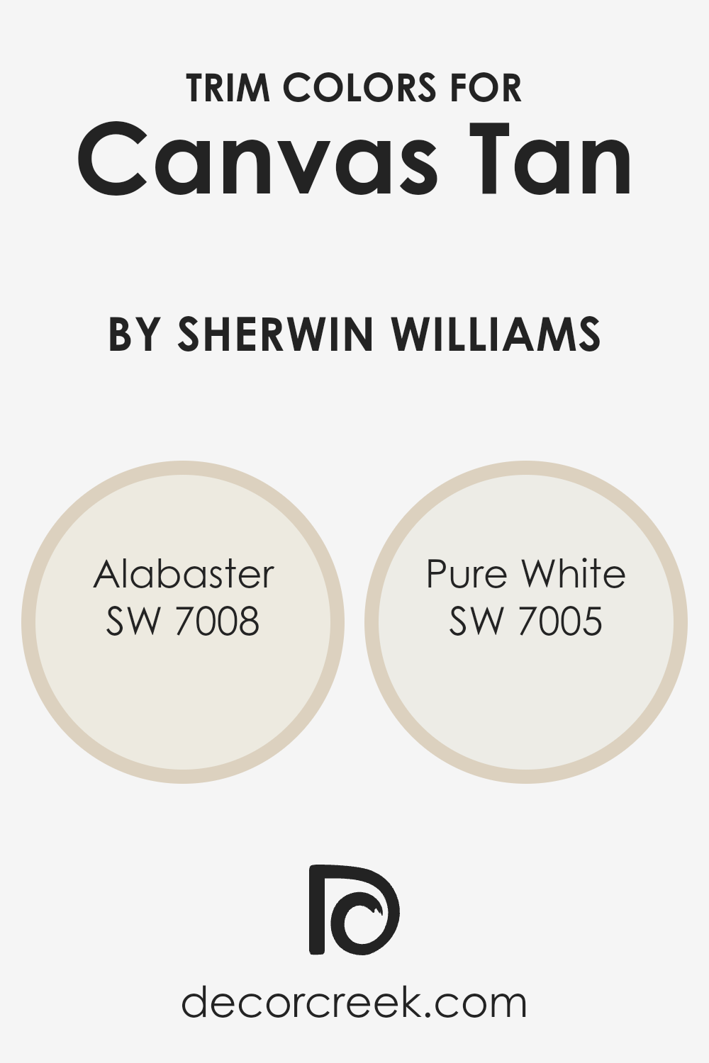
What are the Trim colors of Canvas Tan SW 7531 by Sherwin Williams?
Trim colors are those specific shades that are used in contrast to the main color on walls, to enhance architectural features such as door frames, window trims, skirting, and crown moldings. When it comes to a versatile hue like Canvas Tan by Sherwin Williams, selecting the right trim color becomes vital.
A trim color not only adds depth and dimension to the wall colors but also accentuates the architectural details of a space. The use of proper trim colors can transform a room, giving it a polished and refined look which elevates the overall aesthetic.
For Canvas Tan, a neutral yet warm shade, choosing trim colors like Alabaster SW 7008 or Pure White SW 7005 from Sherwin Williams can be ideal. Alabaster is a soft, creamy white with a hint of warmth, blending seamlessly with Canvas Tan to create a cozy and inviting atmosphere without overwhelming the senses.
On the other hand, Pure White is a crisp, clean shade that offers a striking contrast, highlighting the natural warmth of Canvas Tan and bringing freshness and clarity into the space. These trim colors complement Canvas Tan in a way that they not only uplift the main color but also contribute to making the space feel more vibrant and lively.
You can see recommended paint colors below:
Colors Similar to Canvas Tan SW 7531 by Sherwin Williams
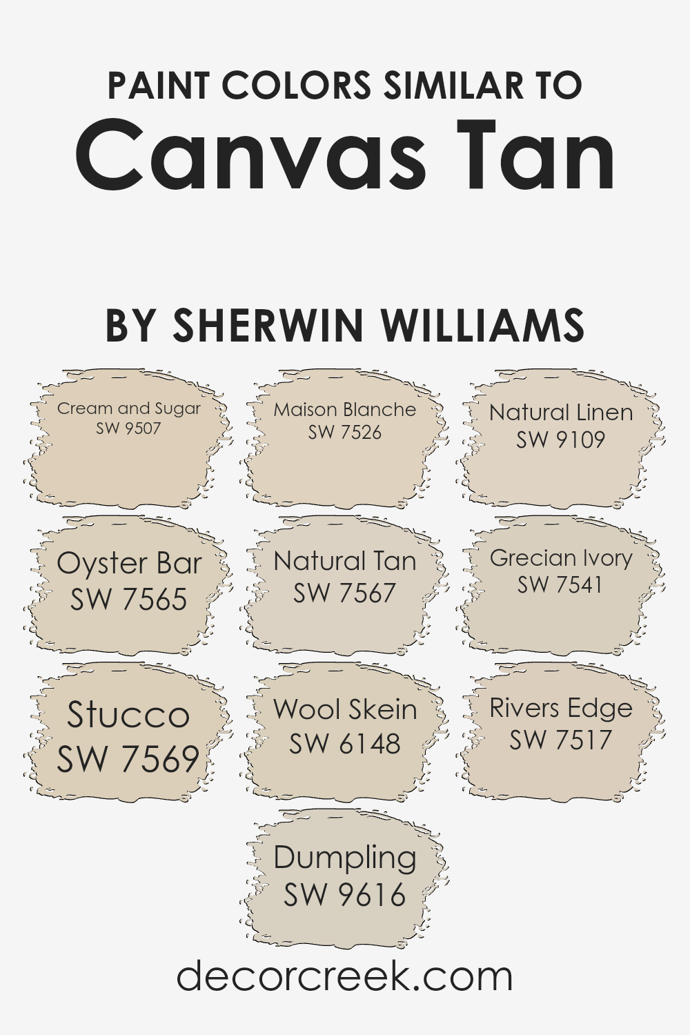
Using similar colors can significantly enhance the aesthetic appeal and harmony within a space. When we look at shades like Cream and Sugar, we find a cozy warmth that envelopes a room in a comforting hug of creamy richness. The shade is perfect for creating a soft, inviting atmosphere.
Oyster Bar, on the other hand, introduces a subtle sophistication with its muted elegance, making it ideal for spaces that aim for a refined look without overpowering. Stucco brings a grounded, earthy vibe, echoing the textures and colors of natural clay, which can add depth and serenity to an environment.
Dumpling offers a gentle, muted backdrop, acting as a canvas that allows other design elements to shine, while Maison Blanche provides a crisp, clean look with its subtle, sophisticated undertones, perfect for creating a tranquil and airy space.
Natural Tan, as the name suggests, borrows from the organic, comforting hues of nature, adding warmth and a sense of welcome. Wool Skein, with its understated elegance, weaves a fabric of softness into any decor, creating a calming and restful setting.
Natural Linin is like a breath of fresh air, light and breezy, offering a neutral base that’s versatile and effortlessly chic. Grecian Ivory, with its hint of antiquity, brings a timeless elegance, perfect for spaces that aim for a classic look with a touch of warmth. Lastly, Rivers Edge provides a serene and calming touch, reminiscent of the peaceful flow of water, it’s perfect for spaces intended to be a refuge from the hustle and bustle of daily life.
Each of these colors, while unique, shares an affinity with Canvas Tan, offering a palette that can create cohesion and warmth in any space.
You can see recommended paint colors below:
- SW 9507 Cream and Sugar (CHECK A SAMPLE)
- SW 7565 Oyster Bar (CHECK A SAMPLE)
- SW 7569 Stucco (CHECK A SAMPLE)
- SW 9616 Dumpling (CHECK A SAMPLE)
- SW 7526 Maison Blanche (CHECK A SAMPLE)
- SW 7567 Natural Tan (CHECK A SAMPLE)
- SW 6148 Wool Skein (CHECK A SAMPLE)
- SW 9109 Natural Linen (CHECK A SAMPLE)
- SW 7541 Grecian Ivory (CHECK A SAMPLE)
- SW 7517 Rivers Edge (CHECK A SAMPLE)
Colors that Go With Canvas Tan SW 7531 by Sherwin Williams
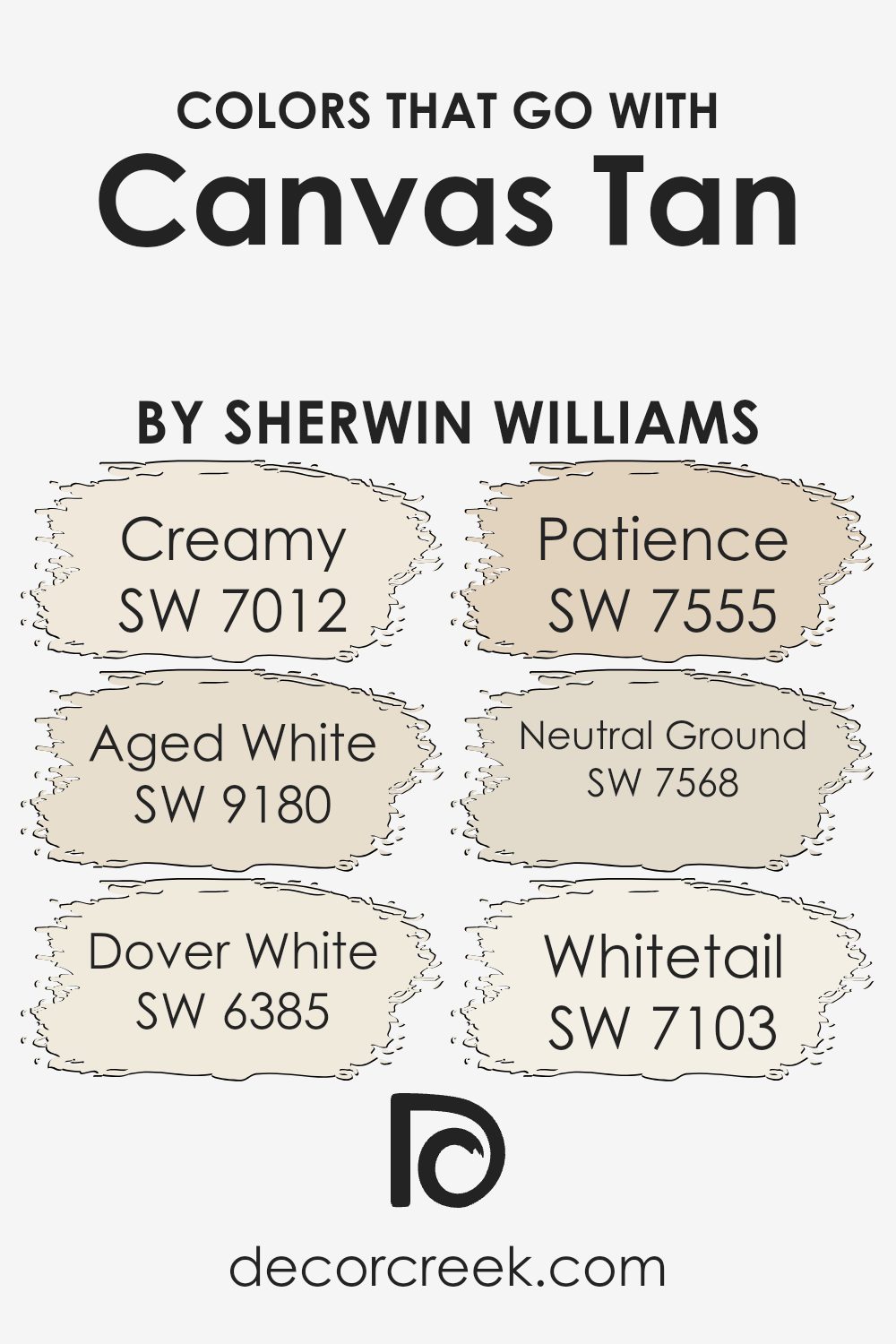
Choosing the right colors to complement Canvas Tan SW 7531 by Sherwin Williams is crucial for creating a cohesive and appealing look in any space. These colors work together by providing a harmonious blend of warmth and subtlety that enhances the welcoming and versatile nature of Canvas Tan.
Using complementary colors like SW 7012 – Creamy, a soft and buttery hue, adds a gentle contrast that elevates the warmth in Canvas Tan. Meanwhile, SW 9180 – Aged White brings an element of aged charm with its off-white tone that has a hint of vintage, enriching the depth of your palette.
Including colors such as SW 6385 – Dover White, a bright and clean shade, introduces a fresh and crisp element that can make spaces feel more open and airy. Patience SW 7555, with its understated elegance, offers a muted and sophisticated backdrop that allows Canvas Tan to truly shine.
Then there’s SW 7568 – Neutral Ground, a soft and earthy beige that seamlessly blends with Canvas Tan, providing a soothing and natural look. Lastly, SW 7103 – Whitetail, a very light and almost ethereal white, adds a subtle lift to the overall palette, ensuring that the space feels balanced and thoughtfully curated. Together, these colors create a warm, inviting, and seamlessly blended aesthetic that makes the most of Canvas Tan’s versatility and charm.
You can see recommended paint colors below:
- SW 7012 Creamy (CHECK A SAMPLE)
- SW 9180 Aged White (CHECK A SAMPLE)
- SW 6385 Dover White (CHECK A SAMPLE)
- SW 7555 Patience (CHECK A SAMPLE)
- SW 7568 Neutral Ground (CHECK A SAMPLE)
- SW 7103 Whitetail (CHECK A SAMPLE)
Complimentary Colors for Canvas Tan SW 7531 Paint Color by Sherwin Williams
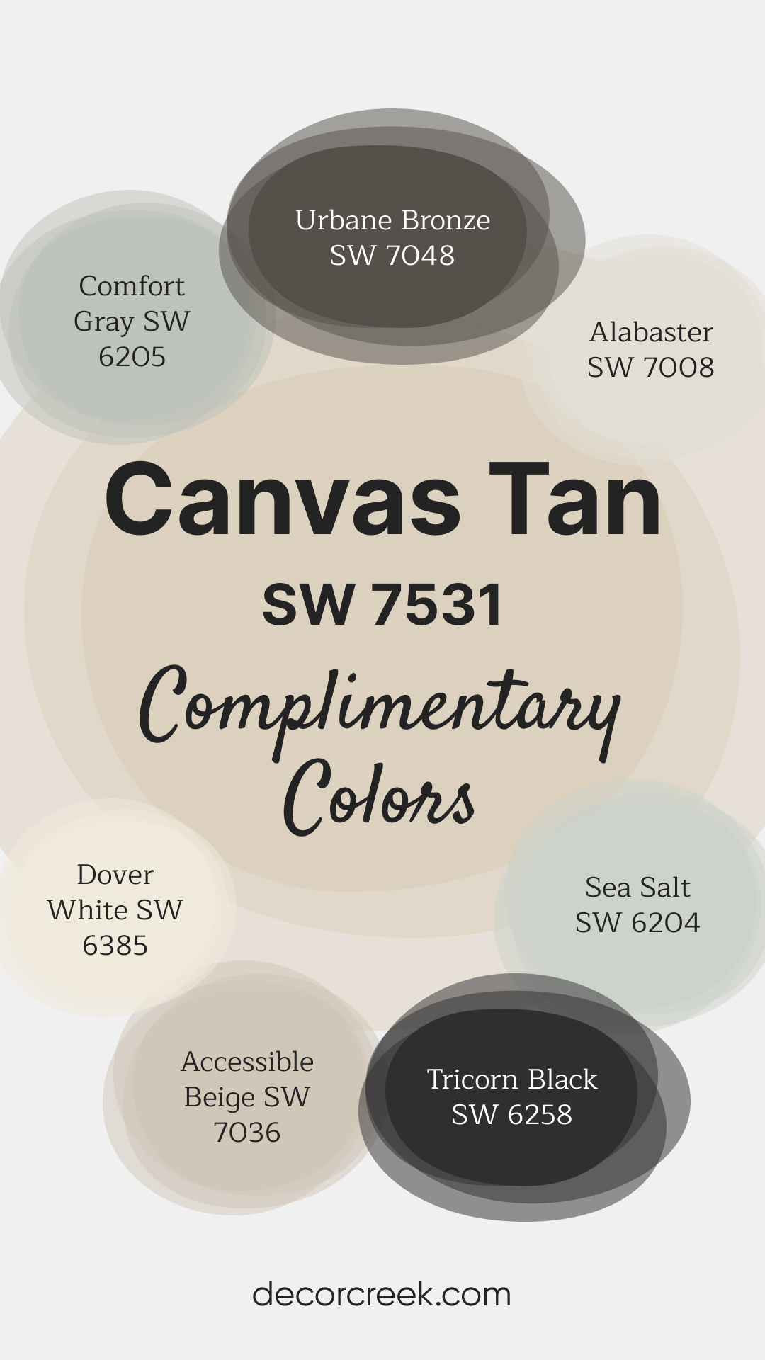
This Sherwin Williams palette offers a perfect mix of warmth and contrast for a stylish home. Canvas Tan and Accessible Beige bring subtle warmth to your space, while Sea Salt and Comfort Gray add a refreshing hint of color. For a striking contrast, Urbane Bronze and Tricorn Black provide bold, dramatic accents.
Alabaster and Dover White round out the palette with their crisp, versatile tones. Together, these shades create a harmonious combination that’s easy to coordinate, whether you’re refreshing walls or accenting furniture.
How to Use Canvas Tan SW 7531 by Sherwin Williams In Your Home?
Canvas Tan SW 7531 by Sherwin Williams is a beautiful and versatile paint color that can bring warmth and brightness to any space in your home. This shade of tan is like the blank canvas it’s named after, offering a neutral background that works well with a variety of decor styles and other colors. Whether you’re looking to freshen up your living room, bedroom, or even the kitchen, Canvas Tan can do the job.
This color is especially helpful for rooms that could use a touch of coziness without feeling too small or dark. It reflects light well, making your space appear larger and more inviting. For those wanting to update their furniture or accent pieces, Canvas Tan serves as a great backdrop, allowing bold colors or patterns to stand out.
You can also use Canvas Tan in your entryway or hallways to create a smooth transition between more vibrant rooms, ensuring a cohesive look throughout your home. Its versatility means you can pair it with whites for a clean, classic look, or with darker hues for a bit of contrast and drama.
Canvas Tan SW 7531 by Sherwin Williams vs Natural Tan SW 7567 by Sherwin Williams
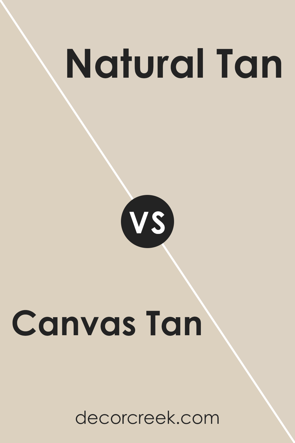
Canvas Tan and Natural Tan by Sherwin Williams are two beautiful neutral colors that many people love for their homes. While both shades belong to the tan family, there are some differences between them. Canvas Tan is a light, warm beige color. It has a cozy feel and works well in spaces where you want to add a touch of warmth without overpowering the room.
On the other hand, Natural Tan is slightly darker and has a more muted tone. It’s perfect for those looking for a neutral color that still brings depth and character to a space. Both colors are versatile and can easily blend with various decor styles. However, if you’re aiming for a brighter, more open feel, Canvas Tan might be the way to go. For a more grounded and understated look, Natural Tan could be your ideal choice.
You can see recommended paint color below:
- SW 7567 Natural Tan (CHECK A SAMPLE)
Canvas Tan SW 7531 by Sherwin Williams vs Natural Linen SW 9109 by Sherwin Williams
Canvas Tan and Natural Linen are two colors by Sherwin Williams that share a cozy vibe but have distinct tones. Canvas Tan leans more towards a warm beige, giving off a soft yet inviting feel. It’s like the color of a well-loved, sunlit room that feels welcoming. On the other hand, Natural Linen is lighter, almost hinting at an off-white with a touch of warmth.
It’s akin to the color of a favorite cotton shirt that’s comfortable and familiar. Both colors create a soothing atmosphere but in slightly different ways. Canvas Tan brings warmth and coziness, making spaces feel more intimate, whereas Natural Linen offers a lighter, airier feel, perfect for making small rooms appear larger and brighter.
Together, they can complement each other beautifully in a home, blending warmth with light in a harmonious way.
You can see recommended paint color below:
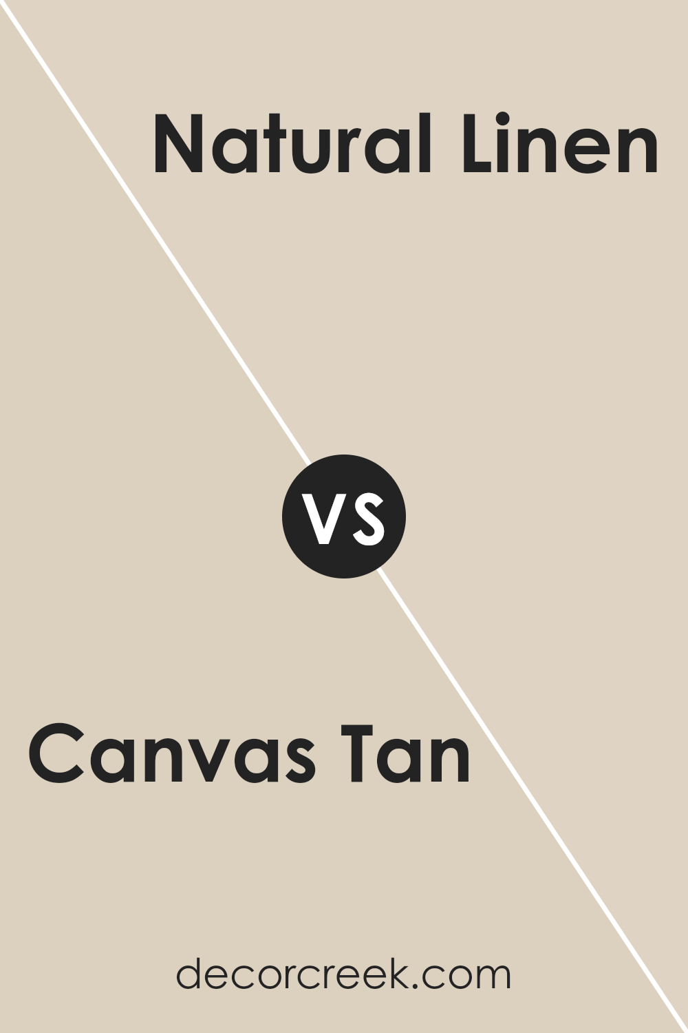
Canvas Tan SW 7531 by Sherwin Williams vs Maison Blanche SW 7526 by Sherwin Williams
Both Canvas Tan and Maison Blanche are colors by Sherwin Williams, but they bring different vibes to a room. Canvas Tan is a warm and cozy shade, leaning towards a light brown or a rich beige. It’s the kind of color that makes a room feel inviting and comfortable, perfect for living spaces or bedrooms where you want to relax.
On the other hand, Maison Blanche is a lighter, creamy off-white. It’s more subtle than Canvas Tan, offering a fresh and clean look. This color is excellent for making small spaces appear bigger and brighter, ideal for kitchens, bathrooms, or any area you want to feel airy and open.
While both colors are neutral and can blend well with many designs, Canvas Tan adds warmth and depth, creating a snug atmosphere. Maison Blanche, being lighter, brings a sense of calmness and simplicity to a space. Depending on the mood you want to set, each color has its unique charm to offer.
You can see recommended paint color below:
- SW 7526 Maison Blanche (CHECK A SAMPLE)
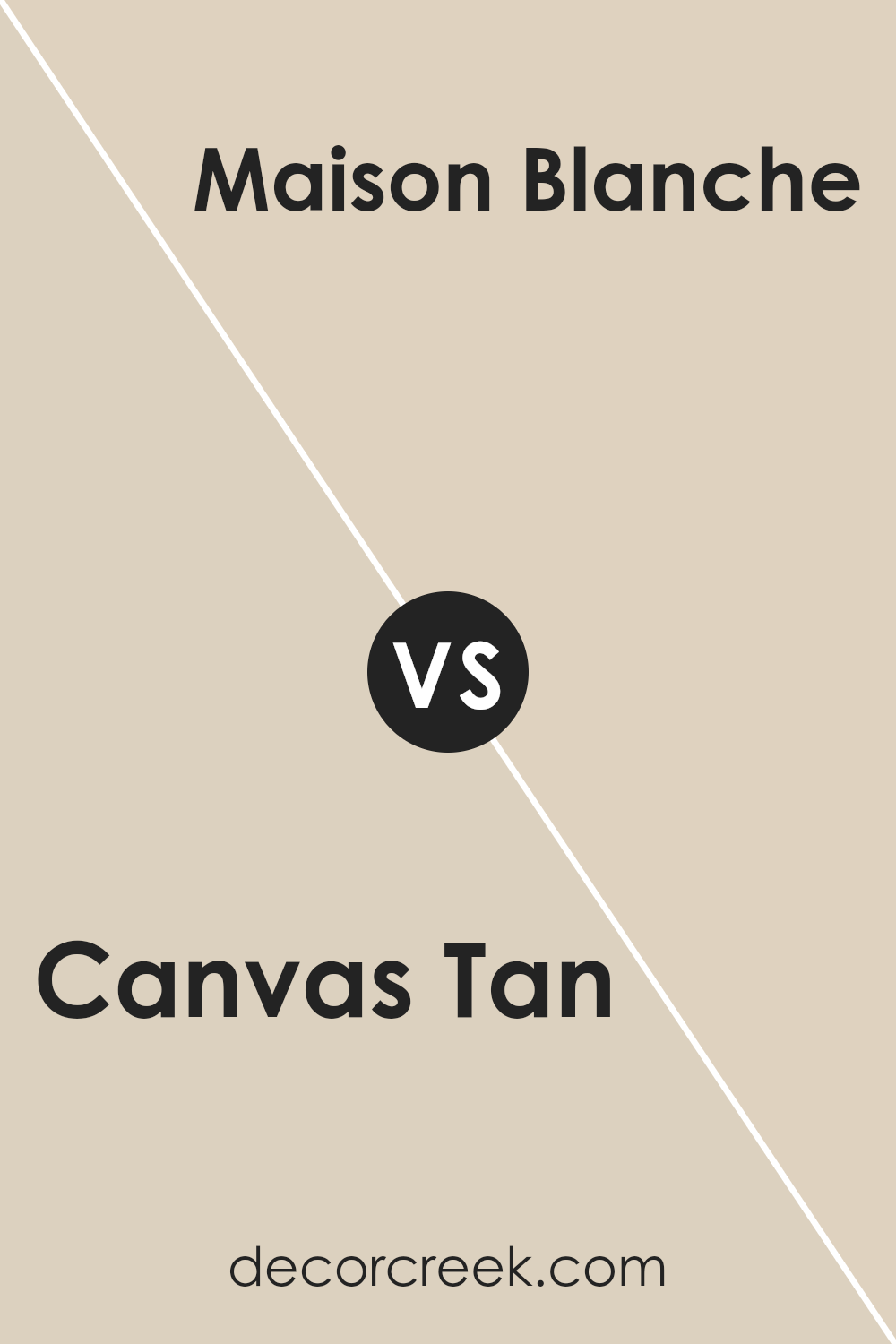
Canvas Tan SW 7531 by Sherwin Williams vs Dumpling SW 9616 by Sherwin Williams
Canvas Tan and Dumpling by Sherwin Williams are both warm, inviting colors, though they have distinct differences. Canvas Tan is a mid-tone beige with subtle, earthy nuances. It creates a cozy, welcoming atmosphere in a room without overwhelming the space. This versatility makes it a great choice for living areas, bedrooms, and common areas, providing a neutral backdrop that pairs well with a wide range of decor.
On the other hand, Dumpling is a lighter, creamier color. It leans towards a softer, more delicate pale hue that brings brightness to spaces. Its gentle tone is perfect for creating a serene, calm environment, making it ideal for nurseries, bathrooms, or any room looking to capture a sense of tranquility.
While both colors offer warmth, Dumpling offers a clean, airy feeling, suggesting a more subtle, soothing presence compared to the grounded, richer feel of Canvas Tan. Choosing between them depends on the desired mood and ambiance for the space.
You can see recommended paint color below:
- SW 9616 Dumpling (CHECK A SAMPLE)
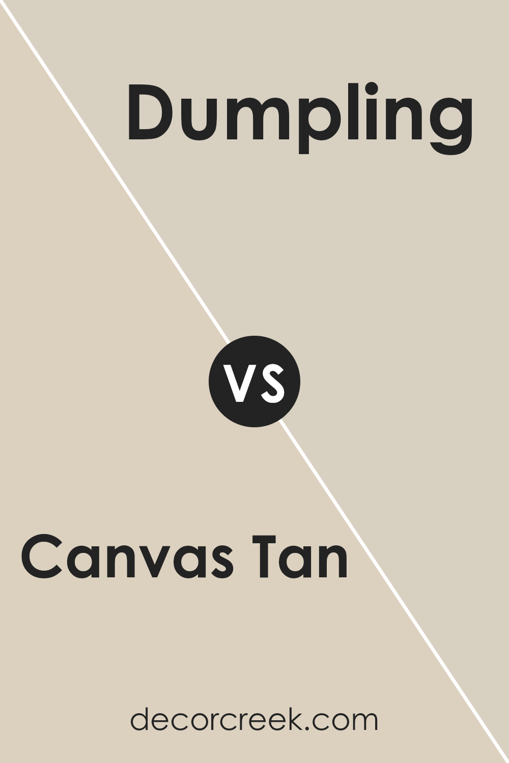
Canvas Tan SW 7531 by Sherwin Williams vs Oyster Bar SW 7565 by Sherwin Williams
Both Canvas Tan and Oyster Bar by Sherwin Williams are popular paint colors, yet they offer distinct vibes for your space. Canvas Tan has a warm, welcoming feel to it, brighter and leans more towards a creamy beige. It provides a cozy and light atmosphere, making rooms feel airy and more spacious. It’s great for common areas like living rooms and kitchens where you want a friendly, inviting mood.
On the other hand, Oyster Bar takes a step toward subtlety with its earthy, muted tone. This color is softer and more understated than Canvas Tan, carrying a hint of gray that adds a sophisticated, modern touch to spaces. It’s perfect for creating a serene and elegant environment, suitable for bedrooms, bathrooms, or any place where you seek a calm and relaxing atmosphere.
While both colors bring their unique charm, the choice between them depends on the mood you’re aiming to achieve: Canvas Tan for a bright and warm feel, and Oyster Bar for a soft, refined elegance.
You can see recommended paint color below:
- SW 7565 Oyster Bar (CHECK A SAMPLE)
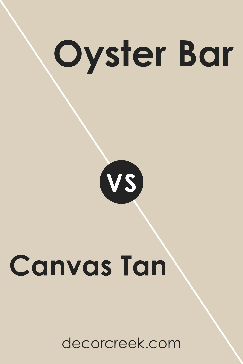
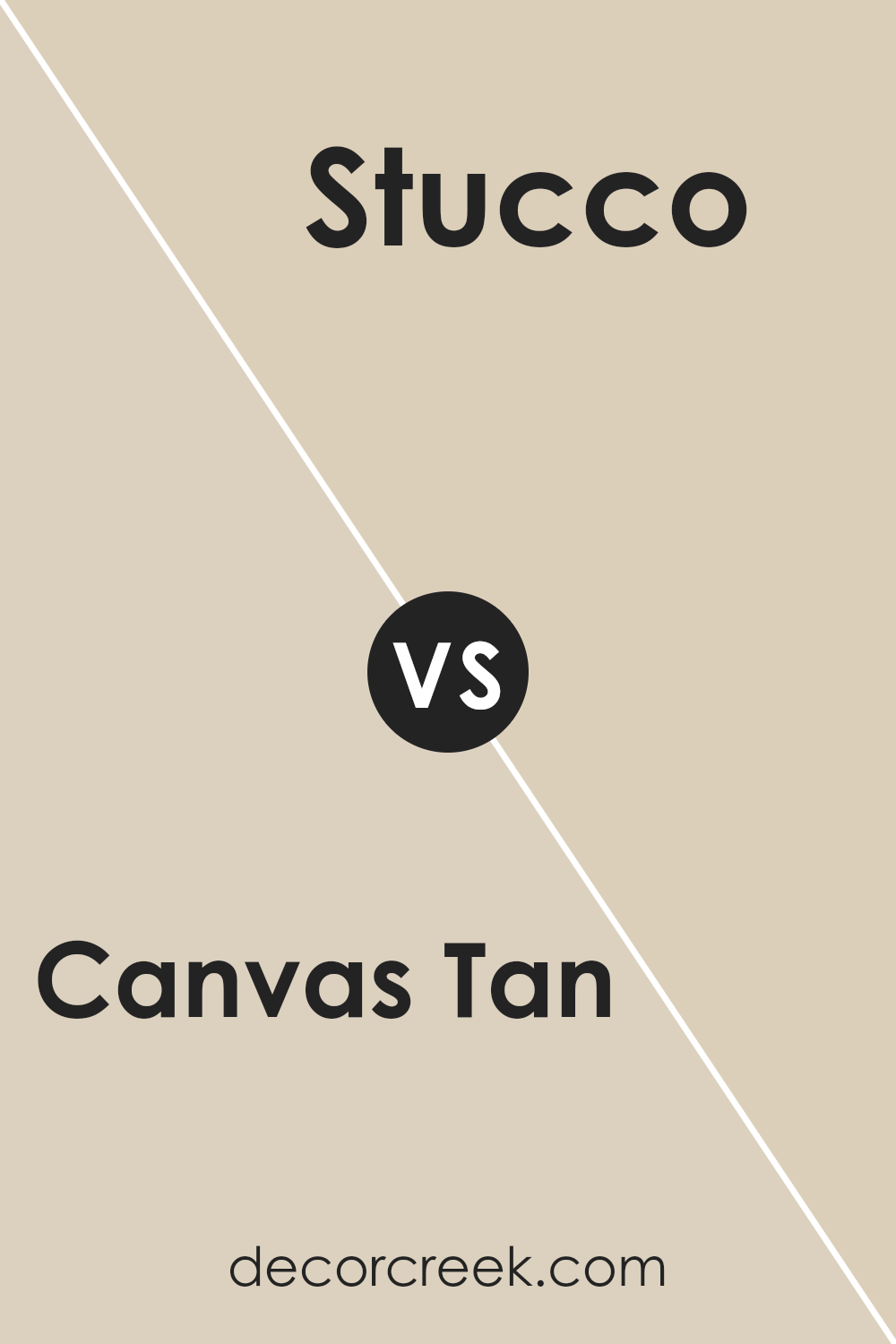
Canvas Tan SW 7531 by Sherwin Williams vs Stucco SW 7569 by Sherwin Williams
Canvas Tan and Stucco are two colors from Sherwin Williams that bring subtle warmth to any space, yet they stand apart in their unique hues. Canvas Tan is a light, soft beige that brings a cozy, inviting feel to rooms. It has a hint of creaminess, making it a perfect backdrop for various decor styles, from modern to traditional. It’s the kind of color that complements wood tones and natural textures beautifully.
On the other hand, Stucco is a bit deeper and leans towards a taupe-gray. It’s still in the neutral zone but offers a slightly more pronounced statement. This color is ideal for those looking to add a bit of depth to their walls without overwhelming the space with too dark a shade. Stucco works well in spaces where you want to create a serene, grounded atmosphere.
Both Canvas Tan and Stucco offer elegance and versatility, but the choice between them depends on the mood you’re aiming to achieve. Canvas Tan lights up a room with its bright warmth, while Stucco brings a sophisticated and understated elegance.
You can see recommended paint color below:
- SW 7569 Stucco (CHECK A SAMPLE)
Canvas Tan SW 7531 by Sherwin Williams vs Wool Skein SW 6148 by Sherwin Williams
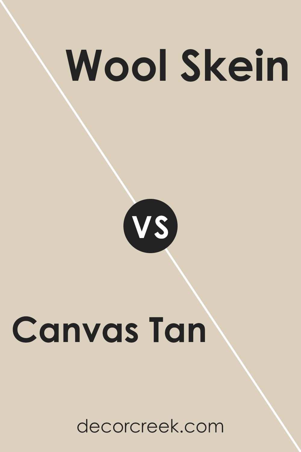
Canvas Tan and Wool Skein are two colors by Sherwin Williams that offer subtle, yet distinct, tones for any space. Canvas Tan leans more into a warm beige, bringing a cozy and inviting feel to rooms. Its earthy touch can make a space feel grounded and welcoming, perfect for creating a soothing environment.
On the other hand, Wool Skein adds a slightly cooler and lighter nuance to the mix. This color could be described as a soft, light beige with hints of gray, offering a more neutral backdrop that blends effortlessly with various decor styles. While Canvas Tan warms up a room with its richer depth, Wool Skein lights up spaces with its airy vibe.
Both colors are versatile, but their unique undertones can influence the mood and feel of a room differently. Choosing between them depends on the desired effect: a warm, earthy ambiance or a light, neutral setting.
You can see recommended paint color below:
- SW 6148 Wool Skein (CHECK A SAMPLE)
Canvas Tan SW 7531 by Sherwin Williams vs Cream and Sugar SW 9507 by Sherwin Williams
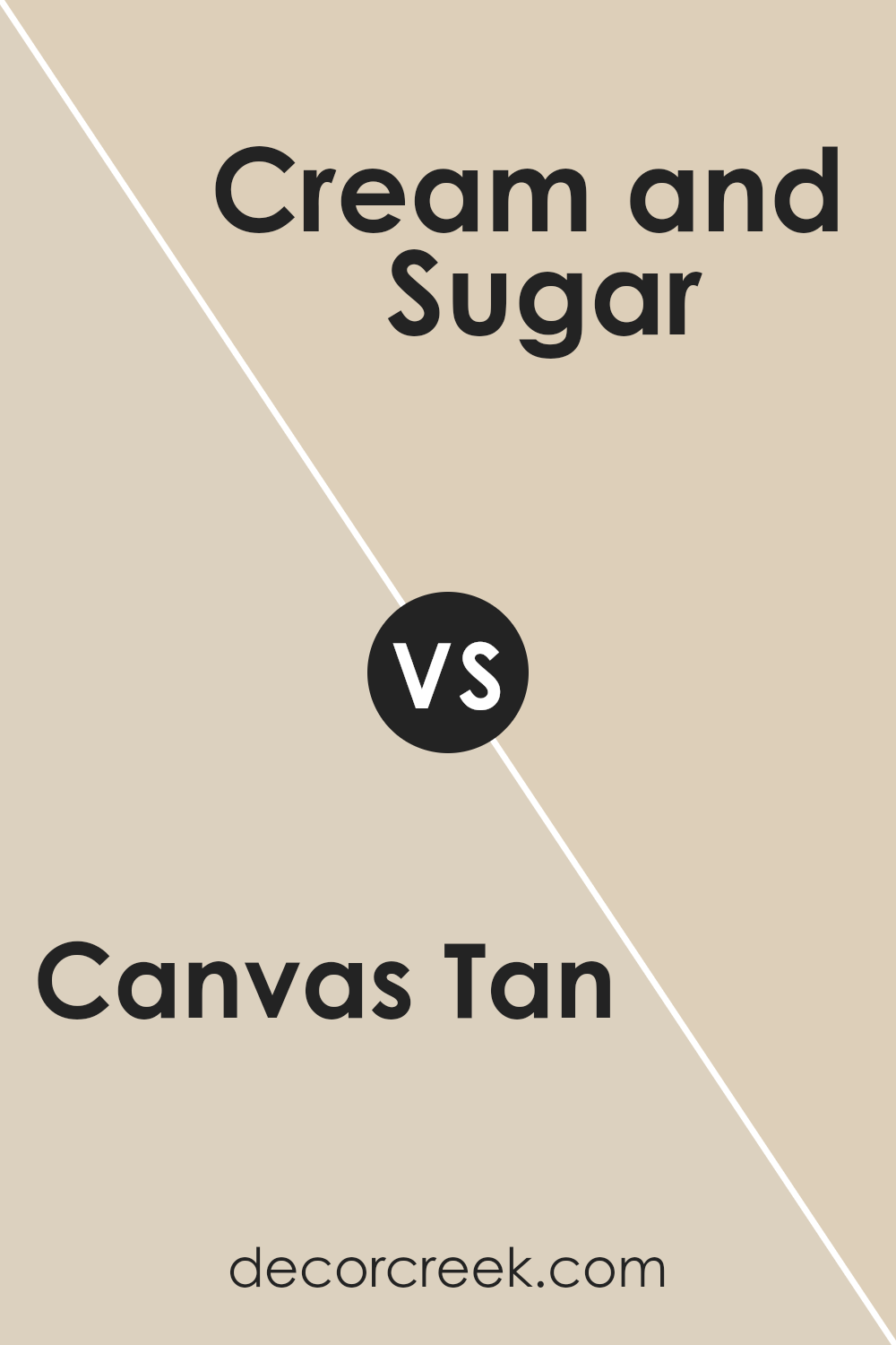
Canvas Tan and Cream and Sugar by Sherwin Williams are two elegant colors with their unique characteristics. Canvas Tan is a softer, more muted tone, offering a warm and welcoming feel without being too overpowering. It’s like a cozy, sunlit room in the morning, giving a relaxed and comforting vibe. This color works well in spaces where calmness and serenity are desired.
On the other hand, Cream and Sugar is a lighter, creamier color. It’s akin to the smoothness of a well-blended latte, introducing a brighter and more uplifting feel to any space. This color adds a hint of freshness and light, making rooms appear more spacious and airy.
While both colors bring warmth and coziness, Canvas Tan leans more towards a natural, earthy look, whereas Cream and Sugar offers a soft, airy, and more delicate ambiance. They can complement each other well in different parts of a home, depending on the mood and atmosphere you want to create.
You can see recommended paint color below:
Canvas Tan SW 7531 by Sherwin Williams vs Grecian Ivory SW 7541 by Sherwin Williams
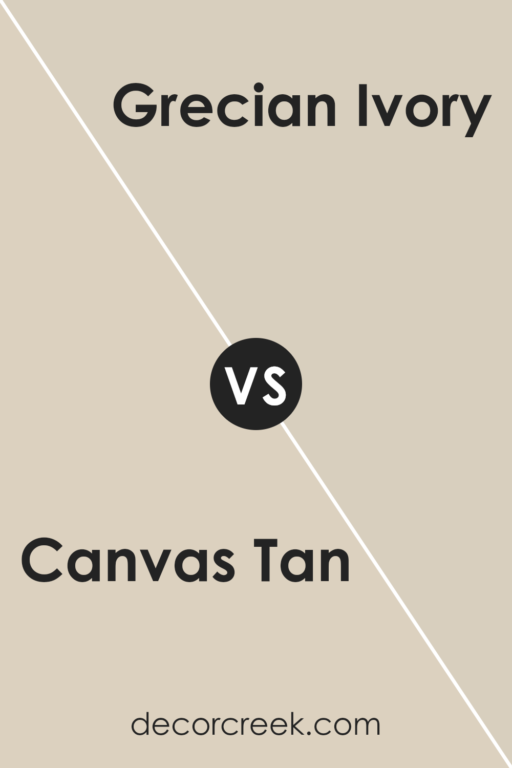
Canvas Tan and Grecian Ivory are two cozy colors by Sherwin Williams, each with its own unique vibe. Canvas Tan is a soft, warm beige that feels like a snug, inviting blanket on a chilly day. It’s like the cozy, earthy color of a sandy beach just before sunset. Think of it as a hug from your favorite cozy sweater.
On the other hand, Grecian Ivory steps it up with a hint of creaminess, bringing in a touch of light and airiness that reminds you of a gentle morning glow. It’s a bit brighter than Canvas Tan, offering a refreshing and slightly more uplifting atmosphere. This color makes a room feel more spacious and luminous, kind of like opening a window on a sunny day.
While both colors are perfect for creating a warm, welcoming space, Canvas Tan leans more towards a traditional, grounded feel, and Grecian Ivory offers a soft, brighter, and somewhat more refined touch. They both work well in lots of spaces but serve different moods and tones depending on what cozy vibe you’re aiming for.
You can see recommended paint color below:
Canvas Tan SW 7531 by Sherwin Williams vs Rivers Edge SW 7517 by Sherwin Williams
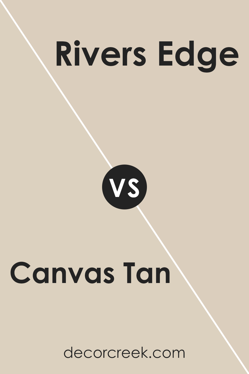
Canvas Tan and Rivers Edge by Sherwin Williams are two colors with unique qualities. Canvas Tan is a soft, warm beige, giving off a cozy and welcoming vibe suitable for spaces where you want a touch of comfort without overwhelming brightness. It pairs well with various decor styles, offering a versatile backdrop for rooms in need of a gentle, sunny lift.
On the other hand, Rivers Edge steps into a cooler territory. It’s a mid-tone gray with a hint of blue, evoking the feeling of tranquility and calmness found by a gentle stream. This color is perfect for creating a serene, peaceful environment in your home. It favors a more modern or contemporary setting, working well in spaces aiming for a refresher without straying too far into stark, cold shades of gray.
While both colors come from the same family, their distinct undertones set them apart, offering two different approaches to interior decor: Canvas Tan leans into warmth and coziness, while Rivers Edge suggests calmness and modernity.
You can see recommended paint color below:
- SW 7517 Rivers Edge (CHECK A SAMPLE)
Conclusion
Canvas Tan by Sherwin Williams is a versatile and warm neutral color that seamlessly fits into any space, offering a cozy yet sophisticated feel. Its soft and welcoming nature makes it an excellent choice for those looking to create a serene and inviting atmosphere in their homes. Being a part of Sherwin Williams’ collection, this shade has gained popularity for its adaptability, working well in various settings such as living rooms, bedrooms, and even kitchens, proving its versatility in interior design.
The beauty of Canvas Tan lies in its ability to complement both contemporary and traditional decor styles. It acts as a perfect backdrop for a wide range of color palettes, from bold and expressive to muted and understated. Its popularity underscores the growing trend towards natural and earthy tones in home decor, highlighting its relevance in modern interior styling.
In conclusion, Canvas Tan stands out as a timeless choice for achieving a warm and inviting ambiance in any home, reaffirming its position as a go-to neutral in Sherwin Williams’ esteemed color lineup.
Ever wished paint sampling was as easy as sticking a sticker? Guess what? Now it is! Discover Samplize's unique Peel & Stick samples.
Get paint samples


