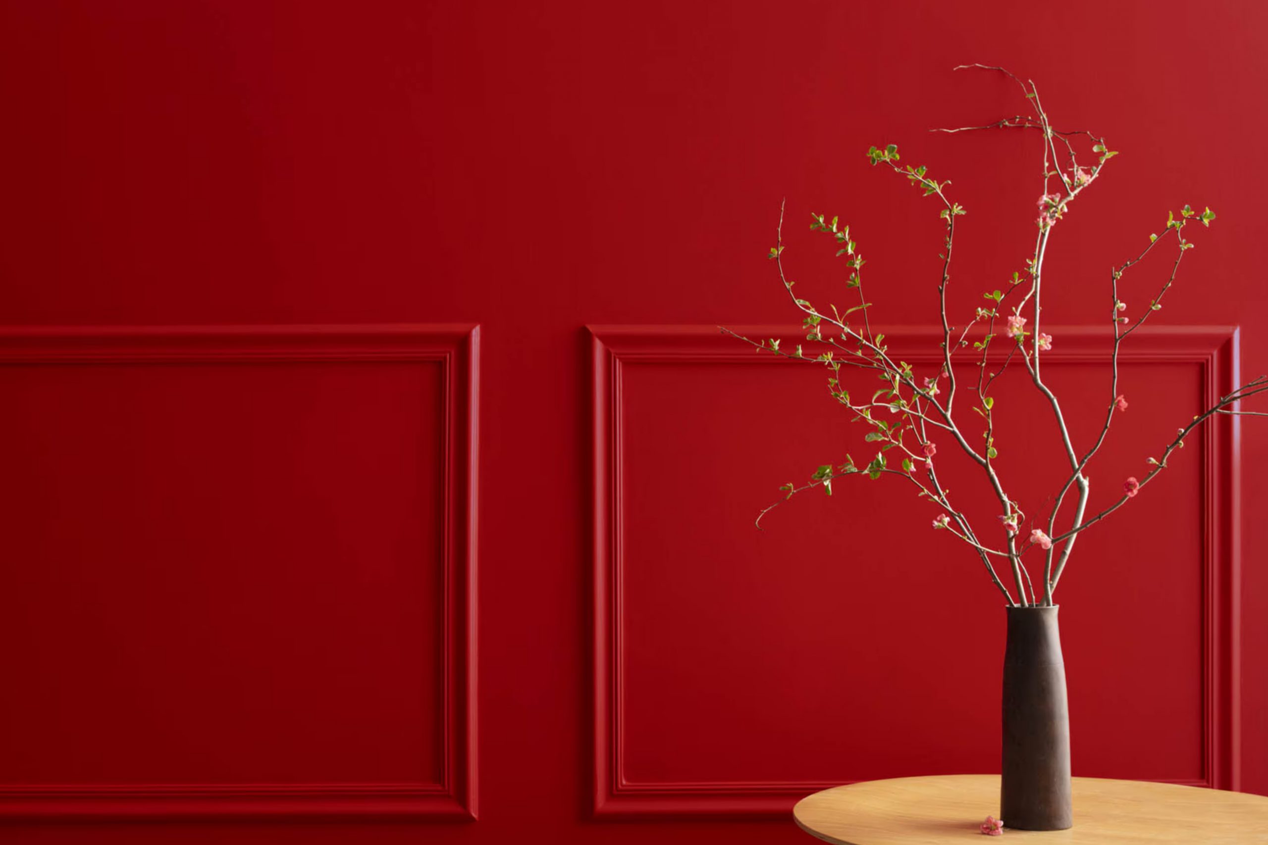
HC-181 Heritage Red by Benjamin Moore is a timeless and vibrant color that brings a touch of classic elegance to any space. This particular shade of red has a deep, rich hue that commands attention while still maintaining a warm, inviting feel. Perfect for those looking to add a splash of energy and personality to their home, HC-181 Heritage Red works well in a variety of settings, from the kitchen to the living room, or even as an accent color outdoors.
Choosing the right paint color can be tricky, but Heritage Red offers a unique blend of sophistication and boldness, making it a versatile option for many design styles. Whether you’re updating a single room or transforming your entire house, this shade by Benjamin Moore provides a stunning backdrop that can be paired with a wide range of decor elements.
In this article, we will explore the different ways HC-181 Heritage Red can be used to enhance your home’s appearance. From tips on selecting complementary colors to advice on the best finishes for different rooms, you’ll find everything you need to know to make the most of this beautiful color.
Get ready to add a touch of warmth and style to your space with HC-181 Heritage Red, a color that stands the test of time while still feeling fresh and modern.
What Color Is Heritage Red HC-181 by Benjamin Moore?
Heritage Red by Benjamin Moore is a rich and bold color that brings a classic and timeless feel to any space. This vibrant shade of red is deep and striking, making it a perfect choice for adding a statement to your home. It has a certain warmth and elegance that can transform a room into a cozy and inviting space.
This color works exceptionally well in traditional, colonial, or Victorian interiors, where its classic appeal can be fully appreciated. However, it’s also versatile enough to add a pop of color to modern or minimalist decor, creating a stunning focal point without overwhelming the space.
When it comes to pairing materials and textures with Heritage Red, natural wood tones work beautifully, offering a warm and grounded look. Think oak, walnut, or mahogany for furniture and flooring, which will complement the depth of the red without competing with it. Metals like brass or gold can add a touch of luxury and sophistication, while softer textures like velvet or silk in neutral shades can provide a smooth contrast that highlights the richness of the red.
In terms of accessories, incorporating cream-colored items or muted greens can balance the boldness of Heritage Red, ensuring the space feels comfortable and harmonious. This color is truly versatile and can create a dynamic interior that feels both refined and welcoming.
Is Heritage Red HC-181 by Benjamin Moore Warm or Cool color?
Heritage Red by Benjamin Moore (HC-181) is a standout paint option that brings a bold and warm feel to any room in your home. This color has a deep, rich tone that makes a statement without overwhelming the space. It’s perfect for creating a focal point, whether on a single accent wall or for more adventurous projects like painting kitchen cabinets or a front door. The beauty of this shade lies in its versatility; it works well in traditional spaces for a touch of elegance, as well as in modern settings for a pop of vibrant energy.
Adding Heritage Red to your home affects the ambiance significantly. It introduces warmth and depth, making rooms feel more inviting and cozy. Despite its strong presence, it pairs beautifully with a wide range of colors, from neutral shades like whites and grays for a crisp, contrasted look, to earthy tones and even bold hues for a more dynamic palette. This flexibility makes it a great choice for anyone looking to add personality and character to their living space.
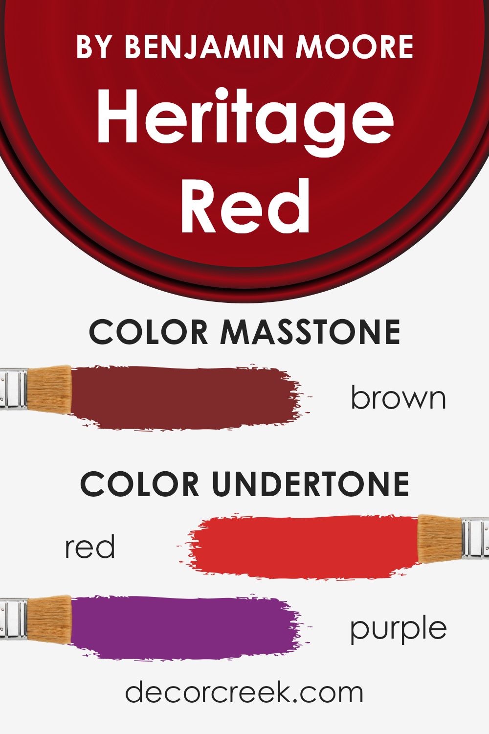
Undertones of Heritage Red HC-181 by Benjamin Moore
Benjamin Moore’s Heritage Red is a rich and dynamic color that can bring warmth and character to any space. But what makes this shade really stand out are its undertones. Undertones are subtle colors that lurk beneath the surface of the primary color, influencing how it looks in different lighting conditions and when paired with various furnishings and materials. Heritage Red has a wide array of undertones, including red, purple, dark grey, olive, pink, orange, navy, grey, dark green, pale pink, and dark turquoise.
Understanding these undertones is crucial when using this color, especially on interior walls. Each undertone can emerge slightly more, depending on the room’s lighting and surrounding colors. For instance, in a well-lit room with natural light, the red and orange undertones might make the space feel warmer and more inviting. In contrast, rooms with less natural light could highlight the cooler navy or dark grey undertones, creating a more sophisticated ambiance.
The diversity of Heritage Red’s undertones also means it’s incredibly versatile. It can complement a wide range of decor styles and preferences. The olive and dark green undertones could enhance a nature-inspired theme, while the pink and pale pink undertones add a soft, elegant touch.
Overall, the intricate blend of undertones in Heritage Red means it can create different moods and effects in a space, making it a fantastic choice for adding depth and interest to your interior walls.
Whether you want a cozy, warm feel or a more refined and elegant atmosphere, paying attention to these undertones can help you achieve your desired effect.
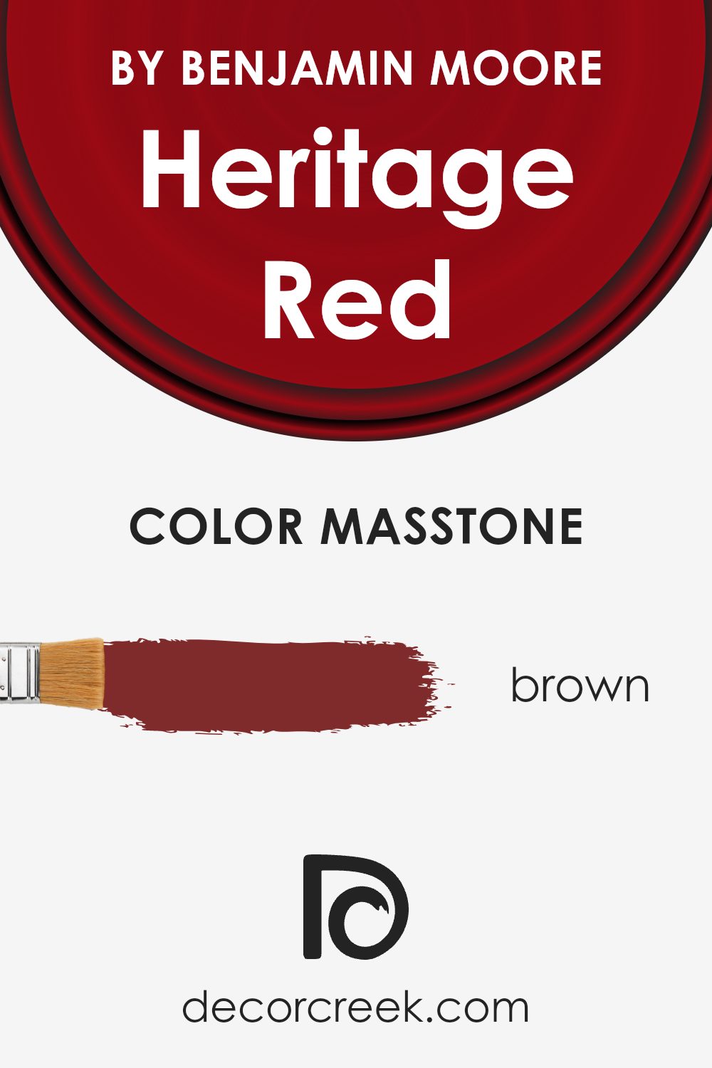
What is the Masstone of the Heritage Red HC-181 by Benjamin Moore?
Heritage Red HC-181 by Benjamin Moore is a unique color with a masstone of Brown (#802B2B). This rich hue blends warmth and depth, making it an excellent choice for adding character to any room in your home. Because its foundation is brown, it brings a cozy and inviting atmosphere that is perfect for living areas, dining rooms, or even exterior siding. Unlike brighter reds, its earthy base helps it complement many decors without overwhelming them. This makes it versatile, fitting well with both modern and traditional styles.
In homes, Heritage Red can create a stunning focal point. For instance, painting a single wall with this color can add a dramatic yet sophisticated flair. It also works beautifully on kitchen cabinets or as an accent in nooks, providing a pop of color that’s not too jarring.
When paired with neutral colors such as whites, creams, or soft grays, it offers a lovely contrast that enhances the overall warmth of the space. This color can also highlight architectural features, making them stand out in a subtle yet impactful way.
How Does Lighting Affect Heritage Red HC-181 by Benjamin Moore?
Lighting has a big impact on the way colors appear in our environment. This effect is essential to understand when you’re thinking about painting a room or choosing colors for your decor. Let’s take a color like Heritage Red by Benjamin Moore as an example to see how different lighting conditions can change the way it looks.
Firstly, artificial light can change the appearance of Heritage Red significantly. In a room with warm, yellow-toned artificial lighting, this color can appear more vibrant and warm, making the room feel cozy and welcoming. However, in cooler, white artificial light, Heritage Red might look a bit sharper and brighter, giving the room a more energetic feel.
Natural light, on the other hand, brings out the truest form of the color but still varies throughout the day and depending on the direction of the windows. In north-facing rooms, natural light tends to be cooler and more consistent throughout the day. Here, Heritage Red may appear somewhat muted and less intense, potentially giving off a more elegant and subdued look.
South-facing rooms get a lot of bright, warm sunlight all day, which can make Heritage Red look vivid and lively. The warm undertones of the color will be drawn out, making the room feel welcoming and cheerful.
East-facing rooms enjoy bright, warm light in the morning, with the color possibly looking very vibrant and dynamic at this time. As the day progresses and the natural light becomes less intense, Heritage Red may take on a softer and more muted appearance, maintaining a pleasant look throughout the day.
In west-facing rooms, the situation is reversed from east-facing rooms. The color might start softer in the morning and then become dramatically more vivid and warmer as the afternoon progresses into the evening due to the intense, warm light coming through.
In conclusion, lighting plays a crucial role in how Heritage Red by Benjamin Moore is perceived. Whether under artificial light or influenced by the direction of natural light, the color can shift in intensity and warmth, affecting the mood and feel of the space.

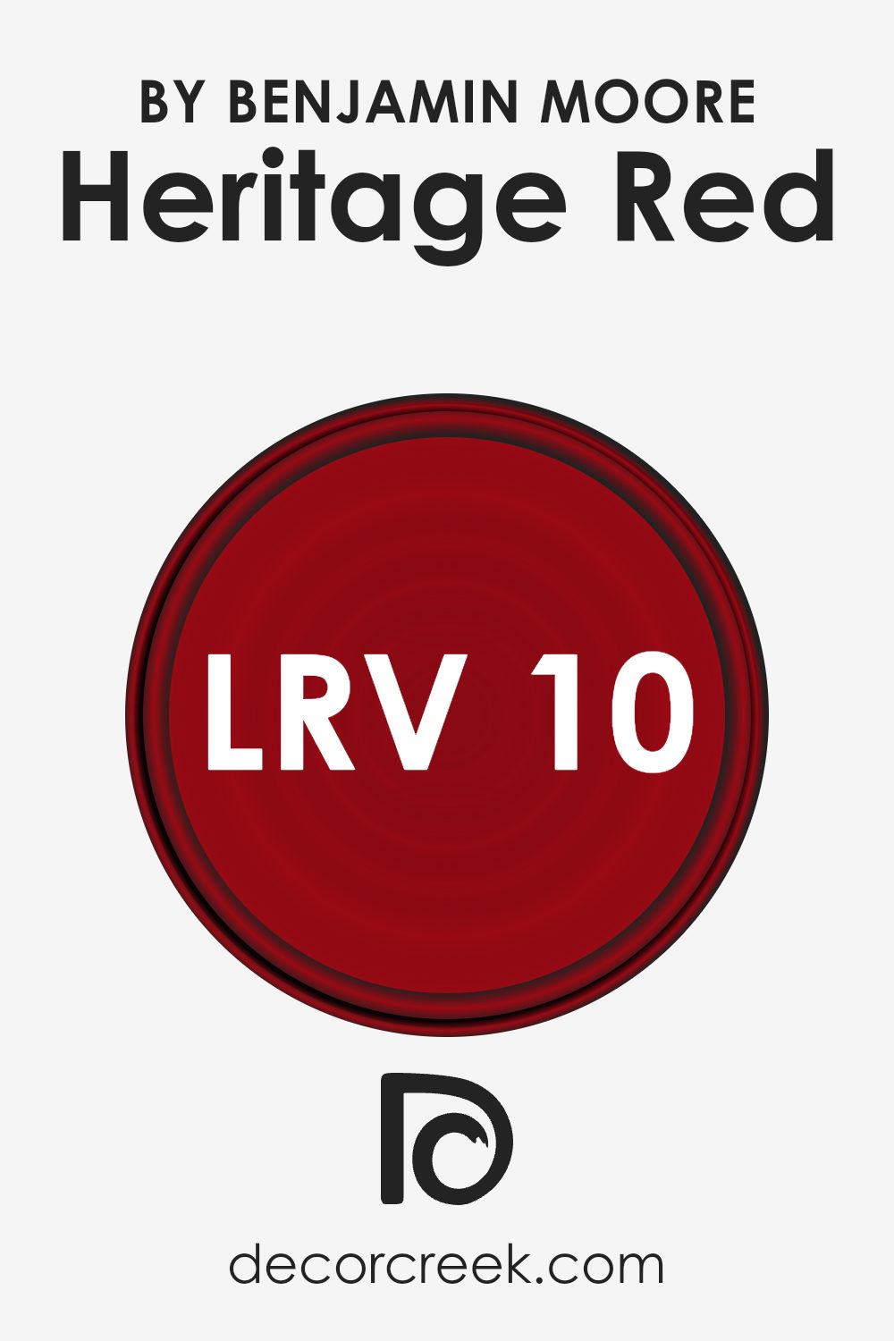
What is the LRV of Heritage Red HC-181 by Benjamin Moore?
The LRV of 10.26 for the specific color in question means it’s on the darker end of the spectrum, reflecting only a small portion of light. This indicates that it will absorb more light than it reflects, making it a bold choice that can add depth and drama to a space. In rooms with plenty of natural light, this color can appear more vibrant and dynamic, whereas in poorly lit rooms, it may seem even darker and more intense.
Integrating additional lighting or combining it with lighter colors can balance its dramatic effect, making it a versatile choice for various spaces.
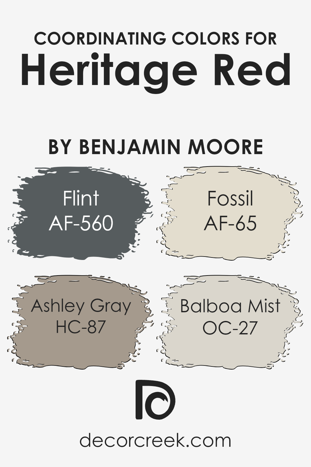
Coordinating Colors of Heritage Red HC-181 by Benjamin Moore
Coordinating colors work together to create harmony and balance in a space, enhancing the overall aesthetic appeal. They can either complement or contrast each other, depending on the desired effect. When paired correctly, coordinating colors can bring out the best features of a room, making it more inviting and visually interesting. For Heritage Red by Benjamin Moore, a versatile and rich color, there are specific coordinating colors that can enhance its depth and warmth without overwhelming the space.
AF-560 Flint is a deep, almost charcoal grey that provides a strong but understated backdrop to the vibrant Heritage Red. Its cool tones can bring a modern edge to the warmth of Heritage Red, creating a sophisticated and contemporary look. HC-87 Ashley Gray, on the other hand, leans towards a softer, warmer grey with hints of brown.
This color works well with Heritage Red by offering a gentle contrast that is pleasing to the eye, making spaces feel cozy and well-coordinated. AF-65 Fossil is a neutral beige with subtle undertones that complement the natural vibrancy of Heritage Red. This combination can make a room feel grounded and serene, ideal for creating a peaceful retreat. Lastly, OC-27 Balboa Mist offers a light, airy feel with its gentle grey tones.
When used alongside Heritage Red, it brings a refreshing balance, brightening the space without diminishing the impact of the bolder color. Together, these colors harmonize to create environments that are both welcoming and stylish.
You can see recommended paint colors below:
- AF-560 Flint
- HC-87 Ashley Gray
- AF-65 Fossil
- OC-27 Balboa Mist
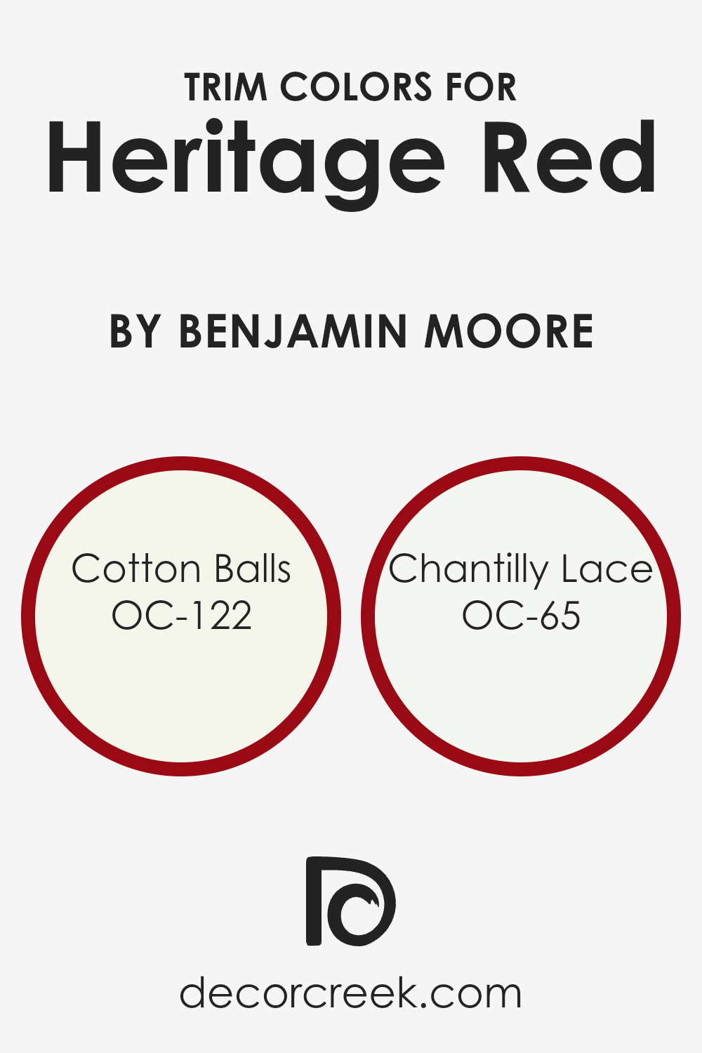
What are the Trim colors of Heritage Red HC-181 by Benjamin Moore?
Trim colors are the accent colors applied to the detailing of walls, like moldings, skirtings, door frames, and window frames, to enhance the overall look of a room or exterior. These colors can either contrast with or complement the main wall color to add depth, definition, and character to a space.
When applied thoughtfully, trim colors can highlight the architectural features of a home, helping to frame and emphasize the beauty of the primary wall color. For a rich and bold color such as Heritage Red by Benjamin Moore, choosing the right trim color is crucial in achieving a balanced and aesthetically pleasing look.
For a color like Heritage Red, OC-122 Cotton Balls and OC-65 Chantilly Lace are excellent trim choices. Cotton Balls presents a soft, warm white with a touch of creaminess that brings a subtle coziness to the vividness of Heritage Red, softening its impact without diminishing its presence. This gentle hue helps in creating a smooth transition between the boldness of the wall and the trim, ensuring the space feels inviting.
On the other hand, Chantilly Lace is a crisp, clean white that offers a sharper contrast to Heritage Red, giving a fresher and more pronounced delineation to the room’s architecture.
This cooler tone helps to refresh the visual palette, ensuring that the rich depth of Heritage Red stands out beautifully without overwhelming the senses. Together, these trim colors play a pivotal role in enhancing and refining the overall feel of a space painted in Heritage Red.
You can see recommended paint colors below:
- OC-122 Cotton Balls
- OC-65 Chantilly Lace
How to Use Heritage Red HC-181 by Benjamin Moore In Your Home?
Heritage Red HC-181 by Benjamin Moore is a bold and rich paint color that brings warmth and energy into any home. It’s a classic shade of red with a timeless appeal, making it perfect for adding a touch of elegance and vibrancy to your spaces. If you’re looking to create a focal point in a room, painting one wall with Heritage Red can instantly draw the eye and add depth to the space.
This color works exceptionally well in dining rooms or living areas, where its warm tones create a cozy and welcoming atmosphere.
You can also use it on your front door for a welcoming pop of color that stands out against a more neutral exterior. For those who might feel uncertain about committing to such a bold shade on larger surfaces, consider using it on furniture pieces or accent decorations to inject color into the room without overwhelming it. Heritage Red pairs beautifully with cream or beige tones, providing a balanced and sophisticated color scheme for any part of your home.
Conclusion
Heritage Red by Benjamin Moore is a standout color that truly brings a space to life. It’s a rich and vibrant shade that works wonders for anyone looking to add a bold statement to their home or project. Its unique tone can create a warm and inviting atmosphere, making it a great choice for areas where you want to draw attention or simply make a memorable impression. Whether used on a front door, as an accent wall, or throughout a room, this color manages to balance intensity and sophistication effortlessly.
Choosing Heritage Red shows a keen eye for design and a willingness to incorporate dynamic elements into your space. Its ability to transform any room with a touch of elegance and excitement makes it a popular choice among homeowners and professionals alike. The color’s versatility is also a key attribute, blending well with various styles and decors.
Ultimately, incorporating Heritage Red into your design scheme can rejuvenate and enrich your environment, proving it to be a timeless selection from Benjamin Moore’s palette.
Ever wished paint sampling was as easy as sticking a sticker? Guess what? Now it is! Discover Samplize's unique Peel & Stick samples.
Get paint samples

