Picture this: you’re scanning through endless paint swatches, searching for that perfect shade that just clicks. That was me, until I stumbled upon 2141-50 Horizon Gray by Benjamin Moore. It’s not just any gray; there’s something quietly profound about it. It reflects a sense of calmness and is flexible enough to fit into nearly any room, whether it’s a bustling kitchen or a peaceful bedroom.
This shade has a subtle complexity that pulls you in. It’s neither too dark nor too pale—it’s just right. Pairing it with different décor styles and colors might seem like a challenge, but surprisingly, it holds its own, providing a steady backdrop that complements both vibrant hues and muted tones.
For anyone tweaking their home ambiance or even giving a single room a quick update, Horizon Gray offers a fresh perspective. It holds the potential to change mundane rooms into elegant areas with minimal effort.
If you’re looking for a color that merges effortlessly with your life and décor, bringing balance and a modern touch, Horizon Gray might just be your match.
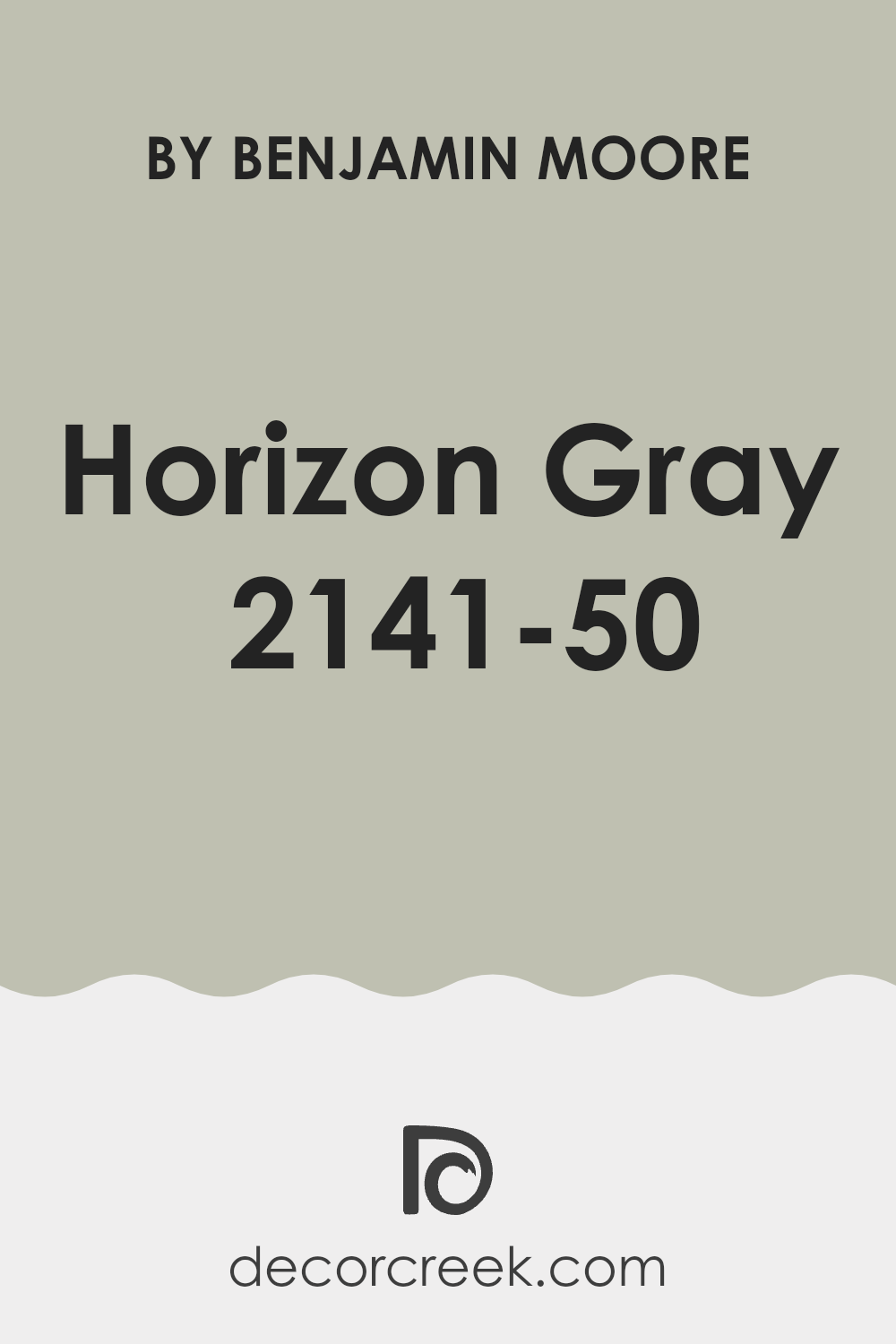
What Color Is Horizon Gray 2141-50 by Benjamin Moore?
Horizon Gray by Benjamin Moore is a unique mid-tone gray that has a soothing presence in any room. This flexible shade can subtly shift in appearance depending on the light, sometimes revealing subtle blue or green undertones. This makes it an excellent choice for creating a calm and inviting atmosphere in your room.
Ideal for many interior styles, Horizon Gray works exceptionally well in modern and minimalist designs due to its clean and straightforward appeal. It also fits seamlessly into a coastal or Scandinavian aesthetic, where its lightness can make rooms feel airy and bright.
When it comes to pairing materials and textures, Horizon Gray complements natural wood tones beautifully, from light birch to darker walnut, enhancing the organic feel of the room. It also goes well with metallic finishes like brushed nickel or chrome, adding a touch of understated glamour to a room.
Textiles like cotton and linen in neutral colors or soft pastels work well with this shade, creating a cozy, layered look. In rooms where you want a smoother texture, consider using satin or silk accents to add a slight sheen against the matte finish of the paint, providing a gentle contrast that’s pleasing to the eye.
Is Horizon Gray 2141-50 by Benjamin Moore Warm or Cool color?
Horizon Gray 2141-50 by Benjamin Moore is a flexible and subtle paint color that offers a fresh and modern look for any room in your home. This shade of gray has a warm undertone, making it cozy enough for living areas and even bedrooms.
It’s not too dark or too light, which means it’s great for spots where you need a neutral background that doesn’t overpower your décor or furniture. In well-lit rooms, Horizon Gray will appear more vibrant, while in rooms with less natural light, it maintains a calm and steady appearance without turning too murky or shadowy.
Whether you have a lot of natural light or need to rely on artificial lighting, this color adjusts well to different lighting situations. It works nicely in contrast with both bright tones and other neutrals, allowing you to mix and match your furnishings easily. Perfect for a modern aesthetic, it keeps rooms looking clean and well put-together.
Undertones of Horizon Gray 2141-50 by Benjamin Moore
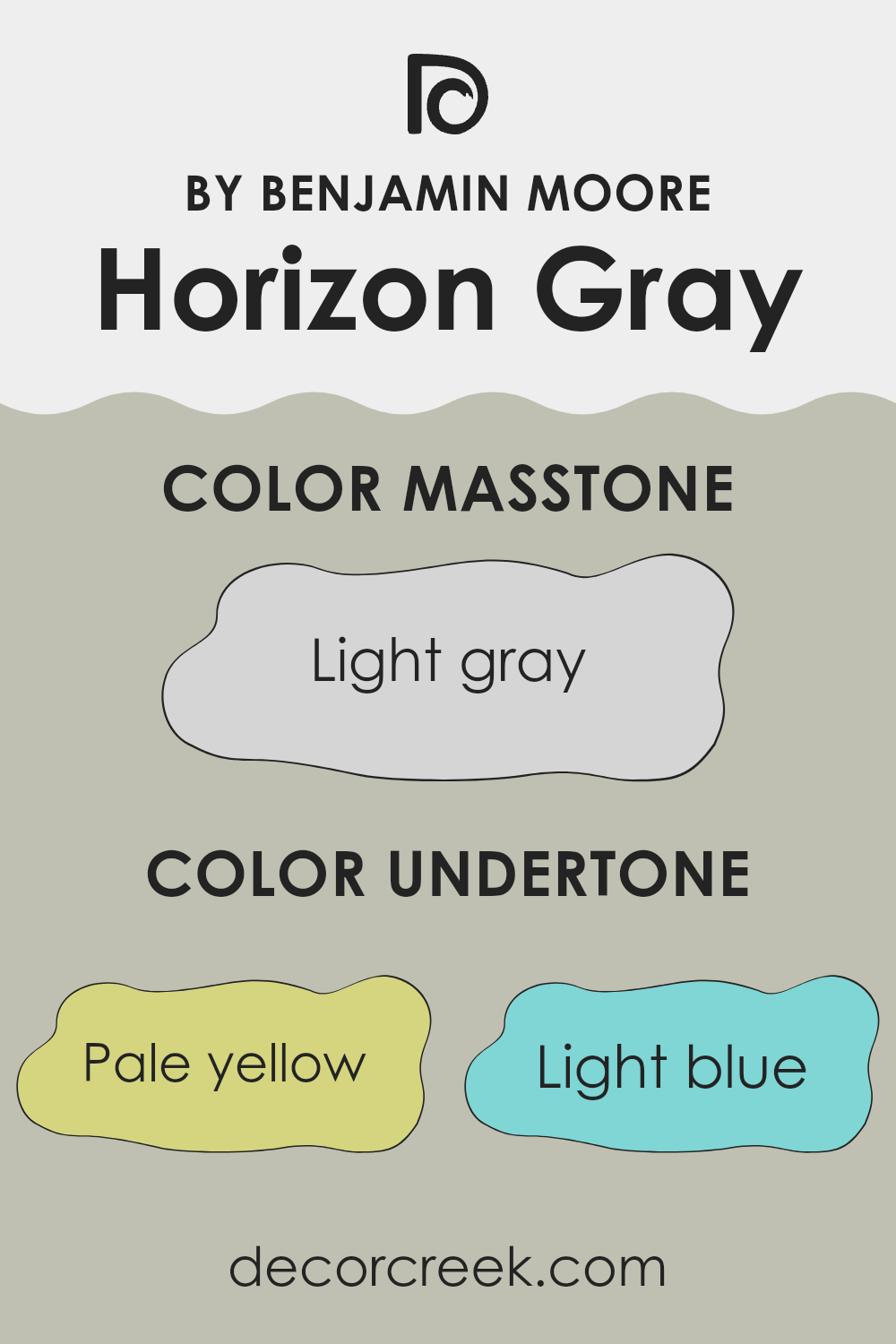
Horizon Gray by Benjamin Moore is a flexible paint color with a complex blend of undertones that can subtly influence the overall vibe of a room. This color has understated hints of pale yellow, light blue, light purple, mint, pale pink, lilac, and gray. Each of these undertones contributes to the way Horizon Gray appears under different lighting conditions.
Firstly, undertones are subtle colors that lie beneath the surface of the main color. They can enhance how we perceive the dominant shade, adding depth and complexity. For example, in bright sunlight, the pale yellow undertone in Horizon Gray might make the color appear warmer, while in dimmer light, the light blue and lilac undertones could give a cooler impression.
When applied to interior walls, Horizon Gray’s intriguing mix of undertones allows it room adaptability. The pale pink and lilac undertones can make a room feel softly inviting, perfect for bedrooms or cozy living areas. In contrast, the mint and light blue undertones might bring a fresh, airy feeling that’s ideal for bathrooms and kitchens.
Overall, Horizon Gray adjusts well to different rooms and styles, its shifting undertones playing with light to enhance the atmosphere. Whether creating a soothing backdrop or a nuanced focal point, this paint color gently shifts to match the mood and function of the room it inhabits.
What is the Masstone of the Horizon Gray 2141-50 by Benjamin Moore?
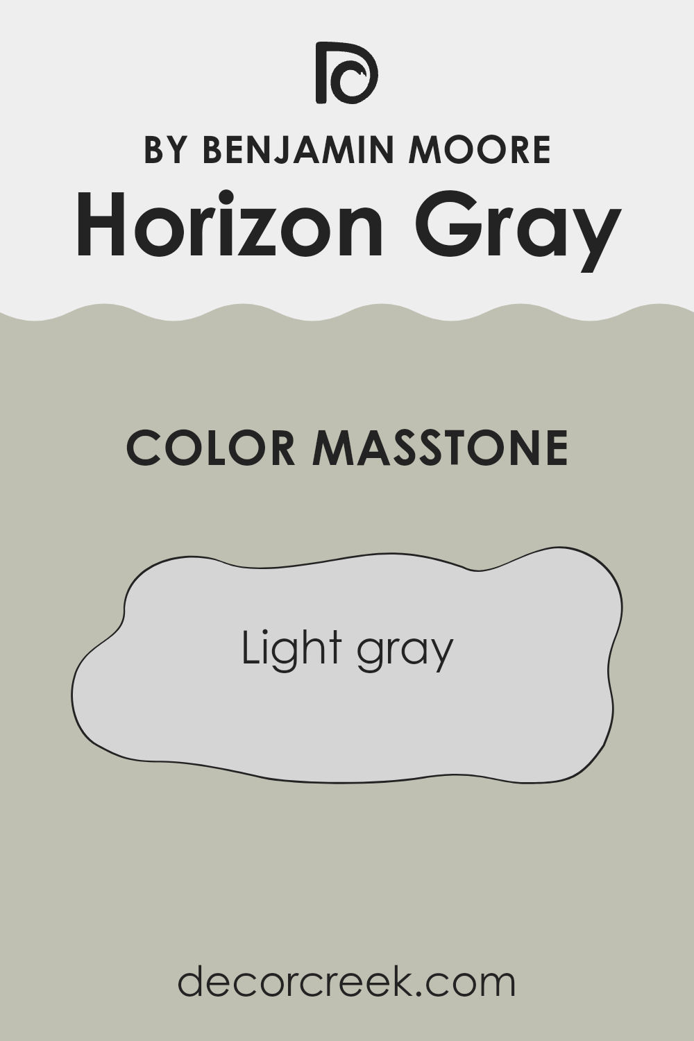
Horizon Gray 2141-50 by Benjamin Moore is a shade of light gray with a masstone, meaning the pure color before it’s lightened or darkened, of #D5D5D5. This specific hue is an excellent choice for various rooms in a house because its light gray tone is soft and neutral.
It pairs well with many other colors, from bright accents to deeper shades, making it adaptable for design purposes. In living rooms or bedrooms, it creates a calm and inviting atmosphere, while in kitchens and bathrooms, it offers a clean and fresh look.
This light gray doesn’t overpower rooms but instead provides a subtle background that allows furniture and décor to stand out. Its flexibility also means it can work well in rooms with a lot of natural light or in darker areas, as it helps to reflect light around the room, making the area feel larger and more open. Overall, it’s a practical and appealing choice for adding a gentle touch of color to your home.
How Does Lighting Affect Horizon Gray 2141-50 by Benjamin Moore?
Lighting plays a crucial role in how we perceive colors. The way a paint color looks in your room can change significantly based on the type of light it’s exposed to, whether it’s natural sunlight or artificial lighting from lamps and fixtures.
Take Horizon Gray 2141-50 by Benjamin Moore, for example. This flexible shade can look quite different depending on the light. In artificial light, such as that from LED or incandescent bulbs, Horizon Gray tends to appear warmer and more inviting, with its softer gray tones becoming slightly more pronounced. This can make a room feel cozy and welcoming during the evening or in rooms without much natural light.
In natural light, the color can shift dramatically. Natural light varies depending on the time of day and the direction a room faces:
- North-facing rooms: These get less direct sunlight, which can make Horizon Gray appear cooler and more shadowed, increasing its depth and making it look more profound and substantial.
- South-facing rooms: These benefit from plentiful natural light for most of the day, which can make Horizon Gray look lighter and more airy. The warm sunlight can draw out the subtle hints of blue in the gray, adding a fresh feel to the room.
- East-facing rooms: Here, the morning light can make Horizon Gray look soft and gently vibrant, perfect for starting the day. As the light changes, so will the perception of the shade, possibly becoming cooler by the afternoon.
- West-facing rooms: In these rooms, the color will experience the soft morning tones turning into a much warmer glow by evening, as the setting sun casts a golden light, making the walls feel warmer.
Thus, Horizon Gray is an adaptable color choice that reacts dynamically to different lighting conditions, making it suitable for various rooms and settings. When deciding on this shade, consider the room’s orientation and the type of light it receives to fully take advantage of its potential.
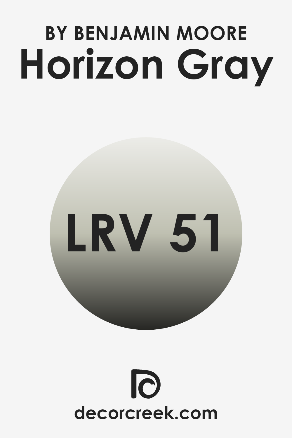
What is the LRV of Horizon Gray 2141-50 by Benjamin Moore?
LRV stands for Light Reflectance Value, which is a measure indicating how much light a paint color reflects or absorbs when it’s applied to a surface. This scale goes from 0, being absolute black that absorbs all light, to the highest number on the scale, representing pure white which reflects all light back.
This value is crucial when choosing paint colors because it helps determine how bright or dark a room will feel. A higher LRV can make a small room feel larger and more open, as it reflects more light around the room, while a lower LRV can make a room feel cozier and more enclosed because it absorbs more light.
In the case of Horizon Gray with an LRV of 50.68, this color is balanced in terms of light reflection. It neither reflects most of the light nor absorbs too much, placing it in the middle range. This makes it adaptable for use in different rooms regardless of the size.
In a well-lit room, this color will appear lighter and more airy, while in a poorly lit room, it will present a slightly denser presence, adding depth and character to the room. It’s an ideal choice for those who want a shade that maintains a steady appearance under different lighting conditions.
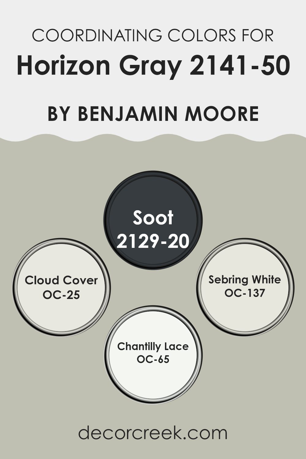
Coordinating Colors of Horizon Gray 2141-50 by Benjamin Moore
Coordinating colors are shades that complement each other well when used together in décor schemes, enhancing the aesthetics of the environment they are applied in. These colors, chosen carefully, create a harmonious look that allows features of a room or elements of a design to stand out without clashing.
When paired with Horizon Gray by Benjamin Moore, which is a muted, flexible gray, the chosen coordinating colors amplify this effect, each bringing their own unique character to the blend while maintaining an overall balance.
For instance, Soot 2129-20 is a deep, dark charcoal color, offering a bold contrast that can make lighter tones pop while adding a grounding effect. Cloud Cover OC-25, in contrast, is a light, airy off-white that provides a soft and gentle backdrop, ideal for creating a relaxed setting. Sebring White OC-137 presents itself as a clean and bright white with a very subtle hint of warmth, perfect for brightening up rooms without feeling sterile.
Finally, Chantilly Lace OC-65 stands out as a crisp, pure white, providing a sharp, fresh clarity to rooms that pairs excellently with more subdued or richer tones, ensuring that the room feels cohesive yet vibrant. Together, these shades complement Horizon Gray by offering varying depths and balances, allowing for flexible design strategies.
You can see recommended paint colors below:
- 2129-20 Soot
- OC-25 Cloud Cover
- OC-137 Sebring White
- OC-65 Chantilly Lace
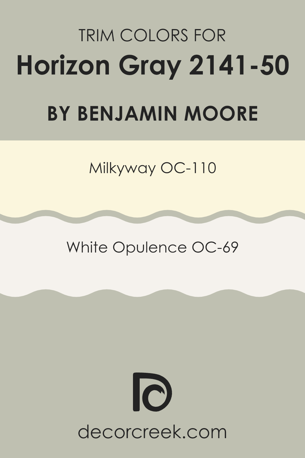
What are the Trim colors of Horizon Gray 2141-50 by Benjamin Moore?
Trim colors are specific shades used to highlight or frame the features of a room, like door frames, moldings, windows, and skirting boards. When paired with a neutral wall color, such as Horizon Gray by Benjamin Moore, trim colors help to define and subtly enhance the architectural details of a room without overpowering it. Choosing the right trim color can truly shape the overall aesthetic and feel of a room, giving it a clean and finished look.
One popular choice for trim color is OC-110 – Milkyway, which is a gentle off-white that offers a soft contrast against more pronounced wall colors like Horizon Gray, gently complementing the gray without stealing the spotlight.
Another great option is OC-69 – White Opulence, a brighter, crisper white that provides a more noticeable frame around Gray walls, making the room feel fresh and neatly put together. Both these shades support the main color and help in creating a harmonious color scheme in any living room.
You can see recommended paint colors below:
- OC-110 Milkyway
- OC-69 White Opulence
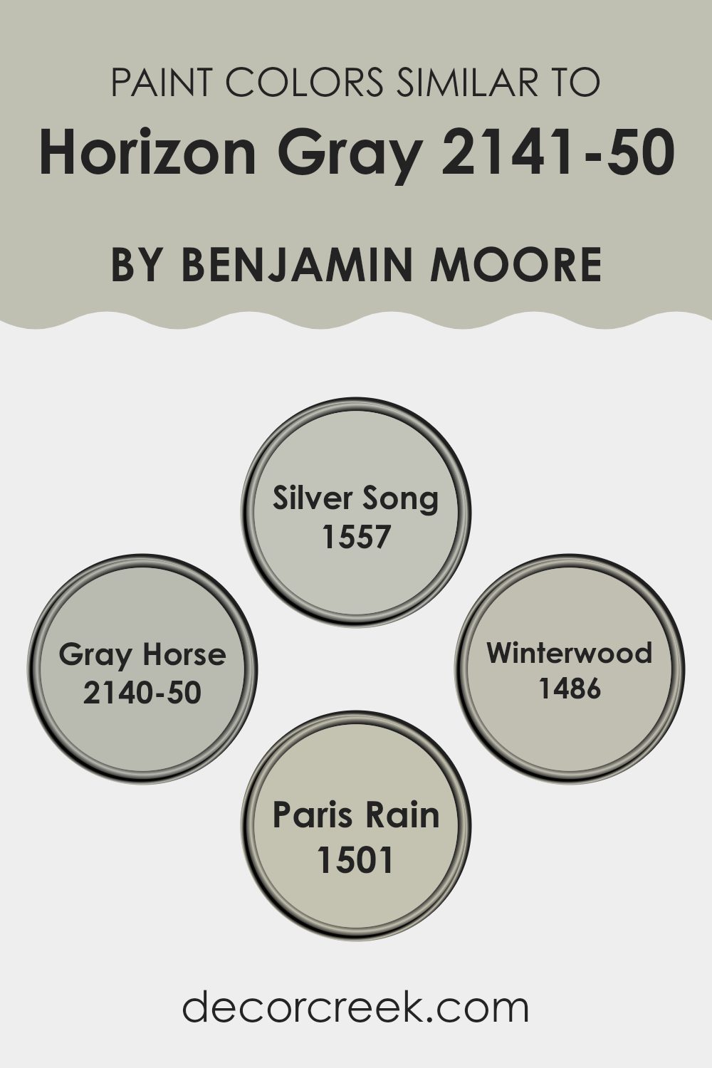
Colors Similar to Horizon Gray 2141-50 by Benjamin Moore
Choosing colors that are similar to Horizon Gray by Benjamin Moore is crucial because it creates a subtle yet effective aesthetic uniformity. These shades share a common foundation but differ slightly in undertones or brightness, allowing for a harmonious look in any room.
This approach accentuates design elements seamlessly without causing stark contrasts that might clash with each other or overpower the visual room. Additionally, using colors like Silver Song, Gray Horse, Winterwood, and Paris Rain can give a room a consistent feel while allowing for varied depth and interest across different surfaces and décor elements.
Silver Song is a light gray that can brighten rooms while maintaining a cool and calm appearance, perfect for creating a relaxing environment. Gray Horse, with a hint more depth, offers a robust backdrop that complements more vibrant accents or furniture. Winterwood steps back into a more muted tone, ideal for those looking to blend backgrounds seamlessly with soft furnishings and natural materials.
Paris Rain adds a touch of liveliness with its slightly more pronounced hue, making it suitable for areas where a splash of personality is welcomed without overpowering the senses. Together, these shades provide a flexible palette that complements Horizon Gray, ensuring design coherence and aesthetic fluidity in interior rooms.
You can see recommended paint colors below:
- 1557 Silver Song
- 2140-50 Gray Horse
- 1486 Winterwood
- 1501 Paris Rain
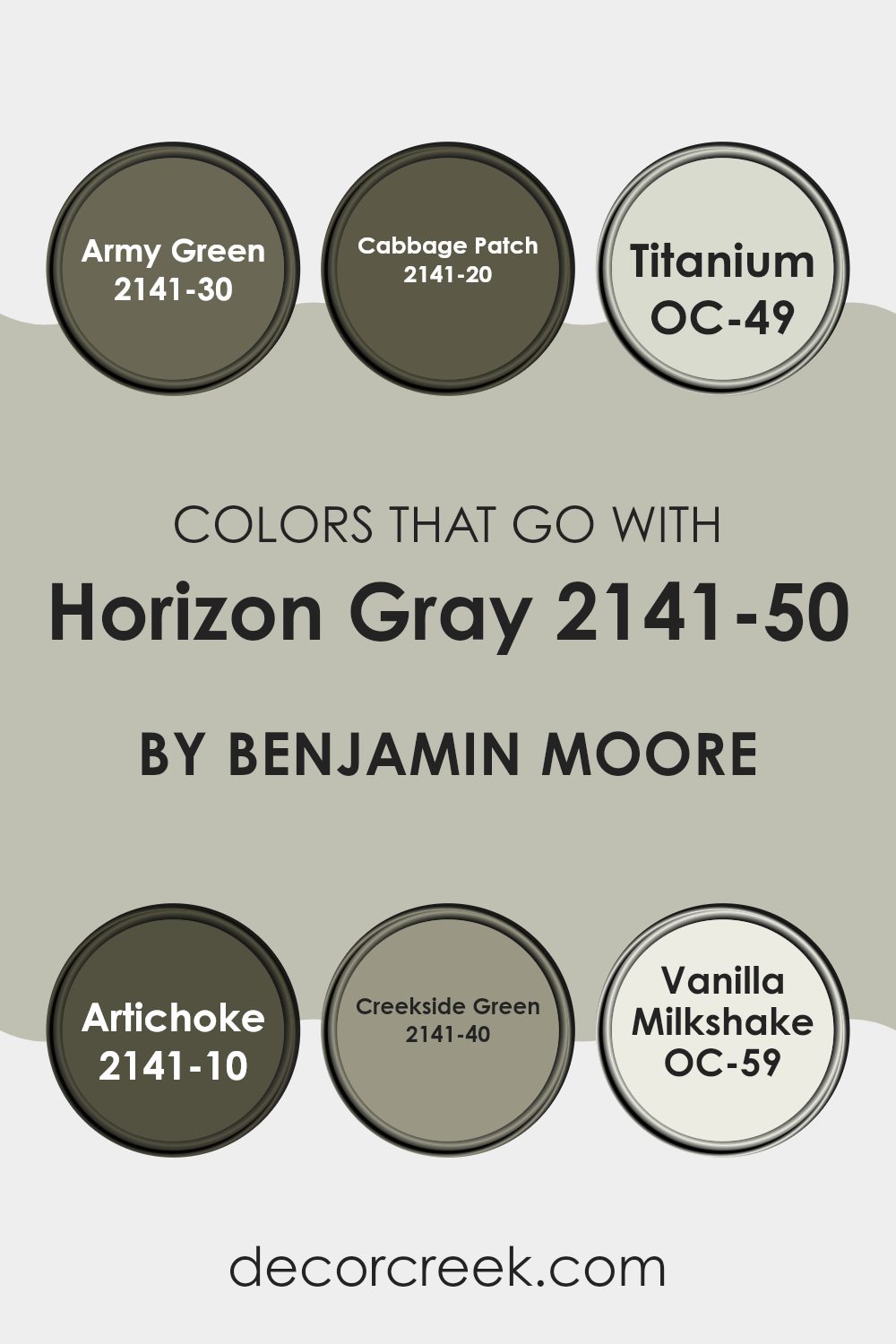
Colors that Go With Horizon Gray 2141-50 by Benjamin Moore
When decorating a room, choosing the right colors to complement a base color like Horizon Gray 2141-50 by Benjamin Moore is crucial in achieving a cohesive and visually appealing design. Horizon Gray is a flexible neutral that serves as a soft, calm backdrop, making it easier to incorporate more dynamic colors without overpowering the room.
For instance, pairing Horizon Gray with Army Green 2141-30 introduces a robust, earthy feel to a room, adding depth without dominating the gray’s subtle charm. Cabbage Patch 2141-20 is a bit lighter than Army Green, offering a gentle touch of green that refreshes the atmosphere without clashing with the soft gray tones.
If a lighter touch is needed, Titanium OC-49 works well by providing a clean, barely-there contrast that brightens the room subtly. For a bolder statement, Artichoke 2141-10 lends a dense, hearty color that gives a rich vitality and warm contrast against the cooler gray. When aiming for balance with a bit of color, Creekside Green 2141-40 introduces a lively, yet not overpowering, option that harmonizes beautifully with Horizon Gray.
Lastly, Vanilla Milkshake OC-59 serves as an ideal accent shade, offering a creamy, almost white hue that refreshes and contrasts gently with gray’s cool undertone, ensuring that the room feels light and open. Each of these colors supports Horizon Gray in creating a harmonious and welcoming room, reflecting different moods and styles while maintaining an element of consistency.
You can see recommended paint colors below:
- 2141-30 Army Green
- 2141-20 Cabbage Patch
- OC-49 Titanium
- 2141-10 Artichoke
- 2141-40 Creekside Green
- OC-59 Vanilla Milkshake
How to Use Horizon Gray 2141-50 by Benjamin Moore In Your Home?
Horizon Gray 2141-50 by Benjamin Moore is a flexible neutral color with a hint of warmth making it perfect for any room in your home. This shade fits well in living rooms, offering a cozy and welcoming feel. It pairs beautifully with crisp white trims, enhancing its subtle gray tones and creating a clean, fresh look.
In the kitchen, Horizon Gray can help create a relaxed vibe, ideal for a room where you spend a lot of time. It works well on cabinets or walls and complements stainless steel appliances or wooden countertops seamlessly. If you’re thinking about refreshing your bedroom, this color provides a calm backdrop, ideal for a restful room.
It can also be used in bathrooms to create a light and airy atmosphere. Moreover, Horizon Gray is an excellent choice for exterior use, giving your home a modern touch while maintaining a classic appeal. Whether for a big project or a small update, Horizon Gray offers a stylish yet unobtrusive backdrop to your décor.
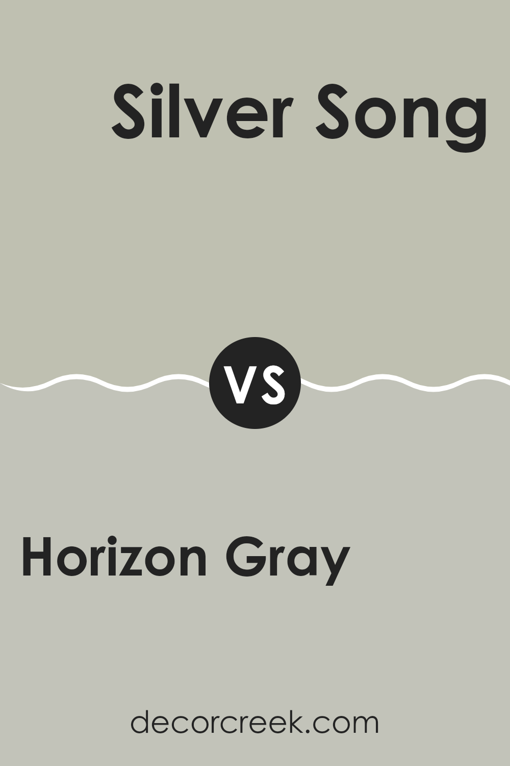
Horizon Gray 2141-50 by Benjamin Moore vs Silver Song 1557 by Benjamin Moore
The main color, Horizon Gray by Benjamin Moore, has a gentle mix of gray and blue, presenting a subtle, cool vibe that feels fresh and modern. It’s flexible and works well in different lighting, adjusting softly to the ambiance of the room.
On the other hand, Silver Song by Benjamin Moore is a lighter gray that leans towards a soft, silvery tone. This shade reflects more light, making rooms appear brighter and more open. It has a hint of a cool undertone, which gives it a clean, airy feel.
While both shades share a gray base, Horizon Gray offers a depth that borders on the celestial and airy blue, whereas Silver Song steers more towards a luminous, metallic whisper. Each shade would suit different moods and rooms, with Horizon providing a more grounded feel and Silver Song helping to lighten and lift a room.
You can see recommended paint color below:
- 1557 Silver Song
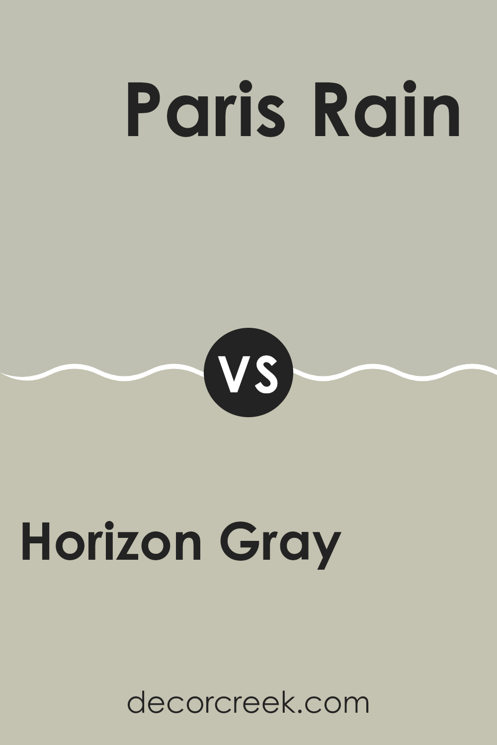
Horizon Gray 2141-50 by Benjamin Moore vs Paris Rain 1501 by Benjamin Moore
Horizon Gray by Benjamin Moore is a lovely mid-tone gray that has a calm, soothing presence. It offers a subtle warmth making it flexible and pleasing, fitting well in almost any room that aims for a cozy yet modern feel. Its balanced shade can act as a neutral backdrop, allowing other colors or décor elements to stand out.
Paris Rain by Benjamin Moore is another gentle shade, but it leans more towards a greenish-gray hue, giving it a unique twist compared to the more straightforward gray of Horizon Gray. Paris Rain brings its own charm, especially in rooms that benefit from a touch of nature-inspired tones. This shade can help soften a room while maintaining a fresh, contemporary look.
While both shades share a gray base, Horizon Gray sticks to a neutral, warm gray palette, whereas Paris Rain introduces a hint of green, offering a mild but distinctively different vibe. This makes each color suitable for different aesthetic preferences and room functions.
You can see recommended paint color below:
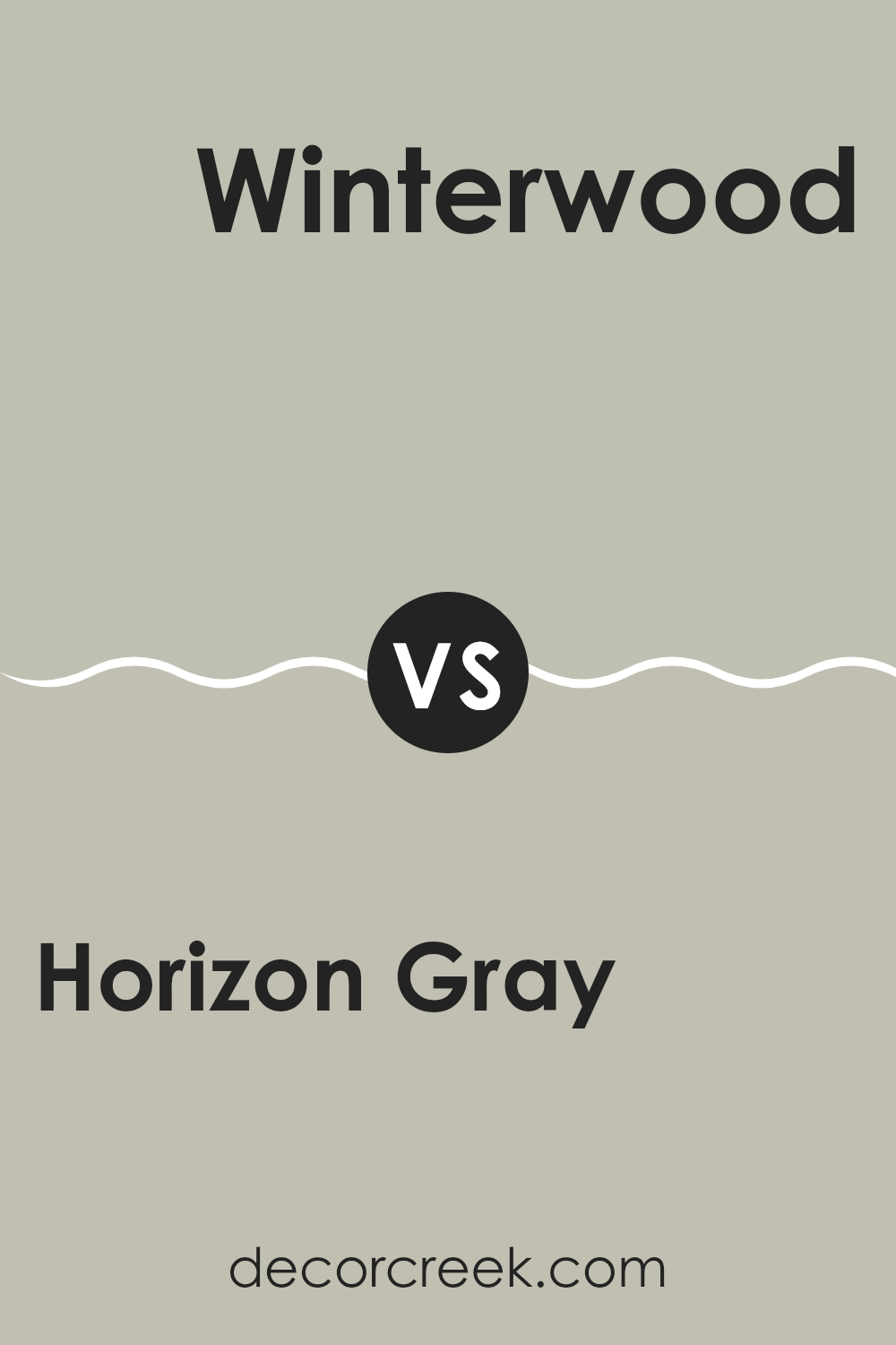
Horizon Gray 2141-50 by Benjamin Moore vs Winterwood 1486 by Benjamin Moore
Horizon Gray by Benjamin Moore is a subtle, soft gray with a touch of warmth, making it quite flexible for any room. Its warm undertones mean it can create a cozy atmosphere while still maintaining a fresh, modern look. This shade is great because it pairs well with a variety of décor styles and colors.
On the other hand, Winterwood by Benjamin Moore is another neutral option, but it leans more towards a greenish-gray tone. This gives it a unique touch compared to the more straightforward gray of Horizon Gray. Winterwood is ideal for those wanting to add a bit of earthy, natural vibes to their room without straying too far from neutral tones.
It works especially well in areas that get a lot of natural light, as the light brings out the subtle green undertones. Both shades offer calmness and a clean backdrop, but Horizon Gray is potentially more adaptable, while Winterwood offers a hint of color for a slightly different feel.
You can see recommended paint color below:
- 1486 Winterwood
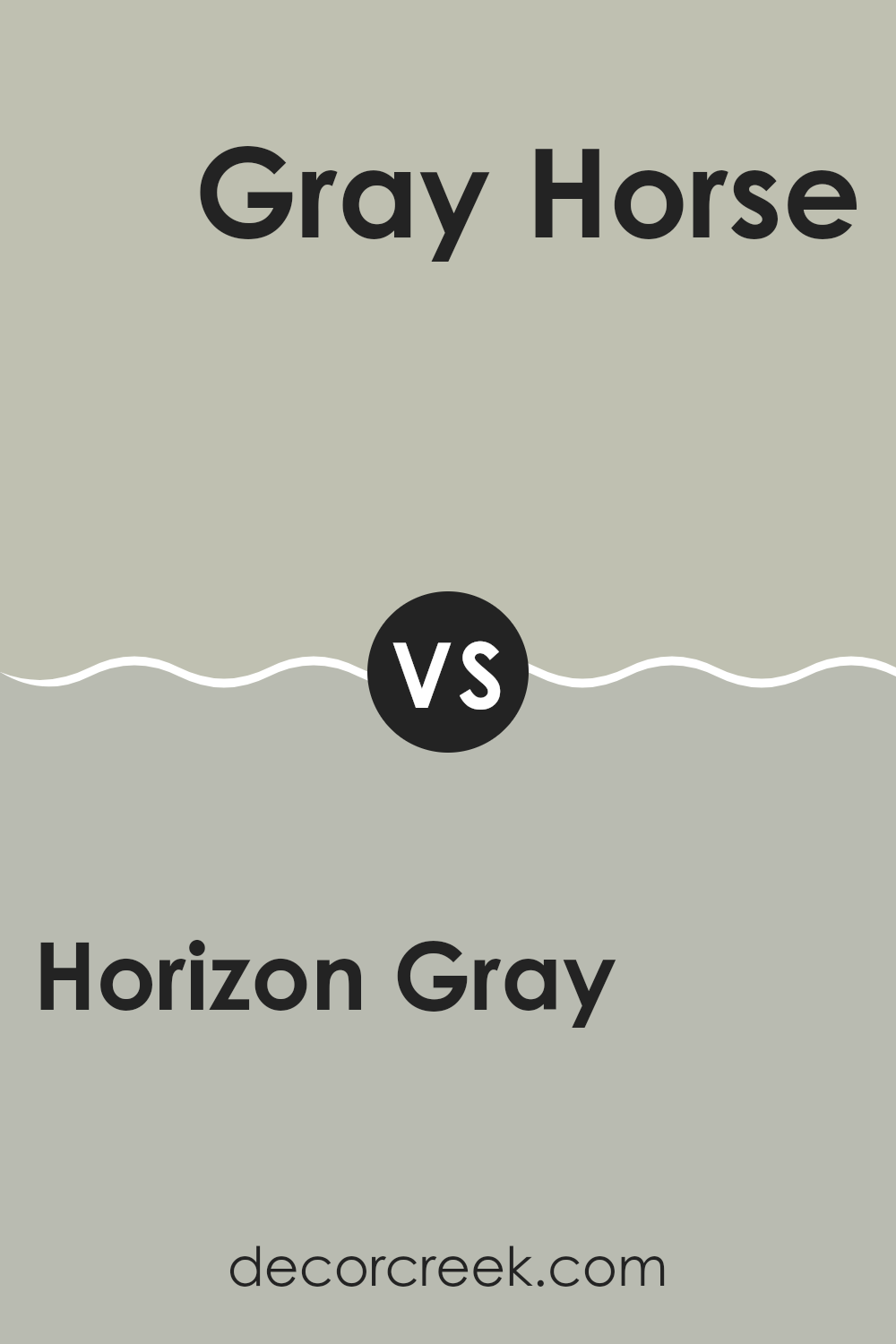
Horizon Gray 2141-50 by Benjamin Moore vs Gray Horse 2140-50 by Benjamin Moore
Horizon Gray and Gray Horse, both by Benjamin Moore, are two unique shades of gray that seem similar but have distinct tones and feelings. Horizon Gray has a subtle warmth to it, making it a cozy choice for rooms where you want a soft, welcoming feel. It’s lighter and has a hint of green, which helps brighten up rooms without feeling too cold.
On the other hand, Gray Horse is a bit deeper and leans toward a cooler tone. Although it’s still in the gray family, it carries a slight blue undertone that gives it a fresher look. This shade is perfect for modern rooms or for creating a more striking appearance while maintaining a calm vibe.
When choosing between the two, consider the mood you’re trying to achieve and the natural light in your room. Horizon Gray works well in smaller, warmer lit areas, whereas Gray Horse might be better for larger, brightly lit rooms.
You can see recommended paint color below:
- 2140-50 Gray Horse
In conclusion, 2141-50 Horizon Gray by Benjamin Moore is a truly special color that has the power to make any room look and feel fantastic. This shade of gray is soft and gentle, making it a peaceful background for any room in your home.
Whether you want to paint your bedroom, living room, or even your kitchen, Horizon Gray works beautifully everywhere because it’s so calm and pleasing to look at. Plus, it’s a shade that pairs well with many other colors, which means it’s easy to find furniture and decorations that look great with it.
I found out that it can make small rooms look bigger and give any place a clean and neat look. So, if you’re thinking about giving your room a new look, Horizon Gray could be the perfect choice. It’s not just another gray; it’s a unique shade that brings a calming feel wherever it’s used.
Ever wished paint sampling was as easy as sticking a sticker? Guess what? Now it is! Discover Samplize's unique Peel & Stick samples.
Get paint samples

