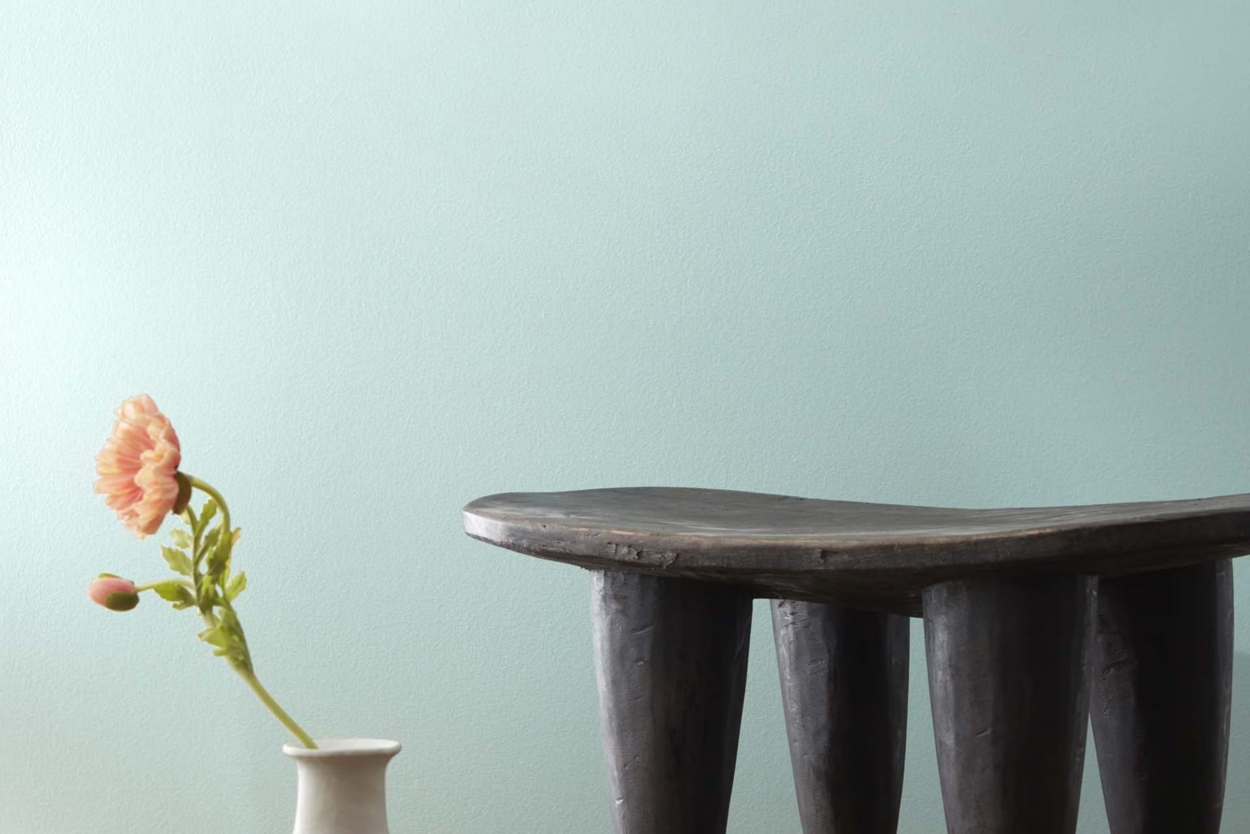
I recently painted a room with Benjamin Moore’s 673 Iced Green and was impressed by its subtle, soothing quality. It’s a color that doesn’t shout for attention yet quietly enlivens the area. Let me share a bit about why I chose this shade and how it changed the feel of my room.
At first glance, 673 Iced Green appears as a gentle whisper of color, a pale, muted green that looks almost neutral. In different lights, it presents varying undertones, from a soft mint to a hint of blue. This adaptable nature is what drew me in. I wanted a color that could keep the room feeling fresh and airy without the cool detachment that some greens have.
During the painting process, I noticed how smoothly the paint went onto the walls and how it offered excellent coverage. It dried to an even, durable finish, and any fears of it being too bold or out of place quickly vanished. Now finished, the room feels like a calm haven, just as I hoped, with a look that’s modern yet enduring.
In my experience, 673 Iced Green has brought a new energy to my home. It’s perfect for anyone looking to freshen up an area without it feeling excessive with color.
What Color Is Iced Green 673 by Benjamin Moore?
Iced Green 673 by Benjamin Moore is a fresh and gentle green hue with a hint of blue. This light, soft color has an airy quality that makes areas feel open and relaxed. It’s cool but inviting, making it an adaptable choice for many different areas of the home.
This particular shade is well-suited for areas that aim for a calm, refreshing atmosphere. It’s great for bathrooms and bedrooms, where a soothing color can enhance the sense of relaxation. In living rooms, Iced Green works to create a friendly, welcoming vibe.
When it comes to interior styles, Iced Green fits beautifully with minimalistic and Scandinavian designs due to its simplicity and clean tone. It also looks fantastic in coastal themed interiors because it mirrors the light, breezy feel of the seaside.
For materials and textures, Iced Green pairs well with natural wood, which complements its earthy undertones. It also works beautifully with white and other neutrals, creating a balanced and light area. Textiles in lighter textures, such as linen or soft cotton, enhance the gentle feel of the color, making areas feel comfortable and relaxed. Overall, Iced Green is a flexible color choice that can refresh any interior with a touch of nature-inspired freshness.
Is Iced Green 673 by Benjamin Moore Warm or Cool color?
Iced Green 673 by Benjamin Moore is a light, fresh green that’s perfect for adding a gentle touch of color to any room without excessive impact. This shade works well in homes because it is soft and understated, making it adaptable for many different styles and areas.
It’s a great choice for rooms where you want to create a relaxing environment, like bedrooms and bathrooms, because its subtle hue promotes a calm atmosphere. The color pairs beautifully with both light and dark furniture, making it easy to integrate into existing decor.
It also works well with natural elements, like wooden floors or plant decorations, enhancing the fresh feel of the room. Iced Green is also light-reflective, meaning it can help to make small areas appear brighter and more open. Overall, it’s a practical choice that adds a gentle personality to the home without demanding too much attention.
Undertones of Iced Green 673 by Benjamin Moore
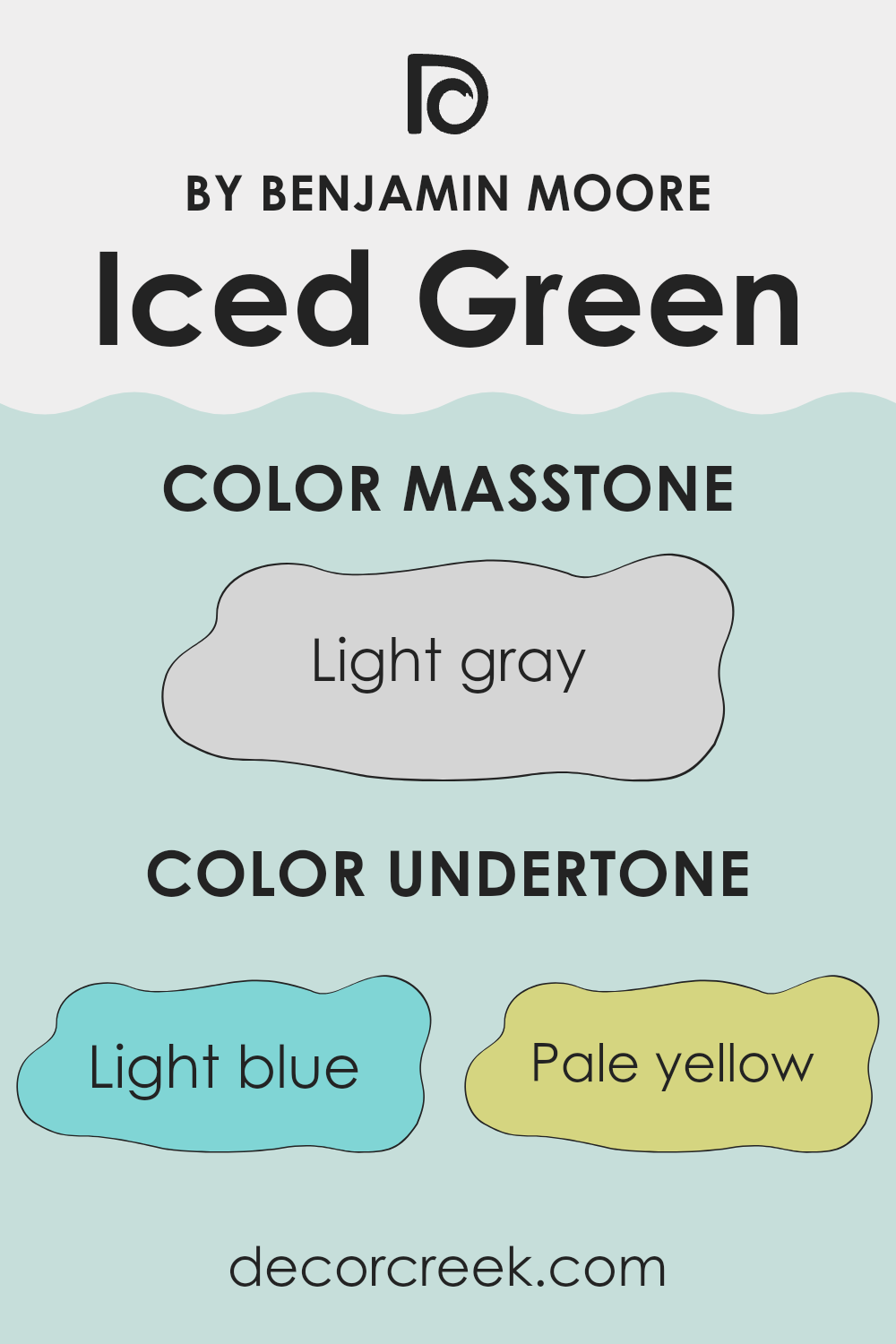
Iced Green 673 by Benjamin Moore is a unique shade that incorporates a blend of subtle undertones which greatly influence its appearance and the ambiance it creates in an area. These undertones include light blue, pale yellow, light purple, mint, lilac, pale pink, and grey.
Understanding undertones is crucial because they can alter the perceived color depending on the lighting and surrounding elements. For example, light blue and mint bring a cool freshness to the green, making it feel more vibrant and lively.
Pale yellow and pale pink add a soft warmth, subtly brightening a room without overpowering it with color. Light purple and lilac introduce a gentle, almost whimsical quality to the shade, while grey gives the green a muted, more neutral feel that is easier to match with a variety of decor styles.
When applied to interior walls, Iced Green’s undertones combine to create an adaptable backdrop. In rooms with ample natural light, the blue and mint undertones might become more pronounced, enhancing the feeling of airiness and openness. Conversely, in areas with less light, the grey and purple hues might dominate, providing a cozy, soothing atmosphere.
This adaptability makes Iced Green an excellent choice for many different areas, from kitchens and bathrooms to bedrooms and living zones. Its ability to harmonize with various decor elements and adapt to different lighting conditions helps in achieving a balanced and pleasing aesthetic.
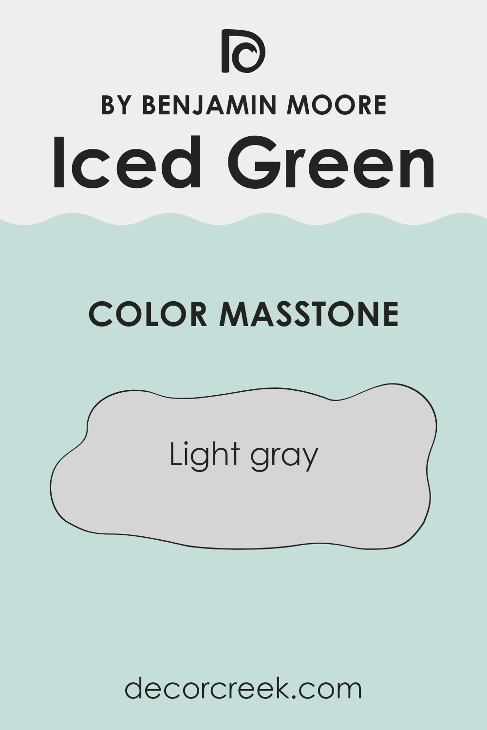
What is the Masstone of the Iced Green 673 by Benjamin Moore?
Iced Green 673 is a paint color by Benjamin Moore with a masstone—or main appearance—of light gray. When used in homes, this color offers a soft, gentle look because of its light gray shade. This feature makes it an excellent choice for anyone who wants to create a peaceful and clean atmosphere in their home.
The lightness of the gray in Iced Green 673 brings a bright and airy feel to any room, which can make small areas appear larger and more open. It’s also adaptable, matching well with various decor styles and furniture colors, from traditional wooden pieces to modern metal accents.
Due to its neutral base, it doesn’t become excessive in an area but rather complements other colors in furniture and decorations. Thus, this paint is ideal for designing a comfortable and welcoming home environment, which is stylish without being over the top.
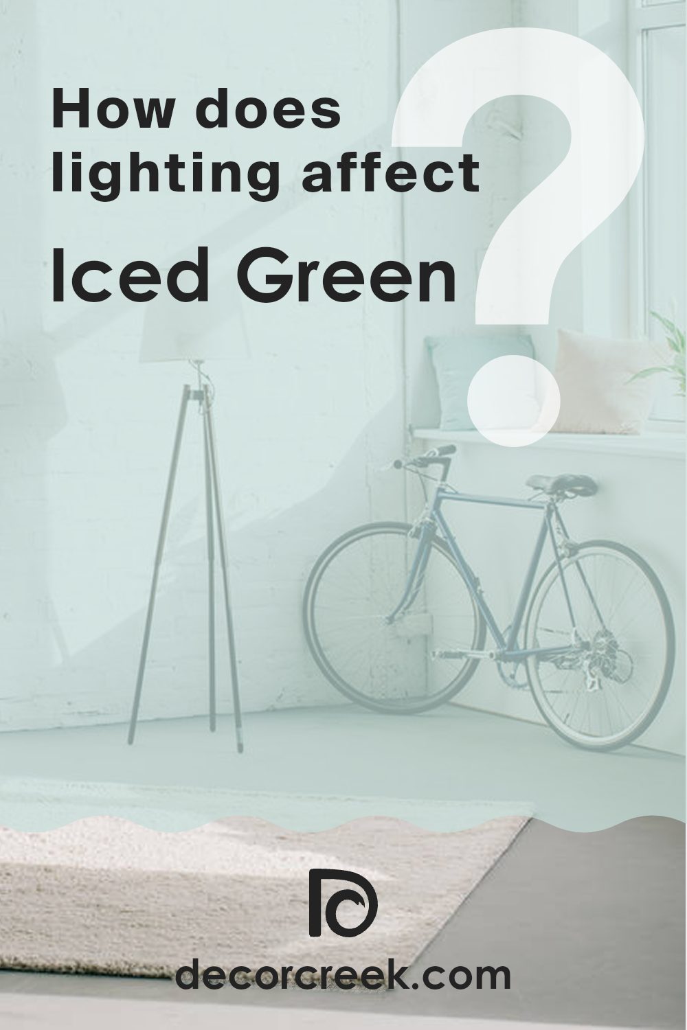
How Does Lighting Affect Iced Green 673 by Benjamin Moore?
Lighting plays a crucial role in how we perceive colors in different environments. The color of the light itself can shift the appearance of paint hues on the walls. For instance, daylight is generally more blue, while most artificial lights offer a yellowish hue, affecting how paint colors are seen.
Iced Green 673 by Benjamin Moore is an adaptable color with a soothing green tone that can look quite different under various lighting conditions. Under artificial light, such as LEDs or incandescent bulbs, this color tends to show a slightly more yellowish or warmer tone because artificial lights usually cast a warmer glow. This makes the green feel softer and more muted.
In natural light, the color is influenced by the direction the room faces:
- North-facing rooms receive less direct sunlight throughout the day, which tends to be cooler and bluer. Here, Iced Green 673 might appear slightly darker and greener, maintaining a fresh and cool vibe.
- South-facing rooms are filled with plenty of bright and warm sunlight all day. This exposure tends to enhance the vibrancy of the paint, making Iced Green 673 look brighter and more lively, bringing out any subtle warm undertones.
- East-facing rooms get the most sunlight in the morning, which is a warmer light. As a result, in the morning, Iced Green 673 will appear more cheerful and bright. As the day progresses and the natural light fades, the color may become softer and more subdued.
- West-facing rooms have the strongest sunlight in the afternoon, when the sun is setting. This means that the intense, warm afternoon sun can make Iced Green 673 look very vibrant and dynamic during this time, potentially highlighting green tones more in the evening.
Understanding how different lighting conditions affect the appearance of colors like Iced Green 673 can help you make better decisions about paint colors for your area, ensuring that the color matches your aesthetic and functional desires for each room.
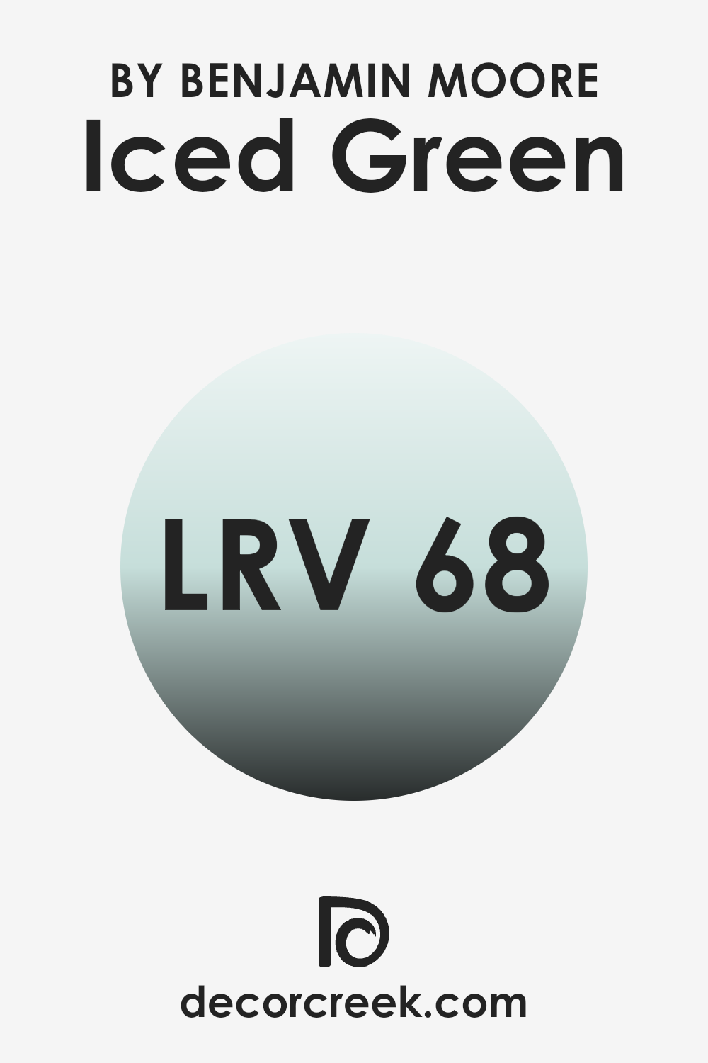
What is the LRV of Iced Green 673 by Benjamin Moore?
LRV stands for Light Reflectance Value, which is a measure of how much light a color reflects. The scale used to measure LRV ranges from 1 to 99, and it helps determine how light or dark a color might appear once applied to an environment. Higher values indicate that a color reflects more light, making it appear brighter.
This is particularly useful when choosing paint colors as it gives a good indication of how much a particular color will lighten up an area or make it seem smaller and more cramped depending on its light reflecting qualities. With an LRV of 68.04, Iced Green by Benjamin Moore is on the lighter side of the scale, meaning it will reflect a significant amount of light.
This makes it an excellent choice for areas that you want to appear more open and airy. The higher LRV also means that this color can effectively help in brightening dim rooms or enhancing natural light in well-lit areas. However, the way this color interacts with light might change slightly depending on the time of the day and the type of lighting used, often presenting different nuances and enhancing the overall ambiance of the room.
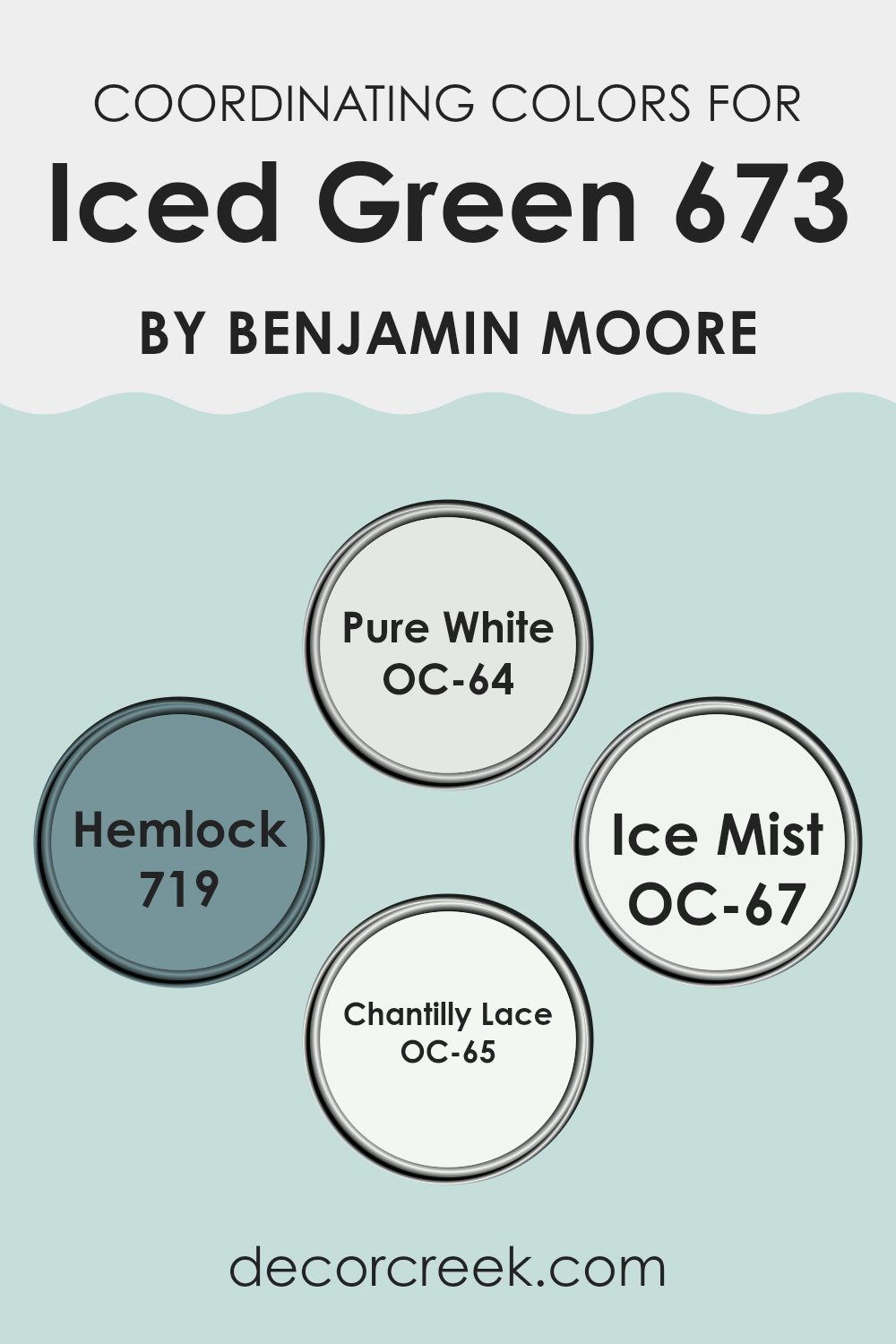
Coordinating Colors of Iced Green 673 by Benjamin Moore
Coordinating colors are hues that complement each other and help bring a balanced and harmonious look to any room. When you choose a primary paint color like Iced Green by Benjamin Moore, you might want to select a few coordinating colors to complete the aesthetic.
These colors are typically used for trim, accents, or even adjoining rooms to create a cohesive feel. For example, colors like Pure White OC-64, Hemlock 719, Ice Mist OC-67, and Chantilly Lace OC-65 are great partners for Iced Green due to their ability to support and enhance the main color.
Let’s take a closer look at these coordinating colors. Pure White OC-64 is a clean and clear white that brings out the crispness without being too strong for the senses. It is perfect for creating a fresh frame around Iced Green areas. Hemlock 719, on the other hand, presents a more pronounced green undertone that can provide a deeper natural connection to Iced Green, enhancing earthy vibes. Then there’s Ice Mist OC-67, a very light, almost ethereal white with a subtle cool undertone that works well for ceilings or a room that needs a gentle touch.
Lastly, Chantilly Lace OC-65 offers a slightly warmer tone of white that produces a soft, inviting atmosphere, which pairs well with the quiet charm of Iced Green. Together, these colors support one another, ensuring that each room looks thoughtfully designed and visually pleasing.
You can see recommended paint colors below:
- OC-64 Pure White
- 719 Hemlock
- OC-67 Ice Mist
- OC-65 Chantilly Lace
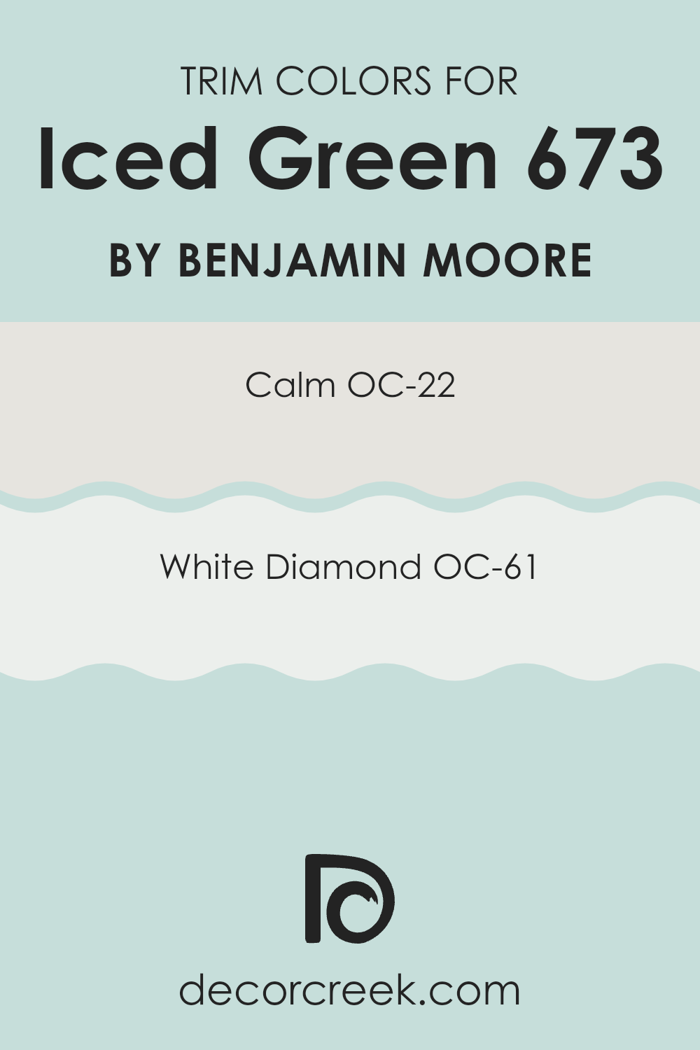
What are the Trim colors of Iced Green 673 by Benjamin Moore?
Trim colors refer to the hues chosen to accentuate or highlight the architectural features of a room, such as door frames, baseboards, crown moldings, and window casings. Using the right trim color can visually enhance the overall appearance of an area, providing a subtle contrast that frames and defines the areas, making them stand out against the larger expanses of wall color. For a color like Iced Green by Benjamin Moore, which is a fresh and lively shade, selecting the right trim color is crucial for achieving a balanced and harmonious look.
OC-22 Calm and OC-61 White Diamond are excellent choices for trim colors to pair with Iced Green. OC-22 Calm is a soft and gentle white that offers a clean and understated contrast to the more vibrant Iced Green, adding a peaceful and light touch to the room’s borders.
OC-61 White Diamond, on the other hand, has a slightly brighter and crisper white tone that brings a clear delineation to the edges, enhancing the room’s features with a pristine clarity and making it feel more open and airy. Both these colors help in clearly defining the area while complementing the refreshing vibe of Iced Green.
You can see recommended paint colors below:
- OC-22 Calm
- OC-61 White Diamond
Colors Similar to Iced Green 673 by Benjamin Moore
Choosing similar colors for a color scheme creates a harmonious and unified look that can make any area feel cohesive and well thought out. Colors that complement each other, such as variations of greens and blues, have this subtle way of blending seamlessly, providing a smooth visual transition from one area to another. This aesthetic continuity can enhance the overall ambiance of a room without creating stark contrasts, allowing each element to contribute to a soothing overall effect.
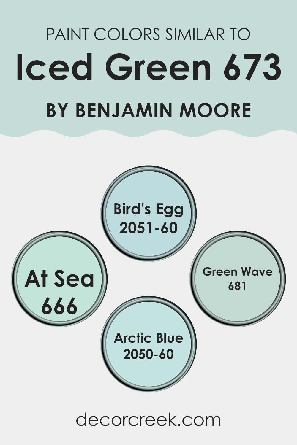
For instance, Bird’s Egg by Benjamin Moore presents itself as a gentle blue that evokes the feeling of a clear sky, making it a pleasant backdrop in a room aiming for a light and airy feel. At Sea is deeper, hinting at the mysterious depths of ocean blues, perfect for adding a touch of drama while still maintaining an air of familiarity within the theme.
Green Wave, meanwhile, offers a hint of vibrant green that recalls lush vegetation, ideal for bringing some natural freshness to an environment. Lastly, Arctic Blue stands out with its subtle hint of cool, icy tones, resembling a breezy winter morning and excellent for areas that aim to feel both calm and invigorating. All these colors operate within the same family, creating a visual dialogue between each other that enhances their collective impact.
You can see recommended paint colors below:
- 2051-60 Bird’s Egg
- 666 At Sea
- 681 Green Wave
- 2050-60 Arctic Blue
Colors that Go With Iced Green 673 by Benjamin Moore
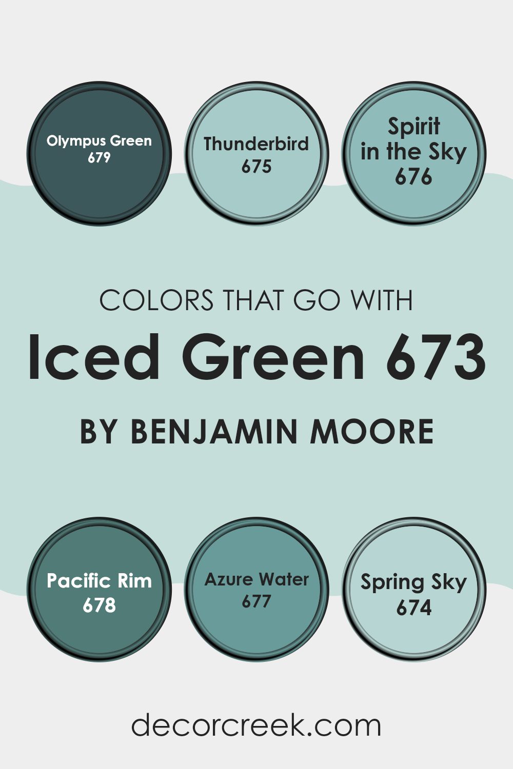
Choosing the right colors to accompany Iced Green 673 by Benjamin Moore is crucial because the complementary shades help create a coherent and pleasing ambiance in any area. Colors like Olympus Green, Thunderbird, Spirit in the Sky, Pacific Rim, Azure Water, and Spring Sky are all excellent choices that harmonize well with Iced Green, each adding its unique touch to the overall decor.
Olympus Green is a deep, rich green that adds a lush, verdant contrast to the lighter Iced Green, making it perfect for creating a nature-inspired feel in an area. On the other hand, Thunderbird is a dark, almost charcoal grey that offers a grounding effect, providing a strong visual anchor.
Spirit in the Sky is a light and airy blue that lifts the mood and brings a sense of calmness, working well in areas intended for relaxation. Similarly, Pacific Rim combines the cool tones of blue and green to produce a vibrant yet calm hue that’s refreshing to the eyes. Azure Water is a softer version of blue that suggests the openness of the sky and water, promoting a light, breezy feel.
Lastly, Spring Sky is a gentle blue that reminds one of a clear spring morning, perfectly complementing Iced Green by adding a subtle touch of cheerfulness. Together, these colors form a palette that is harmonious and pleasing, enhancing the beauty of any area they’re used in.
You can see recommended paint colors below:
- 679 Olympus Green
- 675 Thunderbird
- 676 Spirit in the Sky
- 678 Pacific Rim
- 677 Azure Water
- 674 Spring Sky
How to Use Iced Green 673 by Benjamin Moore In Your Home?
Iced Green 673 by Benjamin Moore is a refreshing paint color that brings a cool and calm feeling to any room. Perfect for creating a light and airy atmosphere, this pale green shade works well in many areas of a home. You can use it in a bedroom to create a soothing backdrop that helps you relax and sleep better.
It’s also great for bathrooms where it can make the area feel clean and spa-like. If you want to add a touch of freshness to your living room or kitchen, Iced Green is a good choice as it pairs well with both light and dark furniture, enhancing the overall look of the room.
Additionally, this color is adaptable enough to be used on walls, cabinets, or as an accent in decorative elements. It injects a natural, soft touch to your home, making your living area feel more pleasant and inviting. Whether you paint an entire room or just one wall, Iced Green by Benjamin Moore can add a fresh vibe to your home.
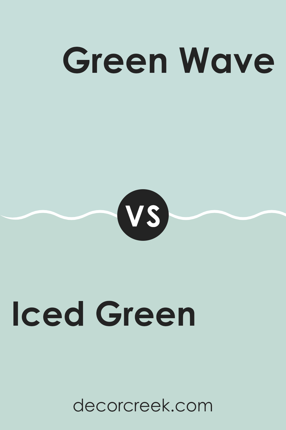
Iced Green 673 by Benjamin Moore vs Green Wave 681 by Benjamin Moore
If you’re looking at Iced Green and Green Wave from Benjamin Moore, you’ll see some clear differences. Iced Green has a subtler, lighter tone that almost feels fresh and airy.
It’s great for a calm, relaxed vibe in a room, like creating a soothing environment in a bedroom or a peaceful living area. On the other side, Green Wave is a bit more vivid and noticeable.
It’s a richer color, closer to a true green, which can make small areas feel lively or give a more lush, invigorating look to a larger room. Both colors are part of the green family, but they set a different mood due to their intensity and depth. Iced Green works well if you prefer a lighter touch of color, while Green Wave might be the choice if you’re after something that grabs more attention.
You can see recommended paint color below:
- 681 Green Wave
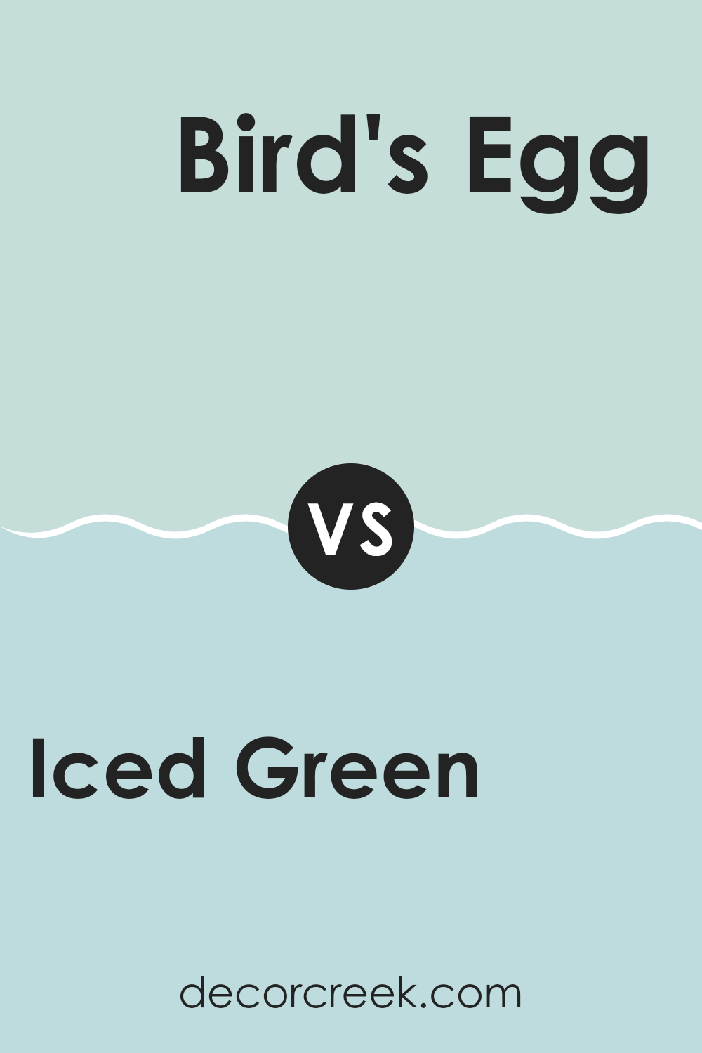
Iced Green 673 by Benjamin Moore vs Bird’s Egg 2051-60 by Benjamin Moore
Iced Green and Bird’s Egg by Benjamin Moore are two complementary shades that lend a fresh and lively feel to any area. Iced Green is a subtle and cool mint-like tone. It has a soothing quality without becoming too vibrant, making it ideal for creating a relaxed atmosphere in rooms like kitchens or bathrooms.
On the other hand, Bird’s Egg is a slightly brighter and more playful color. It resembles the soft blue of a robin’s egg and brings a cheerful brightness to areas.
Both colors share a lightness and soft palette that are easy on the eyes, yet they offer distinct vibes — Iced Green leaning towards a hint of green freshness, and Bird’s Egg offering a gentle blue lift. Whether used separately or together, these colors can beautifully lighten up a room while maintaining a simple and clean aesthetic.
You can see recommended paint color below:
- 2051-60 Bird’s Egg
Iced Green 673 by Benjamin Moore vs At Sea 666 by Benjamin Moore
Iced Green 673 and At Sea 666, both offered by Benjamin Moore, present unique shades of green. Iced Green illuminates areas with its light, airy feel, leaning towards a subtle minty tone. It has a cool undertone that brings a refreshing touch, making it especially great for smaller rooms or areas needing a feel of openness.
On the other hand, At Sea 666 offers a deeper, more ocean-inspired hue. While still in the green family, this color bears a stronger, darker tone, hinting at the depth of the sea. It’s perfect for creating a focal point in a room or adding a sense of depth and interest.
Together, these colors could work well in a single setting, with Iced Green brightening the area and At Sea adding a contrasting depth. Each has its charm, whether looking to lighten up a room or add a touch of drama with a darker shade.
You can see recommended paint color below:
- 666 At Sea
Iced Green 673 by Benjamin Moore vs Arctic Blue 2050-60 by Benjamin Moore
Iced Green and Arctic Blue by Benjamin Moore are both light, refreshing colors, but they differ in their undertones and the overall mood they create. Iced Green leans more towards a soft, pale green with a hint of gray. This makes it a subtle choice, perfect for creating a gentle and calm atmosphere in any room. It pairs well with soft whites or deeper greens for a nature-inspired palette.
Arctic Blue, on the other hand, is a clearer light blue that evokes the crispness of icy water. It’s slightly brighter than Iced Green and brings a fresh, airy feel to an area. This color works beautifully in areas that receive lots of natural light, enhancing the feeling of openness and airiness.
Both colors are quite muted and can easily be used in various settings, from bedrooms to living rooms, depending on the ambiance you want to achieve. Iced Green is more grounded and earthy, while Arctic Blue offers a splash of cool freshness.
You can see recommended paint color below:
- 2050-60 Arctic Blue
After reading about 673 Iced Green by Benjamin Moore, I have learned quite a bit about this special paint color. It turns out that 673 Iced Green is not just any green; it has a unique softness that can make any room feel calm and happy. This green has a hint of coolness that reminds me of a gentle breeze on a sunny spring morning.
In homes, Iced Green could make a lovely choice for bedrooms or living rooms where you want a touch of color without it being too bright or distracting. It seems perfect for creating a peaceful spot for reading or playing games with family. I also found out that it goes well with many other colors, which means it can fit in nicely with different styles and furniture.
For anyone thinking about adding a new touch to their room without making everything look totally different, 673 Iced Green could be a great choice. It’s gentle, fresh, and sure to make any area feel more welcoming.
If I had my own room to repaint, I’d definitely consider this color because it sounds both pretty and calming!
decorcreek.com
Ever wished paint sampling was as easy as sticking a sticker? Guess what? Now it is! Discover Samplize's unique Peel & Stick samples.
Get paint samples

