Choosing the right paint color for your home can be a daunting task, but SW 6534 Icy by Sherwin Williams might just be the shade you’re looking for. In this guide, I’ll give you a rundown of everything you need to know about this particular color. First and foremost, it’s important to understand that Icy is a cool-toned color that brings a fresh and clean feel to any room. Whether you’re planning to refresh your living room, bedroom, or even your kitchen, this shade has the potential to brighten up the area beautifully.
However, considering a few factors before finalizing your paint choice is crucial. Think about the lighting in your room, as it plays a significant role in how the color will actually appear once on your walls. Natural light shows the truest color, while artificial light can alter its appearance.
Additionally, it’s wise to consider the existing decor and furnishings in your room. Icy pairs well with a variety of styles and materials, making it quite adaptable.
By the end of this read, you’ll have a clearer picture of whether SW 6534 Icy is the perfect match for your decorating aims, helping you make a well-informed decision that you’ll be happy with for years to come.
Is Icy SW 6534 Right for My Home?
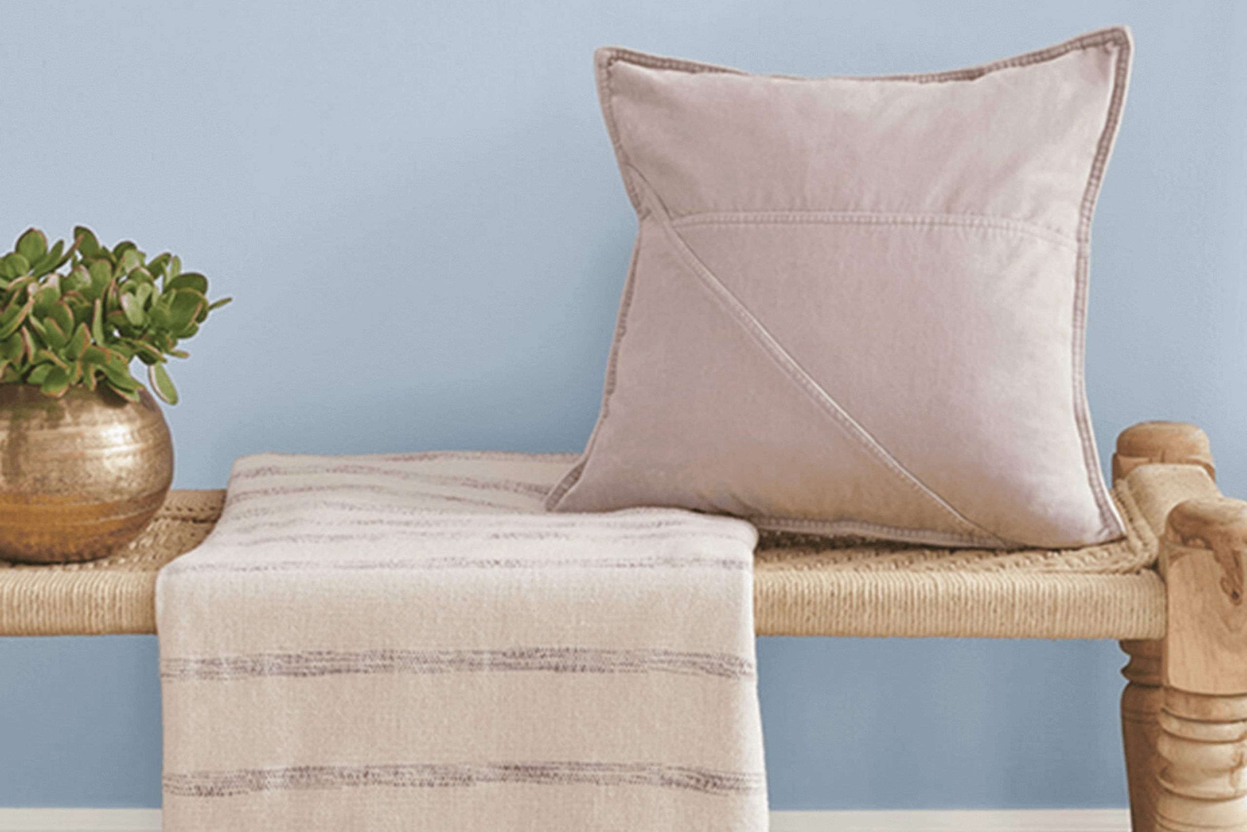
The color Icy by Sherwin Williams is a gentle, light blue that reminds me of a crisp, clear sky on a sunny winter morning. It’s light enough to make rooms feel larger and airy, perfect for creating a soothing atmosphere in any room.
I find this color works beautifully in modern and Scandinavian interior styles because of its clean and simple vibe. It pairs especially well with natural light, which brings out its subtle vibrancy. When I think about materials, Icy looks stunning with light woods like maple or birch that underscore its brightness. For a fresher look, I sometimes combine it with white trim or white furniture pieces which makes the blue really pop.
Soft textiles like cotton or linen drapes in white or soft gray complement this color well, adding to the airy feel of the room. I also love incorporating metallic finishes like brushed nickel or soft silver, which reflect light and enhance the cool tones of the paint.
All in all, Icy is a flexible color that can help to create a light and refreshing room. It’s subtle enough not to feel stressful but distinctive enough to give a room a fresh and inviting feel. Ideal for anyone looking to freshen up their home with a touch of calm.

decorcreek.com
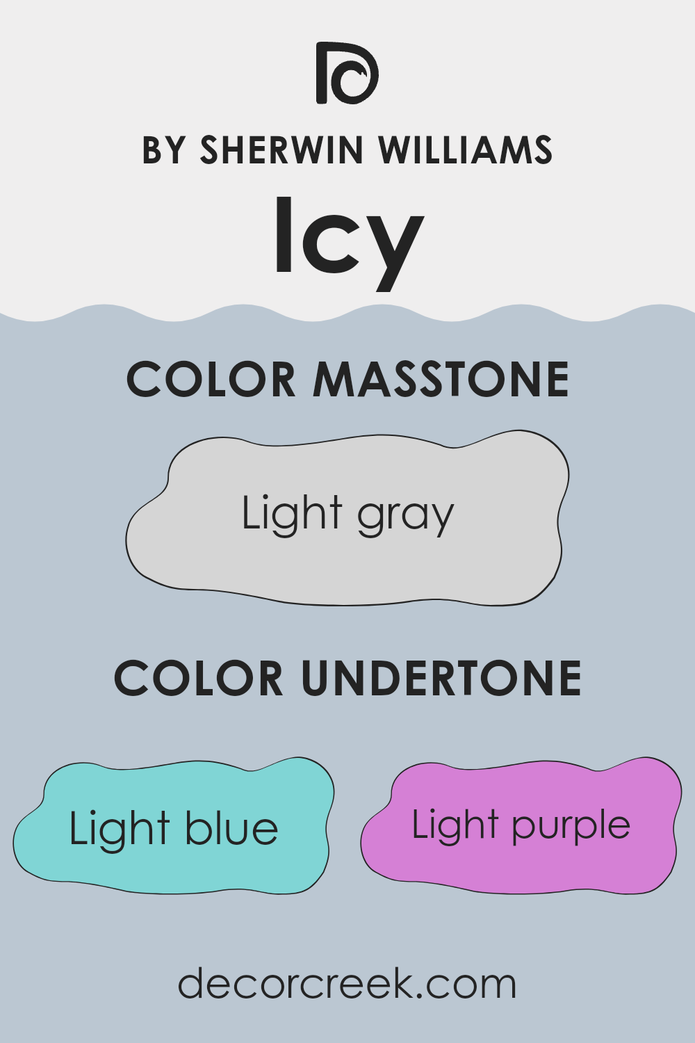
What are the right undertones of Icy SW 6534 ?
IcySW 6534 by Sherwin Williams is a unique shade that carries a mix of subtle undertones which greatly influence its appearance under different lighting conditions and when paired with various decor elements. The undertones for this color include light blue, light purple, pale yellow, lilac, mint, pale pink, and grey. Each undertone adds a distinctive flavor to the main color, affecting how it is perceived and how well it integrates with other colors in a room.
In interior design, undertones play a crucial role in creating harmony or contrast. For instance, the light blue and mint undertones of IcySW 6534 offer a cool, fresh vibe, making it an excellent choice for bathrooms or kitchens where a clean, refreshing look is desirable. The hint of light purple and lilac adds a touch of softness, which can work well in a bedroom where a peaceful and restful environment is key.
Using this color on interior walls can have varied effects depending on the room’s lighting and surrounding colors. In natural light, the pale yellow and mint undertones might become more pronounced, bringing a lively and brighter feel to the room. Meanwhile, in areas with less light, the grey undertone can become more dominant, providing a neutral backdrop that complements bolder colors and decorations.
Overall, the flexibility of IcySW 6534 makes it a practical choice for many rooms. Understanding and considering its undertones allows for a more informed application, ensuring the color helps achieve the desired impact in a room. Whether aiming for a soothing atmosphere or a bright, dynamic look, this color, with its rich undertone composition, can meet various interior design needs.
decorcreek.com
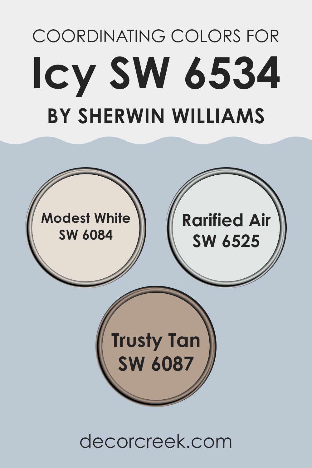
Best Coordinating Colors to use with Icy SW 6534 by Sherwin Williams this year.
Coordinating colors are shades that complement a primary color, enhancing its aesthetic appeal without overshadowing it. These colors work together to create a harmonious palette that can add depth and interest to any room. When choosing coordinating colors for a primary shade like a cool, refreshing blue, it’s important to select tones that balance well and maintain the overall vibe you desire for your room.
One great coordinating color is SW 6084 – Modest White, a gentle and subtle off-white that pairs beautifully with cooler tones to create a calm and inviting atmosphere. It reflects light softly, making it an ideal choice for creating a sense of more room.
Another coordinating option is SW 6525 – Rarified Air, which is a very light, almost ethereal blue that complements deeper blues to enhance their vibrancy without competing for attention. This color is perfect for achieving a cool, airy feel in a room. Lastly, SW 6087 – Trusty Tan is a warm, neutral tan color that offers a comforting contrast to cooler blue hues, adding warmth and a cozy ambiance to interiors. It’s especially effective in rooms where you want to add warmth without overpowering the existing color scheme.
You can see recommended paint colors below:
- SW 6084 Modest White
- SW 6525 Rarified Air
- SW 6087 Trusty Tan
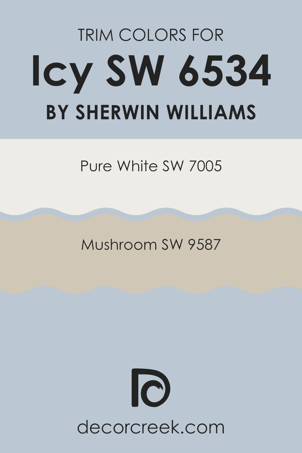
Trendy Trim Colors of Icy SW 6534 by Sherwin Williams to use this year.
Trim colors are specifically chosen paints applied to areas such as door frames, moldings, and baseboards, creating a visual frame or border around different parts of a room or exterior. The right trim color can accentuate the architectural features of a home and provide a clean, finished look that complements the main wall color.
For example, when using a color like Icy by Sherwin Williams, selecting an effective trim color is crucial to enhance the overall aesthetic and add a harmonious contrast or coherence to the room.
Pure White (SW 7005) is a crisp, clean white that offers a fresh and bright contrast, making it a great trim choice to pair with cooler tones such as the icy blue of SW 6534. It can help in making the main color stand out while providing a sense of freshness. On the other hand, Mushroom (SW 9587) is a warm, earthy tone, slightly muted, which can add a subtle warmth to the trim, softening the transition between the walls and other elements in the room. This color is particularly useful for adding a gentle, welcoming feel to the rooms without overpowering the main color scheme.
You can see recommended paint colors below:
- SW 7005 Pure White
- SW 9587 Mushroom
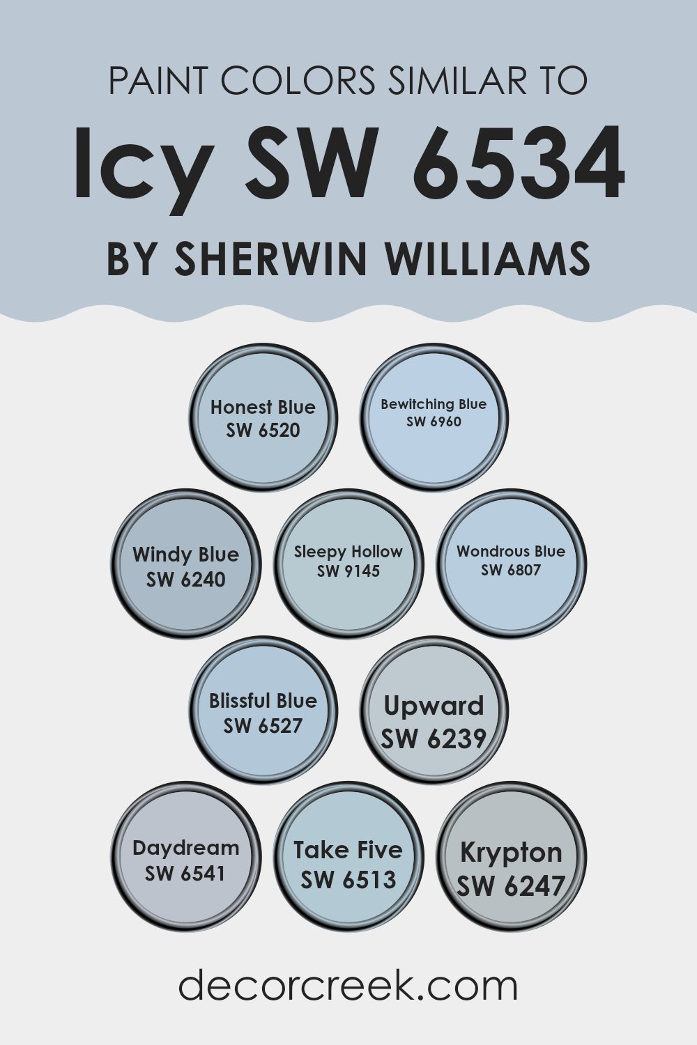
Evergreen Colors Similar to Icy SW 6534 by Sherwin Williams
Choosing similar colors, such as those closely related to Icy SW 6534 by Sherwin Williams, is essential for creating a cohesive and harmonious appearance in your room. When colors share a common hue, they naturally blend well, producing a smooth visual experience that is soothing to the eye.
For instance, Honest Blue SW 6520 offers a deep, clear tone that is vibrant yet calm, making it ideal for lively rooms that still seek some peace. Bewitching Blue SW 6960 presents a slightly duskier shade, adding mystery and depth to interiors. Windy Blue SW 6240 carries a softness reminiscent of a calm sky, perfect for creating a relaxed atmosphere.
Sleepy Hollow SW 9145 leans towards a muted teal, subtly enriching rooms without overpowering them, while Wondrous Blue SW 6807 dazzles with its vivid, sky-like vibrancy which can instantly lift a room’s mood. Blissful Blue SW 6527 veers into slightly lighter terrain, providing a gentle breath of air in any room.
Upward SW 6239 and Daydream SW 6541 both cast a lighter, almost ethereal quality, projecting lightness and freshness. Take Five SW 6513 blends naturally within the spectrum with its understated approach. Krypton SW 6247 closes the color circle with its crisp, modern edge that could act as an elegant yet straightforward backdrop for daily activities. Using these similar shades allows for flexibility in decor changes without the risk of color clash, creating a consistent theme that flows effortlessly from room to room.
You can see recommended paint colors below:
- SW 6520 Honest Blue
- SW 6960 Bewitching Blue
- SW 6240 Windy Blue
- SW 9145 Sleepy Hollow
- SW 6807 Wondrous Blue
- SW 6527 Blissful Blue
- SW 6239 Upward
- SW 6541 Daydream
- SW 6513 Take Five
- SW 6247 Krypton
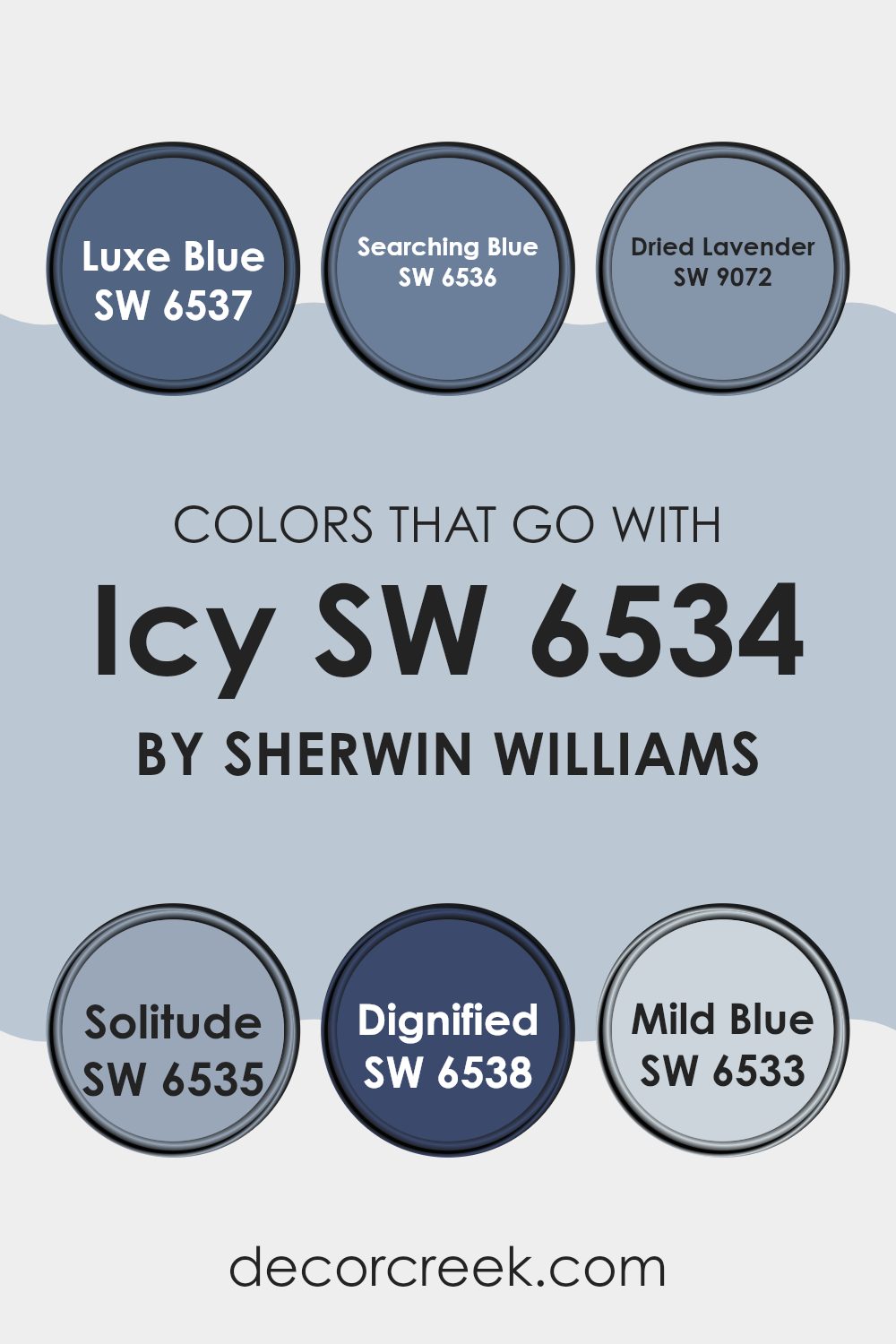
Colors that Go With Icy SW 6534 by Sherwin Williams
Choosing complementary colors for Icy SW 6534 by Sherwin Williams is crucial for creating a harmonious and appealing color scheme in any room. When selecting accents or coordinating colors like SW 6537 – Luxe Blue, SW 6536 – Searching Blue, SW 9072 – Dried Lavender, SW 6535 – Solitude, SW 6538 – Dignified, and SW 6533 – Mild Blue, it’s all about balance and enhancing the room’s mood without overpowering the senses.
Luxe Blue is a bold, vibrant hue that adds a splash of energy to a room, making it perfect for accent walls or decor items. In contrast, Searching Blue is softer and more subdued, ideal for a calming effect in bedrooms or bathrooms. Dried Lavender, with its gentle purple tone, offers a unique and subtle touch of color that brings a hint of playfulness into rooms.
Meanwhile, Solitude is a darker blue that provides depth and focus, making it great for creating a focal point in a room. Dignified is a strong, commanding color that works well in formal areas or to add gravity to a room. Lastly, Mild Blue is light and airy, making it perfect for creating a relaxed and open atmosphere, significantly enhancing the light and breezy feel of Icy. When these shades are used thoughtfully, they generate a visually pleasing environment that feels cohesive and thoughtfully designed.
You can see recommended paint colors below:
- SW 6537 Luxe Blue
- SW 6536 Searching Blue
- SW 9072 Dried Lavender
- SW 6535 Solitude
- SW 6538 Dignified
- SW 6533 Mild Blue
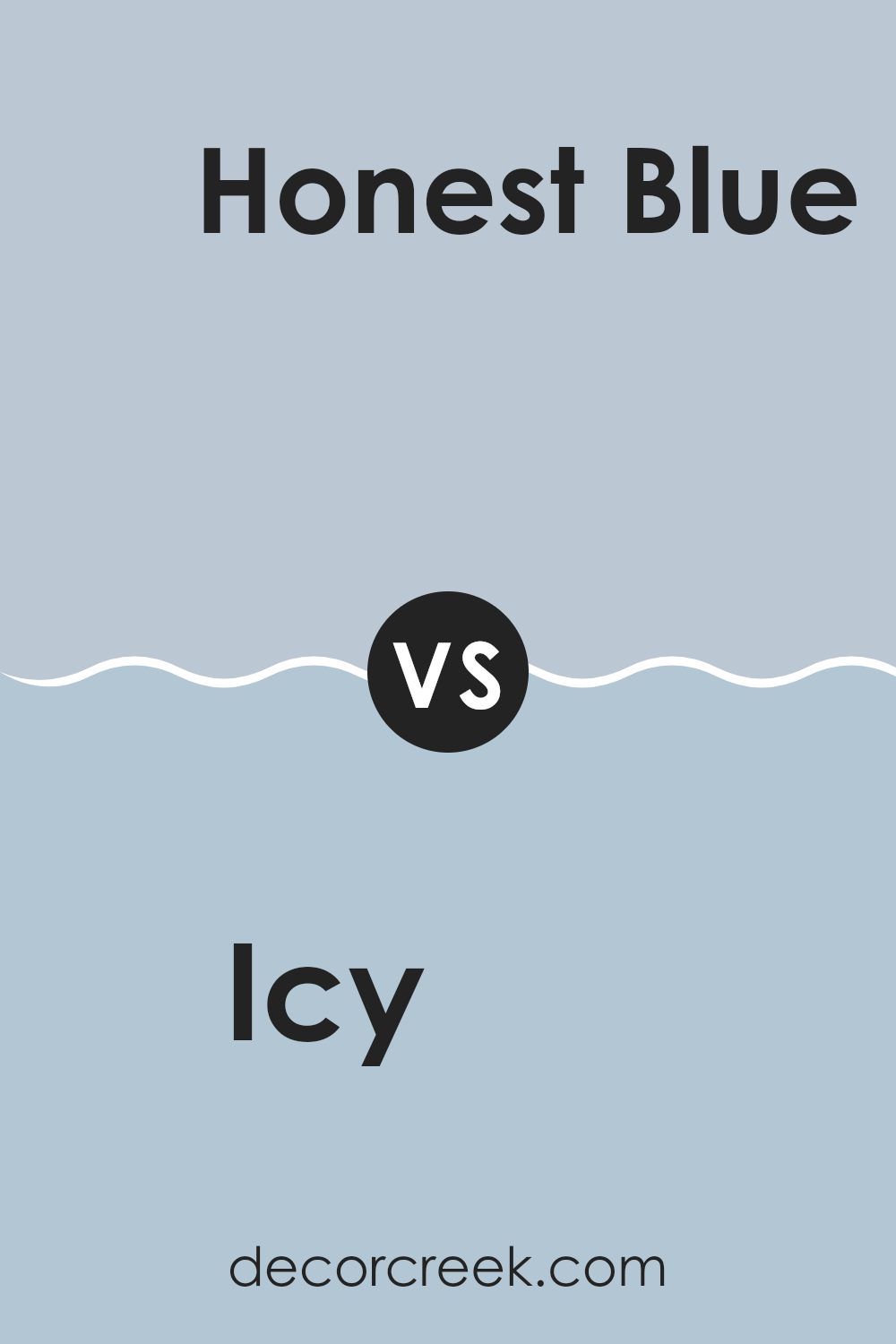
Icy SW 6534 by Sherwin Williams vs Honest Blue SW 6520 by Sherwin Williams
The color Icy from Sherwin Williams is a soft, light blue with a cool undertone that gives a fresh and clean look. It’s a very light shade that can make small rooms appear larger and more airy.
On the other hand, Honest Blue is a deeper shade of blue with a more vivid and pronounced tone. This color brings a stronger presence to a room and is very dynamic, making it a good choice for creating a focal point or adding a splash of color without being stressful.
While Icy might be suited for those looking for a subtle and light background color, Honest Blue fits well in rooms where a bolder statement is desired. Both colors offer a refreshing blue palette but differ in intensity and mood, with Icy leaning toward a calm, muted feel and Honest Blue offering a more lively atmosphere.
You can see recommended paint color below:
- SW 6520 Honest Blue
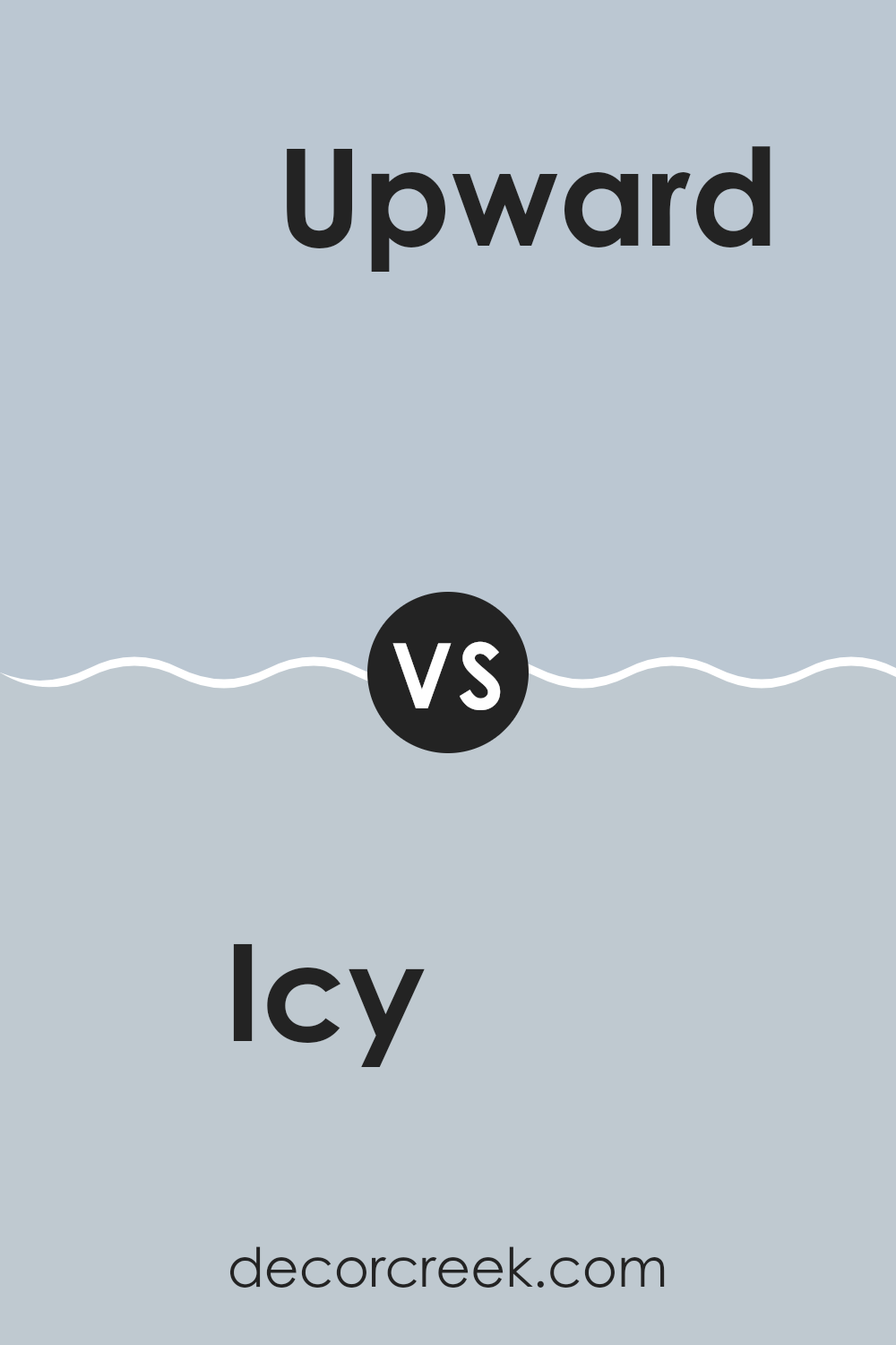
Icy SW 6534 by Sherwin Williams vs Upward SW 6239 by Sherwin Williams
Icy (SW 6534) and Upward (SW 6239) by Sherwin Williams are both calming shades of blue, but offer different vibes for rooms. Icy has a fresh, crisp blue tone reminiscent of a clear winter sky, providing a cool and refreshing feel. This makes it ideal for creating a light and airy atmosphere in rooms like bathrooms or kitchens where a sense of cleanliness is paramount.
On the other hand, Upward is a softer, subtler blue with a hint of gray. This muted tone feels warmer and is well-suited for living areas or bedrooms where a cozy and inviting atmosphere is desired. Upward’s soothing nature also makes it a great choice for creating a restful environment.
Both colors reflect light well, making them excellent choices for smaller rooms or areas with limited natural light. While Icy gives a room a more vibrant burst of cool color, Upward offers a more restrained, gentle presence, making both adaptable but distinct in their applications.
You can see recommended paint color below:
Icy SW 6534 by Sherwin Williams vs Take Five SW 6513 by Sherwin Williams
The color Icy SW 6534 by Sherwin Williams is a light, soothing blue with a touch of gray that gives it a cool and calm appearance. It’s quite subtle and has the ability to make a room feel fresh and open.
On the other hand, Take Five SW 6513, also by Sherwin Williams, leans toward a more vibrant and lively shade of blue. It’s brighter compared to Icy and has a playful charm that can energize a room. Both colors bring their unique qualities to a room.
Icy is great for a minimalist or more understated look, while Take Five suits rooms where a more cheerful and dynamic tone is desired. When choosing between these two, consider the mood you want to set in the room and how much natural light it receives, as both factors can influence how these colors appear when applied.
You can see recommended paint color below:
- SW 6513 Take Five

Icy SW 6534 by Sherwin Williams vs Blissful Blue SW 6527 by Sherwin Williams
Icy SW 6534 and Blissful Blue SW 6527, both from Sherwin Williams, offer distinct shades of blue that cater to different tastes and moods. Icy is a light, airy blue with a subtle hint of green, giving it a refreshing and calm feel. It’s perfect for creating a bright, open room, making it ideal for bathrooms and kitchens where you want a clean and crisp atmosphere.
On the other hand, Blissful Blue is slightly deeper and richer. It leans more toward a true sky blue, which adds a cheerful and relaxed vibe to any room. This color works well in bedrooms or living areas where a slightly more dynamic but still gentle background is desired.
Both colors offer a fresh feel, but Icy’s cooler undertones might make it more suitable for a modern look, while Blissful Blue, with its warmer undertones, creates a friendlier, inviting environment. Choosing between them depends on the specific mood and style you want to achieve in your room.
You can see recommended paint color below:
- SW 6527 Blissful Blue
Icy SW 6534 by Sherwin Williams vs Windy Blue SW 6240 by Sherwin Williams
Icy (SW 6534) and Windy Blue (SW 6240) are two distinctive shades from Sherwin Williams. Icy is a soft, almost pastel blue with a cool undertone, giving it a fresh and clean appearance. It’s light enough to be used in small rooms without making them feel cramped, and it reflects light well, adding a subtle brightness to rooms.
Windy Blue is a bit deeper and has hints of gray, making it a more muted and understated color compared to Icy. This shade is excellent for creating a cozy, inviting atmosphere in a room. It works wonderfully in areas that receive less natural light or rooms that aim for a more relaxed vibe.
Both colors have their unique appeal, with Icy being brighter and fresher and Windy Blue offering a more relaxed and cozy feel. Depending on what you’re looking for — whether it’s a light and airy ambience or a more subdued environment — choosing between these two can significantly influence the mood and style of your room.
You can see recommended paint color below:
- SW 6240 Windy Blue
Icy SW 6534 by Sherwin Williams vs Wondrous Blue SW 6807 by Sherwin Williams
Icy (SW 6534) and Wondrous Blue (SW 6807) by Sherwin Williams are both attractive colors, each with its unique appeal. Icy is a light, airy blue with a subtle gray undertone that gives it a crisp and clean look. It’s an excellent choice for creating a peaceful and refreshing vibe in a room, making it ideal for bedrooms or bathrooms where you want a soothing atmosphere.
On the other hand, Wondrous Blue is a brighter and more vivid shade. It leans toward a richer, more vibrant turquoise that can instantly add a lively splash of color to any room. This hue is perfect if you’re looking to make a statement or add a focal point in your decor.
In comparison, while both colors share a blue base, Icy is more subdued and neutral, making it adaptable for various settings. Wondrous Blue is more daring and energetic, suited for rooms where a more dynamic look is desired. Depending on your room’s purpose and the mood you want to set, either color could be the perfect fit.
You can see recommended paint color below:
- SW 6807 Wondrous Blue
Icy SW 6534 by Sherwin Williams vs Bewitching Blue SW 6960 by Sherwin Williams
“Icy” (SW 6534) and “Bewitching Blue” (SW 6960) are two distinct paint colors from Sherwin Williams. “Icy” is a light, airy blue with a hint of grey, capturing a crisp and clean feel that’s perfect for creating a refreshing and open atmosphere. This color works well in rooms that aim for a minimalist or modern vibe, giving rooms a bright and uplifting touch.
On the other hand, “Bewitching Blue” is a much deeper shade, offering a bolder and moodier feel. This color has a more pronounced presence, making it ideal for adding drama or a focal point in a room. It’s great for accent walls or rooms where you want to make a statement with depth and richness.
Both colors offer unique possibilities, with “Icy” being more subtle and light, and “Bewitching Blue” providing a strong and assertive blue tone. Depending on the mood and style you want to achieve, each color holds its charm and effect.
You can see recommended paint color below:
- SW 6960 Bewitching Blue
Icy SW 6534 by Sherwin Williams vs Daydream SW 6541 by Sherwin Williams
Icy SW 6534 and Daydream SW 6541 are two distinctive shades by Sherwin Williams. Icy is a soft, cool blue with a hint of green, giving it a refreshing and calm appearance, perfect for creating a light and airy feel in any room. It pairs well with white trim for a clean and crisp look.
On the other hand, Daydream is a slightly deeper blue with a touch of grey, offering a more grounded and relaxing vibe. This color provides a subtle contrast against lighter colors, making it ideal for a cozy reading nook or a bedroom.
Both colors bring their unique charm to a room. Whether you prefer the bright and uplifting quality of Icy or the soothing and gentle tone of Daydream, each color has its own way of enhancing the aesthetic of an environment. Choosing between them depends on the mood and atmosphere you want to set in your room.
You can see recommended paint color below:
- SW 6541 Daydream
Icy SW 6534 by Sherwin Williams vs Krypton SW 6247 by Sherwin Williams
Icy SW 6534 and Krypton SW 6247, both from Sherwin Williams, offer distinct vibes for interior rooms. Icy is a light, almost pastel blue that brings a fresh and airy feel to any room. It’s quite subtle and can make small rooms appear larger and more open.
On the other hand, Krypton is a deeper shade of blue-grey, providing a more grounded and calming atmosphere. This color is great for creating a cozy, comforting environment, particularly in areas meant for relaxation like bedrooms or living areas.
Both colors work well in modern decor but serve different aesthetic purposes; Icy leans towards a cheerful and vibrant look, while Krypton moves towards a more reserved and soothing aesthetic. Choosing between them depends on the mood you want to set in your room.
You can see recommended paint color below:
Icy SW 6534 by Sherwin Williams vs Sleepy Hollow SW 9145 by Sherwin Williams
Icy SW 6534 and Sleepy Hollow SW 9145 by Sherwin Williams are two distinct paint colors that can create different moods in a room. Icy is a light blue with a fresh and breezy feel, making it perfect for creating a bright and airy atmosphere. It’s ideal for smaller rooms or areas that you want to appear more open and inviting.
On the other hand, Sleepy Hollow is a deeper, muted teal that offers a more cozy and snug vibe. This color works well in larger rooms or areas where you want to promote a sense of calm and comfort. It pairs nicely with rich woods and warm accents.
Both colors are flexible, but while Icy pulls in more daylight and reflects light, making a room feel larger, Sleepy Hollow tends to absorb light, which can make a room feel more enclosed and intimate. Choosing between them depends on the mood you wish to set and the characteristics of the room you are decorating.
You can see recommended paint color below:
- SW 9145 Sleepy Hollow
In wrapping up, SW 6534 Icy by Sherwin Williams is a paint color I really adore. When you look at Icy, you think of pure snow or clouds that are really high up in the sky. It’s a kind of light blue that almost looks white when you first see it. What’s cool is that depending on where you use it, it can either add a calm feeling or make a small room seem a little bigger.
I noticed that Icy works well in lots of different parts of the house. We tried it in the bathroom and it made the room feel fresh and clean. In the living room, it helped to make everything look bright and welcoming. Even in busy places like the kitchen, it created a cool and calm background that didn’t steal the show from other colors around. Plus, using Icy means you can have fun picking other colors to go with it because it’s really good at matching with a lot of different shades.
So, if you’re thinking about giving a room a new look, Icy by Sherwin Williams is a great choice. It’s light and calm without making things boring, and it can help any room feel just right, whether it’s big or small. It’s definitely a color I’d recommend if you want a change that’s nice and easy on the eyes.

decorcreek.com
Ever wished paint sampling was as easy as sticking a sticker? Guess what? Now it is! Discover Samplize's unique Peel & Stick samples.
Get paint samples

