The most common way of refreshing your home’s interior is to repaint its interior walls. However, it only seems so simple! In fact, you need to be able to pick the paint color which will pair well with the rest of the colors in your living space.
This is why people often prefer to choose rather simple and neutral colors since they work well with the majority of interiors and color schemes. And if you have been wondering how to use such a paint color as SW Upward correctly, you will definitely find this article useful.
We will explain what kind of color it is, what undertones and LRV it has, and how to coordinate it with other colors correctly to get a well-balanced color palette. Also, you will learn in what rooms this paint is best to be used.
What Kind Of Paint Color Is SW Upward?
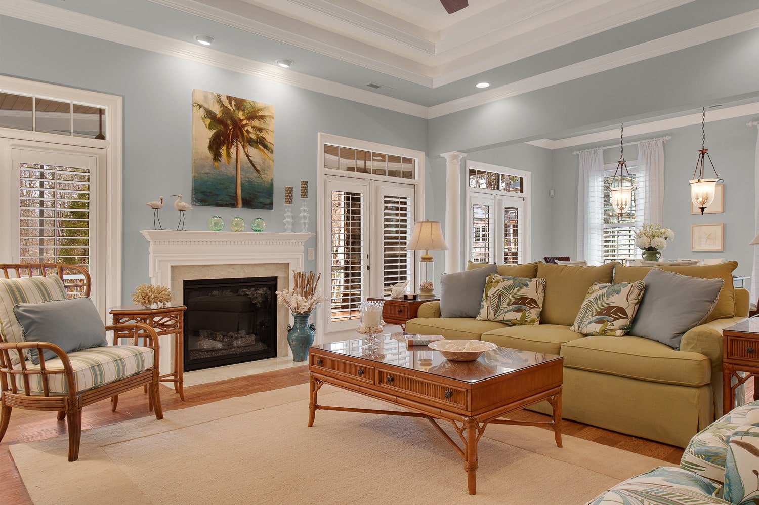
There is no need to explain what kind of color it is, you just need to take a look at it and you will say: it’s blue! And you will be absolutely right. Sherwin-Williams paint color called Upward belongs to the family of blue colors. As Hextoral says, Sherwin-Williams Upward is a calming and soft, pure light-toned blue.
This paint color is very balanced and tranquil, being able to transform your home and create a modern atmosphere where you can feel refreshed and relaxed. SW Upward feels very motivating, light, airy, and spacious when used in your home.
This paint color is known for being able to add a “chill” effect in your home whether you use a tint or paint all the walls in this specific color. So, if you are looking for a blue that is somewhat bolder and yet extremely light to make your space feel bright and lively – SW Upward is one of the best options!
But is this color easy to use on the walls?
How will it react to light and what you should keep in mind before applying it? This is what we are going to discuss next.
Ever wished paint sampling was as easy as sticking a sticker? Guess what? Now it is! Discover Samplize's unique Peel & Stick samples.
Get paint samples
What Undertones Does Upward SW-6239 by Sherwin-Williams ?
Being aware of undertones is mandatory because it allows you to use the color correctly and pick other colors for the living space respectively. Speaking of SW Upward, this color only seems so simple! In fact, this sky-clear blue is pretty tricky to use indoors.
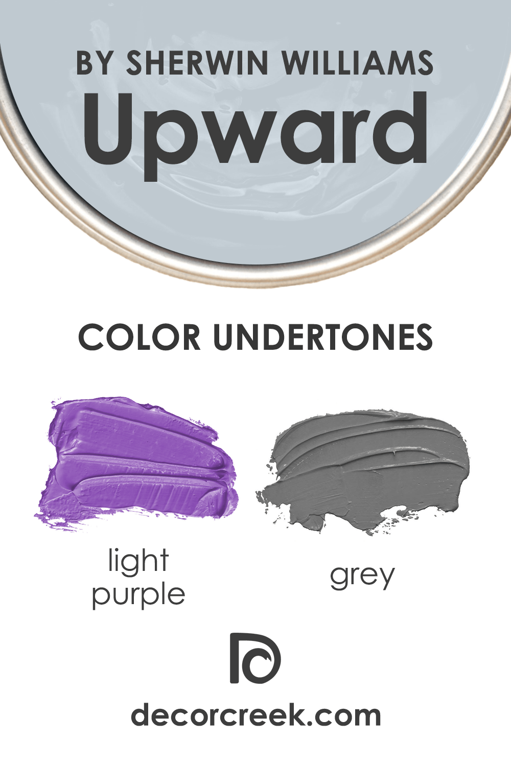
See, this blue color has gray undertones which most of you would never guess since Upward reads true blue when you look at the color swatch. The only way to see its true identity is to sample it in your home on the walls.
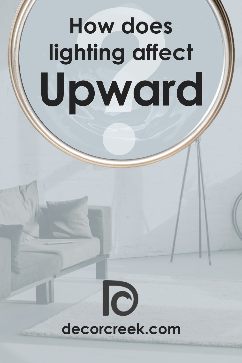
Depending on the light around, the color may change quite significantly.
But you should always keep in mind that this color will appear to be lighter in excessive natural light. Also, due to the lack of natural light and sun, it may also appear grayish (say hello to its gray undertones!).
But in the absence of lighting conditions, this paint color reads darker. Under specific lighting conditions, you may even find out very slight hints of purple in this paint color!
LRV of Upward SW-6239 by Sherwin-Williams
Those color changes that we mentioned above are possible thanks to the color’s LRV (light reflectance value). The LRV shows how much light a certain color can reflect when it is applied to the wall. The LRV scale goes from zero to 100 and the higher the LRV the lighter the color, and vice versa.
The LRV of SW Upward is 57 which makes this blue neither too dark nor too light.
However, when you paint your walls with this paint color, it may appear much lighter than you expected!
This is why SW Upward is not suitable for you if your goal is to create a cozy and warm-toned space. Well, unless you balance this sky-blue with some warmer-toned paint colors.
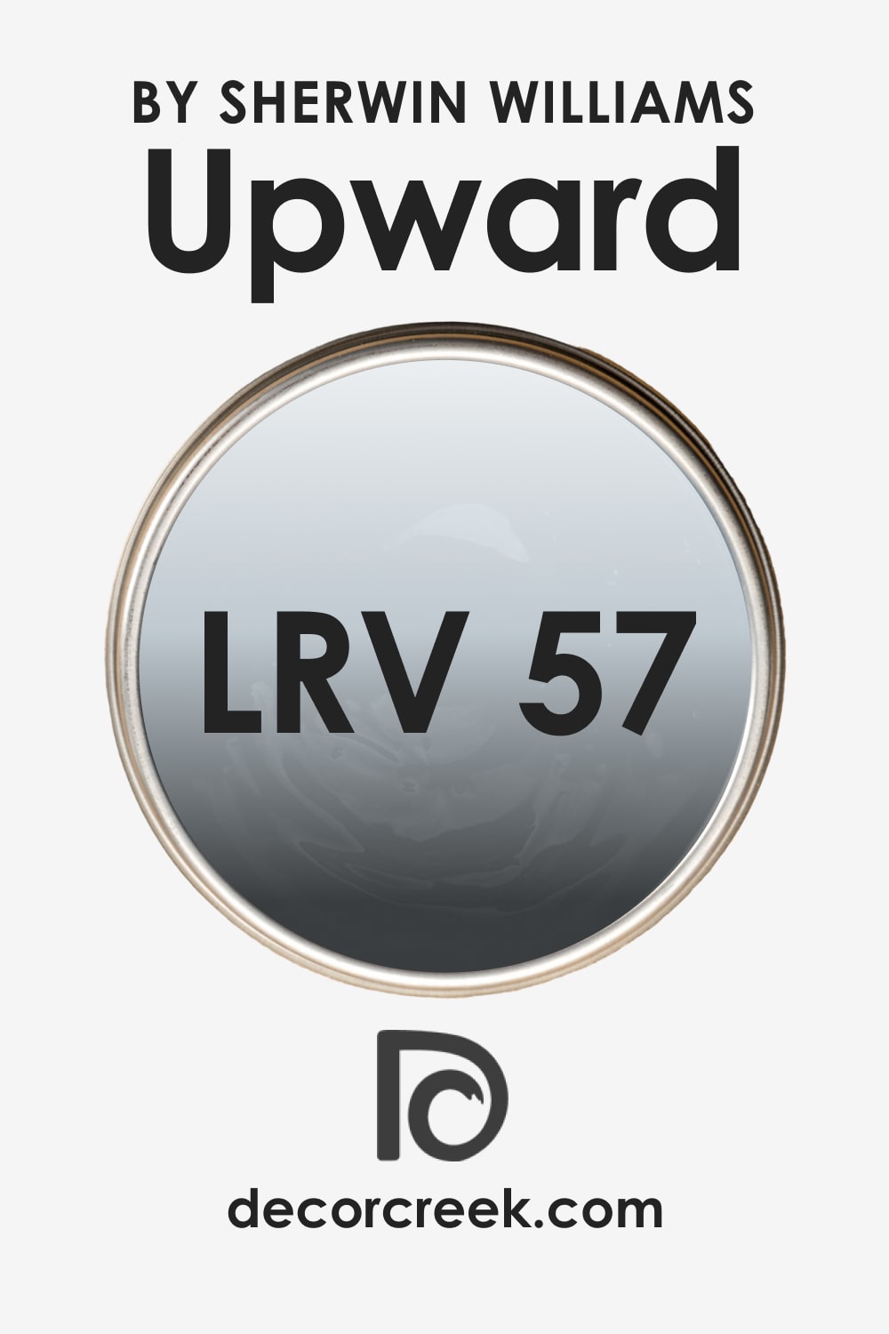
LRV – what does it mean? Read This Before Finding Your Perfect Paint Color
Upward SW-6239 Coordinating Colors
To be able to create a balanced and harmonious space in your home, you need to know how to coordinate colors correctly there. And since it is quite a difficult task (especially for amateurs), grab a few ideas on color options that will suit SW Upward:
For a monochromatic palette:
On the other hand, for a contrasting palette, you might want to consider the following paint colors:
- SW 9085 Touch of Sand
- SW 6224 Mountain Air
- SW 9087 Smoky Beige
Other coordinating colors include SW Extra White, SW Icicle, and SW Natural Linen.
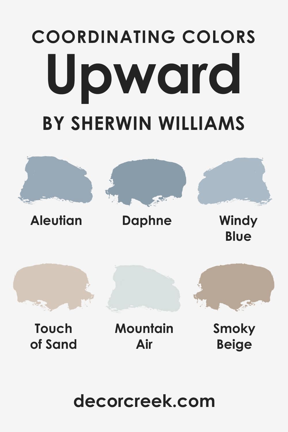
What’s the Best Trim Color of Upward SW-6239?
White is a traditional win-win color option when it comes to ceilings, trims, and moldings. So if you are looking for an ideal trim color to use with SW Upward, choose SW High Reflectance White for a crisper touch.
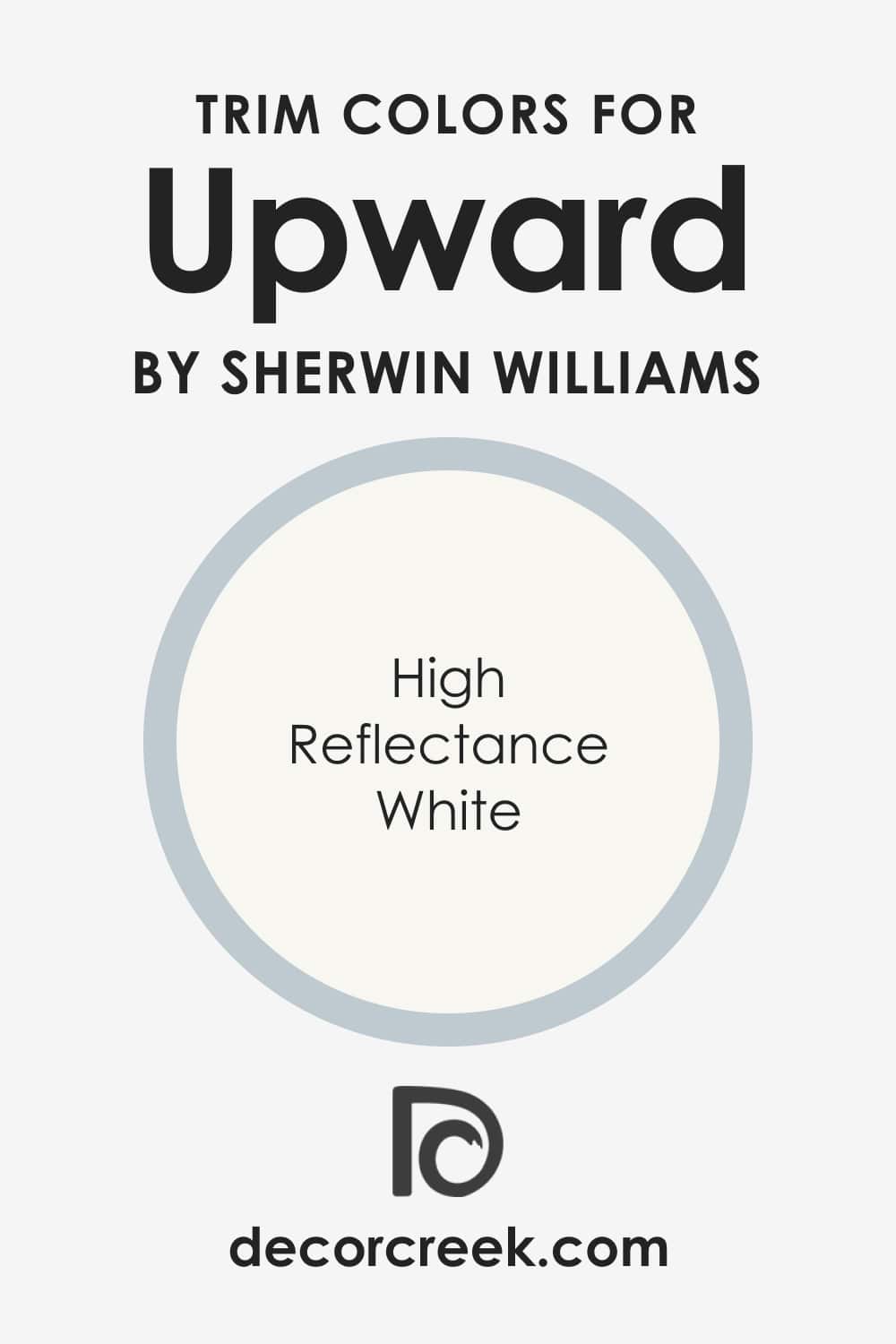
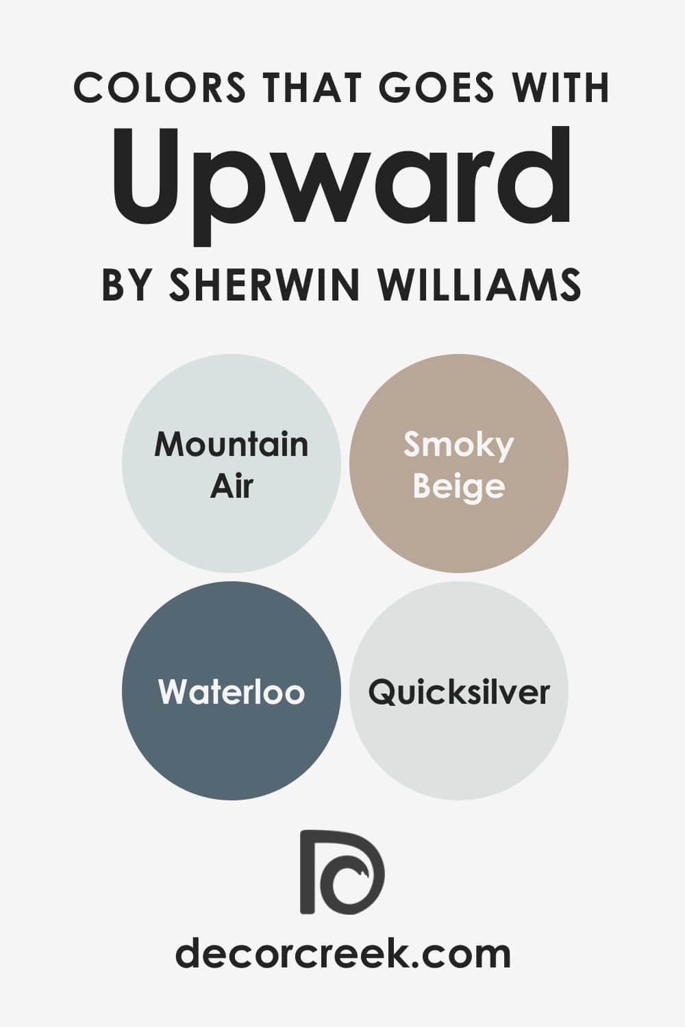
Colors That Go With SW Upward
The more balanced the color palette in your home the more cozy and elegant the living area looks even though the colors you use are rather cool-toned. But how is it possible to pick the colors that will work well with the paint on the walls?
This is the most common stumbling stone for homeowners since people often lack knowledge in color theory and color combination. However, we are here to help you out. Just check out what paint colors will go well with SW Upward:
- SW Mountain Air
- SW Smoky Beige
- SW Waterloo
- SW Quicksilver
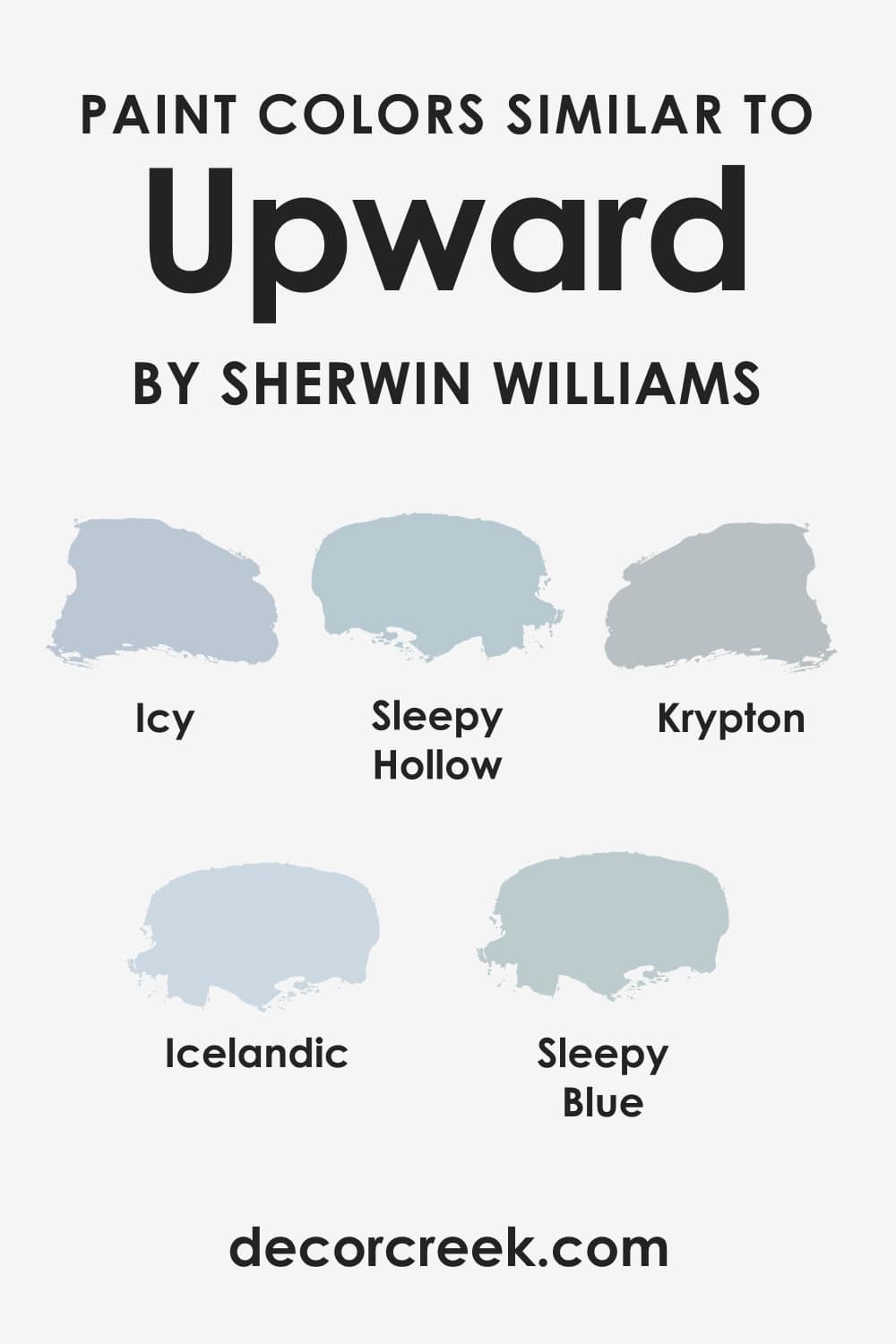
Paint Colors Similar to SW Upward
If you need to change the paint color you initially planned to use in your home, it may be difficult for you to choose a shade that is nearly the same as the color you were going to use at first.
In this case, knowing what similar colors your paint has can be very helpful. But remember: there won’t be a 100% match anyway! So here are a few similar paint colors that can be used instead of SW Upward:
- SW Icy
- SW Icelandic
- SW Sleepy Hollow
- SW Krypton
- SW Sleepy Blue
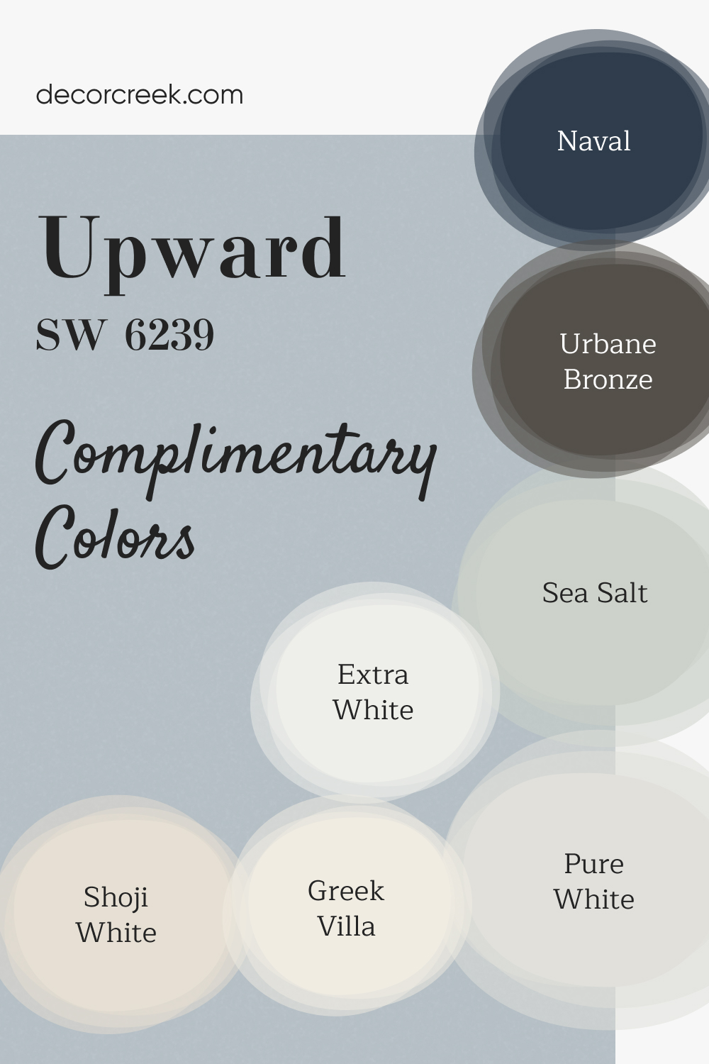
Complimentary Colors for Upward SW-6239 Paint Color by Sherwin-Williams
This collection of Sherwin Williams colors offers a perfect balance between soft neutrals and bold accents, giving you plenty of options for any room in your home. Upward is a soft, serene blue that works well in bedrooms or bathrooms, providing a calm, uplifting atmosphere.
Paired with the brightness of Extra White or Pure White, your space will feel open and fresh. Shoji White and Greek Villa are excellent choices for walls, bringing a warm, neutral background that complements any style. Naval and Urbane Bronze offer rich, bold tones that can be used for accent walls, doors, or cabinetry.
Sea Salt rounds out the palette with a gentle, soothing color perfect for creating a tranquil environment. Whether you’re looking to brighten up a space or add a touch of depth, this palette provides plenty of possibilities for a cohesive and stylish home design.
Where Upward SW-6239 Paint Color Can Be Used In Your Home?
Since we already know that SW Upward is a tricky color despite its seeming simplicity, you might be wondering now in what rooms it is best to use it. It makes sense because it’s wiser to figure it out in advance rather than repainting the room only because the paint worked wrong and you ended up with the unwanted hue!
For this purpose, we prepared a list of areas in your home where this magnificent blue can look absolutely wonderful!
Upward SW-6239 in the Living Room
This color is your go-to option if you want a cool and crisp effect there. But if you are looking to create a cozy environment, we would recommend using this paint as an accent wall paint color and pairing it with beige upholstery, some warm-toned throw pillows, and blankets.

Upward SW-6239 in a Bedroom
Since SW Upward is tranquil and balanced, it is a perfect color for bedrooms. Just remember to use it along with whites, off-whites, greys, mauves, and some greiges. It will help you make the room look less “chill”.

Upward SW-6239 in the Kitchen
This light blue color can work really well in your kitchen as well, especially if you want a cool-toned kitchen or if you want to make it look larger and spacious. For this purpose, you can use this paint color either on the cabinets or the backdrop walls.

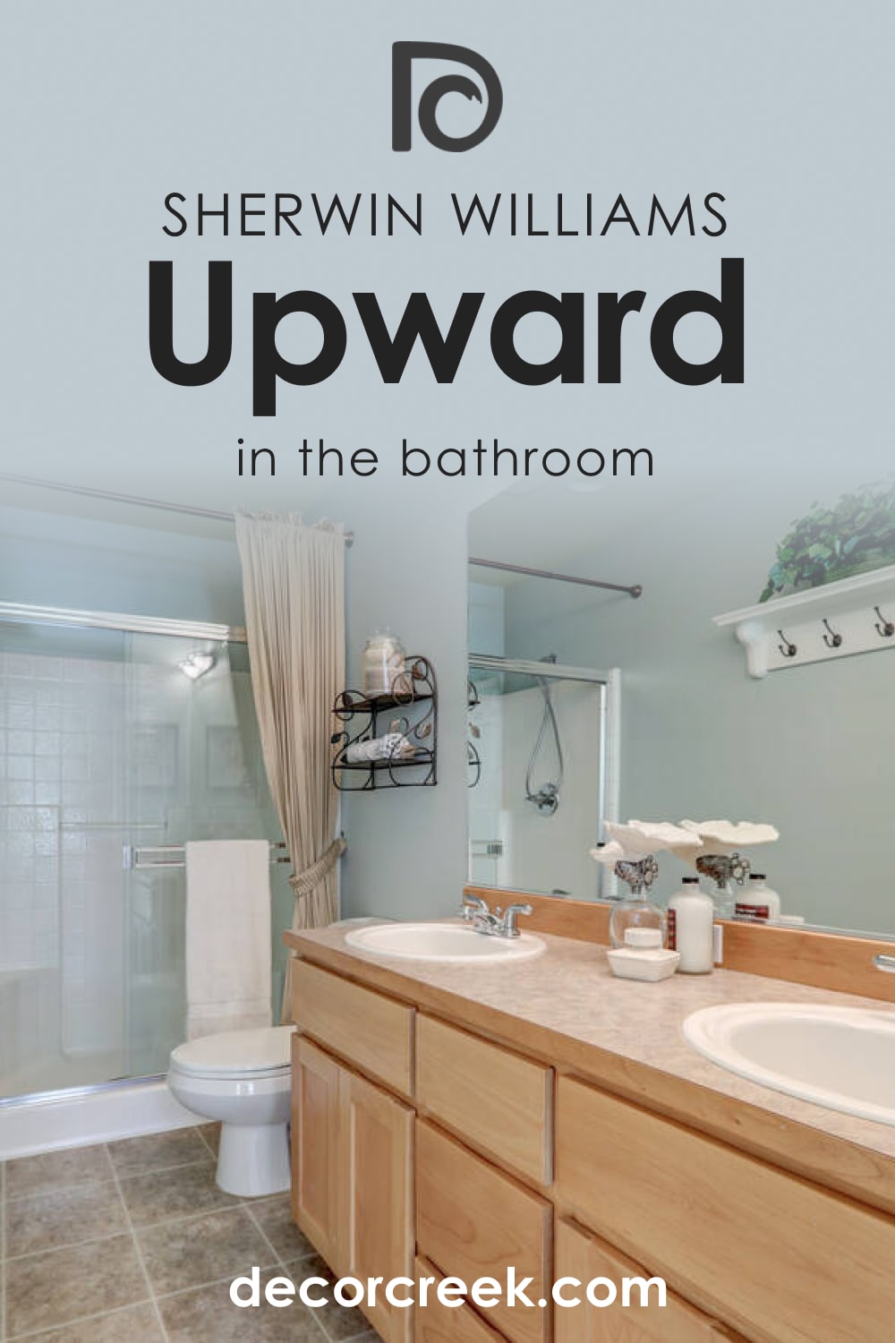
Upward SW-6239 in the Bathroom
When used in bathrooms, this blue color can create a perfect tranquilizing effect. And if you try pairing this paint color with white cabinets and golden or chrome pull handles, the space won’t look way too “cold”.
Upward SW-6239 for the Exterior Use
SW Upward can absolutely be used as an exterior paint color! Moreover, you have two options of its use: you can either paint the entire house with it or just touch the front door with it, leaving the rest greige or gray.
SW Upward can be used in many homes since this color is surprisingly versatile in terms of use. You just need to be sure you want to have a cool and tranquilizing effect in your living area. By the way, this blue color will look especially great the following interior designs:
- Coastal
- Mediterranean
- Modern
- Minimalistic
- Contemporary

Comparing SW Upward With Other Colors
To be able to better understand how this paint color works, we recommend you read its comparison with a few other alternative colors. It will help you to see all the distinctions between them even if the colors are pretty close.
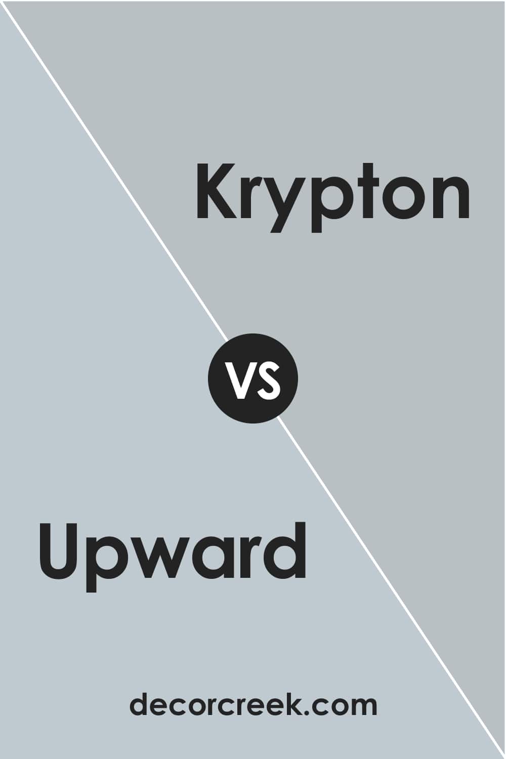
Upward vs Krypton Sherwin-Williams
Krypton has way more noticeable gray undertones that are perfectly seen if you place this color beside SW Upward. Upward, in its turn, reads bluer, lighter, and clearer. If you want a “darker” alternative of Upward, you should definitely consider Krypton!
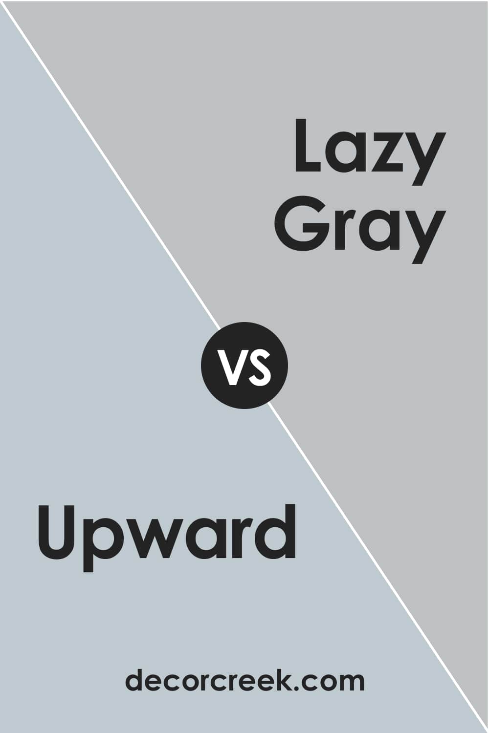
Upward vs Lazy Gray
Lazy Gray reads a bit more muted compared with Upward, plus, it has more prominent grayish undertones. In general, these features make Lazy Gray a less bright and more grayish version of Upward.
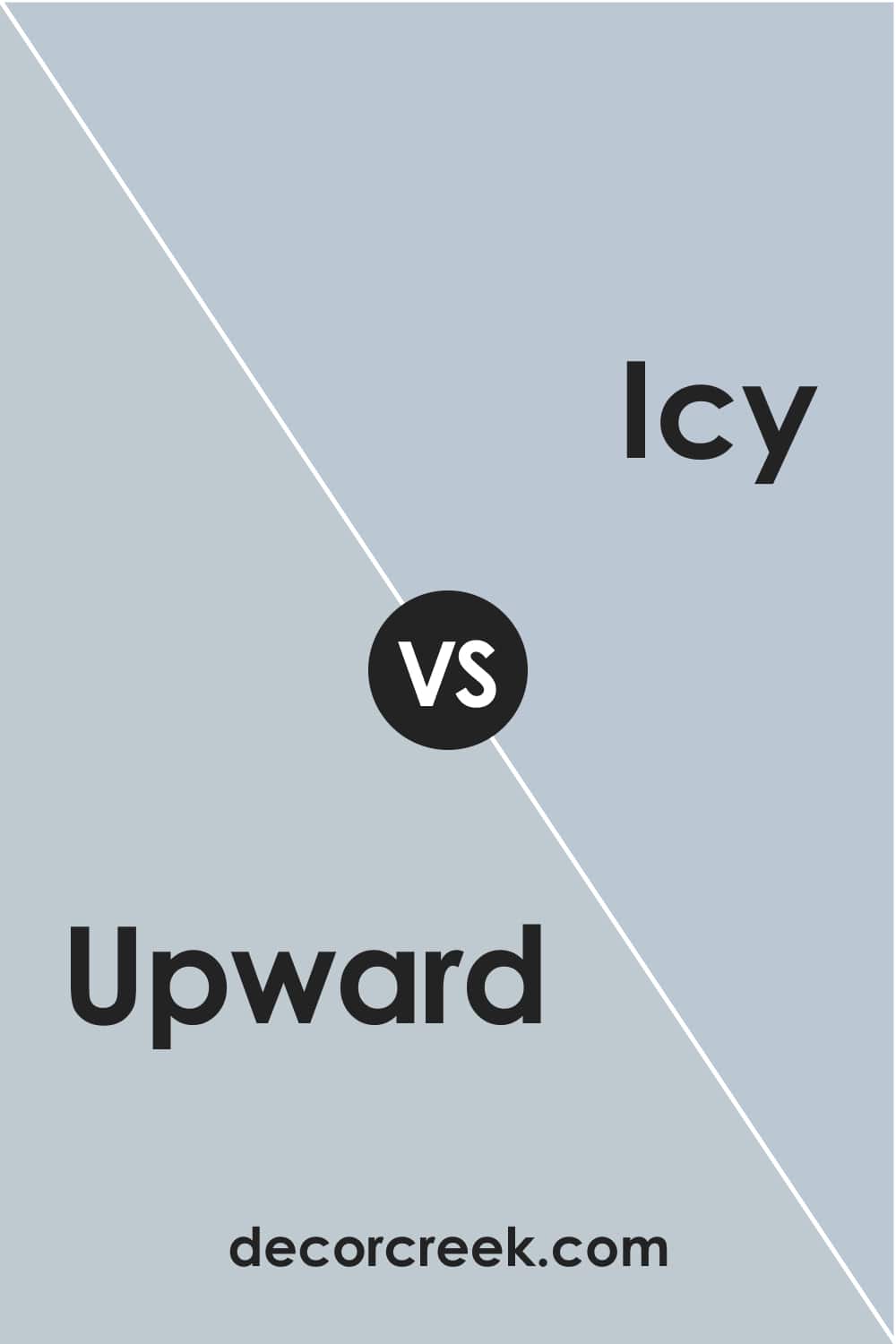
Upward vs Icy
SW Icy paint color reads clear and rather bright blue in comparison with Upward that reveals its gray undertones pretty much if you place it side by side with the counterpart. Moreover, Icy looks much “cooler” so be careful when using it in your home!
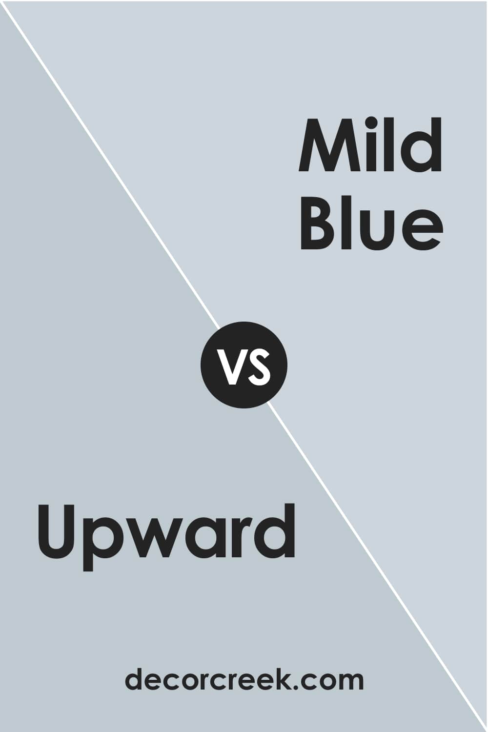
Upward vs Mild Blue
By the side of SW Mild Blue, Upward reads a prominently grayish blue. Mild Blue, on the contrary, looks more “chilly” and definitely much lighter – a good option if you need a lighter version of Upward. However, these colors don’t create enough contrast to be used together in the same room.
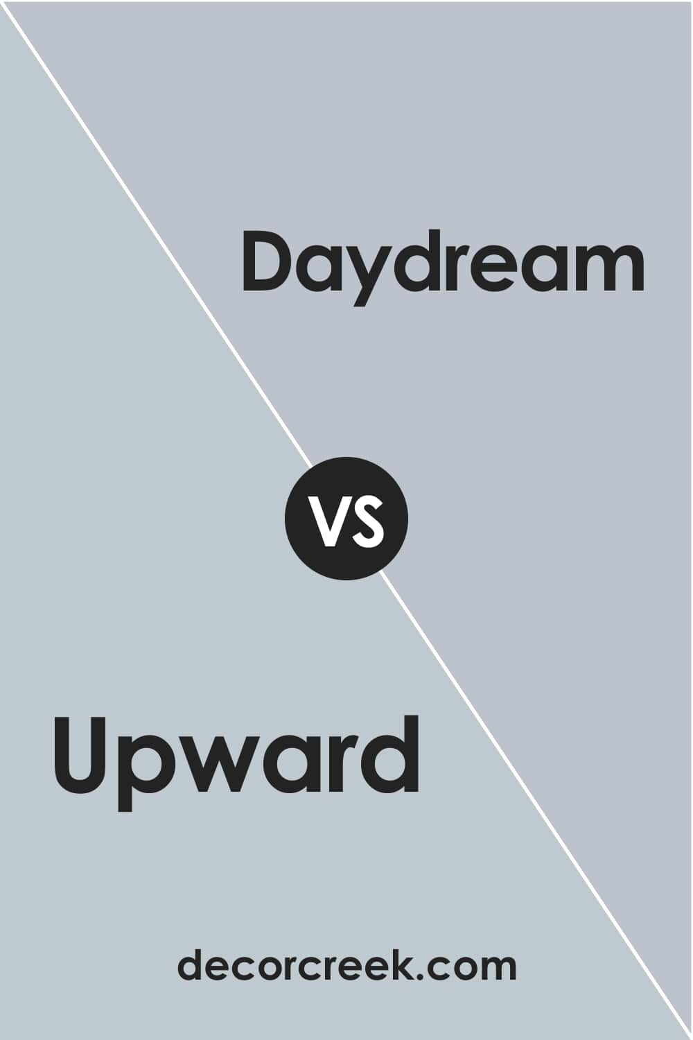
Upward vs Daydream
Unlike Upward with its gray undertones, SW Daydream has prominent purple undertones in it. This purplish blue is also not very bright, just like its counterpart, but these colors don’t create a good combo.
So, now you know all about SW Upward paint color. You learned what kind of color it is and where this blue can be used in your home. Also, you are now aware of its features that make this color rather tricky.
With all that, as well as with the list of coordinating and similar colors, you will easily use SW Upward correctly.
Ever wished paint sampling was as easy as sticking a sticker? Guess what? Now it is! Discover Samplize's unique Peel & Stick samples.
Get paint samples
Frequently Asked Questions
⭐Is SW Upward a good color for a nursery?
It can be if you use it with warmer white and/or beige colors.
⭐Does SW Upward work well with black?
Yes, this blue looks really nice with black color. But you should have other colors in the room as well.
⭐Does SW Upward have purple undertones?
It does have a very slight hint of purpleness that can sometimes be seen!


