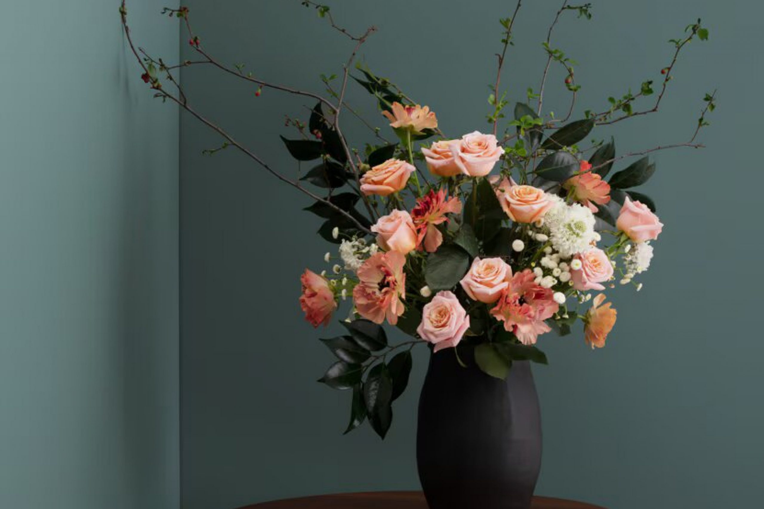
HC-160 Knoxville Gray by Benjamin Moore is one of those colors that instantly feels refined and balanced. This deep, moody gray brings a sense of calm and stability to any space. Whether used for an accent wall, an entire room, or even on the exterior, its versatility makes it a standout choice.
I found that its subtle blue and green undertones make it incredibly adaptable. It pairs beautifully with both modern and traditional decor, making it a popular choice for living rooms, bedrooms, and even kitchens.
This color can serve as a bold backdrop or blend more softly into the environment, depending on the lighting and surrounding colors.
What I really appreciate about Knoxville Gray is its timeless quality. It’s not a color that’s likely to go out of style, and it provides a solid foundation for various design elements like furniture, art, or architectural details.
If you’re looking to refresh a space with a color that adds depth without overwhelming, HC-160 Knoxville Gray might be the perfect choice.
In my experience, utilizing Knoxville Gray can make a remarkable difference in creating a space that feels both inviting and refined.
What Color Is Knoxville Gray HC-160 by Benjamin Moore?
Knoxville Gray (HC-160) by Benjamin Moore is a deep, stormy hue with a mix of blue and gray undertones. It’s a color that brings warmth and depth to a room, offering a rich, moody feel. This shade works beautifully in traditional, modern, and transitional styles, adding a touch of drama without overwhelming the space.
In a traditional setting, Knoxville Gray can be paired with creamy whites and rich wood tones to create a comforting, classic look. In a modern interior, it works well with clean lines, metallic accents, and touches of white to highlight its depth.
In transitional spaces, Knoxville Gray can act as a bridge between traditional and contemporary styles, grounding the room.
When it comes to materials and textures, this color pairs nicely with natural wood finishes, leather, and textured fabrics like linen and wool. It can also complement metallics such as brushed gold or silver, bringing out its understated elegance. Velvet or suede accents in soft neutral or muted jewel tones can further enhance its luxurious feel.
Whether used on walls or as an accent color, Knoxville Gray adds a layer of sophistication and coziness, making it a versatile choice for various spaces.
Is Knoxville Gray HC-160 by Benjamin Moore Warm or Cool color?
Knoxville Gray by Benjamin Moore is a deep, rich shade that brings character and depth to any room. It’s a versatile color that can adapt to different styles, from modern to traditional. The gray has bluish undertones, which can make a space feel cozy and inviting. When used in a living room or bedroom, it can create a warm atmosphere, perfect for relaxation.
In rooms with plenty of natural light, Knoxville Gray can appear lighter, while in spaces with less light, it can create a more intimate setting. This color pairs well with whites and creams, providing a beautiful contrast that highlights architectural details like moldings and trim.
It can also complement warm wood tones, bringing balance to the room’s design.
In homes, Knoxville Gray can be used on an accent wall to add interest or throughout a space for a unified look. Its versatility makes it a favorite choice for many homeowners.
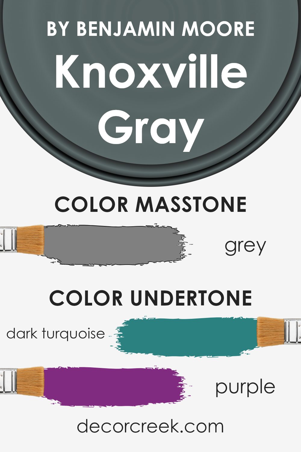
Undertones of Knoxville Gray HC-160 by Benjamin Moore
Knoxville Gray HC-160 by Benjamin Moore is an intriguing color with a complex mix of undertones that significantly affects how we perceive it. Undertones are like hidden colors that influence the main color’s appearance. When you look at Knoxville Gray, you aren’t just seeing gray; you’re seeing a blend of other subtle colors.
This particular shade of gray includes undertones of dark turquoise, purple, olive, navy, dark green, and more. These undertones can make Knoxville Gray read differently depending on the lighting and surrounding colors.
For instance, if the room has a lot of natural light, the blue and turquoise undertones might become more noticeable, giving the space a cooler feel.
In contrast, in dimmer lighting, the olive and brown undertones might come forward, creating a warmer and cozier atmosphere.
When used on interior walls, Knoxville Gray can create a versatile backdrop. Its rich undertones allow it to pair well with a wide array of accent colors. For example, pairing it with pale pink or light turquoise can highlight its more vibrant tones, while combining it with deep navy or dark green can emphasize its rich, earthy qualities. This adaptability makes Knoxville Gray a popular choice for creating a sophisticated and balanced environment.
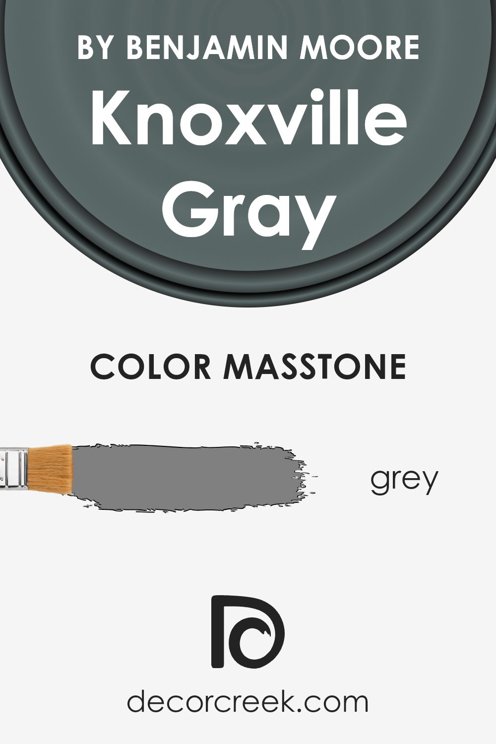
What is the Masstone of the Knoxville Gray HC-160 by Benjamin Moore?
Knoxville Gray HC-160 by Benjamin Moore is a versatile gray color that can easily fit into different home spaces. As a masstone, it resembles a mid-tone gray (#808080), which makes it quite neutral and adaptable. The neutrality of this gray allows it to complement a variety of other colors and styles, making it a favorite choice for living rooms, bedrooms, and kitchens.
When used on walls, this shade adds a subtle depth that can make rooms feel cozy and inviting. It can serve as a calm background color, letting other decor elements stand out. Knoxville Gray also works well on exterior surfaces, giving homes a classic look that is both modern and timeless.
In rooms with plenty of natural light, it can appear slightly warmer, while in darker spaces, it maintains its true gray nature, providing a consistent and balanced appearance throughout the day.
How Does Lighting Affect Knoxville Gray HC-160 by Benjamin Moore?
Lighting plays a crucial role in how we perceive colors. The color Knoxville Gray HC-160 by Benjamin Moore is a versatile, deep blue-gray that can look different depending on the lighting conditions.
In artificial light, such as incandescent bulbs, Knoxville Gray may take on a warmer tone, emphasizing its gray shades and minimizing the blue undertones. It can appear cozier and more muted. Under LED lighting, especially those with a cooler temperature, the blue undertones might become more prominent, giving the room a slightly colder feel.
Natural light changes throughout the day and can vary based on the room’s orientation. In north-facing rooms, where the light is cooler and more consistent, Knoxville Gray can appear more muted and cool-toned. The blue undertones are more visible, which might make the room feel slightly more formal and calm.
South-facing rooms receive warm, bright light through most of the day. Knoxville Gray can look warmer and more inviting, with the gray tones being more noticeable. The room feels vibrant and lively, but the color retains its depth and complexity.
East-facing rooms get rich, warm light in the morning which tends to enhance the warmer tones in the paint. As the day progresses, the color can appear cooler. Knoxville Gray may look slightly lighter and more welcoming in the morning and take on its cooler attributes later in the day.
West-facing rooms receive warm light in the afternoon and early evening. Knoxville Gray might appear warmer and more dynamic as the day ends, emphasizing the gray tones while maintaining an inviting atmosphere.
Understanding these differences can help you choose the right room and time of day to use Knoxville Gray to achieve the desired mood and ambiance.
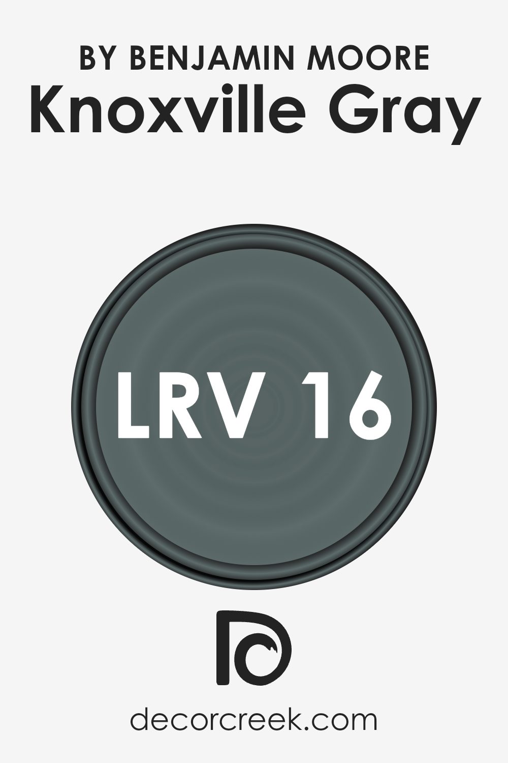
What is the LRV of Knoxville Gray HC-160 by Benjamin Moore?
Light Reflectance Value, or LRV, is a measurement used to determine how much light a color reflects. On a scale of 0 to 100, pure black has an LRV of 0 because it absorbs all light, while pure white has an LRV of 100 because it reflects all light. The LRV of a color can influence how bright or dark a room feels.
A higher LRV means a color reflects more light, making rooms feel larger and airier. Conversely, a lower LRV indicates a color absorbs more light, which can make spaces feel more intimate and cozy.
When choosing a paint color, considering its LRV helps you understand how it will interact with the natural and artificial light in your space.
The LRV of Knoxville Gray is 15.68, which places it on the darker side of the scale. This lower LRV means that Knoxville Gray absorbs more light than it reflects, giving it a rich and substantial presence on walls. In a room with ample natural light, this color may appear slightly lighter and bring out the color’s depth and bluish undertones.
In spaces with little light, Knoxville Gray can create a moody, intimate atmosphere, as it doesn’t bounce much light back into the room. It’s a versatile shade that can add sophistication to larger spaces but may feel overpowering in very small or dimly lit areas.
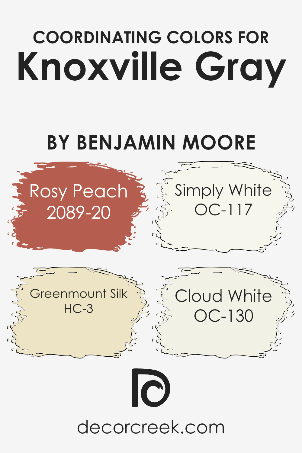
Coordinating Colors of Knoxville Gray HC-160 by Benjamin Moore
Coordinating colors are those that complement each other in a pleasing way, creating a harmonious look when used together in design. When Knoxville Gray by Benjamin Moore is paired with the right colors, it can really shine. This gray is versatile, offering a hint of blue-green undertone that pairs well with muted or warm tones.
Rosy Peach (2089-20) is a warm, inviting color that adds a soft, cheerful vibe. It balances well with the cool undertones of Knoxville Gray, bringing warmth to a room. Greenmount Silk (HC-3) is a gentle, soft green that invokes a sense of nature and freshness. It pairs beautifully with Knoxville Gray’s subtle tones, adding depth.
Simply White (OC-117) is a pure and clean white that offers brightness, making spaces look airy while allowing Knoxville Gray to stand out. Finally, Cloud White (OC-130) is a warm white with a touch of creaminess, perfect for creating a cozy, welcoming atmosphere while still allowing the gray’s personality to take the forefront. Together, these colors create a balanced and inviting palette that enhances any living space.
You can see recommended paint colors below:
- 2089-20 Rosy Peach
- HC-3 Greenmount Silk
- OC-117 Simply White
- OC-130 Cloud White
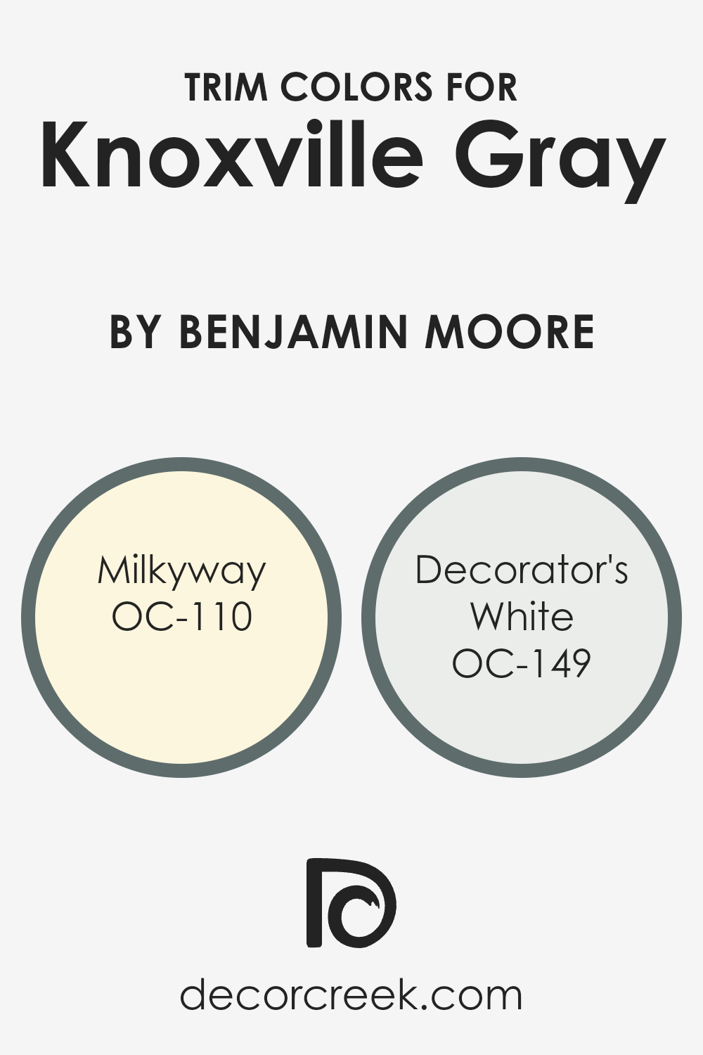
What are the Trim colors of Knoxville Gray HC-160 by Benjamin Moore?
Trim colors are the finishing touches that help define and highlight architectural features, like windows, doors, and moldings, within a room. They are important because they create contrast and add depth, enhancing the main wall color and drawing attention to the details.
Knoxville Gray by Benjamin Moore is a rich, dark gray with blue-green undertones that can make a room feel cozy and grounded. Choosing the right trim colors can make a big difference in how Knoxville Gray looks and feels in a space since they balance and complement the darker tones.
Milkyway OC-110 is a soft, creamy off-white that brings in a gentle warmth.
When used as a trim color, it creates a subtle and smooth transition that highlights Knoxville Gray, while keeping spaces warm and inviting.
On the other hand, Decorator’s White OC-149 is a very different kind of white. It has a cooler, clean edge that makes it feel crisp and bright. This trim color adds a fresh, modern look and works well to provide a sharp contrast with Knoxville Gray.
The clean brightness of Decorator’s White against the dark and moody gray-blue can define and enhance the character of the room.
Choosing these trim colors offers flexibility in setting different moods and highlighting the unique qualities of Knoxville Gray, making it either cozier with Milkyway or more contemporary with Decorator’s White.
You can see recommended paint colors below:
- OC-110 Milkyway
- OC-149 Decorator’s White
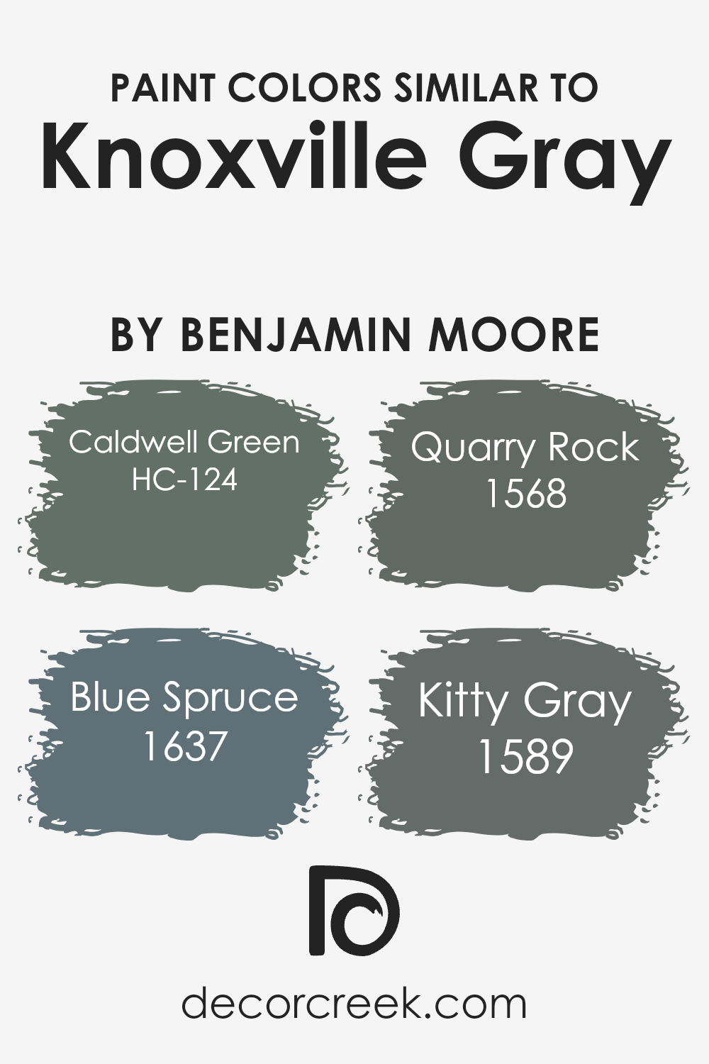
Colors Similar to Knoxville Gray HC-160 by Benjamin Moore
When decorating a space, using similar colors helps create a cohesive and harmonious look. These colors, which share similar undertones, work together beautifully, adding depth and interest without clashing. The color Knoxville Gray is a muted, elegant shade, and its similar colors include Caldwell Green, Blue Spruce, Quarry Rock, and Kitty Gray.
Each of these has a unique character but remains close enough in tone for a unified appearance.
Caldwell Green is a rich, deep green that brings a touch of nature indoors, offering a sense of calmness and balance.
Blue Spruce, on the other hand, has a soothing teal-blue quality, reminiscent of a peaceful forest retreat, and pairs well with earthy tones. Quarry Rock is a solid, earthy gray that grounds any space, providing a robust backdrop that’s neither flashy nor plain
. Finally, Kitty Gray offers a soft, warm gray with just a hint of warmth, making it versatile and easy to live with. Together, these colors complement each other and Knoxville Gray beautifully, allowing each hue to stand out while still maintaining a consistent and orderly look.
You can see recommended paint colors below:
- HC-124 Caldwell Green
- 1637 Blue Spruce
- 1568 Quarry Rock
- 1589 Kitty Gray
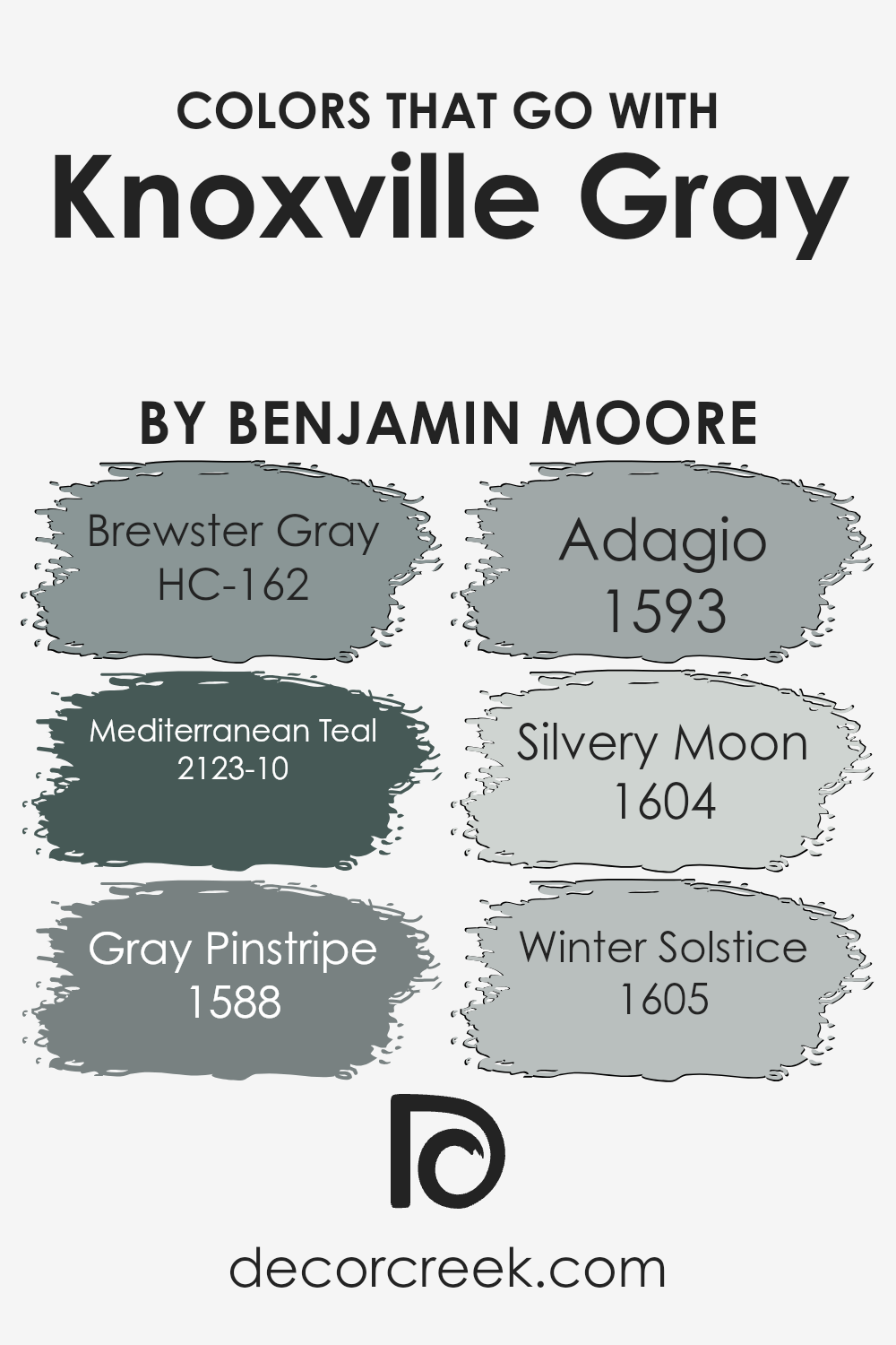
Colors that Go With Knoxville Gray HC-160 by Benjamin Moore
Knoxville Gray HC-160 by Benjamin Moore is a rich and complex color that serves as an elegant backdrop for various complementary shades. Pairing it with Brewster Gray HC-162, which is a deep and moody gray, can create a subtle and sophisticated contrast that adds depth to any room.
Mediterranean Teal 2123-10, on the other hand, introduces a lively pop of color that invigorates the space without clashing, as its blue-green tones are harmonious with Knoxville Gray’s muted quality.
Gray Pinstripe 1588 offers a soft yet assertive gray hue that serves as an ideal neutral to pair with Knoxville Gray, balancing out any bold design elements and keeping the overall look cohesive.
Meanwhile, Adagio 1593 introduces a gentle, timeless blue that complements Knoxville Gray’s depth, making rooms feel welcoming and balanced.
Silvery Moon 1604 brings a light, airy feel to the mix, contrasting beautifully with the darker gray, perfect for creating a fresh and open atmosphere.
Finally, Winter Solstice 1605 is a cool gray that adds a crisp touch, seamlessly blending with Knoxville Gray to create a refined and polished look.
Together, these colors create a harmonious palette that works well in any setting, whether you are aiming for a dramatic or subtle look.
You can see recommended paint colors below:
- HC-162 Brewster Gray
- 2123-10 Mediterranean Teal
- 1588 Gray Pinstripe
- 1593 Adagio
- 1604 Silvery Moon
- 1605 Winter Solstice
How to Use Knoxville Gray HC-160 by Benjamin Moore In Your Home?
Knoxville Gray HC-160 by Benjamin Moore is a stylish and versatile paint color. It is a rich, deep smokey blue with hints of gray, making it a great choice for many different areas in your home. This color works well in living rooms or bedrooms, creating a cozy and comfortable atmosphere.
It pairs beautifully with lighter shades, such as off-white or beige, providing a nice contrast that adds depth to any space.
In kitchens, Knoxville Gray can serve as an elegant choice for cabinets or an accent wall, adding a touch of boldness without being overwhelming. It also complements metallic hardware, such as brushed nickel or brass, giving an updated look. In bathrooms, this color can create a relaxing space, especially when paired with white tiles or fixtures. Knoxville Gray is also perfect for a home office, as it offers a professional and calm backdrop that can help with concentration and productivity.
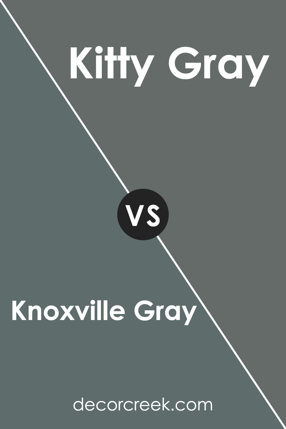
Knoxville Gray HC-160 by Benjamin Moore vs Kitty Gray 1589 by Benjamin Moore
Knoxville Gray HC-160 and Kitty Gray 1589, both by Benjamin Moore, are unique shades that offer different vibes for any space. Knoxville Gray is a deep, rich blue-gray that can sometimes appear greenish under various lighting. It’s a bold, moody color that adds warmth and depth, making it ideal for making a statement in any room.
On the other hand, Kitty Gray is lighter and softer, with a more traditional gray tone. It’s a versatile neutral that’s easy on the eyes and works well in a variety of settings. Kitty Gray can make a room feel open and calming, without the intensity that Knoxville Gray brings.
While Knoxville Gray commands attention and adds character, Kitty Gray provides a more understated, everyday elegance. Both colors are stylish, but their impact differs, with Knoxville Gray offering more drama and Kitty Gray more subtlety.
You can see recommended paint color below:
- 1589 Kitty Gray
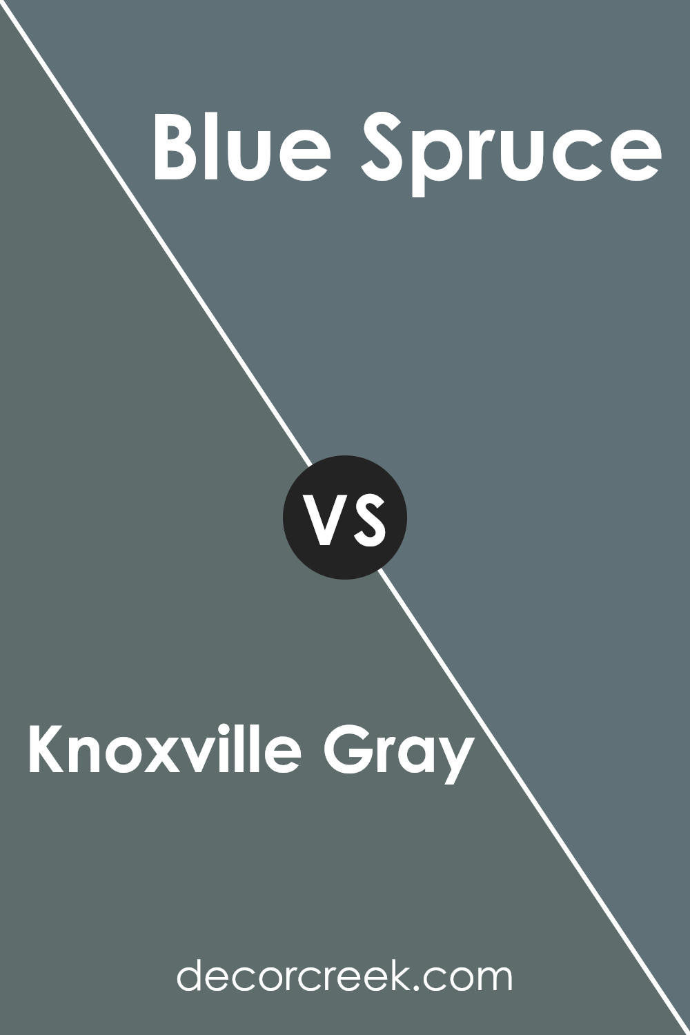
Knoxville Gray HC-160 by Benjamin Moore vs Blue Spruce 1637 by Benjamin Moore
Knoxville Gray and Blue Spruce are both beautiful colors by Benjamin Moore, each with its own unique characteristics. Knoxville Gray is a deep, muted shade of gray with greenish-blue undertones. It has a classic and timeless look, making it great for both traditional and modern spaces. It provides a calm, grounded feel without overwhelming a room.
On the other hand, Blue Spruce is a rich blue-green color with a slightly darker and more intense tone than Knoxville Gray. It draws more on green hues, giving it a more vibrant look while staying elegant. This color can bring depth and interest to a space, making it feel cozy and inviting.
Both colors work well in different settings depending on the mood you want to create. Knoxville Gray offers a more subdued, neutral option, while Blue Spruce adds a bit more color and personality.
You can see recommended paint color below:
- 1637 Blue Spruce
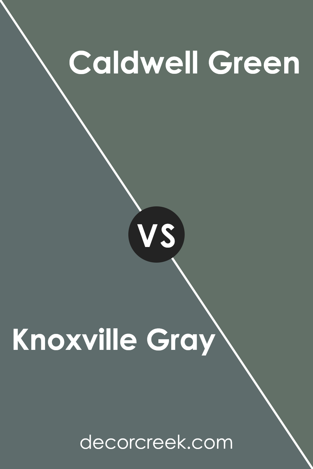
Knoxville Gray HC-160 by Benjamin Moore vs Caldwell Green HC-124 by Benjamin Moore
Knoxville Gray and Caldwell Green, both by Benjamin Moore, offer unique aesthetics. Knoxville Gray is a muted blue-gray, often with a slight hint of green. It feels calm and versatile, making it a great choice for different spaces and styles. It works well in both traditional and modern settings, blending comfortably with various color schemes.
Caldwell Green, on the other hand, is a deeper, richer green with a touch of gray. This color brings more warmth and a natural feel, making it ideal for creating a cozy atmosphere. It pairs beautifully with wood tones and earthier palettes, complementing outdoor views or garden-adjacent rooms.
While Knoxville Gray offers more of a neutral backdrop, Caldwell Green tends to be bolder and more pronounced, suited for accent walls or areas where you want a touch of nature. Both colors harmonize well with whites and off-whites, providing balance to any room.
You can see recommended paint color below:
- HC-124 Caldwell Green
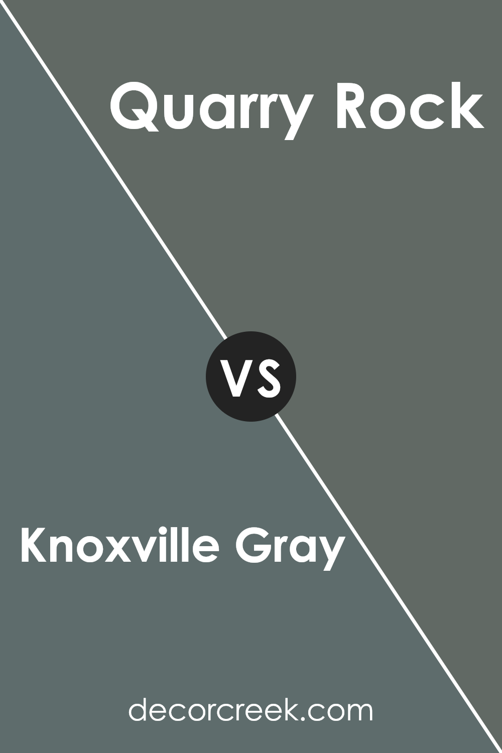
Knoxville Gray HC-160 by Benjamin Moore vs Quarry Rock 1568 by Benjamin Moore
Knoxville Gray HC-160 and Quarry Rock 1568 by Benjamin Moore are both rich, timeless shades. Knoxville Gray is a medium-to-dark blue-green with gray undertones. It has a muted, calming feel, making it versatile for various spaces, whether you want a bold accent wall or a cozy room. It pairs well with whites and lighter grays for contrast.
On the other hand, Quarry Rock is a warmer, darker gray with hints of brown. It offers a more solid, earthy vibe, perfect for creating a grounded atmosphere. Quarry Rock works well with creams, beiges, and other neutral colors, adding depth without dominating the room.
While both colors are neutral in their own ways, Knoxville Gray leans cooler with its blue tones, whereas Quarry Rock is warmer. Choosing between them depends on the mood you wish to set: the cool elegance of Knoxville Gray or the warm, earthy comfort of Quarry Rock.
You can see recommended paint color below:
- 1568 Quarry Rock
Conclusion
This shade of gray is not too dark and not too light, sitting perfectly in between. It’s a great choice if you want something classic for your home that still feels fresh and modern.
Knoxville Gray can help make any room feel nice and cozy. Imagine having a warm blanket around you, and that’s kind of how this color makes a room feel. It’s like having a little bit of magic on your walls that makes everything look just right.
One of the best things about this shade is how it works well with other colors. If you have bright furniture or fun decorations, Knoxville Gray will make them stand out even more. If everything you have is more neutral, this color will fit right in and help tie everything together.
So, if you’re thinking of adding a new color to your room and want something that feels comfortable and stylish, Knoxville Gray could be the perfect pick.
It’s like a friend who’s always there to make things better without being too loud or flashy. I can’t wait to see what it does to make your home feel even more amazing!
Ever wished paint sampling was as easy as sticking a sticker? Guess what? Now it is! Discover Samplize's unique Peel & Stick samples.
Get paint samples

