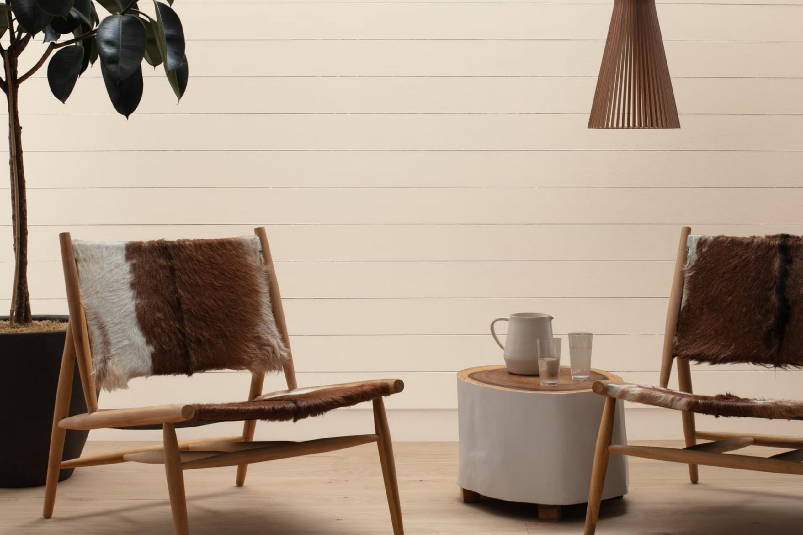
I recently recommended a fresh coat of paint for a client’s living room, and after going through lots of options, I landed on CW-95 Lime White by Benjamin Moore. This color is part of the Williamsburg Collection, which interestingly, draws from historical hues while giving them a modern twist. Unlike the bold colors I previously favored, Lime White has a subtle and soothing presence that instantly softened the look of my spot.
The color is a muted off-white with undertones that shift with the changing light, offering a hint of warmth in the mornings and a soft glow as the evening sets in. It seamlessly complements various decor styles and colors, providing a versatile backdrop for my eclectic mix of furniture and artwork.
Using Lime White made me realize how a paint color could enhance the overall ambiance of a room without overpowering it.
It works beautifully to create a serene and welcoming atmosphere, which is exactly what I was aiming for in my living spot.
What Color Is Lime White CW-95 by Benjamin Moore?
Lime White CW-95 by Benjamin Moore is a warm and subtle off-white with hints of green, making it a cozy and inviting choice for any spot. Its muted tone provides a gentle backdrop, allowing other elements in the room to stand out. This color is particularly effective in creating a light, airy atmosphere without feeling too stark, perfect for living rooms and bedrooms that aim to promote a relaxed and comfortable vibe.
When considering interior styles, Lime White CW-95 is versatile but works exceptionally well in country, cottage, and modern rustic interiors. Its earthy undertone harmonizes with natural materials such as wood, wicker, and linen, enhancing the organic feel of these textures. It’s also an excellent match for soft, brushed metals like copper and bronze, which add a touch of warmth and charm to the subtlety of this color.
Lime White CW-95 pairs beautifully with natural elements like wooden furniture, stone accents, and plenty of green plants — all of which help the room feel more connected to nature. Fabrics like cotton and wool in neutral colors, as well as terracotta pots and other ceramic accessories, also complement this paint color wonderfully.
The flexibility of Lime White CW-95 makes it a smart choice for creating a calm, inviting environment that feels both refreshing and grounded.
Is Lime White CW-95 by Benjamin Moore Warm or Cool color?
Lime White CW-95 by Benjamin Moore is a gentle off-white color that offers a hint of warmth. This subtle hue is very adaptable and works beautifully in various rooms in the home. It provides a soft backdrop that allows furniture and artwork to stand out, making it a great choice for living rooms and bedrooms where you want a calm and inviting atmosphere.
This color is also effective in smaller rooms like bathrooms or hallways, making them feel more open and airy. Because it’s a neutral color, it pairs well with many other colors, from bold and bright shades to softer tones, giving homeowners flexibility in decorating. Using Lime White CW-95 on walls can help reflect natural light, which brightens the room and can also make rooms feel larger.
Overall, Lime White CW-95 is a practical choice for those looking to refresh their home without overwhelming it with color, maintaining a clean and welcoming feel.
Undertones of Lime White CW-95 by Benjamin Moore
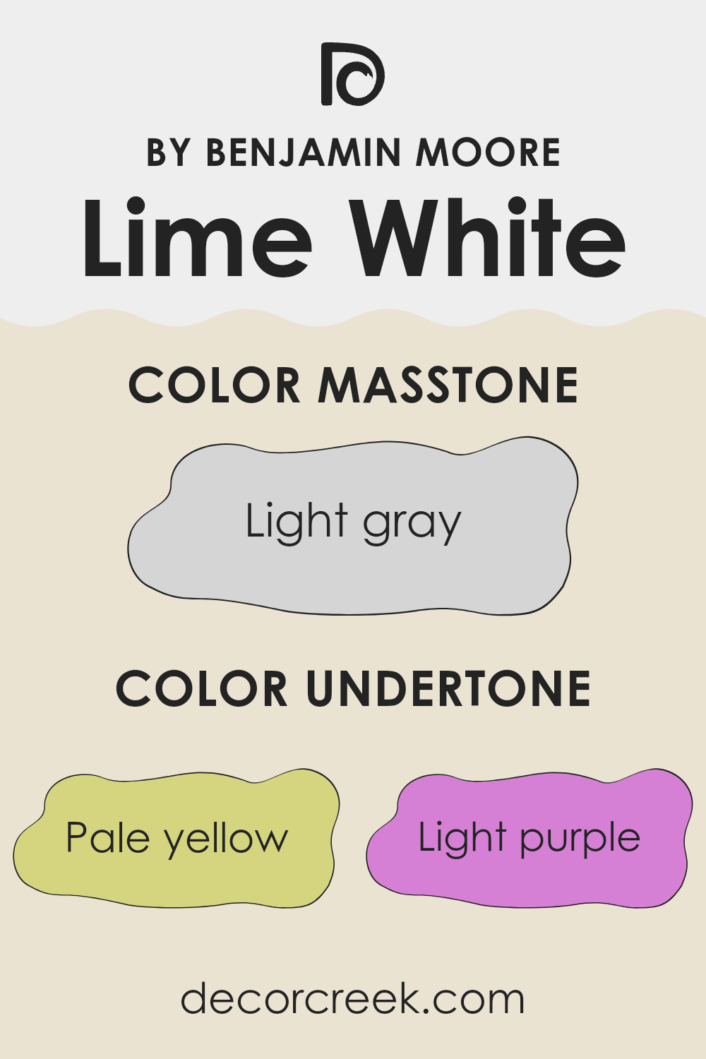
Lime White CW-95 by Benjamin Moore is a unique paint color with a complex set of undertones that subtly influence its overall appearance. Undertones are secondary colors that affect the primary hue of a paint, often visible under certain lighting conditions or when placed next to contrasting colors. In Lime White, these undertones include pale yellow, light purple, light blue, pale pink, mint, lilac, and grey.
Undertones play a crucial role in how we perceive color. For instance, a pale yellow undertone can make a white paint feel warmer, whereas a grey undertone might give it a cooler, more muted look. Due to its variety of undertones, Lime White can appear differently depending on the lighting and surrounding colors. Its versatility allows it to adapt subtly to different decor styles and preferences.
When used on interior walls, the undertones of Lime White can influence the mood and atmosphere of a room. For example, the light blue and mint undertones can bring a fresh and airy feel, making a room seem more spacious and open. The lilac and light purple undertones add a touch of softness, ideal for creating a relaxing environment. Meanwhile, the grey undertone helps in achieving a neutral backdrop that complements various types of furniture and decorations.
Overall, the understanding of undertones in Lime White CW-95 can help in making informed decisions while decorating, ensuring the color aligns with the desired ambiance and aesthetic of a room.
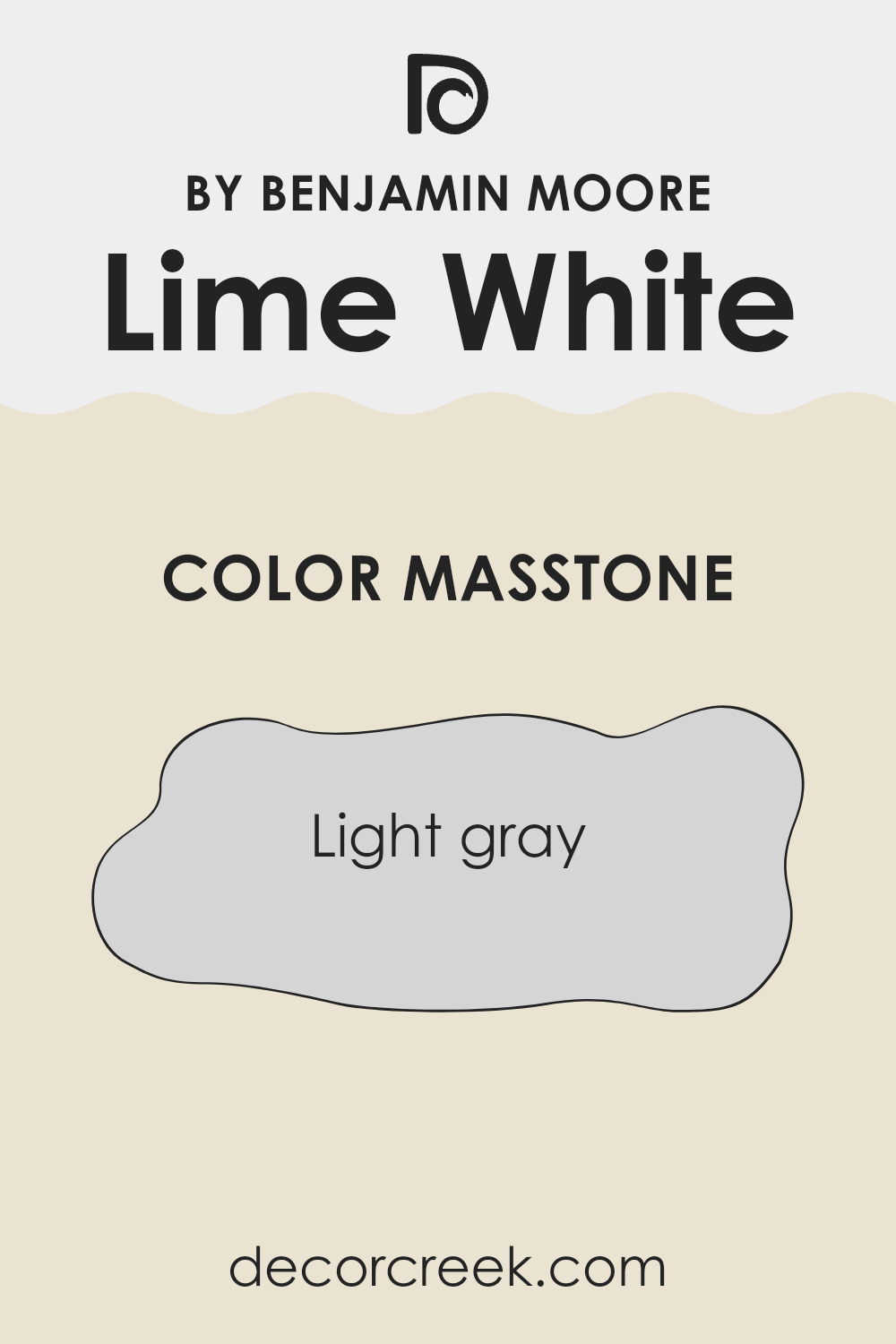
What is the Masstone of the Lime White CW-95 by Benjamin Moore?
Lime White CW-95 by Benjamin Moore is a gentle light gray color that brings a refreshing neutrality to any room. This subtle shade, with its understated elegance, serves as an excellent backdrop in homes, complementing furniture and decor without overpowering them.
Its light gray tone helps in making rooms feel larger and more open, which is especially useful for small rooms or areas with limited natural light. Also, since it’s such a soft and forgiving color, it hides minor wall imperfections well, which can be a practical benefit for busy family homes.
This color is adaptable and can be paired easily with brighter colors or other neutrals to create cozy and inviting living areas. Overall, Lime White CW-95 is a versatile choice that works well in various settings, from modern apartments to traditional houses, adding a clean and calm aesthetic to any spot.
How Does Lighting Affect Lime White CW-95 by Benjamin Moore?
Lighting greatly impacts how colors appear in various environments, creating different feelings and atmospheres in a room. When discussing a specific color, such as Lime White by Benjamin Moore, we see these effects in action under both artificial and natural lighting.
In artificial light, Lime White takes on a warmer tone. Depending on the type of bulb used (LED, fluorescent, or incandescent), the color can look slightly different. LED lights, for instance, tend to bring out a crisp brightness in the color, making it appear fresh and lively. Fluorescent lighting can give it a slightly cooler tone, which might make the color look a bit more reserved.
In natural light, the behavior of Lime White shifts through the day. The quality of the natural light affects how this shade appears. Under full sunlight, it can look vibrant and pure, enhancing the brightness of the room. On cloudy days or in softer, diffused light, the color may appear more subdued and gentle.
The orientation of the room also influences how this color is perceived. In north-facing rooms, which receive less direct sunlight and more cool light, Lime White might appear slightly more muted and cooler. This can give a calm, gentle feel to the room. In south-facing rooms, flooded with warm, direct sunlight throughout the day, the same color might look more vivid and lively, making the spot feel bright and welcoming.
Rooms facing east will see Lime White wake up beautifully with the morning sun, appearing bright and cheerful. However, as the day progresses, the absence of strong sunlight might make the color look softer and cooler, which can be quite refreshing. Conversely, in west-facing rooms, the color will display its full charm in the late afternoon and evening, looking radiant and full of life as it reflects the golden tones of the sunset.
These variations underline the importance of considering the interaction between light and paint colors in home decorating to achieve the desired atmosphere in any room.
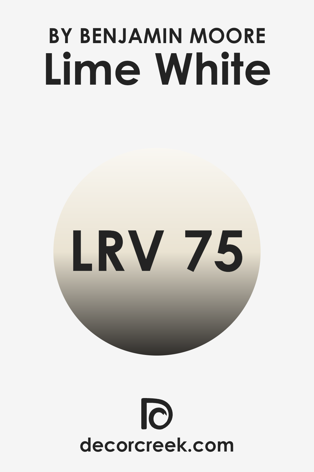
What is the LRV of Lime White CW-95 by Benjamin Moore?
LRV, or Light Reflectance Value, is a measurement used to describe the percentage of light a paint color can reflect back into a room. It runs on a scale where 0 means it absorbs all light (appears black), and higher values up to the maximum reflect more light, making them appear lighter.
This concept is crucial when picking paint, as it largely influences how bright or dark a room feels. Colors with higher LRV, like the mentioned white color, make rooms appear larger and more illuminated, which is useful in rooms with less natural light.
The LRV of 75.37 for this white shade means that it reflects a lot of light, making it a good choice for creating a sense of openness and brightness in a part of the home. This particular shade of white is effective at bouncing back most of the light that hits it, thus enhancing the overall lightness of a room. Such a high LRV makes it particularly suitable for smaller rooms or those with limited natural sunlight, helping to create a visually lighter and more welcoming part of the home.
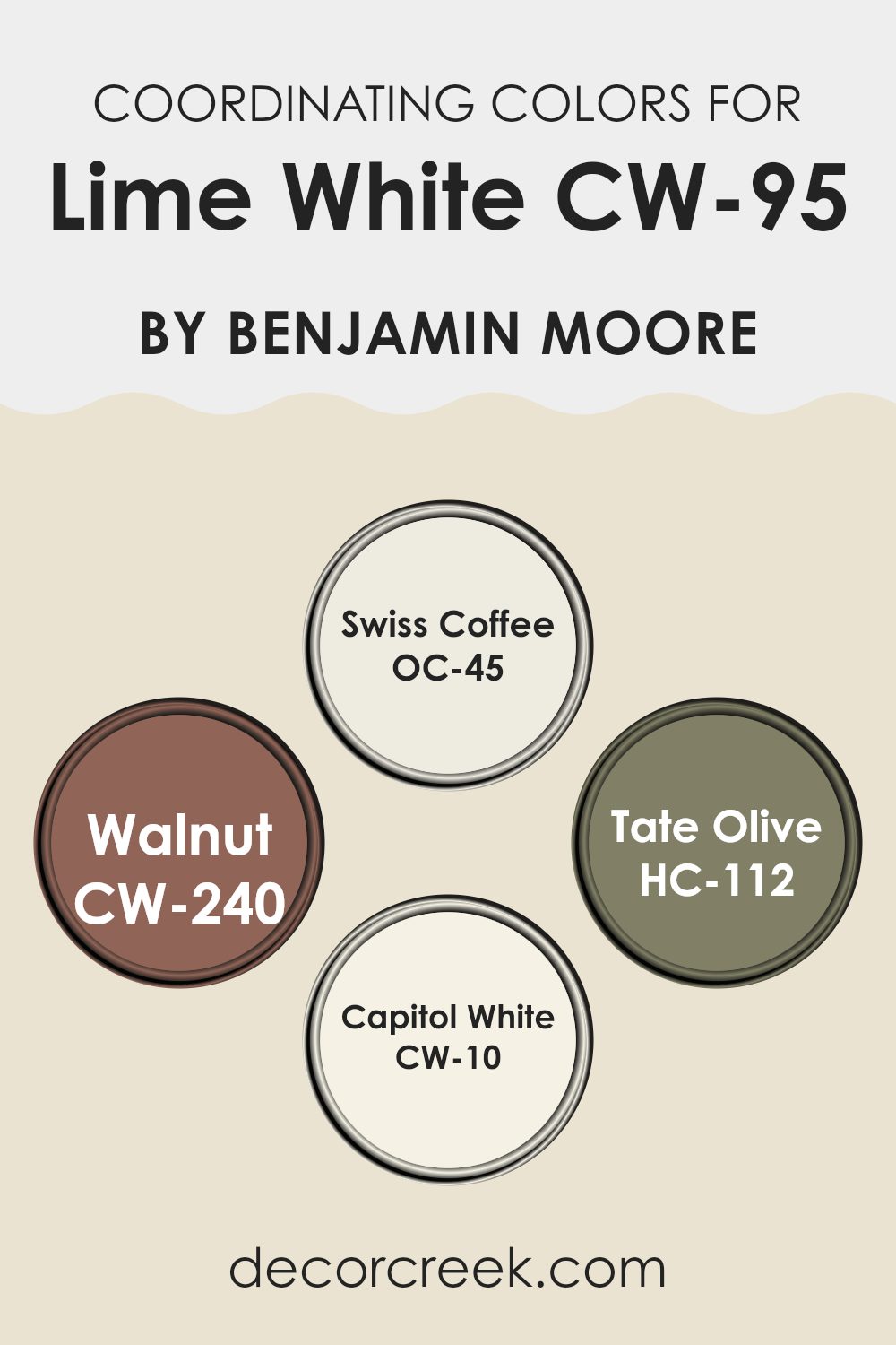
Coordinating Colors of Lime White CW-95 by Benjamin Moore
Coordinating colors are shades that blend well together to create a harmonious look in any part of the home. They often consist of colors that contrast or complement the main hue, which in this case is a soft, delicate tone like Lime White. Coordinating colors can create depth and interest, making the main color stand out more or softly blend into a cohesive design.
Swiss Coffee OC-45 is a warm, creamy white that brings a cozy, inviting feel to any room. It’s perfect for walls or trim and pairs well with darker or bolder colors to create a balanced look. Walnut CW-240 is a deep, rich brown that provides a strong contrast to lighter tones, ideal for furniture or accent walls to add a touch of elegance.
Tate Olive HC-112 is a muted green that works beautifully to bring a natural, earthy element into the mix, perfect for interiors that aim to have a calming, grounded vibe. Lastly, Capitol White CW-10 is a crisp, clean white with a slight undertone of grey, excellent for creating a fresh and bright atmosphere, especially useful in areas that receive less natural light. Together, these colors support and enhance the beauty of Lime White, offering a variety of decorating options to suit any taste or part of the home.
You can see recommended paint colors below:
- OC-45 Swiss Coffee
- CW-240 Walnut
- HC-112 Tate Olive
- CW-10 Capitol White
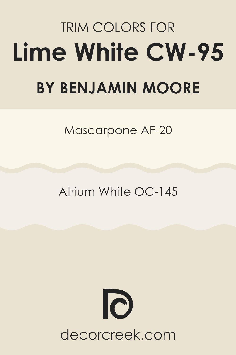
What are the Trim colors of Lime White CW-95 by Benjamin Moore?
Trim colors are used on the architectural elements of a room, like baseboards, moldings, door frames, and window casings, to create visual contrast and highlight these features. Choosing the right trim color can enhance the overall aesthetic of a part of the home and complement the main wall colors.
For a paint like Lime White CW-95 by Benjamin Moore, which is a soft, warm white, selecting trim colors that are harmonious yet subtly different can add a gentle contrast and bring a refined look to the interiors without overpowering the main hue.
AF-20 – Mascarpone by Benjamin Moore is a creamy, rich white that offers a slightly more saturated hue, making it an excellent choice for trim, providing a soft but distinct boundary against the lighter Lime White CW-95 walls. OC-145 – Atrium White is another great option for trims, with its very slight pink undertone that presents a fresh and appealing look. It pairs beautifully with Lime White CW-95 by giving just the right amount of contrast to subtly define the part of the home.
You can see recommended paint colors below:
- AF-20 Mascarpone
- OC-145 Atrium White
How to Use Lime White CW-95 by Benjamin Moore In Your Home?
Lime White CW-95 by Benjamin Moore is a subtle, warm white paint that can add a soft and inviting touch to any room in a house. This color works beautifully for creating a cozy atmosphere, making it ideal for living rooms and bedrooms where a calm and welcoming feel is important.
Its versatility also extends to kitchens and bathrooms, where it can help to brighten the interiors without making them feel stark or too clinical. Using Lime White CW-95 can be a great choice for painting walls or trim, and it pairs well with a wide spectrum of colors, allowing for easy decoration changes in the future.
For those looking to freshen up old furniture or cabinets, this color can be successfully applied to give a clean, refreshed look. It’s particularly effective in interiors that get a lot of natural light, accentuating the light without overwhelming it with a strong hue.
Conclusion
Wrapping up our look at CW-95 Lime White by Benjamin Moore, it’s clear this paint color is more than just basic white. Whether it’s on the walls of a living room or brightening up a kitchen, Lime White adds something special, yet remains simple and clean.
It’s a great base that lets other colors or furniture really stand out. You won’t get tired of it because it has a fresh, welcoming feel that makes your home look and feel cozy. Plus, it works well in different kinds of light, continuing to look great whether it’s sunny or cloudy. That’s pretty cool, right?
If you’re thinking about giving your own room a new look, CW-95 Lime White could be a winner. It’s like the soft background of a beautiful painting, allowing everything else in the room to come alive. So, if you’re ready for a change and want something new but not too wild, think about this color. It might just be the perfect choice!
Ever wished paint sampling was as easy as sticking a sticker? Guess what? Now it is! Discover Samplize's unique Peel & Stick samples.
Get paint samples

