When it comes to choosing a paint color that brings a sense of warmth and neutrality to your home, HC-81 Manchester Tan by Benjamin Moore stands out as a popular favorite. This soft tan hue is versatile, making it a go-to choice for any room in your house. Whether you’re sprucing up your living room, bedroom, or even your kitchen, Manchester Tan adds a subtle touch of elegance without overwhelming the space.
The beauty of Manchester Tan lies in its ability to blend with a wide range of decor styles and color schemes. From modern minimalistic to cozy country or even eclectic, it provides a solid foundation that allows your furniture and accent pieces to really stand out.
This color is particularly admired for its adaptability in different lighting conditions, where it can shift from a lighter, almost creamy color to a deeper, more pronounced tan, offering depth and complexity to your interiors.
Moreover, homeowners and interior designers alike appreciate Manchester Tan for its calming effect. It’s a color that evokes a sense of tranquility and serenity, making it perfect for creating a relaxing atmosphere in your home.
Whether you’re aiming for a refresh of your walls or looking for the perfect backdrop for your art and photographs, Manchester Tan by Benjamin Moore is an excellent choice that combines beauty and flexibility.
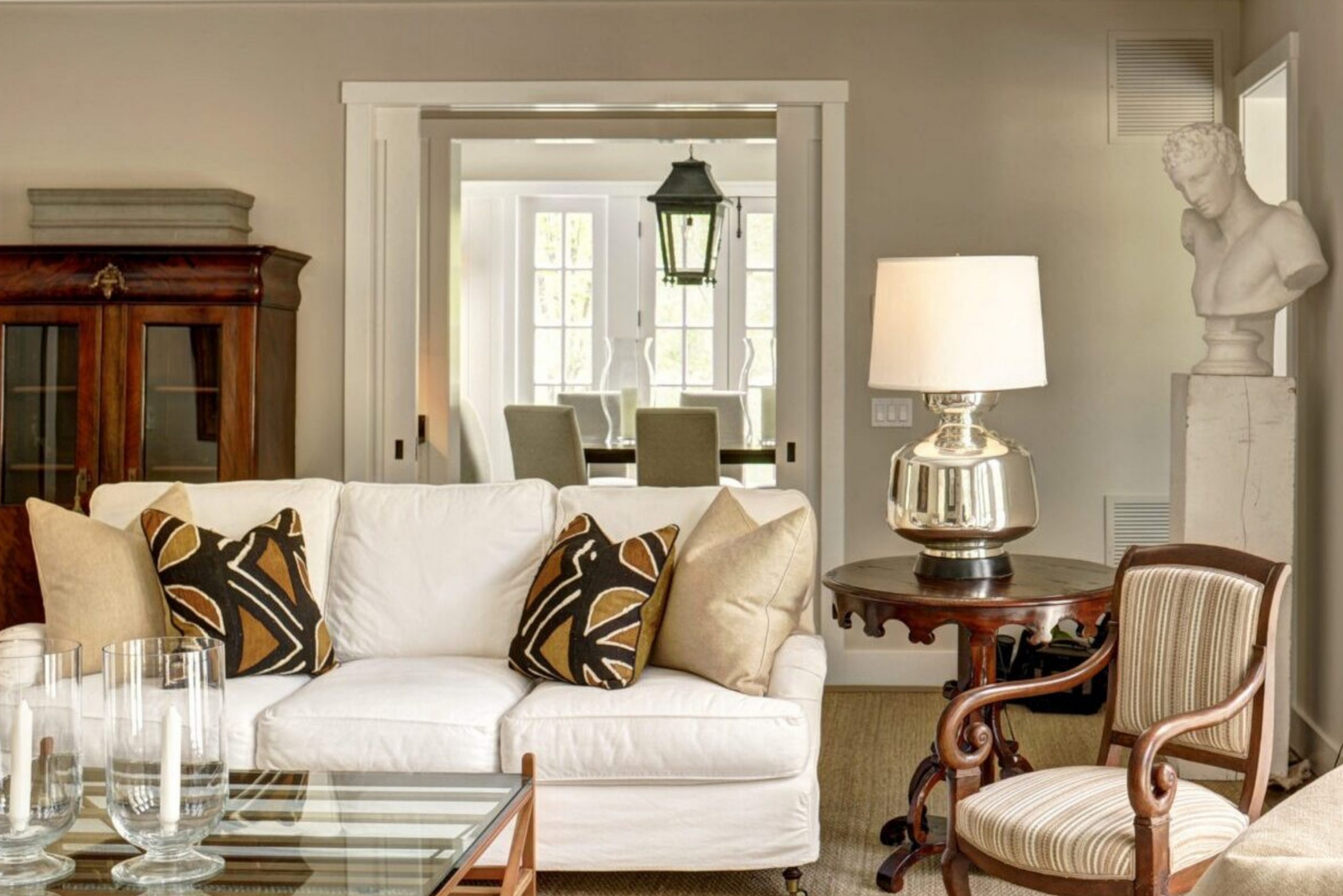
What Color Is Manchester Tan HC-81 by Benjamin Moore?
Manchester Tan is a warm, neutral beige color that brings a sense of calmness and simplicity to any space. With its understated elegance, it serves as a versatile backdrop, allowing other colors to shine without dominating the scene. This characteristic makes it a popular choice for those aiming for a timeless and serene interior.
This color works exceptionally well in various interior styles, from modern and minimalist to country and coastal. Its natural earthiness bridges the gap between indoor comfort and outdoor freshness, making it an ideal choice for living rooms, bedrooms, and even home offices where a neutral, soothing palette is desired.
Its warmth adds coziness to contemporary spaces and complements the simplicity of Scandinavian design, while in more traditional settings, it brings a light, airy feel without losing the classic touch.
Manchester Tan pairs beautifully with a wide range of materials and textures. It looks stunning against crisp white trim, enhancing the room’s brightness and space. Natural wood, whether light or dark, complements its warmth, creating an inviting atmosphere.
Linen fabrics and textured pieces like woven baskets or chunky knit throws add depth to the color, while metallic finishes like brass or gold introduce a touch of sophistication, making the overall aesthetic comfortably chic and effortlessly balanced.
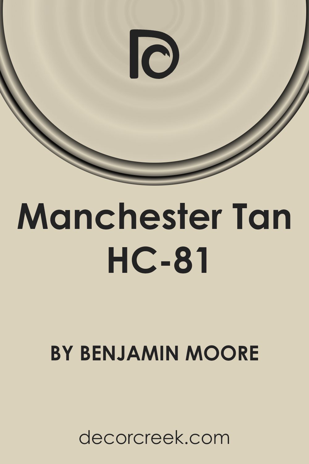
Is Manchester Tan HC-81 by Benjamin Moore Warm or Cool color?
Manchester Tan by Benjamin Moore is a warm, neutral color that brings a natural, subtle elegance to any room. This shade of tan finds a sweet spot, being not too dark and not too light, making it versatile for use in various settings within a home. Since it has a natural earthy tone, it pairs seamlessly with a wide array of color schemes and design aesthetics. Whether your home has a modern, minimalist vibe or a cozy, traditional atmosphere, Manchester Tan can enhance the space without overpowering it.
This particular shade is great at reflecting light, helping to make spaces appear larger and more open. It’s especially effective in rooms that may not get a lot of natural sunlight, adding a warm glow that makes the space feel inviting. When used on walls, it acts as a soft backdrop that allows furniture and artwork to stand out.
Its adaptability also means you can easily switch up your decor without having to repaint, as it complements both bold and subdued colors alike. In essence, Manchester Tan offers a timeless appeal that works beautifully in homes, providing a serene and sophisticated ambiance.
Undertones of Manchester Tan HC-81 by Benjamin Moore
Manchester Tan by Benjamin Moore is a color that at first glance might seem simple, but when you take a closer look, it reveals a complex nature due to its various undertones. These undertones include pale yellow, light purple, light blue, pale pink, mint, lilac, and grey. Each of these undertones contributes to the perception and versatility of Manchester Tan, affecting how it appears on interior walls and how it feels in a space.
Undertones in paint colors are like secret ingredients that can subtly change the overall look of a color. They can influence the warmth or coolness of a color and how it behaves under different lighting conditions. For instance, pale yellow and mint undertones in Manchester Tan add a touch of warmth, making a room feel cozy and inviting.
On the other hand, light purple, light blue, and lilac bring in a cooler, more serene vibe, perfect for creating a calm and restful space. Pale pink and grey undertones balance the color, ensuring it remains flexible and neutral, able to pair well with a wide range of decor styles and other colors.
When applied to interior walls, Manchester Tan’s rich blend of undertones allows it to adapt to various lighting conditions and design elements. It can look warmer and more welcoming in rooms with plenty of natural light, or cooler and more reserved in spaces with less light.
This adaptability makes Manchester Tan a popular choice for those wanting a paint color that can support different moods and themes, from warm and rustic to cool and minimalist. The undertones essentially ensure that the color remains dynamic yet grounded, capable of tying together furnishings and accents in a harmonious way.
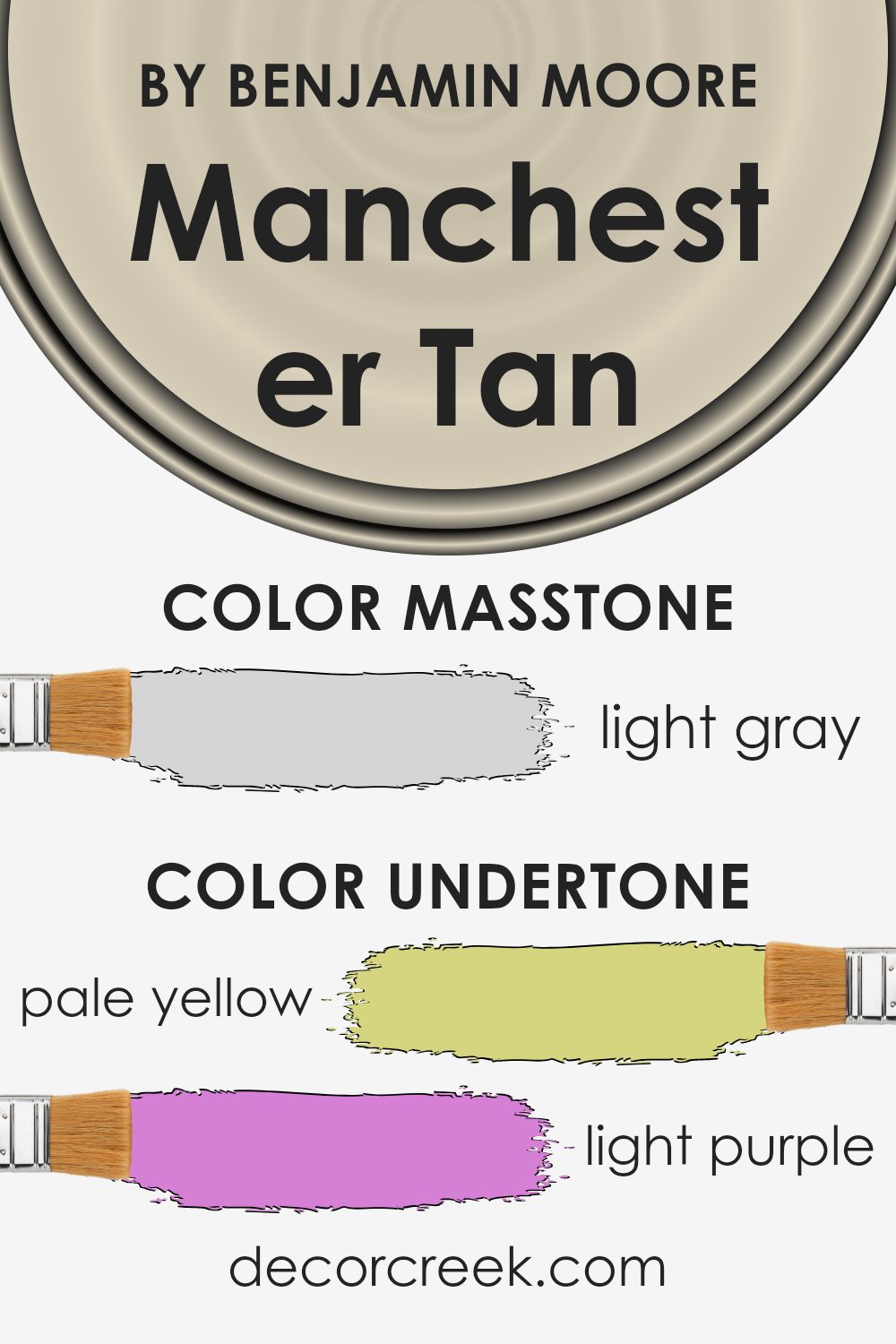
What is the Masstone of the Manchester Tan HC-81 by Benjamin Moore?
Manchester Tan HC-81 by Benjamin Moore, known for its masstone color of light gray (#D5D5D5), is a versatile shade perfect for home interiors. This particular light gray has a warm undertone that makes it easy to work with other colors. Because of its softness, it’s great for creating a cozy, welcoming atmosphere in rooms.
Its lightness reflects natural light beautifully, making spaces appear brighter and more open. This color can be used in various rooms such as living rooms, bedrooms, and kitchens, adding a subtle touch of elegance without overwhelming the space. It pairs well with both bold and muted colors, giving homeowners the flexibility to mix and match decor pieces.
Whether you’re going for a modern or traditional look, this color can complement your style while adding a harmonious backdrop to your home’s interior. Manchester Tan’s adaptability and soft charm make it a go-to choice for creating a serene and inviting environment.
How Does Lighting Affect Manchester Tan HC-81 by Benjamin Moore?
Lighting plays a key role in how we see colors. It can make a big difference in the appearance of paint colors on our walls. For example, Manchester Tan is a popular paint choice for many homes. It’s a neutral color, which means it doesn’t lean too strongly towards any color on the spectrum, making it versatile. However, the lighting in your room can change how this color looks.
In artificial light, Manchester Tan tends to look warmer. This is because most indoor lighting has a yellow tone, which adds a cozy feel to the color on your walls. It’s like the color snuggles up a bit, becoming more inviting.
In natural light, the color can change throughout the day. Natural light brings out the truest version of Manchester Tan, showing its real beauty. In the morning, with the gentle sunlight, it might look soft and warm. As the day goes on and the light becomes brighter, the color may appear more vibrant.
The direction your room faces also affects how Manchester Tan looks:
- North-faced rooms get less direct sunlight, which can make this color look a bit cooler and more muted. It won’t be as warm and might even seem a bit grayer.
- South-faced rooms bask in plenty of sunlight, making Manchester Tan look brighter and warmer. It brings out the cozy, welcoming vibe of the color.
- East-faced rooms catch the morning sun. Here, Manchester Tan can look soft and warm in the morning, offering a gentle start to the day, but it might lose some warmth in the afternoon as the sunlight fades.
- West-faced rooms get the afternoon and evening sun, which means Manchester Tan can look quite neutral or muted during the day but becomes warmer and more inviting in the late afternoon and evening.
So, lighting can indeed transform Manchester Tan, showcasing its flexibility and adaptability in different settings, enhancing the mood and feel of a room.
What is the LRV of Manchester Tan HC-81 by Benjamin Moore?
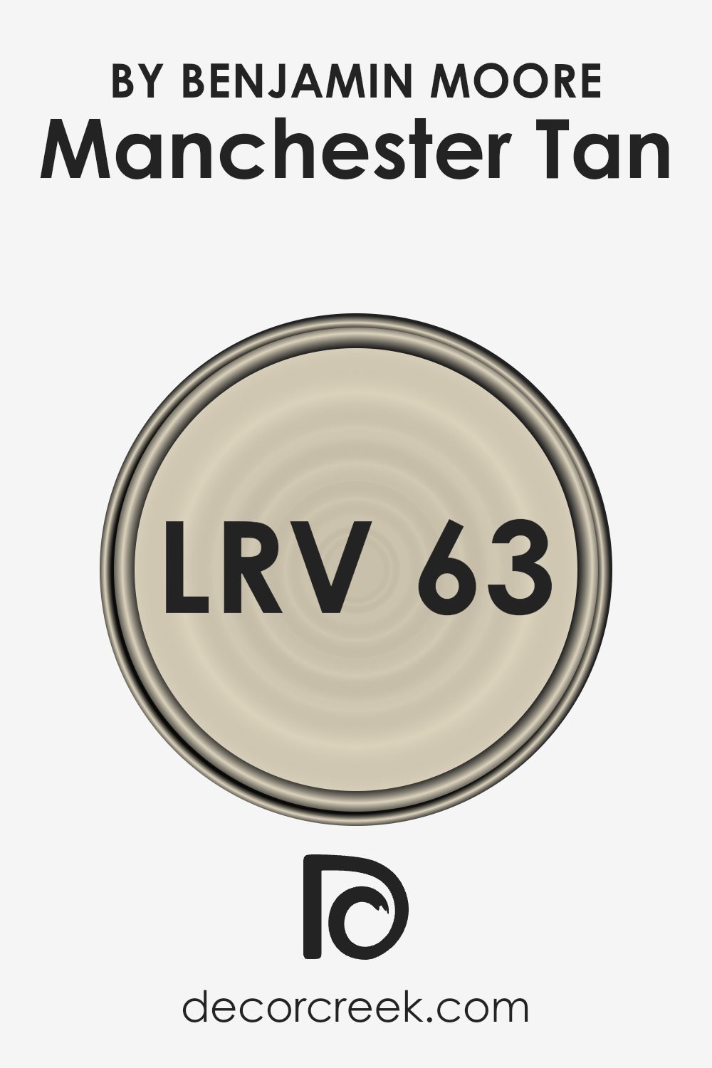
With an LRV of 63.24, Manchester Tan falls in the middle to higher range, meaning it’s a color that reflects a good amount of light without being overly bright. This characteristic makes it a versatile choice for many rooms, especially those you want to feel warm and inviting without the starkness some high LRV colors can bring.
Its ability to reflect a decent amount of light can help in making a space feel more lively and spacious, making it a great pick for common areas, bedrooms, or even home offices.
Coordinating Colors of Manchester Tan HC-81 by Benjamin Moore
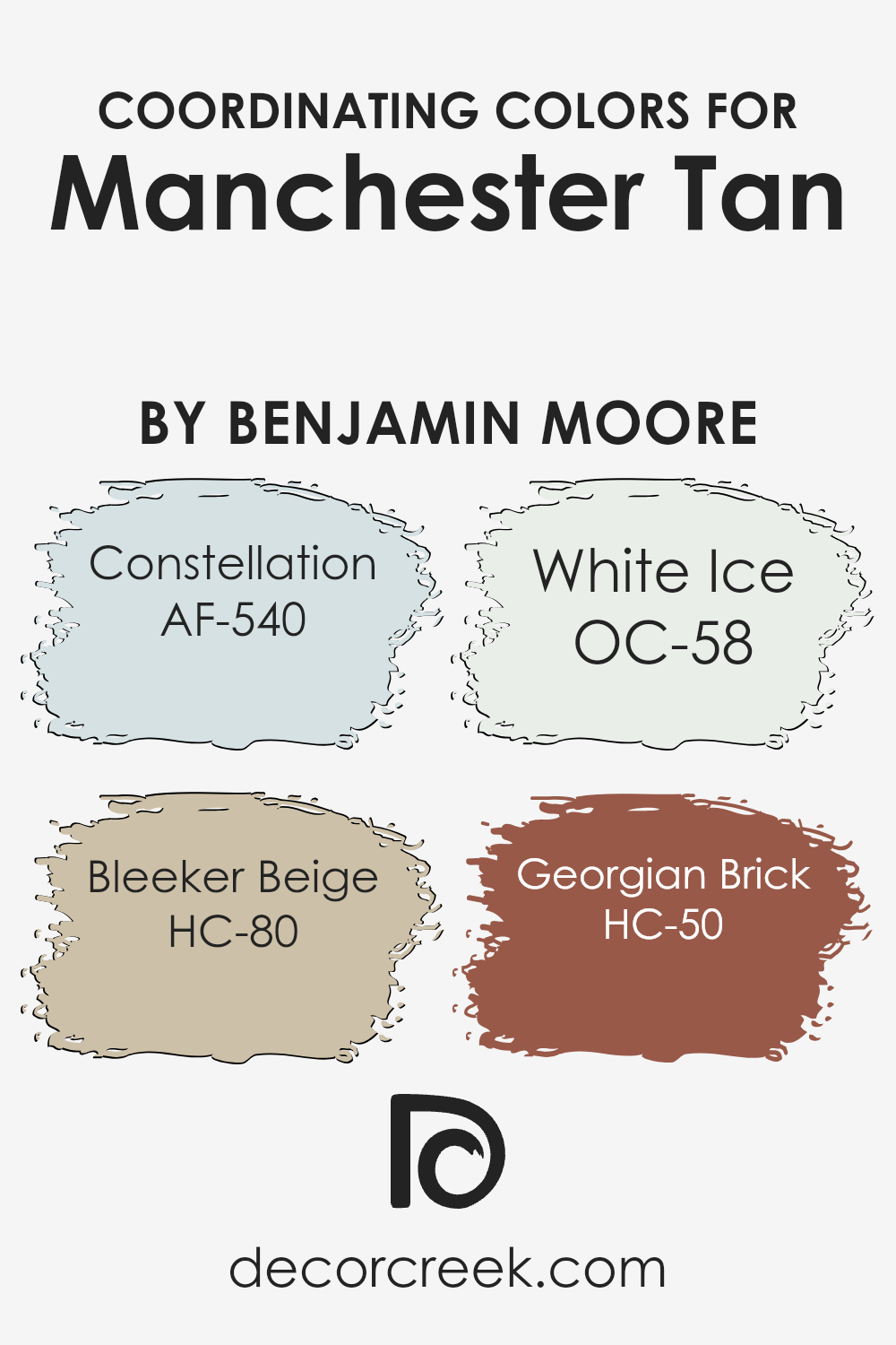
Coordinating colors are those that complement each other visually and work well together when used in the same space, creating a harmonious and pleasing effect. When we talk about coordinating colors for a specific paint shade, like Manchester Tan by Benjamin Moore, we’re referring to colors that have been identified as enhancing the main hue, making it stand out or blend in seamlessly depending on the desired effect. This selection can transform a room, balancing out tones and tying together different elements of the decor.
For the shade Manchester Tan, a soft and neutral hue, its coordinating colors include AF-540 – Constellation, a light, airy blue that adds a serene vibe, giving a sense of calm and openness to spaces. HC-80 – Bleeker Beige is another ally, a bit deeper than Manchester Tan, offering warmth and a grounded, earthy feel that’s incredibly versatile.
OC-58 – White Ice serves as a crisp, clean contrast, refreshing and bright to open up any room. Lastly, HC-50 – Georgian Brick provides a bold, rich complement with its robust, reddish undertone that can anchor and add depth to a space, creating an inviting atmosphere. Together, these coordinating colors provide a palette that can enhance Manchester Tan’s flexibility, allowing for various combinations to suit any decorating style.
You can see recommended paint colors below:
- AF-540 Constellation
- HC-80 Bleeker Beige
- OC-58 White Ice
- HC-50 Georgian Brick (CHECK A SAMPLE)
What are the Trim colors of Manchester Tan HC-81 by Benjamin Moore?
Trim colors are the shades used on the edges and borders of walls, door frames, window frames, and moldings, creating a visual frame or accent in a room. When combined with a wall color like Manchester Tan, these accent colors enhance the room’s overall aesthetic, making the wall color stand out and adding depth and character to the space.
Choosing the right trim color is crucial because it can either complement the main color, bringing harmony to the room, or create a striking contrast, making a bold statement.
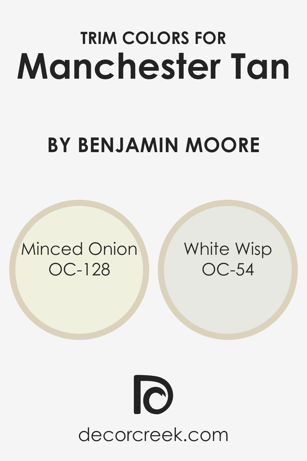
For a wall color like Manchester Tan, trim colors such as Minced Onion OC-128 and White Wisp OC-54 by Benjamin Moore are ideal. Minced Onion OC-128 is a subtle, warm beige that offers a soft, almost creamy contrast, enriching the warmth of Manchester Tan without overwhelming it. This gentle hue adds a layer of sophistication and a hint of coziness to the space.
On the other hand, White Wisp OC-54 is a crisp, clean white with a breath of cool undertones, bringing a fresh and airy feel to the room. It provides a sharp contrast to Manchester Tan, highlighting architectural details with clarity and brightness. Both colors complement Manchester Tan beautifully, enhancing the room’s ambience and contributing to a balanced, cohesive look.
You can see recommended paint colors below:
- OC-128 Minced Onion
- OC-54 White Wisp
Colors Similar to Manchester Tan HC-81 by Benjamin Moore
Similar colors play a crucial role in design and decoration because they create a sense of harmony and balance. When colors are close to each other on the color spectrum, they have a way of complementing each other, enhancing the overall aesthetic without overwhelming the senses.
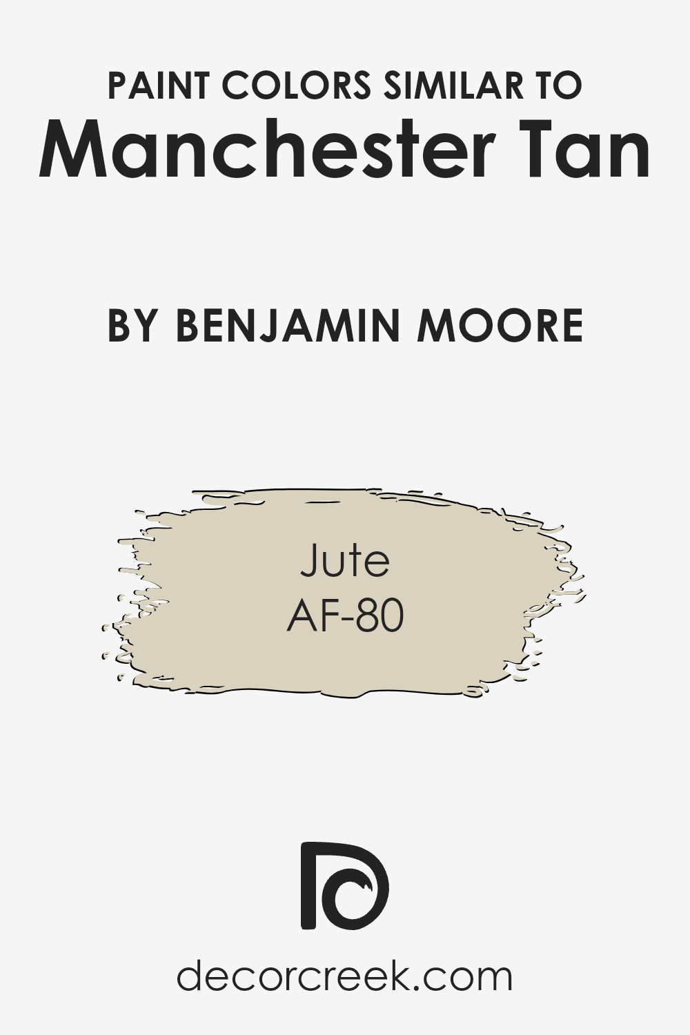
This principle is particularly relevant when considering colors like Manchester Tan by Benjamin Moore and its similar colors, such as AF-80 Jute.
These shades share a common warmth and neutrality, making them versatile for a wide range of applications. They work together to produce a cohesive look, providing a subtle backdrop that allows other elements in a space to stand out.
Manchester Tan is a warm, inviting hue that brings a natural, earthy feel to any space, making it feel more welcoming and lived-in. It’s the kind of color that’s adaptable, fitting in with various decor styles, from modern to rustic. On the other hand, AF-80 Jute shares this warm base but leans slightly towards a lighter, airier feel, offering a hint of calmness and serenity.
It’s excellent for creating a sense of space and openness, making smaller rooms feel larger and more inviting. Together, these colors offer a palette that’s both flexible and harmonious, allowing for creative freedom in design while ensuring a refined and cohesive look.
You can see recommended paint color below:
- AF-80 Jute (CHECK A SAMPLE)
How to Use Manchester Tan HC-81 by Benjamin Moore In Your Home?
Manchester Tan HC-81 by Benjamin Moore is a versatile and warm neutral paint color that brings a cozy and welcoming feel to any room. It’s like a hug for your walls! This color is perfect for those who want to add a touch of elegance and comfort to their home without going too bold. Because it’s a neutral shade, it works well in any space, from the living room to the bedroom, kitchen, or even the bathroom.
You can use Manchester Tan to create a soothing backdrop that complements both modern and traditional decor. It pairs beautifully with white trim for a crisp and clean look, or you can match it with darker woods for a more grounded, earthy vibe. This color is also fantastic for open spaces, as it helps to visually connect different areas of your home, making it feel larger and more cohesive.
Whether you’re refreshing your entire house or just wanting to update a single room, Manchester Tan provides a beautiful, timeless base. It’s amazing how this one color can transform a space, making it feel refreshed and cozy at the same time. So, if you’re looking for a color that’s both easy to live with and stylish, Manchester Tan could be the perfect choice for you.
Manchester Tan HC-81 by Benjamin Moore vs Jute AF-80 by Benjamin Moore
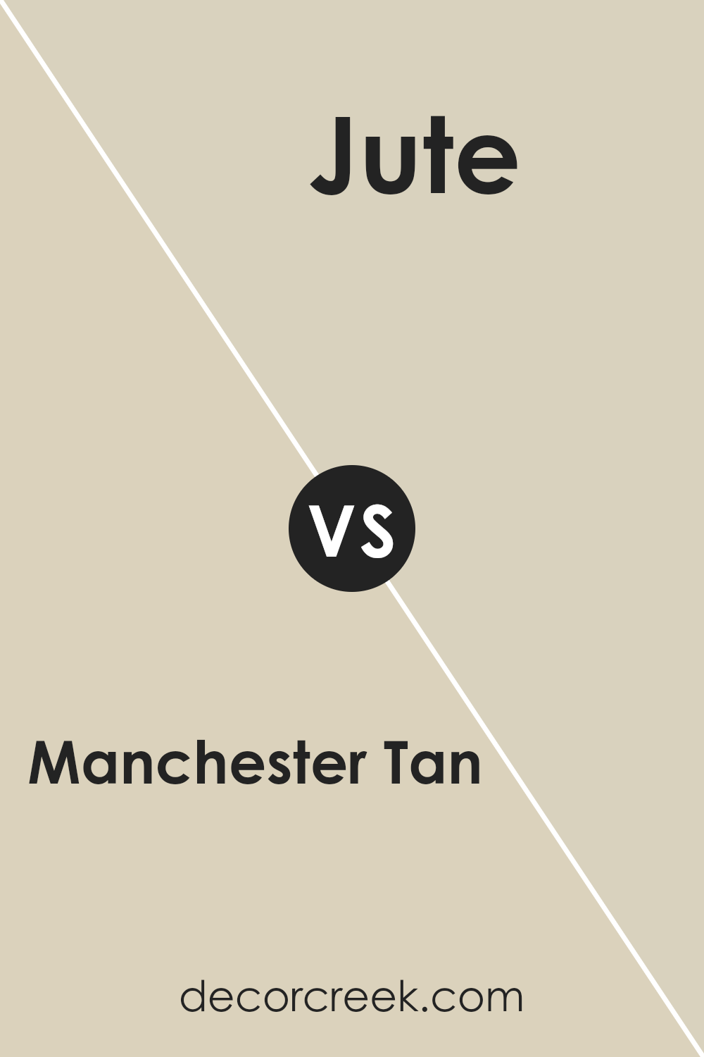
Manchester Tan and Jute are two inviting colors from Benjamin Moore. Manchester Tan is a warm, neutral beige that balances well between a light and mid-tone, offering a comfortable backdrop in various settings. It’s versatile enough to work in any room, adding a cozy yet sophisticated touch. On the other hand, Jute is slightly lighter, leaning more towards a creamy, soft hue.
This color brings a sense of openness and calm to spaces, making rooms feel airy and more spacious. While both colors share a neutral base, Manchester Tan leans a bit more towards a traditional beige, offering depth and warmth. Jute, with its creamier aspect, reflects more light, making it ideal for creating a serene and tranquil atmosphere.
Both colors are beautiful in their own right, offering different levels of warmth and brightness to suit various decorating styles and preferences.
You can see recommended paint color below:
- AF-80 Jute (CHECK A SAMPLE)
Conclusion
The color Manchester Tan by Benjamin Moore is a versatile neutral shade that has gained popularity for its ability to complement a wide range of decor styles and settings. This hue is a perfect choice for those looking to create a warm and inviting atmosphere in their spaces without overwhelming them with color.
Its subtle undertones provide a sophisticated backdrop that can enhance both modern and traditional interiors. Whether applied to living rooms, bedrooms, or common areas, Manchester Tan offers a timeless aesthetic that brings a sense of calm and elegance to any space.
In practical terms, this color proves to be an excellent option for homeowners and designers looking for a paint that bridges the gap between functionality and style. The adaptability of Manchester Tan means it pairs well with various color schemes and furniture styles, making it a go-to choice for projects that aim for a neutral yet visually interesting look.
Its ability to reflect light beautifully contributes to a more spacious and airy feel, which is particularly beneficial in smaller or darker rooms. All in all, Manchester Tan stands out as a reliable and chic choice that can easily transform and elevate the look of an interior without being too dominating or bland.
Ever wished paint sampling was as easy as sticking a sticker? Guess what? Now it is! Discover Samplize's unique Peel & Stick samples.
Get paint samples


