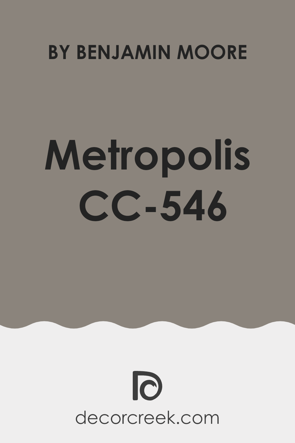
Painting a room is like giving it a brand-new personality, and choosing the right shade is crucial for setting the mood. One color I recently came across is CC-546 Metropolis from Benjamin Moore. If you, like me, enjoy subtle yet impactful changes in your surroundings, Metropolis could be a perfect choice. This shade belongs to a refined palette that adds a certain depth and consistency to any area without making it feel too heavy.
When I decided to repaint my home office, Metropolis caught my eye. It’s a color that straddles the line between gray and blue, providing a calm backdrop for both work and relaxation. The color lends itself well to various decors, complementing vibrant artworks or acting as a steady foundation for a more neutral theme.
It pairs beautifully with soft whites or even bold hues, giving you plenty of flexibility. Whether you are looking to refresh a single room or rethink your entire house, Metropolis from Benjamin Moore is worth considering.
It provides a gentle yet striking effect, making any area feel more refined and coordinated.
What Color Is Metropolis CC-546 by Benjamin Moore?
The color Metropolis CC-546 by Benjamin Moore is an adaptable shade of gray with subtle undertones of blue. This subtle complexity makes it a go-to choice for those looking to add a hint of modern elegance without making an area feel too heavy with bolder colors.
Its neutral yet distinct hue works perfectly in various interior styles, particularly urban modern, minimalism, and Scandinavian designs. The muted nature of Metropolis CC-546 allows it to serve as an excellent backdrop for brighter colors, helping other elements in the room stand out.
In terms of materials, this color pairs well with natural wood, adding warmth to the coolness of the gray, creating a balanced and inviting atmosphere. It also looks stunning when matched with metals like silver or chrome, reinforcing a more contemporary or industrial aesthetic.
Textures that work well with Metropolis CC-546 include soft linens and plush velvets, which add depth and contrast to the subtle refinement of the color. Leather furniture and accents can also complement this shade, offering a smooth, clean look that feels both modern and enduring.
Whether you’re styling a cozy living area or a minimalist bedroom, Metropolis CC-546 provides a strong foundation that supports a range of decorative styles and elements, making it a practical and stylish choice.
Is Metropolis CC-546 by Benjamin Moore Warm or Cool color?
Benjamin Moore Metropolis CC-546 is generally considered a Warm color.
It is officially described by Benjamin Moore as a “warm grayish taupe with moody undertones.”
While it is a gray-based neutral, the presence of brown and the subtle plum/purple undertones give it a warmth that prevents it from feeling cold or stark like many true grays.
It has enough saturation to provide depth and can lean slightly cooler (showing more of the purple/blue/green hint) in certain lighting conditions, but its overall classification is on the warm side of the gray spectrum.
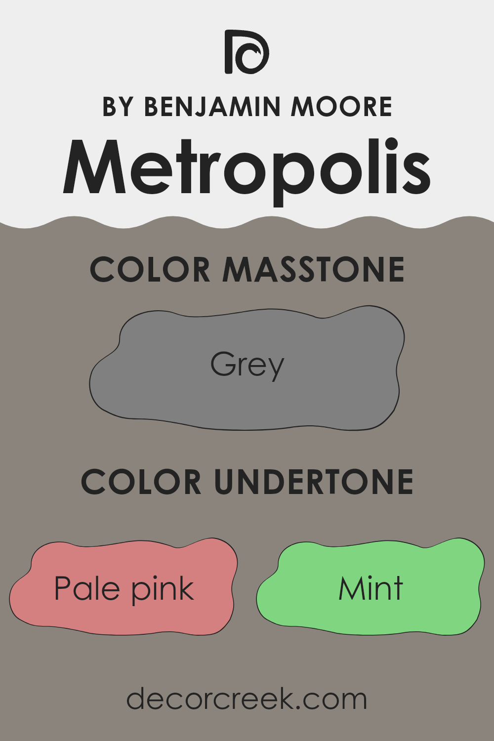
Undertones of Metropolis CC-546 by Benjamin Moore
Metropolis CC-546 by Benjamin Moore is a unique and adaptable paint color that has a complex array of undertones. These undertones include shades of pink, mint, olive, lilac, purple, and many others like dark turquoise and pale yellow.
The presence of so many different undertones means that this color can appear slightly different depending on the lighting and surrounding colors. In interior areas, the undertones in Metropolis can greatly influence the mood and appearance of a room.
For example, in an area with ample natural daylight, the lighter undertones such as pale pink or light blue might become more visible, giving the room a softer and more airy feel. In contrast, in areas with less natural light or at night under artificial lighting, darker undertones like navy or dark grey might stand out, giving the walls a more grounded and cozy appearance.
Undertones play a crucial role in how we perceive color. They can subtly affect how the main hue is seen and can either warm up or cool down the color perception. When choosing Metropolis for interior walls, it’s important to consider these undertones. They can complement furniture and decor, creating a cohesive look.
For instance, olive and brown undertones could harmonize well with wooden furniture, enhancing the overall warmth of the area. In contrast, pairing it with metallic or modern elements could highlight cooler undertones like light turquoise or purple, giving the room a fresher look. Understanding these undertones can help in selecting the right decor, curtains, and even lighting to make the most of the paint color, ensuring it performs beautifully in any interior area.
What is the Masstone of the Metropolis CC-546 by Benjamin Moore?
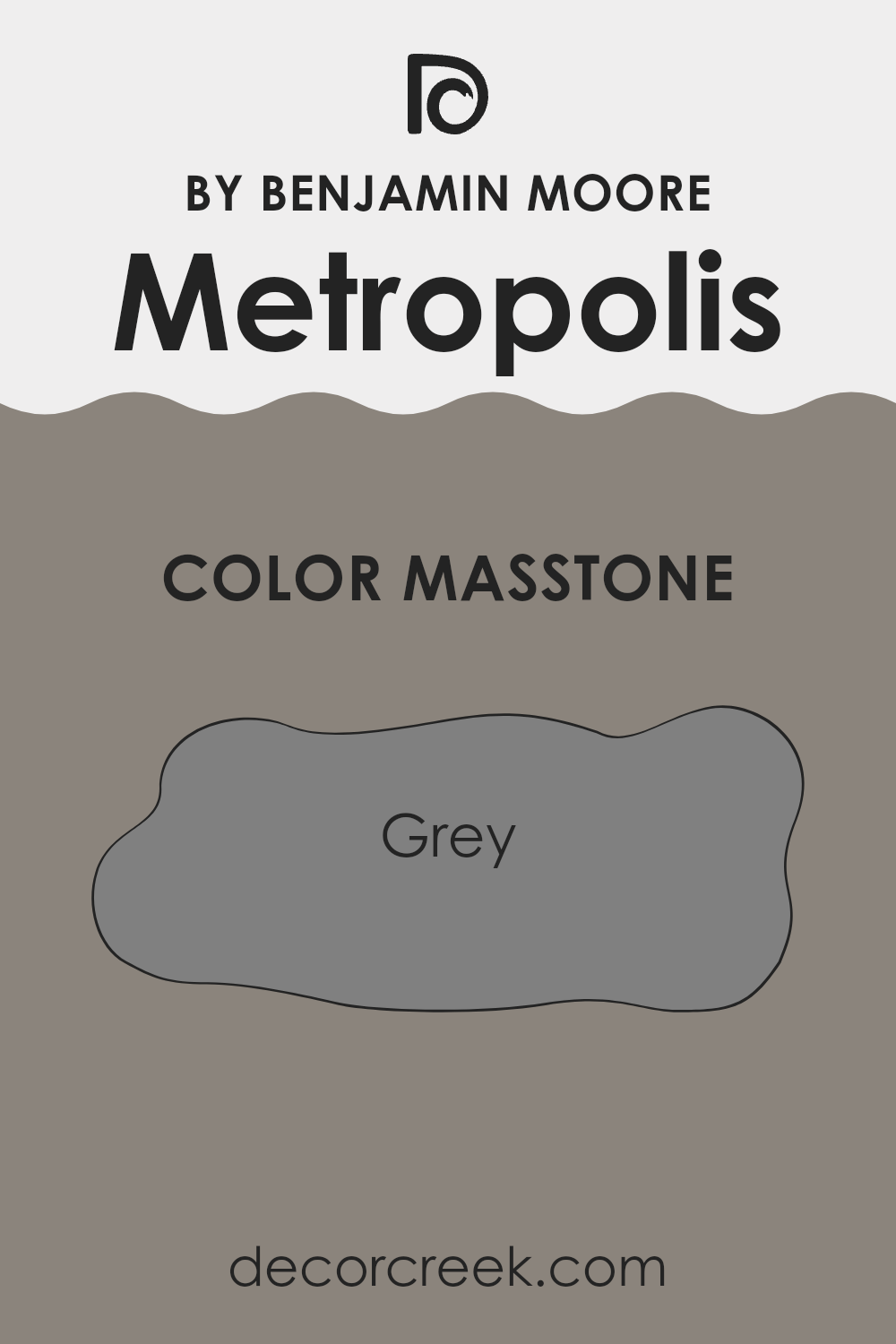
The masstone (the main or dominant color) of Benjamin Moore Metropolis CC-546 is a medium-to-deep gray-taupe.
It is officially described by Benjamin Moore as a “warm grayish taupe with moody undertones.”
While its masstone is definitely a sophisticated gray-brown mix, its complexity comes from the subtle undertones, which can include hints of green, blue, or a faint plum/purple, depending on the lighting in the room.
How Does Lighting Affect Metropolis CC-546 by Benjamin Moore?
Lighting plays a crucial role in how we perceive colors in our environment. This is because different light sources have varying color temperatures and intensities, which can alter the appearance of paint colors like the one from Benjamin Moore called Metropolis.
In artificial light, such as LED bulbs or fluorescent lamps, Metropolis can appear slightly different depending on the type of bulb used. For instance, in warm, yellowish light, Metropolis might look softer and more muted, giving a cozy feel to the area. But under cool, bluish light, the same color can seem sharper and more vivid, providing a more modern look.
Under natural light, the perception of Metropolis changes throughout the day. In the morning light, it can appear bright and clean, while during sunset, it might take on a richer, deeper tone. Natural sunlight tends to show the truest color, making it a great way to assess this particular shade.
Areas that face different directions also affect how Metropolis looks due to the quality of light they receive:
- North-faced areas: These areas get less direct sunlight, which can make Metropolis look cooler and more shadowed. It’s a good choice if you want the area to feel more formal or reserved.
- South-faced areas: These areas enjoy ample sunlight most of the day, which can make Metropolis appear lighter and more vibrant. It’s ideal for creating an inviting and lively atmosphere.
- East-faced areas: Morning light in these areas can make Metropolis look very bright and welcoming in the morning, but it might become calmer as the day progresses.
- West-faced areas: In these areas, the evening light can warm up Metropolis, making it look more intense and dynamic towards the end of the day.
Understanding these distinctions can help you decide which area is best for this color, based on the mood and atmosphere you want to create.
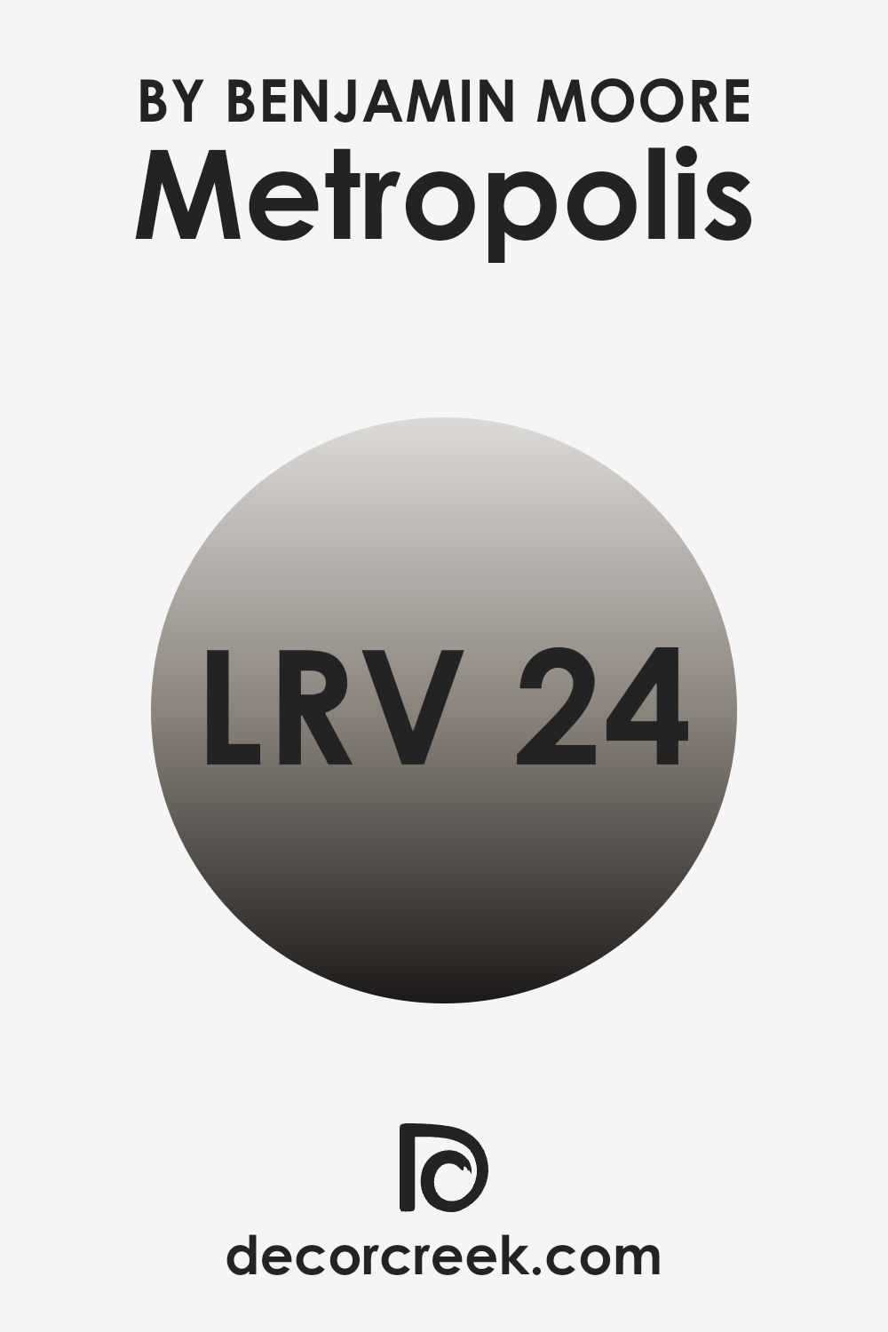
What is the LRV of Metropolis CC-546 by Benjamin Moore?
LRV stands for Light Reflectance Value, a measurement that tells you how much light a paint color will reflect when it’s on your wall. It’s shown as a number from 0 to 100, where 0 means no light is reflected (it absorbs all the light) and 100 means all light is reflected. The LRV helps you understand how light or dark a color might look once it’s applied to your area.
Higher LRV colors make an area feel brighter and more open because they reflect more light, while lower LRV colors can make an area feel cozier but smaller as they absorb more light. With an LRV of 24.46, Metropolis CC-546 by Benjamin Moore is on the lower side, meaning it does not reflect a lot of light. This makes it a darker shade that can give the area a more intimate and enclosed feel.
Because it absorbs more light, this color is best used in areas with sufficient natural or artificial lighting to prevent the area from feeling too dark. The specific LRV of Metropolis CC-546 is significant because it can create a moodier atmosphere, a great choice if you want to add some depth and intensity to an area while still keeping it welcoming.
decorcreek.com
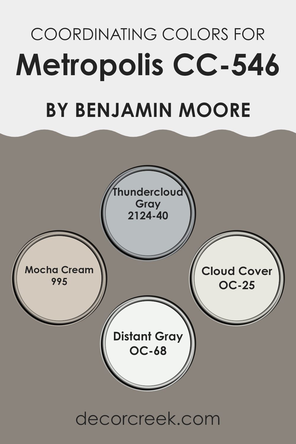
Coordinating Colors of Metropolis CC-546 by Benjamin Moore
Coordinating colors are selected to complement each other and share a harmonious visual relationship, enhancing the overall aesthetic of an area. These colors typically balance well when used together, either by highlighting each other through contrast or blending seamlessly due to their tonal similarities. They provide a designer or homeowner with a variety of options for creating a cohesive palette throughout different areas, maintaining an underlying continuity even when using different main colors in various rooms.
For instance, Thundercloud Gray is a deep, moody gray that brings a striking presence to an area, perfect as an accent wall or furniture piece to ground lighter tones. Mocha Cream offers a warm, creamy beige that softens and warms any area, ideal for creating a cozy and inviting atmosphere.
Cloud Cover is a light, neutral gray with a very clean and open feel, excellent for larger areas to help make them appear bigger and brighter. Distant Gray is an ultra-light gray that almost merges with white, perfect for trim or ceilings to subtly complement bolder wall colors. Each of these coordinating colors works in sync to create a cohesive and pleasing look, allowing flexibility in design while maintaining a fluid aesthetic across decor elements.
You can see recommended paint colors below:
- 2124-40 Thundercloud Gray
- 995 Mocha Cream
- OC-25 Cloud Cover
- OC-68 Distant Gray
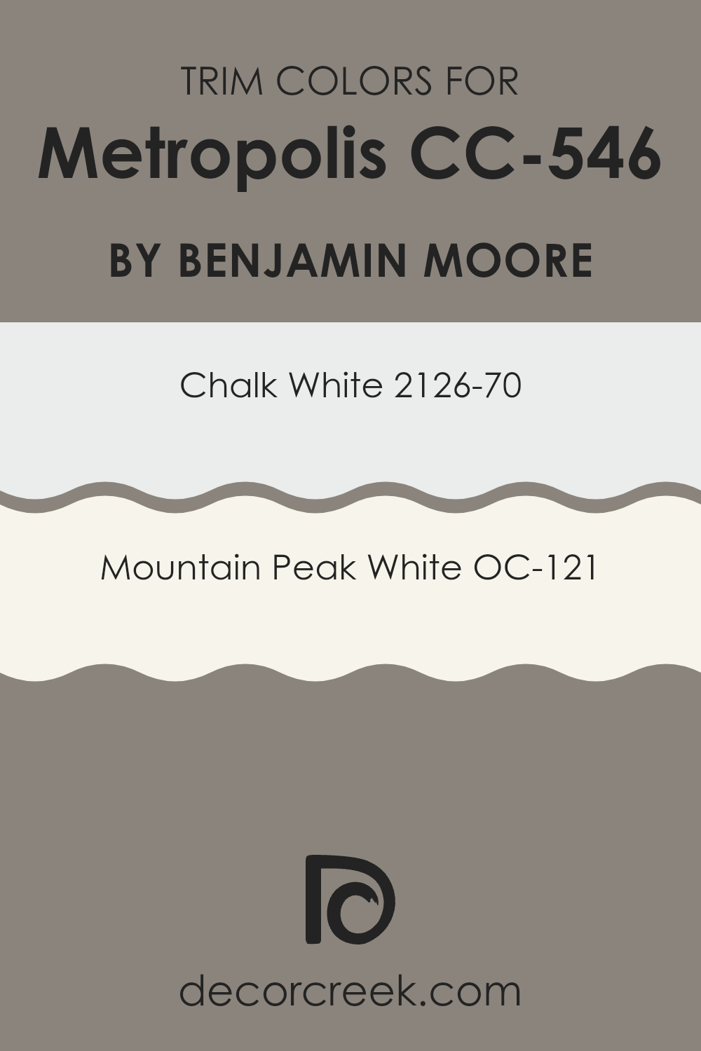
What are the Trim colors of Metropolis CC-546 by Benjamin Moore?
Trim colors are specific shades used to highlight the architectural features of a room such as door frames, window frames, and skirting. By contrasting with the wall color, these hues help to define the area visually and add a polished finish to the overall look of the room.
For instance, when paired with the color Metropolis CC-546 by Benjamin Moore, lighter trim colors such as Chalk White 2126-70 and Mountain Peak White OC-121 can create a clean and crisp border that accentuates the deep, rich tones of the Metropolis shade.
Chalk White 2126-70 is a soft, pure white that brings a fresh and airy feel to any area, making it an excellent choice for trim, giving a sense of clarity and neatness against darker hues. On the other hand, Mountain Peak White OC-121 offers a slightly warmer tone, providing a subtle contrast that is still stark enough to highlight Metropolis’s strong character without making it feel too heavy.
This combination ensures that the walls are the focal point, while the trim neatly outlines and enhances the room’s architecture.
You can see recommended paint colors below:
- 2126-70 Chalk White
- OC-121 Mountain Peak White
Colors Similar to Metropolis CC-546 by Benjamin Moore
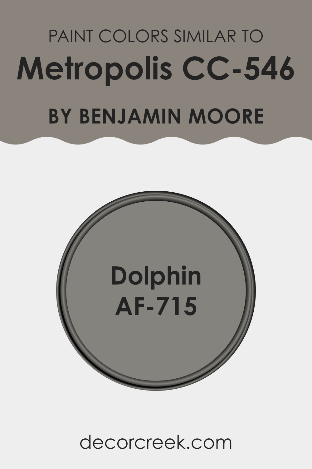
Understanding and using similar colors in decorating can create a harmonious and streamlined look that enhances the feeling of unity in an area. When colors such as Metropolis CC-546 and Dolphin AF-715, both by Benjamin Moore, are used together, they complement each other because they share similar undertones and intensities.
This creates a subtle blend rather than a contrast, giving an area a cohesive feel without any one color overpowering the other. Such a palette can effectively enhance the aesthetic appeal while maintaining a calming atmosphere, making it ideal for areas intended for relaxation or concentration.
Metropolis CC-546 is a rich, medium-toned gray with a hint of blue undertone, making it an adaptable choice for both modern and traditional areas. It serves as an ideal backdrop, offering enough depth to make white trim pop or to soften the starkness of dark furniture.
On the other hand, Dolphin AF-715 is slightly lighter than Metropolis, presenting itself as a soft, muted gray that leans toward a neutral palette. It is perfect for creating a light, airy feel in an area, yet possesses enough warmth to make it inviting and comfortable. When used together, these colors provide a polished yet understated aesthetic that can work beautifully in various design settings.
You can see recommended paint color below:
- AF-715 Dolphin
How to Use Metropolis CC-546 by Benjamin Moore In Your Home?
Metropolis CC-546 by Benjamin Moore is an adaptable gray paint color that can be a great option for adding a touch of modern style to your home. Its soft neutral tone makes it easy to pair with a wide range of other colors, making it ideal for many rooms and settings.
For instance, you could use it in your living area, combining it with bright accents like red or blue for a lively contrast or softer tones for a more subtle look. Additionally, it works well in bedrooms, creating a calm background that supports both vibrant bedding and simple, muted textiles.
Metropolis CC-546 is also an excellent choice for painting cabinets or furniture. It provides a clean, contemporary look without overpowering other elements in your decor. Its flexibility means it can suit both a modern minimalist home and an area with traditional touches. Simply put, this color can help bring a fresh and updated feel to any area without making drastic changes.
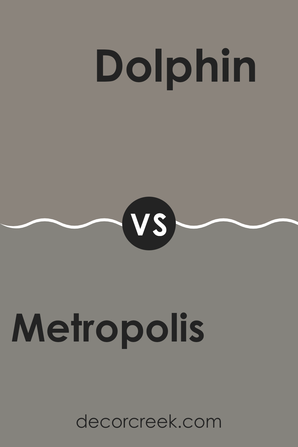
Metropolis CC-546 by Benjamin Moore vs Dolphin AF-715 by Benjamin Moore
Metropolis CC-546 has a Light Reflectance Value (LRV) of approximately 23.26. It is described as a warm, grayish taupe with moody plum or purplish undertones. Part of the Designer Classics Collection, Metropolis is a more complex and enveloping color.
Its subtle plum nuance makes it particularly interesting in spaces with cooler, north-facing light, where it prevents the gray from looking sterile and adds a touch of sophisticated warmth and depth.
You can see recommended paint color below:
- AF-715 Dolphin
After reading about the CC-546 Metropolis paint by Benjamin Moore, I’ve found that it’s a really interesting choice for making rooms look nicer. This paint color is like a gray but has some hints of blue in it, which makes it cooler and calming. From what I understand, it’s perfect for places where you want to relax, like your bedroom or living area.
The paint is also good at hiding marks and small dents on the walls, which is great if you have kids or pets that might mess up the walls a bit. It’s easy to clean too, so you can simply wipe it down if it gets dirty.
People who’ve used this paint say that it works well in different kinds of light. Whether you have a lot of natural light from windows or use lamps and lights inside, the color still looks nice. This is good because you don’t want the color to look too different throughout the day.
Overall, CC-546 Metropolis by Benjamin Moore seems like a really good choice if you’re thinking about repainting a room. It’s pretty, easy to keep looking good, and works well in many types of areas and lighting situations. I think it would make any area look fresh and welcoming.
decorcreek.com
Ever wished paint sampling was as easy as sticking a sticker? Guess what? Now it is! Discover Samplize's unique Peel & Stick samples.
Get paint samples

