Black
Black Blue
Blue Brown
Brown Gray
Gray Green
Green Neutral
 Orange
 White
White Yellow
When you’re searching for a paint color that subtly combines refinement with adaptability, 2129-60 Mt. Rainier Gray by Benjamin Moore might just be the perfect choice. This shade of gray extracts its unique flair from the natural grandeur of its namesake, Mount Rainier.
You’ll find that it resonates with a cool, calming presence that pairs beautifully with a wide range of decor styles, from modern minimalism to cozy traditional settings. Unlike deeper, more imposing grays, Mt. Rainier Gray maintains a lightness that gives rooms an airy, breathable feel without feeling too stark or cold.
As you consider this color, think about how it interacts with different lighting throughout the day, subtly shifting tones to adjust to each mood and moment.
Whether you’re aiming to refresh your living room, bedroom, or even your kitchen, this adaptable hue offers a refreshing alignment with both bold and subdued accent colors, making it a reliable choice for your next painting project.
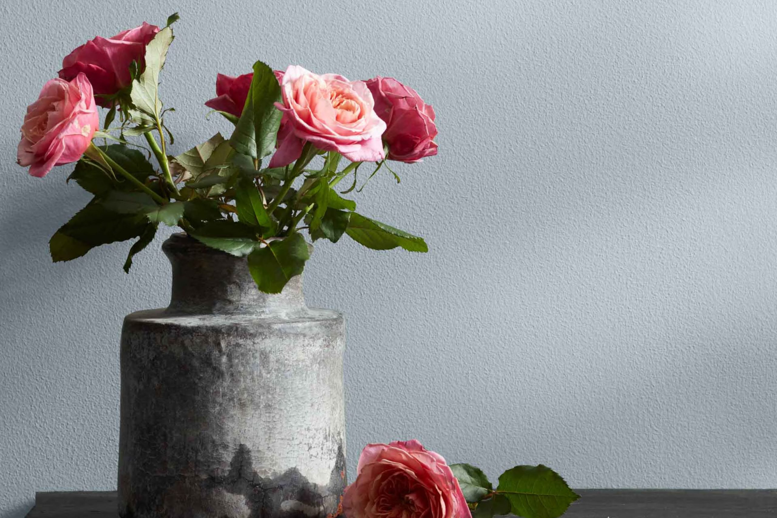
What Color Is Mt. Rainier Gray 2129-60 by Benjamin Moore?
Mt. Rainier Gray by Benjamin Moore is a soft, muted gray with subtle blue undertones. This color provides a calm and welcoming feel to any room, making it extremely adaptable for use in various interior styles. It is especially well-suited for minimalist and Scandinavian designs, where its clean and crisp nature can help create a light, airy room. Additionally, Mt. Rainier Gray works beautifully in coastal decor due to its cool hue, reminiscent of sea mist and cloudy skies.
This paint color pairs well with a wide range of materials and textures. When combined with natural wood, such as oak or walnut, it brings out a warm contrast that enriches the overall ambiance of a room. It also complements metallic finishes like brushed nickel and chrome, which add a modern touch to the decor. For a more textured look, linen fabrics and knitted throws in this gray can enhance comfort and add visual interest.
Mt. Rainier Gray is not only suitable for living rooms and bedrooms but also looks great in kitchens and bathrooms, where it can work harmoniously with white tiles and cabinetry to create a clean and inviting atmosphere. This color’s adaptability makes it a great choice for anyone looking to refresh their home with a new paint color.
decorcreek.com
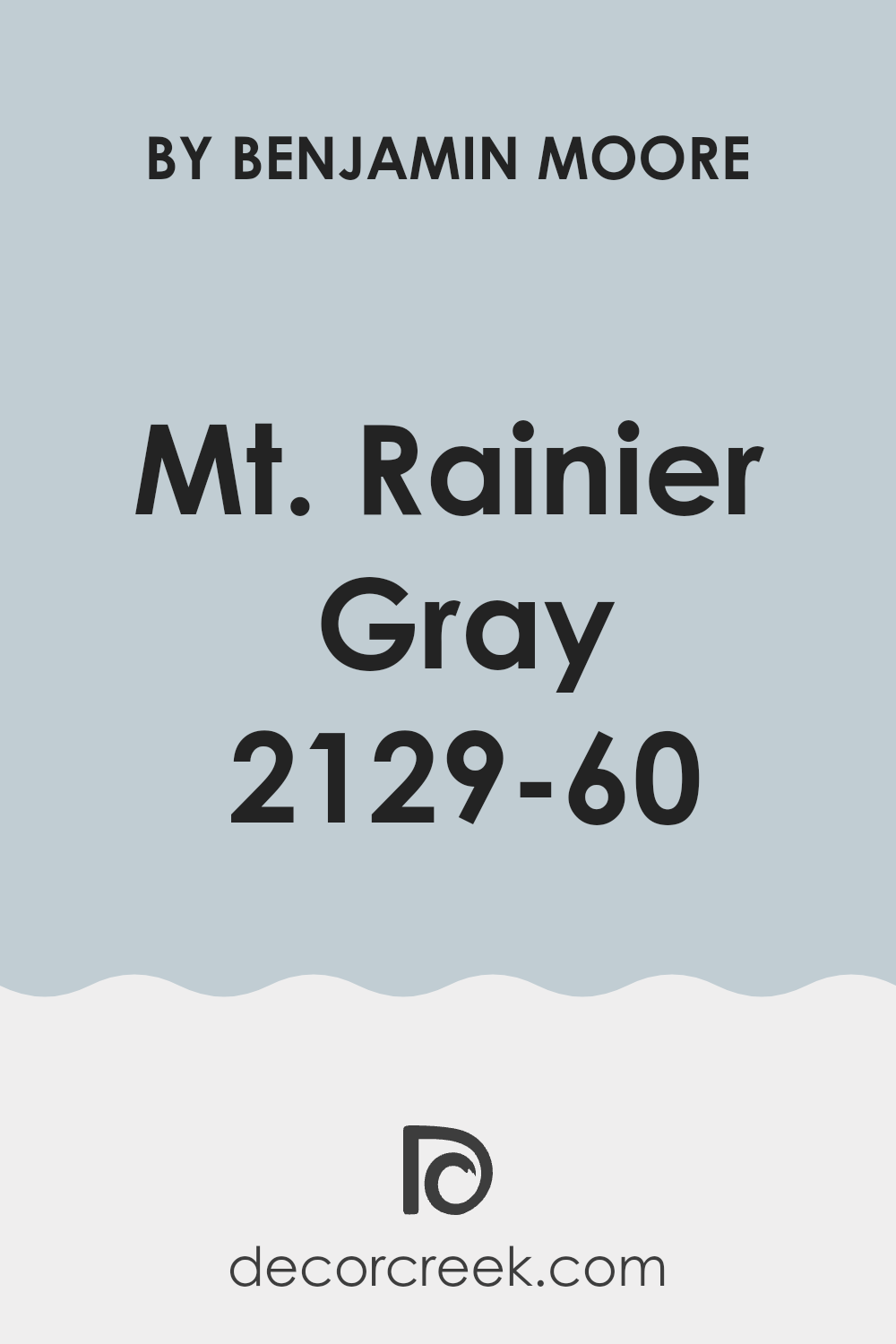
Is Mt. Rainier Gray 2129-60 by Benjamin Moore Warm or Cool color?
Mt. Rainier Gray by Benjamin Moore is a calming, cool gray paint color that brings a fresh and soothing atmosphere to any room in your home. This shade has a touch of blue undertones, which helps create a clear and clean look. This makes it a fantastic choice for bathrooms and bedrooms where you want to set a relaxing vibe without making the room feel too chilly. In well-lit areas like living rooms, Mt. Rainier Gray looks brighter and airy, promoting a light, open feel.
What’s great about this color is its adaptability. It pairs beautifully with bright whites for a crisp aesthetic, or it can be matched with darker colors like navy blue or charcoal for a bold contrast. Furthermore, its subtlety means that it doesn’t overpower rooms.
Instead, it complements and enhances various decor styles and furniture, making it easy for homeowners to implement without needing significant changes. Whether your home has a modern feel or leans towards a more traditional look, Mt. Rainier Gray fits in effortlessly, making it a popular choice for updating interiors.
Undertones of Mt. Rainier Gray 2129-60 by Benjamin Moore
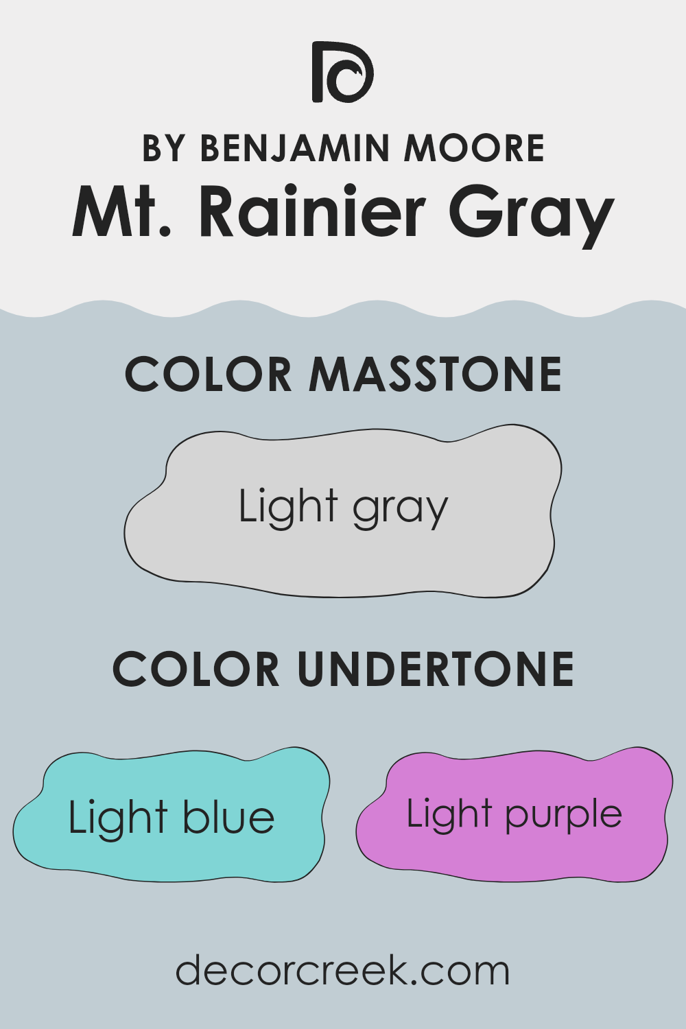
Mt. Rainier Gray is a unique paint color that has a dynamic blend of undertones that can subtly influence the feel and appearance of a room. Undertones are the hidden hues that can emerge under different lighting conditions, affecting how we perceive the primary color. For Mt. Rainier Gray, these undertones include light blue, light purple, pale yellow, lilac, mint, pale pink, and grey, each adding a distinct flavor to the base color.
In general, undertones can make a color appear cooler or warmer depending on their bias. For instance, light blue and lilac undertones in Mt. Rainier Gray can give a cooler touch to the walls, making them feel more refreshing and calm. On the other hand, pale yellow and pale pink can warm up the room subtly, adding a soft, welcoming vibe. Mint and grey undertones contribute to a neutral balance, ensuring the color remains adaptable for various decor styles and settings.
When applied to interior walls, Mt. Rainier Gray adjusts to different lighting scenarios. Natural light can enhance its cooler tones, making the room feel airy and open, while artificial lights, especially warmer bulbs, can highlight its warmer undertones, making the room feel cozy and inviting. This ability to interact with light makes Mt. Rainier Gray a practical choice for many rooms, effortlessly complementing various furniture styles and accessories.
decorcreek.com
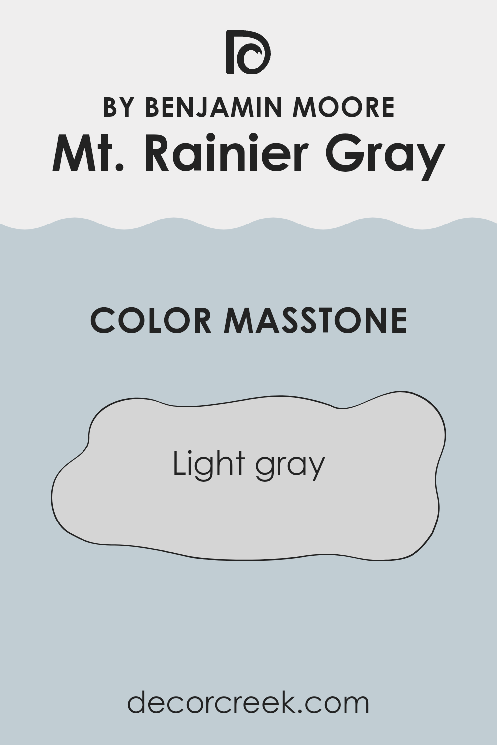
What is the Masstone of the Mt. Rainier Gray 2129-60 by Benjamin Moore?
Mt. Rainier Gray (2129-60) by Benjamin Moore is a light gray shade with the color code #D5D5D5. This color has a soft and neutral tone, making it very adaptable for use in homes.
It offers a clean and fresh look that pairs well with a wide range of other colors, from bright and bold to soft and subtle. This flexibility is perfect for homeowners who enjoy changing their decor style or accents seasonally.
Light gray walls can make smaller rooms appear larger by reflecting light, which helps to open up the room. In larger areas, this color can help maintain a feeling of spaciousness while providing a subtle backdrop for furniture and art pieces to stand out. Since it doesn’t overpower, it’s excellent for rooms where you want to relax, like bedrooms and living rooms. Accessories in vibrant hues or deeper shades can easily pop against a light gray backdrop, allowing for a very personalized decor style.
decorcreek.com
How Does Lighting Affect Mt. Rainier Gray 2129-60 by Benjamin Moore?
Lighting plays a crucial role in how we perceive colors in our environment. Different lighting conditions can make the same color look different at various times of the day or in different locations within a home.
Let’s consider the color Mt. Rainier Gray by Benjamin Moore and how it reacts under various lighting conditions. This shade is an adaptable gray that balances between a cool and warm tone, making it quite suitable for use in many different settings.
In natural light, Mt. Rainier Gray tends to reveal its true color best. Under the bright, clear light of a sunny day, it shows a crisp and neutral gray, making it particularly appealing for rooms that get a lot of natural sunlight.
When placed in a north-facing room, which typically receives less direct sunlight and cooler, bluer light, Mt. Rainier Gray may appear slightly more muted and cooler. This can enhance the calm and quiet feel of a room, making it ideal for bedrooms or study rooms that benefit from a subtle and peaceful ambiance.
South-facing rooms receive more intense sunlight throughout the day, especially in warmer climates. Here, Mt. Rainier Gray can feel warmer and slightly lighter, enhancing a feeling of airiness and spaciousness, which makes it a good choice for living rooms and kitchens.
In east-facing rooms, where the morning light is warm and bright, Mt. Rainier Gray will start the day appearing light and cheerful, then transition into a true neutral as the light fades. This characteristic supports its use in breakfast nooks or dining areas where the day starts bright.
Finally, in west-facing rooms, this color will experience the reverse of east-facing rooms. It stays more neutral during the day and warms up in the late afternoon and evening as the sunlight becomes redder. This warming effect in the evening can create a welcoming and cozy atmosphere in rooms like family rooms.
In artificial light, the type of bulb used also affects how Mt. Rainier Gray is perceived. Warm bulbs will enhance its warmer tones, making it more inviting, while cool LED lights may bring out its cooler undertones, giving it a more formal appearance.
decorcreek.com
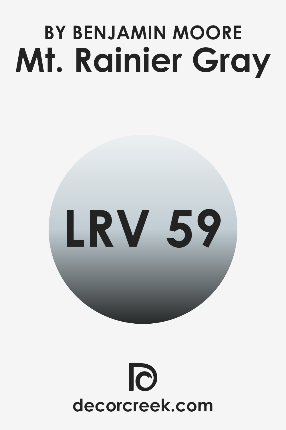
What is the LRV of Mt. Rainier Gray 2129-60 by Benjamin Moore?
LRV, or Light Reflectance Value, is a measurement used to describe the amount of visible and usable light that a color reflects when it’s on your walls. It’s essentially a way to measure how light or dark a color will appear once it’s applied.
Paints with higher values are lighter, reflecting more light back into the room, which can make rooms feel more open and airy. On the other hand, colors with lower values are darker, absorbing more light, which can make a room feel more enclosed or cozy.
The LRV of Mt. Rainier Gray by Benjamin Moore, which is 59.48, means that the color is on the lighter side but still holds some depth. This specific shade will reflect a good amount of light without being too bold, making it a great option for rooms that you want to keep feeling fresh and bright. However, since it isn’t extremely high, it retains enough richness to provide some visual warmth and coziness, fitting well in areas like living rooms or bedrooms where a balance between brightness and a welcoming atmosphere is crucial.
decorcreek.com
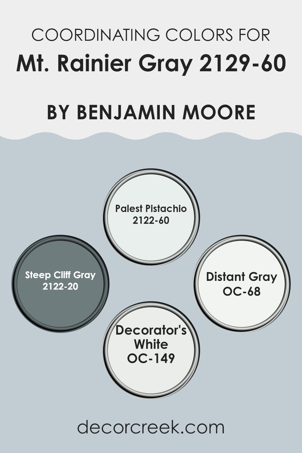
Coordinating Colors of Mt. Rainier Gray 2129-60 by Benjamin Moore
Coordinating colors are shades that complement or enhance each other when used together in decorating. This design principle helps create a harmonious and balanced color palette in a room. Mt. Rainier Gray by Benjamin Moore, a gentle and adaptable gray, pairs effectively with a range of coordinating colors which were specifically chosen to support various design intents and to bring the best out of the primary color.
Palest Pistachio is a soft, subtle green that brings a hint of nature’s calmness to the palette, making it perfect for creating a light and airy feel in a room. Steep Cliff Gray is a much darker gray that offers a striking contrast to the lighter Mt. Rainier Gray, adding depth and definition to the room.
Distant Gray is an almost white, very light gray that provides a clean and crisp background, ideal for making other colors stand out. Decorator’s White is a pure, bright white used to bring a fresh and clear element to rooms, ensuring that the interiors feel more open and spacious. Together, these colors work in unity to support a design that is coherent and aesthetically appealing, each color bringing its unique characteristic while supporting the others.
You can see recommended paint colors below:
- 2122-60 Palest Pistachio
- 2122-20 Steep Cliff Gray
- OC-68 Distant Gray
- OC-149 Decorator’s White
What are the Trim colors of Mt. Rainier Gray 2129-60 by Benjamin Moore?
Trim colors are the hues used for the architectural details and edging like door frames, window frames, skirtings, and moldings in a room. Choosing the right trim color can significantly enhance the overall appearance of a room, offering a clear visual structure and contrast that makes wall colors pop.
Trim colors can highlight the architectural features of a room, providing a crisp, finished look that complements the main wall color. In the case of Mt. Rainier Gray by Benjamin Moore, using trim colors such as White Opulence OC-69 and Mayonnaise OC-85 can create an appealing contrast that clearly defines the room, making it look clean and well-coordinated.
White Opulence OC-69 is a clean and bright white that brings a fresh and airy look to any room. It harmonizes beautifully with the cool tone of Mt. Rainier Gray, adding a lively contrast that enhances the wall color’s modern feel without dominating it. On the other hand, Mayonnaise OC-85 offers a warmer, softer white with a subtle creamy touch that can add a gentle richness to the cooler shades of the gray walls. This color combination adds depth and character to the room while maintaining a relaxed and inviting atmosphere.
You can see recommended paint colors below:
- OC-69 White Opulence
- OC-85 Mayonnaise

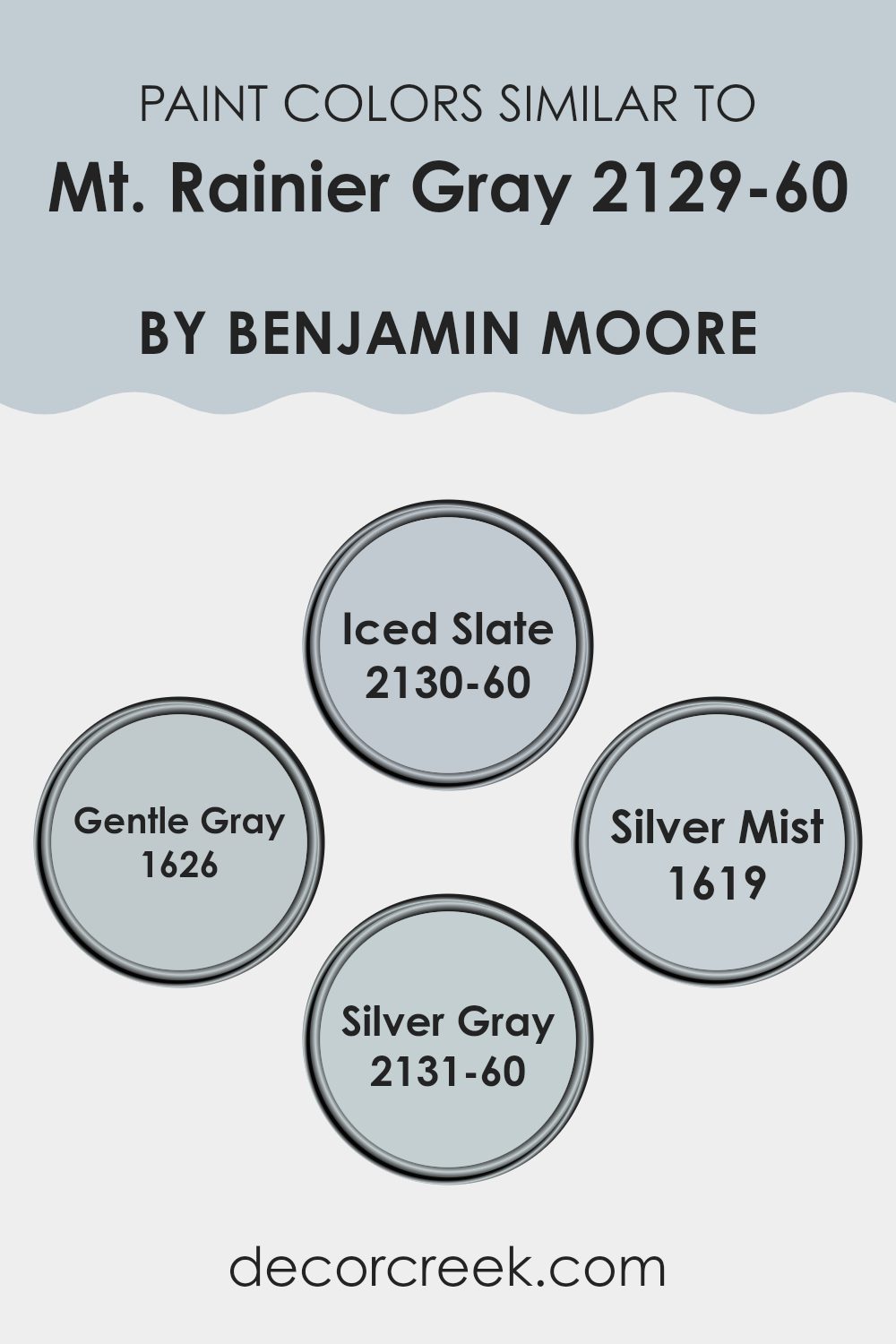
Colors Similar to Mt. Rainier Gray 2129-60 by Benjamin Moore
When decorating a room, choosing similar colors can create a cohesive and harmonious environment. Using shades like 2130-60 Iced Slate, 1626 Gentle Gray, 1619 Silver Mist, and 2131-60 Silver Gray, which are close to Mt. Rainier Gray, ensures that the colors in the room flow smoothly from one to another without harsh transitions.
This approach is particularly effective in achieving a subtle yet visually interesting aesthetic. It allows for a calmer room where the eye moves easily around the interior, leading to a more relaxed atmosphere.
Iced Slate is a cooler shade that gently reflects light, giving a fresh, airy feel to any room. Gentle Gray offers a soft, muted appeal that works wonderfully as a neutral backdrop, providing a subtle depth to interiors. Silver Mist has a light, breezy quality that can make a room feel open and spacious. Lastly, Silver Gray provides a touch of warmth to balance out cooler tones, lending a soft harmony to the overall palette. When these tones are used together, they create an environment that is both inviting and stylish, without dominating the senses with strong contrasts.
You can see recommended paint colors below:
- 2130-60 Iced Slate
- 1626 Gentle Gray
- 1619 Silver Mist
- 2131-60 Silver Gray
Colors that Go With Mt. Rainier Gray 2129-60 by Benjamin Moore
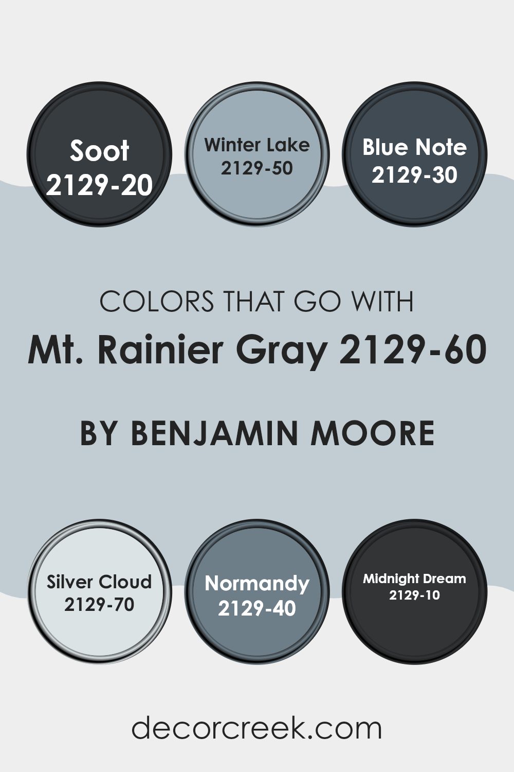
Choosing complementary colors for Mt. Rainier Gray 2129-60 by Benjamin Moore is essential because it ensures that the gray acts as an adaptable backdrop, allowing other colors to stand out. The right combination can create a smooth, coherent look in any room, making it feel intentionally designed and aesthetically pleasing.
Colors like Soot and Blue Note, for example, offer darker hues that contrast nicely with the lightness of Mt. Rainier Gray, making any room feel balanced and well-composed. Other options like Winter Lake and Normandy provide a subtle splash of color, which brightens a room while maintaining a calm atmosphere.
Soot is a deep, charred gray with a hint of black that adds a striking boldness to rooms, ideal for accent walls or furniture. Winter Lake has a gentle blue tone that mimics a calm, foggy morning sky, perfect for creating a soothing environment. Blue Note is even darker, resembling the deep shades of a night sky, great for adding drama and depth.
Silver Cloud offers a lighter, almost ethereal gray that matches effortlessly with Mt. Rainier Gray for a seamless look. Normandy boasts richer, more intense blue tones, wonderful for making a statement without being too bold. Lastly, Midnight Dream is a strong, oceanic blue that brings vibrancy and energy into a room, ideal for lively areas. Together, these colors work harmoniously with Mt. Rainier Gray to craft rooms that are visually cohesive and inviting.
You can see recommended paint colors below:
- 2129-20 Soot
- 2129-50 Winter Lake
- 2129-30 Blue Note
- 2129-70 Silver Cloud
- 2129-40 Normandy
- 2129-10 Midnight Dream
How to Use Mt. Rainier Gray 2129-60 by Benjamin Moore In Your Home?
Mt. Rainier Gray 2129-60 by Benjamin Moore is an adaptable paint color that can be a great choice for any room in your home. With its soft, light gray tone, it provides a gentle backdrop that works well with many styles and colors.
You can use it in living rooms or bedrooms to create a calming atmosphere that makes your room feel larger and more open. It’s especially good for smaller rooms or any area that needs a touch of brightness without being too bold.
This shade pairs beautifully with brighter colors like blues and greens for a refreshing look, or with darker grays and blacks for a more grounded, cohesive feel. It also matches well with wood tones and metallic finishes, making it easy to use with your existing decor. Whether you’re looking to refresh your kitchen, bathroom, or a main living area, Mt. Rainier Gray offers a clean, modern look that can make your home feel inviting and updated.
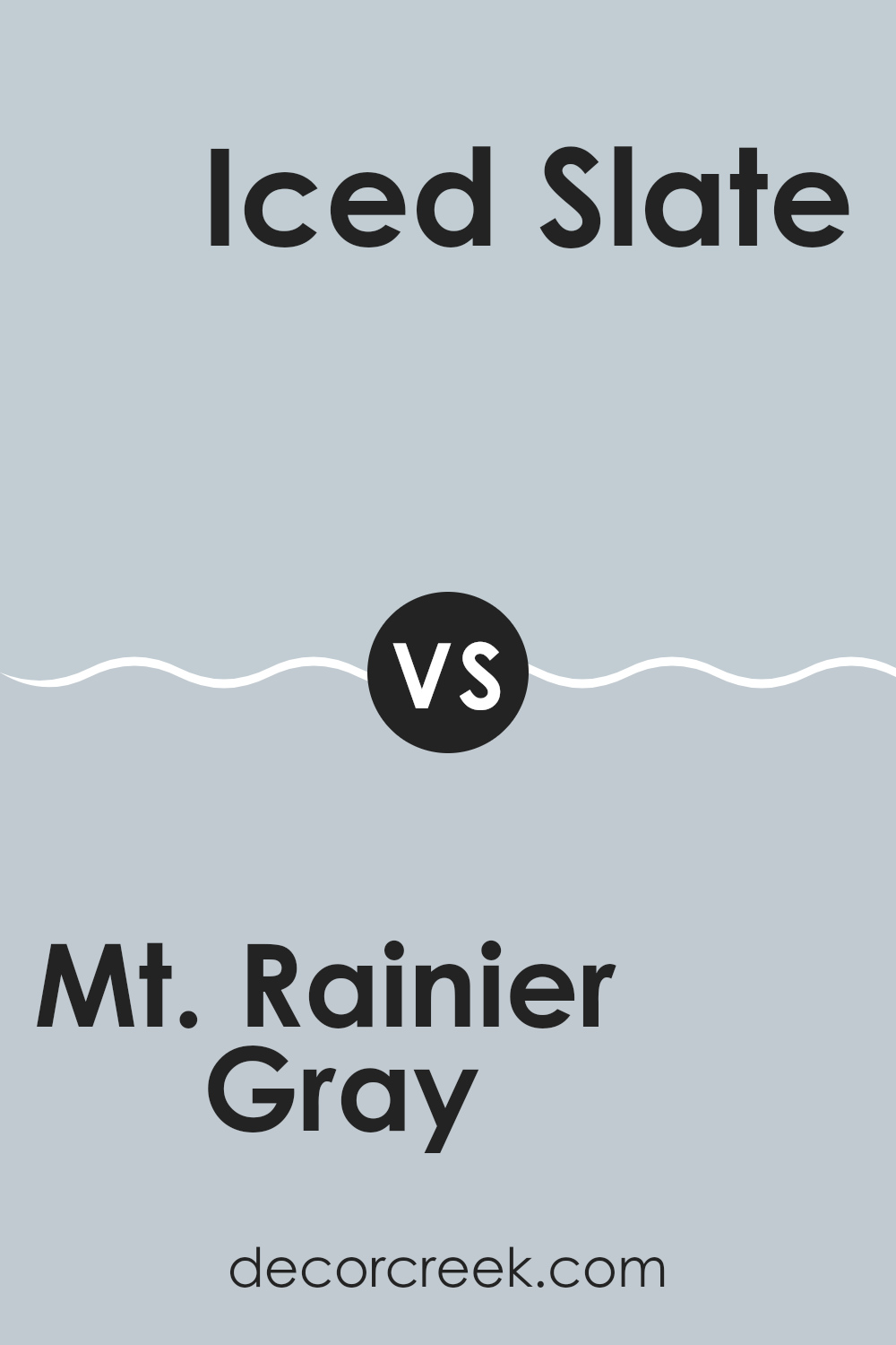
Mt. Rainier Gray 2129-60 by Benjamin Moore vs Iced Slate 2130-60 by Benjamin Moore
Mt. Rainier Gray and Iced Slate by Benjamin Moore are two close but distinct colors. Mt. Rainier Gray is a lighter, softer gray that feels airy and open, great for making a room feel more spacious and relaxed.
On the other hand, Iced Slate has a deeper, slightly bluer tone, making it a bit more pronounced and cooler, which can bring a calm, collected feel to any room.
Both colors work beautifully in modern homes for a clean, minimalist look but serve slightly different moods due to their warmth and depth. Mt. Rainier Gray is perfect for someone looking for a subtle hint of gray, whereas Iced Slate might be preferred by someone who enjoys a stronger presence of color while maintaining a peaceful atmosphere.
You can see recommended paint color below:
- 2130-60 Iced Slate
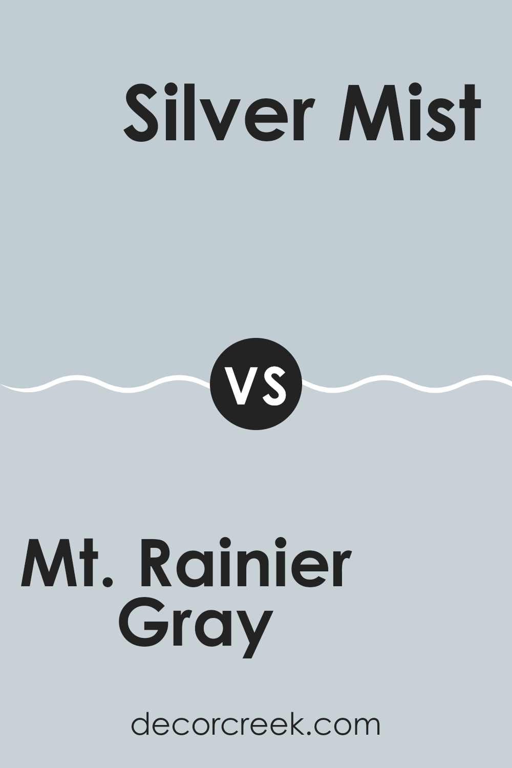
Mt. Rainier Gray 2129-60 by Benjamin Moore vs Silver Mist 1619 by Benjamin Moore
Mt. Rainier Gray and Silver Mist are both gray colors by Benjamin Moore, but they have distinct tones. Mt. Rainier Gray has a light, airy feel that can make a room look bright and spacious. It is a cooler shade, suggesting a touch of blue, which adds a fresh and clean vibe to rooms.
On the other hand, Silver Mist is darker and warmer. This color can create a cozy atmosphere, making it a great choice for rooms where you want a more inviting, snug environment. It leans toward a silvery tone, which can add a gentle, reflective quality to the walls.
Both colors are adaptable and work well in various settings, whether modern or traditional. Mt. Rainier Gray can add a more brisk, open feel, while Silver Mist provides a soft, comforting presence. Choosing between them depends on the mood and style you want to achieve in your room.
You can see recommended paint color below:
- 1619 Silver Mist
Mt. Rainier Gray 2129-60 by Benjamin Moore vs Gentle Gray 1626 by Benjamin Moore
Mt. Rainier Gray and Gentle Gray by Benjamin Moore are both subtle shades of gray, but they have some distinct differences. Mt. Rainier Gray has a cooler tone that can remind you of a cloudy sky, giving a fresh and airy feel to any room.
It works well in rooms where you want a light yet defined color. On the other hand, Gentle Gray is slightly warmer and softer, making it a bit cozier and more inviting. This color has a hint of blue, which adds a gentle, soothing quality, perfect for creating a relaxed atmosphere in rooms like bedrooms or living areas.
While both colors provide a clean and minimalistic look, your choice might depend on the mood you’re trying to set – cooler and crisp with Mt. Rainier Gray or warm and comforting with Gentle Gray.
You can see recommended paint color below:
- 1626 Gentle Gray

Mt. Rainier Gray 2129-60 by Benjamin Moore vs Silver Gray 2131-60 by Benjamin Moore
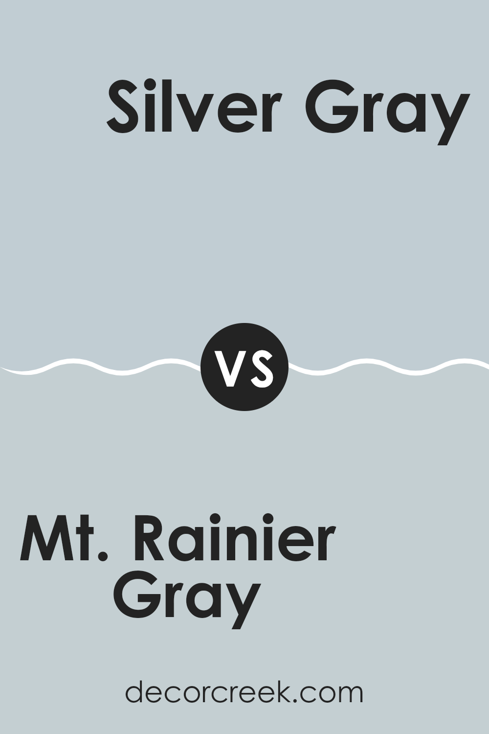
Mt. Rainier Gray and Silver Gray are two shades by Benjamin Moore. Mt. Rainier Gray gives off a soft blue vibe, adding a slightly coastal feel that’s airy and light. It’s perfect for those looking for a subtle hint of color without dominating a room.
On the other hand, Silver Gray leans closer to a classic gray with blue undertones, offering a cleaner, crisper look. This makes it a great fit for modern rooms that aim for a fresh and uncluttered appearance.
Both colors share cool undertones, but Mt. Rainier Gray’s blue tint stands out more, providing a unique touch compared to the more neutral presence of Silver Gray. Each color has its own charm and ideal uses, depending on the mood you want to set in a room.
You can see recommended paint color below:
- 2131-60 Silver Gray
After reading about 2129-60 Mt. Rainier Gray by Benjamin Moore, I feel confident in saying that it’s a really nice color for painting walls. The color is like a soft, light gray which reminds me of a calm, cloudy day. It’s great because it’s not too bright and not too dark, making it perfect for any room, whether it’s a sunny living room or a cozy bedroom.
This gray paint mixes well with other colors too. You can pair it with blues, greens, whites, or even darker colors like black for a neat look. It works in modern homes and even places that have a lot more old-fashioned stuff. Plus, because it’s kind of a quiet and simple color, it helps make a room feel more relaxing and comfy.
Many people, decorators, and painters say this color is a good choice because it looks clean and fresh. It doesn’t get boring, and it doesn’t make you tired of looking at it. Whether you are just changing up one room or the whole house, Mt. Rainier Gray could be a good pick. So, if someone is thinking about a new color to paint their walls, this gray might be the right way to go!

decorcreek.com
Ever wished paint sampling was as easy as sticking a sticker? Guess what? Now it is! Discover Samplize's unique Peel & Stick samples.
Get paint samples