If you’re thinking about adding a splash of brightness to your spaces, I really think you should consider this shade. Navel is a vibrant orange that can instantly warm up your room and make it more inviting. It’s perfect if you love colors that add personality and aren’t shy about making a statement.
Using Navel in your home can be a lot of fun. You can paint an accent wall to jazz up your living room or maybe brighten up your kitchen.
It’s especially great in spaces where you gather with friends and family since it brings in a sense of happiness and energy.
Plus, this color goes really well with a lot of other shades. You can match it with neutrals for a balanced look or pair it with contrasting colors for something more bold and energetic.
So, if you’re up for giving your place a cheerful touch, think about using SW 6887 Navel. It might be just what you need to create a space that feels both warm and lively.
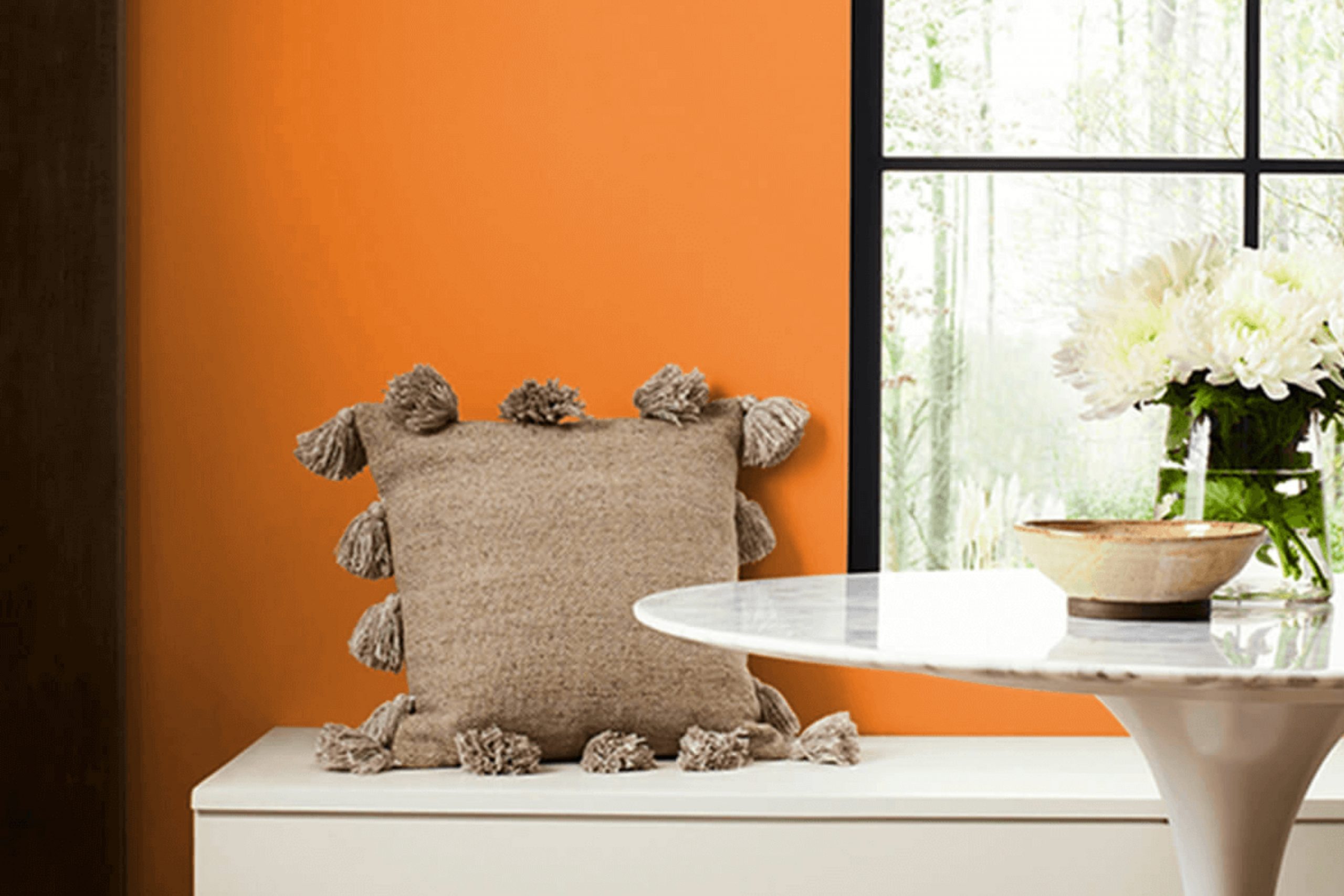
What Color Is Navel SW 6887 by Sherwin Williams?
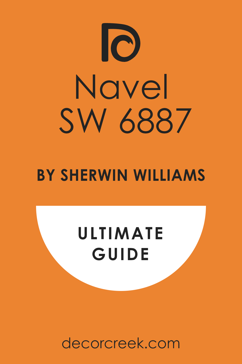
The color Navel by Sherwin Williams is a vibrant, pure orange that brings a lively and energetic atmosphere to any space. It has a youthful and cheerful vibe that can instantly brighten up a room. This bold hue works particularly well in modern and eclectic interiors, adding a pop of color that makes a strong statement.
In terms of materials, Navel pairs beautifully with natural wood tones, from light oak to dark walnut, which help to balance its intensity. It also looks striking when combined with sleek materials like polished chrome or brushed nickel, enhancing a contemporary feel.
Textures like soft woolen throws or smooth leather in neutral colors can also complement this vivid orange, providing a cozy yet stylish environment.
This color is ideal for accent walls, especially in spaces that benefit from extra warmth, such as a living room or kitchen. It can also enliven smaller elements like cushions, vases, or artwork frames. When used thoughtfully, Navel creates a dynamic and inviting space that encourages creativity and happiness.
Is Navel SW 6887 by Sherwin Williams Warm or Cool color?
NavelSW 6887 is a vibrant shade of orange offered by Sherwin Williams. This bold color can make a significant impact in any home, offering a fresh and lively energy to any space. It’s perfect for creating an accent wall in a living room or bedroom to inject some personality and fun.
Due to its intensity, it pairs well with neutral colors like white, grey, or beige, which help balance its brightness and prevent it from overwhelming the space.
Using NavelSW 6887 in smaller doses, such as on a piece of furniture or within decorative elements, can also enhance a room without making it too intense. This color works especially well in spaces that need a boost of warmth and cheer, making it great for kitchens and dining areas where families gather.
Ultimately, NavelSW 6887 adds a lively splash of color that can make your home feel more welcoming and energetic. It’s a color that brings life to space and can be adjusted in intensity to fit the mood and setting of any room.
Undertones of Navel SW 6887 by Sherwin Williams
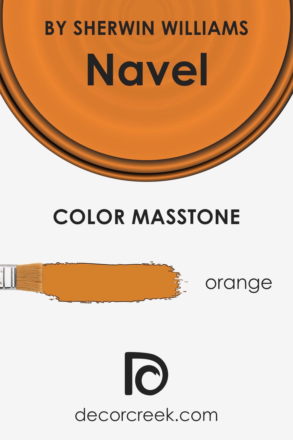
Navel SW 6887 is a vibrant shade of orange that can significantly influence the ambiance of a room depending on its undertones. Undertones are subtle colors that are present within the main hue but not always immediately noticeable. They can change how a color looks depending on the light and what other colors are nearby.
For Navel SW 6887, undertones are diverse, ranging from pale pink to mint, which makes this color quite flexible. Pale pink and pink give it a soft, slightly warmer feel, perfect for a cozy nook or a children’s play area.
Yellow and pale yellow undertones make the orange brighter and more energetic, which can liven up a kitchen or home office. The red and brown undertones add depth, making it a great choice for a dining room, adding a sense of warmth and comfort.
Light green and mint undertones can freshen up the look, ideal for bathrooms or small spaces that need a punch of cheerfulness. Grey and olive bring a more grounded, calm vibe, suitable for living rooms. Purple undertones introduce a touch of elegance.
When used on interior walls, these undertones interact with both natural and artificial lighting, as well as furniture and decor colors, affecting the overall perception of the space. For example, in a room with lots of natural light, the yellow and light green undertones might stand out, making the room appear brighter. In a space with less light or with darker furniture, the brown and red undertones might become more prominent, creating a richer, more enveloping feel.
Understanding and considering these undertones helps in achieving the desired mood and style in a room using NavelSW 6887.
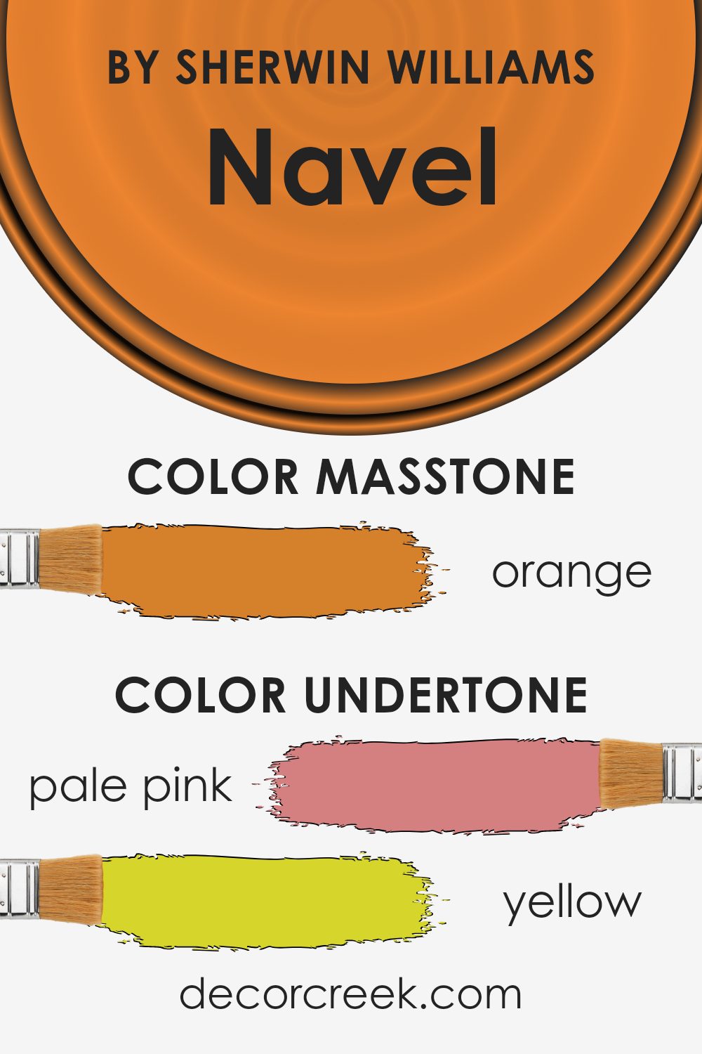
What is the Masstone of the Navel SW 6887 by Sherwin Williams?
NavelSW 6887 by Sherwin Williams has a masstone primarily colored Orange (#D5802B), offering a vibrant and warm hue that is perfect for adding a touch of energy and cheerfulness to any room. This shade of orange works wonderfully in living spaces where you want to inspire activity and social interaction, such as living rooms or kitchens, because it brings a sense of comfort and friendliness.
Natural light plays a significant role in how this color is perceived; under bright sunlight, it can appear more vivid and lively, whereas in softer, artificial light, the orange can give a room a cozier, more inviting feel.
Orange tones like this are also known for their ability to work well with neutral colors like whites, grays, and even navy blues, providing a pleasant contrast that can make furniture and decor pop.
This makes NavelSW 6887 a great choice for adding character and warmth to modern home designs.
How Does Lighting Affect Navel SW 6887 by Sherwin Williams?
Lighting plays a crucial role in how we perceive colors in our surroundings. The color Navel by Sherwin Williams, a vivid orange, can appear differently depending on the type of light it is exposed to. In natural light, this bold shade reflects a vibrant and cheerful hue, making spaces feel lively and energetic.
However, under artificial lighting, the same color might become warmer or softer depending on the intensity and color temperature of the light used.
For rooms facing north, which receive less direct sunlight, Navel can look more subdued. In these settings, artificial lighting can help maintain its brightness, but it’s crucial to choose the right type of light to prevent it from looking too dim or washed out.
In contrast, in south-facing rooms that get abundant sunlight, this color will appear most true to its swatch, maintaining its dynamic orange tone throughout the day. This makes it an excellent choice for areas where you want to create a cheerful and inviting atmosphere.
In east-facing rooms, Navel will have a bright and warm appearance in the morning when the sun rises, bringing out the full vibrancy of the color. As the day progresses and natural light diminishes, the color may require supplemental artificial lighting to keep its lively vibe.
Conversely, in west-facing rooms, the color will start off more muted in the morning and gradually warm up as the sun sets. Here, the late afternoon light will enhance its depth and richness.
Understanding how light affects the appearance of colors like Navel can help you decide on the best placement and lighting conditions to achieve the desired impact in your decorative projects.
This ensures that you get the effect you want, no matter which room you are painting.
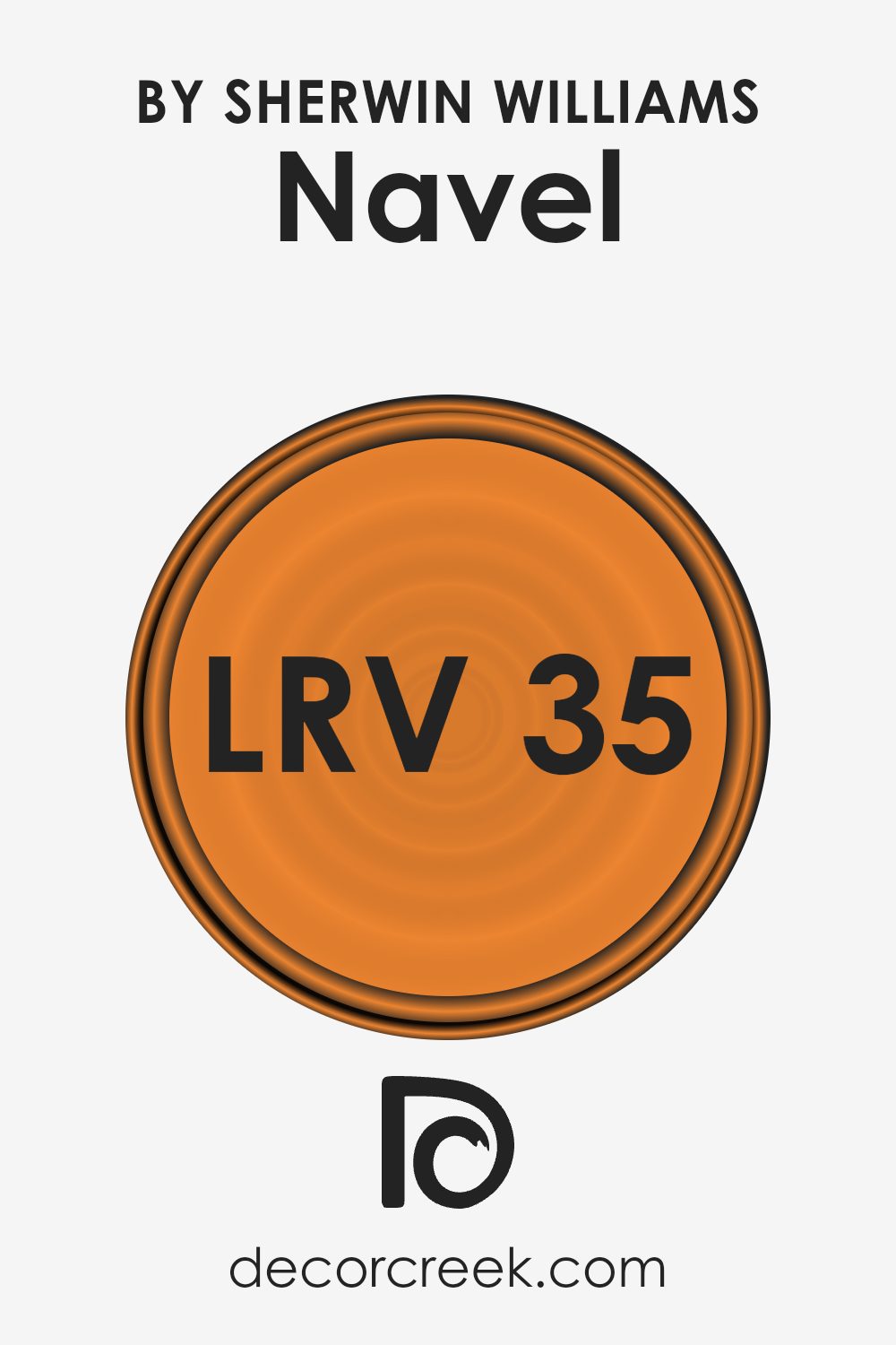
What is the LRV of Navel SW 6887 by Sherwin Williams?
LRV stands for Light Reflectance Value, which is a scale that measures the amount of light a paint color reflects back into a room. Think of LRV as a brightness gauge; the higher the LRV number, the more light the color can reflect. Typically, values around 50 are considered medium.
Light colors have high LRVs and can make a room feel more open and airy because they reflect more light. On the other hand, colors with low LRVs absorb more light, creating a cozier or potentially gloomier atmosphere.
The LRV of 34.626 for the specific paint color means it is on the darker side of the scale but not extremely dark. It will not reflect a lot of light, suggesting that it would be best used in a space where a somewhat dimmer, more subdued feel is desired. This LRV level can make a room feel smaller or more enclosed.
When using this paint color, good lighting can help to balance the visual effect, making the room feel more comfortable without appearing too dark. Always consider how much natural and artificial light your room gets before deciding on this hue.
Coordinating Colors of Navel SW 6887 by Sherwin Williams
Coordinating colors are shades that complement each other well when used together in design. They can help create a balanced and visually appealing look in any space. When you choose coordinating colors, it means selecting hues that either contrast or harmonize with the main color, depending on the vibe you want to achieve.
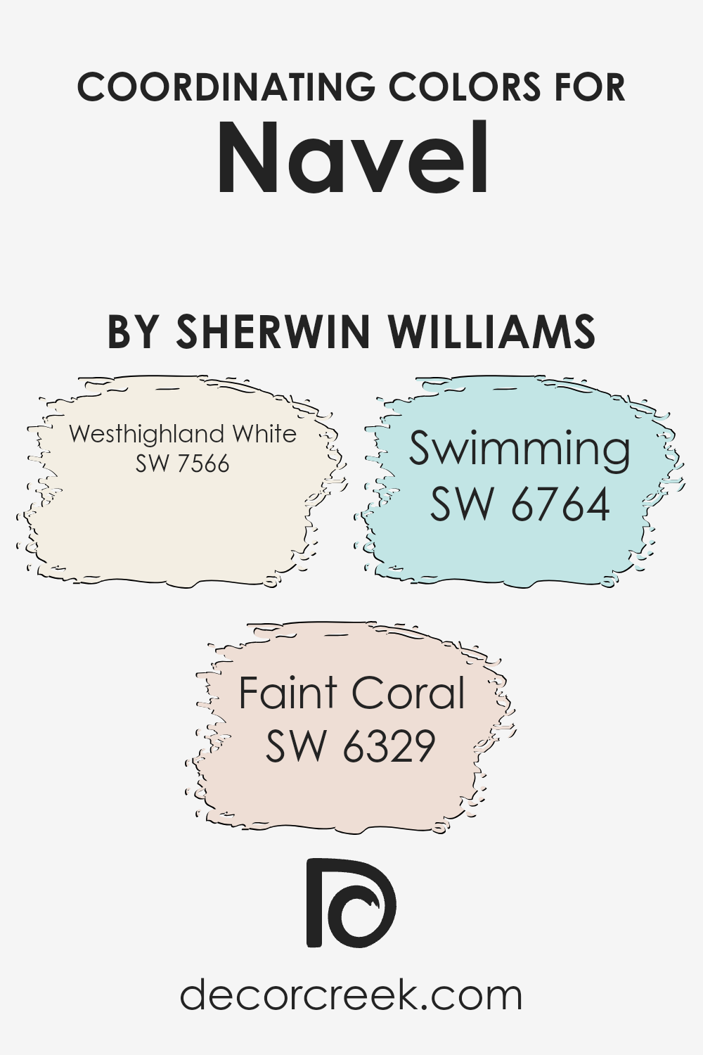
For the vibrant orange Navel by Sherwin Williams, colors like Westhighland White, Faint Coral, and Swimming have been suggested to coordinate well.
Westhighland White SW 7566 is a clean, bright white that works wonderfully to offset more vivid colors. It offers a crisp backdrop that can make other colors, such as the bold Navel, pop out even more. Faint Coral SW 6329 is a soft, gentle orange that shares a color family with Navel but at a much milder intensity.
This hue can add warmth and a subtle contrast when paired alongside more saturated colors. Lastly, Swimming SW 6764 is a light, refreshing blue that provides a cool contrast to the warm tones of Navel, creating a balanced and appealing color scheme in any decorating project.
These coordinating colors work together to enhance the overall aesthetics without overwhelming the visual senses.
You can see recommended paint colors below:
- SW 7566 Westhighland White (CHECK A SAMPLE)
- SW 6329 Faint Coral (CHECK A SAMPLE)
- SW 6764 Swimming (CHECK A SAMPLE)
What are the Trim colors of Navel SW 6887 by Sherwin Williams?
Trim colors are a key design element in interior and exterior painting projects, acting as accents that highlight and define the architecture of a space or structure. For a vibrant color like NavalSW 6887 by Sherwin Williams, choosing the right trim colors is crucial to creating a balanced and visually appealing look.
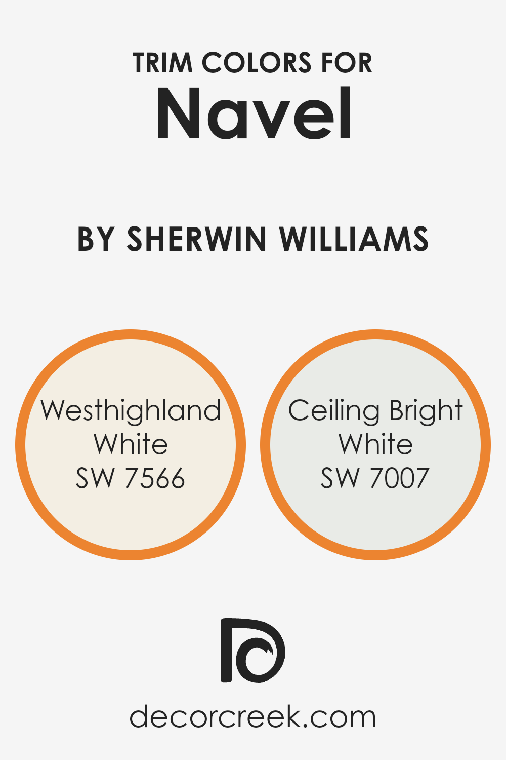
Using lighter trim colors such as SW 7566 – Westhighland White or SW 7007 – Ceiling Bright White can effectively complement and offset a deep, striking shade like Naval, ensuring the main color stands out while maintaining a clean and cohesive appearance.
Westhighland White, or SW 7566, is a warm and inviting shade of white that provides a gentle contrast against richer and darker hues, making it an excellent choice for softening the intensity of NavalSW 6887. Ceiling Bright White, or SW 7007, on the other hand, is a crisp and clear white that creates a sharp delineation which can make the naval color pop even more vividly.
Both choices help in enhancing the overall aesthetic by providing a fresh, neat frame that works well with the depth and richness of darker colors.
You can see recommended paint colors below:
Colors Similar to Navel SW 6887 by Sherwin Williams
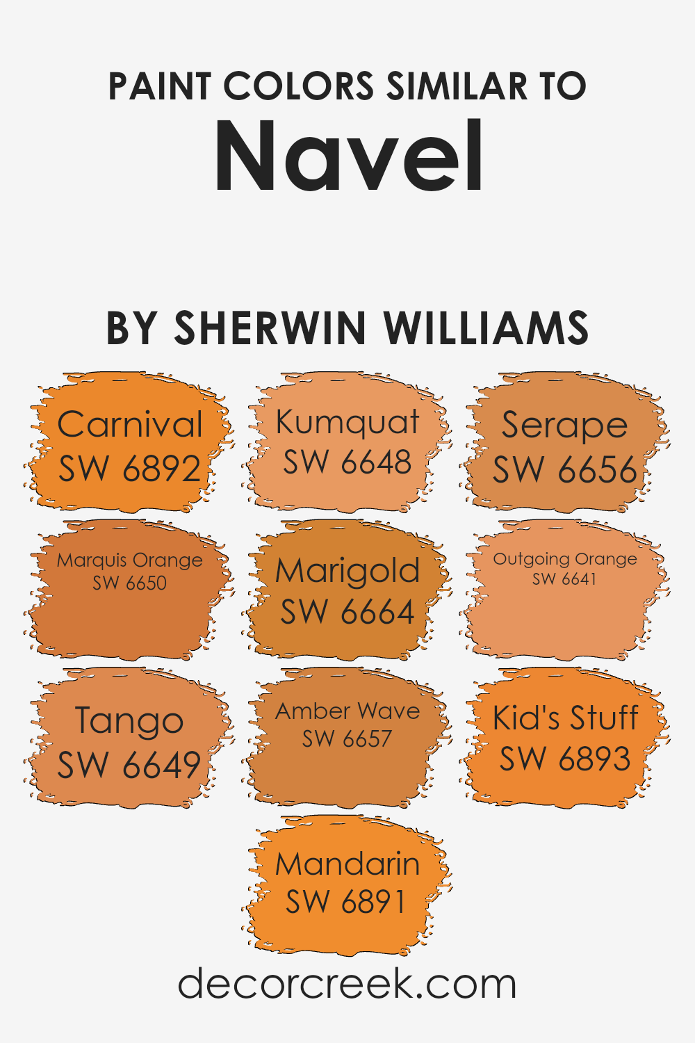
Choosing similar colors can greatly enhance the cohesion and overall aesthetic of any space. Similar colors, like those in the orange and yellow family surrounding SW 6887 by Sherwin Williams, create a harmonious look that is pleasing to the eye because they naturally blend well together.
This can be perfect for creating a warm, inviting atmosphere in a room, as these colors tend to evoke feelings of happiness and energy.
For example, SW 6892 – Carnival is a vibrant, energetic orange that sparks excitement, making it ideal for lively spaces. SW 6650 – Marquis Orange has a rich, deep hue that offers a more grounded feel, perfect for cozy areas. SW 6649 – Tango is a playful shade that combines the intensity of red with the cheerfulness of orange, suitable for places where you want to add some pop.
SW 6891 – Mandarin is a bright, zesty orange that brings a burst of freshness to any environment. SW 6648 – Kumquat is a softer, more subdued orange, providing a gentle touch of color. SW 6664 – Marigold, a sunny yellow, radiates warmth and light, ideal for creating a welcoming vibe.
SW 6657 – Amber Wave offers a golden yellow shade that resembles the soft glow of a sunset. SW 6656 – Serape is a unique mixture of orange and yellow tones, evoking a sense of creativity and fun. SW 6641 – Outgoing Orange is bold and friendly, perfect for spaces used for interaction.
Lastly, SW 6893 – Kid’s Stuff is a fun, playful orange that’s great for areas designed for joy and play. Each of these shades supports a vibrant, energetic theme when used alongside NAVEL by Sherwin Williams, allowing for varied yet cohesive design options.
You can see recommended paint colors below:
- SW 6892 Carnival (CHECK A SAMPLE)
- SW 6650 Marquis Orange
- SW 6649 Tango
- SW 6891 Mandarin
- SW 6648 Kumquat
- SW 6664 Marigold (CHECK A SAMPLE)
- SW 6657 Amber Wave (CHECK A SAMPLE)
- SW 6656 Serape (CHECK A SAMPLE)
- SW 6641 Outgoing Orange (CHECK A SAMPLE)
- SW 6893 Kid’s Stuff
Colors that Go With Navel SW 6887 by Sherwin Williams
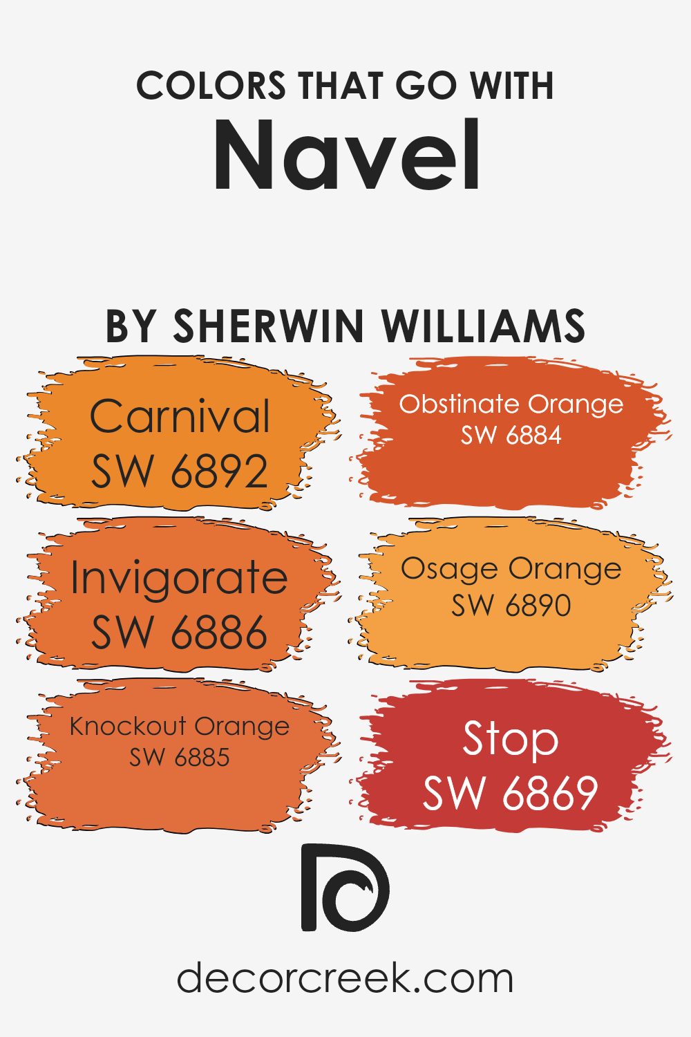
Choosing the right colors to complement Navel SW 6887 by Sherwin Williams is vital because it ensures that the overall look remains harmonious and pleasing to the eye. Navel is a vibrant, cheerful orange that makes a strong statement on its own. Pairing it with well-suited colors like Carnival, Invigorate, Knockout Orange, Obstinate Orange, Osage Orange, and Stop can enhance the energy of a space and bring out the best in the prominent orange hue.
Carnival SW 6892 is a playful, bright pink that adds a fun, youthful vibe when paired with Navel. It’s a bold color that works well in energetic spaces. Invigorate SW 6886, true to its name, is an intense orange that provides a seamless match, reinforcing the dynamic orange theme with a slightly deeper tone.
Knockout Orange SW 6885 pops with a fiery, spirited red-orange tint, while Obstinate Orange SW 6884 offers a bit milder orange that’s still striking, allowing for a layered orange palette. Osage Orange SW 6890 brings a fresh, zesty twist with its light and vivid tone, soothing the intensity of deeper oranges.
Lastly, Stop SW 6869 is a vivid red that provides a stark but appealing contrast, adding a dash of dramatic flair that can accentuate Navel’s inherent brightness. These colors together create an enthusiastic and warm environment, ideal for lively, spirited settings.You can see recommended paint colors below:
- SW 6892 Carnival (CHECK A SAMPLE)
- SW 6886 Invigorate (CHECK A SAMPLE)
- SW 6885 Knockout Orange (CHECK A SAMPLE)
- SW 6884 Obstinate Orange (CHECK A SAMPLE)
- SW 6890 Osage Orange (CHECK A SAMPLE)
- SW 6869 Stop (CHECK A SAMPLE)
How to Use Navel SW 6887 by Sherwin Williams In Your Home?
Navel SW 6887 by Sherwin Williams is a bold and vibrant shade of blue. It adds a lively splash of color to any room, making it perfect for creating a cheerful and inviting atmosphere. If you’re looking to spruce up your living room or kitchen, consider painting one accent wall with Navel.
This will introduce a pop of color without overwhelming the space. For bedrooms, using Navel for decor items like throw pillows or curtains against a lighter wall can bring in a fun contrast, keeping the room bright yet cozy.
Navel also works beautifully in smaller spaces such as bathrooms. Painting the entire room or just the cabinet fronts can make the area appear more open and cheerful. Even in outdoor spaces like a porch or trim, Navel can withstand different weathers while keeping your home exterior fresh and stylish. With its strong yet warm tone, Navel can easily work with neutral colors, providing a balanced yet striking aesthetic.
Navel SW 6887 by Sherwin Williams vs Carnival SW 6892 by Sherwin Williams
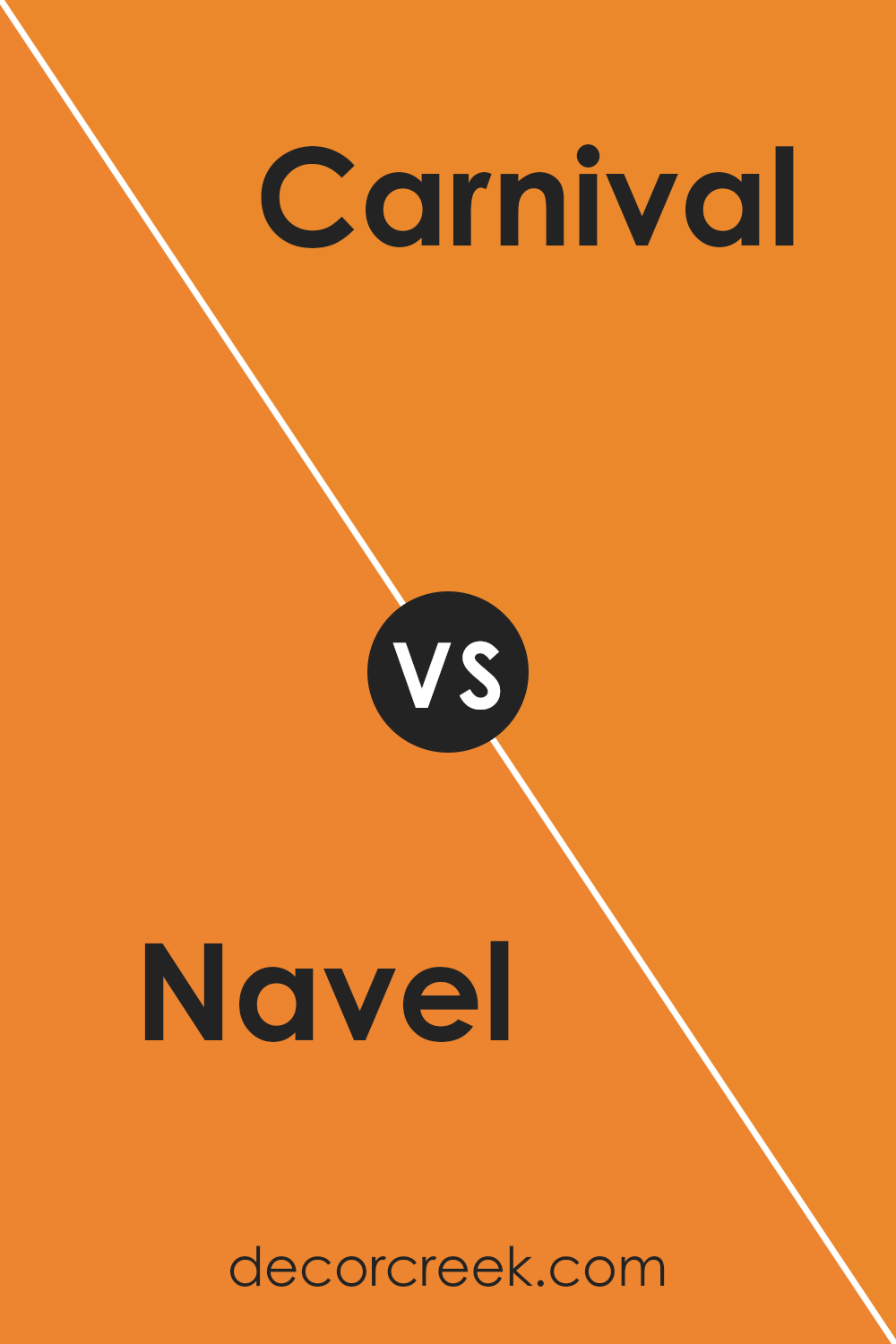
The color Navel by Sherwin Williams is a vibrant, deep orange that brings warmth and energy to any space. It’s reminiscent of autumn leaves or a cozy sunset, making it perfect for creating a welcoming and lively atmosphere. On the other hand, Carnival by Sherwin Williams is a bright, playful pink.
This color is fun and youthful, lending a sense of cheerfulness to an area. It can really brighten up a room and works well in spaces intended for creativity and activity. When comparing the two, Navel offers more of a warm, rich hue, suitable for cozy and inviting environments, while Carnival pops with a more light-hearted, stimulating appeal, ideal for dynamic, spirited areas.
Both colors are bold in their own right and would stand out distinctly in any interior or exterior application.
You can see recommended paint color below:
- SW 6892 Carnival (CHECK A SAMPLE)
Navel SW 6887 by Sherwin Williams vs Outgoing Orange SW 6641 by Sherwin Williams
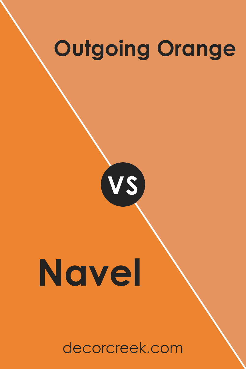
Navel SW 6887 and Outgoing Orange SW 6641 are two vibrant colors from Sherwin Williams that bring a lot of energy and warmth to any space. Navel is a true, cheerful orange that resembles the bright color of an orange fruit. It’s bold and lively, making it perfect for creating a focal point in a room.
On the other hand, Outgoing Orange is a bit more muted compared to Navel. It has a softer, peachy tone that feels very welcoming and cozy. This color is great for adding a gentle pop of color without overwhelming a space. Both colors are great for areas where you want to add some cheerfulness and warmth, like kitchens, playrooms, or creative spaces.
However, the choice between them depends on how bold or subtle you want the room’s vibe to be. Navel makes a stronger statement, while Outgoing Orange is more laid-back.
You can see recommended paint color below:
- SW 6641 Outgoing Orange (CHECK A SAMPLE)
Navel SW 6887 by Sherwin Williams vs Serape SW 6656 by Sherwin Williams
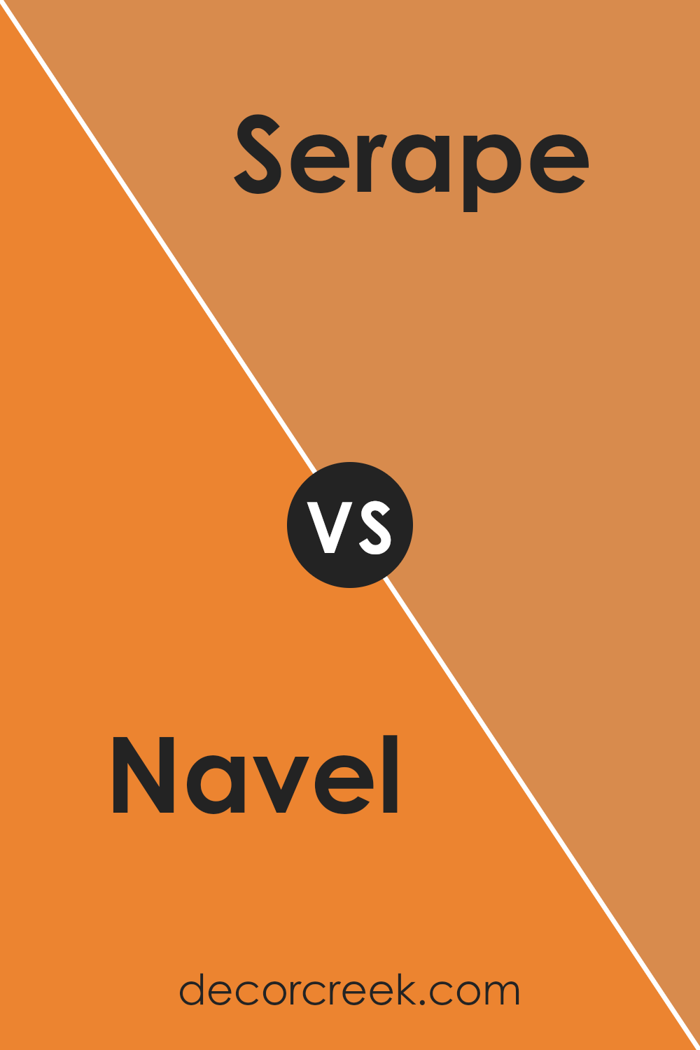
Navel SW 6887 by Sherwin-Williams is a vibrant, pure orange that’s bold and lively. It brings a sense of energy and brightness wherever it’s used, perfect for creating a focal point in a room. On the other hand, Serape SW 6656 is also from Sherwin-Williams and presents a much softer, almost pastel-like hue.
While it’s still within the orange family, Serape has a pinkish tone that makes it gentler and more subdued compared to Navel. This color is great for adding a touch of warmth in a more understated way. If you’re deciding between the two, consider Navel for a more striking impact and Serape for a softer, welcoming vibe.
Both colors can warm up a space, but the intensity of their impact differs notably.
You can see recommended paint color below:
- SW 6656 Serape (CHECK A SAMPLE)
Navel SW 6887 by Sherwin Williams vs Mandarin SW 6891 by Sherwin Williams
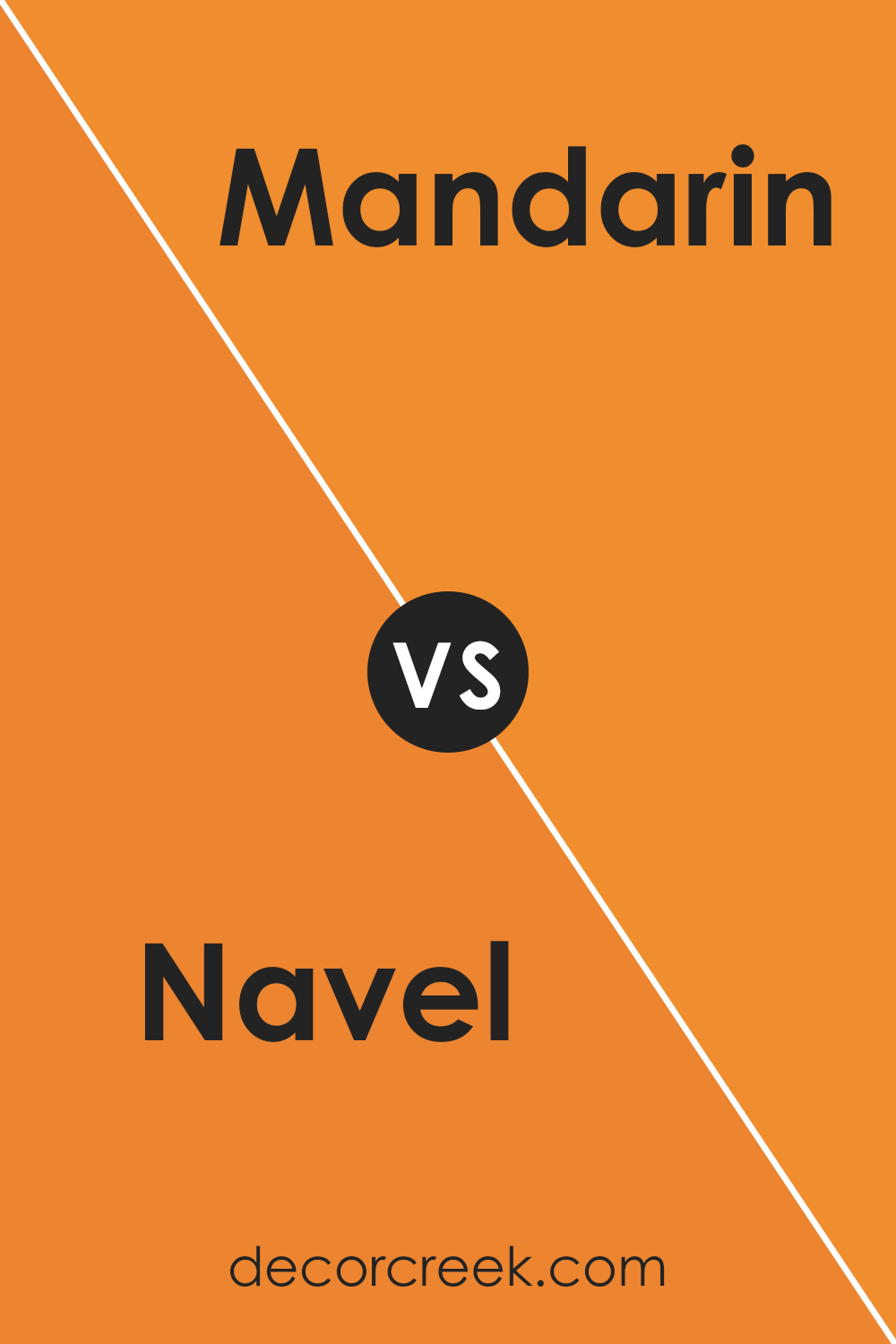
Navel SW 6887 and Mandarin SW 6891, both from Sherwin Williams, are vibrant and cheerful colors that brighten up any space. Navel is a true orange that’s bold and eye-catching, perfect for making a strong statement in a room. It has a playful yet warm vibe, making it great for common areas like living rooms or kitchens where you want to add a burst of energy.
On the other hand, Mandarin is a slightly more intense shade with a deeper, fiery undertone. It leans towards a red-orange, which gives it a more dramatic flair compared to Navel. This color works well in spaces where you want to draw attention or stir up excitement, such as a dining area or an accent wall.
Both colors are bright and can create lively environments, but Mandarin’s richer depth makes it the more daring choice, while Navel offers a more balanced and cheerful orange.
You can see recommended paint color below:
- SW 6891 Mandarin
Navel SW 6887 by Sherwin Williams vs Kid’s Stuff SW 6893 by Sherwin Williams
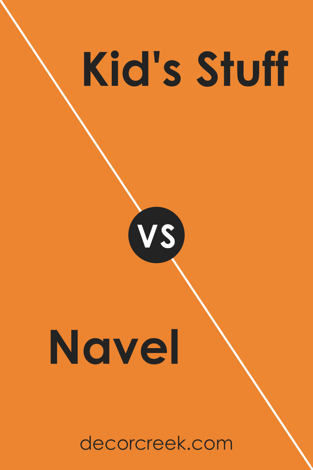
Navel SW 6887 by Sherwin Williams is a warm, vibrant orange that stands out with its cheerful and energetic vibe. This color is perfect for spaces where you want to introduce a sense of welcoming and liveliness, such as a kitchen or children’s play area. It pairs well with neutral shades, helping to balance its brightness.
On the other hand, Kid’s Stuff SW 6893 by Sherwin Williams is a bold and bright yellow. This shade is lively and playful, making it ideal for areas that need a pop of color to spark creativity or joy, like a playroom or a casual dining area. Kid’s Stuff SW 6893 can be beautifully matched with other bright or pastel tones to create a fun, youthful atmosphere.
Both colors are excellent choices for adding a fresh look to a room, but while Navel SW 6887 brings a warm, sunny feel, Kid’s Stuff SW 6893 injects a more playful and energetic burst of color. They can make spaces feel more welcoming and lively in their own unique ways.
You can see recommended paint color below:
- SW 6893 Kid’s Stuff
Navel SW 6887 by Sherwin Williams vs Kumquat SW 6648 by Sherwin Williams
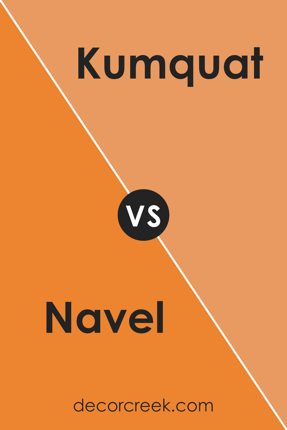
Navel SW 6887 and Kumquat SW 6648 by Sherwin Williams are both vibrant and cheerful colors, but they have distinct tones that set them apart. Navel has a pure, bright orange hue that really stands out. It’s the kind of color that brings a lively and energetic feel to any space. It’s perfect for creating a focal point in a room or adding a playful touch to decor.
On the other hand, Kumquat is a slightly deeper orange with a touch of red, giving it a warm and cozy vibe. This color is ideal for spaces where you want to add warmth and a welcoming atmosphere, like living rooms or dining areas.
Both colors are great for adding a splash of brightness to your home, but the choice between them depends on the mood you want to create. Navel is more about energy and fun, while Kumquat leans towards a cozy and comforting feel.
You can see recommended paint color below:
- SW 6648 Kumquat
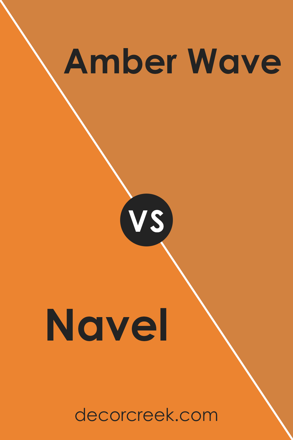
Navel SW 6887 by Sherwin Williams vs Amber Wave SW 6657 by Sherwin Williams
Navel SW 6887 and Amber Wave SW 6657 by Sherwin Williams are two rich, warm colors that brighten any space. Navel is a vibrant orange that has a bold and cheerful vibe, perfect for making statements in areas like a lively kitchen or a playful living room. It pairs well with neutral shades and can add a lot of personality to your surroundings.
On the other hand, Amber Wave is a softer, more muted orange with a golden undertone. It’s less intense than Navel, providing a cozy and soothing feel, ideal for spaces where you want a calm yet warm atmosphere, like bedrooms or a reading nook.
Both colors can create inviting spaces but have different intensities and warmth. Navel stands out and grabs attention, while Amber Wave offers a gentle warmth that blends smoothly into the décor. Depending on the mood you want to set, you might choose Navel for energy and excitement, or Amber Wave for a more relaxed and warm setting.
You can see recommended paint color below:
- SW 6657 Amber Wave (CHECK A SAMPLE)
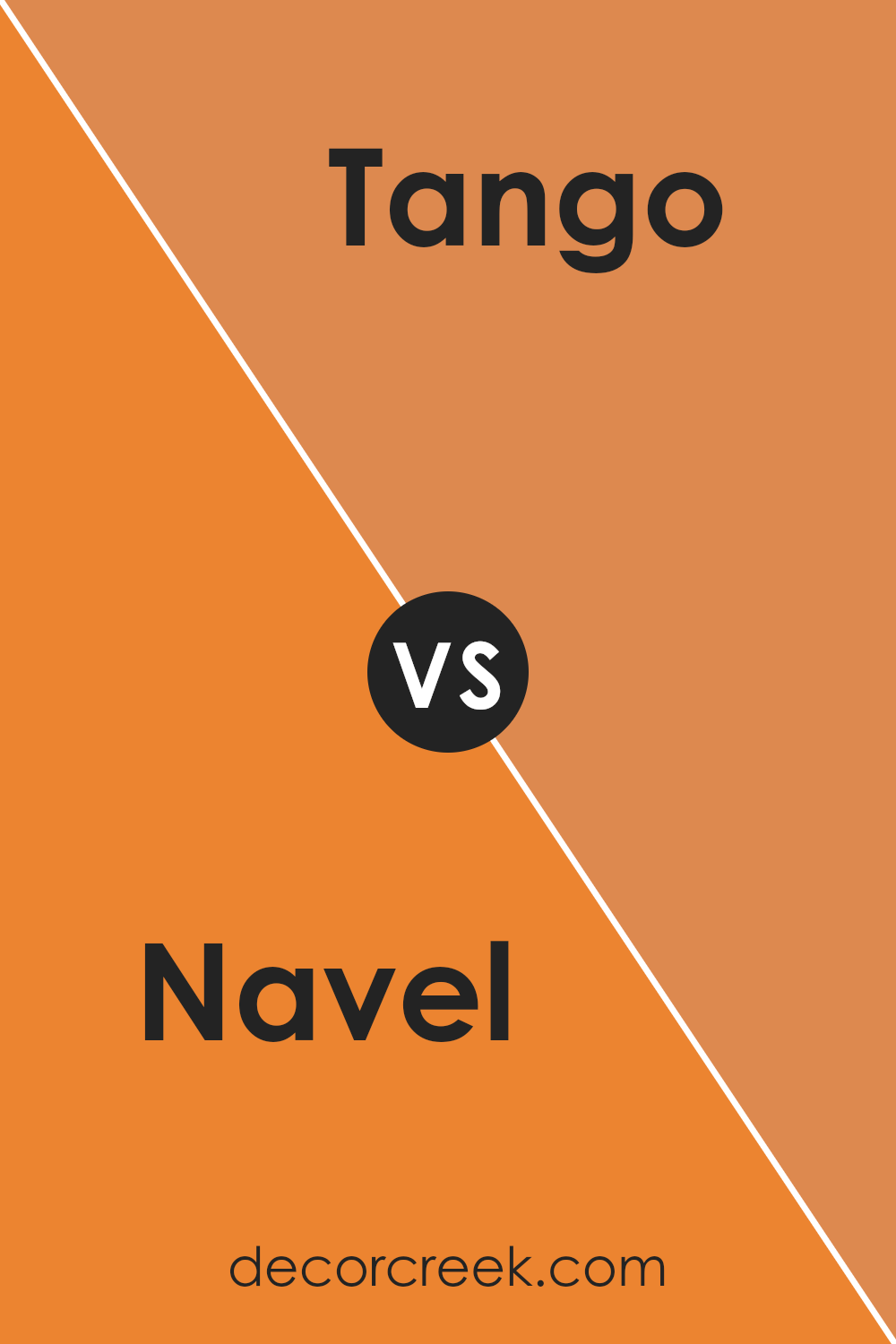
Navel SW 6887 by Sherwin Williams vs Tango SW 6649 by Sherwin Williams
Navel SW 6887 and Tango SW 6649 are two vibrant colors from Sherwin Williams. Navel is a bright orange that brings to mind the citrusy shades of a ripe orange peel. It’s a lively color that can instantly perk up a room. On the other hand, Tango is a slightly mellower orange, more of a pumpkin hue. It’s warm and cozy but with enough brightness to keep things interesting.
Both colors are excellent for making a statement, yet they have different vibes. Navel is bolder and can be a great choice for an accent wall or to add a splash of cheerfulness to any space. Tango, being a bit softer, might work better for larger areas or whole rooms, as it’s easier on the eyes and pairs nicely with a variety of decor styles.
While Navel stands out more strikingly, Tango offers a gentler approach to bringing warmth into a room. Together, they could create a nice balance if used in the same area.
You can see recommended paint color below:
- SW 6649 Tango
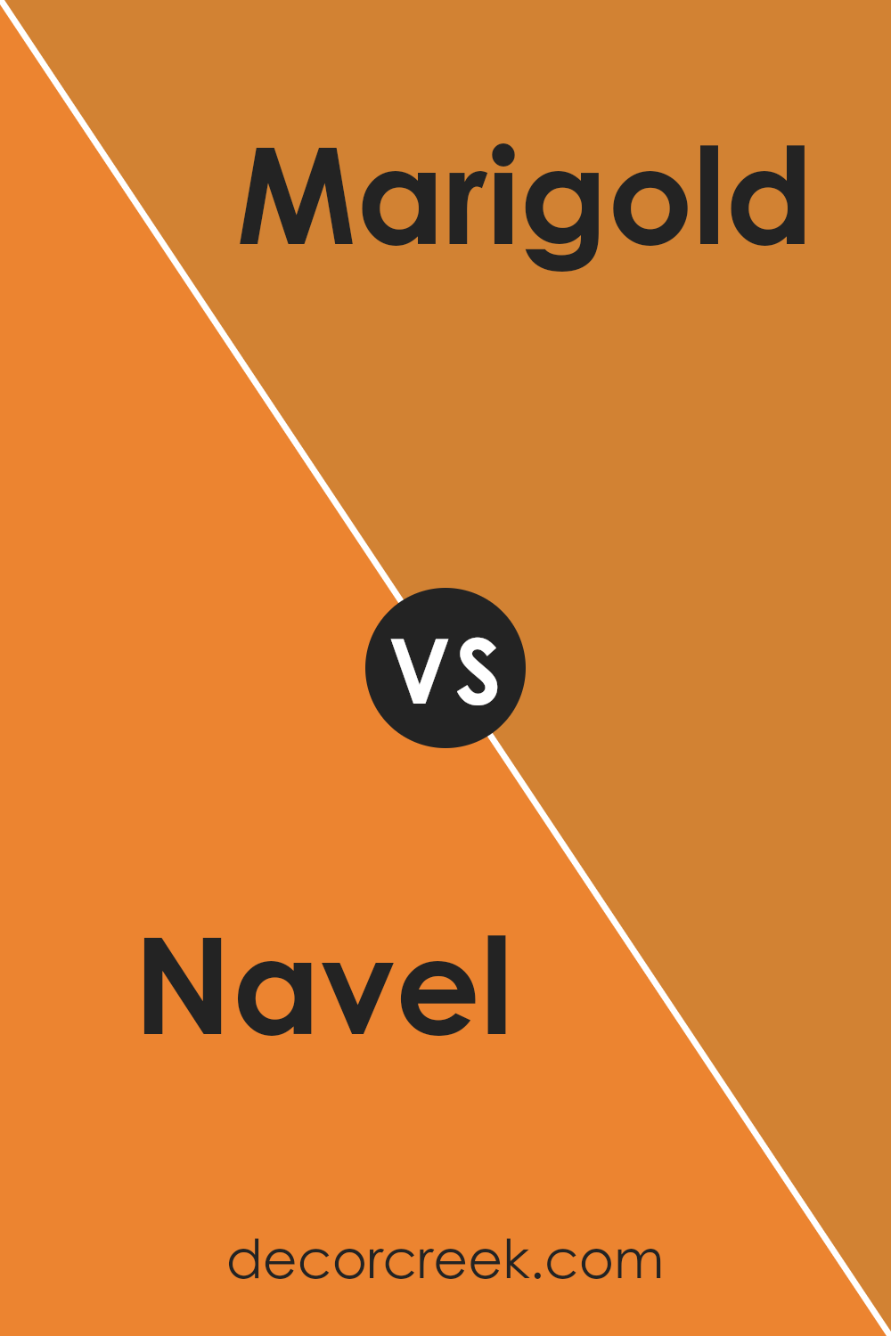
Navel SW 6887 by Sherwin Williams vs Marigold SW 6664 by Sherwin Williams
Navel SW 6887 and Marigold SW 6664, both by Sherwin Williams, present vibrant and lively hues suitable for adding personality to any space. Navel, a bold orange, brings a punchy, energetic feel that’s perfect for stimulating creativity and adding excitement. This color works well in playrooms, creative spaces, or any area that benefits from a dose of cheer.
On the other hand, Marigold has a golden yellow tone that offers a bright and welcoming vibe. This shade is ideal for kitchens, living rooms, or any space where a friendly, inviting atmosphere is desired. It pairs beautifully with natural light, enhancing the warmth of the room.
Both colors are strong in their own right but cater to different moods and settings. While Navel leans towards a more playful and dynamic character, Marigold nurtures a warm, cozy feeling. Choosing between them depends on the particular ambience you want to create in your space.
You can see recommended paint color below:
- SW 6664 Marigold (CHECK A SAMPLE)
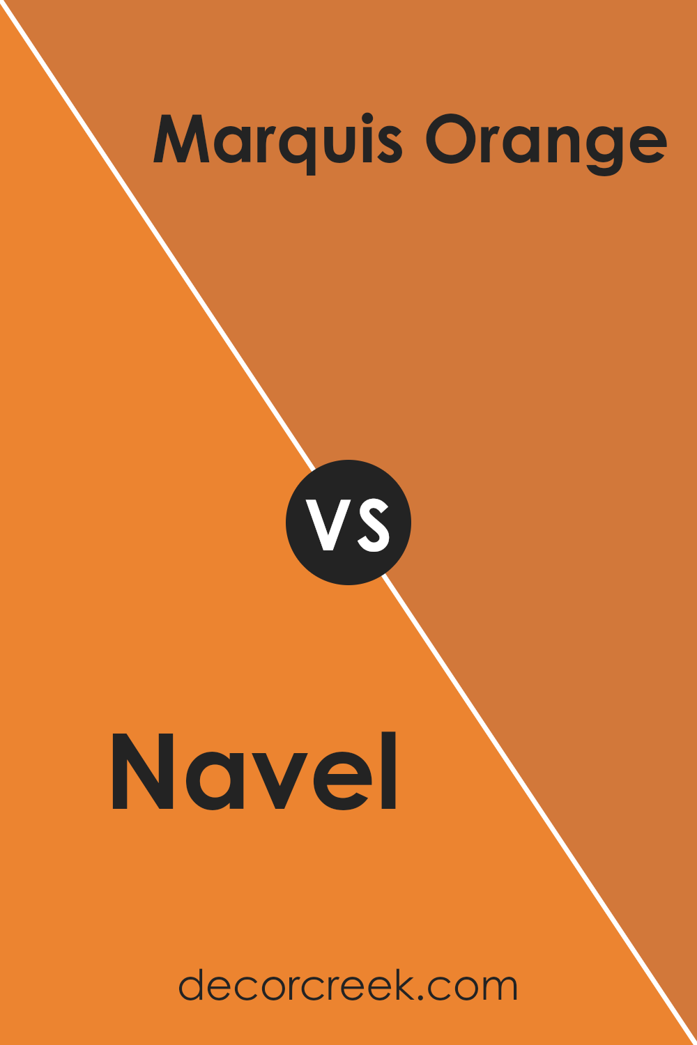
Navel SW 6887 by Sherwin Williams vs Marquis Orange SW 6650 by Sherwin Williams
Navel SW 6887 and Marquis Orange SW 6650 are two vibrant colors by Sherwin Williams, both bringing unique energy to spaces. Navel is a bright, cheerful orange, resembling the lively color of a ripe orange’s peel. It’s bold and can make any room feel happy and inviting.
In contrast, Marquis Orange has a slightly more mellow tone. Think of the rich color seen in a marigold flower. It’s still bright, but with a depth that offers warmth.
While both colors are in the orange family, Navel pops with a more electrifying vibe that draws the eye immediately. It works well in areas where you want to add excitement or a playful touch. On the other hand, Marquis Orange, being slightly subdued, is excellent for creating a cozy atmosphere, ideal for living rooms or bedrooms where a softer ambiance is preferred.
Both colors work great for adding life to a space, but the choice between them depends on the mood you’re aiming to create.
You can see recommended paint color below:
- SW 6650 Marquis Orange
Conclusion
In wrapping up my thoughts on SW 6887 Navel by Sherwin Williams, I must say it’s an exceptionally vibrant and cheerful orange that can really brighten up any space. It gives a room a warm, sunny feel, making it perfect for spaces like kitchens or playrooms where you want a lot of energy and happiness.
It’s also great for a feature wall in a living room or bedroom if you want to add a pop of color without it being too overwhelming.
Using SW 6887 Navel is also a great way to bring some fun and positivity into your home. It’s important to think about the other colors you want to use with it because it pairs really well with cool blues or even neutral whites and grays that can help balance out its brightness. This way, your room won’t feel too loud but will still have that cheerful touch.
Overall, if you’re thinking about trying a new color in your home, SW 6887 Navel could be a wonderful choice. It’s friendly and bright, and it might just make your home feel even more welcoming. Whether you’re painting a whole room or just adding an accent, this color is sure to bring a little extra joy into your space.
Ever wished paint sampling was as easy as sticking a sticker? Guess what? Now it is! Discover Samplize's unique Peel & Stick samples.
Get paint samples


