Have you ever considered refreshing your space with a new color? If so, let me introduce you to HC-158 Newburg Green by Benjamin Moore. This shade is a beautiful, deep green that brings a sense of calm and sophistication to any room.
It’s part of the Historical Collection, which is inspired by America’s historic landmarks and offers colors that are both rich and timeless.
Choosing the right paint color can completely change the feel of your space. Newburg Green is versatile, working wonderfully in a bedroom for a cozy vibe or in a living room to create a welcoming atmosphere for guests.
Whether you live in a modern apartment or a traditional house, this color can fit seamlessly into your home. Plus, it pairs beautifully with both light and dark furniture, so you don’t have to worry about revamping your existing decor.
If you’re thinking of giving your walls a makeover, HC-158 Newburg Green could be the perfect choice for you.
It’s more than just paint; it’s a way for you to make your living space truly your own. Why not give it a try and see the transformation for yourself?
What Color Is Newburg Green HC-158 by Benjamin Moore?
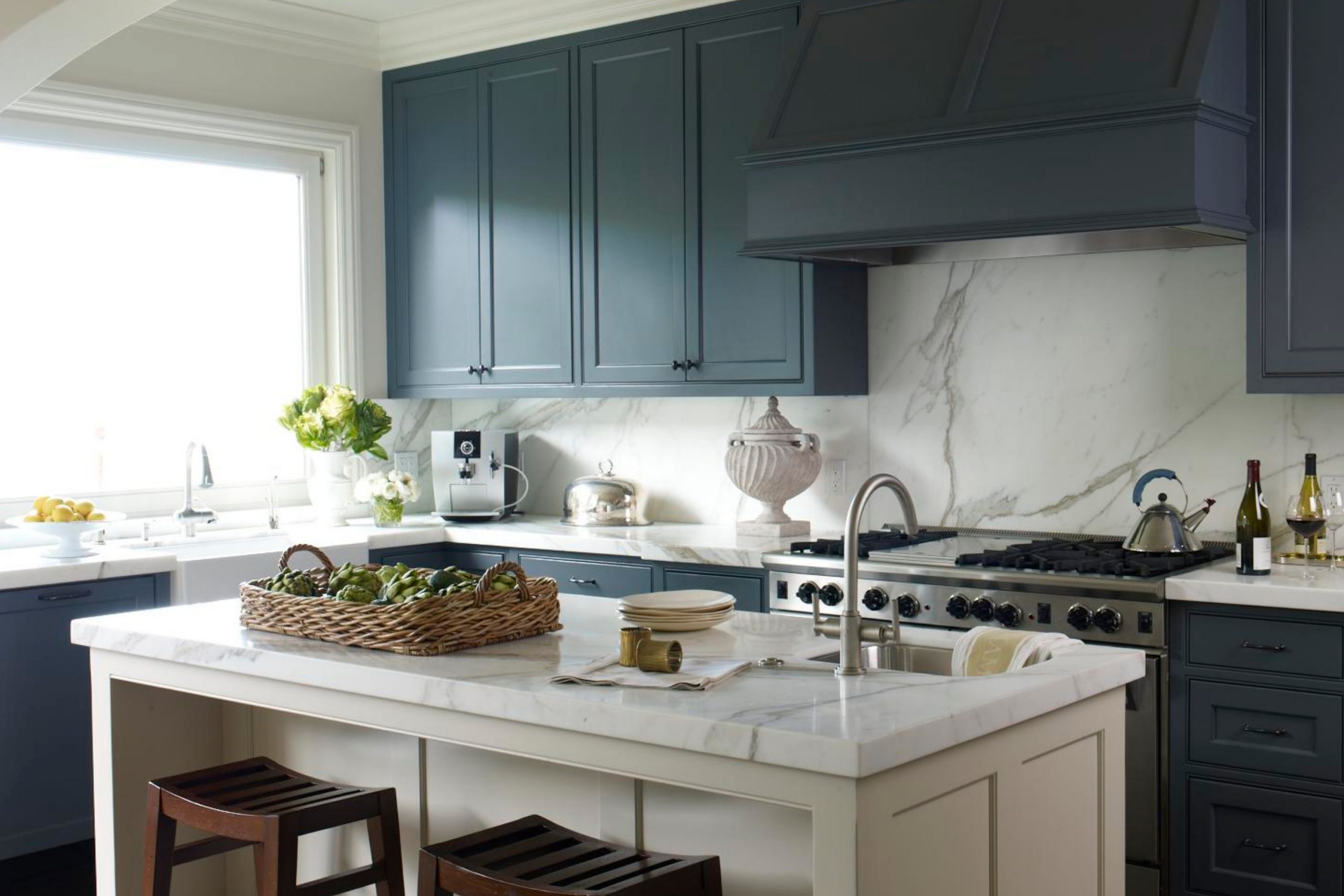
Newburg Green by Benjamin Moore is a rich, deep teal that manages to feel both warm and inviting. It’s a versatile color that adds depth and character to any space. This color works exceptionally well in interior styles like traditional, coastal, and even modern settings because of its ability to blend seamlessly with various decor elements.
For traditional spaces, Newburg Green pairs beautifully with warm woods and antique furnishings, creating a cozy, timeless look.
In coastal-inspired rooms, it echoes the colors of the deep ocean and pairs well with light, sandy tones, and natural fibers like linen and cotton, enhancing the beachy feel.
In modern interiors, the color can be used as an accent wall to contrast with sleek furniture and metal accents, giving the room a striking, contemporary vibe.
The color looks stunning when complemented with materials like brass or gold hardware, which highlights its depth and makes the room shine.
Newburg Green also works well with different textures. Combining it with velvet upholstery adds a touch of luxury, while pairing it with rough-hewn wood elements can create a more rustic atmosphere.
This versatility makes it ideal for various applications, from living rooms and bedrooms to kitchens and bathrooms, always providing a stunning backdrop or pop of color.
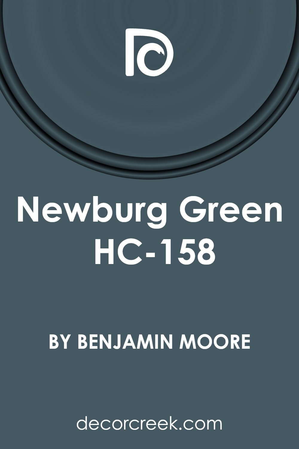
Is Newburg Green HC-158 by Benjamin Moore Warm or Cool color?
Newburg Green HC-158 by Benjamin Moore is a deep, soothing green shade that brings a vibrant yet calming feel to any room. Often associated with nature, this color helps create a cozy, inviting atmosphere—perfect for spaces where you want to relax and wind down.
It works exceptionally well in home offices or reading nooks, providing a backdrop that encourages focused thinking and creativity without being too stark.
Its rich tone pairs well with both dark and light furniture, offering versatility in various decorating styles from modern to rustic. It’s particularly stunning when used on an accent wall, where it can be the room’s focal point without overwhelming the surrounding decor.
It also complements natural elements like wooden features or plants, increasing the feel of bringing the outdoors in, making spaces feel alive and open. If you’re looking to add a dash of earthiness with a stylish twist, Newburg Green is a robust choice.
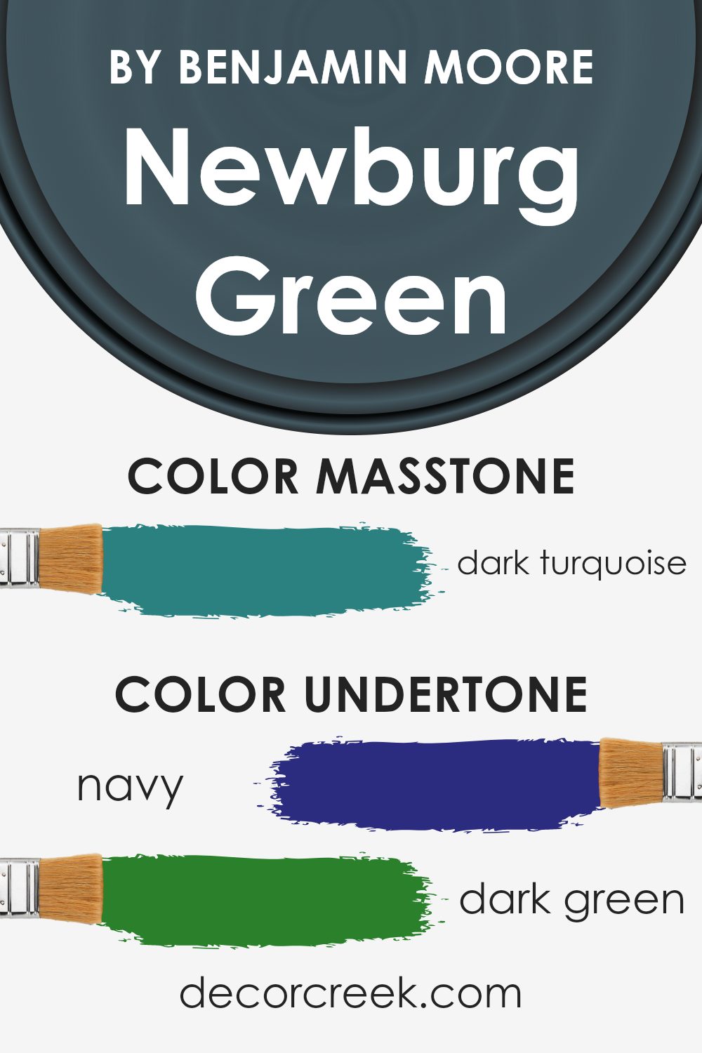
Undertones of Newburg Green HC-158 by Benjamin Moore
Newburg Green is a unique color because it has many different undertones. Undertones are the subtle colors that are mixed into the main color, affecting how it looks under different lighting conditions or when paired with other colors.
The main undertones in Newburg Green are navy, dark green, and grey, but you can also notice hints of other shades like purple, olive, and brown.
These undertones can make the color appear darker, lighter, warmer, or cooler depending on the surroundings.
When used on interior walls, Newburg Green’s complex mix of undertones offers a dynamic look.
In natural daylight, the navy and dark green undertones might become more prominent, giving the walls a rich, deep feel. In artificial lighting, the grey or dark grey undertones might stand out, adding a modern touch.
This variety makes Newburg Green versatile and suitable for different rooms and styles. Whether in a cozy study or a spacious living room, this color can add depth and interest to the space.
Moreover, the presence of undertones like blue, lilac, and light turquoise can subtly influence the mood of a room.
These hints can cool down a space or bring a touch of freshness, depending on the other colors and decor used in the room.
In summary, the variety of undertones in Newburg Green makes it a fascinating color choice for walls, enhancing the overall ambiance of any interior space.
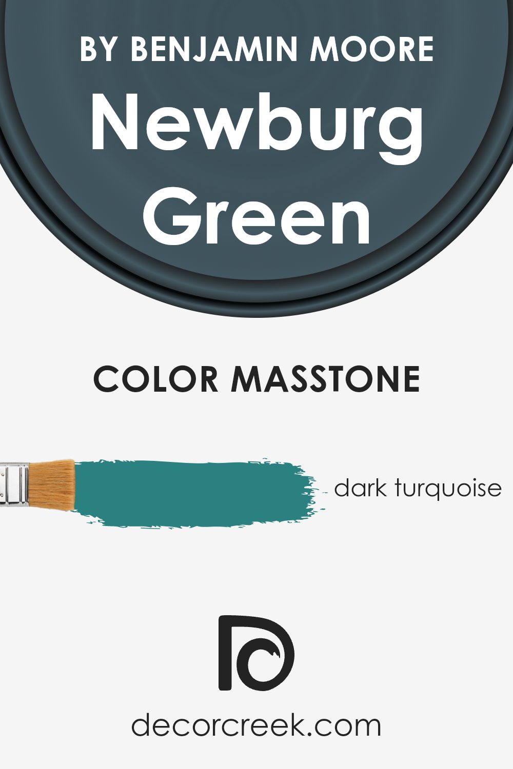
What is the Masstone of the Newburg Green HC-158 by Benjamin Moore?
Newburg Green HC-158 by Benjamin Moore in its masstone appears as a dark turquoise, a deep, rich shade similar to the color with the code #2B8080. This unique color can bring a cozy and inviting atmosphere to any space within a home.
It’s particularly effective in areas where people want to feel relaxed, such as living rooms and bedrooms. The deep turquoise hue has a calming effect, which can help in spaces meant for rest or unwinding at the end of the day.
This shade also pairs well with many decor styles, making it versatile. It can complement natural wood tones, whites, and creams, adding depth and contrast without overwhelming the space. It’s also quite forgiving in terms of showing wear and tear or smudges, making it a practical choice for high-traffic areas like hallways and family rooms.
Using it in your home can bring a touch of nature indoors, reflecting the colors found in forests and oceans, and creating a peaceful yet distinct interior atmosphere.
How Does Lighting Affect Newburg Green HC-158 by Benjamin Moore?
Lighting plays a crucial role in how we perceive colors. When it comes to painting a room, understanding the effects of lighting on colors is essential for making smart design choices. Different types of light can change the way a color looks, which can dramatically alter the mood and feel of a space.
Take the color Newburg Green by Benjamin Moore, for example. This shade can look quite different depending on the light it’s exposed to. In artificial light, Newburg Green tends to appear darker and more intense.
This is because most artificial light sources, like incandescent bulbs, project a warm glow that can enhance the depth of darker colors.
In natural light, the appearance of Newburg Green can vary throughout the day. Morning light, which is often softer, brings out the blue-green undertones of this shade, making it look vibrant and fresh.
As the day progresses and the light becomes brighter, the color may appear lighter and more airy.
Considering the direction a room faces can also affect how Newburg Green looks:
- North-Faced Rooms: These rooms get less direct sunlight, which can make colors look cooler and more shadowed. Newburg Green in a north-facing room might appear more muted and subdued.
- South-Faced Rooms: These rooms benefit from ample sunlight, making colors look lighter and more vivid. Here, Newburg Green would be lively and true to its hue as seen in natural daylight.
- East-Faced Rooms: These rooms enjoy bright light in the morning, which can make Newburg Green look soft and inviting early in the day. As the light fades, the color may take on a more muted tone.
- West-Faced Rooms: With evening light, west-facing rooms can make Newburg Green look warmer and more cozy, especially in the late afternoon and evening when the sun casts a golden hue.
By understanding these nuances, one can select lighting and room orientation that both complements and enhances the chosen paint color, maximizing the beauty of the space.
What is the LRV of Newburg Green HC-158 by Benjamin Moore?
LRV stands for Light Reflectance Value, which is a measure used to describe the percentage of light a paint color reflects from or absorbs into a surface. It’s a useful metric for understanding how light or dark a color will look once it’s applied to the walls of a room.
Typically, an LRV can range from low to high values, with lower numbers indicating darker colors that absorb more light and higher numbers corresponding to lighter colors that reflect more light.
Understanding LRV can help in choosing paint colors that best fit the lighting of a room, enhancing both the appearance and ambiance.
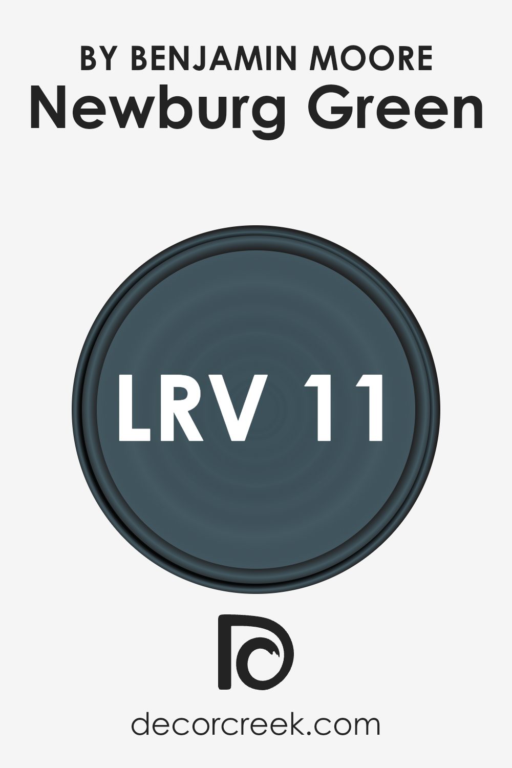
The LRV of Newburg Green (HC-158) by Benjamin Moore is 10.58, which means it is on the darker end of the scale. As such, this color will absorb more light than it reflects, making it appear quite rich and deep when painted on walls.
In rooms with limited natural light or smaller spaces, this darker LRV can make the space feel cozier but smaller.
However, in a well-lit or large room, this color can add a sense of warmth and depth, making it a compelling choice for those looking to create a cozy and inviting atmosphere.
To ensure the color doesn’t make a room feel too cramped, pairing it with lighter colors or reflective decor elements can help balance the visual impact.
Coordinating Colors of Newburg Green HC-158 by Benjamin Moore
Coordinating colors are hues that work well together to create a harmonious look in any space. When you choose coordinating colors for a paint like HC-158 by Benjamin Moore, you ensure that each color complements the others nicely without clashing or overwhelming the senses.
These coordinated colors can range from neutral tones to lush greens, all designed to enhance the primary color.
For instance, AF-15 – Steam is a clean and airy white that offers a fresh breath to any room and pairs seamlessly with richer tones like Newburg Green. Healing Aloe 1562 is a soft, light green with a subtle hint of gray, giving it a soothing presence that can soften the intensity of deeper shades.
OC-86 – White Blush has just a hint of pink, providing a warm and welcoming feel when used alongside cooler hues.
Lastly, HC-57 – Sheraton Beige is a warm, neutral beige that acts as a solid foundation, ensuring that bolder colors stand out beautifully. Each of these coordinating colors supports and enhances the primary color, allowing for versatile design schemes that feel cohesive and thoughtfully curated.
You can see recommended paint colors below:
- AF-15 Steam (CHECK A SAMPLE)
- 1562 Healing Aloe (CHECK A SAMPLE)
- OC-86 White Blush
- HC-57 Sheraton Beige (CHECK A SAMPLE)

What are the Trim colors of Newburg Green HC-158 by Benjamin Moore?
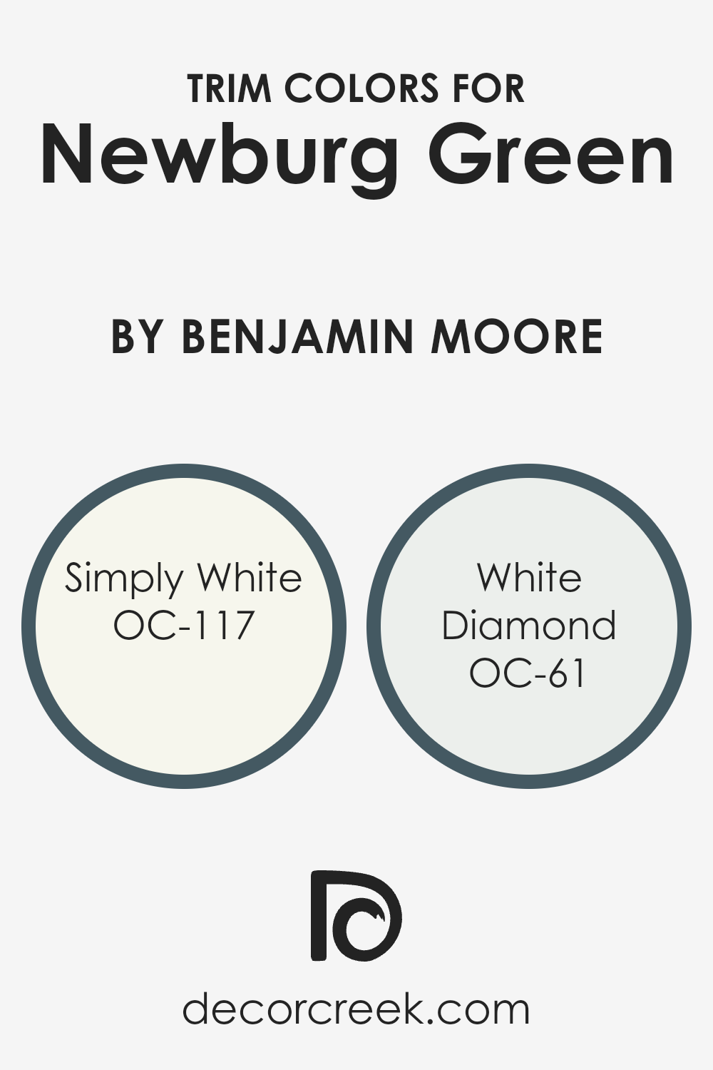
Trim colors are crucial in defining and accentuating the distinct features of a room, such as door frames, window frames, and moldings, by creating a visual contrast with the primary wall color. When using a rich and deep hue like Newburg Green by Benjamin Moore, selecting the right trim colors can significantly enhance the overall aesthetic.
Simply White OC-117 and White Diamond OC-61 are great choices as they add a crisp, clean edge to the sophistication of Newburg Green, highlighting architectural details and brightening the space.
Simply White OC-117 is a bright and fresh white that brings out a lively contrast against the darker tones of Newburg Green, giving spaces a refreshed and airy look. White Diamond OC-61, on the other hand, offers a slightly softer approach with its subtle, almost sparkling finish that complements Newburg Green by softening its intensity and adding a light reflective quality.
Together, these whites work harmoniously to provide balance and a refreshing lift that makes Newburg Green stand out beautifully.
You can see recommended paint colors below:
- OC-117 Simply White
- OC-61 White Diamond
Colors Similar to Newburg Green HC-158 by Benjamin Moore
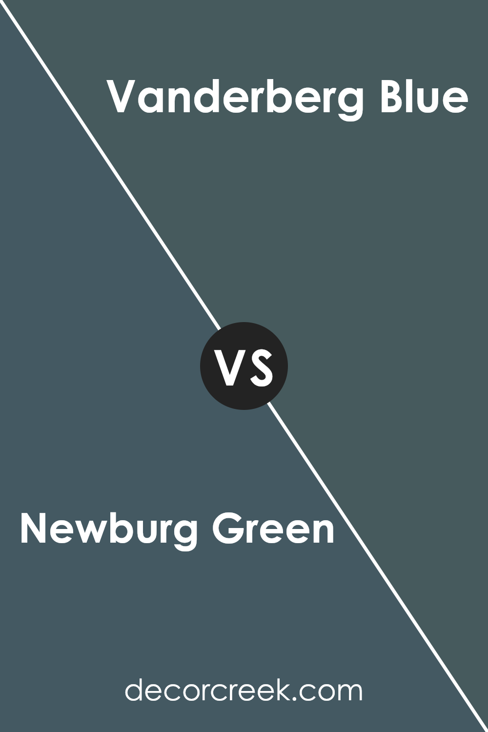
Choosing similar colors for a design project is crucial as it helps create a cohesive look that is pleasing to the eye. When colors closely resemble each other, like Newburg Green and Vanderberg Blue, they can effortlessly blend together to enhance the aesthetic appeal of a space.
This type of color coordination is often used to maintain a consistent theme or mood throughout an interior or a piece of artwork. By using shades that share common undertones or are adjacent on the color wheel, designers achieve a harmonious and balanced visual experience.
Such similarities in color can subtly draw rooms together without the colors clashing or competing for attention, providing a smooth visual transition from one area to another.
Newburg Green is a deep, rich green with hints of blue, creating a lush and inviting atmosphere wherever it is applied.
It pairs well with decor that aims to establish a grounded, calm environment. On the other hand, Vanderberg Blue is a slightly lighter shade that leans towards a soft, muted blue with a touch of green.
This color is ideal for spaces intended to have a refreshing yet cozy feel, enhancing the sense of openness and comfort. Both colors support a relaxed theme, making them excellent choices for someone looking to create a peaceful and cohesive space.
You can see recommended paint color below:
- 721 Vanderberg Blue (CHECK A SAMPLE)

How to Use Newburg Green HC-158 by Benjamin Moore In Your Home?
Newburg Green HC-158 by Benjamin Moore is a rich, deep teal color that brings a bold and cozy atmosphere to any room. If you’re looking to add a touch of elegance and warmth to your home, this color is a great choice. You can use it in a variety of ways to enhance your living space.
For instance, painting an accent wall in Newburg Green can make your living room or bedroom more inviting and provide a beautiful backdrop for artwork and furniture.
It also works well in smaller spaces like a bathroom or a reading nook, giving them a cozy, enclosed feel without making the space seem too dark.
If you’re not ready to commit to painting an entire room, consider using it for cabinets or a kitchen island for a pop of color.
This versatile shade pairs nicely with light woods, metallic finishes, and creamy white accents, allowing for a beautiful contrast that makes any home décor stand out.
Newburg Green HC-158 by Benjamin Moore vs Vanderberg Blue 721 by Benjamin Moore
The main color, Newburg Green, is a deep, rich teal that leans more towards green. It offers a cozy and enveloping feel, making it great for spaces where you want a comforting and grounding atmosphere. It’s a versatile shade that can work well in a variety of rooms, from living rooms to bedrooms.
On the other hand, Vanderberg Blue is a light, airy blue with a slight gray tint. This color has a fresh and clean look, making it ideal for kitchens, bathrooms, or any other space where a sense of openness and purity is desired.
It’s especially good for smaller spaces as it tends to make them appear larger and more open.
Both colors come from Benjamin Moore, a trusted name in paint, ensuring quality and longevity.
While Newburg Green provides a deep, moody vibe, Vanderberg Blue offers a lighter, more relaxed feel, making them suitable for different aesthetics and functions in home decor.
You can see recommended paint color below:
- 721 Vanderberg Blue (CHECK A SAMPLE)
Conclusion
In summing up my thoughts on HC-158 Newburg Green by Benjamin Moore, I find it’s a really special greenish-blue color that can make any room feel cozy and nice. This color isn’t too bright or too dark, which makes it just perfect for painting walls in both big areas like the living room and small spaces like a bathroom.
I’ve learned that Newburg Green works well with lots of other colors. You can pair it with soft yellows, creamy whites, or even bold reds, and it will still look great. It helps other colors pop and adds a neat background that makes your furniture and decorations stand out.
Additionally, I noticed that this color has a calming effect and makes a room feel more comfortable and inviting. It’s good for places in your home where you want to relax, like your bedroom or reading nook. If you’re thinking about adding a new color to your home, Newburg Green by Benjamin Moore could be a great choice.
It’s simple, looks nice, and creates a friendly feeling that anyone, whether friends or family, would enjoy.
Ever wished paint sampling was as easy as sticking a sticker? Guess what? Now it is! Discover Samplize's unique Peel & Stick samples.
Get paint samples


