Newburyport Blue has a way of making a room feel instantly calm and refined. This deep, rich blue has a classic feel that works in so many spaces, adding just the right touch of sophistication. Whether on walls, cabinets, or an accent piece, it’s a color that always feels stylish and timeless.
As I stood in a room painted with Newburyport Blue, I noticed how it balanced perfectly between being bold yet understated. It’s not just another blue; it has depth and character.
It works beautifully in both traditional and modern settings, making it a favorite for those seeking elegance without being overpowering.
Let me share why I appreciate it so much. Its ability to change with light is remarkable; under bright sunlight, it has a crisp, clean appearance, while in dimmer lighting, it takes on a cozy, enveloping warmth.
It’s a perfect choice for living rooms, bedrooms, or even a dining area where you want to create an inviting atmosphere.
Pair it with whites or lighter neutrals for a classic look, or experiment with contrasting colors for something more dramatic. No matter how you style it, Newburyport Blue by Benjamin Moore offers a timeless appeal that fits into your vision of a perfect space.
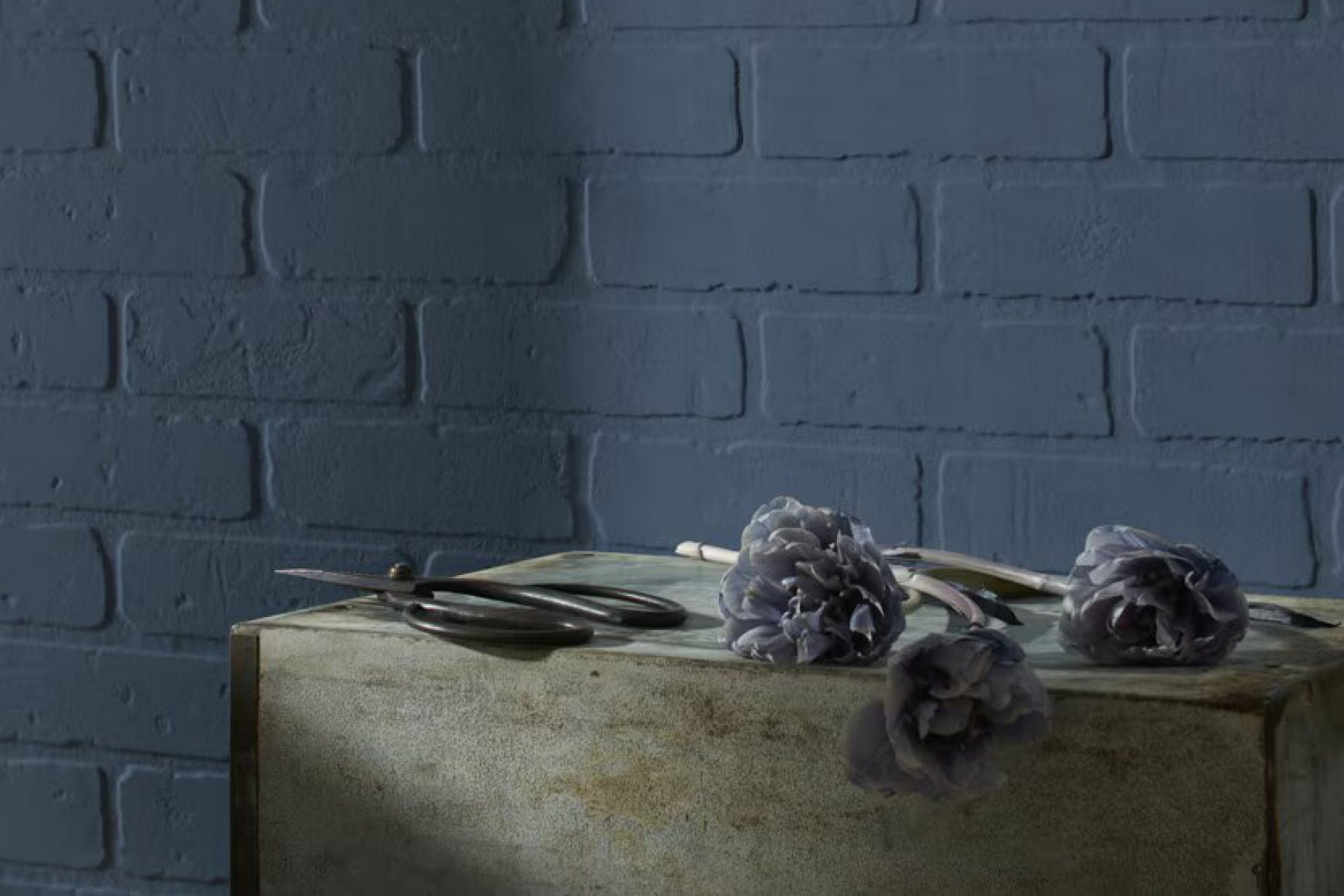
What Color Is Newburyport Blue HC-155 by Benjamin Moore?
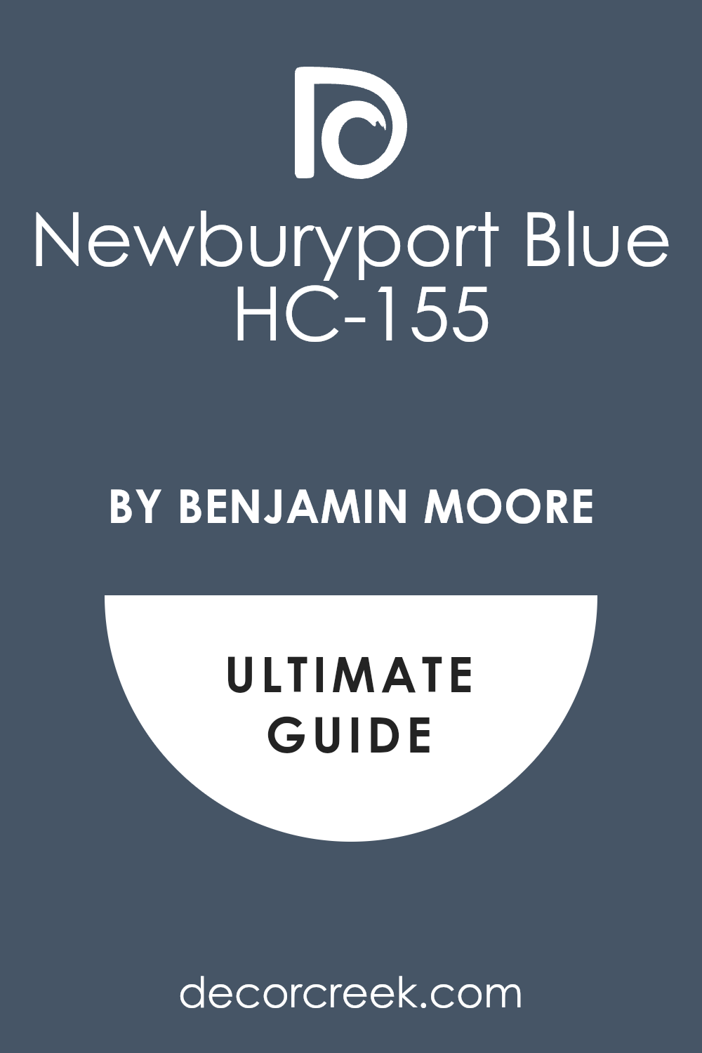
Newburyport Blue (HC-155) by Benjamin Moore is a deep, rich blue with hints of gray that give it a timeless and elegant look. This color is versatile and can be used in various interior design styles, including traditional, coastal, and modern. Its muted undertones make it particularly suitable for creating a cozy atmosphere, whether used in living rooms, bedrooms, or even kitchens.
In traditional settings, Newburyport Blue pairs beautifully with warm wood tones, adding contrast and highlighting the natural texture of the wood. In coastal interiors, it complements crisp whites and nautical-themed decor, enhancing the airy and relaxed feel of the space.
For a modern look, pair it with sleek metals like brushed nickel or chrome, which contrast nicely against the deep blue. Incorporating materials such as leather or soft fabrics in light gray or cream colors can add warmth and balance to the room. Textures like linen or velvet in complementary shades can also add depth and interest.
Newburyport Blue works well with neutral shades, such as whites, grays, and beiges, creating elegant and balanced combinations. It also pairs harmoniously with mustard yellows or rusty oranges for those willing to add a pop of color. This makes it a flexible choice for many homes.
Is Newburyport Blue HC-155 by Benjamin Moore Warm or Cool color?
Newburyport Blue HC-155 by Benjamin Moore is a rich, deep shade of blue that brings a sense of warmth and coziness to a room. This color works well in many types of spaces, adding a touch of elegance without being too bold or overwhelming. Due to its depth, Newburyport Blue can create a cozy atmosphere, making it a great choice for living rooms, dining rooms, or bedrooms. It pairs beautifully with both light and dark furniture, allowing for versatility in design.
In spaces with ample natural light, the color might appear slightly lighter, adding a refreshing vibe, while in darker rooms, it maintains a strong, grounding presence. Newburyport Blue is also an excellent choice for accent walls, as it provides a striking contrast that enhances other colors and decor in the room.
Overall, it’s a color that complements a wide range of decor styles, from traditional to more modern designs.
Undertones of Newburyport Blue HC-155 by Benjamin Moore
Newburyport Blue by Benjamin Moore is a rich and complex shade. When you look at it, several undertones come into play, influencing how the color appears in different settings and lighting. These undertones include shades like navy, grey, purple, and even hints of green and brown.
The way we see color is affected by these undertones. For example, in a room with warm lighting, the warmer elements of Newburyport Blue—like the brown and green hints—might stand out more, giving the color a cozy and inviting feel.
Conversely, in cooler lighting, the grey and purple undertones might become more prominent, making the shade look cooler and even slightly dramatic.
On interior walls, these undertones add depth. The color can appear different throughout the day; it may seem more serene and muted in the morning, while taking on a deeper, richer tone in the evening. The navy and dark blue undertones bring a timeless appeal, while the subtle hints of violet and lilac add a touch of sophistication.
Thus, Newburyport Blue is versatile, looking dynamic but never stark, adapting beautifully to its surroundings and making it a reliable choice for various interiors.
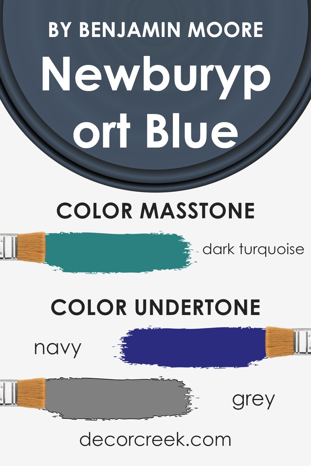
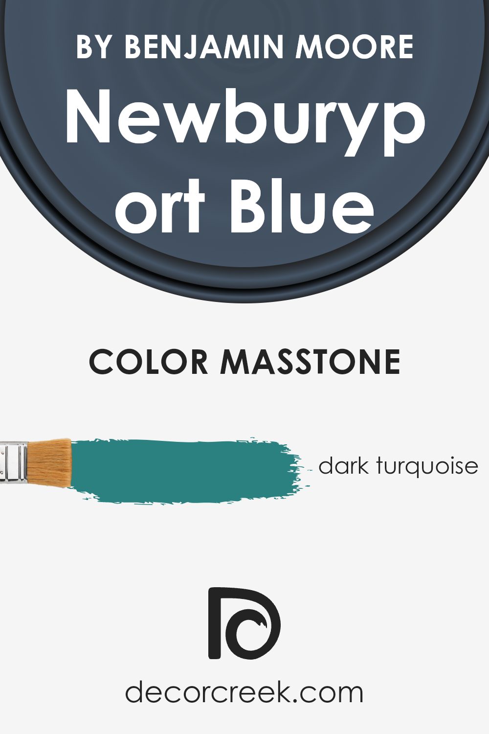
What is the Masstone of the Newburyport Blue HC-155 by Benjamin Moore?
Newburyport Blue HC-155 by Benjamin Moore has a rich dark turquoise masstone, identified by the color code #2B8080. This deep shade of turquoise gives the color a bold and calming presence in a room. When used in homes, it creates a strong impact without being overwhelming. The dark turquoise tone makes it an excellent choice for accent walls or even entire rooms where a feeling of calmness is desired.
Due to its depth, Newburyport Blue can make a space feel cozy and inviting. It pairs well with lighter neutrals like whites or creams for a balanced look. It can also complement natural materials like wood, enhancing their warmth.
Additionally, the color’s darker undertones can add an element of sophistication to modern homes, making it suitable for living rooms, bedrooms, or studies.
Overall, Newburyport Blue offers a versatile and stylish option for those looking to add a touch of color without overwhelming the space.
How Does Lighting Affect Newburyport Blue HC-155 by Benjamin Moore?
Lighting plays a significant role in how we perceive colors in our environment. The same color can look quite different depending on the type and direction of light it is in. Let’s take Newburyport Blue (HC-155) by Benjamin Moore as an example to see how lighting affects its appearance.
In natural light, the color of a wall can change throughout the day. North-facing rooms generally get cooler and more consistent light, which tends to highlight the gray undertones in Newburyport Blue, making it appear more muted and cooler. This can give the room a calm, slightly formal feel.
South-facing rooms, on the other hand, are filled with warm, bright light for most of the day. Newburyport Blue in these conditions can show its full depth and richness, appearing brighter and slightly warmer due to the yellowish light. This can make the space feel more welcoming and vibrant.
In east-facing rooms, the light is strongest and more vivid in the mornings. Newburyport Blue can appear brighter and a bit more lively during these hours, with light that might cast slight shadows and play up some vividness in the hue. As the day goes on and the light fades, the color may seem cooler and more subdued.
West-facing rooms get the stronger sunlight in the afternoon and evening. The afternoon light is warmer and can enhance the richness of Newburyport Blue, making it look more intense and dynamic. In the morning, these rooms can appear more shadowed and cooler, with the blue tones being more apparent.
In artificial light, the effect on Newburyport Blue will largely depend on the bulb used. Incandescent and warm LED lights, which cast a yellowish hue, can make the color appear warmer and more inviting.
Cooler bulbs, like some LEDs and fluorescents, may emphasize the cooler tones, giving the room a fresher feel. Thus, the choice of lighting can dramatically change the perception of color in any space.
What is the LRV of Newburyport Blue HC-155 by Benjamin Moore?
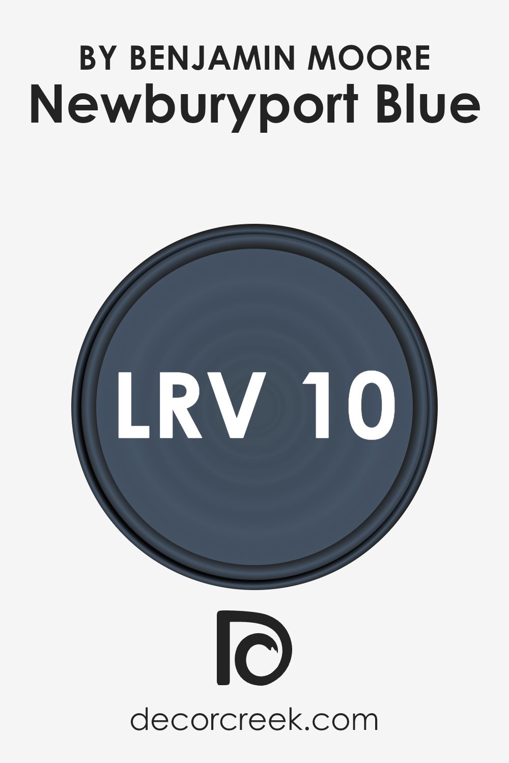
LRV stands for Light Reflectance Value. It’s a measure that tells us how much light a color reflects or absorbs. The LRV scale ranges from 0 to 100, where 0 is absolute black and reflects no light, and 100 is pure white and reflects all light. The LRV is crucial in understanding how a paint color will look and feel in different spaces.
A higher LRV means the color will reflect more light and potentially make a room look brighter and more spacious. In contrast, a lower LRV means the color absorbs more light, which can make a space feel cozier or more intimate.
Newburyport Blue by Benjamin Moore has an LRV of 10.31, which means it is on the darker end of the spectrum. This low LRV indicates that the color is deep and rich, absorbing much more light than it reflects. In a room with minimal natural light, this blue can appear even darker, giving the space a snug, enveloping feel.
However, in a brightly lit area, it might appear slightly lighter but will still maintain its strong, dramatic presence. Hence, the low LRV of Newburyport Blue means it will add a bold and sophisticated touch to spaces, providing a backdrop that can make other elements in the room stand out.
Coordinating Colors of Newburyport Blue HC-155 by Benjamin Moore
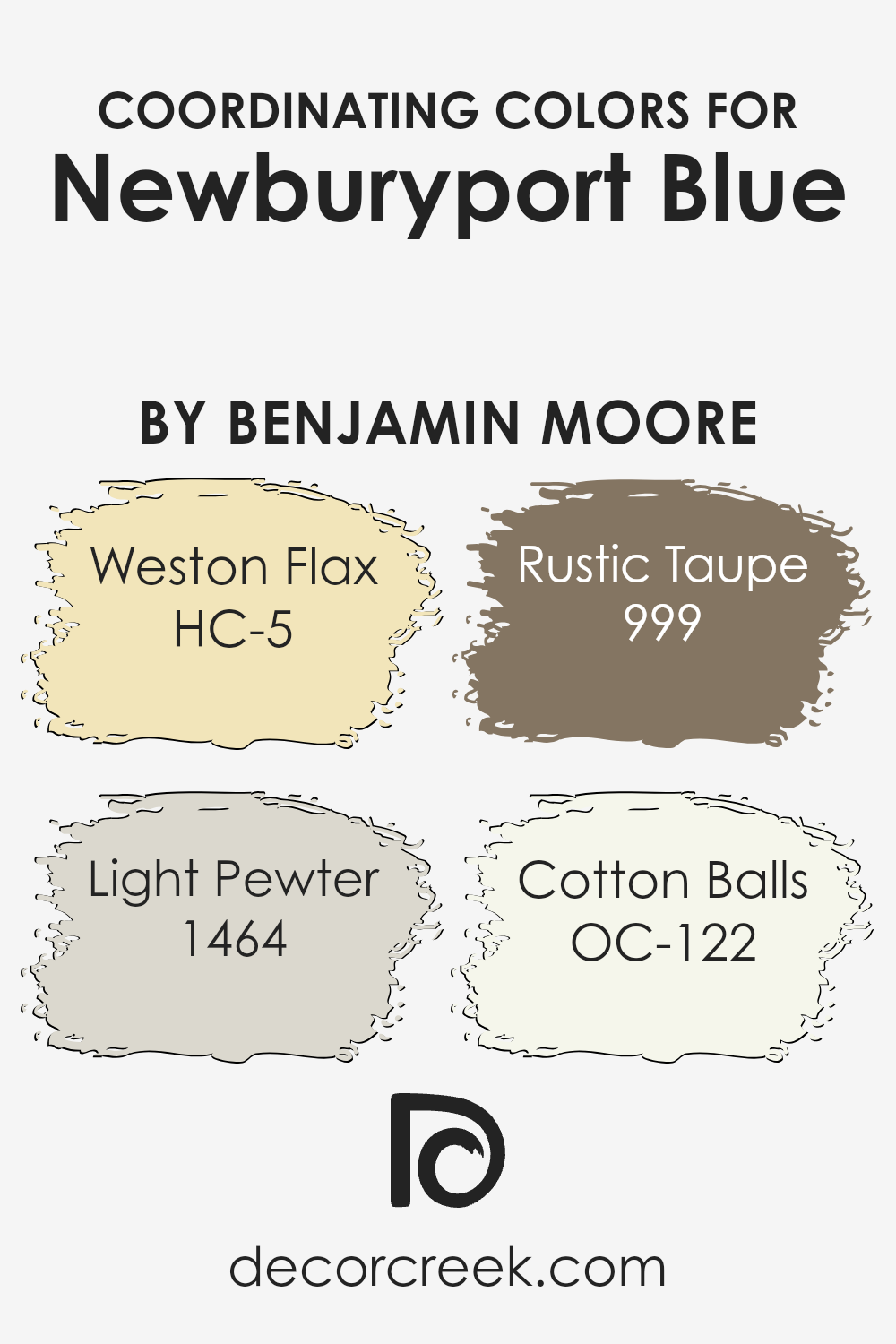
Coordinating colors work together to create a balanced and visually appealing palette. They enhance each other when used in a space, providing contrast while still harmonizing for a cohesive look. Consider Newburyport Blue, a rich, timeless hue by Benjamin Moore. To complement it, you can use a range of colors that naturally enhance its depth.
For instance, Weston Flax, with its warm and inviting yellow shade, adds a touch of brightness and can create a welcoming atmosphere. Light Pewter offers a soft and neutral gray that provides a subtle backdrop, allowing the bold blue to stand out without overpowering the space.
Another great coordinating color is Rustic Taupe, a warm, earthy tone that grounds the palette with its understated elegance. It adds a layer of warmth and pairs well with both lighter and darker shades. Lastly, Cotton Balls is a clean, crisp white that can be used to create contrast and highlight architectural details, making it an excellent choice for trim or ceilings.
Together, these colors create a harmonious palette that plays off the strength of Newburyport Blue, ensuring a balanced and inviting environment.
You can see recommended paint colors below:
- HC-5 Weston Flax (CHECK A SAMPLE)
- 1464 Light Pewter (CHECK A SAMPLE)
- 999 Rustic Taupe (CHECK A SAMPLE)
- OC-122 Cotton Balls
What are the Trim colors of Newburyport Blue HC-155 by Benjamin Moore?
Trim colors are the finishing touches in a room’s decor that help define the space and highlight architectural details. For Newburyport Blue by Benjamin Moore, selecting the right trim colors is essential to enhance its rich, classic appeal. This deep, muted blue pairs beautifully with lighter shades that can provide contrast and clarity.
Trim colors like White Opulence and Mayonnaise from Benjamin Moore serve this purpose well. White Opulence offers a soft, slightly warm white, which can bring a gentle glow and prevent the trim from feeling too stark against the deeper blue. It adds an element of softness and complements the blue without overshadowing it.
On the other hand, Mayonnaise is another great choice for a trim color, providing a creamy, off-white hue that brings warmth and light, helping to balance the boldness of Newburyport Blue. This shade is cozy and inviting, which adds to the overall comfort of a room. Both White Opulence and Mayonnaise work to highlight the crisp lines of trim, adding visual interest and a polished finish to the space.
The careful selection of trim colors ensures that the Newburyport Blue walls are enhanced in a way that feels cohesive and inviting.You can see recommended paint colors below:
- OC-69 White Opulence
- OC-85 Mayonnaise

Colors Similar to Newburyport Blue HC-155 by Benjamin Moore
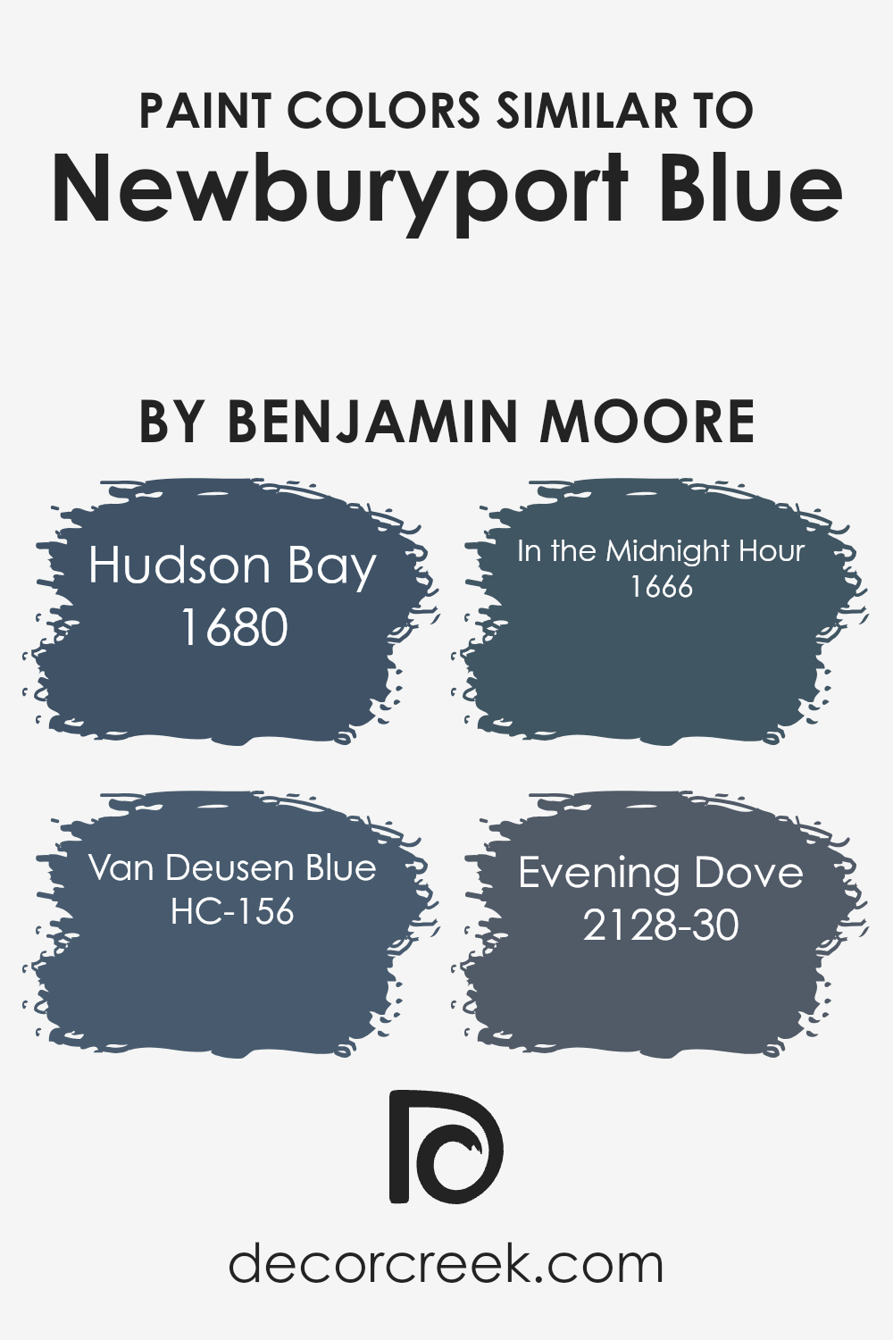
Similar colors play a crucial role in design as they help create a harmonious and balanced aesthetic. They provide a sense of unity and can set a specific mood in a space. For example, Newburyport Blue, a deep and rich blue hue, can be beautifully complemented by colors that share similar tones.
When similar colors are used together, they support each other and make the primary color stand out without overwhelming it. This use of a cohesive palette, especially in home interiors, can create a more inviting and cohesive environment, allowing each color to enhance the other’s characteristics subtly within a room.
Some colors that nicely complement Newburyport Blue include Hudson Bay, Van Deusen Blue, In the Midnight Hour, and Evening Dove. Hudson Bay is a slightly lighter, more muted blue that feels inviting and peaceful. Van Deusen Blue offers a stronger presence with its deeper blue shade that suggests confidence and stability.
In the Midnight Hour brings a mysterious and dramatic touch with its dark and deep blue-black tone, adding depth to the palette.
Evening Dove, with its smoky and shadowy hue, can ground a space, making it cozy and intimate. Together, these colors create a balanced and visually pleasing palette, each bringing a unique aspect while maintaining a cohesive look.
You can see recommended paint colors below:
- 1680 Hudson Bay (CHECK A SAMPLE)
- HC-156 Van Deusen Blue (CHECK A SAMPLE)
- 1666 In the Midnight Hour (CHECK A SAMPLE)
- 2128-30 Evening Dove (CHECK A SAMPLE)
Colors that Go With Newburyport Blue HC-155 by Benjamin Moore
Newburyport Blue HC-155 by Benjamin Moore is a deep and rich navy color that can bring elegance to any space. Choosing the right colors to pair with it is essential to create a balanced and harmonious look. Gray Timber Wolf (2126-50) is a soft gray that serves as a calm backdrop, enhancing Newburyport Blue’s boldness without overpowering it.
Meanwhile, Nickel (2119-50) adds a slightly warmer, yet neutral tone that can highlight the blue’s richness.
Violet Mist (1437) introduces a touch of subtle color, giving off a gentle hint of purple that adds depth and variety without clashing. Oxford Gray (2128-40) is another fantastic option, with its muted and muted blue tones that can provide a layered effect when combined with Newburyport Blue. Black Pepper (2130-40) is a dark, charcoal-like gray that brings an element of drama into the room, perfect for adding contrast.
Lastly, Blue Gaspe (1435) offers a lighter, fresher blue that complements Newburyport Blue beautifully, lending brightness to the color scheme. Together, these colors work well with Newburyport Blue to create a versatile and appealing space.
You can see recommended paint colors below:
- 2126-50 Gray Timber Wolf (CHECK A SAMPLE)
- 2119-50 Nickel (CHECK A SAMPLE)
- 1437 Violet Mist (CHECK A SAMPLE)
- 2128-40 Oxford Gray (CHECK A SAMPLE)
- 2130-40 Black Pepper (CHECK A SAMPLE)
- 1435 Blue Gaspe (CHECK A SAMPLE)

Newburyport Blue HC-155 by Benjamin Moore Color Palette
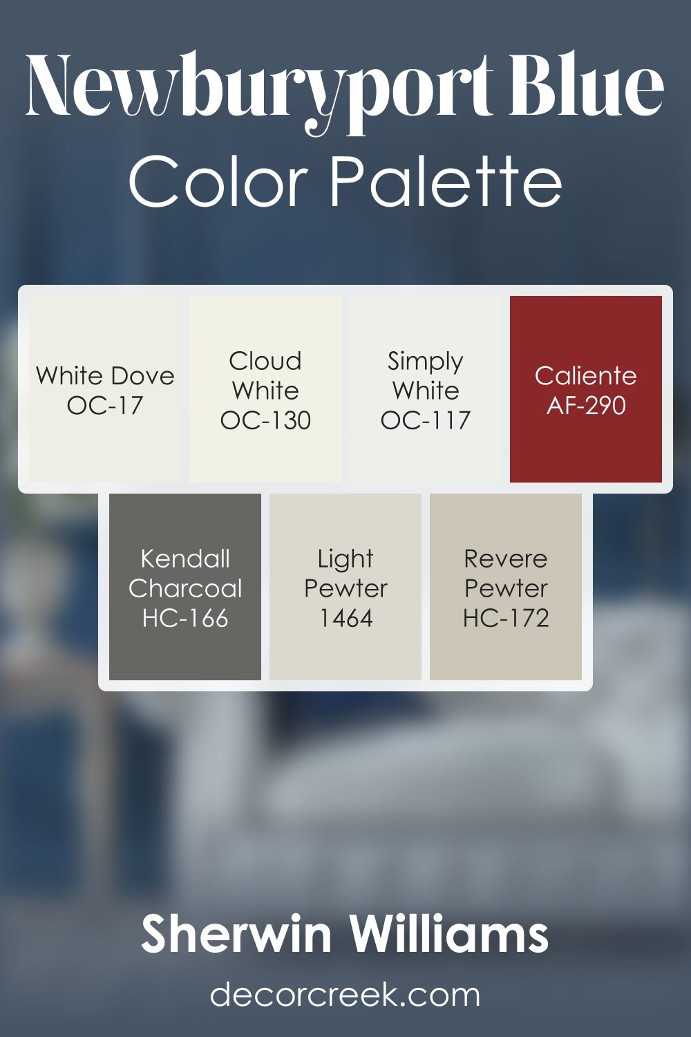
Newburyport Blue carries a steady, classic navy character that feels confident and welcoming. This palette highlights its depth with a thoughtful mix of warm neutrals, soft whites, and expressive accents. White Dove, Cloud White, and Simply White brighten the palette with gentle clarity, allowing the navy tone to stand out in a clean, balanced way.
Light Pewter and Revere Pewter add warm, grounding notes that soften the contrast and make the palette feel comfortable and lived-in.
These subtle greige tones help Newburyport Blue stay rich without feeling too strong.
Kendall Charcoal introduces a darker, calming anchor that enhances the palette’s structure, while Caliente brings a warm spark that adds life and personality. Together, the palette forms a balanced blend of warmth, depth, and clear contrast.
It works beautifully in entryways, kitchens, offices, or living rooms where a confident yet welcoming atmosphere is desired. The navy base gives the palette strength, while the supporting whites and neutrals offer warmth and softness, creating a combination that feels polished, friendly, and full of character.
How to Use Newburyport Blue HC-155 by Benjamin Moore In Your Home?
Newburyport Blue HC-155 by Benjamin Moore is a rich, deep blue that brings a classic and calm feeling to any home. It’s a versatile color that can be used in different rooms and styles. In a living room, it can create a cozy and inviting space when used on an accent wall. Pairing it with neutral furniture and light curtains can balance the boldness of the blue.
In a bedroom, using it on all walls can make the space feel restful and peaceful, especially when complemented with white or light gray bedding. In the kitchen, Newburyport Blue works well on cabinets, adding a touch of elegance without overwhelming the space. It pairs nicely with brass or stainless-steel fixtures.
The color also looks great outdoors, adding charm to front doors or shutters. By choosing this shade, homeowners can add a touch of traditional style to any area.
Newburyport Blue HC-155 by Benjamin Moore vs Hudson Bay 1680 by Benjamin Moore
Newburyport Blue HC-155 and Hudson Bay 1680, both by Benjamin Moore, are popular blue paint colors with distinct characteristics. Newburyport Blue is a deep, muted blue with gray undertones. It brings a sense of calm and formality, making it a great choice for living rooms or dining areas. Its darker hue provides a classic and timeless look.
On the other hand, Hudson Bay 1680 is a vibrant blue with a touch of green. It feels fresher and more energetic compared to Newburyport Blue. This color can add a lively touch to a room, making it ideal for spaces where you want a bit more color energy, like nurseries or playrooms.
While Newburyport Blue is more traditional and subdued, Hudson Bay stands out with its brightness and slight green tint. The choice between them depends on the mood and atmosphere you want to create in your space.
You can see recommended paint color below:
- 1680 Hudson Bay (CHECK A SAMPLE)

Newburyport Blue HC-155 by Benjamin Moore vs Van Deusen Blue HC-156 by Benjamin Moore
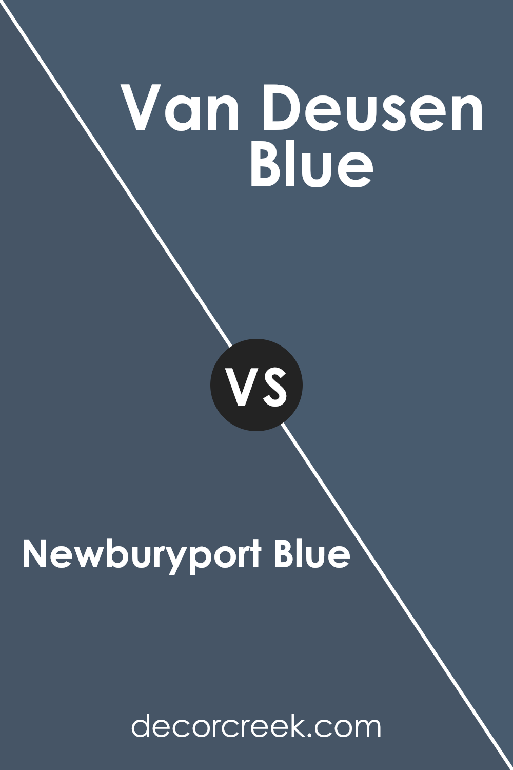
Newburyport Blue HC-155 and Van Deusen Blue HC-156 are both popular blue paint colors by Benjamin Moore, but they have distinct qualities. Newburyport Blue HC-155 is a dark, warm blue that carries a hint of gray, giving it a slightly muted appearance. It’s a versatile color that can create a cozy and inviting atmosphere in any room.
On the other hand, Van Deusen Blue HC-156 is also a rich blue but feels slightly cooler and more vibrant than Newburyport Blue. It has a more pronounced blue tone with less gray, making it a strong choice for adding a pop of color.
Both colors are excellent for adding depth to a space, but Newburyport Blue tends to be more calming and subdued, while Van Deusen Blue makes a bolder statement. Choosing between them depends on whether you want a warmer or cooler vibe in your space.
You can see recommended paint color below:
- HC-156 Van Deusen Blue (CHECK A SAMPLE)
Newburyport Blue HC-155 by Benjamin Moore vs Evening Dove 2128-30 by Benjamin Moore
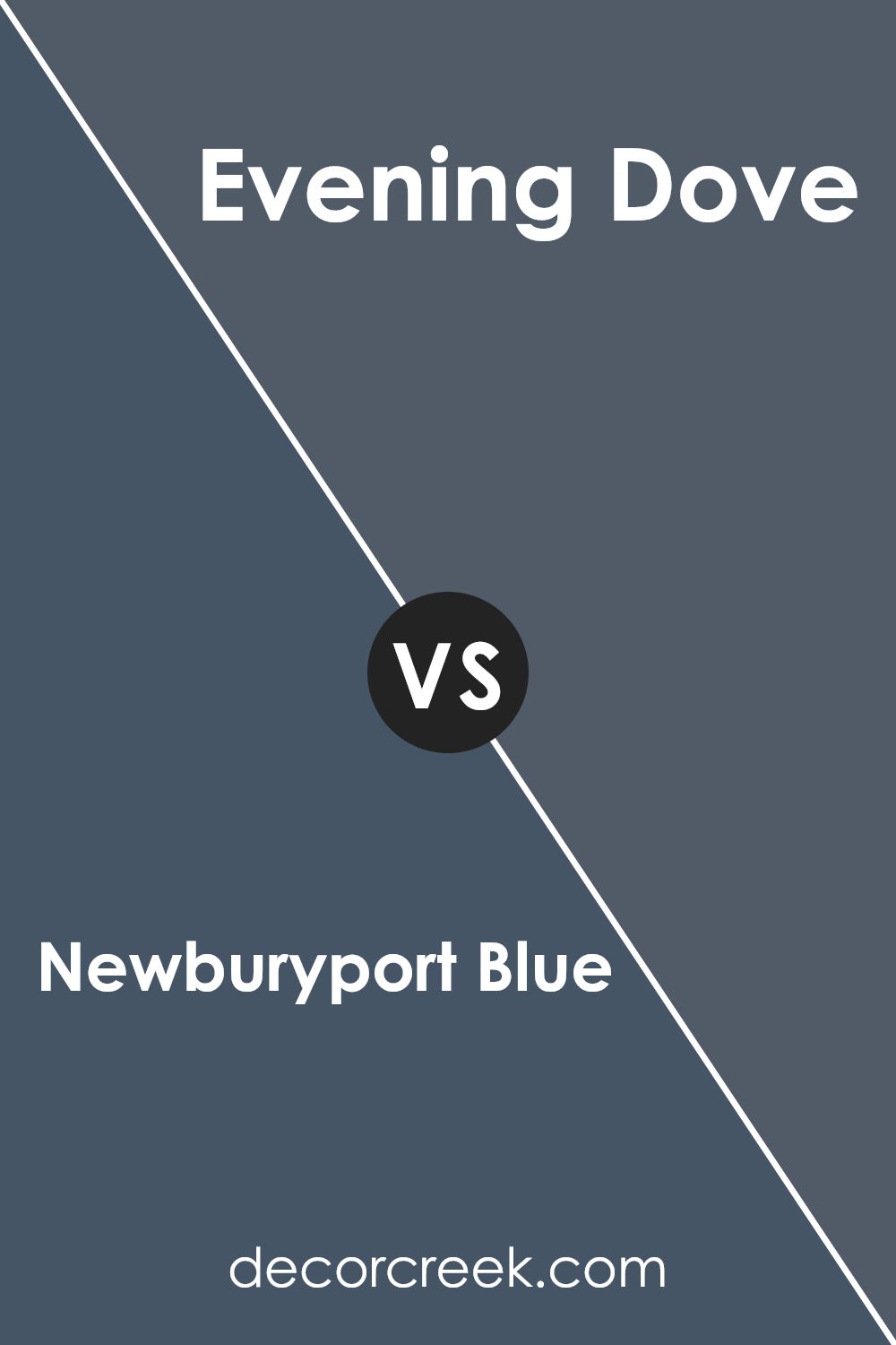
Newburyport Blue HC-155 and Evening Dove 2128-30, both by Benjamin Moore, are two rich and versatile shades of blue that offer distinct looks. Newburyport Blue is a deep, muted blue with a hint of gray. It’s a classic color that works well in both traditional and modern settings because of its balanced tone. It can easily be the main color in a room, bringing a sense of calm and depth.
On the other hand, Evening Dove is a darker, more intense blue that borders on navy. It’s bolder and can create a more dramatic effect in a space. Evening Dove can be great for accent walls or rooms where you want a cozy, enveloping feel.
The additional depth in Evening Dove adds a touch of mystery, making it ideal for spaces where a striking, powerful blue is desired.
Both colors can complement a variety of other shades and can be used to build a cohesive color palette in a home.
You can see recommended paint color below:
- 2128-30 Evening Dove (CHECK A SAMPLE)
Newburyport Blue HC-155 by Benjamin Moore vs In the Midnight Hour 1666 by Benjamin Moore
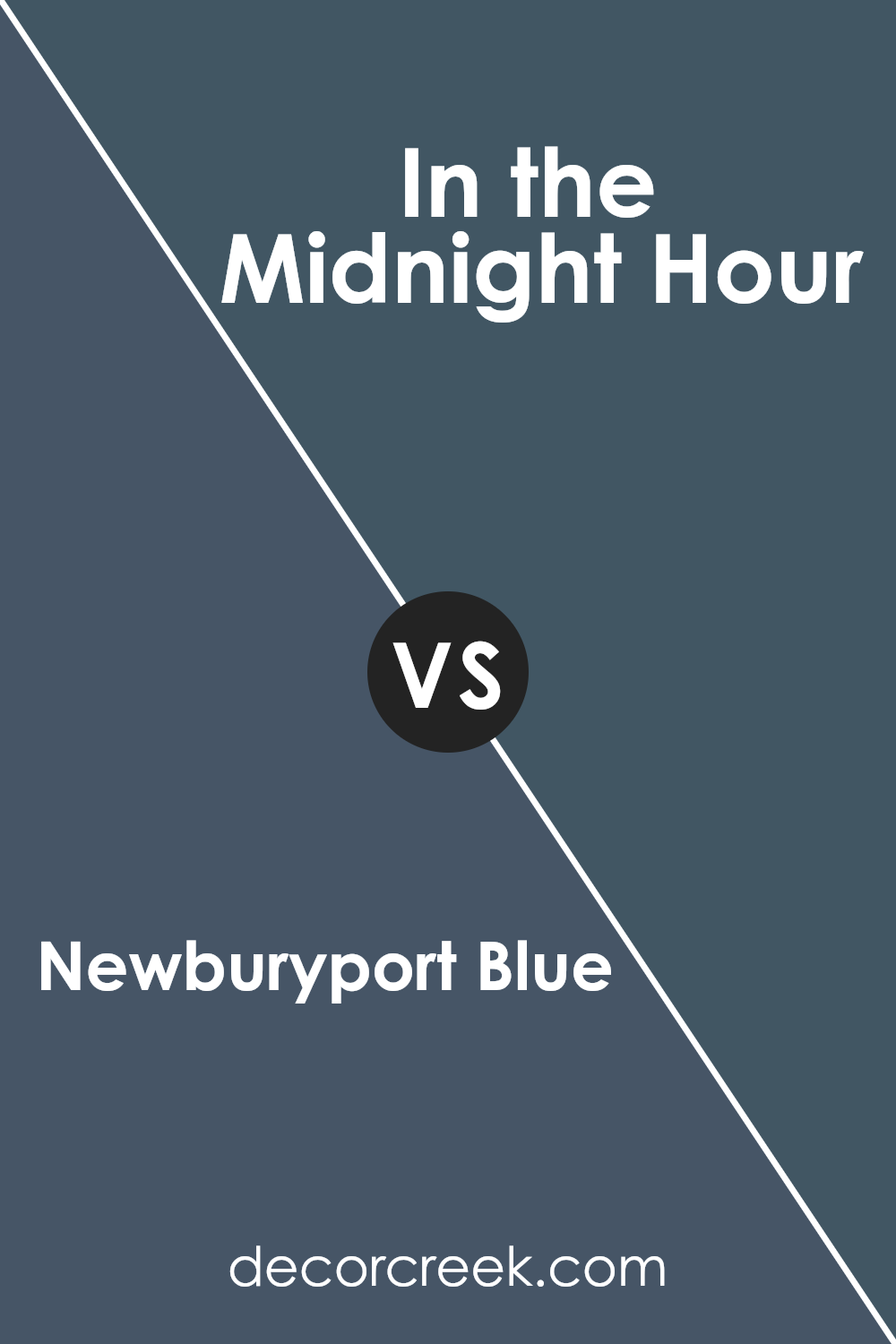
Newburyport Blue HC-155 by Benjamin Moore is a rich, deep blue with grey undertones, giving it a classic and timeless feel. It can create a cozy atmosphere and works well in traditional spaces. It pairs nicely with whites and creams for a balanced look.
In contrast, In the Midnight Hour 1666 by Benjamin Moore is a darker, more intense blue that borders on navy. It’s bold and makes a strong statement, perfect for those who want to add drama to a room. This color can be used to create an intimate space and pairs well with softer shades like pale greys or pastels for contrast.
Both colors are versatile and can fit into various styles, but while Newburyport Blue is more understated and calming, In the Midnight Hour offers a more dramatic and daring choice. Both can be used on walls, accents, or furniture, depending on the mood you’re going for.
You can see recommended paint color below:
- 1666 In the Midnight Hour (CHECK A SAMPLE)
Conclusion
Newburyport Blue by Benjamin Moore is a lovely color that makes places look super nice. When I first saw HC-155, I felt like it was a perfect shade of blue that wasn’t too bright or too dark. It reminded me a bit of the ocean on a calm day.
This color has a bit of magic because it can fit almost everywhere, whether it’s a bedroom, the kitchen, or even the study room.
Something cool about Newburyport Blue is how it makes rooms feel cozy and welcoming. It’s like the inside of a big, comfy blanket that wraps around you. I also noticed that it looks amazing with other colors. It works great if there’s white furniture or decorations with shades of gray or brown. This makes it super fun because you can use different colors around it without worrying if they will match.
I think using this blue is like giving any room a friendly hug, making it a happy place to be. It’s a color I would recommend to anyone who wants their home to feel warm and inviting. Overall, Newburyport Blue is a color that brings a smile. It is simple yet special.
I really enjoyed learning about it and imagining all the wonderful places it could go. It’s a color that makes everything feel just right.
Ever wished paint sampling was as easy as sticking a sticker? Guess what? Now it is! Discover Samplize's unique Peel & Stick samples.
Get paint samples


