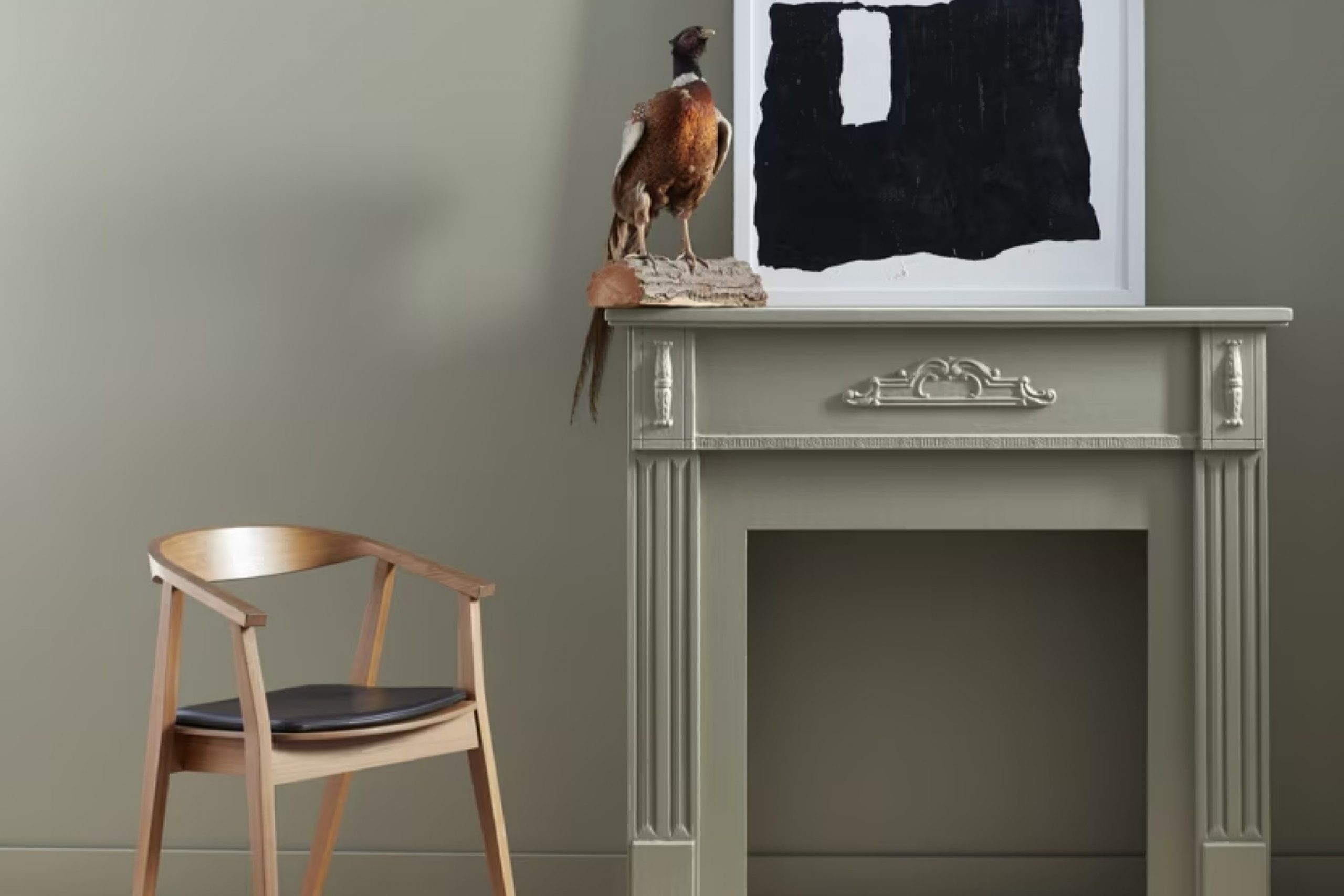
This shade, a blend of deep earthy tones, creates a sense of warmth and stability. It offers a subtle charm that works beautifully in a variety of settings, from a cozy living room to a sophisticated office space.
I found that its rich yet understated color provides a perfect backdrop, making other elements in the room stand out. Whether combined with bold or neutral accents, Oil Cloth adds a touch of elegance and depth.
It’s versatile enough to complement both modern and traditional décor styles.
As I began to experiment with this color, I realized how it anchored a room, bringing together various textures and furniture pieces seamlessly. CSP-760 Oil Cloth doesn’t overwhelm a space but rather enhances its character.
It’s a hue that draws you in, inviting you to linger and enjoy the comfort of your surroundings.
My experience with this paint has been nothing short of inspiring, opening up endless possibilities for creating a warm and inviting atmosphere at home.
What Color Is Oil Cloth CSP-760 by Benjamin Moore?
Oil Cloth CSP-760 by Benjamin Moore is a rich, deep color that combines earthy brown and dark green tones. It’s reminiscent of the forest undergrowth and has a comforting, grounded feel. This shade works well in spaces where you want to create a cozy and welcoming atmosphere.
In terms of interior styles, this color is versatile. It complements rustic and traditional designs beautifully, adding warmth and depth to wooden beams and stone accents. It also fits well with modern interiors, adding a bold contrast to sleek, minimalist furniture.
In a mid-century modern setting, Oil Cloth provides an excellent backdrop for vintage wood furniture and metal details.
For materials and textures, this color pairs wonderfully with natural woods like walnut, oak, and mahogany. It brings out the grain and enriches the natural beauty of these woods. Soft textiles such as wool, cotton, and linen in neutral or muted tones can balance the richness of this color, while leather in dark shades can enhance its depth.
For a touch of contrast, consider accents in brass or brushed gold, which add a hint of elegance and complement the warmth of Oil Cloth CSP-760. Whether used in a large living area or a cozy study, this color creates a comfortable and inviting space.

Is Oil Cloth CSP-760 by Benjamin Moore Warm or Cool color?
Oil Cloth CSP-760 by Benjamin Moore is a warm, neutral color that can bring a cozy atmosphere to any room. This shade has subtle undertones that make it versatile and adaptable, complementing a wide range of decor styles. Its earthy tone works well in both modern and traditional settings, providing a grounded and comforting feel.
In living rooms, it pairs nicely with natural wood tones, enhancing the inviting ambiance. In bedrooms, Oil Cloth can create a restful environment, making the space feel snug and peaceful.
Kitchens with this color exude warmth, especially when combined with creamy whites or darker shades for contrast.
Its ability to blend and enhance other colors in the space makes it a great choice for open floor plans, ensuring a cohesive look throughout.
Overall, Oil Cloth CSP-760 is a dependable color that contributes to a comfortable and welcoming home atmosphere.
Undertones of Oil Cloth CSP-760 by Benjamin Moore
Oil Cloth CSP-760 by Benjamin Moore is a versatile color with a range of subtle undertones that affect how it appears in different spaces. Undertones are the colors that lie beneath the main color, influencing how we perceive it under various lighting conditions.
Oil Cloth CSP-760’s undertones include shades like pale pink, lilac, light blue, and olive. These give the color a dynamic quality, making it look slightly different depending on the surrounding environment and lighting.
For example, in a room with lots of natural light, the lighter undertones such as pale yellow or light turquoise might become more visible, giving the paint a warmer or cooler tone, respectively. Conversely, in artificial lighting, darker undertones like navy or dark turquoise might come to the forefront, giving the color a richer, deeper appearance.
On interior walls, the undertones of Oil Cloth CSP-760 can create a sense of depth and movement. The presence of both warm and cool undertones means it can easily blend with a variety of color schemes in your home.
For instance, pairing it with white or light colors can highlight its bright undertones, while using it alongside darker furnishings can enhance its more subdued hues. This makes it a flexible choice for living areas, bedrooms, or any space where a balanced and harmonious atmosphere is desired.
What is the Masstone of the Oil Cloth CSP-760 by Benjamin Moore?
Oil Cloth CSP-760 by Benjamin Moore is a versatile shade of grey, similar to the neutral tone #808080. As a masstone, it serves as the surface-level color that is easily seen. This particular grey is adaptable, making it a popular choice for home interiors.
Its neutrality allows it to fit well with a wide range of color schemes and decor styles. In living rooms or bedrooms, CSP-760 can create a calm and balanced atmosphere without dominating the space. It pairs nicely with bold colors or softer pastels, depending on personal taste.
Because grey can take on different appearances depending on lighting, Oil Cloth might look warmer or cooler based on the light source, providing dynamic variations throughout the day. This makes it a flexible option for those who want a color that can subtly shift and complement other elements in the home over time.
How Does Lighting Affect Oil Cloth CSP-760 by Benjamin Moore?
Lighting plays a crucial role in how we perceive colors. The color Oil Cloth CSP-760 by Benjamin Moore is a deep, muted green with gray undertones, which can look very different depending on the type of light it is exposed to.
In natural light, Oil Cloth can appear richer and more vibrant because sunlight contains all colors of the spectrum. However, the direction from which the sunlight enters a room can change its appearance. In artificial lighting, the color might shift depending on the bulb type.
Incandescent bulbs may give the color a warmer tone, while fluorescent lights might make it appear cooler or even dull.
In north-facing rooms, which receive less direct sunlight and have cooler, muted light throughout the day, Oil Cloth CSP-760 may look slightly darker and grayer, emphasizing its muted nature. These rooms might make the color feel more somber and muted.
South-facing rooms get bright, warm, and consistent sunlight for most of the day. Here, the color will seem warmer and more vibrant, showcasing its green tones more prominently. In such rooms, Oil Cloth can feel lively yet balanced, taking on a cozier appearance.
East-facing rooms receive warm morning light and cooler light later in the day. In the morning, Oil Cloth might look brighter and more vivid, while in the afternoon, it could appear subdued and cooler. This change throughout the day adds a dynamic quality to the color.
West-facing rooms experience the opposite, with cooler light in the morning and warm light in the evening. Thus, in these rooms, Oil Cloth may appear flatter earlier in the day and become richer and more saturated as evening approaches. The shift from dull to warm during the day can make for an interesting play of colors.
Overall, Oil Cloth CSP-760 is a versatile color that changes with its lighting environment, adding unique character depending on the time of day and direction of light.

What is the LRV of Oil Cloth CSP-760 by Benjamin Moore?
LRV, or Light Reflectance Value, is a measurement that tells us how much light a color reflects or absorbs. It is on a scale from 0 to 100, where 0 means the color absorbs all light and appears very dark, and 100 means it reflects all light and appears very bright, like white.
When you choose a color for your walls, the LRV helps determine how bright or dark a room might look. A higher LRV means a color will reflect more light and can make a space feel larger and more open, while a lower LRV indicates a darker color that absorbs more light, making a room feel cozier and smaller.
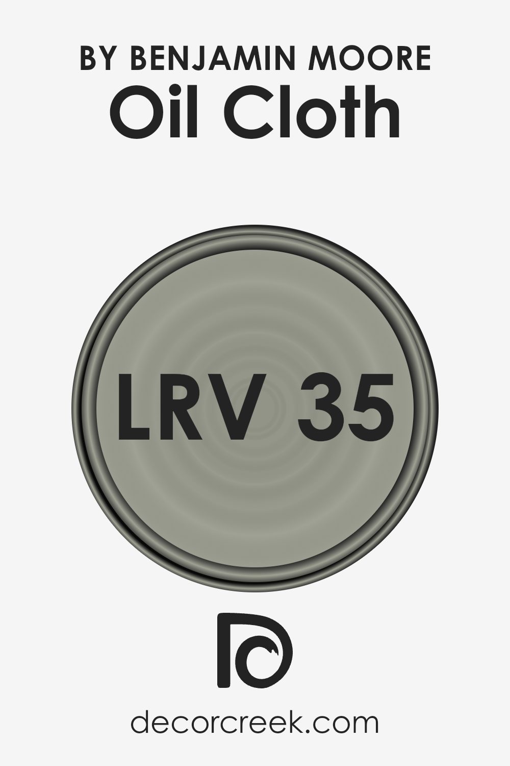
For Oil Cloth, with an LRV of 35.31, the color leans towards the darker side of the scale. This means that it will absorb more light than it reflects, giving it a rich and deep appearance. On the walls, this color can create an inviting and intimate atmosphere, perfect for spaces where you want to feel cozy and warm.
It won’t make the room feel overly bright, so it’s ideal for areas where you desire a more subdued ambiance, such as a study or a bedroom. This LRV also makes the color versatile enough to pair with lighter accents and furniture, adding contrast and depth to a room.
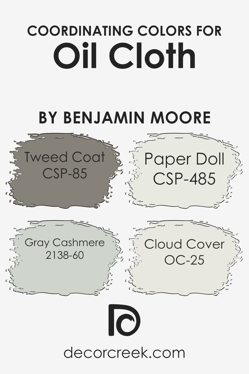
Coordinating Colors of Oil Cloth CSP-760 by Benjamin Moore
Coordinating colors are hues that complement a main color, creating a harmonious look when used together. In design and decor, these colors bring balance and visual interest. Imagine how a room feels when you combine the rich, earthy tone of Oil Cloth from Benjamin Moore with its coordinating shades.
Each hue plays a part in enhancing the overall ambiance. Tweed Coat, with its warm, inviting golden-brown, adds depth and a cozy touch to a space. It brings a sense of comfort that’s perfect for any room in the house.
Gray Cashmere, another coordinating color, introduces a soft and soothing light blue-green. This shade offers a gentle backdrop that subtly contrasts the richness of Oil Cloth. Paper Doll is a delicate off-white with a hint of pink, which brightens the room without overpowering other elements. It adds a touch of softness and warmth.
Lastly, Cloud Cover is a light and airy white, providing a crisp, fresh feel that ties all the colors together seamlessly. When you use these hues together, they create a dynamic yet cohesive palette, making spaces feel balanced and welcoming.
You can see recommended paint colors below:
- CSP-85 Tweed Coat
- 2138-60 Gray Cashmere
- CSP-485 Paper Doll
- OC-25 Cloud Cover
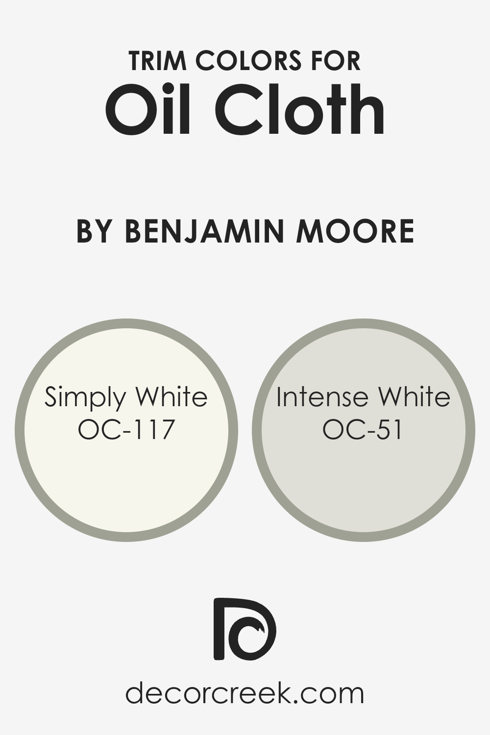
What are the Trim colors of Oil Cloth CSP-760 by Benjamin Moore?
Trim colors refer to the paint colors used on the molding, baseboards, window frames, and other accent areas in a room. These colors highlight architectural details and frame spaces, providing a clean line that separates walls from floors and ceilings.
For the paint color Oil Cloth by Benjamin Moore, using trim colors like Simply White (OC-117) and Intense White (OC-51) ensures a beautiful contrast or complement to the walls. These specific trim colors can balance the room’s overall look by either defining the edges subtly or offering a crisp, clean break.
By choosing the right trim colors, a room can feel more put together and polished, accentuating the primary wall color effectively.
Simply White (OC-117) is a fresh, clean shade that brings an airy and bright feel to a space. It works particularly well as a trim color because it adds clarity and a sense of openness, making it a popular choice for those looking to achieve a neat, defined look around doors and windows.
On the other hand, Intense White (OC-51) is a soft, understated grayish-white that provides a more muted trim color option. This soft shade can add subtle sophistication to a room, complementing Oil Cloth’s deeper tones without overwhelming the overall design.
Both choices frame walls nicely, each offering a unique ambiance to enhance a room’s aesthetic.
You can see recommended paint colors below:
- OC-117 Simply White
- OC-51 Intense White
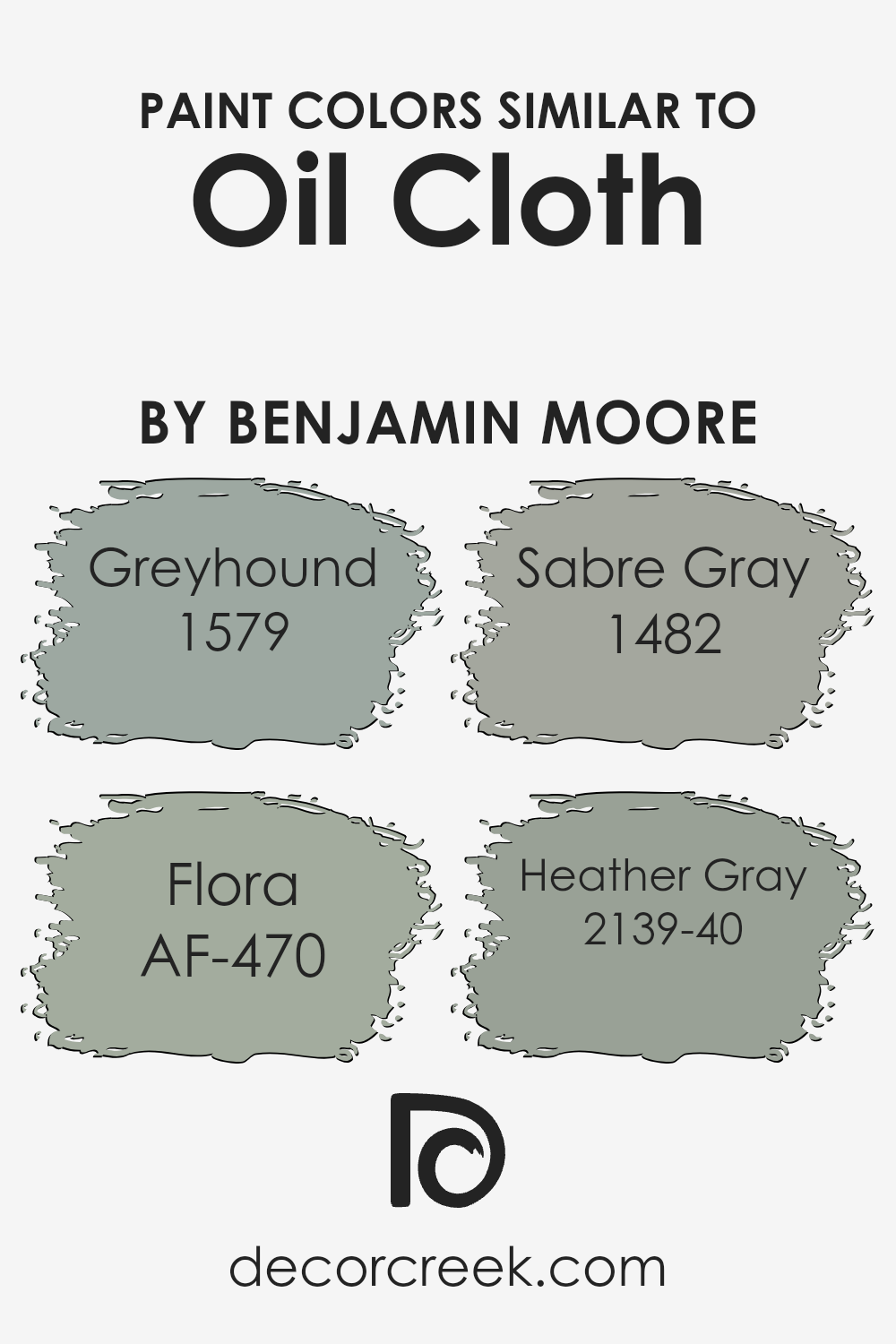
Colors Similar to Oil Cloth CSP-760 by Benjamin Moore
Similar colors are crucial in design because they create harmony and cohesion in a space. When colors are similar, they share undertones that allow them to blend seamlessly. This helps to establish a pleasing and unified environment.
The similar colors to Benjamin Moore’s Oil Cloth, such as Greyhound (1579), Flora (AF-470), Sabre Gray (1482), and Heather Gray (2139-40), work well together due to their shared muted and balanced tones. They offer subtle shifts in hue, which adds depth without causing clashes.
Greyhound is a warm gray that feels soft and inviting, making it suitable for cozy spaces. Flora, on the other hand, is a gentle earthy green that evokes a sense of calm and blends beautifully with other muted tones. Sabre Gray offers a more neutral gray option that is both versatile and timeless, perfect for adding stability.
Lastly, Heather Gray is a slightly cooler gray that brings a subtle crispness, ideal for adding a bit of contrast. Together, these colors function cohesively, enhancing each other without overwhelming a space.
They provide an effortless flow from one hue to the next, ideal for creating a soothing and consistent atmosphere in any room.
You can see recommended paint colors below:
- 1579 Greyhound
- AF-470 Flora
- 1482 Sabre Gray
- 2139-40 Heather Gray
Colors that Go With Oil Cloth CSP-760 by Benjamin Moore
Choosing colors that complement Oil Cloth CSP-760 by Benjamin Moore is essential for creating a cohesive and visually appealing space. Oil Cloth CSP-760 is a versatile and rich color that pairs beautifully with a variety of tones. AF-460 – Jojoba is a warm and calming green that creates a soothing contrast when set against Oil Cloth.
This combination is perfect for spaces where you want a touch of earthiness. 2140-40 – Storm Cloud Gray brings a touch of depth and moodiness, adding drama and interest to the environment. It pairs well with Oil Cloth, offering a bold yet sophisticated feel.
2140-50 – Gray Horse is a lighter gray that offers a neutral backdrop, allowing Oil Cloth to stand out without overwhelming the senses. This can create a balanced and open atmosphere. In contrast, 2134-70 – Genesis White provides a fresh and clean look, enhancing the richness of Oil Cloth while keeping the space bright and airy.
CSP-765 – Rooftop Garden is a natural green that adds a lively touch, enhancing the organic feel of your decor. Finally, 1480 – Sleigh Bells, with its cool and soft tone, delivers a touch of elegance, tying everything together for a harmonious space.
Each of these colors works with Oil Cloth CSP-760 to create environments that suit various moods and styles.
You can see recommended paint colors below:
- AF-460 Jojoba
- 2140-40 Storm Cloud Gray
- 2140-50 Gray Horse
- 2134-70 Genesis White
- CSP-765 Rooftop Garden
- 1480 Sleigh Bells

How to Use Oil Cloth CSP-760 by Benjamin Moore In Your Home?
Oil Cloth CSP-760 by Benjamin Moore is a rich, deep shade of gray with a subtle hint of blue. This versatile color can be a great choice for various rooms in your home, bringing a calm and cozy feel to any space. In the living room, Oil Cloth creates a comfortable and inviting atmosphere, especially when paired with lighter furniture and accessories.
In the bedroom, it can help create a peaceful environment that promotes rest. The color also works well in a home office, offering a neutral background that helps with concentration and focus. When used in the kitchen or dining area, Oil Cloth provides a modern touch, especially when combined with white or natural wood tones.
For more contrast, consider using it as an accent wall or pairing it with lighter colors to highlight architectural details. Its adaptability makes it an excellent choice for various decor styles and preferences.
Oil Cloth CSP-760 by Benjamin Moore vs Sabre Gray 1482 by Benjamin Moore
Oil Cloth CSP-760 by Benjamin Moore is a deep, earthy green with hints of brown. It evokes a sense of nature, bringing a touch of the outdoors inside. It’s warm and can create a cozy atmosphere. The richness of this color makes it a strong choice for spaces where you want to feel snug and grounded, like a study or a living room.
On the other hand, Sabre Gray 1482 by Benjamin Moore is a lighter, cool gray. It has a softer and more neutral appearance. This makes it versatile, suitable for many settings without being overwhelming. Gray can make spaces feel calm and clean, which works well in areas like bathrooms or kitchens.
While Oil Cloth is bold and cozy, Sabre Gray is subtle and airy. Choosing between them depends on the mood and style you want to set in your room. Oil Cloth adds warmth and depth, whereas Sabre Gray offers simplicity and elegance.
You can see recommended paint color below:
- 1482 Sabre Gray

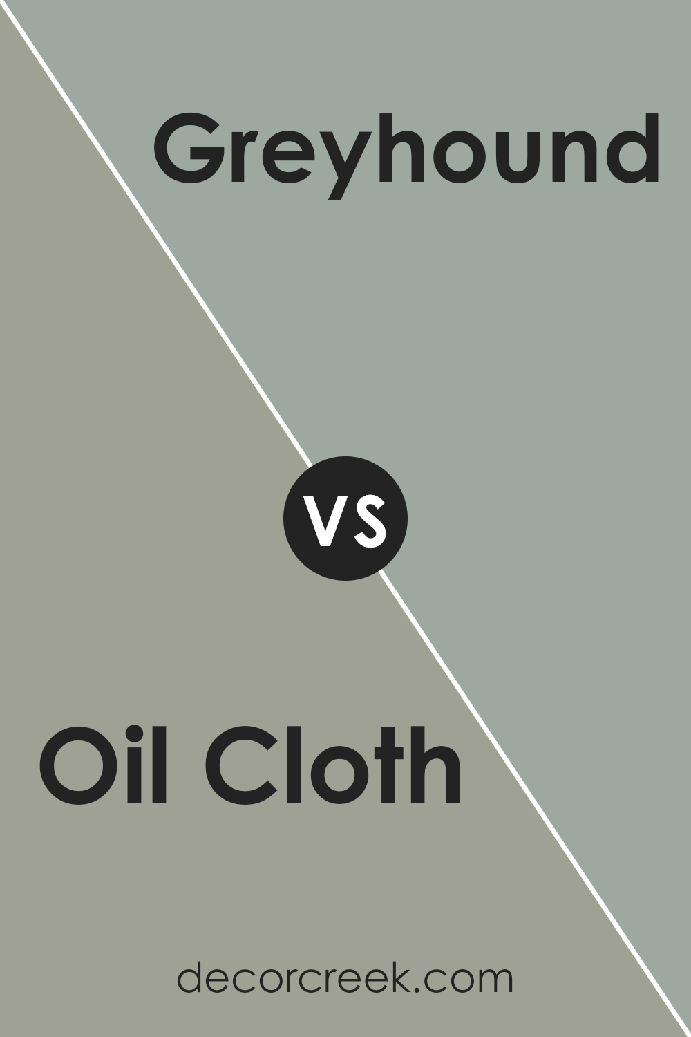
Oil Cloth CSP-760 by Benjamin Moore vs Greyhound 1579 by Benjamin Moore
Oil Cloth (CSP-760) by Benjamin Moore is a deep, rich green with hints of blue, giving it a luxurious and cozy feel. It’s a bold choice that can make a strong statement in a room. This color works well in spaces where you want warmth and depth, like a study or living room.
On the other hand, Greyhound (1579) by Benjamin Moore is a soft gray with a touch of warmth. It’s more neutral and subtle compared to Oil Cloth. Greyhound is versatile and can complement various styles, making it suitable for bedrooms, kitchens, or bathrooms.
While Oil Cloth can add drama and moodiness, Greyhound offers a calm and balanced backdrop. Using Oil Cloth as an accent wall color or for cabinetry can create contrast when paired with Greyhound on other walls. Together, they can create an inviting and balanced space, blending richness with neutrality.
You can see recommended paint color below:
- 1579 Greyhound
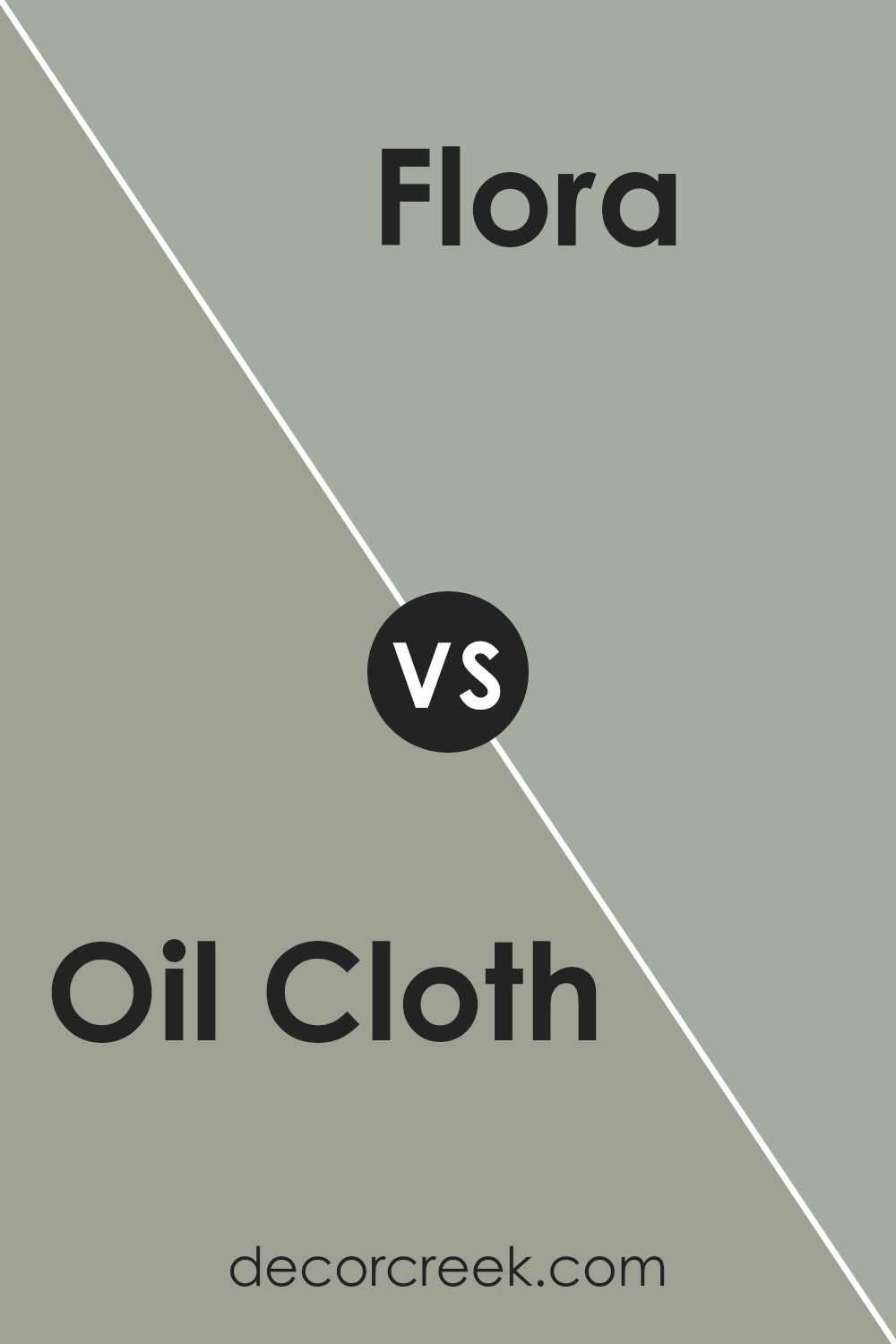
Oil Cloth CSP-760 by Benjamin Moore vs Flora AF-470 by Benjamin Moore
Oil Cloth CSP-760 by Benjamin Moore is a deep, rich color with earthy undertones. It’s a dark, muted hue that creates a cozy and grounded feeling in a space. This color works well with a variety of settings, adding a touch of warmth and depth. It pairs nicely with natural elements like wood and stone.
In contrast, Flora AF-470 by Benjamin Moore is a lighter, more vibrant shade. It’s a green color that feels fresh and lively, reminiscent of new leaves and springtime. Flora AF-470 can brighten up a room and add a sense of spaciousness and life.
It is particularly effective in bringing an outdoor feel into indoor spaces.
While Oil Cloth provides a more intimate and snug atmosphere, Flora offers a refreshing and invigorating touch. Both colors have their own unique charm, with Oil Cloth being more subdued and Flora being more revitalizing. They can be used separately or combined to create balance in a room.
You can see recommended paint color below:
- AF-470 Flora
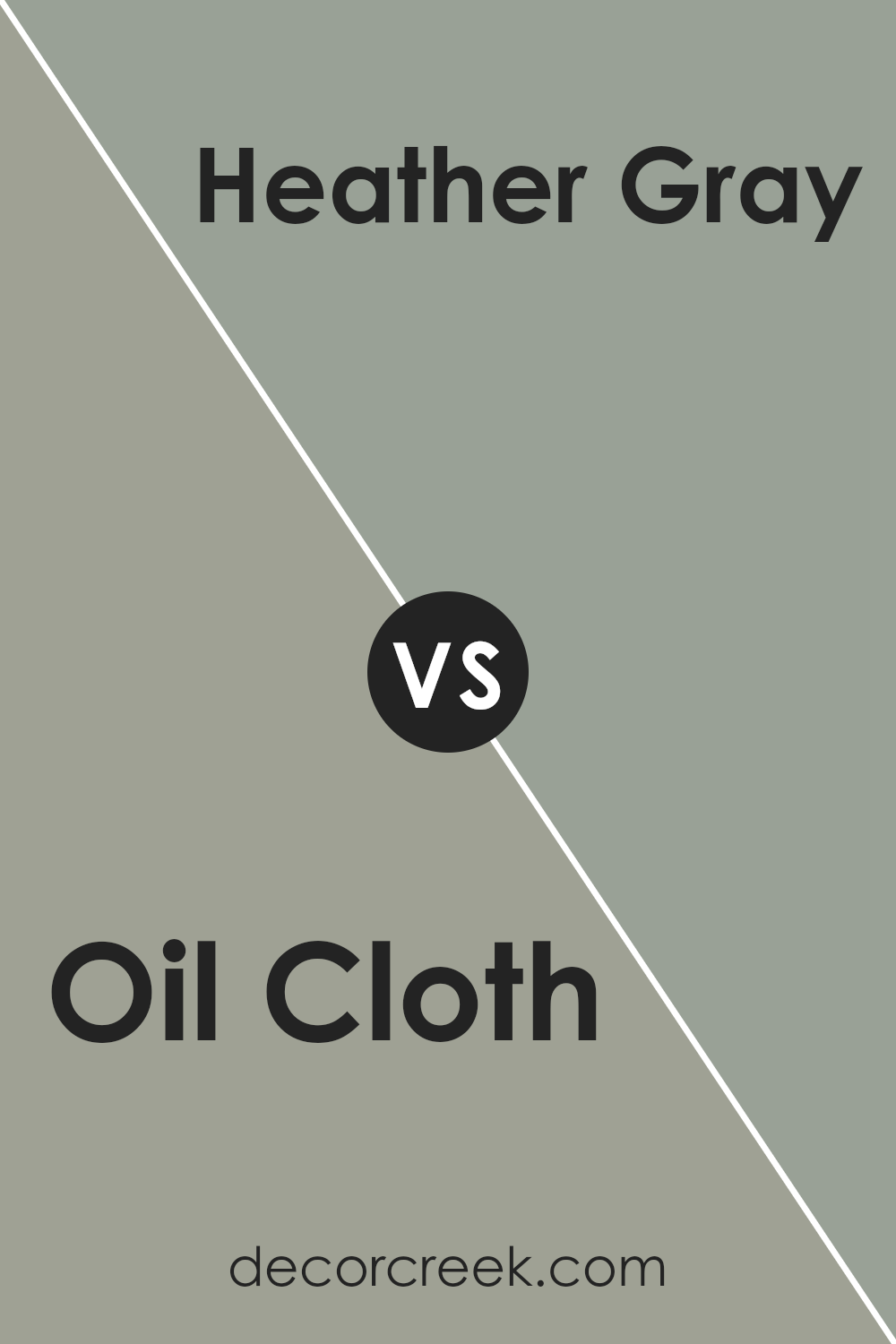
Oil Cloth CSP-760 by Benjamin Moore vs Heather Gray 2139-40 by Benjamin Moore
Oil Cloth CSP-760 by Benjamin Moore is a deep, rich green shade with hints of gray. It’s a bold color that can make a room feel cozy and slightly dramatic. It’s perfect for adding warmth and depth to a space without being overwhelming.
On the other hand, Heather Gray 2139-40 by Benjamin Moore is a lighter, softer gray with subtle green undertones. This makes it a versatile and calming choice that can work well in many settings, from modern to traditional spaces.
When comparing the two, Oil Cloth is more intense and moody, ideal for creating a strong statement or accent wall. Heather Gray is more muted and neutral, making it great for a soothing backdrop or a calming environment.
Together, they can complement each other nicely, with Oil Cloth providing strong accents against the gentle, understated backdrop of Heather Gray.
You can see recommended paint color below:
- 2139-40 Heather Gray
Conclusion
Imagine a color that mixes gray and green in just the right way—it’s not too dark and not too light. It’s like a comforting hug from your favorite blanket. This color works well in so many places in your home, whether it’s the living room, bedroom, or even the kitchen.
It can make a large room feel cozy or a smaller room feel more open. It’s like magic! People also say that it goes well with many other colors, so it’s pretty easy to use if you like to mix and match.
The paint is highly regarded for its quality. When you paint your walls with it, it covers really well and lasts a long time, so you won’t need to repaint often. In short, Oil Cloth by Benjamin Moore seems to be a great choice if you want a color that is friendly, flexible, and long-lasting.
Plus, it just looks really nice! So, if you ever need to pick a paint color, this could be your winner.
Ever wished paint sampling was as easy as sticking a sticker? Guess what? Now it is! Discover Samplize's unique Peel & Stick samples.
Get paint samples

