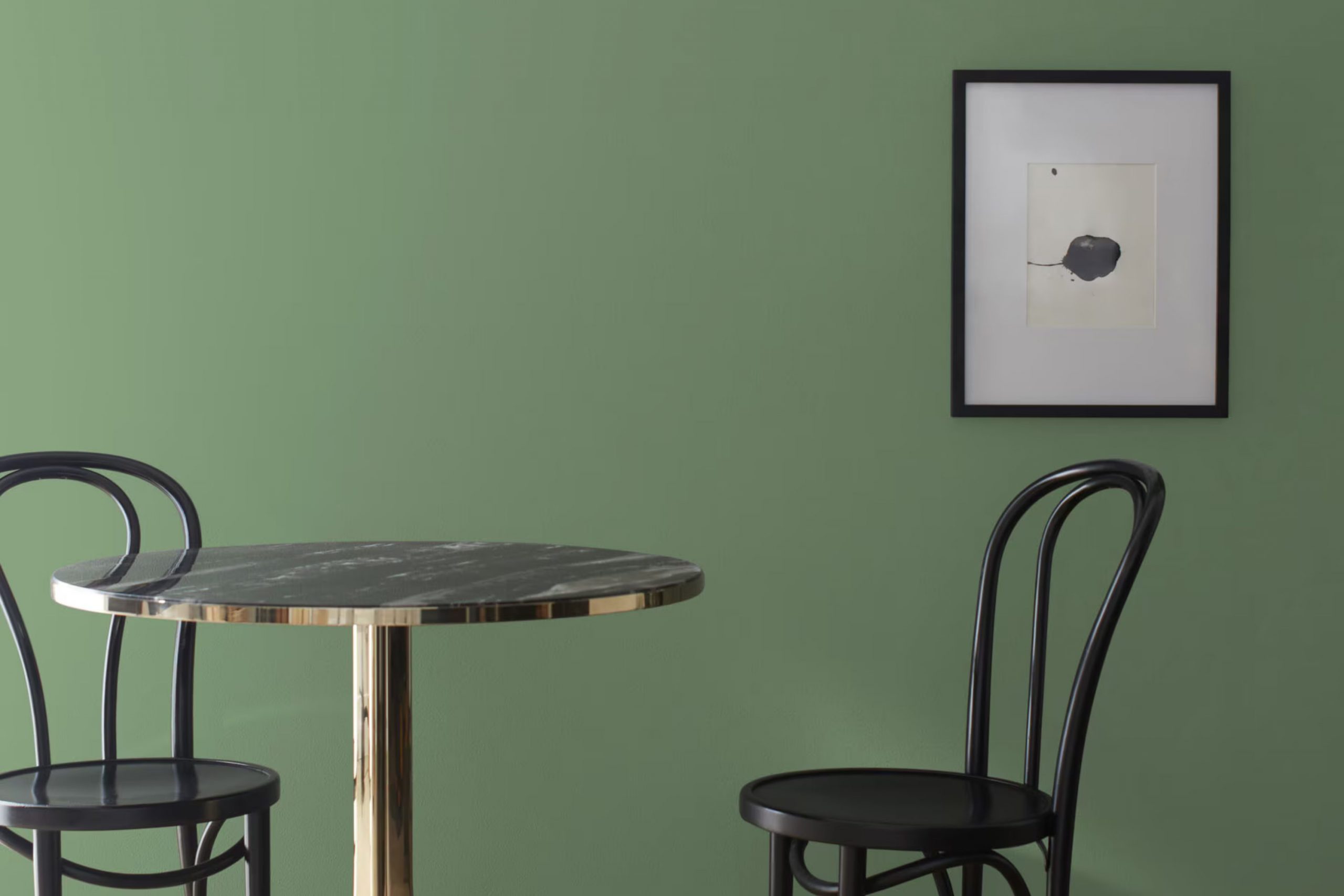
When you first set eyes on CW-520 Palace Green by Benjamin Moore, it’s like stepping into a calm oasis. This shade of green is mild yet distinct, perfect for anyone looking to add a touch of elegance without overpowering a room.
The beauty of Palace Green lies in its adaptability—it pairs just as well with bold accent colors as it does with subtle earth tones, making it a go-to choice for refreshing any room into a cozy, inviting area.
Whether you’re painting a bedroom to create a restful environment or giving your living room a fresh look, CW-520 Palace Green offers a beautiful backdrop that complements wood furniture, metallic finishes, and natural textiles equally well.
If you’re considering a new color for your home, Palace Green provides a unique blend of warmth and style.
What Color Is Palace Green CW-520 by Benjamin Moore?
Palace Green CW-520 by Benjamin Moore is a rich, deep green hue that evokes the lush foliage of a stately English garden. This color has a traditional charm but can be flexible enough to fit into various interior styles. Its muted vibrancy makes it a perfect choice for those looking to add a touch of nature-inspired elegance without overpowering a room.
Ideal for creating a cozy and inviting atmosphere, Palace Green works particularly well in colonial, farmhouse, and rustic interior designs. Its earthy tones blend seamlessly with natural materials like wood, enhancing the grains and textures, especially in darker woods like mahogany or walnut. This color also pairs beautifully with leather, adding a sense of age and luxury to furniture pieces such as sofas and armchairs.
In terms of textures, Palace Green is complemented by rough, tactile materials such as burlap, linen, and raw silk, which help to soften its boldness while maintaining an organic feel. Metals like brass and copper provide a warm contrast that highlights its richness.
For those looking to create a room that feels grounded and connected to nature, while still maintaining a sense of warmth and comfort, Palace Green is an excellent choice. Its adaptability with various materials and textures also allows for flexibility in personalizing your room.
Is Palace Green CW-520 by Benjamin Moore Warm or Cool color?
Palace Green CW-520 by Benjamin Moore is a rich and warm shade of green that brings a cozy and inviting atmosphere to any room. This particular color is perfect for those looking to add a touch of nature-inspired calmness to their living areas without overpowering the room. Its deep hue works well in both sunny and dimly lit rooms, enhancing the area without making it feel smaller or cramped.
Using Palace Green in a home can create a comforting vibe in areas like the living room or bedroom. The color pairs beautifully with natural materials like wood and stone, helping to ground the decor and connect the indoor environment with outdoor elements. Additionally, it complements neutral colors like whites, creams, and beiges, allowing for a flexible palette in home design.
Palace Green is also durable and easy to maintain, making it a practical choice for busy households. It hides imperfections well and is adaptable enough to fit various decorating styles, from rustic to more modern looks.
Undertones of Palace Green CW-520 by Benjamin Moore
Palace Green is a flexible color that blends a deep, rich green base with a complex mix of undertones that can subtly influence the mood and style of a room. The color’s undertones include shades like olive, mint, and dark turquoise, along with paler hues such as pale pink, light green, and pale yellow. These undertones can interact with both natural and artificial lighting, shifting the color’s appearance throughout the day.
When used on interior walls, the presence of these undertones can make Palace Green appear more dynamic and layered. In a room with plenty of sunlight, the lighter undertones like mint and pale yellow might become more pronounced, giving the area a fresher, more lively look. In contrast, in a room with less light or during the evening, darker undertones like olive and dark green might stand out, creating a cozier and more enveloping feel.
The diversity of undertones also means that Palace Green can pair well with a wide range of décor elements and color schemes. For instance, furniture and accessories in shades of lilac, light turquoise, or pale pink could bring out the subtler notes in the paint, whereas darker elements in shades like navy or dark grey could complement its richer facets.
Overall, the undertones in Palace Green make it a flexible color choice for interior walls, capable of accommodating various decorating styles and tastes while providing an ever-changing backdrop that adjusts with the light and surrounding colors.

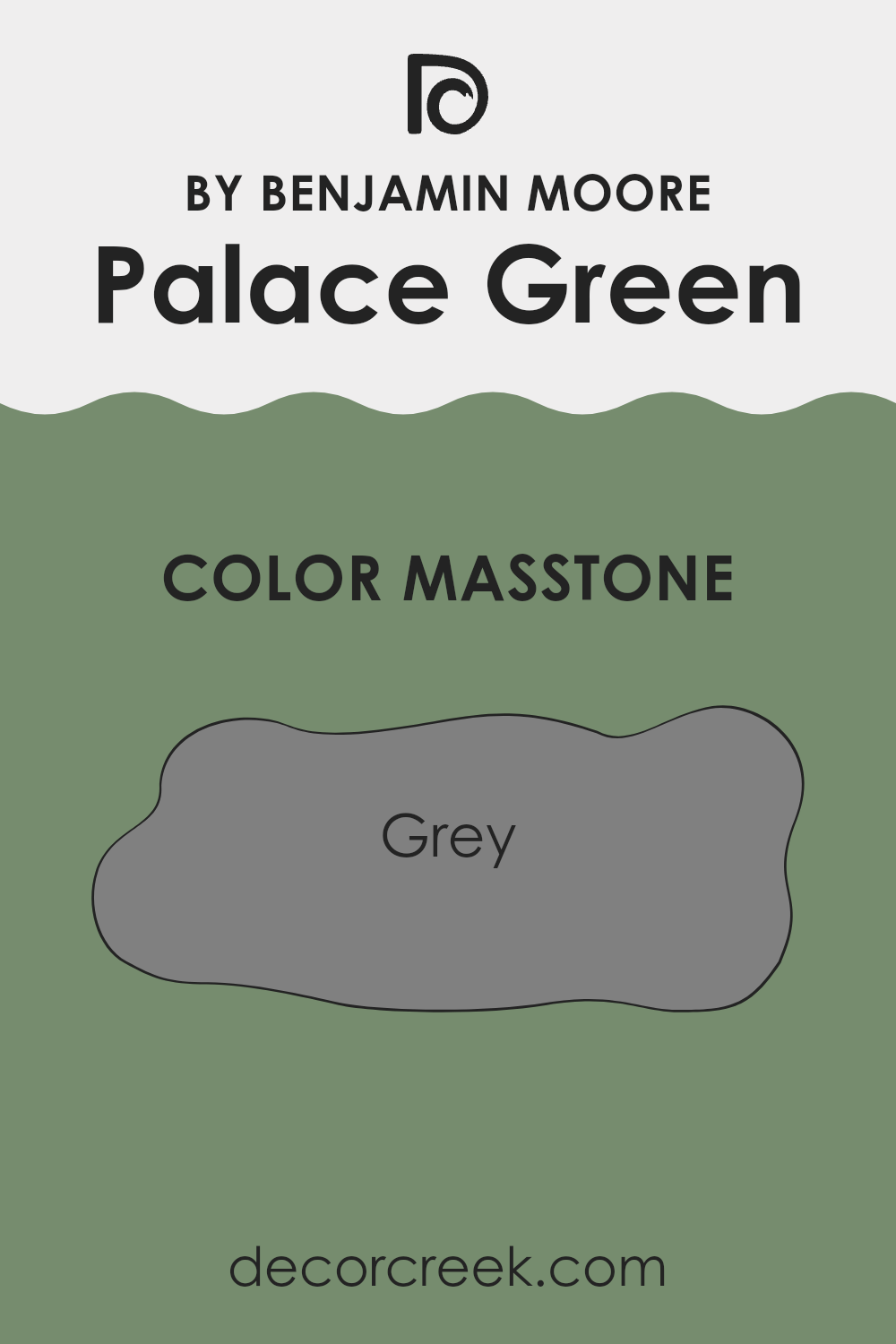
What is the Masstone of the Palace Green CW-520 by Benjamin Moore?
Palace Green CW-520 by Benjamin Moore has a masstone of Gray, with the specific shade being Grey (#808080). This neutral tone makes it highly flexible in home decorating. Gray is known for its ability to work well with other colors, providing a balanced backdrop that allows other hues in the room to stand out.
Whether you’re pairing it with bright colors for a lively atmosphere, or softer tones for a more subdued look, this gray ensures that the desired effect is achieved without competing for attention.
In practical terms, the neutrality of Grey (#808080) helps in hiding imperfections and maintaining a cleaner look for longer periods, which makes it suitable for areas that receive a lot of traffic. Its neutral character also means it can shift seamlessly between different styles and seasons, making it a smart choice for anyone looking to have a color that will sustain various decor updates over time.
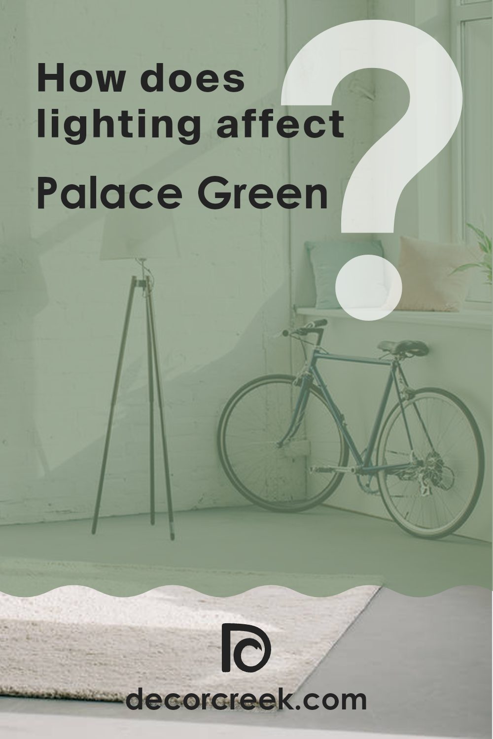
How Does Lighting Affect Palace Green CW-520 by Benjamin Moore?
Lighting plays a crucial role in how colors appear in a room. The light source can change the hue, brightness, and feel of paint colors on the walls. Different types of light can make the same color look different in various environments.
Consider “Palace Green CW-520” by Benjamin Moore as an example. It’s a rich and lush color that behaves differently under artificial and natural lighting. Under artificial lights like LEDs or incandescent bulbs, this color might appear slightly brighter and more vibrant because artificial light tends to enhance the intensity of colors. Especially in the evening, under warm artificial lighting, it can create a cozy and inviting atmosphere.
In natural light, the appearance of the color can vary significantly depending on the direction the room faces and the time of day. In north-faced rooms, which receive less direct sunlight and generally have cooler, softer light, “Palace Green CW-520” can look more subdued and less vibrant. It might even seem slightly bluish, giving a calm feel to the room.
In south-faced rooms, where sunlight is abundant throughout the day, “Palace Green CW-520” will show its true color most brightly and vividly. The ample sunlight brings out the depth of the color, making the room feel lively and full of energy.
East-faced rooms get plenty of light in the morning. Here, “Palace Green CW-520” will look especially bright and cheerful in the morning, providing a refreshing start to the day. As the sun moves, the intensity of the color will soften, maintaining a gentle appearance throughout the afternoon.
Lastly, in west-faced rooms, this color will shift throughout the day. It starts off less intense in the morning but grows increasingly vibrant towards the evening as the sun sets. This can create a dynamic change in the room’s mood, from a calm morning to a more dramatic evening.
Understanding how different lighting conditions affect color can help you make better design choices, ensuring that your rooms always look their best.
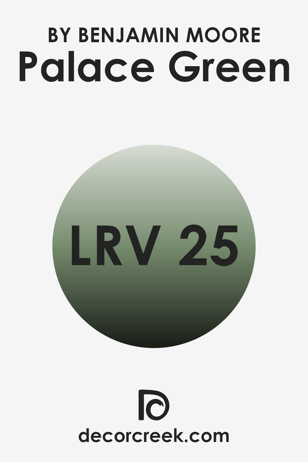
What is the LRV of Palace Green CW-520 by Benjamin Moore?
LRV, or Light Reflectance Value, is a measurement used to evaluate how much light a paint color reflects back into a room compared to how much it absorbs. On a scale from zero to one hundred, where zero represents absolute black and one hundred represents pure white, each color is assigned a numerical value. This value helps in determining how light or dark a color will look on a wall.
A higher LRV means the color will appear lighter and reflect more light, making rooms feel more open and airy. Conversely, a lower LRV means the color will absorb more light, giving a richer but darker appearance to walls and potentially making areas feel smaller or more enclosed.
The LRV of Palace Green (25.05) indicates it is on the darker side, as it absorbs more light than it reflects. This characteristic means that when used on walls, Palace Green will create a more intimate and cozy atmosphere in the room.
It’s a color that doesn’t bounce much light around, which can be advantageous in a brightly lit area where a calming effect is desired or in a room intended to have a more grounded, comforting feel. However, in a poorly lit area, using a color with such a low LRV can make the room appear even smaller and darker, so careful consideration of lighting and size is essential when using deeper shades like this.
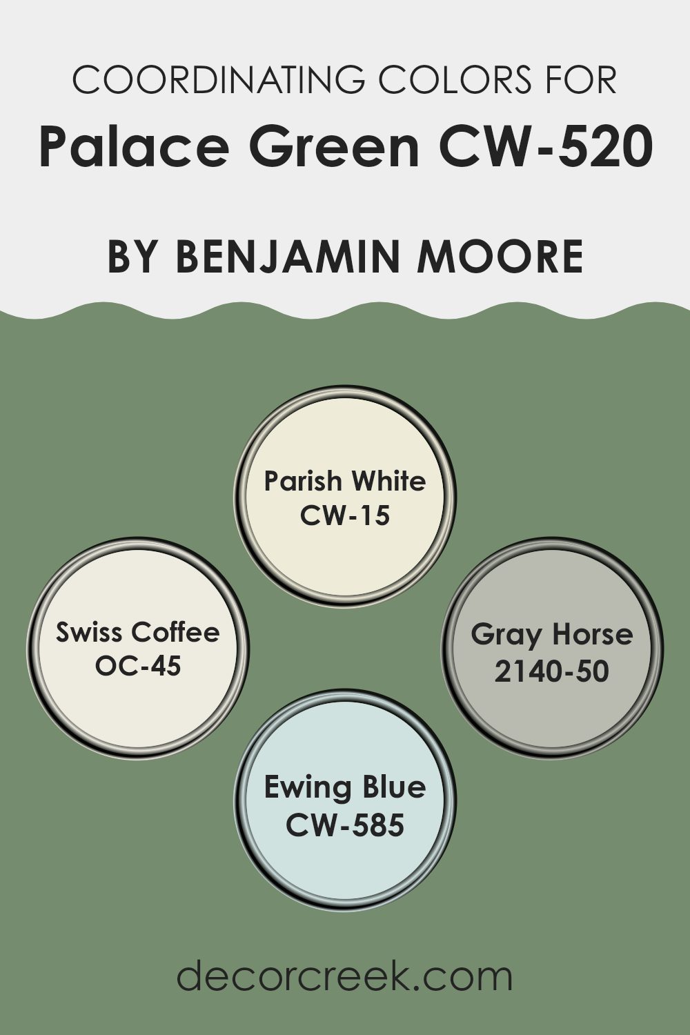
Coordinating Colors of Palace Green CW-520 by Benjamin Moore
Coordinating colors are shades that complement each other when used together in a decorating scheme, enhancing the overall aesthetic of a room. These colors either create harmonious visuals or offer striking contrasts, while still maintaining a balanced look. For example, if you’re working with a base color like Palace Green CW-520 by Benjamin Moore, choosing the right coordinating colors can really make the design stand out. Coordinating colors are generally chosen to bring out the best features of the main color, making the room feel thoughtfully put together.
In the case of Palace Green CW-520, colors like CW-15 Parish White and OC-45 Swiss Coffee offer subtle contrasts and a sense of freshness. Parish White is a clean, crisp white that provides a light and airy feel, making it perfect for trim and ceilings or as a contrast to bolder colors.
Swiss Coffee, on the other hand, is a soft and creamy white that creates a soothing backdrop, allowing more saturated colors to pop without overpowering the senses. For a bit of depth, 2140-50 Gray Horse adds a muted gray-green layer that blends effortlessly with the earthy tones of Palace Green, perfect for creating a cohesive yet diverse palette.
Lastly, CW-585 Ewing Blue introduces a soft, muted blue, complementing the green while adding a gentle touch of color, ideal for accent walls or accessories. By understanding and using these coordinating colors creatively, you can effectively set the mood and style of any room.
You can see recommended paint colors below:
- CW-15 Parish White
- OC-45 Swiss Coffee
- 2140-50 Gray Horse
- CW-585 Ewing Blue
What are the Trim colors of Palace Green CW-520 by Benjamin Moore?
Trim colors are specific shades used on elements like door frames, window sills, baseboards, and moldings to define and accentuate the architectural details of a room. When paired with a unique shade like Benjamin Moore’s Palace Green, choosing the right trim color becomes crucial to enhance the visual appeal and create a cohesive look.
OC-117 – Simply White and OC-121 – Mountain Peak White are excellent choices for trim colors as they offer a clear contrast to the stronger hue of Palace Green, making the walls stand out and giving the room a neatly finished look.
Simply White is a clean, crisp white that provides a fresh and bright contrast, perfect for making the lush tones of Palace Green pop in a room.
Mountain Peak White, on the other hand, has a warmer undertone that offers a subtle, inviting glow, softening the overall feel while still highlighting the bold green. By pairing Palace Green with one of these whites, one can achieve a pleasant balance, making the area appear more polished and well put-together.
You can see recommended paint colors below:
- OC-117 Simply White
- OC-121 Mountain Peak White

How to Use Palace Green CW-520 by Benjamin Moore In Your Home?
Palace Green CW-520 by Benjamin Moore is a soothing green paint color that’s perfect for adding a fresh touch to your home. It has a soft, nature-inspired vibe, making it great for areas where you want to feel relaxed and comfortable. You can use this color in various rooms such as bedrooms, bathrooms, or living areas where a calm atmosphere is desired.
For a refreshing look, try painting all the walls in a smaller room like a bathroom. In larger rooms, consider using it on an accent wall to create a pleasant focal point without overpowering the area. This shade also pairs well with light woods and neutral tones, giving a natural, airy feel to the room.
If you’re interested in home decoration but hesitant to commit to bold colors, Palace Green is a safe yet beautiful choice. It works wonderfully in homes with a lot of natural light or rooms that need a touch of subtle color to brighten up the environment.
After testing CW-520 Palace Green by Benjamin Moore in different rooms in my house, I have to say I’m really impressed. This paint color is beautiful and changes depending on the light. In the morning, it’s bright and happy, and by evening, it turns into a calm, soothing green that makes the room feel cozy.
I used it in my living room and it made spending time there more enjoyable. Everyone who comes over always compliments the color, saying it feels warm and inviting.
It was easy to apply the paint, and it covered the old color well, which saved me time and effort. It doesn’t chip or peel easily, which means it’ll look great for a long time without needing touch-ups. It’s definitely a good choice for anyone looking to refresh their home with a new color that isn’t too bold but still makes a room feel special.
CW-520 Palace Green is a great pick if you want a color that makes you feel good every time you walk in. Whether for a bedroom or a living area, this paint brings a fresh, vibrant vibe that really makes a house feel like a home.
Ever wished paint sampling was as easy as sticking a sticker? Guess what? Now it is! Discover Samplize's unique Peel & Stick samples.
Get paint samples

