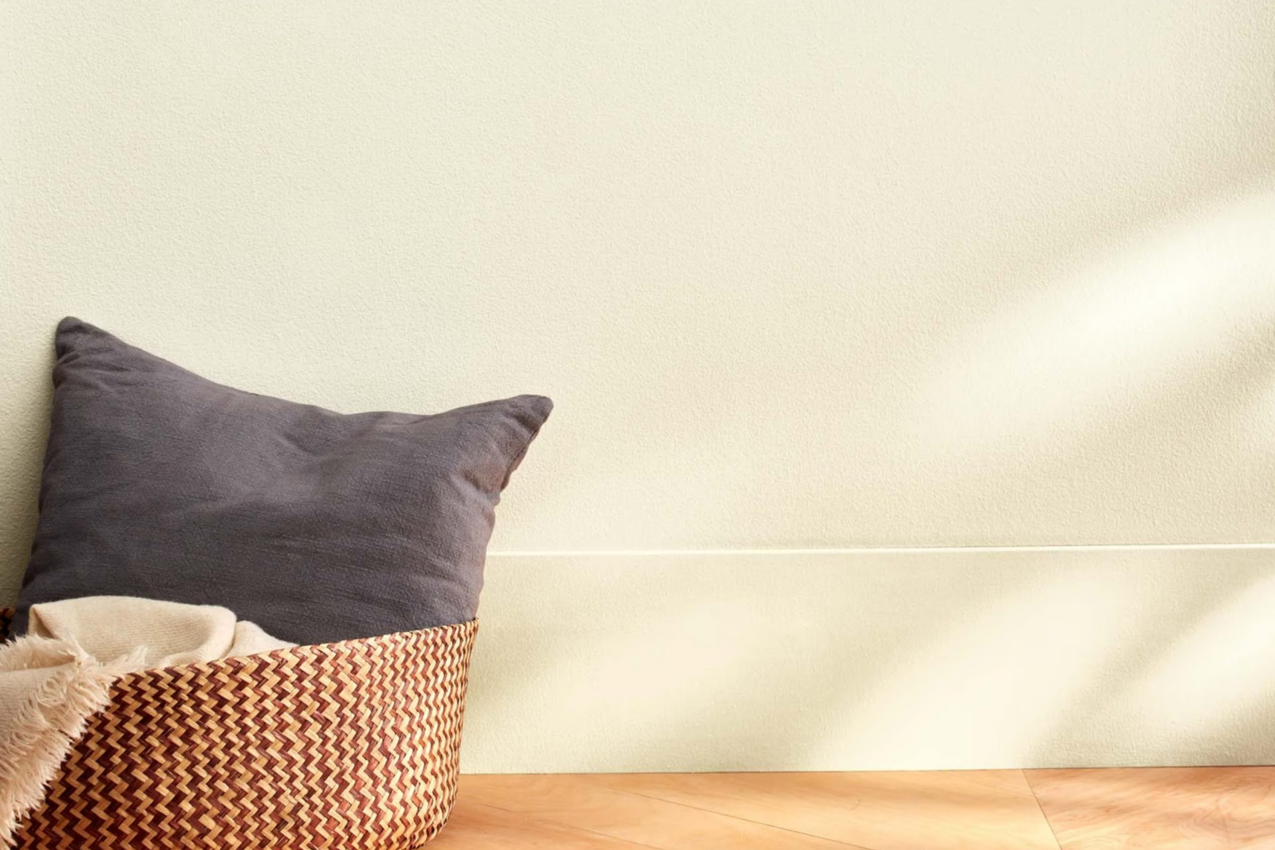
Imagine walking into a room bathed in the soft, inviting warmth of CW-15 Parish White by Benjamin Moore. It’s a shade that instantly makes you feel at home, with its charming blend of subtlety and sophistication. The color is neither too stark nor too muted; it strikes a perfect balance that can enhance any room. Parish White has a gentle quality that wraps around you, creating an inviting atmosphere that feels just right.
When I think about Parish White, I picture an adaptable color that complements any style, be it modern, traditional, or somewhere in between. The way it interacts with light throughout the day is a true delight: mornings have a gentle, creamy glow, while evenings become warm and cozy.
This shade has a unique ability to act as both a backdrop and a highlight, allowing it to adapt to the personality of any room. Whether paired with bold accents or soft, neutral tones, Parish White manages to bring out the best in its surroundings.
If you’re searching for a color that can provide a fresh yet enduring foundation for your home, look no further. CW-15 Parish White embodies an understated elegance that makes every room feel calm and welcoming.
What Color Is Parish White CW-15 by Benjamin Moore?
Parish White CW-15 by Benjamin Moore is a warm, soft white color that brings a gentle glow to any area. This adaptable shade has subtle cream undertones, giving it a cozy and inviting feel. It works beautifully in a variety of interior styles, making it a popular choice for both traditional and modern settings.
In traditional interiors, Parish White complements rich wooden furniture and classic design elements. It enhances the natural warmth of wood tones and pairs well with plush fabrics like velvet or chenille. In modern areas, this white serves as a clean backdrop that allows bold colors and sleek materials to stand out. It pairs nicely with metals, glass, and stone, creating a balanced and harmonious look.
Parish White is also a great choice for coastal or cottage-inspired interiors. It blends well with natural textures such as jute, linen, and wicker, adding to the relaxed and airy vibe. Moreover, it enhances areas filled with natural light, making them feel brighter and more open.
Whether used on walls, ceilings, or trim, Parish White CW-15 brings a pleasant warmth to any room, effortlessly complementing various materials and textures while adapting to different design styles.
Is Parish White CW-15 by Benjamin Moore Warm or Cool color?
Parish White (CW-15) by Benjamin Moore is an adaptable and subtle paint color that works well in many home settings. It is a soft, off-white shade with warm undertones, providing a gentle and inviting atmosphere. This color is perfect for creating a cozy and comfortable room, making it suitable for living rooms, bedrooms, and kitchens.
In a home, Parish White can help brighten a room without feeling too stark or cold. It pairs wonderfully with both light and dark furniture, enabling homeowners to mix and match styles with ease. Whether your home décor is modern or traditional, this color allows elements like wood, metal, and textiles to stand out beautifully.
Additionally, Parish White can help make smaller rooms feel more open and spacious. Its warmth provides comfort while maintaining a clean and fresh look. Overall, this shade offers a practical choice for any home, adding a touch of simple elegance without overpowering the room.
Undertones of Parish White CW-15 by Benjamin Moore
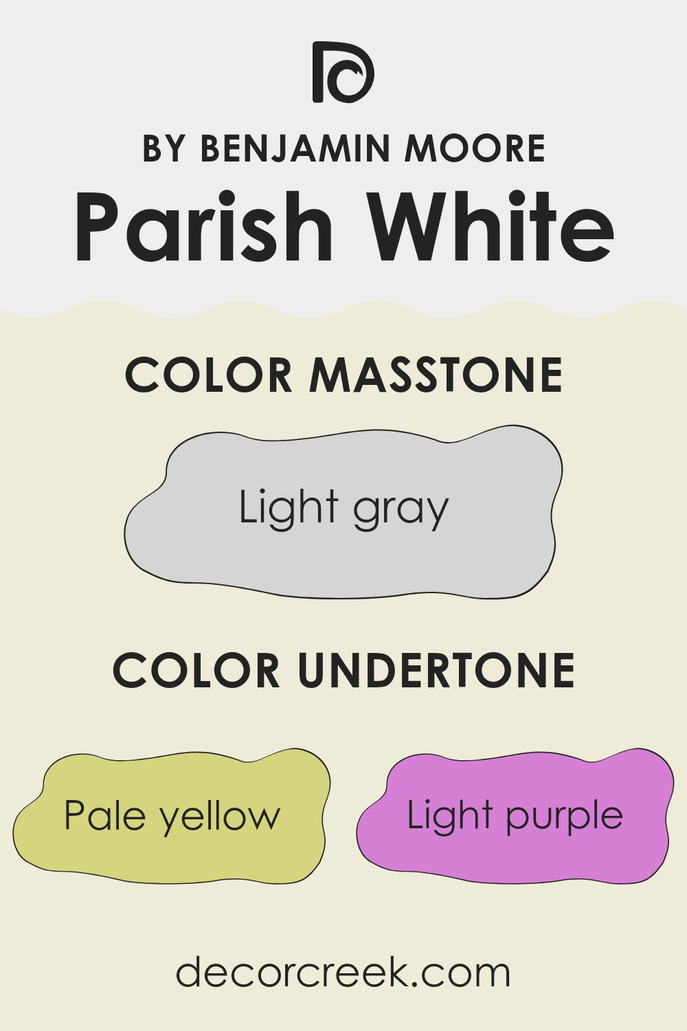
Parish White by Benjamin Moore is a soft and adaptable white shade with unique undertones. These undertones include pale yellow, light purple, light blue, pale pink, mint, lilac, and grey. Undertones give a color depth and character and influence how the color appears in different lighting. For example, in bright sunlight, the pale yellow undertone can make the white seem warm and inviting, while the grey can add a subtle coolness in shadowy areas.
When applied to interior walls, the undertones in Parish White can have various effects. A room painted in this color might feel warmer due to its yellow undertone when paired with natural light. The soft purple and pale pink undertones can add a hint of charm, making the room feel cozy and comforting.
Meanwhile, the light blue and mint undertones can infuse a refreshing vibe, perfect for areas that need a touch of calmness. The grey undertone helps maintain a balance, preventing the color from feeling too warm or cool. Overall, Parish White’s undertones allow it to adapt beautifully in different environments, making it a great choice for those looking to subtly enhance their room with an adaptable and neutral palette.
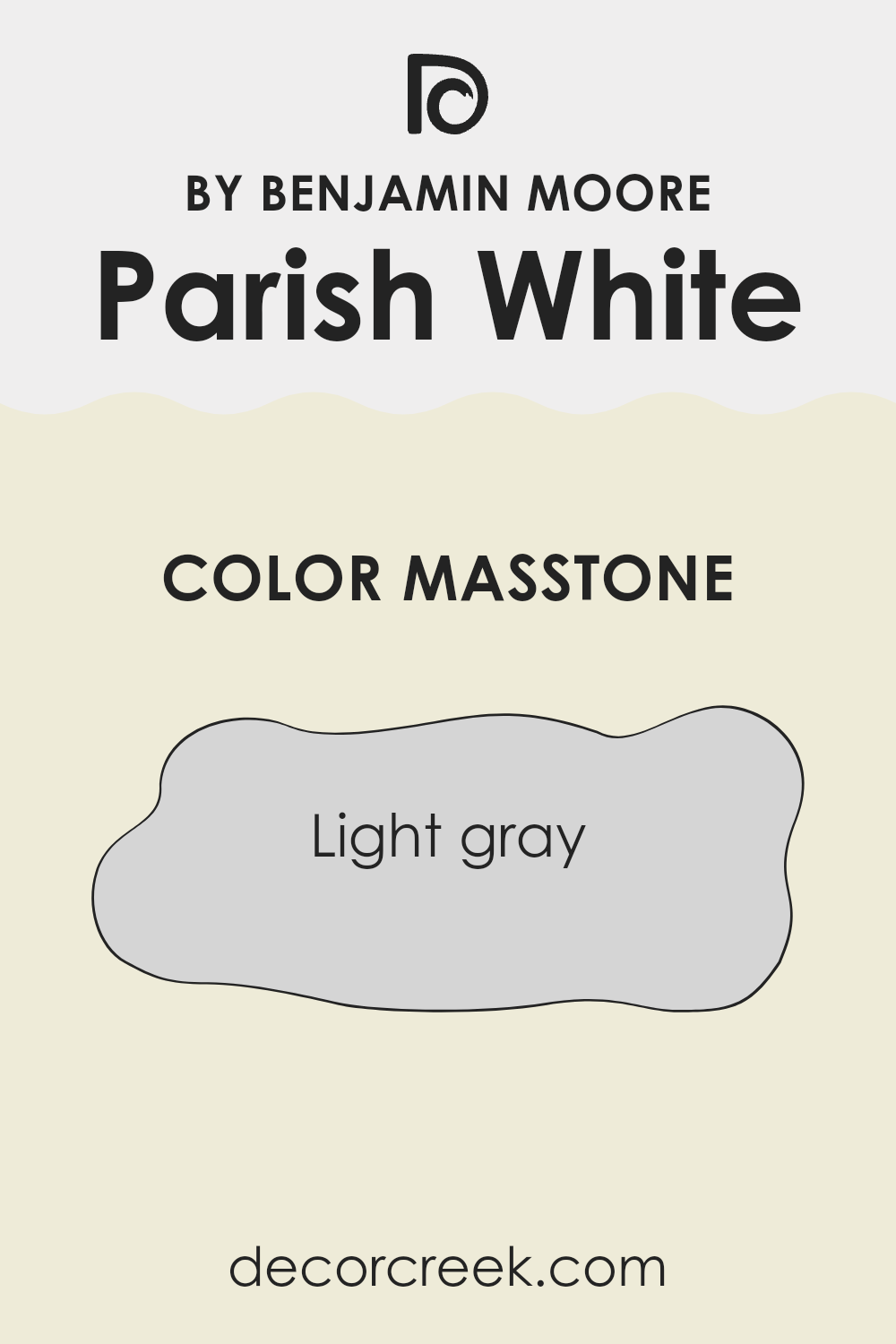
What is the Masstone of the Parish White CW-15 by Benjamin Moore?
Parish White by Benjamin Moore is a light gray color with a masstone of #D5D5D5. This soft, neutral shade provides a calming backdrop for any room in the home. Its light gray tone makes it adaptable and easy to pair with various colors and design elements.
Due to its neutrality, it works well in both modern and traditional areas, allowing furniture and accessories to stand out. In living rooms and bedrooms, this light gray creates an airy, open feel, making these areas more inviting and comfortable.
It reflects natural light beautifully, which can make small rooms feel bigger. In kitchens and bathrooms, Parish White provides a clean, fresh look that complements stainless steel appliances and white fixtures.
Its ability to blend with different textures and materials makes it a reliable choice for homeowners looking to achieve a cohesive look without overpowering their existing decor.
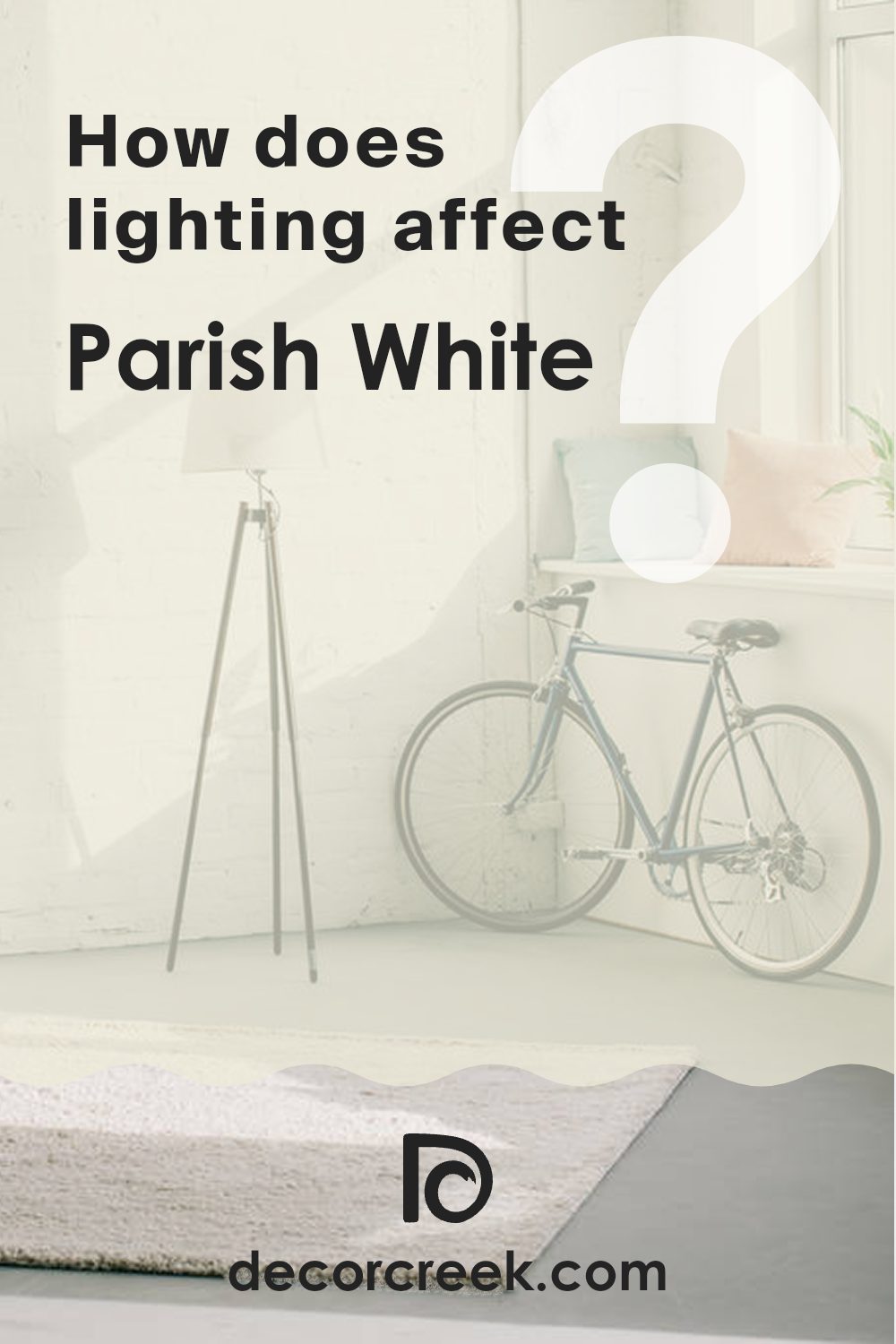
How Does Lighting Affect Parish White CW-15 by Benjamin Moore?
Lighting has a big impact on how we see colors. Depending on whether it’s natural or artificial light, colors can look very different. Let’s take a look at the color Parish White by Benjamin Moore to see how it changes in different lighting conditions.
In artificial light, like from lamps with yellowish bulbs, Parish White might appear warmer. The yellow tones in the light can make this paint color look a bit more creamy or soft. Under cool artificial light, such as fluorescent bulbs, the color could take on a slightly cooler tone, appearing more muted.
In natural light, Parish White has another chance to change. The amount and direction of the light have a lot to do with it. In rooms facing north, light is often cooler and softer, which might make this color appear a little grayer or cooler. The lack of direct sunlight means the color could appear more subdued.
In south-facing rooms, sunlight is often strong and warm. This sunlight brings out the warmth in Parish White, making it look bright and sunny. It can reveal the more subtle undertones of the paint, adding depth.
East-facing rooms get direct sunlight in the morning and remain cooler for the rest of the day. This morning light can make Parish White look bright and fresh early on, perhaps showing off its lightness more. Later in the day, it might appear more muted.
West-facing rooms get the warmest light in the late afternoon and early evening. Parish White in these rooms can seem warmer and cozier in the afternoon sun, as the light brings out warmer tones. Overall, Parish White is adaptable and changes depending on the light. Understanding these changes can help in choosing where to use it to get the best effect for the room.
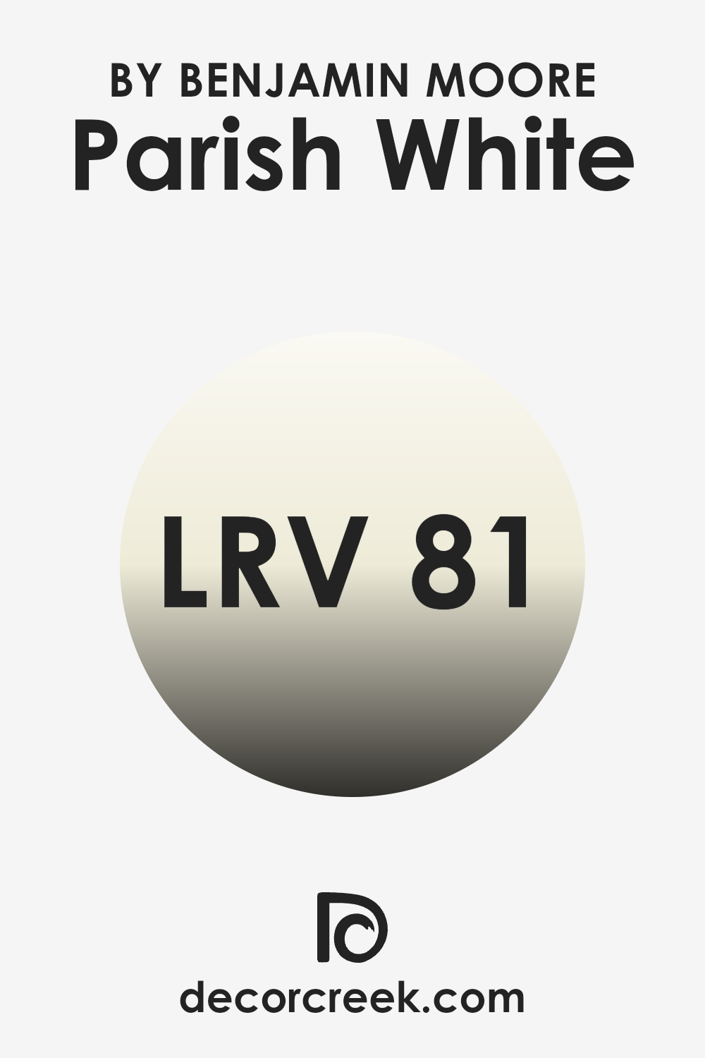
What is the LRV of Parish White CW-15 by Benjamin Moore?
LRV, or Light Reflectance Value, is a measurement that tells us how much light a color reflects or absorbs. It’s measured on a scale from 0 to 100, where 0 means the color absorbs all light (like black) and 100 means it reflects all light (like white). When you paint a wall, the LRV will affect how bright or dark the room feels. A higher LRV means the color will reflect more light, making the room feel brighter and larger. Conversely, lower LRV colors absorb more light and can make a room feel cozier or more intimate.
For the color Parish White by Benjamin Moore, with an LRV of 81.09, it reflects a large amount of light. This high LRV means that Parish White will make a room feel bright and airy. It’s an excellent choice for areas where you want to maximize light, such as in a room with limited natural light or in areas where you want a clean, open feel.
The color will help illuminate the room, making it feel welcoming and spacious. Because it reflects most light, Parish White will maintain its bright appearance throughout the day, responding well to different lighting conditions and making colors around it stand out subtly.
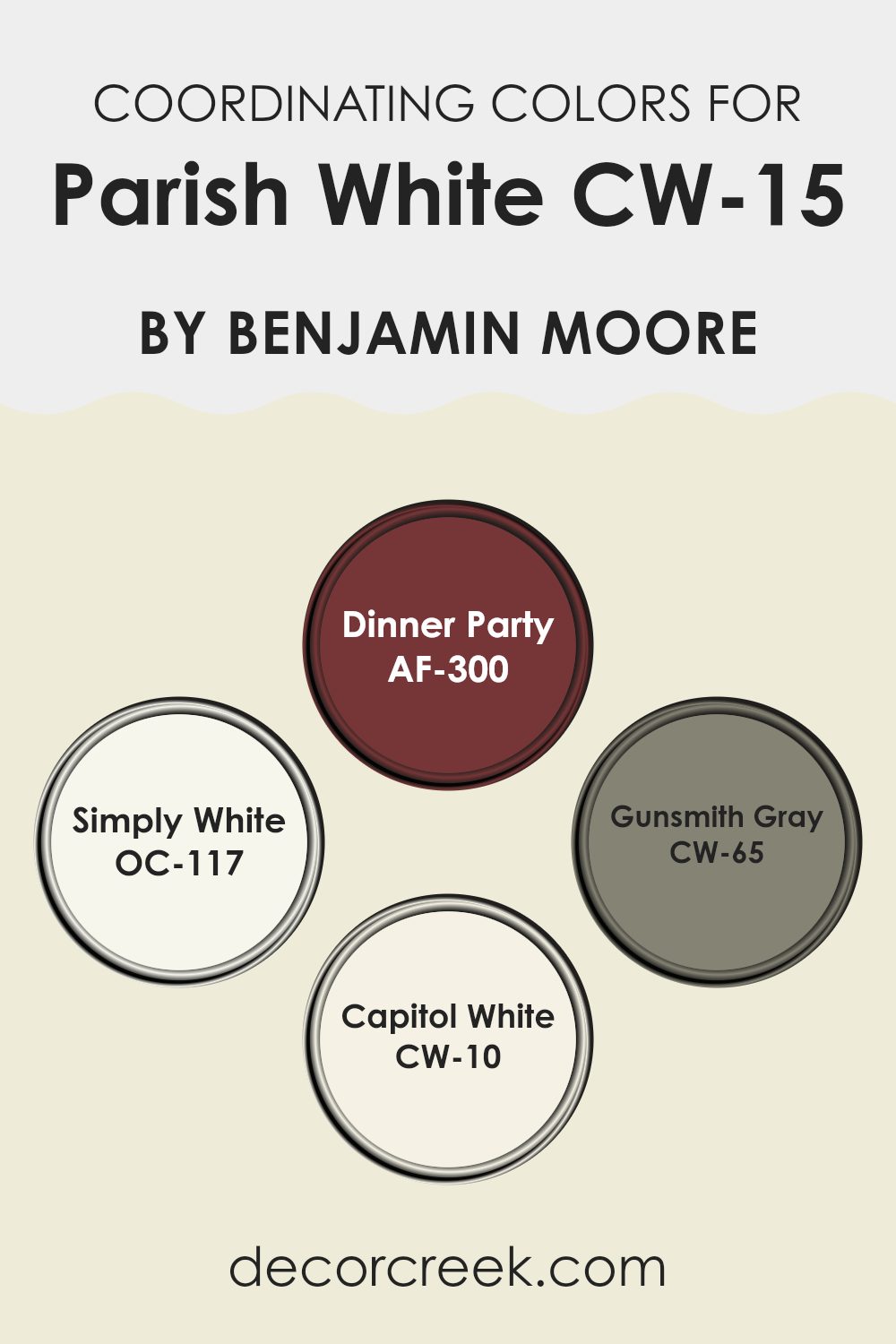
Coordinating Colors of Parish White CW-15 by Benjamin Moore
Coordinating colors are hues that complement one another, creating a harmonious look within a room. When paired with Parish White, a soft and gentle white shade, these colors work together to enhance the overall atmosphere of a room. AF-300, also known as Dinner Party, is a rich, deep red that adds warmth and a touch of drama to a room, making it perfect for creating a focal point or adding depth to your design. On the lighter side, OC-117, Simply White, offers a crisp, clean contrast that brings brightness and a sense of openness, ideal for balancing out the more intense hues.
CW-65, Gunsmith Gray, is a refined and muted gray that provides a modern and neutral backdrop, perfect for introducing calm and balance without overpowering the other colors. CW-10, Capitol White, is slightly warmer than Parish White and blends seamlessly for a softly layered effect, contributing a subtle cozy feel.
Together, these colors work in harmony, allowing each to shine while supporting one another to create a cohesive and inviting environment in any room. By choosing such coordinating colors, you can achieve a well-rounded design, where each color complements and highlights the others, resulting in a balanced and appealing aesthetic.
You can see recommended paint colors below:
- AF-300 Dinner Party
- OC-117 Simply White
- CW-65 Gunsmith Gray
- CW-10 Capitol White
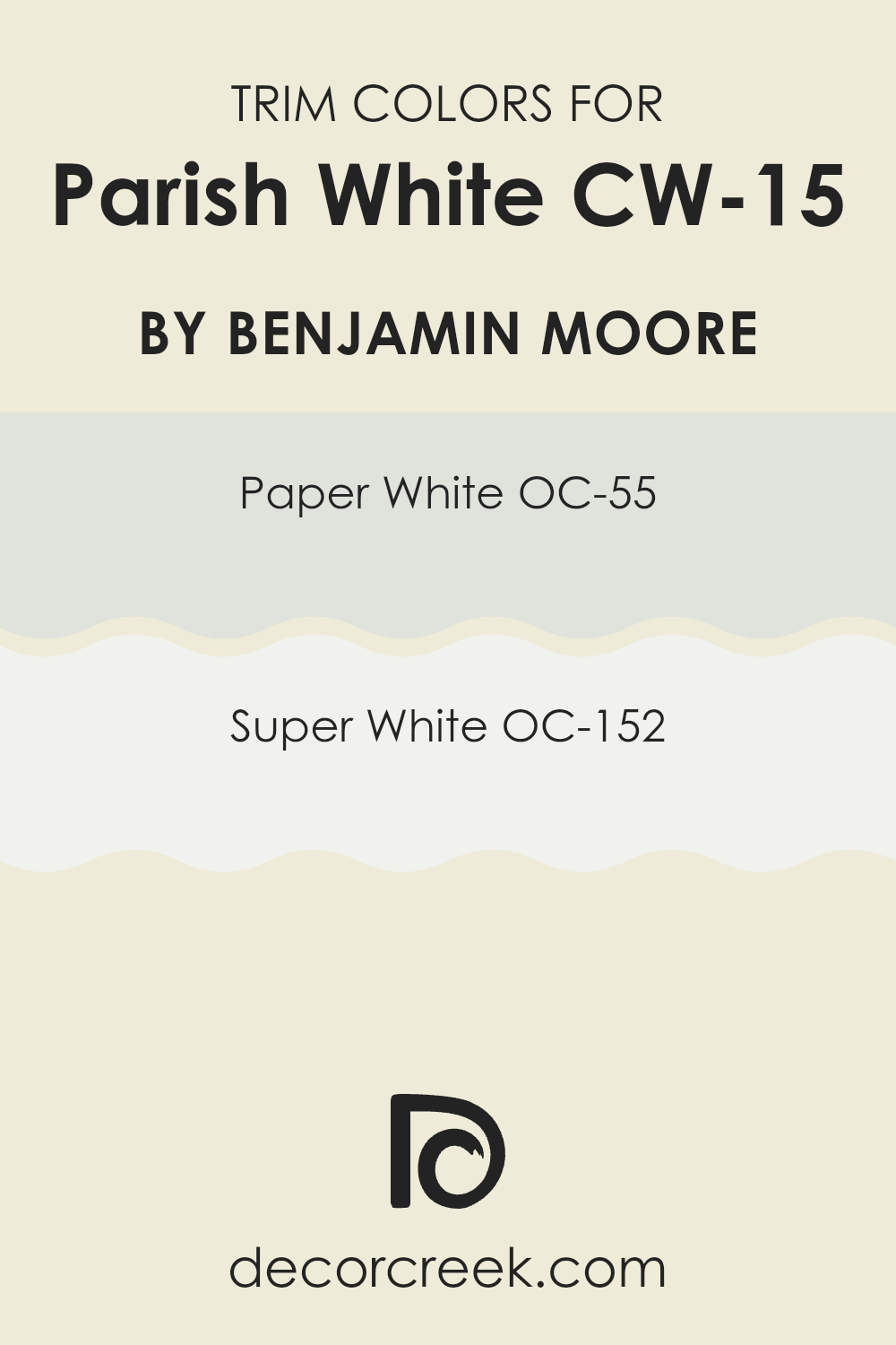
What are the Trim colors of Parish White CW-15 by Benjamin Moore?
Trim colors refer to the shades used for the finishing touches around windows, doors, baseboards, and other edges in a room. They are essential because they help frame and highlight the main wall color, creating contrast and definition. In the case of Parish White by Benjamin Moore, choosing the right trim color is crucial to complement this soft, warm white.
Paper White (OC-55) and Super White (OC-152) serve as excellent trim options because they offer different levels of brightness and contrast to suit various design preferences. These colors can make the Parish White walls pop, giving a room a polished and completed look.
Paper White is a subtle, cool grayish tint that adds a slight contrast without being too stark or overpowering. It works well in areas where a gentle transition is desired. Super White, on the other hand, is a crisp and bright white that provides a clean, sharp outline around walls. When used as trim, it makes the Parish White walls stand out even more, giving the room a fresh and clear appearance. Both colors add their unique touch but are unified in their ability to beautifully complement Parish White.
You can see recommended paint colors below:
- OC-55 Paper White
- OC-152 Super White
How to Use Parish White CW-15 by Benjamin Moore In Your Home?
Parish White CW-15 by Benjamin Moore is a soft, warm white with a subtle creamy undertone. This paint color is adaptable and can be used throughout the home to create a welcoming and bright atmosphere. It works well in both modern and traditional settings, making it a great choice for various interior styles.
In the living room, Parish White can provide a fresh backdrop that complements colorful furniture and decor, while still adding warmth to the room. In the kitchen, it can lighten up the area, making it feel larger and more open. It’s also a great option for hallways or entryways, as it reflects light beautifully, making these areas seem inviting.
In the bedroom, Parish White can contribute to a peaceful vibe, promoting rest and relaxation. Pair it with soft, neutral bedding for a cohesive and calming look. Its adaptability makes it a reliable choice for any room in the home.
After reading the article about CW-15 Parish White by Benjamin Moore, I feel like I really understand what makes this paint color special. It’s a very nice shade of white that can make any room look brighter and cleaner. It’s not too bright or too dull, so it fits well in many places inside a home. People seem to really like it because it works with almost every room decoration and adds a fresh look.
Parish White can make a room feel bigger even if it’s small. It’s a color that doesn’t get boring, and it makes everything around it stand out better, like furniture and pictures. This white paint is good for people who might want to change how their rooms look without buying new stuff.
I think the article showed me that CW-15 Parish White is a great choice for anyone who wants to make their home look nice and inviting. It’s a simple color, but it does a lot to make rooms feel just right. I learned that sometimes a good coat of paint can change how a room feels, and Parish White seems like a perfect pick for that.
Ever wished paint sampling was as easy as sticking a sticker? Guess what? Now it is! Discover Samplize's unique Peel & Stick samples.
Get paint samples

