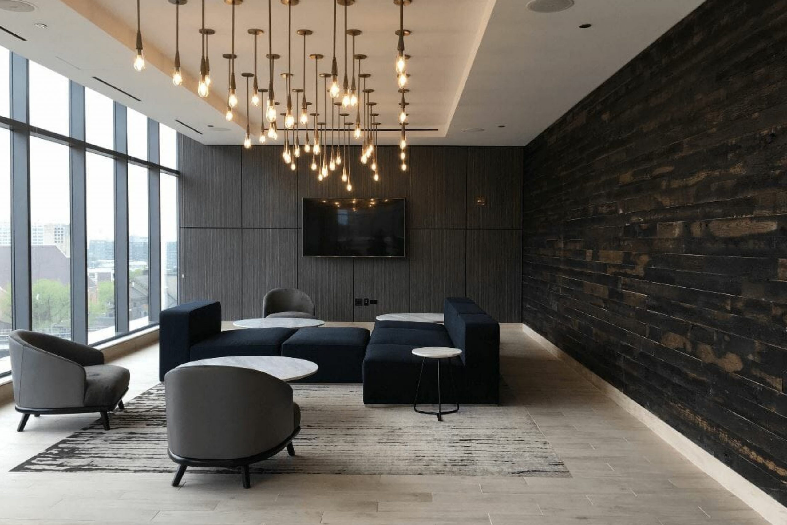
Looking for the perfect paint color to add some uniqueness to your space? Benjamin Moore’s 2124-10 Wrought Iron could be exactly what you need. Unlike the name might suggest, Wrought Iron is not a simple black. Instead, it’s a deeply sophisticated charcoal hue that brings elegance and depth to any room it graces. This color is versatile, fitting perfectly into a variety of spaces whether you’re looking to create a striking accent wall, refresh your exterior doors and trim, or even give furniture a makeover.
Wrought Iron by Benjamin Moore is more than just a paint color—it’s a way to transform a space without overwhelming it. Its rich, dark tone works well with a wide range of color palettes, making it a great choice for those who are looking for something that stands out while still blending harmoniously with other elements in their decor.
If you’re thinking of refreshing a room in your home or giving a piece of furniture a new lease on life, consider Wrought Iron.
Its unique blend of depth and versatility makes it a go-to choice for those looking to make a sophisticated statement. Whether applied in large doses or used sparingly for subtle accents, this color promises to make any space more intriguing and inviting.
What Color Is Wrought Iron 2124-10 by Benjamin Moore?
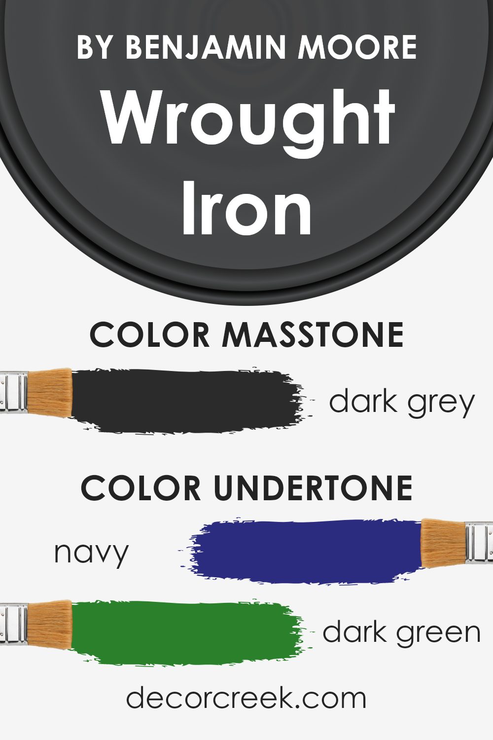
Wrought Iron by Benjamin Moore is a deeply rich, almost black paint color with subtle undertones of navy blue. This versatile shade can add sophistication and depth to any space, making it a popular choice among designers and homeowners looking for a strong statement without the starkness of pure black. Unlike true black, Wrought Iron softens under different lighting, revealing its complex layers and creating a warm, inviting atmosphere.
This color works exceptionally well in a variety of interior styles, including modern, industrial, and traditional. In a modern setting, its boldness creates a striking contrast against white or light gray, making spaces feel grounded yet airy. In industrial designs, it enhances the raw, unfinished elements like exposed brick and ductwork, adding to the edgy aesthetic.
Traditional spaces benefit from Wrought Iron’s depth, especially when paired with rich wood tones, adding an element of timeless elegance.
When it comes to pairing materials and textures, Wrought Iron is incredibly versatile. It pairs beautifully with natural wood, from light oaks to dark walnuts, enhancing the warmth of the wood. Metals like brass, copper, and silver also complement this shade well, adding a touch of glamour to the moody hue.
For textures, think of soft, plush fabrics like velvet or wool in lighter colors to create a cozy yet sophisticated ambiance. Linen and cotton in creamy whites also work well, offering a soft, subtle contrast to the boldness of Wrought Iron.
Is Wrought Iron 2124-10 by Benjamin Moore Warm or Cool color?
Wrought Iron 2124-10 by Benjamin Moore is a unique paint color that brings a lot of depth and character to any home. This isn’t just any black; it’s a soft, deep gray with blue undertones that give it warmth and sophistication. Using Wrought Iron in your home means adding a touch of elegance without making spaces feel too dark or closed in. It’s perfect for accent walls, exterior trim, or even cabinets and doors for those looking to make a subtle yet strong statement.
In homes, this color works wonders by providing a stunning contrast against lighter colors, making them pop and giving rooms a more defined look. It’s also incredibly versatile, fitting in with various decor styles, from modern minimalist to cozy traditional.
If you have a space that gets plenty of natural light, Wrought Iron can add an air of coziness without the heaviness commonly associated with darker colors. And in smaller rooms or areas with less natural light, using it as an accent can create depth without overwhelming the space. Indeed, Wrought Iron 2124-10 by Benjamin Moore is a choice that can transform a house into a home with its rich, inviting hue.
Undertones of Wrought Iron 2124-10 by Benjamin Moore
Wrought Iron by Benjamin Moore is a complex color with a rich mix of undertones, including navy, dark green, brown, dark turquoise, purple, olive, and grey. These undertones play a crucial role in how we perceive the color, adding depth and dimension that can vastly change under different lighting conditions or when paired with various decor elements.
The presence of navy and dark turquoise brings a coolness to the mix, suggesting a subtle hint of the serene and the deep. Dark green and olive inject an earthy, grounded feel, offering a whisper of nature and calmness. On the other hand, brown adds warmth, tying it back to natural wood tones and leather, providing a comforting, enveloping effect. Purple undertones introduce a touch of richness and luxury, giving the color a plush vibe that’s both sophisticated and inviting.
When used on interior walls, Wrought Iron transforms the space, bringing these undertones into play. In natural light, the cooler undertones might become more pronounced, making the room feel airy and more spacious. Artificial lighting, however, can enhance the warmer undertones, creating a cozy and intimate atmosphere. The grey aspect ensures it remains balanced, acting as a bridge between the cool and warm elements.
This dynamic interplay of undertones means Wrought Iron can adapt to different styles and palettes, making it incredibly versatile.
Whether it’s creating a statement wall that feels both bold and soothing or complementing decor that ranges from modern minimalist to rich and traditional, Wrought Iron has the unique ability to adjust its character, thereby transforming the look and feel of any room.
What is the Masstone of the Wrought Iron 2124-10 by Benjamin Moore?
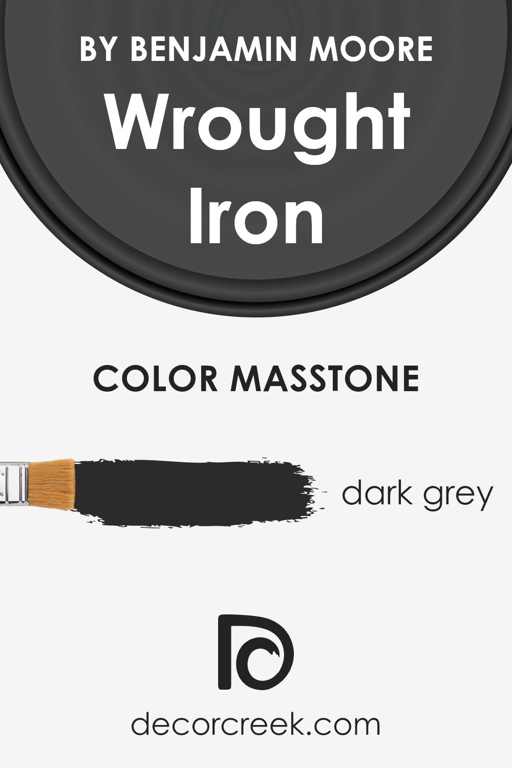
Wrought Iron 2124-10 by Benjamin Moore has a masstone of dark grey, known by its code #2B2B2B. This shade acts as a strong, solid color choice for homes, bringing a sense of elegance and contemporary flair wherever it’s used. Being a deeply rich grey, it’s versatile enough to fit in various spaces, whether you’re aiming for a modern vibe or something more classic and understated.
When applied to walls, it can make a room feel cozy and inviting, yet spacious due to its ability to reflect light more than darker shades. It’s perfect for accent walls, offering a striking contrast to lighter colors, making other elements in the room pop. In addition, this color works well with natural materials like wood and metal, adding a sophisticated touch to furniture, cabinets, or exterior finishes.
Its neutrality means it can seamlessly integrate with most color palettes, allowing for easy decoration without worrying about clashing colors.
How Does Lighting Affect Wrought Iron 2124-10 by Benjamin Moore?
Lighting plays a crucial role in how we perceive colors. The color of a paint, like a shade from Benjamin Moore, can look different depending on the light source. This is because natural sunlight and artificial light can enhance or subdue the hues in paint colors. Let’s explore how Wrought Iron, a specific shade, reacts under various light conditions and in rooms with different orientations.
In natural light, the true color of Wrought Iron shines brightly. This color is known for its depth and complexity, and under the sun’s rays, it can reveal subtle undertones that might not be noticeable under artificial lighting. In a room that gets plenty of sunlight, this color tends to appear more vibrant and dynamic, showing off its rich qualities.
When it comes to artificial light, the type of bulb matters. LED or fluorescent lighting can alter how Wrought Iron looks. Under warmer, artificial lights, the color might appear softer and less intense, potentially highlighting more of its brown or gray undertones, depending on the specific type of artificial light used.
Room orientation significantly affects how Wrought Iron looks throughout the day. In north-faced rooms, which receive less direct sunlight, Wrought Iron may appear more consistent throughout the day but could look cooler and slightly more muted, emphasizing its gray qualities. South-faced rooms, bathed in warm, direct sunlight for most of the day, can make this color feel warmer and more lively, enhancing any underlying warm tones.
East-faced rooms see this color transform. In the morning, with the soft, warm sunrise, the color can appear vibrant and warm, slowly transitioning to a cooler tone as natural light diminishes. Conversely, in west-faced rooms, the color looks cooler in the morning and then gradually warms up, reaching a peak warmth in the late afternoon with the setting sun, showcasing the versatility of Wrought Iron under varying lighting conditions.
Understanding these effects can help in choosing the right room or setting for applying this versatile color, ensuring that it matches the desired ambiance and mood.
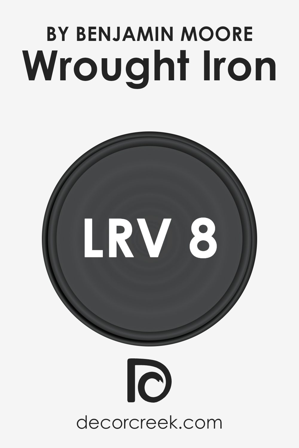
What is the LRV of Wrought Iron 2124-10 by Benjamin Moore?
LRV stands for Light Reflectance Value, which is a measurement indicating the amount of visible and usable light that gets reflected from or absorbed by a painted surface. It’s essentially a scale from 0 to 100, where 0 is absolute black and doesn’t reflect any light, while 100 is pure white and reflects all light.
This value matters a lot when choosing paint colors because it can significantly affect the mood and brightness of a room. A higher LRV means the color will reflect more light, making a space feel more open and airy. On the other hand, a lower LRV means the color will absorb more light, which can make a space feel cozier or smaller and require more artificial or natural lighting to brighten it up.
Given that the specific color we’re talking about has an LRV of 8.17, it’s quite low on the scale, meaning it will absorb a lot of light and reflect very little. This makes it a deep, rich color that can add a lot of drama and depth to a space. However, because it reflects such a small amount of light, it’s better used in well-lit rooms or spaces where you want to create a more intimate and cozy atmosphere.
In rooms with less natural light, this color could make the space feel smaller and darker than it actually is. So, it’s essential to consider the lighting in your room when choosing this color, as its low LRV can significantly affect the overall look and feel of your space.
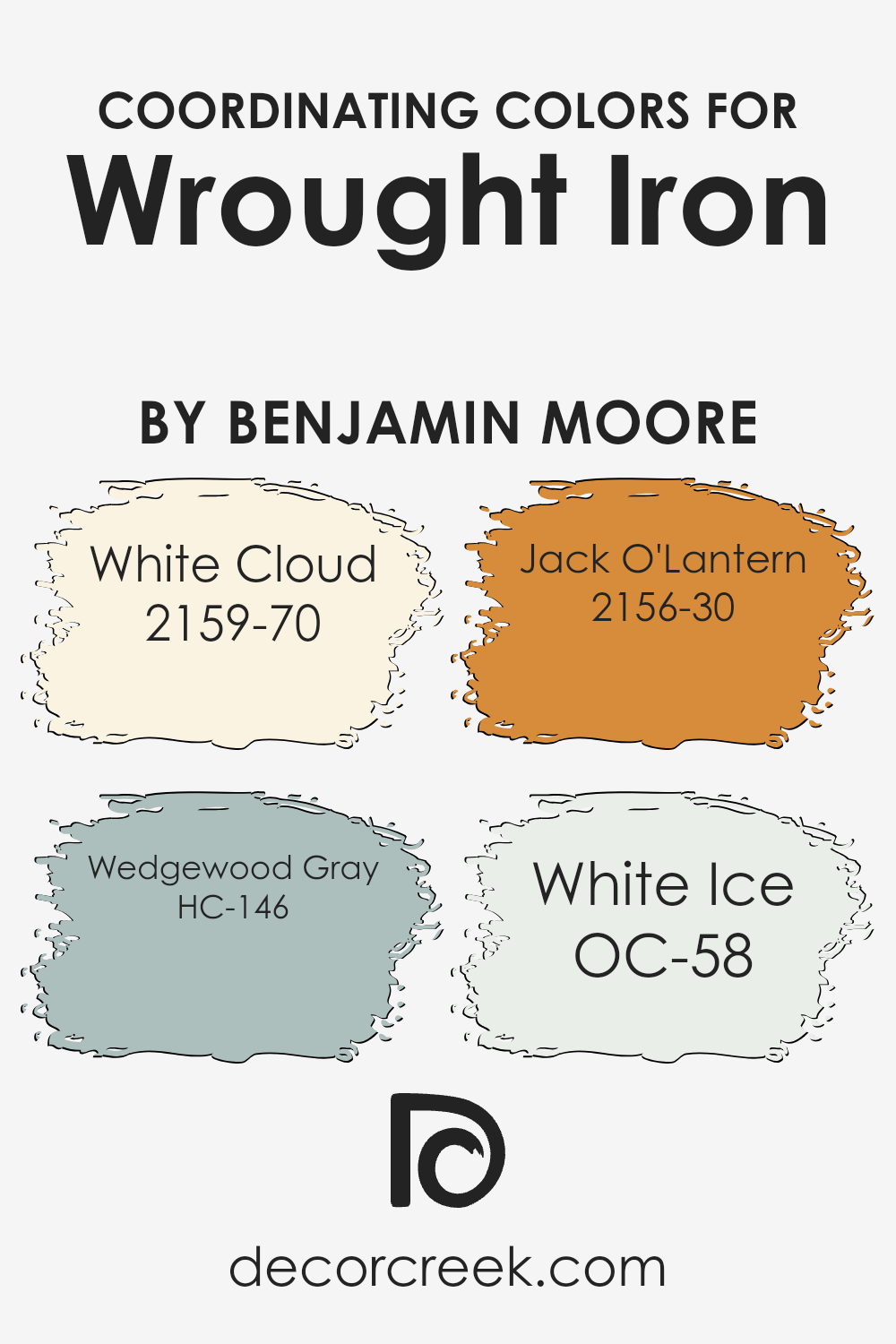
Coordinating Colors of Wrought Iron 2124-10 by Benjamin Moore
Coordinating colors are hues that complement or enhance each other when used together in decor or fashion, creating a balanced and visually appealing look. These colors often share certain undertones or are positioned in a way on the color wheel that they bring out the best in each other.
When decorating with a base color like the sophisticated charcoal hue of Wrought Iron by Benjamin Moore, selecting the right coordinating colors is key to achieving a harmonious design. White Cloud, Wedgewood Gray, Jack O’Lantern, and White Ice are exemplary coordinators that offer a blend of harmony and contrast to Wrought Iron.
White Cloud is a gentle, airy white with a hint of warmth that can lighten up the deep tones of Wrought Iron, providing a fresh and clean appearance. Its subtlety acts like a canvas, allowing bolder colors to stand out. Wedgewood Gray has a serene, soothing quality with a touch of blue-green, offering a natural, calming complement to the darker Wrought Iron. This combination can evoke a sense of tranquility in a space. Jack O’Lantern adds a vibrant pop of orange, injecting energy and warmth into the mix and creating an eye-catching contrast with its lively, spirited character.
Lastly, White Ice is a crisp, cool white with a slight hint of gray, offering a sleek and modern counterbalance that enhances the contemporary feel of Wrought Iron, rounding out the palette with its bright, reflective quality. Together, these coordinating colors work to create a dynamic and well-rounded aesthetic.
You can see recommended paint colors below:
- 2159-70 White Cloud
- HC-146 Wedgewood Gray
- 2156-30 Jack O’Lantern
- OC-58 White Ice
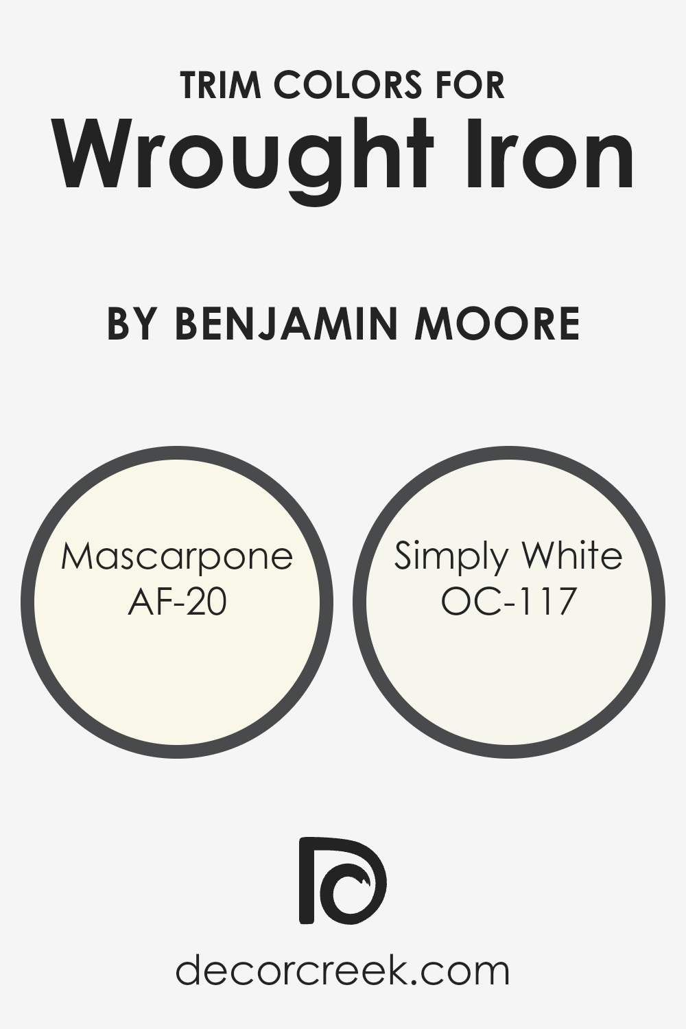
What are the Trim colors of Wrought Iron 2124-10 by Benjamin Moore?
Trim colors are specific shades selected to complement or contrast the primary color of a wall or object for decorative effect. When dealing with a rich and sophisticated hue like Wrought Iron by Benjamin Moore, choosing the right trim colors can significantly enhance the overall appearance of a room or exterior. The choice of trim color can highlight architectural details, create a sense of cohesiveness, or add a pop of brightness to balance darker tones. For this particular shade, trim colors like AF-20 – Mascarpone and OC-117 – Simply White are suggested to provide a beautiful contrast that brings out the depth of the darker hue.
AF-20, known as Mascarpone, is a creamy, off-white hue that offers a soft and warm contrast against darker colors, making it an ideal complement to the deep tones of Wrought Iron. This color has the ability to add a layer of richness and warmth to spaces, making intricate details stand out without overwhelming the senses.
OC-117, or Simply White, on the other hand, is a clean and bright white that provides a crisp and refreshing look. It brings an element of lightness and clarity to the mix, highlighting the sophisticated darkness of Wrought Iron without competing for attention. Together, these trim colors can dramatically elevate the aesthetic appeal of a space, creating a balanced and inviting atmosphere.
You can see recommended paint colors below:
- AF-20 Mascarpone
- OC-117 Simply White
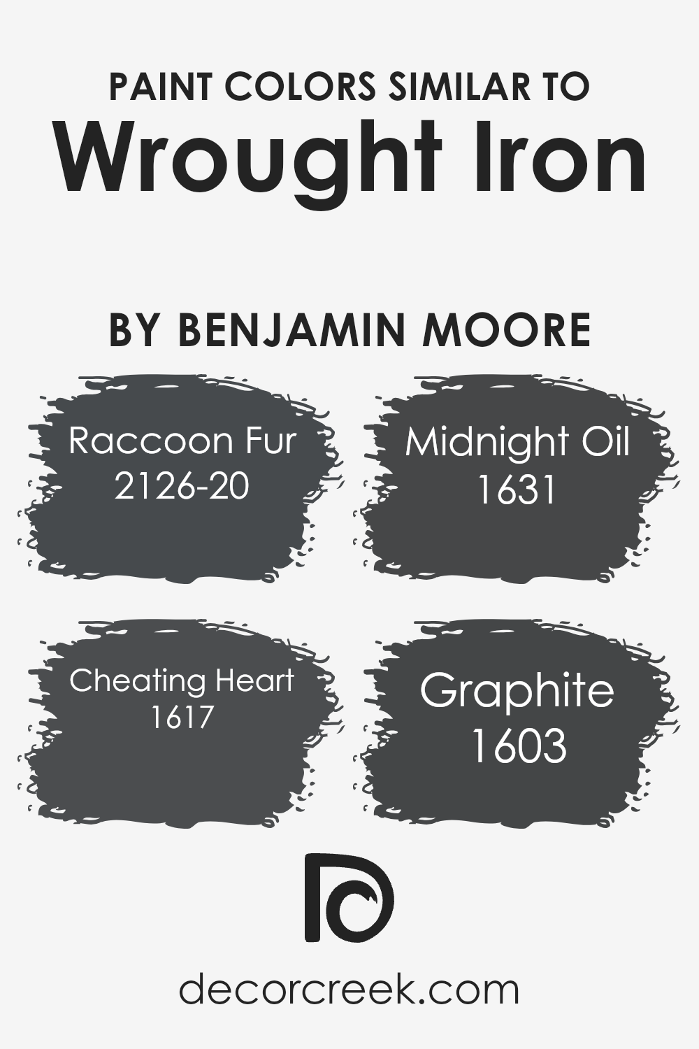
Colors Similar to Wrought Iron 2124-10 by Benjamin Moore
Choosing similar colors to Wrought Iron by Benjamin Moore is important because it helps create a cohesive and harmonious aesthetic in any space. Similar colors work together by sharing an underlying tone or intensity, making the transition between them smooth and pleasing to the eye.
For example, when decorating a room, using colors like Raccoon Fur, Cheating Heart, Midnight Oil, and Graphite alongside Wrought Iron can add depth and dimension without creating a jarring effect. This approach is particularly useful in achieving a sophisticated and layered look, which is often desired in interior design.
These colors, while each unique, share a common base that makes them work well together, allowing for a versatile palette that can suit various styles and preferences.
Raccoon Fur has a deep, charcoal gray shade that exudes warmth, making it perfect for creating cozy spaces. Cheating Heart is slightly lighter, offering a soft, enveloping feel that’s both inviting and elegant. Midnight Oil takes a turn towards the navy side of the spectrum, providing an excellent way to introduce a touch of color while maintaining the muted theme.
Lastly, Graphite showcases a lighter gray, offering a subtle contrast to the deeper shades, making it ideal for highlighting architectural features or as a base color for walls. Together, these colors complement Wrought Iron beautifully, allowing for creative freedom in design while maintaining a cohesive look.
You can see recommended paint colors below:
- 2126-20 Raccoon Fur
- 1617 Cheating Heart
- 1631 Midnight Oil
- 1603 Graphite
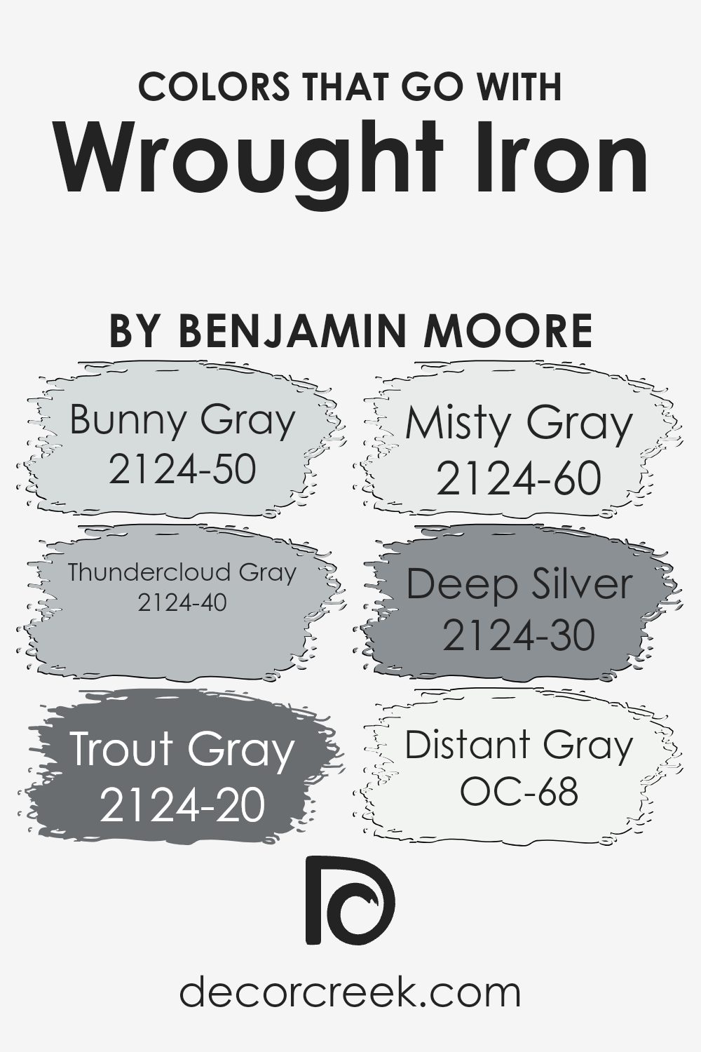
Colors that Go With Wrought Iron 2124-10 by Benjamin Moore
Choosing the right colors to complement Wrought Iron 2124-10 by Benjamin Moore is crucial because it ensures that your space achieves a coherent and visually appealing look. Wrought Iron is a versatile, deep, almost black hue that acts as an anchor, providing a grounding effect in any room.
When paired with compatible colors, such as Bunny Gray, Thundercloud Gray, Trout Gray, Misty Gray, Deep Silver, and Distant Gray, it creates a sophisticated palette that can enhance the aesthetic appeal of any space. These complementary colors work together to balance the darkness of Wrought Iron, adding dimension and softness to the overall design.
Bunny Gray 2124-50 is a light, soothing gray with a hint of warmth, making it perfect for creating a serene and inviting atmosphere. It contrasts beautifully with the depth of Wrought Iron, offering a subtle lift to spaces. Thundercloud Gray 2124-40 is a medium gray that carries a bit more intensity, adding a dramatic yet balanced backdrop that works well in contemporary settings. Trout Gray 2124-20 is a darker shade that leans towards charcoal, providing a bold yet refined look that enriches the depth of Wrought Iron. Misty Gray 2124-60 is on the lighter side, introducing airiness and light to counterbalance Wrought Iron’s solidity. Deep Silver 2124-30, a rich gray with noticeable depth, offers a sophisticated blend that enhances the complexity of the space. Lastly, Distant Gray OC-68 is almost white, offering a crisp, clean contrast that makes Wrought Iron stand out even more. Together, these colors create a harmonious and dynamic palette that elevates the appearance of any room.
You can see recommended paint colors below:
- 2124-50 Bunny Gray
- 2124-40 Thundercloud Gray
- 2124-20 Trout Gray
- 2124-60 Misty Gray
- 2124-30 Deep Silver
- OC-68 Distant Gray
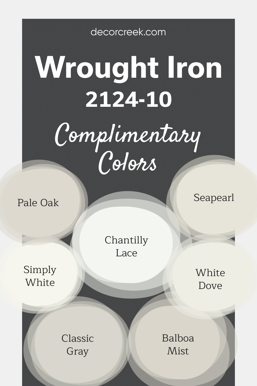
Complimentary Colors Wrought Iron 2124-10 Paint Color by Benjamin Moore
Wrought Iron by Benjamin Moore is a bold, deep shade that adds a touch of elegance to any space. It pairs beautifully with bright whites like Chantilly Lace, White Dove, and Simply White for a sharp, clean contrast. These lighter shades enhance the richness of Wrought Iron, creating a striking yet balanced design.
For a more neutral look, Pale Oak, Classic Gray, Balboa Mist, and Sea Pearl offer soft, understated options that complement Wrought Iron without overpowering it.
This versatile palette can suit both modern and classic interiors, making it easy to create a stylish and cohesive space.
How to Use Wrought Iron 2124-10 by Benjamin Moore In Your Home?
Wrought Iron 2124-10 by Benjamin Moore is a versatile paint color that brings sophistication and depth to any space in your home. Perfect for those who love a bold statement, it pairs beautifully with a wide range of decor styles. Whether you’re updating a single room or transforming your entire home, this shade can easily complement both modern and traditional designs.
You can use Wrought Iron 2124-10 in your living room or bedroom to create a cozy, inviting atmosphere. Applying it on a feature wall can add dramatic flair, making your space feel more luxurious. It’s also an excellent choice for exterior doors and trim, offering a stately contrast to lighter house colors.
In kitchens or dining areas, cabinets painted in this deep, rich hue can provide a stunning backdrop to dishes and appliances, making the space feel grounded and stylish. Bathrooms benefit too, with Wrought Iron giving a spa-like quality to walls or vanity cabinets.
Remember, a little goes a long way. Pairing this color with lighter tones and ample lighting can prevent rooms from feeling too dark. With its timeless elegance, Wrought Iron 2124-10 offers endless possibilities to beautify your home.
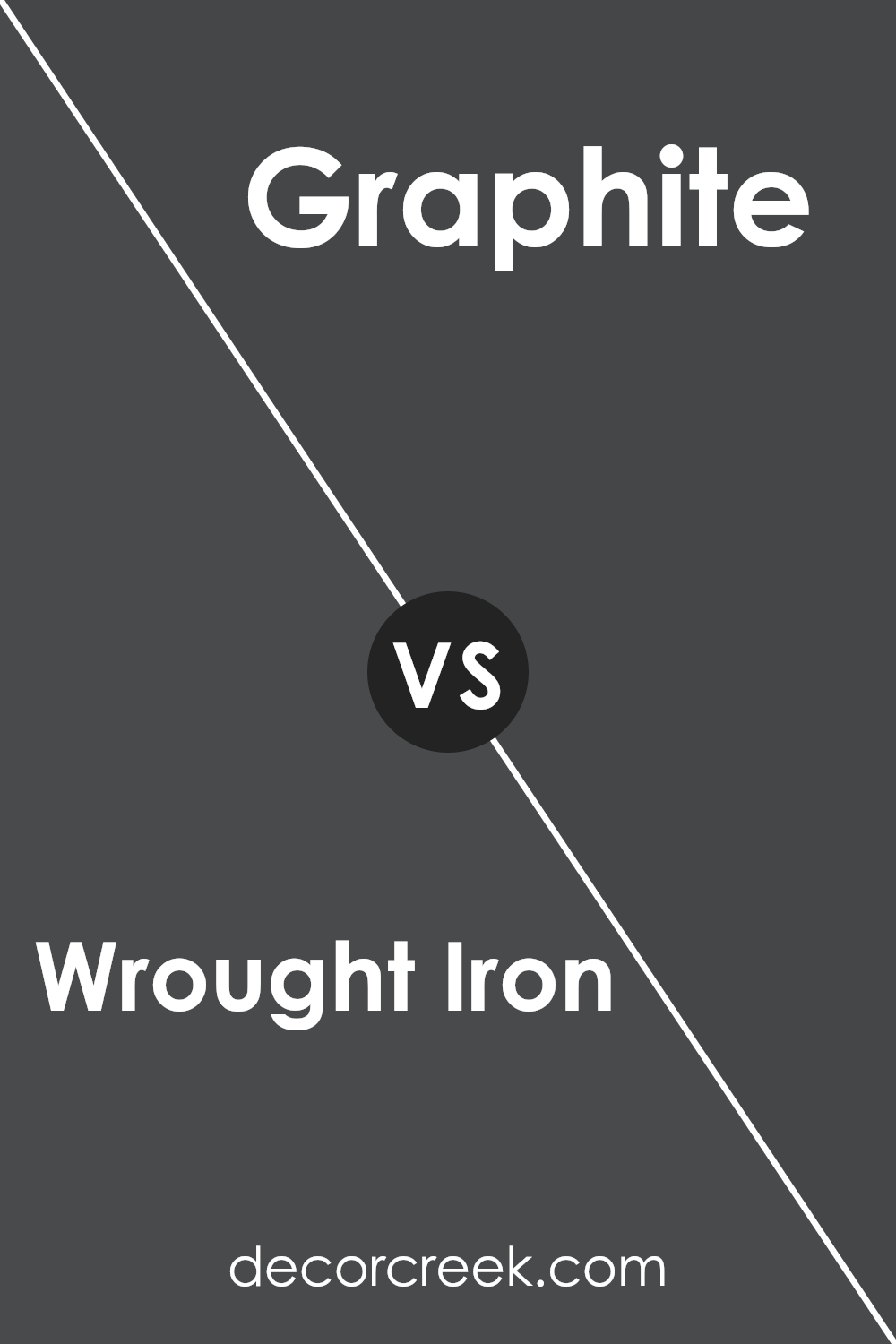
Wrought Iron 2124-10 by Benjamin Moore vs Graphite 1603 by Benjamin Moore
Comparing Wrought Iron by Benjamin Moore to Graphite by the same brand, you get a sense of how different two dark shades can be. Firstly, Wrought Iron is a deep, rich color that seems almost pure black in low light. It’s powerful for creating a bold statement in any room, giving a solid, classic look without being too overbearing.
On the other hand, Graphite has a slightly lighter touch. It’s not as intense as Wrought Iron, carrying more of a gray tone. This makes Graphite more versatile for spaces where you want depth without the heaviness of a near-black color. It works well in areas needing that grey sophistication but with a hint of softness.
Both these colors provide unique options for home decor, offering a dark elegance that’s hard to match. Whether you’re looking for the depth and intensity of Wrought Iron or the softer, more flexible charm of Graphite, Benjamin Moore has got you covered.
You can see recommended paint color below:
- 1603 Graphite
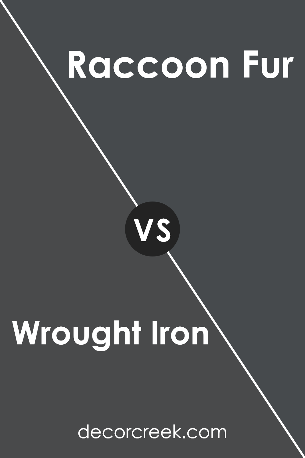
Wrought Iron 2124-10 by Benjamin Moore vs Raccoon Fur 2126-20 by Benjamin Moore
Wrought Iron and Raccoon Fur, both by Benjamin Moore, are unique shades that bring a sophisticated touch to any space. Wrought Iron is a deep, almost black gray that has an elegance making it versatile for both modern and traditional settings. It’s like the strong, silent type that stands firm in its richness without overwhelming a room.
On the other hand, Raccoon Fur steps into the room with a slightly softer approach. While it’s also dark, it leans more towards a navy blue undertone, giving it a cooler feel compared to Wrought Iron’s solid gray base. This color can add depth to spaces, making them cozy yet stylish.
Both colors are perfect for those wanting to add a touch of drama without going for pure black. Wrought Iron is your go-to for a more grounded, earthy vibe, while Raccoon Fur is ideal if you want that hint of color while staying in the darker palette. Either way, you can’t go wrong with these tones for creating striking spaces.
You can see recommended paint color below:
- 2126-20 Raccoon Fur
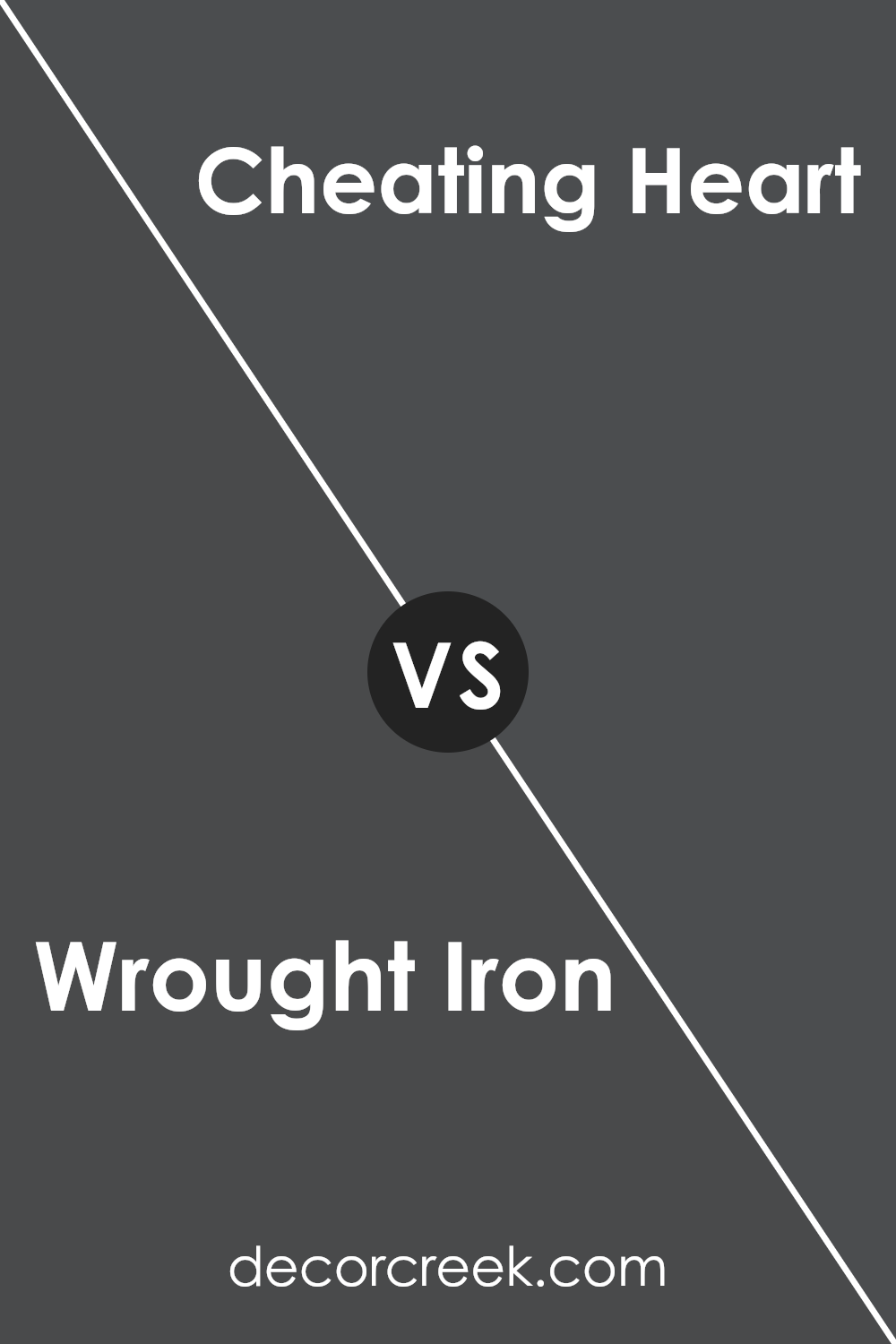
Wrought Iron 2124-10 by Benjamin Moore vs Cheating Heart 1617 by Benjamin Moore
The main color we’ll talk about is Wrought Iron by Benjamin Moore, a bold and sophisticated shade that’s like a dark charcoal with a touch of navy blue. It’s almost like the color of a stormy sea at dusk, balancing between gray and blue. Now, if we look at Cheating Heart by Benjamin Moore, it’s another dark color but with a twist. Cheating Heart is more like a deep, rich gray that leans towards black, creating a feeling of elegance and mystery. This shade could remind someone of the smooth, dark surface of a well-used chalkboard.
Although both colors share a dark and moody vibe, Wrought Iron has a hint of blue, giving it a unique but subtle warmth. On the other hand, Cheating Heart feels cooler, edging closer to black without losing its depth. If you’re trying to decide between the two for a room, think about the mood you want.
Wrought Iron might offer a touch of color and warmth, while Cheating Heart provides profound depth and a classic, timeless look.
You can see recommended paint color below:
- 1617 Cheating Heart
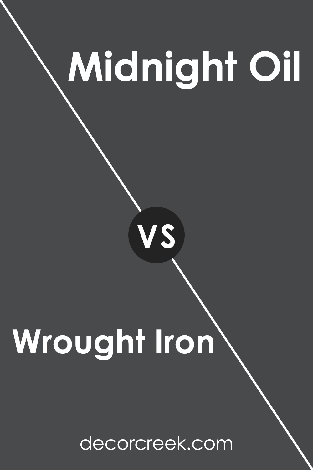
Wrought Iron 2124-10 by Benjamin Moore vs Midnight Oil 1631 by Benjamin Moore
Wrought Iron by Benjamin Moore is a deep, rich gray with a hint of navy blue, giving it a sophisticated and versatile appearance. This color is incredibly popular for adding a touch of elegance without the starkness of black. It’s perfect for creating a statement in any space, offering depth and dimension without overwhelming the room.
On the other hand, Midnight Oil by Benjamin Moore is a slightly darker shade that leans more towards the navy side of things. While it still retains some of the characteristics of a deep gray, the blue undertones are more pronounced, creating a cozy and enveloping atmosphere. This color is ideal for those looking to add a bit of drama and intensity to their space, making it feel more enclosed and snug.
Both colors are quite similar in their dark base, but the key difference lies in their undertones and the overall mood they set. Wrought Iron is more neutral and flexible, making it easier to pair with various decor styles, while Midnight Oil offers a bolder statement with its deeper blue influence, perfect for creating a focused and serene environment.
You can see recommended paint color below:
- 1631 Midnight Oil
Conclusion
Wrought Iron by Benjamin Moore is a versatile and sophisticated color choice that can add depth and character to any space. Ideal for those looking to achieve a bold yet elegant look, this shade acts as a stunning backdrop that complements a wide range of decor styles. Its unique blend creates a striking balance, ensuring that it stands out in a room without overwhelming it. This color proves itself as a timeless choice for both modern and traditional settings, offering a perfect blend of strength and style.
Choosing Wrought Iron for your next project means you’re selecting a color that brings a sense of richness and luxury to your space. Whether applied to accent walls, cabinets, or exterior details, this shade’s flexibility in fitting with various color schemes and materials highlights its appeal.
As homeowners and designers alike look for colors that offer a significant impact yet have the ability to blend seamlessly with different elements, Wrought Iron emerges as a top contender. Its ability to uplift spaces with its deep, refined tone has made it a beloved choice for those aiming to create an atmosphere of sophistication and elegance.

Ever wished paint sampling was as easy as sticking a sticker? Guess what? Now it is! Discover Samplize's unique Peel & Stick samples.
Get paint samples

