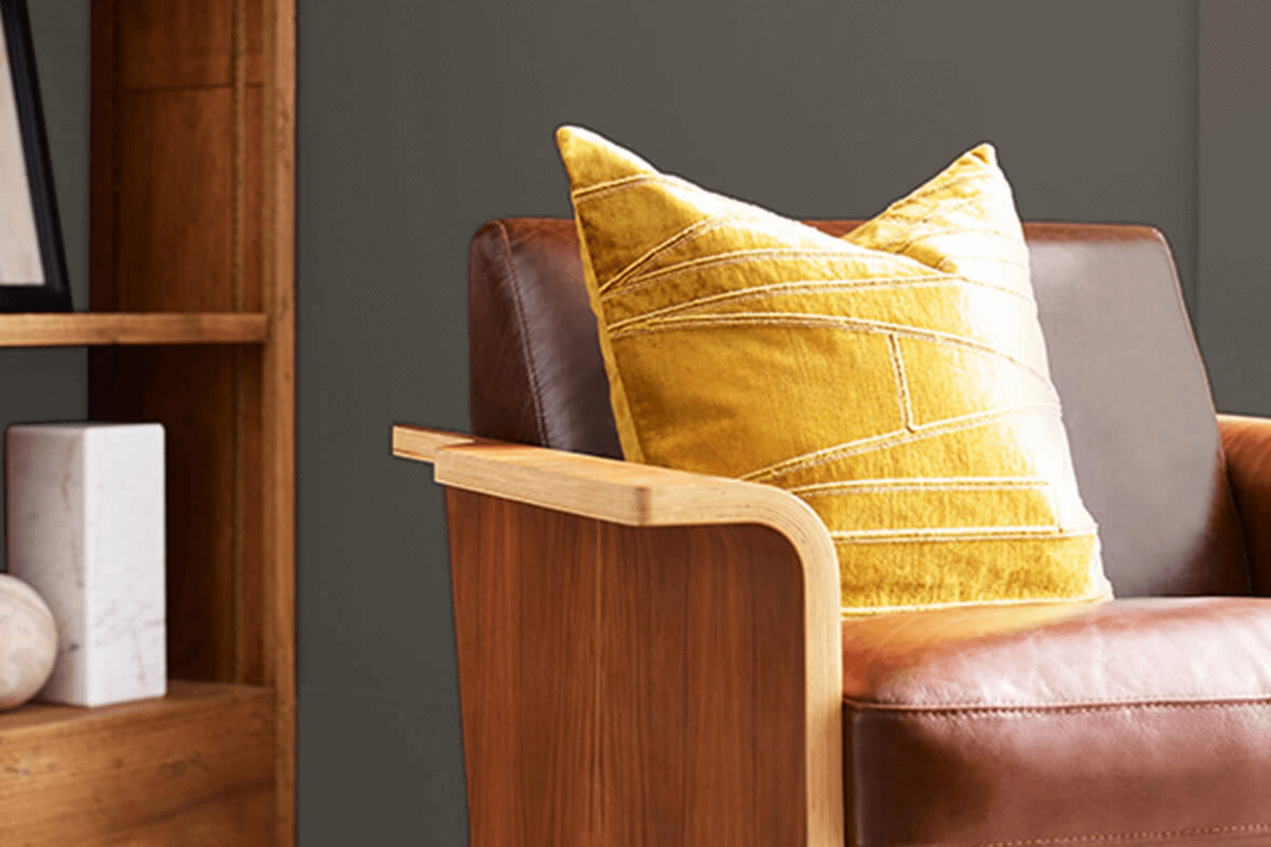
Let me introduce you to SW 9620 Prelude by Sherwin Williams, a color that has significantly changed the atmosphere in my own home. This particular shade carries a subtle charm that enhances the surroundings without overwhelming them. Its versatility allows it to smoothly fit into various décor styles, whether your home features a modern, minimalist look or a more traditional setting.
As a homeowner, finding a paint that not only looks good but also complements the existing elements of your space is always a challenge. SW 9620 Prelude offers a balanced blend that works beautifully in sun-filled rooms and under artificial lighting, maintaining its consistency throughout different times of the day.
This color has allowed me to refresh my space and give it a fresh, inviting look that impresses guests and makes everyday living more enjoyable.
Let me guide you through how SW 9620 Prelude can enhance your home’s aesthetics, offering a fresh palette that can revitalize any room without requiring a complete overhaul of your existing décor.
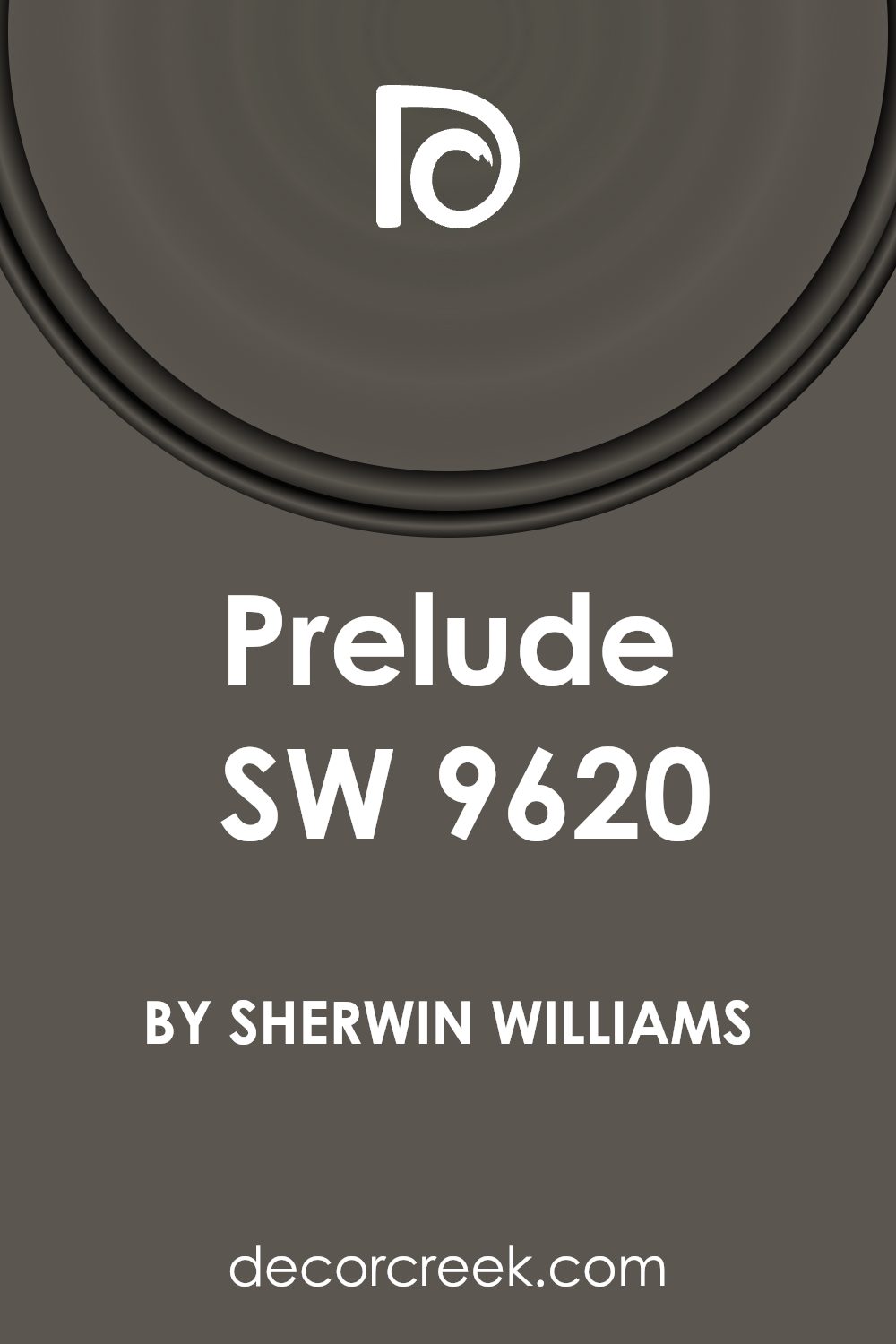
What Color Is Prelude SW 9620 by Sherwin Williams?
“Prelude” by Sherwin Williams is a versatile and homely color that adds a layer of subtle elegance to any room. It’s a soft, muted beige with warm undertones, making it perfect for creating a cozy and welcoming atmosphere. The color has a soothing quality but remains neutral and gentle, ensuring it doesn’t overwhelm the space.
This shade is ideal for various interior styles, especially rustic, modern farmhouse, and traditional decor. In a rustic setting, “Prelude” complements natural materials like wood and stone beautifully, enhancing the earthy elements without competing for attention. In modern farmhouse interiors, it pairs well with shiplap walls and distressed wood textures, facilitating a light and airy feel.
For traditional rooms, it provides a clean backdrop that works well with classic furniture pieces and rich textures like velvet or silk. “Prelude” also coordinates excellently with a range of materials. Alongside natural wood, it brings out the organic beauty of the grain. When paired with metal finishes like brass or copper, it offers a subtle contrast that is both inviting and stylish.
Its compatibility with various fabrics and textures – from linen to chunky knits – makes it a go-to color for designers looking to create a harmonious space. Whether used on walls, as a color for cabinets, or as an accent, “Prelude” adds a gentle touch of warmth to any interior.
Is Prelude SW 9620 by Sherwin Williams Warm or Cool color?
PreludeSW 9620 by Sherwin Williams is a soft and subtle color that fits well in any home. Its light, soothing shade can make small spaces appear bigger and brighter. Because of its neutral tone, it blends easily with other colors. Whether pairing it with bold shades as an accent wall or with soft tones for a more muted look, it keeps the room feeling fresh and welcoming.
It’s especially good in bedrooms and living areas where you want a calm, relaxed atmosphere. It can calm down sunny rooms without making them feel cold or darker. This versatility ensures it matches well with various furniture styles, from modern to traditional.
Many homeowners like using it in entryways and bathrooms too because it provides a clean and gentle backdrop, making these spaces appear more open and airy. Overall, this color is practical for anyone looking to refresh their space without overwhelming it with too intense colors.
Undertones of Prelude SW 9620 by Sherwin Williams
PreludeSW 9620 is a versatile color that contains a mixture of various undertones, affecting its overall appearance and how it is perceived in different settings. The undertones for this color range across a spectrum including browns, greens, grays, purples, and more. Each undertone adds a unique dimension to the color, subtly influencing its visual impact and how it complements other colors and elements in a room.
Undertones are like the hidden flavors in a color that can become more apparent under different lighting conditions or when paired with other colors. For instance, brown undertones can add warmth to a space, making it feel cozier and more inviting, while gray undertones provide a neutral base that works well with modern décor. Green undertones might bring in a touch of nature and freshness, particularly in a space with lots of natural light.
When applied to interior walls, the undertones in PreludeSW 9620 can subtly alter the mood and style of the room. For example, the presence of purple undertones can lend a slight touch of luxury and warmth, ideal for living areas or bedrooms. In contrast, the Naval and dark turquoise undertones can help create a more grounded, calm environment, suitable for offices or studies. The combination of these undertones means that PreludeSW 9620 can adapt flexibly to various decorative styles and preferences, making it an excellent choice for those who want a color that ties together multiple elements within a room.
Its ability to respond dynamically to different lights and settings also makes it a practical choice for any space that experiences changes in natural or artificial lighting.
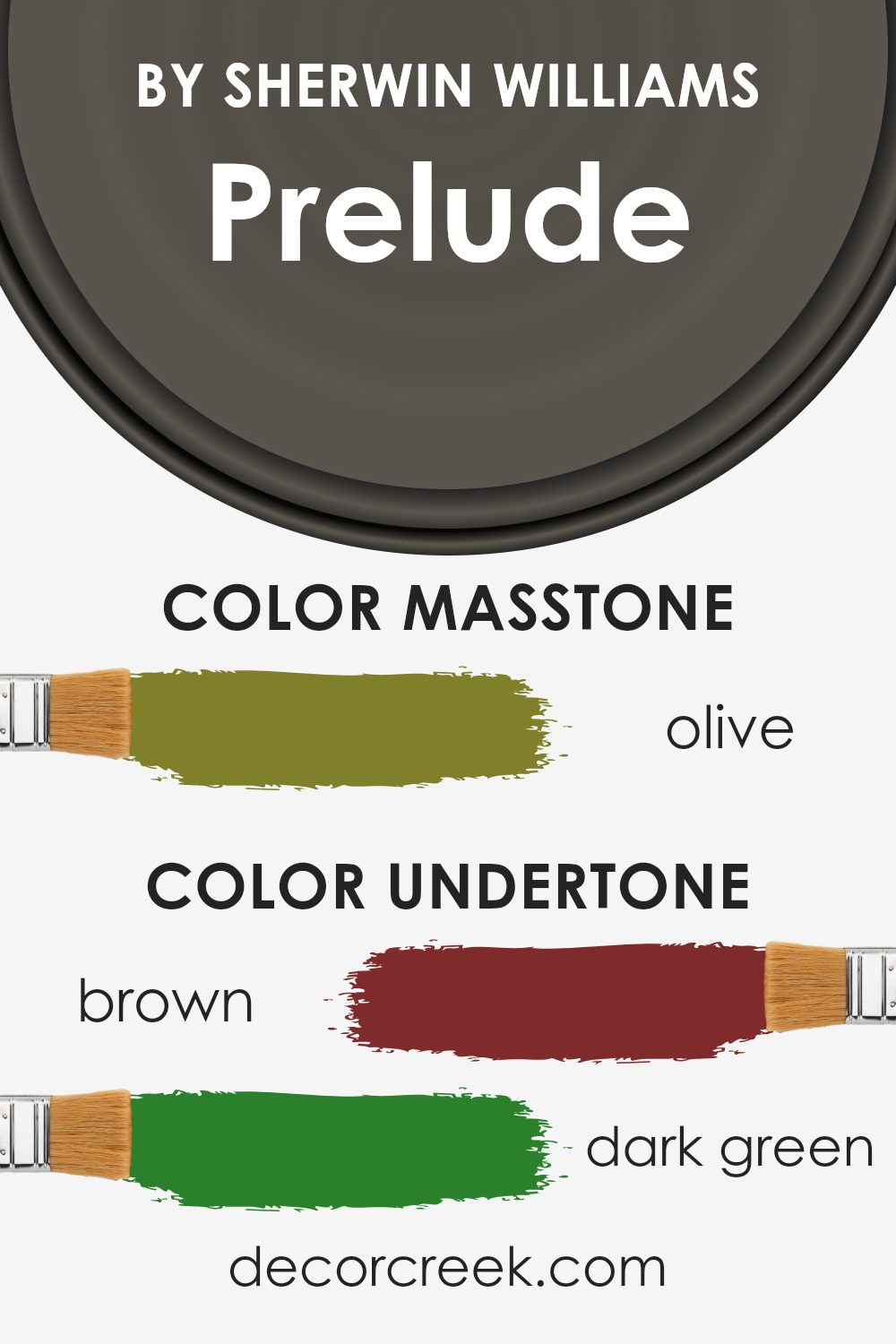
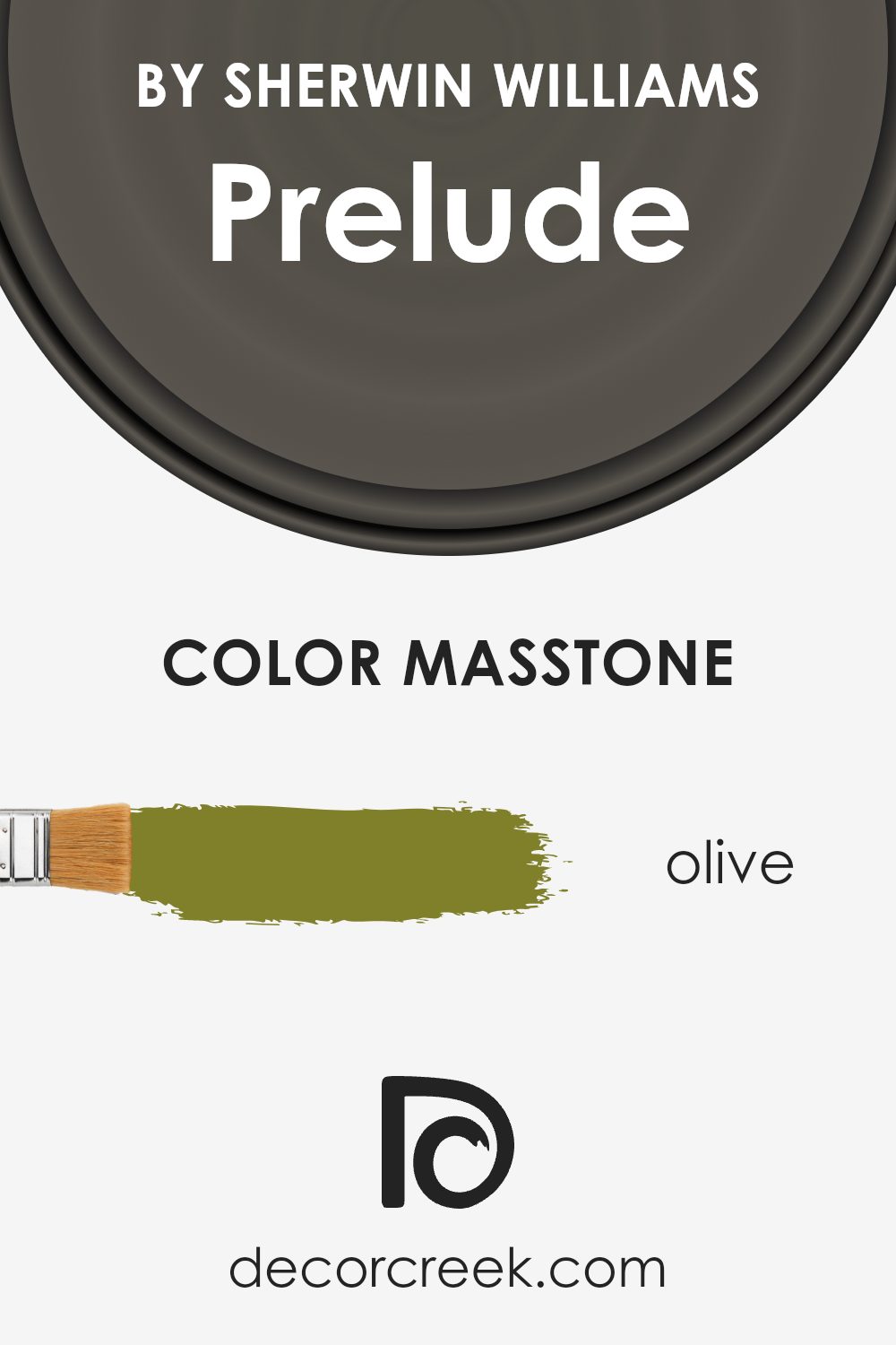
What is the Masstone of the Prelude SW 9620 by Sherwin Williams?
The masstone of Olive (#80802B), as seen in PreludeSW 9620 by Sherwin Williams, brings a warm, earthy tone to any room. This shade of olive is a dark, muted green that pairs well with natural materials and colors, making it great for spaces that aim for a cozy, inviting atmosphere. When used on walls, it provides a comforting backdrop that tends to make large spaces feel more intimate and grounded.
This particular color is versatile enough to fit into various home styles, from rustic to modern. It works exceptionally well in areas that receive a lot of natural light, as the sunlight softens and enhances the green, making the room feel alive and fresh.
Furniture and decor in lighter colors like creams and beiges or rich browns can stand out against this Olive backdrop, creating a beautiful contrast. This color can also hide smudges or marks well, which makes it practical for high-traffic areas in a home.
How Does Lighting Affect Prelude SW 9620 by Sherwin Williams?
Lighting plays a crucial role in how colors appear in different environments. The color we see is influenced by the type of light under which it is viewed. Each light source, whether it’s artificial or natural, can drastically change the perception of a color. For example, the shade Prelude by Sherwin Williams might look different in various lighting conditions.
In artificial light, such as that from incandescent bulbs, colors can appear warmer, enhancing the yellowish or reddish tones. If Prelude is used in a room with a lot of warm artificial lighting, it may take on a cozier, slightly more muted tone, because artificial lights tend to soften the intensity of colors.
In contrast, under natural light, colors are usually seen in their truest form. Natural light, especially sunlight, provides a range of color wavelengths and thus can bring out the most vibrant aspects of a color. If a room painted with Prelude receives a lot of natural sunlight, the color might appear sharper and more dynamic.
The direction a room faces also affects how colors like Prelude are perceived due to varying levels of sunlight throughout the day:
1. North-Faced Rooms: These rooms get less direct sunlight, which can make colors appear cooler and slightly more subdued. In north-facing rooms, Prelude might look more neutral and calm, with a soft, elegant finish.
2. South-Faced Rooms: These rooms are filled with plenty of bright, natural light for the majority of the day. Here, Prelude can look very lively and vibrant, with its true color showing through effectively.
3. East-Faced Rooms: These receive a lot of light in the morning but less in the afternoon. In the morning, Prelude will appear bright and cheerful, whereas in the afternoon, it might take on a softer tone as the light fades.
4. West-Faced Rooms: The exact opposite of east-faced rooms, they get a lot of sunlight in the afternoon. Prelude in these rooms will be mellow and gentle in the mornings but become vivid and warm in the evenings.
Understanding these nuances can help in deciding where to apply different colors for desired effects in home or office spaces.

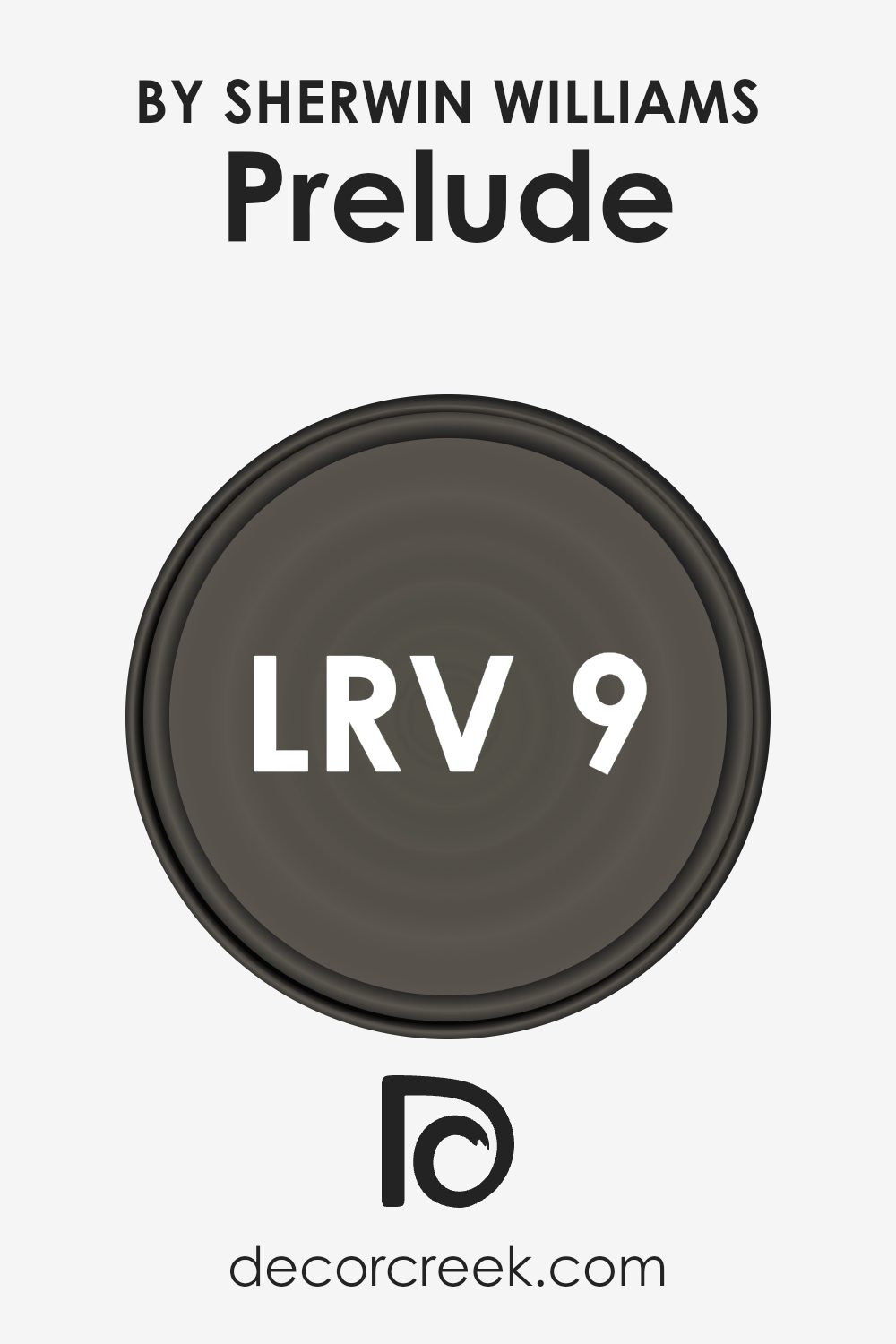
What is the LRV of Prelude SW 9620 by Sherwin Williams?
LRV stands for Light Reflectance Value, which is a measure used to express the percentage of light a paint color reflects from or absorbs into a painted surface. Simply put, it tells you how bright or dark a color will look once it’s on your walls. Higher values indicate that the color reflects more light, making a room feel lighter and potentially larger.
Conversely, colors with lower values absorb more light, which can make a space feel cozier but smaller and darker. This measurement is particularly helpful when deciding how a color might alter the appearance and mood of a room under different lighting conditions.
For the color in question, with an LRV of 9.451, it is on the darker end of the scale. It means this color will absorb a significant amount of light, rather than reflecting it. When applied to walls, this darker shade will add a sense of depth and can enhance a warm, intimate atmosphere in the space.
However, in rooms with limited natural light or smaller spaces, using a color with such a low LRV might make the room feel even smaller and darker. It is ideal for larger rooms or areas where you want to create a more grounded, cozy feel, and it should be balanced with lighter colors or good lighting to ensure the space doesn’t become too enclosed.
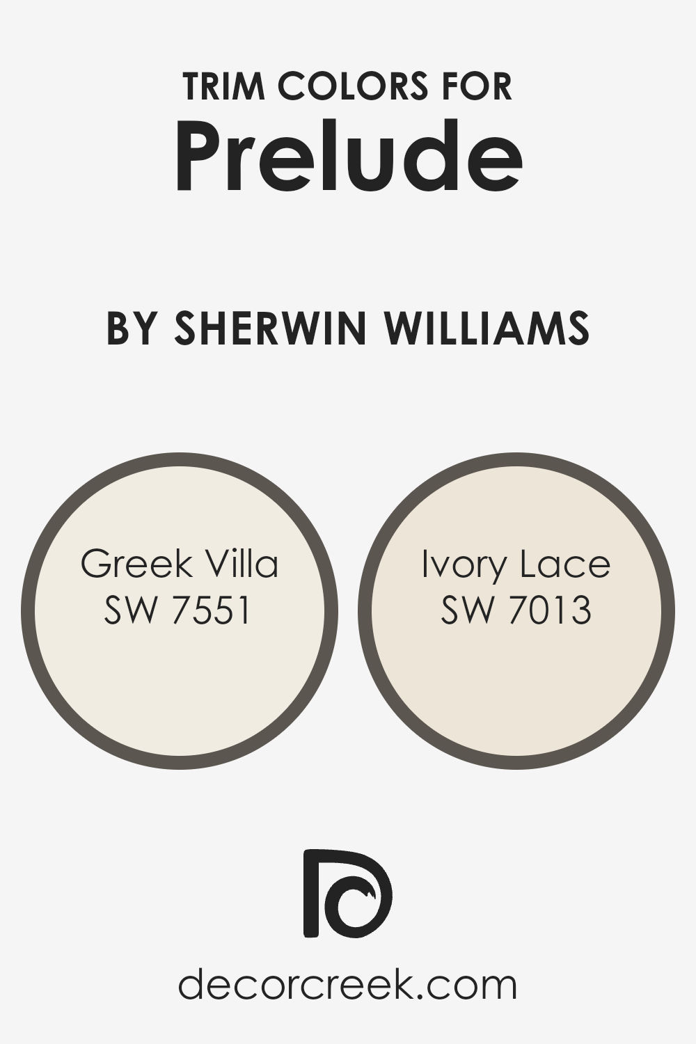
What are the Trim colors of Prelude SW 9620 by Sherwin Williams?
Trim colors are specific shades used on the architectural features of a room, such as window frames, doors, baseboards, and moldings. These colors are essential in defining and highlighting the intricate details of these features, setting them apart from the main wall colors.
For example, using colors like SW 7551 – Greek Villa and SW 7013 – Ivory Lace as trim colors against a color like PreludeSW 9620 can make the trim pop and add a subtle contrast that enhances the overall aesthetic of the space. The right trim color can accentuate architectural elements, draw attention to details, and create a pleasing outline around different areas of a room.
SW 7551 – Greek Villa is a warm, creamy white that offers a soft, welcoming touch when used as a trim color. It smoothly complements deeper, nuanced hues, providing a gentle contrast without overwhelming the base color. On the other hand, SW 7013 – Ivory Lace, with its slightly deeper tone, offers a hint of coziness and richness.
It works exceptionally well as a trim color by providing a slightly more pronounced but still soft contrast against richer wall colors, increasing the visual interest of the space without making it feel cluttered or overly distinct from the main color theme.
You can see recommended paint colors below:
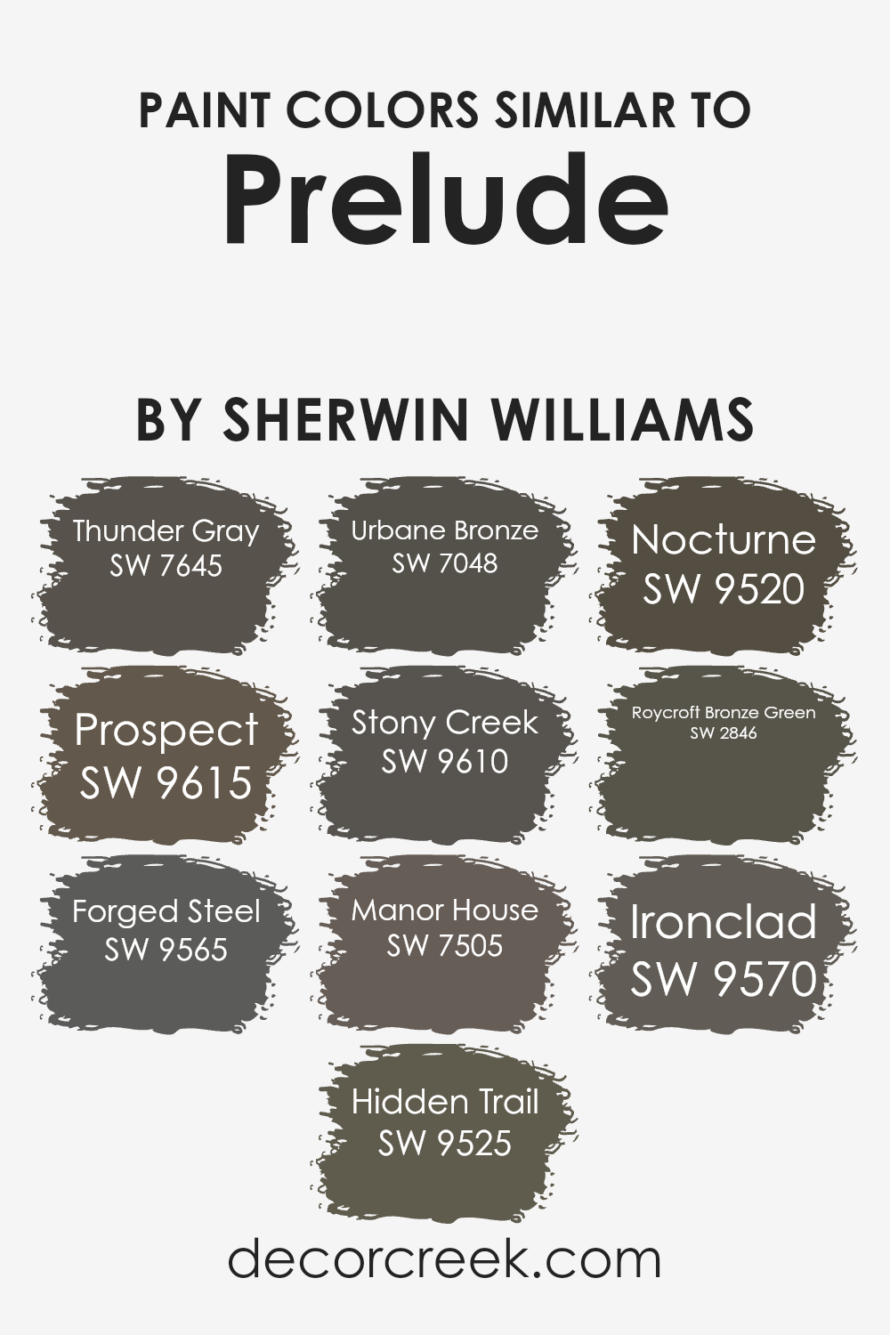
Colors Similar to Prelude SW 9620 by Sherwin Williams
Choosing similar colors in interior design can help create a cohesive and consistent look throughout a room or home. When colors are close in hue or intensity, they blend seamlessly and offer a subtle distinction that enriches the environment without overwhelming the senses. For example, Thunder Gray is a deep, moody gray that brings a sense of grounding to spaces, while Prospect, another gray shade, is slightly lighter and works well to soften room edges without causing a stark contrast.
Forged Steel adds a touch of metallic flair to this palette, reflecting light in a way that can make a space feel more dynamic. Hidden Trail is another neutral, earthy tone that pairs beautifully with natural materials like wood or stone, enhancing the organic feel of a room.
Urbane Bronze goes deeper, adding a rich, dark anchor that can help define different areas or features within a space. Stony Creek has an earthy, gray-green undertone that lends itself well to spaces that aim for a connection to the outdoors or a naturalistic style.
Further along the spectrum, Manor House offers a classic, sturdy presence with its darker gray façade, which pairs well with lighter colors for an elegant contrast. Nocturne steps into the realm of near-blacks, excellent for drawing attention to furniture or artwork as focal points.
Roycroft Bronze Green has a unique vintage appeal with its bronze-green undertone, ideal for adding a touch of nostalgia or depth. Lastly, Ironclad, a dark gray with a slight industrial tone, works effectively in modern spaces, complementing metallic fixtures and contemporary decor. Each of these colors can be used interchangeably to maintain a fluid theme, yet each one also holds its own character, providing versatility in design choices.
You can see recommended paint colors below:
- SW 7645 Thunder Gray
- SW 9615 Prospect
- SW 9565 Forged Steel
- SW 9525 Hidden Trail
- SW 7048 Urbane Bronze
- SW 9610 Stony Creek
- SW 7505 Manor House
- SW 9520 Nocturne
- SW 2846 Roycroft Bronze Green
- SW 9570 Ironclad
How to Use Prelude SW 9620 by Sherwin Williams In Your Home?
Prelude SW 9620 by Sherwin Williams is a paint color that brings a fresh and bright feeling to any room in your home. With its soft and welcoming hue, Prelude is great for spaces where you want to create a cozy and inviting atmosphere.
You can use this color in various ways around your home. For example, painting your living room walls with Prelude can make the space feel more open and airy, making it a delightful spot for relaxing and hosting guests. It’s also perfect for bedrooms, where it can help set a calm mood, essential for a good night’s sleep.
In addition, you could use it in the kitchen or dining area to give a light, clean look that enhances the mood for cooking and dining. With its versatility and pleasant appeal, Prelude is a fantastic choice for anyone looking to refresh their home’s look.
Prelude SW 9620 by Sherwin Williams vs Hidden Trail SW 9525 by Sherwin Williams
The comparison between Prelude and Hidden Trail, both by Sherwin Williams, highlights their distinct tones. Prelude is a soft, light lavender, providing a gentle and soothing vibe ideal for creating a calm, inviting atmosphere in spaces like bedrooms or quiet sitting areas. In contrast, Hidden Trail offers a darker, richer brown shade that gives off a warm and cozy feel, perfect for areas where you want to promote comfort and relaxation, such as living rooms or cozy study areas.
While Prelude hints at a light, airy feel, resembling early morning skies, Hidden Trail suggests the earthiness of a well-trodden forest path. Both colors provide unique feelings: Prelude adds a touch of freshness and light, whereas Hidden Trail focuses on depth and warmth.
Choosing between them would depend on the mood and functionality of the room in question. For lighter, more reflective spaces, Prelude works well, while Hidden Trail fits spaces where a sturdy, comforting presence is beneficial.
You can see recommended paint color below:

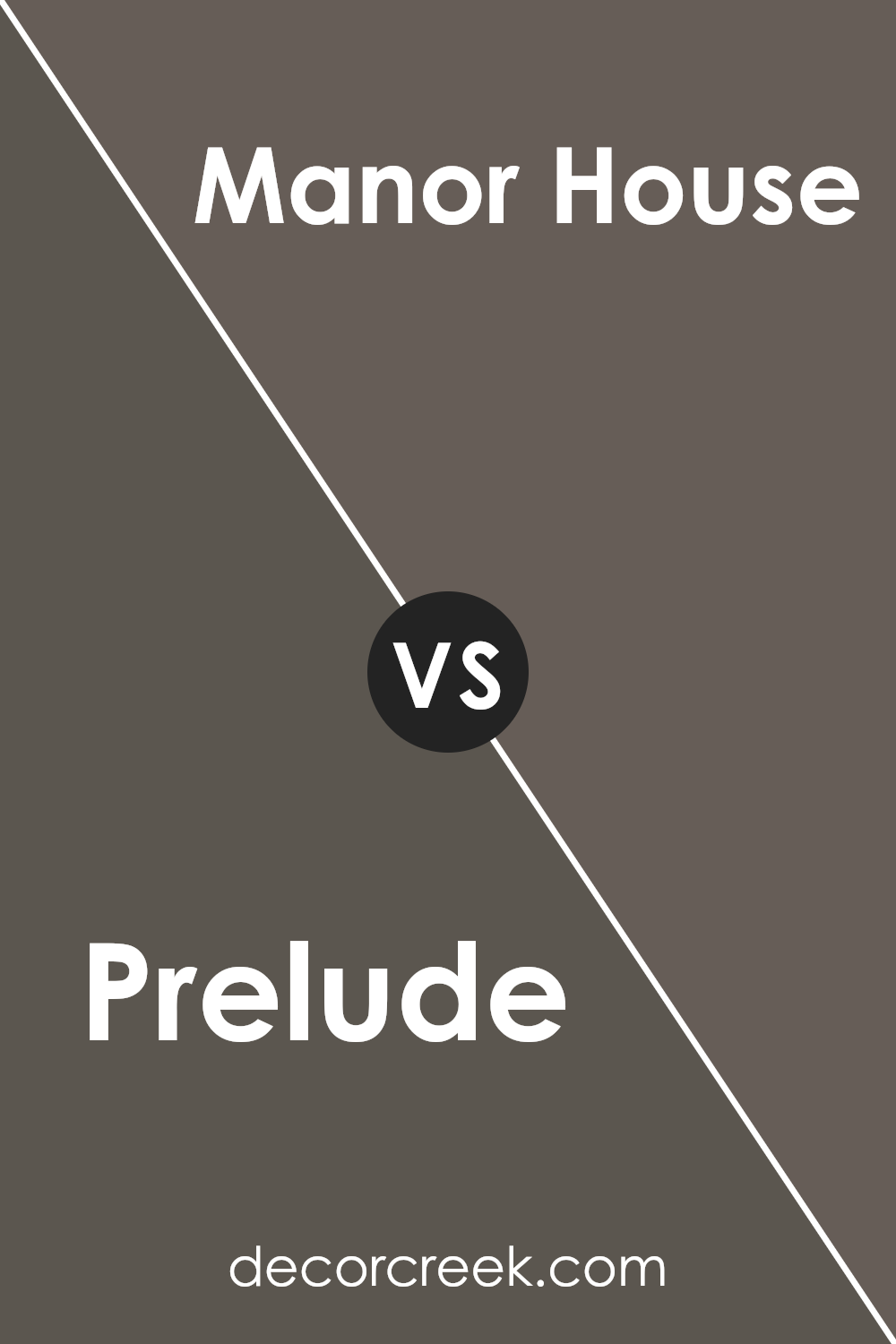
Prelude SW 9620 by Sherwin Williams vs Manor House SW 7505 by Sherwin Williams
Prelude (SW 9620) and Manor House (SW 7505) are both colors from Sherwin Williams, each with its own unique charm. Prelude is a gentle and understated gray with a subtle blue undertone, giving it a fresh and calm appearance. It’s a fantastic choice for creating a soothing backdrop in spaces that seek a touch of modern minimalism without feeling too cold.
On the other hand, Manor House is a deeper, warm gray that leans more towards a classic beige. This color is perfect for adding a cozy and welcoming feel to any room. It pairs beautifully with a wide range of décor styles, from rustic to contemporary, making it quite versatile.
When used in the same space, these colors complement each other well. Prelude could serve as a cool counterbalance to the warmth of Manor House, offering a harmonious blend that can make rooms feel balanced and inviting. Together, they can set a relaxed tone that’s both pleasing and easy on the eyes.
You can see recommended paint color below:
- SW 7505 Manor House
Prelude SW 9620 by Sherwin Williams vs Nocturne SW 9520 by Sherwin Williams
“Prelude” and “Nocturne” by Sherwin Williams are two distinct colors that cater to different moods and settings. “Prelude” is a light and soft beige, offering a neutral backdrop suitable for any room.
It’s bright enough to make small spaces appear larger and has a warm undertone that makes it welcoming. On the other hand, “Nocturne” is a deep charcoal with blue undertones, giving it a stronger presence.
This color is ideal for creating a bold statement, perfect for accent walls or furniture pieces. It can make large spaces feel cozier and adds a dramatic flair to the interior. While “Prelude” reflects more light, enhancing brightness and warmth, “Nocturne” absorbs light, which can either enrich a space’s intimacy or make it seem smaller. Both colors have their unique appeal and can dramatically affect how a room feels and looks.
You can see recommended paint color below:
- SW 9520 Nocturne
Prelude SW 9620 by Sherwin Williams vs Ironclad SW 9570 by Sherwin Williams
Prelude and Ironclad by Sherwin Williams are both unique shades that cater to different aesthetic tastes. Prelude is a soft, gentle grey that carries a subtle warmth. It’s perfect for creating a cozy, inviting atmosphere in spaces like living rooms or bedrooms. Its lightness brings a sense of brightness, making small rooms appear larger.
On the other hand, Ironclad is a much darker, steel-like grey. This color is bold and strong, ideal for making a statement. It suits modern decor styles and works well in formal areas or areas that require a touch of drama, like dining rooms or home offices.
Both colors work well with various decor styles, but while Prelude adds light and softness, Ironclad offers depth and a touch of mystery. Each can be paired with brighter colors or different textures to achieve a balanced interior look. Whether you want a room that feels welcoming or striking, these colors provide great starting points.
You can see recommended paint color below:
- SW 9570 Ironclad
Prelude SW 9620 by Sherwin Williams vs Urbane Bronze SW 7048 by Sherwin Williams
Prelude and Urbane Bronze, both by Sherwin Williams, are unique shades that offer distinct vibes for interior spaces. Prelude is a subtle, soft neutral with hints of beige and gray, providing a clean and calm atmosphere.
It’s versatile and works well in any room, enhancing other colors without overpowering them. On the other hand, Urbane Bronze boasts a much darker, richer tone, almost leaning towards a deep brown with grayish undertones. This color is bold and makes a statement, excellent for accent walls or on cabinetry for a touch of drama and depth.
While Prelude brings light and airiness to a space, Urbane Bronze adds warmth and a cozy feel, making spaces feel more grounded. Depending on your decor goals, you can use Prelude for a light, airy feel or Urbane Bronze for a more grounded, cozy ambiance.
You can see recommended paint color below:

Prelude SW 9620 by Sherwin Williams vs Thunder Gray SW 7645 by Sherwin Williams
Prelude SW 9620 and Thunder Gray SW 7645, both by Sherwin Williams, present unique shades that can significantly alter the feel of a space. Prelude is a soft, muted lavender-gray that offers a gentle and soothing appeal, ideal for creating a restful environment. Its subtle purple undertones bring a touch of warmth, making it a perfect choice for bedrooms or quiet sitting areas.
On the other hand, Thunder Gray is a deeper, more intense color. This shade is a dark charcoal with slightly bluish undertones, giving it a strong, prominent presence in any room. It’s excellent for making a statement, whether as a feature wall or in a space that benefits from a darker, more dramatic look, like dining rooms or home offices.
Both colors work well with modern and traditional decor, but Prelude lends itself to softer, lighter themes, whereas Thunder Gray suits bolder, more striking design schemes. Additionally, pairing these colors in the same palette can create a pleasing contrast, balancing light and dark tones beautifully.
You can see recommended paint color below:
- SW 7645 Thunder Gray
Prelude SW 9620 by Sherwin Williams vs Roycroft Bronze Green SW 2846 by Sherwin Williams
Comparing Prelude and Roycroft Bronze Green, both by Sherwin Williams, you’ll notice some interesting differences. Prelude is a soft, gentle blue with a calming presence, perfect for creating a relaxed, peaceful vibe in any room. It reflects light beautifully and can make small spaces seem larger and more open.
On the other hand, Roycroft Bronze Green is a much deeper and earthier tone. This color incorporates elements of green and bronze, giving it a more grounded feel. It works well in spaces that need a touch of nature or a more serious, sturdy look.
When choosing between these two, consider the mood you want to set. Prelude is great for bedrooms or bathrooms where you want a light, airy feel. Roycroft Bronze Green suits areas like an office or den, where its richness adds strength and character to the space. Both colors offer unique atmospheres and can be versatile for various decorating styles.
You can see recommended paint color below:
- SW 2846 Roycroft Bronze Green
Prelude SW 9620 by Sherwin Williams vs Prospect SW 9615 by Sherwin Williams
Prelude and Prospect are both shades offered by Sherwin Williams. Prelude is a deep, rich navy blue that provides a strong, classic look in any room. It has a boldness that can anchor a space and pairs well with a variety of decor styles.
On the other hand, Prospect is significantly lighter, leaning towards a soft gray with a subtle blue undertone. This color is versatile and gentle, making it a great choice for creating a calming effect in spaces meant for relaxation. The contrast between Prelude’s depth and Prospect’s lightness can be used effectively to balance different areas of a home.
While Prelude adds drama and focus, Prospect offers a lighter, airier feel. Both colors can work beautifully together or stand alone, depending on what you want to achieve in your decorating scheme.
You can see recommended paint color below:

Prelude SW 9620 by Sherwin Williams vs Stony Creek SW 9610 by Sherwin Williams
Prelude and Stony Creek by Sherwin Williams are two distinct shades that can set very different tones in a space. Prelude is a deep, dark blue that brings a strong and moody atmosphere. It’s perfect for creating a cozy, intimate feeling in a room, especially good for spaces designed for relaxation and reflection, like bedrooms or reading areas.
On the other hand, Stony Creek is a muted green with grey undertones that gives a subtle, earthy vibe. This color is more understated than Prelude and works well in spaces where you want to promote calm and focus, such as offices or living rooms.
The green tones in Stony Creek also pair nicely with natural materials like wood or stone, enhancing a room’s connection to nature. Choosing between the two depends on the desired mood and the room’s purpose. While Prelude leans towards a dramatic flair, Stony Creek offers a soft, grounding presence.
You can see recommended paint color below:
- SW 9610 Stony Creek
Prelude SW 9620 by Sherwin Williams vs Forged Steel SW 9565 by Sherwin Williams
Prelude by Sherwin Williams is a light gray with soft blue undertones, giving it a fresh and airy feel. It works well in spaces that aim for a clean and bright atmosphere. This color reflects a lot of light, making it a great choice for smaller rooms or areas that don’t get much natural sunlight.
On the other hand, Forged Steel is a much darker gray that leans towards a charcoal tone. This color is bold and adds a strong presence to any space. It is ideal for creating dramatic accents, especially in larger or well-lit areas where its depth won’t overpower the surroundings.
Both colors have their unique appeal, but they serve different purposes in interior design. While Prelude opens up a space and brings in lightness, Forged Steel offers depth and boldness, making for a striking contrast or a sophisticated backdrop. Together, they could create a balanced look if used thoughtfully in the same setting.
You can see recommended paint color below:
Concluding my thoughts on SW 9620 Prelude by Sherwin Williams, I am quite impressed with this paint color! SW 9620 Prelude is not just a simple gray; it has a unique blend of softness and warmth, making it perfect for any room in your home. Whether you’re painting a bedroom, living room, or even your kitchen, this color adds a gentle charm without being too bold or flashy.
I especially appreciate how it pairs wonderfully with various decorations and furniture styles, whether modern or classic, providing a lovely backdrop that helps other colors pop. Also, for anyone worried about painting for the first time, SW 9620 Prelude is user-friendly.
The paint goes on smoothly, covering the walls easily which makes the painting experience less stressful and more fun. Overall, if you’re looking for a color that is calming and easy to match with other colors and styles, SW 9620 Prelude by Sherwin Williams could be a great choice. It’s nice without being too loud, and it creates a warm, welcoming environment in any room.
Painting with it has definitely made me happy with my choice, and I think others will feel the same.
Ever wished paint sampling was as easy as sticking a sticker? Guess what? Now it is! Discover Samplize's unique Peel & Stick samples.
Get paint samples

