Introducing SW 7048 Urbane Bronze by Sherwin Williams, a rich, sophisticated hue that’s been making waves in the world of interior design. This color isn’t just a simple trend; it’s a timeless choice that brings warmth and depth to any space.
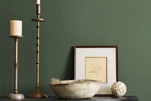
Urbane Bronze stands out for its unique ability to blend in with various decor styles, from modern minimalist to cozy rustic. It’s not just a paint color; it’s a statement of elegance and style.
This versatile shade draws inspiration from nature, mimicking the beauty of natural stone and the earthy richness of wooded landscapes.
It has the power to transform a room into a serene retreat, providing a perfect backdrop for both bold statement pieces and understated furnishings.
Whether you’re looking to update a single room or planning a complete home makeover, Urbane Bronze offers a sophisticated palette that can create a sense of cohesion and beauty throughout your space.
In this article, we’ll explore how Urbane Bronze can enhance different areas of your home, from creating a welcoming exterior facade to adding a touch of drama to your living room or bedroom.
You’ll learn how to pair it with complementary colors and materials, and get tips on achieving the perfect finish.
With Sherwin Williams’ SW 7048 Urbane Bronze, you have the opportunity to bring a touch of the natural world into your home, creating spaces that are not only stylish but also incredibly inviting.
What Color Is Urbane Bronze SW 7048 by Sherwin Williams?
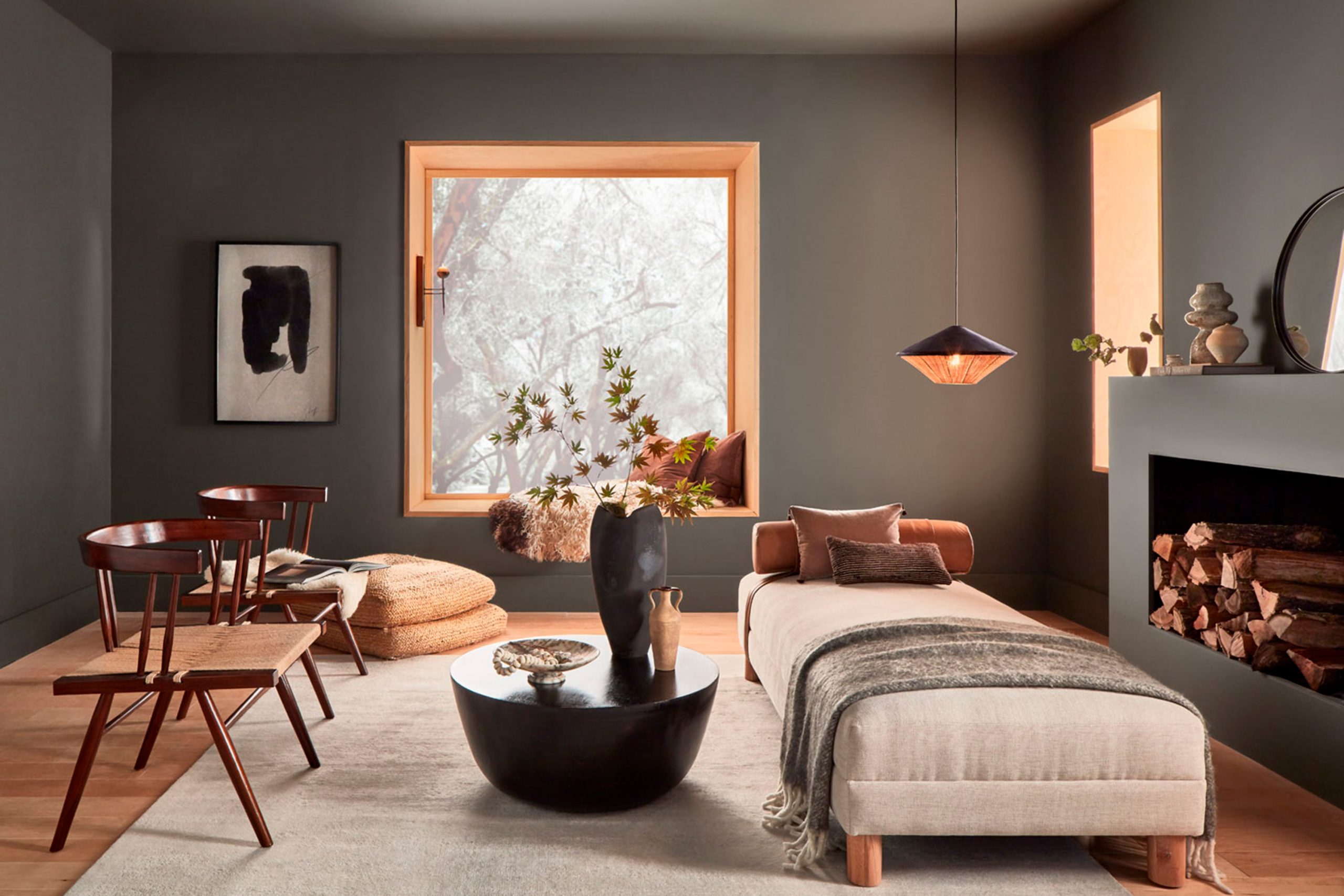
Urbane Bronze by Sherwin Williams is a rich, sophisticated deep gray-brown that brings a sense of calm and strength to any space. Think of it as the shadowy hue of a forest at dusk, both grounding and mysterious.
This color has an organic feel to it, making it versatile for various interior styles, particularly those leaning towards minimalism, modern farmhouses, and even industrial designs.
Its warm undertones make it a fantastic choice for creating a cozy and inviting atmosphere.
Imagine it on a feature wall, providing a stunning backdrop that allows your decor to shine, or even in a full room, enveloping the space in its comforting depth.
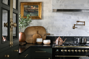
Urbane Bronze pairs beautifully with a wide range of materials and textures. With natural wood, it highlights the warmth and grain, creating a connection to the earth.
Against the sleekness of metal, it offers a striking contrast that’s both bold and balanced. Fabrics like linen or wool in lighter shades can soften its intensity, bringing a layer of lightness to a room.
For those looking to add a touch of sophistication to their home, this color works wonders in creating spaces that feel both refined and welcoming.
Whether in a modern loft or a traditional living room, Urbane Bronze has the unique ability to blend seamlessly, offering endless possibilities for creating a space that feels perfectly put together.
Ever wished paint sampling was as easy as sticking a sticker? Guess what? Now it is! Discover Samplize's unique Peel & Stick samples.
Get paint samples

Is Urbane Bronze SW 7048 by Sherwin Williams Warm or Cool color?
Urbane Bronze by Sherwin Williams is a rich, deep color that brings a sense of sophistication and grounding to any space.
Imagine a color that stands out for its ability to blend both warmth and depth, making it perfect for creating a cozy, intimate environment in your home.
This shade is part of the neutral palette, but its bold character allows it to make a statement, whether it’s used on an accent wall, kitchen cabinets, or exterior siding.
What makes Urbane Bronze so versatile is its ability to complement various decor styles, from modern to traditional.
It pairs beautifully with natural materials, such as wood and stone, enhancing the textures and bringing an earthy, serene vibe to your space.
color also works well with a broad range of other colors, including creamy whites, soft grays, and vibrant greens, providing a stunning backdrop that allows your decor to shine.
Incorporating Urbane Bronze in your home can transform rooms into refined, stylish spaces. Its unique blend of gray and brown tones offers a comforting retreat from the busy world outside, making your home a haven of tranquility and style.
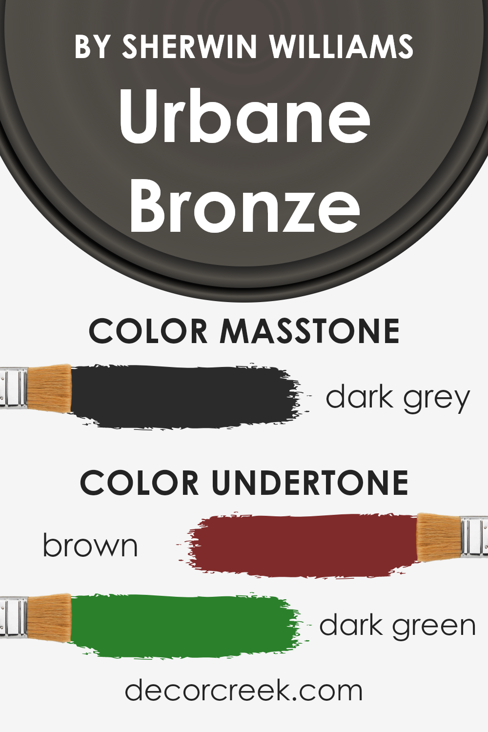
Undertones of Urbane Bronze SW 7048 by Sherwin Williams
Urbane Bronze by Sherwin Williams is a sophisticated and rich color that stands out for its depth and versatility. One of the most interesting things about it is the undertones that come to life under different lighting conditions.
The main undertones you’ll find in this color are brown (#802B2B) and dark green (#2B802B). These undertones play a crucial role in how we perceive the color overall.
Undertones are subtle hints of color that are mixed into the primary paint color. They can change the way a color looks depending on various factors like natural light, artificial lighting, and even surrounding colors.
For Urbane Bronze, its brown undertone adds a warm, earthy quality to the color, making it feel cozy and inviting. On the other hand, the dark green undertone introduces a touch of nature and depth, providing a calming and grounding effect.
When used on interior walls, Urbane Bronze brings a luxurious and natural feel to the space. In rooms with lots of natural light, the brown undertone might become more pronounced, creating a warm, enveloping atmosphere.
In spaces with less light or at different times of the day, the dark green undertone might peek through, adding sophistication and a connection to the outdoors.
This complex interplay of undertones makes Urbane Bronze a versatile choice for interior design, capable of complementing a wide range of décor styles and elements.
It’s a color that transforms a room, adding layers of richness and character to the walls.
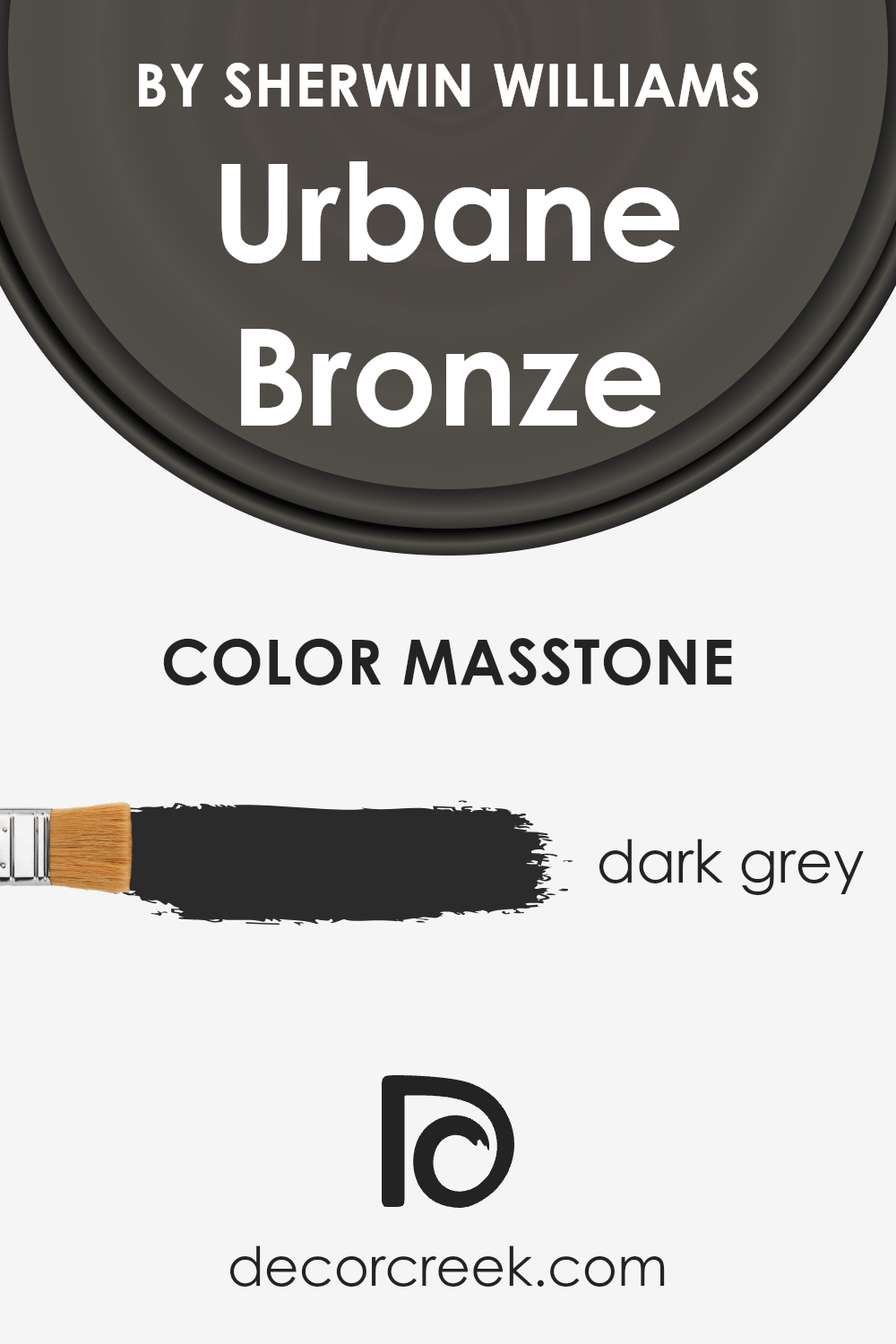
What is the Masstone of the Urbane Bronze SW 7048 by Sherwin Williams?
Urbane Bronze SW 7048 sports a dark grey masstone, closely mirroring the shade #2B2B2B.
This rich, deep grey provides a strong, stable foundation for any room in a home, making it a popular choice for those looking to add sophistication and a touch of modernity.
The beauty of Urbane Bronze lies in its versatility. Whether in a cozy, intimate setting or a spacious, light-filled area, this color brings a grounding effect that’s both calming and stylish.
In homes, Urbane Bronze works wonders by adding depth and character. It’s not just a simple dark grey; it has layers that unfold differently under various lighting conditions, from soft and warm to cool and mysterious.
This adaptability makes it an excellent choice for feature walls, kitchen cabinets, or even exterior trims.
Paired with lighter tones or vibrant accents, it allows for a wide range of design possibilities, making spaces feel more enclosed and comfy without overwhelming them with darkness.
Urbane Bronze stands as a testament to how dark colors can enhance home aesthetics by offering a backdrop that makes other colors pop while exuding elegance on its own.
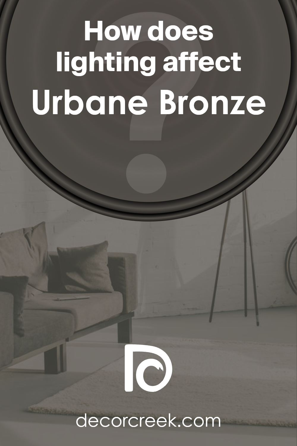
How Does Lighting Affect Urbane Bronze SW 7048 by Sherwin Williams?
Lighting plays a crucial role in how we perceive colors. It can significantly impact the appearance of a paint color on our walls, making it look very different under various light sources.
In essence, the type of light—whether artificial or natural—changes how we see color. This phenomenon is particularly evident with a sophisticated color like Urbane Bronze.
When placed in a room with artificial light, Urbane Bronze tends to reveal more of its warm undertones, creating a cozy and inviting atmosphere.
The intensity and type of artificial light can alter its appearance further.
For example, under LED lights that mimic daylight, Urbane Bronze might look more neutral and balanced, whereas under warm, incandescent lights, its brown and gray undertones become more pronounced, wrapping the room in a feeling of warmth.
In natural light, this color shifts dramatically throughout the day. Its appearance can range from a soft, muted gray in the morning light to a richer, deeper bronze as the sun moves across the sky.
The amount and direction of natural light a room receives also play a significant role in how Urbane Bronze looks.
In north-faced rooms, which receive less direct sunlight, Urbane Bronze can appear cooler and more shadowy, emphasizing its gray undertones.
This can make the room feel more serene and tranquil, albeit a bit darker.
South-faced rooms bathe in abundant natural light, brightening and warming up Urbane Bronze.
In these spaces, the color can look lighter and more welcoming, with its brown undertones becoming more prominent, creating a pleasant and inviting ambiance.
East-faced rooms enjoy the morning light, which can make Urbane Bronze appear slightly softer and more neutral in the morning, gradually taking on a warmer, more vibrant quality as the day progresses.
Conversely, in west-faced rooms, the color may start cooler and gradually warm up, peaking in richness and warmth in the afternoon to evening light when the setting sun casts a golden hue.
Understanding how lighting affects colors like Urbane Bronze helps in choosing the right paint for your space, ensuring that the color behaves as you expect throughout the day and under different lighting conditions.
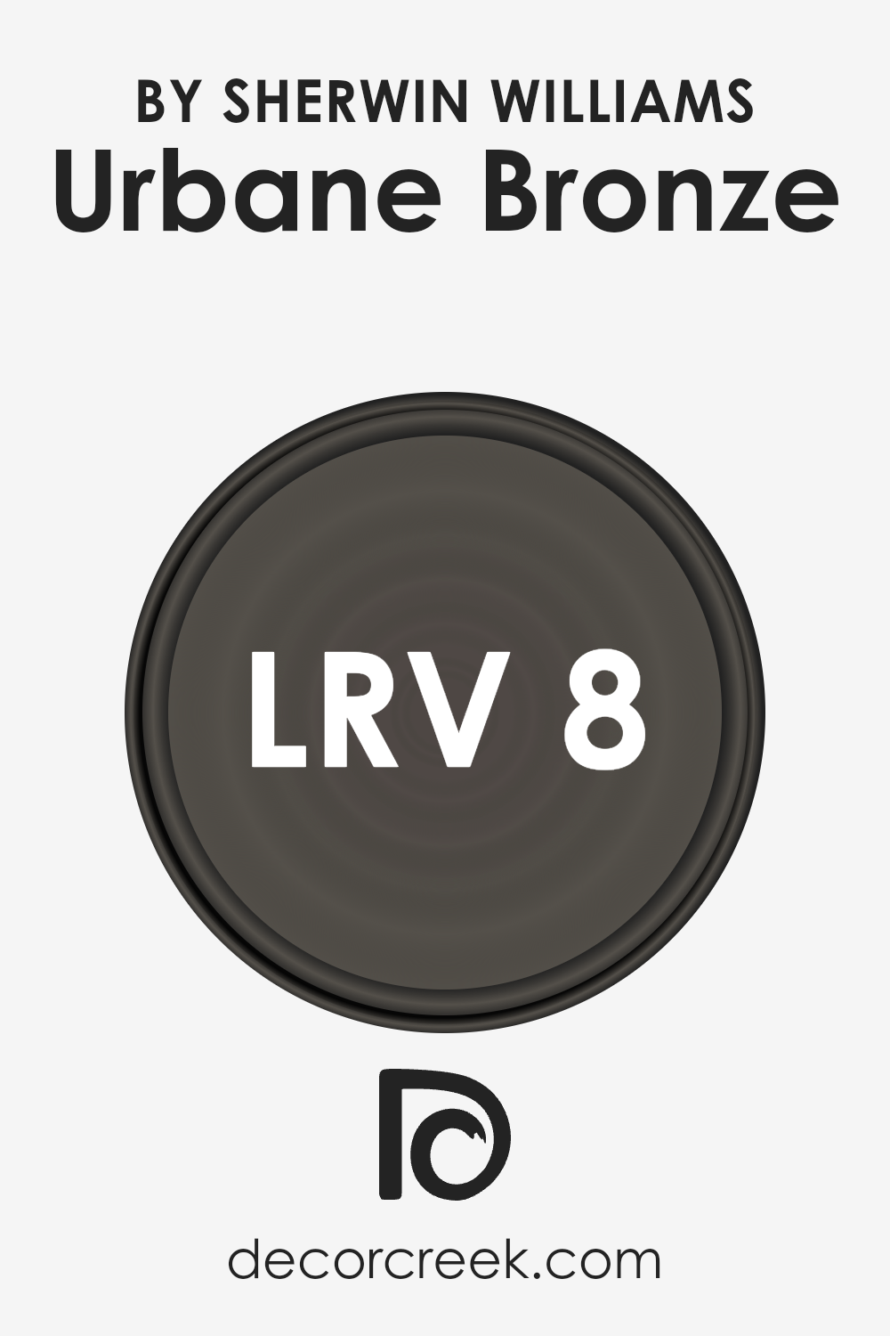
What is the LRV of Urbane Bronze SW 7048 by Sherwin Williams?
Light Reflectance Value, or LRV, is a way to measure how much light a paint color reflects or absorbs. This scale goes from 0, which is pure black, absorbing all light, to 100, representing pure white, reflecting all light back.
LRV is important because it helps to understand how a color will look in different lighting conditions. A color with a low LRV will make a room feel cozier and more enclosed because it absorbs more light.
On the other hand, a color with a high LRV will make a space feel more open and brighter because it reflects more light.
Given that Urbane Bronze has an LRV of 8.121, it’s considered a very dark color. This means it will absorb much of the light in a room rather than reflecting it.
When used on walls, Urbane Bronze will create a rich, deep look, adding a sense of elegance and warmth. However, because it’s so dark, it’s essential to consider the lighting in your space.
Natural light will help to soften the color’s appearance, but in rooms with little to no natural light, it can appear almost black.
Strategic lighting and lighter decor can help balance the darkness of this shade, enhancing the overall ambiance without making the room feel too closed in.
LRV – what does it mean? Read This Before Finding Your Perfect Paint Color
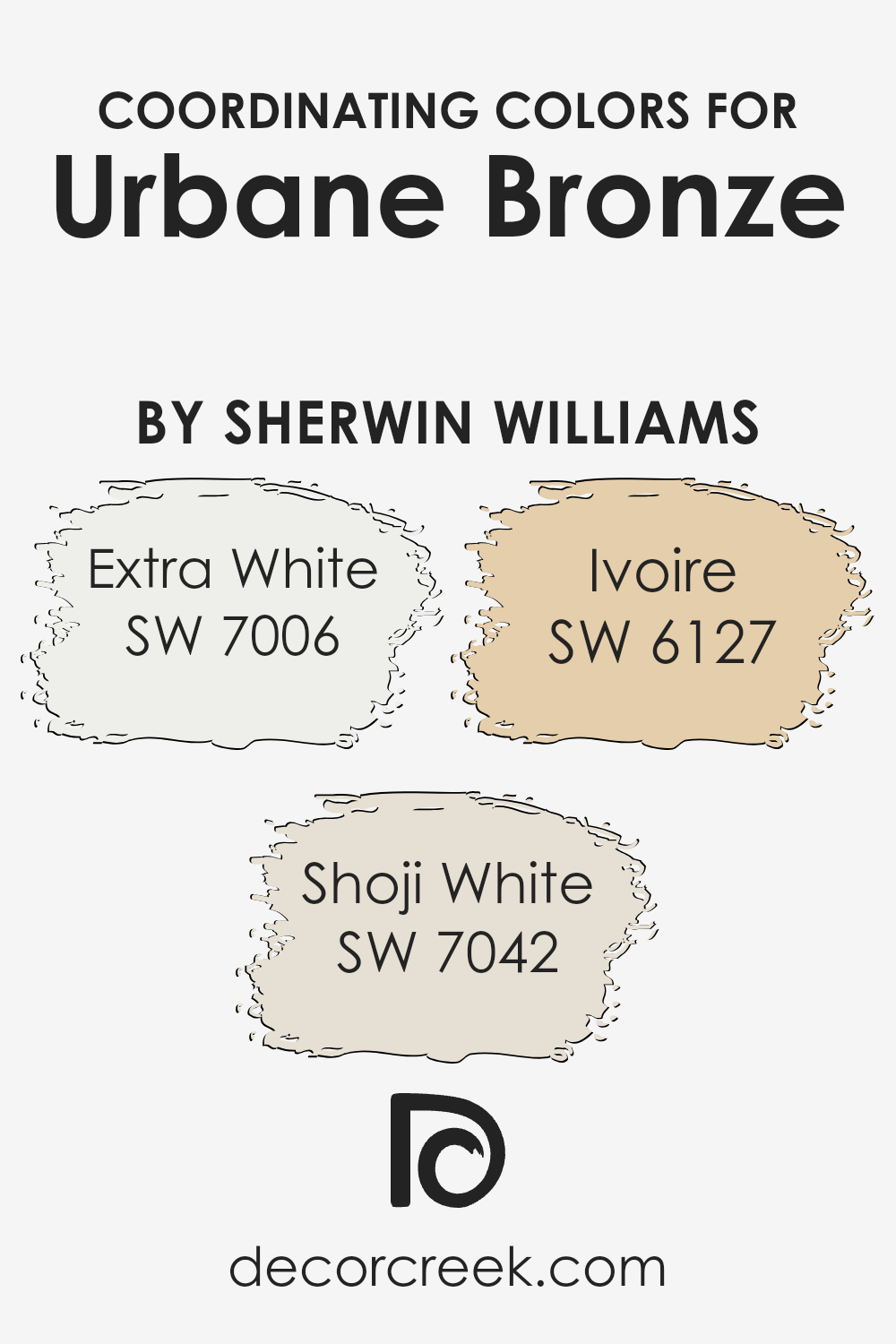
Coordinating Colors of Urbane Bronze SW 7048 by Sherwin Williams
Coordinating colors are hues that work well together, creating an aesthetically pleasing palette for any space. They are selected based on their compatibility with a main color, enhancing its beauty without overshadowing it.
This idea is perfectly illustrated with Urbane Bronze by Sherwin Williams, a rich, sophisticated shade, and its coordinating colors. Each coordinating color adds its own flair while ensuring the palette remains cohesive and balanced.
Extra White (SW 7006) is a crisp, clean shade that brings a breath of fresh air to any palette. It’s the perfect counterbalance to the deep tones of Urbane Bronze, providing a sharp contrast that highlights architectural details or furniture lines.
Then there’s Shoji White (SW 7042), a softer white with warm undertones, offering a subtle, soothing complement to Urbane Bronze. It creates a gentle transition between the darker and lighter elements within a room.
Ivoire (SW 6127) introduces a hint of color with its warm, creamy presence. This inviting hue adds a sunny disposition to spaces, promoting a welcoming atmosphere when paired with Urbane Bronze.
Together, these colors harmonize, delivering a versatile palette suitable for various design styles.
You can see recommended paint colors below:
- SW 7006 Extra White
- SW 7042 Shoji White
- SW 6127 Ivoire
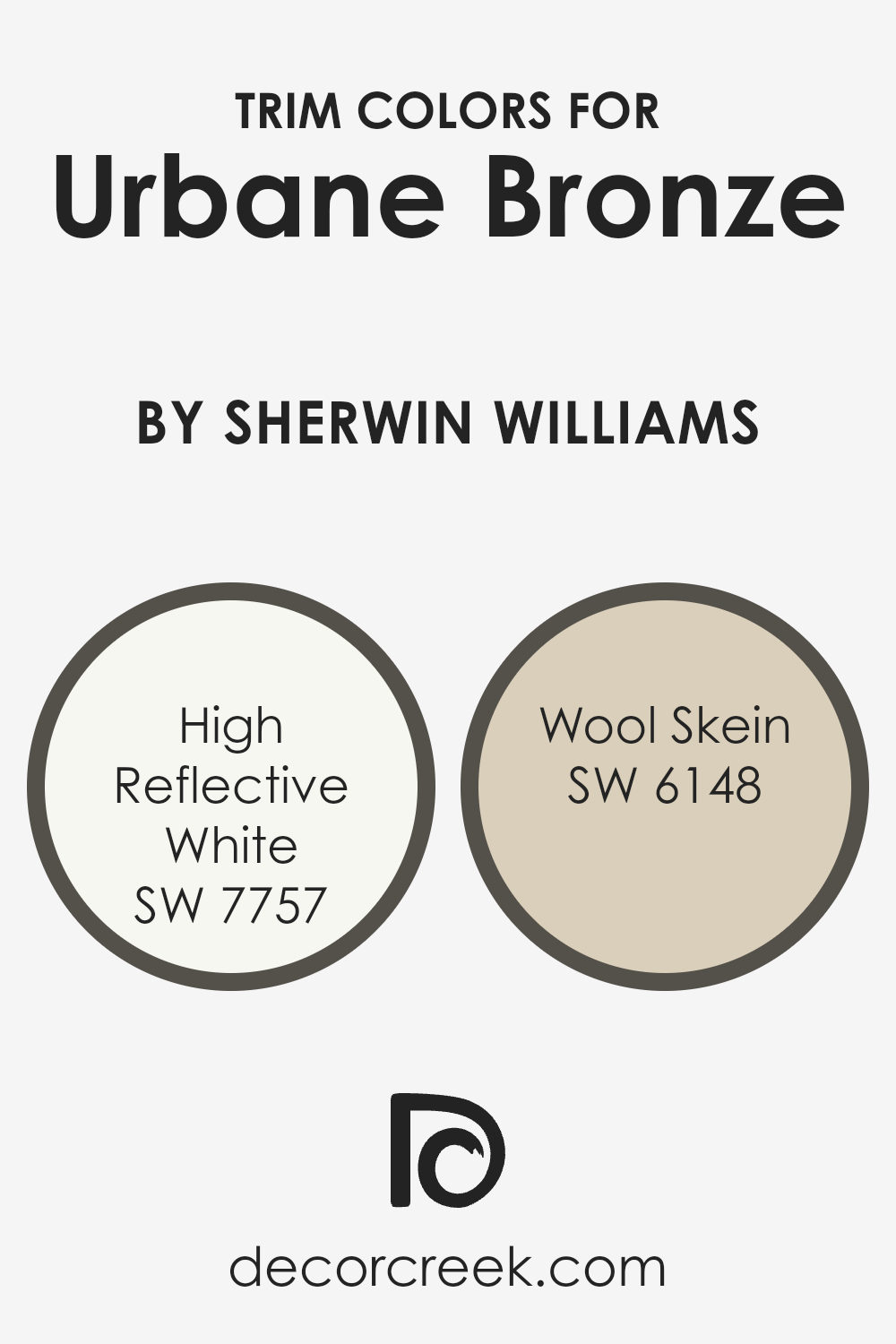
What are the Trim colors of Urbane Bronze SW 7048 by Sherwin Williams?
Trim colors are the hues selected for the architectural elements and details of a building such as door frames, window frames, and baseboards.
These colors play a crucial role in complementing the main color of a space or exterior, in this case, Urbane Bronze by Sherwin Williams, a rich and sophisticated gray-brown that adds an elegant depth to any space.
The right trim color can enhance the overall aesthetic, create visual appeal, and highlight the unique architectural features of a building. It’s like adding the perfect frame to a beautiful painting; it enhances the artwork without overpowering it.
For Urbane Bronze, two excellent trim color choices are High Reflective White and Wool Skein by Sherwin Williams.
High Reflective White is a bright, clean white that offers a sharp contrast, making the Urbane Bronze pop and bringing clarity and balance to the deep, warm tones of the wall color.
It’s like adding a fresh layer of snow against a dark winter night, providing crispness and brightness. On the other hand, Wool Skein is a soft, neutral beige with warm undertones, offering a subtler contrast.
It’s reminiscent of natural wool, bringing a cozy warmth to the room while still allowing the Urbane Bronze to stand out without sharp contrasts.
Both of these trim colors complement Urbane Bronze beautifully, allowing it to shine while providing a polished, finished look to the space.
You can see recommended paint colors below:
- SW 7757 High Reflective White
- SW 6148 Wool Skein
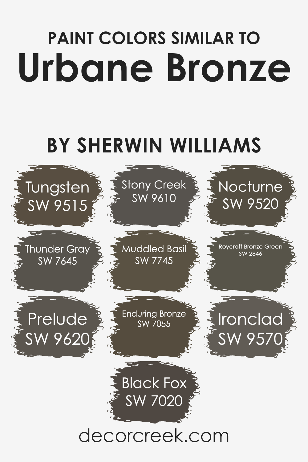
Colors Similar to Urbane Bronze SW 7048 by Sherwin Williams
Choosing similar colors can significantly impact the design and feel of a space, offering a cohesive and polished look.
When working with a base color like Sherwin Williams’ Urbane Bronze, finding matching shades enhances the aesthetic appeal and allows for subtle yet impactful variations in the decor.
Similar colors, such as Tungsten and Thunder Gray, provide a sleek and sophisticated vibe with their cool undertones, creating a serene and inviting atmosphere.
Prelude and Black Fox add depth and intensity, perfect for adding dramatic flair or grounding a room with their darker tones.
Stony Creek and Muddled Basil introduce a touch of nature, with earthy hues that bring warmth and tranquility into spaces.
On the other hand, Enduring Bronze and Nocturne echo the base color’s richness but with varying levels of luminosity, allowing for interesting layers and textures in interior designs.
Roycroft Bronze Green and Ironclad stand out by incorporating subtle green or metallic elements, offering a unique twist and depth to the palette.
These shades work together seamlessly, creating a dynamic yet harmonious look that can be adapted to suit different styles and preferences.
By choosing colors within the same family, you can craft spaces that are visually cohesive and full of character, making the most of the subtle differences and similarities between the shades.
You can see recommended paint colors below:
- SW 9515 Tungsten
- SW 7645 Thunder Gray
- SW 9620 Prelude
- SW 7020 Black Fox
- SW 9610 Stony Creek
- SW 7745 Muddled Basil
- SW 7055 Enduring Bronze
- SW 9520 Nocturne
- SW 2846 Roycroft Bronze Green
- SW 9570 Ironclad
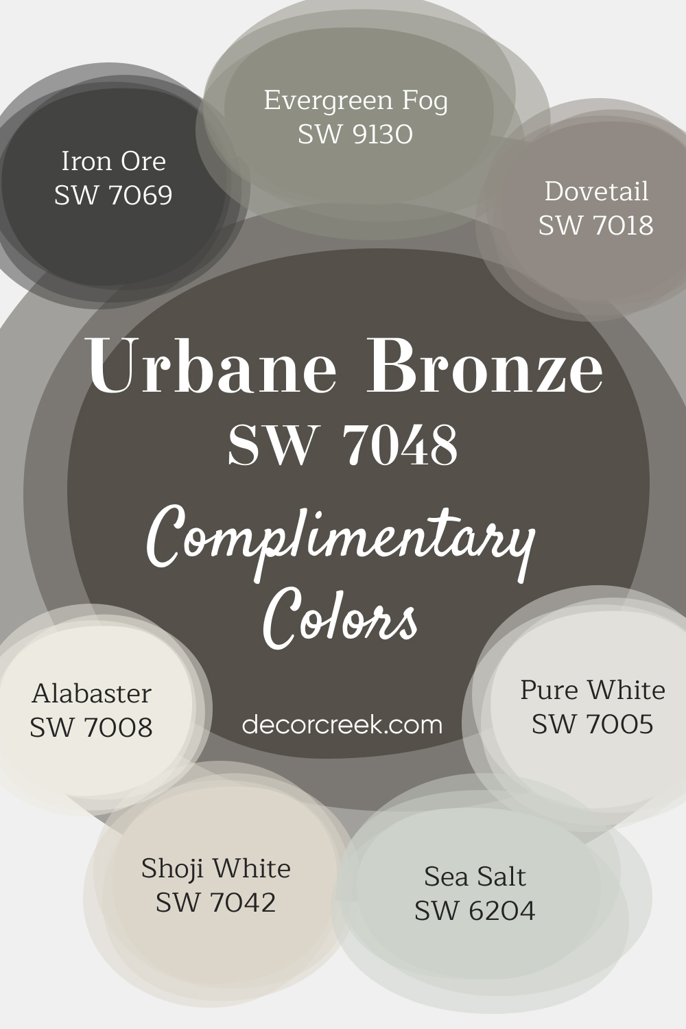
Complimentary Colors for Urbane Bronze SW 7048 Paint Color by Sherwin Williams
Urbane Bronze is a rich, bold color that stands out when paired with lighter shades like Pure White, Alabaster, or Shoji White. This combination provides a crisp, balanced look, perfect for adding contrast to your space. For a refreshing touch, Sea Salt and Evergreen Fog bring in muted green tones that offer a natural feel.
Dovetail adds a versatile gray option that fits seamlessly with both light and dark colors, making it easy to pair throughout your home. For those wanting a more dramatic touch, Iron Ore delivers a deep, dark contrast ideal for accents or trim. These colors work together to offer a flexible palette suited for both modern and traditional designs.
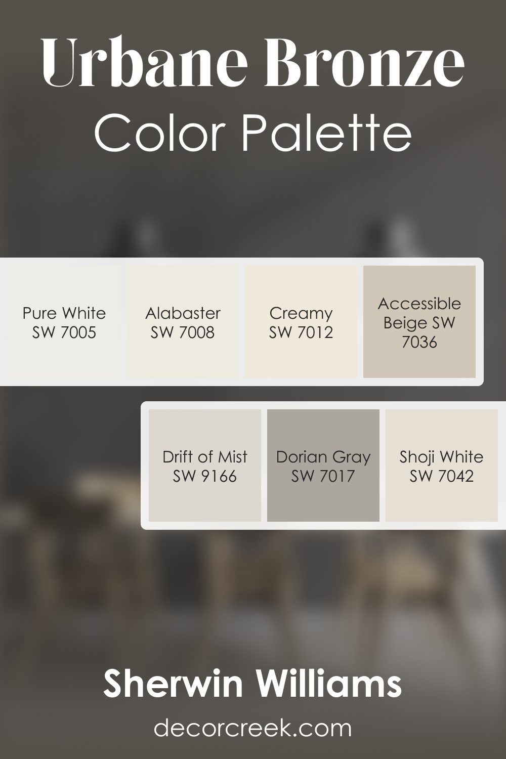
Urbane Bronze SW 7048 by Sherwin Williams Color Palette
The Urbane Bronze palette brings a grounded and welcoming feeling that works beautifully in homes that appreciate depth balanced with gentle light. Alabaster and Pure White brighten the palette, giving Urbane Bronze a soft backdrop that keeps it from feeling heavy.
Creamy adds a warm highlight that pairs naturally with this rich tone. Accessible Beige and Drift of Mist help create smooth transitions for rooms that flow from one to another, giving your home a steady rhythm.
Dorian Gray introduces subtle strength, while Shoji White adds delicate warmth that blends effortlessly with natural textures.
Together, these colors build a palette that feels inviting, calm, and full of character — ideal for creating rooms that feel relaxing, stylish, and thoughtfully layered.
How to Use Urbane Bronze SW 7048 by Sherwin Williams In Your Home?
Urbane Bronze by Sherwin Williams is a rich, deep color that brings a sense of warmth and sophistication to any room. This particular shade has an earthy brown base with gray undertones, making it highly versatile for various decorating styles.
It works great for creating a cozy and inviting atmosphere, especially in living areas or bedrooms where a calming presence is desired.
You can use Urbane Bronze in different ways around your home. It’s an excellent choice for accent walls, providing a striking backdrop that makes artwork or furniture stand out.
If you’re feeling bold, painting a whole room in this color can create a dramatic, enveloping feel. For a more subtle approach, using it on cabinetry, doors, or trim offers a modern twist and contrasts beautifully with lighter walls.
In addition to its aesthetic appeal, Urbane Bronze coordinates well with natural materials like wood, stone, and metal, enhancing the connection to the outdoors.
Its earthy vibe pairs nicely with a wide range of colors, from soft neutrals to vibrant hues, allowing for personal expression in your decor.
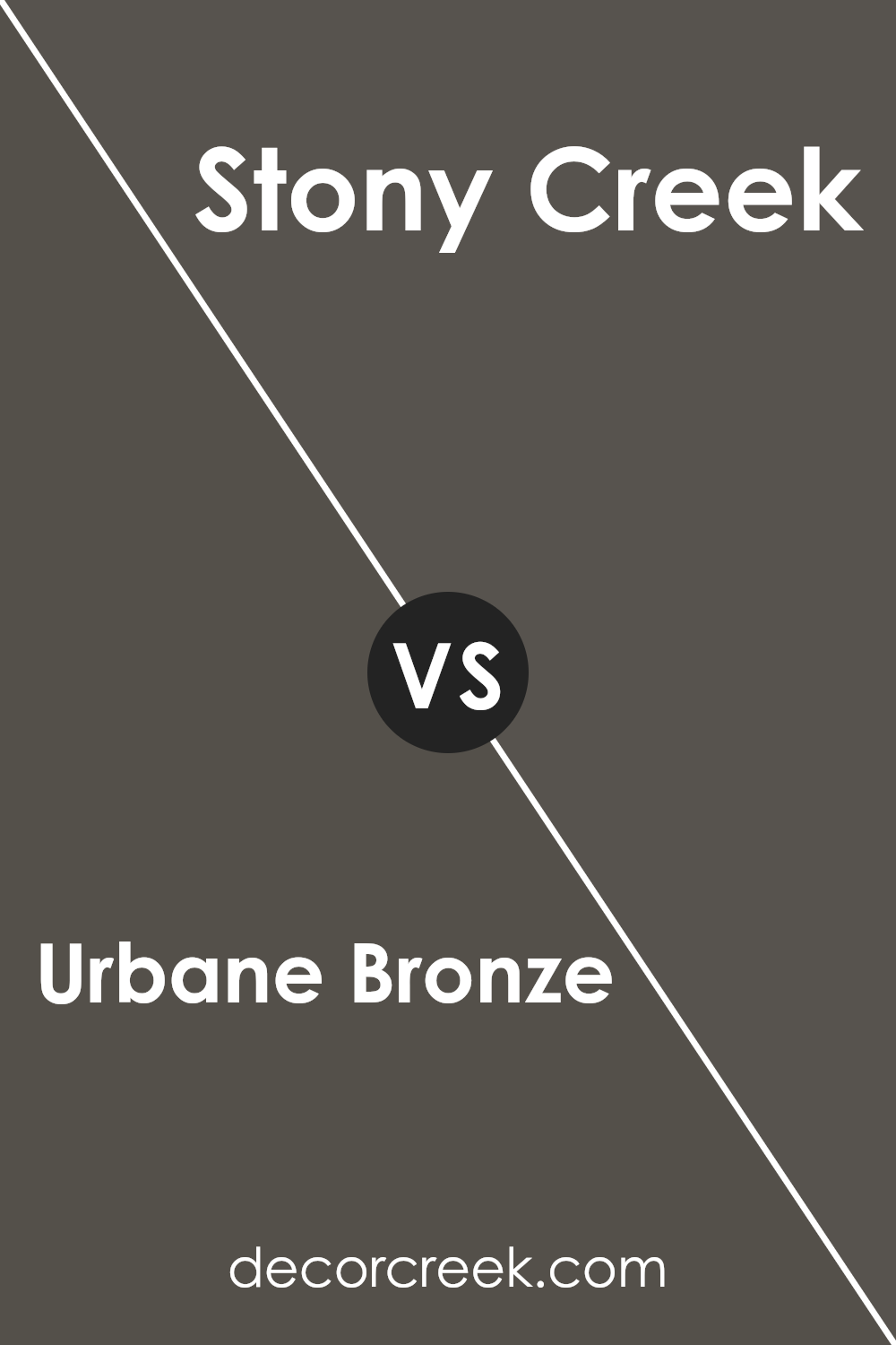
Urbane Bronze SW 7048 by Sherwin Williams vs Stony Creek SW 9610 by Sherwin Williams
Urbane Bronze and Stony Creek are two colors from Sherwin Williams that offer unique vibes to any space. Urbane Bronze is a deep, rich color that leans towards a dark gray or soft black with warm undertones.
It has a natural elegance and can produce a strong statement, making rooms feel cozy and grounded. On the other hand, Stony Creek is a lighter, more muted shade.
It’s a kind of gray with a touch of green, offering a serene and calming effect that can make spaces feel more open and airy.
While Urbane Bronze brings depth and warmth, making it perfect for accent walls or exterior trim, Stony Creek provides a soft backdrop, excellent for rooms that aim for a subtle, peaceful atmosphere.
If looking for drama and intimacy, Urbane Bronze is the go-to. However, for a light, refreshing feel, Stony Creek would be the better choice.
Both colors reflect Sherwin Williams’ knack for creating versatile paint colors that can suit various tastes and design needs.
You can see recommended paint color below:
- SW 9610 Stony Creek
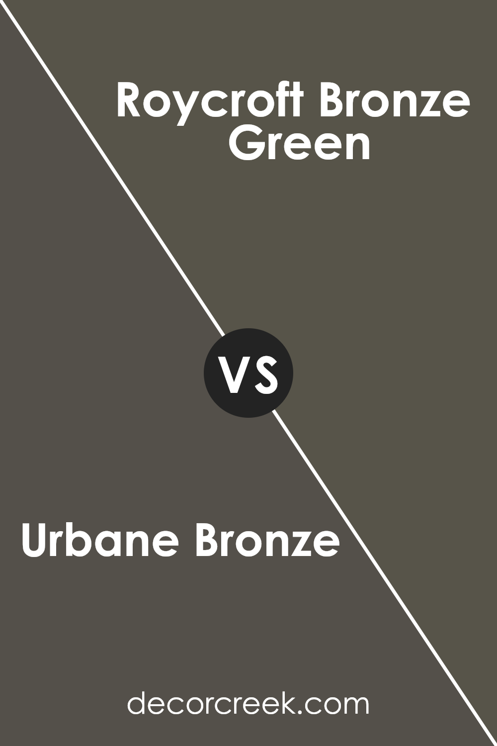
Urbane Bronze SW 7048 by Sherwin Williams vs Roycroft Bronze Green SW 2846 by Sherwin Williams
Urbane Bronze is a dark, warm, and cozy color, akin to a deep, rich chocolate with hints of gray. It’s a sophisticated shade that’s versatile enough to make a statement in any room without overwhelming the space.
It pairs well with a variety of decor styles, acting as a stunning neutral that brings a sense of calm and grounding.
On the other hand, Roycroft Bronze Green has a unique blend of green and bronze undertones, offering a more earthy and natural vibe.
This color is reminiscent of a dense forest at dusk, providing a serene and tranquil atmosphere.
While Urbane Bronze lends itself to a chic and modern aesthetic, Roycroft Bronze Green offers a more traditional and rustic look, perfect for spaces intended to have a closer connection to nature.
Both colors are beautifully deep and rich, but each brings its own distinct personality to interiors, from the refined elegance of Urbane Bronze to the comforting, natural appeal of Roycroft Bronze Green.
You can see recommended paint color below:
- SW 2846 Roycroft Bronze Green
Urbane Bronze SW 7048 by Sherwin Williams vs Enduring Bronze SW 7055 by Sherwin Williams
Urbane Bronze and Enduring Bronze, both by Sherwin Williams, offer distinct yet subtly different color experiences for walls.
Urbane Bronze leans into a deep, rich, almost charcoal-like tone, creating a feeling of sophistication and grounding. This color is perfect for making a bold statement in a room, offering a backdrop that highlights decor while bringing a sense of warmth.
On the other hand, Enduring Bronze is slightly lighter, embodying a warmer, more welcoming bronze tone. It carries an earthy vibe, making spaces feel cozy and inviting.
While it also provides depth to walls, its effect is softer compared to Urbane Bronze, making it easier to pair with a wide range of color palettes and decor styles.
Choosing between them depends on the mood you’re aiming for: Urbane Bronze for dramatic flair and Enduring Bronze for a gentle, nurturing atmosphere.
Both colors promise to transform spaces with their unique charms, but the end result hinges on the ambiance you wish to create.
You can see recommended paint color below:
- SW 7055 Enduring Bronze
Urbane Bronze SW 7048 by Sherwin Williams vs Black Fox SW 7020 by Sherwin Williams
Urbane Bronze and Black Fox, both from Sherwin Williams, are quite popular choices for those aiming to bring a sense of sophistication and sleekness to their spaces. While they share some similarities, key differences set them apart.
Urbane Bronze leans more towards a deep, warm gray with brown undertones, making it feel cozy and grounded. It’s perfect for creating a statement without overwhelming a space with darkness.
On the other hand, Black Fox presents itself as a very dark gray, almost black, with slight hints of brown. This color is richer and deeper, providing a bold backdrop or striking accent in any room.
While Urbane Bronze brings a certain softness and warmth, Black Fox offers more drama and intensity.
Choosing between them depends on the mood you’re aiming for: Urbane Bronze for a warm, inviting feel, and Black Fox for a strong, commanding presence.
Both colors are versatile, but the effect they have on a room can be quite different.
You can see recommended paint color below:
- SW 7020 Black Fox
Urbane Bronze SW 7048 by Sherwin Williams vs Tungsten SW 9515 by Sherwin Williams
The main color, Urbane Bronze, is a deep, warm, earthy shade reminiscent of rich soil or dark stone. It’s a cozy and sophisticated hue that feels grounded and enveloping, perfect for creating a serene atmosphere or making a bold statement.
On the other hand, Tungsten is a lighter, cooler gray that leans towards a modern and sleek look. This color is versatile, working well in spaces that aim for a fresh, clean aesthetic without feeling too sterile.
Tungsten brings in a touch of contemporary elegance, providing a neutral backdrop that allows other colors to shine.
When comparing Urbane Bronze and Tungsten, it’s clear that they offer distinct vibes – Urbane Bronze offers depth and warmth, wrapping a room in comfort, while Tungsten provides a crisp, airy feel that can make a space feel more open and bright.
Together, they could complement each other beautifully, with Urbane Bronze adding richness and Tungsten offering balance.
You can see recommended paint color below:
Urbane Bronze SW 7048 by Sherwin Williams vs Thunder Gray SW 7645 by Sherwin Williams
Urbane Bronze and Thunder Gray are two colors from Sherwin Williams that offer distinct vibes for any space. Urbane Bronze is a rich, warm color with deep brown tones and a hint of gray.
It’s perfect if you’re looking to add a cozy, grounding effect to a room. This color has a natural earthiness, making it great for creating a serene, relaxing space.
On the other hand, Thunder Gray is cooler and lighter compared to Urbane Bronze. It’s a versatile gray with hints of blue, adding a modern and somewhat more dynamic feel to spaces.
Thunder Gray works well in areas where you want sophistication without dark heaviness, making rooms feel more spacious and airy than Urbane Bronze might.
Both colors are beautiful and offer unique atmospheres. Urbane Bronze leans towards creating a warm, inviting retreat, ideal for living rooms or bedrooms.
Thunder Gray, meanwhile, is excellent for a chic, contemporary look, suitable for bathrooms, kitchens, or offices. Choosing between them depends on the mood you want to set and the specific characteristics of your space.
You can see recommended paint color below:
- SW 7645 Thunder Gray
Urbane Bronze SW 7048 by Sherwin Williams vs Nocturne SW 9520 by Sherwin Williams
Urbane Bronze and Nocturne by Sherwin Williams are two distinct shades that bring their unique vibes into any space. Urbane Bronze is like a dark, warm hug, with its rich, deep brown tones and a hint of gray.
It creates a cozy atmosphere, perfect for spaces where you want to relax and feel grounded. It’s versatile, working well in both modern and traditional settings, offering a sense of sophistication and comfort.
On the other hand, Nocturne steps into the room with a cooler, moodier attitude. It’s a dark gray, almost tipping into the black territory, with a slight navy blue undertone that gives it a bit of mystery.
Ideal for making a bold statement, Nocturne works great for accent walls or for rooms that aim to stir up a dramatic flair.
While Urbane Bronze leans towards warmth and earthiness, Nocturne skews cooler and into the realm of the night sky. Both colors are deep and dark but serve different purposes based on the ambiance you’re aiming to achieve.
You can see recommended paint color below:
- SW 9520 Nocturne
Urbane Bronze SW 7048 by Sherwin Williams vs Prelude SW 9620 by Sherwin Williams
Urbane Bronze and Prelude by Sherwin Williams are both unique, but they serve different vibes in a space. Urbane Bronze is like a deep, comforting hug from an old friend.
It’s a dark, warm, earthy color that feels solid and grounding. Think of that rich, almost black, but not quite, color that can make a statement wall feel cozy and inviting.
On the other hand, Prelude is more like the first light of dawn. It’s a light, airy gray that feels fresh and clean. This color doesn’t shout for attention but rather whispers, adding a subtle, sophisticated backdrop to any room.
It’s like the perfect neutral that isn’t too warm or too cool, making it super versatile for pairing with other colors.
Together, they could create a stunning contrast—Urbane Bronze bringing depth and warmth, while Prelude offers a breath of fresh air.
Whether you’re going for a bold look or something more understated, these colors have you covered.
You can see recommended paint color below:
- SW 9620 Prelude
Urbane Bronze SW 7048 by Sherwin Williams vs Ironclad SW 9570 by Sherwin Williams
Urbane Bronze and Ironclad, two colors from Sherwin Williams, offer distinct vibes for any space.
Urbane Bronze has a deep, warm essence, almost like rich soil, making it perfect for creating a cozy and inviting atmosphere.
It’s a dark, almost chocolatey shade that balances between black and brown, offering a unique blend that suits both modern and traditional designs.
On the other hand, Ironclad stands out as a cooler, steel-like color. Imagine the color of weathered metal; that’s Ironclad for you. It’s less about warmth and more about giving a space a sharp, contemporary edge.
This color screams modernity and is ideal for those looking to add a minimalist or industrial chic touch to their surroundings.
While Urbane Bronze wraps you in warmth, making a room feel snug and secure, Ironclad provides a sleek, modern aesthetic. Both colors have their charm, depending on what mood or style you’re aiming for in your space.
You can see recommended paint color below:
- SW 9570 Ironclad
Urbane Bronze SW 7048 by Sherwin Williams vs Muddled Basil SW 7745 by Sherwin Williams
Urbane Bronze and Muddled Basil are two unique colors by Sherwin Williams that offer distinct vibes for any space. Urbane Bronze is a deep, warm gray with brown undertones, creating a cozy and sophisticated atmosphere.
It’s perfect for those looking to add a bit of elegance and depth to a room. On the other hand, Muddled Basil presents a different mood.
This color is a rich, earthy green with subtle gray undertones, which brings a natural and refreshing feel to a space.
It’s like bringing a bit of the outdoors inside, ideal for anyone wanting to add a touch of nature to their environment.
Both colors are versatile but in different ways: Urbane Bronze works well in refined, modern settings, while Muddled Basil suits spaces that aim for a more organic, grounding ambiance.
Choosing between them depends on the atmosphere you’re aiming for – sophisticated and chic with Urbane Bronze or relaxed and natural with Muddled Basil.
You can see recommended paint color below:
- SW 7745 Muddled Basil
In summary, the color Urbane Bronze by Sherwin Williams has emerged as a popular choice for those looking to bring a sense of sophistication and warmth into their spaces.
Its unique blend of grey and brown hues offers a grounded, earthy feel that is both modern and timeless. This versatility makes it excellent for a variety of applications, from accent walls to exterior trim, enabling homeowners to create cozy, inviting environments.
Its popularity underscores a shift towards more natural, serene color palettes that aim to transform homes into tranquil sanctuaries.
Moreover, the adaptability of Urbane Bronze in different settings and its compatibility with a wide range of decor styles stands out.
Whether it’s being used to add depth to minimalist spaces or to complement rustic, wood-heavy themes, it manages to enhance the overall aesthetic without overwhelming it.
The choice of Urbane Bronze reflects a growing trend towards colors that offer both beauty and a sense of calm, making it a go-to option for those updating their homes.
Its success underscores the desire for colors that connect us to nature and provide a solid foundation for various design styles.

Ever wished paint sampling was as easy as sticking a sticker? Guess what? Now it is! Discover Samplize's unique Peel & Stick samples.
Get paint samples