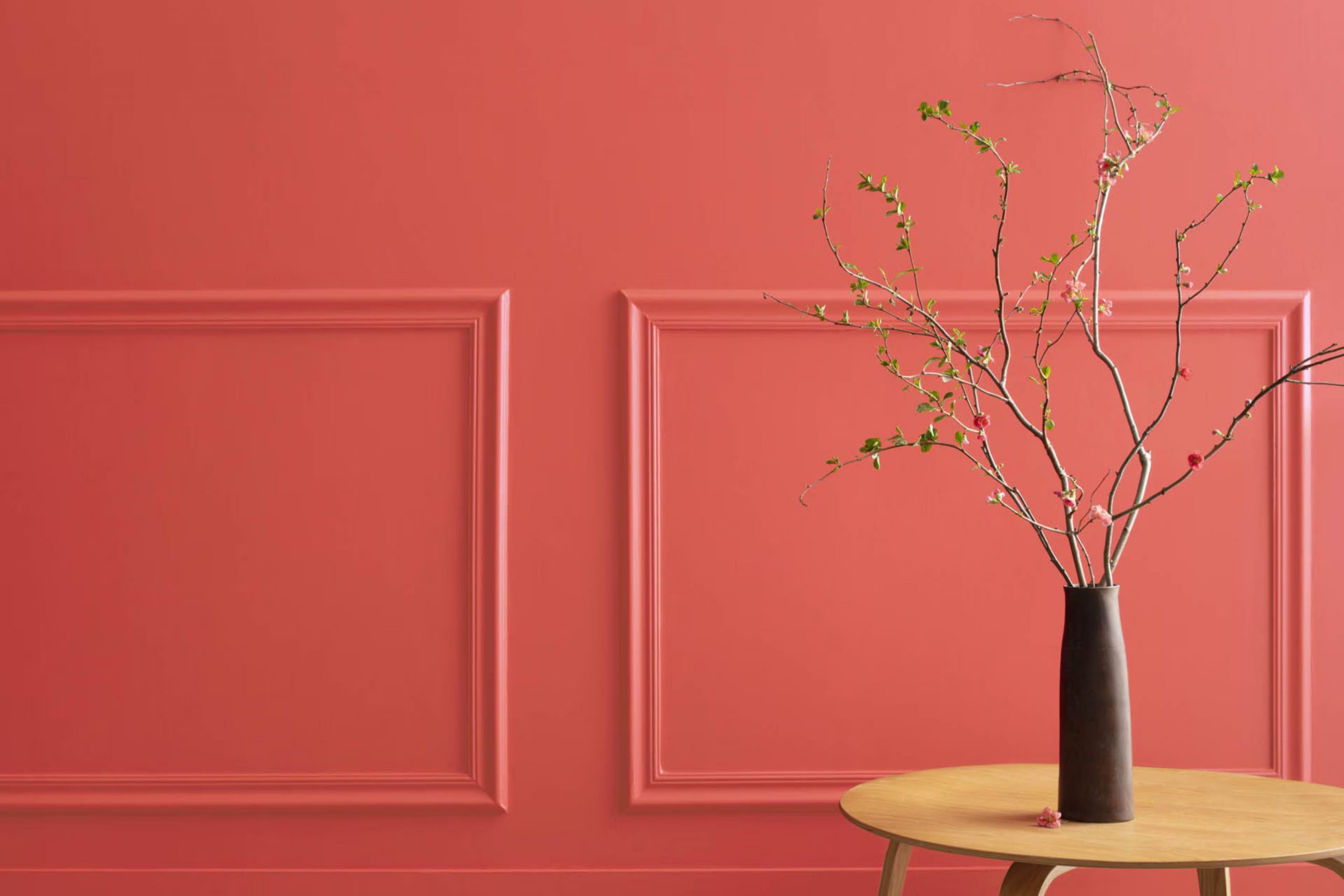
When you first encounter 2008-30 Raspberry Blush by Benjamin Moore, you might be struck by its vibrant allure. This particular shade of raspberry is bold and commands attention, ideal for anyone looking to inject some energy into a room. People often overlook the powerful influence of a color like Raspberry Blush; it’s not just another pink. Rather, it has a daring, almost rebellious vibe that can instantly perk up an interior.
You’ll find that this color is exceptionally adaptable, contrary to initial assumptions. It can work beautifully in a living room to set a lively ambiance, or in a dining area to enhance the warmth and sociability of meal times. Decorating with Raspberry Blush, you get an opportunity to create a fresh yet cozy atmosphere, making any room feel more inviting.
The tone is particularly effective for those who appreciate an interior that stands out without feeling overpowering. Accessories and furnishings in neutral tones complement it well, allowing Raspberry Blush to take center stage without dominating the décor.
If you are someone considering a dynamic addition to your home’s palette, Raspberry Blush by Benjamin Moore could be the vibrant touch you’re looking for.
What Color Is Raspberry Blush 2008-30 by Benjamin Moore?
Raspberry Blush by Benjamin Moore is a vibrant, energetic shade of red with a hint of pink undertones. This bold color injects any room with a lively, playful vibe and makes a strong statement when used in interior design. It works particularly well in bohemian, eclectic, and contemporary interiors, providing a dynamic backdrop that can invigorate the senses and stimulate creativity.
In terms of pairing with materials and textures, Raspberry Blush complements natural wood, which can help balance its intensity with a warm, grounding effect. Metals like brass and copper also go well with this color, adding a touch of luxury and brightness. For textiles, consider velvet or silk to introduce a sense of luxury, or cotton and linen for a more relaxed feel. These combinations can help create a balanced and inviting interior area.
Additionally, this color works wonders when used in smaller doses, such as on accent walls, within artwork, or for decorative accessories like cushions and throws. It pairs nicely with neutral shades like soft whites or grays, which allow it to stand out without overpowering the interior. Overall, Raspberry Blush is perfect for those looking to add a splash of joy and energy to their home.
Is Raspberry Blush 2008-30 by Benjamin Moore Warm or Cool color?
Raspberry Blush by Benjamin Moore is a vibrant, bold red shade with an undertone that pulls slightly towards orange. This particular color brings a lively pop to any room, making it an instant focal point. Ideal for an accent wall, it can also bring energy to smaller elements like trim or doors. In living areas, Raspberry Blush pairs well with neutral tones such as whites and greys that help balance its intensity. This combination ensures that the room feels lively without being overpowering.
In bedrooms or study areas, using this color might seem brave due to its vibrancy. Yet, when used thoughtfully, it can add a sense of fun and creativity, stimulating the mind – perfect for areas meant for imaginative tasks. Kitchens and dining areas also benefit from this red-orange shade, as it can create a warm, welcoming atmosphere, encouraging lively meals and conversations.
Moreover, Raspberry Blush is useful in homes that need a pick-me-up or have a lot of natural light to soften the boldness. It’s a color that can make modern homes feel more dynamic and older homes feel refreshed and lively.
Undertones of Raspberry Blush 2008-30 by Benjamin Moore
Raspberry Blush by Benjamin Moore is a vibrant and bold color that adds a lively touch to any room. Understanding its undertones can really help in deciding how and where to use it effectively in home decorating.
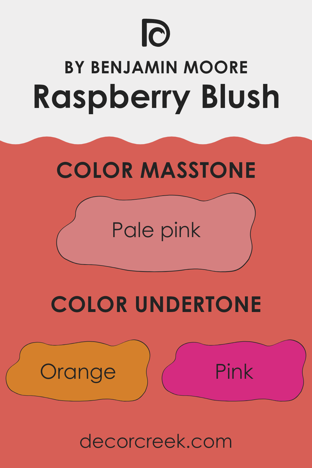
This particular paint has a base that might look just pink or red at first glance, but it’s actually mixed with various undertones like orange, pink, red, and even hints of olive and grey. These undertones play a significant role in how the color appears under different lighting conditions and when paired with different decor elements.
For instance, the orange and red undertones in Raspberry Blush make it warm and inviting, perfect for living areas or dining rooms where you want to create a cozy and welcoming atmosphere. The pink undertone adds a touch of softness, which can be great for a bedroom where you want a more relaxed feel.
When this color is used on interior walls, the combined undertones interact with both natural and artificial light, affecting the color’s intensity and vibrancy. During the day, natural light might enhance its brighter red and pink undertones, making the walls seem more alive and dynamic. In artificial lighting, the deeper tones like olive and grey might become more noticeable, providing a grounding effect that balances the high energy of red and orange.
Overall, Raspberry Blush with its rich blend of undertones offers a dynamic palette that shifts subtly depending on the surroundings and lighting, making it a flexible choice for adding character and warmth to a room. When choosing furnishings and accessories, considering these undertones will help in creating a cohesive look that complements the walls and brings out the best in this unique color.
What is the Masstone of the Raspberry Blush 2008-30 by Benjamin Moore?
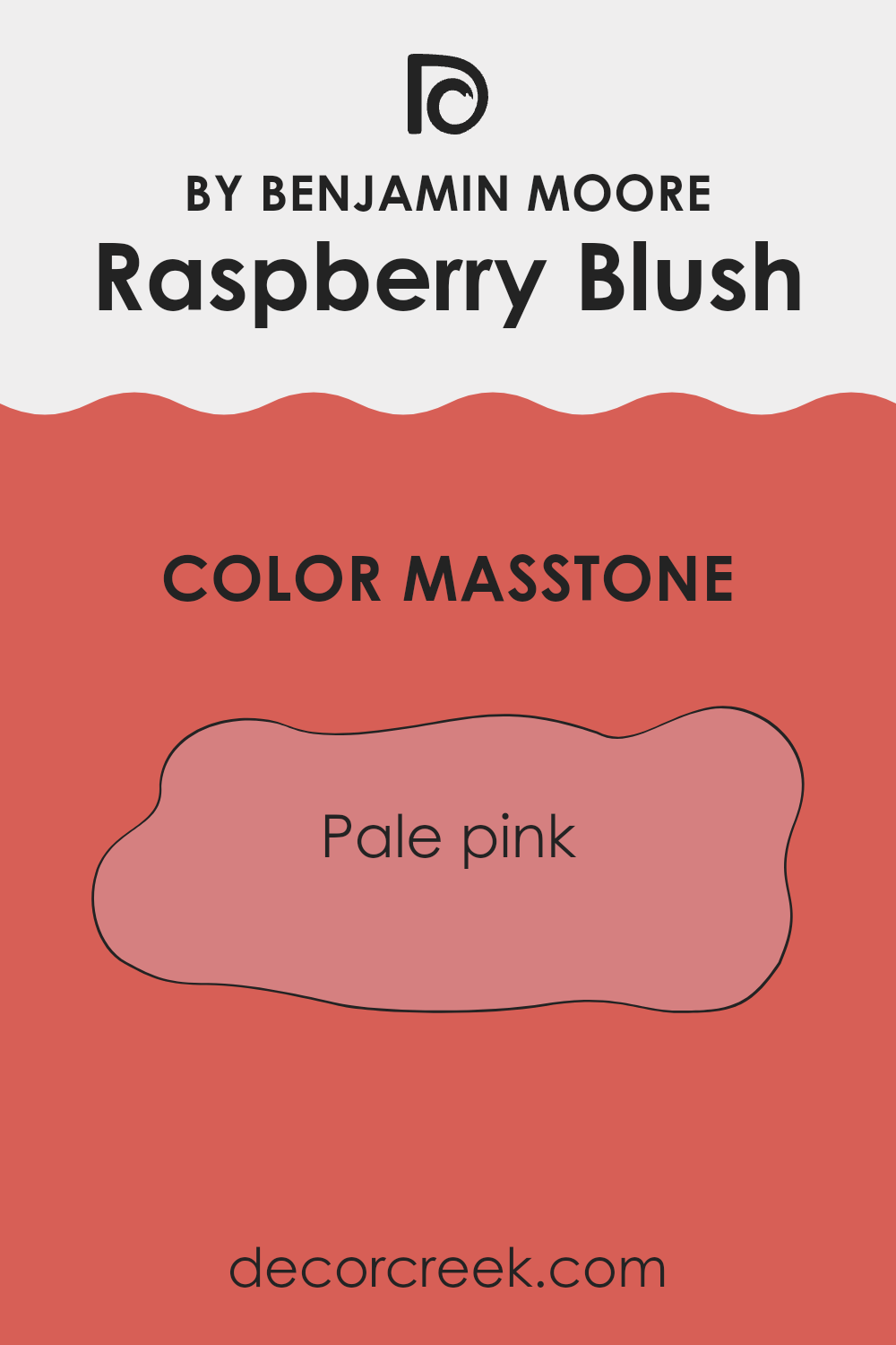
Raspberry Blush 2008-30 by Benjamin Moore has a masstone of pale pink (#D58080), giving it a soft and gentle presence in any room. This color is quite adaptable and works well in many areas of a home. In living rooms or bedrooms, this pale pink hue creates a calm and welcoming atmosphere.
It’s light enough not to overpower the room but adds just enough color to warm up the interior. In rooms with lots of natural light, this shade can appear even softer, making the interior feel airy and fresh.
This color is perfect for anyone wanting to add a touch of warmth without going too bold. It pairs nicely with neutral tones like creams and grays, as well as with deeper colors like navy or rich greens for a more dynamic look. The pale pink shade of Raspberry Blush is also great for smaller rooms, as it doesn’t make interiors feel cramped, but rather adds a sense of openness and light. Overall, it’s an easygoing color that can help make a house feel like a home.
How Does Lighting Affect Raspberry Blush 2008-30 by Benjamin Moore?
Lighting plays a crucial role in how we perceive colors, and the choice of light can significantly alter the appearance of a paint color on your walls. Different types of light affect how we see colors because they cast different hues and intensities of light.
For instance, artificial light, such as that from incandescent bulbs, tends to give off a warmer glow, enhancing warm tones. Using a color like Raspberry Blush, a vibrant and bold shade, under artificial lighting can make it appear richer and more intensely orange or pink, depending on the specific type of bulb used.
In contrast, natural light shows the truest color, but the appearance can still vary depending on the time of day and weather conditions. For Raspberry Blush, natural sunlight can bring out its lively and energetic qualities, making the color pop more vividly during the day.
The orientation of the room also impacts how this color is displayed. North-facing rooms may pose a challenge for Raspberry Blush, as they tend to receive cooler, bluer light, which can cause the paint to look slightly more muted and less vibrant. These rooms do not get much direct sunlight, which does not enhance this particular shade optimally.
South-facing rooms are the most ideal for Raspberry Blush as they benefit from plentiful, warm light for most of the day. This exposure will keep the color looking lively and dynamic, maintaining its warmth throughout the day.
East-facing rooms get morning sunlight, which is bright and warm. Hence, Raspberry Blush would look especially vibrant and cheerful in the morning, potentially fading a bit in intensity throughout the day as the natural light diminishes.
Similarly, in west-facing rooms, the color will display its true vibrancy in the late afternoon when the light is warmest. During the morning, when the lighting is cooler, the color may appear slightly duller. Understanding these differences can help you decide where to apply specific colors like Raspberry Blush to achieve your desired effect.
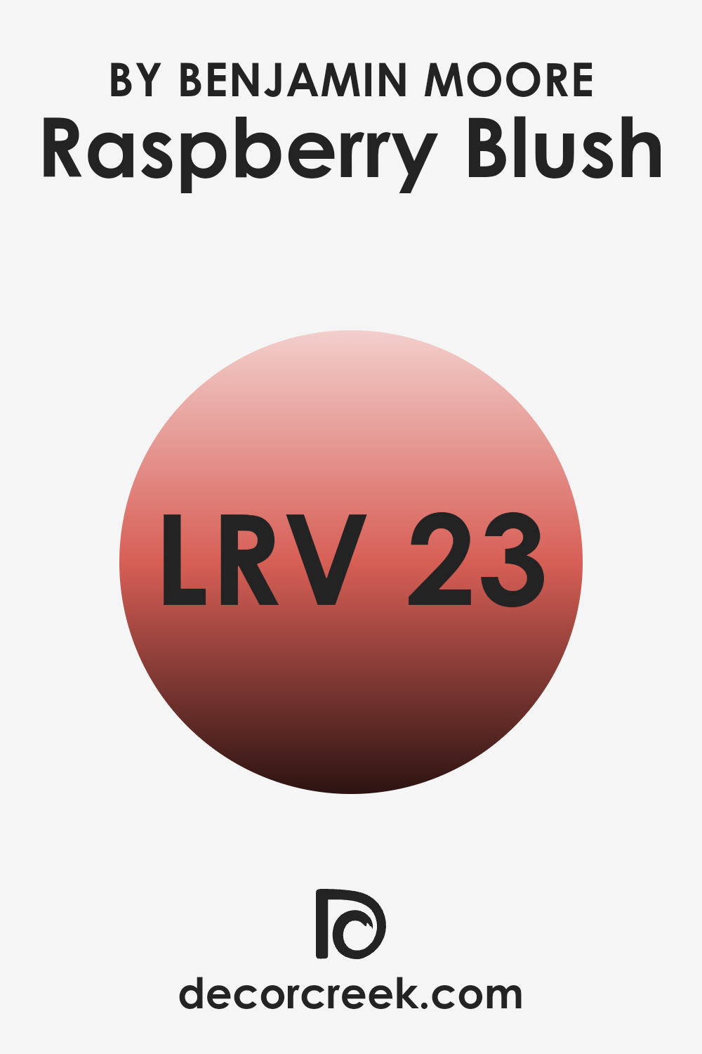
What is the LRV of Raspberry Blush 2008-30 by Benjamin Moore?
LRV stands for Light Reflectance Value, a measure used to determine how much light a paint color reflects or absorbs. This value is usually given as a number on a scale from zero, representing pure black that absorbs all light, to one hundred, representing pure white that reflects all light back.
A higher LRV means the color reflects more light, making a room feel brighter and more open. In contrast, a lower LRV means the color absorbs more light, which can make a room feel cozier but smaller and darker.
The LRV of Raspberry Blush by Benjamin Moore is 22.68, which indicates it’s on the darker side. This means it will absorb more light than it reflects, which could make a room painted in this color feel intimate and warm. However, because it doesn’t reflect much light, using it in a small room or a room without much natural light might make the room appear even smaller and darker. In larger or well-lit rooms, this warm, deep hue can add a vibrant touch without overpowering the room.
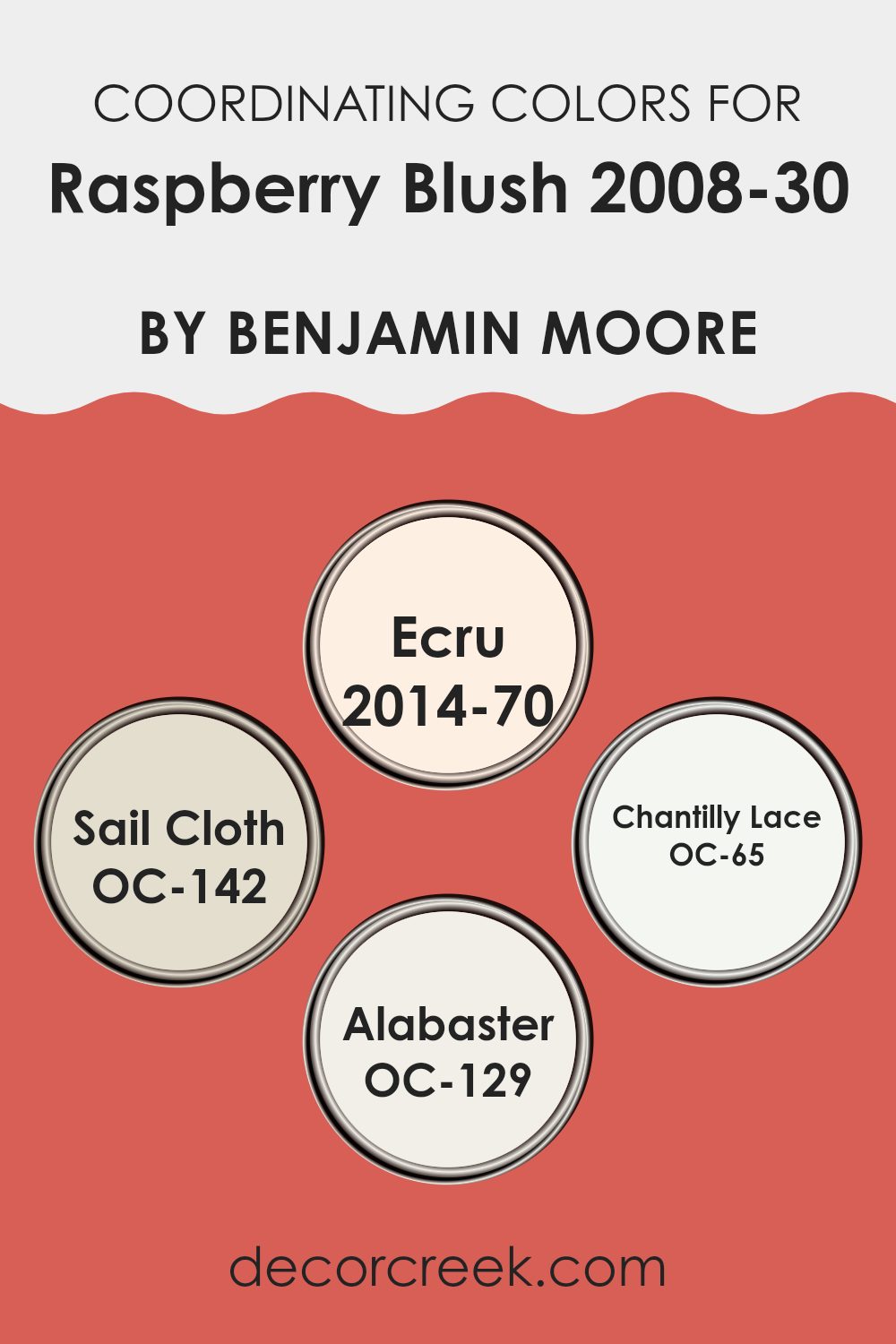
Coordinating Colors of Raspberry Blush 2008-30 by Benjamin Moore
Coordinating colors are shades that complement each other when used together in a design or decor setting, enhancing the overall aesthetic appeal without dominating the main color. The concept works by selecting colors that balance each other, either by being on similar color levels or by offering a striking contrast that is still harmonious. For instance, Raspberry Blush can be paired effectively with subtler tones to create a balanced look.
2014-70 – Ecru is a soft, creamy neutral that can soften intense hues with its soothing presence, offering a gentle contrast that’s easy on the eye. OC-142 – Sail Cloth also serves as a neutral backdrop, but it has a slightly warmer undertone, providing a cozy feel that works well in rooms aiming for a welcoming atmosphere.
OC-65 – Chantilly Lace is a crisp, clean white that offers a sharp contrast to more saturated colors, bringing a fresh and bright element into any room. Lastly, OC-129 – Alabaster, another soft and warm neutral, complements vibrant colors by grounding them slightly, ensuring the room feels neither too stark nor overly bold. These coordinating colors together work splendidly to bring out the best in Raspberry Blush, allowing it to stand out while ensuring the decor remains balanced and aesthetically appealing.
You can see recommended paint colors below:
- 2014-70 Ecru
- OC-142 Sail Cloth
- OC-65 Chantilly Lace
- OC-129 Alabaster
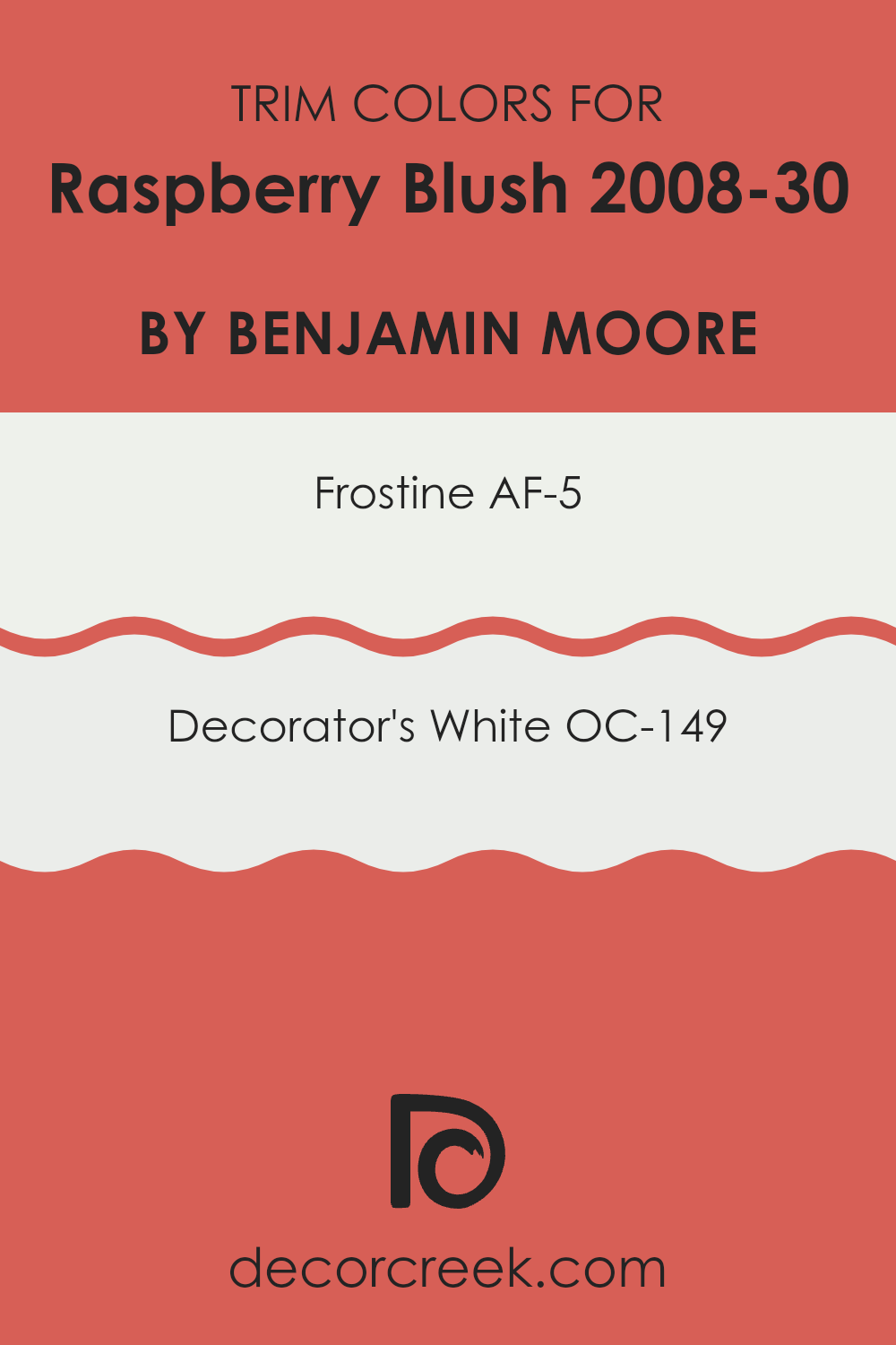
What are the Trim colors of Raspberry Blush 2008-30 by Benjamin Moore?
Trim colors are essential in painting because they help to frame and accentuate the main color choice, creating a polished and cohesive look. When using a bold and vibrant main color, such as Raspberry Blush by Benjamin Moore, choosing the right trim color is crucial.
A properly selected trim color not only highlights the beauty of the main color but also ensures that the transitions between the different areas of a room are smooth and pleasing to the eye. Frostine AF-5 and Decorator’s White OC-149 are two trim colors that coordinate exceptionally well with Raspberry Blush.
Frostine AF-5 is a gentle, subtle white with a hint of coolness, making it a perfect choice to pair with a warmer tone like Raspberry Blush. It offers a slight contrast that is not overpowering, ensuring that the intensity of Raspberry Blush stands out prominently. On the other hand, Decorator’s White OC-149 is a crisp, clean white that provides a sharper contrast to Raspberry Blush, which can make the vivid pink pop even more dramatically. Both of these trim color options support Raspberry Blush beautifully by providing a visual break and cleanly defining the architectural details of the room.
You can see recommended paint colors below:
- AF-5 Frostine
- OC-149 Decorator’s White
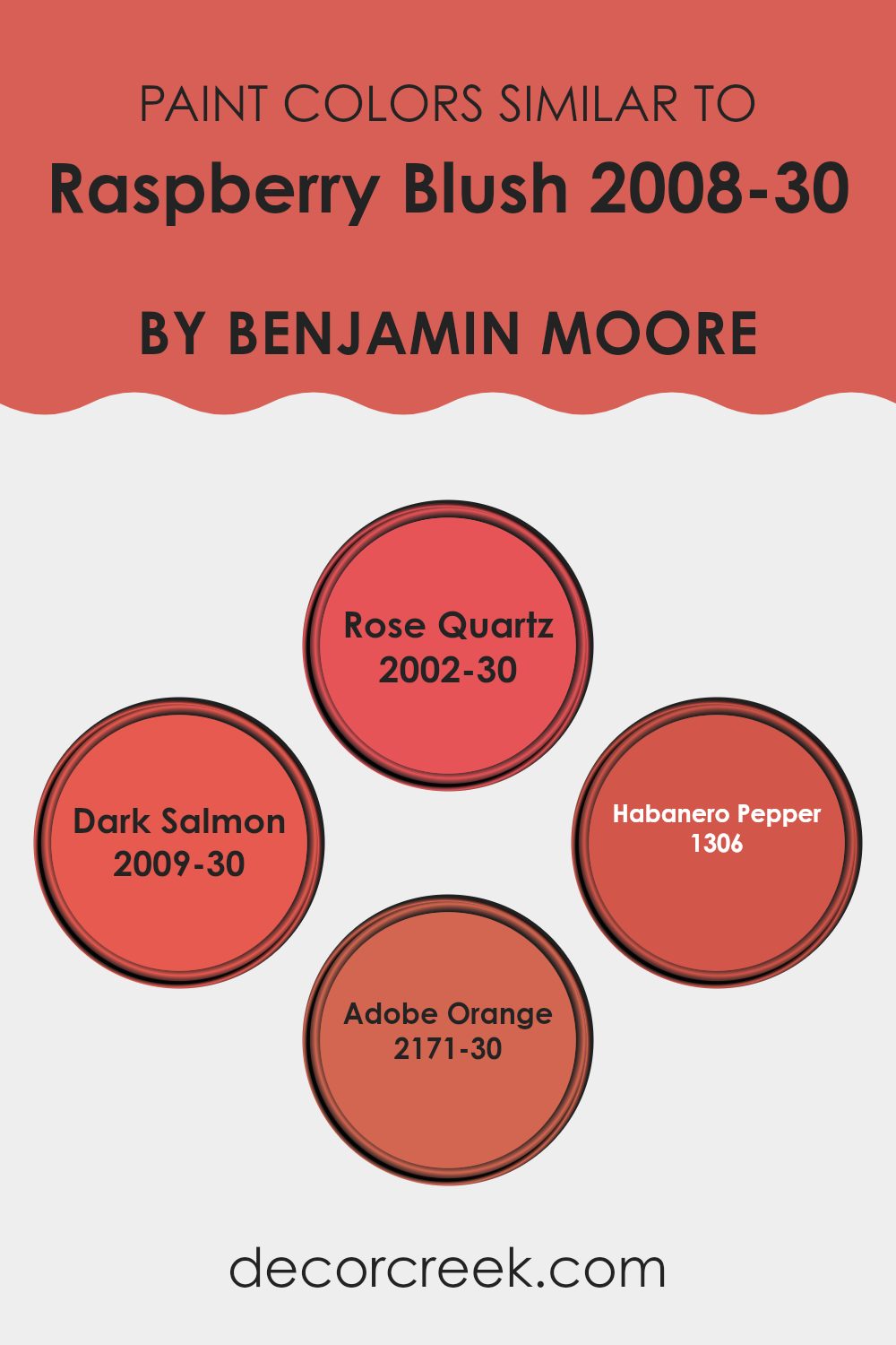
Colors Similar to Raspberry Blush 2008-30 by Benjamin Moore
Similar colors play a crucial role in interior design by creating a harmonious and cohesive atmosphere in any room. When colors like Rose Quartz, Dark Salmon, Habanero Pepper, and Adobe Orange are used alongside a vibrant color such as Raspberry Blush, they help form a visually pleasing palette that can enhance the mood and aesthetic of an interior. These similar shades work well together because they share common undertones that provide a subtle yet impactful continuity that can make decorating decisions less daunting and more intuitive.
Rose Quartz is a gentle pink that evokes a sense of calm warmth, making it a perfect accompaniment to the boldness of Raspberry Blush. Much like a quiet backdrop, it allows bolder colors to stand out without feeling overpowering. Dark Salmon, another shade in the family, has a richer, deeper tone that bridges the gap between pink and orange, offering a playful yet grounded feel.
Moving toward the spicier side of the range, Habanero Pepper adds a zestful punch with its fiery red-orange hue, injecting energy and vivacity into any palette. Lastly, Adobe Orange offers a dustier, earthier approach, reminiscent of clay and natural landscapes, providing a solid foundation for livelier shades to pop while keeping the overall look grounded. Together, these colors complement each other, enhancing the overall aesthetic of any interior they adorn.
You can see recommended paint colors below:
- 2002-30 Rose Quartz
- 2009-30 Dark Salmon
- 1306 Habanero Pepper
- 2171-30 Adobe Orange
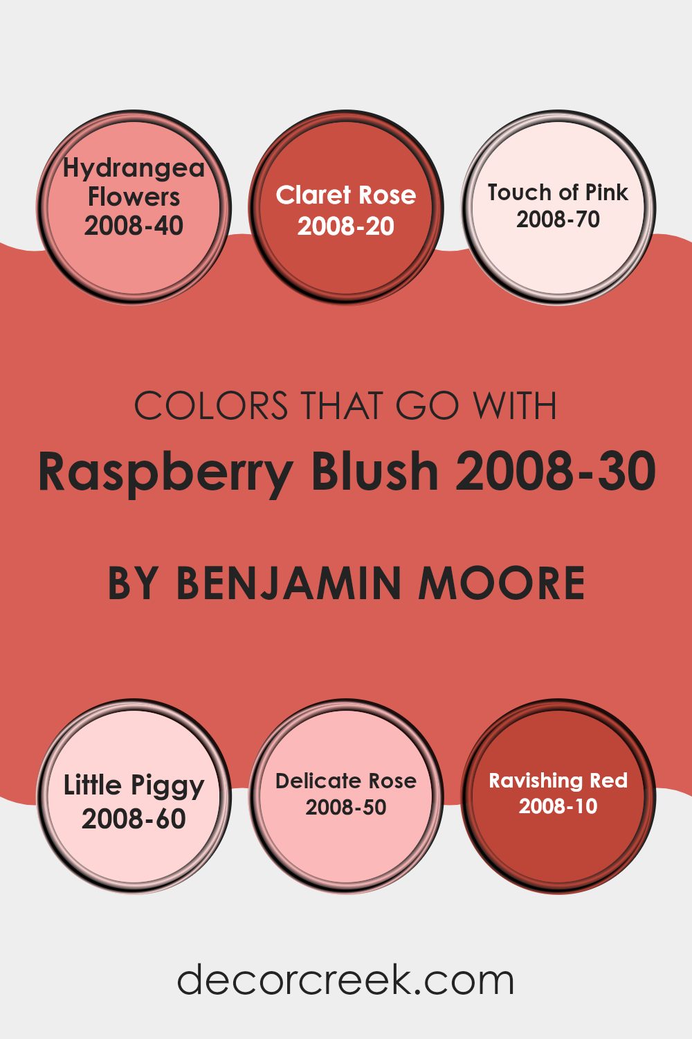
Colors that Go With Raspberry Blush 2008-30 by Benjamin Moore
Choosing the right colors to accompany Raspberry Blush by Benjamin Moore is essential for creating a harmonious and visually appealing interior. Colors like Hydrangea Flowers, Claret Rose, Touch of Pink, Little Piggy, Delicate Rose, and Ravishing Red are specifically chosen to complement or contrast with Raspberry Blush, depending on the desired effect. Coordinating colors can enhance the overall aesthetic of a room, making it feel more cohesive and well-planned. When colors work well together, they create a natural flow through the interior that is pleasing to the eye and can influence the room’s mood and perceived size.
Hydrangea Flowers is a soft, muted hue, providing a gentle contrast to the boldness of Raspberry Blush, making it ideal for creating a balanced look. Claret Rose offers a deeper, richer tone that pairs beautifully with the vibrant Raspberry Blush, perfect for adding depth to your decor. Touch of Pink is a very light, nearly pastel pink that introduces a subtle shift in hue that softens the overall appearance.
Little Piggy is a playful, lighter pink that injects a sense of fun and freshness into the mix. Delicate Rose, slightly richer than Touch of Pink, provides a mid-tone option that bridges the gap between the more intense and lighter pinks. Lastly, Ravishing Red is a strong and assertive color, matching the intensity of Raspberry Blush for those looking to make a bold statement. Together, these colors ensure a dynamic yet unified interior, enabling a variety of design directions.
You can see recommended paint colors below:
- 2008-40 Hydrangea Flowers
- 2008-20 Claret Rose
- 2008-70 Touch of Pink
- 2008-60 Little Piggy
- 2008-50 Delicate Rose
- 2008-10 Ravishing Red
How to Use Raspberry Blush 2008-30 by Benjamin Moore In Your Home?
Raspberry Blush 2008-30 by Benjamin Moore is a bold and vivid shade of red-orange. This color brings energy and warmth to any room, making it a great choice for areas where you want to add some excitement.
It’s especially effective in dining rooms or living areas where lively conversations are common. If painting an entire room with Raspberry Blush feels too much, consider using it on just one accent wall. This approach helps create a focal point without overpowering the room.
Additionally, you can use Raspberry Blush for doors or furniture to give a pop of color that brightens up your decor. This shade pairs well with neutral colors like whites or grays, which help balance its intensity and make the room feel cozy yet vibrant. Accessories or textiles in Raspberry Blush can also refresh a room with bursts of color.
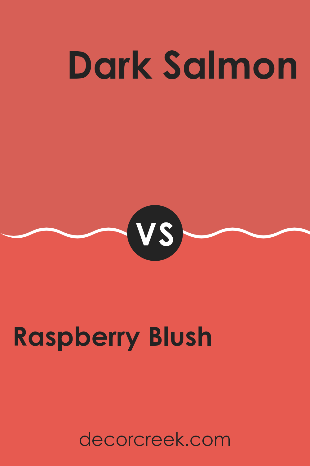
Raspberry Blush 2008-30 by Benjamin Moore vs Dark Salmon 2009-30 by Benjamin Moore
Raspberry Blush and Dark Salmon are both vibrant, warm shades from Benjamin Moore. Raspberry Blush is a bold, punchy color with a deep pink-red hue that stands out in any interior, making it a lively choice for walls or accents.
It’s the kind of color that can instantly make a room feel more energetic and inviting. On the other hand, Dark Salmon is a more subdued and earthy tone. It blends reds with orange to create a cozy, more muted finish compared to Raspberry Blush.
This color works well in areas where you want to introduce warmth without making the interior feel too intense or heavy. Although both shades share a red base, Raspberry Blush leans toward a more vivid and dynamic look, while Dark Salmon offers a softer and gentler approach. Depending on the mood you’re aiming for—playful and dynamic or warm and soothing—either of these colors could be the perfect fit.
You can see recommended paint color below:
- 2009-30 Dark Salmon
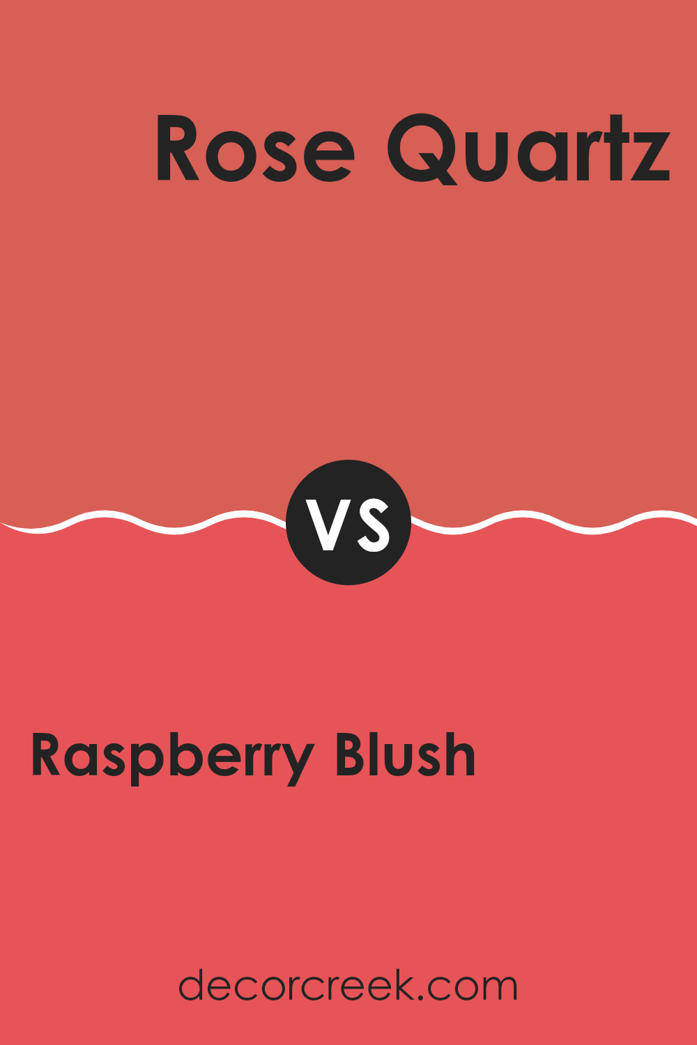
Raspberry Blush 2008-30 by Benjamin Moore vs Rose Quartz 2002-30 by Benjamin Moore
Raspberry Blush and Rose Quartz by Benjamin Moore are two distinct yet appealing shades. Raspberry Blush is a bold, vivid color resembling a deep, vibrant pink with a slightly red undertone. It stands out as a lively and energetic hue, perfect for adding a striking touch to any room.
It can make a room feel warm and energetic. On the other hand, Rose Quartz is a softer, lighter pink with a soothing feel. This color has a gentle and airy quality, making it ideal for creating a relaxing and welcoming atmosphere in any room.
While Raspberry Blush draws attention and makes a statement, Rose Quartz offers a subtle and gentle charm, contributing to a peaceful and inviting environment. These differences make each color suitable for different moods and settings, from vibrant and playful to calm and cozy.
You can see recommended paint color below:
- 2002-30 Rose Quartz
Raspberry Blush 2008-30 by Benjamin Moore vs Adobe Orange 2171-30 by Benjamin Moore
Raspberry Blush and Adobe Orange, both by Benjamin Moore, are vibrant and bold colors, but they have distinct tones that set them apart. Raspberry Blush is a strong, lively pink with a hint of red that gives it a playful energy, making it a great choice for rooms meant to spark creativity and happiness.
On the other hand, Adobe Orange offers the warmth of terracotta clay, a robust orange with a brown undertone that makes it feel inviting and cozy, suitable for areas where you want to feel relaxed and comfortable.
While Raspberry Blush feels more youthful and daring, Adobe Orange has an earthy richness that feels warm and nurturing. Depending on the mood you want to create, each color offers unique possibilities. Raspberry Blush stands out and draws the eye, making it great for a focal point in a room. Adobe Orange, being more subdued, works well as a background color that complements natural materials and textures. Both colors are perfect for adding personality to an interior but cater to different tastes and design needs.
You can see recommended paint color below:
- 2171-30 Adobe Orange
Raspberry Blush 2008-30 by Benjamin Moore vs Habanero Pepper 1306 by Benjamin Moore
The main color, Raspberry Blush, is a bold and vibrant red that leans towards a pink hue. This lively color is full of energy and can really brighten up a room. It has a playful quality to it that makes it great for creating a focal point in an interior.
On the other hand, Habanero Pepper is also a robust red, but it has an orange undertone which gives it a warmer feel. This color is a bit more muted than Raspberry Blush, making it slightly less intense but still very striking. It’s perfect for adding warmth and coziness to an area.
Both colors are similar in their vibrancy and ability to make a strong visual impact. However, their different undertones—pink for Raspberry Blush and orange for Habanero Pepper—will affect how they interact with other colors and elements in a room. Raspberry Blush is likely to feel more youthful and fun, while Habanero Pepper might give off a more welcoming and homey vibe.
You can see recommended paint color below:
- 1306 Habanero Pepper
As I wrap up my thoughts on the 2008-30 Raspberry Blush by Benjamin Moore, I’m really excited about this color! It’s a bold pink, not a quiet one, that seems to bring the room to life. Using this shade in your home can make things fun and lively. It’s great for a spot where you want everyone to feel cheerful and awake.
I think this paint can work wonders if you use it on a big wall or as a special touch on furniture. Imagine a bookshelf painted in Raspberry Blush—it would make picking books so much more fun! This color can also give a fresh look when you’re tired of seeing the same old colors around you.
Raspberry Blush isn’t just another pink. It has a lot of red in it, which makes it strong and full of energy. For those who love colors that are loud and proud, this would be perfect. I believe it’s a great way to add some excitement to any room without too much effort. Just a can of paint, a brush, and a day off, and you can turn a dull room into something exciting.
So why not give it a try? Bring in some Raspberry Blush and see how it changes your home. It might just make you and everyone else at home smile brighter.
decorcreek.com
Ever wished paint sampling was as easy as sticking a sticker? Guess what? Now it is! Discover Samplize's unique Peel & Stick samples.
Get paint samples

