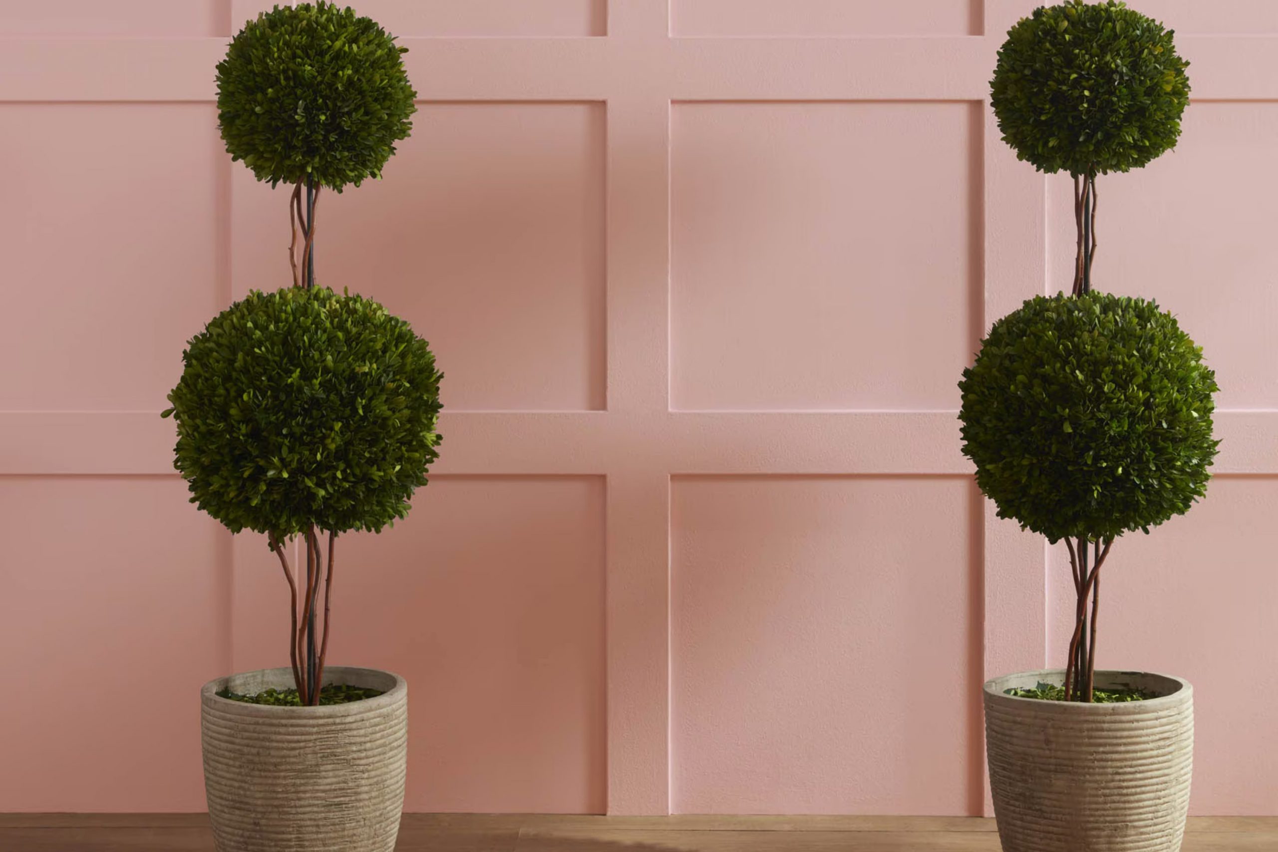
Choosing the right wall color for your room can really set the tone for everything else. I recently decided to refresh my bedroom and was looking for something soft and neutral but with a hint of warmth. That’s when I came across 2102-50 Rose Bisque by Benjamin Moore. It’s a gentle yet warm hue that brings a cozy and welcoming atmosphere to any room.
What I like most about Rose Bisque is how flexible it is. Whether you’re looking to pair it with bold, dark furniture or softer, light-colored decor, it adapts beautifully. Plus, it’s not just limited to bedrooms; it looks equally good in living rooms, bathrooms, and even kitchens.
The color also does a great job of reflecting both natural and artificial light, making my bedroom feel more open than it actually is.
If you’re considering a makeover for one of your rooms or just interested in a new wall color that offers warmth without feeling too intense, Rose Bisque might just be what you need.
What Color Is Rose Bisque 2102-50 by Benjamin Moore?
Rose Bisque is a warm, soft pink hue that brings a cozy, inviting feel to any room. This color is light and muted, making it adaptable for use in different interior designs. It pairs exceptionally well with classic white trim, adding a subtle contrast that enhances its warmth.
This color is particularly ideal for styles like shabby chic, where its gentle pink tones complement the distressed furnishings and soft, floral patterns typical of the style. It also works well in modern farmhouse and traditional interiors, where its warmth can add a fresh, welcoming touch without overpowering the room.
When it comes to materials, Rose Bisque pairs beautifully with natural wood, whether it’s a light oak or a more rustic, weathered finish. The natural grains and textures of wood help ground the color, preventing it from feeling too airy. Additionally, textiles like linen or cotton in white or soft pastel shades can help create a soft, layered look that feels cozy and well put together.
Furthermore, incorporating elements like brushed gold or copper fixtures can add a touch of warmth that complements the pink tones of Rose Bisque, creating an interior that feels both cozy and stylish. Overall, this color is perfect for creating a gentle, welcoming atmosphere in any home.
decorcreek.com
Is Rose Bisque 2102-50 by Benjamin Moore Warm or Cool color?
Rose Bisque 2102-50 by Benjamin Moore is a warm, soft pink color that brings a cozy and inviting feel to any room. This shade is great for creating a welcoming atmosphere in rooms like living rooms and bedrooms where you want to relax and feel at home. It’s especially good in rooms that get a lot of natural light, as the sun brings out its gentle tones, making the room feel airy and light.
When used on walls, this color goes well with creamy whites or soft grays, which help balance its warmth while keeping the overall vibe gentle and easygoing. It’s ideal for those who want a touch of color but aren’t looking for something too bold or too intense.
Additionally, Rose Bisque can pair nicely with natural wood finishes, green plants, and textured fabrics such as linen or wool, adding layers to the visual interest of the room. Overall, it’s an adaptable color that can make your house feel more like a welcoming home.
Undertones of Rose Bisque 2102-50 by Benjamin Moore
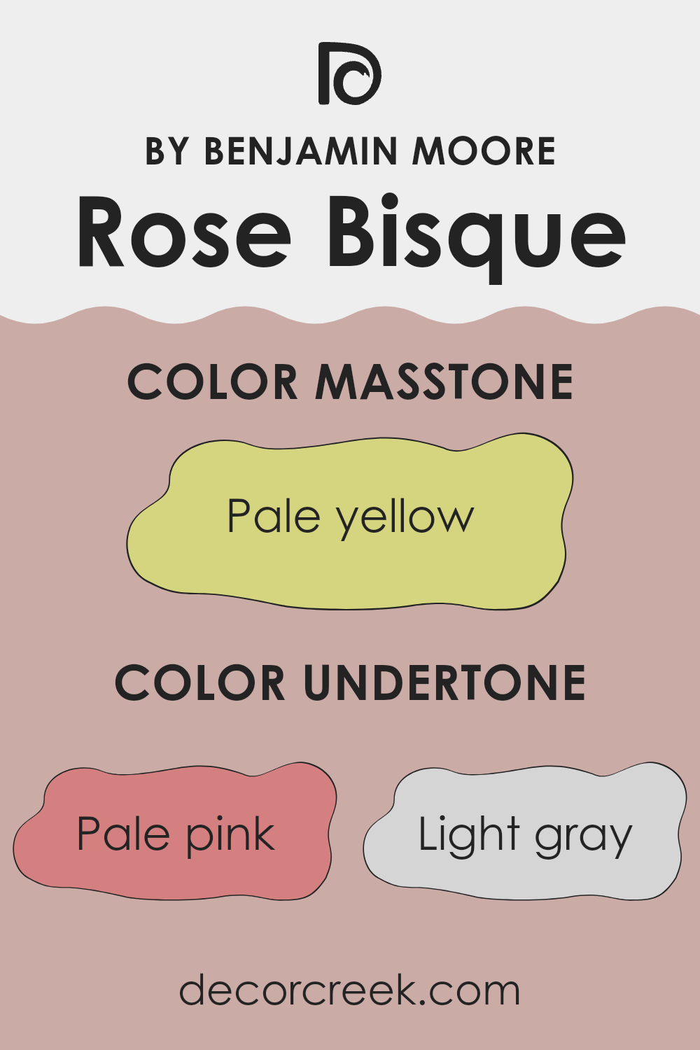
Rose Bisque is an adaptable paint color from Benjamin Moore that carries a number of subtle undertones, adding depth and complexity. Understanding undertones can greatly impact how we perceive the overall color. When we look at a color like Rose Bisque, what might seem like a simple shade at first glance reveals multiple layers upon closer inspection.
Undertones are the subtle colors that lie beneath the surface of the primary paint color. They can shift the way a color appears under different lighting conditions and can significantly influence the mood of a room. For Rose Bisque, the undertones include pale pink, light gray, light purple, and hints of other colors such as mint, grey, light blue, lilac, yellow, orange, light green, and olive.
These undertones can make the walls feel warmer or cooler depending on the lighting. For instance, in a room with plenty of natural light, the pale pink and light purple undertones of Rose Bisque might make the room feel gentle and welcoming. Alternatively, in artificial light, the grey or light blue undertones might become more dominant, giving the room a cooler feel.
When using Rose Bisque on interior walls, these undertones offer a unique advantage. They allow the color to adjust subtly to different decor styles and accessories. If paired with soft textiles and natural materials, the warmer undertones of pink, yellow, and orange can make the room feel cozy and inviting. Conversely, if the room features modern elements like metal or glass, the cooler undertones like gray and light blue might stand out, lending a fresher look to the room.
In essence, the range of undertones in Rose Bisque helps it remain flexible and responsive to various interior styles and lighting conditions, adding a nuanced character to any room.
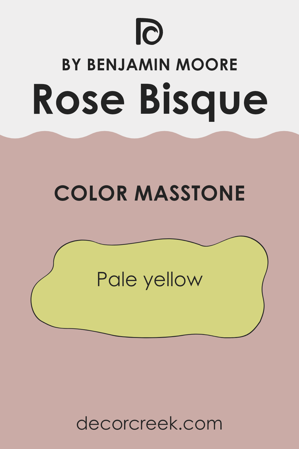
What is the Masstone of the Rose Bisque 2102-50 by Benjamin Moore?
Rose Bisque2102-50 by Benjamin Moore presents a masstone of pale yellow, visually represented by the color code #D5D580. This subtle, mellow yellow shade can have a calming effect in homes, adding a touch of soft, comforting brightness to any area.
Its lightness makes it great for smaller rooms or areas with limited natural light, as it helps to make them appear more open and airy. Because of its neutral yet warm tone, it pairs easily with a wide range of other colors, from strong, dark shades to more delicate pastels, offering flexibility in decor choices.
This pale yellow can be used on walls to create a cozy yet light ambiance, ideal for living areas and bedrooms where a soothing atmosphere is desirable. It’s also a fantastic option for kitchens and bathrooms, where it contributes to a clean and fresh look. Overall, the mild vibrancy of this color adds to a home’s visual appeal without feeling too intense.
How Does Lighting Affect Rose Bisque 2102-50 by Benjamin Moore?
Lighting plays a pivotal role in how colors are perceived in a room, influencing both the mood and aesthetics. Colors can look vastly different depending on the type of light — whether it’s natural sunlight or artificial lighting like LEDs or incandescent bulbs.
Taking the color Rose Bisque from Benjamin Moore as an example, we can see how different lighting conditions alter its appearance. In artificial light, Rose Bisque tends to have a warmer, cozier feel, making it ideal for living areas or dining rooms where a friendly, inviting atmosphere is desired. The subtle pink tones can become slightly richer, enhancing the sense of warmth.
In natural light, Rose Bisque displays a more true-to-color hue. In bright sunlight, its soft peachy-pink undertones can appear more vivid, bringing a fresh and lively vibe to a room. This effect makes it a good choice for areas that receive a lot of daylight, as it complements the light rather than competing with it.
In rooms facing different directions, the color can also have varied appearances:
North-facing rooms: These rooms typically receive less direct sunlight, which can make colors appear slightly cooler. Rose Bisque may thus seem more subdued and less warm, giving a softer touch to the room.
South-facing rooms: Here, the ample sunlight can make Rose Bisque look more vibrant and energetic, as the natural light accentuates its warmer undertones.
East-facing rooms: In these rooms, the morning light can make Rose Bisque look bright and cheerful, an excellent choice for bedrooms or breakfast nooks to start the day with a sunny touch.
West-facing rooms: With evening light, this color can appear softer and more muted, creating a relaxing atmosphere that’s perfect for winding down at the end of the day.
Understanding how lighting affects color can help you choose the right paint color for your room based on the room’s orientation and the type of light it receives. Rose Bisque, with its adaptable hue, can adjust beautifully across different lighting scenarios, making it a practical choice for various settings.

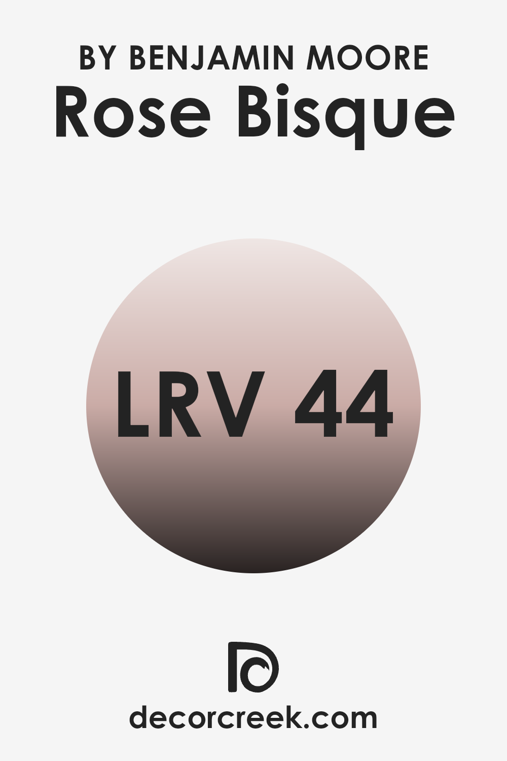
What is the LRV of Rose Bisque 2102-50 by Benjamin Moore?
LRV stands for Light Reflectance Value, which measures the amount of light a paint color reflects or absorbs when it’s applied to a wall. It’s a number that usually ranges from 1 to 99, where a higher number indicates that the color will reflect more light and appear lighter, while a lower number means it absorbs more light and looks darker.
This value is crucial in choosing paint colors because it helps you understand how bright or dim a color will look in your room depending on how much natural or artificial light your room gets.
In the case of Rose Bisque with an LRV of 44.08, the color is somewhat balanced between light and dark. The LRV indicates that Rose Bisque won’t make a room feel overly bright, nor will it absorb all the light in a room, making it feel overly dark. Instead, it strikes a nice balance, providing a cozy feel without closing in the room. This makes it a flexible choice for rooms that may have moderate lighting and need a color that can complement the ambient light without dominating the room.
decorcreek.com
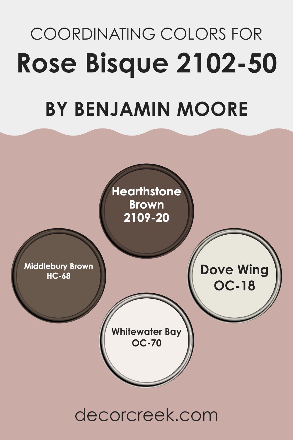
Coordinating Colors of Rose Bisque 2102-50 by Benjamin Moore
Coordinating colors are shades that complement one another and are often used together to create a cohesive and visually appealing color scheme in interior design. When selecting coordinating colors, it’s essential to choose hues that balance well with the main color to prevent any clashing and to bring out the best in each shade. For instance, Rose Bisque, a delicate and gentle hue, can be beautifully enhanced by compatible colors that either offer a bold contrast or softly harmonize.
Hearthstone Brown, a rich, deep tone, pairs wonderfully with the lightness of Rose Bisque, providing a striking counterbalance that adds depth and warmth to any room. Middlebury Brown, another complementary color, is slightly more subdued than Hearthstone but still offers a warm, earthy base that works well with softer hues, grounding them without overpowering their lightness.
Dove Wing is a soft, off-white color that provides a subtle contrast to Rose Bisque, bringing a light, airy feel to the surrounding area, making it ideal for creating a relaxed, welcoming atmosphere. Lastly, Whitewater Bay, a fresh, pale hue, offers a hint of contrast to Rose Bisque which is ideal for those looking to maintain a soft and gentle ambiance in their decor. These colors, when used together, help create a harmonious and appealing palette that can enhance the overall aesthetics of any room.
You can see recommended paint colors below:
- 2109-20 Hearthstone Brown
- HC-68 Middlebury Brown
- OC-18 Dove Wing
- OC-70 Whitewater Bay
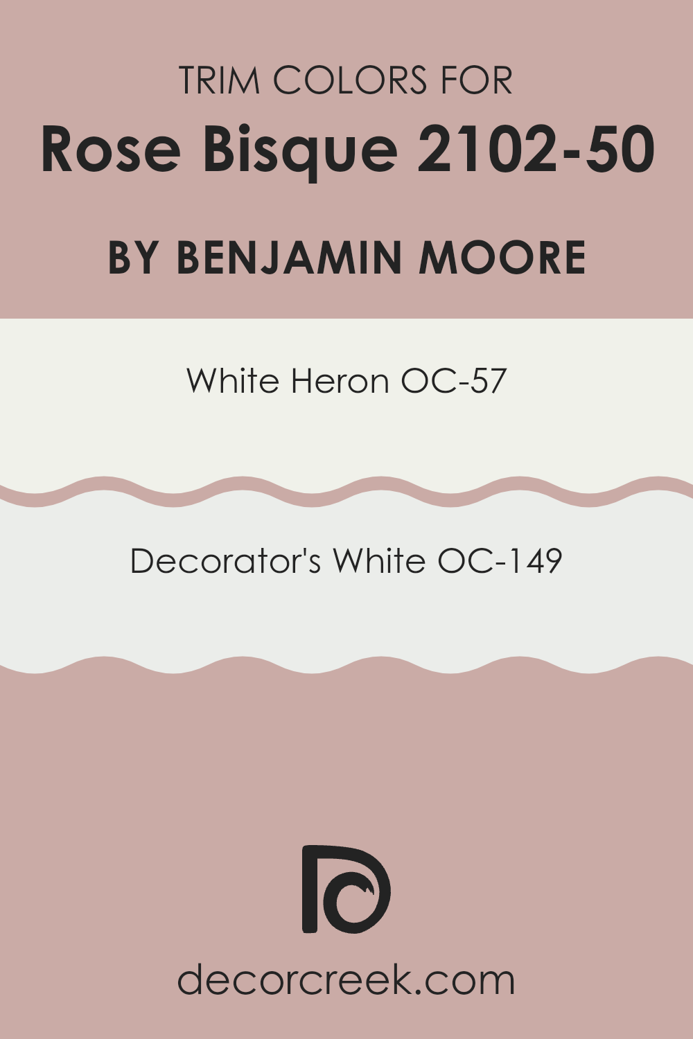
What are the Trim colors of Rose Bisque 2102-50 by Benjamin Moore?
Trim colors, such as those recommended for pairing with Rose Bisque, are neutral shades used to accentuate and define the edges, corners, door frames, and molding in a room, creating a clear visual contrast that emphasizes the main color. Opting for appropriate trim colors is crucial as they subtly highlight architectural features of the room, enabling a cohesive and polished overall appearance.
For example, using OC-57 – White Heron and OC-149 – Decorator’s White alongside Rose Bisque can gently frame the walls and draw attention in a subtle way, providing a clean and fresh boundary that complements the gentle tones of Rose Bisque.
White Heron OC-57 is a crisp and clean white that has a refreshing and pure feel. This color is ideal for trim because it offers a bright and sharp contrast, making it suitable to pair with softer wall colors like Rose Bisque while maintaining visual balance without overpowering it. On the other hand, Decorator’s White OC-149 is a slightly cooler white with subtle gray undertones, giving it a modern edge that can enhance the nuanced pigment in Rose Bisque. This shade is perfect for those who want a slightly more defined frame around a room, lending a contemporary yet understated outline to the walls.
You can see recommended paint colors below:
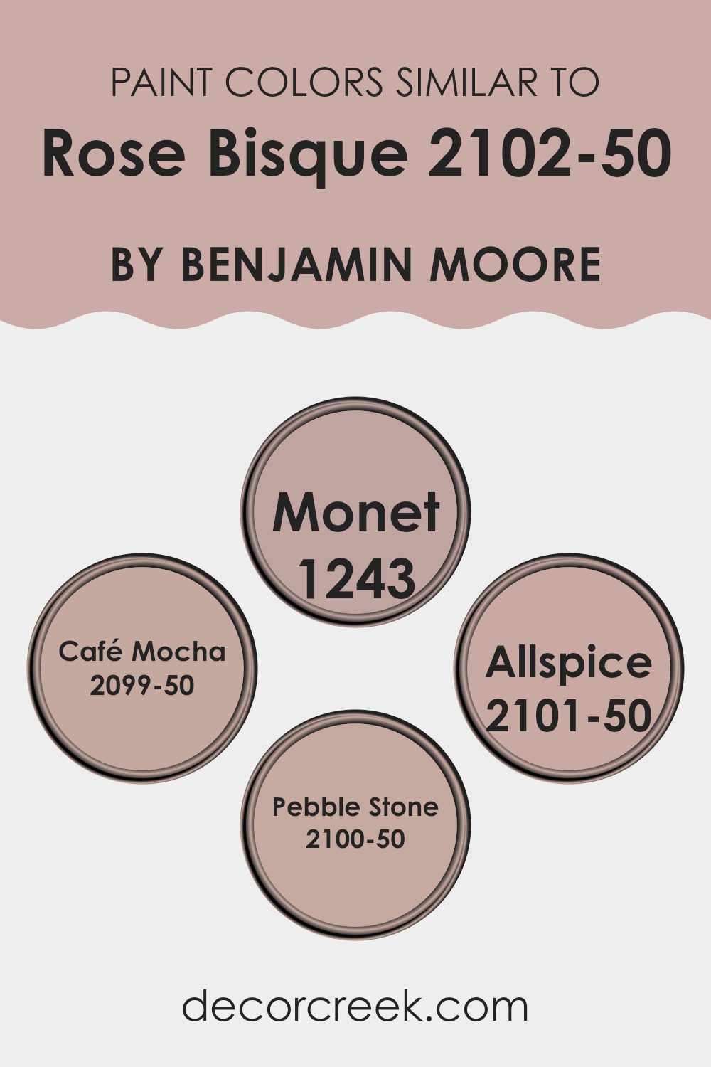
Colors Similar to Rose Bisque 2102-50 by Benjamin Moore
Choosing similar colors like Rose Bisque 2102-50 by Benjamin Moore and its close variants is essential in creating a harmonious and cohesive look that is pleasing to the eye. These color choices are often used to achieve a subtle and unified aesthetic without stark contrasts, which can be particularly useful in rooms seeking a soft and gentle ambiance.
Similar colors work well for creating a gradient effect, where each color slightly varies from the other, lending a smooth transition that enhances the overall aesthetics of a room. This method allows for a layered look that adds depth and interest without feeling too intense.
For example, Monet 1243 is a soft hue that lends a warm undertone, perfect for rooms that want a hint of coziness. Café Mocha 2099-50 offers a richer, slightly deeper tone that recalls the comfort of a warm drink, making it ideal for inviting settings. Allspice 2101-50 carries a spicier, yet still muted tone, which can add understated, refined warmth to rooms.
Lastly, Pebble Stone 2100-50 provides a neutral, soft grey that pairs well with other colors, serving as a flexible backdrop for decor elements to stand out. Using these colors alongside Rose Bisque can create a delicate, fluid visual experience that enhances the environment without excessive contrast.
You can see recommended paint colors below:
- 1243 Monet
- 2099-50 Café Mocha
- 2101-50 Allspice
- 2100-50 Pebble Stone
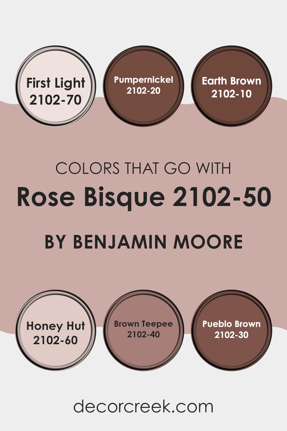
Colors that Go With Rose Bisque 2102-50 by Benjamin Moore
Choosing complementary colors for Rose Bisque 2102-50 by Benjamin Moore is crucial in creating a harmonious and visually appealing room. When paired correctly, these colors can enhance the mood of a room, making it feel more welcoming and balanced. Rose Bisque is a soft, gentle pink that gives a warm touch to any room. By selecting hues that complement this color, you can design a cohesive look that flows smoothly from one area to another.
For a light and airy feel, First Light 2102-70 is an excellent choice. It’s a pale pink that nearly whispers with its softness, perfect for creating a gentle ambiance in rooms meant for relaxation. On the darker side, Pumpernickel 2102-20 offers a striking contrast with its deep, rich brown tone, grounding the lighter pink of Rose Bisque.
Earth Brown 2102-10 provides a strong sense of earthiness with its robust, dark brown shade, making it a great option for adding a sense of stability and warmth. If you’re aiming for a bit of sweetness and softness, Honey Hut 2102-60 has a charming light apricot tint that pairs well with Rose Bisque, giving off an invitingly warm vibe. For those preferring a mid-tone option, Brown Teepee 2102-40 strikes a perfect balance with its flexible, moderate brown shade, providing a cozy and adaptable backdrop for furnishings.
Lastly, Pueblo Brown 2102-30, which has a rich terra-cotta hue, creates a lovely, warm feel that complements the rosy tones of Rose Bisque beautifully, perfect for rooms that aim for a more natural, earthy atmosphere. Each of these colors works together to support the chosen theme, whether it’s vibrant and dynamic or calm and relaxing.
You can see recommended paint colors below:
- 2102-70 First Light
- 2102-20 Pumpernickel
- 2102-10 Earth Brown
- 2102-60 Honey Hut
- 2102-40 Brown Teepee
- 2102-30 Pueblo Brown
How to Use Rose Bisque 2102-50 by Benjamin Moore In Your Home?
Rose Bisque 2102-50 by Benjamin Moore is a warm, soft pink paint color that brings a cozy, welcoming feel to any room. It’s ideal for creating a gentle ambiance in your living areas such as bedrooms and living rooms.
This color works well on walls, adding a subtle hint of warmth without feeling too intense. For those wanting to introduce color without committing fully to bold walls, Rose Bisque can be used for painting furniture or accent pieces. It pairs beautifully with creamy whites or soft grays, providing a balanced look.
Also, because it’s a softer shade, it doesn’t clash with bolder colors, making it flexible for integrating into existing color schemes. In the bathroom, pairing it with white tiles and fixtures can give a fresh, clean look, while in a nursery, it offers a gentle backdrop that feels soothing and comforting for babies.
Rose Bisque 2102-50 by Benjamin Moore vs Allspice 2101-50 by Benjamin Moore
Rose Bisque and Allspice, both by Benjamin Moore, carry a subtle charm but in distinct ways. Rose Bisque has a gentle pink hue that offers a refreshing touch to rooms without being too bold. It’s soft and creates a welcoming vibe, perfect for living areas or bedrooms looking for a touch of warmth without overpowering color.
On the other hand, Allspice has a deeper, more muted tone, leaning toward a refined mix of brown with hints of gray. This color is ideal for those who prefer something less traditional than typical browns yet still want a sense of warmth. It can work well in many settings, providing a solid, grounding influence in a room.
Both colors can complement a range of décor styles and preferences, giving you a lovely palette to work with whether you lean toward the slightly brighter and airy Rose Bisque or the cozy, muted depth of Allspice.
You can see recommended paint color below:
- 2101-50 Allspice
Rose Bisque 2102-50 by Benjamin Moore vs Café Mocha 2099-50 by Benjamin Moore
The main color, Rose Bisque, and the second color, Café Mocha, both from Benjamin Moore, offer distinct tones that could beautifully complement various rooms. Rose Bisque is a soft, muted pink with a warm undertone that gives it a gentle and welcoming feel. It’s subtle enough to use in large areas without feeling too intense and creates a cozy ambiance. It works particularly well in bedrooms or living areas where a touch of softness is desired.
On the other hand, Café Mocha is a richer, darker shade that resembles the comforting color of coffee with cream. This color adds a sense of warmth and depth to any room. It’s particularly effective in creating a focal point or accent wall, and it pairs well with a wide range of decor styles, from modern to rustic.
When used together, these colors complement each other: the softness of Rose Bisque balances the robust depth of Café Mocha, making them a great duo for creating a harmonious color scheme in your home.
You can see recommended paint color below:
- 2099-50 Café Mocha
Rose Bisque 2102-50 by Benjamin Moore vs Monet 1243 by Benjamin Moore
When comparing Rose Bisque by Benjamin Moore to Monet by Benjamin Moore, you will notice some distinct differences. Rose Bisque has a gentle, warm pink tone that feels soft and comforting, making it ideal for creating a cozy atmosphere in rooms like bedrooms or living rooms. This color is subtle yet inviting, providing a light backdrop that isn’t too intense.
On the other hand, Monet is a cooler, grayish blue shade that gives off a calm, muted vibe. This color is flexible and works well in many settings, offering a more neutral palette that pairs easily with a wide range of decor. Monet’s understated refinement makes it suitable for areas where you want a touch of color without it being the center of attention.
Overall, Rose Bisque adds warmth with its pink hues, while Monet offers a cooler, more understated look with its blue-gray tones. Both colors have their own appeal, depending on the mood and style you want to achieve.
You can see recommended paint color below:
- 1243 Monet
Rose Bisque 2102-50 by Benjamin Moore vs Pebble Stone 2100-50 by Benjamin Moore
Rose Bisque and Pebble Stone by Benjamin Moore are both subtle, soothing colors, but they differ in tone and warmth. Rose Bisque has a soft, warm hue with a subtle pink undertone, making it feel cozy and inviting. It’s an excellent choice for rooms where you want to add a gentle touch of warmth and comfort, like living rooms or bedrooms.
On the other hand, Pebble Stone carries a cooler tone, leaning more toward a neutral gray with a hint of beige. This color is adaptable and provides a calm, muted backdrop that works well in many settings, from modern kitchens to home offices. It can help make a room feel more open and airy while still adding character.
Both colors are quite neutral but cater to different aesthetic preferences and effects within a room. Rose Bisque warms up a room, while Pebble Stone offers a cleaner, more straightforward look. Choosing between them depends on the desired mood and existing decor of your room.
You can see recommended paint color below:
- 2100-50 Pebble Stone
After reading about 2102-50 Rose Bisque by Benjamin Moore, I really think it’s a wonderful color! It’s a soft, gentle pink that seems to make any room feel warm and cozy. Sometimes, picking the right paint can be tough, but this shade looks like it would be lovely in lots of different places like bedrooms and living rooms, or anywhere you want a quiet and happy feeling.
This color isn’t too bright, but it’s also not too dull, making it just perfect for someone who wants something pretty simple that still adds a touch of beauty to their home. If you like colors that make you feel happy and relaxed, 2102-50 Rose Bisque might be a great choice! It seems to work well with other colors too, so you can use it with many different furniture styles and room themes.
Overall, 2102-50 Rose Bisque by Benjamin Moore is a paint color that looks like it would make many people smile when they walk into a room painted with it. It’s soft, warm, and has a friendly vibe.
I think it’s a paint color worth trying if you want to freshen up your room with something nice.
Ever wished paint sampling was as easy as sticking a sticker? Guess what? Now it is! Discover Samplize's unique Peel & Stick samples.
Get paint samples

