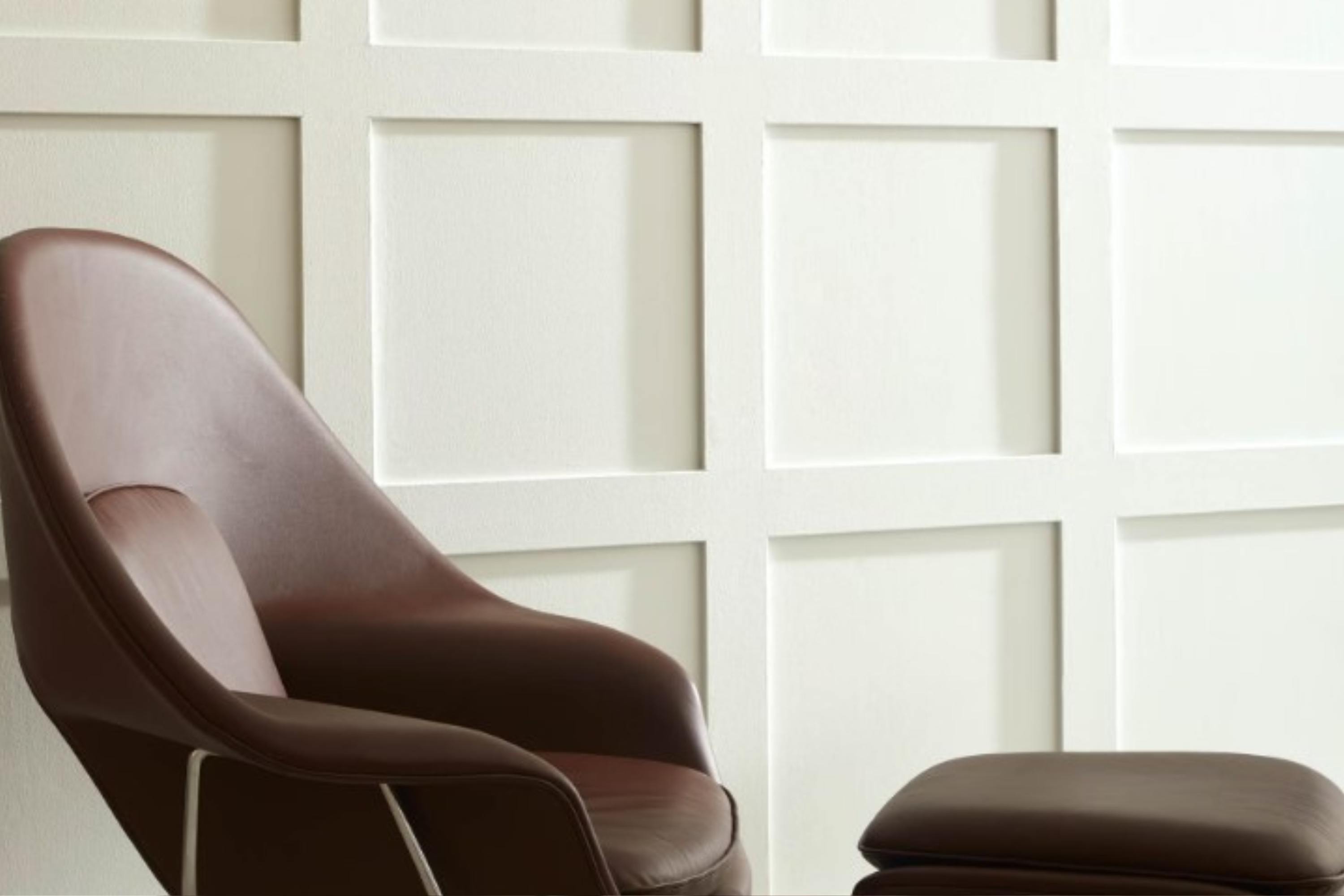
Introducing OC-57 White Heron by Benjamin Moore, a paint color that truly stands out for its versatility and timeless appeal. When you’re thinking about giving your space a fresh, bright look, White Heron is a color you might want to consider.
It’s not just any white; this shade has a unique quality that brings a special kind of brightness to any room, making spaces feel more open and airy. Whether you’re updating a small apartment or refreshing the look of a spacious house, White Heron has the ability to make your home feel welcoming and refreshed.
This color is perfect for anyone looking to add a touch of elegance to their walls without overwhelming the room with intense colors. It’s great for living rooms, kitchens, bedrooms, and even bathrooms – basically anywhere you want to introduce more light and a sense of expansiveness.
And because it’s from Benjamin Moore, you know you’re getting a quality product that professionals trust. In the following paragraphs, we’ll discuss how OC-57 White Heron can transform your home, along with tips on how best to apply it and colors that pair well with it. If you’re considering a makeover or simply want to update a room, OC-57 White Heron offers a beautiful and straightforward solution.
What Color Is White Heron OC-57 by Benjamin Moore?
White Heron OC-57 by Benjamin Moore is a crisp, clean white that has a slightly warm undertone, making it highly adaptable and versatile for various interior spaces. Unlike stark whites, it has a softness to it that brings a refreshing and inviting feel to any room. This color shines in areas where natural light floods in, showcasing its gentle warmth, yet it remains bright and airy under artificial lighting as well.
This white is perfect for minimalist and modern interiors due to its pure and uncluttered vibe. However, its understated warmth allows it to seamlessly integrate into more traditional or rustic styles, acting as a beautiful backdrop that enhances other colors or design elements in the space. It’s a color that promotes a sense of calm and cleanliness, making it ideal for bedrooms, living rooms, and even kitchens, where it can make the space appear larger and more welcoming.
White Heron pairs wonderfully with natural materials and textures such as wood, stone, and metals, highlighting their natural beauty without competing for attention. It works well with soft textiles like linen or wool, adding a layer of coziness to any interior.
Whether combined with bold colors for a striking contrast or used alongside softer hues for a harmonious look, White Heron provides a solid foundation for various design palettes, making it a go-to white for those looking to refresh their space with a timeless and adaptable color.
Ever wished paint sampling was as easy as sticking a sticker? Guess what? Now it is! Discover Samplize's unique Peel & Stick samples.
Get paint samples

Is White Heron OC-57 by Benjamin Moore Warm or Cool color?
White Heron OC-57 by Benjamin Moore is a fresh and airy paint color that brings a sense of calm and brightness to any room. Its subtle warmth makes it versatile, easily fitting into a wide range of home styles and spaces.
Unlike stark whites, its soft tone avoids feeling sterile, instead offering a welcoming and comfortable atmosphere. This quality makes it particularly effective in spaces that aim to be serene and restful, such as bedrooms and bathrooms.
Furthermore, White Heron has the ability to enhance natural light in a room, making spaces appear larger and more open. This can be especially beneficial in smaller rooms or areas with limited light, where it can help create an illusion of spaciousness. Its neutral character also serves as an excellent backdrop for art, furniture, and decor, allowing homeowners to experiment with different color accents and textures without clashing.
Overall, White Heron OC-57 supports a fresh, cohesive look throughout a home, providing a timeless canvas that adapts well to changing styles and seasons.
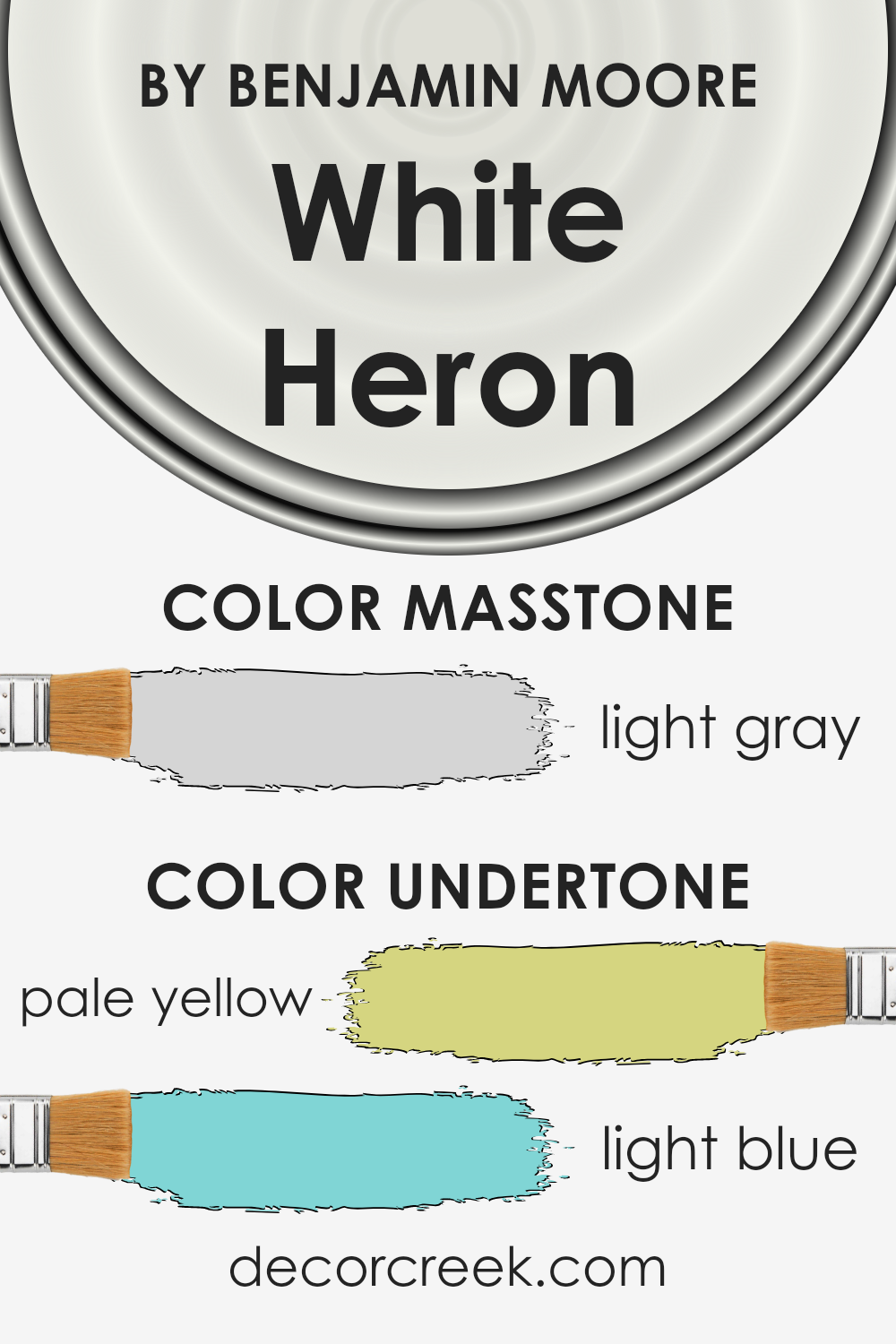
Undertones of White Heron OC-57 by Benjamin Moore
White Heron OC-57 by Benjamin Moore is a popular paint color choice for its clean and crisp appearance. This color isn’t just a simple white; it comes to life with subtle undertones of pale yellow and light blue. Undertones in paint colors play a crucial role because they can subtly change how the color appears in different lighting conditions and surroundings. They add depth and complexity, making the color more versatile and appealing.
The pale yellow undertone of White Heron adds a soft warmth to the color, making spaces feel more inviting and cozy. It’s perfect for rooms that could use a touch of sunlight without the boldness of a true yellow.
On the other hand, the light blue undertone introduces a hint of cool freshness, reminiscent of a clear sky on a sunny day. This balance means that White Heron can adapt to various settings and decor styles, making it an excellent choice for interior walls.
When applied to interior walls, the undertones of White Heron affect the room’s mood. In natural light, the pale yellow might become more prominent, creating a sunny atmosphere. Meanwhile, in artificial lighting, the light blue might stand out, offering a calm and serene vibe.
This interplay of undertones makes White Heron a dynamic color that can bring a room to life in subtle yet impactful ways. Its ability to harmonize with different lighting and accents makes it a favored choice for creating refined and adaptable living spaces.
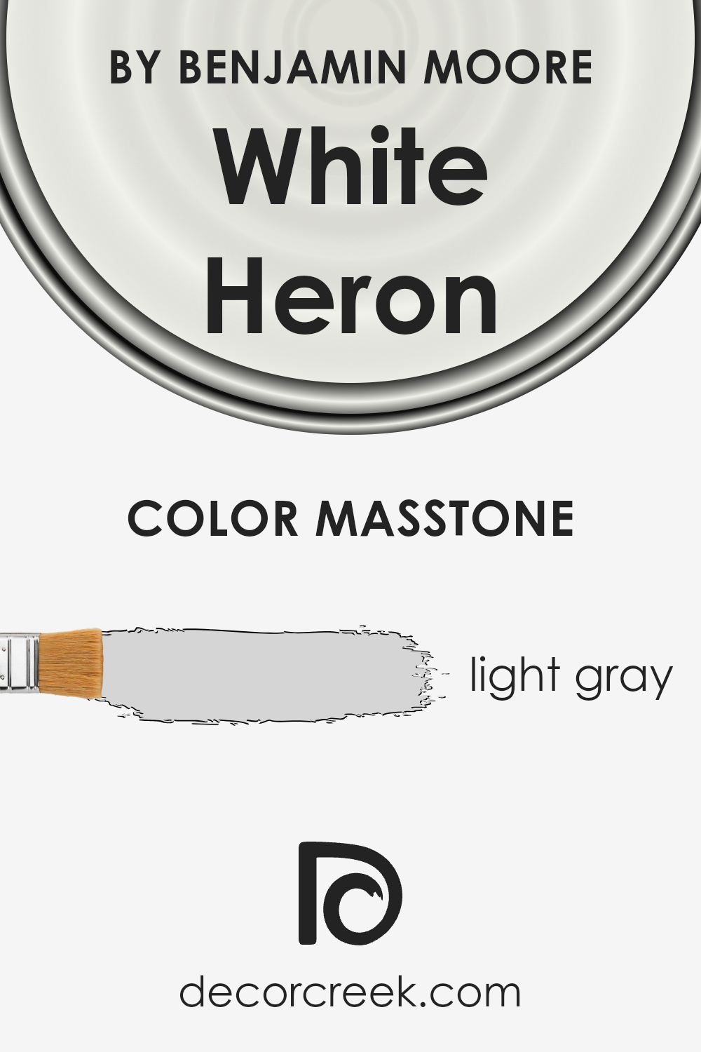
What is the Masstone of the White Heron OC-57 by Benjamin Moore?
White Heron OC-57 by Benjamin Moore has a main color tone of light gray (#D5D5D5). This subtle, soft shade is versatile, making it a popular choice for homes. Its light gray mass tone offers a fresh and clean look, perfect for creating a serene and calming environment. This color works well in spaces that receive plenty of natural light, enhancing the feeling of openness and airiness in the room.
Due to its neutrality, it serves as an excellent backdrop for various decor styles and color schemes, allowing homeowners to easily mix and match their furniture and accessories without clashing. It’s especially great for small spaces, as the lightness of the color can help make rooms appear larger and more inviting.
Additionally, its simplicity allows it to blend seamlessly with other colors, offering a cohesive look throughout the home.
How Does Lighting Affect White Heron OC-57 by Benjamin Moore?
Lighting plays a critical role in how we perceive colors, significantly impacting the appearance and feel of a room. Different light sources can change how a color looks, making it seem brighter, duller, warmer, or cooler. White Heron OC-57 by Benjamin Moore is a perfect example to illustrate this, as subtle changes in lighting can influence its appearance in various environments.
- In artificial light, such as that from LED bulbs or fluorescent lamps, White Heron can look slightly different depending on the type of bulb. Warmer-toned bulbs may make it appear softer and slightly more creamy, while cooler-toned bulbs can give it a crisper, more vibrant feel. This makes it a versatile choice for interior design, as it can adapt well to the ambiance created by different artificial lighting choices.
- In natural light, the color takes on a different character through the day. In north-faced rooms, which receive less direct sunlight, White Heron maintains a consistent, true white appearance, promoting a calm and serene ambiance. However, it might feel cooler due to the lack of direct sunlight.
- South-faced rooms bathe in abundant sunlight, making White Heron gleam brightly, enhancing its crisp and clean qualities. The ample natural light can make the color feel warmer throughout the day, creating a welcoming and lively space.
- East-faced rooms enjoy the warmth of the morning sun, making White Heron appear soft and warm in the mornings, then transitioning to a true, neutral white as the day progresses and the direct sunlight moves away. This shift provides a gentle and energizing start to the day, with the color adapting subtly.
- West-faced rooms capture the afternoon and evening light, with the setting sun casting a warm glow. Here, White Heron can take on a softer, warmer hue in the afternoons and evenings, creating a cozy and relaxing environment.
Overall, White Heron’s ability to interact with both artificial and natural light in diverse directions makes it an excellent choice for any room, adapting subtly to create the perfect backdrop for any space.

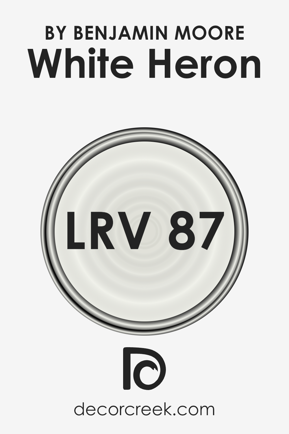
What is the LRV of White Heron OC-57 by Benjamin Moore?
LRV stands for Light Reflectance Value, which is a measure of the percentage of light a paint color reflects back into the room, compared to how much it absorbs. LRVs range from 0 to 100, with 0 being completely black (absorbing all light) and 100 being pure white (reflecting all light). This value is crucial because it helps determine how light or dark a color will appear on your walls and how it will change under different lighting conditions.
Brighter rooms may amplify the lightness of a paint color, while rooms with less natural light can make the color appear slightly darker. Understanding the LRV of paint can help you make better choices for your space to achieve the desired mood and feel.
Given that the LRV of White Heron OC-57 by Benjamin Moore is 86.69, this indicates it is a very light color that will reflect most of the light that hits it, making rooms appear brighter and more spacious. Because it’s on the higher end of the LRV scale, it’s perfect for making small spaces feel larger or for brightening up a room that doesn’t receive much natural sunlight.
However, the appearance of White Heron can still be influenced by the direction of your room, the size and type of windows, and the other colors used in your decor. Even with its high LRV, the actual effect of this color on your walls might vary throughout the day as natural lighting changes, highlighting the importance of considering all these factors when choosing paint colors.
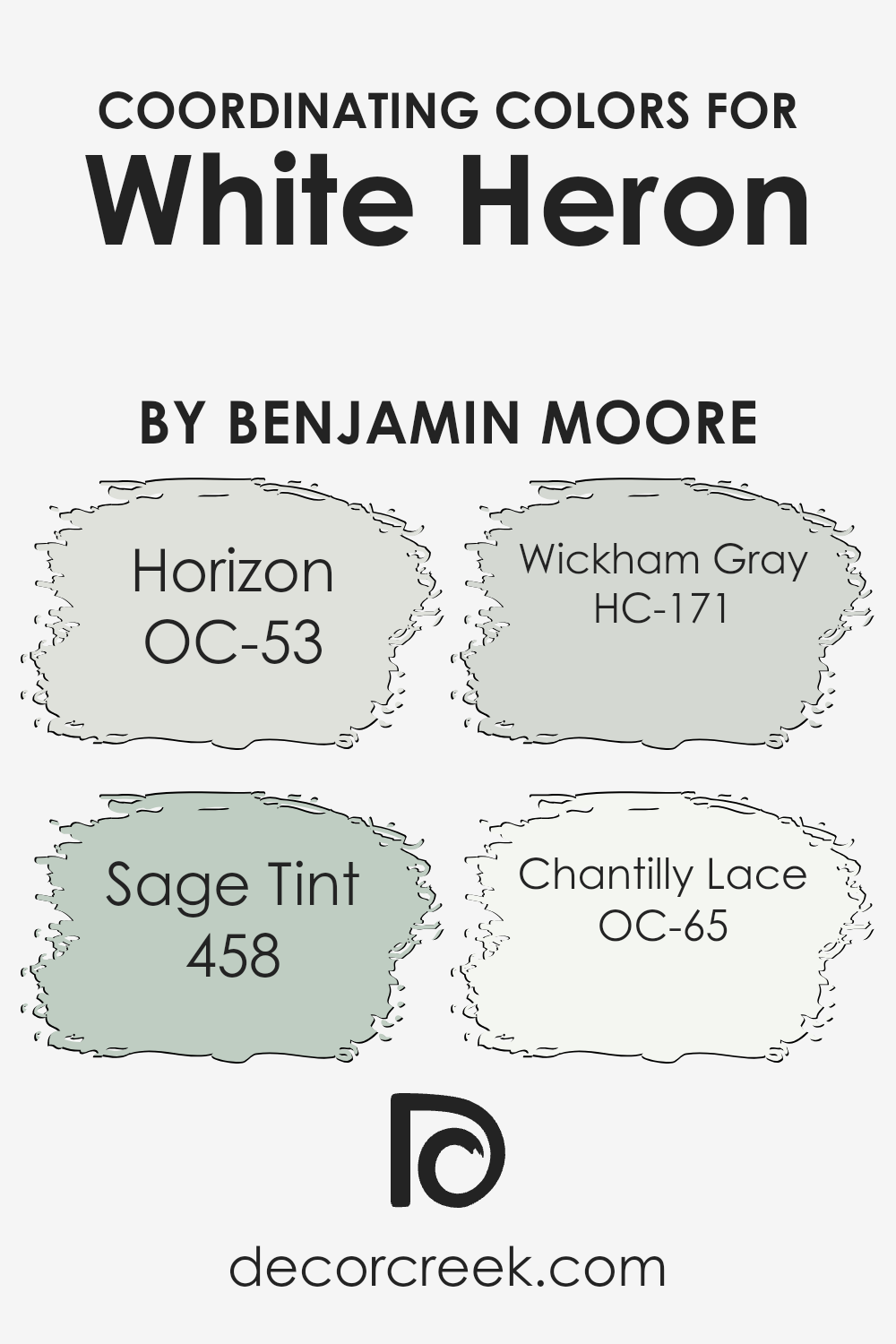
Coordinating Colors of White Heron OC-57 by Benjamin Moore
Coordinating colors are essentially hues that harmonize well with a specific color, enhancing the overall aesthetic of a space without overpowering it. In the case of White Heron OC-57 by Benjamin Moore, a subtle and versatile shade, its coordinating colors are expertly chosen to complement its crispness and light-reflecting quality, creating a seamless and cohesive look.
These colors work together by balancing warmth and coolness or by offering a subtle contrast that adds depth and interest to your decor without clashing.
Horizon OC-53 is a soft, airy gray that mirrors the serene feeling of a misty morning sky, offering a tranquil backdrop that allows White Heron to shine. Sage Tint 458 introduces a hint of nature-inspired green, providing a gentle splash of color that’s soothing and earthy, perfect for creating a relaxed environment. Wickham Gray HC-171, another gray in the palette, leans towards the cooler spectrum with its blue undertones, giving a refreshing but understated vibrancy.
Lastly, Chantilly Lace OC-65 is a pristine white with just a whisper of warmth, ensuring a bright and inviting space that enhances the openness brought by White Heron. Together, these colors offer a harmonious blend perfect for any space seeking balance, light, and a touch of sophistication.
You can see recommended paint colors below:
- OC-53 Horizon
- 458 Sage Tint
- HC-171 Wickham Gray
- OC-65 Chantilly Lace
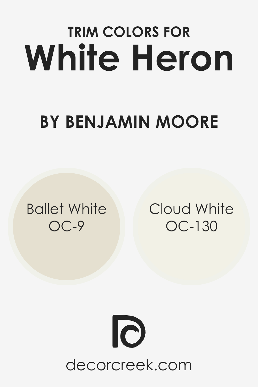
What are the Trim colors of White Heron OC-57 by Benjamin Moore?
Trim colors are essentially the shades used for the detailing parts of a room or exterior, such as door frames, window sills, skirting boards, and moldings. They play a crucial role in accentuating the architectural features of a space, creating contrast, and complementing the primary wall colors to enhance overall aesthetic appeal. When considering a soft, versatile wall color like Benjamin Moore’s White Heron, selecting the right trim color is pivotal.
It can frame and lift the main color, adding depth and definition to a room. Trim colors can subtly shift the mood and style of the space, from cozy and inviting to sleek and sophisticated, depending on the chosen shade and its undertones.
For a color like White Heron by Benjamin Moore, pairing it with a trim color like OC-9, Ballet White, offers a warm and inviting approach. Ballet White softly blends with White Heron, ensuring the transition between wall and trim is seamless yet distinctly appealing, lending a gentle, cohesive look to the space.
On the other hand, OC-130, Cloud White, brings a crisp, clean edge to trim work, perfectly offsetting the softness of White Heron with its slightly brighter and more radiant undertone. The contrast is not stark but rather delicately enhances the architectural details, promoting a fresh and airy ambiance that briskly complements White Heron’s timeless elegance.
You can see recommended paint colors below:
- OC-9 Ballet White
- OC-130 Cloud White
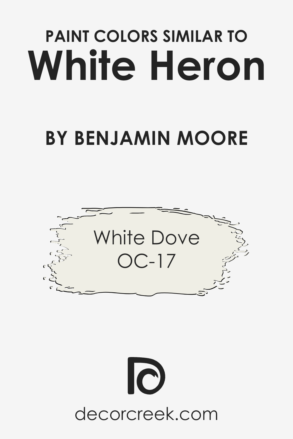
Colors Similar to White Heron OC-57 by Benjamin Moore
Choosing similar colors to White Heron OC-57 by Benjamin Moore is essential for several reasons. Similar colors help create a seamless and coordinated look in a space, allowing for a more refined and harmonious appearance. When colors are closely related, they can enhance the sense of unity and flow within a room, making it feel more cohesive. This is particularly important in open-plan spaces or rooms that transition into one another.
By using colors like OC-57, you introduce a light, airy feel that can make spaces seem larger and more welcoming. Additionally, similar colors can provide a subtle contrast that adds depth and interest without overwhelming the senses. This balance is crucial in achieving a calming and comfortable environment.
One similar color is OC-17 White Dove. This shade acts as a perfect complement to OC-57, offering a soft, warm undertone that enriches the ambiance without dominating. White Dove has a slightly creamy aspect, which brings a cozy warmth to the space, making it ideal for living areas and bedrooms where comfort is key. Meanwhile, its ability to reflect light beautifully enhances the room’s natural brightness, creating an inviting and serene atmosphere.
Choosing colors like White Dove alongside OC-57 allows for a sophisticated palette that is both versatile and timeless, ensuring spaces are not only beautiful but also feel like home.
You can see recommended paint color below:
How to Use White Heron OC-57 by Benjamin Moore In Your Home?
White Heron OC-57 by Benjamin Moore is a fantastic paint color choice for anyone looking to freshen up their home with a clean, bright look. This shade of white has a subtle warmth to it, making any room feel inviting and cozy without overwhelming it with color. It’s perfect for areas where you want to maximize natural light, such as living rooms, kitchens, and bedrooms.
Applying White Heron on walls can make small spaces appear larger and more open, while also serving as a neutral backdrop for art, furniture, and accent pieces. This versatility means it can easily fit into various decor styles, from modern minimalism to rustic charm. For those interested in selling their home, using White Heron can also help in staging the space by creating a neutral, appealing environment for potential buyers.
Overall, White Heron OC-57 is an excellent choice for creating bright, airy spaces that feel both welcoming and stylish.
White Heron OC-57 by Benjamin Moore vs White Dove OC-17 by Benjamin Moore
White Heron and White Dove, both by Benjamin Moore, are two popular shades of white, but they do have some subtle differences. White Heron is a very clean white. It’s like looking at a blank canvas, offering a pure backdrop for any space.
This color is great if you want a sharp, crisp look in a room. On the other hand, White Dove is a softer shade of white. It has a hint of warmth to it, making it feel cozy and inviting. Think of White Dove as a gentle hug for your walls; it brings a comfortable and soothing vibe into a space.
While both colors are versatile and can complement various decor styles, White Heron suits modern and minimalist designs well because of its starkness.
White Dove, with its touch of warmth, is perfect for creating a welcoming, homey feel. Choosing between them depends on the mood you want to set in your room.
You can see recommended paint color below:
Conclusion
In conclusion, White Heron by Benjamin Moore is a remarkably versatile paint color, making it an excellent choice for anyone looking to refresh their space. Its subtle nuances allow it to merge seamlessly into a variety of decor styles, from modern to classic, injecting a fresh and airy vibe into any room without overpowering.
This paint color stands out for its ability to enhance natural light, making spaces appear more open and inviting.
Furthermore, its adaptability extends to various parts of the home, including living areas, bedrooms, and kitchens, highlighting architectural details beautifully. Whether you’re looking to create a serene sanctuary, a bright and lively gathering space, or a sleek and sophisticated setting, White Heron offers a solid foundation for a wide range of design aesthetics. It proves itself as a top contender for anyone aiming to achieve a timeless look with a modern twist.
Ever wished paint sampling was as easy as sticking a sticker? Guess what? Now it is! Discover Samplize's unique Peel & Stick samples.
Get paint samples
