Black
Black Blue
Blue Brown
Brown Gray
Gray Green
Green Neutral
 Orange
 White
White Yellow
If you’re searching for a unique paint shade that brings a calming yet lively atmosphere into any room, let me introduce you to 2060-30 Seaport Blue by Benjamin Moore. I recently decided to repaint my study and came across this interesting color. Seaport Blue holds a perfect balance between bold and soothing, which is why I found it so appealing for a room where I both work and relax.
This shade of blue isn’t just another typical navy or sky blue; it’s deep yet carries a certain brightness that can make a small room feel larger or add personality to an otherwise neutral palette. I decided to use it on one feature wall, and the effect was immediate. The color has a way of shifting under different lighting conditions, looking more like a calming ocean at dusk in natural light and becoming a richer, more royal blue under artificial lighting.
I always like my decor choices to reflect a bit of my personality and style, and 2060-30 Seaport Blue has not disappointed. It’s not just about changing a wall color; it’s about creating an atmosphere that influences your mood every time you walk into the room.
Whether it’s an office, a reading nook, or even a kitchen, this color has an adaptable quality that can refresh and brighten interiors.
If you’re considering a fresh feeling for your room, you may want to think about this unique shade.
What Color Is Seaport Blue 2060-30 by Benjamin Moore?
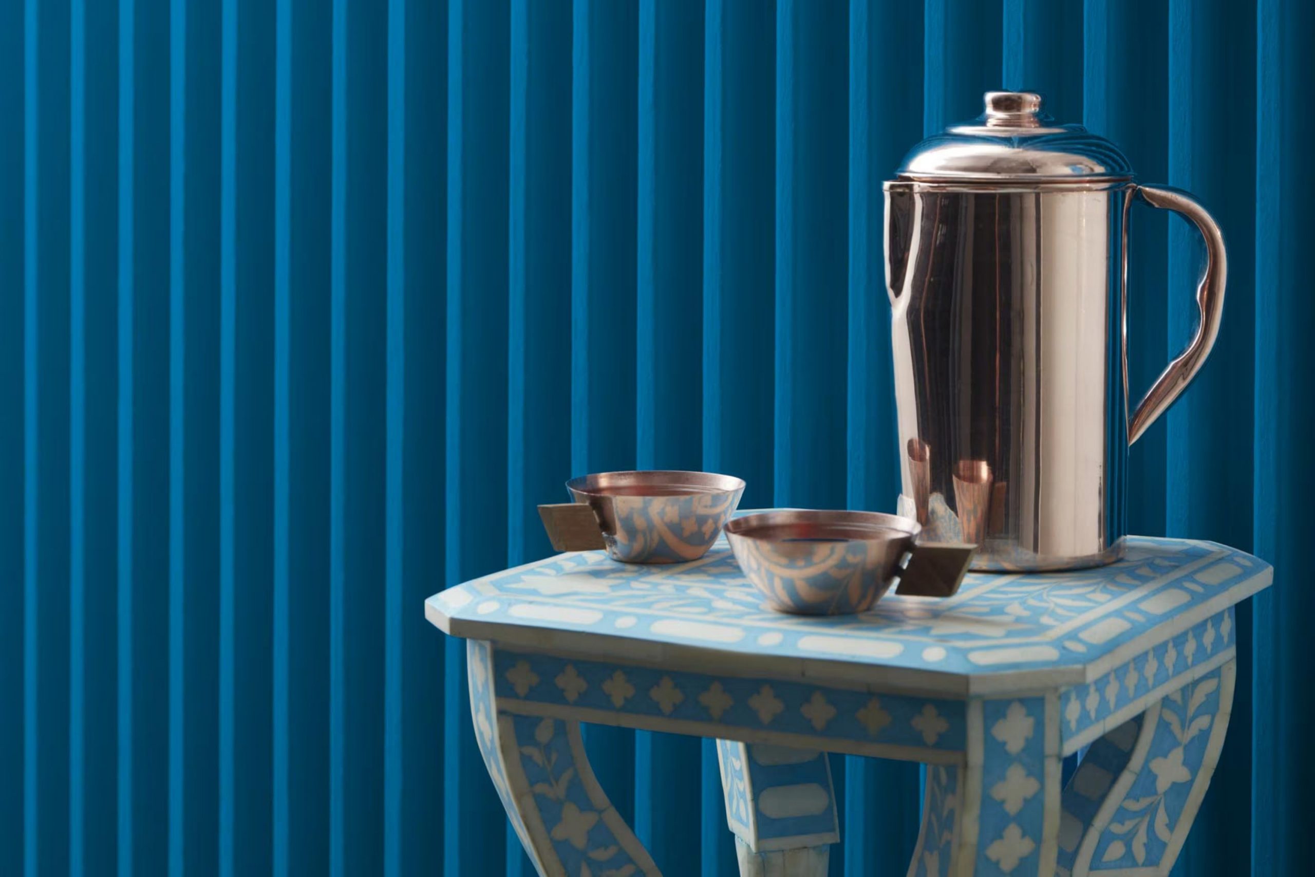
Seaport Blue by Benjamin Moore is a lively and bold shade that can add a splash of energy to any room. This rich blue has a luminous quality that can brighten interiors even on the gloomiest days. It’s perfect for creating a focal point in your home, whether on an accent wall, cabinets, or even a ceiling.
Seaport Blue works exceptionally well in coastal or nautical-themed interior designs, drawing inspiration from ocean colors to bring the feeling of the seaside indoors. It also fits beautifully into modern and contemporary styles, offering a striking pop of color among neutral tones.
When it comes to materials, Seaport Blue pairs wonderfully with natural wood, which can soften the intensity of the blue while maintaining a fresh appearance. Think light oak or warm walnut for a balanced contrast. Textures like linen or canvas also complement this shade, adding a touch of rustic charm that balances the freshness of the blue with something more grounded.
Metallic finishes, especially in silver or brushed nickel, can give a crisp and clean finish that matches the lively quality of Seaport Blue, making any room feel more energetic and welcoming.
decorcreek.com
Is Seaport Blue 2060-30 by Benjamin Moore Warm or Cool color?
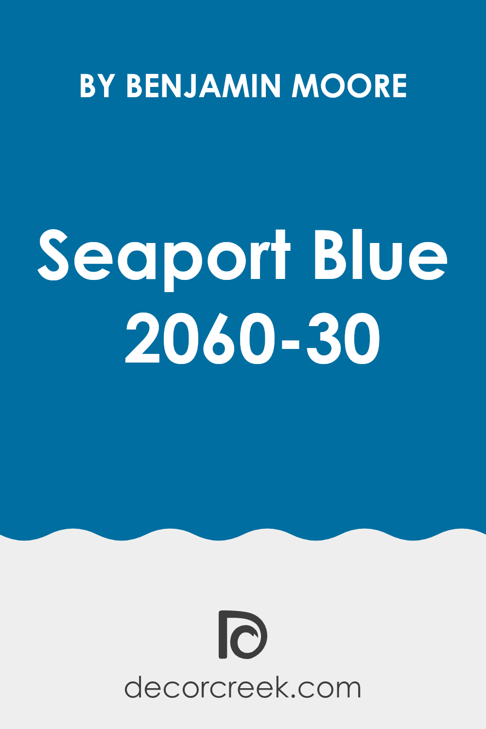
Seaport Blue by Benjamin Moore is a vivid and refreshing shade of paint that brings a cool and calming feeling to any room. Its bright blue tones can make rooms seem more open and airy, which is wonderful for smaller rooms or areas with limited natural light.
Because of its lively nature, Seaport Blue is an excellent choice for bathrooms or kitchens, where it adds a clean and crisp appearance. It also works beautifully in bedrooms, providing a calming backdrop that’s not too intense, making it easier to relax.
Pairing it with neutral colors like white or gray helps the blue stand out and gives the home a fresh and modern feeling. Adding accessories or furniture in warm tones such as yellow or red can create a beautiful contrast, highlighting the coolness of Seaport Blue. It’s adaptable enough to be used for a feature wall or throughout an entire room, depending on the effect you want to create.
Undertones of Seaport Blue 2060-30 by Benjamin Moore
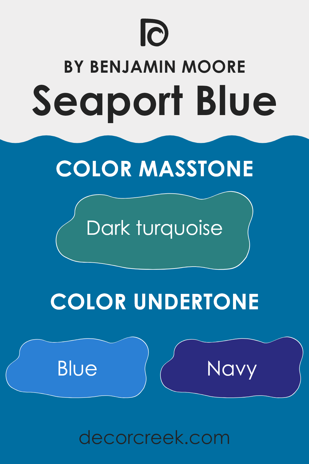
Benjamin Moore’s Seaport Blue is a unique color with a variety of undertones that influence its appearance in different lighting conditions and settings. Undertones are subtle hues blended into the main color, affecting how it is perceived. For Seaport Blue, these undertones range across shades like blue, navy, and dark blue, while also extending into related tones such as light turquoise, turquoise, and light blue. These bluish undertones help the main color maintain a cool and fresh feeling.
Additionally, it includes subtle hints of grey, dark grey, and even lilac, which can soften the brightness slightly and add depth, making the color more complex and adaptable. This adaptable quality means it works beautifully with both natural and artificial lighting, often appearing slightly different under each.
In interior rooms, the effect of these undertones becomes especially noticeable. On walls, Seaport Blue can create a calming yet lively atmosphere because the undertones react differently with decor elements and changing light sources. During the day, the lighter and turquoise undertones may become more visible, giving the room a lively feeling. By evening, the darker tones like navy and dark blue may stand out more, creating a cozier and more enveloping atmosphere.
Seaport Blue’s range of undertones also makes it easy to pair with different color palettes and furnishings, allowing it to fit beautifully into many interior styles, from modern to traditional. It’s a color that doesn’t simply cover the walls but adds richness to the entire feeling of a room.
decorcreek.com
What is the Masstone of the Seaport Blue 2060-30 by Benjamin Moore?
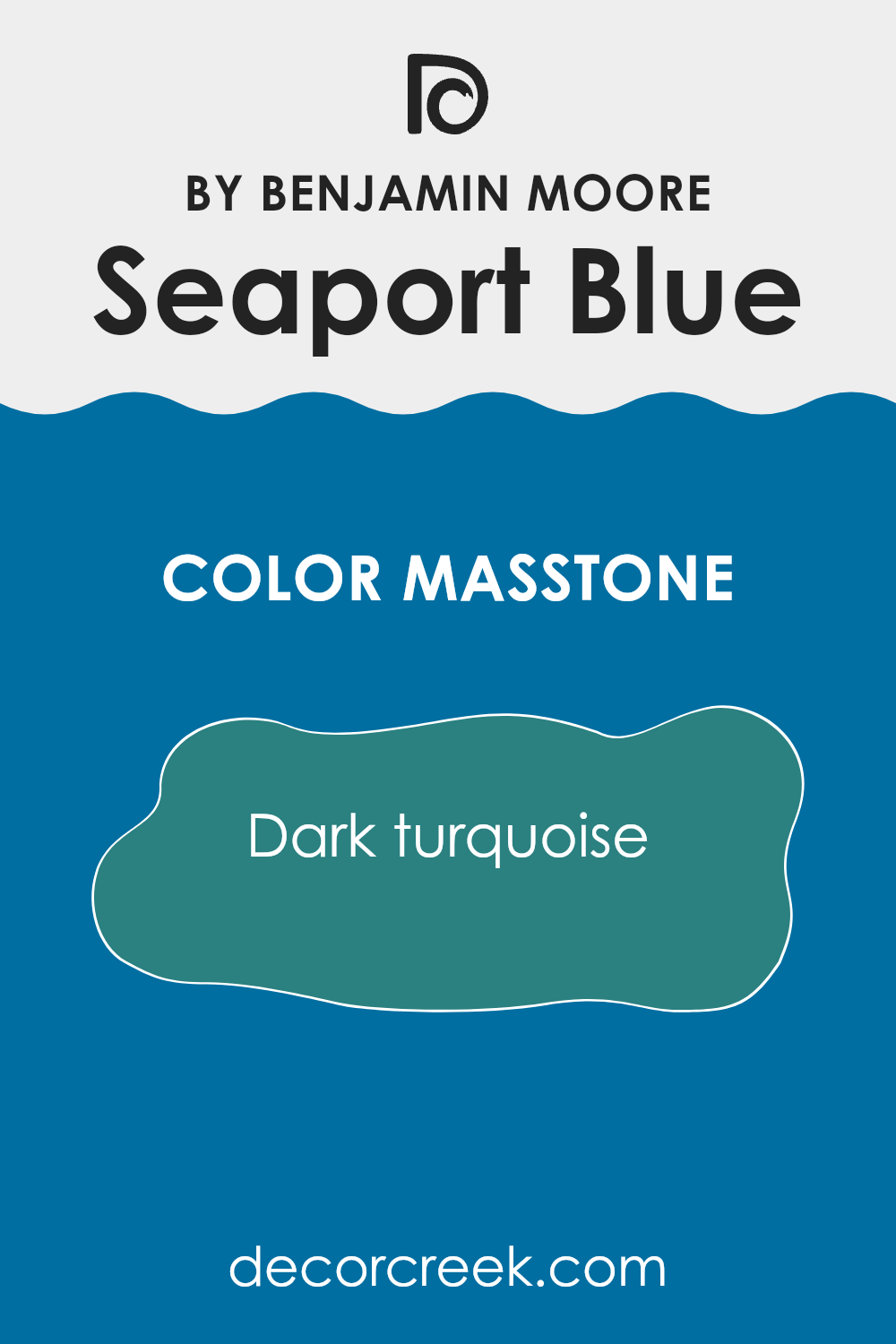
Seaport Blue 2060-30 by Benjamin Moore is a dark turquoise color, resembling rich ocean depths. This deep shade blends green and blue tones, creating a cozy and welcoming atmosphere in any room. Its muted and rich appearance makes it perfect for bedrooms or living areas where a calming atmosphere is desired.
Since it isn’t too bright, this color pairs beautifully with many decor styles and can serve as a striking backdrop for both light and dark furniture. Being a darker color, it can also help make large and open rooms feel more grounded and comfortable.
Due to its adaptable nature, Seaport Blue can work beautifully in different areas of a home, including kitchens and bathrooms, creating a connected visual flow. When used in well-lit rooms or paired with plenty of indoor lighting, it maintains its richness without feeling too intense, helping preserve a balanced appearance.
decorcreek.com
How Does Lighting Affect Seaport Blue 2060-30 by Benjamin Moore?
Lighting plays an important role in how colors appear in different environments, and this is especially true for paint colors. The same color can look different depending on the type and amount of light it receives. Natural light reveals the truest version of a paint color, while artificial light can change how the color appears.
Using Seaport Blue as an example, under artificial light this shade can take on a slightly different appearance depending on the type of bulb used. Fluorescent lights, which often produce a bluish tone, can make Seaport Blue appear cooler, highlighting its blue qualities. Incandescent lighting, which creates a warmer glow, can make the color appear slightly greener because of the yellow undertones in the light.
In natural light, Seaport Blue is more likely to show its true shade, but the direction the room faces also affects its appearance. In north-facing rooms, light is cooler and more even throughout the day, which can make Seaport Blue look more consistent but slightly softer and shadowier. South-facing rooms receive stronger light, making the color appear brighter and more vivid throughout the day.
In east-facing rooms, Seaport Blue will be influenced by the warm yellow light of the morning sun, possibly appearing softer and lighter. However, as the day continues, the sunlight becomes less intense, leading to a more accurate appearance of Seaport Blue by the afternoon. West-facing rooms experience the opposite effect; the color may appear more muted in the morning and become richer and more lively in the evening as the sun sets.
Understanding these details helps when choosing the right paint color for your room, allowing you to improve how it looks under different lighting conditions and achieve the atmosphere you want.
decorcreek.com
What is the LRV of Seaport Blue 2060-30 by Benjamin Moore?
LRV stands for Light Reflectance Value, which is a measure used to show how much light a paint color reflects back into a room compared to pure white, which reflects the highest amount of light.
The LRV scale starts at 0, which is absolute black and reflects no light, and goes up to the highest value representing pure white, which reflects the most light. The higher the LRV, the brighter and lighter the color appears, and the more it can brighten a room. Lower LRVs suggest darker colors that absorb more light, making a room feel cozier but also smaller.
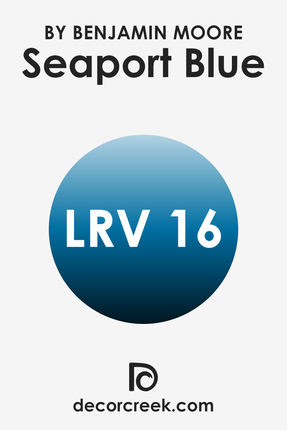
For Seaport Blue, with an LRV of 16.13, it means this shade is quite dark. It doesn’t reflect much light, so it can make a room feel smaller and more enclosed. This color would be ideal for creating a more intimate atmosphere in a larger room or for use on an accent wall to add depth and visual interest. In small rooms, however, using a low LRV color like this could make the room feel cramped or gloomy unless balanced with good lighting and lighter shades.
decorcreek.com
Coordinating Colors of Seaport Blue 2060-30 by Benjamin Moore
Coordinating colors are selected hues that complement or improve each other when used together in interior rooms. These colors create a balanced and visually pleasing appearance, allowing individual elements to flow naturally from one to another.
For instance, when coordinating colors with Seaport Blue, a deep and lively shade, choosing the right companion colors can strongly influence the overall appearance; it’s important to select hues that match the mood and feeling you want to create.
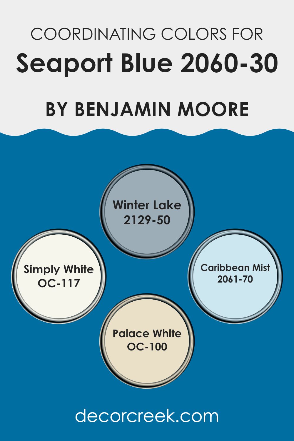
Winter Lake, with its calm blend of blue and gray, pairs beautifully with Seaport Blue by offering a soft contrast that isn’t too intense, helping the room feel connected and balanced. Simply White provides a clean and fresh backdrop that allows deeper colors like Seaport Blue to stand out, giving a room a bright and airy feeling.
On the other hand, Caribbean Mist serves as a light and breezy complement to the richness of Seaport Blue, adding a sense of freshness to the palette. Lastly, Palace White, slightly warmer than Simply White, works beautifully to soften the bold appearance of Seaport Blue, resulting in a natural and welcoming room. These coordinating colors, when paired thoughtfully, create a beautiful visual experience that can improve the appearance and atmosphere of any room.
You can see recommended paint colors below:
- 2129-50 Winter Lake
- OC-117 Simply White
- 2061-70 Caribbean Mist
- OC-100 Palace White
What are the Trim colors of Seaport Blue 2060-30 by Benjamin Moore?
Trim colors play an important role in defining the appearance and character of a room by highlighting architectural details and improving the overall design. When paired with a lively shade like Seaport Blue by Benjamin Moore, selecting the right trim color can truly make the walls stand out and bring forward the depth and richness of the main color.
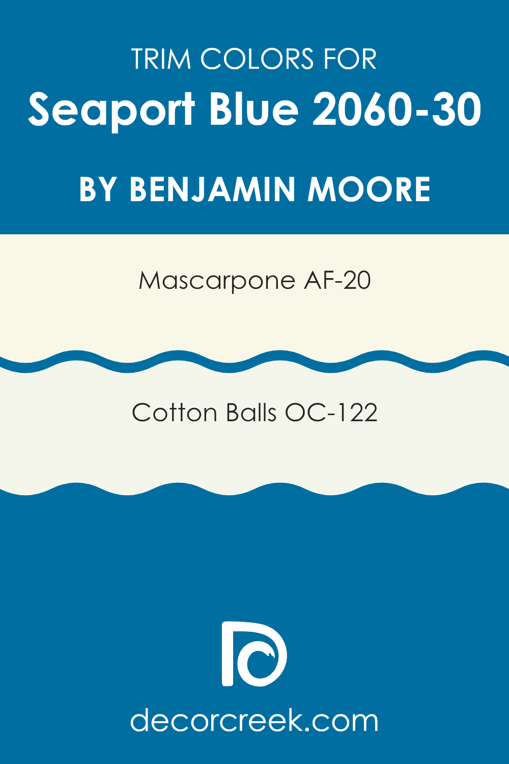
AF-20 – Mascarpone and OC-122 – Cotton Balls are two trim colors that work exceptionally well with Seaport Blue. Mascarpone, a warm and creamy white, offers a soft contrast that gently complements the boldness of Seaport Blue without making it feel too intense. On the other hand, Cotton Balls is a cleaner and crisper white that creates a sharper contrast, giving a fresh and lively appearance that balances the richness of the blue.
Mascarpone is a delicate shade, much like the richness found in its namesake cheese, providing a subtle warmth that improves cozy and welcoming rooms. It has the unique ability to add a touch of comfort to the brightness of Seaport Blue, making it an excellent choice for traditional interiors. Cotton Balls, with its bright and airy feeling, acts as a refreshing contrast to the rich Seaport Blue, perfect for creating a more striking and energetic visual effect. This color is ideal for modern interiors where a crisp and clean appearance is desired, ensuring the blue stands out vividly.
You can see recommended paint colors below:
- AF-20 Mascarpone
- OC-122 Cotton Balls
Colors Similar to Seaport Blue 2060-30 by Benjamin Moore
Using similar colors in design helps create a harmonious and connected appearance, which can improve the atmosphere of a room by tying different elements together. When colors like Seaport Blue by Benjamin Moore are used as a base, coordinating similar shades allows for subtle variation that adds depth and visual interest without making the room feel too intense.
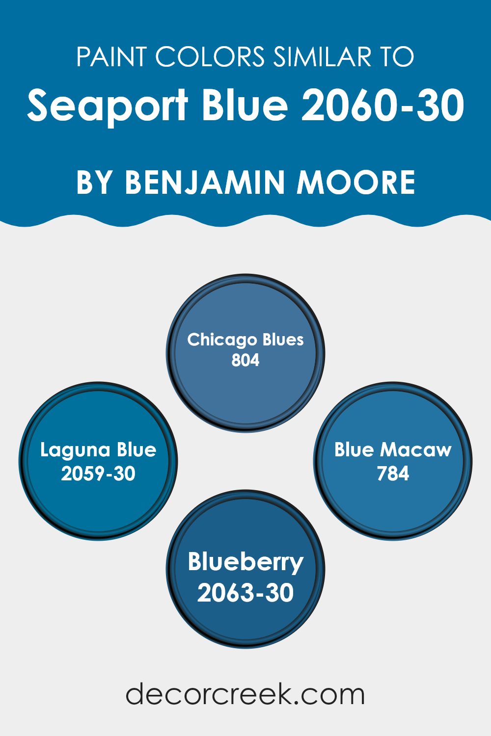
For instance, variations like Chicago Blues and Laguna Blue, while close in the color spectrum to Seaport Blue, provide slight differences in shade that can be used effectively to define areas within a room or add a gentle contrast.
Chicago Blues offers a slightly richer and deeper hue that reflects the mysterious depth of its namesake city’s jazz heritage, perfect for creating a focal point or highlighting key furnishings. Laguna Blue has a livelier and more energetic quality that hints at tropical waters, making it ideal for rooms intended to feel fresh and invigorating.
Blue Macaw, inspired by the exotic bird, introduces a touch of brightness that can brighten any room, especially in interiors that benefit from a splash of lightness. Finally, Blueberry is a denser and more saturated option that brings a strong presence into a room, creating an impressive backdrop or a dramatic statement wall. Each of these colors complements Seaport Blue, allowing for a smooth and dynamic yet connected color palette.
You can see recommended paint colors below:
- 804 Chicago Blues
- 2059-30 Laguna Blue
- 784 Blue Macaw
- 2063-30 Blueberry
Colors that Go With Seaport Blue 2060-30 by Benjamin Moore
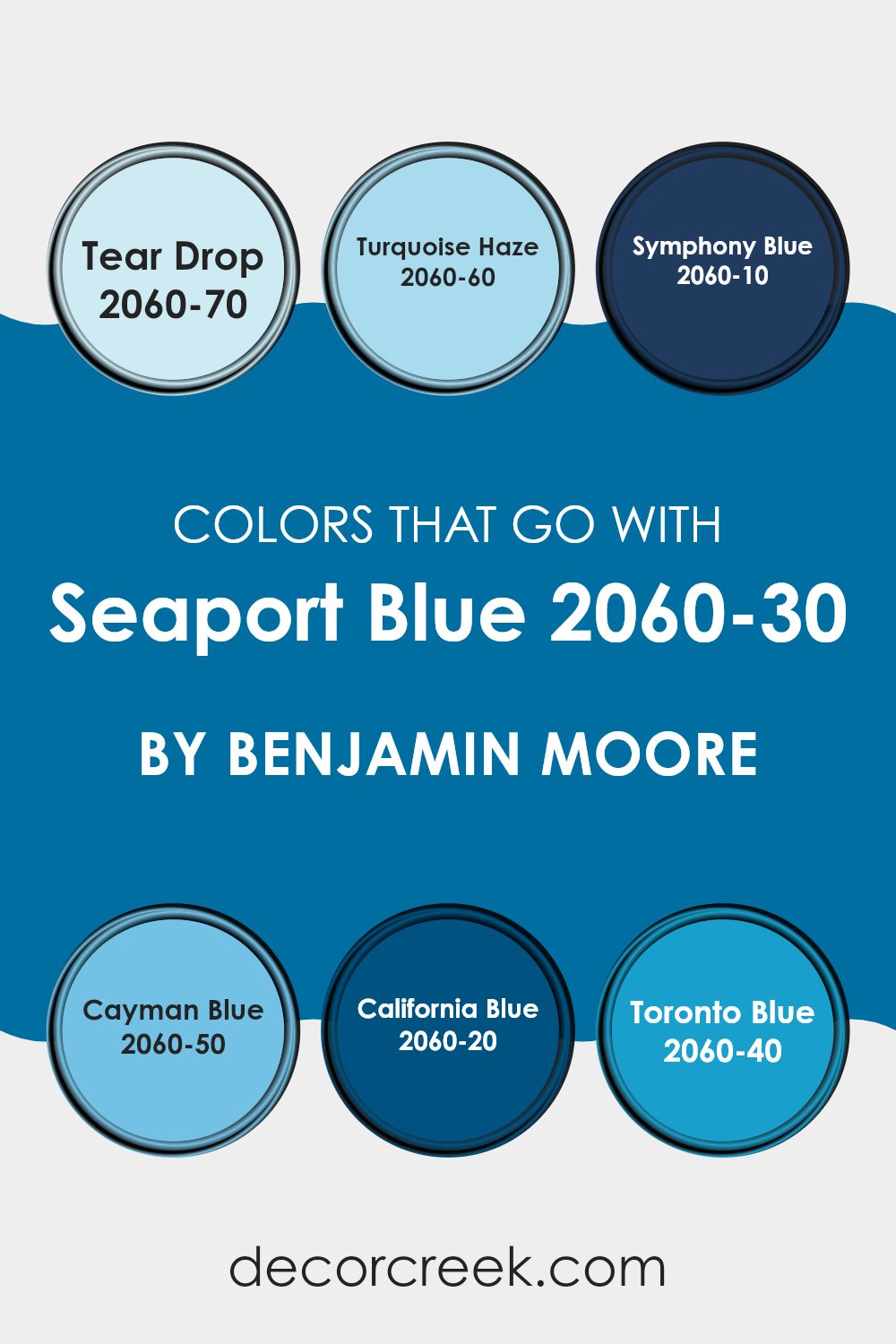
Selecting the right colors to complement Seaport Blue 2060-30 by Benjamin Moore is important for creating a balanced and visually pleasing room. When paired with colors such as Tear Drop, Turquoise Haze, Symphony Blue, Cayman Blue, California Blue, and Toronto Blue, Seaport Blue becomes even more expressive, highlighting its lively yet calming character. Each of these colors shares a similar tone and depth, allowing them to blend naturally without clashing, which improves the overall appearance of the room being painted.
Tear Drop is a gentle and light blue that adds a soft touch when paired with the deeper Seaport Blue, creating a fresh feeling. Similarly, Turquoise Haze offers a slightly greenish-blue tint that brings a lively and cheerful atmosphere into any room. Symphony Blue, on the other hand, is much darker and creates a bold contrast that can make Seaport Blue stand out dramatically.
Likewise, Cayman Blue, which is also on the darker side, provides a rich backdrop that allows Seaport Blue to become the focal point. California Blue is lively and adds energetic character to the surroundings, making it ideal for more dynamic rooms. Lastly, Toronto Blue presents a softer and more muted option that pairs smoothly with Seaport Blue for those seeking a more understated appearance. These color choices are not only visually attractive but also help create a connected environment that feels balanced and pleasing to the eye.
You can see recommended paint colors below:
- 2060-70 Tear Drop
- 2060-60 Turquoise Haze
- 2060-10 Symphony Blue
- 2060-50 Cayman Blue
- 2060-20 California Blue
- 2060-40 Toronto Blue
How to Use Seaport Blue 2060-30 by Benjamin Moore In Your Home?
Seaport Blue 2060-30 by Benjamin Moore is a lively color that brings a fresh and energetic feeling to any room. This shade of blue can be a fantastic choice for creating a cheerful and welcoming room. It works beautifully in many areas throughout the home.
For instance, painting a bedroom wall with Seaport Blue can add a playful touch while keeping the atmosphere light and airy. In a living room, pairing it with neutral furniture and accents can balance the brightness and help the room feel connected.
This color is also wonderful for bathrooms, where it can create a clean and fresh appearance. Accessories in white or grey can complement the blue beautifully, adding a modern touch. Lastly, in a kitchen, Seaport Blue can be used on cabinets or an accent wall, paired with light countertops, to create an enjoyable cooking atmosphere. Overall, this color is adaptable and can brighten your home in many beautiful ways.
Seaport Blue 2060-30 by Benjamin Moore vs Blue Macaw 784 by Benjamin Moore
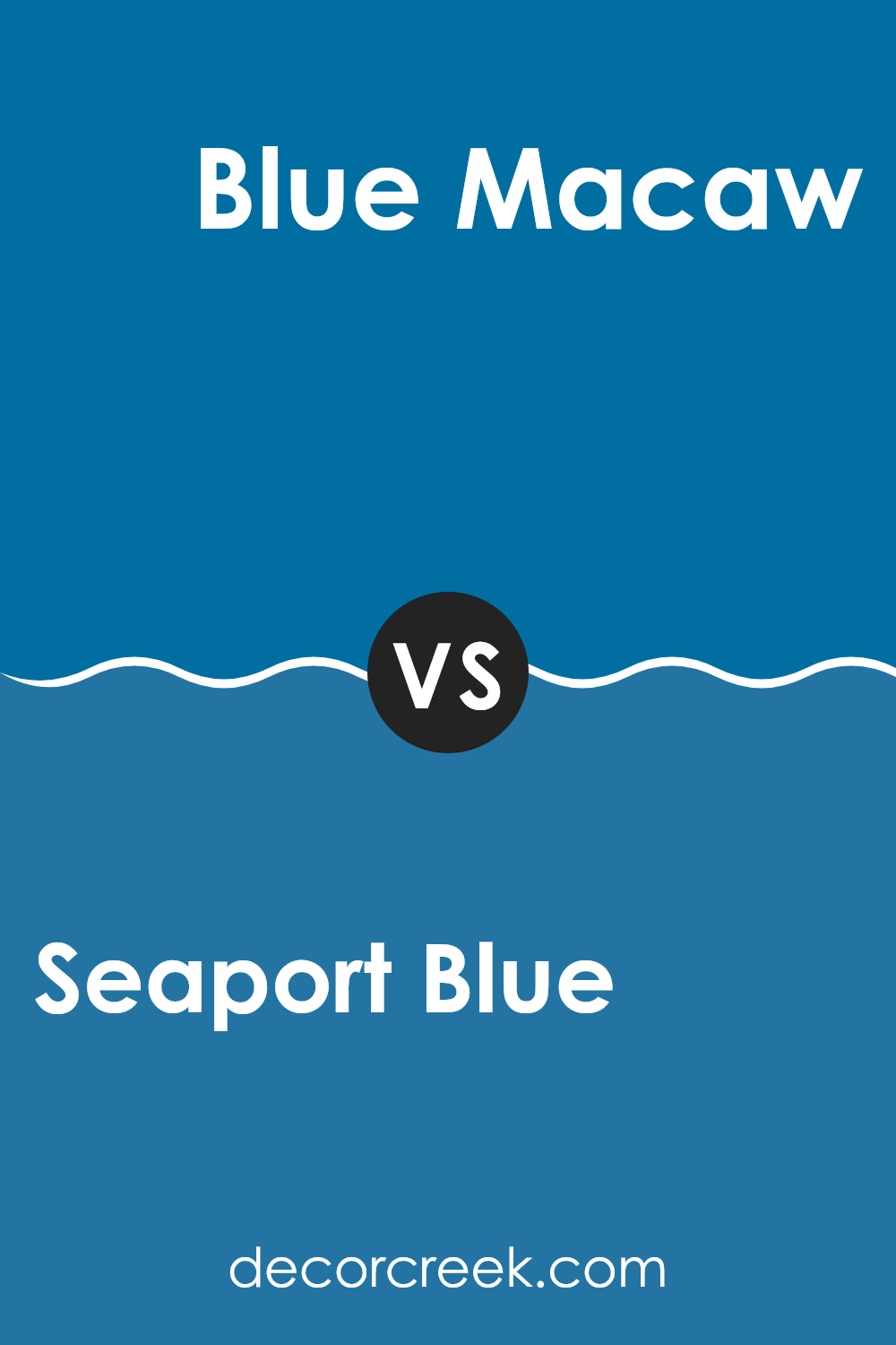
Seaport Blue and Blue Macaw, both by Benjamin Moore, are distinct shades of blue but each carries its own unique charm. Seaport Blue is a deep and lively color that resembles the rich tones of the ocean. It’s quite bold and can create a striking statement in a room.
On the other hand, Blue Macaw is a brighter and lighter shade, more reminiscent of tropical skies or clear sunny days. This color has a cheerful and welcoming quality that can brighten any room.
When comparing the two, Seaport Blue tends to bring a more dramatic feeling to interiors, while Blue Macaw leans toward creating a breezy and airy atmosphere. Both colors are adaptable and can be used in different decorating styles to create different moods and feelings throughout your home.
You can see recommended paint color below:
- 784 Blue Macaw
Seaport Blue 2060-30 by Benjamin Moore vs Blueberry 2063-30 by Benjamin Moore
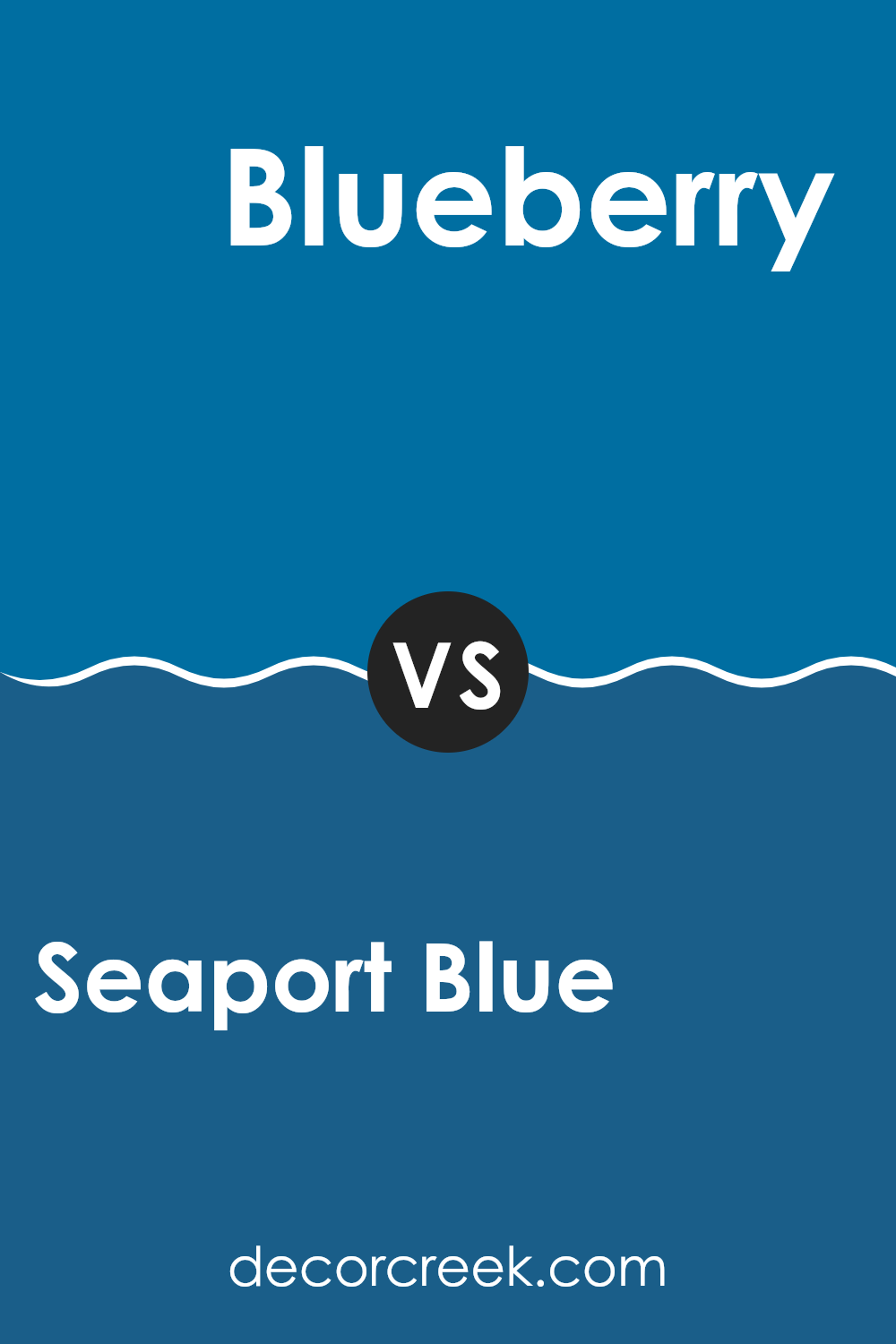
Seaport Blue and Blueberry, both by Benjamin Moore, offer distinct shades of blue for different tastes and interiors. Seaport Blue is a deep and rich blue with a touch of green, making it perfect for creating a cozy and welcoming atmosphere. It resembles the color of a deep harbor, providing a strong base shade that pairs beautifully with lighter tones and natural materials.
On the other hand, Blueberry is a lively and pure blue. This color is brighter and leans toward the classic tone of a blueberry fruit, offering a more energetic and playful feeling. It’s ideal for rooms designed to feel lively and fun, such as children’s rooms or creative areas.
Both colors have their own unique appeal: Seaport Blue is wonderful for a mature and grounded appearance, while Blueberry suits a brighter and more energetic decor style. Depending on the mood you want to create, either color can become a striking choice for your walls.
You can see recommended paint color below:
- 2063-30 Blueberry
Seaport Blue 2060-30 by Benjamin Moore vs Laguna Blue 2059-30 by Benjamin Moore
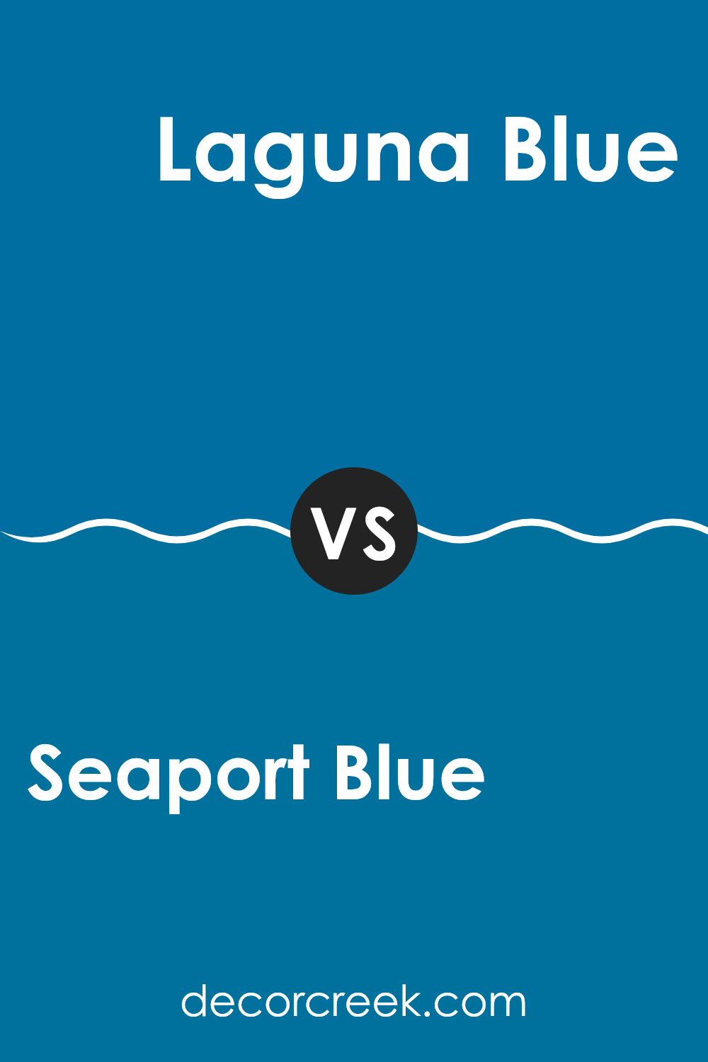
Seaport Blue and Laguna Blue by Benjamin Moore are both lively shades, but they have distinct tones that set them apart. Seaport Blue is a deep blue with a strong presence, giving a bold and energetic feeling that can make any room stand out. It leans slightly toward a navy tone, making it a wonderful choice for a dramatic wall color or an accent feature.
On the other hand, Laguna Blue is brighter and has a more noticeable aquatic appearance. It’s closer to a true blue, reflecting a cheerful and energetic atmosphere that can brighten a room. This shade brings to mind a clear sky on a sunny day or the lively waters of a tropical beach, ideal for creating a fresh and lively atmosphere.
Both colors are excellent choices depending on the feeling you want to bring into a room: Seaport Blue for depth and richness, and Laguna Blue for brightness and cheer.
You can see recommended paint color below:
- 2059-30 Laguna Blue
Seaport Blue 2060-30 by Benjamin Moore vs Chicago Blues 804 by Benjamin Moore
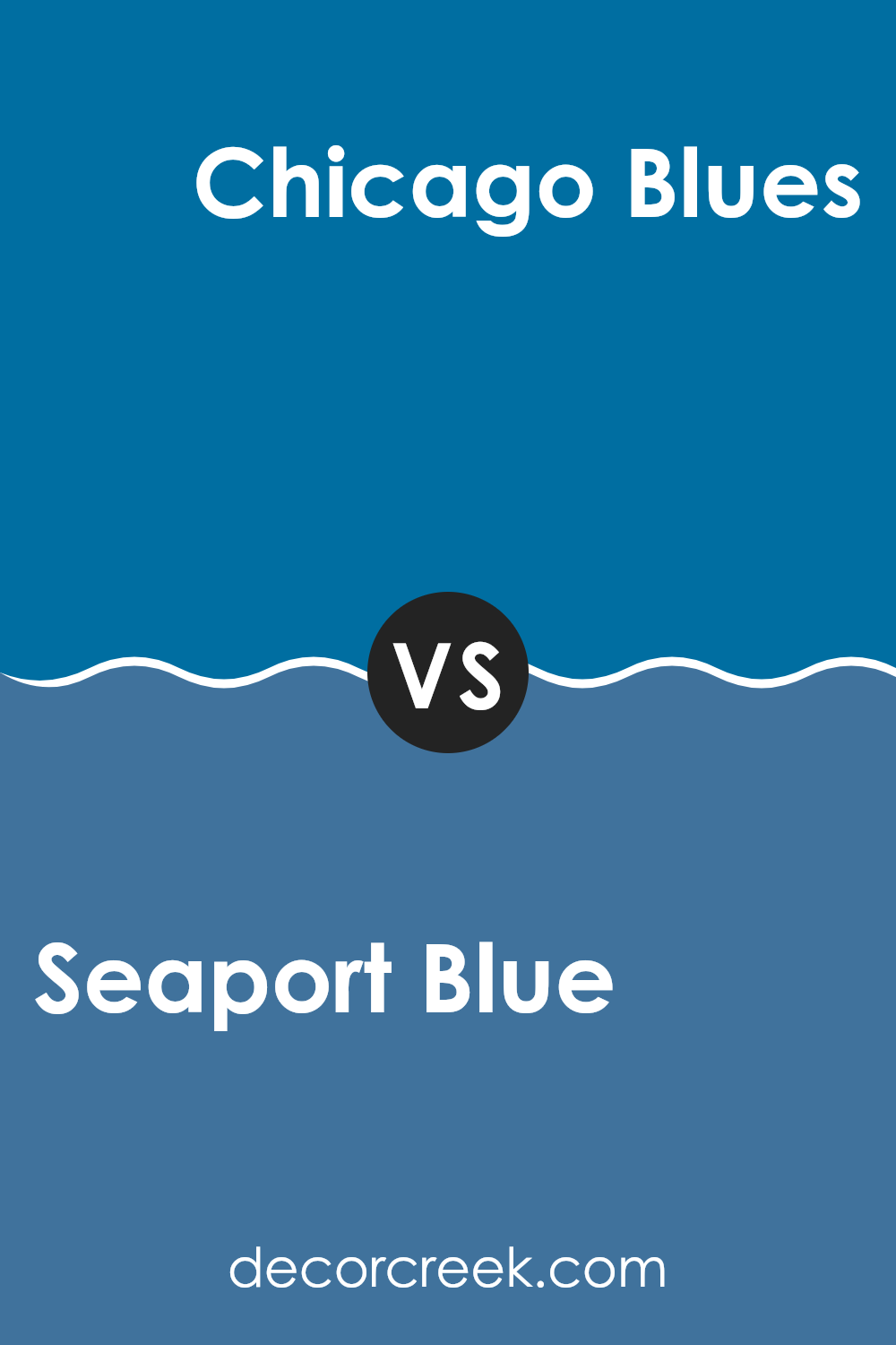
Seaport Blue and Chicago Blues by Benjamin Moore are both lively shades of blue, but they have distinct differences. Seaport Blue is a bold and deep color with a hint of teal. This gives it a fresh and energetic feeling, perfect for creating a strong yet welcoming atmosphere.
On the other hand, Chicago Blues has a more classic blue tone, reminiscent of a clear sky. It’s slightly lighter than Seaport Blue, creating a calm and soothing atmosphere while still maintaining enough depth to stand out.
While both colors can add a refreshing touch to a room, Seaport Blue leans toward a more dramatic and energetic appearance, whereas Chicago Blues offers a more classic and calming look. Both are wonderful choices, but the selection depends on the mood you want to create in the room.
You can see recommended paint color below:
- 804 Chicago Blues
As I finish writing about the “2060-30 Seaport Blue” by Benjamin Moore, I’ve learned a lot about this special shade of blue. It’s like the color you see at the beach, cool and calm. This paint can make any room feel like a peaceful place, just like being near the ocean. It’s wonderful for rooms where you want to relax, like a bedroom or a living room.
Painting a wall with Seaport Blue is like bringing a piece of the sky into your home. It looks beautiful during the day and equally beautiful at night. Also, this color pairs beautifully with other shades. You can combine it with lighter colors like white for a fresh appearance or with darker tones for a more dramatic feeling.
I found that many people enjoy this color because it stays interesting and helps homes feel cozy. After seeing how this shade can change a room, I think it’s a wonderful choice for anyone wanting to refresh their home with something new. Benjamin Moore did a wonderful job with “2060-30 Seaport Blue,” creating a paint color that not only looks beautiful but also makes people feel good.
decorcreek.com
Ever wished paint sampling was as easy as sticking a sticker? Guess what? Now it is! Discover Samplize's unique Peel & Stick samples.
Get paint samples