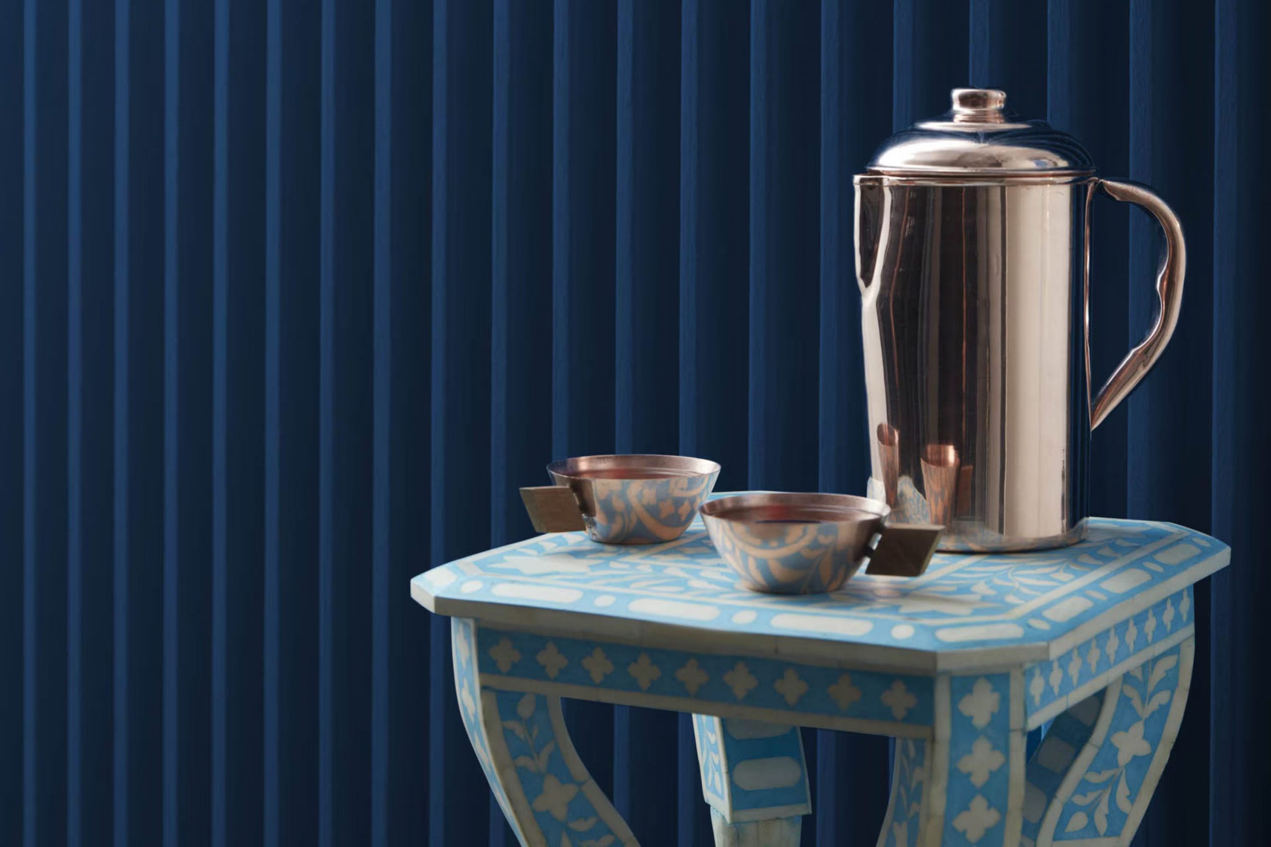
When you’re thinking about refreshing a room with a new coat of paint, choosing the right color is crucial. Benjamin Moore’s 2060-10 Symphony Blue is a shade you might be considering. From my experience, this blue isn’t just any ordinary blue; it has a vibrant quality that can completely redefine a room. It’s essential to understand how it behaves in different lighting conditions, as this can impact the mood and feel of your room.
Symphony Blue has a lively personality that can energize everyday living areas or bring a regal elegance to a more formal setting. Before you decide to paint your walls with this shade, think about the existing elements in your room. Do your furnishings and decor lean towards modern or traditional? Symphony Blue can complement many styles, but it shines best when paired thoughtfully.
It’s also worthwhile to test a sample on your wall and observe it at different times of the day. This way, you can be sure that Symphony Blue aligns with your vision for the room.
Whether you’re updating your living room, bedroom, or another area of your home, this color has the potential to make a significant impact.
Is Symphony Blue 2060-10 Right for My Home?
As someone who loves to experiment with colors in interiors, I find Symphony Blue by Benjamin Moore to be an absolutely striking shade. It’s a deep, vivid blue that carries a hint of vibrancy, making it a fantastic choice for anyone looking to add a bold splash of color to their home. This particular blue has a royal flair to it, yet it doesn’t overpower a room.
This color works beautifully in many interior styles, especially in modern and contemporary rooms where its intense hue can really stand out against neutral backgrounds. It’s also a great fit for eclectic or artistic rooms, as it can act as a bold backdrop for art and other decorative elements.
When it comes to pairing materials and textures, Symphony Blue works exceptionally well with natural wood, which helps warm up the cool feel of the blue. Metallic finishes like gold or brass can create a rich look, while pairing it with glass adds a clean, modern touch. For textures, I love combining it with soft, velvety fabrics, which help balance the boldness of the blue with a cozy feel. Overall, this color is a flexible choice for anyone looking to bring lively color into their home.
What are the right undertones of Symphony Blue 2060-10 ?
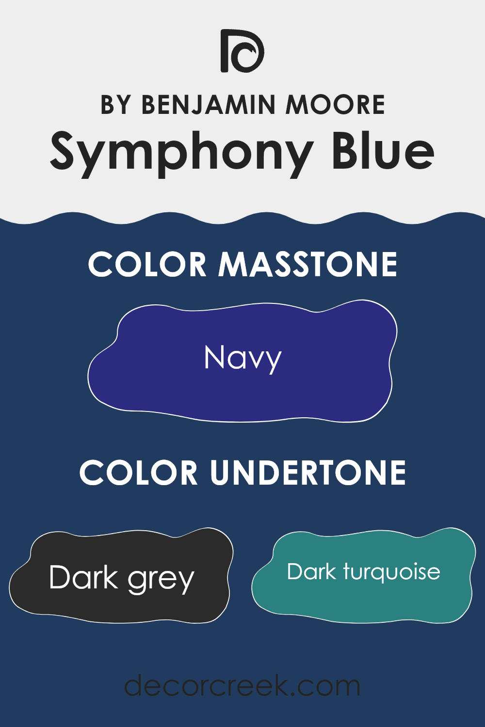
Symphony Blue by Benjamin Moore is a rich, deep blue paint color that carries undertones which can subtly change its appearance under different lighting conditions. The undertones in any paint color are secondary colors that influence the primary hue, affecting how we perceive the painted surface.
The undertones for Symphony Blue include dark grey, dark turquoise, dark green, purple, brown, dark blue, grey, olive, blue, violet, and lilac. These undertones add depth and complexity to the wall color. In natural light, some of these undertones, like dark blue and violet, might become more noticeable, giving the walls a slightly different feel compared to how they look in artificial light where darker undertones like dark grey and brown might be more dominant.
When painted on interior walls, Symphony Blue’s undertones allow the color to adapt subtly to various types of décor and lighting, making it a flexible choice for many rooms. For instance, in a room with lots of natural light, the brighter undertones like blue and violet might make the walls feel vibrant and lively. In contrast, in a room with less light, the darker undertones might make the room feel more enclosed and cozy.
Understanding the undertones of Symphony Blue can help in selecting furniture and decorations, as these undertones will interact with the colors of the items in the room, potentially enhancing harmony in the room. This adaptability makes Symphony Blue a practical choice for different rooms and styles, bringing a rich and dynamic character to the walls.
Best Coordinating Colors to use with Symphony Blue 2060-10 by Benjamin Moore this year.
Coordinating colors are shades that work well together by enhancing the overall look of a room when used together. They’re often chosen based on their ability to balance, highlight, or smoothly blend with the main color. For instance, Symphony Blue, a deep and vivid blue hue, pairs beautifully with colors that can either contrast it effectively or create a harmonious, soft gradient. The selection of coordinating colors should consider the room’s mood, lighting, and purpose, aiming for a coherent visual flow that pleases the eye.
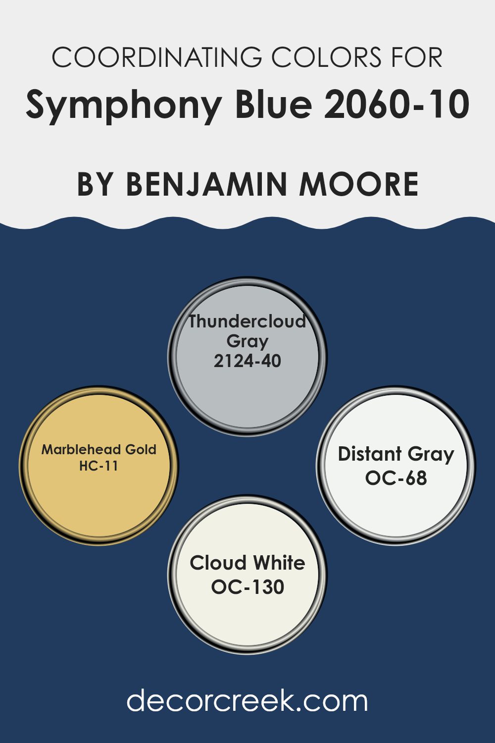
Thundercloud Gray is a moody gray that adds a dramatic flair when paired with the intensity of Symphony Blue, giving depth and contrast to interiors. Marblehead Gold is a warm, inviting shade that provides a striking yet balanced contrast to the cooler tones of the blue, offering a vibrant pop of color and warmth.
Distant Gray is much lighter and neutral, which softly complements deeper shades without feeling too heavy, perfect for creating a calm background. Lastly, Cloud White acts as the ultimate neutral, ensuring that the more intense shades don’t overpower the room, and it helps create a clean and airy feel. Together, these coordinating colors form a flexible palette that enhances the beauty of any interior.
You can see recommended paint colors below:
- 2124-40 Thundercloud Gray
- HC-11 Marblehead Gold
- OC-68 Distant Gray
- OC-130 Cloud White
Trendy Trim Colors of Symphony Blue 2060-10 by Benjamin Moore to use this year.
Trim colors are essentially the accent colors used on the finishing elements of a room, such as moldings, door frames, and baseboards. These colors can greatly enhance the overall appearance of a room by providing a contrasting or complementary frame to the walls.
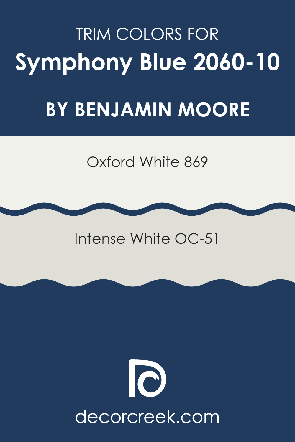
For a bold color like Symphony Blue by Benjamin Moore, selecting the right trim color is crucial because it helps to either subtly blend or create a striking boundary with the main color. Trim colors like 869 – Oxford White or OC-51 – Intense White are popular choices as they can either offer a crisp delineation or soften the edges visually, enriching the appearance of the wall color.
The color 869 – Oxford White is a pure, clean white that brings a clear distinction and freshness to a room painted in Symphony Blue, making the walls distinctly pop while keeping the environment light and airy. On the other hand, OC-51 – Intense White, which offers a hint of gray, provides a softer edge to the bold blue, adding a gentle, harmonious flow between the trim and the wall. This color can help in creating a smooth visual transition without sharp contrasts, thus supporting a cohesive look throughout the room.
You can see recommended paint colors below:
- 869 Oxford White
- OC-51 Intense White
Evergreen Colors Similar to Symphony Blue 2060-10 by Benjamin Moore
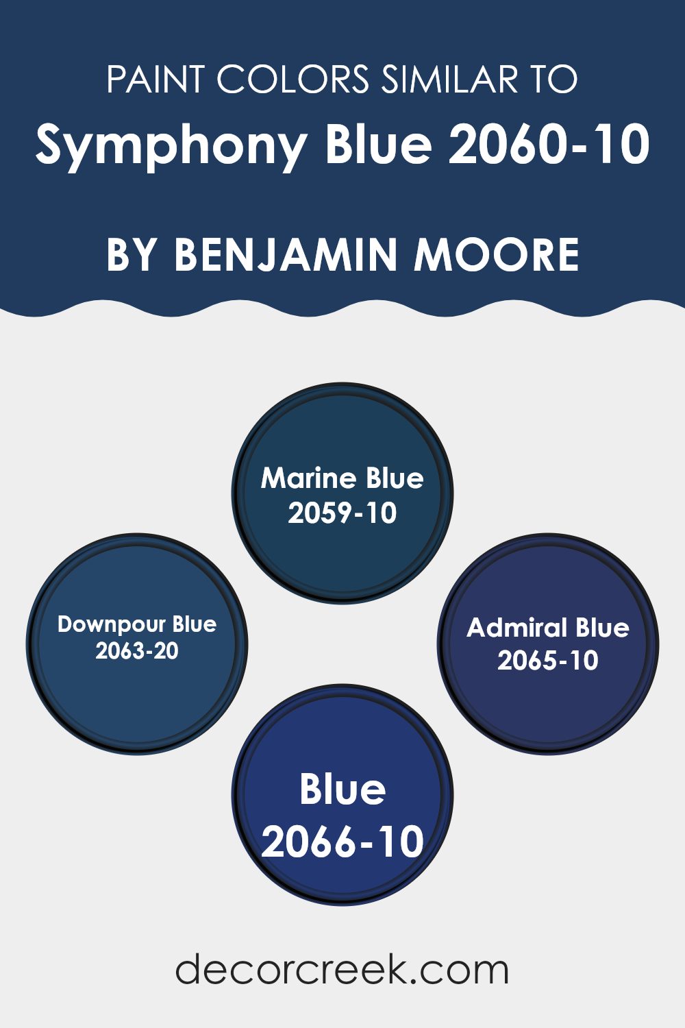
Choosing similar colors is essential in interior design because they create a cohesive and harmonious atmosphere. When colors like Marine Blue, Downpour Blue, Admiral Blue, and Blue are used alongside Symphony Blue, they work well together without strong contrast, supporting a smooth visual flow in the room. This approach is especially helpful in open-plan layouts or rooms that connect to one another, as it keeps a consistent theme throughout the home.
Marine Blue, a shade lighter than Symphony Blue, offers a fresh and lively feel without overpowering the room. It’s perfect for areas where you want a touch of color while keeping a light and airy mood. Downpour Blue, on the other hand, is deeper and brings a more dramatic and moody feel to an area, ideal for accent walls or furniture pieces.
Admiral Blue, even darker, adds depth and intensity, making it suitable for creating focal points within a room. Lastly, the color Blue provides a classic and enduring look, flexible enough to be used in many applications from walls to decor items, helping everything blend smoothly.
You can see recommended paint colors below:
- 2059-10 Marine Blue
- 2063-20 Downpour Blue
- 2065-10 Admiral Blue
- 2066-10 Blue
Colors that Go With Symphony Blue 2060-10 by Benjamin Moore
Choosing the right colors to pair with Symphony Blue 2060-10 by Benjamin Moore can make all the difference in a room’s atmosphere. These complementary colors create a harmonious palette that enhances the boldness of Symphony Blue, making it more vibrant or more muted depending on the accompanying shade. Understanding how these shades work together is key to achieving the desired mood and aesthetic in an interior setting.
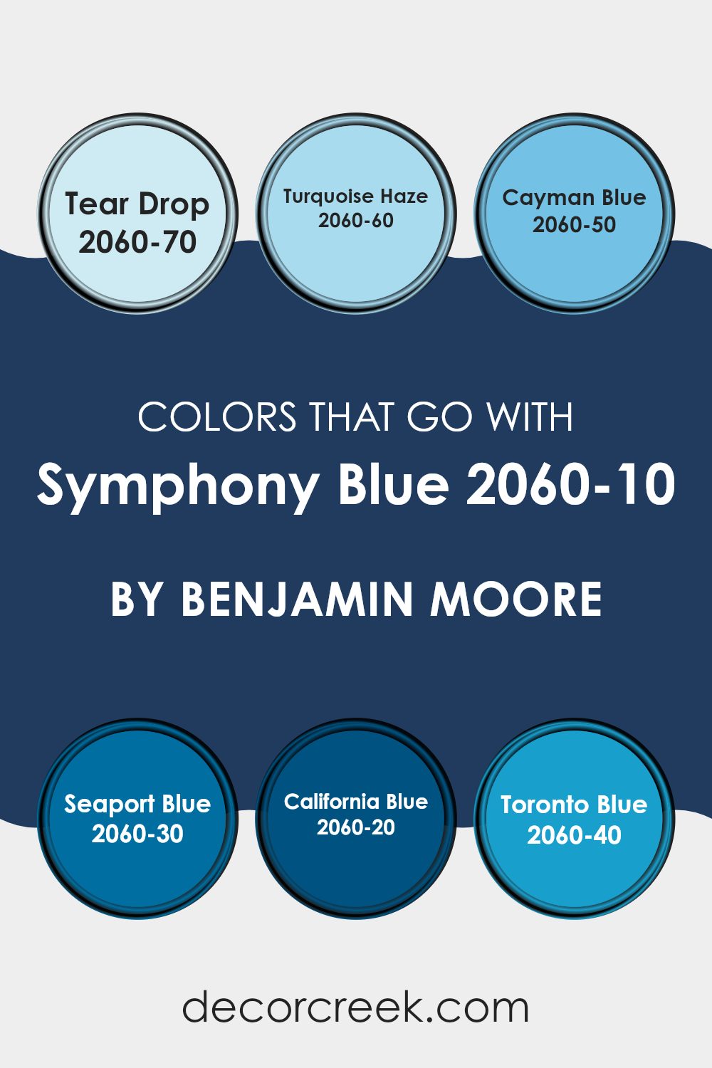
A soft and gentle color, Tear Drop 2060-70, is a light pastel that can bring a refreshing and calm quality to the intense Symphony Blue. Moving a bit deeper, Turquoise Haze 2060-60 adds a touch of brightness that can lighten up a room while blending naturally with the cool undertones of Symphony Blue.
Cayman Blue 2060-50 serves as a middle ground, neither too light nor too bold, and helps create a balanced and pleasing look alongside Symphony Blue. On the darker side, Seaport Blue 2060-30, California Blue 2060-20, and Toronto Blue 2060-40 each introduce progressively deeper blue tones. These colors add depth and interest to the interior, making the room feel more grounded and rich when paired with the striking Symphony Blue. Overall, these complementary colors offer many options to enhance or soften the visual impact, depending on the desired effect.
You can see recommended paint colors below:
- 2060-70 Tear Drop
- 2060-60 Turquoise Haze
- 2060-50 Cayman Blue
- 2060-30 Seaport Blue
- 2060-20 California Blue
- 2060-40 Toronto Blue
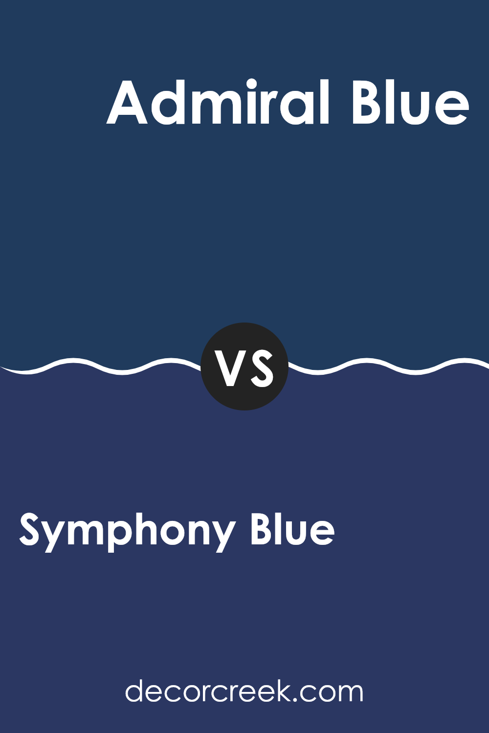
Symphony Blue 2060-10 by Benjamin Moore vs Admiral Blue 2065-10 by Benjamin Moore
Symphony Blue and Admiral Blue, both by Benjamin Moore, are vibrant shades of blue paint. Symphony Blue has a deep, rich tone that can be great for adding a strong presence to a room. It leans slightly toward a royal blue but keeps a comforting warmth.
In contrast, Admiral Blue is a darker shade that leans more toward navy. It often gives off a more formal vibe, making it suitable for rooms that aim for a grounded, stately look.
While both colors provide a bold backdrop, Symphony Blue feels a bit more energetic and lively, whereas Admiral Blue offers a sense of solidity and depth. These colors can work well in different rooms depending on the atmosphere you want to create, whether it feels lively and engaging or more reserved and grounding.
You can see recommended paint color below:
- 2065-10 Admiral Blue
Symphony Blue 2060-10 by Benjamin Moore vs Blue 2066-10 by Benjamin Moore
Symphony Blue and Blue are two distinct shades offered by Benjamin Moore. Symphony Blue is a rich, deep blue with a vibrant intensity that makes it stand out in a room. It’s a bold choice that can make any area feel more dynamic and exciting.
On the other hand, Blue is a darker shade, almost veering toward a navy. This darker tone offers a stronger sense of drama and is excellent for creating a statement, especially in a room aiming for a more impactful visual effect.
Though both colors share a base in blue, Symphony Blue adds life and energy to a room, while Blue provides a more grounded, forceful presence. These colors are great for different purposes, with Symphony Blue working well where you want vibrancy, and Blue where you prefer solidity and a touch of mystery.
You can see recommended paint color below:
- 2066-10 Blue
Symphony Blue 2060-10 by Benjamin Moore vs Marine Blue 2059-10 by Benjamin Moore
Symphony Blue and Marine Blue by Benjamin Moore are quite similar but have some noticeable differences that affect their impact in a room. Symphony Blue is a deep, vivid blue with a vibrant quality that seems to fill a room with energy.
It’s perfect for someone looking to add a strong, dynamic feel to their environment. On the other hand, Marine Blue is also a dark blue, but it leans slightly toward a teal undertone, giving it a somewhat cooler appearance.
This coolness makes Marine Blue a great choice for a calming and refreshing atmosphere, ideal for a peaceful bedroom or bathroom. Both colors are bold and can dominate a room if used extensively, however, their individual undertones mean they can create slightly different moods. Symphony Blue feels more energetic, while Marine Blue offers a cooler, more laid-back vibe.
You can see recommended paint color below:
- 2059-10 Marine Blue
Symphony Blue 2060-10 by Benjamin Moore vs Downpour Blue 2063-20 by Benjamin Moore
Symphony Blue and Downpour Blue are two distinct blue shades from Benjamin Moore. Symphony Blue is a deep, vibrant blue that adds a bold pop of color to any room. It’s a strong hue that can make walls stand out or function as an accent color.
On the other hand, Downpour Blue is darker and closer to navy, giving it a more reserved and calming presence compared to Symphony Blue. While Symphony Blue is bright and eye-catching, Downpour Blue is more understated, making it a great choice for creating a relaxed atmosphere in areas like bedrooms or studies.
Both colors can work beautifully in modern settings, making rooms feel fresh and stylish. Depending on the mood you want to set, Symphony Blue injects more energy, while Downpour Blue offers a subdued elegance.
You can see recommended paint color below:
- 2063-20 Downpour Blue
Writing about the paint 2060-10 Symphony Blue by Benjamin Moore has been really interesting! This paint is not just any blue; it’s special because it brings a bright and happy feeling wherever it’s used. From bedrooms to living rooms, this paint adds a cheerful spark. It’s perfect for anyone wanting to make their room look lively and fun without going too crazy with color.
What’s super cool about Symphony Blue is how it works well with lots of other colors. You could pair it with whites or even bold colors like yellow or red, and it still looks great. This makes it easy for someone to use it in different parts of their house without worrying about it clashing with the furniture.
After seeing pictures and reading other people’s experiences with the Symphony Blue by Benjamin Moore, it’s clear that it can really change the feel of a room. It doesn’t just make the walls look nice; it makes the whole room feel new and exciting. So, if anyone is thinking about adding some new paint to their walls, I definitely recommend giving Symphony Blue a try.
It’s a fun color that can make any room pop and smile!
Ever wished paint sampling was as easy as sticking a sticker? Guess what? Now it is! Discover Samplize's unique Peel & Stick samples.
Get paint samples

